#similarly to their character designs I wanted to repeat the shapes present in their origin sigils
Explore tagged Tumblr posts
Text
Winter Anime 2019 Part 3: High on Concept
If you wait long enough, you’ll find something good to say.
Doukyonin wa Hiza, Tokidoki, Atama no Ue / My Roommate is a Cat
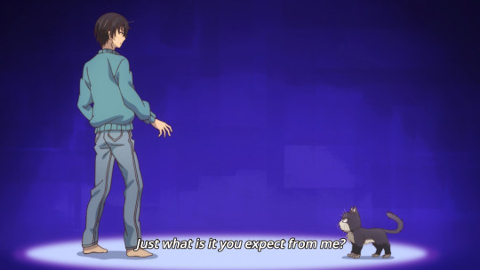
What: Misanthropic mystery author picks up tough stray cat, both get healed.
✅ The cat acts like a cat, the misanthrope acts like a misanthrope.
✅ The approach of telling the same simple story from the perspective of two characters that can’t really communicate effectively is interesting.
✅ This is very basic, but it works. I like both characters, and it's generally inoffensive. Pretty much Barakamon with less of a focus on telling you exactly what to feel. Might watch more of this.
❌ I see we’re now at the point where shows get localized titles that sound like lazy translations of bland Japanese names even when the Japanese title is not that bland to begin with. Lovely.
Dimension High School
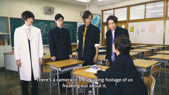
What: A bunch of kids press XXX and YYY and are sucked. Wooow.
✅✅ The wraparound segments look extremely realistic. If there was more lensflares and shots of feet I’d almost say someone has finally beaten KyoAni in making anime look like a cheap, egregiously overacted J-Drama.
❌❌ Sadly, the puzzle dimension they end up in just looks like homemade MMD animation, because it is. I mean, at least it’s mocapped, but apparently with a Kinect.
❌❌ E.g., they make jokes about clipping and they kinda have to because everything clips into everything else all the time.
❌❌ Did I mention that all they actually do is solve lame puzzles and fail to be funny about it? It’s really getting to the levels of the dreaded “barely animated voice actor improv podcast” at these points.
♎ Suwabe’s in it, and that’s never an outright bad thing. He’s voicing the quizmaster, in the process proving he’d do anything for a paycheck. I wonder if he has a fiverr acocunt.
Domestic na Kanojo

What: Highschooler loses virginity to one night stand, finds out that it was the sister of the teacher he has a crush on. Incidentally, the mother of both also just married his father. Zany!
✅ This is presented like a low-key, slow drama, and it’s not even bad at that. Some good directing going on here, at least in the beginning.
❌❌ Really just too bad that it’s impossible to take seriously with a setup as contrived as this, not to mention taking it as seriously as it apparently wants to be taken. It’s also not exactly original.
❌ I’m not gonna say that sketchy relationships can’t work (it worked fine for KoiAme, for example), but embedding your suddenly also incestuous pupil-teacher affair in the setting of a harem comedy, complete with other sister walking in on attempted drunk blackout kiss, is not giving me confidence that this has the chops to pull it off.
❌❌ The show this reminds me the most of is Love and Lies, and that’s a real bad calling card to have.
Girly Air Force
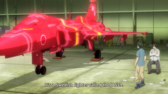
What: Girl-shaped fighter jets fall in love with a dude.
❌❌ It’s just another military-hardware-is-cute-girls-actually show in the vein of Strike Witches, the kind where they think that having a few plane CG models is already thrilling content.
❌❌ But then it doesn’t even turn out to be that in practice, because most of the episode is taken up by lame “worldbuilding” (i.e., coming up with excuses for why your fanservice show has to be the way it is) and trying to make your bland harem lead interesting, which is a futile endeavour.
❌ The most interesting part is still the CG dogfighting, such as it is. It’s not great either. Also, girly planes are pink.
♎ Honestly got a laugh out of them randomly picking a Gripen as heroine unit in addition to actual JSADF hardware, because that’s a sleek-looking plane. The biggest prank the JSADF ever pulled on the otaku industry is buying the chubby F-35, which is nowhere to be seen here.
Go-toubun no Hanayome / The Quintessential Quintuplets
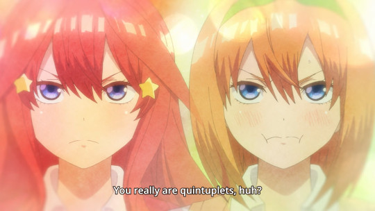
What: Empoverished highschooler is hired as a tutor for some rich quintuplets with large breasts.
❌ This is a blatant harem setup that would make a 2003 bishoujo VN blush.
✅ However, in practice it’s much better than it sounds. It knows it’s a wacky romcom with a dumb premise and it does not pretend otherwise.
✅ So it’s lighthearted, but it’s also surprisingly classy. In fact, it’s classier than Domestic no Kanojo, which is a show that’s actually trying to look respectable and failing.
✅ The relationships are also very feisty, with an energy that a comedy needs. There’s a lot of sass to go around here. Probably the best of these I’ve seen in a while, so I’ll give it three eps.
Kemurikusa
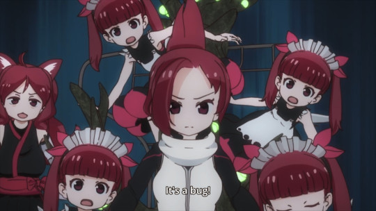
What: After getting pulled off the sequel, the Kemono Friends crew made their own version. Presumably there are blackjack and hookers in this show’s future.
❌ If you are a fan of KF’s “charms”, fear not, you would not be able to tell these people made another anime before. It's still total amateur hour.
❌❌ It’s not even the “looks”, though those certainly are not a highlight. The design is okay and the animation is bad, but I’m not incapable of enjoying shows with bad animation. What really kills it is the editing. I usually don’t comment on editing because that’s almost always competent and only very rarely great, but Kemurikusa has uniquely lazy and badly timed editing. Every shot being seconds longer than it needs to be is already an annoyance in low-key dialog scenes, but the alleged action is laughable and allows you a long, unblinking stare at every frame of bad animation. I really do wonder why they even bother with it when it’s so terrible.
✅ The setting seems alright, even though it’s just a reskinned Kemono Friends. At least it’s not gijinka nonsense this time (which makes one wonder where the gimmick characters are supposed to come from, but I digress), and it’s more upfront about what it actually is too. I’d call it mildly intriguing.
❌ I don’t mind mystery and certainly prefer it to exposition bombs, but instead of that this episode quickly establishes the most basic facts... and then repeats them over and over and over some more. Combined with non-editing, this makes for horrible pacing.
♎ I had no opinion on KF’s longer-term qualities, because the first episode was so boring I never got any further. I won’t have an opinion on this show’s long-term qualities for the same reason.
Magical Girl Spec-Ops Asuka
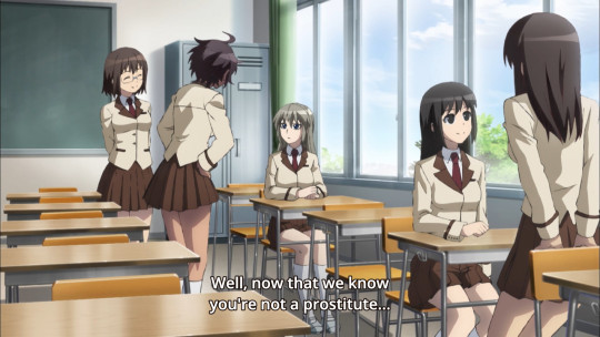
What: Magical girls are tragic, shoot gun’s.
❌❌ Yo bro, what if magical girls but dark? Surely such a thing has never been attempted.
❌ The particular source of grim here is that these girls are war vets and fight with semi-realistic weaponry, so there’s a fair bit of the ol’ milwank in this one as well.
❌ The best part of the entire show is that the enemies they originally fought looked like cute teddy bears. Of course, this is dropped in favor of just slicing and dicing some random terrorists in the main narrative. I guess “dark magical girl” is still too outlandish a concept, gotta go with ripping off The Punisher again.
❌ The characters so far are nothing special, you got your PTSD Rambo and the generically cute tomodachis she swears to protect. Such contrast!
❌❌ If you must make these 80s action movies with some otaku gimmick pasted on top, would you mind making the action look good at least? Because I don’t care how many gallons of blood you paint in your dramatic but conspicuously non-moving pans.
Meiji Tokyo Renka
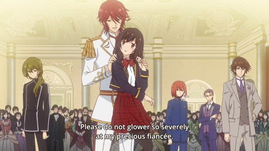
What: Spiritually sensitive lonelygirl gets kitsuned to the Meiji era, which is full of delicious beef and some handsome men too I guess.
✅ This isn’t an outright comedy, but it goes all in on everyone’s fabulosity level to a degree that it’s really already three quarters to Dame x Prince.
✅ Similarly, the lead is not quite as unimpressed with these hams as Ani was, but she certainly has a lot more interest in roast beef than in these guys always trying to pull her into sparkly chin-holding poses &c.
✅ Meiji Tokyo Renka doesn’t seem to be anything special, but it gets the tone right and is expressive enough to not become boring.
♎ While certainly watchable right now, with these there’s always the chance that it decides to launch into real drama in the long run, which in turn almost always goes wrong.
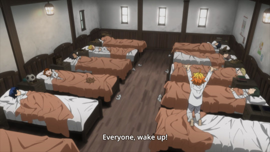
Yakusoku no Neverland / The Promised Neverland
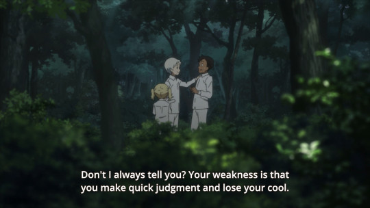
What: An orphanage’s happy daily life gets upended by the realisation that they’re just pizza rolls for some demonic entities.
✅ I watched this right after Kemurikusa and let me tell you, it sure helps if you’ve got professionals on the team. This is a highly competent show as far as cinematography and editing is concerned. While there isn’t any reason to go all out on the action sakuga, this show looks real good.
❌ I’m not feeling the character design, to be specific I think everyone’s chin is too big. This sounds like a real assholy nitpick, but be aware that this will impact around 90% of the time you watch this.
✅ The premise is workable for a shounen manga, even if hardly original (remember Owari no Seraph?) At least it’s not kids with superpowers spamming beams at each other while discussing the nature of heroism, and seems to be going for a more mindgames-based approach in the vein of Death Note. The characters are just barely good enough so far. In the end it’s not so much the premise, but how well the production values are able to sell it. And that’s what Neverland is good at.
❌ It’s specifically a Weekly Shounen Jump manga, and that is huge red flag. Sure enough, while the visuals and mood deliver, the dialog writing justifiably assumes the reader is a moron. Almost every line in this is either straight universe exposition or someone reading someone else’s character sheet back to them. It’s insane and not even necessary because their actions establish all of this just fine, but hey, WSJ readers amirite?
❌ Also, since it’s a successful WSJ property, don’t expect an ending or be prepared to watch this show for years. Most likely both.
♎ This seems like it could be entertaining once the exposition is out of the way and the real meat of the narrative starts. Then again, at that point pacing would come into play, which is yet another achilles heel of WSJ-style shounen manga. Against my better judgement, I’ll probably have a look how this develops, but I don’t expect much.
#anime#winter2019#impressions#meiji tokyo renka#yakusoku no neverland#the promised neverland#Doukyonin wa Hiza Tokidoki Atama no Ue#My Roommate is a Cat#dimension high school#domestic na kanojo#girly air force#go-toubun no hanayome#the quintessential quintuplets#Magical Girl Spec-Ops Asuka
185 notes
·
View notes
Text
Simple Folk - Digital Avatar

Today we took part in a short workshop focused upon simple character design in the software Adobe Photoshop. The purpose of this workshop was to show us how simple and easy it is to create characters in digital programs.
Task 1 - Inspiration:
At the beginning of the session we looked at some sources of inspiration, to provide some guidance when creating our own characters in a similar style. We began by looking at a few illustrators who often use a very simplistic and cartoon approach to their character designs. We looked at 4 main creators:

All of these illustrators share common share a common style. They all use simplistic shapes and designs to portray their characters and objects. Their illustrations are always extremely bare, with very little detail meaning there is nothing to distract you from the characters important features. As well as very little detail, these illustrators also tend to use a very limited colour scheme, often preferring to use only one or two main colours, with differing saturation and levels of vibrancy, which ties the entire image together. More tactile and peaceful ways of colouring include the use of water colour and inks, which seem to perfectly match and couple with this watered down, simple style of drawing.
One other key element is the use of bold black lines, like classic comic books which highlight each section of the characters body. Or sometimes, the lack of outline is used, creating a more stylized approach and giving the characters a more realistic yet still cartoon like aesthetic.

An artist who inspired me personally this project, an artist who i have cited before, was Joan Cornella, and his similarly simplistic illustrations. Joan Cornella shares a very similar style to the artists we looked at before hand. He also uses very minimal detail, pastel colours and over exaggerated expressions.
His characters also have that childish, very naive style to them, however, the actual contents of his comics and illustrations certainly isn't child friendly. For my design i wanted to take a similar approach by using the innocent visuals with a character design which perhaps more mature and less naive.
Much like the rules we created after studying Saul Bass’ graphic designs, we came up with a set of rules which we could follow to generate stylised work similar to the artists. Here are some of the rules i came up with:
A use of bold, black outlines - outlining the characters limbs, facial features and every individual aspect of the design.
Alternatively, no use of outlines at all, instead letting the different colours show each section of the design.
A very limited use of colour - only one to two different colours, however, different levels of saturation and darkness can be used too.
A muted use of colour - instead of bright primary colours use pastels and less vibrant shades.
A very limited use of detail - often presenting only the bare basics of a character to show their personality.
Exaggerated features to show the characters personality or behaviour type, including extreme facial expressions, poses and body types.
Task 2 - creating a character:
Now that we had a good understanding of the key elements of characters in this style we were tasked with creating our own batch of simple characters. As the session was about creating a small avatar we focused only on designing the characters head and not the body.
We began by creating simplistic pencil sketches, experimenting with the shape of the characters face, the arrangement of their facial features and what shapes we could use for their facial features in general. For my designs i started with very basic designs, using ovals, circles and other simple shapes for the head, however, i began drawing characters which got continuously more distorted and abstract, i tried using less simple shapes and more abstract arrangement of facial features in the characters. I wanted to see how far and how abstract i could take the designs while still looking childish and naive in aesthetic, and still looking like a human being. Extending from this, i also wanted to over exaggerate the features of the character, in order to better communicate what type of person and what personality this character may have.
Eventually, my face illustration developed into that of a severely overweight man with a receding hair line. This design for my caricature contrast against those drawn by the influences we looked at; While their characters mostly looked happy and pleasant, mine goes against this by having unfavorable traits and somewhat negative connotations. Much like Cornellas work, my design almost deceives the viewer through the pastel colours and soft design - choices often synonymous with childrens illustrations, however, the features of the characters face suggest a more mature audience - creating a strange relationship between these two contrasting themes.
It was fun to quickly and easily generate a range of characters, each of them with slight alterations making them unique, but i always kept to the key rules in order to keep the designs in that simplistic, naive visual style.
As i mentioned, i also took influence from Joan Cornellas illustrations, i tried to capture and recreate the lifeless, slightly creepy gaze his characters posses. I wanted to create an unsettling feeling in the viewer and to create the effect that the longer you stare at him the more disturbed you feel.
Once we had settled on a basic design we were task with simple redrawing the characters face over and over again. This technique helps us to familiarize ourselves with the character, and also helps to ensure us that we are happy with the design. Alternatively, when redrawing the design, the face will inadvertently change ever so slightly each time. it is very difficult to recreate the image perfectly. However, these small alterations build up, eventually creating a page of unique designs - which all came from one initial design. We can then choose our favorite out of these faces in order to recreate digitally.
Task 3 - Digital Development

The third task was to actually begin creating our characters digitally, using the digital program Adobe Illustrator. Firstly, we were given a quick tutorial on how to use Illustrator to actually create our characters, the process was very simple:

The technique was to build up the characters face by using the in built shape tool - with the idea being that each shape would build up to create the overall face.

Every section of the face would be created using a simple shape such as a circle, triangle square etc, but placed on separate layers - meaning we could place each part of the characters facial features above or below each other, for example, the main face shape you be right at the back (the layer would be at the bottom of the chart), while the eyes of the character would be above this back face layer (meaning this layer would be on top of the face layer within the chart) The technique was very simple and easy to get a hang of, its very similar to the way we drew the characters faces before hand - starting with the outline of the head and then filling in the details such as the facial features.
The Shape tool provided us with a range of basic shapes we could use to build up the characters face, however, these pre set shapes were quite limiting, and theres only so much you can do with them as they originally are. To create a larger range of more interesting shapes we manipulated a range of settings. One of the most important, and the effect i predominantly used, was the ability to change the roundness of the shapes edges. The technique allows you to turn the straight corners of a rectangle into much softer curves, this can also be used to fully round the rectangles edges, creating more of an oval shape. This is the main technique i used to create most of the character features, the most clear example of this is the characters main head shape, which was used by setting a rectangles edges to a max roundness.

Another technique we used to alter the shapes was the use of the Direct selection tool, which when used on a shape allows you to alter the edges, so you can transform the shape’s points and roundness;allowing for basically infinite shape possibility.

Through the use of this shape we could create more interesting and human feature. I used this tool extensively when creating my digital face in order to make the more complicated shapes which aren’t instantly available within Illustrator. For example, i bent the end of a curved rectangle into a point, giving me the shape for the characters eyebrows.
Overall, at first i found some of the features tricky to get the hang of, however, i quickly got to grips with these simple techniques and the way which illustrator works. Here is a short gif showing the process which i went through and the techniques i used to create another similar face:

Distorting the norm:
While drawing the original pencil sketches for my characters face i experimented with the idea of creating a more mutated, distorted appearance; by using more liquid, organic shapes such as stretched ovals. This idea of distorting the human form is very prevelant in my project, and is shown through out my research. I’ve been looking at how body horror has been presented and looking at different sources where its been shown such as the illustrated manga Junji Ito and films such as The Thing.
Linking to these research points i thought it would be interesting to try and mutate the character avatar which i created and see how it would look. I thought the easiest tool to do this would be the Liquify technique within photoshop - a tool which allows you to shape and manipulate the form of your photo any way you please. I used this Liquify tool to drag and distort areas of the characters face. I would then copy this frame, distort it slightly more and repeat that process, up until the characters face was unrecognisable and a mess of flesh:

I then assembled each of these frames into a timeline, giving me a frame by frame transformation of the character going from normal to horrifically disfigured. Here’s the animation i produced:

I’m happy with the way the animation turned out, the transformation even unsettles me slightly and greatly reminds me of the transformations from The Thing, which inspired me while making this.

Alternatively, a lot of people said that the animation would look better if only part of the mutation was shown, instead of the complete explosion look. I created this alternative gif of the shortened version, and i must agree i prefer this animation as the face becomes distorted, but not too distorted, meaning it is still recognisable in its mutated form, which i think makes the imagery even more unsettling.

Next steps and developments:
In the future i don’t really have any plans to use these techniques, as i am focusing on more hand drawn illustrations, however, once i have made some a possible development could be to transform the drawings digitally, using this simple illustrator method.
Extending from this, an interesting idea could be use the same Liquify animation technique on my illustrations to create a GIF or short animation of the drawings, bringing them to life and adding another dimension to the horror imagery - which also links to my research of horror films and moving imagery. It is definitely something i am considering for the future.
0 notes
Text
Scary Godmother

Scary Godmother is a series of comics and children's books created by author Jill Thompson, The adventures follow a child named Hannah, who is helped by her scary godmother to stand up against her mean spirited cousin.
Unlike Harley Quinn I am not familiar with the work of Jill Thompson and have not read any of the Scary Godmother comics, so this design relied more on research into the character and her visual appearance. I started looking at all the different representations of the character across the comics themselves, the books and even the animated television series. the portrayal of the character was also important for myself as the designer as i wanted to see how the actress would interpret the character as unlike with Harley the character has more room for interpretation. With a character like Harley Quinn her characteristics are very poignant and exaggerated so her costume has to match, while with Scary Godmother while watching the series is fun and playful but with in rehearsals with the Applied students she was presented as more motherly and matriarchal , so the costume had to be adapted to match.
For my research i also divulged into representations of fairy godmothers, and explored ways of making their costumes more spooky and scary, while not looking cheap or too scary for the target audience. So from all the characters to choose from I decided to create this costume from scratch.
Illustrations from Jill Thompson’s books and comics depict the costume of scary godmother very similarly to that of a ballerina with the tulle skirt,

This lead to me to look upon classic ballet costume patterns. Inspired by Tulle skirts to create a fairy like poofed dress.
Tulle as a material in my opinion is extremely versatile, light weighted, and thin however capable of creating skirt and dresses of mass size with the least amount of weight. The negative aspects of working with this material comes down to its fine structure, when cutting and sewing the tulle it can easily be ripped or fray, making the density/structure of the costume fairly weak. Tulle is also incredibly rough and irritating which may cause discomfort to the actor wearing the costume, however one way to defeat this problem is the use of and underskirt, for example when it came to the 7 stories showcase the actress playing scary godmother wore a small elasticated pencil skirt to combat rubbing and protect from the slightly transparent quality of the material.

As previously stated I chose to look upon the patterns of Ballet costumes for my scary godmother costume. Costume patterns are usually made of paper or sturdier materials like paperboard or cardboard to withstand repeated use and are basically used as a template from which the parts of a garment are traced onto fabric to then be cut out and assembled, slightly like a net of a 3D shape that most students had to assemble in maths class at school. Patterns are just one way of which one can create a costume, it gives a basic level of skill to any novice sewer like myself. For the skirt i used a simple Black tule, Then referring to the measurements taken for the actor in question I measured out enough tule to cover her from her waist down to her knees, I then proceeded to cut out 5 equal sections of tule wide enough to cover her around her waist (which for confidential reasons I will not disclose within my blog). Following cutting the tule, i then proceeded to layering it over one another to create a fuller ballet skirt then attached them to the hem of a belt i had created earlier using the overlocker.
When i created the belt to attach the layers of tule to, I created a flap on the backside of the belt measuring around 4 inches,

this flap allowed me to attach the layers of tule behind the belt to create a clean stitch free look. When attaching the tule i first hand stitched it in place, each individual layer, then went over the stitching using the overlocker. which previously mentioned it a machine used to create hemming on costumes. the belt was a simple tie belt this allows us as actors to adjust the tightness of the belt as much as needed, easier for comfort and fit.
the next section of the costume to move onto was the top half, for this section i used an average velvet red vest top. the velvet material was key as it has a lot of stretch and give to it, so when using this material and altering hasn't got to be 100% accurate. I chose a red Vest top to match with the recurring red and black theme throughout the whole set of characters being portrayed, in doing this we connect the characters together as one and gives the illusion of being real comic characters that have come to life, also the use of bright colours especially with this character (who is named SCARY godmother) makes the personal less intimidating for young audience members. Which is also why the makeup used for this character was less intense and harsh as originally intended.
what differs this costume from the rest of the Applied, was the subtle accents of green, it was used as a nod to the original comic strip Jill Thompson whom uses green heavily with in her illustrations. Around the collar of the vest stop i stitched on a green lace embroiled collar, for the design of this collar I decided to tack it down in 7 placed to allow it to move with the costume but also allowing it to be adjusted and styled.
To give the illusion of wings, attached to the back of the vest top sewn under the green collar is another full tule cape.

I chose to use tule for the wings down to the fact i believe costume wings tend to look distasteful, cheap; while the tule material moves more freely, and when caught in the breeze gives the illusion of winds flapping.
Considering this was my first full complete costume, i must admit I am proud of the way it has turned out. Was by far enjoyable to create.
0 notes