#should... probabl have transparent image lol oop
Note
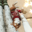
Uh papyrus
Just Ya Boy?? yeWE SORTA OF A BNGO

#i could try biting him but i dont want to#also the fandoms not mean we're moving past like.. making him super Baby (other than... babybones paps )#we love to see it#icecream buddy#should... probabl have transparent image lol oop
5 notes
·
View notes
Text
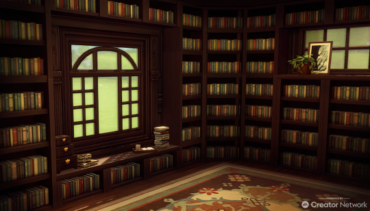
Thank you to the EA Creator network for the code to check out the Book Nook Kit. I haven't had the time I want lately to play and build in ts4 that I would like but I really wanted to take some time to do a quick little cc-free set-type build cc-free with this new Kit since I uh very much love building libraries.
Further review of my quick look at the pack under the cut if you're interested - but my main takeaway is that I'm underwhelmed with the color swatches for the bookshelves and I should, as such, note that the colors in my screenshot above have been adjusted.
I really really wanted to like this Kit so much. The initial promo images didn't inspire me (at all) libraries are one of my favorite things to build in ts4, and I was really hoping the items in this pack could replace some of the CC that I use. That will almost definitely not be the case, however.
My main gripe is with the bookshelves. I enjoyed some of the clutter items and will never turn down a good stack of books, though I do have to admit i didn't look too closely at the other large furniture items because they simply don't fit the style in which I tend to build. The shelves, however, came kind of close to being what I had hoped, but ultimately there's just too many small things that bug me about them that I don't see them being worth the cost of the pack.
Those issues with the shelves were:
1) The snapping - I'm really not into this trend of wall items snapping. If you're someone who really likes to finesse positioning I think you'll probably understand how difficult this becomes with snapped items. TOOL alleviates some of these issues but TOOL should not be a necessity for paid packs (and also bugged out when i was trying to move a piece not on the wall, so maybe a moot point, altogether ¯\_(ツ)_/¯ ). I've also only just noticed that I kept the book swatches all the same because I kept having to replace them to fix placement issues and obviously forgot to adjust that. Oops! :')
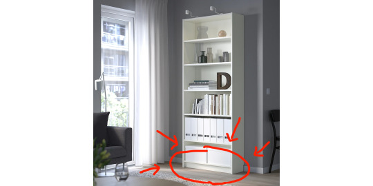
2) No base - The shelves just look, to me, so awkward and off without a base for them to sit on the floor. If you look at most shelves of this type, like Ikea's billy bookcases which these have a very similar vibe to, the bottom shelf does not sit directly on the floor, but is instead slightly elevated off of it:
Like, I understand that removing that element from the equation makes the stacking/snapping effect easier to pull off, but :///
3) The Color Swatches - I didn't check 100%, but I think the swatches do match up to The Immaculate base game display shelf which is nice. But just ughhhhhhhh. I really hated the wood colors on these. They all felt cold and institutional. I really wanted there to be a warm mahogany-esque swatch for good dark academia vibes but, alas. For full transparency this is my image before I photoshopped the colors to be closer to the vibe that I wanted:

Before-> After. It wasn't the absolute worst and got some of the vibes I wanted, but also like. meh.
All in all, this kit was a bit of a disappointment to me. I can see some of my issues being fixed with recolors - but at that point I might as well just be using other CC items??
I'll also recommend some of my current favorite bookshelf items I have in my game
> These bookshelves by MLys - these basically never ever leave my game even when I'm going super CC-light.
> and this modular library set by SSTS (which admittedly has some of my same issues with snapping items in ts4 - but it's free and has seriously BEAUTIFUL swatches and details and so. I cannot complain even the smallest single bit. It's gorgeous and I can only hope to one day build a library worthy of the set, lol)
33 notes
·
View notes
Text
color icon tutorial
ok i’m not super great at making icons but an anon requested a tutorial for my icons so i will post my process! it’s good for beginners i think (even tho i have been making these icons this way since 2016 lol)
you’ll need:
Photoshop CS5 or higher (I have CS5 which is quite old, I know, but I pirated it many years ago oops)
relatively hq pics to make icons out of
a psd (if you need some, tumblr.com/tagged/psd is what i periodically check for some).
an action (preferably sharpening action, since that is what i use)
a texture if you want
you, yourself, and you, and i guess this tutorial
i’m going to be making this as a beginner’s tutorial so it’s gonna go about as in-depth as one can be! it’s gonna include a lot so feel free to skip a lot of it if you are already pretty well-versed in photoshop or icon-making.
ITS SO LONG IM SO SORRY IT IS SO VERY IN-DEPTH I’VE EXPLAINED EVERY POSSIBLE THING I COULD’VE
but also if you have any questions at all, please let me know. i love teaching people stuff.
example of the icons that i make:

Hi hello welcome
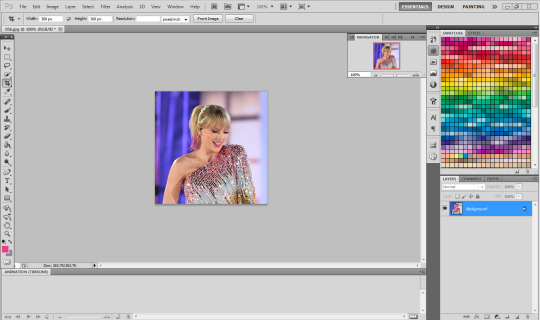
Ok, so first open up Photoshop. I am using CS5.
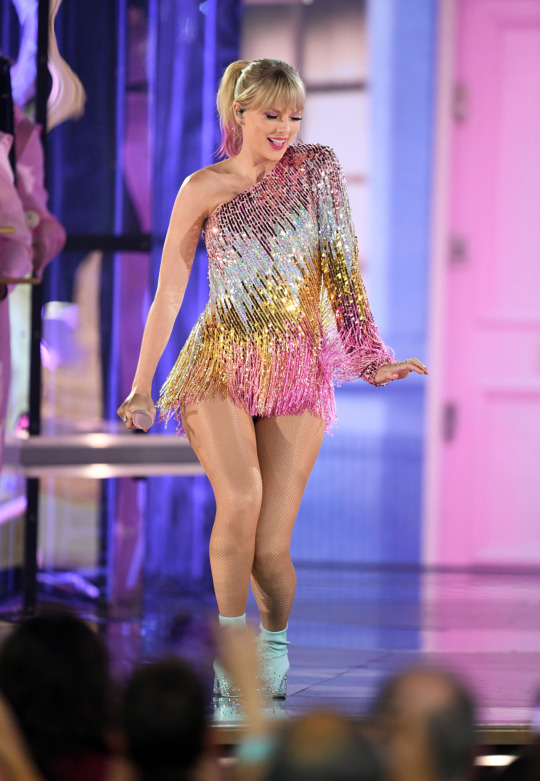
You will need hq pics of whatever you plan to icon. I do 99% Taylor Swift, so I use taylorpictures.net for all my icon needs. Make sure they are of semi-decent quality, they don’t have to be amazing since we will be shrinking them down to a very small size so much of the quality is gonna disappear anyway but like, make sure you can at least tell the subject from the background distinctly (you’ll see why later).
This is the picture I am using for this tutorial (and will post icons separately):
Open this in ps (File > Open > the picture)
Ok so now it’s the actual tutorial lol
1. Crop the image
We are not going to crop it to 100x100! Select the Crop tool and set the dimensions to 300 px x 300 px--MAKE SURE THAT YOU TYPE IN PX AFTER YOU TYPE IN 300, OR ELSE IT WILL CONVERT TO CM AND THAT WILL NOT WORK FOR THIS!
Next, crop the picture you want as much as you want--as long as you get what you want in the icon. For these kinds of icons, you just want to focus on one item--like Taylor, for example--instead of multiple (not Taylor and her backup dancers since this isn’t what my icons look like and you won’t be able to do that very well on a beginner level). Crop that to a 300x300 px size and click the check mark on the top bar to finalize it.

If your pic is hq enough--meaning a larger picture--it will probably look super small. That’s ok, it’s just proportional to the old picture. Go to the right side bar and select the Navigation tool.
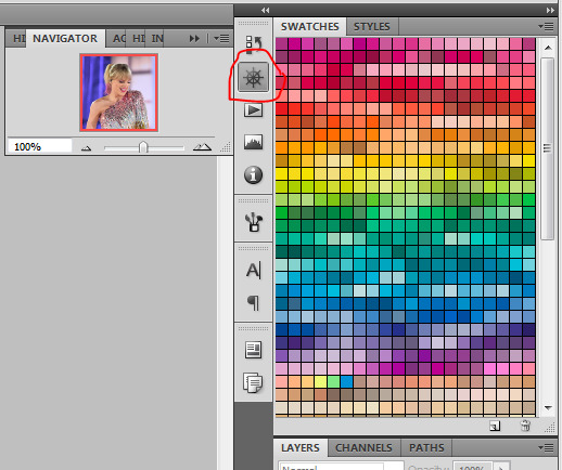
If that tool isn’t there, you will just have to go to Window and select Navigator, and it will bring that up for you.
See where it says 100% in the picture right there? It will likely say something like 25% or whatever if you just cropped it, so change it to 100% which will bring it to full size.
Cool! now it should look like this:
2. Use the Quick Selection Tool

Go to the left sidebar on Photoshop. Depending on which PS you have, it might look different. This is what mine looks like. Regardless, the icon should look relatively the same I believe across all Photoshop versions. If it’s not there, you might want to left click and hold down on some of the icons and see if it is an alternative option (it should be there already--but it is grouped with the Magic Wand Tool just in case).
This tool has three options in the top bar: free select, add, and subtract. Start with the middle option: add.

This will allow you to choose which parts of the picture you want to select to cut out for your icon. You can change the selection brush size, but I always keep it at 3px because it keeps it really precise.
Drag your mouse over the area of the image that you want included in your icon. This tool will automatically choose parts of the image that are similar--for example, Taylor’s blonde hair will like all be selected around the same time, but the pink/blue background will not be, since it can tell that those are starkly different colors and thus two different objects in the picture. It should have a crawling ants moving line around the areas of the picture you want to select. If you go outside of what you want included in your icon, that’s ok! That’s why the subtract option is there. Just select that--to the right of the Add option--and go over what you do NOT want in your icon to get rid of it using the Subtract tool. You might have to go back and forth between those tools in order to get exactly what you want in the final product.
I can’t show you my final outline for Quick Selection since it goes away when I screenshot, but after you’re sure you got what you want in your moving ants line, it’s time to finalize it.
Remember, this tool effectively cuts out the selected portion of the picture from its background.
3. Refine Edge
On the top bar, click the big rectangle button that says Refine Edge. It will bring up a window that looks sort of like this, but I have settings adjusted the way I like:
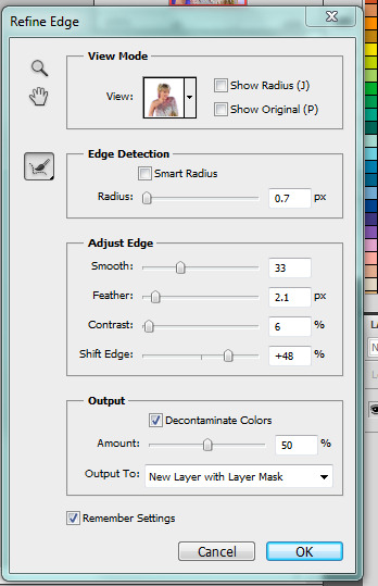
You can change these settings any way you’d like, but I generally stick with this. It’s also okay to mess around with them and see how you feel. If you don’t want to do that, you can just use my settings and edit anything you don’t like later.
Click OK to cut.

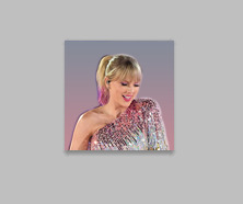
This has pretty much removed the background from the picture and only left what we cut out and a transparent background (hence the checkered background--that is space that doesn’t actually exist). You can also see some shadow from the background around her arms and hair, which we can delete out later very easily. That is a result of the settings from Refine Edge, which is why some people choose to lower the Feather bar so that it doesn’t include as much shadow--which is good for many pictures since a lot of these are straight cuts, but this can occasionally cut out part of the icon you want to keep or make it look weird since you want just a little space to mess up when it comes to the Quick Selection Tool.
Bonus step if you want a selective colored icon:
Some people like really vibrant icons that include re-coloring. I’m not very good at it, but what I do (and it sometimes turns out well--this is typically the way people do it, though they are less sloppy than I am) is select a color from the Swatches at the right that is similar to the one that they want to paint over. For example, if I wanted to make Taylor’s hair more yellow/gold and vibrant, I will choose a yellow. Select the Paintbrush tool. On the top bar, the Opacity will likely be set to 100%, which will basically color right over the picture and look weird. Set the opacity to something very light--mine is 20%--and paint over the part that you want to color. Make sure you do this in one stroke--if you paint over her hair with 20% opacity once, let go of the mouse, then go over it again, it’s gonna start building up and becoming more opaque!
You can also completely recolor a picture this way, like if you wanted Taylor to have entirely pink hair, you can use this same method but choose the pink you want instead of a similar yellow. This can be very difficult and tedious, so I don’t typically selective color my icons, though occasionally I do because I love those icons with obnoxiously vibrant colors.
4. Open texture/create new background.
Ok, so I do both of these things depending on the background I want. I have some textures saved such as this that I use for icons:

I didn’t make it--it’s pre-made by another artist on tumblr from whom I downloaded their texture pack. You can make backgrounds like these too, but I’m not very good at them.
SO you can either File > Open one of these pre-made backgrounds/textures, or you can make your own.
In order to do that, you can do File > New and change the settings to width: 100 pixels and height: 100 pixels. Under Background Contents, choose White. That’s very important! You don’t want transparent, it doesn’t help us. That brings up a new window on Photoshop next to the picture we’ve just cut out, just a small white square. You can paint that whatever color you’d like. Use the Paint Bucket tool and choose a color from the Swatches section on the right. This will make the background completely one color. However, if you want a gradient, you can do this several ways, but I do it like this:

Click that, go to Gradient, and mess around with the Gradient options and see how you like the background. Here’s one I made, for example:

Boom! Background for icon. I will use this since I made it for this tutorial so yeah it might not look amazing but here we are.
IF YOU USED THE TEXTURE I JUST POSTED OR YOU KNOW THE TEXTURE YOU ARE USING IS NOT 100x100--THE ONE I POSTED BUT DID NOT MAKE IS 200x200--THEN YOU NEED TO RESIZE IT TO 100x100.
You can do this by going to Image > Image Size and changing the 200 pixels x 200 pixels (or whatever is there) to 100 x 100.
5. Duplicate layer
Now it is time to combine these two images we’ve created. Go back to the original picture we worked on--mine is Taylor at the BBMAs--and go to the right sidebar. You should have two copies of this image now: Background and Background Copy. Background Copy is the cut out picture we are using for the icon. Right click on Background Copy and select Duplicate Layer...
This will bring up a window that asks what you wanna do with this layer.

Select the dropdown under Destination. Currently, the Document selected is the image we are already on (my Taylor pic was saved under 056.jpg) but we want to click the dropdown and select the pic that we are using for the background. In my case, it’s titled Untitled-1 since I didn’t change the name. Yours probably is too. Select whatever your background image is saved as and click OK.
Now go to the background image or texture that you just selected--your cutout should be there, but you can probably juuuust barely see it! That’s because your picture is about 3 times bigger than your background.
6. Resize layer
Use the Select tool--the very top icon on the left sidebar--and make sure Show Transform Controls is selected on the top bar. If it’s not, you’ll know--because you won’t be able to resize the image.

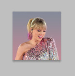
The square you are seeing (that isn’t the picture) is the layer we just duplicated onto the background, aka the icon. You’ll want to hold Shift and select the bottom right part of the image to resize to whatever you would like visible in the icon--it could be the entirety of the picture we cut out, or just part of it, if you realize you like how only part of it looks. Either way, you need to hold Shift while you do this, or else the image will NOT stay proportional, and it’ll look all wonky. Hold Shift the entire time you are resizing. This is what mine looks like:
You can see I both resized it and moved it a little to the right--you can use the Select tool to move it, but that might move it way too much since it does it incrementally, you can just use the arrows on your keyboard and move it by pixels which takes longer but is way more precise.
You can still see the shadows from the background on the icon, so select the Eraser tool (if the shadows bother you or you don’t like how it looks) and zoom waaay in. You want to be careful with the Eraser tool! (Also make sure Background Copy is still selected so you don’t accidentally erase the background. If you just have Background Copy selected while you erase, it will only erase whatever is part of that layer, it won’t bother the background).
While zoomed in, erase the pixels that are obviously discolored from the rest of the image. You can zoom in and out to check how you like it as it progresses.
Here is mine after I used the eraser tool on any parts of the image I thought were bad! It should lay on the background naturally.
Now that we’ve figured that out...
7. Sharpen/action
Now is the time to apply an action! Please sharpen your icons. You want them to look good on your blog or others blogs, and in order to do that, you need to sharpen them.
If you already have actions uploaded, cool! If you don’t know how, well, I sure am going very in-depth here so you’re in luck.
Download an action from any photoshop resource (or tumblr.com/tagged/photoshop-action is where I look occasionally). You will have to load them onto your Photoshop now. Click the button that looks like a movie Play icon on the right sidebar. This will bring up the Action list. Photoshop likely has pre-made actions for you, but we don’t use those because I never taught myself how to use those so maybe you can use them, I don’t know. I just use ones I download from Tumblr.
Click that little dropdown menu and click Load Actions...
This should bring up a file opener and you can select the action that you downloaded for this icon. It will download it into Photoshop and will now always be there--you don’t have to load actions every single time you want to use them. If you load them once, they should be there for the rest of forever.
Scroll down to find that action and select it. Now, make sure you still have Background Copy selected. I don’t care about applying an action to the background, just the copy, which is still our image that we cut out. Click the Play button on the Action list--pictured above on the very bottom of the screenshot, next to the Circle and the Folder icon. This will apply the action to the background copy. (Hint: if the Play button isn’t available, it’s probably because your action is in a folder. Click the dropdown of the folder and click the first thing under it--that should be the action and it will apply it).

There it is with the action applied! It’s muuuuch sharper--perhaps a little too sharp, but that’s ok, it won’t look bad on people’s blogs.
8. Add a PSD
To apply a PSD, File > Open and choose the PSD you want to use. I listed above where I find most of my PSDs, just download one you like. You can choose 100 different ones and try it out if you want. I use the same one for everything, by @toxicpsds (I believe it’s #6). This should open a third window with the PSD over a sample image (thanks to the artist!). You just have to select the PSD layer--not the image with it--and Duplicate Layer and put it on the image that we have produced thus far. It is the same process as when we took our cutout and put it on the background. (The PSD is probably under a group--mine says Group 1--so just select the group in its entirety--shift-click it if you need to).

You can tell the background is also lighter. If you don’t want the color of the background affected by the PSD, select Background Copy and the PSD together, right click on one of them, and select Merge Layers. This will put the cutout and the PSD in the same layer, which should take the PSD off of the background and revert it back to the color we had before. However, I really like what the PSD did to the background, so I will keep it this way.
I am finished now with my icon!
9. Save it for Web
To save the icon to be able to post on Tumblr, go to File > Save for Web & Devices, which will bring up a window like this. It might look a little different since I have my settings a certain way, but whatever.
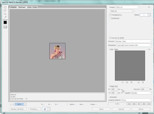
(Sorry this looks weird here, it’s just what happens when I screenshot. I’m not a tech wizard).
Your pre-saved things might look different, but make sure you are saving a a PNG-24 for the best quality. Just make your settings look like this, basically, then click Save.
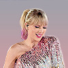
There she is! All done!
If you have any questions, let me know! I tried to be really specific, but I’m not sure what level people are on Photoshop (probably better than I am) so just ask if I need to clarify anything!
60 notes
·
View notes
Text
QUICK TUTORIAL: lineart gifs & watercolours
i’ve received a few asks about how i made this gifset, so here’s a quick guide! i’m skipping right to the interesting parts, so you need to have basic knowledge of how to use photoshop to make gifs or you’re not going to get much out of this tutorial. the basic idea is very simple but the process can be extremely frustrating, as usual. proceed at your own risk.
things you’ll find behind the cut:
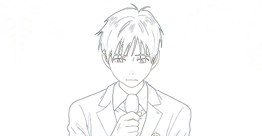
how i get from this:
to this:

and to this:

still with me? great! let’s begin!
i use photoshop cc in this tutorial! all features should be available in other versions too, but they might be called something else. in that case please consult google.
YOU WANT YOUR GIF TO HAVE AS FEW FRAMES AS POSSIBLE!
get them ready and do your basic thing ie resize, remove excess frames and set the framerate. next, flatten the frames into layers and download this action (19 frames at most) or do the following manually:
duplicate your first layer
set the copy to divide
add gaussian blur (approximately radius 0.6px) to the copy
use smart sharpen on the original layer. play around with the setting until the lines look clear and smooth (my settings: amount 300%, radius 0.3px, reduce noise 10%, remove gaussian blur)
check that the blurred layer is on top of the sharpened one
merge layers
repeat with every single layer :))))
now your gif should look something like this:
as you can see, if you wanted you could just paint over the parts where the background is still visible, add some colour or overlays and tadaaah, a perfectly fine gif! but we don’t want that today. we want to make our lives hell.
NEXT, WE’LL DO SOME MASKING AND GET RID OF THE BACKGROUND. i use the quick selection tool because it’s quick (lol), i’m lazy and these kind of gifs have nice and clear lines so it works like a dream!

make sure you’ve selected everything, it can be difficult to tell what’s part of the background and what’s the selection as you can see.
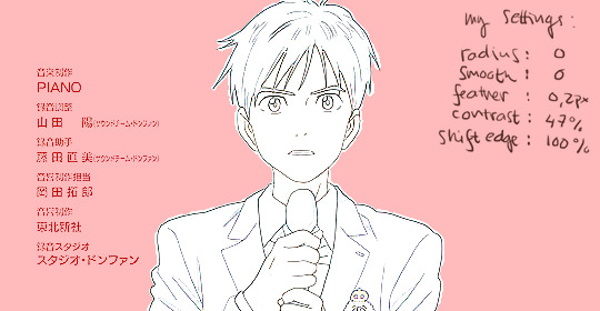
all done? next you’ll need to click mask and select. i invert the selection at this point, so the following settings only work with that! i forgot to put it in the pic but in addition to these setting, i usually have the output set to “layer mask” so that saves me a few clicks. when you’re happy with what you’re seeing, click ok and go though any bits that didn’t mask properly by hand.
can you guess what the next step is? yeah.
now do the same to all your layers...
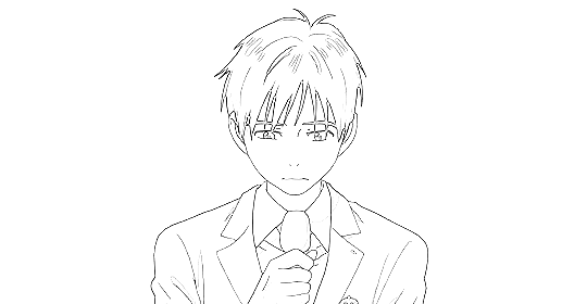
... and you’ll end up with something like this!
you probably can’t notice much difference, because it doesn’t show up properly on my blog, but the background is transparent! i’ve also added two adjustment layers to clean up the lines a bit:
black & white
levels (my settings: shadow 60, midtone 1.00, highlight 230)
//EDIT: naturally, the settings i used for the tutorial don’t work for all scenes but in my experience they’re a pretty good place to start from! also, if the scene has a very busy background i usually mask it before resizing and applying the lineart effect to make sure it looks as good as possible (and it also gives you the option to use the same frames in other projects without having to do it all over again)! in those cases the blurred layer leaves a fuzzy border around the image when you merge the layers, so you need to select the sharpened layer’s pixels before merging and mask the resulting layer with the selection. oh and i usually convert the layers for the first frame into smart objects before sharpening or blurring so i can easily adjust the settings to be optimal for the scene.
again, you could stop here, walk away with a nice transparent lineart gif and call it a day.
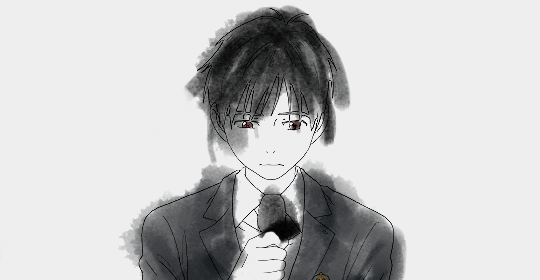
no? then we’ll start adding the watercolour.
this is, of course, all done manually as well, frame by frame. don’t blame me, i told you this was going to be frustrating.
add a white layer to act as a background, and adjust the output levels of the levels layer you just added a few minutes ago! my setting are: shadow 0, highlight 238
THE NEXT STEP IS TO START PAINTING
the gif should give you the basic idea of what to do from here on.
basically, it’s something like this:
create a new layer on top of everything, pick a brush, add colour to appropriate spots, don’t mind if you can’t stay inside the lines. it’s actually better if you don’t! i usually have the colouring layers set to linear burn.
check what frame you have selected! you want to find the corresponding lineart layer, right click it and pick select pixels.
create a mask for your coloring layer from that selection. now the outline should be rather nice and smooth, and all you need to do is mask the inner parts using either a selection tool or do it manually. in this case i prefer the latter.
if your gif doesn’t have much movement, you can get away with duplicating the colouring layer for the next frame instead of painting everything from scratch! just duplicate the layer, delete the old mask, move the layer a bit if needed and add the mask from the next lineart layer.
repeat these steps until you run out of frames.
keep or delete the white layer you’ve used as a background.

before you even notice, you have a super pretty lineart gif painted in watercolour style, ready to be posted on tumblr or edited more!
i edited mine a bit more and ended up with this baby! i kind of lied in the beginning, since i’m not telling you how i turned it into this lmao oops. basically i just added the bg image and a few gradients on top of everything? super easy!
//EDIT: i can’t not tell you guys i feel so guilty lmao.
okay, we’re starting from the bottom up!
changed the white background colour to #e6e6e6
a picture of flowers on top of it, color burn 60%
levels adjustment: shadow 60, midtone 1.00, highlight 230
and output adjustments are shadow 0, highlight 220
linear gradient fill layer, 90angle, colours #f3bfa5 and #fbeebc
set mode to soft light 100%
jump to between the lineart adjustment layers and colourings
color fill layer in #f3bfa5, set mode to soft light 100%
jump on top of everything
vibrance adjustment layer, +100 vibrance and +31 saturation
gradient map adjustment layer, colours #f3bfa5 and fbccbc
set mode to overlay 30%
duplicate the adj layer you just made, chance mode to color burn
look at your beautiful gif and cry tears of joy

and that’s about it! i hope this cleared up the process a little!
thank you for checking out my tutorial! if you have any more questions, my ask box is always open ♥
oh and feel free to tag me if you post something made with this tutorial! i’d love to see your creations! i track #nikiforoov so just tag your post with that :)
#yuri!!! on ice#chaoticresources#photoshop#fyyoi#yuuri katsuki#tutorial#my edits#please let me know if there are some clear errors#in my defense it's 5am here rn and i should've been asleep ages ago#but noooope#here i am#what can i say i really love playing around with photoshop lmao
2K notes
·
View notes
Last Seen Blogs

review3edw
Sem título

sorridi6bellissima
Stronza Come Il Mondo, Dolce Come Te.

shirishsmileworld
shirishsmileworld
watashiwawasabi
wasabi sims

ameliaquerida
Amélia