#self-published comics
Explore tagged Tumblr posts
Text


John Porcellino's King-Cat Comics & Stories #83 has arrived!
AND, it's a King-Size Special Issue, running a whoppin' 48 pages.
HERE
6 notes
·
View notes
Text
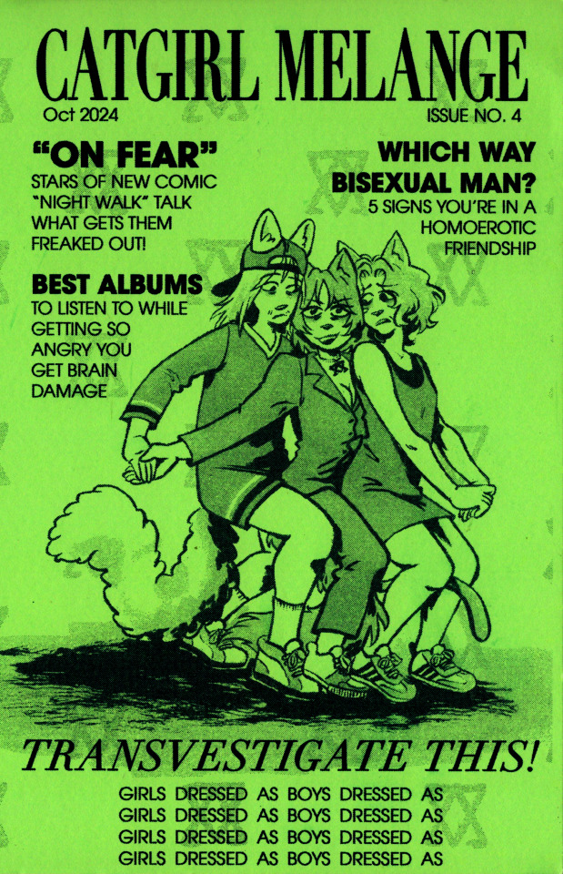
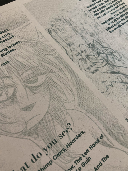
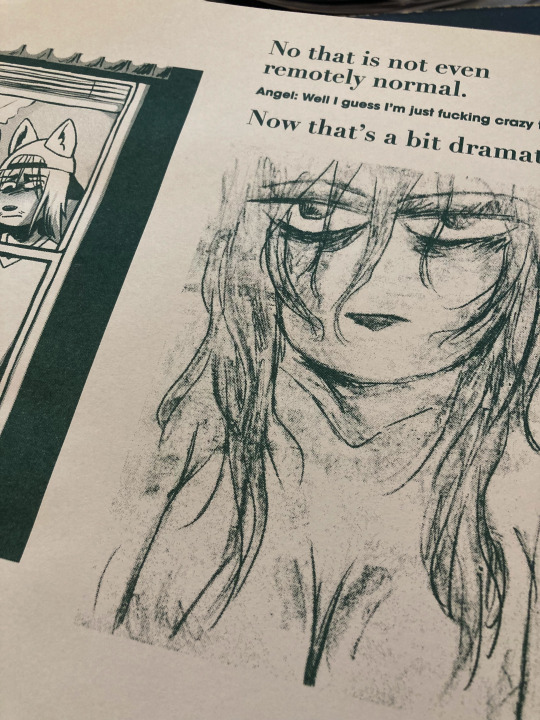
The newest issue of Catgirl Melange is available for preorder!
24 pages of juicy risograph comix and cartoons. With an all new comic "Night Walk" Orders will ship out no later than Halloween! It is also available digitally on itch!
1K notes
·
View notes
Text
Nice review of Grixly, many issues of which are available from Copacetic, HERE.

Grixly by Nate McDonough
A central appeal of these is the low price point, at $3 an issue, but McDonough is a very solid storyteller, presenting no bullshit strips usually in one-page format, about the world of hanging out in comic shops finding cheap stuff to flip on Ebay. (His store, holidaycomics, prices things fairly, and I would recommend buying from him.) The one-page, nine-panel format also lends itself to Instagram serialization, so you can read at least some of the strips there. Whether this comic would make sense to a reader not immersed in that specific vantage point, where you are into independent comics because of the the idiosyncratic voices on offer but can also see interest in mainstream comics of the eighties and nineties, if not the current era, I don’t know, maybe? Part of me wants to make the case that, as McDonough moves across the country, selling things online to people around the world, this feels less like a comic about comics and more about America, commerce, and consumerism, told through a specific lens. The landscape is a true working-class one, of small businesses, flea markets, and eccentricities. But at the same time, if I am going to describe the comic and the anecdotes contained there, my mind keeps flashing back to Nate mentioning the character Typhoid Mary, only to have someone respond that they hate her because she raped Deadpool. Politics are rarely explicit, but it’s pretty clear a lot of people that Nate encounters have had their brains cooked by either the backdrop of culture war or deep immersion in fictional worlds, supplanting reality so that friendly engagement with strangers is difficult. Still, Nate recognizes and feels affection for people that just want to burrow through longboxes alongside him in peace, maintaining the largely agreed-upon standards of personal space.
The consistency with which McDonough releases issues makes it feel like a blog or diary, not trying to present a point but to tell a story of his days. Like a more subculturally specific King-Cat, reading Grixly is a way of checking in with a guy with whom the reader will likely find a great deal in common.
4 notes
·
View notes
Text


All Rodney Books now available for single purchase on my shop!!!!! AAAAA I think book 5 came out real nice with the color cover :)


164 notes
·
View notes
Text


I finished up my Tater Tot Hot Dish Recipe Comic!
#comics#Recipe Comic#Comix#Self published#Self Published comics#Zine#Comic Zine#Web comics#Original comic#Indie Comic
158 notes
·
View notes
Text
I feel like I should say since there's been a recent uptick in a lot of communities I'm in/see stuff from a lot of white people pretending to be Asian, but you are not welcome here if you are in anyway stealing from Asian cultures for clout or the aesthetics of it
This includes if you're white and you give your self inserts Asian names, I truly do not care if your f/o is from an anime, you should not be using an Asian name under any circumstances. I hate that whenever I see someone using an Asian name online, I feel like I have to start searching their account to see if they're actually Asian or just a white person who likes the aesthetic of it bcs far too many white people will use Asian names here just bcs it sounds cool, with no regard for the actual cultural meaning behind it. Meanwhile actual Asian people will be mocked for their names, or treated like their names are too hard to learn to pronounce, or discriminated against based on their names
Asian cultures are not a fun little costume for people to dress up with. They aren't just a nice aesthetic, they aren't just a thing you can borrow from bcs you think it sounds cool
#my posts#selfship community#anti asian racism#like it's definitely a perpetual problem of white people not seeming to realize asian names are like#a thing that are tied to culture and identity#but it's gotten crazy lately with people pretending to be asian online for clout#just in the past like 3 weeks of things i've seen#we had the white woman pretending to be a japanese woman on comic twitter#the white woman who pretended to be korean to get a 'ownvoices' book published#(who btw. named herself kim chi. you cannot make this shit up)#and then the white guy pretending to be japanese to try to justify his hate of the new assassin's creed game using stuff around yasuke#like it's so draining. i hate how much this is a never ending problem#i hate how casually white people will use asian names#like worstie. i am a korean woman. but i am whitepassing and mixed so i never use korean names for my self inserts#bcs i have the privilege of looking white and people generally only knowing i'm asian if i say it#it feels inappropriate to me for me to name my self inserts a korean name#bcs that would then mean they experience the world in a different way than i do#even being whitepassing bcs of the way people treat korean (and other asian) names#if you are white you have no fucking right to asian names#idgaf if your f/o's an anime character. stay away from asian names bcs they are not yours to dress up in#vent a little bit sorry team#i've been dealing with white people doing this shit and being assholes to me about it for well over a year now. it's exhausting
189 notes
·
View notes
Text

Cover art for the 3rd comic issue of 88! Im taking pre-orders for the comics here
451 notes
·
View notes
Text
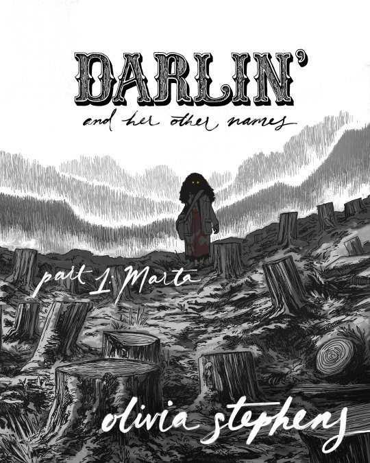
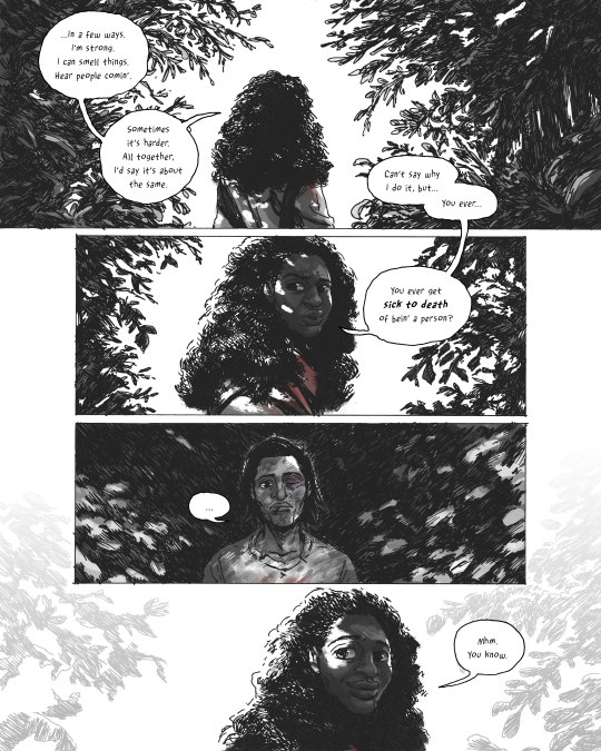
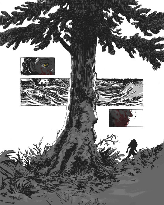

DARLIN’ AND HER OTHER NAMES, PART 1: MARTA
The first installment of my new werewolf-western-horror-romance comic is available now on gumroad and itch.io!
www.darlincomic.com
90 pages, mature readers only.
DARLIN’ is intended for mature audiences. This comic contains elements which some readers may find distressing, including:
murder, gun violence, animal cruelty and animal death, blood, gore, body injury/horror, nudity, and language.
Please proceed mindfully.
Title designs by Binglin Hu.
(Thank you to friends, family, patrons and readers for your patience and support during the making of Part 1!
I also want to give my immense thanks to Tin House, Mineral School Artist Residency, Artist Trust and MacDowell for providing time, space and support during various stages of Part 1’s progress. It means the world to receive validation for this weird little self-published project.)
#darlin' and her other names#darlin#comics#graphic novel#indie#self publishing#comic#werewolf#werewolves#cryptid#horror#western#romance#genre fiction#webcomic#indie comics
1K notes
·
View notes
Text
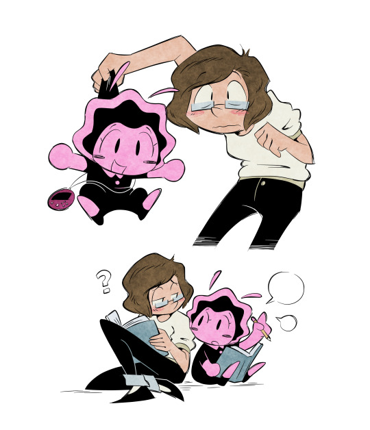
My college roommate is a sea slug!?
#(its been ages since i've drawn anything other that molly LOL I still hope to do something with these two one of these days)#(currently working on developing it more and considering making it another self-published comic if there ends up being any interest)#my college roommate is a virtual pet#mcriavp
161 notes
·
View notes
Text


✶ WASP LOBOTOMY ✶
risoprinted, hand-bound mini comic
very happy with this guy :) i’ll have some copies at ocad artist ally if you’re around toronto, and some on my kofi soon if your not and would like one <3
#anothrknife#my art#zines#mini comic#printmaking#risograph#riso print#art zine#hand bound book#self publishing
59 notes
·
View notes
Text
as the holder of extremely niche isako lore it's really important to me that you know i didn't make this whole writer thing up. the p3 club book brings up that she's a writer as a hobby, specifically so that it can then say she hasn't had any particular success with it. her whole profile is so hilarious but this bit really gets me. mean to her
#it just refers to her as a dōjin author which can include both fanfiction and original works. as long as it's self-published#i like to think she's got both under her belt ofc. look at her. that woman writes fanfiction.#but the one i made up for my comic is a webnovel she posts on her lil blog. and it probably stinks. but i love it for her. w/ all my heart#i support her awful novel. hamburg has been trying to make her realize how much subtextual yuri is in that thing for like 6 years now.
65 notes
·
View notes
Text


FROM THE ARCHIVES!
The Copacetic Archives are nigh on endless. Every week we pull and post more items. Many are SINGLE COPIES. ALL in limited or very limited supply, and, for the most part, priced below market. Here's a look at just a few that we've put up recently. We'll continue to share more here, but you can, of course CHECK IT OUT now!
FROM THE ARCHIVES!

#comics#archives#back issues#underground comix#small press comics#self-published comics#alternative comics#weirdo#rip off comix#fantagraphics
2 notes
·
View notes
Text


Get yourself some sexy sexy discounted artwork from my store
85 notes
·
View notes
Note
Idk how to tell you this but it’s unreasonable to expect a novel written 3 decades ago to align with today’s understanding of representation and respect.
i think it's sleight of hand to suggest that the complaints many people (not just i!) have with sbb can be reduced to "representation and respect" rather than observations about the politics that informed its writing, but even if we grant this: why would anyone recommend a book that they agree is wildly inadequate by contemporary standards as first-line reading for lesbians? if there is such a failure to "align" with "today's understanding", what on earth makes it the go-to introductory text that it is so often shilled as? better to give it an honest elevator pitch—it is a semi-autobiographical historical document, with some interesting and compelling things to say but also with all the perspectival limitations that that entails, about one kind of lesbian experience in a few parts of the usa in one part of the 20th century.
#ask answer#i'm not even gonna publish the other ask because#calling me “babe” in the same breath that you suggest i can't do math is so comically transmisogynistic#that if you have arrived at this point in defense of a book by a tme person i can only prescribe greater self awareness#as for the actual claim raised in the other ask#i'm sorry that it doesn't register as very instrumentally violent to u when one of the few deaths written in the book#is of a Black character doing suicide-by-gun#like just genuinely sorry that this is your outlook simply because the white pov character also suffers
93 notes
·
View notes
Text
Thank you!
A big thank you to everyone who got a copy of Mostly (h)Armless! I think that for an obscure little fancomic it did really well! About 30 copies have gone where none can ever take them away again. I've also finally received my own version and I am happy about the quality.
I've now unpublished it but turns out you can never entirely take a book off the store once published. You can't edit it to be something else either. (which is what I had hoped to do, I have a bunch of unpublished original comics lying around). So it's just kinda going to sit there for all eternity, unavailable for sale. I sincerely hope it won't give me problems later on.
Anyway, if anyone is curious about one day printing their own comics, here are a few things I have noticed that I will definitely remember for my future printing endeavors:
Most glow and blending effects like Lighten, Color dodge, Hard Light, Linear dodge (add), etc don't look that nice in print despite looking awesome in digital.
Make your line art thick enough.
soft shading looks bad, cell shading looks good. (But it's better to fully fill shapes with a contrasting color rather than doing fancy lighting.)
Consider shading in black rather than color. (optional)
Details and soft lines are usually lost and a waste of time (Mostly in case of a colored book. Black and white may be different)
Keep panels spaced far enough apart.
Draw big panels. Small panels aren't as nice to look at and the eyes are naturally drawn to the larger panels.
Gradients don't look very nice either. Unless they have a light color.
Vintage comic textures and effects actually looks nicer in print than digital (which surprised me).
In dark scenes, rim lights are essential to make the character pop out. M(h)A would've looked like ass if I hadn't added those.
Stay away from the borders of your page, especially the left and right ones. Not just for the text but for the drawings too.
Keep track of which side of your page will be closest to the spine, keep a distance from that side especially. Because your book will be folded and part of the page will be hidden (the thicker your book, the more will be lost).
fancy panel compositions are cooler in digital...
contrast contrast contrast...
Don't be afraid to use pure black a lot.
Don't be afraid to use white a lot.
The 3D shake effect is also not that cool on print. But looks gorgeous on digital.
To myself… keep the font size consistent…
If text is outside a text bubble, it should have a high contrast stroke
Text should always be high contrast in general.
Motion blur is really cool in digital but not so much on print.
Keep black silhouettes black, avoid adding any kind of subtle glow or texture.
Text bubbles can have color but they should be light (again high contrast) watch out for saturated green or blue or red. Test in greyscale. Contrast should be more than 70%.
Line art should not be colored. Keep it black for print.
Hard borders are better than soft borders. On everything.
white panel borders are better than black panel borders.
But white borders with a black stroke are probably the best (cause more contrast).
Again light colors are better than dark colors. To do dark scenes it might be better to just use black and contrast with a lighter color.
Line art perfection is not that interesting, especially in regards to hard surface shapes like robots. (Might be personal taste though. I enjoyed looking at robots with messier line art more than those where I did perfect brush strokes.)
Beware dark blue and purple...
Compositions and colors of both the left and right page should always fit together. I think I did that pretty well here at least.
If possible make your total amount of comic pages devisable by 4. (so 24 pages total, or 28, or 96, you get the idea) not including the cover and back. Or else add a little extra drawing to fill the remaining pages.
I think that's about everything I can see based on my own print. I'm sure that a fair few of the things that I found looking worse in print than digital could be resolved by just being... better at converting your files. There's the whole CMYK color mode thing but in my personal experience that has been such a pain to work with, and each time my prints looked worse attempting to convert the file rather than had I just left it in RBG and let the printer do the guessing work for me.
So if you're like me and you're hopeless at this technical mumbo jumbo printing stuff, I think just avoiding the things I mentioned while drawing should get you well under way to having a nice print. The most important thing to remember is that digital and physical media are two entirely different beasts and if you are interested in getting your comics printed it's easier to adapt your workflow to that from the start rather than going back and altering. A lot of the mistakes I made here are rookie ones and I should have known better. But it's very easy to get lost in the process once you've started. I hope to improve my next print significantly. Once I can make RBG look good, I might try CMYK again.... Maybe. Potentially. No.
Hope these tips can be of service to somebody. They'll be a useful archive for myself in any case. If anyone wants me to elaborate more on a specific point, I'm happy to explain.
39 notes
·
View notes
Text
Annnnnd we are LIVE! Dark Spider: With a Vengeance is here. We can't wait to get this comic to all of you. It's an incredible story filled with action, suspense, and explores the human side of our titular hero, Dark Spider.

#comics#art#illustration#indie comics#kickstarter#self publishing#blackheroesmatter#lawful evil comics#dark spider
53 notes
·
View notes