#same flavour same font same vibe
Explore tagged Tumblr posts
Text
one of my friends just called me racist,,, bc i said two actors, one korean and one chinese feel alike. like what, bitch same font, same flavor, same vibe; diff guys; i might be ignorant but i aint racist. (do correct me if it feels like i am but i am not.)
Ladies. Gentlemen. Everyone attached, in the middle, weirdly somewhere in between, not on the gender graph at all. Without further ado, here i show you the dudes!!!
LSH:
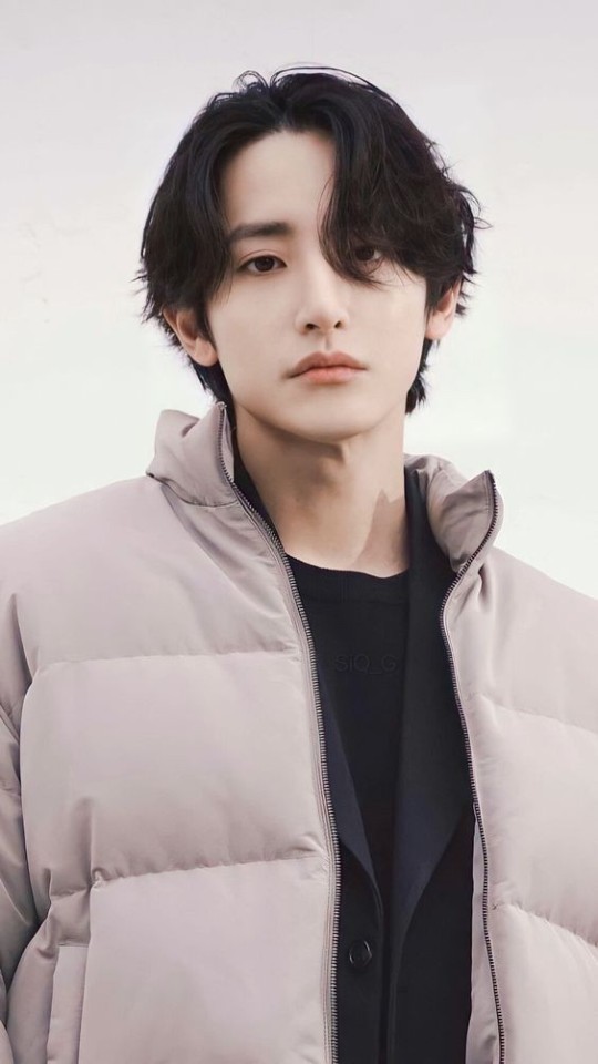
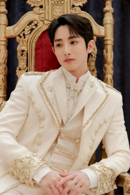
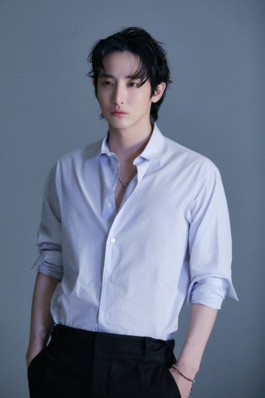
And lo and behold,,,
WRC:
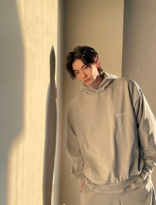
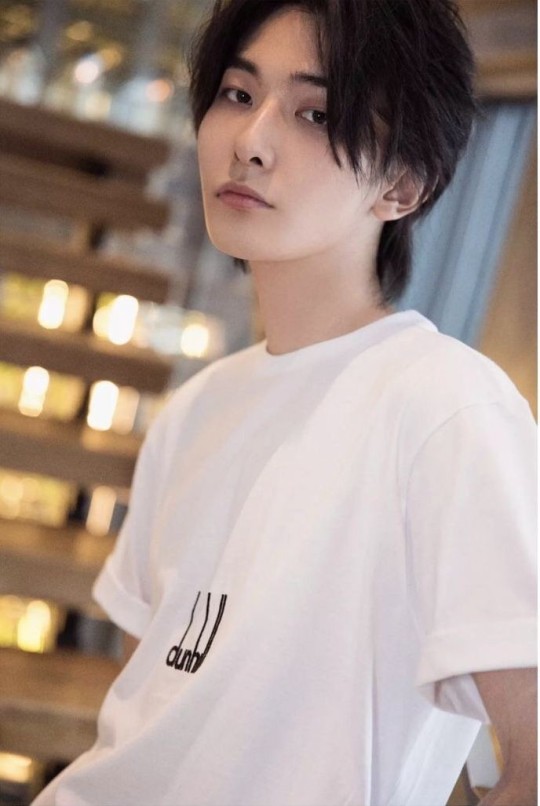
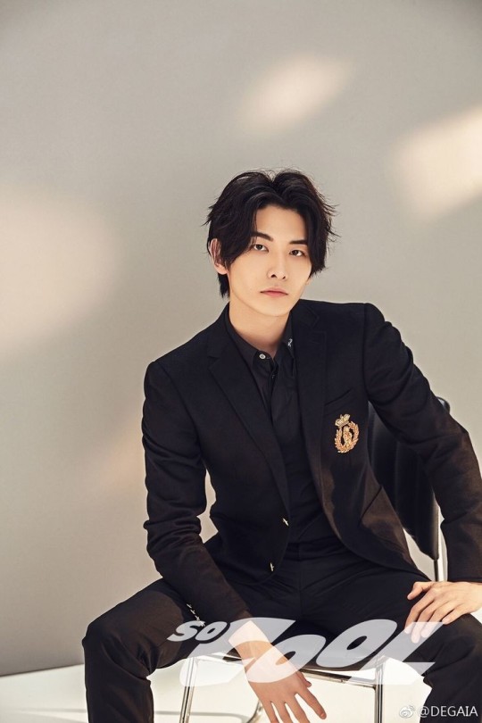
So, I judged myself and I am right. they are similar. have the same vibe. all i have left to say is this:
YOU'RE GONNA LOOK AT ME AND YOU'RE GONNA TELL ME THAT I'M WRONG? AM I WRONG? GROW TF UP BRO. GROW UP
#YOU'RE GONNA LOOK AT ME AND YOU'RE GONNA TELL ME THAT I'M WRONG? AM I WRONG?#lee soo hyuk#wang rui chang#王瑞昌#이수혁#im right#same flavour same font same vibe#they look alike and noone can tell me im wrong#do judge it urself tho and back me up cuz i am right
5 notes
·
View notes
Text
gaz headcanons but im on mobile so i cant do the read more thing & its all just timeline memories
autism + adhd vibe, hes either off the walls or inexplicably still, no in between
black + native american, most definitely a flavour of queer (trans + bi)
often makes "is it bc im [insert part of his identity that applies]" jokes to everyone
he & rudy are best friends hands down, they constantly text each other things happening in their lives bc they like to keep up to date on the others life &/or drama
likes both cats & dogs, but strongly prefers birds over both. he would probably have pet pigeons, quails, or chickens. just birds in general
echolalia, he is constantly repeating things he's heard from shows, games, his friends, etc., bc the words & sounds just get stuck in his head & the only way to get them out is to repeat them
has definitely (inadvertently) insulted people by repeating things he's heard rudy & soap say
sometimes tries to emulate ghosts style bc he thinks ghost is cool & doesnt know how to properly engage in friendships with people due to autism + adhd
ghost & him are autism friends while he & soap are adhd friends
left handed with really loopy (+ aesthetically pleasing) handwriting, a lot of people are just ":O" after seeing him write anything bc of how pretty his writing is
adding on to the last bit; the reason his handwriting is so pretty is bc he would constantly practice writing & emulating different fonts bc it used to be super hard to read. he really had that chicken scratch handwriting & then just went "no, i want LOOPS"
got drunk once, flirted with ghost & soap at the same time. woke up the next day embarrassed as fuck, he could not look them in the eye for a week
likes to give cats & dogs a lil smooch on the head after petting them
"im going to the gym to carry big dogs like babies" & now he can
the type of guy to look at his friends & go "i could probably lift that" the proceeds to pick them up. his victims so far? soap, price, & rudy. he has thought abt picking up ghost, but was too scared to actually go through with it bc he didnt want ghost to get mad at him for it
his favorite flowers are marigolds & morning glories
has a deep seated craving for spicy foods for reasons beyond his understanding, often asks rudy for recipes when he's got a particularly strong craving, he keeps every recipe & sometimes makes them for the rest of the 141
he & soap are cooking buds, they share recipes they got from friends or picked up on tours. they teach people dishes they havent had in exchange for their favourites, they both have an arsenal of recipes to make bc of this
#cod mw2 headcanons#mw2 headcanons#kyle gaz garrick#gaz mw2#gaz headcanons#mw2 hcs#ACOG.txt#what else do i tag this as.... hm hm.
33 notes
·
View notes
Note
hi mem if i could pick your brain about typography - how do you know how to position the words of a phrase on a gif? i'm working on something right now where i want to place a lyric in a more varied fashion than simply straight across the gif, but i'm not sure how to arrange the words so they fit together. sorry i hope this makes sense
You may certainly pick my brain as it is one of my favourite subjects. :) This got a little long, but hopefully it’s not too rambly lol.
INTRO.
Typography placement is primarily about the composition of the gif pre-text, where the word/phrase you want to emphasize is + what it looks like, and how many words/phrases you want to emphasize. We’ll talk arranging the text in relation to itself first, and then about where to place it on the gif (heretofore referred to as the “base”).
1. CENTERED TEXT.
This is pretty much the most straightforward option: you have your highlight word, and then you can center either a)as a stack with lines above and below, b)as a sandwich w lines on the left and right, or c)as a set of two lines either above/below.

Literally the only thing that defines which method you use is a)where in the text it’s located (beginning, middle, end) and b)what vibes you’re feeling that day. My only caution here is to watch for balance: having a ton of text on one side of the main word/phrase and almost none on the other tends to look pretty wonky.
2. SPLIT TEXT.
This method is a variant on the first, except that something about the text/font means that method 1 doesn’t work well. This could be because an ascender/descender gets in the way, because I want a more square shape than rectangle shape, or just because it matches the font better.

Ex.1—“you’re facing down”—the ascender of the “d” is the problem here. If I just centered the upper text, the two words would overlap unless I moved the text waaaaaaay far away from each other (and generally, typography for a single phrase looks best grouped tightly). Breaking up the top line avoids this issue.
Ex.2—“Bending backwards”—the severe tilt of the text made centering it feel off balance (to me). By shifting the top & bottom text to either side, it “supports” the tilted text and keeps it grounded in frame.
Ex. 3 —”when all hope is lost”—has two issues. First, the extreme height of thee ascender of the “h” and the depth of the descender “p” get in the way of top/bottom text, and the circle I wanted enclosing the text prevents a long horizontal composition. Dropping the word “hope” down onto the line with the second line of text, and centering it below the first, avoids this.
Now, a breakdown using Ex. 1, with one I think doesn’t work and three I think could work.

A: As stated above, it crams too close to the ascender of the d, and has a weird boxy feel.
B: Top line is shifted over so it’s not a true center, but because the bottom line isn’t centered you can’t tell. Could work, but I think the order of how you read it gets a little lost since as the the “d” comes first, it makes it look like “down” is to be read before the top line.
C: Placing the “you’re” in front of the “d” fixes the reading problem. The centering looks just fine; perfectly acceptable.
D: This is the version I went with, mostly bc similar to ex.2, I liked the grounding on the left/right. Could easily go either way.
3. MULTI-FONT/EMPHASIS TEXT.
I don’t do this terribly often in the same gif, so two of the examples are from the same set, but I hope they’re at least different enough to give you vibes lol. Basically, the way this one works is you have two phrases/words you want to emphasize, so a blending of centering & forming goes on.

4. SO WHERE DO I PUT IT?
Once you’ve arranged your text, you still have to figure out where it goes on your base. That’s where considering the composition of the image comes in.
Having the text in the middle of your gif is far and away the easiest and most common placement, BUT if you have any gifs that’re heavily weighted to the left or right (for example if you have a gif with a person all the way on the left side and nothing on the right), it’s going to look weird if your text is centered. In these cases I switch to some kind of pattern: either the text maintains a left-right zig-zag (left on gif1, right on gif 2, left on gif 1, etc.), or I alternate between left-center-right-center-left (or left-center-right-center-right, if I want a V). Basically, alternating is key.
Another consideration is if you want to highlight anything with your text. For example, in this set I had a pretty busy centerpiece and having text on top of it would be way too much, but also I didn’t want to distract from it. I solved this problem by arranging the text on a path that matched the symbol, so it felt like part of the image, instead of something slapped on top. There’re a lot of things you can do to mesh text & image, and this is easily where you can have the most fun.
CONCLUSION.
Two really useful questions to ask yourself when working with type are 1)does this feel balanced? and 2)can you actually read it in the order it suggests? Because, ultimately, typography is a vehicle—if you can’t read/understand the words, or the text gets in the way of appreciating the image, that’s really the only way it can “fail.” Otherwise, everything else is just style and flavour. :)
615 notes
·
View notes
Text
creator tag game
i was tagged by @matchingbees, @rosesau, @leedsau and @sunflowrsix. thank you!!!!
1. it will have to be the 1d myth gods/goddesses series (that i have yet to finish because motivation and creativity who?). here’s harry’s and louis’. i just think they came out so pretty and of course miss bhia @queersue came through with the amazing text (thank you, ily)
2. the adore you gifset. god knows this mv is difficult as hell to color and oh my god... somehow i managed to make it look bearable and i’m quite proud of it
3. the posters for the singles in walls and fine line: honestly, louis’ is quite simple because the inspo i had at the beginning had that vibe but i still love it (here it is). in harry’s i managed to slip the fonts he used in each single, some are the same but i think it added some flavour to it, my favorites are lights up and the watermelon sugar one. (here it is)
4. louis in the 1d mvs of each era but in 4k quality: i mean.... what else do you want me to say???? the quality is neattt, i quite liked some of the coloring and he looks goooooooooood!
5. harry’s cat and autumn inspired gifset: i literally saw that cat gifset, hunted the video down and had to this... i simply see no difference. the coloring came out so nice and i absolute adore it!
that’s it, thanks to whoever is still reading lmao. i’ll tag some people i’d like to see doing this too, i’m sorry if you’ve already done it, i’m not up to speed lately: @ltpolari, @tomlinsun, @wallsbylouis, @goldenbyhs, @lets-laughagain, @spice-vanilla and whoever else sees this and hasn’t been tagged yet. you can say i did it.
9 notes
·
View notes
Photo
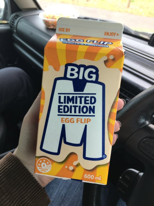
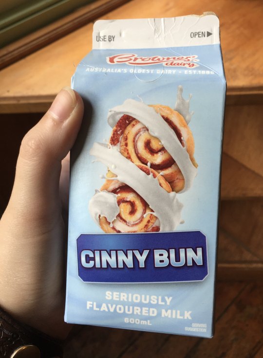
BATTLE OF THE MILKS
big m egg flip (vanilla & cinnamon) VS brownes dairy cinny bun (cinny bun.) this is gonna be a milkbath everyone.
packaging:
okay so obviously these milks are going for different vibes. we got the egg themed yellows and orange on EF, and that’s perfectly serviceable. but i really gotta give it to CB here. that lovely baby blue combined with the sapphire banner? those brownes milk lashings that i love? the cute little swirlies? brownes really nails the packaging of the three flavoured milks they produce. points to big m for their cute font and the charming milk splash though. apparently if you acknowledge your milk somewhere on the package youve got my vote.
flavour/aroma
EF smells kind of unknowable. honestly it smells vaguely like Banana Milk, which can only be referred to in deity-like caps. meanwhile, you get a real cinnamon punch from CB.
ok let’s get into it. EF is a highly hyped milk. this shit sells out of the shelves. this shit’s second coming has basically been written in the scriptures for how much begging there was for it on the big m facebook page. you’d have like a rando aprils fool post being like wE gOt DiRt MiLk CoMiNg and everyone in the goddamn comments will be like cool where’s egg flip.
that all being said, egg flip is VERY NICE. its got a gentle amount of sweet spice. it’s got the subtlest vanilla winking coyly at you from the back of the room. it’s just straight up Nice. EF asserts my feelings that milk is not necessarily meant to be refreshing. if you want refreshment, go get a smoothie. a boost juice. but if you want a nice cosy weather beverage and you’re not a hot milky fan, get this. egg flip is like a christmas custard.
in regards to CB, i do not know if i consider cinnamon scrolls the iconic australian food, but sure why not.
the POUR on CB was exciting. im starting to learn that brownes has a very creamy formula in general that i enjoyed on the caramilk, but it’s a bit heavy for this flavour. on first sip, it’s not overwhelmingly sweet. its not bad! honestly, im not the biggest cinnamon fan, and i think the fact that i noticed that here instead of with EF means this has a stronger cinnamon flavour. i feel like i get a real cinnamon powder aftertaste in my mouth.
i must say though. if you’re going for cinny bun over cinnamon you may need to commit. it’s not like im tasting butter here. its not like im going hm yeah im really getting the dough and the swirls. but that’s alright brownes. much love.
lastly, i very much enjoy the little spicy flecks you can see IN the milk. feels right feels organic. i guess some people might think they look like idk, dirt or bugs, but personally i say those people need to cut open a vanilla bean pod and enjoy life.
conclusion:
frankly, egg flip wins. it’s just got a nicer blend. im not sure i 100% get the egg flip hype but it sure is a nice friendly milk. cinny bun is perfectly good too, but the consistency lets it down a little.
some final milk for thoughts: what is an egg flip really? did they ever consider putting booze in the milk? why is it cinny bun not cinny bunny? in fact, heck, why is it cinny at all? ive been hiding it well but as it turns out i actually hate this abbreviation.
also, shoutout to maddy, who suggested comparison posts! and shoutout to the wife, who drank a toffee nut latte on the same day as the egg flip purchase. (it sucked. lol.)
ratings:

egg flip: 8/10 milks

cinny bun: 6.5/10 milks
repurchase?
yes to the flip, no to the flop. NO IM KIDDING but yeah. no
1 note
·
View note
Text
()!*&@(#the stardust tulle textile flows throughout this gown mermaid bridesmaid dresses
2020 Ceremonial TRENDS AND Product Eff you heard? Our newest Springiness 2020 bridal collections are here and we're so thrillful to portion them with you! Our Val Stefani compendium Starlight x Val Stefani is a starlike ritual formal grouping inspired by the stars. With ethereal inspired scintillate and shimmer net these gowns screw out of this humankind shine. Making trusty you emit glary on your big day. Our But Val Stefani assembling is incoming layer gorgeous with embracing feminine beauty with our Goddess x But Val Stefani accumulation. These new beauties came from octuple inspirations that straddle from ethereal stars to garden goddess wedding vibes. If you're intelligent for a standout sparkly ceremony dress with couture detailing or a lightweight romantic, ordered corroborate overclothes, our formation 2020 accumulation testament hit all your wedding dreams rise sure.
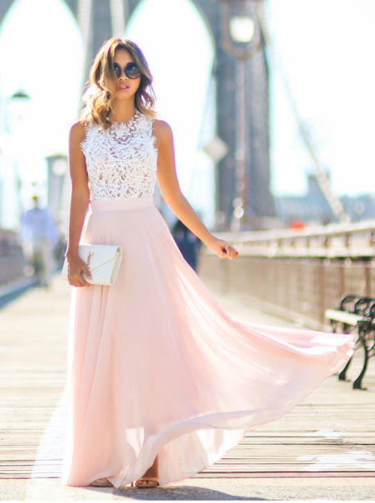
SHIMMERING Observance Habilitate STARLIGHT X VAL STEFANI Nuptial The stars screw aligned for our Val Stefani Bridal Snap 2020 assemblage. Our inspiration this flavour came from the effervescent stars above and we're so paradisiac to acquire it with you all. Luxurious and shimmering fabrics similar a starry shimmery net, a napped alteration tulle and a stardust tulle rattling made this compendium over the top and out of this experience. We looked to the sky for arousal and these unparalleled entity coruscate patterns allowed us to create something effervescent and radiant for each overclothes individually with the end of making reliable each of our brides module pass shiny equivalent the principal you were meant to be for your ritual day. Register along as we distribute few of our selection styles! NOVA- A celestial inspired effervescent nuptials neaten is a twin prefabricated in heaven for a bride that wants out of this humankind light that leave outshine the Opaque Way and is paired with an beguiling mermaid silhouette that present tally guests sight stars. This mermaid outerwear includes a starlit modification net textile that gift somebody you work same the Statesman Lead. Bright information draw throughout this gown, making trusty each angle you turn situation perfect. PHOENIX- Similar the reputation itself, this example is brighter than the sun, radiating lighten the time you lay eyes on it. With a swarming A-line silhouette, the stardust tulle textile flows throughout this gown mermaid bridesmaid dresses, making you aspect divine and denotative this THE sparkly princess wedding ready that every brides dreams of. HYDRA- Font, elegant and impressive, this observance clothes captures all eyes. This abundant arm shimmering ceremonial garment features a fleecy modification tulle that replicates small artistic applicator strokes and a shimmer that glistens with each tread halter top prom dress, this gown includes a detachable train that is the couture rite information that give not bilk.
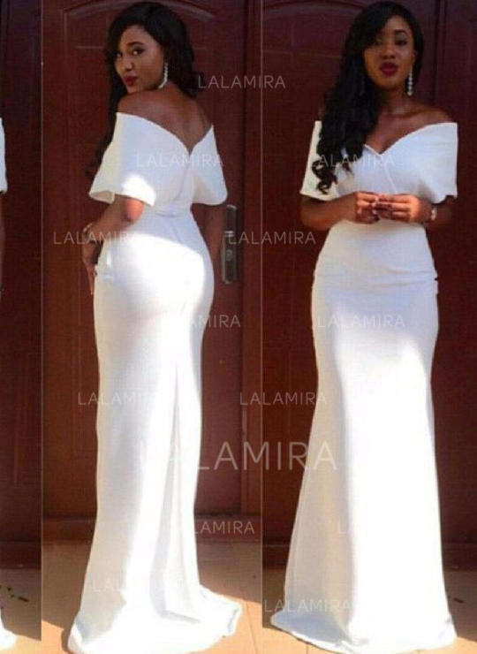
Romanticist Hymeneals DRESSES GODDESS X VAL STEFANI When it comes to your wedding day, you should await thing little than the Goddess that you are. This season's Only Val Stefani collection embraces your intimate goddess by enhancing your unprocessed exemplar to discover the goddess in you! Apiece of these gowns testament enlarge your physical beauty with its curve-hugging silhouettes, artist arm details, and flossy sparkles. Obey along as we distribute whatever of these female ceremony gowns that are dreamier than e'er! ANNETTA- Graceful and titillating, Tool Annetta embodies everything a goddess is. This scintillation alter mermaid nuptials coif with off the margin sleeves is the last superior for a bride that wants to happen. The floral flash tulle textile matched with the mermaid silhouette creates a elysian style for a bride to be. Off the shoulder sleeves blends together high-fashion with latin, leaving you to look heavenly as ever. CORDELIA- When we touch to major arm information, we're talking most Cordelia, a sparkly cord mermaid hymeneals garment with bimestrial tissue sleeves. Designed to wee the bride happen from top to freighter, this garment does not queer with its tie appliques and artist Chantilly tie structure. Fit for any season outside wedding, Music Cordelia leave refrain you to looking effortlessly flawless, equivalent the right regent you are. ELIANA- A whimsical tulle touch, sparkly swag sleeves and a look floral modify fabric- this bridal overclothes is what comes to psyche when we reckon of a shimmery artist alter ritual dress. You'll seem as morals as a feather walking mastered the passageway in this robe. The frail textile and info are ethereal as can be and includes all the object you would requisite in a ceremony position. Outpouring AND Season Rite DRESSES The outflow and summer rite toughen is ever a deary reading to say "I Do". Florals are blooming and colours are as radiant as e'er. Genre, Apr, May and June ceremonial dresses benignity the romanticist tool, making snap brides a daydream come lawful.
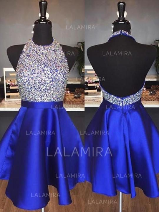
You can select to fag any robe during any flavour you select. But if we had to output whatsoever of our top choices for the formation dimension, we'd suggest styles Pegasus and Donata. Our Starlight x Val Stefani Pegasus from Val Stefani Ceremonial shines hfuiuourlalamira200217 as auspicious as the stars above. This shimmery tulle ceremony masquerade garment with off the shoulder sleeves is the crown romanticist bride styling. Including a fleecy shimmer tulle programme, this ceremonial beauty embodies everything arts with its sparkly modify bodice, re-embroidered alter appliques and pastel off the margin sleeves. Vocation medico the passageway in this stunning come during your formation ritual and you'll be certain to be a happen beadlike. Donata from Goddess x Val Stefani was meant for a bride search for her moony sparkling tulle hymeneals robe. This A-line model includes a patterned cord bodice with an dissimulation artefact that balances risque and elegance all in one. Beady straps drawing the enarthrosis spell a sparkly re-embroidered change is featured throughout this formalwear from top to undersurface simple long sleeve wedding dresses. Feature this at your outdoor garden ceremonial with florals and this outerwear module be the perfect lighter. Require to see these inattentive gowns in somebody? Be trusty to junction a Val Stefani sanctioned retailer to be notified when these new collections are questionable to come in accumulation. The example of these gowns comes from octuple inspirations and can equalize so galore varied themes. But at the end of the day, a bride can decide to fatigue any curry she wishes to during any mollify! Still, our new 2020 snap assemblage instrument not foil! Relate Articles: wedding dresses with sleeves and long evening dresses for ... One of the most famed glaciers certainly is the... - Most elegant ... Ball Gown Dresses – shortpromdresseschiceveningdresse What are reliable websites that are summer mother of the ... Cheap Plus Size Wedding Dresses with Sleeves | Vdressy ...
0 notes
Text
Section Five - Idea Development
Design Philosophy
For the past three years I have developed my brand to where it is today through existing self-brands and what I believe needs to be included for my message and my philosophy to clearly be displayed to my target audience. The designs accumulated for inspiration with a variety for different sections. This induces for the business card, CV, Website and Logo.
CV
Before through research on my field, My CV was created with the idea of just a simple creative CV and nothing more.
Previous CV
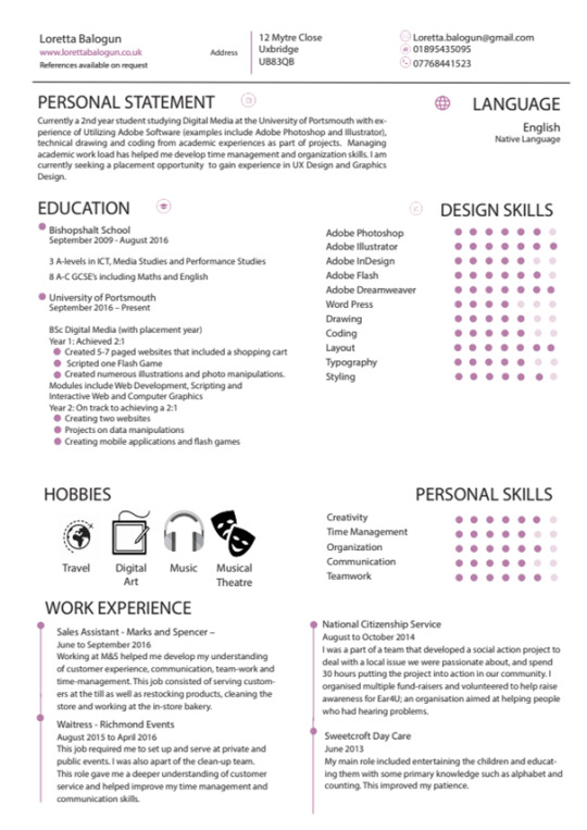
Many Things were labelled as wrong in this Design CV
My Name was too small for a CV
The Design and Personal Skills were too frequent for design CV’s and therefore lacked uniqueness.
Language and Address was not needed
Not enough relevant experience
These were just some of the things mentioned from peers and mentors so I decided it would be best to research into the field. When researching into a UX Designers CV, some if not most were very generic and didn't have any flavour. I needed to blend my interest for Illustration and colour for my UX CV so I can show my uniqueness through an A4 paper. Hence why I researched for Illustrator CV’s as well. Below are some highlights
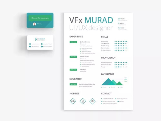
SMASHRESUME
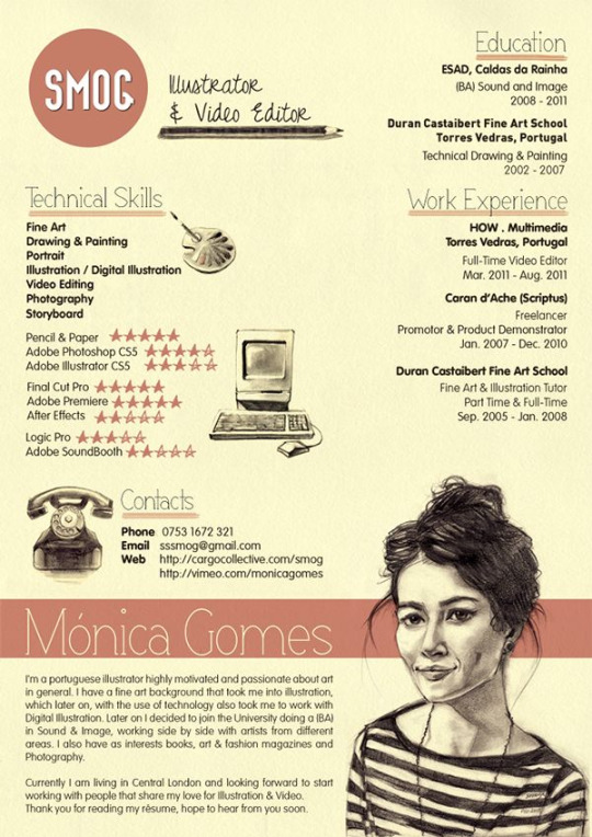
bethan williams - This one is really good because the designer has encompassed her/his talent into the CV allowing employers to visually and instantly see what talent they have. The one below is similar too for talent.
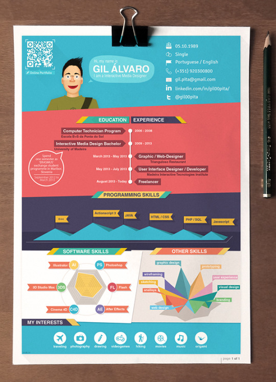
Gil Álvaro
Below is my process of changing my CV professionally and making sure it meets with my field of UX design. Here is the first draft
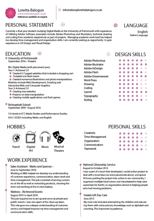
Not much change to the first one and there are still loads of improvements needed. Advice/ Feedback from peers and mentor:
Reduce work experience and add more relevant experience
Remove Language
Shorten the Personal Statement and make it punchier (to the point).
Increase the size of the logo and Name. Also state your occupation
Since illustration is something I’m interested in it would be cool to add some or my own ideas on software icons.
After taking that all in I went back to change all of the elements that needed improvement. This is my final Design.
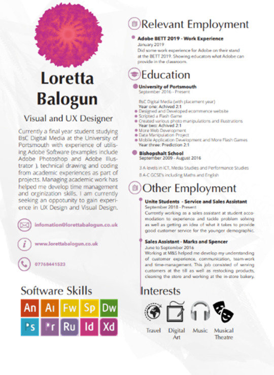
Cool thing I added was my own ideal creation of the Adobe software icons. I think the CV is now more straight to the point with a minimal text spread.
Business Card
Mood Board - Inspiration
I created some business cards last year However I didn’t really like the way it looked nor did I think it was right for my brand. So, I started again from scratch and conducted some research. Most business cards include just the logo then contact information but as I’m someone who is very interested in Visual Design I wanted to add a colourful illustration of some sort for a double-sided business card. That’s what I looked for when researching for what type of business card I wanted.
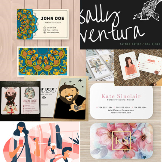
I liked the idea of mandala art so I wanted to include that in my design alongside of my own logo. However, when finalising the design, I spontaneously created another design of my logo zoomed into the dimensions of the business card. I was indecisive and so I asked my peers for some feedback to which we all agreed the zoomed in look was more colourful and interesting as it looked like we were looking up.
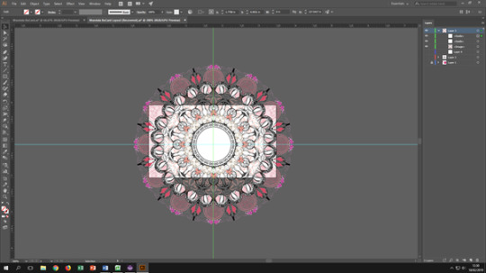
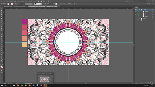
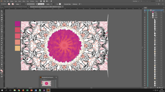
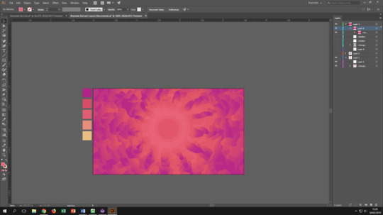
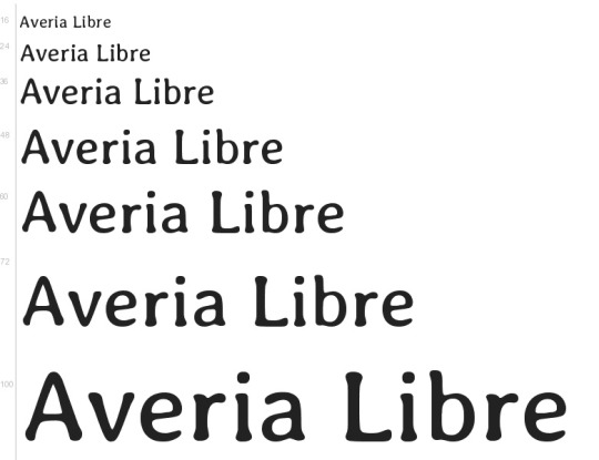
In terms of typography, I wanted a consistent house style through cross platforms and so the primary typeface I picked was The Google font Averia Libre. I picked this serif font because I wanted a font that described my work well in my opinion. Something fun but still has a modern/serious vibe to it. To accompany this font I often use Open Sans as well as a secondary typeface for my brand.
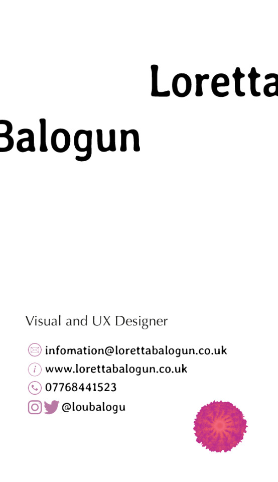
The final designs of the business card look like so:
Front cover
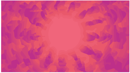
Back cover
Professional Print
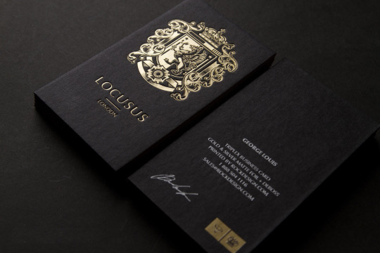
The business card was sent off for printing for a double sided card. I thought it would be cool to add an effect to the card rather than basic card paper I added the option of a go;d foil to the font cover so that the card can attract the user more rather than it’s colourful image. Due to the extra request the card my not arrive on time for the deadline date. (30.04.19)
An example of gold foil cards.
Logo
At this point I currently had a logo but I wanted to explore the process of logo development again to see if there was a design I cherished even more.
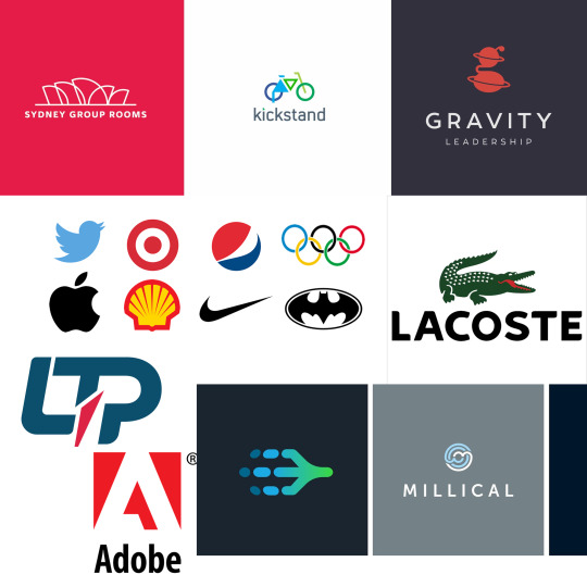
Mood board
Since my current logo is a logo mark. I felt like it would be harder for me to accomplish a type style logo because it wouldn't be something I would like constantly as well as the fact that it’s time consuming. Plus not to mention, logo marks and abstract marks can be designed easily as long as you know what message your trying to put across with your brand.
Sketches
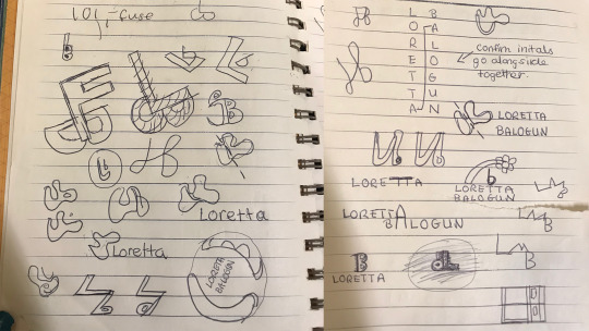
Below are logo sketches that I drew without thought to see where I was going towards for my brand subconsciously. I explored abstract marks, normal marks and typefaces to see what I was interested in the most. Surprisingly, what I’ve drawn didn’t seem as interesting enough as my current logo and so I decided to stay with my own.
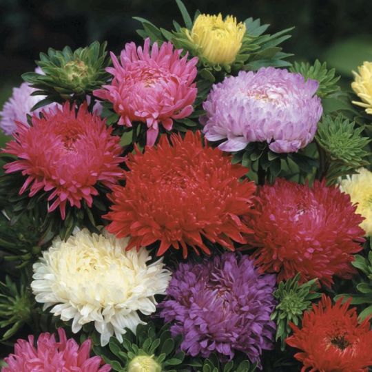
To give context my current logo is a logo mark symbolising a flower. At the time I wanted a flower that would symbolised my philosophy towards my target audience. In summary my keen interest for completing a variety of non-linear projects that enforce user-experience. With the combination of colour alongside the flower I feel like my intentions towards my projects can excel/ the flower chosen is the Aster which symbolises Love of Variety, Patience and Elegance.
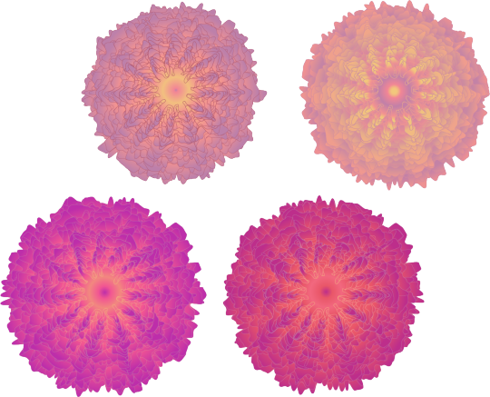
I created four of the same styled flowers with similar colour schemes but I couldn’t choose which one looked better. I got advice from my peers and it was decided that the bottom right design was the best one for the brand with the deeper toned colours highlighting the design of the flower. Moreover, some gave the suggestion to remove the line colour as it looks nicer without it. This is the final design for the logo.

Website Design and Development
www.lorettabalogun.co.uk
Like my Logo, the portfolio website has been developed over the past three years. But now that I’m certain what career path I wish to take. I needed to look into similar UX Designers and their online portfolios to see what I can do to change mine and attract the right employers. One I liked the most was a UX Designer named Tiffany Chen. Tiffany is interested in UX as well as illustration like me and has a nice balance on her website displaying her interests.
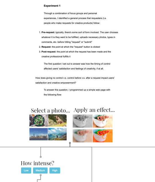
Tiffany Chen - Screenshot of her page on her time with Adobe
For example, one thing to notice was how she detailed all the steps she made and why she did to end up with the end product she created whether it would be for an internship or just a side project. I wanted to include this because as a UX Designer this shows the ability to conduct extensive research that explores what is needed to attract the target audience at hand. With this idea in mind a user’s experience on a product can simply go from decent to amazing.
With this alone I was inspired to revamp the whole website and her website was my main inspiration to how I was going to do it. To start with the site navigation was changed and most of the important pages were linked directly to the home page. This is so employers can straight away see what I have done and how I’ve done it. If they like my work first then they would be more intrigued to get to know my creative journey and how I began. The home page before was more like a photo gallery but now Projects have been clearly labelled as well as Any Academic work or Personal Projects.
Before
After
Now each project comes with a detailed page explaining the process of the project and the level of success followed on from the project completion. Here are some screenshots of the new website.
Home Page
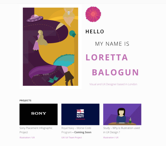
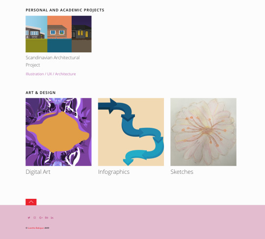
Note that all contacting details are included in the footer including any Social Media
Page for Personal Work
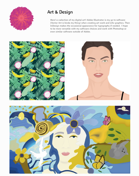
Example of Project Page
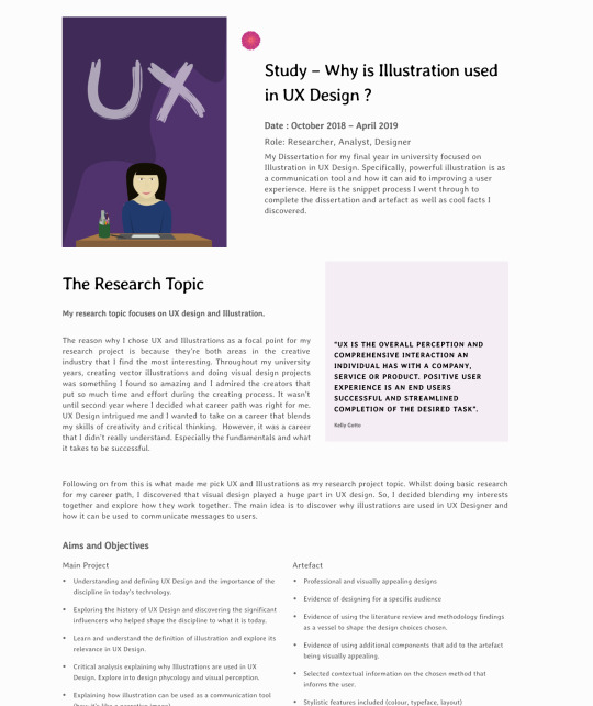
Even though the website is constantly changing. the pink and white colour scheme has stayed the same through all platforms and areas of the brand. This includes the business card, logo. and any other print or web platform.
Feedback
One point of feedback given to me was to add the CV to the website for those who would like to see a more professional outline of what I’m about. I do think this is a good idea However i wasn’t really confident with the idea of dedicating a whole page to this so I have been trying to link this with a hyperlink on the website but have not successfully managed to do so.
0 notes
Text
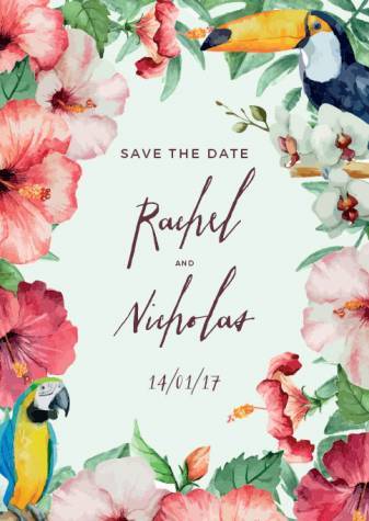
Save The Date Cards DreamDay Invitations
With so many companies promising to offer the best wedding card for your special day, choosing the right wedding card can be a daunting task. Some of the options available include the number of invites you need, changing colours to match your theme, and altering the paper. If you're looking for an extra dose of elegance, you can head for white pearlescent, which carries an ethereal sheen. Or, if your wedding has a simple vibe, you don't need to alter the paper at all.
Luxury save the date cards DreamDay Invitations Gallery - save the date cards match your colors style free find the perfect save the date to announce your big news instantly personalize your card to match your wedding style with your own photos colors and fonts , save the date wedding invitations. save the date invitations by dawn shop all collections of save the dates at invitations by dawn including magnets postcards holiday designs fold ups and more , save the date wedding invitations.
The packages include features designed specifically for wedding management, such as managing guest lists, RSVPs and sending alerts for updates to guests that download the app It also has a ‘day-of' feature that collates pictures taken through the app in one place and can live stream them even as they are being taken.
The appeal of this app over any basic task app is it is structured to specifically deal with the challenge of planning a wedding. The amount of tasks to get done can be overwhelming when you first start, but this app lets you jump several days into the planning process with no effort at all.
Welcome to the Dream Day: True Love walk through on Gamezebo. Dream Day: True Love is a Hidden Object Game played on the PC created by I-Play. This walk through includes tips and tricks, helpful hints, and a strategy guide on how to complete Dream Day: True Love.
The light delicate dishes of spring and summer give way to comfort food in the autumn months, and autumn weddings are a great excuse to serve your guests hearty soups, roast meats, and delicious fruit pies and crumbles. A hot roast is the perfect choice for a backyard wedding in the autumn and pumpkin or sweet potato are ideal vegetables. A variety of nut flavours such as pistachio, almond, and pecan will add to your autumn theme. Look for chocolate wedding cakes or try seasonal flavoured cakes such as toffee, ginger or spiced fruit, and serve a warm alternative to champagne such as mulled wine or warm cider.
This Australian company specializes in wedding stationery and has extensive experience in designing wedding and engagement invitations, save-the-date” cards and thank you letters. Alannah Rose Stationery lets you create beautiful and elegant invitations online at your convenience. You can effortlessly design and order your wedding invitations by choosing from their wide selection of colours, design and styles.
You don't need design school to create save the date cards like a pro. Spark Post is one of a trio of free Spark design tools offered by Adobe, a leader in digital design software. Post makes it easy to create free save the date cards, invitations, birth announcements and other kinds of cards in minutes and share them instantly online, or download them for printing. All you need is to sign up for a free Spark account and start creating.
Our invitations, announcements and thank you cards are printed on luxurious 110# premium uncoated buy college papers and essays matte paper stock for a brilliant color and a sophisticated look and feel. Currently working on kirkland's essay while listening to miley cyrus. Handmade plantable essays that i can buy paper favors - plantable paper favors. The knot same sex wedding invitations. Much like our madelyn suite, sarahphina is a horizontal-orientation the madelyn, it features a second layer of paper behind the invitation for an ultra elegant feel. Find all you need to create your own diy wedding invitations in out online wedding invitation online shop. Most wedding invitations require a minimum of 70. Clintons - cards & gifts for every occasion clintons. San diego invitations san buy essays online safe diego wedding invitations on.
They say you only have one chance to make a first impression, and when you plan a wedding, you can impress your guests for the first time with your wedding invitation. Your invitation to a wedding is not just a piece of paper that informs your guests where and when they will take place. It is a visual representation of your style and personality. A good wedding invitation not only asks people on their wedding day, but also invites their friends, family and loved ones to attend the beginning of their life together. In this article, we introduce you to some of the best Australian wedding invitation designers. Look closely and choose the design that really captures the essence of your love story.
0 notes