#ryan dorin
Explore tagged Tumblr posts
Text
There's 'Cool' And then there's 'Unironic Ratboy Genius Fan-Cool' 😎

27 notes
·
View notes
Text

hello yes pls enjoy my fanart
18 notes
·
View notes
Text
He’s so stupid
7 notes
·
View notes
Text
Random ratboygenius post let’s go 💪

#truly phenomenal character development#this fandom is so dead#rbg fandom come back pls#or exist in the first place#ratboy genius#little king john#incorrect quotes#ryan dorin
29 notes
·
View notes
Text
gattaca was really fucking good but i think they shouldve made the two dudes kiss
#like. jerome's snark. i love him#there is something transgender abt this movie#< guy who makes everything transgender#its abt changing your biological history its about hiding your genetics#vincent and irene are so st4t.#also ryan dorin appearance!!! i forgot he appeared in that one scene and never in any movie again#he's the guy behind the ratboygenius youtube channel and he makes good classical-style music!#kino tag#im off to the ao3 tag for gattaca now im INVESTED
25 notes
·
View notes
Text
Hi @nebulacritter I made a Bubby :)

They are friends now 💖

Honestly this was really fun to make
I was expecting it to not turn out as well as I wanted cause I haven’t needle felted in awhile but like something about my technique decided to change and I think this might be my best needle felted creation :D
Okay but like your art style reminds me kind of a mix of Rodney Greenblat and Ryan Dorin and I love it so much keep up with your art it is wonderful to see every day 🥰
7 notes
·
View notes
Note
i must inquire, thoughts on the happyman finale?
You know, maybe its the 13 years of waiting in me speaking, but it was honestly underwhelming. The original music in it was a bit lackluster and I think he knew this which is why it featured so many callbacks to past scenes, which I don't mind! It is a finale, its all about remembering and remeniscening. The songs they changed to sing again were great, it was awesome to finally be able to hear every character together, I loved old fingerheads little special guest apoearence, but like, idk. It did feel like ryan dorins kinda just like, okay I gotta do something about this. and I do hold the happyman opera very very near and dear to my heart so I can't possibly hate it. But it did feel weak. I am happy with it overall, I just wish it hadn't simmered for so long. Especially with like, how potent the ending of scene 17 was.
What I'm most excited for is the fact that the backgrounds are the way they are! Years ago he said the program used to make them broke or something when he got a new computer and so he's been unable to make them for wuite some time, but theyre here, which means he either gor a new old computer, or the program itsself hss been remade to work on new computers. Both are awesome because the backgrounds in happyman hsve always captivated me and I really hope now that he has it back he keeps making little 2D animations with it, especially now that theyre able to be seen in higher definitions.
2 notes
·
View notes
Text
Ratboy Genius is something. I love it but like. Start an episode with two guys singing about how they’re playing catch in space. End that same episode wondering if the creator genuinely believes that electric space fish shot their cosmic thunderbolt at Mars long ago and that’s what created Valles Marineris.
youtube
Bestie go home your PHD is in music, not science. Ryan Dorin can write great stories and even better music but that guy doesn’t know anything about space.

I do not know what to make of this man


What is he talking about.
9 notes
·
View notes
Text
homestar runner and ratboy genius are cousins in being somewhat surreal/offputting, extremely niche web animations, whose music is one of the biggest selling points, except the brothers chaps are normal people and ryan dorin is an anti-vaxx conspiracy theorist so i guess we know which is superior
4 notes
·
View notes
Text

I know all the pop culture things but for all the wrong reasons.
I know that Battlestar Galactica exists solely because Ryan Dorin had a 10 second cameo in it
I was only made aware of the Beatles after I fell in love with Yoko Ono’s performance art
I only know Geiger because his stuff heavily influenced Scorn
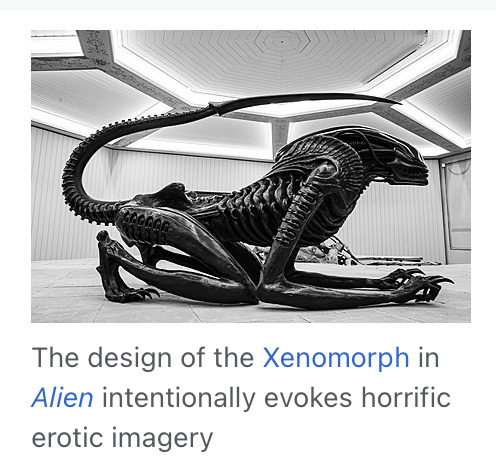
wait. he was supposed to be sexy??
23K notes
·
View notes
Text
CHILDREN'S SONG BOOK DEVELOPMENT.
Starting off this assignment I already have the sort of songs I want in mind. All of these songs will be more geared towards being "Child Friendly" rather than specifically targeting children, just for more flexibility in terms of options. It makes this assignment a lot more fun.
SETTING UP THE INDESIGN DOCUMENT: - A5 size 1754 x 2480 px - 12 Pages
CHOICES:
Are We Getting Any Closer - Songs Ohia Why? It's a pretty mellow song about getting close to somebody.
Place to Be - Nick Drake Why? This song is more poem like than the previous, it's more suited to these sorts of books. I would've just filled the book with nick drake songs, but I think having a wide array of different styles and approaches keeps the book fresh.
Potato Knishes - Ryan Dorin Why? This is an extremely surreal song that's just fun to think about, and it's about as non-sensical as some actual children's songs. The song itself is really weird and awesome, inspired by dadaism it takes advantage of a completely uncanny visual style to make an impact. I want to include the scene from the music video into my image.
Underground - Tom Waits Why? It's another absurd song, but it's much more grounded. It paints a clear image into your mind, which will be quite easy to put into an actual image for the book itself.
V. UNIVERSE - The Microphones Why? It's a song that helps you grasp the universe's immense expanse, and it reads like a really sweet kids rhyme. The song itself is something else (super atmospheric and scary), I wouldn't play that song to children, but I would read it's lyrics out to children.
Visualizing Each Song:
General Visual Style: For general visual style I want to think about what would appeal to a kid. OR firstly, I should probably think about what wouldn't.
No: - Visually Complex Images (because children are more likely to attach themselves to simple, approachable characters made from simple shapes). - Gore/Violent Images (obviously) - Sharp Shapes (rounded shapes are more appealing)
Yes: - Animal Characters (people aren't interesting to children, animals are much more appealing via their cute/coolness). -Simple, Vibrant Colours (Keeping things simple and visually eye-catching will appeal the most to children). - Fantasy Imagery/Abstract Imagery (Not everything has to be grounded, kids aren't picking apart all the aspects of these images, so making them visually interesting over keeping them grounded is probably the best option). A design style I want to specifically evoke is that of Scott Benson:

^I love his appealing and simple style and think it would work well in a children's book. TITLE PAGE DESIGN: I've made sure to paint all of these images in photoshop (illustrator for the vector images) with A5 sized canvases to match the InDesign file.

Here's a thumbnail I drew for the Title Page (Front Cover). I want the words to look like they're coming out of the trumpet the cat is playing. In terms of colours I'm Thinking about using orange/blue/pink, an unusual pallet, but I think it will work. I don't want to use any sorts of greens unless I absolutely have to cause it'll clash poorly.

Here's the final image. I think this palette works quite well, so I might just roll with it for the rest of the designs.

I've made sure to keep this document multilayered, adding as many layers as I could just so I can control all the aspects of the image.

^ Something to point out about this background I painted in photoshop is that I specifically designed it so it had depth and also vaguely looked like a city, just foggy. It lifts up the image quite a bit, looking more dynamic.

These abstractions exist just to fill space. The composition needed something, and I remembered that a lot of jazz album covers from the 50s utilize abstract art. So I just borrowed that idea for my own composition.

^This being one example POTATO KNISHES DESIGN


Here's the thumbnail I drew for Potato Knishes. It's heavily inspired by the video for the song.
^A screen shot from the music video (and yes, when I said surreal, I meant it). I felt like moving towards a more realistic interpretation of the character would go over better with kids. The character depicted in both the music video and my design is called Little King John, and he's lonely, so I tried to capture that here.

^This is my final design, I feel like it will pop against a good background. I'm quite proud of this, it really depicts the character of the lonely little king with only potato knishes to keep him company, all captured within this one image. Not having to explain much through the song. I think I want to make these images like that, with characters who are apart of the images that represent the songs. It's much more fun that way, and it's visually interesting for kids. When I was a kid, I remember that a lot of my favourite picture books would be the ones which depict a scene without text, one that implies something, it sparks the imagination. Obviously I have to include text here, but I want to lean into sparking the imagination of the reader. UNDERGROUND DESIGN
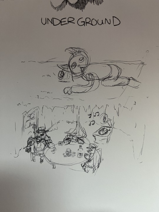
^This design for Tom Waits' underground depicts a group of moles living underground playing poker while a cat person above listens to what's going on underground by using a cup to amplify the sound. The inspiration for this is Tom Waits' curiosity for moles, so I thought it would be fitting to have the image depict them.

This final design is quite good. It properly visualizes an interesting scene that compliments the song.
UNIVERSE DESIGN
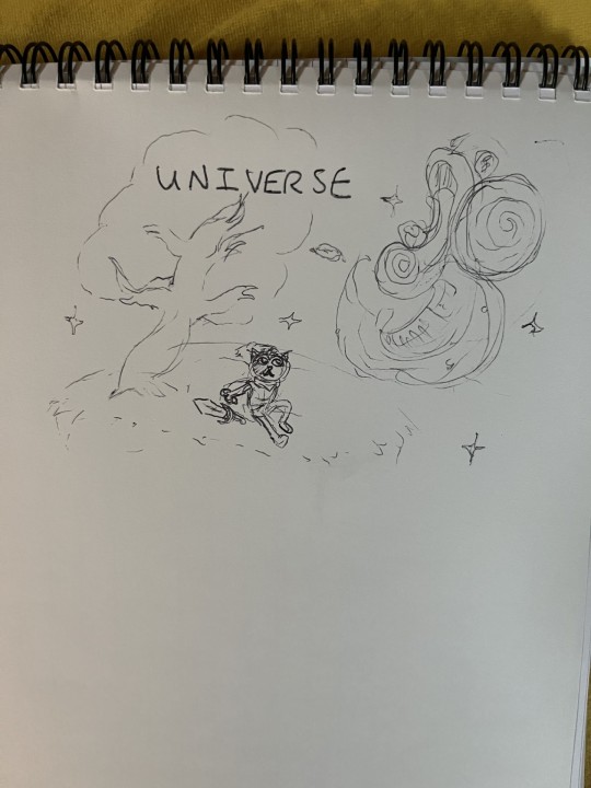
^UNIVERSE is a very unusual song. It hasn't much strong imagery within the lyrics themselves, but I based this design on the feeling I get when experiencing the totality of the lyrics. The magical wonder of the universe specifically is definitely inspiriting, and when listening to the song I imagine myself on a field looking up into the sky at night taking in it's sheer size.

^I've changed the design quite a lot from the thumbnail/concept sketch. I wanted to mix up the character a bit, taking a dog instead of a cat (too many cats already). I've also aimed to make a face in the sky with the moon as an eye, reflecting that lyric in the song itself "Oh, Universe, I see your face looks just like mine!". This design specifically evokes fantastical themes, which I like a lot. It's a consistent theme currently, so yeah.
PLACE TO BE: VECTOR DESIGN #1
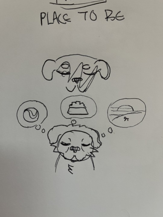
^ Vector Images are much more complex and difficult to pull off than the raster images I've been creating in Photoshop. For Place to Be I'm just going with a simplistic design.

Here I've utilized the Copy + Paste tool and the Reflect tool (O) to mirror the head shape for symmetry.

^This is my vector image. It's quite different, and it's hard to replicate the style I've been using in a vector image, so it's going to be a stylistic whiplash unfortunately, but it gets a idea across. A sad dog missing all the things he had, or a dog dreaming about the things he could have. Are We Getting Any Closer? VECTOR IMAGE #2
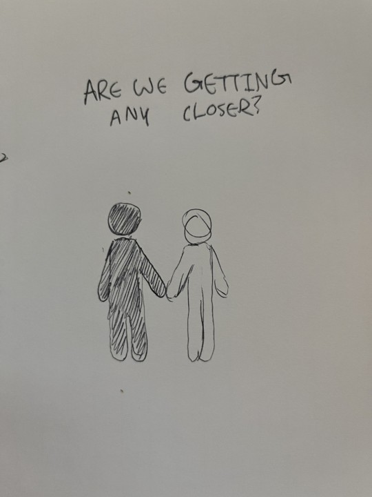
^Here I'm going for something Simplistic and easy to make. I'm running out of time. Since this is a song about getting closer to somebody, I am going to make that literal.

^This final design is simple, and gets an idea across.
MAKING THE INDESIGN BOOK
Numbered Pages:

^Just adding numbered pages to the document via the parent pages.


^All the songs are in including this contents page.

For the Title Page, I've researched this way of getting curved text. First, I make an invisible circle object, then I change the text tool to the "Type on a Path" tool which allows me to type on the curve on the circle.

^The raster image quality isn't great, I'll change that in the preferences.

^Changing the image quality.

^changing the colour of the pages. I might change them to a darker colour later.


^These are generally where I want the images to be in the compositions. I've also added some filler space where needed with the vector images with backdrop raster images.

^I've adjusted the parent pages with these pink borders I whipped up in photoshop. The frame really brings together a lot of the images and centers the eyes a bit more and fills a bit more space. I've also centered and lowered the size of the page numbers.
0 notes
Text
ryan dorin is a genius also and i wish he got more recognition
1 note
·
View note
Text

🌈🐾Im Em! I use any pronouns and im genderfluid. I like drawing silly guys and joining wayyy too many fandoms lol. ✨🎉
🦝🧁Im autistic and dyspraxic and I struggle sometimes with memory so please be nice lmao 🎂🦨
🐶💫I like writing and making comics for funsies, my main two currently being my HTF fancomic No Control and my Sparklecare rewrite Crackcare. I make them purely for fun so I apologize if the writing isn't exactly great lol✏️🐀


🎉Im in MANY fandoms. This might not even be all of them but eh🎉
Dhmis 🌈🩸
Welcome home 🏠👁️
OSC (Bfdi, II, etc) 🔥🍃🫧
Furry fandom 🐾
Ringtone Deathmatch 💀🧸🩸🦔(No I dont support the weird controversial stuff in the pilot. I just like Host, Psycho Teddy, and Punk Porcupine. I have my own rewrite au.)
FNAF 🐻🐰🐥🦊
Salad fingers 🥗
Bugbo 🐜🕷️⚫🦗
ENA 🟨🟦
Bluey 🐶🐾
Mascot horror 🎉✨ (Poppy playtime, Rainbow friends, indigo park)
Trevor henderson creations 🚨🌲
TADC 🎪🌈
My Friendly neighborhood 🧦🌞
Imaginary friend asylum 🃏💫
Mlp 🐎🏳️🌈
Roblox ✨
Ratboy genius 🥔🐁(I dont support the weird antivax stuff Ryan dorin does)
Moshi monsters 🎩
Happy tree friends 🩸🐇🫀
Max design pro 🐵🍗 (yes I know it's brainrot but the toxic yaoi is funny)
Goodbye Kitty 🧶☠️(i do n o t support the weird and very very outdated stuff in the show, I just like stupid murder cats. I also hate Todd Goldman so much. Ive basically kidnapped his ocs and they are mine now and in much better hands)
Making fiends💙💚
Unicorn wars🧸🦄
Dandy's world 🌼🖤
Bunny Maloney🐰💸
Club penguin shutdown 🐧🩸 (I am aware of the allegations against the creator, and if they're true I do not support them)

❌People who post NSFW or proship content please DNI with my profile. I am a minor and that kinda stuff makes me very uncomfortable. Also, people who are racist, ableist, transphobic, homophobic, etc please also DNI. Israel supporters please DNI, free Palestine!❌

🎨If theres anything you'd like me to draw related to any of my fandoms please feel free to send me an ask with your request! Only rule is that im not comfortable drawing nsfw art, or characters from fandoms im not in (I will draw ocs tho!)✏️
✨ I also take blingee requests, just send me the picture you want blingeed and what aesthetic you want!! 🌈
🌟✨Main thing I'm taking requests for rn!: Happy tree friends✨
Go read my htf fan comic NO CONTROL!
Go read my sparklecare hospital rewrite!

#welcome home#the amazing digital circus#tadc#dhmis#poppy playtime#mlp#ifa#tfwlb#fnaf#furry#osc#bluey#trevor henderson#salad fingers
63 notes
·
View notes
Video
Totino's Pizza Rolls - 'Toti' from Emma Debany on Vimeo.
The secret alternate ending to the Totino’s Pizza Roll ‘Ask Mom’ commercial. Most of this was shot in twenty minutes after wrap.
Legally, this extended cut is a short film, not an ad. :) Honestly I'm not sure if Totino's even knows about this so maybe don't tell them.
Talent: Toti - Josephine Arciaga Teen - Johnny Briseño Store Manager - Emma Debany
Director - Emma Debany Agency Creative Directors: Bo Jacobson Alyssa Ollis Agency Producer - Emily Brown Executive Producer - Malcolm Wax Head of Production - Tony Galante Producer - Brandon Robinson Production Manager - Brendan Lynch Production Coordinator - Federica Schiano Lomoriello 1st AD - Jesse Hays 2nd AD - Christina Mitchell PAs: Eric Cepeda Nick O’Neil Diego Lopez De Anda Zechariah Gonzalez Yuri Brito Brad Beltran
Cinematographer - Bryant Jansen 1st AC - Chris Macdonald 2nd AC - Loren Azlein VTR - Jeep Thatcher DIT - Daniel Woiwode Sound Mixer - Chase Yeremian BTS Photographer - Rachel Martin Gaffer - Tony Jou Best Boy Electric - Braden Barton Electricians: Tanner Johnson Tyler Billis Key Grip - Aaron Burton Best Boy Grip - Agyeman Johnson Grips: Hayden Miller Garrett Dorin
SFX Makeup - Ally McGillicuddy SFX Makeup Fabricator and Assistant - Caitlyn Brisbin MUA Assistant - Edwin Monzon Hair Stylist - Richard De Alba
Toti Costume - Abigail Keever Costume Stylist - Laura Francis Costume Assistant - Amy Fay
Production Designer - Joe Holliday Art Director - William O’Donnell Prop Master - Kate Simmons Set Decorator - Kassandra DeAngelis Set Dressers - Nick Jones Rebecca Steele Alice Ross Fabricator Assistants: Shannon Pollack Tara McNamara Graphics - Laurah Grivalja
Home Economist - Marah Abel Home Economist Assistant - Lisa Walgren Food Stylist Truck Driver - Richie Jacobo
Craft Services - Karla Maria Padilla Sustainability Coordinator - Nik Eco PA - Grace Hofmann Site Rep - Sean Location Manager - Percy Haverson
Sound Design and Mix - Evan Anderson Music - Tyler Monsein Lyrics and Singer - Emma Debany
Editorial - PS260 Editor - Tyler Hurst Assistant Editor - Cole Wagner Managing Partner - Zarina Mak Executive Producer - Zeke Bowman Head of Production - Evann Payne
Finishing - PS260 Producer - Yoko Lytle Flame Artist - Mark Popham Creative Director - Marcos Pacheco Graphics Artist- Michael Yu Flame Artist - Stephanie Issacson Color - Company 3 Colorist - Tim Masick Producer - Ryan Moncrief
Special Thanks to Sloane Skala and Josh Ferrazzano
0 notes
Text
Pilot project to protect elderly is the brainchild of Corrimal Fire Station captain
Corrimal Fire Station Captain, Paul Dorin, State MP for Keira Ryan Park, and FRNSW Acting Commissioner Jeremy Fewtrell INSPIRED by a Corrimal firefighter’s own experience in caring for his mother with dementia, an innovative use of smartphone technology is being trailed to protect elderly and vulnerable people from house fires. Fire and Rescue NSW (FRNSW) is partnering with care providers to…

View On WordPress
0 notes
Text
Desperately awaiting Ratboy Genius to start a new story arc
There’s something really special about this series, man
7 notes
·
View notes