#proportions are actually correct lol
Explore tagged Tumblr posts
Text
It is time for the exchange @brick-a-doodle-do
I give you Mayhem Trio’s first all the same size hug after they found a shrinking potion for @orchid-harmony
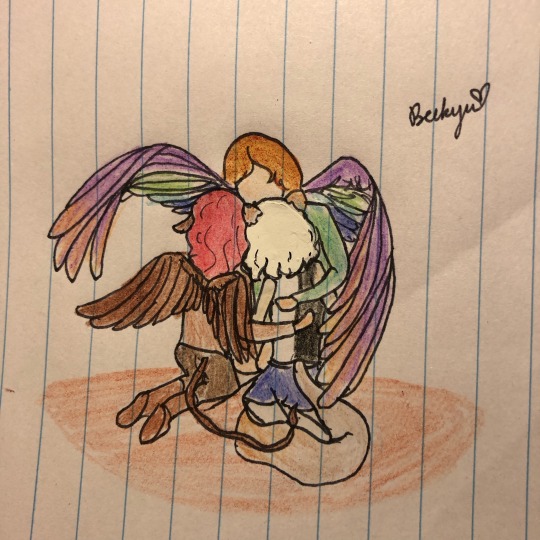
Tis a very special moment for the 3 of them❤️
I’m also very mad that I’ve misplaced my sketchbook during the move and had to do this on lined paper >:|
#mayhem trio#c!beckyu#c!brick#c!orchid#oc sonas#beckyu arts#we are having an extremely special moment#never before have we been able to hug like this#I’m also very aware the c!bricks wings are probably bigger than c!Beckyu’s but for the purpose of this drawing let’s pretend the size#proportions are actually correct lol
17 notes
·
View notes
Text
SO as an aromantic villain liker, I have to admit that whether aro or not, there's something compelling about Philip perhaps clinging to Caleb in part because of an alienation from the Other way of acquiring a Good God-Loving Family in his day and age. because if Caleb spurns their witch hunting dreams to go fall in love with a witch that's a perceived betrayal to Philip on two fronts, the witch sympathizing and the abandoning Philip for romance. it's compelling in a "Belos selectively ignores all the norms of his own oppressive belief system that he spurns, when he could have easily found a home amongst the freaks if he let go of his hate" way. it's compelling in an "adds even more parallels to Lilith, who avoids following his path, and shows that people who start in a similar place, with both genuine flaws and genuine instances of being wronged by the world, the latter not entirely unrelated to aromanticism, are still able to find joy instead of hatred, because aromanticism is not a destiny to endlessly suffer nor a destiny to do evil" kind of way.
BUT. unfortunately. I've seen way too many posts that just spew garbage like "Belos is evil because he's incapable of love, obviously! and the heroes are good and moral and (cough) not subhuman (cough) because they actually love people 🥰," just total horseshit right at the intersection of aphobia and ableism. just a total admission that they don't think love can ever motivate people to hurt anyone, that they don't think they can hurt anyone they love and no one they love could really hurt them, that love is a get out of jail free card when doing harm while harm is a get banned from love and humanity permanently card, so. basically, we can't have nice things.
#i'm not plugged in enough to the belos fandom to know if i'm kicking a hornet's nest or not here lol so i won't tag him#also because i'm apologetic for posting about belos! because the whole extended wittebane family is so Overdiscussed#not poorly written in the show. but So Overdiscussed when the literal protag never lands in the spotlight outside of shipping#but you know. sometimes i'm just correct about the Overdiscussed character! and the world needs to know!#the owl house#toh meta#now i will return to making aro headcanons for less popular villains#in fandoms with a slightly higher proportion of actual adults#because i'm not a masochist!#and also posting more about non-blond-man characters in TOH because that's straight-up what they deserve
43 notes
·
View notes
Text
Follow up question! Well, follow up in that I keep forgetting to ask, it's otherwise completely unrelated: 3. do y'all have any recommendations for where to buy bras online? Not sports bras and not pullover ones, my ribs are too messed up to reliably be able to not get stuck in bras without clasps lol
Hey y'all! Two questions, for once not that weird lol 1. do you have a recommendation for a crocheted hexipuff blanket pattern? (if I am remembering that those are called correctly) 2. I got some small pieces of the like thermal insulated batting in a box of scraps and it makes a pleasant crinkly noise when moved. Do y'all know if it's machine washable (when inside a finished object) and do you think it would be good to put inside like stuffed animal ears as a fidget toy kind of thing?
#the person behind the yarn#I have a uh atypically proportioned torso#on account of the odd mix of genes I got from both my grandmas#(I inherited my grandma's mini version of a barrel chest but my other grandma's cup size lol)#that mean I need a large cup size but my torso is not very wide from side to side#so frequently when the band size is correct the underwire is too wide and tries to stab me#but the band size I need is small enough that wire-free bras do not usually come in sizes that actually match what I need#without the band being too big to actually fit#but the fabric wore out in the back of one of my few remaining bras#in a weird. somehow both stretched and torn and not torn kinda way#so I really really need to find a replacement
20 notes
·
View notes
Text
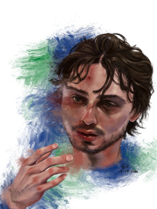
who is #43?
Hello !! First off thank u for visiting. If you clicked read more by accident rip sorry it’s a lot of text. ENJOY!!! <3
1. This was the photo reference I used. I really did mean it when i said he photographs well!! I really like how scrungly he looks at times lol. v paintable
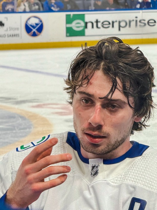
2. here’s a timelapse for your viewing pleasure in video + gif form <3

3. Process breakdown below. I am not formally trained, so don’t take any of this as professional advice!! The way i paint has been compared to channeling some evil contract with a demon also. So um . Im saying that i dont remotely think that this is efficient or correct, its just whats comfortable for me <3
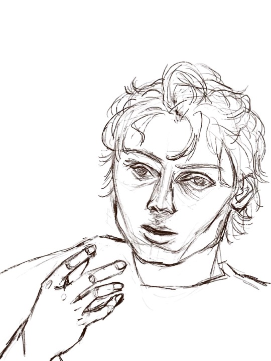
3a) the dreaded lining phase. I have 2 modes of operation when it comes to painting - either i go full-dick with fancy inking/sketching + cel shading (rare, unrefined, haven’t figured out a nice workflow yet) OR i do a very very basic chicken scratch set of lines like so:
It’s less about being realistic here and more about laying down some guide lines for the chaos ahead. If i thought i could get away with it, I would start every rendered painting i do with laying down colours — but unfortchh ive tried that before and it usually ends in really weird proportions. Even with the lines i still need to make adjustments. This is something no people except me would notice but look at the above sketch; the eyes are too big and slightly too far apart, the forehead is too small and thus the hair is also not quite big enough… I have a bad habit of drawing eyes too big on faces, they’re my favourite facial feature to draw.. i barely resisted giving him big cow eyelashes (I love big cow eyelashes… all of my OC’s and most of my more stylised fan art of characters get big cow eyelashes… god…. Big cow eyelashes SAVE ME……….)
Anyway. Structure of the face + hand somewhat established. <3
3b) Underpainting!! Okay stay with me here . Ever since i figured out i dont have to paint in 03925893853 different layers, I’ve joyfully painted on 1 layer as much as possible. I dont have the brain power all the time to be managing layers so I simply dont work with that many layers. For this painting, the skin in its entirety was painted on one layer, the hair on another layer, and the effects on the last layer. There was a placeholder background off-white/grey colour for a while there, and I duplicated the line layer — one for figuring out where to lay colours, and one hidden for later so i could check back to see how accurate to the sketch/proportions were to the actual painting. 6 layers, 2 of which i painted the bulk of the piece on, 1 more at the end.
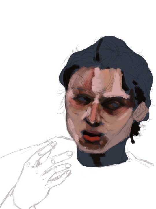
3c) here’s where I started carving out features. I think about objects in terms of volumes and light rather than lines. i love painting and sculpting because of this!! Here you see where I’ve begun to define his features — his eyelids, his bags, his nostrils. Just refining what was there before. The suggestion of facial hair before i gave it up and left it for later (his face is so naked the WHOLE time)
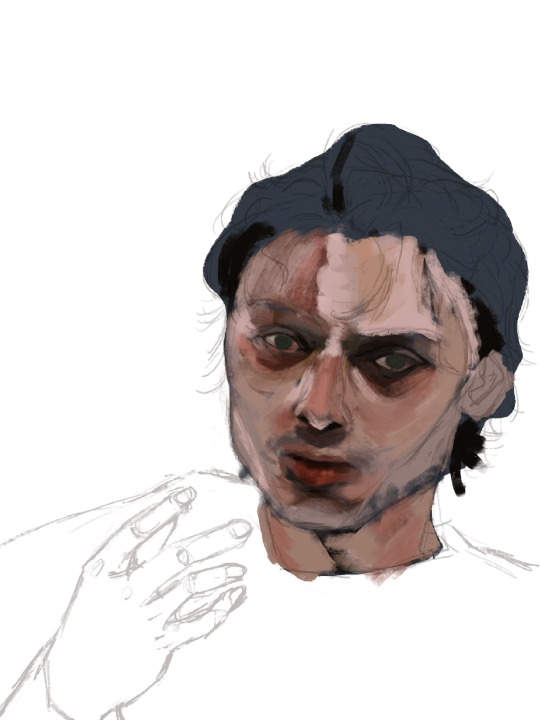
3d) nose bridge highlight, suggesting his eyebrows, a cheek highlight. A touch more coral red and muted yellow pull away from the grey/blue underpainting. Strategically leaving some of it peeking through.
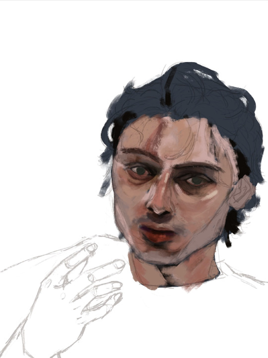
3e) i truly start messing with the fidelity of his features here. Red lipstick <3 and some violet/blue for shadows on the right side of his face.

3f) the part where it starts looking like q.hughes to me (though, my friend said i got his vibe pretty early on which is such a compliment.. waaaaa…..) I love this part of every painting i do. I know it’s definitely not the Correct order since other parts of the entire painting are simply Not Rendered or Done, but whos gonna stop me?? :3
I love love loveeee painting faces. Adding the little shinies to his eyes + lips + upper lip + nose … you don’t know how much of a difference it makes until you do it. Also i snatched his eyebrows
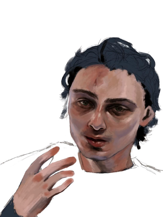
3g) i really pushed the red/coral/ochre/orange here. Note the yellow highlights on his cheekbones, the forehead, and the thin thin line of pink right between where his bottom lip ends and his chin shadow starts <- very important . To ME!!!!!!! Also highlighting his waterline and adding his lashes was so so fun <3
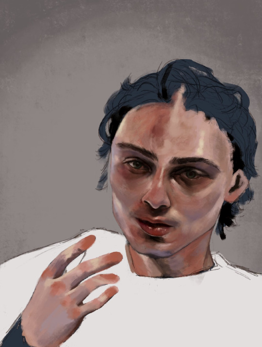
3h) FACIAL HAIR!!! And I started rendering his hand. Some micro adjustments made to his face for proportion check.

3i) i start painting his hair in earnest and realise his forehead is too small so i make the adjustment. I really love how it falls into his eyes in this photo. <3
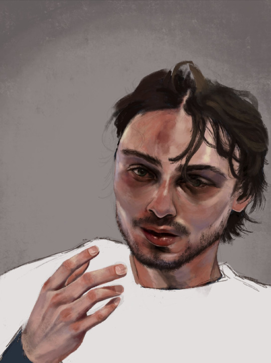
3j) i make some final adjustments to his eyes — a bit smaller, closer together. And i refine the outline of his jaw, push the stylisation of it just a little.
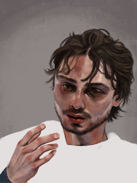
3k) Finishing details; his flyaway hairs, his moles, a bit of texture on his face, shadows cast by his hair, his little forehead cut <3
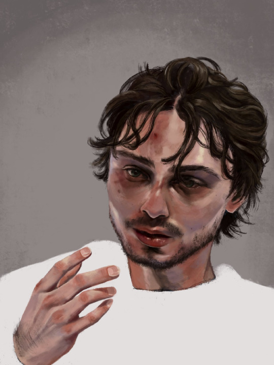
3l) i adjusted his hand here, added more texture to his skin, refined his hair a tiny bit more, and made the decision not to fuck around painting his jersey because i wanted the focus to be his face <3

3m) Canucks blue and green. Captain at 23. His form bleeds into the background. He is the franchise.

theee most fun ive had painting anything. and i finally feel... warmed up? if that makes sense. art for me is like. if i dont do it in a while it feels like nothing goes right when i come back to it. i hate that feeling, and the most difficult hurdle to clear is letting myself feel that until i get back into my Zone. after all this time i feel like im BACK !!!!!!!
i loved painting this fella. hes SO Shaped. <3
Apologies i simply do Not have the energy to write the alt text for all of these so i hope the little blurbs are okay aslkjasdklj. i gotta post and go to bed . if u made it this far, thank you for reading!!
#details and process under the cut ….!#god… it really is like . they let anybody be in their mid 20s these days??? (<- guy in his mid 20s)#quinn hughes#vancouver canucks#hockey art#puckpainting#<- abandoned wet rat of a tag. rarely used
153 notes
·
View notes
Note
Do you have any advice on how to begin drawing a cetacean? When I'm drawing terrestrial animals, I can break them down into simpler shapes pretty easily, but cetaceans are just Big Tubes and I'm completely stumped on how to start
(Disclaimer that my work is rather stylised, so I'm not looking for advice on photorealism! Just any advice you have in general. I admire your ability to understand and render these sausage-bodied beasts)
Hi! That's an interesting question. I have to admit I had to draw a couple of dolphins first to see how I actually deal with them when free-handing lol. So much of my work as of late is scientific illustration, where in many cases I can build upon my own older illustrations. The new pieces are always 100% new, but correcting a base - however poor - is easier than starting from scratch.
Before I go any further let me stress the eternal importance of references. I can draw a dolphin fine from memory but for it to be actually accurate I need references. I always use them. Especially when it comes to weird poses or angles, but even for illustrations I will reference 25-50 photographs. Use them, study them, find them. They are a resource not a cheat.
Also, years ago I actually started work on a whole series of dolphin drawing tutorials. Or rather, collections of notes and tips for different topics (anatomy, differences between males and females, colouration, variation). Looking at the files now I see I had actually written and drawn a frightening amount already. Perhaps I should try to finish them? Is that something people would be interested in? Anyway, it starts off with a word of encouragement, which I do want to share here:

Actual advice is below the cut:
ONTO METHODS - illustrations
I found that for me, my method depends on whether I'm making an illustration or a full scene painting. For illustrations - which are in flat side view - I actually embrace the sausage. I drew a dolphin for you and saved the steps of how I go about it.
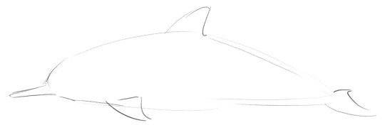
And this is the first. I start with a sort of flat-bottomed airfoil shape, and then add fins and a beak in approximate locations.

Next is refining the appendages and giving a face. Shape and placement of appendages as well as eye and mouth line is all experience and/or reference work.

Then comes fixing what I messed up lol. I always make the head too big first try (would have been good for a baby dolphin though!). Using cutting/transforming/moving selections around I correct proportions to what feels correct to me (again, that part comes from having seen and drawn a lot of dolphins).

Add some markings and hooray we have a spinner dolphin! This is the part where I would seriously start consulting references to check all the details and proportions are in order. If you don't need (photo)realism you can skip that step and use refs further back in the process just to get the shape/idea/colour of the species you're trying to paint right.
MORE METHODS - for different poses
When it comes to dynamic poses, my workflow is completely different. I just start from the nose and build my dolphin from there. Because as said above, they do have anatomy. And I think the way the beak flows into the cheek, the eye bumps connect, then the curve of the throat, the attachment of the pectoral fin, the way the belly curved up towards the genital region, the slight bulge behind that, then the muscles of the peduncle which flow into the flukes - I think the relations between those separate parts are enough for me?

These are the little dolphins (and a porpoise) I sketched from memory. In all cases I started from the tip of the nose and built from there, with minimal or no adjustments/erasing along the way. It was very much outline work. Details on eyes, mouth, etc, would come later. The killer whale is a bit different and got way more detailed than the rest. With such a front view angle I do use some spherical shapes to break it down for the body and face.
Otherwise I've never really liked or used the method of breaking an animal down into shapes, it never felt logical or intuitive to me. My "method" (if you can call it that lol) just comes from having drawn a lot of dolphins. I don't know if it is necessarily helpful when you want to get a grasp of them when starting out. Regardless I do hope this answered your question somewhat and you could get something useful out of it!
Also, I realise now I mostly talked about "standard "dolphins - for whales/short-beaked smaller cetaceans/etc my process is mostly the same, except their heads just have different shapes.
#namtalk#tutorial#sort of?#i always wish I had a clearer answer to these kinds of questions!#but i do hope this is still helpful#seeing those old tutorials also really makes me want to finish them#so many projeeccctttssss
31 notes
·
View notes
Note
Hiiii I love the way you draw the trolls!! I know this is weirdly specific but how on Earth do you draw the hands ;w;
I've (mostly) got the hang of troll anatomy with the feet, torso- even the neck and head but my gosh I cannot get the hang of the hands and arms. Do you.. mayhaps, happen to have any tips for a beginner artist? Or possibly a reference handy?
This is kiind of difficult to explain bc in my head it's just. I Do It KGJFH which I know isn't exactly helpful so I am gonna try my best to explain my process
I am gonna be describing how I do it in My style so there's gonna be discrepencies between how I do it and how they look in the actual movies, but I hope it helps break em down enough?? Idk we'll see
Gonna need a diagram to help bc it's easier to show than tell so uhhh hey Branch

So, I know you're asking for hands but yknow arms are part of it lol, so the trolls in the movies do have arms that go from slimmer at the shoulders to wider at the wrists (there is a word for this. they taper?? I think?), I tend to exaggerate it a little just because it makes more sense in my head and for me personally is easier to draw, think of em as like little teddy bear arms lol

Some proportions in Trolls (and to how I draw anything generally lol) are incredibly flexible so it really doesn't matter how good you are at anatomy, the idea is to make it look good moreso than make Sense a lot of the time, as long as it looks vaguely right then you're on the right track :P
Now for what you actually asked for: The Hands!!

Troll paws are real nubby little things lol, but they do operate just the same as any other regular hand you would draw, just a lil more squart and missing a finger sgfdhf
Think in more Rounded Rectangles than anatomically correct hands. I think that instead of the three knuckle joints humans have, it is easier to picture them as having two (I think that's how it is in the movies anyway?? icr lol) The knuckle where the finger connects to the hand and then a single joint in the middle of the finger to allow it to yk actually bend LOL
Also drawing hands in general, The little chubby bits on the outside of your hand under your pinkies and thumbs are really useful guidelines for me personally, so it's good to know if that helps you too ^_^

As for actually connecting the hands With the arms - Again this is for my style, it's not really how it looks in the movies I don't think but, it's close enough that I get away with it FHGFJH

So, generally what I'll do is I'll connect the back of the arm to that first knuckle, usually making a little triangle where I guess the back of the hand is??? This can be squarshed and stretched as needed, I usually don't even think about it tbh but I did notice that it's there DSGFDHF

And here's just a couple other angles of hand arm connection. Otherwise, yeah, they do basically just work like regular ol people hands they're just a lil chunkier hehe
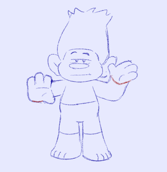
Also you can hide a bent elbow behind a hand nobody has to know.... as long as it lines up it doesn't matter... GHKFG
Thank you Branch for being our wonderful hand / arm model this evening
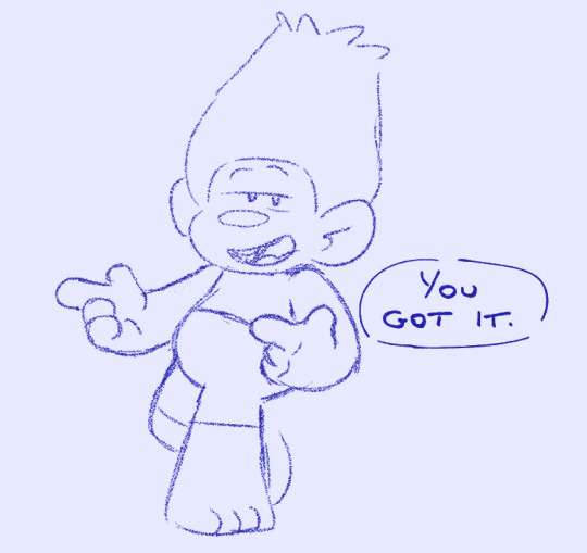
And I hope this was in any way at all useful!! If you'd like any more explanation or have any other questions feel free to lmk!!
#dreamworks trolls#trolls branch#art tips#mydoodles#I love getting these kids of asks I love to helping people#especially with art related stuff ^_^
63 notes
·
View notes
Note
#i could name at least three examples off the top of my head rn pls do, I love this messy webbed site and wanna remember our collective cringefails
another person on anon asked me this so @ that person I am also answering yours <3
the absolute worst offender of this in my opinion is the banana milkshakes in Paris thing. please genuinely correct me if I'm wrong but I have yet to see an actual source of paul saying that that isn't just a tumblr post. as far as I can tell someone literally just made that up and tumblr ran with it
the second I can think of is (at least in my opinion) the whole India thing, I think it's been blown very slightly out of proportion. don't get me wrong it's a significant period in beatles history BUT I don't think it was as significant for j+p/their relationship and some make it out to be. like for example I don't believe there was One Massive Fallout that happened there that kickstarted the breakup, rather a lot of smaller things that happened before and after the trip
the third is more general but I think biographies need to be taken more with a pinch of salt and less like they're infallible sources of absolute fact. one thing that really snapped me out of this was Chapter 26 of Craig Brown's book 150 Glimpses of the Beatles, where he talks about Paul's 21st birthday party. He takes sources from multiple biographies/autobiographies talking about the party and the incident that happened there, and the amount of inconsistencies between some of the accounts (not to mention how overdramaticised some of them are) really woke me up to how you really have to read those books critically and not take them at face value. human memory is so unreliable lol
if anyone can think of any more pls feel free to add
40 notes
·
View notes
Text

Hello! I wanted to make this post because it has been about a week since I last posted any new art. I don't have any finished work to show at the moment, but I do have some progress footage. I also have some extra information about the last art I posted, including the shader I made for it.

So far things are going very smoothly. I am almost finished sculpting and rigging Narinder. All that is really left to do is make some weight painting corrections (and maybe turn the eye holes into actual eye sockets).

Narinder's head was sculpted from the ground up. However, for Narinder's body, I instead modified the free base mesh assets provided by Blender to have the proportions and features I wanted. I connected the body and the head as best as I could (my topology work is not very good lol), and here we are.

After I make the final touches on Narinder, I will need to model and rig the lamb. Now that I have some prior experience, I am hoping the process will be faster. Once I have them both modelled and rigged, I can finally realize the ideas that have been plaguing my mind for the past 3 weeks. I will be modifying Narinder a lot more once I develop a design for him that I like.
Here is a list of some of my ideas so far:
-narilamb brainrot
-narilamb brainrot
-narilamb brainrot
-stylized renders
-narilamb brainrot
-cyborg/robot narinder
-narilamb brainrot

I want to show a "behind the scenes" for the last piece I posted. I had already sculpted Narinder's head when I started making this piece, so most of the work was making the shaders.
The "swirl" surrounding Narinder is an extremely deformed torus knot. I used an equation from Wikipedia to make geometry nodes to generate it.

Narinder's eyes were made by plugging in unusual values into that equation.

Making the shader for the swirls was the most challenging part. I heavily modified an existing shader from some album art I made for a friend last year. The piece was originally going to be a lot more colorful. However, no matter what I did the colors in the swirl kept clashing with Narinder's silhouette.

This is what drove me to make it only red and black. I eventually fixed up the colors, but it was really lacking something. After trying a few different modifications (example below),

I settled using the ray portal BSDF node. You can get some crazy results with ray portal BSDF by plugging in random values into the "normal" and "direction" vector inputs. Once I was satisfied with the result, I used GIMP to color-correct and make the lighting a bit more interesting.

Here is the shader for the swirl. The image used in the image texture node is an image of my friend, but you can use whatever image you want. I don't think it affects the end result that much. (I'm not organized lol)


22 notes
·
View notes
Note
I have always drawn in a near realistic style, so the art of simplification in animation is simply incomprehensible to me. I mean.. You look at this medic and think "God, it looks so nice", while the proportions of his face are very different from the real ones, but this does not cause rejection. When I was trying to master the cartoon style, I realized that I was subconsciously trying to make faces "more correct", I was afraid of hyperbolization, on which cartoons are built. So I just want to express my admiration for your skill to simplify and detail when needed XD Great style, I have a lot to learn.

thank you so much for the thoughtful and detailed comment!
sometimes...replicating art styles like tf2 which are already so stylised is difficult. the base layer is always realism, then you layer the sources stylisation and then you layer your interpretation on top of that...it can end up like a huge tall wedding cake. more knowledge of realism will never be a bad thing though as a cartoon style is always trying to simplfy the realistic form...it's hard to simplfy when you don't actually know how something looks! one tip i find with images like this is to highly focus on one element, medium-focus on another and then low-focus on another (aka half-arse this element). this will give the image a 'flow' or 'rhythm'. Here the hair was my high-focus (it's the element with the most detail and brush strokes), the face itself was medium focus (very complex around the eye and eyebrows) and the clothes and eye itself were low focus (the contrast of medium focus around the eye vs the low-focus of the eye itself makes the viewer look there). if you give elements in an image this varying levels of focus (or effort) it also makes it quicker and easier for you to draw! :D its funny you mention his proportions though - i was looking back at this recently and really wanted to tweak a few things. there's something squiffy about the neck and the 'depth' of the head is something i struggle so much with (and eye placement). he's also too young and handsome LOL oh well - i'll try and apply to future drawings 🙏
175 notes
·
View notes
Note
story prompt: a couple of witchy gay guys are sat on a beach people watching and making minor modifications to passersby until the beach is suddenly a catalogue of hunky men with outrageous proportions
Witchy gays are a large part of my friend group! This was fun, also made me realize I need a more coherent mechanism for how magic works (beyond verbal suggestion lol). Ended up a quick mix of dick growth, ass expansion, a little bit of macro if you stick around til the end.
1101 words
--------------------------
"He could start a small country with that thing."
"Was that one you or me?" Olly asked, his head slowly following the sight of an overstuffed speedo bouncing between two tanned thighs moving with sudden awkwardness across the beach. Its owner glanced down with a look of worry as the waistband of his swimwear drooped farther from his actual waist, weighed down by the unexpected mass stretching them to their limit. The worry turned to a flush of embarrassment as he made eye contact with Olly, who wasn't even bothering to hide his attention behind the pair of sunglasses dangling just below his chin. "Either way, fantastic work," he said with a wink at the overendowed beachgoer.
"That might have been a group effort," said Amir, turning to his friend. "He's always here when we are. Bad timing, I guess."
"Tragic, really. Not to mention he's definitely a grower. Must hit fifteen, sixteen inches when he really gets going."
"Let's not go overboard," Amir warned. "This isn't exactly in the rulebook."
"It's not against the rulebook, either. It's just practice, right?"
"Yeah, of course. They kept warning us that body mod spell work is complicated and risky..."
"So we get the feel of things by trying out minor shifts."
"Inconsequential changes."
"Negligible adjustments. No one gets hurt. Unless our regular ends up tripping over his own--"
"Careful! The spell's still active."
"Oh...shit..." Olly trailed off at the sight of a silhouette walking towards the sunset, a third shadowy limb swinging down past his knees and seeming to droop even further towards his ankles. The tatters of a speedo blew across the sand as he tried to hold his gargantuan cock complacent through a panicked scurry back up the beach, onlookers not hesitating to unapologetically hit record.
"We're gonna be hearing about that, aren't we?" said Amir. "This beach is already developing a little bit of a reputation for its...proportions."
"Well ok, we might be getting better at this than we thought," offered Olly with a smirk. "Maybe too good."
"You're sure it's not just because we're sitting on top of a half-assed transmutation circle?" Amir lifted a corner of their shared beach blanket to reveal a softly glowing sigil partially buried in the sand.
"A half-assed transmutation circle of our own design," corrected Olly. "Besides, there's nothing half-assed within a half mile, thanks to you."
"I like what I like," Amir blushed, gazing around at a landscape of astonishing bubble butts. Each a unique variation on themes of perkiness, roundness, muscle, and mass, yet most all of them visibly beyond the realm of quotidian normalcy. "At least most of them can still reasonably shove into normal pants. We learned our lesson after, well,"
"Right," said Olly, eyes drifting up to the lifeguard tower. "I think 'beachball buns' may have been a bit much."
"He broke the sides of the chair," said Amir, thinking of the lithe, toned lifeguard who had been trying to play it cool for as long as possible as his cheeks inflated to catastrophic proportions. "He could barely make it down the stairs."
"Yes, and now we know about sudden shifts in centers of gravity," said Olly, reminiscing on the sight of the lifeguard's bodacious bubble butt jiggling out of control, throwing off his momentum as he tried to make it down the steps.
"Where's he even going to find new swimwear that fits?" asked Amir, still fixated on the memory of those stretchy trunks ripped to shreds as he trudged up the beach with his newfound counterbalance, trying and failing to hold the pieces together and cover up his globular cheeks. "Or anything that fits."
"And the look on his face trying to squeeze back into his car... Someone had to shove the door closed from outside. It went viral overnight. Definitely your best work," Olly smiled at his friend.
"Ugh," Amir fell back onto the towel, resting on his elbows. "We need to be more subtle."
"Fair enough." Olly locked eyes on a beachgoer waist deep in the water, his impressive musculature glistening in the setting sun. "Like just improving what they're already going for." The swimmer paused for a second to wriggle his shoulders as they inflated into noticeable boulders, his back widening with striated muscle.
"Right, just little boosts here and there," said Amir, as their new target turned around to reveal a juicy pec shelf expanding inches in front of him. With one hand worriedly kneading his sensitive tits, he started moving to the shore. As he emerged from the water, he seemed to keep rising, stumbling awkwardly as his body lengthened upward by a foot and a half. "Was that you?"
"Like you said, just little boosts."
"I think that was more than a little. I meant just enough for a little wardrobe malfunction." As if on queue, a comically large dick fell out the leg of his trunks. He hurriedly tried to maneuver his hog back above the hem, positioning it around one thigh, tears showing in the thin fabric as it jumped a couple inches in girth.
"Not two in one day," Olly mocked.
"I don't know, maybe it's something in the water." Amir gestured dismissively on the last word, only noticing the sparks of chaos magic fling off his fingers when it was too late. "Hm. We...should...go. I think that's enough for today."
They began packing up their beach supplies and knocking sand off the sigils, carefully placing them in their packs as a growing panic crept its way from the water up the shore, beachgoers slowly and inexplicably inflating with mass. The new lifeguard, whose buns were already on their way to beachball size, blew the whistle, calling in swimmers from farthest out. His face flushed as they approached the shore, rising fifteen, then twenty feet out of the water, Olly and Amir narrowly dodging the shadow of one kayak-size foot that came crashing down onto their stuff.
"Oh, uh, sorry," came a deep booming rumble from above, massive finger daintily brushing off the remains of their sigils, their glow fading away with the setting sun.
"No problem, dude!" Olly yelled up at the giant only to be met with the sight of a gargantuan prick swinging just above his head, oozing a small river of precum.
"Wait..." his face was slowly turning to terror as he realized his chest cleared the lifeguard tower. "What's...happening to me??"
The two friends looked at each other for a long moment then turned and began digging through their backpacks.
"Ok," said Amir. "Let's jot that down."
13 notes
·
View notes
Text
How big is the Ghenis?
Reminder:
i'm stupid and i suck at maths so this is probably wrong
this is just for lols
i definitely fucked up with pixel measurements bc i used picsart
don't bother correcting me, it's not worth it, my results are funnier anyway
General assumptions:
According to Tobias, both Papa I and Papa II are around 6 feet (~183cm) tall. However, the fandom seems to go with the headcanon that Secondo is 6'2" (~188cm), so I'll calculate both. I'm using centimeters because I'm Polish and while I am also a masochist, I'm not that fucking mad. I will offer the final product in both cases in inches tho so y'all don't eat me.
According to Wikipedia:

So we'll use that as our base and assume Secondo is 8 heads tall. According to the same article:

So let's start with calculating those as a base. Since Tobias Forge has rather long legs (as seen below), I'm going to go with "four heads" rather than three and a half.

If we go with 183 centimeters tall Secondo, our proportions would be:
One head (1/8 of full body height): 22.8 cm.
Legs: 91,5 cm from floor to perineum (basically crotch)
Arms: 68,6 cm (I'm assuming from shoulder to wrist, since hand is mentioned seperately in the article)
Forearms: 34,3 cm (since the shoulder-to-elbow and elbow-to-wrist are relatively the same length)
Thighs: 40,7cm (according to a mess of a calculation that I won't get into because fucking hell)
During the fateful shot, we can see just a little bit above his knee, so for the sake of calculation we're gonna assume we can see the whole thigh, which is (according to Picsart) 155 pixels.
So, for the sake of calculation, 155 pixels = 40,7cm, which means 1 pixel is 0,26 cm.
The Ghenis is, from tip to base (at least as far as I can see but the quality is shit) 123 pixels.
123 pixels * 0,26cm = 31,98 cm (which is absolutely miscalculated somehow but I'm too lazy to actually check my calculations bc it's midnight. we're going with the monstrous cock baby)
According to online calculators, 31,98 cm is 12,59 inches.
If we go with the fandom, 188cm tall Secondo, the measurements are:
One head: 23,5 cm
Legs: 94 cm from floor to perineum
Arms: 70,5 cm (I'm assuming from shoulder to wrist)
Forearms: 35, 25 cm
Thighs: 42 cm
155 pixels = 42 cm, which means 1 pixel is 0,27 cm.
123 pixels * 0,27cm = 33,21 cm
According to online calculators, 33,21 cm is 13,07 inches.
Conclusion?
He was not kidding when he says he comes richly endowed.
~
Math done by Jez. Secondo's cock is to me what FNaF lore is to MatPat.
Taglist: @copias-fluffy-asscheeks @lunarsromantichomicide @randodummy @tuttifuckinfruttifriday @copiaspowderedjizz @dio-niisio @firefirevampire @mybotanicaldemise @emo-mess @natoncesaid @sirlsplayland @thatoddboy @ouijaboardemo @lightbluuestars @strawberriiblossoms
129 notes
·
View notes
Text
TL;dr: how a simple hobby keeps me from collapsing (bc we really don't pay enough attention to mental health as a society)
So earlier this year I was writting a fanfic and that's been like, the only anchor to sanity I've had for a long while. I started out on a whim one night and spewed out around 10 pages in one night. I've started at 11pm and stayed up till 5am writting. It's been such a fucking nasty year (bc all the shit started last November actually) where I've been struggling with family issues, health issues, being unemployed and struggling financially, and then the feeling of being left behind when my partner got a job and I didn't, and a lage etc. Suddenly in May I got posessed by this supernatural impulse to write a fanfic after what felt like a lifetime (around 13 years). Days turned into months, one draft became 5 separate stories abt the same characters, I discovered what whump was thus rediscovering something I was really adept to without even realizing it, followed closely several challenges althougth never pressured myself to participate (bc deadlines and I don't get along) and on top of that I started a completely new story of a genre I had never dreamt of exploring before.
Around June I was writting a super emotional scene of my side fanfic. My fave character had attempted suicide and failed, and it was a super heavy scene where she talked about this with a friend in the most nonchalant way (at first) and he was completely shocked and devastated. I was writting this at a cafe, my favorite one, and had to make a real effort to keep a straigth face while typing out bc I tend to act out the feelings as I describe them and my eyes were getting all red and wattery. But everything was fine and I got the full scene toghether. And... I felt so incredibly lighter and happier after that.
I've been trying to find an explanation for it since then. I've been battling depression since a long time now, 10 years, but I hadn't felt suicidal since a long long time ago. But I know too damn well the feeling of the symptoms of depression going away, and BOY what I felt was like a MIRACLE! The floating sensation? Just knowing everything is going to be better? Damn I missed that. I had felt it before a few times in prior years when something significantly good happened, when I went regularly to therapy, etc.
The weirdest part is that things weren't even particularly bad at that point, and even when they were the absollute worst around February I hadn't seriously thought about suicide not even once. It was more like homicidal rage at that point haha, but nothing about harming myself. I keep thinking about it ever since, how optimistic I was for the next month or so before my mood got worse due to environmental reasons. And I still went to that part over and over again to correct, add details and overall finishing the rest of the fic but this proved to be a difficult feat since I never could get myself into the same mood again.
And I'm like... what?? Why did this particular scene caused that blissful effect on me? I've never ever been in that exact situation, surely I fantasized about it (we all do at some point) and I know I'm far from cured of the depression for I still feel some of the indicators of its presence, but the change in me since I wrote those pages was explosive and intoxicating. Maybe I was channeling everything through my blorbo in ways I didn't knew I could, maybe it's just the fact that she got listened at without judging or being accused of faking it/being a failure/blowing it out of proportion, maybe bc she was feeling as lonely and unseen as I currently feel to the point you can disappear for days and nobody would notice (or at least that's what you tell to yourself)
I'm worried that if I tell all this to my therapist she'll institutionalize me haha. For real. I dunno what they normally do in these cases lol. Also I don't want to tell her yet that I write fanficiton since I´m not ready to explain an Xgen-er what is it and why my generation hype so much abt it
#fafnir ramblings#to think that I still have so much pain to inflict in these poor little meow meows#the fanfics is not even done yet#and then I have another one abt substance abuse but now I'll have to wait till next whumptober I think#tw sui ideation#tw sui attempt#tw depression#ao3 fanfic#fanfic writers#whump writing#whumpblr#whump community#tw sui talk
9 notes
·
View notes
Note
Hey, I know this is not really splatoon related but can you give us tips of how to draw fat peopll/ink fishes? I always struggle to do so, and i' trying to learn how to do it
I got an ask similar to this a while ago and answered it here! I guess check that out for more of an in-depth overview of how I approach drawing fat inkfish (and people!) myself. There's a lot of good posts and tutorials floating around tumblr about this already (and i'm too lazy to go look for links, but they're out there lol)
I wrote down a lot of general tips in that previous post and I don't really think i have anything to add that other people haven't already said and that i haven't already said myself, so I'll just stress the importance of referencing Real People. As with drawing pretty much anything, you want to understand the mechanics behind it and How It WORKS, and then you'll mostly be chilling... especially with a subject with this much variety in it!
But since I want this answer to have any net value at all and not just be a "well look at this other post i made" referral, i would also like to talk to everybody who is New to drawing fat people or just generally unsure of their ability to do and reassure that you will probably do it badly at first. that's fine, i think i probably did it badly for 10 years. this is how learning art works. it probably won't take you ten years if you actually use references for it though lol
But to save you some time and frustration: give some love to areas that are NOT the stomach or torso. Fat also accumulates in the limbs and the face and you will hit a wall really quickly if you just add a belly and draw stick arms and legs (which also occurs in real body types obviously, but if you're trying to go above Chubby territory it doesn't really work, and most of the time when people struggle with drawing fat people my understanding is that they can't make bigger sizes look correct at All). But to do this effectively you will probably need to learn basic fat distribution, and after you learn this, you will probably be able to eyeball proportions correctly while drawing and also be able to eyeball when they seem off. (This is doubly why I recommend looking at a variety of real people for reference).
And for Inkfish - THE TENTACLES. Don't sleep on the tentacles. Those are part of the body and they are FLESH! Therefore they should also have fat accumulation to some degree. It's a pretty effective visual in conveying higher fat percentage and works the other way around too, if you have a particularly skinny character (which is surprisingly hard to convey in a species with no skeleton, i'm ignoring whatever the FUCK Acht has going on. i'm choosing to believe those are the structure for the gills if we wanted to explain it), you can give them notably thin tentacles and it will help get the point across. Just scale the suckers accordingly if you're into that kind of stuff. They don't change size, so they will look smaller on bigger tentacles and really big on tentacles where there's not much else than the central muscles.
My final beginner tip is stop drawing fat characters with anime boy sharp jawlines. this might work with characters that are just barely chubby but the majority of people will have a double chin or AT LEAST a generally softer jawline. if you're drawing someone who's like, significantly fatter than chubby and they don't have a double chin, it will look like a skinny guy in a fat suit 99% of the time. hope this helps lol.
17 notes
·
View notes
Note
We've talked about queer baiting, we've talked about disability baiting, now onto: BODY TYPE/IMAGE BAITING! What a mouth full, lol. So this is something I'm kinda neutral on since it doesn't happen often in the books I read, so let me explain. When an author writes a character and clearly states the body type, especially for young female characters, is not conventionally considered attractive by society, often it's fat in most cases. But every source of official art is showing them as being rail thin, and toned. Normally I'm neutral because the author doesn't always have the ability to change the official art if it's a licensed book.
I've seen licensed books use a cover where the MC is depicted completely different from how they're described in the book, so yeah. What gets me though is that even in self-published content most authors still seem to choose a conventionally slim and attractive design for the depiction of the character. Or something observed in both licensed and self-published, they only reblog, comment, or endorse once again repeat, conventionally thin and fit fan-art of the character. It often feels like they mention "yes this character isn't conventionally attractive... but actually nah I'm not committing to that at all ever." But this also extends to other body or features. I remember reading a book explaining the features of a character as being "slightly too large for her face" and the accompanying art piece, added by the Author, did not at all reflect that: slim nose, proportional eyes lips and ears. It could have been a sketch of some random insta model tbh. Even characters described with distinct ethnic features, or just more unusual features often seem to be forgotten when it comes to art. Like a girl is described with an aquiline nose, and none of the art publishe or liked reflects it. A guy, especially a male love interest is described with acne? Nope, don't expect it to be shown visually. Especially with scars, acne, stretchmarks, it's rarely ever put in the limelight. Character has a "disfiguring birth mark"? //Yuck btw?// Don't worry, we'll make it look as attractive and non-offensive as possible. It's not even like these characters are described as ugly in most cases, it's just what society considers either "unconventional" or "flaws", but nobody, not even the creator of these characters wants to actually show them, even when artists do portray characters with them.
--
It's just the latest version of that romance novel trope where the heroine is tragically out of fashion because her boobs are too big.
I assume the marketing stems from 1. cowardice and 2. the entirely correct assumption that the book will sell better with a blandly conventional face on the cover.
52 notes
·
View notes
Note
me again... I MEANR LIKE. IN ART LOL. LIKE WHEN U DRAW FACES FROM THE SIDE
Oh hm. I don’t always know how to answer questions like these other than just “practice” because unfortunately practice is the real answer. Look at references from real life. Trace pictures of yourself and your friends. Become very familiar with proportions. Mine aren’t even correct idk. I drew a quick Bart for you and exported the video if you want to see the process I do? I don’t know how helpful this will actually be
18 notes
·
View notes
Text
trying to make a last minute cardboard pip boy for halloween so I at least have some semblance of a costume and I have the base and screen done I'm surprised I even managed to do that lol. it's absolutely not any of the actual pip boys cause my phone is gonna be the screen and it is giant and therefore it's only the screen because it takes up all the space lmao, it's in correct af, the proportions are incorrect af. But I'll try to make and add some details like knobs and buttons this afternoon because otherwise with just the screen it's so weird. Big if, if I manage to do that I might just spray paint it (I have to investigate which colors I have tho let's hope a dark brown or dark olive or black) and then paint the details by hand. Hopefully it turns out okayish and ready for halloween night. no idea if anyone's gonna understand or recognize it but this is still fun
4 notes
·
View notes