#preview without filter
Explore tagged Tumblr posts
Text


ᰢᩨ̼◞⩉:⩉ ܀ ⃝ 🖐🏻💭 ⇶˚₊♡̴ 𝗡ᴥᩚᨰ ᰍ̥ꕤ̼ᩧ𝕤꯵ 𓆇 ᶻ 𝘇 𐰁 🥄💤🐢 ︵︵︵ ℓιƙᩧ𝗲 ↻ 𝗿ҽᩨႦʅσ𝗴 ▓⃞⃯˚⌗ 🦷ꕤᩚ̸ ͝111 ઇઉ . . . あ⃠☻ ƸӜƷ 🐬⚓
#colorspoem#random girls#random girls pack#purple moodboard#with psd#moodboard#random icons#random simbols#moodboard famous#site model icons#famous#moodboard with psd#messy psd#psd deviantart#psd preview#psd filter#blue moodboard#site model without psd#with psd icons#icons#avrey ovard#avrey ovard icons#avrey ovard moodboard
46 notes
·
View notes
Text
can i just say? on the rare occasions i end up on amazon, it's genuinely the worst fucking website to browse. what do you MEAN this shit is dominating
#they don't even have an 'Apply' button for filters. they make you fully reload the page for EVERY SINGLE ONE#if there's multiple colors for something there's no way to preview that. you MUST open the product page#and i know it's not the website design at fault for this one but. god. needle in a haystack ass shopping. SO much garbage to wade through#i kind of refuse to believe anyone goes on amazon without doing so begrudgingly
7 notes
·
View notes
Text


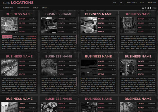
XOXO - RPG THEME SET - 1k SPECIAL !!!
This theme set is completely free. It is a special thank you for 1k followers. Please support me and my work by liking and reblogging this post!
[ BLOG THEME INFORMATION ]
Option between 400px, 450px, 500px and 540px posts.
Custom Body Fonts and Body Font sizes (11px - 13px)
Two Custom Header Links
Two Dropdown Links with unlimited link options
Dropdown Links are optional
Fully supports NPF (beta editor) posts.
The theme adjusts to different screen sizes.
Visible Source Link & Scroll to top button.
A lot of the design can be changed in the editing panel. Everything else is explained in the code.
Sidebar Boxes for: Welcome, Events, Admins, Quick Links and Schedule
Quick RPG Information on the header (Member & Application count, short rp information and Plot description)
Disclaimer and further blog information in the footer.
Sticky Sidebar
Footer can be turned off.
[ LOCATION PAGE ]
The Page does not contain any javascript (100% java free)
Comes in 2 versions (with and without filters)
Location picture sizes are 130 x 130. They will resize automatically.
Option for a background picture.
3 Custom Links
All colors can be easily edited on top of the css code
The theme will resize to different screen sizes.
Custom accent colors (explanation in the code)
[ CHARACTER PAGE ]
The Page does not contain any javascript (100% java free)
Comes in 2 versions (with and without filters)
Character picture sizes are 155 x 150. They will resize automatically.
Option for a background picture.
3 Custom Links
All colors can be easily edited on top of the css code
The theme will resize to different screen sizes.
Character boxes have custom links.
Custom accent colors (explanation in the code)
[ GUIDELINES ]
Do not claim as your own.
Do not remove the credit!
Do not use as a base code or take parts of this code for your theme.
Feel free to edit as much as you want!
All credits are mentioned in the code!
Static Blog Theme Preview + Page Preview Links + All Codes Location Page Preview + All Codes Character Page Preview + All Codes All codes (without preview)
#rpg theme#rp theme#free theme#non contained theme#character page#location page#page theme#rph#rpc#rp resources
612 notes
·
View notes
Text
Vanilla Gpose Tips
I get asked occasionally how I make my screenshots if I'm not using shaders or mods. The short answer: Patience. Gpose's suite of tools is a lot more robust than it used to be when it was first released. But if you want a screenshot to really shine without using third party add-ons, it's not something you can just go into gpose, take a printscreen and get back out. You might capture a moment with nice lighting that way, but it takes more than that. 1. Choosing a location and time of day is job one. What kind of mood are you trying to convey? Does your intended screenshot have a theme (or a prompt?) or are you just looking at your new glam and marveling at how fine your character looks in it? Does a lighter or darker setting suit the character better? Setting, time of day, and weather can affect this. 2. You can stop time and weather from changing. I keep this on by default because it can take upwards of 30 minutes IRL to fine tune a screenshot. The middle button below. Make sure it's highlighted.

3. Toggle battle effects on/off. It's the button right next to the time/weather stop, the icon of the guy holding the sword. If the icon is highlighted as it is in the screenshot, your battle effects are on. If you want to capture pure motion and not worry about battle effects, turn this off. 4. Wet effect. Use it, use it, use it. It doesn't just make clothes look wet and make skin glossy, it actually helps to bring out texture and detail on the character's outfit. Especially since the graphics updates in 7.1. I've found it also adds shine to hair and can help the eyes stand out more.
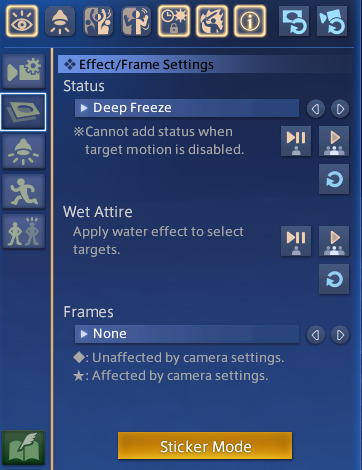
5. Sticker Mode. Yes, there are oodles of cute minion stickers, flags, and numbers, but there are also some great effects to be found in the Decorations category! Sparkles and twinkles, lens flare, among other things can help enhance metallic points on a glamour, AND they can be resized! So if you want a more subtle twinkle on the edge of your spectacles or earrings, you can tilt and downsize your desired sparkle. There are also cute flowers and hearts. 6. Quick Keys. If you're playing on a keyboard, the 1 on your top number row freezes the screenshot. This is extremely helpful if you're trying to catch a battle emote right at a specific moment. If you miss it, keep trying because emotes will continue to cycle until you change them. R and Scroll Lock will both hide/unhide the gpose controls. X will turn on lighting. Space Bar will toggle your character to stop them from facing the camera and vice versa. 7. Lighting Intensity is Dependent on Distance. The closer you're zoomed in on your character, the brighter the light is going to be when you turn it on. Try adjusting your zoom in or out and toggling the light to see if the illumination is to your liking. You can also adjust the RGB on the lights to fit the mood/environment. I also recommend turning on Manual Brightness. 8. Color Filter and Screen Effect. These two features, in my opinion, require the most patience. Not every color filter and screen effect will work well together in every scenario. Click through and preview all of them in your screenshots and see if some SE's work better with your preferred CF. You might find an unexpected combination that you love. Trailer and Echo color filters are great for flashbacks (no one uses Aetherometer, it's an eye bleeder). Use the Pencil or one of the monochrome CFs and Noise 2 SE to create a nice black and white film or photo effect. 9. Frames. Frames are one of the more limited features and not always needed in order to capture a great screenshot. Action poses benefit from the Cinema frames, however, while more lighthearted moments play well with the photo options.
10. Emotes. Before you enter Gpose, be sure to /groundsit to clear your most recent emotes. Summoning mounts and minions also count as emotes for the sake of Gpose. By the same token, you can use battle abilities before entering Gpose, and this is what it will cycle through. You can't activate a battle ability while IN Gpose. You will have access to all of your non-battle emotes and facial expressions, though. You can combine any emote with any facial expression by choosing the action first, and expression second, so you can /prettyplease and /awe at the same time to make your character look hilariously horrified. If you enter Gpose with an active battle ability, you can still apply a facial expression to it from within the tool. 11. Bits and Bobs. Enable Manual Focus and Depth of Field will help bring out the details of the background more, and will help to make a more cohesive screenshot. Manual Focus is great if you want your character in the frame, but you want to shift the focus elsewhere, to an object or another person in the background for example. In the same menu where you'll find emotes, click the second eye button to "Track Camera". Your character's eyes will follow the position of the camera. Lastly, again, have patience. Allow yourself time to play with all the tools Gpose has to offer. You're probably not going to get the winning screenshot after clicking Printscreen just one time, you should take multiple shots from different angles with different lighting and effects, then compare them all and pick the ones you like best. And remember, even if it's the true endgame, it's not a competition. Your screenshots are not "worse" or "boring" just because you're not using third party tools. I look forward to seeing what you create, and you should too.
427 notes
·
View notes
Text
from the vantage point of death (teaser)

summary. when the lord of the dead meets the goddess of spring, all his plans are derailed. pairing. hades!choi seungcheol x f!persephone!reader genre/tags. reverse hades and persephone au, bastardizing mythologies to form my version of it, unhinged mc (a little, but we love her), NO STOCKHOLM SYNDROME, suggestive in the full version, more tags to come by then preview wc. ~600 ; full wc. ~10k (likely more) target posting. March 20, i.e. spring equinox
notes. blaming @ylangelegy cos the hozier brainrot got 10000x worse and made me bump this fic up in word count more than my actual feb fics. title co-opted from uklg. my characters have taken over the page while I tag along for the ride. as always, reblogs are appreciated and come say hi if you're so inclined! stream hozier

For the first time in millennia, Seungcheol walks above ground.
As expected, the Goddess of Spring’s domain is a lush garden, nothing but Life as far as the eye can see. He enters much more easily than expected; the wards have weakened concerningly so, even as the lingering magic in the air hint at their former strength.
As he ventures in, the leaves sway to some invisible wind, a smidgen more alive-seeming than they would be in the mortal realm. Still, there is yellowing on some trees. Dead petals litter the floor. Leaves crunch under his shoe as he walks.
Though present, the Goddess’ magic is weakening.
“Goddess, are you here?” He calls.
In the distance, he hears someone coughing.
Seungcheol breaks into a jog, concern rising. He plucks through the threads of death that he senses, filtering them out until a single golden string remains, though its luster seems to dull with every minute that passes. He follows it forward.
“Goddess, please speak if you hear me.”
“Here,” he finally hears a weak voice croak.
He turns, finding you sprawled a few feet shy of what is evidently your chambers.
Seungcheol does not hesitate to lift you in his arms, walking up the steps you were collapsed on. Your breath escapes your mouth in reedy pants, eyes hazy and unseeing as you gaze at him without recognition. He nudges the gossamer curtains open, slipping through the gap while cradling you to his chest.
Seungcheol lowers you onto your bed, fluffing and adjusting the pillows the best he could. He finds a jug of water and a cup resting on a nearby table. Filling the cup, he tilts it up your lips. “Here. Drink.” You take small sips, holding not the cup, but his hands as he feeds the water to you. He feels your fingers trembling. Once a small noise of protest leaves you at the water still falling past your lips, Seungcheol quickly sets the cup aside, easing you into a lying position.
You close your eyes, breathing finally steady. Sorrow tugs at his heart as he wipes the sweat off your brow.
“Oh Goddess, how did this happen to you?”
It has been many centuries since the last time an immortal crossed the River. He wonders if the Underworld would be to your taste, absent of Life as it is. Only the lands of the blessed are lush with any kind of greenery, as it is near enough to Life, housing souls getting ready for reincarnation.
Lost in his thoughts, he does not notice the string of death that guided him to you suddenly wink into brilliant gold and disappear.
The Goddess’ eyes snap open, and Seungcheol startles. All too quickly, he feels strong hands grasp at his forearms and push. He stumbles back, almost tripping over his robes, but before he is able to resist, he lands in the middle of what he realizes is a ritual circle. The runes around his feet burst into brilliant gold light, washing the world in their glow. Vines rapidly begin to sprout, curling, tangling, and twisting above and around him. From beyond the light, he hears a faint voice chanting.
It is magic, but one entirely foreign to his eyes.
Finally, the glow fades. That same force he sensed earlier seems to be binding him in place, making his limbs ten times heavier than normal. Seungcheol fights to stand, grasping at the structure in front of him to help himself up. A great tangle of vines surrounds him; despite their flimsy appearance, they refuse to break or wilt with any amount of magic he forces into them.
In fact, they only seem to grow stronger.
Confusion gives way to realization, and then dawning fury. He zeroes in on the woman on the other side of the cage. The haze in your eyes has disappeared, replaced with a sharp gaze and a triumphant smirk. Around you, the air crackles with power.
“Caught you.”

#choi seungcheol x reader#seungcheol x reader#scoups x reader#seventeen x reader#svt x reader#seungcheol x you#svt fanfiction#seventeen fanfiction#seventeen imagines#.dive site
277 notes
·
View notes
Text
Better Man | boyfriend's brother!harry | a preview

NEW PATREON SERIES OUT NOW!
Patreon Series Synopsis: Y/n's dating Dante - the charming, handsome, and most beloved Styles brother. From the outside, he looks like the perfect boyfriend. But behind closed doors, things aren't so sweet.
Dante's older brother, Harry, is his opposite. He's a bit rough around the edges, rarely cracks a smile at all, and he intimidates most people. Y/n typically keeps her distance but lately, they keep being brought together and she soon realizes that underneath Harry's hard exterior is a gentle soul with a lot of love to give.
. .
The breeze was warm, the music from inside steadily bleeding out into the night around them, while she shared a cigarette with a man she knew almost nothing about.
“Dante’s gonna kill me,” Y/n said quietly, her eyes wandering back up toward the handsome mysterious Styles brother as he wrapped his lips around the filter and inhaled.
Harry dropped the butt, blew out a breath of smoke, and stepped on it, “You tell him everything?”
She looked up again at the starry sky. The answer was no; She hadn't been telling Dante much at all lately.
“He'll smell the smoke,” she said, still gazing at the constellations. Glancing at him she realized he’d been watching her. She warmed, every inch of her skin growing hot.
“Come here, let's see,” something easy and charming wove through his deep voice.
Her heart skittered to a stop. She didn't know what it was about Harry that made her feel like her skin would burst into flame right then. Was it because he was finally paying her attention? It wasn't as if she'd ever craved for his attention before.
Without thinking too hard on it, she began to move toward him, like a moth to flame. It felt illicit. But technically they were doing nothing wrong.
She held her breath when his hand rested on her wrist. His grip tightened as he pulled her close enough that she could smell his cologne. Her pulse beat in her throat, and his hand was so hot, spreading warmth up her arm and down to the pit of her stomach, that she hardly noticed him leaning in, brushing his face against her hair.
“No smoke,” the words were smooth with a rough edge, the heat of his breath winding down her neck.
His palm slid from her wrist to her fingertips before he pulled away, leaving a trail of fire down her arm. He pushed off the wall, and she took a step back and out of his way. Walking toward the door, he stopped and turned to her. His voice was cool, indifferent, and laced with an intimidating tone.
"We should get back in there."
Y/n didn't know if she was relieved or disappointed to be going back inside. But she knew that she would never forget the shared cigarette or the way Harry made heat chafe beneath her skin and confusion wrap itself around her throat.
"Where'd you go?" Dante asked her harshly as he watched Harry walk past like they hadn't just had a little moment together outside.
"Just stepped outside to get some air."
"With him?"
She followed Dante's gaze toward his brother who was taking his seat and leaning forward to grab his glass of whisky.
"Yes. He went to smoke so I joined him outside."
Y/n was still pissed at Dante and Harry's warning about his brother felt like it was hung up above the stage where the band played in flashing neon.
He's always been an asshole.
"Yeah. I can tell. You stink now. Smell like Marlboros and red wine."
A scoff fell from her lips as she rolled her eyes. Somehow the fresh air, the shared cigarette, and Harry's company had actually made her feel rather confident, defiant even, "You know what… I'm gonna go. You stay. Enjoy the wedding. We'll talk tomorrow."
"Where are you gonna go? You're not coming home tonight?"
Shrugging she picked up her purse from the table, "I think I'm gonna go stay with my sister. I need a night away from you."
. .
If you'd like more consider joining my Patreon!
xoxo
#harry styles#patreon exclusive#first post#harry edward styles#harry styles fanfic#harry styles fic#harry styles fanfiction#harry styles writing#harry styles one shot#harry styles series#harry styles smut#harry styles x reader#harry styles x yn#harry styles imagine#harry styles fan fic#harry styles fiction#harry styles concept#x reader#reader insert
283 notes
·
View notes
Text
if i bend under the weight + sun bleached flies
synopsis: tim's super! s/o gets hit with kryptonite and gets stuck under a building tags: gn! reader, blood, broken bones, needles, panic attacks part of my dc augu-whumpers series ; requests for this are open!
⋅────⊱༺ ♰ ༻⊰────⋅
PREVIEW.
"Was that a crash? Damn, that was loud."
"A building collapsed in the far east. Supers is in charge of that area."
"Supers? You there? Status report. What happened?"
“Shit! Shit! Shit! They’ve been hit with Kryptonite. Vitals are unstable! Someone get there now!”
༻⊰───⋅
Tim cried too, tears mingling with the grime on his face. “I’m sorry, I know, I know, baby. Please! Come on, we have to get up.”
⋅────⊱༺ ♰ ༻⊰────⋅
You were a super.
A near-indestructible hero with strength beyond measure. People watched in awe as you deflected bullets, halted runaway trains, and shattered barriers that would have left ordinary heroes in ruin.
To them, you were an immovable rock, impervious to life’s storms, a being untouched by doubt or weakness.
You had grown used to this. You were used to being seen as strong, so much so that you rarely had backup on missions. You were often sent out alone, expected to handle every crisis on your own. After all, you were a super. You fought solo, without regret, without asking for assistance. You believed you could bear it all.
But now, you found yourself beneath the skeletal remains of a collapsed building, the wreckage pressing down on you with a force that should have been a mere inconvenience. Dust and debris swirled around you in the dim light filtering through cracks in the rubble. The once-sturdy structure groaned and creaked as if protesting your struggle.
Normally, you would have lifted the wreckage effortlessly, but something was terribly wrong with your powers. Your hands, usually so strong, trembled as they strained against the concrete. You could feel the weight of each individual slab pressing down on you, pinning you to the ground.
Kryptonite, you thought, the realization hitting you with a force almost as crushing as the debris. The last memory you remember is being hit with a green glow.
Whimpering, you took a deep breath, strands of damp hair fell over your eyes, clinging to your sweat-soaked forehead. The burn in your side, a sharp and unfamiliar sting, pierced through the usual numbness. Your breathing came in ragged gasps, each inhale heavy with the smell of dust and despair. You had grown so accustomed to invincibility that pain felt like an unwelcome stranger. The once-mighty walls of your strength seemed to be crumbling, just like the debris around you.
There was a ringing in your ears, a harsh buzz that grew louder. You realized it was your communication link, crackling with urgency. You heaved, your head lolling to the side as you struggled to keep the building aloft. Every muscle screamed in protest, and the once-lightweight concrete now felt like it was made of lead.
"Supers? You there?"
Someone's voice echoed in your ear, Batman you think, steady and calm.
"Where are you? We need some backup here, stat."
You swallowed hard, feeling a lump in your throat. Your eyes drooped, the weight of your exhaustion pulling them down. "S… Sorry. I'm in a situation right now. I can't provide backup. Might actually need some..."
There was a pause, a brief silence that felt like an eternity.
"How serious is your situation? I don’t think anyone will be able to help you for a while. Think you can handle it?"
You could hear the detachment in his voice, the cold, clinical tone that expected you to push through just as you always had. There was no urgency, no hint of concern—just an unwavering belief that you would somehow manage.
Belief that a super could hold their own.
You blinked away the growing tears, shifting your position slightly to alleviate the burning in your side. The ringing in your ears had subsided, replaced by the dull roar of your own heartbeat.
"O—okay. I think I can hold on for a bit." Your voice was barely more than a whisper, the words forced out through gritted teeth.
The comm-link clicked off, the abrupt silence leaving you alone with the weight of the world pressing down on you.
You struggled as you lifted the building, feeling the bones in your wrists start to give way under the pressure. A sharp, searing pain shot through your arms as the bones cracked, the sickening sound lost in the groaning of the collapsing structure.
Your palms were now raw and bleeding, cut by the jagged edges of the debris. Warm blood trickled down your arms and you heaved, throat dry.
Tears mingled with the sweat on your face, blurring your vision. You blinked them away, focusing on the task at hand. You had to hold on. You had to keep fighting. The world above depended on it.
Slowly, agonizingly, you managed to lift the building a few inches. It was a minuscule shift, but it was enough to make a difference. The weight shifted slightly, and you could see a small gap forming. With a final, desperate effort, you managed to lift the wreckage high enough to create a gap wide enough for you to fly out.
As you emerged into the open air, you collapsed onto the ground, your breathing ragged and uneven.
For now, at least, you had held on.
༻⊰───⋅
"Was that a crash? Damn, that was loud."
"A building collapsed in the far east. Supers is in charge of that area."
"Supers? You there? Status report. What happened?"
“Shit! Shit! Shit! They’ve been hit with kryptonite. Vitals are unstable! Someone get there now!”
There was a cold, icy feeling sinking deep into Tim's bones as he heard the announcement through his earpiece. His heart pounded in his chest, each beat feeling slower and more labored than the last.
He quickly checked his location on his communicator. The display flickered with stark, cold reality—he was indeed the nearest to the scene, but still a grueling 15 minutes away. The distance seemed to stretch into an endless expanse, each second feeling like an eternity.
Without hesitation, he sprinted to his bike, his movements driven by sheer adrenaline. The cold, numbing fear was replaced by a burning urgency as he mounted the bike and roared to life. He maneuvered through traffic with reckless speed, weaving and cutting corners as if each second lost could mean a life.
As he drove, the cold, numbing fear slowly began to ebb away, melting into a fiery, scalding anger.
"Why the fuck weren't there reinforcements?!" he shouted into the earpiece, his voice laced with frustration and desperation. "Did no one think to check the fucking area? Is everyone just sitting around with their heads up their asses?!"
The bike roared beneath him, and his driving became even more reckless. Tim leaned into every turn, the engine's growl mingling with his furious breaths. He spotted a fence ahead, a barrier that seemed to mock his urgency.
Without a second thought, he gunned the throttle, launching the bike into the air. The bike soared, crashing through the fence with a deafening crack. Concrete and debris exploded around him as he slammed into the ground on the other side. The impact jarred his bones and rattled his teeth, but he barely registered the pain.
He tore through the final stretch of the city streets, his bike a blur of metal and fury. The wreckage came into view, a twisted maze of steel and concrete.
Tim skidded to a halt, his heart pounding furiously as he dismounted. He spotted you, hunched over right beside the collapsed rubble, your blood seeping into the grass.
Tim’s heart felt as though it was being torn in two as he saw the state you were in. His rage gave way to the deep, icy fear again as he rushed forward.
With trembling hands, he carefully rolled you onto your back, his gaze sweeping over your injuries.
Your face was ghostly pale, streaked with a grimy mix of dirt and blood. Each shallow, labored breath you took seemed to cut through the air with an echo of a sob. The severity of your injuries was laid bare—cuts and bruises marred your skin, each wound a painful testament to the violence you had endured. Blood pooled around you, a dark, crimson stain against the surrounding debris, making his stomach churn with a sickening nausea.
His eyes fell to your wrists, and he was horrified by the sight of them—clearly broken, twisted at unnatural angles.
He leaned down, his voice softening with a tender, almost broken affection.
“Hi, pretty bird,” he whispered. “I’m here. I’ve got you.”
“Kryptonite,” you rasp out, your voice barely more than a whisper.
“I know, I know,” he whispers back, his voice low and soothing. He reaches into his utility belt, pulling out a syringe with a green needle, filled with a bright, clear liquid. It was an antidote, a precaution he had hoped never to use.
Tim was always prepared for every situation, his mind a labyrinth of strategies and contingencies. One of the many things you loved about him. His meticulous nature meant that nothing was left to chance, and that care extended to you, his lover.
His hand was steady as he moved to insert the needle, but when you thrashed in pain, he realized too late that the entry had been rougher than he intended.
The sharp intake of breath you took, the wince that crossed your face—these were things he had rarely seen, and he realized just how fragile you were in this moment.
Tim had always relied on your metahuman durability, knowing that you could handle whatever force he threw your way, trusting in your strength without a second thought.
Then you screamed and cried, your sobs echoing through the night. The pain was unbearable, a relentless pressure squeezing you from every angle. Tim’s face crumpled in horror and panic, his usually calm demeanor cracking under the weight of your suffering.
He administered the antidote with trembling hands, his movements hurried yet tender. The needle was pulled away with a gentleness that belied his growing panic.
“I’m so sorry,” he choked out, moving to comfort you. “I didn’t mean for it to hurt. Please, just hold on. I’m right here.”
His hands were unsteady as he brushed the sweat and tears from your face, touch as gentle as he could manage despite his own mounting panic.
Tim was losing his grip. The sight of you, so vulnerable and hurting, was terrifying and so, so, so unfamiliar, driving him to a near hysterical state.
The antidote began to take effect, the green glow from the syringe slowly dissipating as it worked to counteract the kryptonite’s effects. But Tim’s relief was fleeting. The urgency of the situation pressed down on him, and he realized with a jolt that he needed to get you to a safer location.
“Come on, pretty bird, I need to get you up,” he said, his voice quivering with desperation.
Each attempt to lift you was met with new waves of agony, your screams slicing through the air like a jagged blade. Your cries were heart-wrenching, each one a brutal slash against his soul, unraveling him with every tortured note. The dark, red stains seeped into his heart, a reminder of how he was failing you.
Tim cried too, tears mingling with the grime on his face. “I’m sorry, I know, I know, baby. Please! Come on, we have to get up.”
With a desperate heave, he dragged you into his arms. You shuddered violently, your body wracked with ragged, sputtering sobs. Tim's heart squeezed with each gasping breath you took, and then, with a final, shuddering exhale, you fainted, your body going limp against him.
Panic surged through Tim like a tidal wave. His breath came in frantic bursts as he cradled you, trying to stay calm despite the overwhelming fear clawing at him. His hand fumbled for his comm device, his movements erratic and desperate.
He knew he had the skills—both medical and analytical—to assess your situation and manage it. His training had equipped him with the ability to stabilize injuries, evaluate critical conditions, and make quick decisions under pressure. But now, those skills felt useless against the crushing weight of his fear.
“Someone, please!” he screamed into the device, throat raw. "Help me!"
༻⊰───⋅
#i like seeing men cry and suffer#kinda choppy but welp!#tim drake#tim drake x reader#tim drake x you#tim drake angst#tim drake wayne
286 notes
·
View notes
Text
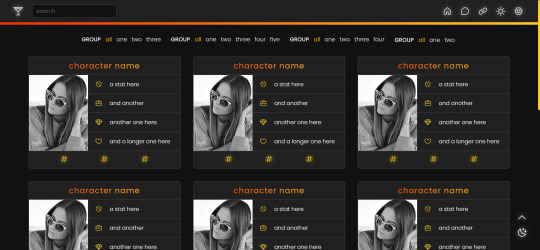
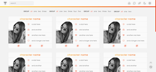
page 002: valentina
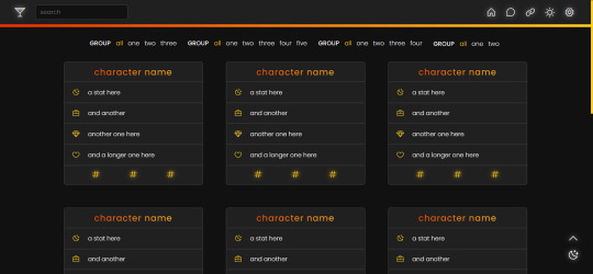
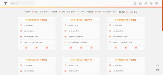
a character page that can be used with or without images, but with enough imagination and intermediate level coding skills, it can be edited to be used for other purposes. instructions are in the code and in the spreadsheet.
v1 (no images): preview / code + spreadsheet / code (without gsheets)
v2 (with images): preview / code + spreadsheet / code (without gsheets)
features
navigation links, filters, search filter and hide/show controls
endless muses boxes with a title, stats and links in each box
customizable colors (gradient, links and accent), font-size and width of the boxes and images
140x180 images in v2
google sheets integration
day/night mode
responsive
terms
reblog this post if you like it or use it
do not edit, move or delete the credit
do not use as a base code and take credit for it
full terms of use
credits and notes under cut:
credits
google sheets integration by @nonspace
day/night mode tutorial by @mournstera
masonry layout by desandro (+ tutorial by @suiomi)
isotope combination filtering + combination of filtering and search by metafizzy
hide/show controls by @seyche
phosphoricons by helena zhang and tobias fried
images taken from unsplash
full list of credits
notes
instructions on how to integrate google sheets are both in the code and in the spreadsheet, as well as on this page
to change any of the icons in the code, visit phosphoricons, find the icon you want to use and change the weight and icon like in the example below:

#rph#tumblr page#character page#free content#free page#themehunter#supportcontentcreators#completeresources#allresources#dearindies#resourcemarket#userthmrec#*#* page#* valentina
274 notes
·
View notes
Text
Round 13 is here!
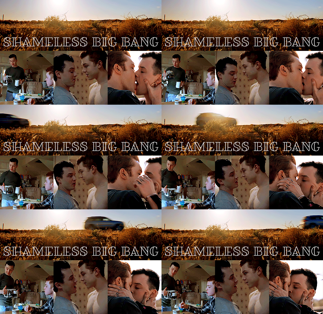
Aaaand it's back! It's been a hot minute but we are happy to announce the next round of the Shameless Big Bang! As mentioned in a previous post, @whaticameherefor and @wehangout will be running the shindig this time around, we're both super excited to see what this amazing fandom comes up with! Also, check out the new banner by the wonderful @celestialmickey - thank you, Macy!
A bit of housekeeping before we get started. Take a read of the FAQ page so you know what is expected of you, but a couple of specifics ...
The minimum word count for the Shameless Big Bang is 20k. There is no maximum.
At least one piece of art must be done, but artists are more than welcome to do more than that.
Your fic must be completed by the posting date.
If your fic is way over the 20k mark, then at least that first 20k must be ready for posting day. You will also need to provide a posting schedule to ensure the fic will be posted in its entirety.
And without further ado, here is our schedule!
September 5 – Sign-Ups open
October 7 – LAST DAY TO SIGN UP/Confirmations sent
October 21 – First Author Checkpoint
November 4 - Rough drafts due
November 11 – Summary previews for artists
November 15 – Artist claims open (authors and artists will be paired up on a first come, first served basis)
December 16 – First artist and second author checkpoint
January 20 – Second artist and third (and FINAL) author checkpoint
February 3– Posting Schedule will be announced
February 24 – Posting begins!
Again, we are sticking with the original format of completing your work before posting. If you plan to participate, please try to be mindful of that when you commit. Also, while most people are good about staying in touch, we have people every round who have issues with communicating and responding to emails. We are going to continue to take a more strict approach with that if people aren’t responsive, especially once authors and artists are paired off and the posting dates get closer. Check points are designed to update the organizers about your progress, so if at any point you feel like you won’t complete your fic, these are the times to let us know! We will not be confirming your sign up until the last day, so please wait until after then to reach out if you don't hear from us.
You can sign up to participate here!!
Don’t forget that there are a few different ways to keep up with us:
The Shameless Big Bang Tumblr page is the primary source of information. Remember, you can find out more info about the Big Bang at our Info & FAQ page. You can find links to the art and stories from previous rounds, and the home page even shows our commonly used tags, which you can use to filter through posts.
We also have a Discord! If you provide your Discord information during sign-up, we'll add you automatically.
As a reminder, the Big Bang is a collaborative effort between authors and artists. Please be mindful about your time and how busy you are when you sign up. We don’t want you to have to drop out and leave someone in the lurch if we can avoid it.
If there are any questions, you’re always welcome to send this page an ask, hit us up independently, or email us at [email protected]! Reblog and spread the word!
#gallavich#ian x mickey#shameless us#ian gallagher#mickey milkovich#shameless big bang#shameless big bang 13
188 notes
·
View notes
Note
Hey bro, been using this InstaJock app for a while now and I love it, but I'm wondering about this new camera feature? App updated last night and it popped up, no idea how to use it though haha
Hey dude! I’m so glad you reached out! I had no idea that people who were already jocks read my blog. I always figured it was mostly nerds trying to avoid (or seek out) jockification. It’s awesome to get an ask from someone who's actually been transformed by InstaJock. I’d love to interview you sometime, get some insight into how being jockified by the app feels, but we can talk about that later. Right now we should talk about InstaJocks newest feature.
I was able to check it out without being turned (don't try this at home if you don’t want to be jocked, it took a lot of work and protective measures) and I have to say I’m very impressed. InstaJock has always had a camera function, since almost every jocks first post is of them flexing their new muscles excitedly, but recently they added a new feature using the camera that I think is going to revolutionize the app. It’s called preview mode, and it’s exactly what it sounds like.
Using the new feature, an InstaJock user can take a picture of any unturned nerd, and with the filter they can see how the geek would look if they had the app. In other words it shows you how they’d look as a jock. It’s meant to encourage jocks to send the app to more people, and it’s been working. Since the new feature was added the number of new InstaJock users joining every day has almost doubled.
I probably shouldn’t share this, since it’s basically begging people to send me an invite to the app, but I do have protections against that so… what the hell, why not. I managed to take a selfie of myself with the preview mode filter. When I saw what I’d look like as a jock… I nearly set up a profile for myself then and there.
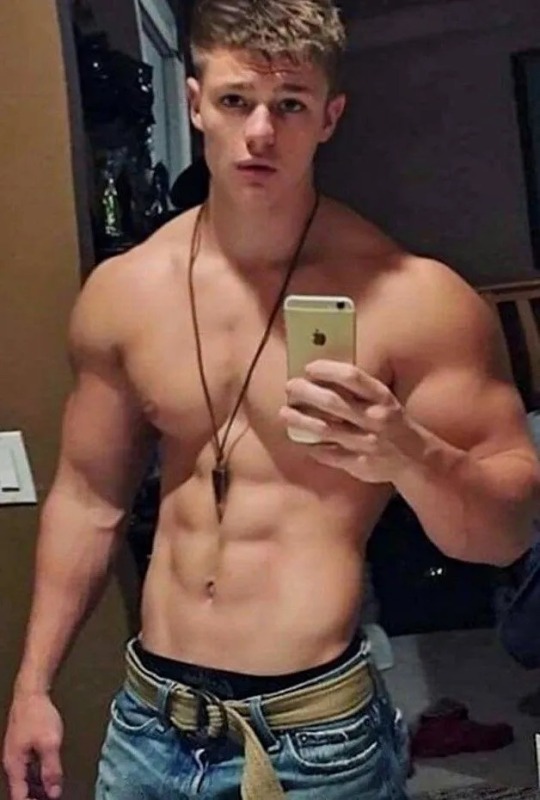
I know I can’t use the app if I wish to continue this blog. I have to have brains to report on this stuff. But it’s getting harder and harder to resist it, especially now that I know how fucking hot I’d look.
287 notes
·
View notes
Text
Some thoughts on Cara
So some of you may have heard about Cara, the new platform that a lot of artists are trying out. It's been around for a while, but there's been a recent huge surge of new users, myself among them. Thought I'd type up a lil thing on my initial thoughts.
First, what is Cara?
From their About Cara page:
Cara is a social media and portfolio platform for artists. With the widespread use of generative AI, we decided to build a place that filters out generative AI images so that people who want to find authentic creatives and artwork can do so easily. Many platforms currently accept AI art when it’s not ethical, while others have promised “no AI forever” policies without consideration for the scenario where adoption of such technologies may happen at the workplace in the coming years. The future of creative industries requires nuanced understanding and support to help artists and companies connect and work together. We want to bridge the gap and build a platform that we would enjoy using as creatives ourselves. Our stance on AI: ・We do not agree with generative AI tools in their current unethical form, and we won’t host AI-generated portfolios unless the rampant ethical and data privacy issues around datasets are resolved via regulation. ・In the event that legislation is passed to clearly protect artists, we believe that AI-generated content should always be clearly labeled, because the public should always be able to search for human-made art and media easily.
Should note that Cara is independently funded, and is made by a core group of artists and engineers and is even collaborating with the Glaze project. It's very much a platform by artists, for artists!
Should also mention that in being a platform for artists, it's more a gallery first, with social media functionalities on the side. The info below will hopefully explain how that works.
Next, my actual initial thoughts using it, and things that set it apart from other platforms I've used:
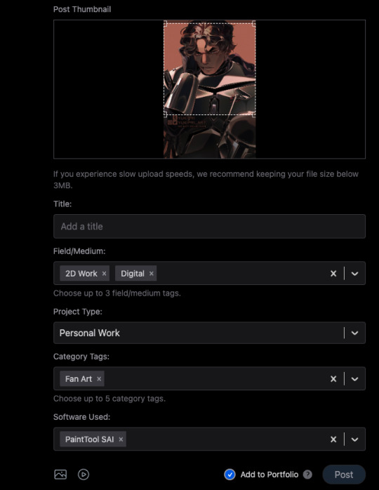
1) When you post, you can choose to check the portfolio option, or to NOT check it. This is fantastic because it means I can have just my art organized in my gallery, but I can still post random stuff like photos of my cats and it won't clutter things. You can also just ramble/text post and it won't affect the gallery view!
2) You can adjust your crop preview for your images. Such a simple thing, yet so darn nice.
3) When you check that "Add to portfolio," you get a bunch of additional optional fields: Title, Field/Medium, Project Type, Category Tags, and Software Used. It's nice that you can put all this info into organized fields that don't take up text space.
4) Speaking of text, 5000 character limit is niiiiice. If you want to talk, you can.
5) Two separate feeds, a "For You" algorithmic one, and "Following." The "Following" actually appears to be full chronological timeline of just folks you follow (like Tumblr). Amazing.
6) Now usually, "For You" being set to home/default kinda pisses me off because generally I like curating my own experience, but not here, for this handy reason: if you tap the gear symbol, you can ADJUST your algorithm feed!
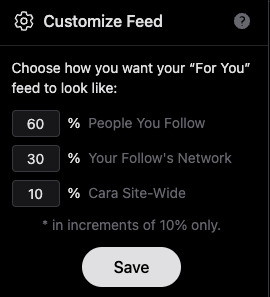
So you can choose what you see still!!! AMAZING. And, again, you still have your Following timeline too.
7) To repeat the stuff at the top of this post, its creation and intent as a place by artists, for artists. Hopefully you can also see from the points above that it's been designed with artists in mind.
8) No GenAI images!!!! There's a pop up that says it's not allowed, and apparently there's some sort of detector thing too. Not sure how reliable the latter is, but so far, it's just been a breath of fresh air, being able to scroll and see human art art and art!
To be clear, Cara's not perfect and is currently pretty laggy, and you can get errors while posting (so far, I've had more success on desktop than the mobile app), but that's understandable, given the small team. They'll need time to scale. For me though, it's a fair tradeoff for a platform that actually cares about artists.
Currently it also doesn't allow NSFW, not sure if that'll change given app store rules.
As mentioned above, they're independently funded, which means the team is currently paying for Cara itself. They have a kofi set up for folks who want to chip in, but it's optional. Here's the link to the tweet from one of the founders:
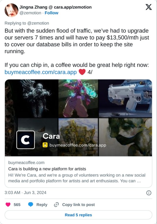
And a reminder that no matter that the platform itself isn't selling our data to GenAI, it can still be scraped by third parties. Protect your work with Glaze and Nightshade!
Anyway, I'm still figuring stuff out and have only been on Cara a few days, but I feel hopeful, and I think they're off to a good start.
I hope this post has been informative!
Lastly, here's my own Cara if you want to come say hi! Not sure at all if I'll be active on there, but if you're an artist like me who is keeping an eye out for hopefully nice communities, check it out!
#YukiPri rambles#cara#cara app#social media#artists on tumblr#review#longpost#long post#mostly i'd already typed this up on twitter so i figured why not share it here too#also since tumblr too is selling our data to GenAI
181 notes
·
View notes
Text
BioWare Blogpost: Accessibility
"Journal #10 Accessibility Spotlight A look into Dragon Age: The Veilguard’s Gameplay Accessibility Options --- Hey everyone! Today, we want to share many of the Accessibility features in Dragon Age: The Veilguard. Regardless of skill level or ability, we want everyone to be able to enjoy the full experience and story of our game. There are several features and settings to customize the game to meet your individual needs; so let’s dig in!"
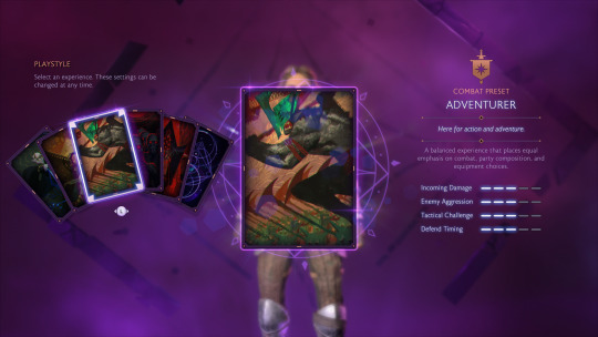
"First off, let’s discuss combat and the difficulty settings. During Character Creation, players can select from one of five curated difficulty levels or create a completely customized experience: Storyteller - Here for the story. Keeper - A balanced combat experience that emphasizes party composition and equipment choices over reaction times. Adventurer - A balanced experience that places equal emphasis on combat, party composition, and equipment choices. Underdog - Here to be pushed to the limit, requiring strategic planning and tactical decisions. Nightmare - Overwhelming battles that give no quarter. Requires a mastery of combat, equipment, skills, and game mechanics to survive. - Selecting Nightmare cannot be undone without starting a new playthrough. Unbound - Customize all settings. - Settings impact numerous aspects of gameplay. If this is your first time, consider a curated preset instead. Even after selecting a difficulty, there are more combat options available in the Settings Menu if you wish to make further adjustments. For example, you can adjust elements like parry timing, aim assist strength, or even how aggressive enemies are. See below for a full list of combat settings."
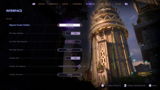
"UI and HUD elements are also customizable. Many elements of the HUD can be conditionally hidden or turned off entirely. For example, you can fully hide elements like Rook’s health, the objective tracker, or the Mini Map. There are also options for the text size in the UI."
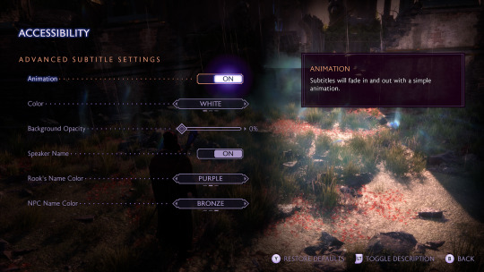
"There are some accessibility aids for interface elements. For example, subtitles are fully customizable allowing you to modify things like the size, opacity, speaker names, and color. Other settings add audio aids to visual-only elements like incoming attack indicators. For anyone with vision deficiencies, there are full-screen color filters to improve visibility."
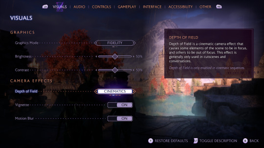
"Beyond the UI and HUD, there are a few more options regarding the game’s visual effects. For anyone who deals with motion sickness, there is a Persistent Dot Option and Motion Blur can be fully turned off. The in-game Camera Shake can also be adjusted from 0-100%. Additionally, there’s an FOV slider in the graphical settings."
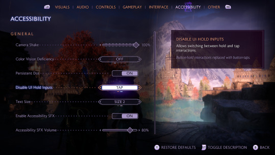
"As discussed in the PC Features Blog, all inputs are remappable for gameplay in Dragon Age: The Veilguard on both controller and keyboard for all platforms. Input sensitivity and deadzones are also customizable with sliding scales. There are some UI interactions that require an input to be held for a short period of time, but this can be changed to tap instead. All of these options allow you to play the game in whatever way is most comfortable. These settings and more are available in Dragon Age: The Veilguard! See a full list below to check out all of our Accessibility settings and check out our Accessibility Portal. Interviews and coverage of our Preview Event will be released on September 19th; so watch out for that. Chat soon! — The Dragon Age Team"
"Audio - 3D Audio - Accessibility SFX - Glint Ping SFX - Mono Audio - Speaker Type - Volume Sliders Controls - Ability Wheel Controller Activation (Hold or Tap) - Disable UI Hold Inputs - Input Remapping - Invert Axis (X & Y available) - Swap Left & Right Sticks - Stick Deadzones - Trigger Deadzones - Vertical & Horizontal Sensitivity - Vibration Intensity GAMEPLAY Combat - Aim Assist - Aim Snap - Combat Timing - Enemy Aggression - Enemy Damage - Enemy Health - Enemy Resistances - Enemy Vulnerability - Prevent Death Exploration - Frequent Auto-Saving - Library (Codex, Glossary, Missives) - Object Glint Distance - Object Glint Visibility - Objective Marker Visibility - Pause at any time - Waypoint Visibility - World & Local Maps available at all times Visual / UI - Camera Shake - Depth of Field - Full-screen Colorblind Filters - Hide-able HUD Elements (Abilities, Damage Numbers, Hints, Mini Map, Objective Tracker, Player Health, Tutorials) - Low Health Screen Effect - Motion Blur - Persist Dot Option - Ranged & Melee Threat Indicators - Subtitle Advanced Options (Background Opacity, Speaker Names, Speaker Name Color, Subtitle Size) - UI Text Size - Vignette"
[source]
#dragon age: the veilguard#dragon age the veilguard spoilers#dragon age: dreadwolf#dragon age 4#the dread wolf rises#da4#dragon age#bioware#video games#long post#longpost
128 notes
·
View notes
Note
How do you find shows that are simultaneously dramatic and emotional enough to be fun without bringing up upsetting emotions and familiar drama? How is watching adventures with all the stuff that usually happens in them not upsetting in itself? Is having the promise of a good ending enough to make the shit happening before it survivable? Don't happy endings feel cheap? Unrealistic? Is it all not just a reminder of how real life doesn't have happy endings?
I watch a lot of shows. Like, a lot of shows. There's a fair bit of stuff that I'll watch a little of but then end up not finishing for one reason or another.
In terms of finding stuff I like, I mostly use the description and categorization listed on the show itself. So, for example, if I'm in the mood for an adventure serial I'll filter by genre and then work through the synopses and previews. Or I'll just pick it up because it seems to be popular.
As far as emotions and drama... I don't know. Some shows do it well, some don't. But I personally find a lot of the drama and emotions in the media to be way more tolerable than in real life. Mostly because I know it's not real. There aren't any actual real people in danger of experiencing the dire consequences of their fictional actions.
Happy endings are fine, I guess, but I don't think a show needs one to be satisfying. It just depends on my mood. An ending only feels cheap to me if it's written poorly and tries to shortcut to big dramatics without building up the storyline beforehand.
You're right that real life doesn't have happy endings, but that's really only because real life doesn't have endings at all. Your two options every day are to either survive and go on, or die. And if you die that's not really an "ending," because you're real and not a story. And then the still-living people who know you then also have to either survive it, or die. Stuff just keeps happening.
Don't bother looking for a happy ending in a media if it annoys you. (Life is too short to spend watching media you don't like. Spend it watching media you do like.) And don't bother worrying about a happy ending in real life. (Because that's not real.) Just see if you can figure out strategies to make each day you survive less shitty. For example, I started out with an electric cattleprod in my brain. And now I have a broken cattleprod that no longer prods. Significant quality of life improvement.
61 notes
·
View notes
Text
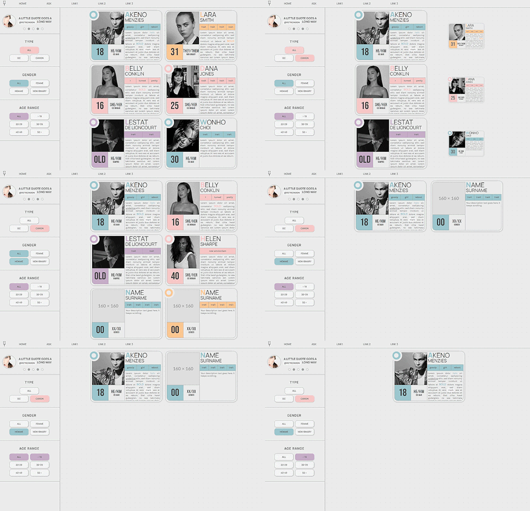
PASTEL - MULTIMUSE & GIF DIRECTORY PAGE !!!
This page is completely free. Please support me and my work by liking or reblogging this post.
[ INFORMATION ]
THIS CODE IS 100% JAVASCRIPT FREE!!!
Info on the filters: For the sake of proper styling, the filters won’t work on some mobile browsers! Further explanations can be found in the code!
The theme will adjust to (almost) all screen sizes.
All colors and effects are easy editable.
The code offers 2 main links (Home and Ask) but also (almost) unlimited free individual links.
The muse cards come with an individual link, which can also be removed completely.
Grayfilter for pictures available!��(Please read in the root section of the css code very closely. It comes with explanations)
Custom accent colors.
Comes in two muse page versions (with and without filters)
UPDATE 02/20/24: comes in a gif directory version!
[ GUIDELINES ]
Do not claim as your own.
Do not remove the credit!
Do not use as a base code or take parts of this code for your theme.
Feel free to edit as much as you want!
Further credits and inspiration credits can be found in the code.
Click the SOURCE LINK to be redirected to the preview, preview pictures and the codes!
988 notes
·
View notes
Text
how i do my visual novel filtered photo backgrouds
ive had some questions about this so i figured i'd put together a quick post on my process and what goes into it.
this isnt really a tutorial and instead is just a ramble of how i do stuff with a ton of examples and pictures lol
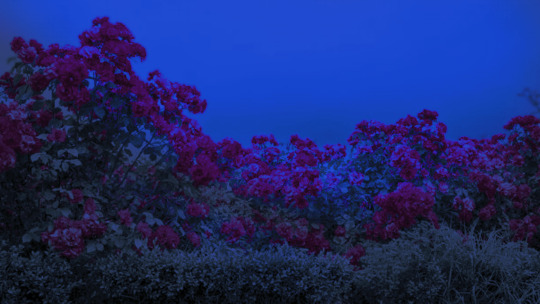
read more below. this is a long post and you probably want to be looking at these images on your computer instead of your phone
step one is that i find CC0 photos or otherwise easy licenses to use because I'm lazy and don't want to have a list of credits of random photographers caue i used one of their images but also i don't want to use stuff without crediting
because they have a general lincese that just wants you to mention the site i prefer unsplash or pixabay but there's other public domain type photo sites too obviously
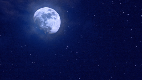
so like okay heres a random picture

i have a photoshop CS5 from 10 years ago. but these can be done with gimp or krita and whatever. theres even photopea that has photoshop in the browser
basic stuff is that i start by cropping my bg into my renpy resolution (i use 1920x1080) this is also the part where sometimes i might rotate a bg. it is a good way to add some chaos vibes to a scene
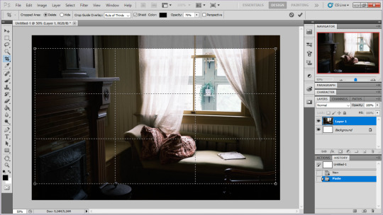
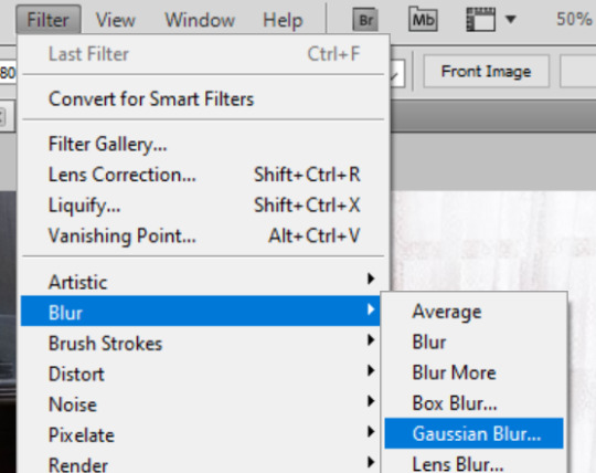
i tend to add some mild blur effect since i find that having too sharp photos as backgrounds clashes with the artstyle of my sprites. like just a couple pixels worth of blur tends to do it
the next part is called fuck around and find out

i like to play with the values to just get random results. hue/saturation for tinting the picture, messing with the curves to get some really sharp effects, or channel mixer to add more of a color
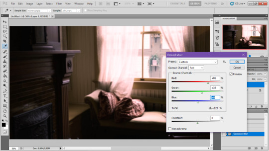
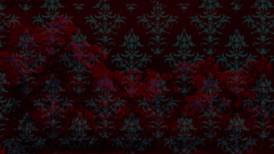
this part is just purely vibes based but i personally think reducing the colors of the background is the simplest way to create something that feels coherent. especially if you make backgrounds based on moods. like having a blue tinted bedroom vs a red tinted one really changes the atmosphere
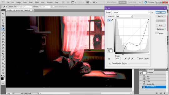
you can get some pretty intense effects but its always important to remember that its meant to be a background and there's a risk it distracts from the sprites
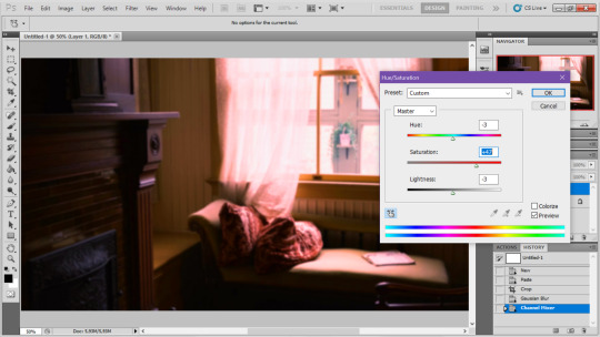
in this case im not including the effect for the curves. after the colours look fine the final step i tend to have is apply some sort of effect.

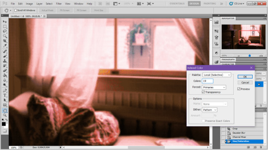
i really like changing the colour mode to indexed colour since i like crunchy pixels. (had to zoom in to 100% to show the actual effect) downside of indexed is that it doesn't look ideal unless its displayed in the exact resolution it was made in but i like it
here is the images before indexed mode:
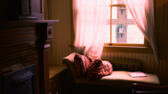
after indexed mode(i think you have to click the image and open it in full to see the actual effect):
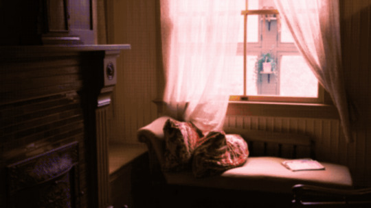
another thing ive been playing with recently has been grain+chromatic aberration combo. it makes things feel surprisingly lively with just this simple thing so you'll probably see me overusing this effect in the future

you have to mess with the numbers to get the effect you want but for me these were the parameters I've been using
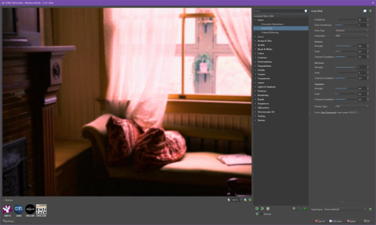

ignore the preview missing idk why it does that.
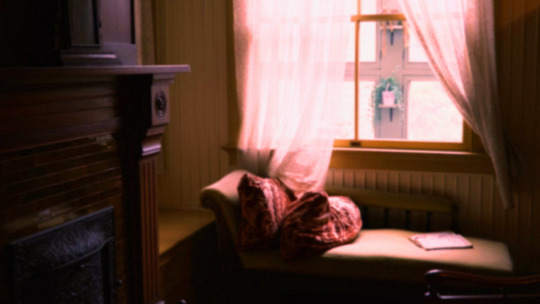
heres the image (the non indexed version) after these krita effects
one random special mention i have is that playing with layer blend modes is great
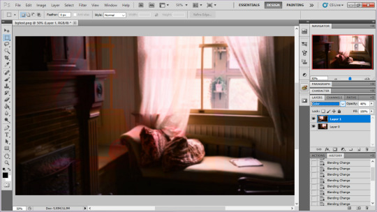
in this example i just copied the same background, mirrored it horizontally and set the layer blend mode to color and it lowered the layer opacity slightly. it just adds some.... idk what to call it visual noise? itj just fucks it up a bit. i used overlapping images and screen modes in some of the hopeless junction images i did for some pretty nice effects
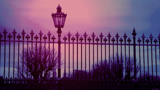
i dont really know waht the blend modes do i just scroll until something looks good lmao
theres a ton you can do with these. like for example just adding a single air brush dot of a bright color on a separate layer and setting it to some blend mode to add a tint to a background
i used these both in malmaid and in the second one i just brushed on some color on a separate layer to give it a moodier vibe

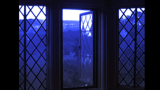
i think having variations of the same background is an extremely easy way to add some life to the bgs without having to do new stuff. like here was the hotel lobby when entering, and here is the hotel lobby when they ran away from the place. i added a radial blur with photoshop


i think theres some beaty in artifacts that come from low resolution images too. sometimes i intentionally use images that have clear compression artifacts cause i think it looks neat. i don't really worry about the details too much as the vibe is the most important thing
its honestly just a matter of knowing these tools exist and just fidgeting around with combinations to find what you want. it also helps to look at other backgrounds or images in general that you come across and just be curious. how was this done? how could i recreate it? that's the type of experimenting that has led me to these.
idk thats all i have to say. ty for reading and play malmaid on steam like and subscribe for more gay puppies

137 notes
·
View notes
Text
Tagging/searches
Reuploading this entire thing, updated.
• I see people complaining about Tumblr's search systems not working, and that's fair if you don't know the rules (I don't know all of them either), but one little tip I can give you is that, sometimes, simply looking up a tag on your blog shows you fewer posts than if you were to click on said tag directly in your blog's posts and browse it that way. That's how you get all of the results.
• When tagging, make sure the most important tags for general searches are the first three and for blog searches the first five. If you create a problematic tag (don't ask me what that means, that's tumblr's decision), more often than not, it does hide the entire post from your searches, meaning it won't come up even when you search it using one of its other tags (or the post's words).
• If you reblog something and tag it appropriately, it still won't show up in the general searches because those only show original posts. Tagging them is for your blog only. That said, tag your original posts so they get in the tag.
• When I can't find something, the method that never fails is to go through archives. If it's a text post, then that's fairly easy - you click on the text post filter and search a word from your post (not a tag! you can't do that with the in-built browser search, only the archive search). Remember, the result is only for the posts you see on your screen so you need to scroll -> refresh the search -> scroll etc. It won't always highlight the word for you, or better said, you won't always see it, and in that case, it means it is there but not in the post's preview (the preview is small; it can't fit everything in it).
Photos are more difficult to find but it is possible if you use the right tags to organise them. As in, don't just tag under the general tag, create subtags.
• If you want to create a tag for yourself only, add an underscore before your tag. It works exactly like a normal tag except for the fact that it's hidden for everyone but you. You won't see it when you look at a post but it will be there when you click on it and enter the editing mode or when you edit in your mass post editor.
• Featured tags: These are tags you can set for your blog. If you don't set them, tumblr will pick them for you based on what you post the most. They show up in your archive's tags and in your blog's search (though you won't see all of them in your blog's search if you have too many). If you can't find a tag there, add it to your featured.
• Capital letters make no difference (Abc = abc = ABC). They're a matter of personal preference. However, spaces matter (abc def is not the same as abcdef ..... think of fan art and fanart for example).
• If you want to find anything on tumblr, use: words you remember from a post site:tumblr.com (you can add /post directly after that for more accuracy because some posts get indexed differently and it wouldn't catch those without that addition)
• url.tumblr.com/day/insert year/insert month/insert day
• If you want to search by using two tags at once, use: https://[blogURL].tumblr.com/search/%23[tag1]%2C%20%23[tag2] (just remove the brackets)
A post that's worth a read
What are tags actually for
#tagging#tag guide#tumblr#abby talks#tumblr guides and related#An example of the hidden tag would be _scrn on my Arcane side blog. I use it for my own screenshots + I added it to my featured.
39 notes
·
View notes