#please don't mind the weird anatomy and colors!!
Explore tagged Tumblr posts
Text

The family on a holiday before the born of the second child... idk this is the special AU so that's Evan not Lizzie, sorry Liz I love you still
Close ups:
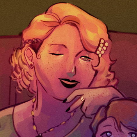

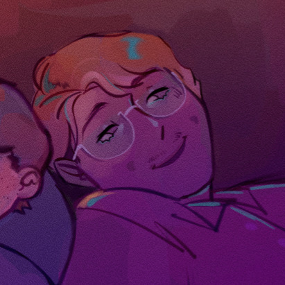

#as said in the... text; this is the AU I'm working on rn!!#coffee shop e!m au#still pending a normal name#fnaf#fanart#five nights at freddy's#fnaf au#fnaf fanart#michael afton#my art#purple guy#mrs afton#william afton#afton family#evan afton#or whatever his name is#is in thr belly :]#featuring also mr. fox of 7 tails and a silly orca#please don't mind the weird anatomy and colors!!
60 notes
·
View notes
Note
Is it just me or has the card illustrations (specifically the groovy) been kinda bad lately? Like don't get me wrong most of the pre groovy are absolute bangers, but the groovies? Not so much. But lately there has been an obvious decrease in quality with anatomy, and even 😐 a whitewashing problem.
Take Lilia's dorm groovy for example— the piece is gorgeous, but whenever I zoom into his face the way they draw his face looks so off.
As for the whitewashing issue, I've noticed that Leona's beastly garb groovy had him very ashy looking (but some may argue that it's just the lighting casted on him)
Right now though the one that's been bothering me the most is the obvious whitwashing on Kalim's tsum groovy. We really can't argue that it's a lighting issue there, cause Jamil's firework card had a similar setting and he didn't look that light.


Personally, I think TWST’s Groovy illustrations have always been hit or miss since the beginning. I have similar issues with the faces in Lilia and Leona’s Dorm Uniform Groovies, and the anatomy seemed slightly off in a few others. I can’t find the original post anymore (I think OP didn’t tag it??), but I clearly recall an artist having spoken about how the pose in Epel’s initial Dorm Uniform art looked weird; they included drawings of how Epel’s spine and limbs looked vs how they should look to illustrate what they meant. Those are just a few examples of then and now though, and we have to keep in mind that if we include ALL available cards then the funky faces and weird posing/proportions only make up a very small percentage of what’s out there.
The more important issue at the moment is the coloring choices that were made for a few recent SSR event Groovies: Beastly Garb Leona and Tsumsted Kalim. They are pictured below with a few other card illustrations I pulled that have similar lighting (or as similar as I could find). You’ll notice (especially for Tsumsted Kalim’s Groovy) that the characters’ skin colors are much lighter than they should be.
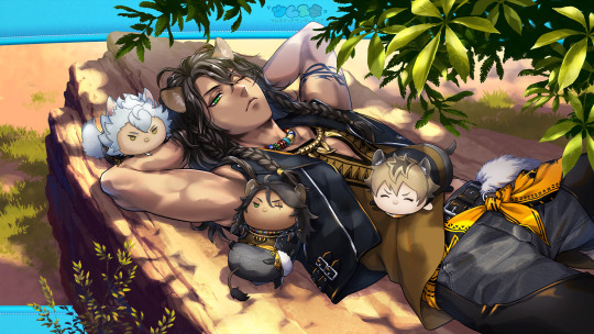
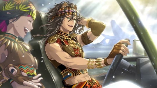
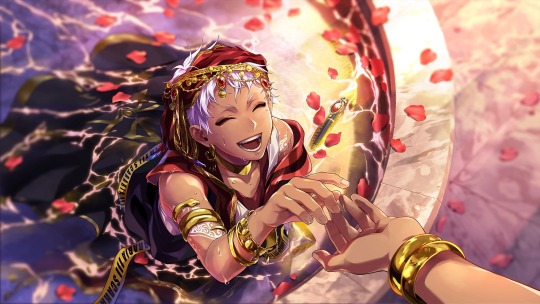
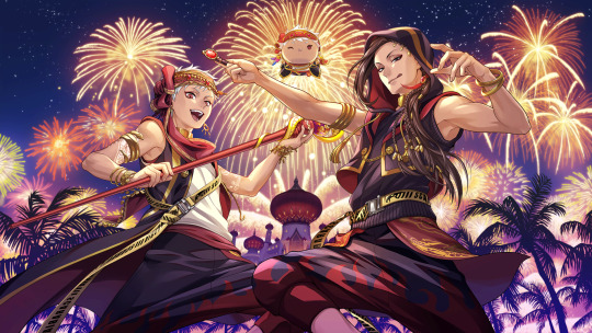
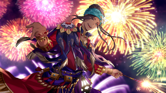
Now I’ll be honest here 💦 I actually can’t tell (even when eyedropping the colors to compare; I don't even know if eyedropping is an accurate way to compare colors since the lighting and environment in every illustration is never EXACTLY the same) if Leona’s Beastly Garb Groovy is just the strong sunlight or if it has been whitewashed. I don’t have enough knowledge and/or experience with color theory and in real life to know for certain. However, as the Anon has said, that same argument cannot be made for the Scarabia duo. It’s particularly bad for Tsumsted Kalim because Yasmina Silk Jamil also had fireworks in the background, and his skin color is fine there. Sometimes artists purposefully use an altered color palate to achieve a different feeling in their pieces (for example, pastel colors for a soft, soothing look). I don’t think that was the case for Tsumsted Kalim because everything else in the Groovy art looks pretty true to color for the lighting (but again, I'm not an expert in coloring so I could be wrong). When taken in conjunction with Leona’s Beastly Garb… it could indicate a troubling pattern.
There’s been a lot of speculation going around for why this has happened, chief among that speculation being the TWST team has likely hired new staff and/or colorists (and Japan, being Japan, is pretty homogenous; it may be difficult to find artists with an understanding of how to color and shade darker skin tones). Again, these are just guesses circulating in the fandom. Nothing is confirmed, and nor does this excuse what has happened.
This has, very understandably, caused a lot of hurt and upset in the TWST fandom and community. So now the question is…
What can we do about it?
You can communicate your feelings to the TWST team! They have a form to collect thoughts and opinions from the playerbase, which can be accessed here.
PLEASE NOTE:
Be polite and professional. Nothing good comes out of anger, especially if the anger is directed at others; if you are rude and/or curse at the staff, they will be much less likely to hear you out.
Communicate in Japanese. The staff you are sending your complaint to are Japanese, and the game itself is Japanese (Beastly Garb Leona and Tsumsted Kalim are not yet out in the EN server, which is staffed by totally different people).
If you don’t know how to write in Japanese, this Twitter user has created polite templates to communicate our concerns with the whitewashing. (Their whole thread is great; please reference it if you need additional assistance!!) I would not recommend adding extra text, especially if you would be relying on a translation program to do so. Speaking in broken Japanese can be perceived as rude and will only detract from your message.
A similar situation to this occurred during the initial run of Fairy Gala; TWST had used “exotic” in its text, and after receiving an influx of feedback from the players, the devs went in and changed the dialogue to no longer use the term. It’s possible to make the change we want to see a reality if we respectfully make our thoughts known.
#twst#twisted wonderland#Leona Kingscholar#Jamil Viper#Scarabia#disney twisted wonderland#Lilia Vanrouge#Kalim Al-Asim#notes from the writing raven#advice#tw // whitewashing
178 notes
·
View notes
Note
could you review the Machop line for us please?

Basically the psychical counterpart to the Abra line, the Machop line does a pretty good job at being wrestling-themed muscle monsters. Machop here is a bit too small to really have any seriously muscles, but it looks bulky enough, and serves as a good starting point for the rest of the line.
One thing I do like about this line is that they're fairly humanoid monsters, but each stage throws in one weird non-humanoid trait; in this case, Machop's tail. It adds a bit of flavor and makes for a more interesting monster design. I also like those plated segments on their heads.
The one thing that drives me nuts about Machops design, however, is THOSE THREE LINES ON ITS CHEST. WHAT ARE THOSE?? I never hear anyone mention them, but its always portrayed with them. They almost seem like ribs, but it doesn't make sense to see the ribs on a creature so muscular. Thankfully they're easy to ignore, but once you notice them you'll never really un-notice them.
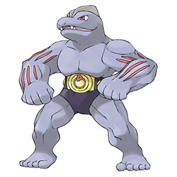
Machoke is probably my favorite of this line. While it looses the tail, it makes up for it with a more reptilian face, which I really like. I'm not entirely sure what the markings on its arms are or why it gains them and then looses them immediately, but they look cool—almost like exposed muscle—and they add some additional flavor to this stage so it stands out from the rest of the line.
However, my big beef(cake) with Machoke, and Machamp as well, is the belt. I don't mind the black markings, which fit into the wresting theme, but having a literal wresting belt there just feels so weird, and is very much one of those weird Gen 1 quirks that probably would've been handled differently in a later gen (see: Incineroar).
I don't always mind Pokemon holding objects, but I feel like there needs to be a degree of rationale behind it; like, it needs to be explained where they got the object from, why they carry it, and it needs to add something to the design.

The reason it has the belt is supposedly to hold back its power, but like... how??? Why???? These things and more will never be answered. It's never explained where the belt comes from either, and honestly, it doesn't add much to the design; the wrestling would've been obvious already due to the anatomy and the spandex-like markings. The design is otherwise fine as a whole, but that parts really distracting.

What's stronger than a big muscly guy? A big muscly guy with four arms, of course! The extra arms are honestly a pretty cool idea; they not only different Machamp from the rest of the line but just are a cool element for a monster in general, and work well with the theme.
However, while I like the new arms, the face is a bit of a downgrade. It's less that its flatter/more human-ish and more that it has those giant yellow markings; they match the color of the best at least, but they just look off. Also, the belt's still there. On the plus side, I do like the overall look, and its two-toed feet are an improvement; Machoke's felt a bit too humanoid.
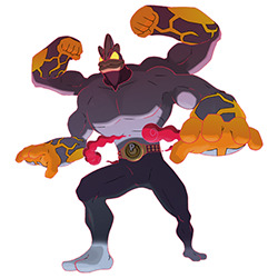
And g-max Machamp is decent enough, nothing crazy but nothing terrible looking. I guess my main issue with it is that it doesn't really do anything new conceptually; its a little different visually, but it doesn't enhance the line in any way. Why not give it a third set of arms in the back or something? Granted, multiplying design elements is more of a mega thing, but that would've at least been something unique. Or heck, why not finally remove that belt? Its supposed to hold back its power, so wouldn't taking it off here make sense?
But that said, the design itself isn't bad. I do like the smaller head and the more prominent neck, which makes the chest look all the bigger by extension. I also enjoy the way the markings have extended to make it look like its now wearing full-on pants, and how it has the additional cowl around the neck. The arm markings also aren't bad in that they attract attention to the arms and match the yellow accents in the eyes, belt, and mouth; however, they also feel kind of arbitrary, like they felt like the design needed something else but they weren't sure what so they just tossed those on there.
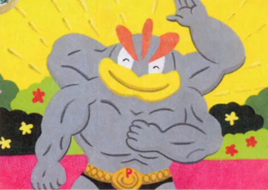
Anyway, as a whole, the line's pretty solid; the theme is obvious, each stage is unique, and the designs are enjoyable if you enjoy more humanoid monsters (which I do). The only things that bog it down a bit are details like the belts and the fairly standard g-max design.
58 notes
·
View notes
Text
Commissions
Note for everyone; even if you can't order a commission, I understand, but promoting this would mean the world to me. I'm struggling with finances due to issues I won't delve into, and I'm trying to afford the payments for my Cheer team + school fees. I already have a job to begin payment for it, but it's limited times and I'd prefer more help on it.
RULES
No Nsfw themes.
Try not to barter, please, I don't like wavering on prices.
Keep in mind that I may struggle with other people's styles (this applies to shows, I'm not doing it to a singular artist until I've gotten permission)
Feel free to remind me, but don't harass me over it. (You will get your money back in 2 months time after payment if I am unable to finish it.)
-----------------------------
I will have 15 slots open at a time and will make a reminder post when 2 are open.
(If you'd like to be @ ed or dmed when one is open, just let me know.)
-----------------------------
Examples of my work
(fairly recent or good examples of my skillset)


These are just a few
Sorry for the weird setup.
To summarize, I experiment with shading, posing, and backgrounds quite often.
I am willing to do
Furry art (I learned the anatomy and I'm fine with it as long as I have references and it is kept SFW, If you do not have a reference but have ideas and are willing to keep constant communication with me, then I am willing as well.)
DnD art (I can learn the anatomy of any creature and do any details you want)
Perspective backgrounds (I am fine with it)
Lyric art2
Complicated poses, if I cannot do it I will let you know and we can come up with something else.
Strange anatomy, as long as you have a reference I can do it
Design commissions
Fanwork of characters from a fandom
Feral characters
Humans
Anthro
I am less likely to do
Ship art (I can't draw kissing, but if it's not that then it's probably fine)
Demonic imagery
Insanely complicated designs (I can do it, just unsure if it'll be accurate enough to your liking.)
Geometric designs, they are very difficult for me but I can do it with some talking back and forth.
Art of real people (If you are fine with it being stylized, then I am willing)
There will be more added, this is still a WIP
Keep in mind I am a minor, so I cannot do this as a full time job. A piece can take anywhere from a day to a couple weeks to get done. I will keep you updated on the progress as I go along, I just may be slow to respond.
Sketch
I will provide cleaned-up sketches if you prefer, let me know.
Bust - 3$
HalfBody- 5$
Fullbody- 9$


Colored Sketch
Messy/Sketchy lines, and (usually) flat colors.
Bust - 5$ ( +1$ for colored sketching lines)
(+2$ for basic shading)
OR
(+3$ for atmospheric shading)
HalfBody- 9$ ( +2$ for colored sketching lines)
(+5$ for basic shading)
OR
(+7$ for atmospheric shading)
Fullbody- 17$ ( +3$ for colored sketching lines)
(+7$ for basic shading)
OR
(+10$ for atmospheric shading)


Lineart
This is clean line art, no colors. Just line art.
Bust - 7$
HalfBody- 13$
Fullbody- 25$


Flat color
This is clean line art with colors, no shading without the added cost.
Bust - 9$
(+ 2.50$ for colored lines)
(+ 2.50$ for basic shading)
HalfBody- 17$
(+ 5$ for colored lines)
(+ 5$ for basic shading)
Fullbody- 30$
(+10$ for colored lines)
(+ 10$ for basic shading)


Atmospheric Shading
This is clean line, and colored shading.
Bust - 17$
HalfBody- 30$
Fullbody- 54$


Lineless
No lines(Or minimal lines, depends on how you'd like it) on the art, can also be a painting
Bust - 15$
(+5$ for basic shading)
OR
(+7$ for atmospheric shading)
HalfBody- 25$
(+6$ for basic shading)
OR
(+8$ for atmospheric shading)
Fullbody- 45$
(12$ for basic shading)
OR
(+15$ for atmospheric shading)


Backgrounds
This all depends on the complexity, but it will usually be around this range. I will keep you updated as it goes
Simple pattern, blank color, or a design - 0-1$
(EX: Image = 0$, Pokka dots = 0$, Gradiants - 0$, Stripes/Checkers(That I have to draw) - 0.25$, Blurry background - 1$) (Feel free to ask questions!)
Simple background (Like eyes, something I have to draw) - 3$
Nature background - (Depends on complexity) 10-50$
City background - 10-100$
Inside a room - 10-80$
These are examples, they will vary. References for what you'd like are preferred.


-----------------------------
Extra information
An additional character will be 75% of the cost added back to the drawing. (If it is a fullbody and you are adding a halfbody, it will be 3/4 the price of the halfbody).
If you do or don't want me to post the drawing, let me know. Otherwise, I may or may not.
Let me know if you want the Krita file.
If you don't want to DM me on Tumblr, Deviantart works too.
-----------------------------
Current Slots:
Open
Open
Open
Open
Open
Open
Open
Open
Open
Open
Open
Open
Open
Open
Open
-----------------------------
Payment
I do have a Paypal that I will DM you if we get through the basic process.
I'll have half the price upfront, and the rest when the piece is finished.
Refunds are applied when
- I do not finish it.
- I have taken more than 2 months to work on it without stating that it would take that long, or letting you know of a pause beforehand.
If you back out, I will charge you according to how much has been done. If I have a sketch at that time, you will be charged 50% of the price of a normal sketch. I get slow payments, but I can't afford to spend time on things I won't get paid for. Again, you know this as you go into the process, I will let you know when I start it, and as I get through each phase of it.
Your satisfaction is entirely dependent on you, as I will be updating you throughout the process, and you can tell me to change whatever you want me to. You are hiring me for this work, and I intend to do it well and efficiently.
I will take breaks between taking commissions, as I am, again, a student in high school. I am in the midst of competitive sports and several studies so I understand if I am taking too long for you.
FAQ:
None yet, adding more as we go.
#commissions#art commissions#art comms open#art commissions open#commissions open#furry comms open#dnd commission#cheap commissions
12 notes
·
View notes
Note
How do you draw up your comics so quickly? I've been wanting to get into making comics myself, but it seems so daunting lol
Was hoping to get some tips on how you draw them so well and so quickly /pos /nf
Omf that's a tough one. My honest first response is "All I do is draw all day" so please don't hold yourself to my standards I don't have anything better to be doing.
Basically it's a mix of stuff:
My art style is simple/character designs are simple. Backgrounds are simple, overall.
STUFF BE SIMPLE.
"Gets the point across" tends to be the idea.

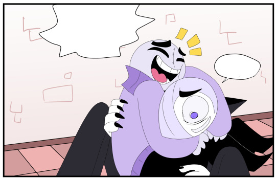
Anatomy isn't perfect, gradients are used a lot, shading isn't always present, I try to limit my color pallets to be pretty small.
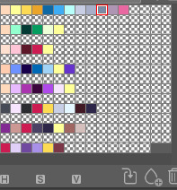
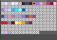
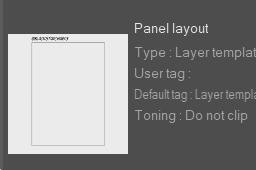
I have a bunch saved onto the side bar in Clip Studio. And I have presets like the borders of the panels as a pre-set so I don't gotta make a new one over and over again.
Short cuts are NOICE.
Art wise:
I start with a thumbnail. Just getting the idea/facial expressions of the character down.
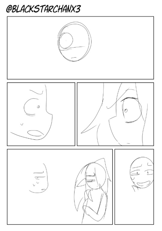
Sketching is 2nd step but I have no examples because I delete those pretty quickly.
More similar to this so line art is WAY easier.
I change the sketch's opacity to like 20 ish and a light blue to see it better.
Then I do line art and add a neutral color under it to make coloring easy. I change this to black after ward to fill any gaps.

Add color and ba-bam
I use "Color burn" "linear burn" and Multiply in the layer settings for shading. Just depends on the circumstance.

I guess smth else I do is go by "Chapter" or scenes.
Smth that's helpful for some is writing a script and then drawing your stuff based on that.
Often what I end up doing is writing a script but using it as a guide rather than a beat by beat thing.
Referencing manga for inspiration is smth I do a lot.
Smth I'd recommend doing is making a one shot or a comic you purposely make to be short.
Longer comics are daunting but the best way to deal with that is to complete parts of em. XD It's like going through a video game. Beating each mini boss gets you closer to the final. Like instead of one big project, see it as a bunch of smaller ones.
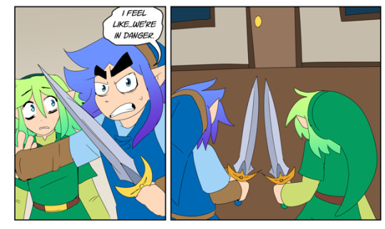
Smth I do to let off steam from bigger projects is making stupid shit like this:
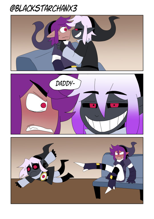

Like there's no point to it other than to be dumb and funny.
Keeping the story entertaining or fun even while doing a part you don't want too.
Sometimes you will just have to chug through a portion you dislike but is necessary. But staying strong really helps.
Pop on a freakin' YT video and zone the hell out is what I do.
Your art doesn't have to be perfect every single time, my comics at least, are free so anyone who complains is a little bitch.

Just do what makes you happy.
Huge thing to consider: Your art doesn't have to be held to any specific standard.
You don't even have to COLOR that shit if you don't want too lmao. There's no rules. You can color a sketch and post it. It literally doesn't matter.
A specific standard of what every webcomic should be held to is a lie. It doesn't exist. Go feral.

Draw backgrounds. Even if you suck at em. It helps give the world dimension hah.
That's what I've been trying to do.
Use your comics as a way to experiment.
Ghost Soulmate I wanted to try out this weird painter style for the shading/lighting.
In FSR it was trying out a more anime style
Falling Cards is weird character designs + A FAR too ambitious story hah.
Bunny and Kitty was to see if I could do a shorter form story.
Biggest advice would be: Just try smth. You got no obligation to finish smth either. Just try it and see how it goes.
I'd recommend having an idea where your story is going before you start, but just starting ANYWHERE helps.
I tend to doodle my characters before I jump into their comic. Doodle them doing fun stuff before I go into the meat and potatoes of what I want them to do. I often have an ending in mind too before I start. You can fill in the gaps later.
Anyways that's all I got Idk if this was useful or helpful. X'D
22 notes
·
View notes
Text

Ooc: Please don't mind the rough anatomy and coloring
Been thinking about a more Sonic-centered OC. This is Mako, a dingo/koolie mix inspired by the black opal gem. She's just a weird hippie/surfer wannabe looking for her place in the world.
Anyone interested in a RP blog for her?
12 notes
·
View notes
Note
Hello again! My tablet pen is dead, but I still have a sketch book, and mer desgins/anatomy has all but consumed my thoughts at this point.
Profile designs of the mers we've seen so far (- Spreen)

Sorry it's a bit messy, my eraser wasn't that good ;-;
I gave Bagi a weird shirt thing(?) It has two loops for her arms and ties behind her neck so she can still move her sail if she needs to. Otherwise it stays on by magic(?). I don't know I just wanted to give her a shirt thing. If there's another idea you have for that let me know, I can understand why that wouldn't come up in the fic.
And two questions- First: What color(s) is/are Bagi's tail? Also do you have a color in mind for the belly pack?
Second question: Do all mer's have face scales or just ones with scaled tails? Or some other third thing? I know Ramon has face scales and a scaled tail, but I don't remember any other mers descriptions specifically referencing face scales like Ramon.
Sorry for all the questions, I really like drawing mers and this fic is scratching an itch for mers + character design that I love. If there are any adjustments or if they looked a bit different in your head please let me know!!
THIS IS SO NICE ART!!!💖
face scales are mostly for merfolk with scales on the tail as well but how much they have vary between mers. Ramon has especially noticeable ones.
I like to think the bellypack is green (similar to the color green she has on her skins pants)
I haven’t considered Bagi and by extension Cellbits colors a lot, I try to think about how their skins looks and take inspiration from that but I think Bagi would have a pretty even split with white and brown (similar to how her hair is). Like White belly and brown back while Cellbit is mostly white with like one brown stripe, so like the opposite of his hair(I’m also taking inspiration from his federation outfit,).
Also I don’t mind the questions at all! I love your art and I also love talking about fics and ideas I have!! So feel free to ask as much as you want! :D
8 notes
·
View notes
Note
Are there some artists on YouTube or tutorials you would recommend ?
I will put some links below that helped me💛
This artist can help people at any level of art. For people just starting out or who have had some self-taught practice, or maybe they're picking up the pencil again after a few years of not drawing.
All-time favorite YouTuber right here!
His voice is soothing, but he also has videos where he doesn't talk at all if you aren't a fan of that type. The videos are pleasing to just watch if you dont feel like following along. He breaks anatomy down by shapes, which helped me understand it all a lot more.
youtube
If you are looking to draw humans, this is your guy. I recommend starting with understanding the basics of anatomy before you jump into any stylized art like manga or anime stuff.
youtube
He has tutorials for traditional pencil sketching and digital art. I think it's best for beginners to start out traditionally and work their way into digital art.
It's cheaper than a tablet, for one, and it's way easier to learn the basics on a sketchbook! Chommang teaches better in his traditional sketching videos.
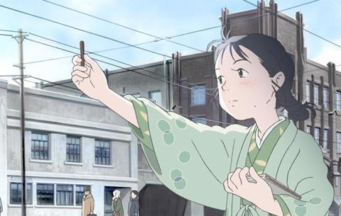
Also, I'd recommend focusing on the body more than anything as a beginner. Drawing a face is hard, especially if you have a specific style in mind, and you might get stuck trying to get the face to look right.

Drawing and mastering body parts will build your technique and confidence in working up to small details in the face.

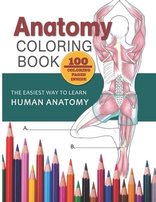
The coloring book specifically was super helpful to understand muscles and why things may look weird or normal in some drawings.
A personal favorite:
youtube
I was having a rough time a majority last year and feeling down on myself. Eventually I lost the energy to do any hobby.
This video really helped me flip my perspective. He pretty much says don't be too hard on yourself and compare your drawings to other people. He spent years of his life doing that and hated drawing because of it.

Also... it may sound annoying or obvious... but practice every day. I fell off for a while and stopped my daily practice, but I'm starting up again. It really makes all the difference in the world.

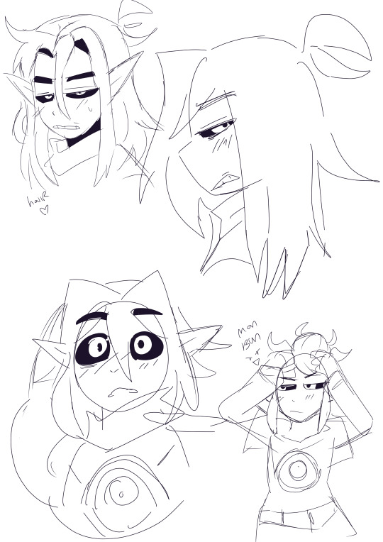
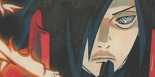
Good luck anon! I hope you have a good weekend. With enough patience we can learn to draw Madara in any situation.
16 notes
·
View notes
Text
Request an animal to perhaps get a nice drawing of said little guy!! I'll do almost any animal that exists or has existed (given references are available), but I'm mostly familiar with mammals.
Send an ask with the animal + whatever detail you feel is necessary, such as pelt color and age or send a reference! Example below! Colors to emphasize what i mean.
Hi, can you draw me a white and yellow golden retriever mutt puppy? He has huge paws, a cute round face, a pink nose and eyes! Thanks in advance!!! 😄
Basic rules:
I'll draw what seems more fun in my free time!! Please keep that in mind! I'm a very busy full time student.
I won't draw fur anthros. I will, however, draw ferals if it strikes my fancy.
Feel free to send as many requests as you want.
Feel free to use the images drawn, but credit this blog so other people can get a chance at it too and i get to draw more little guys!
As a rule of thumb I'll do a new drawing every single time because i like drawing animals, but sometimes I'm in the mood for coloring, so I'll color in a drawing I've already done if i feel like it.
Don't insist too much if your request doesn't get drawn, I'm doing this for free and for fun.
Kin and therian friendly!! Y'all can send requests of your kintypes to use as reference too!
OCs allowed.
Pelt colors not found in nature are allowed and cherished.
Don't be rude.
More info on the mun under the read more if you feel like knowing more about the thing that runs this blog.
This blog is inspired by those "daily-[insert thing here]" blogs. I can't draw a thing every single day though. So this is eventual little guys, not daily.
Hi. I'm a 22 year old artist from Brazil. I'm a He/she sort of queer. I'm autistic! Animals have been my special interest since i was 7 and I love learning more about animals. I'm a weird nerd that's super into anatomy and behavior and physiology of all sorts of little creatures!!! Its really cool to me. My favorite animals are dogs, hyenas, bunnies, deer and sharks.
The main is @bnnuy-wabbit
10 notes
·
View notes
Text

So yes... this was supposed to be my piece for the RK1700 Blooming event.. 😂 I just finished it so I thought I'd share anyway. I just thought them making flower crowns for each other would be adorable
Also, bonus doodle - Amanda caught them ruining her garden 😭

#Detroit Become Human#RK800 x RK900#RK1700#SHAME SUSAN!! SHAMEEEEEEEEE!!!#I got a pass for tagging it as the picture for event so I'm gonna do it now#blooming17#LALALLALA I'M NOT LOOKING AT IT ANYMORE IT'S YOUR PROBLEM NOW ALALALALLA#gosh I feel so scared everytime I post anything that isn't a cursed doodle jfkrfkjss ANYWAYS BACK TO TAGGING#DBH Connor#DBH Nines#should I tag Amanda as well 😂#OK WHEEEW now goodnight everyone I have to wake up early for work wish me luuuck ahahha#DBH#my art#FanArt#please don't mind the weird colors I'm colorblind#and the wonky anatomy literally no idea how to fix it#I'M STILL LEARNING ART OK
388 notes
·
View notes
Note
How about Maiponpon? <3
Oh I adore Maiponpon's Corrin artwork!
Maiponpon's artwork is solid in general, though. Their color work is vivid and very defined, and their anatomy is still great even while maintaining motion. They're SUPER talented at giving a sense of dynamic and motion even in their neutral portrait artwork.
Like Dream Corrin:

So nice and floaty, it really is a beautiful design.
Also a cool thing to note about their color skill is Sothis:

Aside from how awesome it is that Maiponpon even drew her sitting on her throne, look at the coloring on her attack portrait:

It's still dark and dramatic, like Sothis still being in the mind of Byleth. But that's not the case in her Christmas portrait:

Isn't that such a neat attention to detail?
And their posework is so great, I love Corrin's attack pose, he looks like he's dancing gracefully, and the flow of his outfit really lends that motion:

Also I think it's unfair that they got rid of Maiponpon as M!Corrin's artist but they decided to keep Sencha for F!Corrin. Don't get me wrong, I LOVE Argon's Corrin and I love Hanamura Mai's Ninja Corrin. But a part of me has a weird conspiracy theory that they're fine with Sencha making F!Corrin lewd and horny whereas the moment Maiponpon gave us true equality:

Suddenly they're no longer M!Corrin's artist. Either get rid of Sencha too or keep Sencha AND Maiponpon, IS. Actually, just get rid of Sencha for F!Corrin please.
Anyways, criticisms? I'd say that maybe the only criticism I can think of is that they haven't really had a wide variety of characters to draw. They've been shown to draw both male (Corrin) and female (Lucina, Sothis) characters, but that's about it. So it's hard to see if they really have a grasp on drawing other types of characters too (rugged, mature, or old). But at least with the three they've drawn, they can draw men (with muscles), women, and children.
Maiponpon's a 9.99999/10 and so help me, if IS doesn't hire them again to draw another character I WILL cry.
#Fire Emblem Heroes#FEH#Maiponpon#ask game#Gosh seriously though where is Maiponpon?#I miss their artwork ;w; I wanna see them draw more characters#They made M!Corrin look so charming
24 notes
·
View notes
Note
Hi art-res! I have a little problem with values. I've seen many artists say that pure white and pure black should be avoided, but I don't really understand why? (Thank you in advance and I really love this blog XD)
Hi homie!
Photo ex from Unsplash (open domain img)
In nature, there very rarely is pure black or white. It can make your drawings look more bland color wise and not as realistic if you over use those while you are going for a specific look.
Like for black fur, I mix in purple, blue, brown, and grayish tones in it. It makes it more lively looking. For grey fur, light green, blue, purple can also be pretty cool. It doesn’t look that shitty when you look at it from a normal viewing distance.
Here’s an example I did including weird ass colors… (my personal art account is @astrikos) Turned out pretty cool, & this is a close up so you can see the colors a bit more.

In nature, colors of other stuff bounce onto the surfaces of other objects. Like if you put your arm next to a bright red jacket, if you look carefully, you should be able to see the red light bouncing onto your skin tone/objects you’re holding. Pretty subtle, but it’s there. Also depends on the texture/reflectivity of the object.

Or the lighting itself might be colored. Then your work also looks litty gang when you use colored highlights and shadows as opposed to black, white, grey.

For this reason, I add colors to the shadows and don’t really use black or grey in my value work.
For some pieces, I will use pure white highlights, but just as like a dot or two. Even then, you don’t even really need that white color.
But if you want to use white or black to pop your image, or you have a specific idea in mind, don’t limit yourself! You can achieve a lot of cool stuff by experimentation and creatively breaking the rules.
Here’s an example of me using black and white a lot in a colored drawing.

Have fun with it!
Hope this helps!!
Thanks for reading! If this post helped, please consider reblogging it or sharing it with your friends! ❤️
More useful articles and resources / support Art-Res | my art tumblr | Idea Generator | Check out the Art-Res Anatomy Ebook!
225 notes
·
View notes
Text
#dinviataunuitiptrans
It's 2020 and my only resolution is to take it easy on me and go walk whenever I feel the sadness circling my soul, so this day I do just that.
I woke up freezing because the heater got broken and I know that if I stay indoors I'm gonna fall into some sort of despair so I go and brew some few cups of tea, purr them in bottles, roll up my last blunt from the stash, eat some pasta left overs from new years eve, dress myself in pretty colors and head out. It's been one hour of walking therapy so I stop by McD. to pee and then head out to the small park to have a smoke and rest my legs.
"- Futu-ți morții mă-tii de adiere băşită" is the best my brain could think of when the wind blowed away the tobacco from my rizla while trying to roll, so I start all over.
"- Futu-ți morții mă-tii...", this is my second attempt, the tobacco is all over my pants so I take a deep breath and keep on trying.
"- Futu-ți morții mă-tiiiii!!!!"
That was my 3d attempt to roll but the wind had other plans for my lungs. But then you came bye amused by the words you didn't understand, holding a pack of cigarettes and inviting me to stop fighting the wind and have a smoke from your pack. So I take one and you take a seat next to me and we lit up the cancer tubes, I say thanks and you say I'm very cute and smile. To scare the shyness away I pretend to flip my hair in the gayest way possible:
- Oh, just cute? and I thought I was beautiful, now you destroyed my dreams to ever be an instagram sensation.
You start laughing and tell me I'm actually beautiful and we start playing this game where we kinda make fun of how dumb we as humans are, I'm cracking up silly jokes and you do the same, I tell you I find you very cute also and I apologise for shattering your dreams of being an insta model, you laugh and you give me another cigarette and then move a bit closer to me.
- You're very smart for such a young guy...are you seeing someone?
- Love, you're sweet but I'm not that young...
Then you touch my hand and tell me you already like me and that I don't have to lie to impress you because you have been with guys younger than my age. That's how I find out that I'm most likely 22 or 23 and that you're just few years older than me, you're 25. I tell you lies are not my sexy kink and that I'm born in 1984, on the 31st of May. You laugh but I see the awe on your face so I tell you the good looks run in my family and that if you see my brothers you'll know what I'm talking about.
- Show me
You say that and then cuddled so close to me that you give me no option but put my arm around you while I start pulling out pictures from the phone.
- Here is Patrick, he's the love of my life and one of the sweetest man the Universe has given us. He's gonna be 35 this year.
You say we look alike but that I'm prettier than him so I turn a bit red and start feeling kind of uncomfortable so I swipe away.
- In this picture he's with Max, they are at a court hearing. Max is the oldest one, he is in his 40s and he lives here in UK but up north. I haven't seen him for ages and I miss him and his signature paranoia very much. This is Andrei, I have tons of pictures with him, we live together and he is so sweet that every time I think of him my heart melts. Probably the reason I take secret pictures of him while sleeping.
I show you more pictures with him and tell you the story when I had to sleep in his room and how he cuddled close to me when we were sleeping and you press yourself against my body and tell me you get it why. This makes me feel even more uncomfortable cuz you kinda took up every cm of my personal space but I don't know what to do so I brush it off.
- He's 22 and he might be one of the sexiest of us but he's not the youngest, Gherman is. See? This is Gabi but I call him Gherman, this is a screenshot from one of our chats, I always do this pictures when we talk so that I have them to look at when I miss them. You would say he's 14 but actually he just turned 18. He's an adorable pain in the ass but with the soul in the right place. And this is Chriss, look how gorgeous this guy is and his heart is pure gold. He's such a talented artist but unfortunately he wasn't discovered yet, he draws nudes and erotic art and it's mind fucking blowing. This is a photo with Chriss, Rami and Teo, I almost cried when I got these pictures of them. Rami represents the whole notion of humanness and he's shy just like me.
- This guy is blonde... is he also your brother?
You pointed out to Teo so I show you more pictures with him and then pull up pictures with Andreas also.
- Yeah, we have few blondes in our family but we decided to love them nonetheless. This is Andreas, not only that he's blond but he's also a very wise man. It's always such a pleasure talking to him. He's in Germany now. Just like Leo.
I'm looking for pictures with Leo so I start scrolling for the screenshots from the last whatsapp conversation and you decide to take a break from your cuddle and have a smoke. Now I feel more comfortable even though you're still resting your body next to mine.
- Here is my adorable Leo.
- He looks alot like the first guy without the beard..
- Like Patrick?
- Yeah
You see the pictures with me and Vlăduț and you like him.
- This is your brother also, I can tell. Is he old like you?
- No, actually he's young like you. And also an amazing musician and sound therapist. He makes sounds with weird instruments and then you feel a bit better. But he's not in London anymore, he returned home, he wasn't feeling very good here.
I feel you're a bit disappointed and probably thinking that you'll have to settle with me but once you get me started with my brothers it's very hard to make me stop.
- And this is Aris, he looks like an artist because he is one, he's a painter and a tattoo artist. And this is Elias, if you're ever looking for a smart conversation then he's the guy to go to. Him or Alexander. The difference is the sarcasm of Alex versus the warmth of Elias.
Then I show you Alexander and you smile and ask me if Elias and Alex are twins but I have no chance to answer because now you're handing me your phone and ask me to pull up my fb and I do just that so you start looking around while I'm getting even more nostalgic going through the pictures in my phone. I'm looking for a picture with Abel but I have no more time to show it to you
- You're transgendered?
- Oh love, there's no such thing as being "transgendered", nobody can transgender me, I am transgender because this is how I am.
- You mean you're not a real man?
- I'm just as a real human as you are love, and for sure am a man. Just that I'm a trans man
- And you're proud of this sickness...
And then you show me my cover photo.
I felt your disgust even since you said "Trasgendered" and I know very well that look in your eyes, I once had a crazy girlfriend who used to look at me just like that and somehow it feels so fucking familiar that I sense what is going to happen next so I try my best to avoid it. I tell you that each of us has its own life to live and that people must learn to accept and embrace diversity if we want to heal this human race. I tell you that body parts are just that, body parts and that gender identity is not defined by sexual anatomy. I want to tell you more but I was right and you snap into rage mode, slap the shit out of me almost poking my eye out with your nails.
- Fucking disgusting predator, man with pussy, you should be burned alive.
You walk away in anger showing the middle finger, shouting "fuck you", so I shout back that you wish to have the luck to get fucked by such a proud trans man but that I don't fuck crazy bitches anymore so you turned around and you were fuming so I told you that if you come back to hit me again I'm gonna punch you in the face. You left. I start rolling one and feel sorry I got angry and yelled back but somehow so relieved that you went away.
Dear L.,
You have my FB now and somehow I hope this message gets to you: please get some medical help you are in desperate need, and you won't get to meet nice guys like me everywhere.
I know you have serious mental issues cuz a healthy mind wouldn't let you go to total strangers looking for their attention and affection on a bench in a park, you don't cuddle with strange men and expose yourself like that.
I lived with a girl like you, extremely violent and unstable that is, for a whole year and I know that you were just looking to meet somebody that looks like a nice guy but actually hoping to get an asshole so you can have an excuse to violently manifest your pain. Been there through that already so I know the drill. The fact that you discovered I'm transgender was just the trigger you were looking for, and I didn't feel you hated me but I did feel that you wanted to make someone suffer and you found me, so it was just a matter of time until something would have triggered you.
PS: I'm sorry I threatened you but I don't like being hit. I wouldn't have hit you back but I would have called the ambulance because I learned that being a sweet person doesn't help when somebody suffers like you do.
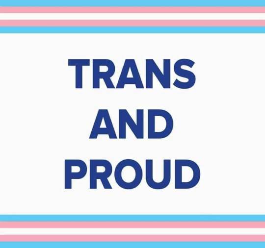
#trans guy#trans man#transform#transition#transgender#unicorn#trans pride#trans is beautiful#trans is valid#trans and proud#dinviataunuitiptrans
2 notes
·
View notes
Note
I am afab, and I definitely feel like my gender is female but I don't think I'm cis. I feel dysphoria like I'm supposed to have an amab body yet I want to present as a female. What is this?
Please don’t use expressions such as “AMAB body” when you are not talking about yours (or citing someone), since assignment doesn’t necessarily correlate specific bodies. The idea that sex/gender assignment equals anatomy erases both people who transition physically and intersex people. AGAB language exists for descriptive reasons, not as a thinly veiled “politically correct” way to say “biological female” or “biological male”.
That said, I think that it’s possible that you either:
Take into account a “male coded” appearance into your gender: you want to use “female coded” clothing but you also want to see yourself as partly male or masculine;
Are at least partially female and want to have a “female coded” presentation, but want to be seen as a nonbinary/genderqueer/gender non-conforming person without changing your wardrobe, and changing your physical appearance could accomplish that;
Have some kind of issue that may translate into something similar to gender dysphoria, even if you identify with your assigned gender.
As for what labels you could possibly use, well... it’s hard to know from this description, but here are some:
Ambigender: “A feeling of two genders simultaneously, without fluidity/shifting. May be used synonymously, in some cases, with bigender.”
Genderfuck: “Some nonbinary people may choose or need to present a 'clashing' combination of gender cues that are incongruous, challenging or shocking to those who expect others to fit the gender binary. For example, combining a beard with makeup and a padded bra. This practice of transgressively breaking the rules of gender presentation is known as genderfuck, genderfucking or sometimes genderpunk.”
Lamingender: “A polygender identity that feels layered, or as if it is composed of distinct slices.“Midgender: “A gender that exists in the middle between the binary genders of female and male, and may be a mix of both."Offgender: “A gender that closely represents/is most closely represented by another gender, but is not that gender. Can be likened to what the color off-white is to white for descriptive purposes."Schrodigender or Schrodingender: “1) A gender which you can both feel and not feel.2) A single gender that exists as if it were many genders at once.”Skoliogender: “A gender which is almost recognizable, but is just slightly off; a gender which approaches a recognizable gender, before sharply veering off."Transbodied: “A term to describe being at the weird and difficult intersection between gender, sex, spiritual identity, and mental illness (sensory disorder, BIID, dissociation, etc.), while understanding that your mind and body don't match up in some way that is not straightforwardly related to gender dysphoria, wistphoria, or transition."Commogender: “1) When you know you aren't cis, but you settle with boy or girl for the time being.2) A feeling that one is definitely not cis, but is unable to define what their gender is due to mental exhaustion. May be used as commoboy/commogirl if the person identifies with a binary gender for convenience.“Contrarigender, Oppogender, Divergender or Discrepantgender: “When you feel/are two (or more) contradicting or generally `opposite' genders at the same time, such as being simultaneously completely gender-null and another gender.”Nonpuer or Nonvir: “Someone who is not male at all in any way, shape, or form, but feels a strong connection to masculinity within their gender. Nonpuer is the young form and Nonvir is the older form, as, similarly to the term "enby", many find "boy" (puer means boy in Latin) infantilizing.”That said, only you can say for sure what’s going on!~ Tath
#ambigender#genderfuck#lamingender#midgender#offgender#schrodigender#skoliogender#transbodied#commogender#contrarigender#nonpuer#Tath#Anonymous
16 notes
·
View notes