#please don't make these same changes on mobile i LIKE icons
Explore tagged Tumblr posts
Text

I made a tier list...
please make your own!! I need to see boomer nations opinions on our man!!!! I know the tiers are actually so vile so change them if you desire :)))
OK so my quick blurb on why they are their!! (working worst to best)
28. Identity Crisis #5 - HE WOULD KILL ME FOR THE FUN OF IT. It did bring about the most random rivalry between Tim drake’s fandom and boomer's which is very funny
27. Black Lantern - Oh no… he's back… like a boomerang. Ate his own son... RIP…. L skill issue
26. Sliver Age - Would actually call me a slur and say that I don't deserve rights. He would hate crime me and then solicit me for sex. He looks like he's wearing a dress… what a pretty lady.
25. Flash TV Show - EWWWWWWWW, he though he ate...
24. DC Online - He looks like he would punch me in face at a NYC bus stop
23. White Lantern - Don't look at me like that… stop. He's back from the dead like a boomerang?? Something about most of the New 52 boomerangs don't hit the same. the bride all in white :’)
22. Young Justice - Gave me the ick. You might be thinking... he looks identical to SS hell to pay, why is he down here?? Great question… HE WAS SO CREEPY TO ONE OF THE GIRLS IN YOUNG JUSTICE….. WHO IS A MINOR!
21. Injustice Movie - Just because your in the background… doesn't save you from this list!!!
20. New 52 - Ok he's kinda hot if you look through your peripherals…Why are you wearing skinny jeans… you millennial
19. Harley Quinn TV Show - He's fine… just fine. “We’ll stack out bingo… Boomer loves an older woman” NO HE MUST LOVE ME! I AM VERY VERY MATURE FOR MY AGE
18. Flash: Sins of the Father - Can you please stop talking in the 3rd person… you are starting to sound crazy.
17. Most Wanted - I know jack shit about him. That's probably because he is barely in a comic issues THATS NAMED AFTER HIM!
16. Flash Point Paradox - His fight scene actually ate. I'm a sucker for Boomer being with the Rogues. If cyborg can take his belt off… so can I
15. Suicide Squad 2021 - Wow they somehow gave him even less lines than his first movie. 1. He doesnt look like boomer. 2. His accent is so bad… and hes AUSTRALIAN 3. His acting low key kinda mid 4. They killed off two of the only OG suicide squad members they had on the cast 5. He dies in the first 20min and in the most disrespectful way
14. Suicide Squad 2016 - The only good thing to come from this man is the fanfiction he brought. THIS FUCKING MOVIE MADE HIM A CANON BRONY WHICH I CAN NOT FORGIVE. GET THIS OUT OF MY SMUT BEFORE FREAK THE FUCK OUT >:( Fuck him and pinky too, you son of a bitch!!!! (its not that serious lol... i just want him to stop fucking a toy horse... please guys)
13. This Goober Alien Guy - I know nothing. He just kinda showed up… and I'm not mad just a little confused. He looks like he needs a hot chocolate and a hug :))))
12. Lego Batman Movie - Low key an icon. What I would do to get my hands on one of these sets… I would come close to killing someone for it
11. DC Lego Super Villains - If he wasn't Lego I would propose (Shane Dawson style) Once again what I would do for the very discontinued Lego set tie in…
10. Batman: Brave and The Bold - Those cheekbones could cut someone. Why are you wear a mini skirt… take it off ;)
9. Suicide Squad (comic) - Yes I know he was drinking and driving but he's not real so it doesn't count!!! The beginning of the Boomer Mobile! THE GAP TOOTH DUDE!
8. Justice League Unlimited S1 - AAAAAAAAAAAAAAAAAAAA! Ok the hairline is… bad…. But so is mine twin!! I LOVE THAT THEY GAVE HIM PROPER CLOTHES AND NOT RAGS DUDE
7. Agent of Oz - is this picture is my school profile pic...yes… and??HE'S COVERED IN BLOOD AND IM GIGGLING!!!!!!!!!!!
6. Stjepan Sejic's Boomer - Choke hold and choke me... I want to hear his voice but he can't break his mewing streak…The ungodly things I would let him do to me
5. Dark: Apocalypse War - Constantine! Boomer! GIRLS! GIRLS!! ILL SLEEP WITH BOTH OF YOU!!! I was not expecting him in this movie so I started to freak out when he showed up DUDE. PLEASE LET ME SIT ON IT
4. Suicide Squad: Hell to Pay - I'm a ride he wouldn't survive… I DONT HAVE WORDS TO DECRIBE HOW I FEEL DUDE… I WOULD DO ANYTHING HE ASKED FOR NO JOKE. Dead on the floor
3. Justice League Unlimited S2 - The glow up in REAL... had me on my hands and knees as a 3rd grader… and still on my knees today. I have never wanted someone to fuck me in the back alleyway of a shit bar so bad in my life
2. Batman: Assault on Arkham - The one that started it all… he is the reason I am this way. no lube, no protection, all night, all day, from the kitchen floor to the toilet seat, from the dining table to the bedroom BUT GREG ELLIS IS PUBLIC ENIME NUMDER ONE. YOU KNOW WHAT YOU DID!!!!
AND THE BEST ONE!!!!!!!! WE ALL SAW IT COMING
1. Suicide Squad: Kill the Justice League - I AM GNAWING ON THE IRON BARS OF MY ENCLOSURE!!!!!! He has it all, the face, the VOICE, the look, the character!!!!! It is hands down the most consistently good representation of captain boomerang out their… and its canon that's he has a big dick :D I would sell my first born to get one night…
Thank you all for reading this word vom, I am sick in the head <3
if any of the comic issues are off or something please let me know :)
PLEASE PLEASE PLEASE make your our and tag me!! i need to see them <3<3<3
#captain boomerang#dc villains#digger harkness#george digger harkness#rouges#kill the justice league#captain boomerang x reader
113 notes
·
View notes
Text
my terf+transphobe blocklist
Every terf I've found. For your blocking pleasure! Under the cut
Oh fuck there's a terf in my notes! What can I do? 1. Flag on shinigami eyes browser extension. You've probably heard of this, but it's free, available on desktop. Also available on firefox mobile I think. Has been used to improperly flag people before. Trust but verify. 2. Look through "Blogs like this one" to break the reblog chains and effectively block a whole circle of them. You could also just look through who they're reblogging from. 3. Have a quick scroll for any posts that are reportable. This takes a lot more time than the other steps, but if enough people report them, and if you're reporting something that breaks tumblr's guidelines, then their account could get taken down. Win. 4. Lastly, block. OR Block first and save yourself the psychic damage. If you're on mobile, you could block first and go back later on desktop, finding them in your blocked tumblrs list, to do the rest. Do not interact! Do not send anons! Don't even give them that. Just flag, report, block, move on. Movements don't go anywhere in silence.
Please know that there aren't actually that many of them. I've noticed from going through so many, and from how they interact in my notes... I don't want to say too much because I'm starting to feel like someone's going to read this eventually. But it can be pretty clear that they have multiple accounts. Some of them are making this their full-time jobs. Just sitting on the computer and finding trans people to bully. It's pathetic and sad. If you block all of them, they just... stop existing. Because it's a small group of people. But they do make new accounts once too many people have blocked them, every... 3-9 months? Or, I imagine, once they start to notice that the site feels empty to them and they've been blocked by too many people? It's easy to block enough of them, but I do recommend setting aside some time to do this. I also recommend taking care of your mental health afterwards. When I encounter a block list from someone else, I always check out the blog before blocking, because tools like these can be used against us as well. Shinigami eyes has been used to incorrectly mark trans people before. Trust but verify. No tool is perfect. So I'm assuming you're going to check some of these blogs out too, because that's what I would do. Set some time aside to take care of yourself afterwards please. Love you.
How to put these in your blocklist quickly
The way I do it uses desktop and your phone at the same time. Or 2 tabs on desktop. The second part is to reference the usernames or look them up. Click on your own profile picture icon and on the right hand side of the screen should be this:

Click on "blog settings" at the bottom. You'll be brought to a new screen, where you'll scroll all the way to the bottom, and see this:
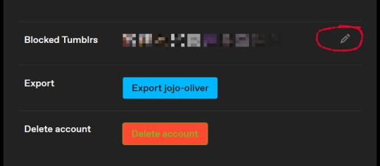
Click on the writing thing there and then you'll finally see your block list:
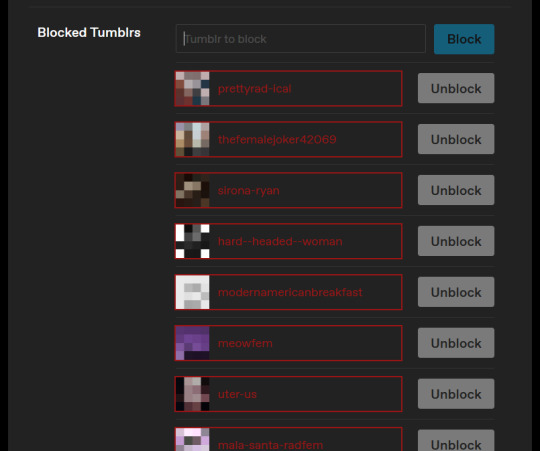
I'll find this post and reblog with more of them whenever I find them. I've never made a block list before, if I could do something better let me know <;3 If someone's changed their username DM me and I'll edit it Accurate as of 2023-10-04 ----------------------------------- -Row 1- prettyrad-ical thefemalejoker42069 sirona-ryan hard--headed--woman modernamericanbreakfast meowfem uter-us mala-santa-radfem nightdepthss radfemtiktok radfem-rage glitter-soda cordycepsfem burningtheroots meanevilandcruel floradfem radsplain terf-hands gougarfem freckled-radfem radrevoltz a-toast-to-womanhood radmista -Row 2- gentlyriseandfall acidbathcat chubbyraccoonman julzlex28 kweerphobique female-prince antiyourwokehomophobia2 quinntheestallion antiporn-activist blueipa angela-anaconda-was-a-lesbian ellaacadia opabiniawillreturn coochiequeens raccoonjesus redheddebeauty nonenosome2 gendiebrainrotreceipts cornedbeef101 kaleiddie bolshefem -Row 3- irresponsiblebirdowner 1-888-narcolepsy terfytingz strozzaprete raidenfem capricorn-season cloud-enigma-blog rad-fem-r-us butch-reidentified terf-tea antigender1 the-rad-menace paperlunamoth femailment patronsaintofvulvas goyangii femmessias2 chadradfem filianongrata -Row 4- i-eat-boiled-eggs-for-breakfast conmigonoeh daughterf radishpanda adult-human-gc-female nansheonearth ilistened2transwomen magnetictapedatastorage demonlizard noncompliantbi transmisogynyiscool goblinous radbutches radicalfembabey frankenawus femmesandhoney lavendertruffles etesienne lavendeerlesbian latina-and-rad punishthegods -Row 5- shes-unforgettable blackswallowtailbutterfly iceyrukia womantichrist faxroux femgoddess-hecate radicalitch radicalblunt chocobbunnii finnishrogue cheesyradfem the-land-of-women transwomenarestillmen catsthemewsical butchlesbianz sowhatnotcreative womens-suffrage-revival-squad -Row 6- back-not-broken friendlymathematician vulva-lacking-losers lilleisak misandristdiarist lookupmedicalmisogyny irisintel womenshallrise creatorisawoman mint-fem large-gamete-maker wordsfromthewick feministfairy libertarian-princess rad-claid-plaid cisthoughtcrime powerfem feral-radfem -Row 7- lizaganderson gynoids-over-androids localbisaster tubularfem there-are-4-lights realisticflyinglesbian femjerma earwigeater destroyerofgender scumbhag clytemnestra-was-right kronkk eternal-echoes kafkaesqueneet xrgl maleswillbemale aspiringfalseidol old-school-butch radafayscage -Row 8- makeyourownopinion gcdk ex-schizo zombierightsadvocate buildingmode2fromthesims1 sofuma feministclassicist radfemlands scumlafeccia son-of-hemera terra-feminarum natures-imperfection atmospherings belastrenchcoat sublimeobjectperson wawaenjoyer feministhetic sparklypinktutu1 -Row 9- kittens2000 spacemonkeyg78 princessterf hidetothink nobleelfwarrior ancientdriftwood 10reallybigants radfemsilv elfyprincess meetmebythe1ake genderatheist religion-is-a-mental-illness s34b4ss kurwaii zlatan-dreams radradmarivy impawsterette if-you-see-gay-me lethalyellowallele dyke-chytilova molagrunda gruncheon victoriassecretagent
-Yippee you made it to the bottom! Check to see if I've added more since, if you'd like. Practice some self care. Love you.-
216 notes
·
View notes
Note
hey, can i please ask what dimensions you use to make your header gif? (I THINK you used to have that thing where you have a little circle gif inside the header as well. If you don't mind sharing how to do that I would appreciate it! If you didn't, please disregard haha)
hiiii!! sorry this took me so long lmao but yes! this was my header for a while and i basically had the circle gif act as my icon (so i just hid my icon under edit appearance) so i'll walk you through how to make it!
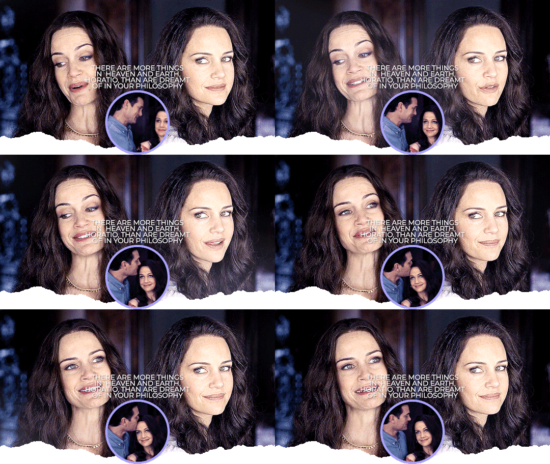
ultimately, the header contains 3 separate gifs: liv on the left, liv on the right, and hugh and liv in the circle. i find it easiest to make the gifs all separately first and then bring them all together on what will become the header's canvas,.
i crop, sharpen, color, and then convert each of the 3 gifs into a smart object and plop them onto the header canvas. the dimensions of this one are 640x360 but i believe the header dimensions have changed and are now 580x326 (that's what my current one is) but idk i never had an issue using the larger dimensions so you can try both out and see what you like best!
the original dimensions for the 3 gifs themselves were: 640x360 for the two large gifs and 368x184 for the circle. the circle gif doesn't matter quite as much, just make sure it's at least a few pixels larger than the circle you create when you get to that step!
so once all 3 gifs are turned into smart objects (if you don't know how to do this, when you're in timeline, highlight all your layers and right-click -> convert to smart object. this just makes the whole gif into one layer and they're easier to work with and adjust as necessary.
when i'm blending gifs together, i like to set the background/first layer of the gif to black. it helps when you're blending and your layer masks get really close together and instead of going to a transparent background, it goes to black and i think it gives it a cleaner look. this really is just personal preference and completely optional though!!
anyway, i brought over the two main liv gifs first and played around with where i wanted each one. this is what i have once i figure out the positioning and set both layers to screen.
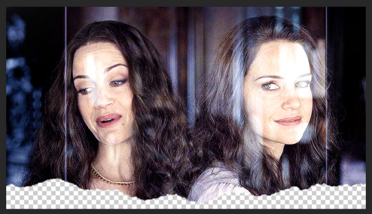
then you want to add a layer mask to each gif. select each layer separately and press this lil guy at the bottom off your layers panel:

when i'm blending, i pretty much exclusively use a soft round brush. size depends on what i'm blending and the dimensions, but hardness is always set to 0%. on a layer mask, you're going to use either black or white. black removes parts of the gif, white will bring them back. it's a very low-stakes way of getting rid of areas you don't want while not having to worry about deleting too much.
once i'm happy with the blending, this is what my layers ended up looking like (with the black layer beneath), but this will vary depending on your gifs and positioning!

the next step is the ripped paper effect at the bottom (if that's the vibe you're going for). you could theoretically do this with any kind of brush. i just like the look of it so it's not such a harsh transition on my mobile theme from the header to the background color.
these are the brushes i use but i'm sure you can google something to the effect of "ripped/torn paper brush photoshop" and find plenty others.
go ahead and group both of your gifs, your base layer, and any other coloring layers if you didn't color them before transferring them to this canvas. to do this, select all applicable layers and press ctrl+g or right-click -> group from layers.
now select the group and add a layer mask the same way we did with the gifs using the little icon at the bottom of your layers panel. your layers should look like this now:

once your brushes are loaded into photoshop, open up the brush tool by pressing 'b' and select the brush you want to use. i usually try a few different ones out just to see the different edges. you may have to adjust the brush size and make sure the hardness is set to 100% if applicable. before using the brush, make sure the layer mask itself is selected like in the above screenshot and your color is set to black.
when you hover over the canvas with your selected brush, you'll be able to see where the top edge will rest. i keep mine pretty close to the bottom -- i think the highest up this particular one goes is about 50px from the bottom. you should end up with this:
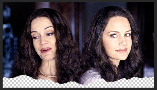
onto the circle/icon!! i truly just ended up eyeballing this size-wise. go ahead and call up the ellipse shape tool. to do this, right click on the shape tool and select ellipse like so:
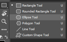
colors are totally up to you, but i like my shit color-coordinated so i believe i color picked the bottom circle (the outline) from liv's purple dress in the right gif. once you have the ellipse shape tool equipped, click anywhere on your canvas. the dimensions i used were 150x150 but of course feel free to experiment. for a perfect circle, both numbers do need to be the same.
using ctrl+t (the transform tool) drag the circle to the vertical center of your gif and right to the very bottom so it's hanging over into the transparent part. this is what will make it look like your actual icon on your mobile theme.
next, create another circle. i'd recommend using black for this one, but it really doesn't matter. the dimensions for this one are 140x140 (10px less than your outline circle), but again, this will vary depending on the outline dimensions. i liked the thickness of a 10px difference, but you can always increase or decrease that depending on your preference. this circle is going to be the base for your icon gif.
again, use ctrl+t to vertically center your circle and bring it all the way to the bottom just like you did with the outline circle. as long as they're placed/snapped to the exact same location, you'll have a perfectly consistent outline.
go ahead and bring over your icon gif, already sharpened, colored, and converted to a smart object. make sure this layer is directly above your black circle. on your gif layer, right-click -> create clipping mask. ctrl+t to move it to the same location as the circles and adjust it to your liking.
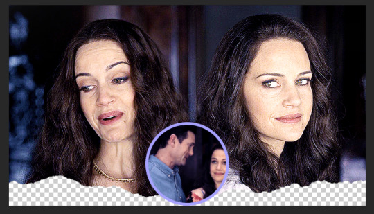
of course, it's completely up to you if you want to add text or overlays or not, but i figured i'd share what i did in case you're curious! (click to enlarge)
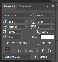
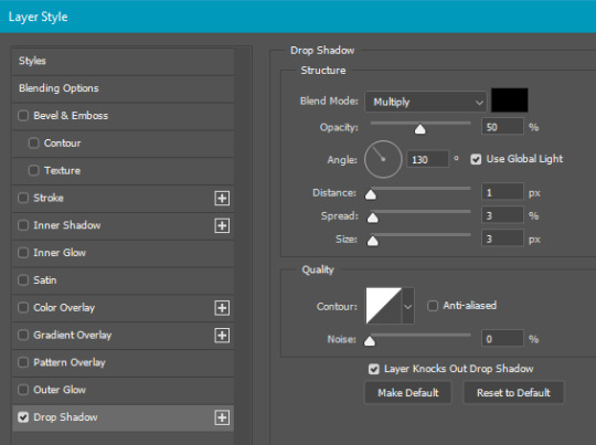
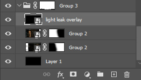
and for the overlay, i just grabbed a video off youtube of different light leaks. i only wanted it to be on the two main gifs and not the icon gif, so i plopped it into that group we made and put it at the top, over everything else, and set it to screen like so:
and that's pretty much it! if you have any questions about the tutorial (or anything else) just let me know!! i'm more than happy to help 🥰
#answered#gracegordongreene#my tutorials#gif tutorial#gifmakerresource#chaoticresources#completeresources#dailyresources
78 notes
·
View notes
Note
how did you make the "thief in the night" text on the banner?? :00

ty for askingg! laptop tut below the cut
9 steps with guiding gifs
uses the website pixlr
this is a laptop tutorial, so mobile settings may not be the same
PIXLR
i'm already signed in, but i believe this is what it looks like to new users as well.

(1) click create new and CHOOSE ANY IMAGE SIZE! for a square, press art grid.

(2) now that we're here, we want to go to the left and press the T, which will lead you to a text box, and then CLICK "ADD NEW TEXT", the upmost button on the new pop-out.


reminder: don't use the box labeled "name" to put your text, as that names the layer. use the box labeled "text".


for my example text, i'm going to use "soobfi." from the word i chose, i'm going to take out one letter and replace it with a space.

this is because in the text, you have to leave a space for the cursive letter like shown below. without the cursive "i," it's simply th_ef.
the letter i'll be taking out is B. (3) REPLACE THE LETTER YOU'RE REMOVING WITH TWO SPACES.

(4) now, let's ADD A FONT. the one i'm using below is candu by dora typefoundry. (download is linked)
please ignore how i already sized it up T^T same steps still apply
text sidebar -> scroll until you see font: verdana -> click it and select "+ add local font" -> select an .otf or .ttf file -> press okay (in file explorer) -> font is inputted


don't like the candu font? here's a list of similar fonts to look through! (link)
tip: to adjust your text, click it so the border surrounding it highlights in blue.

use the horizontal knobs on left or right to make your textbox (not your text) shorter or longer.

to make your text bigger or smaller, use the knob on the bottom.
you can also do this by scrolling down on the left side (where you wrote your text) and find size and alter it there.
to move around your text, click and drag.
(my settings: candu, size 200, middle align)

now, let's add the cursive letter. (5) ADD ANOTHER TEXT BOX.
go to the sidebar -> press the "T"
click "add new text"

there are two things that can happen when making a text box (both are shown in the video)
if you make a new text box while having no other text selected, it will add a regular text and you won't have to take any additional steps.
if you make a new text box with the previous text selected, you will have to click *off* of the selected area and unhide the previous layer.
can't see the layers? press the arrow on the right side. how to unhide the bottom layer? press the eye icon with a line through it.
(6) PLACE THE REMOVED LETTER IN THE NEW TEXTBOX. for me, this letter is b, so i'll add b to the new textbox. (i later on changed b -> B)

i'm not sure if it may be me only, but when i tried texting in the new textbox, it wouldn't let me type any letters.
if this is the case- reload. if reloading still doesn't work, copy the letter you're making cursive and paste it into the textbox.

(7) TURN YOUR LETTER CURSIVE. i will show the gif on how to change fonts again if refreshers are needed.

please be aware that you have to click a .ttf or .otf file. if you download a font and it's in a package (.zip), open the folder and extract the .ttf/.otf file.
the font i'm using for the b only is acroterion. (download is linked)


don't like acroterion? here's a list of similar fonts! (link)
my favorites: darleston, optiyork-script, tc wedding3, and beautiful.
"these look too swirly/extravagant for the style i'm going for" -> don't worry, as we're only using one letter from the font. the contrast from the sans-serif to the cursive is supposed to be drastic. still, if you would like a more minimal cursive look, here are some that i reccommend.
hello olivia, south hamburg, and bridget script.

(8) SIZE THE LETTER TO MATCH THE REST OF THE TEXT. you can move text by clicking and dragging, and adjust the size by using the knob on the bottom (pulling it up and down) or scrolling down on the sidebar and adjusting the size from there.
please make the textbox as small as the text.
how? move the tabs on the left or right of the textbox to shorten or lengthen it. this *will* move your text, but it's okay as you can move it back.

adjusting vs adjusted!!


i didn't record it, but i re-centered the text because i moved it downwards. if you want to center the text, click the sans-serif (the print letters) and adjust the cursive letter to match.

(9) save using the blue box in the bottom right corner and you're done!! you did so well ^3^ need any help? my inbox, asks, and replies are always open :D
5 notes
·
View notes
Note
hey this might sound stupid but can you show me how do you change the name of the links you post? idk if you understand what I mean sorry
That's not stupid at all, don't worry!!! I'm always happy to help. If I understand your question correctly (please correct me if I'm wrong), it's not much of a changing the name of a link as much as it's inserting a link in a fragment of text- although you'll find that in the end the result is the same.
From mobile: after you've typed out and underlined the text you want to make an hyperlink out of, you select the link icon at the right bottom of the screen, over the keyboard and under the colored dots

Then you insert the html of the page you want to link your post to! After that you just have to select the “add link” button, and you're done :)

At the end, it'll look like something this:

The process is fairly analogous when editing a post on desktop; there you'll see the link icon will pop up among with another few icons once you've highlighted the text, but it should be fairly intuitive to identify. That being said, let me know if you need any other clarification!! Good posting (。•ᴗ-)✧
#Please never apologize for asking something!!!! Even the most common of things was done for the first time for everyone!#people asks me stuff
3 notes
·
View notes
Text

#BLADEDSOUL: a private, independent, selective, canon divergent interpretation of ILLYANA RASPUTIN. influenced by comic appearances and heavily headcanon based. dni if under 20. personals will be blocked.
affiliates ... BUCKY. SCOTT. MANTIS.
BOARD. PLAYLIST.
RULES &. DISCLAIMERS.
00. my interpretation of illyana follows magik: illyana and storm for her background, while the rest is a mish mash of other comic appearances, personal headcanons, and different verses i've made for her.
01. this is my blog and i reserve the right to curate my space how i see fit. i'm heavily selective on who i follow/follow back. if i don't see our muses interacting, or if no interactions have happened after some time, then it's likely i'll softblock to keep my dash clean. similarly, if i don't receive a follow back then i'll unfollow to avoid mistakenly interacting with posts of those who i'm not mutuals with.
02. i have incredibly poor memory, so if i follow your blog and you don't want me to then please hardblock! i'll likely just think i never followed to begin with if you softblock and will refollow again. the same goes with breaking mutuals, as i might think it's just tumblr fucking with me and refollow. i will do the same.
03. i'm not here for drama of any kind. i just want to love on illyana! no sort of bigotry of any kind will be permitted on this blog. racists, homophobes, abelists, antisemites, zionists, trump supporters and the likes will be blocked on sight. if you interact with blogs that are bigots you will also be blocked. alongside this, writing fucked up shit ( incest, cnc, age gaps ) will also get you blocked, as well as if you interact with them.
— i do not participate in reblogging callouts, and don't want to be a part of any petty drama's unless someone is actually a predator/terrible person in general. i'm new the the marvel rpc so i don't know of any existing problems. if i'm interacting with somebody problematic than there's a 100% chance i'm unaware. please approach me about it so i can act accordingly!
04. using endearments for people comes naturally to me ( beloved, babe, love, lovely etc ) but please don't hesitate to let me know if you aren't okay with this. whether it's immediately or if it starts to make you uncomfortable. i tend to hold off with new people but i use them so frequently they just slip out. the last thing i want is to make any uncomfortable, and no offence will be taken if you'd prefer i didn't!!
05. activity levels will vary, as i do have a life outside of tumblr! i have a few other roleplay blogs too, as well as a few more i'm planning to make. i often dot around between them depending on who i have muse for. my discord is available for mutuals who'd like it, though i'm incredibly anxious so it may take a little while for me to get into the groove of things. but i promise you won't get rid of me when i've eased up. i will grow on you like moss.
06. i do practice affiliates/mains/exclusives as long as we've done some form of plotting or rps beforehand. don't hesitate to ask.
07. i rely very heavily on extensive plotting. i LOVE digging into the nitty gritty of plots and relationships, however i'm not opposed to winging things with starters and relationships to begin with.
08. formatting varies from blog to blog. i tend not to make icons/page breakers but that may change for illyana depending on motivation levels. don't feel the need to match anything i do: be it formatting or length. i'm almost exclusively mobile bound, except for when i have to cut replies from threads. sorry if anything looks janky on desktop but !! if i can't see that it looks janky then it's not my problem.
09. i work on a motivation based sort of schedule? sometimes i will see receive a reply to a thread that i immediately have the words to reply to, or receive a prompt i'm really interested in that will garner a faster response. this doesn't meant i don't enjoy other threads or want to respond to pre-existing prompts in my inbox, because i absolutely do - it's just a case of needing a little more time to dwell on it. please feel free to message and remind me of threads i may be taking a while to reply to if you think i may have forgotten, which is absolutely a possibility.
ABOUT THE MUN. hi !! <3 i'm carcass, twenty two, and a raging lesbian! i'm chronically anxious, so it may take a while for me to reach out for plots and rps ( though i will send in memes as i see them ) but i'm always looking for new rp partners + friends in the rpc. i work 6am until 2pm, so most my writing comes on the evenings, along with a few little bits during work if it's slow.
BLOG ROLL:
MARVEL: magik. punisher max!frank uc. @redbek (oc)
ARCANE: @j1nxers. @gunclick. @rcknrs.
MISC: cortana uc. @ofintra.
0 notes
Text
im going to be very real right now and say YES i don't like all social media sites being the same, and becoming like twitter is bad, HOWEVER, the tumblr layout as it was... was ALSO not good. and this new layout is most similar to NEW twitter - twitter didn't always look like this either. twitter used to be a LOT worse and this is ACTUALLY more user friendly.
the KEY difference here that makes it NOT TWITTER is that FOLLOWING IS THE DEFAULT TAB. if tumblr keeps FOLLOWING AS THE DEFAULT TAB FOREVER then we have won. everything else does not fucking matter and can be ignored.
the way it was before with 18 icons as they added more stuff PLUS the different feeds on top was getting cluttered and bad. and on mobile i'm sure they'll rearrange stuff because it is a literal mess. this is...actually not a bad thing.
and if you don't like certain things you can 1) get ublock origin for your browser (PLEASE USE FIREFOX) 2) get xkit rewritten and customize it to your heart's content.
i have vision problems and can't see very well and have to zoom in for things and while this layout is still not perfect and there's things i would fix, it is FAR easier for me to use than whatever ABOMINATION it had become of 16 different feeds and 30 icons i cannot remember what they are.
and if the things we dislike are labeled better we can....avoid them better. (and shit like making tumblr live unhideable permanently without extensions is still bad.)
and that being said - recommendation based content isn't inherently bad. the key question to ask always is - are they FORCING you to look at it first above who you follow? are they making it a default rather than something you can turn on or flip to? that's the difference people should look for. sometimes i do genuinely find things i wouldn't have before because of some of these features, and it's actually nice to come to tumblr where i can use them but not be FORCED into that being my default. tumblr having the option but it being a choice is actually the best of both worlds. (and if it's not the default, it doesn't change what and HOW people post, either).
if tumblr is SMART, they can continue to differentiate themselves from every other social platform by saying you can see the chronological feed of people you are following first and foremost and that will NEVER change, plus we have features to discover more if you would like. but a slight UX change for desktop, which MOST users actually don't use most of the time, is not that big of a deal. i promise.
if i were to ask @staff @changes for further improvements, i'd ask that my blogs and getting to my own posts still didnt take so many clicks thru having to expand the ACCOUNT menu, but that's about it.
Tuesday, July 18th, 2023
🌟 New
We’ve renamed the “Include stuff in your orbit” dashboard setting to “Include posts liked by the blogs you follow”. It still controls the same behavior: whether or not you’ll see posts liked by blogs you follow in your Following feed. Also, reminder that you can hide your own likes from this feature in your blog settings.
On web, on the mobile layout of the site, we’ve shuffled the order of the items in the navigation drawer slightly.
🛠 Fixed
We fixed an issue with the activity graph on web that could cause your browser to cache an outdated copy of the data. Now your browser should refresh with the latest data every time you visit that page.
🚧 Ongoing
Nothing to report here today.
🌱 Upcoming
Starting tomorrow (July 19th), some of you will see a new navigation layout for the desktop website that we’re experimenting with.
Experiencing an issue? File a Support Request and we’ll get back to you as soon as we can!
Want to share your feedback about something? Check out our Work in Progress blog and start a discussion with the community.
4K notes
·
View notes
Note
hehe* alright then. if i'm 🎀 anon, then ur darling. it's a deal 🤝😌
i think the links are working now too :) ! but ofc u never know when it comes to this site lmao but still thinking positive thoughts ofc !! i honestly feel u on the updates tho. i think this recent update has been all over the place- i mean,, not to be be mean,, but i wanna know WHO thought it was a good idea take the home button out of the main navigation and put in such a random ass spot then proceed to not give the home button the home icon???? like bfr😭😭😭 and don't get me started on whatever that tumblr live mess is💀- sweeties just pack it up
okay cool cool, i'll request in a different ask since this is getting a lil lengthy lol. but oooo what puzzle did u end up doing ! puzzle are always fun .. sometimes frustrating .. but still fun haha*. i hope u have a good rest of ur day ! 🎀💕
yay yay okie!!
i’m slowly collecting cute nicknames 😋 you guys have me giggling, kicking my legs, twirling my hair or whatever
this hellsite needs to sort itself out 😭 secrets out i’m a massive hater, so i hope tumblr takes full offense on this one
no seriously like i know they want to promote their crusty ass merch but no one wants it for a reason.. sales aren’t gonna shoot up just because you put your store in the most convenient place, like please just change it back 🧎🏻♀️ the only good thing that came out of the update was polls. I HATW TUMBLR LIVE i’m never gonna use it, please please please get rid of it!!!!!! there’s like a million other apps people can go live on, we don’t need it here 😟 the most infuriating part is the ‘read more’ fucks up posts, like i cant even write on mobile anymore because the readmore line completely changes chunks of text 🧍♀️ and i had the worst night of my life when i posted ‘star girl’ because the read more had glitches the text and just yeah, it’s super lame
oooo a couple of years ago i think, my parents bought me this bts puzzle for christmas it’s like the love yourself/ speak yourself tour one, it’s really hard because there’s a shit ton of flowers that all look the same and they’re tiny so i was sat there for hours trying to figure it out 😭 and i still only got the easy white border done. my dad said that i should try and piece together all the boys and then work around them and maybe that’ll make it easier so i might try that today after i get a little productive 🧍♀️
i hope you have a nice rest of your day too!! however long of it you have left!!! and i’m excited to see your request 🫶
#ask#🎀 anon#i’m willing myself not to watch venom rn because i know i won’t write anything if i put it on
1 note
·
View note
Text
still always get so irrationally angry when a website changes their layout to be more “mobile friendly” in a way that literally makes everything more convoluted, obnoxious to navigate (overly simplified, everything turns into small bubble icons or is hidden away in tiny menus that only make sense for phone use, options that used to be there are now gone so they don’t take up space, etc. etc.).. like.. didn’t it used to be a thing to have BOTH a desktop and a mobile version of a site??? WHY must you merge everything???? if I wanted to view this website on a phone I WOULD BE VIEWING IT ON A PHONE, wouldn’t I??? perhaps there are.... REASONS people prefer desktop browsing.. (text processing, etc.).. pERHAPS this makes everything WORSE actually ..
#like i don't know anything about webstie development but for massive corporations SURELY you can afford to maintain both a desktop and mobil#e version of a website#i hate phones i hate everything mobing towards phones i hATE how websites get ruined and so much more difficult#for me to use and get features taken away tht are actually USEFUL or etc.#this is just a larger part of the oversimplification and homogenization of all online spaces but hujnjejkjkgjrjkbjhtbjhthbjthjbkhthbtjhthhth#maim and kill and fury#which is ALSO such a huge pet peeve of mine and doesn't even make any sense!!!!#like even from a money making capitalist perspective like.... don't you think maybe some people navigated towards your#product because of whatever unique thing you were doing in the first place?? taking away all your features#and making your wbesite look exactly like every other website and copying every thing every other remotely successful website#is doing is like.... how is that going to help you ???#who is even the target audience you think WANTS these changes??#like market wise - if I have 5 utterly identical shirts to choose from then why would I care which one I get? they're all the same and if#you don't stand out there's no reason for me to buy your product over someone elses. wouldn't you.. WANT.. a unique selling point??#which I'm not even TALKING about that right now ggbhtg I'm just trying to put in a new grocery order#i just want.. to order some bread... go to a store and pick it up.. please#why is my cart now hidden in a tiny icon menu at the top and then i click that and then have to click ANOTHER drop down menu just to#see the full contents because god forbid you have information ACTUALLY laid out neatly in front of the user instead#of stashed away .. which again - MAKES SENSE if you're on a phone with limited screen space but IM NOT#IM USING DESKTOP BECAUSE I WANT TO SEE THE DETAILS AND THE INFORMATION#I WANT THE ACCESS TO THE FULL DETAILS AND THE INFORMATION I WANT THE MORE ''COMPLICATED'' LAYOUT#WHAT DO YOU NOT UNDERSTAND .. do you think people just use desktop computers because they don't#have a cell phone or something and are just so sad and desperate to get the mobile phone experience#'oh thank GOD everything on my desktop computer is now tiny and looks like shit and has the worst most unsuitable for this format#tyep layout imaginable! yes! it's not like this was the reason I avoid using phones for this stuff in the first place - i am so glad#to finally have it seem like I'm using a phone but on my actual computer! <3'#go to complete hell
48 notes
·
View notes
Text
New and Genuine Tumblr Update Proposals
Bring back the corner flap that opens the post's permalink in a new window
Add a badge that changes color depending on how many bots you've blocked. Blogs with a higher "tier" of badge get priority on whether their reporting is taken seriously, to reduce spam
Add a badge to new accounts that disappears after a month, both to combat bots and to allow users to more easily identify people that don't know how to use the site yet
Bring the green mutuals mark (visible on the followers page on the current version) to the dashboard beside a person's username, for easy reference if you're mutuals with someone you're about to reply to
Make desktop dashboard configuration HTML-configurable, in the same way blogs are (Ao3 skins are a good reference for how this would work)
Make the mobile dashboard color-customizable in the settings, allowing the user to pick the color of the background and text with a color wheel
Accessibility toggle: Takes ALT descriptions and makes them appear as text below the images they're attached to
Change the notes configuration from "comments and tags, tags," and "other reblogs" to a dropdown list of toggles: "show comments," "show tags," and "show other reblogs"
Add a "replied from [username]" message beside replies in notes, to be able to determine who a reply is aimed towards. Extending from this, make this message a link to the post in the reblog chain the reply was made from
Add a "show reblogs only from [username]" box to the notes, with the [username] portion a blank space to be filled in by the person looking
Add an option to the search function to exclude tags
Add an option to the dropdown search menu to sort by most additions
Add an option to the dropdown search menu, specifically for the type of posts, to filter by asks
Add an option to the search menu to "search text only" or "search tags only" to improve search functionality. For example, if I'm searching for "witcher," I have the option to choose to see things tagged only as "witcher," rather than getting every post that says something like "I'm done with the Witcher, now moving on to Skyrim"
Add an option to the report menu for "suspected bot activity"
Add an asker-side toggle for an ask to be replied to privately. Currently, this is on the side of the person asked, and the asker has to request "please reply privately" and hope it's respected
Inform a user who asked anonymously if their anonymous question has been answered
Add a "screenshot post" button that makes a copy of the post in png form and adds it to your clipboard
Divide tags into "indexed" and "non-indexed," configurable by a symbol. For example, #i am up too late would not be indexed and therefore hidden from searches, while #real coffee hours* would be indexed and able to be searched
Add the ability to include multiple tags for search in the archive page of a blog
Add the ability to exclude tags from the archive page of a blog
Change the sideblog list in the "account" menu on desktop to a list of icons along the left side of the dashboard, each one being that sideblog's profile picture, and toggle between dashboards when each sideblog is clicked
Change "post now" at the bottom of a post to "post to [username]," to help with accidental posts to the wrong sideblog. This can be a movement of the dropdown menu from the top of the post to the bottom
Add a toggle to the settings menu for "loop video after completion." The current default is to loop endlessly
With each algorithm tab, include an information button (a question mark, for example) that explains in plain terms where it gets its data. For example "based on your likes" would say "these posts were liked by 10 people you have also liked the posts of," or "in your orbit" would say "these are people that 10 of your mutuals follow"
Add a sorting function to both the "followers" and "following" tabs, for example: "sort by A-Z," "sort by order followed (descending/ascending)," and "sort by date last posted"
Add an option to "block this post" in the meatballs menu of a post, removing the post and subsequent reblogs from your dash and adding them to a blacklist that can be found in settings
Add a search box to both the drafts and queue page, allowing users with several posts in both of these to find and edit posts more easily
These are just off the top of my head. I've purposely stayed away from "remove function that everyone hates" in terms of updates, as I'm aware that some of those have certain criteria and/or are out of Tumblr coding staff's control. The single exception to this is the first point about the corner flap, because I believe its inclusion adds functionality and ease-of-access to the site.
If any of these look good, go ahead and code them in. No permission/credit required, I'm just invested in the future of the site.
@staff
#wishlist#honestly i really do want this site to function better and these are some things either i wish i had or i've seen other people wish for#long post#real coffee hours
153 notes
·
View notes
Text
ok, I'm ready to talk about this now. please forgive me if i repeat myself or say smth that doesn't make sense, I'm a bit tired.
So for starters, I'm likely never ever leaving Tumblr, especially not for Twitter. BUT i have to admit that Twitter is better than Tumblr engagement-wise.
I know there's a lot of jokes about how 'ooughh why are all the cool artists only on twitter !!" but the truth is,, its because the community on twitter is more vocal. I've gotten more responses to my art on twitter than on Tumblr, and while i love the Tumblr SC community and all it's awesome artists, you guys are just .. Really quiet most of the time.
The BIGGEST problem is that no one reblogs art, and that creates less engagement*, which is very discouraging for creators and only drives them to either stop posting, or go to other apps to post. Now you might be wondering: "Why are they feeling discouraged about low engagement? Why don't they just create for themselves?" and the answer to that is: We DO create for ourselves. That's why we draw and write and compose music and make gifs. The art is for us. We SHARE it for you! If every fanartist only made art for themselves and didn't care about engagement, you would not have any content besides stuff from the source material. It's not the attention most of us are looking for, but the community. I want to know that my art is reaching people, I want people to interact with it, to ask about it, to be inspired by it, to just show that someone, anyone, likes it and wants to see more. I wanna know that I'm not screaming out into the void. So please, consider contributing to the community you're in by sharing the work of your favorite artists. *(Because Tumblr isn't like Twitter or Instagram. reblogs are the only way posts can be shared on this app. Likes and replies do NOTHING to spread the post around. Likes are basically just bookmarks. The only thing they really do is add more notes to your post, which helps get it to the 'Top' of the tags page.) Here are some of the notes I've gotten on a couple of my Tumblr art posts:


and .. God these are really bad like to reblog ratios. preferably, there should be more reblogs than likes on an art post, or at least, they should be close to equal. Like this:

This is an example of a GOOD like to reblog ratio! (the only thing that would make it better is if 3/4ths of those reblogs weren't made by the same person.)
"But Doodler, what if I like the post but don't want it on my main blog for xyz reason?"
That's a fair reason, but you don't have to worry about that bro. you can just make a sideblog!! If you didn't know, Tumblr lets you do that without having to create a second email.
if you're on desktop, just click the little account icon and press on the '+ New' button next to the Blogs section, and it should take you to a page where you can create a new sideblog.


(Keep in mind that any settings you have on your main will not be transferred to your sideblog, aka, you have to manually change the settings of each individual sideblog you make, and if you wanna block people from seeing your sideblog, you have to go into the settings of that blog and type out the names of the blogs you wanna block into the blocked Tumblrs section.)
there's more information of main and sideblogs on tumblr's help page, including how to create them on mobile: https://help.tumblr.com/secondary-blogs/
"Okay, but I have nothing to add to the post."
That's perfectly fine!! You don't have to leave a comment, just reblogging is enough to show support! Think of it this way: A reblog means "I love your post so much, I wanna share it with everyone who follows me!" A like is a nice gesture, like giving a thumbs up as you're walking by. It's sweet, but it doesn't really help the artist.
"But it takes more time to reblog than to like a post."
That's only true if you're not using the quick-reblog feature!

^ To reblog a post quickly on desktop, you can either hover over the post and hit the Shift + R key, or you can hold E and click on the post you want to reblog! The only cons to this method is that it only reblogs to your main (at least as far as I know, feel free to correct me if you know how to quick-reblog to a sideblog). But it's different on mobile! If you hold the reblog button for a few seconds, this should appear:
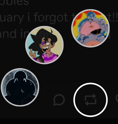
and you can swipe in the direction of the blog you want to reblog it to! Cons of this is that it only shows the first 3 blogs in your blogs list, so if you have multiple unused sideblogs, you have to drag your most used sideblogs to the top. (On desktop, click on the account icon on your sidebar, then use the 4 dots next to the username to drag the blog up or down. idk if there's a way to do this on the mobile app.)
"No one reblogs my art, so why should I reblog theirs?"
I understand your anger, BUT, reblogging other people's posts can actually get YOU more engagement!! Whenever someone reblogs my post with a nice comment, I tend to go through their blog to see if I can somehow return the gesture. We can only fix this culture of taking from and not giving artists if we work together.
"Isn't it weird to reblog a lot of posts?"
NUH UH!! It's actually weirder to NOT reblog posts. This site is built on reblogging. A lot of the most popular posts are ones with long chains of reblogs with people talking to each other in the additions, or via tags. Unless you're making a blog that exclusively for your art or something, your blog should be about 90% reblogs, 10% original posts. Of course it varies, but basically, more reblogs than original posts is the norm on this app. Also, reblogging is ESPECIALLY important if you're currently an empty blog with no avatar. Empty blogs are suspicious because a lot of bots look like empty blogs. I've had to stop myself from blocking some of you because you didn't have a title, didn't have an avatar, and/or didn't have any posts on your blog. Lastly, although I'm emphasizing reblogs in this post, know that there are other ways of interacting with blogs you like!! That could include using the ask feature. Some blogs let you send an anonymous ask(like my blog !!) so you don't have to worry about them knowing who you are if you wanna send a nice comment but are too shy to show yourself. Or you could try drawing or writing something for them and tagging them under the post. Any interaction is better than no interaction.
TL;DR: Reblog posts or artists will stop sharing things with you, and please try to interact with people in the fandom so that it feels more like a community and less like an endless void.
And please consider reblogging this post so that more people can see it. I'll also be reblogging some more post that explain this whole thing better than me. Don't be afraid to ask about anything. God. This is way longer than i intended it to be. ough. *falls over
thinking about how its been being on twitter,,
286 notes
·
View notes
Text
Nonpartnering pride flag!
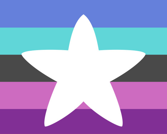


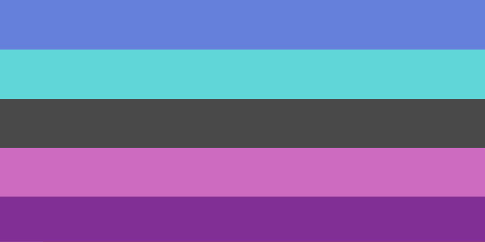
[ID: Four versions of a pride flag. The first two are shaped like squares, the second two are shaped like wide rectangles.
The flag has five horizontal stripes of: medium blue, cyan, very dark grey, light magenta, and dark purple.
The first flag in each set has a large, solid white, round-tipped five pointed star in the center.
End ID.]
This flag is for people who do not want and are not seeking a partner of any kind - not sexual, not romantic, not platonic or queerplatonic or any other kinds of attraction that will no doubt be getting names in the coming years so everyone can pretend they're the new default you must at least feel in order to be happy.
(Also for the record, none of these colors have anything to do with gender. It's not blue for boys/masculine people and pink for girls / feminine people with a cheap "oh and nonbinary people are in there too I guess because all nonbinary people are transmasc or transfem or just neutral which is totally for sure what the white star means" thrown in as an afterthought. It's just blue and purple, which are the best fucking colors. Don't go applying symbology that's not there.)
also like since I guess it's a thing, yes you can use this flag if you're married for tax benefits or whatever, assuming you're just friends with the person you're married to lol.
This pride flag is public domain, meaning you can use it for literally anything you want, no credit or permission needed. Here's the archive page for the flags. "https://archive.org/details/nonpartnering-pride-flag"
Here it is icon sized:

[ID: The same flag as above, now much smaller, 100x100 pixels. End ID.]
If you do use the flag, please try to include an image description whenever possible, and if someone asks, please try to direct them to an HD version of the flag.
The longer versions of the flags should in theory be the perfect size for a header for a tumblr blog, but they change crap on this site so often it might not work anymore, or might not work on mobile.
I chose a rounded star because I wanted a star to represent being whole and complete all on your own, and gave it rounded corners because I just didn't like the way the normal five pointed star was so sharp and pointy. You can make it a pointed star if you want, though.
The colors were chosen because A)I fucking love purple and blue, B)I wanted it to sort of match the transfuckyou flag from my dream (cyan, blue, white, purple, cyan, the one with Wild Future), as in, "fuck you I will not force myself to fit into into society's moulds just because you think it's the only natural way to exist". way.
so yeah this flag is a big fuck you to amatanormativity and especially a big fuck you to the people in aspec spaces who still act like getting a partner is the most important and natural thing in the world and the only way to be happy, but they think saying this is fine now because they mean a queerplatonic partner instead of a romantic and/or sexual one.
the stripe hex codes if anyone wnats them:
blue: 6580DA
cyan: 60D6D9
dark grey: 494949
light magenta: CD6BC1
dark purple: 812F95
and fun fact. This drawing of Altera is the first use of this pride flag because I designed it in that drawing and then made the full sized version you see here. "https://rjalker.tumblr.com/post/702456141902495744/id-a-digital-drawing-showing-a-character-labeled"
#nonpartnering#nonpartnering pride flag#aroace#aroaceapl#nonplatonic#ughghg#aqueerplatonic#I'm too lazy to type out all the tags this should go in.#Rjalker makes pride flags#described images#unromanceable
37 notes
·
View notes
Note
I love that the itch.io IF game community has grown immensely and has created mobile templates to make development easier. HOWEVER, as a mobile UX designer, I hate the mobile design of almost every single game I've played because the user experience is terrible. Interactive elements are generally too small and difficult to target with a touch screen, features are arranged non-intuitively, icons are not explained in a user friendly way, font sizes are too small, etc etc. So many of the choices I see are artistic ones and have been made for aesthetic purposes. I hate to be the one to rain on a parade, especially because I love the games I've played, but sometimes the experience makes it so difficult to enjoy the story being told. Since I'm not a beta tester, it feels like it's not my place to bring this up to devs since I feel that it is unsolicited criticism. Tl;Dr: IF games are amazing. Please find someone who designs UX for mobile apps/games to make the experience even better. Thanks for letting me confess in your ask box, gl with your writing!
Thank you for confessing Anon,
Since you are someone who designs mobile UX, it's def normal to be more sensitive when it comes to play mobile version of IF. I am sure editors who read IF must cringe a lot reading our unedited stuff, or UI designers for desktop must cry about how our page looks.
Accessibility is tricky. It requires knowledge about what could need accessibility (colours, font, placement of things, etc...) and about how to implement it (code). Having the knowledge of one still need the knowledge of the second for it to work. I think the strive for more accessibility is quite recent in the IF (Tumblr) space, especially with Twine games. With more code/information being shared, though templates and tutorials, it's been a bit easier to think of this and have more people implement it. Still, it involves a lot of learning (on top of learning the IF program), which for a lot of hobbyist creators is not always available, or funds if you want to go the hire a designer route, which same. I think believe, while it could be better, we are slowly getting there.
I guess there is still a collaboration route, but that requires time/communication/willingness to share projects...
And honestly, there isn't as much useful information out there to create good UI, especially mobile version, that would work with IF programs. And, as much as I like to splash around in the puddle (it makes sense in French), I really wish there were more tutorials for mobile creation. Every system/format has their own tweaks, which makes some things incompatible or needing more specific knowledge.
For example: Twine/SugarCube has a built-in UI, which includes a decent-ish mobile UX, but if you want to change things, you need to learn to work around the built-in CSS; a lot of which is not compatible with Twine/Harlowe. So if you find code for Harlowe, it probably won't work for SugarCube.
Even with the templates, you need to know how it works to be able to edit it.
Though... It does seem you would be open to help us creators get better and help readers have nicer experience overall. I guess here are some ways you could do that to avoid ruffling feathers (or rain on the parade) :P
Participating in beta
Reaching out to creators and see if they want pointers (i.e. not just a list of what is wrong, but maybe solutions?)
Creating UX templates that is mobile compatible*
Creating tutorials focusing on UX and what to keep in mind for mobile viewing (like a do/don't do)*
*would probably need to make sure those are compatible with IF programs. but damn those would so useful
Also not every IF have to be mobile compatible. TTTT def can't.
~~~~~~~~
SEND ME YOUR CONFESSIONS ! RELIEVE YOUR SOUL!
Thank you for the luck :)
#ask box#confession time#gosh I would love to work with a UX designer#but money tho#and also still a hobby#and learning to do stuff myself is fun
27 notes
·
View notes
Note
I was really excited about this project, and got immensely disappointed with the release of the UI. The fact it's almost a carbon copy of FlightRising's interface is just so... sad. It basically drains Pawborough of its own identity. I really-really hope you guys will consider changing it, because the original concept is lovely. Here's a few things I'd like to comment on: 1. FR's interface is dated. Currently, they're refactoring the site, and i wouldn't be surprised if their next goal after the refactor would be a UI redesign. And you guys, instead of trying to modernise it and make it your own, are copying a UI from *a decade ago*. 2. Why are you keeping the narrow column format of the site? Most people have a wide-screen monitor nowadays, and it looks bizarre to have such a compressed website. Please consider automatically adapting the site's layout to a user's screen width, sorta like Wolvden/Lioden does. IIRC, they have two columns of content (main stuff in the center & a column with user's data on the left), which stack into one column when you're using a mobile device (aka a narrow screen). But since you're planning to make a mobile version anyway, you should consider making the desktop version of the site wide and, well, desktop-friendly, and then figure out the mobile version as it's own thing. 3. Does the user box in the top right of the site really have to be literally identical to FR, with the same data placed in the same way, and also with the energy bar literally having the same exact segments on it? Especially since you have removed the flight banner, making that user block much less balanced looking. Instead, I think you guys can consider making it much more horizontal and narrow. Assuming the two variables on the right (book and turnip icons) are pet/familiar count and cat count, I feel like they can be dropped completely and moved to the user page. I don't think they need to be displayed at all times on all site's pages.

Image link
Alternatively, you can also use Lioden/Wolvden's approach and make a separate column, and then put all user information and bookmarks in that side column. As a compromise between FR & LD, you can place that user column on the right. Here's a screenshot from google for reference:
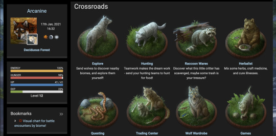
Image link
I'd also like to point out the bookmarks box in the column with user data. It's virtually unlimited and you can name your own bookmarks. Introducing this would allow you to largely collapse the left column with site navigation, because you don't use most of those links every day. As a FR player, I would only keep ~13 links in my always-visible bookmarks instead of the 29 available in the left navigation bar. It would be especially nice if I could add emojies into my bookmark names like you can on LD/WD, so it's easier to see what i need right away. As a mini-addition, please work on the navigation column on the left. It's horrible on FR, and it will be horrible on PB if you introduce it. There's gotta be better ways to navigate the site. 4. I hope you reconsider some of the artstyle choices regarding backgrounds and decorations. What got me excited about PB was the absolutely fantastic character art from NPCs to the breed artworks. You seriously couldn't have picked a better artist for this over Amelia B. It has so much personality and immediately elevated PB in my eyes over Lorwolf, which had absolutely soulless art and looked almost traced from photos. But then I was absolutely heartbroken to see you have went with this odd, textured, sketchy style for the backdrops. Why? I'm assuming it's something like anime-style logic, where characters are cell-shaded and flat and backgrounds are painterly, but to pull that off you need a simply spectacular background artist and... i'm sorry, but your artists just don't pull it off. There's color going outside of lines on the opal waterfall background, some "hairy" scratchy lines that don't follow the shape of the object and dang it just looks flat in terms of values. Its not a terrible thing to make the cat pop, but the fact it's literally the opposite of the cats' style just makes it look odd. The obsidian sentry artwork is probably my least favorite out of everything shown by far. the head anatomy is all over the place and the shading is blurry and muddy where it looks like it should have sharp edges. It just seems like you hired a professional to do the breed artwork, and an actual newbie to do some of the items/backgrounds. Addittionally, i noticed that you're planning to introduce player-made familiars/decors, so that would introduce even more style variation into the equation. Please, please consider making the style same-ish for all site assets. It's not bad if the background assets stay low-contast and a bit flat, but at least give them the same linework as the cats in terms of weight, texture, and quality. Perhaps you can use colored lineart in decorations and backgrounds to make it more muted in comparison to the cats. And I see I'm not the only one asking for this, so please don't fall for the sunk cost fallacy and rework the assets you already have, instead of "dooming" your sites for decades of having blurry, sketchy backgrounds. Anyway, all of this is coming from a good place, I promise this wasn't written in bad faith. Im extremely excited and passionate about this project and I really-really hope it succeeds. But please, not only listen to user feedback, but also make changes before it's too late.
Thank you for the feedback. To address a few things I believe were lost in translation that we hadn't made clear, and to address this feedback:
The narrow width of the container actually is a placeholder! We do wish to switch to a wider version, and the demo utilizes an early test build. We do already utilize flexbox, which will adjust to the player's screen size, but it's our intention to make the container limit bigger. On top of that, we are hoping to modernize much of the old interface style while keeping a nostalgic charm, including things such as integration of flexbox as an example. Thank you for pointing this out, as this was something that wasn't made clear, and that we did not think to mention.
The userbox is our design nadir right now, we understand, and we are looking to redesign it immediately. Our idea at this time is to disperse the pixel components among it into the ribbon, place where a graphic was intended to go into the navigation, and leave only the icon and energy bar at the top. Actually, we have design mockups with much similar placement to your mockup! Though we were considering putting money in the ribbon too so as to distance ourselves as much as possible. We will consider the feedback of leaving the components strictly on a user's page, so we will fiddle with this. As well, we will fiddle with information potentially in a column. Thank you for the effort you put in!
Regarding the user navigation, we could potentially make it collapsable, as well as introduce bookmarks for those who prefer it. However, to avoid the inaccessibility of dropdowns, the default state would have to remain uncollapsed. Making the navigation collapsable has actually been discussed previously as a good idea. As of now we are looking into increasing the margin of the list and importing imagery into it for better readability, thinking similar to Marapets and early Neopets, but different. What we enjoy about the navigation is a consistent knowledge and potential memorization of everything on a site that collapsed information does not provide, but perhaps we can design something that will allow for the best of both worlds. We are taking in this feedback to heart. Thank you for sharing what you as a user prefer from your game experience!
We understand your distaste for some of the Kickstarter assets, and should there be a demand we can reconsider the rendering for some of them, such as decor. We do, however, have several artists on the team that can do backgrounds and decor, and we shall work to better instruct style discrepancy. We apologize for the distaste in the assets, and we will improve with both stylistic direction and artistic synergy. The intention for our backgrounds is to bring a storybook feeling, and there is going to be an amount of subjectivity to the judgement of this choice. We apologize that it is not to your taste. Regardless, we appreciate your feedback, will note it for future adaptation of our stylistic direction, and once again apologize for your distaste. To clarify, "user-made" decor and companions will simply be user instruction on the design, while our art and design team is still controlling the final piece.
Thank you for feedback on the user experience, and we promise we have not been writing off these points entirely, but rather wanting to express that we understand and, as stated, want to incorporate this feedback while remaining true to our philosophy. We apologize that our communication was lackluster and will be keeping this as our statement on the matter before updating with our new designs. We will do better to communicate our intentions. We do want to hear what a user will most value from an interface experience! Once again, thank you for taking the time and effort to share this information with us, and thank you for the patience as we learn!
24 notes
·
View notes
Text
Rules & Navigation Tags below the cut!
1. My blog is semi selective as of 2022. I will not follow back each time I receive a new follower. On the flip side, if I follow and I see selective or mutual, I strongly hesitate to interact even if the follow is or isn't returned. I haven't had the best experience when trying to meet new mutuals, so if I don't reach out first regarding interactions, its nothing personal, just me being more scared of disrespecting boundaries than anything else. So if you have any questions or hesitation regarding interactions, shoot me a message!
2. Rockelle has a triggering past including abuse, domestic violence, rape, cheating, etc. I have an umbrella tag, 'dont pull it; {triggers tag}' which is for any and all triggers. I will tag the individual triggers as best as I can but if you wish to avoid any and all topics including any sorts of triggers, please block the designated triggers tag.
3. I am a mobile only user, I do not use desktop Tumblr at all. I attempt to make the experience as similar to desktop tumblr as possible but of course since we do not see the same thing, I apologize for any inconveniences this causes you. This means I cannot cut posts or replicate most of the features from desktop, I dont do much to my blog mainly due to the limitations.
4. Icons credits goes to @tutorgirlcommissions @tutorgirlrph , @estrangedaframian , @eternalyouth , @mountaindcw , @thedumpofrps and @coinflippcd and my blog layout credit goes to @ofwaterandfire ! Thank you to all of them for making my blog a wonderful place and desktop friendly!
5. I dont have any triggers but if you have any ideas or scenarios that might be considered weird, talk to me about it, I dont bite, promise!
6. Want to be an asshole towards Rockelle? That's completely fine and is not seen as an attack towards the mun at all. How she reacts is something your character has to deal with.
7. Check the tags during roleplays! Within the first few replies, I try to make little tags that describe your character! It could be a movie, song, tv show reference or even a joke! I work hard on them so look at them or I steal kneecaps. >:(
8. Anytime I get a new mutual, I send a thank you message! It helps with me keeping track of them and it opens the door to talk about scenarios, plotting, etc. And if you don't respond, thats okay! I will still interact with you and love your muses just the same! Side note, if I forget to give a thank you, it doesnt mean I dont like your muse or you any less!
9. Rockelle is 100% fandomless so she doesnt fit into one verse or universe. If the desired verse is not under the verses post, feel free to ask me about anything you like! Dont think Rockelle only fits into a bubble due to her character design, just ask!
10. I do not have a banned faceclaim list but I strongly hesitate to interact with those who use dead people as faces. This does not apply to canon characters such as batman, joker, etc due to them having 'new' faces depending on the era.
11. For my mobile users, all of my character info and other related content is under the #lovely kitten; {character info} or #lovely kitten {character info} tag for easy access.
12. Me being a mobile user, I cannot see your rules, info, etc if you do not have a caard or link available on your blog. So if I reach out to ask for them, please dont take it personally.
13. Want to stop a roleplay? Cool! Want to change the trajectory of how the plot is moving? Cool! Want to ship? Thats very cool! You just have to make sure to communicate these things with me. I am not a mind reader and while I will try to be as upfront as possible regarding things, I do not want to make anyone feel discomfort or not enjoy roleplaying with me. I wont bite if you no longer want to continue interacting or cut out something in a roleplay! I wont know until you tell me, communication is key!
14. Rockelle is a multiship muse and is dating several people in different universes. If in the roleplay she has a significant other, she will not cheat on them as that is a trigger for her. However by default (unless discussed) Rockelle will be single due to her 'in universe' story. Due to trauma, poly relationships are a fat no for her as well.
15. Muse is 128 and mun is 22, both of age!
16. I respond either at lighting speed or I take awhile due to lost muse. I do not expect a response to be given within a timeframe or within a designated period. Take as much time as you need seriously. No need to apologize, shit happens.
17. Please do not steal anything from my blog. I will literally hunt you for sport. Dont play with me.
18. The most important rule of all, have fun and enjoy the chaos! ❤️
About Mun!
~ Sup! Names Gigi and I am 22 yrs old! Gremlin and a person with endless zoomies 24/7. If you are my mutual, I will most likely send tiktoks and random things that remind me of our roleplays.
I do have a discord that is available for mutuals if asked!
13 notes
·
View notes
Text
Okay so there are a lot of new people on Tumblr, right? I could take the time to rant about likes vs reblogs and how this site can’t afford an algorithm, but there is another thing that I noticed: blog customization.
Why should you customize your blog? Mainly so people don’t assume you’re a bot. This website has had a problem with bots for years, and the first instinct for most people is to block a bot. If you still use the default icon, don’t have a set theme, and only a couple reblogs, you might be mistaken for a bot.
Now that the “why” is out of the way let’s talk about how to customize your blog and icon. The following step-by-step guide is under the “read more” link. If this is all obvious stuff to you, great, you don't need this.
The icon is the first and most important part. Since art theft is a no, what can you use for your icon?
Picrew
Screenshots of your favorite character or celebrity
some artists have free to use (with credit) icons that you can google (because tumblr search is...not great)
creative commons licensed images (google images, click on the usage rights filter)
make your own
ask if you can use someone’s art as an icon (and give credit in the description)
The next thing that isn’t as important is the header image. It’s basically the same rule as above, don’t steal art, and you can use most of the sources above, except pre-made icons and picrews (they won’t fit in the header image space properly)
To edit your icon (and entire blog) on desktop

Go to the top right corner and click the little dude, and then select settings from the drop down list.
Once you reached the settings page, there will be a column of options on the right, and if you scroll down there is a subsection called “Blogs”
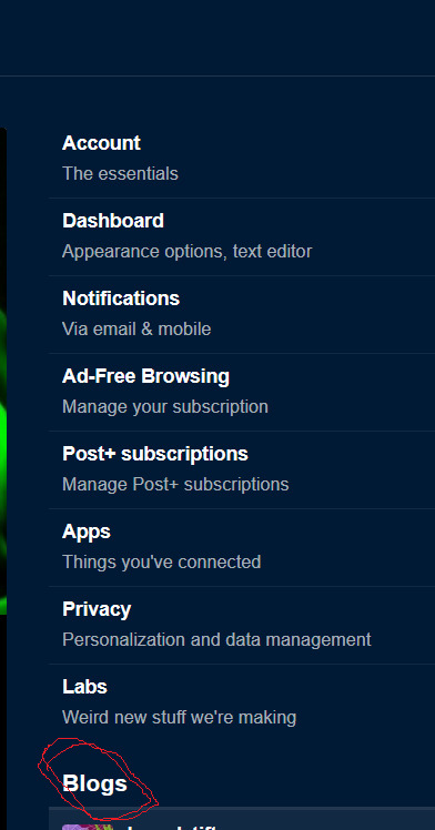
Click on your blog name. It should lead you to a screen similar to the one below (my example is a sideblog, not my main, but it works for demonstration) Click on the edit appearance button.

When you click that button, you should notice square translucent boxes on the header image and in the center of your icon. Clicking on either will lead you to your files, where you can upload an image.
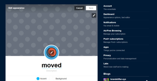
When it comes to the header image, you can zoom in and move it around to fit how you want it.
You might also notice the title and description that you can edit, including hiding the block of text and changing the font and color of the title, and the color of the description.
Clicking on the background button will open a list of colors to choose from, as will the accent. That one is for underlining the title and description.
Save it and you’re golden, and you can edit it at any time.
It's just as easy on mobile, if not easier
Just tap on the dude in the lower corner

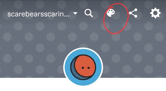
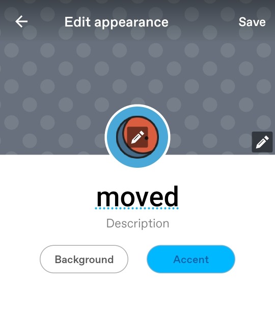
Click the little paint palette in the upper right corner
Have fun!
There’s more advanced stuff if you decide you really want to go all out with customization (and I highly recommend it, because it’s your blog, you have the power)
And if you think this guide might be useful, please reblog it so it gets to someone who might need it
9 notes
·
View notes