#playing with gouache playing with markers
Explore tagged Tumblr posts
Text
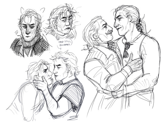
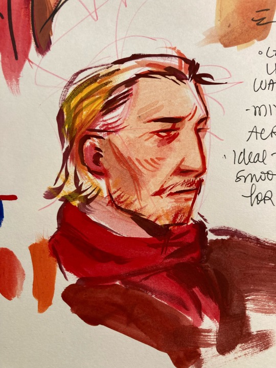
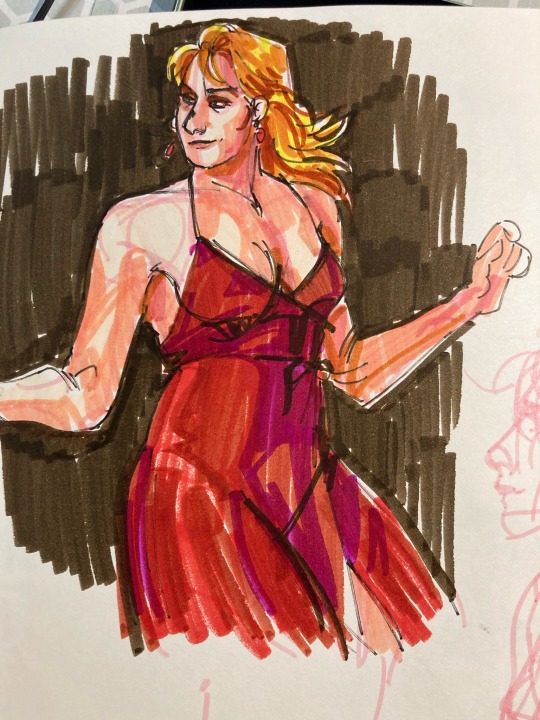
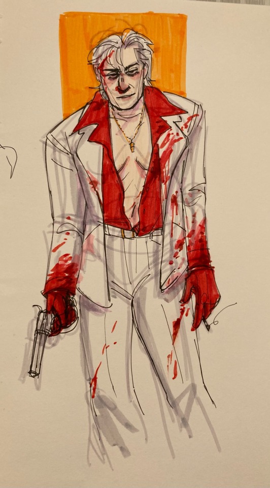
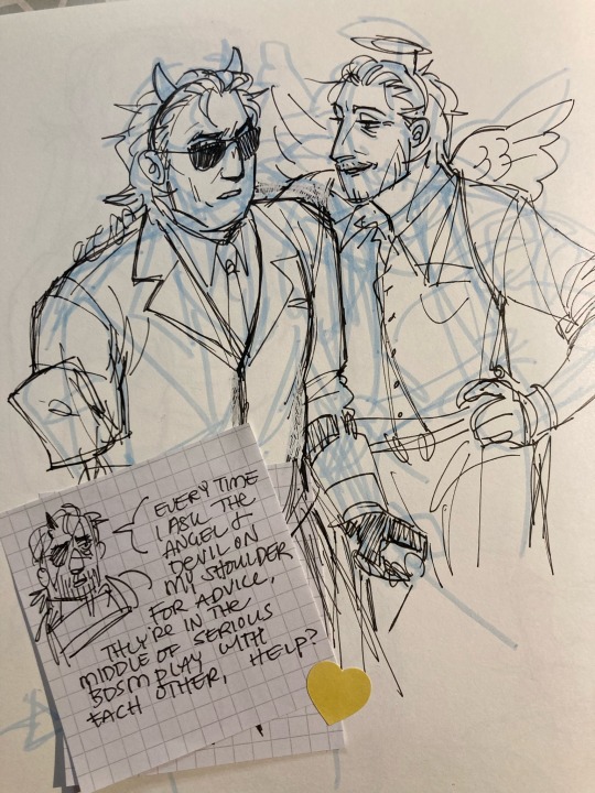
help ?
#mgs#id in alt text#blood#playing with gouache playing with markers#lots of layering problems . gouache isnt as opaque as i want it/expexted it to be but we’re working on it#the other ocelot i painted was a nightmare .#also im rotating an ocelhira sickfic in my head. i wanna give that man a cold#fun streak of red and gold in the middle there. fitting#anyways i have to be up early tomorrow goodnight mwah
99 notes
·
View notes
Text
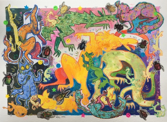
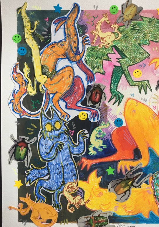
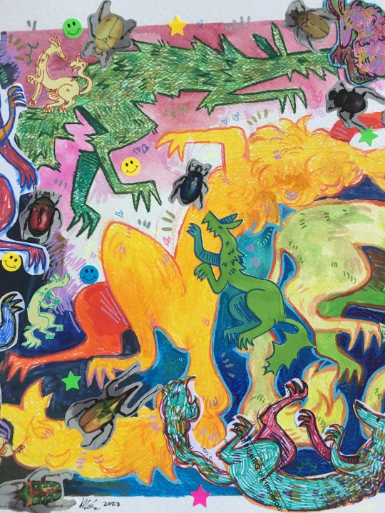
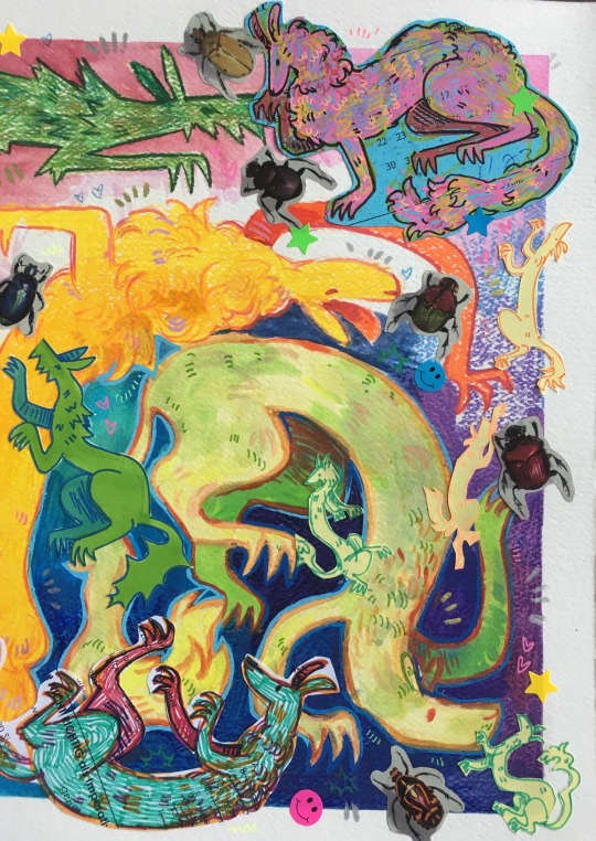
finally finished this piece for my art class!! ive been working on it on an off for literal months,,
it was supposed to be about art as play, but i ended up taking it too seriously and getting overwhelmed, so this is in many ways much smaller than the original plan [im still VERY proud of it, it probably worked better than the og would]. now i think its also about fine tuning and rendering childhood creativity into real work and skill. i believe the top right creature was one of my first for this piece :)
thank you to the old cut up national geographic mag at my school for the beetle pictures couldnt do it without you /hj
#art#drawing#collage#mixed media#gonna list all the materials ohh boy#colored pencil#alchohol markers#gouache#watercolor#art as play#art class#beetles#creature art#autistic artist#special interest
105 notes
·
View notes
Text
Bought paper for marker drawing ----> immediatly give up and start using my gouache on the paper because I'm scared
#save me gouache save me#its ok tho its a nice cardstock and i wanted to do more bigger pieces like this anyways so#i have more fun eith painting nowadays.. markers will be a skeyvhbook exclusive. there fun to play with#dustbunnies.txt
5 notes
·
View notes
Text
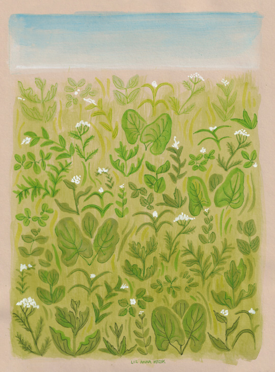
the prairie is very green and white right now, holding its breath waiting for pink and yellow right on the horizon.
playing with markers and gouache
356 notes
·
View notes
Text

Art vs Artist! 🍄🌿 Reusing the same photo from last year because I never take any photos of myself and I just noticed I didn't have any that's not a selfie making a weird face 😂 a very short 2023 recap of my art 🌠
This year has been weird, but with many new learning experiences! I got to illustrate another children's book and also got some cool client projects that I haven't shared here 🐦
I mostly did digital art this year, but I really miss my gouache paints and markers, so I hope I can play with them again next year! But thanks to all the digital art I made, I finally tried some new merch items like washitape, zip pouches, acrylic charms and wood ornaments, so I got the chance to learn about the manufacturing process too ✨
I got burnt out in the middle of the year and I was totally uninspired to create, but this made me learn to accept projects more wisely and manage my time better.
And to wrap up the year, me and my boyfriend moved in after 6 years together! The move was pretty stressful, but it's been such a rewarding experience and we're loving it so much!
With all of this, I'm being gentle on myself for not having created a lot of bigger traditional illustrations, but I'm so looking forward to it next year!! 🌟
I'm so grateful for all your love and support throughout this rough year, and I hope we'll be together for some new and exciting adventures in 2024!! Wish you all a Happy New Year!! 🌠
P.s: I'll be taking a little break from social media in the beginning of January, but I'll still be working so the shop will be open as well as my inbox ♥
92 notes
·
View notes
Text
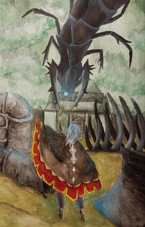
Hi, I'm new to Tumblr!
I'm really enjoying the site so far, it has a really wonderful sense of community I feel is missing from many other platforms.
I will be mostly working on paintings and sculptures. You can expect fanart of whatever media I'm currently obsessing over (that's Baldur's Gate 3 at the moment, if you want to know) and pieces containing OCs. (I'm trying to worldbuild and eventually write a book. I am struggling.)
Anyway, here's a piece of fanart I drew for Sky Children of the light! I play the game really just for the vibes and drawing inspiration, it's so pretty!
For this piece, I used gouache, acrylic paint and a white gel marker. I had a lot of fun painting it.
As I am new to the site, a self-taught hobby artist, and with English not being my first language, constructive criticism is appreciated! I'm always looking to improve! :)
78 notes
·
View notes
Text
CLAMP Exhibition (2024)
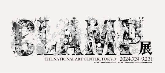
July 3 - September 23, 2024 in Tokyo
The biggest CLAMP exhibition to date, the event showcases the original artwork from 23 works made by the group of four women, from RG Veda to Card Captor Sakura: Clear Card (technically 22 but they're counting Legal Drug and Drug and Drop separetely).
Over the years CLAMP has published a variety of manga, including those for boys (shounen), girls (shoujo) and young men (seinen), depending on the magazine they were published. Appealing to readers of all ages, genders and countries, their work continues to captivate.
The exhibition will feature a total of 800 original manuscripts (200 in color, 600 black and white), divided in 7 areas: Color, Love, Adventure, Magic, Phrase, plus Imagination and Dream.
C for COLOR. CLAMP colors the world.

Displaying a total of 200 original colored pieces from all 23 works (100 for each half of the exhibition).
This area showcases the variety of artstyles, techniques and tools CLAMP used over the years on their different manga. Includes pieces with colored ink, Copic markers, acrylic gouache, pastels, and digital art.
Even when publishing 2 different works at the same time the group likes to vary their tools: RG Veda (1989-96) was colored with ink and airbrushes, while Tokyo Babylon (1990-93) was colored with screen tones. The artstyle also changed depending on the publisher.
2. L for LOVE. CLAMP draws the forms of love.

The artwork in this area are divided in 8 types of love seen throught CLAMP's manga.
"The love depicted by Clamp is not singular—there is a straightforward love towards a significant other, but it can also be a determination to protect loved ones, a thought character keeps in their hearts, or even the conflict itself." (from tokyoartbeat article)
3. A for ADVENTURE. CLAMP weaves the stories of adventure.
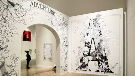

350 manuscripts from 6 action-packed manga series: RG Veda, Tokyo Babylon, X/1999, Magic Knight Rayearth, Cardcaptor Sakura, and Tsubasa: RESERVoir CHRoNiCLE.

Includes a synopsis of each work and selected scenes to follow along parts of the story.


4. M for MAGIC. CLAMP casts its magic.

The fantasy, magic, and mysterious powers seen in CLAMP works are seen in the moving manga pannels projected in 3 large screens in this area.
5. P for Phrase. CLAMP spins the phrases.


The first room showcases 40 manuscripts from xxxHolic.
The second room focuses on the power of words spun by CLAMP, exhibiting quotes form their works on the walls. Visitors can also pull one phrase sticker from the Phrase Box from CLAMP and take it home, or stick it to a wall in the room. There are 120 different phrases to pull.


6. IMAGINATION
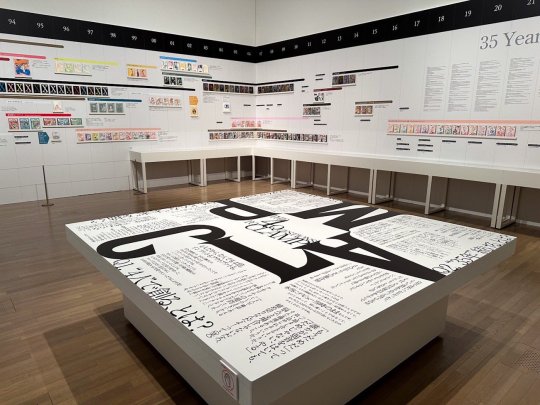

Timeline of 35 years of creative work, from 1989 to 2024, featuring manga volumes, magazine issues, and more.
An installation in the center of the room also features quotes from a new interview with the four women specially for this event.
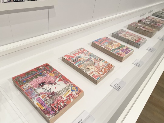

This is also the only area which features CLAMP's work in other media, including various collaborations. There is a selection of color illustrations, rough design drafts, and other artworks from Soryuden: Super Dragon Brothers, CODE GEASS, BLOOD-C, HiGH&LOW g-sword, Cardfight!! Vanguard, GIFT (picture book by Ice skater Yuzuru Hanyu), The Grimm Variations, and HELLO KITTY.

7. DREAM
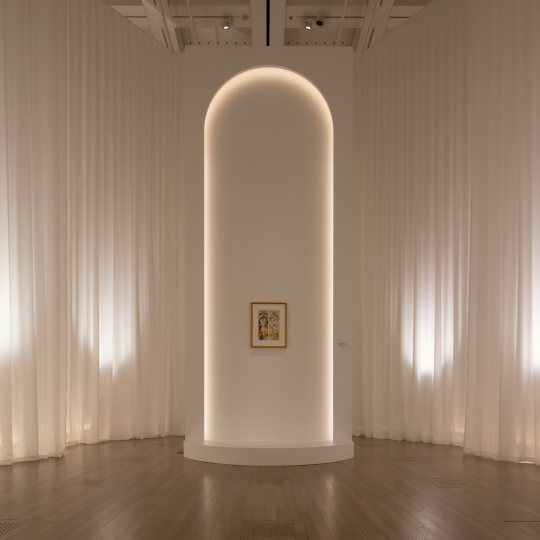
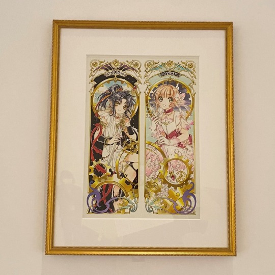
The last area is solely to exhibit a new illustration featuring Ashura (RG Veda) and Sakura Kinomoto (Card Captor Sakura: Clear Card), representing CLAMP's beginnings and future through their first and latest work.
"Kuro" (Black) and "Shiro" (White) are also the names of the new artbooks titled COLOR, which compile the artworks seen in the exhibition. A deluxe edition will be released at a later date compiling both volumes in one.
............................................

The audio guide during the exhibition is provided by Jun Fukuyama, who has played Kimihiro Watanuki in the anime series xxxHOLiC, Kobayashi Kotaro in ANGELIC LAYER, and Lelouch Lamperouge in Code Geass: Lelouch of the Rebellion (CLAMP is responsible for character design in Code Geass) .
The place also features a store with a long list of products.
They also have the first volume of their various manga available to read, and a TV showcases the recently shared announcement video of the new anime project of Magic Knight Rayearth.
CLAMP Exhibition National Art Center in Roppongi, Tokyo First Half: Wednesday, July 3 - Monday, August 12 Second Half: Wednesday, August 14 - Monday, September 23
Sources:
Tokyo Art Beat
Fashion Press
Bijutsutecho (+)
Natalie Mu
Internet Museum
Official Clamp_ex Twitter
#clamp#clamp exhibition#cardcaptor sakura#tsubasa reservoir chronicle#magic knight rayearth#xxxholic#rg veda#x 1999#tokyo babylon#ccs#mkr#trc
39 notes
·
View notes
Text
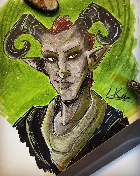
Pssst, I started to discover the game Dragon Age: Inquisition, experimenting this game after hearing a lot about this game and paf!
Been inspired and drew my first character I play, a mummy Qunari warrior. :D
Made with Ohuhu markers and some gouache for the small effects.
#fantasy#art#lyza kernunia#artist on tumblr#illustration#my art#traditional art#fanart#dragon age#dragon age inquisition#qunari#markers#ohuhu markers
23 notes
·
View notes
Note
the eye color bracelet anon YOURE A GENIUS ILY... The way the alphas would just stand there letting 'mega hold the beads up to their faces but the betas would look with her, handing her some beads they think fit the criteria. Soap, being his artsy self, would be in literal heaven, might even stray from the group or drag them on another part of the store for drawing supplies, using the beads as reference for his future drawings, mixing paint once they're back on base so his next drawing of the pack can have 100% accurate eye color.
they'd probably end up with way more stuff than necessary with Soap encouraging 'mega to try new things, maybe come paint with him? let's do pastels.. have you seen these alcohol markers?? what about that gouache?
'mega sitting on Price's lap when they're back on base while she makes the bracelet, all of them huddled up in the rec room while soap also plays with his new supplies
OML 'mega and soap having a monthly trip to the art store and always coming back with new ideas and new stuff to make..
I'm 100% yapping rn but my brain is so filled with scenarios my apologies

Omg yessss 😭 I love this idea so much y'all have no clue. They have to get it just right, and Johnny has to go first because he's wandering as soon as he gets the chance. Buying half the store because he needs some new supplies but also, he has an art student in the making.
He so would teach the reader how to paint, or help her polish her skills. Trying different kinds of drawing/painting? Absolutely. I love pack bonding time so much 😭 my heart.
Definitely dragging Simon along so he can keep them on leashes on their monthly trips. Otherwise they'll buy way too much stuff. The spare room becomes an art supply closet 😂
#don't apologize i will never get sick of these little scenarios#theyre just so cute and soft#answered#crcb lore
33 notes
·
View notes
Note
please post a tutorial or walkthrough or even just a longer process video talking about how you draw!! im obsessed with the textures and colors but i cant seem to wrap my head around it!! (i would pay money for a whole mini course tbh if you were interested in uploading one to gumroad or wherever 😵💫)
thank you, i'm flattered :') texture and colour are really important to me so i'm always fine-tuning them to find what works. to be honest i feel like i'm not qualified to teach others since i haven't really even settled on a process, i just kind of mess around until i like what i'm looking at. there are certain things i do much of the time but it's definitely not a linear process!
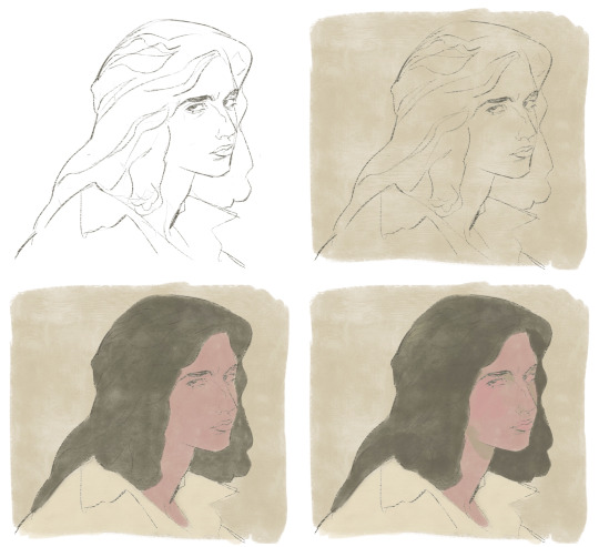
that being said lately i've been experimenting with traditional media and i've found i really enjoy how gouache behaves so i've been trying to replicate the process in digital. i'll try and explain how i've went about it recently using this super boring piece of a random person...
i'm using a basic pencil brush and a default procreate brush called gouache. i picked it for the name when i was looking for something similar to the paints i'd been using but honestly it looks more like a marker to me.


i find trying to do separate inks on top of a sketch distracting so i just erase what i won't need. i'll add a darken layer on top of the sketch and go over it with a single colour as a kind of underpainting. i did the flat colours on a separate darken layer here but generally i'll just work on one layer.
we'll add some colour variation and shading, it looks super subtle here but i'll punch it up later. i think the critical thing with this kind of brush is working with transparent layers so you don't lose the texture and you can play with mixing colours.
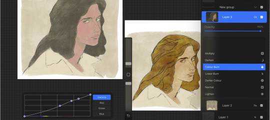
i'll often mess with the curve tool a lot but this piece is pretty simple and i ended up only using it once or twice. when i'm happy i'll duplicate the colour layer and see which blending mode i like, testing stuff out at different levels of opacity until i find something cool. i think i went with a transparent overlay layer here.
the lineart is getting buried so i duplicate that layer as well, drag it to the top of the pile and repeat the process of stacking blending modes. something i like to do is add one layer with the lineart blurred to give it a softer look.
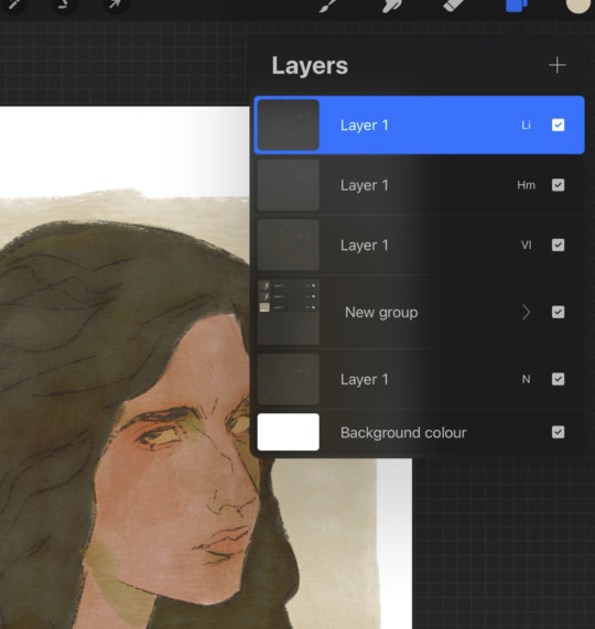
i'll fill a new layer with a dark colour, add about 80% noise scaled up a bit and set the layer to saturation. again you can experiment with the blending mode but i've been using this one recently.
this next part might be pointless but i save the image, open the new file and resize it without actually changing the resolution much, then sharpen it to bring back the detail. maybe it's in my head but i feel like this makes the image look a tiny bit more finished and adds some crunch.

finally i duplicate the whole thing, blur the layer on top and set it to luminosity on low opacity to create a soft glow effect.
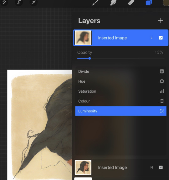
final touch-ups and you're done!
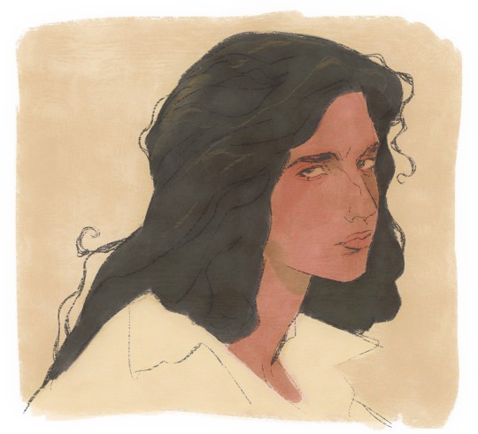
sorry for the convoluted explanation! my process tends to messy, i get distracted and don't often work in distinct steps but i think i managed to describe some of the things i do the majority of the time. i hope it's even a little helpful :)
99 notes
·
View notes
Text
It's still on the mind, but I would like to eventually get a set of alcohol markers and gouache to play around with those, like on top of the acrylic paint and colored pencils I have.
5 notes
·
View notes
Text
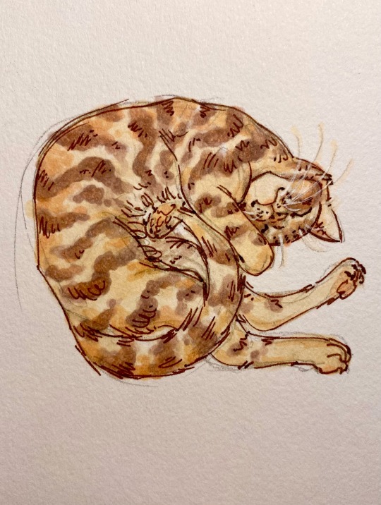
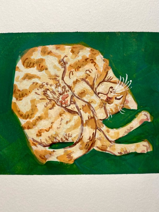
Kitties!! Just wanted to play with markers and gouache :3
6 notes
·
View notes
Text
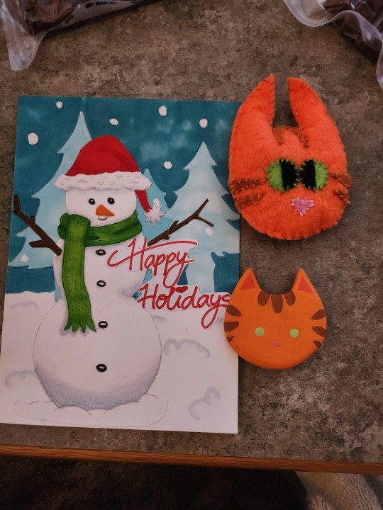
made some cards for neighbours, who's orange cat visits my indoor cat every day to play 😭😊 i grow catnip so i dried some and put some in the toy i made for him!! it's just felt and split embroidery thread. then i made a fridge magnet of said boy with foam clay! first time working with it and it was a little difficult. so so soft but sanding once dry helped to smooth out A LOT!
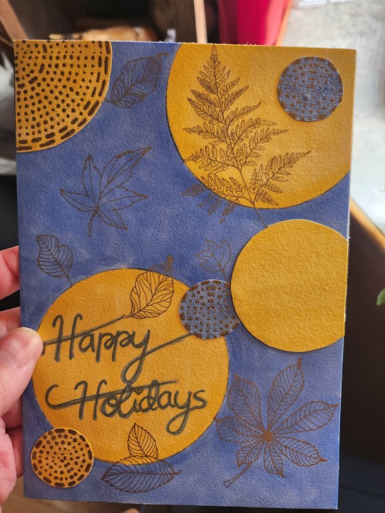
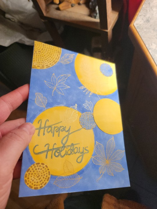
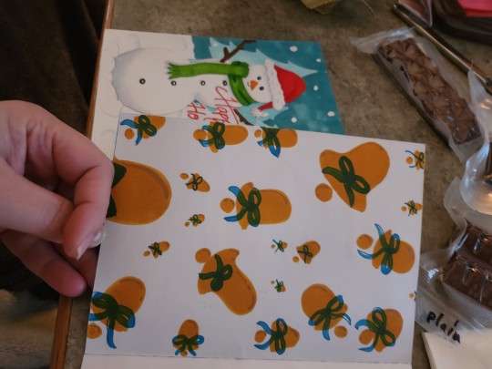
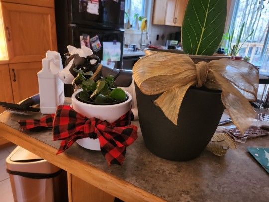
my other neighbour has gotten into plants through me, so i spent a few months growing babies for her. i don't have many plants she doesnt have yet, but these two will do the trick! she loves gold so i embossed(i believe!) gold onto the card. i made both of them with scraps and trash of packaging i saved etc 😊 the circles with gold dots was a chocolate wrapper at some point! i used my alcohol markers for these cards, i really love them! although i just got gouache in the mail and cant wait to play with that next 🥰
i have some more cards made, but I don't want to spoil it in case they see it on here!!!
#my art#traditional art#alcohol markers#trash to art#art#original art#artists on tumblr#small artist
3 notes
·
View notes
Text
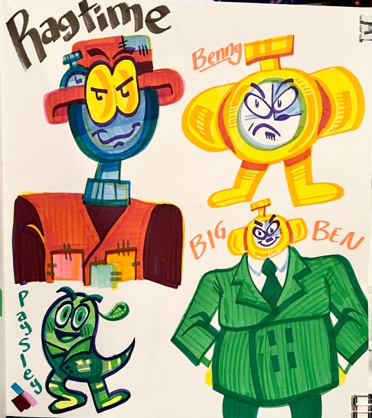
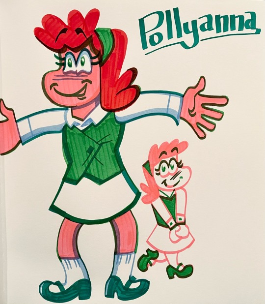
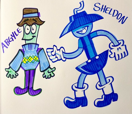
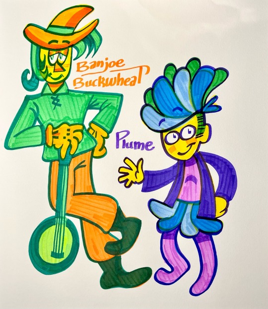
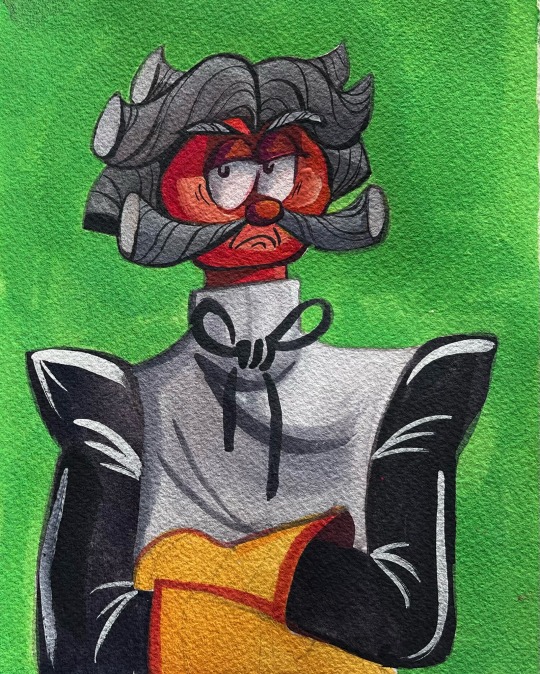
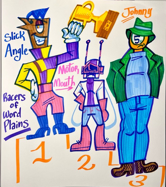
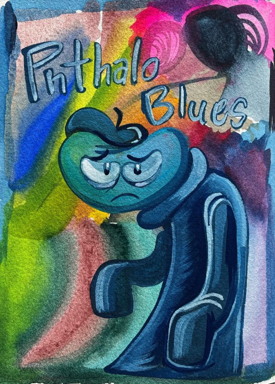
Some Mr. Sketch marker arts and gouache paintings of Word Plains characters!
Descriptions of them all under the read more
Ragtime: He can control time at will, but maybe shouldn’t.
Benny: A little alarm clock that nobody wanted to take seriously or listen to. That is until…
Big Ben: He strapped explosives onto himself to turn himself into an armed clock and walked right into the Word Bank. They decided that day that the money wasn’t worth more than their lives, so the whole bank changed hands. Speaking of hands, Benny’s new suit packs a huge tall and handsome body for him to strut around in.
Paysley: The former owner of the Word Bank. When the bank was handed over, all money in it belonged to Big Ben. However, Paysley was smart enough to stuff everything in his house with bills upon bills, which knocked him down to second richest in Word Plains.
Pollyanna: She’s the kid cousin of Mary Sue and she’s always got a cheer on her face! You’ll never see her cry, even if she really wants to.
Argyle: He is a turtle civilian who just loves wearing argyle patterned clothes!
Sheldon: Son of Femme Fatale and Magnus E. Finder, he is a troublesome kid. He’s figured out pretty early on that he wants to be bad like his mom.
Banjoe Buckwheat: A scarecrow in Word Plains. He prefers plucking his strings to standing around doing nothing all day. He’s a very talented musician and is unrivaled at playing banjo. Super calm and even sometimes shy demeanor.
Plume: A colorful Civilian of Word Plains! I think she may own a shop of some sort, whether that be a boutique or a pen shop.
Licorice Lester: He is the butler and head housekeeper of Chip and Carmen Semisweet’s estate. He is very much no nonsense. He may be bitter, but he has a sweet side too.
Slick Angle: He’s the number one racer in Word Plains. He boasts a boastful personality and a whole lot of attitude.
Motor Mouth: A bug who will talk your head off about vehicles
Johnny: One of Mama Cue’s adult sons, he has a casual interest in race cars and all things that go. I like to think he’s a mechanic
Phthalo Blues: A tortured artist of Word Plains. He’s forever in his blue period.
#ragtime#benny#Big Ben#Paysley#Pollyanna#argyle#Sheldon#banjoe buckwheat#plume#licorice Lester#slick angle#motor mouth#Johnny cue#phthalo blues#word plains
4 notes
·
View notes
Text
I already know at least 3 or 4 art things I want to work seriously on in 2024 and it's driving me nuts:
Re-learn to knit (right-handed or continental)
Continue embroidery (got distracted there)
Work with alcohol markers, and play more with color in general
Finish the (3) crochet dolls I've started and write down the base pattern to share
...and from then on is just everything else: sewing, polymer clay, would love to learn to dye and spin yarn, oil pastels, digital, watercolor, gouache, resin, Inking, 3D printing...I wanna do everything but I have to set realistic goals.
I'm considering making an art IG to chronicle both what I make and my progress and expropriation, so please lmk if you're interested in that.
1 note
·
View note
Text
.
.
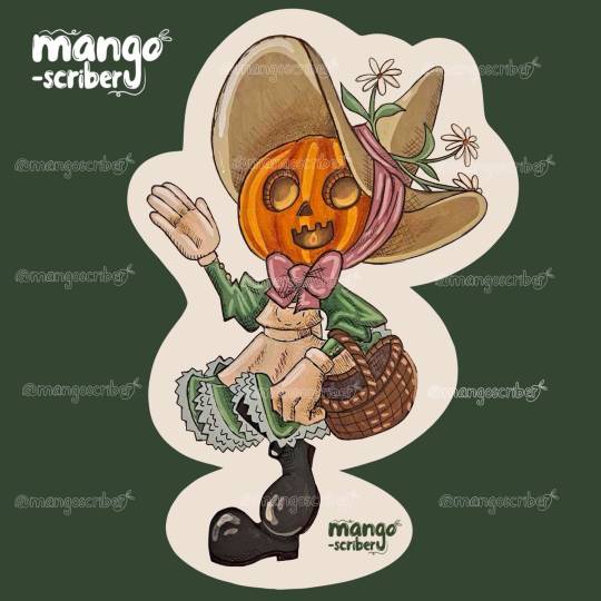
🎃Challenging myself while bringing back an old concept. Three years ago, I did these adorable jack-o-lantern kids around October, but I did them in marker. I love it! But since I've been playing with gouache so much, I wanted to up the challenge even more by painting an illustrated character. It's not for the weak of heart for sure, plus I don't have a ✨️steady painters hand✨️ I'm shakey handed... which makes it hard. I really was almost going to give up. Halfway in, and I felt so disheartened with how it was coming out. But I persisted. Luckily, with a little digital work, I was able to clean up my messes and bring a bit of the color quality I wish I could get. I am now okay with the result, and I hope I can get better with some time and practice.
.
.
.
#gouache#gouacheart#gouache illustration#characterdesign#traditional art#fall#autumn#fallart#pumpkin#jackolantern
0 notes