#playifx
Explore tagged Tumblr posts
Text
A guide to the Interference palette

This is a short guide to the Interference colour palette. It's primarily meant for people suffering of colour vision deficiencies and people interested in improving their colour use in Interference drawings.
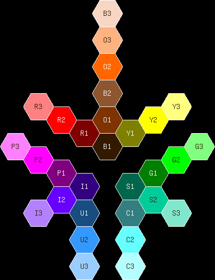
There are 36 colours in the palette, 6 greys plus 10 colour hues with 3 shades each. Actually, there are 9 hues; I'll get to that later.
K0 is black. K1 to K4 are shades of grey. K5 is white.
R1, R2, R3 are red.
O1, O2, O3 are orange.
Y1, Y2, Y3 are yellow.
G1, G2, G3 are green.
C1, C2, C3 are cyan.
U1, U2, U3 are blue (azure, actually).
I1, I2, I3 are indigo.
P1, P2, P3 are purple.
S1, S2, S3 are spring green.
B1, B2, B3 are brown.
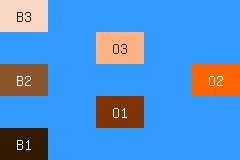
Actually, orange and brown are pretty much the same hue:

The colours in the orange and brown columns are the tints, shades and tone of orange.
So, which colours should we use for each kind of object?
Human skin colours: B1, O1, B2, O3, B3.
R1 and R2 for blood. R3 for tongue, and for blush/sunburn on light skin.
Greenery: Y1, G1, G2, G3, S1, S2, S3.
Day sky: C3, U3, U2. Night sky: U1, K0. Water: C2, C1, U1
Wood: K0, K1, K2, R1, B1, O1, B2, O3

0 notes