#pb29
Explore tagged Tumblr posts
Visit Tumblr Blog
Explore Tumblr blogs with no restrictions, modern design and the best experience.
Last Seen Tumblr Blogs


Fun Fact
The total number of visits Tumblr.com received during January 2021 is 327 million.
Text

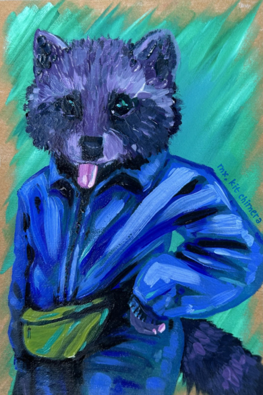
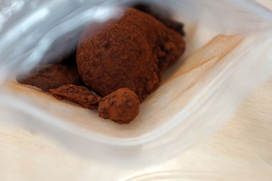
haritora feets - Roxy | watercolor sketch, pigments PBk11, PY184, PB29, PV19
I used VRChat to actually socialize! I followed @cavern-of-remembrance here on tumblr when I was first learning about VRC. Roxy’s VR self-portraits inspired me to take up photography in VRC, where I met other photographers! And there’s SO many similarly inspiring artists of all mediums I’ve been introduced to through her reblogs!
Talking about the tech of VR seems to be “the weather” of VRC conversations. Roxy uses a headset and additional hardware (HaritoraX) for full body tracking, so when we met I was like “oooo leggies!” A good icebreaker topic, I think?
When I was describing the hangout to a partner the next day, the words that came out to describe the additional hardware were “she’s got haritora feets”.
I think the vivid hue of her hair strikes me as very close to PB29/ultramarine blue, which made me want to paint it! So that was the base of the palette. The gradient stripe on the pants was so fun to paint!!
Thank you Roxy for showing this old possum some great VRC worlds and art!
#mx kit chimera#watercolor sketch#vrchat inspired art#autistic artist#furry art#anthro art#sketchbook
129 notes
·
View notes
Text
since the tags on my Lewis hands painting have mostly been along the lines of #WATERCOLOR?! HOW? (thank you!!) I figured I may as well do a wee step by step of how I painted the skin)
(disclaimer: I did not take many photos of the different stages, so you'll just have to trust the power of my narration)


(above) first up: the reference was from the Met Gala, as posted on Lewis Hamilton's Instagram. I can't take credit for the framing/pose — that was all the photographer


here's my cleaned up sketch and the first couple layers — I did a wash of colour on the hands first (quin burnt sienna PO48 quin maroon PR209 pigments my beloved, the best for warmer/deeper skin tones), added in a layer of shadows in the same colour to build structure, then got the inky black background in (mostly burnt umber PBr7 & French ultramarine PB29 I believe, with a bit of Roman Szmal's shadow grey too)
I kinda wish I'd left the background like that, but hey this whole piece was an experiment so I'll learn from it next time


next I added in further shading to the hands — again with the same skin tones as before, in different concentrations depending on the area, with the addition of some redder and darker tones too where needed. I also painted in the tattoos here — making sure they're under a layer or two of watercolour settles them into the skin like a real tattoo, rather than them looking sharpied on
And then! this is where the magic happens, and the part I'm most pleased with: by the stage of the first image above, the shadows were great in terms of position/shade, but felt a bit too blocky and stylised for the piece. So, if you get to the same issue (whether painting skin or clothing or anything with softer and more rounded contours), what you wanna do is:
make a pool of incredibly diluted skin tone mix on your palette. Literally, just water with a subtle hint of colour, roughly the same value as your highlights
get your softest brush. Nope, softer than that. In watercolour brushes, 'springy' is the opposite to 'soft', so you want bristles that don't really bounce back to their original shape if you push the wet brush against a firm surface. I'm using the Silver Black Velvet brush I've been using for the whole painting, but ideally a squirrel/sable or synthetic sable brush is gonna work
gently paint that diluted skin tone wash over the whole of the area (the hands, in this piece). This is why you want your softest brush, so as not to disturb the paint underneath too much. It also helps if the pigments you've been using are more staining (resistant to lifting). In general, phthalos and quinacridones are most staining, and granulating pigments least so. I've been using earth quinacridones here, which are moderately staining. Using good quality 100% cotton paper also helps
before that diluted wash is dry, get some paper towel and dab out the highlights. This keeps the edges softer and more natural than if you just painted around them
the wash you applied should have been just enough to soften those hard edges of shading you had previously, leaving lovely soft and more realistic transitions. Ta-dah!


then, off-camera, I added the darkest shading, painted in the gold, and felt it was missing something so added some scribbly highlights in 'ivory' coloured pencil. And that's that! It did involve a lot more swearing and complaining than I've just made it seem, but the skin part at least was something I'm used to.
35 notes
·
View notes
Text
i went to an art fair with my mom last weekend and had a rly good time talking to artists and stuff and it made me really want to paint with gouache again, since i havent really since college. and i was going through the paints i bought back in college and im just like.. perplexed... why did i buy so many and why did i buy the colors i did. wtf. why do i have four different yellows but none of them are cadmium. anyway i went down a weird rabbit hole where there was an artist i liked who used iwa-enogu (traditional japanese mineral paints) and i was trying to find if you could get them in the united states and what the closest pigments in contemporary paints are because i really liked the shades of blue and found that gunjou is traditionally made with azurite but azurite isn't really used in contemporary paints in favor of more reliable pigments like ultramarine but there is a synthetic version of azurite called verditer and while trying to find if there was verditer gouache i found that holbein (the brand i used mostly) has a line of traditional japanese colors in gouache (Holbein irodori) but when i looked at the pigment info for what they were calling "gunjou" it was just ultramarine and the exact color i already have (pigment PB29)
10 notes
·
View notes
Note
So what's your LEAST favorite pigment?
oooooh... let me see.
i don't think i have any one particular pigment that i dislike ALL of the time—watercolor can be temperamental, and the difference between using a transparent vs opaque color really can change the entire experience. they even dry differently, depending on what color you're using and with what materials. i can't really speak to oils or acrylics though since i've only used those in passing. (i do want to get into oils at some point... it's a gorgeous medium.)
if i absolutely had to pin down a specific pigment or pigment type that i don't particularly enjoy using myself, it... miiight be the cadmiums? yellow, red, orange, it doesn't matter. i know a lot of artists love them to death and they're even a staple on a lot of palettes, but the opacity and toxicity of them just puts them lower down on the list of the pigments i would usually reach for. (as long as you aren't eating them or inhaling the pigment itself handling cadmiums is usually okay-ish, but i prefer to err on the side of caution.)
that's not to say that i outright hate them, i've used them once or twice. but if i have an alternative to cadmium red (pr108) on hand like pyrol red (pr254) or something, i'd rather reach for that. especially since it can make cleaner mixes! (colors that are really opaque tend to get muddy easier, which is also the reason people hear 'don't mix with white, just dilute it' all the time. pyrol red is still opaque, but yk.)
for a while, cadmiums and the like were the only way you could get really true, lightfast and vibrant colors of whatever category they occupied, but there are so many other alternatives now that i find fun to explore and more comfortable to work with.
that said, it makes more sense in general to just play it by ear and see what colors speak to you. pr206 isn't exactly a perfect all-purpose mixing red, but that doesn't stop it from being one of my favorite colors of all time lol. and warmer reds do have a much smaller selection than cooler toned reds do!
(also, not a huge fan of colors that are incredibly hard to rewet, like true viridian (pg18) or potters pink (pr233) even if i do find their shades delicately pretty and really unique. working with them can be frustrating if you aren't using them directly from the tube. some brands are better about that than others though! and both of those are kind of bad examples anyway bc i think they're gorgeous when allowed to granulate on cold or rough press paper, in mixes or on their own.
ultramarine blue (pb29) sometimes has a similar issue actually, but the color is so intense that it remains a staple for me anyway lol. sucker for certain classics ig.)
#ney's art tips (art questions)#ney's chatter (ask answers)#a lot of companies try to find alternatives to cadmiums in their professional lines these days#which is interesting#especially since they tend to be such expensive pigments and some artists seek them out intentionally depending on their style#but that's kind of the cool part about things like this. people have their own chosen tools of the trade that work for their own methods#just because i don't reach for cadmiums personally (for both my wallet and my love of transparent colors) doesn't make them bad altogether#all of you just indulging my ancient pigment fixation you're really so sweet ;;
18 notes
·
View notes
Text

Gouache study I did from a screenshot of Goodnight Moon's ASMR Summer in the Forest video!
I had a lot of fun with this. I worked a lot more thinly with the paint than I normally do, and it actually worked out really well! It helped me unify the colors together and build up my darks gradually. And I didn't run out of my colors before I was done painting an area or mix way more than I needed and wasted paint! Yay!
I also ended up using a lot more purple for the shading then I expected haha.
Supplies
Handmade sketchbook w/ Rives BFK Printmaking Paper
Artist Loft's Necessities Synthetic Brushes (Size 7 and 4)
Lukas Gouache Yellow Ochre (PY1, PY42)
W&N Designer's Gouache Brilliant Violet (PB29, PV1)
Holbein Gouache Primary White (PW6)
Holbein Gouache Ultramarine Blue (PB29)
13 notes
·
View notes
Photo
it's called fashion
oil paint on archival craft-toned card, pigments PW6, PG36, PG7, PB29, PR122, PY151xPY74
Posted using PostyBirb
2 notes
·
View notes
Text
....do these people know you can just buy fine arts supplies?
Look, cochenile: https://botanicalcolors.com/shop/natural-dyes/specialty-raw-dyes/whole-cochineal-insects/
Lapis:
Yellow Ochre: https://thepigmentplace.com/products/yellow-ochre-natural-earth-yellow-pigment
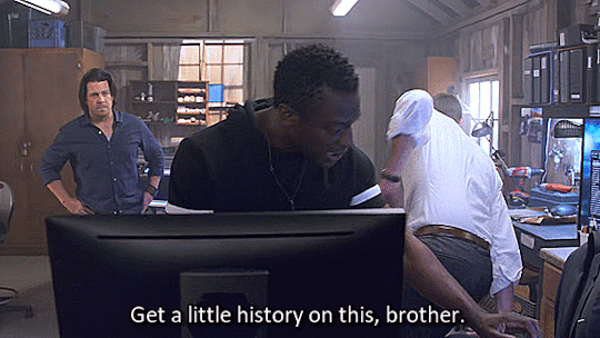
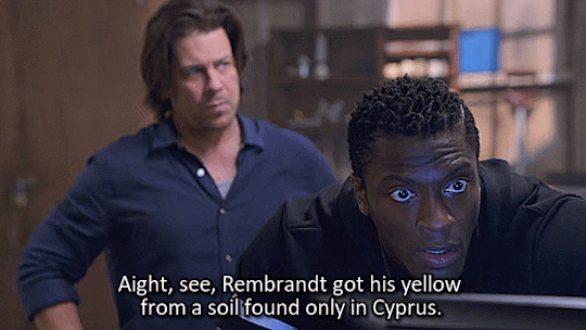
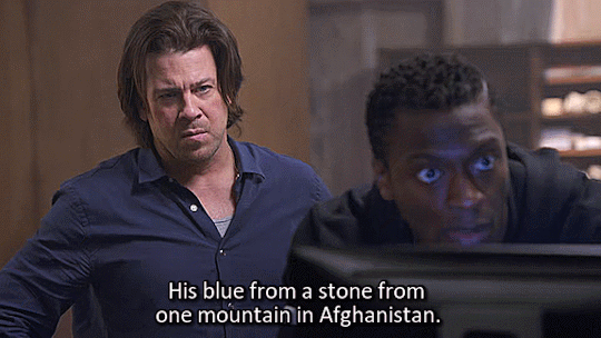
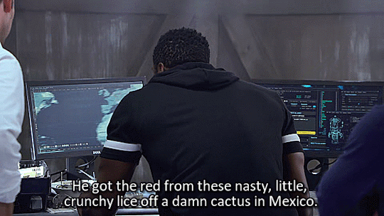
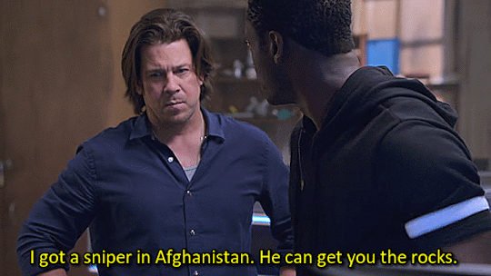
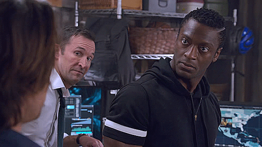
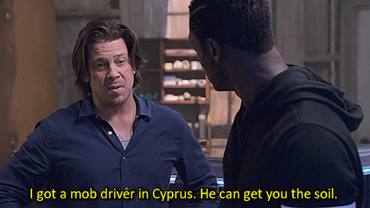
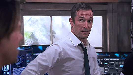

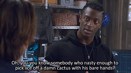
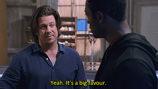
"Bruh, I gotta fake a masterpiece from 1633. Not only does the painting have to look identical, the materials I use have to be identical."
Leverage Redemption S01E01 The Too Many Rembrandts Job.
4K notes
·
View notes
Text

ダニエルスミス エキストラファインガッシュ ムーングロウ PG18, PB29, PR177
0 notes
Text
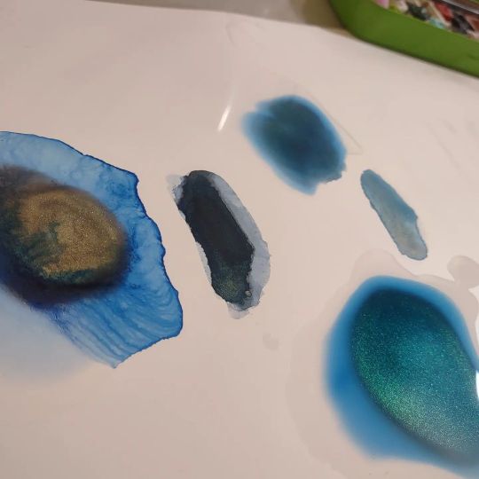
World Watercolour Month 2022 - Day 1 to 15
Day 1
Paul Rubens, Precipitated colours, in the super funky round box. From L to R: Shadow Yellow, Misty Carmine, Dense Cyan, Dusky Purple, Chinese Ink Blue, Country Green

Day 2
One of my favourite granulating convenience colours to come out in the past year is Cesc Farre’s Ocean Grey, currently sold under the Schmincke Horadam family of watercolours. Made with PB29, PBK6, and PG50, you can certainly try your hand at your own concoction. Still available via Jackson’s in the UK, though it is limited edition so it may not last.
I enjoy puddling water on Yupo and watching supergranulating watercolours separate out.

Day 3
Schmincke supergranulating Tundra Violet, made from PB29 and PBR6.
This one moves a lot, and quite quickly. Another puddle on Yupo experiment.
Day 4
Schmincke’s supergranulating Shire Blue, PY159, PB29, PG26.
This moves well in a puddle on Yupo. I do love the lines watercolours leave behind as they dry on Yupo.

Day 5
The lovely red and ethically sourced mica of Beam Paints handmade Wild Salmo

Day 6
Beam Paints - Strange Lake Bed.
Such a luscious blue. It’s hard to see in the image, but when this paint is separating into a still wet puddle of water, it looks like the colours of peacock feathers.
Day 7
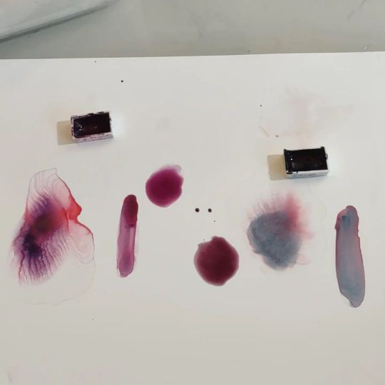
Left: Daniel Smith - Rose of Ultramarine - PB29, PV19
Right: Opus - Ethereal - PR177, PG18, PB29
Day 8
Notturne - PB29, PR179 - A. Gallo
Note that A. Gallo uses rosemary essential oil in their mix. These may not be the paints for you if you’re very sensitive to that scent. It’s not really strong, but it is noticeable.

Day 9
Nordmann Green - PG7, PV16 - Isaro

Day 10
Mayan Indigo Gold - Beam Paints
Sadly, I couldn’t get the shot just right to really see the gold, but I assure you its present, however subtle. You can see it in the bottom right somewhat.
I did try to get them to change the name to Indigold, because I’m just that kind of person. :)
Update: Apparently they did change it to Indigold. :D

Day 11
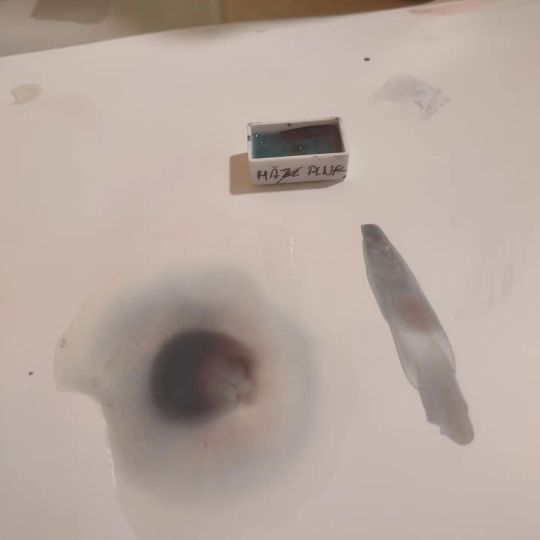
Haze Pink - PR233, PB36 - Schmincke
Day 12
Left: Stoneground’s Vivianite
Right: A. Gallo’s Harbor Blue
Day 13
Random Grey (2022) - Schmincke
This year’s party with the pigments resulted in this grey with sepia tones. Each year Schmincke mixes leftover pigments together and releases the limited edition results. Never the same way twice.

Day 14
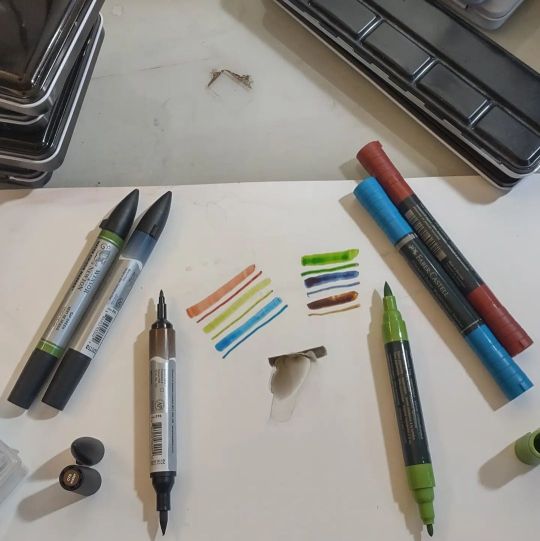
Nowadays the world of watercolour isn’t relegated to pans and tubes alone. These double-tipped markers - the Winsor & Newston on the left (don’t get them mixed up with the dye-based ones in similar tubing) and the Faber-Castell Albrecht Durer on the right - are full of actual watercolour paint. Definitely a viable travel option, since you can paint directly with either tip, or spread the paint out with a watercolour brush.
Day 15
Derwent Pastel Paint Pans are neither watercolour nor gouache, but have aspects of both. As far as I know, they haven’t released the makeup of the paints, so I can’t even tell you what the binder is.

0 notes
Text
Ultramarine Pigment
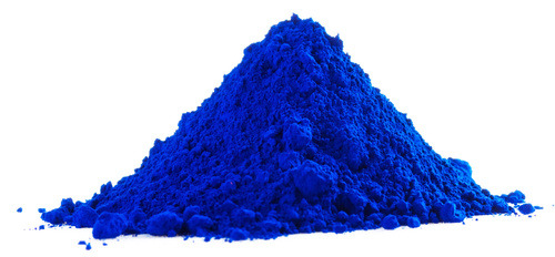
Ultramarine pigments are a group of blue pigments that have been used in art and various other applications for centuries. They are known for their intense blue color and were historically made from the semi-precious gemstone lapis lazuli, but modern versions are synthetically produced.
Here are some key points about ultramarine pigments:
· Origin: The name “ultramarine” comes from the Latin phrase “ultramarinus,” which means “beyond the sea.” It refers to the fact that the pigment was originally imported from Asia, mainly from Afghanistan, where the lapis lazuli mines are located.
· Historical significance: Ultramarine has a long history of use in art, dating back to ancient times. It was highly prized and often reserved for use in the most important and sacred artworks, including religious paintings and manuscripts.
· Lapis Lazuli extraction: Lapis lazuli is a deep blue metamorphic rock containing significant amounts of the mineral lazurite, which is responsible for the blue color. To obtain ultramarine pigment from lapis lazuli, the rock was ground into a fine powder and then treated with various chemicals to extract the blue component.
· Synthetic production: Due to the high cost and limited availability of natural lapis lazuli, efforts were made to develop synthetic ultramarine pigments. In the early 19th century, a French chemist named Jean-Baptiste Guimet successfully synthesized a synthetic version of ultramarine, which became widely used and more affordable than the natural counterpart.
· Types of ultramarine pigments: There are two main types of synthetic ultramarine pigments — Ultramarine Blue (PB29) and Ultramarine Violet (PV15). Ultramarine Blue is the most commonly used and known for its deep, vibrant blue color. Ultramarine Violet has a reddish-blue hue and is used less frequently.
· Versatility: Ultramarine pigments are used in various applications beyond art, including in the cosmetic and industrial sectors. They are used to color plastics, coatings, and textiles due to their stability and resistance to fading.
· Lightfastness: Ultramarine pigments are generally considered to have good lightfastness, meaning they resist fading when exposed to light. This property is essential for the longevity of artworks and other products.
It’s worth noting that with advancements in modern pigments and colors, there are now various alternatives to ultramarine pigments with similar properties and colors. However, ultramarine pigments still hold significant historical and artistic value.
Visit at :- https://ultramarinebluepigments.blogspot.com/2023/07/ultramarine-pigments.html
#sku pigments#Ultramarine Pigment#Ultramarine Pigments#Pigments#ultramarine blue pigment#ultramarine blue pigments#blue pigments#ultramarine blue#best ultramarine blue pigment#blue pigment#ultramarine blue pigment manufacturer#ultramarine blue manufacturer#ultramarine blue manufacturer in india
0 notes
Text
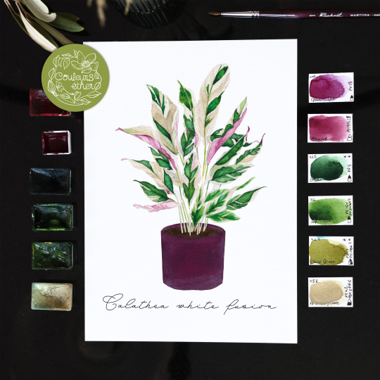
Calathea white fusion
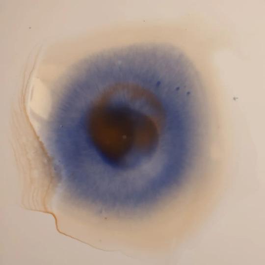
Alors ce Calathea, le White Fusion, il est tellement beau *_* J’ai pris pas mal de photos chez des pépiniéristes pour avoir des modèles, que je prends plus à l’extérieur habituellement, du coup j’ai dû faire aussi tout ce qui est plante d'’intérieur pour cette série et me faire un stock de modèles, au total tout confondu je dois avoir 7k photos de plantes… ils doivent me prendre pour une dingue à chaque fois que je me pointe. (Il me faut un deuxième disque dur interne, ça y est -.-' ) Ce Calathea je le trouve délicat, les motifs de ses feuilles ressemblent à de véritables peintures. La nature sait exactement comment nous émerveiller ! Pour le peindre j’ai utilisé une de mes peintures artisanales :3 un prune, que j'ai obtenu d'un mélange de pigments pv19 et pb29, qui correspond plutôt bien à cette plante !
#calatheawhitefusion#calathea#aquarelle#watercolor#plantes#plantesdinterieur#homeplants#indoorjungle#plantdecor#houseplantlover#houseplantsmakemehappy#naturelover#jungleurbaine#greenbeauty#beauténaturelle#inspiration#décorationintérieure#livingwithplants#nevskayapalitra
0 notes
Text

hello yellowstone 4 x 4" oil painting on smooth artist panel
reference photo taken from a moving car by artist in 2019
PBk31 x PR122 x PV19 x PB29 x PY151+PY74 x PW6+PW4
I have been so excited to try oil painting! Part of me thinks that using the medium with the most prestige to paint queer furry shit is the most Art I'll ever be able to create in my lifetime. I was able to use what I've learned in watercolor/gouache to help me buy a starter palette in oil. I decided to test PR122 and PV19 (they're very similar hues) against one another in the same painting and I definitely gained some understanding.
cw: existential dread?
What a strange time in history to capture, when people represent themselves as suprahuman rainbow animals and interact with one another as these fantastical creature personas. I want to leave behind art that could tell people of the next century about queer experiences through the only ways my increasingly nonverbal autistic brain will allow me to express. Will anything I make survive the coming decades of terrors and burns to be rediscovered by late 21st century baby queers? Maybe my own loved ones will resign to throwing it all in the garbage when I'm gone. I wonder if it is arrogant to try and exist a little longer.
also uh
I have hope that furry culture will continue to encourage art commissions rather than (or in addition to?) AI generated images, so I suppose I am still holding out that I could make money through art?
Many days I feel completely delusional about my right to spend money and take up space making anything. I don't know that I've improved in 20 years.
And now I'm reminding myself that That ^ was the demon which prevented me from "wasting" supplies on practice. And not making things = no dopamine, and no dopamine = more pain. Thanks for coming along on the ride of my nonverbal verbal processing haha. Looks like taking myself seriously and believing in myself is actual self-care. It's okay if things takes time to build.
#oil painting#landscape study#autistic artist#disabled artist#rambling about furry art and the future#kit chimera#mx kit chimera
3 notes
·
View notes
Note
What are the most important colours in a watercolour case? (Feel free to infodump beyond this question, please)
Hello, that all depends on your subject matter and how you like to paint! Are you going to be painting portraits so need some easy ways to mix a wide range of skin tones? Are you a landscape painter who enjoys having a few convenience greens and browns on their palette? Do you like your paints to granulate, or be easily liftable, or be excellent at glazing/staining? And when will you be using the palette - is it a small travel-sized one where you've got to be quite economical with the paints you choose, or is it a larger palette for use at the studio or at home? Is lightfastness a concern for you?
When I'm building a palette though, I base it around a split-primary palette — so a warm and cool version of each colour. This plus at least one earth colour (burnt sienna or burnt umber) and one convenience neutral (paynes gray or neutral tint) are probably the most important things to have in your watercolour collection in my opinion, especially if you're wanting to focus on colour mixing!
So my basic 8-colour palette would be something like:
cool (greenish) yellow: maybe hansa yellow light, or if like me you're not a big fan of regular yellows, a PY129 (often called green gold or rich green gold) is almost green in masstone but diluted to a lovely and functional cool yellow
warm (orangey) yellow: my favourite would be a quinacridone gold hue - either Schmincke (PR101 + PY150) or Daniel Smith or Roman Szmal (both PY150 + PO48) since they're a slightly earthier but vibrant orangey-yellow, but any warm yellow will do! Other common alternatives are new gamboge, hansa yellow medium, etc
warm (orangey) red: my absolute favourite currently is a PR255 (Daniel Smith pyrrol scarlet or Schmincke vermillion), but other common alternatives include cadmium red light (or cad red light hue), or any slightly orange-leaning red you can get your hands on
cool (purpley) red: a common choice here is a quinacridone rose PR122 or PV19, particularly if you'd be doing botanical painting, but my favourite is a PR254 pyrrol red - a postbox or fire engine red, so not particularly cool, but I really enjoy it with the quin gold in skintone mixes. Another option could be to have a middle red such as this AND a cool pinky-red on your palette.
warm (purpley) blue: the obvious choice for this one is an ultramarine PB29, a colour I think pretty much every watercolourist owns. This is a granulating pigment, but some brands such as Schmincke also offer a less-granulating version (Schmincke ultramarine finest) if you're wanting a smoother colour, or a French ultramarine for heavy granulation. I have both on my palette for different purposes.
cool (greenish) blue: the most common choice is a phthalo blue green shade PB15:3, but I much prefer the slightly cooler phthalo turquoise PB16 (Schmincke helio turquoise) - partly because I enjoy the colour and partly because it neutralises with my warm red PR255 beautifully. If you've gone for a cadmium red light as your warm red, try a cerulean as your cool blue to neutralise and match the cadmium's softness.
brown earth colour: I use this to neutralise with ultramarine and make a beautiful soft black, so my choice would be burnt umber, but burnt sienna works just as well (and is possibly more versatile)! Try and get either of these as a PBr7 pigment if you haven't already, as they tend to have the richest colours and cleanest mixes. Other options could be a quinacridone burnt orange PO48 (which I also have on my palette) , or an Indian/Venetian/English Red PR101, but see which neutralises best with your warm blue. A brown earth is also very useful for mixing darker skin tones, so bear that in mind when choosing.
neutral colour: this is a convenience (multiple-pigment, ready mixed) dark neutral colour that can be used to darken other mixes and in place of black. It's also great for monochromatic studies! Sure you can mix your own with ultramarine and burnt sienna/umber, but I get through a Lot of it so it makes sense for me to have a ready mixed version. Common options are paynes grey (a blue-leaning dark grey), or neutral tint (more neutral of course), but on my main palette I just mixed ultramarine finest and burnt umber together in one well to get my own custom mix. A thing to decide here is if you'd like your neutral dark colour to granulate or not!
These are my personal palette essentials, but everyone is different, so the best thing is to test things out and see what works.
Other resources:
I have a short (but continually growing) YouTube playlist on palette building that could be useful too, and Kim Crick has a great feature on essential colours on her pigment database here which I find very useful.
I hope this is of at least a little use!
#long post#art tips#watercolour tips#not art#ask#supplies#thank you for asking! this is only scratching the surface tbh
17 notes
·
View notes
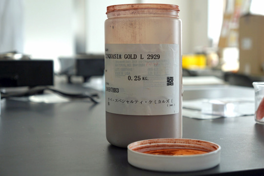
Text
レーキ化実験をしてきました②-三本ロールミル&座学編
20223/2/23(木)、クサカベさんのイベント、「西洋茜のレーキ化と三本ロールミルの操作体験」に行ってきました!
前半、レーキ化実験編はこちら。
漉したレーキを乾燥させてる間、三本ロールミルを体験させていただきました。 そして、省いた座学&濃度高めの雑談?編。
1.座学編
顔料と染料の違い、レーキ化とは何か? 何故退色するのか?などを学んできました。 が、話を聞くのはめちゃくちゃ楽しいのですが、雰囲気でしか理解できない自分の脳みそ。 某特撮もののジャンルで言うところの「だいたいわかった」的なあれ。
(1)染料と顔料��違い
この記事を見に来る人はきっと、染料と顔料の違いはなんとなくわかってると思うので割愛(←ひどい)
そして、レーキ顔料は、染料と顔料のいいとこ取り、みたいな印象もあるかもしれませんが、あながちそうとも言えなくて。 染料のような鮮やかはあるものの、耐光性は染料同様、とても弱いです。 とはいえ、太陽に当たりにくく、耐光性が重視されない雑誌などには向いている、ということで、要は使い分け大事、というわけですな。 (↑わかったような言い方をしているがふんわりとしか理解してない)

ブリード現象というものを表した?資料。 耐光性だけじゃなくて、そもそもやっぱり絵には向いていないんだなぁと思わざるを得なかったです。
ブリード現象については、Tシャツのプリント部分に色が移っちゃうっていう説明のサイトを見つけたのでそちらをどうぞ(丸投げ)。
(2)レーキ化とは
レーキ化とは、を表した図式。 うん、わからん。 とりあえず、アルミニウムと結合することでうんちゃらかんちゃらということだけはわかった。 (↑それはわかったと言えるのだろうか……?)
↓今度はPR48:1で表した図式。(写真が暗くてすまそ)
で。 この名前はわからん赤い染料、水に溶けることで、2つのNaの結合が溶けちゃう?かなんかで消えてしまう。(曖昧) で、塩化バリウム溶液を加えることで、水に消えた2つのNaが塩化バリウムの2Clとくっついて2NaClになってなんちゃらかんちゃら………… (これ以上は記憶が…………orz)
なお顔料だとこの色。 PR48:1、製品で見た限りでは、SHINHANの油絵の具にあるようです。
2.実験中のお話
実験室も楽しいし、実験中の小話も面白いので、煮出してる時間や、濾過してる時間もあっという間でした。
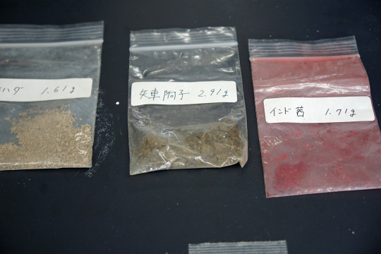
(1)色々顔料
実験中はいろいろなお話や超絶貴重な顔料を見せていただきました。
ハイ、エメラルドグリーン! ハイ、名前憶えてないけど黒すぎる黒!
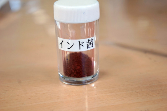
そのほか、廃番になった顔料PB33や、忘れたけど、前に話題になった廃番になった顔料とか。 (みな勘違いしているかもしれないのでここで主張しておくと、当アカウントは、PB27、PB28、PB29、PB35、PB60、PB66、PY3、PR101、PR102、PW4、PW6くらいしか憶えてません。これ以上のキャパシティはありません)
(2)実験の小話
①実験ではアンモニアを使用しましたが、アルカリ性ならできるようですが、アンモニアの方が良い色が出るようです。
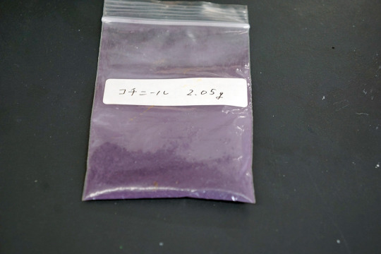
②ミョウバンにくっついた量が顔料の量になるようです。
③コチニールも今回と同様の手順で作れるようですが、藍のレーキ化は別の方法になるようです。 奥が深すぎる!!!
なお、クサカベさんが以前作ったコチニール顔料。 PH値の問題で色が紫色になったようです。 市販で売ってるコチニール顔料は真っ赤だから、むしろレア! ※コチニールでレーキ化するときは、泡と臭いがすごいとのこと。 おうちでもやってみようと思ってホーロー鍋買ってみたけど、大丈夫かなぁ……
他の染料でも色々レーキ化実験を行っていたようです。
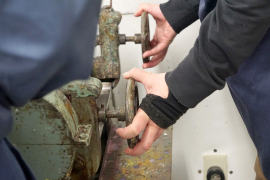
3.三本ロールミル体験
アンモニアを入れた後の濾過~乾燥の時間に行いました。
(1)三本ロールミルを動かそう

↑今回体験する三本ロールミル。 実際に絵具を製造する際に使っているものはもっと大型です。
この写真だとほぼ見えないですが、このロールミルの間の隙間を調整していく体験をします。
先ずは、器具をとりつけ��絵具を投入。 空で動かすと、石同士がこすり合わされて劣化してしまうので、空回し禁止!
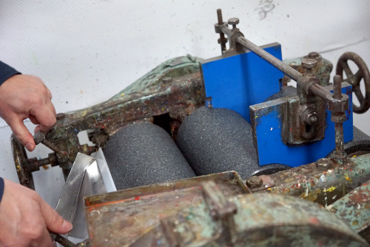
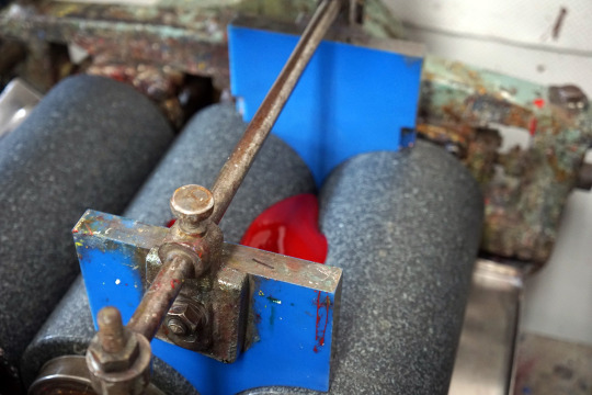
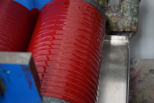
↑駄目な例。
左右、バランス良く綺麗に幅を調整するのが難しい! これができるようになるまでに1年はかかるそうです。 まさに職人技!
そうしてできたものがこちら。 油絵の具か!?という大量の水彩絵具をパレットナイフでごっそり取って容器に詰めるというなんか豪快な体験ができました。
(2)後片付け
上に取り付けた器具を取りは牛、こちらは洗い場で洗います。
肝心のミルは、中々大変そうでした。(写真がないので詳細は割愛) 少しでも色が残っていたら、次に作る絵具に多大なる影響を与えてしまうので、洗浄作業もとても大事!
毎日あの大きなロールミルを掃除していると思うと、本当に大変だ……
4.最後の質疑応答など
最後はいろいろな絵具の原料などを見せていただきました。
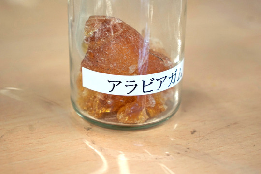
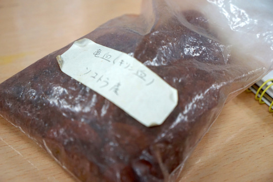
↑ドラゴンズブラッド。 龍血樹という木から取れるようです。根っこではなく葉っぱから水分を取る変わった木のようです。 バイオリンにも使われているのは初耳!
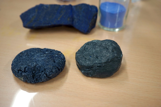
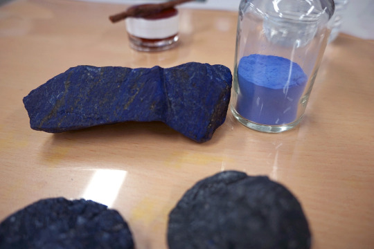
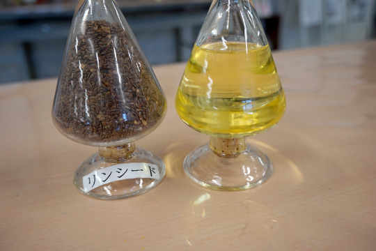
↑こちらはみんな大好きラピスラズリ。 下の丸っこい塊はチェンニーニの作り方ででてくるやつ(←曖昧)で、ミツロウとかなんちゃらとか松ヤニとかを混ぜてなんちゃらするなんちゃら(←なんちゃらが多すぎる)
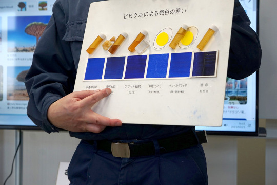
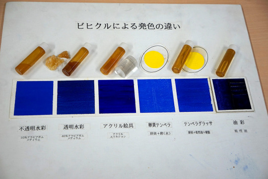
最後、面白かった質問は、バインダーによって色がどれだけ変わるか、というもの。
こう見るとかなり違う!特に油絵の具! 不透明水彩・卵黄テンペラが一番顔料に近いようです。
というわけで、この後は恒例(?)お買い物タイム。 いろんな顔料が超安い! オーレオリンとかいっぱいあったけど、ちょっと諦めた。
以上、レポートでした。
なお、最初は参加者6名だけは少なすぎる(>_<)って思ってましたが、作業をしていると、6名が限度なんだな、と実感しました…。
なお、今回は参加費6,000円でしたが、休日の開催で、6名しか参加できないうえ、内容盛りだくさんで、お財布へのダメージは確かにあるものの、この内容の濃さからすると安すぎる……という印象でした。
最初から最後まで、本当に色々盛りだくさんであっという間でした。 休日の中開催していただいて、本当にありがとうございました!!
0 notes
Text


and i am currently selling them (dm if you’re interested)
I called this color Marine Deep and it’s made using the pigments PB29 (Ultramarine) and PBk11 (Mars Black) Both of these pigments are granulating so this is a very granulating color. This paint was made using Gum Arabic, Honey and Ox Gall
This is my first time making homemade paints and I really liked them :]


I made homemade watercolors and made a drawing with them
151 notes
·
View notes
Text
Art Supplies I'm Using Right Now (Sept. 24, 2023)
I like posting exact materials on here to help me keep track of how I make a particular piece, so I'm making this as a masterlist of everything I use right now so I can just copy and paste in the future.
I'm not planning on cataloging every single supply I have right now, so I'll update it as I post more - the date in the title will be the most recent update. As of right now, none of these are affiliate links and are just here for people's convenience. I will try to link directly to the manufacturer as much as possible to make it easier to access more detailed information about the product. Any links to retailers should be house brands.
Supplies below the cut.
Paper/Sketchbooks
New York Central Art Supply 100% Cotton Block, 5"x7", 140 lb., Cold Pressed
Strathmore Mixed Media Journal 200 Series, 5.5"x8.5"
Brushes
Mimik Squirrel Round Watercolor Brushes Size 4 & 8
Watercolor Paint
MaimeriBlu Quinacridone Magenta (PR202)
Daniel Smith Hansa Yellow Deep (PY65)
Daniel Smith Hansa Yellow Light (PY3)
Daniel Smith Cobalt Teal (PG60)
MaimeriBlu Faience Blue (PB60)
Daniel Smith Payne's Grey (PB29, PBk9)
Daniel Smith Quinacridone Purple (PV55)
Gouache Paint
TBA
Alcohol Markers
Copic Alcohol Markers
Ohuhu Alcohol Markers (2018)
Ohuhu Pastel Marker Set (2021)*
Acrylic Paints
TBA
Fineliners/Brush Pens
TBA
Acrylic Pens
TBA
Other Inks
TBA
Misc. Supplies
New York Central Art Supply 12 Half Pan Watercolor Tin
*may not be the exact date but I /think/ that's when I ordered them
1 note
·
View note