#only reason i even own nail files is for other cosplay purposes or because well sometimes you need to file down a sharp point
Explore tagged Tumblr posts
Text
just spent like an hour or so filing and shaping my nails in preperation for cosplaying astarion....
#this is a months long commitment btw#that i'm gonna try to maintain as best i can#i want my nails to look nice and my nails currently do not look very nice#cause i've never really cared about my nails before#only reason i even own nail files is for other cosplay purposes or because well sometimes you need to file down a sharp point#i looked up tutorials for this#tho i've technically attended a short manicure class i don't remember much of anything from that#i swear this man is messing with my brain chemistry on some fundemental level#what did they put in that guy???#don't mind me
6 notes
·
View notes
Text
Long Post on Screenshots
Coincidentally, I had glimpsed the twitter thread in question (or something similar) before I saw a post about it and had some thoughts™ as well
I was going to straight up reply but it got out of hand and I ended up blabbing a lot about taking screenshots, mods and ReShade.
Mods. Literally just an aesthetic client-side change. I can't believe people are up in arms about this. Let people have their fun and ignore it if it's not to your taste. There's absolutely no need to shit on someone else's definition of fun. Your values for what comprises a good screenshot made with effort should not be imposed as the standard. (Unless you're holding a screenshot contest, it literally doesn't matter.)
I don't use mods personally, out of laziness and I cannot be bothered messing with my files. Partly because I don't have characters that have a particular appearance that I really want. But that's my reason, and if other people are happy with their mods, so be it. I'm happy with my own thing. Even a walk home next to a world-famous monument just gets dull when you see it so often. It's not a crime to appreciate it through a different lens.
I'm going to preface this by saying no one has to defend what they want to do for fun. And even if your reasons for using mods/ReShade etc doesn't fall in line with any of the ones offered below, it literally doesn't matter and you should have your fun.
Contrary to what some negative folks think, people are still fully capable of doing some really good glamour without mods. Although it makes sense when you play around with FFXIV's glams/character creator enough, you'll quickly realize that there are particular limitations (certain gloves don't show up with certain tops, some bottoms lose the pants/skirt when you wear certain things over them, etc) and some people simply want to portray the details of their characters accurately to their vision. I have seen a lot of really good designs that don't exactly match their in-game sprites. Some people might want to do an easy cosplay. Some people might just want to look pretty and sometimes it doesn't get deeper than that.
Nevermind that there are ordinary people behind modding, creating these for use. They didn’t spawn out of nowhere. They’re a product of someone’s hard work and skill too. Shout out to @keeperofthelilacs for the posts & a glimpse into the grueling, painstaking process just to make a deceptively simple mod and apply changes to each model. I cannot fathom people creating things that are not even in-game.
But obviously, with modding being the new shiny thing, there would be an influx of pretty pictures with people using them. The majority out there still does some creative things without the use of these programs. But their use isn’t indicative of a lack of creativity in taking screenshots.
Yes, the game is intrinsically beautiful and the sights are breathtaking, and there's no shortage of unmodded, unretouched, unReShaded screenshots littered about. I know there are more than a handful of reddit threads with such screenshots up. But, even with the built-in /gpose, the options can be limited and the vivid colors don't always show up the way people intend them to. This is why ‘different’ draws attention. Since we all have the same washed out color palette (suitable for actually playing the game. try raiding with an Aesthetic ReShade setting with Depth of Field on, it is agony.) it’s easier to pick out brighter looking, unusual colored screenshots. Moreso if they’re beautifully composed.
The improvement of colors from ReShade are only one aspect of it, as a lot of people who use them could tell you.
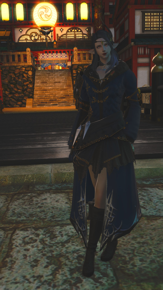
This screenshot has ReShade on and some /gpose settings, and it’s whatever. It’s meh.
It’s poorly lit, tilted to one side for some reason, the background lantern is grabbing all the attention, but the scenery is somehow cut off, my character is awkwardly posed, the colors, while MORE vivid, aren’t really inspiring the ‘hey this outfit is awesome and unique’ feeling. You have no idea what you’re meant to pay attention to.
Now, before you say I took a bad one on purpose, this was actually from the time I first got the diamond coat so I was ACTUALLY trying to show it off. This was one of many screenshots I’d taken, trying to nail down what I wanted to do.
It just goes to show even if you have the tools, you can still produce some pretty underwhelming stuff. And you could easily take a better one if you know what you’re doing.
It may be beyond the provisions of the game, but it’s not an easy task taking good screens with ReShade. Like said, it takes time and skill.
You have to know when to use angles and tilts and how to frame photos. Composition does SO much. The word gets used a lot but there’s a lot involved, whether you do it consciously or not. Do I zoom in up close or far out? How far? Do I want to put my subject in the center or a little to the right? How much of the background should I show? Do I blur? Do I use dutch angles? Do I take a high angle shot? Daytime? Nighttime? /gpose which filter? How much can I crop? Do I need the feet in the frame? Do I add special effects? Lighting setting 3 2 or 1? More green or more red? Those are basic questions people think about, but these are settings you use to tell a story. Then there’s questions like, how do I frame the photo to draw more attention to the feeling of being trapped? How do I use lighting to create a feeling of dread? How do I use the environment to help me tell the story and not just take a dull photo of my character?
And that’s just taking the photo. It’s easy to be tempted by all the shiny stuff you can pile onto a photo, but if it doesn’t serve a purpose other than “ooh”, then the intense sparkles floating around a photo can distract more than contribute.
So you have everything set. You switch ReShade on. You picked out a good preset. But when it comes to stuff like this one size does not fit all, in order to make it work beyond what a preset provides (as night can be pitch black, and daytime is a complete bloom-filled eyesore) you have to get your hands dirty. Presets can be pretty for sightseeing, and for most it’s enough and they work well enough to use consistently in screenshots. And that’s perfectly fine. The settings are very technical and have numerical values. I don’t understand all the values and effects myself, and finding the sweet spot to produce is an arduous process.
The same goes for Photoshop. There’s no magic button to make your art look good. You need a good eye for adjusting saturation, color balance, lighting, cropping, framing etc. to improve ANY photo. More than that, you need to be good at making believable visual effects for fancier edits. If you drag a brush randomly, no one’s going to be immersed in the way those hair extensions were made. Nope, people study the native look of a photo to make changes. Otherwise you just end up with spaghetti hair.

[it’s the same ugly photo but with spaghetti hair]
I literally used the color dropper. It’s not enough to do that!! Like GIRL I’m a fuckin digital painter and I don’t know how all those people paint/edit hair, it’s a SKILL they learned and not one I have LOL. You have to care about lighting and getting the right width and all that. It’s not that simple.
Photoshop’s got a magic wand but it’s not that easy!

People who edit photos are familiar with these... and each one has its own settings and values :,^) that can change the mood of a photo by making only certain colors be more muted or even making everything look a little lighter and brighter.

It’s not that easyyyy look at one of these windows if I didn’t do this for a living I’d be so confused
So going back to showing off my coat. After I saw the lineup of photos I’d taken, I was pretty dissatisfied, especially because I knew I could take better photos.
I identified the problems I saw:
1.Even though I wanted to showcase my outfit, I didn’t have to take a photo straight on. The photo earlier had her facing completely straight into the camera. And it felt very flat.
2. It’s zoomed too far out, you can’t really see the details on the coat.
3. I tweaked my ReShade settings. I worked on the lighting. When I realized my settings and the lighting in game (and on gpose) were not cooperating, I decided to wait for daytime. Kugane at night was distracting as hell with all the lanterns in the background. My clothes were the star.
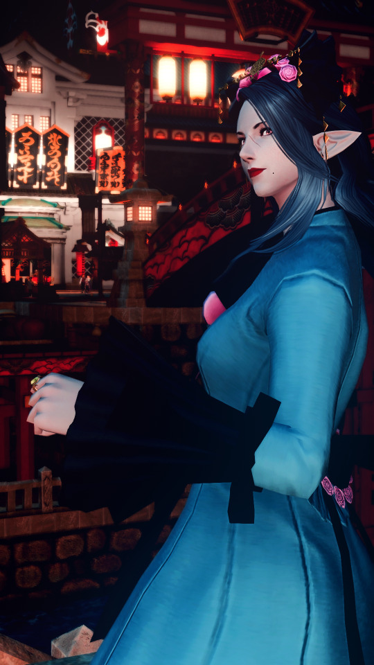
Here’s another screenshot I took wearing the Far Eastern stuff.
I wasn’t showing off the details of the glamour here. Kugane at night has a lot of personality, lights and colors. When I looked at this old screenshot, I realized that it wasn’t a good setting for a simple photo that said “hey check my glam”. This photo told a story. My clothes weren’t the focus, it was the fact that Proxi was in Far Eastern clothes in Kugane. All of those facts were of equal importance, so she was a figure immersed in her surroundings.I didn’t need to capture the details of her dress, just show enough for it to be recognized. That’s why this photo worked. And only one of the many reasons why the badly lit one didn’t work. Contrary to the urge to do so, I didn’t need to tilt the camera angle to make it look interesting. I used her body language, paused an emote at the right second to get something more relaxed, her over-the-shoulder look gives an inviting feeling. I let the color contrast separate her from the background as a figure, but I kept her a part of that warm Kugane vibe with bits of red lighting. There’s a lot of thought that goes into this. How color and mood tie together. Knowing what is essential and what isn’t helps a lot, and sometimes it’s trial and error and you don’t really actually know what you want.
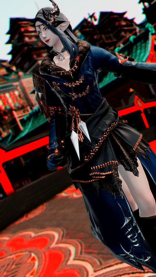
Here’s the final image of the Coat screenshot that I posted a couple months ago
The problem with the Diamond Coat is that I dyed it a dark blue color and I wanted to keep that sense of dark blue without shining a bright light on it, or lightening the color. I used stronger contrasts to bring out the blues, fiddled with settings I didn’t understand but it made details shaper lol. I used angles and some blur to add a little more dynamicity (being a more static photo) and focus on Proxi. While she is still mostly facing forward, I played with her pose more, to get more of a ~random well-dressed elezen on a stroll~ feel. And!! look at all the details on her coat, you can see them!!
But wait, you ask, aren’t you just proving that ReShade is a crutch wELL IT’S NOT. It’s a TOOL. You use. If it makes your life easier and more efficient and it makes you happier, like, honestly it doesn’t matter.
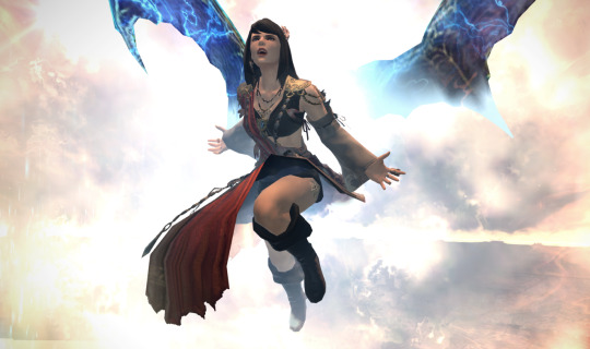
But here’s a non g-pose, non-ReShade screenshot I took during a Zurvan EX run early last year. My PC froze for a second lol. I was going to have a heart attack doing this but as a SMN I’m obligated to RELISH Teraflare. This is ONE lucky screenshot I got and you know what, even if the colors aren’t super vivid, this screenshot feels SO right. The explosions aren’t overwhelmingly bright, the arena is surprisingly a fitting background, and she’s got her leggy up but she didn’t give me a panty flash and I am fortunate this turned out to be a great photo I could put in a church mural.
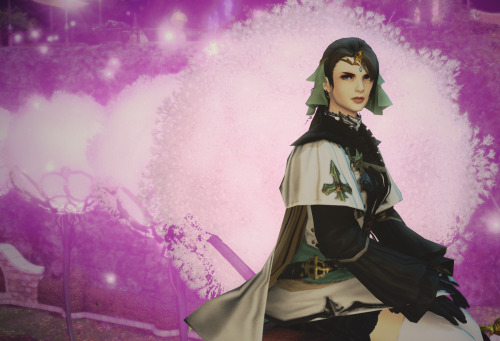
Another non-gpose one. See! framing, contrast and all that. This was from my old blog circa 2016 and it got one note! LOL gpose didn’t even exist yet as we know it, and I don’t think ReShade was widespread or even a thing yet and I was super proud of this one. The trees gave her a soft background without making it too blindingly bright so she stands out and I love it.
So there’s’ your normal screenshot look, without excessive flash and eyesore while still being pretty.
But yeah anyway
TL;DR
1. Don’t be bitter about other people using tools and adding steps to enhance their aesthetic experiences or to create screenshots that are more faithful to their vision. If it’s not harming you, live and let live.
2. There’s more thought that goes into pretty screenshots than you think. Just because they don’t pick up a brush and draw, does not disqualify these screenshot posters as skilled artists in their own right.
(ノ◕ヮ◕)ノ*:・゚'✿ That’s all!
32 notes
·
View notes