#onemoredayproductiondesign
Explore tagged Tumblr posts
Text
Final Film - One More Day
vimeo
0 notes
Text
Critique of film - One More Day
Overall, I am extremely happy with how the final film turned out. I’m so glad we got the location that we did because it gave me so much interesting space to work with, meaning that the final film had the depth and texture we were looking for. As I’ve said previously, this is my first time working as head of department for production design as my primary role on set, meaning I had a chance to focus on the details and really put all my time and effort into the visuals, which I think translated really well.
I am really happy with the extent the room was filled. I think I successfully managed to create a world which convinces audiences that the characters have been in this room for a long time. I do think that I could have made the room feel a bit more lived in - in particular with the way the cans are placed. I feel as though the cans around the room don’t look natural enough and at times they look as if they have been dotted around the room to fill space, rather than to serve a purpose to the story. To improve, I would put them more in clusters, closer to the characters’ possessions as if they have been “chucked aside” rather than placed in a formation. I do think however, that an advantage of placing the cans around strategically gave the set more levels and it provided more depth to the frame - especially for the chess board, where I placed them in a way to prop them up.
Another aspect of the set which I thought worked really well for the narrative and style of the film was the addition of the fabric on either side of the frame. I thought it helped to shape the frame for the wide shots a lot more, and it also helped to provide background to the characters. I think Sarah’s “shrine” really helped to elevate the story and made the dialogue a lot clearer, and I am happy with how much detail I put into it. The only criticism I have with the makeshift tents is that in the final film with the grade applied, it makes it look like a stage set. On the one hand this can be appropriate and fits the cinematography, however it also restricts the story and in a way makes it seem like an isolated scene rather than having a whole outside world around it.
One criticism that came from the final crit, was the use of the wide shots. The lecturers thought that they were relied upon too heavily, which I do agree with. I feel like we should have had more close ups to really show the detail in the production design as every creative decision that I made had intent behind it. I know that we didn't get enough close up coverage on set, and I wish we did because I think it could have helped to drive the narrative more.
0 notes
Text
Critique of process - One More Day
One More Day was the first project that I have worked on as a head of department production designer, and I had the best experience. The communication between the crew made it so much easier to do my job, in particular Alfie, our director was so helpful and was open to my ideas - allowing me creative freedom, while still being true to his vision of the film. Having a location that was basically a blank canvas was both a blessing and a challenge for me because while I had complete freedom to fill the space, I also had to find a way to fill the room in a way which made narrative sense and also in a way which was visually interesting. It was a bit tricky having such a small team for production design as it was quite a big project, but it also meant communication was a lot easier as it was only me and one person in the art department. Occasionally, I found it difficult to find a balance between the work I was doing and the work the art department was doing, and sometimes I felt like I had quite a big workload, however that may have been a mistake in my planning. Initially, I felt like I wasn’t always being listened to within my department, however after a bit more communication, I felt that we worked very well together and we collaborated well, prepping and dressing the set. I would have liked to have been at the recorded rehearsal but unfortunately due to personal reasons I couldn’t attend, which meant that I missed an opportunity to see the blocking for the actors and see a rough lighting plan. While this could have made my job difficult for the dressing of the full set, I felt that I was very good at communicating with my team - especially with our director - which meant that this did not affect my work and this was not an issue I faced on shooting days. My biggest strength for this particular project was planning and communication. I have been on projects where I felt that I wasn’t respected in my role as production designer and I communicated that at the start of this project - this was definitely taken in by the rest of the crew and I was really happy with how the set ran, it was incredibly professional. Additionally, I felt that I was quite good at paying attention to detail, I always made sure that there was intent behind all of my creative decisions and it really payed off. I wish that I was more assertive with my team as I think sometimes I wasn’t getting my point across like I wished, and at times when we were setting up I think we wasted a bit of time focusing too much on things that weren’t going to be seen on screen as much - so I think next time I will focus more on organising my priorities as well.
0 notes
Text
Shoot day 2 - One More Day
The second shoot day was a lot more relaxed for me - all the hard work was done yesterday :)
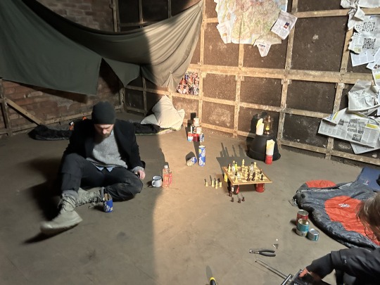
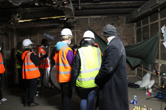
The first things on my list for today was to complete the notes Alfie gave me yesterday. Firstly, I added more newspaper to the wall, layering it more, creating more depth to the frame etc. I then focused on the cans scattered around the room. I had a few comments yesterday saying they looked a bit too perfectly placed - which I did agree with. I then suggested making a pyramid with some of the cans to highlight the characters' boredom in this situation, with other cans more scattered around the room. I liked this idea a lot more and it also provided more levels to the set. I had a lot more props brought to set such as dirty pillows and an extra sleeping bag, so I was able to add these and it made the set look a lot more complete. Additionally, I brought in a tool kit to place behind John - the character who has to fix the radio. We placed tools, nuts and bolts around the radio to make it seem like John had actually taken it apart. And finally, I had Vanessa (production design assistant) set up a game on the chess board (since she is much better at chess than I am haha), with the added objects on the board.

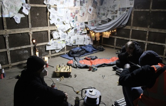

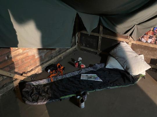

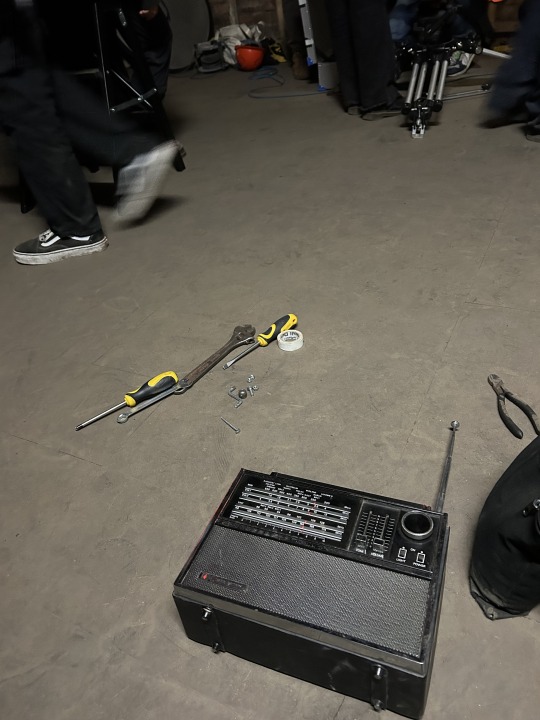
the set with the added props
My second job was to do costume checks with the actors. The night before the shoot, I texted both actors to remind them of things they needed to bring and they both pulled through and brought everything they had to add to their costumes. I honestly thought I did really well with these costumes and I think they set the tone for the film pretty well. I would have liked to find costume pieces for Robert's character John that fit the colour palette that I made, however with the time and budget we had, I had quite limited resources and it wasn't perfect. I would have liked him to have more earthy tones in his costume, and I did have a jumper which worked, however the bunker was colder than we anticipated and I opted for Robert to wear a jacket over the top. I was hoping that the jumper was going to be more visible, but due to the angles and movement, it wasn't as visible as I had hoped. I still think it does look good, I just wished I could have emphasised the character divide through their costumes more. I loved Ben's costume and was really proud that I was able to find pieces that complimented each other so well.
We started off mic'ing up the actors and blocking with them, I was present to ensure that none of the set was going to be in the way of the movements. As mentioned previously, I had already planned my set so that things were out of the way of the actors, but I am also well aware that things change so easily on sets, so I had to be prepared to improvise. Luckily, due to Alfie's good planning and communication, we came across no issues and there was nothing I had to change.

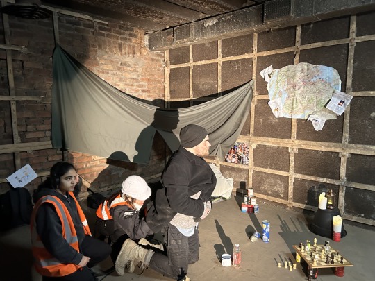


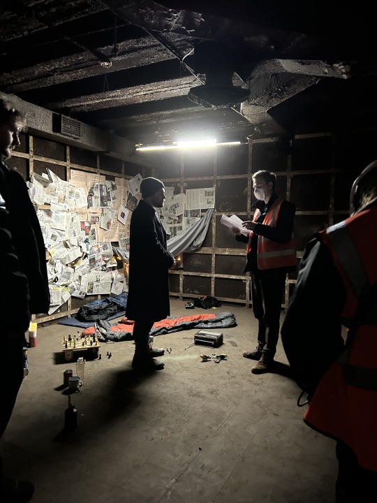


prepping with the actors
I had to keep an eye on the cans throughout the shoot to make sure that none of them had any visible brands showing. Prior to shooting, I turned all of the cans to and branding away from facing the frame, so I just needed to ensure and also brief Robbie to keep an eye on this (for continuity).
After prep was finished we got on with shooting and the hard part of my job was basically over! I wanted to stay out of the way as much as possible so I sat with Finlay, Vanessa and our runner Saif and discussed the logistics of how we were going to do the "blood" splatter shot. India was really excited to be able to create the blood as I know they have an interest in gore and special effects make-up, so I left that in their hands. I was happy with the consistency, they mixed store-bought fake blood with different sauces to make it darker and less gooey. In preparation, I made 6 or 7 extra identical children's drawings so that India had enough tries of the shot to get it just right. At the end of the day, we got called in to help with this shot. I was stood behind the monitor, checking to see if the blood throw worked - i.e. if there was enough, if it splattered on the right spots and any continuity errors such as cleaning the blood off the wall after each try. I was also stood on hand with a hammer and a new drawing to quickly replace it to cut prep time for each take. We had to alter the way it was splattered on the paper a few times, and in hindsight it may have been better to us a paintbrush rather than India's hand, however we got a few takes which worked really well. The main issues we came across here was that on some takes, India's hand or shadow was visible, or at times, not enough blood landed on the paper.
Because we had some extra time, Alfie wanted to try a shot where Cam (played by Ben) is holding the radio which is dripping with John's blood. For this, Ben stood on a footstool holding the radio, while India dripped the blood off the corner of the radio. I held the stool to make sure it was stable for Ben to stand on and I think the shot we got looked really good!!
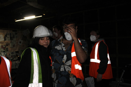
We finished the shoot on time and were able to pack away smoothly. I was really sad to have had to take down the set because I was really proud of all the work we put in. Because I have never had to work with a location that was basically a blank canvas, this project was a real challenge for me, however I had the best time doing it because I had a lot of freedom. There are a few things I will take away from this and I know the guys have been having conversations about making an extended version and I would love to have the chance to rebuild this set and add my improvements. Some things I would do to add improvements would be keeping some of that rubble we cleared at the beginning to add more character to the scene. Additionally, I would add more props around the floor to indicate more to the fact they have been in this bunker for as long as they have - such as more cans, maybe some bottles or empty drink cans. Not only is this the biggest project I've worked on when it came to production design, it was also a project where I was a HOD and had a crew to be a leader of. I am used to producing, so leadership roles are not new to me, but being in charge of one department is a new role I've had to adapt to and I would like to think I was very communicative and was a good leader. This project also allowed me to work with a bunch of new people and during our air breaks (and sitting in Duncan's car because it was too cold outside) we were all able to bond! I loved working on this film, the crew is amazing and I had a lot of fun!!


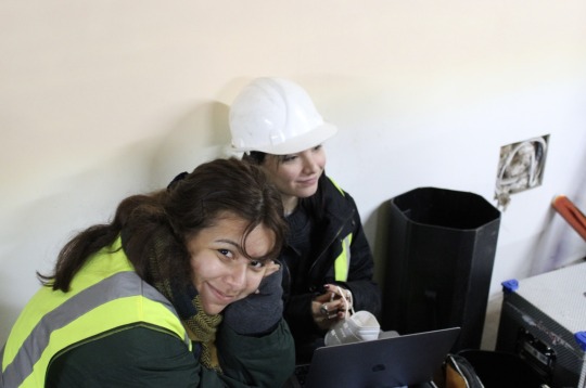

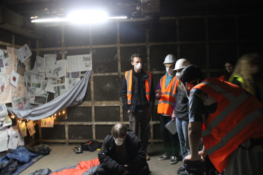

1 note
·
View note
Text
Shoot day 1 - One More Day
Prior to this shoot, Finlay explained to us that there was going to be a very specific set up for the prep day. The crew was going to be split into two groups - camera, and production design - each to be supervised by Finlay or our AD for the day, Vanessa. My team's job was to dress the set to save time for the next day. Prior to this, I showed India and Vanessa my plan for dressing the set, so that set up went as smooth as possible, and everyone knew what they were doing.
As soon as we arrived, we got clearance to clean the room and get as much dust and rubble out of the room as possible to ensure safety for all of the crew and cast.


the best production design team
Because the bunker is such a big space, and the distance between the set and the green room was huge, I was given a radio as head of department for my team so that I received any crucial information from Finlay (producer), Vanessa (1st AD), and Robbie (Script Supervisor). This was not only fun, but also helped me massively learn how to use a walkie-talkie for my other project that I am producing.
As soon as the room was clear, I got started dressing the set. My priority for today was ensuring the walls were covered the way we wanted it to be, so that tomorrow we can focus on blocking and little prop details. Finlay gave us 2 1/2 hours for this, and I was certain that we could complete it in this time. The main worry I had was the placement of the fabric, since I hadn't really figured out a way I thought looked good and made sense for the narrative.
I started covering the right side of the wall with large pieces of the Financial Times newspaper as the text is incredibly small, and it would make sense for the characters to use this as a base for their insulation. I then started tearing up other newspapers to layer over the top, ensuring that the notes that India and I prepared were in the front. I knew that there were not going to be any close ups of the wall - for both narrative and copyright reasons - however I wanted to include as much detail as possible no matter how small, to also show the efforts that my team and I put in to make the space look lived in. Finally, I took the science magazine and isolated the very general headlines about the state of the world and pinned those up - to indicate the point in time and the state that our characters are in right now. I knew that John's side of the wall was going to be more full and dense than Cam's, and I wanted to add a map - to show which areas around them had been "hit" by the apocalypse. Because I knew this map wasn't going to be shown in detail, I had a bit of fun with it. The whole crew and I put pins and crosses in places in Scotland that we all had connections to. I also felt that the space around the maps was quite bare, so I moved some of the science magazine headlines around the map and it really brought it to life more. Another bit of fun we had was filling in one of the crossword with all the names of the crew members to pay homage to everyone's hard work :)


wall details
After I finished with the wall, I moved into the floor space. I had collected two sleeping bags - ensuring to make space for the third, which is only available for the second day. I had previously discussed placement for the main props with Alfie prior to the shoot, and we drew out a very rough floor plan, where he showed me the actor's movements and blocking so that I don't place any props in the way of their path. I also asked our gaffer, Duncan, for the lighting plan so that I don't put any props in the way of the lights, flags of cameras.


rough floor plan and lighting plans from Duncan
I had a big plant pot, which I had planned to place the chess set on, however Duncan and I set out a really cool lay out with the *fake!!* candles and the lantern, which I thought worked even better!! I then had to improvise to find an interesting way to place the chessboard, as I didn't like that there were barely any levels on the set - everything was on one flat surface apart from the lights on the plant pot. I had the idea of using 4 cans placed under each corner of the chessboard to hold it up and it worked perfectly!!

floor set up
I enlisted the help of Alfie (director), to make some creative decisions on the fabric. I had the idea of making a "tent" on John's side of the room - almost as if he had made this with Sarah when she was still around, with the children's drawings scattered around the wall, above her sleeping bag. For this, I used the smaller grey sheet, which I had stepped on a bit on the dusty floor to make it a bit more worn. I used pins to pin them up, and placed the children's drawings in and around it. I did think it was a bit empty and the children's drawings were quite hidden, so I talked to Sophie (DOP) and Duncan about possibly having another practical light on that side of the room. They agreed as it gave more dimension to that side of the room, so I added some fairy lights under the tent. I am really really happy with this part of the room in particular, and I am quite proud of myself for being able to improvise in such an innovative way.


before and after we installed the practical lights
For the other side of the room, I wanted to show that Cam has a much less emotional relationship with the world and the people around him, so I wanted to make it as empty as possible. Alfie and I agreed that if we pinned the green cloth from near the ceiling down and ripped it in the middle, it would create a doorway to his "hole" of a home - which is much more desolate and less personable than John's side. I used the same technique of stepping on the fabric to make it more worn. We also added some random cut outs of faces on Cam's side which made it much less personal and wholesome to John's side of the room. I am really happy with the two personalities I have created in this room alone and I think it reflects the story really well.


Cam's side of the room
Final touches and notes were made from Alfie when I asked for a check towards the end of the day and I'm making sure to collect these things for tomorrow:
more newspaper on the walls
cans to be scattered either more haphazardly or methodically (i.e. pyramid)
finishing touches to the chess set
I had to much fun today bringing this set to life, I am so excited for what tomorrow will bring!!


0 notes
Text
Collecting props
Before I started collecting props, I sketched out a rough idea of how I wanted the set to be dressed.

sketch of the bunker set :)
Something I want to focus on heavily after discussing the space with Alfie, is filling the walls with indicators that they had been here for a long time. After visiting the set again, I talked with India about how we could do this and I suggested filling the wall with newspaper and maps - taking inspiration from Children of Men and The Last of Us.


The Last of Us, Children of Men
Due to our low budget, we weren't able to make our own newspaper, so I decided to by different kinds of newspaper - including the Financial Times, The Metro and a science magazine - which I wanted to layer over each other to indicate our characters' attempt at insulating the room. India and I decided to draw on the newspapers with a big black pen, specifically in the crossword and puzzle section to subtly hint to their boredom.
Another thing that Alfie and I discussed from both a creative and practical standpoint was children's drawings hanging on the wall. Because we weren't sure whether or not the fake blood we are using is going to stain the floors/walls of the bunker, we had to come up with a creative way to cover the floor/wall, as well as keeping a plausible in story purpose. We came up with the idea of children's drawings (Sarah's) scattering the walls and floor. I had a lot of fun with this concept as I bought some crayons and got started on colouring and drawing!! I had to do a combination of random ones, and drawings which included our characters alongside Sarah. For the one we are going to splatter with blood, I've had to draw around 5-6 of the same drawing, in order to give art department (India) multiple chances to get it right.


prep for the shoot
I knew that Saturday the 11th was going to be the day for dressing the majority of the set, so I gathered all of the props - including the radio and chess set (which I was not keeping on set overnight) and packed them together. There were a few things missing, such as one sleeping bag and some extra cans, which I noted to collect for Sunday.
For the dog food cans, I briefed India on the concept that Alfie and I came up with and asked them to design a simple dog food label with the text 'sirloin steak' on the front. They also created another with the text 'chicken flavour', which I loved. We printed them out and glued them onto the cans, I thought India did an incredible job they look so real!!


India and their dog food can :)
I am very ready for this shoot, and I am so excited to be able to dress this set!!
0 notes
Text
Costume meeting
I discussed with Alfie that I would like to meet the actors properly and talk to them about costumes for each of their characters. Due to personal reasons I was not able to attend the recorded rehearsal, so I wanted to set up a meeting as soon as possible.
I sat with Ben and Robert and we discussed the overall atmosphere of the film from a visual perspective. I showed them the mood board for the set and explained the sorts of things they will be using, props wise. I showed each of them their characters' mood boards and got positive feedback from both actors which really reassured me. I have a clear image of the sorts of items of clothing for both actors, some I already have at hand. I also asked them to provide me with their measurements so that I could look in charity shops for items.
Ben:
For Ben, we discussed a darker look, using colours such as black, grey, light blue and navy. For his costume, I already have a lot of items of clothing, therefore I was just asking the actors if there was any pieces of clothing they had to provide. Robert showed me a picture of his black beanie, which I loved and asked him to bring.
Robert:
Robert's costume was a little harder to visualise because it has more colour incorporated. For the children's bracelet, I already had one from an arcade so I was not worried about that. For the woolly jumper, I didn't have any that fit the colour palette, so I noted that as something I needed to check the charity shops for. Additionally, I was thinking of maybe including a hat for his costume, however this is not confirmed since I don't want it to be a beanie (too similar to Ben).
Overall this meeting went incredibly well and I think I am very prepared to collect costume together.
0 notes
Text
Costume design
I had so many ideas for the costume for each character, and after discussing some inspiration points with Alfie and India I was really excited to get started on creating the designs. Mine and India's initial idea for Cam's costume was to dress him in a boiler suit that would be tied around his waist with a stained grey t-shirt. We thought this would be good because in initial planning stages there was going to be a shot where audiences could see Cam after he kills John and Alfie and Duncan wanted the impact to be shown using fake blood. We thought it could look interesting to splatter some fake blood onto the front of his shirt, and to make it more obvious, it would show up more on a light grey t-shirt.
However after discussing the temperature of the room with Alfie and Duncan, I wanted to lean more into using layers and warm textures. I took inspiration from films such as Snowpiercer and Prisoners as I think they capture the tone and colour palette that I had previously discussed with Alfie.

initial colour palette
For the overall costume colour palette, I wanted to lean into using earth tones; blues, greens and browns in particular. I think this works well with the dark theme of the film, and I wanted to add some lighter greens as well to stand out from the dark background of the room.
I then broke my planning down to the two characters, focusing on the information that the production team have given me. I started off with Cam (played by Ben), using Snowpiercer as the main influence. I made a moodboard on milanote so that Alfie could give me pointers as I made it to ensure to change anything he wanted.
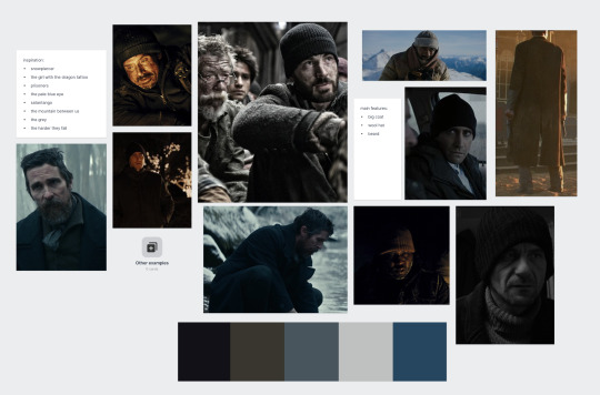
Moodboard for Cam
I made a colour palette that I wanted to stick to, giving Cam darker and colder colours to represent his cynical personality. I want to add pop's of lighter colours but also keeping it cold, so I added lighter blues and greys. I want Cam to wear a black hat and a big long black coat to keep warm, to show that he is more practical, prepared and ready for what's to come. I used inspiration from other thrillers/dramas such as The Girl with the Dragon Tattoo, The Pale Blue Eye (2022) and The Grey (2011).

Better look at the colour palette for Cam
For John, I wanted to bring out his softer, sentimental and unsuspecting traits in his costume. This is why I decided to give him a warmer colour palette, with more colour to hint the fun past he had with his younger sister, Sarah. Something that Alfie and I had extensive conversations about was the way that we can represent Sarah's character in a way that seems authentic and subtle, not too on the nose. We settled on using a child's charm bracelet, adding a pop of colour to John's costume. We also thought that it add's even more tragedy to the idea of his death at the end of the film, since this item alone makes us feel more sympathy for his character.
I want to dress him in a warm woolly jumper, with no coat to show that he is not prepared for what's to come, indicating to the audience that he has given up on carrying on this journey. Alfie also want's him to be wearing circular glasses, which I think would look very cool, especially if they were cracked, to show that they have already endured a lot of stress and trouble.
For John, I used inspiration from Harry Potter and the Deathly Hallows: Part 1, The Banshee's of Inisherin, and again, Snowpiercer.
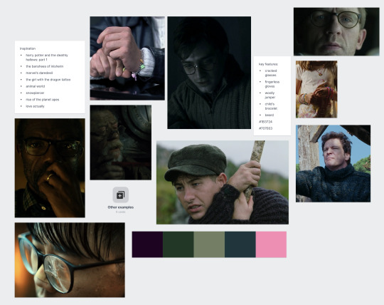
Moodboard for John

Colour palette for John
I had so much fun making these mood boards and sharing them with the team, and I am so excited to collect items for these costumes!!
0 notes
Text
Prop collection so far
One of the most important props in this film is the radio, that Cam has John fix to distract him from the awful situation that they're in. I had a few ideas of what I would like it to look like and after discussing this with Duncan and Alfie, I knew we were on the same page. We want the radio to be an old transistor radio which is battered and broken, preferably with an antenna - this would mainly be for the aesthetic. Alfie suggested that the radio have some sort of screen that lights up to show that it was capable of working, however I suggested that maybe a better way of showing this would be through sound design (crackles etc.). Also I think the screen lighting up may clash with the idea that they want an emergency light to flicker in the room throughout tense parts of the film. To find this radio, I had a browse through EBAY, and found a few which looked like they could work really well. Unfortunately quite a lot of them blew our budget, however I found a few gems and sent them to Alfie, Duncan and Finlay. A lot of these were bids so I had to spend a lot of time watching them and ensuring that I was the highest bidder. The first radio we found was perfect for us and for about 5 days I was the highest bidder, however right at the last minute we lost the bid :(

the radio we lost the bid for :(
Aspects I particularly liked about this radio was the brown colour, and the big knobs on the front which created a lot of dimension and made it very visually interesting.
I did not want to give up so I did a lot more digging into vintage radios and came across two whose bids ended the day i found them. One was £11 and the other was £5.99. I actually much preferred the cheaper one because it had similar sort of qualities I was looking for that the first one we lost had. I called India, and asked them which one they preferred and we agreed on the cheaper one. I put bids on both just in case, however I watched the one we discussed very closely, and at the last 15 seconds, I put a bid in of £6. Luckily, we won this bid and I double checked with Finlay that it fit in budget and got the ok to buy it. :)
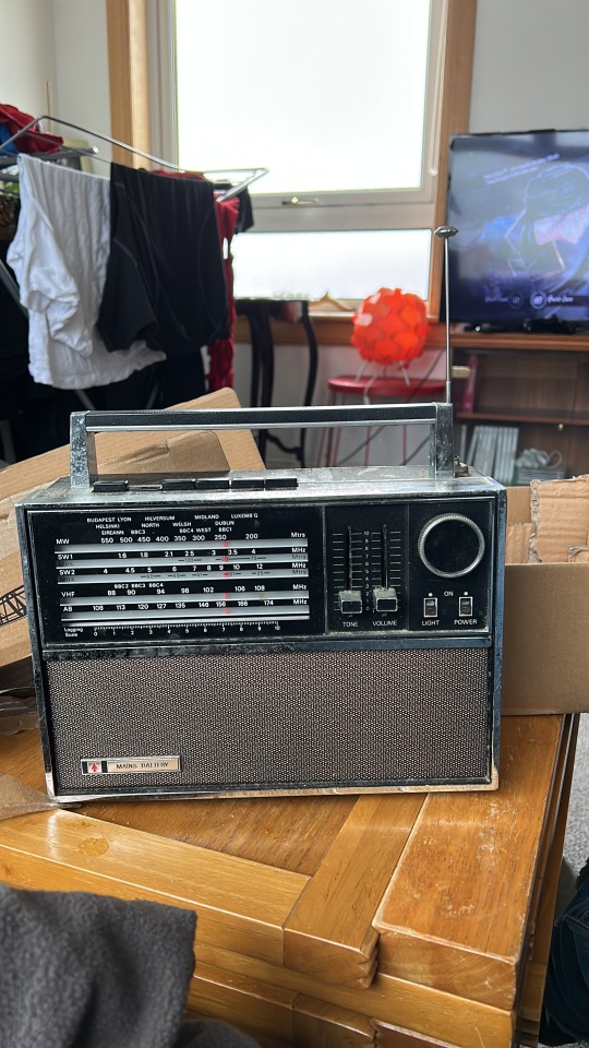
I'm very happy with this purchase and I think with a bit of (temporary) tampering and additions of loose nuts and bolts, we can make this radio look as if it is being torn apart and repaired.
After some discussion with India, we knew there were a lot of props on the list that we already had at hand. For example, we already had some agreements to borrow some sleeping bags, tins, pack of cards and even a chessboard. Some other props such as the backpacks I need to think a bit harder about.
The initial image I had for the backpacks were khaki canvas rucksacks with no branding, slightly ripped, damaged and stained, that looked timeless in the film. However, I knew that with the time and budget we had I would have to be a bit more open-minded.


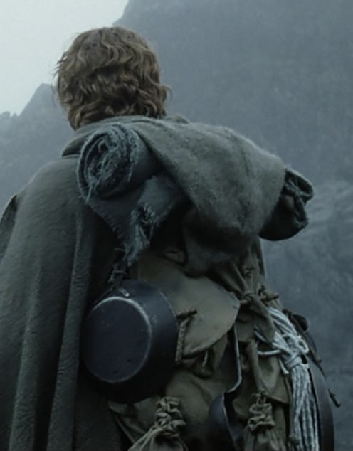
inspiration: Stand By Me (1986), Harry Potter and the Goblet of Fire (2005), The Lord of the Rings: The Two Towers (2002)
I then looked at some of the films that had inspired Alfie and Duncan for this film and took inspiration from them. I looked at media such as The Last of Us, Black Mirror, etc and from there, branched out for more inspiration. I found that I could still make them look used and incorporate them into the film in a way that doesn't look out of place.

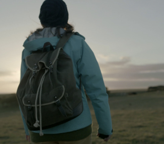
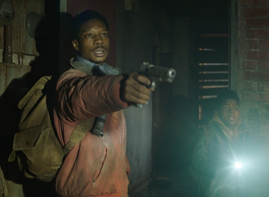
The Last of Us, The Maze Runner, Black Mirror
My plan for the backpacks is talking to the cast and crew, show them my inspiration and see if anyone has any similar to what I am looking for.
What initially gave me the idea for the mismatched and broken chess set were shots from Wes Anderson's Moonrise Kingdom (2012), Fleabag (2016), and Harry Potter and the Philosopher's Stone (2001).


The scene from Moonrise Kingdom gave me the idea that our characters could be playing lots of different games on the chessboard to pass the time, with what they had.
This shot from Fleabag gave me the idea to use other objects in place of chess pieces to make it look more visually interesting, and also add more underlying narrative to the story. Our characters have just found this chess set, and due to the apocalypse, they have not been able to find all the pieces, so they make do with what they have.
And finally, I thought it would be even more visually interesting to have some of the chess pieces be broken, like wizard's chess in Harry Potter. This also foreshadows the tragic death of John, who is killed by Cam using the radio.
I have a chess set which I know I can use so all I need to do now is do a bit of searching to find some loose chess pieces, and other objects that i can use instead.
0 notes
Text
One More Day - set moodboard and planning
As soon as I joined the project, the director, Alfie, sent me a link to a milanote, where him and the rest of the team had been putting any information relevant to the film up for all of us to access. This was really useful for me to catch up on all the work that had been done, and access any important changes such as script updates and team additions. Additionally, we can see updates from all other departments, even if they don't affect my job completely, it is still really interesting to have a look at where they've got to.
When I joined the milanote, there was already a section made for production design so I got started planning out my jobs for the next few weeks. For set inspiration I created a moodboard and using shot deck, I found photos which correlated with how I imagined the set to look. Since visiting the location myself, I can imagine scrap material boarding up the "windows", mats/sleeping bags laid out messily on the floor, a makeshift bucket table and cans thrown around everywhere.
Set Inspiration:
The Last of Us
Children of Men
Trainspotting
The Pianist
The Maze Runner
I got inspiration from mainly post-apocalypse and adventure films, which I think all accurately capture the sense of desperation and survival that our characters experience. I want the room to look unclean, not looked after, with the character's belonging's scattered all over the place. At the same time I would like for there to be a clear divide between the two characters - for it to be clear who's belongings are whose and where they sleep, to show that they have been squatting here for a long time, waiting just one more day to get out.

set moodboard - I am still planning to add to this moodboard until the actual shoot.
From here, I went through the most updated script and made a props list. This was rather limited at first, however after going through it with Alfie, we were able to come up with much more ideas to make the room seem lived in.

Alfie mentioned that he wanted them to sit either side of a makeshift table with a chessboard on it to show how they've been trying to keep themselves busy. I really like this idea and if we can, I'd like have some of the pieces be broken or missing - as if the characters have just found them and have to play with what they have.
Something that was not included in the script but I thought might make the space more visually interesting, is the use of a ripped bedsheet as a divide between the characters. This sheet would be hanging from the ceiling, loosely fallen during this scene. These characters have to spend every second of the day together, hence I thought it would be a good indicator that they want their space at night. Additionally, I like to think that John would have thought of this idea of making this little divide using bedsheets, since he had a little sister (Sarah, mentioned in the script), who he used to make bedsheet tents with before the disaster that put our two characters in this position. I discussed this with Alfie and Duncan and they both thought it would be a good addition. Ideally, I would use a lighter colour to contrast the dark walls in the room, but I would stain it with paint to make it seem used and found.
A little bit like these make-shift tents from Hook (1991), I Am Not A Witch (2017) and Stranger Things (2016-present).


For the dog food brand to put on the tin, I have talked to India - our art department - to ask if they could create a label to put on one of the tins. We have been discussing some designs and I am quite excited to see it brought to life.
Making this moodboard and discussing ideas with Alfie, Duncan, Finlay and India has made me increasingly excited to create this world for our characters to live in. My next steps are to make costume moodboards for each character and discuss with Alfie the personalities of each character in order to incorporate these into their costumes.
0 notes
Text
One More Day - location recce
On the 16th of October, we trekked to The Barnton Bunker Preservation Society SCIO in Clermiston to take a look at a possible location and scout out rooms for camera, sound and production design considerations.
We met one of the workers on the site, Chloe, at the gate and she introduced us to the space, explaining that they are currently doing work in the outer area - which we had to consider in terms of sound when making our final decisions.


She showed us around each of the floors, explaining what each space is used for - some were more plain than others, which I noted could provide both positives and negatives for production design. On one hand, the emptiness means that we have a lot of creative liberty to dress the room how we like, however it also means I have to take into account how I am going to dress the room without it being bare or two dimensional. Some of the other rooms have big pieces of machinery (that do not work anymore) or scrap pieces. I did think that while these could make for really interesting backdrops, it could get in the way of the tone of the film and may cause problems in the future when I am envisioning the story based on the script itself.


These rooms in particular I loved because of the machinery which I thought added both depth and texture to the room. However I noted that they may limit us in terms of dressing the set and also space in terms of camera set ups.
There were also some sections of the bunker that I immediately noted as ones I didn't want to use and discussed with Finlay and Alfie, purely because of how much light and space there was. Of course, production design is not the only factor in determining the choice of location - sound and camera take a big priority in the choice, however the some of the rooms were open plan and while I think it is possible for me to dress those rooms in a way which looked interesting, there were others that stood out to me more and gave me much more inspiration. Additionally, in some of them I felt that I could not see the scenario in the script occurring in that space.


Some examples of rooms that didn't give me that much inspiration
There were a lot of rooms and spaces that I took note of that I loved and got really excited about. One in particular was a room inside of a room. We initially looked at it through a hole in the wall, where a window used to be, and I thought it could look really cool - a frame within a frame. Additionally, the window frame had writing all around it which was an interesting concept they could incorporate into the story, where maybe this bunker was a hideout for more than these two survivors. The room itself is a pale blue colour with brown, grey and blue panels which added interesting dimensions and depth to the space. In this room, I could start to picture how I was going to dress it, with a ripped bed sheet between some of the panels to create a divide between the characters, as if they've been sleeping there for a long time. It also had a cable that hung from the ceiling across the room which I thought could act as a make-shift washing line for the characters (of course we would of had to check the stability and safety of this prior to the shoot). In the centre of the one of the walls also had a big black scorch mark, which I imagined the characters lighting multiple fires to keep them warm - this also gives us an indication for costume design (warm clothes). The only limitation we found to this room was the size - it may not be able to fit all cast and crew comfortably.


Two of the other rooms that I really liked were very similar to each other - the main difference being size. The walls of both rooms were black with wooden panelling overtop, however the bigger one had two exposed brick walls, which I loved. Metal vents ran along the ceiling which I thought gave the room quite an industrial feel - quite post-apocalyptic. The smaller room had plaster ceilings, which had holes and were peeling slightly, adding to the idea of the length of time the characters had been in this space. I could see potential and advantages to both spaces, and all of the other departments seemed to agree that one of these two rooms was going to be the final decision. In the end we decided to go with the bigger room to avoid any safety hazards in regards to the size of the space (fitting all crew and equipment etc.). From my perspective I think we made the right decision because I'd really like to take advantage of the industrial feel of the room.

the smaller room - mr forbes standing in for size reference :)


Our final decision - the big room :)
I am really happy with our decision and I think India and I are going to have so much fun creating and dressing the set here. I had a lot of fun exploring the bunker - Chloe even took us to their "rave room" where they hold parties and gigs, which she suggested we should use for our afterparty :)


This bunker was an amazing find thanks finlay !!!
0 notes
Text
One More Day - costume planning
After we figured out our location, I had a meeting with the director (Alfie) and producer (Finlay) on behalf of both me and India to discuss the costume for the film.
Finlay has confirmed the location with everyone so I got started visualising the set. India and I met to discuss potential costumes and props and had a go at making a rough moodboard. We did hit a wall since we got conflicting information from the team about the temperature of the room in the story. Alfie and I had previously had discussions about the room being cold, therefore the costumes had to include things such as hats and coats. However, when India had discussed costumes with others in the group, they gathered that the room was going to be hot. When we discussed this, I decided we needed a meeting with Alfie, Duncan and Finlay to discuss their preferences.
At the meeting I brought up some questions, focusing mainly on costume due to the fact I would like to do some thorough planning to make the story look visually authentic and believable. We agreed that the room was going to be cold, which I am excited about because it gives me a lot more freedom to play with layers and textures within the costumes. I want the characters to be wearing very different pieces - both to each other, and to their own individual pieces. This is to highlight their current situation - they are survivors of an apocalypse and they have had to collect what they could to survive.
Additionally, we discussed the unknown character of Sarah and who she is to John. I wanted to know this information so I could come up with a way to subtly indicate her importance to John and maybe add some of her character to his costume in some way. We came up with a few ideas:
a pin on his backpack which seems very out of place (she could be his daughter or younger sister)
a scarf that is really out of place to the rest of his costume
a child's bracelet from an arcade
Alfie and I decided that we wanted the article of clothing to represent Sarah to be the child's bracelet because its a lot more personal (and also obvious to the audience) than a pin, and it contrasts well with the tone of the rest of the costume. I already have an idea of what I'd like to use for this so I have been visualising it with the rest of the costume design.
I am really excited to design costume for these characters since I have never done anything like this before. Some references I've already been thinking of for costume design is Bong Joon-ho's Snowpiercer (2013) and Alfonso Cuaron's dystopian thriller Children of Men (2006).
0 notes
Text
One More Day - production design
For my HOD role, I was asked to lead Production Design for Finlay, Alfie and Duncan's film workshop project, One More Day. Before taking on the project I asked to read the script to see if it was something that I would be interested in. I was fascinated by the concept: two men in a bunker discussing their situation and having two contrasting attitudes - one is optimistic they can get out of their situation, the other not so much. The optimistic character, Cam, realises that he needs to take the cynical character, John, out of his misery if he wants to carry on, and makes the difficult decision to kill him.
I thought this script was incredibly well written, and all of the small details in the script including the dog food, radio and costume would make for a really interesting project for me. I asked India to be art department as I know they are very talented at graphics and I already had a lot of ideas for the design for the dog food. Additionally we had discussed how fun and intriguing it would be to work with fake blood.
I'm very excited for this film, especially since we will be working in a bunker and that's pretty cool.


0 notes