#one person sketched and second person did the lineart and the third person colored
Explore tagged Tumblr posts
Text
Would anyone wanna do an art collab?
(Edit) i got a couple! Ty to the people who responded :]
#i remember a long time ago i did a thing with some friends where it was 3 people#one person sketched and second person did the lineart and the third person colored#it was lots of fun#it was years and years back when i used to make DC comics art tho so who even knows where it is#anyways that would be fun to do again i think#but i would need 2 other people so i wont get too ahead of myself#maybe i should ask twitter#its just a bit easier to communicate here i think
16 notes
·
View notes
Note
You have such cool fursonas :333333
Do ya have any others? :<c
And/or, plz share what volcanic/lava border collie and ltoloxa doggie entail :3 (at your leisure, pup just likes to invite peoples to talk about things they like)
- Ryan
thank you!! ive tried to respond to this ask like twice now and tumblr keeps deleting it so lets hope it works lol. This ended up rlly long so I put a read more!
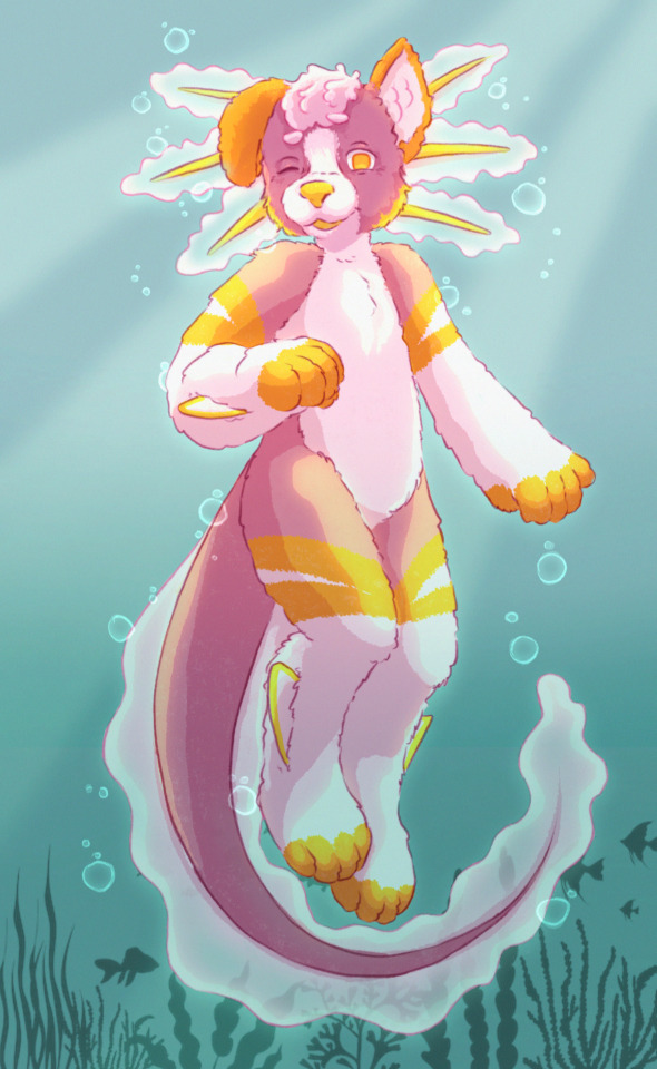


Ive got two characters I would consider “sonas”, and a third i designed not too long ago I’m considering keeping! what i like about the furry community is designing, and when I first properly joined i was absolutely cracking out different designs at a wild pace. I draw sometimes, but I’m not particularly good at it and i prefer to put the time into actually picking the colors and patterns as opposed to stressing over trying to get a sketch and lineart to look okay, so I usually use bases and get commissions!
Halite, the pink axolotl-dog, is my first fursona and I think of him as my baby :3 While I don’t really do characterization or backstory, I think of his personality as being more bubbly and childish. My current icon (Halite sitting in a little floaty) is a P2U base by Applepup Illustrations, as are the two icon-style pieces in the ask. Anyways, I mostly think of him as an axolotl-dog, but since I mostly use bases at the moment, a lot of random pics I have of him are pure canine. When I commission, I usually ask the artists to draw him as the full axie pup! The fullbody is a commision from a friends ex, and I still really love the piece. I think of Halie more them a character than a sona, as I don’t really see him as a representation of myself, but I adore him. I sometimes think of Halite as more animal than anthro, but not always, and while I usually default to he/him pronouns, I really couldn’t care one way or the other in how he’s gendered. Especially since he’s pink, I can imagine if i ever make a suit for him, people would think hes a girl, which is perfectly fine by me!
Igneous, my lava themed collie, is the second design I did that I adopted as my own. I tend to think of him as more of a true “sona”, and a more accurate representation of myself. His personality would lean a lot more towards myself as a person, as opposed to having any seperste characterization. While Halite had probably only gone theough one or two major redesigns and I’m pretty happy with how his design has settled, Igneous has gone through probably six or seven. The fullbody with glasses and piercings is a P2U base I got off of etsy from Subdae Studios literally last night lol! The icon-style one was a few months ago, and While I’m pretty happy with rhe design of his face, I’ve still been adjusting the exact color shades and been MAJORLY adjusting how his fur pattern looks. Honestly, I’m almost at the point where I’m thinking of his fur as shifting in the same way that lava lamps do, with the rolling blobs of color. I’m CONSTANTLY changing his body patterns every time I draw him, and honestly the more I look at it, I already want to adjust how the fullbody I did last night looks! I think of Igneous as being fully anthro at all times, and exclusively using he/him, as I’m really attached to him and think of him as a day to day representation of myself.
I’m wanting to get into fursuit making (I have off and on, I tried making a headbase and have made a couple pairs of paws, I just don’t stick with it), and Igneous will probably be who I make first.
Finally, the most recent design I kept for myself (designed probably two months ago), is this little red-brown-white cat I think I’m naming Feldspar. I use mostly they/them pronouns for them, and think of them as A Little Guy. I designed them for a purpose, I specifically wanted a feline instead of a canine and I wanted more of an “edgy” design, with the darks and reds and bleeding eye motif to fit more of my day to day style, which tends to lean kind of Edgy. I designed a fullbody, but they’re DEFINITELY about to get their first redesign lol, probably with the same base that I did with Igneous last night! If I think of Halite as more of a character and my favorite, and Igneous as more of a proper representation of myself, I’d say Feldspar is somewhere inbetween. They’re significantly less of a representation of myself, but I did make them with the mindset of keeping this character, while the other two I designed and decided I loved. I’d put them on the same level as Halite, being a bit of a baby as opposed to a sona, and more of a silly character! I also wanted a character I can put next to Halite in art, and since Igneous felt so much Like Me it felt odd to place him with Halite, who I kind of think of as being in a different universe. I’ve been using they/them for Feld, and that wasn’t the inital plan, but I think it’ll stick. Same as Halite, I’m not terribly picky on pronouns for them, and I’d say both Feld and Halite can use any pronouns!
I’ve kind of got a pokemon mentality, in the Gotta Catch Em All way. I’ve got my axolotl dog, a normal dog, and a cat. I realllyyyy want a bat sona, but every design I’ve come up with I haven’t really enjoyed for myself. I also really want a yeen and a manokit, and maybe a dutchie! I’m less into dutchies, and I’ve had the same issue with bats, that every design I’ve come up with I don’t wnjoy for myself.
I also don’t name or gender my designs until I decide to keep them, which is why I have a theme going on. Halite is the name of the mineral that is just rock salt, Igneous is a name for all types of minerals formed by magma/volcanic activity, and Feldspar is just a different mineral which can sometimes have those browns and reds. I might change that name, but I’m not sure. The mineral I was thinking of while designing them was these dark red brown pumice rocks I saw growing up in my backyard, but the name Pumice just doesn’t sound nice to me O_o
I also have one more character, a regular dog/wolf type called Sodalite. I don’t have any art of him, but thats because I actually own a head! I bought it second hand off of Ebay, and I really love him. I don’t really think of him as a sona or a character like I do the other three, more of just as a fursuit. While I’d love to have a fullsuit eventually of all three of the others, I don’t really intend on ever getting a fullsuit of Soda. I may or may not keep him long term, and I’ve only had him for like eight months. I really love the design and head, but I just don’t connect to him as well as I do my main sonas. We’ll see what happens once (if) I start making partials for my other guys!
#i can literally jsut go buck wild talking sometimes#hope u enjoyed hehe#lmk if yall have any more questions fr i could probably aay more#but i think thats mostly it#my post#asks#furry art#fursona
2 notes
·
View notes
Note
Hi there! I am obsessed with those TES tarot cards you made. The shapes, the lines, the colors . . . I think The Devil is my personal favorite.
If you don't mind, could you talk about your compositional choices for those? Like layout, structure, arrangement/placement, visual hierarchy, color decisions? Seven years of art school and no composition lessons . . . I'm taking things into my own hands.
Hello !
First of all, omfg thank you so much ?? I'm so glad you like my silly tarot cards :D
I'm really flattered you asked me this question, so I'll try my best to answer it (I'm no teacher and english is not my first language so I hope it will be comprehensible lggklflfifkf)
When you say your an art student who never had any real composition class, I feel you- I've been an applied art student for 4 years (7 if you count design), and apart from really basic and classic stuff like dividing by thirds, the different shots used in cinema, using a little window to help frame what you are trying to draw from life (witch are all very useful), I never really had many composition tips ?
So yeah idk what I'm doing, but that's art baybee
I'll share my process when it comes to designing my cards and hope it'll help lhgktlgofk
I begin by doing little thumbnails (3-4 cm long maximum) with a non erasable pen (or if I'm doing it digitaly, I dezoom a lot, use a big brush and don't erase what I'm doing)
It helps me coming up with big shapes and an interesting compisition (if your doing this on paper, never draw the borders first, it limits your creativity by "putting your drawing in jail" (wisdom from one of my best teachers))
And I personnaly don't use black lines when doing this, because the uglier the lines the less precious I am.
And because I associate dark lines with clean lineart, and this step is about being messy ! So the uglier colors the better :) (for me)
(I'll use two cards as exemples, one I did by doing thumbnails on paper, and the other on my art program)
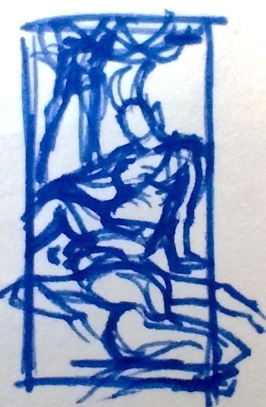
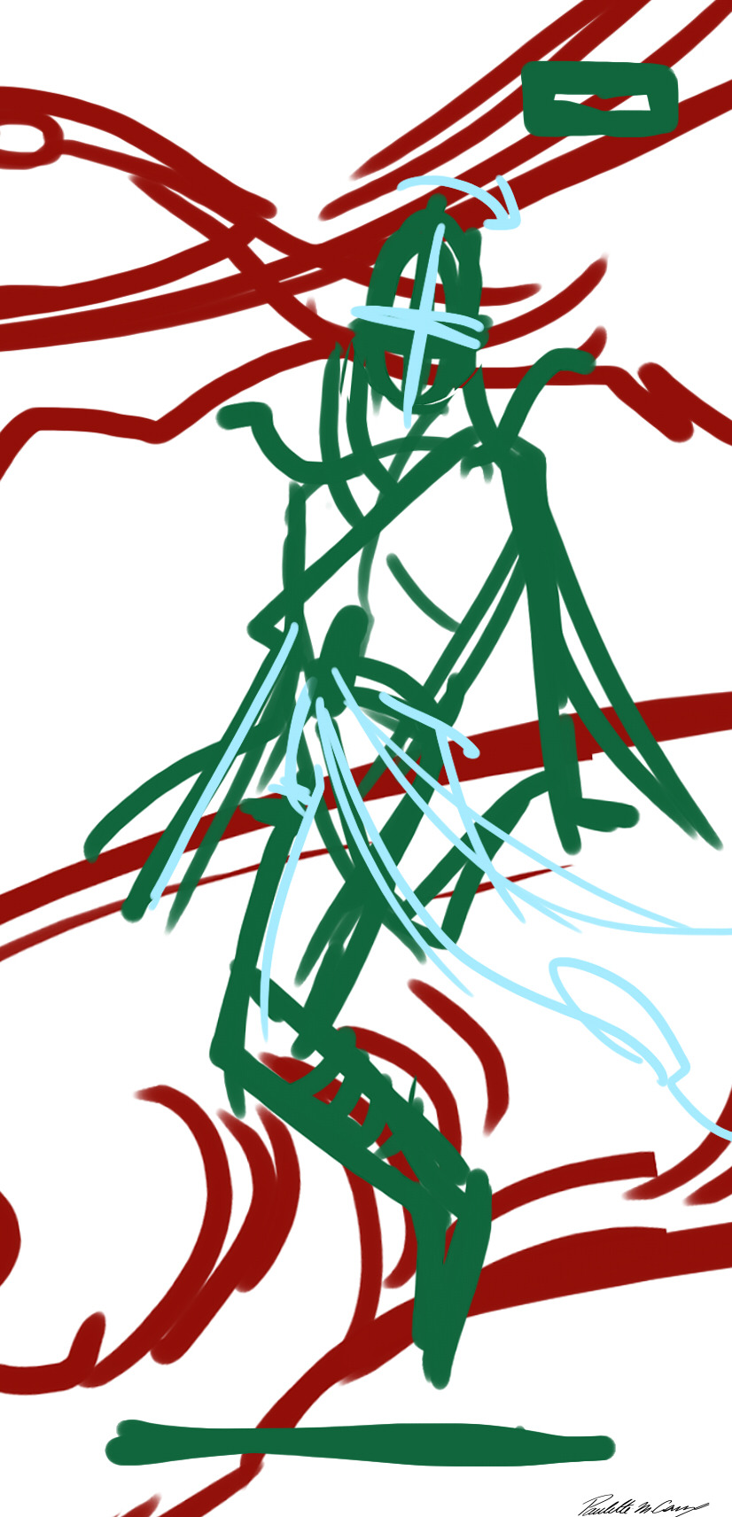
(And sorry I could not use the devil as an exemple, it was one of the three cards I did in class and so I skipped the thumbnailing for time saving :/)
Next step is sketching, still using my ugly colors :)
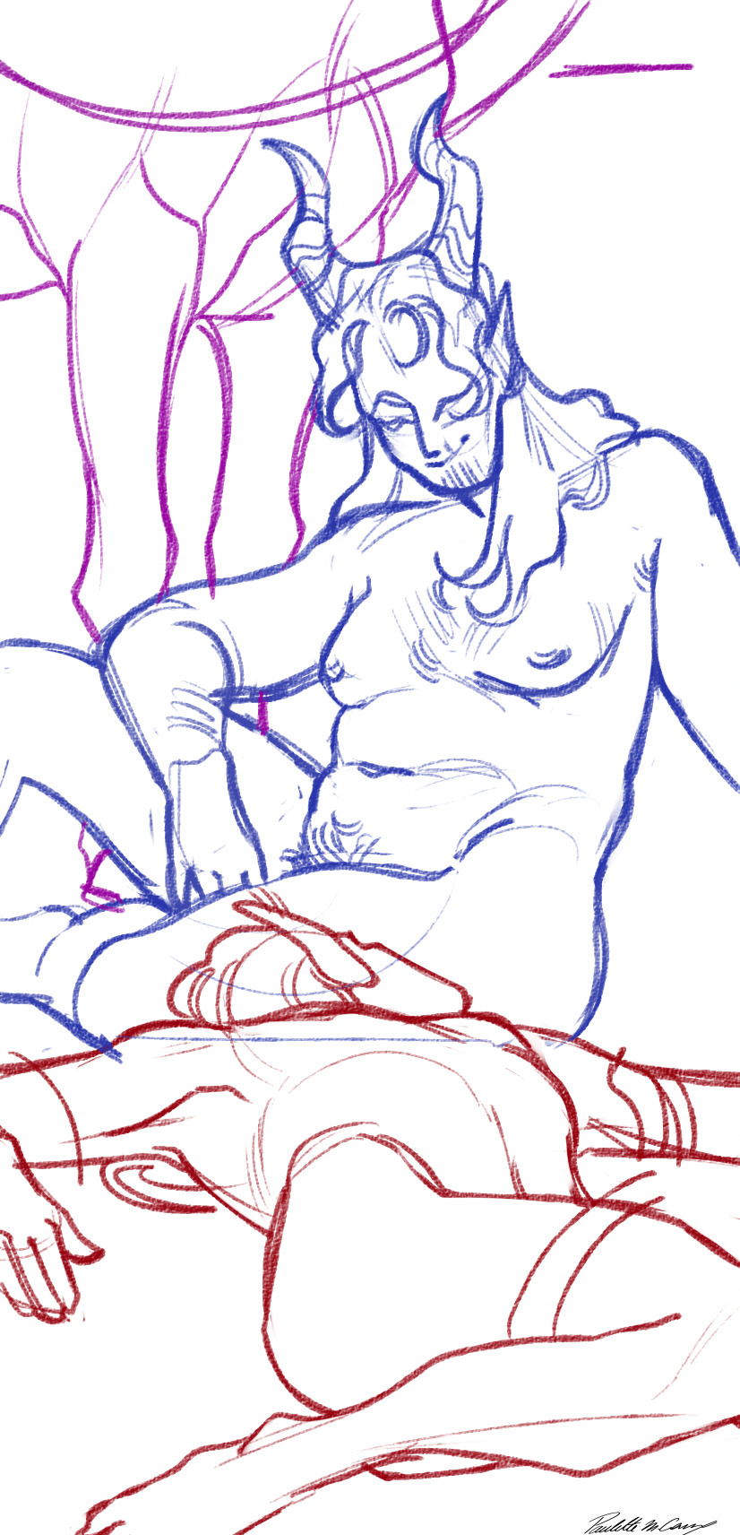
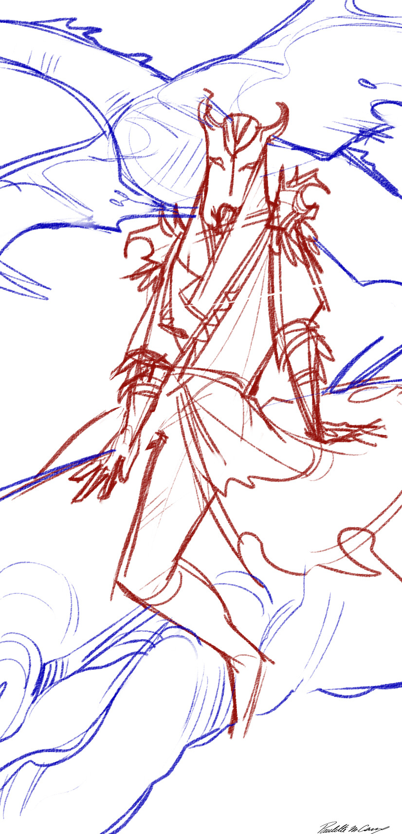
But to talk a bit more about composition, for these I always have the important element of the card near the middle (sanguine's face and his lovers head, and miraak as a whole) (I know trick of the year glgjorlfifjl)
And to help with dynamism, I use a lot of diagonal elements (sanguine's shoulders and hips, his right arm and leg, his is leaning back slightly, and his lover is laid a bit to the left. For miraak he is also laying back, his shoulders are not straight, and his to dragons are going on two different diagonals)
Next comes the line ! For this project I chose to use a pretty simple-ish and stylised look (mainly for time saving since it began as a school project)
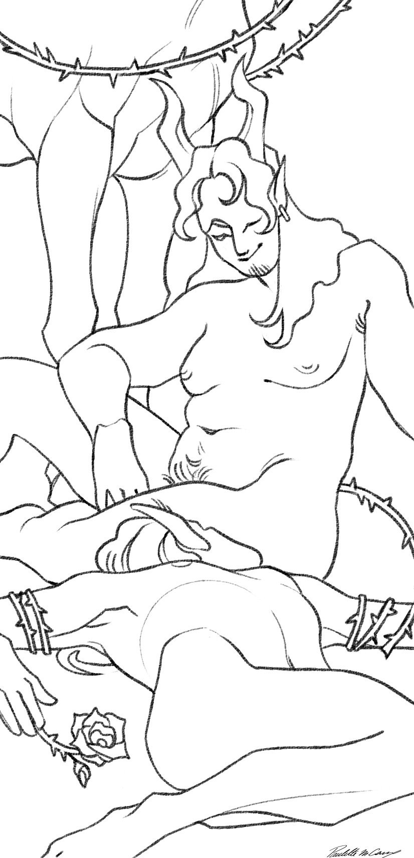
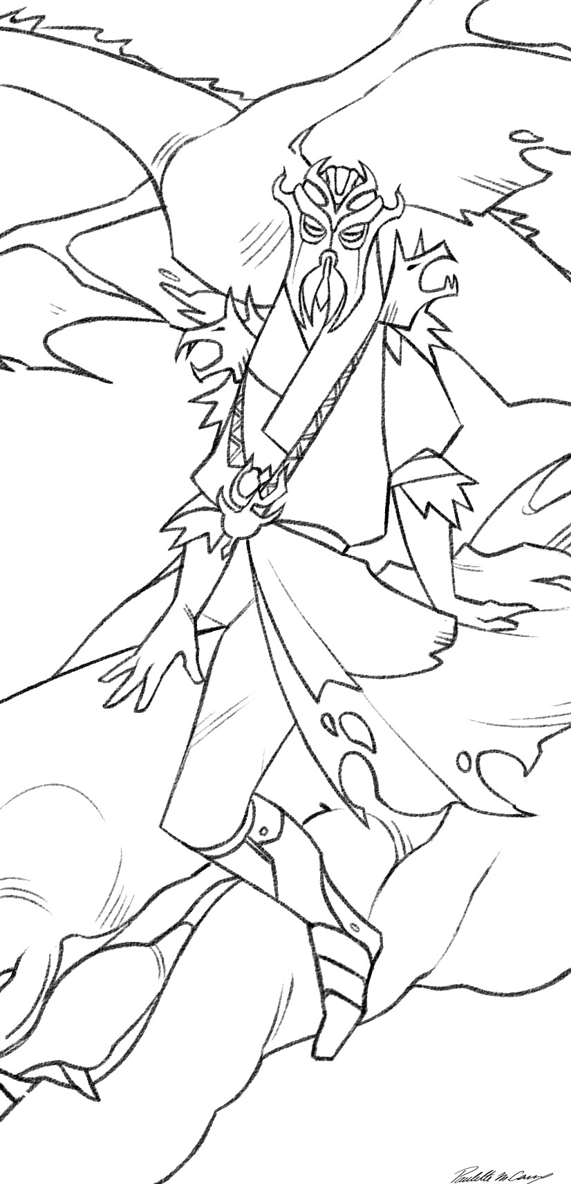
The colors are really simple, I just do a grey scale version then apply an overlay on top :)
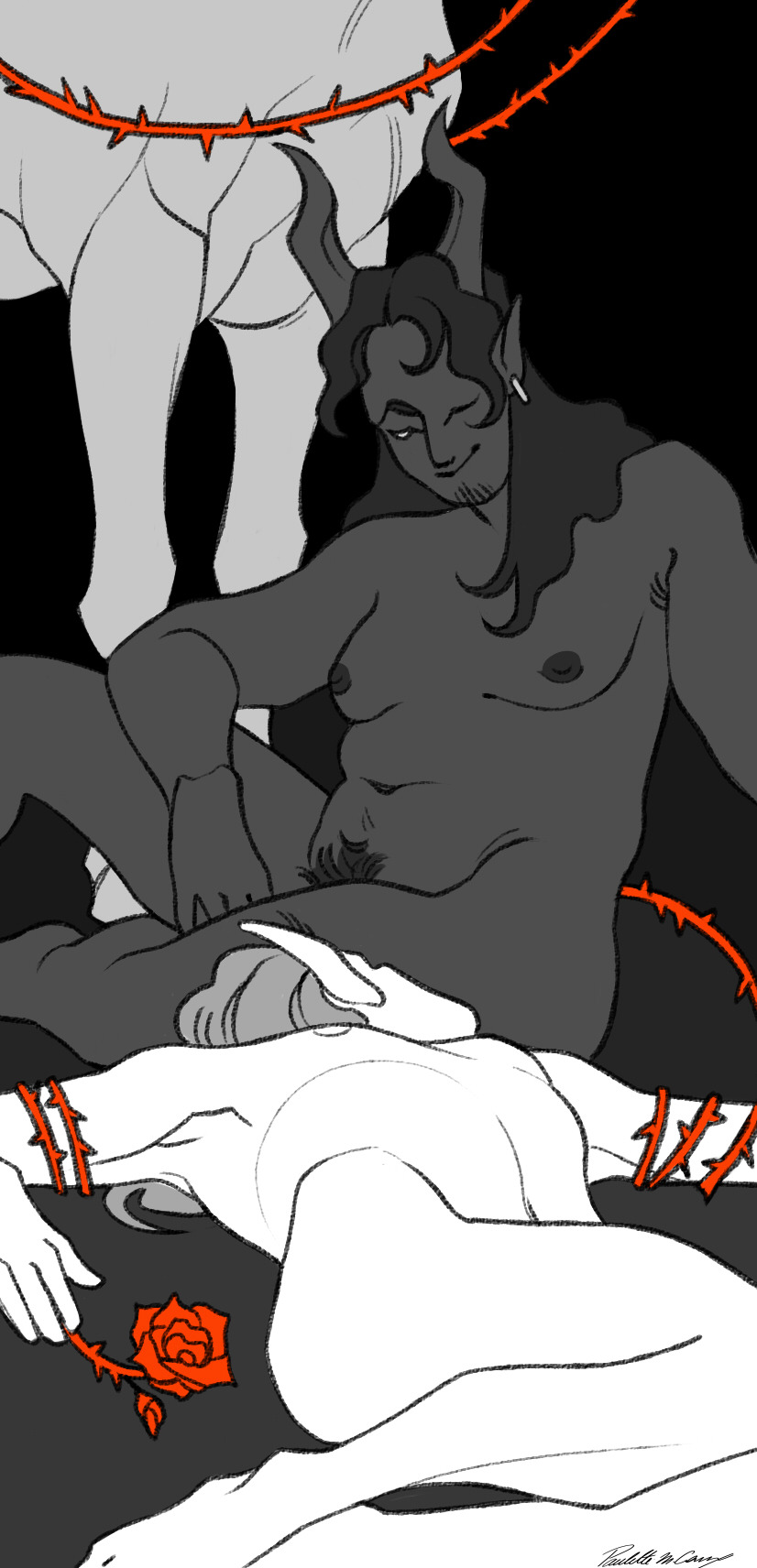
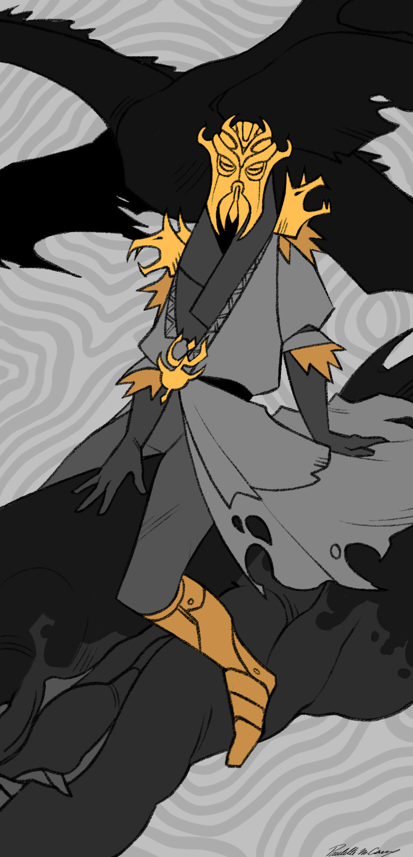
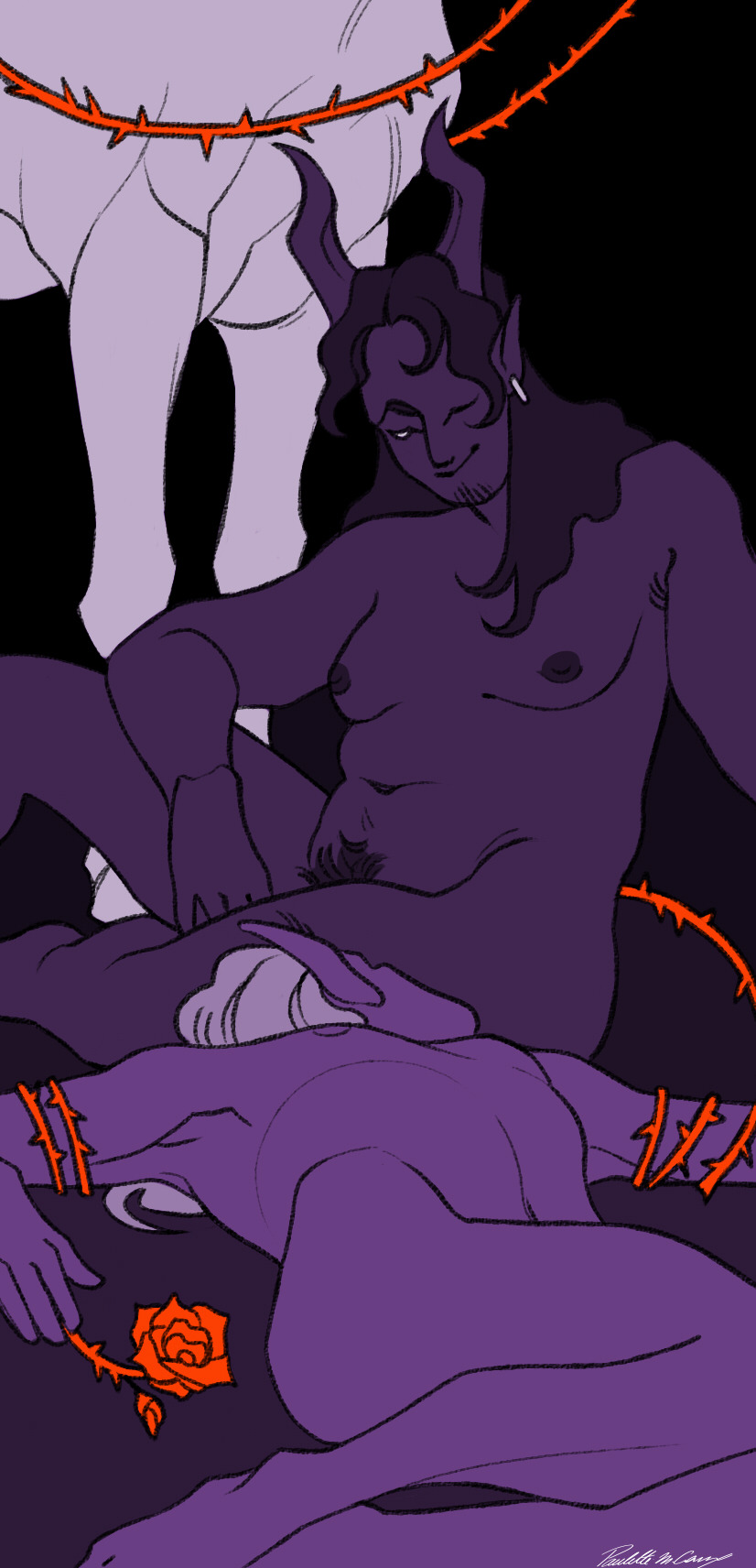
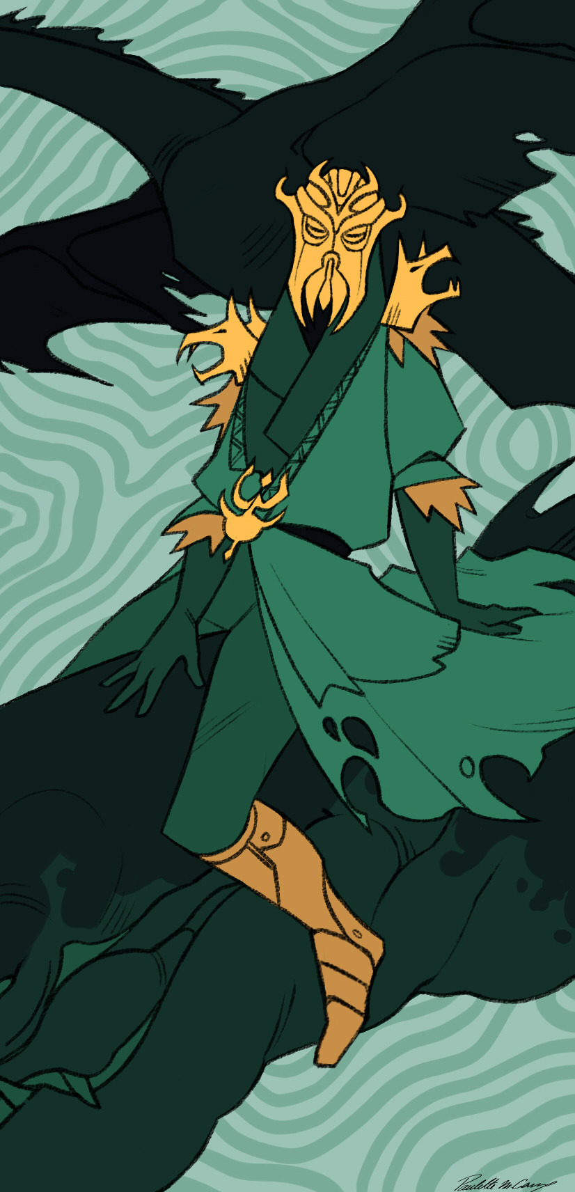
And as a final touch before adding the title, I add a white frame, that I always put behind the foreground to try give them a bit of depth :))
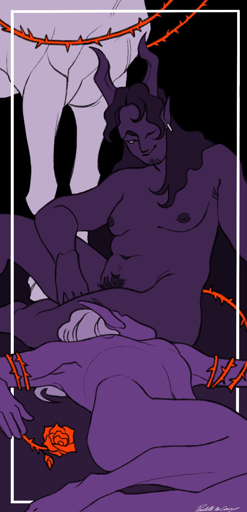
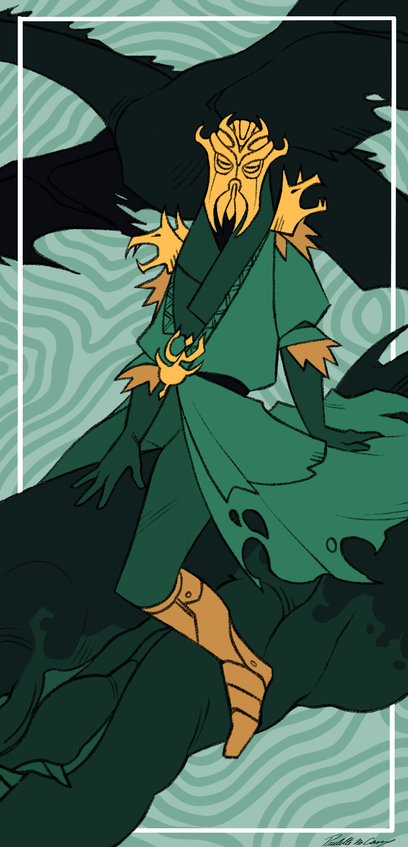
So to sum up my design brief for these :
- clean and stylised lineart
- one color for the whole illustration (exept for the devil because it was the first one I did and I did not know what I was doing glg'goflf)
- a second very saturated color used to highlight important elements (in either yellow, blue, purple or red)
-always have black somewhere
-white frame behind the foreground
-the numbering alternate between the top right and top left (exept once angain for the devil gmgkfnfon I'll have to change that someday)
-the title is always in the middle on the bottom, on top of the white frame
Hope I answerd your question ^^'
thank you again for the very kind message :)
30 notes
·
View notes
Note
'Scusie, I have a question about digital art. How do you do your coloring? If you have a previous post or resource you talked about already then that'd be appreciated. But if not; I've just started getting back into digital art and can't remember how people did their fancy selection methods to color in their lineart. I managed somewhat myself but what would be a simple sketch irl took like an hour or two of trying to work the tablet/program. I want to enjoy it again and use it to start commissions in the future, and I don't want to be easily burned out because of the complexity. For reference, I'm using Krita.
ok I wasn't really sure how to explain it so I made a timelapse? let's see if this helps
so first of all, I'm predominantly using CSP nowadays (which I love and highly recommend), which has this nifty little feature in the bucket tool:
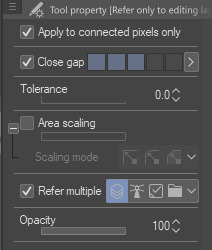
it can close gaps!! Now, I tend to draw pretty loose and my lines have a lot of gaps between them that are too big to close automatically, so I'll manually close them on my color layer with whichever color I'm using. I find this method works best when my pen and bucket tool have anti-aliasing turned off. I think other programs like Medibang and even Aggie.io have some sort of "smart" bucket tool, so I wouldn't be surprised if krita has something similar too.
the second method is simply Not Giving A Fuck and coloring sloppily without caring if the colors stay in the lines. I do this more for stupider comics where looking pretty doesn't matter so much
the third method is the same as the first but using a nice, textured brush so it looks Intentional and Pretty
I also tend to throw gradient maps on everything because they're so fun :)

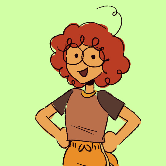

the fourth method (which I did not demonstrate) is the good ol' polygonal lasso tool. I mostly used it when I used Photoshop. It's a really good and fast way to get all your colors blocked in without requiring so much precision, but it can still be a little tedious.
Bear in mind, I am not the kind of person that has each color on its own layer. A basic drawing like this one is lines, colors, and bg, with maybe a gradient map or adjustment layer. There are tons more ways than this to color (look into CSP's reference layers! pretty neat stuff), but these are just the ways that I like to use because I am very very lazy and am only willing to put in the absolute bare minimum effort
983 notes
·
View notes
Text
THE A.T.O.M. CREATE A KAIJU CONTEST 3-D!!!
YOU THOUGHT YOU WERE SAFE! YOU THOUGHT THAT THE TIME OF MONSTERS WAS AT AN END! BUT YOU WERE WRONG, FOR NOW YOU MUST WITNESS…
THE A.T.O.M. CREATE A KAIJU CONTEST 3-D!!!
That’s right, it’s back! Celebrating the publication of The Atomic Time of Monsters Volume 2: Tyrantis Roams the Earth! (which in turn completes The Ballad of Tyrantis arc for this series), I’m holding another monster design jam. The third of such jams, in fact!
Like the first A.T.O.M. Create a Kaiju Contest, the aim of this contest is to create kaiju that would fit within the setting of my big kaiju story series, The Atomic Time of Monsters. Think of it as me letting you into my sandbox to play with my toys for a bit, or like you’re being put in the director’s chair of a new ATOM-verse kaiju movie. That means your entry does have to fit into ATOM’s world, which in turn means that yes, there are limitations to your creativity here. But limitations can be good sometimes - they can make us explore options we wouldn’t consider when given completely free rein to do what we want!
(also you don’t have to make a three dimensional image or anything, the title’s just a pun on how the third movie in a monster movie franchise will often be a 3-D film)
Read below the cut to learn the rules and whatnot:
THE RULES:
1. You are limited to one entry per person. Work hard and make your entry count!
2. Your kaiju must have some sort of description of its physical appearance and its personality - you can submit a drawing or a written description (or both!) for the physical appearance depending on what you’re most comfortable with. Using the same template/format as my official ATOM Kaiju Files (https://horrorflora.com/monster-menageries/atom-kaiju-files/) isn’t required, but it was cool when people did it in the last contest, so feel free to do so this time too!
3. The kaiju you create must specifically be created for this contest - no repurposing characters you made for other, wildly different stories. This is not “trick TT into drawing/canonizing my main OC” time.
4. The kaiju must fit the setting and aesthetics of ATOM. I’ll explain this in more detail down below.
5. The kaiju should add something meaningful to the world of ATOM. The more unique and interesting your kaiju is, the more likely you will win the contest.
6. Don’t make your kaiju too dependent on pre-existing ATOM characters - no “Tyrantis’s long lost evil brother who’s the strongest kaiju in the world.” These should be to Tyrantis’s story what War of the Gargantuas is to Godzilla’s movies – heroes (well, monsters) of another story in the same world.
THE REWARDS:
I will make pencil sketches of the top 5 entries in the contest.
I will then make fully rendered illustrations (lineart, colors, & shading) of the top three entries.
The winning entry will be made into a model ala the ones I’ve been making for ATOM’s core 50 monsters, which can then be shipped to the person who created it (should they be able to cover the shipping costs). That’s right, your kaiju could be brought to life in THREE GLORIOUS TECHNICOLOR DIMENSIONS! (Hey, we worked the gag title in to the prizes!)
THE DEADLINE: All entries must be submitted by July 3rd, 2021. You can submit it here on tumblr, via the horror flora e-mail, or any other channel you know how to reach me through. I’m in a lot of places.
THE GUIDELINES (TO HELP YOUR ENTRY FIT THE RULES AND WIN):
The smartest thing you could do if you want to win this contest is familiarize yourself with the world of ATOM by, y’know, reading all the material I’ve published on the subject. In addition to the many kaiju files that are free to read on horrorflora.com, there are now TWO, count ‘em, TWO novels in this series for you to peruse, both of which establish many of the rules of the setting as well as its general themes and tone! You can get them in either paperback or e-book formatting (I’d recommend the former over the latter since I lack the technology to make a really nice ebook, but if money is an object, the kindle version is only $1). Here’s the links again if you missed them:
Vol. 1: Tyrantis Walks Among Us!
Vol. 2: Tyrantis Roams the Earth!
However, since I know reading a bunch of stuff is, y’know, not something everyone is inclined to do, I’ll jot some good bullet points for you in an attempt to outline how ATOM works in a brief, easily digested way:
ATOM is an homage to the monster fiction of the 1950’s and 60’s (i.e. the Atomic Age), and is set in those two decades, albeit an alternate universe version of them where, y’know, monsters and space aliens exist. If you aren’t familiar with the monster fiction I’m referring to, there will be some reference material provided at the end of this post along with some recommendations for further research.
Kaiju/giant monsters in ATOM work under very specific rules. There’s a full description of those rules at this link, but here’s the jist:
ATOM Kaiju are created created by the radiation of a mineral called Yamaneon, which naturally converts harmful radiation into its own unique energy. In natural circumstances, it takes hundreds of years of exposure to Yamaneon radiation for a creature to become fully transform into a kaiju (luckily, Yamaneon radiation slows the aging process while speeding up the healing process). However, an explosive burst of energy - such as the geothermal and kinetic energy released by an earthquake, or the blast of a nuclear weapon - can speed up the process, turning a normal animal into a kaiju within a matter of seconds.
All ATOM kaiju can heal grievous wounds within minutes or even seconds, are supernaturally strong and durable, and can convert harmful radiation to harmless energy that they then feed off of. Kaiju do not have an equivalent of old age, and can theoretically live forever (though their violent lifestyle means that few do).
ATOM Kaiju generally don’t need to eat unless they are severely injured, getting most of the energy they need from solar or geothermal radiation - but many still have instincts that drive them to seek out food from time to time.
Most ATOM kaiju stand roughly 100 feet tall (depending on their body shape), i.e. smaller than the original 1954 Godzilla. There are exceptions to this rule - younger kaiju can be smaller, while exceedingly old kaiju can be significantly larger, but these are rare.
In general, ATOM kaiju are significantly more intelligent and emotionally complex than people expect animals to be, though most are incapable of speech or complex tool use. There’s a reason ATOM Kaiju Files have a “personality” section.
Most ATOM Kaiju are tooth and claw fighters - ranged weapons are a rarity in this setting.
While the terrestrial monsters in ATOM look strange, they are intended to fit within the taxonomy of animals in reality - reptiles, mammals, fish, arthropods, molluscs, etc.
ATOM’s mesozoic era was dominated by a fictional clade of crocodile-relatives called retrosaurs, which are based on the outdated paleoart that one would find in the 1950’s/60’s fiction - i.e. when dinosaurs were viewed as trail dragging lizards instead of strange birds. You can learn more about retrosaurs here (https://horrorflora.com/2016/11/15/atom-kaiju-file-bonus-a-guide-to-retrosaurs/).
Kaiju appear on every continent in ATOM, but certain areas tend to be dominated by different types.
North America is mainly besieged by retrosaur kaiju and giant arthropods.
East Asia is technically also mainly plagued by retrosaurs and big arthropods, though they tend to look more fantastical and mythic - and, often, oddly well suited to being portrayed by a person wearing a monster suit.
Russia is beset by prehistoric monsters that seem to come from the Cenozoic, particularly the Ice Age.
Western Europe is plagued by creatures that vaguely resemble creatures from myth, if they were also prehistoric. Dragon-y lizards, fiery birds, etc.
Towards the mid-way point of ATOM’s timeline, earth is invaded by a coalition of aliens from different solar systems called the Beyonder Alliance, and as a result a bunch of alien monsters can be found on earth.
Mars and Venus both host (or hosted in Mars’s case) animal life. The surviving Martians colonized Venus, and sent some of their kaiju guardians to earth to help us fend off the Beyonders (who are responsible for the destruction of Mars’s ecosystem). Martian and Venusian kaiju have specific anatomical quirks, which you can see by looking at these kaiju files:
Venusians:
https://horrorflora.com/2017/01/03/atom-kaiju-file-29-karamtor/
Martians:
https://horrorflora.com/2017/01/17/atom-kaiju-file-39-kemlasulla/
https://horrorflora.com/2017/01/17/atom-kaiju-file-40-podritak/
https://horrorflora.com/2017/01/17/atom-kaiju-file-41-sombarvot/
https://horrorflora.com/2017/01/17/atom-kaiju-file-38-ullawdra/
Giant robots exist in ATOM, but are big, bulky, and incredibly expensive. Fancy beam weapons also exist, but are similarly clunky - there are no sleek, elegant machines in ATOM.
Since the fiction ATOM takes inspiration from was made at a time when interplanetary travel was only just beginning to be possible, its scope is significantly smaller than modern sci-fi. Alternate universes/dimensions were pretty uncommon because the idea of alien planets still held a lot of wonder to it. So, as a general rule, don’t try to go farther than the one galaxy.
ATOM is a setting for stories that are focused on humanity learning to coexist with monsters, rather than humanity destroying them. A certain level of sympathy is put into almost every creature of its canon, even the ones that are meant to be villains.
REFERENCE MATERIAL
Here is a playlist of 1950′s monster movie trailers.
Here is some reference material from various monster comics of the 50′s and 60′s.
Good movies to track down to understand ATOM’s inspiration and tone include Ghidorah the 3 Headed Monster, Son of Godzilla, Destroy All Monsters, Them!, The Black Scorpion, 20 Million Miles to Earth, Gamera, The Giant Claw, and The Lost Skeleton of Cadavra.
And here’s the intro cutscenes for all the different giant monsters in the PS2 videogame War of the Monsters.
55 notes
·
View notes
Text
@advtime-theories tagged me in the love yourself challenge a few days ago so i’m gonna go ahead and do it. because i don’t write or do edits often enough to where i have favorites this post is just gonna show my fave drawings of the year. all except the last one of these are ripped from instagram art account which is where i post most of my OC/character design/personal art :^}
1. the first piece i wanna draw attention to is this little birthday cake guy.
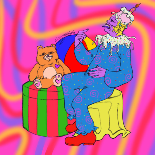
i personally really liked doing this one because i went all-out on the lineart. also i’m really intrigued by the concept of characters wearing cakes and elaborate messy foods as hats and this drawing was basically where that niche started for me :^] also i had fun designing this guy’s outfit pattern.
2. the second one is this older one that’s from summer (i think? it’s been a while)...
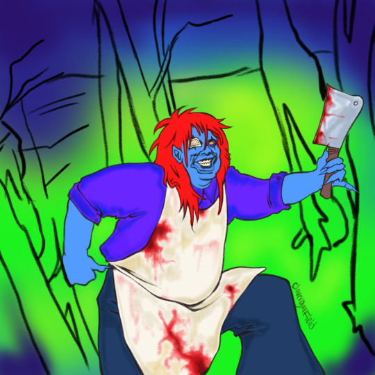
i really liked this one also because of the line art but also because i had so much fun doing the hair. the problem with drawing in this particular art style for me is that it creates an unpleasant stress on my hand and it loses some of the sensory appeal that usually motivates me to draw. because i did this one so quickly i was able to really get into it without any of that and i really like the finished product
3. the third one is my side of a collab piece i did with a friend of mine of super pochaco and super sonico :^>
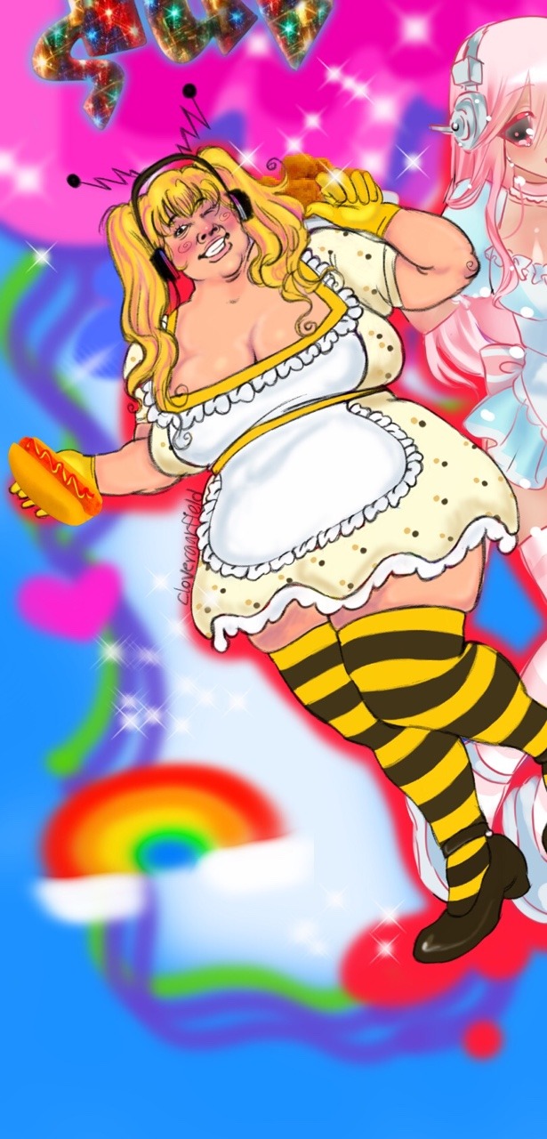
this was the first drawing i really started drawing cheek and elbow swirlies in so i more or less view it as a kind of mini-evolution for me. this was also about when i started making trippy colorful backgrounds and adding edited textures/accessories/etc. in which has become a really big staple for me in my digital art now.
4. fourth one isn’t necessarily a finished piece, just nice lines that kinda got me back into the swing of art in the past week or so.

there’s a wish-washy plan to finish this in motion but at the same time i’m just grateful that able to scrape together motivation enough to get past the sketch layer. it’s nothing special, just another gross looking guy with sameface syndrome but i’m happy with it :^]
5. the final one is literally the one i just posted, i.e. the only one drawn using my more messy, scratchy style and the only blog-related art on this list.
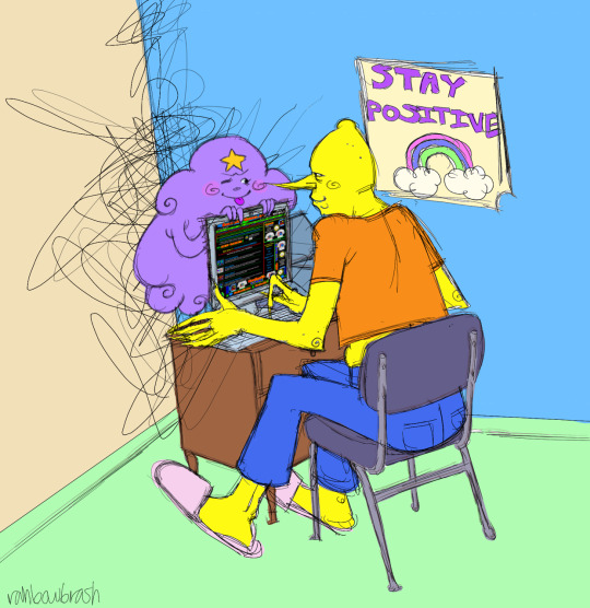
i think developing this side art style was a good thing for me. even though i didn’t churn out as much fixation content as i would’ve liked to, being able to take a break from the more thick and tedious lines of my usual art was nice. and as sloppy as it can look sometimes, i really do enjoy the distinctive spottiness of the paint bucket tool and the jagged scribbles of line. the reason i only have one of my lemongrab related arts on here is because to me they all kind of blend together. they basically represent one thing- drawing for pure sensory pleasure. every moment of making this kind of stuff, from the sketch layer to the final product is based purely in me doing what feels good rather than what looks good. and cmon. look at lsp’s little face <:^9
i’m not terribly savvy with any mutuals or friends on here so i don’t really have anybody to tag, but i did enjoy doing this challenge and reflecting a little bit. here’s to yet another year of drawing fucked up goofy looking slobbering sharp-toothed humanoid creatures :^D
5 notes
·
View notes
Note
What is your process working on art for Ghosts? How do you choose which scenes to draw, and how do you go about capturing that essence when you’re drawing? I love your art and I look forward to seeing every doodle and full piece each chapter :��)
ayyy fun art skills question
okay sO. here’s a cut because there’s gonna be a lot of screenshots probably.
edit: hey tumblr why did you eat my cut--
so for choosing scenes: well i’ve got a hard rule that there’s one for every flashback, because consistency is a good thing, and as a result of that i actually have a whole file that’s JUST concept sketches for flashback pictures, but i’ll get into concepts in a second here. Other art for chapter is largely just me looking for striking visuals; moments we have planned in the chapter that i feel would translate well to art, and which i could enhance the weight of with an image, or failing a good moment sometimes as with this past chapter i’ll go for something a little more abstract to capture a general vibe of the chapter. The picture of astrid w/ trent behind her, with her in his shadow looking dangerous--A lot of the tension in Ghosts is gonna come from that; from the ambiguity on where Astrid stands in all this and what she’ll do if/when she learns certain things, etc etc
anyway though! that’s how to choose things; the next step is for me to do some sketches until i hit on a concept/composition that i like. These sketches are sometimes very small at first, because thumbnails are a great way to get composition down without worrying too much about the details, and when i do that they look like this:
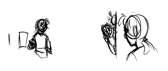
(Both of these were attempts at the art for chapter 6′s flashback; the one on the left was scrapped, and the one on the right i ended up using!)
Sometimes i don’t go small at first though, it varies. Sometimes I get a sketch I like on the first try, too, but other times it takes a LOT of tries--chapter 5′s went through three attempts before I got one I liked; and these were also all drawn before the actual flashback was written!
here was attempt 1:
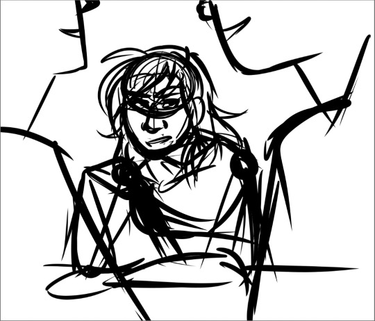
which has an ok composition for the basic theme of “the boys are being romantic and astrid is being an annoying little sister about it”, but i wasn’t in love with it, plus it broke a rule that i’ve been using for the art that i can’t explain without spoiling some stuff but trust me it just doesn’t work.
then we came up with the idea of the kids specifically hanging out at soltryce around this dried up fountain hidden behind some bushes, and that worked out better for this scene; the first attempt at it looked like this
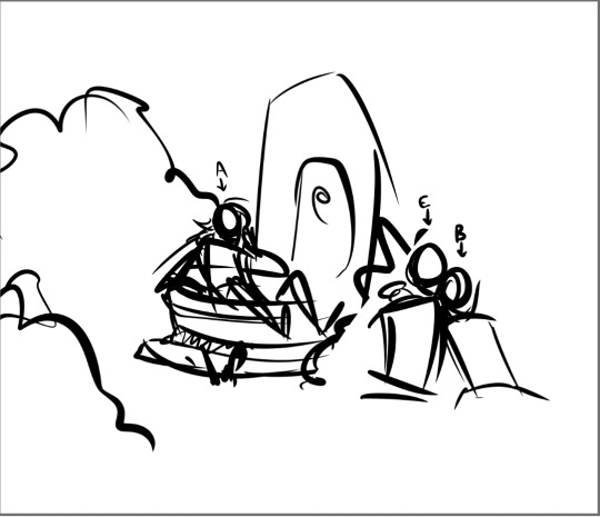
which was getting there but still not really interesting composition...and then, hey, third time’s the charm
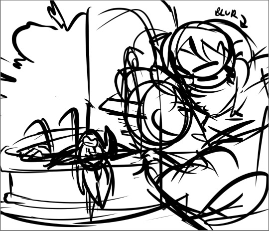
im just gonna keep using this picture as the example because its absolutely one of my favorites i’ve done. but anyway
from this stage then i copy the whole sketch and move it onto its own file, and i collect whatever reference photos or palettes i need and start cleaning up the sketch a bit so i can lay down base colors!
...i apparently dont have the rough flat colors for this image anymore, oops, but i can at least give you an idea of what those would’ve looked like and what a somewhat cleaned up sketch looks like!
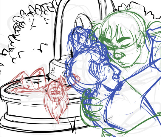
(i always sketch astrid in red, bren/caleb in blue, and eodwulf in green at this stage; it helps make it easier as my sketches get more complicated to determine where one person starts and another ends)
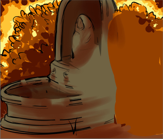
and then this first pass of flat colors is 100% purely to determine if i like the composition still when it’s colored, how the lighting/shading works, if the characters look like they really are in the background, if the mood is conveyed through the color scheme chosen, etc. it’s not supposed to be neat or look at all polished yet, in fact a lot of the time this stage can be REALLY sloppy. this is purely just making sure the overall feel is what i want
and from there every other step is basically just cleanup and tweaking! like, lineart and everything else are technically a lot more complicated than that, but i mean, the hard part of conveying the mood and getting the composition down are done and the rest is usually pretty smooth sailing, aside from the occasional hiccup of “why wont you LOOK RIGHT” and spending hours looking for more references,
anyway thats how the art happens! :D
the whole time, also, ed @tactfulgrimalkin is getting spammed with wips. just. so many.
17 notes
·
View notes
Photo
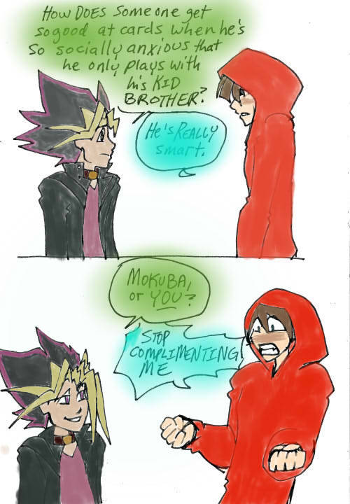
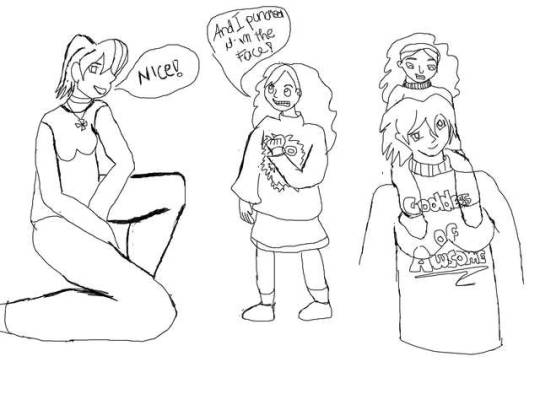
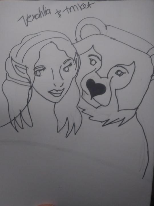
I’ve had one of those days when all I did/all I could do was draw. Here’s things I did.
The first was I colored more lineart from @kintatsujo ‘s AU Yugi Kaiba. Cause like I said my friend was over and the dialogue kinda reminds me of him and he flew back home today and I miss him already.
The second one I’ve actually been thinking about a lot. It started with a couple of posts (like this one) that define Mabel as someone who is -silly and all as she is-herself and who was told by a being she admired that she was a bad person and had enough self-worth to punch it in the face.
And then I kinda tought about how @kintatsujo described Lette as someone who at one point kinda “shrugged everything that was holding her down off and never really looked back.”
I like to think Lette would aprove of Mabel’s reaction to being told she’s Not Worthy by a unicorn. ( there’s also a 99% chance Mabel knit that sweater with Goddes of Awsome in it)
Also yes Mabel is wearing a Kuriboh sweater because of course she would.
I’m….not the best at drawing boobs and Lette’s hair >>
Third is Vexahlia and Trinket cause Critical Role has lowkey taken over my life. I just did a sketch and did lineart with a sharpey cause my tablet was doing this annoying thing with the pen-brush where the lines don’t draw completely and it was stressin me out ( the whole point of this, and the reason these drawings aren’t exceptionally good/my best was to draw to wind down/get through a low spoon day)
#sometimes i art okay#my art#yugi kaiba#other people's lineart#my colors#law of purple#lette#other people's ocs#gravity falls#mabel pines#drawing mabel with floofy hair is one of my favorite things to do
13 notes
·
View notes