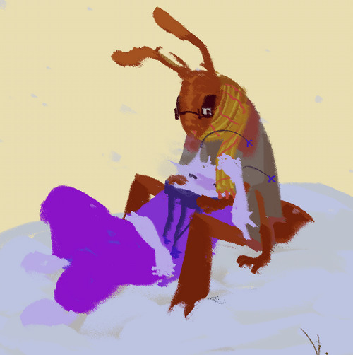
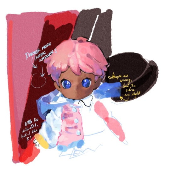
#once i know how draw and color my line art its ON
Explore tagged Tumblr posts
Visit Tumblr Blog
Explore Tumblr blogs with no restrictions, modern design and the best experience.
Last Seen Tumblr Blogs


Fun Fact
Tumblr’s website traffic is steadily declining.
Text
Me: yeah, I'm just bummed because there's not a huge amount of content for Our Life out there.
My girlfriend: Well, then that just means you'll have to make some.
Me (stuttering): well...no...that's not...but like...I...
#shes demanding fanfiction#i love her#once olnf is out its over#once i know how draw and color my line art its ON#our life now and forever#our life#our life beginnings & always#our life: beginnings & always#our life: now & forever#small fandoms
25 notes
·
View notes
Text
people always gotta lot to say about comic artists and about how they need to be "posting more frequently" but you sit them down and tell them to do the same shit and suddenly they're "unprepared", etc. 🙄 yknow this shit doesnt get shat out over night, right? find a hobby in the meantime while you wait, goddamn.
#hows about you write a comic series and script it and do the draft drawing and do the line art and then color every fucking inch in and#GOD FORBID you miss a patch here n there bc you wont hear the end of it from someone who hasnt even touched an art program#or only uses fucking ai. good art- art thats worth waiting for and worth the excitement etc. takes time.#it doesnt get shat out. unless you like eating shat out art. then ig do you.#AND color in the shadows AND add effects AND world build AND AND AND- yeah its not that fuckin easy#be happy you even have to wait A MONTH. most artists would love to actually take their fucking time instead of caving to the demands#of non-artists who dont even know what its like!#just bc an artist you like was able to shit out a bunch of pages a couple times doesnt mean thats something you get to expect from them.#maybe they've been sitting on those pages for a while. maybe they had a sudden burst of energy and motivation. but that shit comes and#goes in swings.#no one is CONSTANTLY on point and ready to draw 24/7. when do i have time to sit down and enjoy some tea or water my plants?#also! i dont owe you shit quite frankly! be grateful for once in ur little shit life. fuck#i now understand why toriyama doesnt like to draw for dbz as much anymore sdjhbfsdhgvfsdg
0 notes
Note
hi, i ireally love your work and i don't know if you've answered this before but, what kinds of studies do you do or how did you learn color theory? i wanna get better at rendering and anatomy but im having trouble TT TT
Hi! Long answer alert. Once a chatterbox, always a chatterbox.
When I started actively learning how to draw about 10 1/2 years ago, I exclusively did graphite studies in sketchbooks. Here's a few examples—I mostly stuck to doing line drawings to drill basic shapes/contours and proportions into my brain. The more rendered sketches helped me practice edge control & basic values, and they were REALLY good for learning the actual 3D structure behind what I was drawing.

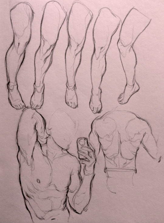

I'd use reference images that I grabbed from fitness forums, Instagram, Tumblr, Pinterest, and some NSFW places, but you could find adequate ref material from figure drawing sites like Line of Action. LoA has refs for people (you can filter by clothed/unclothed, age, & gender), animals, expressions, hands/feet, and a few other useful things as well. Love them.
Learning how to render digitally was a similar story; it helped a lot that I had a pretty strong foundation for value/anatomy going in. I basically didn't touch color at all for ~2 years (except for a few attempts at bad digital or acrylic paint studies), which may not have been the best idea. I learned color from a lot of trial and error, honestly, and I'm pretty sure this process involved a lot of imitation—there were a number of digital/traditional painters whose styles I really wanted to emulate (notably their edge control, color choices, value distributions, and shape design), so I kiiind of did a mixture of that + my own experimentation.
For example, I really found Benjamin Björklund's style appealing, especially his softened/lost edges & vibrant pops of saturated color, so here's a study I did from some photograph that I'm *pretty* sure was painted with him in mind.
Learning how to detail was definitely a slow process, and like all the aforementioned things (anatomy/color/edge control/values/etc.) I'm still figuring it out. Focusing on edge control first (that is, deciding on where to place hard/soft edges for emphasizing/de-emphasizing certain areas of the image) is super useful, because you can honestly fool a viewer into thinking there's more detail in a piece than there actually is if you're very economical about where you place your hard edges.
The most important part, to me, is probably just doing this stuff over and over again. You're likely not going to see improvement in a few weeks or even a few months, so don't fret about not getting the exact results you want and just keep studying + making art. I like to think about learning art as a process where you *need* to fail and make crappy art/studies—there's literally no way around it—so you might as well fail right now. See, by making bad art you're actually moving forward—isn't that a fun prospect!!
It's useful to have a folder with art you admire, especially if you can dissect the pieces and understand why you like them so much. You can study those aspects (like, you can redraw or repaint that person's work) and break down whether this is art that you just like to look at, or if it's the kind of art that you want to *make.* There's a LOT of art out there that I love looking at, probably tens of thousands of styles/mediums, but there's a very narrow range that I want to make myself.
I've mentioned it in some ask reply in the past, but I really do think looking at other artist's work is such a cheat code for improving your own skills—the other artist does the work to filter reality/ideas for you, and this sort of allows you to contact the subject matter more directly. I can think of so many examples where an artist I admired exaggerated, like, the way sunlight rested on a face and created that orange fringe around its edge, or the greys/dull blues in a wheat field, or the bright indigo in a cast shadow, or the red along the outside of a person's eye, and it just clicked for me that this was a very available & observable aspect of reality, which had up until that point gone completely unnoticed! If you're really perceptive about the art you look at, it's shocking how much it can teach you about how to see the world (in this particular case I mean this literally, in that the art I looked at fully changed the way I visually processed the world, but of course it has had a strong effect on my worldviews/relationships/beliefs).
Thanks so much for sending in a question (& for reading, if you got this far)! I read every single ask I receive, including the kind words & compliments, which I genuinely always appreciate. Best of luck with learning, my friend :)
3K notes
·
View notes
Text
How to Create Paper Cut-Out Reliefs: Tips and Techniques for Beginners
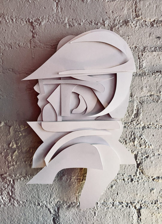
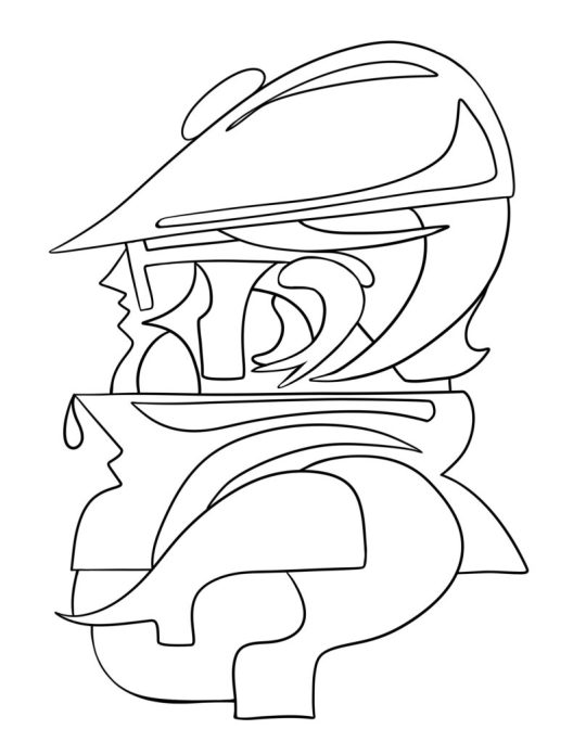
Back again with another lil' series of 2D wall relief paper cut-out forms. Both of the pieces below follow the same process and technique. Im really happy with the process and outcomes. Im working on animating them as we speak. I'll add them to this post later. My paintings inspire my drawings, and my drawings are inspired by those same forms found in my paintings. It makes sense that every so often I want to make those forms "pop out" and off the surface of a flat plane. Alas, it all starts with a quick sketch. See below, just a series of light loose free flowing lines take the lead, forward ->
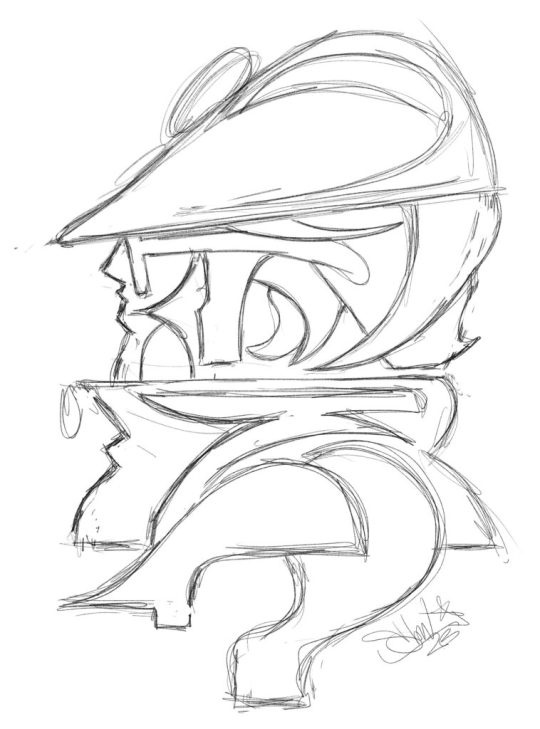
Here we have a dude posing for a profile style portrait. Most likely, this is inspired by the NYC B-Boys from the years 1983 - 87ish. Either way, it's nostalgia for me. Once the sketch feels good, I'll break out the paper and x-acto knife. I keep telling myself that one day Ill work with another material other than paper for these works, perhaps wood or metal.. It will happen, I can foresee it for sure, hang in there. Im using a white bristol paper for the cut outs, I believe it is the vellum type and not the glossy, but either or will work just fine. I love to cut paper and the whole medium of paper art in general.
Paper cut-outs, also known as paper cutting or Kirigami, is a traditional art form that involves cutting shapes and designs out of paper. The history of paper cutting can be traced back to ancient China and Japan, where it was practiced as a folk art. The Chinese and Japanese would create intricate designs, often featuring animals, plants, and mythical creatures, and use them as decorations for festivals and special occasions. I always loved it and have felt inspired by these pieces.
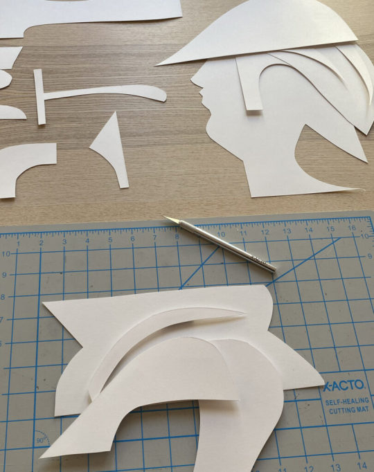
Using the sketch above, I apply the "map" of the shapes and forms that I see. Sometimes I redraw those forms on the paper that I will cut out, and sometimes I just "draw" with the x-acto knife to recreate the forms. Sometimes, it's a combination of both of those techniques. There is also a series of "out-take / byproduct" cut outs that do not make the final piece, those can be saved and used for the next piece, obviously!
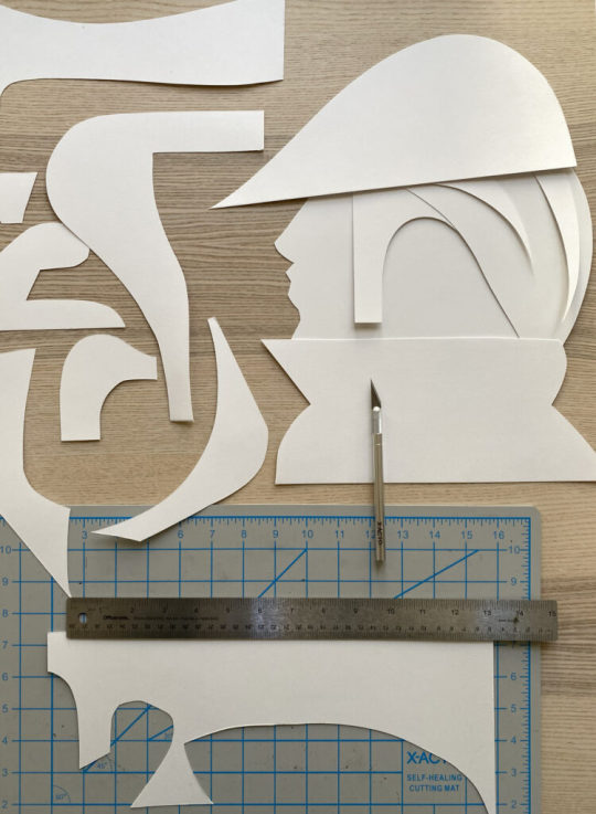
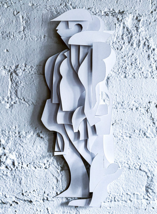
I layer the forms on top of each other to compose the arrangement as a whole, its fun to watch it all come together, in the next phase, you will need some kind of durable tape or you can make little paper forms that can be pasted to both sides of the forms as they stack, this will create the gauge and depth of the piece once it is placed onto the wall.
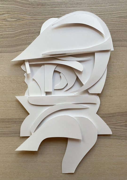
This is the final composition above, I love it! I used a roll of duct tape to make small cylinder forms that connect the pieces together, the piece as a whole comes "off of the surface of the wall" by about 1.5 - 2" inches - you can play with this a bit but keep in mind, the tape makes the piece heavier and it will want to comply with gravity :)
I hung the piece (also temporarily adhered via the same duct tape) for the photoshoot and to also get a good look at how it will function on the wall. I have an old painted fire place in my studio that is a great surface for hanging things, I love the contrast of textures between the bricks and the paper, as you know, the shadows will be super cool to see too.
Once I had the whole piece constructed I took a few pictures of it. I immediately wanted a clean vector line drawing of the whole character. I brought the photo into adobe Fresco and used a vector brush to draw this lovely variation. This is how my brain works, I switch paths because I know they are really pipelines to the "next thing" that I will push this to, so forward we go.
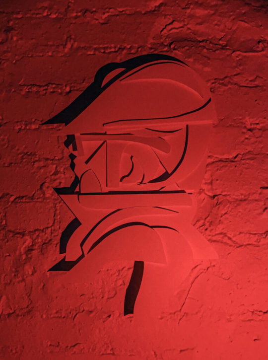
Then, it was light source and photo shoot time. Im not really happy with these picture as traditional "photographs" as I know I can do a much better job, but, as a series of "sketches" for a planned photo shoot, these will really help to make those plans a reality. I love neon colored lights. I have a bunch of them from various places and spaces that I found on the internet. Amazon has a great selection of flashlights with various colored light options. Get a few and play around with how the light can effect your work and the shadows that it creates. This is where the depth and gauge of your pieces play a role. The photos below are also a part of the same session, which all took place over a few days.
Here is another variation with a different character.. What do you think? Shall I make more?
#art#ryan seslow#ryanseslow#paper cut out#paper#paper art#2D design#2D#portrait#character design#graffiti#bboy#nyc#sculpture#paper sculpture
240 notes
·
View notes
Text
24 Asks! Thank you! :}} 🐷

I don't think I'm understanding.. I cant turn my FNAF AU designs into full on OCs, (Original Characters) because.. well Freddy Fazbear and the gang are NOT my original characters. I just made my own AU (Alternate Universe) for them and redesigned them.
Unless that's not what you meant..? I'm sorry for misunderstanding you if that's the case <:(

(In response to this post)
I'm keeping it in mind.. I gotta get to the root of the problem and figure out what needs to be replaced. Once I can figure that out I'll probably set one up 🥹🙏🙏

Well imagine if you were in his shoes. You are transported to some kind of unknown world. And absolutely no one arounds you speaks the same language as you.
Sneep has no way of knowing this is a digital plane. He has no idea if the people around him are real or not, he cant remember his name and no one can explain to him why that is. His body looks different, he feels different, no one around him looks to be a human.. just imagine how scary that is. Not having the comfort of things being explained to you in this situation. Not having the comfort of someone telling you "everything will be okay".
Yeah, I'd lose my mind pretty quick too 💀

@ardent-38
XD No worries! And yeah I started playing Warframe for the first time these past few days. Its been fun so far, Mag being my favorite. (She's the only frame I have <XDD)
I have my eyes out for Titania Prime, Trinity Prime, Mag prime and Mirage Prime. I'm thinking Titania might be my new favorite if I can snag one!
This game is fun, but the longer I play it? The more I miss OG Overwatch 😅 I tried playing TF2 again today and it just isn't the same 😔💔

@chromchill
I am new, but my favorite frame so far is Mag, because she's the only one I have <XDD
But I've got my eyes out for Titania Prime.. and judging by her abilities, she might just become my new favorite 👀👀

@chickenmilk120
What I really would like is just more interactions and comments with my artwork <:( I get bummed when I put a lot of effort into something only to get 3 comments in the end...

I have not <:(( but I've heard many good things about those games! :00

AAAAA THANK YOU SO MUCH!! :DDD That's all very kind of you to say! :}}
And as for Cici and Gerald, you can find their origin comic here! :00

@lordvonbunnyv
Yes please 🥺🥺🙏🙏🙏

@quillsinkwell
Awe! :DD Thank you! They did have a certain charm to them didn't they? :}}


They would have been much better off drawing that mattress character I swear XDD

@neo-metalscottic (Referencing this post)
Hello! So far my tablet is still alive. Although I'm looking into getting my laptop checked out and maybe replacing somethings... 😔
And it was fun to draw Bibi again! I should really draw the fam more often <XD
Not sure what resolutions they'd have.. but one of mine is to be cured of this condition. Or at least get to a point where I can actually function normally again. There's a lot of things planned for 2025 and if I don't get better soon? I'm gonna miss out on all of it. 💔

Yeah, my head just used to be a normal scribble. But now its become a full on blob hasn't it? <XD
There's 2 reasons for this. 1 being that I have been battling some very limiting health conditions for about 8 months now. So drawing my sona all goopy and sickly is to represent how I've felt through this trial 🥲🥲
But the second reason isn't so bad. That being that its just fun to draw my sona like that XD

@bored-animator
Indeed I have! Deltarune too! Just search up "undertale or "deltarune" in my blogs search bar and you're sure to find a lot of it! :))

Thank you so much!! :DD And sure! Send me any game recommendations you'd like! :}}}

@ramiel-hourglass
Thank you so much! :DD But no need to go to the dumpster! <:(( I'll make you something to eat instead, yeah? :)

I use FireAlpaca. And I used to use the pencil brush for line art and the pen for coloring. But lately I've been using the little pixel brush for sketching and line art :00
(This thingy 👇)


I saw it, and I don't really know how to feel about the blue shelled Koopa.. it feels kinda weird to see a Mario kart item brought to life suddenly 😅

I gotta think of stuff to do wither her... 😓😓

First thing that came to mind was Roxanne from FNAF: Security Breach <XDD

@howaboutsomeketchul
Idk how they would celebrate Christmas, since they might not have a good way to gauge the passage of time..

Just search "team fortress 2" in my blogs search bar and you're sure to find most of it! :)

While I see what you're cooking, I don't think my Caine would create a Momigoo NPC for the fast food adventure <:/
The thing that upsets Gummigoo isn't just that his mom isn't real necessarily, its that his memories of her aren't real too. He remembers all these experiences with this person but the memories aren't real...
And the whole reason why Caine let the brothers stay was because he hoped it would help Pomni adjust to the circus. Just like Bella did for Gangle. Bringing up NPCs or things from the Gators adventure could upset or confuse them so Caine wouldn't want to risk it. <:(


@wolfie-777
Merry Christmas and a Happy new year! :DD Sorry for the late reply <XD

@cartoon-fan
Oh I get a lot stolen from those other fandoms too. Octonauts has just been the most frustrating. Constant tracings, theft, copycats, disrespect, its was nuts.
I don't think I'll post Octonauts again anytime soon. I've just had enough of the constant pushing of my boundaries and the boat loads of all kinds of theft.
71 notes
·
View notes
Note
what steps do you go through to draw in your current style? do you have any pointers about it? its absolutely one of my favorites
i'm not sure if i think of my process in steps. in my head, i'm just straightforwardly drawing the shapes the characters are made of at angles that look right and building on that... luckily, i stream when i draw every day, so i have a ton of videos of myself drawing. example:
youtube
i haven't bothered to upload a lot of the modern streams to youtube because my video editor can't handle editing 4-8 hour files even if i'm speeding them up and technically making them shorter because of the way video editors interact with files, and the freeware i use isn't able to make proxy files. the act of downloading and editing and combing through all the footage is a ton of time and memory space and it's just not what people are usually looking for from me, so it's not where i wanna put my time.
but that's neither here nor there. what i mean to say is these vods are really long. so you don't want to rawdog those. but you can just download a video speed controller extension to your browser and it's extremely easy to cruise through the backlog of vods at ~15x speed.
i've gone ahead and highlighted some of the recent videos to separate the chaff from the wheat. i tend to take long breaks to eat or walk my dog so there are big periods of Nothing Happening. i'll try to skim some more and do the same. unfortunately, i don't have any good videos of me coloring, since twitch deletes vods after like a month, and i've just been focusing on sketching.
but yeah, in general, it really depends on how good i'm feeling on a given day -- sometimes i will sketch multiple times for just one panel and sometimes i won't sketch at all. i use paint tool sai 2 and a pixel brush usually 2 pixels wide with no pen pressure. for comics, i have 1 layer for the panel borders, 1 layer for the sketch, 1 layer for the lines, 1 layer for the colors, 1 layer for the text, and 1 layer speech bubbles. sometimes there are special effects that overlap borders and need their own special layers. when i start sketching a new panel, i will usually put it on its own new layer, and sometimes for multiple characters i will put them on another new layer at a different opacity. this is mostly to move them around without constant cleanup. once i've gotten a sketch pretty finished, i merge all of the layers into the sketch layer. the line layer is usually just the sketch layer cleaned up and paint bucket tooled black. but basically, the vast majority of my time working on art is spent trying to fix small things like tangents, fitting speech bubbles into panels, thinking about how to lay out a page, checking continuity interaction with other pages, that kind of stuff. the complex technical parts of the process are to save time on those in ways i can without compromising quality. the other portion of working on the art is like "step 1: draw head circle (or jessie head diamond). step 2: draw the rest of the owl." i don't know if this was helpful at all y_y if you want more pointers i might be able to offer clarity on more specific questions!
126 notes
·
View notes
Note
hi cogmented! love the art. do you have any tips for beginners? thanks and have a good day
HI YES YOU TOO i think most of these are applicable to beginners and non-beginners
i learned these tips from two low level art classes based on charcoal so i find some of these a lot easier through traditional means, but the skills learned from them should be transferable through any medium
i wont be touching on color or perspective too much, here's a past post i did on colors.. more so values, but it didnt go in-depth as i would have liked
shape and form are fundamentals for visual art. you need to think of form to get your shapes around it
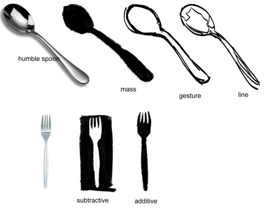
mass and additive are kind of the same thing, just the filling of the shape, no lines involved. gesture is more so for the feeling of the same, and line gets further definition
here are some of my digital examples:
mass, gesture, line
subtractive
the top left drawing started as mass, where i formed the two people's positions into one blob and then colored over it
once you start getting those down, you can start applying it. but, you may want to look at what other artists are doing too
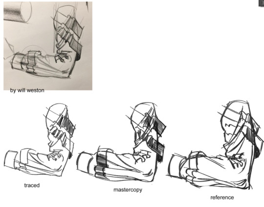
tracing, doing master copies, and using references are all fair methods of learning off of another, just dont pass off traced or copied art as your own
tracing tends to make your lines appear stiff, especially if you are tracing a more gestural drawing. you don't get the same motion as when you are simply referencing
mastercopies are replicas of the art work, made to look exactly like it in an attempt to emulate the same techniques the original artist might have used. i find this personally the most tedious, but beneficial method, but it may not be the easiest thing to do as a beginner who is not used to quick hand motions or confident lines.
this mastercopy sucks because mimicking traditional on digital is not the easiest thing in the world, and i on god just fucked it up, but you can see how that form and shading is much more similar than the other two
using an image as a reference is the most widely known method, but it may not look exactly how you want it to at the start! you might simply not know how line weight, textures, or line methods work yet, which is something figured out through practice and observation
and speaking of observation,

this looks okay, doesnt it?

but there is something much more structured to this, right?
it is hard to not assume you know how things look. you see things every day! your reference is right there! but really think about what you're drawing, and what it looks like.
references are always helpful, be sure to glance back frequently and really look at the distance between things, how things are rotated, how things curve around each other, and where shadows add definition
and even the bottom drawing does not capture everything correctly (the top left is not pointed enough, the middle is too high, the bottom right back fabric is too low, the bottom left is missing a fold, etc etc) i gave myself 5 minutes max for these, but it certainly looks more correct and it is not just more well developed shading
(the box is something i do often to get the size of shapes down, or to see how much space something will take on the canvas)
and always always always experiment

you do not have to draw every line, you do not have to put every detail in its right place, you are only trying to get visual information across in a manner that you enjoy
if you have an idea, but dont think you can do it, the most important thing is that you try it anyway. if it looks like shit and you dont like it, try again another day, just dont stop drawing because one day you will be able to do it
dont be afraid to erase things, to start over if you dont like it, even if you spent time on it, because you can always redo it better the next time and each time it is another thing learned or whatever. or keep it cause it looks funny or interesting who cares, as long as youre doing something
26 notes
·
View notes
Text
after 500 years, im back to working on line-ups for the oxventure PCs for each campaign, this time the hobby horses :3 as with the oxventurers guild, i put a good amount of thought into this, though maybe not as much as the guild haha but regardless, i'll go into more detail under the cut for anybody curious :]
once again, they all have their own eye shines (or, in barnaby's case, are dead behind the eyes lol), though theyre simpler shapes this time. edvard gets stars, lilith gets a squiggle, kasimir gets a hooked shape, and zillah gets hearts.
edvard - i see him as just kind of. soft around the edges from his rich upbringing, but generally is on the thinner side, kind of rounding out in the middle. very Just A Guy with his build and body hair. i went with brown hair rather than black because otherwise, everyone besides lilith would have black hair and it was just to monotonous for me XD still, i tried to keep it dark and not too bright so it would fit the vibe. also, for some reason i thought his vest was floral until i started coloring this, but it totally is not in canon??? :') i liked it too much to not do a floral pattern anyways.
lilith - i really adore her canon outfit, i just get very confused about the layering of everything. so i tried to do distinctive color-blocked for her outfit, while also restricting her outfit's palette to just purples and teals/blue. i am so bad at drawing snakes. i am so so so bad at drawing snakes XD also, i decided to give everybody at least one tattoo because i just thought it would be fun and im taking advantage of the gritty setting. theyre all cool and tough so they have tattoos and totally not because i just love drawing tattoos lmaooo
kasimir - kas is not much of a leap from canon. i love kasimir's design. i just gave him plenty of tattoos under that massive jacket of his. based vaguely on johnny's tattoos, i did my best to reference their arms but ended up more going off of the vibe rather than copying anything specific. johnny's tattoos are simply too intricate and beautiful for me to do repeatedly djfgbdfhd and okay i say this constantly but my faaavorite kasimir design element is his whale belt buckle. its so cute. i love it
zillah - she was also easy for the same reason, i just adore zillah's design. its simple and very fitting. so i just gave her exactly what she has, but like lilith, i simplified the color palette. since my art style is much more cartoony than colin craker's, especially when i dont hatch or shade, restricting the colors makes the designs look cleaner. i almost forgot to color in zillah's hand wraps by the way and i literally put my hand over my mouth, i only caught it as i was typing this XD it was so needlessly over-dramatic
barnaby - i dont know fully how to explain it, but barnaby is definitely the design i am most pleased with. not because i think he has the best design here necessarily, but because hes just so perfectly what i picture in my head. with a lot of my designs, ill adjust small details based on my mood or i just won't fully be confident in my decisions, but with this design? thats just barnaby. chef's kiss. like edvard, i gave him brown hair instead of black for some diversity. i also kept his very thin hair and high forehead because it makes him so endearing to me <3 no five o'clock shadow though, he has to keep himself looking young
#oxventure#oxventure blades in the dark#edvard lumière#lilith cappellanaga#kasimir jones#zillah bruseau#barnaby fortescue iii#i cant believe i said 'ill finish these tomorrow' on my last post for these. oh my god.#its been over half a year and this took me 16 hours LMAO though i am a bit rusty w lineart and full color
32 notes
·
View notes
Note
hi can i ask what helped you to get so good at shapes and colours :o i love the atmosphere ur arts have
wow, thank you! that means a lot to me esp bc i've been trying to improve those areas in my art so i'm glad it comes across 🫶
i approach shape from a more graphic than painterly viewpoint (i can't escape graphic design even when i draw 🥲) so i think about shape in terms of functionality and readability. i really recommend looking into design theory, i liked sinix's videos about this when i was first learning about how to drawe.
my main strategy to create good shapes comes from working strictly in black and white. this makes you focus solely on trimming down the main values in your piece and creating more expressive and readable silhouettes. i love comic art, so when i do this i go heavy on shadows and sharp contrast but thats also just my taste. also when doing this i prefer lasso tool over brushes so you have no choice but to create shapes not lines. either way, limiting your drawing to a couple values will tell you right away what shapes are reading correctly and which need more work.
as for color, the main tips i have are to be aware of contrast and pick intuitively. once your values are in place you can pretty much do anything! i start by picking a main few colors i think overall represent the tone i want to portray in the piece (melancholy, joy, etc) these are totally up to personal interpretation. imo the majority of impactful color schemes are just variations on complementary duos. after i pick the colors i know i want to use for sure, i let the color wheel dictate the rest of my palette.
i also found being mindful of color vibration actually helped me pick better colors. its basically when colors next to each other are too similar in value and creates this haloing effect thats difficult to look at, you see it a lot with super saturated hues. when doing digital art, it happens more subtly and noticing when to up the contrast while picking colors has helped me understand color better.
also experiment with layer modes! if your values are right in your blocking stage you can gradient map that sucker and use it as an overlay to create more fun color combinations. when you work in rgb the world is your oyster
thanks for asking! heres a process gif that will probably explain this better than i have
65 notes
·
View notes
Note
hello … what are your best tips for improving your art? i want to study and learn more but i’m lost on where to begin!!!!! big fan of your work by the way it’s a big inspiration to me! ☀️ i hope this isn’t a bothersome ask!!!!
My biggest tip is to learn first and foremost how to enjoy the learning process. When you do that you’re pretty much set for everything else. The biggest roadblock i and a lot of other artists seem to encounter is not Not knowing how to draw something, it’s not being able to make yourself get up and tackle learning how to head on. A lot of it is just your self talk or mindset when you broach it. viewing improvement as a chore or unachievable makes you reaally not want to do it, so you end up delaying it and just avoiding it altogether. I’ve done that a few times. You basically just have to hype yourself up, even if you don’t fully believe any of what you’re saying, it’ll still influence you in the same way self-deprecative humor can influence someone’s self esteem. And give yourself a treat every time you try :) build up that positive association! It’s tough early on, and it can feel like pulling teeth, but teeth don’t just get pulled for no reason. You’re making a step forward! Decide small goals for yourself. Saying you want to just “improve” is pretty vague, and most of all daunting. It doesn’t happen all at once in that way. You need to build up the bases. If you want to improve, be specific, say you want to get better at composition, color, lighting, anatomy (which must be further broken down to learning how to draw things like arms, legs, hands, because anatomy is a whole thing in and of itself lol.)
and that brings you to actually learning. My suggestion is to draw from life whenever you can. There’s no faster way to understanding three dimensional forms than having a subject right in front of you. This is something i do very often, whenever I go out i bring a little sketchbook and draw friends, surroundings, etc, and it’s what has helped me improve the fastest. Use cross-contour lines to your advantage! Draw a form and try to find its dimensions. It’s mindless and gets much easier the more you do it, while also still being very informative. When you understand the dimensions of something, shading becomes easier too. and ofc study art that you like, deconstruct why you like it and try to apply it to what you draw. Watch speedpaints and pay attention, try to pick apart the process of the artist! I recommend yt channels like ethan becker and sycra for composition and anatomy/design lessons.
thanks for the ask! I really appreciate it and your kind words. Good luck!! You can do it! ^_^
60 notes
·
View notes
Note
Hello!!! I love your art and your style. I'd love to hear your inspirations behind how you draw and, in addition, hear a bit about your painting process (I love the impressionistic look your paintings have)
ahh!!! thank you so much ;u;
Ill tried my best to break down my thought process behind my drawing, so i hope this all makes sense aahaha
undercut cause it came out real long
SO Karl Gnass is an instructor that i took an anatomy class with. and who broke down anatomy in a way that really helped me grasp space. like space a figure occupies. and from that i think my characters feel a bit more...grounded? im not sure what the right word would be but tangible is something people sometimes say about my art.
And i do think when youre able to make a figure look like its really wrapping its hands around something it makes character interactions a lot more intimate.
heres a few under sketches i do when i start a drawing (i am trying REALLY hard not to use my nsfw ones tho those are pretty perfect when it comes to showing u anatomy RIP)

after i got the poses done ill turn down the opacity and rough sketch out details on top of these. and once THATS done i move onto lineart. and the most important aspect of this step is NOT TO TRACE YOUR UNDER DRAWING!!!! thats what sucks the life out of your work!!!!
instead you use your undersketch as a guide. ilI actually redraw the simple anatomy underneath very lightly, erase where they over lap and then add line weight variety + darken up the details.
examples of this are gonna look a little messy but. Left is the original pose i drew out with rough details. right is the drawing i do on top of it. you'll see theyre not one to one and theres some lines i didnt fully erase out when redoing the anatomy. i find my clean up has a lot more energy when i do this.


the thing about my style is that you'll notice i never actually do actual clean smooth lineart. and thats because i HATE DOING THAT SHIT. like i did learn how to do it and consistently forced myself to do it for over a year. and while i do think i learned a lot about line weight and drawing clearer. i realized? its just not for me. I like a textured brush and i like being able to see those small lines i didnt get to fully erase out because i think they look cool lol and thats ok!! do what you want forever man!!! its your art!!!
Also before i move onto painting ill show you this neat little trick. you know those more "loose" drawings of mine that feel more gestural? the begining process is exactly the same. the difference is i use a chunkier pen and try to see how much i can simplify details + just feel out the energy of lines

NOW PAINTING.
man. where to even start.
the thing about painting is that its an entire different set of skills that need to each be honed on their own and will slowly build up together. ill break it down like this.
VALUE, COLOR, and TECHNIQUE
I've said this on another ask before but you'll notice ill do a lot of black and white sketches. and i do that to practice choosing how to group values.
like this example. how light is laios' wolf coat compared to his skin? or kabrus skin color compard to laios coat. when do you want to really push the contrast of light and dark and when do you let values be closer to each other when you DONT want attention

the next step from this is adding a light source.
and when you're working in black and white its a lot easier to pay more attention where you want your light/how its gonna look like hitting youre characters and how far youre gonna push your shadows.

and you know if you get good at this you can play with limited color palletes

this is literally just be picking out blues and hitting the bottom with the gradient tool to light it up
NOW COLOR
is a lot harder and also very subjective. I do a ton of impressionist studies where i just color pick the fuck out of a piece to see what colors masters used + knowing the history of paint and what colors were available during that time period. +knowing what colors = what mood + knowing what colors to use when you want to be more realistic vs when you want to lean into more stylized+ what colors YOU specially incline towards + AHHHHHHHHHHHHH
its a lot and im actually still learning myself
But when i do a painting i collect a LOT of refrences of the kind of mood i want my own painting to feeling like. I've show the first example in another ask before but heres one from my latest labru too


WHen i actually start a painting tho they look like this. The top drawings are just flat colors with a simple outline of where i want the light to be hitting. like in my value studies im just trying to get the idea down, seeing what values need to be darker vs what is lighter. and how the light source covers the character.
figuring this out in the begining makes the rest of the painting so much easier because youve essentially made all the big compostion decisions NOW. from here you can start playing with colors.
my second stage, youll see with drawings at the bottom, is when i start using my texture brush to lay in extra shadows and just play with variety.

and then? i start rendering
that would be TECHNIQUE
And well....thats also something thats gonna be very subjective.
With my own style im not interested in rendering everything to perfection. Im trying to figure out how to texture hair/skin/clothes in ways that make them feel like the materials they are while also showing the energy of my brushstrokes.
I dont zoom in while i paint btw. everything i do is zoomed out so i can see the entire drawing. it helps me not tight up my strokes while also letting me build up all areas of the painting equally. the only time i zoom in is when im lining out the eyes/mouth of a character. and yeah. it drives me insane doing this because ITS SOOOOO Tempting to obsess over paint 1 area forever then zoom out and see that nothing matches lol
The other thing about my style of painting. Is that im not gonna use the exact same formula for every piece. like this isnt cell shading. you can have an idea of how to texture skin/clothes/hair and sometimes it looks great and beautiful in one painting and then it looks like shit in another. ive overhauled a lot of paintings multiple times because what i thought would work doesnt and ive had to force myself to explore and play with my brushstrokes. and you know? i wouldnt have it any other way. it means none of my paintings are gonna look alike! and i think thats pretty cool :D
ill leave you with this in the end. a painting im in the middle of doing and debating to overhaul cause im just not feeling the strokes. who knows what ill look like in the end

anyways i hope this helped a little? even if you look at all this and go. IM NEVER GONNA DRAW LIKE THIS BOZO ahahah
BUT I WISH YOU LUCK ON YOUR OWN ARTS :DDDD
39 notes
·
View notes
Note
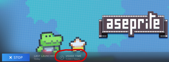
Hello! I just want to say your blinkie style is a huge inspiration for me! I love how everything looks, and its making me consider using aseprite instead of clip studio :D Do you have any tutorials, beginners guides, or other advice you can give to someone who's specifically wanting to make blinkies in the program? Thank you for all your cool art <3 - @m0dem0n (its a side blog so i cant ask from it OTL, pls @ me when you reply!)
THAT'S SO AWESOME, I'm so happy to have inspired you, @m0dem0n !! :'D
I've got a very quick and rough guide linked in my pinned post, but it's really basic and doesn't touch on any sort of 'advanced' techniques, so I'll go a bit more in-depth below the cut. I'll also include a 'speedpaint' of how I make my blinkies!
Before we get started, just a quick disclaimer: I am not really a professional! I love pixel art, but I really am just a hobbyist. Everything I've learned about Aseprite has been through trial and error. That said,
I've put enough hours into it to have picked up a few tricks, LMAO.
The pacing in this video is... bad. You'll need to pause to read all the text, sorry ;o; I'm not really familiar with making videos, but I did my best. (there is no audio, jsyk!)

A few things I didn't mention in the video:
If you plan on drawing any sort of pixel art graphics for your blinkie, CHECK THE "pixel perfect" BOX AT THE TOP!!! it's a magical option that helps you avoid 'doubled up' lines. example:

If you want several color versions of your blinkie (like how I tend to upload 2-3 versions of the same blinkie in pink, blue, green, etc), select every layer you'd like to change the color of (usually it's background, border, and text, but usually NOT the image), then use ctrl+u to open the hue menu. shift the hue here (it's the slider labeled "H"), and once you confirm, all of your selected layers will shift colors! Note that the preview may only show a single layer updating colors, but when you confirm, all selected layers will update.
You can use the alpha slider under the color wheel to select a fully transparent color. Combine this with the gradient tool for cool effects, but remember that you cannot have a *partially transparent* pixel on a *fully transparent* background and still save it as a gif. So if you have a partially transparent red on a solid black background, it'll work! But a partially transparent red on a fully transparent background will not.
When you save your blinkie, make sure you use the "save as" feature, not the "export" one.
I HIGHLY HIGHLY HIGHLY recommend you save every single blinkie as BOTH a .ase and a .gif. A gif will not save layers!! So if you want to edit your blinkie later, the .ase file will save your layers and make your life so much easier. Learn from my mistakes. ;O;
Aaaaand here's the speedpaint! This is what my process of making a blinkie looks like in real time, starting with my little flashing border template.


i had to shrink that speedpaint gif down so much to get it small enough for tumblr to accept that you can't really tell what's happening in it anymore LMAO, but it IS still real speed at least! also the weird distortion on the color picker is what happens if you have a non-dithered gradient with too wide a range. it clumps different values together to reduce colors and makes it look bad. that's why i recommend using dithering, or using a *very slight* gradient!
I know that was a lot of text but hopefully some of it is useful! o/ i'm gonna go lay down now LOL
22 notes
·
View notes
Text
Processing Process, and More Processing
I made this post free and publicly readable on Patreon, but I'm reposting the whole thing right here too because, well, it's a free post, and I don't want to make you click away from your dashboard if you don't need to. But also if you want to support my work, here's the link to the post.
It's a little bit about cartooning, a little bit about drawing, and then it turns into a eulogy for a chicken.

I wrote “process” more than once, and now the word looks funny and is beginning to lose its meaning to me.
This post is about a few things, and it’s a little bit on the sad end of things. Nothing dire! No worries. There’s just a little mention of death, just as a heads up.
Before we get to that, though, I’ve been doing some work and had some thoughts.
I’m often asked about how I draw the noodle hair on my characters, and the answer is typically that I draw each and every line with my hand. But there are considerations of movement and volume that go into it beyond its texturally decorative purposes. I love being able to convey shape and motion with it. It’s less evident, I think, in my illustration work, but I think it’s much more obvious when I do sequential work. In the above image, you can see me working out a sequence of Angelica having a series of thoughts. Her head sort of moves, and her eyes follow. You can see I’d planned out the general shape of the hair and how I’d like it to move.
I wound up moving the drawings a little bit so that the readers eyes will actually follow the character’s eyes as it moves gently rightward on the page. The hair is there to accentuate the movement, like so:
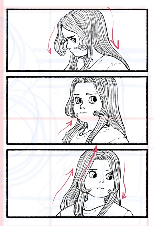
It’s a consideration I employ in all my drawings, but especially when I’m drawing hair and fabric. I don’t use a lot of action lines, so this becomes an important way to give the reader the information that someone is moving through a space. Resistance, gravity, and motion are all things I have to keep in the back of my head when I’m doing these little drawings. I think the planning actually takes more time than the inking, which can happen pretty quickly once I map it all out.
In other news, I’m starting to take my extracurricular artistic development a little more seriously in the silliest way possible.
You wouldn’t know it, but I studied painting college—a medium I switched to after the printmaking professor and head of the Art Department at the time told me I probably shouldn’t be an artist (he gave me a hard candy for my trouble). I recently bought a bunch of little dolls, dressed them up, and am returning to my painting roots. It feels really nice to work in big blobs of color instead of lines. It’s an exercise I came up with in response to a common lament from art students.
One of the more aggravating generational tensions described to me by art school students is when professors describe a student’s portfolio as “too anime” without much explanation. I know what the professor means. They’re trying to get at how referencing your favorite anime or cartoons means that your style becomes a simulacrum, an imperfect copy of a copy, and you never learn to develop your own sense of judgment about where a line or a shape needs to go. And we can tell. It’s a way of working that is perfectly fine for cartooning because cartooning is closer to hand-writing than it is to drawing. I always turn to Charles Schulz’s work for an example. Those figures aren’t literally depicting children—with their little chessboard-pawn proportions and bread-loaf feet—but we read them as endearing children because we’ve come to a consensus between us, the readers, and Charles Schulz, the author, that those shapes mean those things. There are no whiskers or paws in the shape of the word “CAT” but you look at those three letters together, and you know the thing to which it refers. That’s an aspect of cartooning, too. Of course, what elevates it from mere writing is, in part, due to the fact that those little figures do not lose their meaning the more you depict them.
To really draw well, though, you have to do those fundamentals. You have to draw from life. There’s no way around it. It helps you develop a stronger sense of where you like to lay down your lines and shapes, no matter how stylized you like to work. It grows your judgment, and every artist’s best tool is their own well-honed sense of artistic discernment about their own work.
But that doesn’t mean you have to surrender the stuff you like or the things that inspire you to make art! I tell students that if they want to hold fast to their anime style AND hone their fundamentals to develop their eye as an artist, they should buy little figurines and toys of their favorite characters, prop those up against a light source, and draw them as still life objects. Like, yes, do the vases and the figure drawings and all those, I still think those are important. But if this is what you need to keep you interested in drawing from life, having some toys around is a great way to do it! Also, bless those sculptors and toy designers. They’re the best.
I think there’s something to be said about remembering to imagine the physicality of the things we draw, in all its dimensions and in the way it catches the light or casts a shadow. It helps sentimentalize things, too. Makes them feel more real, even emotionally.
Edwina died on Tuesday night, after a few final snuggles, surrounded by her favorite treats. She was about five years old, which is old for a chicken, and she had a very comfortable life. We buried her this morning. She was a good hen, J’s personal favorite.
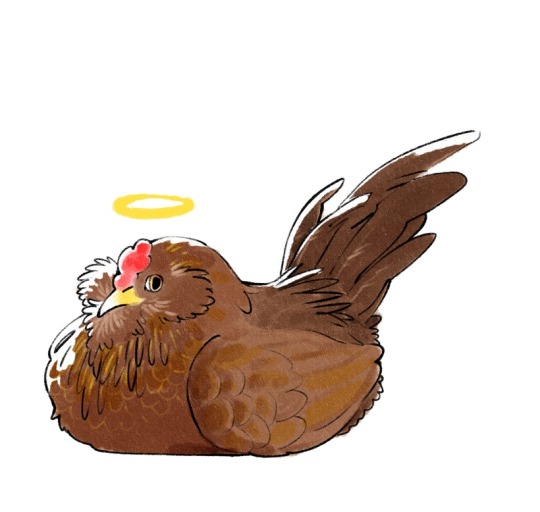
It really feels like the end of an era. She was the last surviving member of our very first flock. After the other hens died, she really seemed to prefer the company of people over other hens. She is survived by Snooki and Nelly, our two other young birds who get along quite well together, actually.
A baby chick costs between three and five American dollars, typically. An egg-laying hen could be between twenty and fifty bucks, depending on the breed. There are roughly 26 billion chickens living in the world today, about 518 million of them here in the United States. They come pretty cheap. And a part of me was moved to cynicism, entertaining the thought that it might be strange to feel sadly over a little animal that, at most, might be roughly equivalent to the price of a fancy lunch and a coffee.
I watched the 1974 musical version of The Little Prince recently, and I remember it mostly because Bob Fosse was in it and scared the crap out of me as a kid—he played the snake that would take the Little Prince back into the sky when his body gets too heavy to take with him. Gene Wilder plays the Fox whom the Little Prince befriends and tames among a garden of roses. The Fox explains that he is like any other fox in the world, but he is changed—made special and particular to the Little Prince—with time, effort, and patience. So, too, is the Prince’s little flower special to him. Out of all the flowers in the universe, she was the one he watered and protected under a little glass jar. And that’s enough.
I knew my little hen would not live that long. It could be very easy to take a broad view of the life expectancy of a hen and distance myself from it by virtue of its mortality and its commonness. People who raise livestock do it all the time. But I also think it’s wonderful that we should all be capable of loving very small, very brief little things. Edwina is not, to my mind, the rough equivalent of a fancy lunch and a coffee. She was our little hen. For her whole life, she was ours. And I’m so happy she was here.
108 notes
·
View notes
Note
Hey, Noodle!
I just wanna say that your art is cool. Seriously
Your colours, composition, linework, etc. It's just pleasant to see your drawings. They're full of life
However, I wanna know more. What's the most important thing for You to considerate in art?
Color palettes, poses, composition, line?
What would you tell somebody to get better at art/ is inspired as you and want to do something similar to you?
if i had to choose its composition thats most important to me when making art though color palette is a very very close second. when i work with composition i really like to think about how i can fill every corner of the canvas as much as possible almost like fitting piece in a puzzle with no gaps between them if that makes sense lol. i really wish i had more advice when it comes to composition maybe one day ill work on compiling some of my thoughts on it. I did try to once before but that didn't go well...
249 notes
·
View notes
Note
Sorry if this is a weird question, but how do you come up with your drawings? What does through your mind while making them? I find your compositions so gorgeous and intriguing but I can't really figure out how you approach things since everything's very shifty and abstract. It's really gorgeous work, I'm so glad I discovered your art :,)
hey first of all this isnt a weird question at all & i'm really glad you enjoy my art heheheheheehe. there's an incoming large largely unformatted block of text that i hope you dont mind!
Honestly there are a billion things going through my mind at a time while I'm drawing and they all sort of bump into each other and cancel each other out like opposing particles. If you've seen any of my streams i'm usually very fast and iterative in a lot of my process and i rarely ever slow down even past the early parts like thumbnailing and sketching. i kind of let my hands do the talking more, yknow? but even then theyre never talking about a single thing at a time. everything interacts with everything, which is probably why i always end up getting lost and meandering. composition is not independent from color & value and neither are they from texture and perspective. its hard thinking of all of the ways they mesh and react to one another so i spend less of my energy thinking and more of it doing, and then assessing once something interesting comes about it. i guess then i prioritize my Hand Movement Actioning and Eye Vision Seeing over my Brain Neuron Assessing. but even though iterations can come and go quick this kind of informed throwing-against-the-wall isn't really the Fastest. but its fun. and you get to stuff all the unused ideas in your pocket for later.
even though i did say how connected everything is i always seem to start with composition. it kind of affects and informs everything the most at least on an individual piece level. with thumbnails & composition in general i think youre supposed to think huge right. so i Always think huge. push everything as much as you can. start with a crazy angle (not necessarily angle meaning "perspective" but like an angle between two lines) and border your scene within it. take an already steep foreshortening and steepen it further with the transform tool & see what shapes form from the empty & filled space. shrink your subject to only fit 3/4ths of the canvas and build around it to make it work. blow things up (enlargen) and blow things up (remove & obliterate). with composition you have so much room for fuckery if you give yourself the grace to accept the fuckiness.
and i guess this freedom to fuck around and iterate and build and build and build upon comes from how most of the time my initial ideas are very. vague? abstract like you've said. sometimes its Just a song or a song lyric and nothing else (no characters to attach to just the feel and my gut). sometimes its a less than 5 word phrase i felt strongly about throughout the day. in my me-only discord server i have messages in #to-draw channel that just say shit like "something about guitar straps" "thanks for knowing me!" "angel don't look at me" "DITHER QUEEN" (<-been meaning to make something with that). for things that have specific guidelines i spend more time thinking conceptually (the "rare animal" coelacanth drawing being an example) but otherwise it mostly comes out after. again. the first strokes. after you put the meat and bones on the canvas. an artist at a workshop i was at last year when i was in my own head about Needing to have a fleshed tangible Profound concept before being able to start something told me not to underestimate the stories that can be told just by your hands. and i think thats what stuck with me the most.
& one last thing i wanna mention is how despite how much i revel in the chaos of the process ive found how important limits are. i don't like cutting back on everything but i like cutting back on some things. sometimes i cut out backgrounds for solid fills and i love them that much more. sometimes i have little subconscious rules in a piece that i try not to break to keep a little level of consistency. if somethings a big wonderful mess already then i love a limited pallet and i love keeping parts empty and i love being able to breathe a little. yknow. but still go over the top in the other parts you have so much permission to. less is more but have a little more in your art than less. YKNOW?
but yeah thanks again for your kind words and wanting to listen to me talk. i havent been drawing much at all so these arent too fresh on the mind but i think i got a lot of what i wanted to say out. i hope u and others can get things out of this! if i made any sense <3
#asks#anonymous#'i'm so glad i discovered your art' ur gonna make me cry man#not putting this under a read more read my thoughts buoy
53 notes
·
View notes
Note
Ello! ʕっ•ᴥ•ʔっ♥️ Im secretly a big fan of your art work and was wondering if you'll do a tutorial on how you make your art work, I love them all very much 💞
Oh, thank you. 🙇🙇 I’m so glad to hear that! And sure, I can make a tutorial real quick. :))
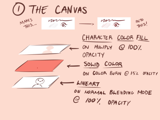
1.) Before I start doing any art, I do this to my canvas. Having a solid fill layer on color burn with low opacity gives a nice outline effect on your pen. As someone who sucks at putting lineweight at the right spots this is a life saver (or if you want to make your linework better, that works too.lol) All color bases and renderings stay above the lineart layer on multiply (I also use clipping mask a lot for rendering.)

2.) I give myself some time to research for poses on Pinterest. If I can’t find anything, I use Magic Poser on my iPad to make all of the poses.
This is a link for the web version.
Here is also the link to the brushes I always use for my drawings.
I’m going to use this old sketch of Ava with his hair short. For this example, I didn’t find a pose. I only referenced the hair style.
Generally I create the basic shapes for everything- the head, wings, body, etc (hair is kinda the exception to this). I don’t go too deep with adding line weight just yet.
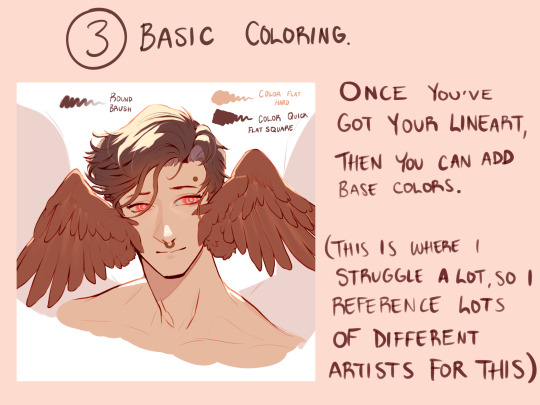
3.) I add the base colors in this step. Sometimes I’ll stop here with my drawings, but with my personal art I continue. I tend to explore a lot of color schemes, so I like seeing how other artists approach this. I can take the longest on this cuz I get so indecisive of what I want. 😅😅
Sometimes if I don’t like my colors overall, I’ll add a solid color layer on Hue at around 30-40% opacity to harmonize every color. This layer stays above all other layers.
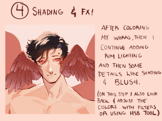
4.) Step 4 is a bit of a continuation from 3. Here I start adding more detail with the coloring, and putting those FX that I want. If I want to, like in this example, I also extend the drawing to show other elements, if I feel like the composition is a bit empty.
After this, I take a step back from my iPad and come back to my drawing the next day. Sometimes doing that helps me find obvious mistakes that I wouldn’t have noticed immediately.
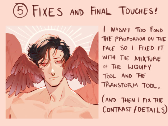
5.) Sure enough, I saw the the mistakes on his face, so I fixed them. I prefer using the liquify over the transform tool when I need to retouch some things; it prevents the linework or coloring from looking “choppy” or torn apart with its resolution.
Once I got the final touches done, I send it off !
Don’t know if this is actually considered a tutorial but maybe seeing this process step by step can help a bit. 👏 good luck, and have fun with what you create!
73 notes
·
View notes