#of course art strikes people in different ways and contains complexity. i think the themes op brings up are really important and shape the
Explore tagged Tumblr posts
Text
But can it not be about both things? Is it not also a movie about emotion? There is a lot going on in the movie and it operates on multiple levels. Did the romantic side of the story or the haunting final shots of the ghosts lingering (the way del Toro chose to end the film!) leave you unaffected? Were we JUST cheering for the downfall of an insular and exploitative aristocratic family? It seems disingenuous to pretend we were.
okay I was googling the runtime for Crimson Peak and for some reason it suggested an article called "why Crimson Peak is one of Guillermo del Toro's most underrated films" and—
"the moral lesson that del Toro wants us to understand from his narrative: that love can make people go mad"
THAT'S your take away from Crimson Peak????? that's what you think the moral lesson is? REALLY?!
#crimson peak#a few people in the replies seem to have said this but here we are again#of course art strikes people in different ways and contains complexity. i think the themes op brings up are really important and shape the#story (and like. the whole genre the story is drawing on)#saying it's just about love would be limiting. but saying it's just about class is limiting also. these themes are all there and intersect#*okay also i want to add that the parasitic/monstrous aristocracy in decline thing is like a staple of the gothic genre#del toro is doing fun and creative stuff with it but it's not like he made it up for this movie it's a 200 year old political take
5K notes
·
View notes
Text
Comparative Debicki studies
I threatened to do this, and recent discussions in the Tenet discord chat have inspired me to get serious about it because I love Elizabeth Debicki and I love Kat but I am particularly fascinated with how Kat stands in subtle, nuanced contrast to the last thing I saw ED in: the Night Manager. So let’s go.
This is Katharine Barton, art valuation expert and wife of arms dealing billionaire and all-around baddie Andrei Sator (Ken Branagh):

This is Jed Marshall, trophy girlfriend of arms dealing billionaire and all-around baddie Richard Roper (Hugh Laurie):

The similarities are obvious already, right? The differences are where it’s fascinating. (This is going to contain spoilers for both pieces of media, be warned!)
When we meet Kat in Tenet, she is a bitter and despairing woman. She doesn’t love her husband any more (though it’s implied that she did once) but is being held hostage through both their child and her past indiscretions. The Protagonist uses her as a lever and access point to her naughty husband; she is exploited as an asset; she gets screwed over in the process, but ultimately saves herself (with slight risk to the whole operation). Despite her being at various points aloof/bitchy, furious, in peril, and saved from danger by the Protagonist, the movie never tips over into James-Bond nonsense--she gives him a friendly peck on the cheek at one point, and that’s that. Mostly, he represents the return of hope, in the form of someone that her husband can’t control. That gives her the impetus to wake up from her despair--we see her literally sit up straight and pay attention when he walks out of the restaurant where he was supposed to be brought low--and eventually triumph.
When we meet Jed in The Night Manager, she’s probably diving naked into some body of water. This is a common theme for her. Jed knows that she has been purchased as one more accessory of Roper’s billionaire lifestyle--like a yacht, or an artwork. She is here to be expensive and desirable and unattainable to the average person. At one point she states to Tom Hiddleston (whose character has so many names I’ll just call him by actor), “I don’t care who sees me naked, I do care who sees me crying.” She also has past indiscretions, including a child, now being raised by her family far away from her. This pains her; there’s a strong indication of substance abuse. Jed is not happy, but she’s an immaculate and perfect pretense. It’s unclear if she’s ever loved Roper, but she’s certainly here of her own volition, carving out a life with her own sort of power. Then things start getting shaky, Hiddleston starts rattling the bars of her perfect cage, and she starts to get afraid. She is used as a lever and access point to the secrets of her naughty husband; she is seduced by Hiddleston, and exploited as an asset; she gets terrified, and traumatised, and ultimately saved by Hiddleston (at risk to the whole operation).
The big point of difference is obvious: Kat saves herself. And gosh that is powerful, especially contrasted with Jed, who trades one violent man’s protection for another, and who is saved partly because Hiddleston couldn’t save the last beautiful woman who came to him for help escaping Roper’s net of crime. (Then again, The Night Manager is le Carre, in all his complexity. Hiddleston needs Jed to be his salvation. He’s a goddamn mess who no longer knows himself and he needs to be her hero. In comparison, the Protagonist needs to get the job done, but he still wants to help Kat as much as he can.)
But in a way, Kat is still under the protection of menfolk--she’s first mentioned as “niece of Sir Someone-or-other Barton”, and there’s an implication that that’s partly why she hasn’t been more summarily dealt with by Sator. She’s got status and privilege and power behind her; people who can make life extremely difficult for Sator. But none of that has saved her from making terrible choices and ending up in a terrible situation. It isn’t enough to save her.
Jed’s power is self-made. She wields her body like a weapon, carefully honed and beautifully caparisoned. Every man in the room is supposed to be stupid with lust for her the moment she walks in; that’s the whole point of her, that’s why Roper picked her. But all that power also can’t save her from her terrible choices and this terrible situation. (I’m particularly fascinated by the nuance here of the “powerful” femme fatale, and a narrative of the power of a confident woman that usually shows up in lines like, “fuck those stuck-up bitches, you think you’re too good for me?” Jed’s is a fragile, ephemeral power, that evaporates in the face of male violence. Kat is physically threatened and beaten by Sator, but she’s never made quite as helpless, alone or terrified as Jed is. In a way, Kat is saved by the Protagonist, it’s just not at the end of everything.)
Both of them are women who seem to have a lot of poise and power, but are the victims of abuse and physical violence from their partners. (Sidebar here that I get very weary about intimate-partner violence being used as a marker of villainy in films. Of course he’s evil, he’s not just an arms dealer, he beats his wife. Never mind all the “such a nice guy”s who also beat their wives.) Both of them show different sorts of courage in attempting to leave the situation. Both of them show, in varying ways, how goddamn hard it is.
But in the end, the thing that strikes me most starkly and hauntingly is that Kat would probably think Jed’s a strumpet, and Jed would probably think Kat’s a bitch, and neither woman would be able to escape their solitary confinement. And I feel like I’ve seen some echoes of that in reactions to Kat, where some movie-goers don’t seem to know what to make of her if she isn’t supposed to fit into that James-Bond’s-girl sort of role.
Anyway, the bottom line is: I initially made a joke with my husband about Elizabeth Debicki getting typecast as the evil arms-dealer’s trophy spouse, but these are two fascinating characters done different in ways both big and delicately small, and I remain in absolute awe of her magnificent performances.
#my girl debicki#ladylike#you go girl#film delights#television delights#tenet#one day that tenet vs night manager debicki dissertation is coming#AND HERE IT IS!#over her diamond-fragile grace kelly come again ethereal power
24 notes
·
View notes
Video
youtube
Are you tired of Great Albums being about music people have actually heard of? Do you want me to just go ape shit, and review obscure minimal wave cassettes from the 80s? Admittedly, Oppenheimer Analysis’s New Mexico is one of the most famous weird minimal wave cassettes, and for good reason: it actually holds up quite well as an album! Come check out what all the fuss is about. Transcript below the break.
Welcome to Passionate Reply, and welcome to Great Albums! Today, I’ll be talking about a very cultish cult classic, and an album that’s one of the definitive works in the very underground scene of so-called “minimal wave”: New Mexico, the only full album released by the duo “Oppenheimer Analysis.” The band’s namesake was actually lead vocalist Andy Oppenheimer, who became acquainted with instrumentalist Martin Lloyd at the 1979 World Science Fiction Convention, where the pair bonded over speculative fiction, Midcentury graphic design and propaganda, and the work of early British electronic pioneers like the Human League. 1982’s New Mexico was these two’s first recording as a group, but Lloyd did go into it with one credit--the year prior, he and David Rome of Drinking Electricity released a double A-side, featuring the jumpy, playful instrumentals “Surface Tension'' and “Connections.” They referred to their act as “Analysis,” making it feel very much a part of the Oppenheimer Analysis story.
Music: “Surface Tension”
Oppenheimer, meanwhile, was a true outsider artist, making a living as a nuclear science writer without any substantive musical background. While not all minimal wave is “outsider music,” and not all electronic outsider music is minimal wave, there’s certainly a correlation there. Oppenheimer’s reedy, somewhat strained voice lends New Mexico the punkish charm that only utterly untrained vocalists can offer: a vessel that cracks and buckles as it fails to contain the raw emotion within.
Music: “Martyr”
The addition of a singer is one major distinction between New Mexico and Lloyd’s earlier compositions, but they’re also very different in tone. As I said earlier, the “Analysis” instrumentals are sort of light-hearted and sprightly, a bit reminiscent of the jazzy synth experiments of artists like Jean-Jacques Perrey and Gershon Kingsley. New Mexico is substantially darker and more gothic, as befitting an LP that’s at least partially a concept album about the nuclear age.
Music: “The Devil’s Dancers”
While nuclear anxiety is an indispensable theme of the album, it’s never a suffocating one that makes it feel horribly antiquated to modern ears. It’s a very aestheticized rumination on nuclear themes, that never jumps up and hollers, “bombs are bad!” Take, for example, the track “Radiance,” probably the best-known track on New Mexico...to the extent that any of them are that well-known. It’s one of the album’s most languorous, atmospheric moments, and paints a vividly desolate picture of ground zero after a detonation, with its fluttering, delicate, but ultimately frigid synth flourishes.
Music: “Radiance”
I think my favourite part of “Radiance” is actually its lyrical turn: an atomic blast isn’t like the radiance of a thousand suns, but rather, vice versa. The latter is the one that’s merely theoretical and dwells in the realm of poetic license, whereas the former is a historical fact that we all have to contend with. “Radiance” is quite solid, but in many ways it’s a pale imitation of the title track, a seven-minute sprawl that works exquisitely as a kind of musical landscape painting:
Music: “New Mexico”
Painfully evocative, with an eerie, almost yearning undercurrent, “New Mexico” is easily the track that feels the most grand and epic. I would really have loved for it to be given more of a place of honour in the tracklisting, possibly as the closing track, but it’s wedged somewhat awkwardly in the middle of the second side. I suppose we can’t expect quite as much from a gonzo underground mail-order cassette release, though. At any rate, while “Radiance” and “New Mexico” are absolutely about atom bombs, they remain very emotionally intimate--almost torturously so. A lot of the other tracks are less about the bomb itself, and more about the rise of “Big Science” in the Midcentury consciousness in the wake of the Second World War--chiefly, “Men In White Coats.”
Music: “Men In White Coats”
As in “The Devil’s Dancers,” Oppenheimer happily accepts the role of an evil or insidious narrator here, and sells us this megalomaniacal perspective with aplomb. A lot of early 80s synth, minimal wave and otherwise, is characterized by more deadpan vocalists, but I can’t stress enough how much Oppenheimer’s piercing lead vocals bring to this album. It’s perhaps the most critical on the tracks that delve into more traditionally emotional topics--chiefly, the standard romantic love numbers. Take, for instance, the harrowing, neurotic “Scorpions”:
Music: “Scorpions”
I’m certainly a fan of the title “New Mexico,” which just ties together all the right connotations. First and foremost, New Mexico is a place--a place you can visit. And this is one of those albums that really wants to ground you in a narrow and specific sense of place, a sonic landscape. New Mexico is mostly empty desert, large tracts of which have been government land even before it started being used more intensively for military research in the 20th Century...most famously, of course, on nuclear weapons. I like to think that the name also suggests novelty and recency of place. We are, after all, entering a “new” world, defined by the advances of science, and the upending of earlier ideas about the world.
The representation of the album art for New Mexico that I’ve been showing you is actually the imagery of the 2010 reissue of the album, which I’ve chosen because I think it’s a bit better known, and I simply prefer it, personally. The most striking thing about it is this colour--a ghostly green, that instantly evokes the common imagery of atomic phenomena. Radiation doesn’t really glow green, of course, but, like everything else about the album, it’s clear that this choice is meant to be a reflection upon the greater cultural imaginings and social impact of the Atomic Age, so I think it’s a perfect fit. At the center of the composition, we see a figure, head bowed and face shaded to provide some sense of anonymity, reaching a hand towards the side of his face in a gesture that’s almost reminiscent of using a cell phone at first glance. What exactly he’s up to is as unclear as his identity. Between the modernist styling of the architecture to his left, and his antiquated attire, the image is quite suggestive of a Midcentury setting. But the real narrative angle here comes from the right side--several figures are approaching that central character, possibly in hostile pursuit. Espionage gone wrong? A desperate attempt to silence a whistle-blower? Much like the music, there’s an ambiguous, mysterious, but also menacing ambiance to this cover.
For historicity’s sake, I’ll also discuss the original cover of the homemade cassettes of New Mexico. As we might expect from the nature of this release, it’s a fairly simple graphic, featuring a nude woman whose full-figured body type, popular on pin-up models, and short hairstyle convey that Midcentury aesthetic almost as well as her clothed counterpart on the reissue. Our eyes are naturally drawn to her exposed breasts, where they meet a pair of radiation warning signs censoring her nipples. A simple image, but a deeply perverse or twisted one. Is it a kind of union between the vulgar, crass profanity of pornography, and the depravity of atomic weapons? Is it a visual representation of the way Oppenheimer Analysis have beautified the nuclear landscape, conflating man’s inhumanity to man with something voluptuous or pleasurable? This cover is at least as complex a symbol for the album as the reissue one is. And while it’s easy to dismiss it as lowbrow, I think it’s worth noting how the salacious or saucy aspect of it would have helped it fit in with other underground cassettes of its era, many of which had lurid or provocative imagery.
Of course, this discussion of the differing incarnations of the album is a natural segue to addressing the release history of New Mexico. The story of Oppenheimer Analysis is deeply entwined with that of New York-based Minimal Wave Records, founded in 2005 by Veronica Vasicka, a radio DJ fascinated by underground electronic music. The label specializes in making obscure, self-published works like New Mexico widely available in digital form, so that more music enthusiasts can get a chance to hear them. Without her, I myself might never have heard this album, and certainly wouldn’t be in a position to make a review like this! Vasicka felt strongly about the artistry of Oppenheimer Analysis, and gave the honour of her label’s first-ever release, “MW001,” to a self-titled EP compiling several of the tracks from New Mexico. Later, in 2010, when she was able to rerelease New Mexico in its entirety, she gave it the honourary designation of “MW001D.”
Vasicka is the one responsible for coining the term “minimal wave” to describe the subgenre she was interested in, and, fifteen years later, I think it’s safe to say it’s had some staying power. While it may be a bit vague and subject to individual interpretation, that’s a problem all genre labels contend with, and I think fans of minimal wave ought to be proud that this term was at least coined by a passionate and dedicated fan, who made her favourite music more accessible to everyone, as a labour of love. It’s also not the only genre term to come about much, much later than the music it seeks to describe. At any rate, New Mexico will always have a place in the minimal wave hall of fame, and it’s a genre-defining work, if in hindsight. The stylistic hallmarks of New Mexico are, for better or for worse, now also those of a whole movement: harsh, tinny rhythm machines, strident synth lines, anxious, unmannered vocals, and technological themes.
But what actually happened to Andy Oppenheimer and Martin Lloyd? In light of the renewed interest in their work in the 00s, they actually got back together for a bit, releasing some archival material from the 1980s and laying down a handful of new tracks, very similar in style to those on New Mexico. Lloyd passed away suddenly in 2013, but Oppenheimer has remained interested in keeping their ideas alive. He’s been performing live as well as putting out new music, first as “Touching the Void,” alongside Mark Warner of Sudeten Creche, and more recently as “Oppenheimer Mk II,” with Mahk Rumbae of Konstruktivists.
Music: “You Won’t Disarm Me”
Something that I think really stands out about New Mexico, especially when compared to a lot of other small-time minimal wave releases, is that it’s a very consistent quality throughout. As you might expect with an underground genre, a lot of the music to choose from is varying degrees of amateurish and clunky, and it’s arguably better to listen to Minimal Wave compilations than the LPs that exist. New Mexico is an exception, though, and doesn’t have any particularly weak tracks. The favourite tracks cited by fans of the album tend to vary pretty widely. My top pick, though, is the album’s opener, “Don’t Be Seen With Me.” It’s a perfect marriage of dizzying, spiraling synth runs, and one of Oppenheimer’s most frenetic vocal performances, that creates a masterful portrayal of being swept up in infatuation with somebody you really shouldn’t be fooling with. That’s all I’ve got--thanks for listening!
Music: “Don’t Be Seen With Me”
#music#great albums#album review#album reviews#minimal wave#minimalwave#coldwave#minimal synth#oppenheimer analysis
16 notes
·
View notes
Text
Research: Draw Draw Draw Project.
Mike Parr Mark making artist
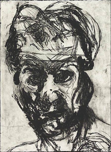
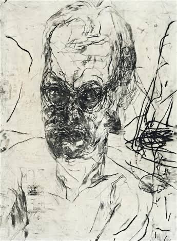
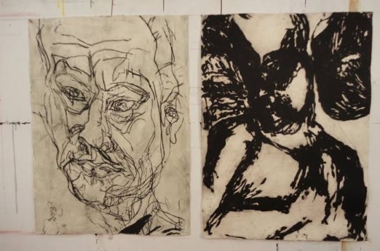
Parr's performances explore physical limits, memory and subjectivity. They often depict self mutilation or extreme physical feats.
Parr spent his childhood in rural Queensland, Australia. He was born with a deformed arm, and this physical feature is prominent within his art work.
Parr’s impression taking is a striking contrast, both emotionally and visually to his video/ installation work, composed of beautiful engravings featuring many different types of lines, using the mark making technique. Parr was fascinated with observation and the possibilities and responses of memory distortions.
Parr’s early work was designed to get a reaction from the audience, although he also focused on exploring issues of identity, memory and states of being. He particularly used his body as a performative tool, often using his prosthetic arm and testing his body’s physical limits through resistance challenges.
In the early 1980s he started a collection called “the self portrait project”, Parr’s self portrait studies first took the form of painstakingly hand drawn copies of performance photographs. Subsequent drawings acknowledge accidental blurs and smudges, with parr generating purposeful distortions through the introduction of a mirror and manipulating the grid.
Life after death collection, combines charcoal, pastel and acrylic on paper; it depicts the artist’s face over and over, in varying states of distortion, as though disappearing or disintegrating.

Paul Verdell
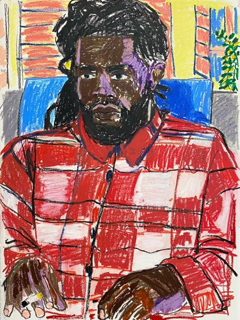
Is an American artist, who is specialized in drawing portraits of many different people that he can find as reference, by using different kinds of colors and lines with his crayons.
Verdell was born in Long Beach, California. At the age 13, his family moved to Fremont, Ohio.
Paul Verdell paints and draws a variety of people with plenty of personality. Like most artists, he has drawn since he was little, but didn’t make a real go of the medium until he was in his mid 20s. That he was decided to go back to school, enrolled in Bowling Green State university, and took a painting class when the first semester came around. Paul eventually developed his unique artistic style, by doing drawings, that him doesn’t consider that good, but he is comfortable with that style. His mark making technique is assertive, created with force and with energy. Paul’s work may seem as if it has loss control imbued within the lines, but his artworks are also vividly representative of the person or object he’s depicting; it’s delicate balance that he’s mastered without purposely pushing his style in a certain direction.
What I like most about his work, is his use of colors, with oil pastels , where he creates different tones on the skin of his characters, using the technique of mark making, which is perhaps more impressive, since it is a very different or unconventional technique for making portraits, that’s why it’s so interesting.
With time, he realized how much colour and expressiveness the textured medium adds to the canvas, and started to experimenting with more and more different types of colors.
The artist isn’t trying to make a statement with his work. In his words, “I’m just here to paint. The viewer can take whatever that want to take out of it”.
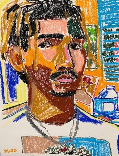
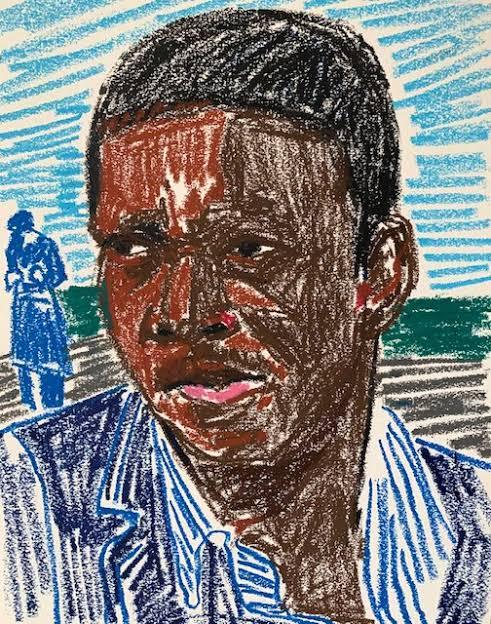
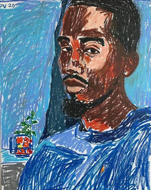
Saul Steinberg
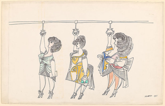
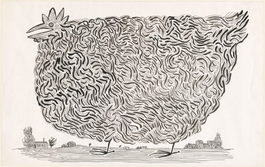
Romanian artist by birth was one of the most important artists of 20th century. A designer and cartoonist in the publishing industry from 1936 to 1999, he spent a considerable part of the 20th century publishing in prominent magazines on the world stage, specially in the New York. The famous cover for the New Yorker that showed the view of the world according to the average American.
In his drawings, Steinberg’s lines seem to reinvent themselves as they progress, creating different kinds of shapes and sizes, sometimes using one single line.
Steinberg’s greatest contribution was his demonstration that the drawn lines is equivalent to thought. Indeed, Steinberg is rarely concerned with outward physical appearance and is much more interested in what and how people perceive what they see. His interest in the human psyche isn’t academic. His playful, childlike doodle quality maintains an elegant deftness that succinctly describes a wide range of subjects. His quirky way to draw, sometimes reminiscent of Dada art, also crossed over into the fine arts world.
much of the humor and mystery in his work occurs in the way he relates humanity’s lack of understanding.
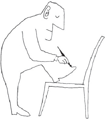
Urban Sketching
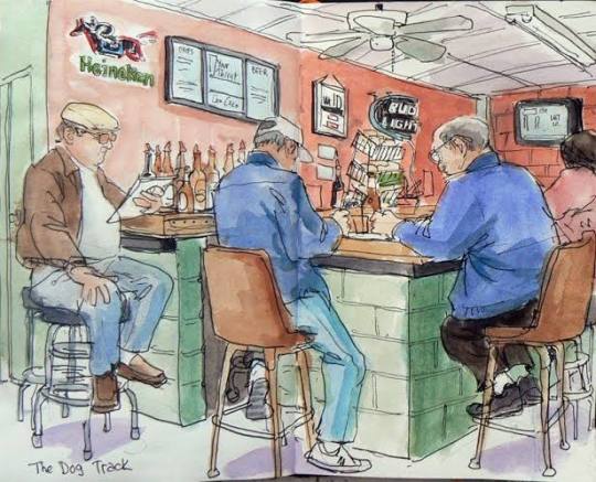
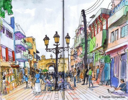
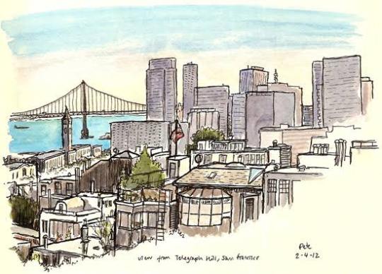
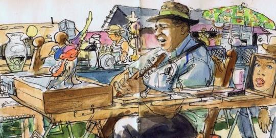
The drawings of urban spaces are gaining more and more admires, and this work certainly has a good baggage to please this audience, as it addresses a range of drawing techniques, which ranges from elementary theory to the more specific technique used by illustrators this modality.
Techniques and perspective tips combined with the composition tips presented in the work, are a combination that certainly makes all the difference when choosing and enhancing the scene that we will sketch, whether it be designing buildings, mansions, parks, people, animals, etc. the inclusion of the curved perspective is also another highlight, as it goes beyond the usual three vanishing points that the author usually address. The techniques, in this sense, are not many, but the author certainly selected those that generate the most impact. The watercolor for example, is his primarily tool, where he uses for the most of his drawings.
This book has been very useful for me for a long time, even today I use it as a reference. I always preferred to draw on my desk, with a reference photo. But I know that I need to let go, and learn to draw outside, just by watching, and trying to finish quickly.
I live in São Paulo for a while, and sometimes when I walk I always have a small sketchbook in my pocket and a watercolor kit. Sometimes I paint trees, sometimes buildings with interesting shapes and colors, from time to time some birds. Anyway, I learned a few things from this book, although I still prefer to draw in my studio, calm and do the drawing with all the time in the world, it is very important that I draw what is around me, so that I learn to train my eyes, in addition to drawing totally random things, which sometimes the internet cannot provide.
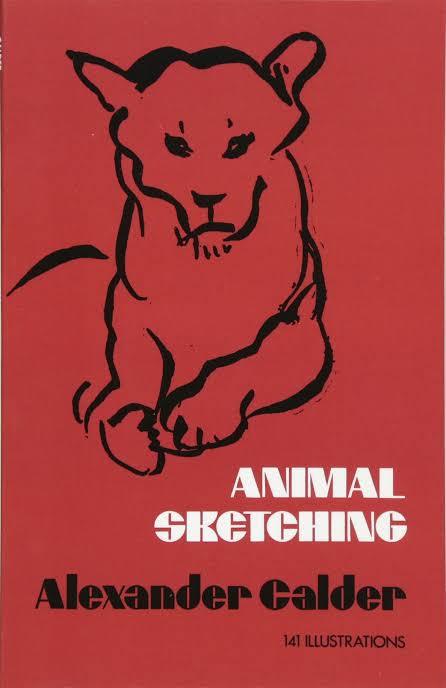
Alexander Calder Animal Sketching
Alexander Calder is a renowned sculptor and inventor of mobiles, and here he brings the simplicity of lines and spirit of movement to the art of animal sketching.
The purpose of the book is to help people like me to draw animals as we can see them.
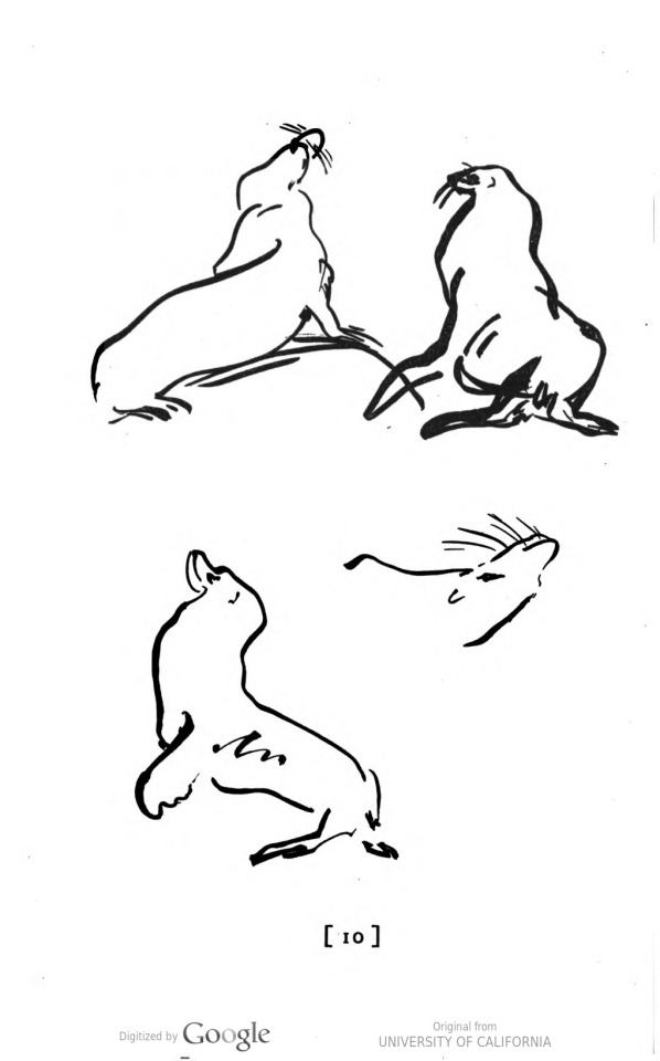
Calder captures the emotions and attitudes of animals in a few quick lines, the person can quickly obtain a lasting groundwork in animal sketching.
This book really helped me, because I drew animal few times, and I was always thinking in the proportions and finalizing the drawing, but I learned that before doing that perfect drawing, I have to understand the movement and the poses, not necessarily making a masterpiece right in the begging, but train and have some fun on doing it.
This book contain several animal sketches, like cats, dogs, deers, cows, horses. All this animals doing different poses and actions for training.
Juan Linares
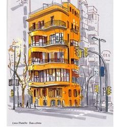
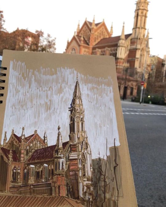
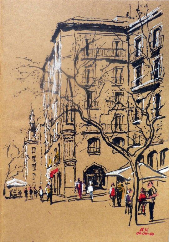
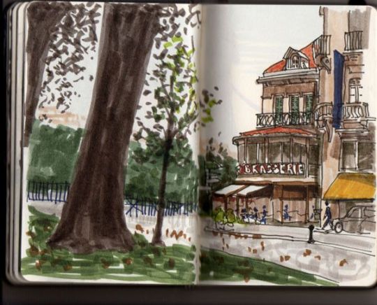
Juan Linares is a Spanish illustrator and painter, who specializes in drawing mainly different environments (Urban sketching), from streets to buildings with a different style of architecture. He mainly understands the perspective and depth of the environment. Uses various types of materials, such as acrylic markers, even alcohol-based pens. But his preferred tool, of course, is watercolor, which he always uses, when walking in the streets of his city Barcelona, where he paints narrow streets, with the small bistros, from the famous La Sagrada Familia church made by Gaudi.
Linares says, that he’s been drawing professionally since 1984. Starting his architecture studies. He drew in sketchbooks, notebooks, and in blackboards. He has a preference in drawing food and buildings.
What I like about Linares's drawings, is the way he can put light and shadows, besides the buildings being magnificently well done, very carefully and calmly (he explains that if you are drawing in some environment it is good to be calm, and patience without feeling the need to finish quickly).
He has traveled to some places in the world, including Brazil itself, where he sketched the museum of Niterói, designed by the architect Oscar Niemeyer, besides the Christ the Redeemer in Rio de Janeiro.
Juan Linares is a great artist, and I really admire the passion he puts in each of his drawings. And I wish to see more of his works, of famous architectures of the world.
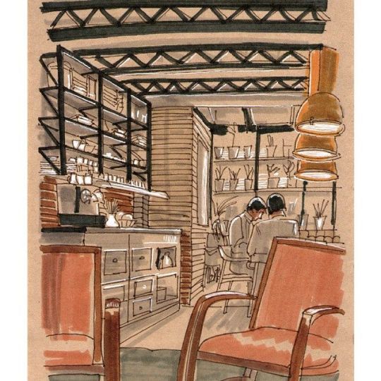
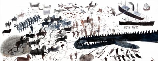
Laura Carlin
Laura Carlin was born is Glastonbury, England. She studied at Buckinghamshire university, followed by The Royal College of Art.
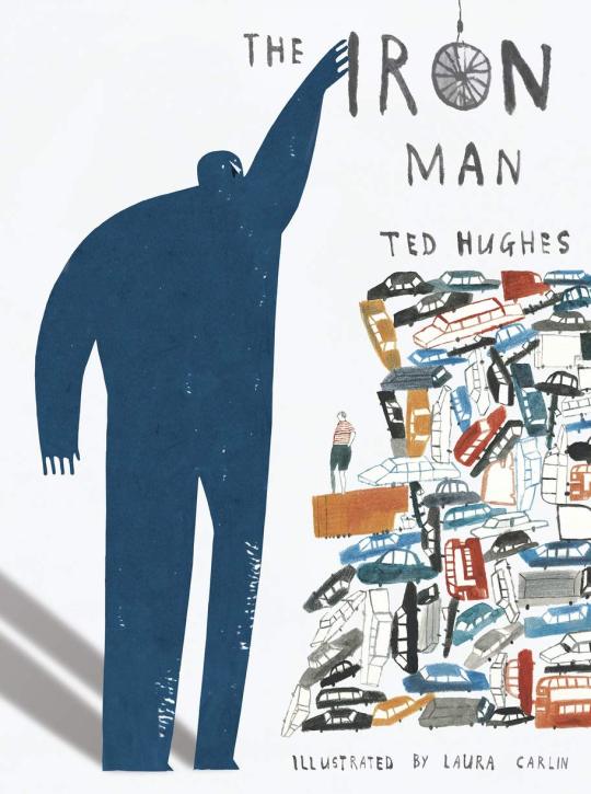
Laura has illustrated many children’s books for Walker Books Ltd, including The Iron Man by Ted Hughes which won many awards, specially praising for Laura’s illustrations.
She has also drawn for a whole host of publications including The New Yorker, The Guardian and Vogue, among many others.
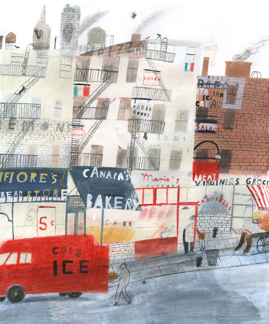
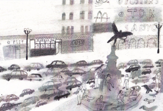
Laura’s works frequently touches on emotionally complex subjects and adult themes of loss , social injustice and environmental change.
As an illustrator Carlin has worked with several contemporary children’s authors including Nicholas Davies for her book The Promise about a young thief whose life has changed after stealing a bag of acorns and Michael Morpurgo’s book The Kites are Flying ! , a story centered on the conflict between Israel and Palestine.
One of the reasons why, I like so much her work, it’s because she has the ability to convey a plethora of emotions through the smallest details on the pages, combining with childlike drawing style and with a sentimental narrative, it’s very brave of her, to do books for children, with such difficult themes to explore.
Research: Show and Tell Project
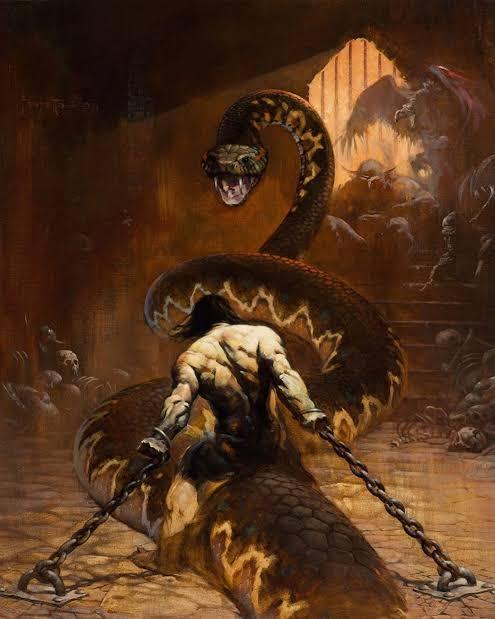
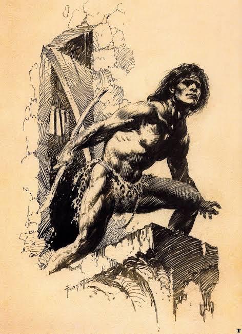
Frank Frazetta
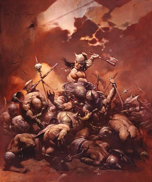
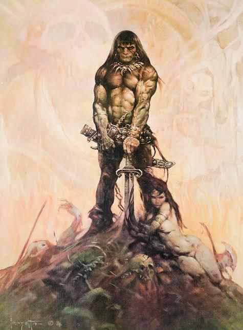
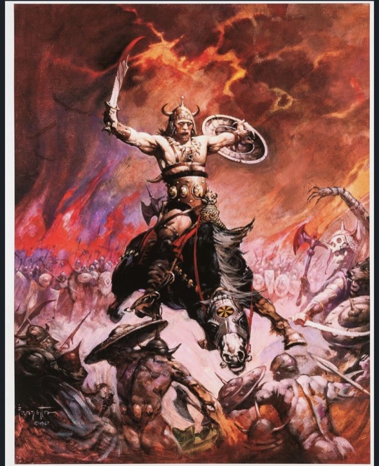
Frank Frazetta was an American illustrator and painter, who became extremely well known for having defined the look, of the character Conan the Barbaro, created by Robert. E.Howard in the 1930s.
Frank was born in Brooklyn, New York, and from an early age he showed his skills as an artist. As a child, at the age of 8, he studied at a small art school called Brooklyn Academy of Fine Arts.
His illustrations are inspired by the great painters of the late 18th and 19th centuries, who portrayed mythological legends.
For me it’s not just the wonderful color palette he used, the wild and original streak or the phenomenal technique he developed. Of course, these things are fundamental, but in my understanding, the most important thing is that he defined practically everything we know in terms of visuals, mainly in the fields of fantasy, witchcraft, barbarism and even a little bit of science fiction.
His paintings defined some characters that we know today, like Tarzan and John carter, that he brought a new life to the characters of Burroughs, not to mention the images of Conan, who made the illustrator famous. Imagine that before him, the Sword and Sorcery look did not exist. The Conan that appeared on the covers of books since the 30s of the last century gets to laugh today. Frazetta was the first to understand the world created by Robert E. Howard.
The reason I chose frazetta as a reference is because I like fantastical worlds so much, and I love to learn anatomy, and frazzetta understood a lot of that, with his extremely vibrant colors, and extremely strong characters, who faced terrible monsters, who disturbed the peace.
Claude Monet
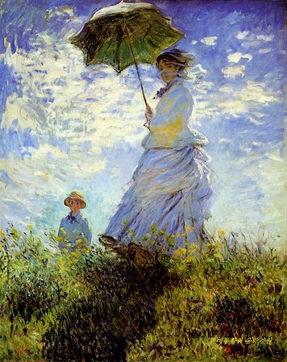
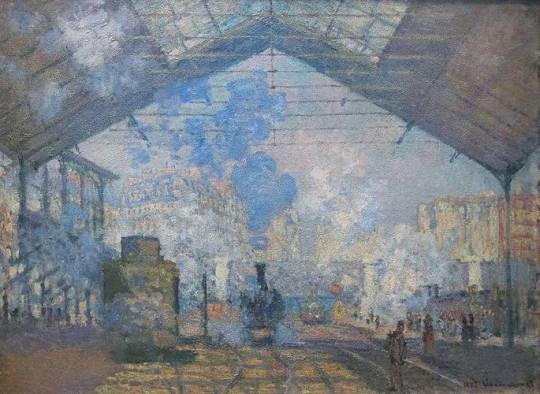
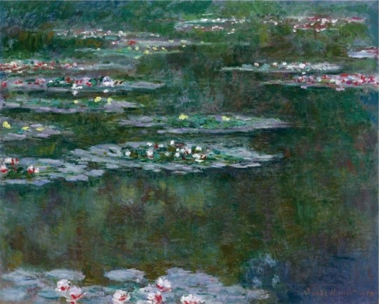
Claude Monet is the main and most dedicated representative of the impressionist movement. He always preferred paintings outdoors, regardless of weather conditions,in order to capture all the effects of nature. Early in his career he was misunderstood, especially by his family, resulting in financial difficulties for years. Only around the age of 40 did he start selling his paintings, he died as a rich and well known artist.
He started to paint from a very young age which earned him some money, selling caricatures, with the money he bought painting materials. In 1858 he met Eugene Boudin, a landscape painter who encouraged him to paint outdoors. The following year he moved to Paris to specialize his techniques. At that time Paris attracted the most varied artists in the world and there Monet met Camille Pissarro and Manet among other avant-garde artists.
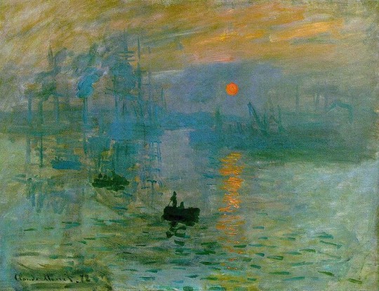
In 1874, the first impressionists exhibition was held in Paris, featuring works by Monet, Renoir, Degas and Cezanne. The term Impressionism, derives from Monet’s painting called Impression, Sunrise (1872).
It was the art critic Louis Leroy to call the artistic movement: Impressionism. It was a way of understanding this type of painting that did not follow the standards established by the academy and its realistic paintings.
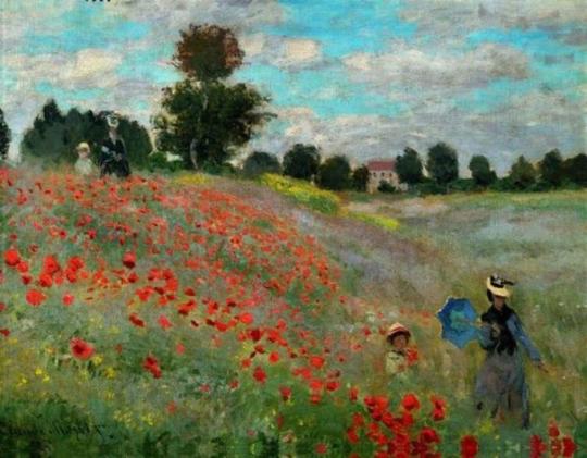
When looking closely at an impressionist work, you see only separate brushstrokes that look like blotches without contour. Seen from afar, the brushstrokes organize for our eyes creating shapes and luminosity.
His works of art followed, as a main theme, the landscape of nature.
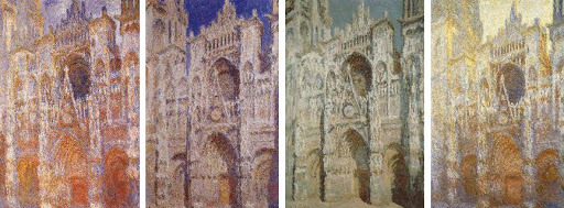
He worked harmoniously with colors and lights, creating beautiful and strong images. In the artistic context, is good to mention the series of paintings that he made on the Cathedral of Rouen (1892-1894), where the artist portrayed the constructions at different times of the day, with variations in brightness.
Monet and the impressionist artists, were no longer interested in themes related to the nobility, to the church, or to producing portraits that were true to reality. They wanted to see the painting as work in itself.
Ridley Scott
Ridley Scott is one of the most well-known film directors of all time. He made several films of different genres, but his most well-known genre is science fiction, making films like Alien, Blade Runner, The Martian and Prometheus.
But before before of being a director, Scott was applying to the Royal College of Art, one the most acclaimed art colleges at the time, to be a designer.
Scott always liked drawing , but he saw that he had no way of being a painter. His teachers always argued that his paintings were more illustrations than paintings.
So he saw that the Royal College of Art, had a particularly strong Graphic Design Department, which would give him a more specific creative target and a broader canvas. He was accepted by the college, and started his studies in 1958 and finished in 1961.
In his words, he considered design college to be extremely competitive, everyone in his class tried to compete with each other to see who was better. And Scott realized that he needed to fight hard to be among the best. “It could be very competitive, with no much being given away and everything kept close to you chest. You observed all the time, watched everyone else did and tried to do better and be the most original”.
Since graduating, Scott has said that he has become extremely perfectionist, and has tried to do as much of his work as a designer and a filmmaker in the best possible way.
After working as a set designer, and director in British television, he began in 1967 to direct commercials, eventually numbering more than 2,000 for his own company. His attention to visual stylization in his commercials, including distinctive atmospheric lighting effects, continued into the feature films that he began to directing in 1977.
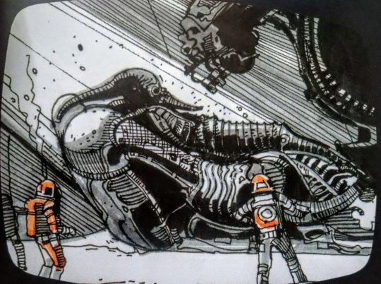
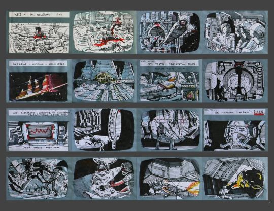
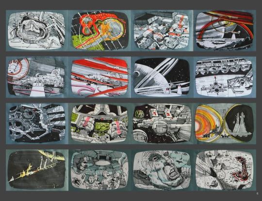
In 1979 Ridley Scott releases what is considered his debut film and his masterpiece, the movie Alien. Starring Sigourney Weaver as Ellen Ripley, Scott is credited with having a heroine take point in the ensuing hunt aboard the Nostromo spaceship. Scott’s paintings and illustrations are close to pointillism with tiny points that result in images of high definition and extreme detail.
A highly detailed approach marks his style. His eye for composition, lighting, and design seems to explain his ability to visualize a movie in his mind. He claims to have and eidetic memory and the ability to recall images with high precision.
https://www.youtube.com/watch?v=tjD82nKybUA


Roxie Vizcarra
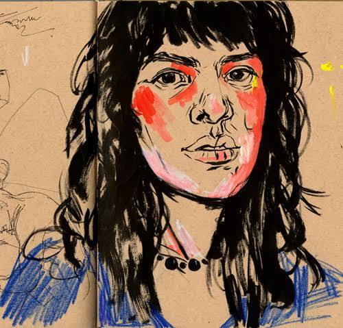
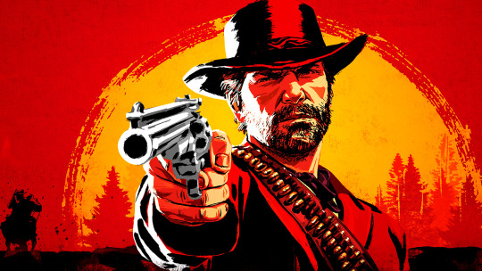
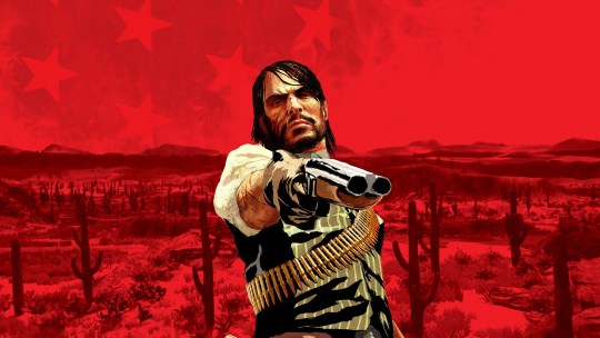
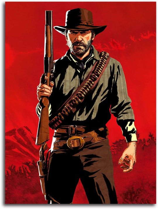
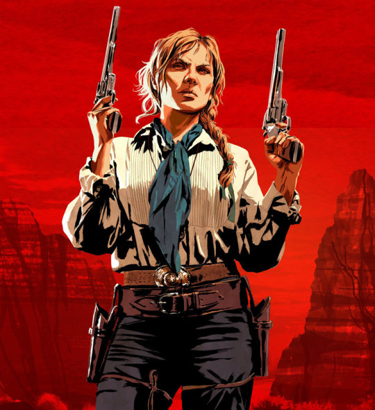
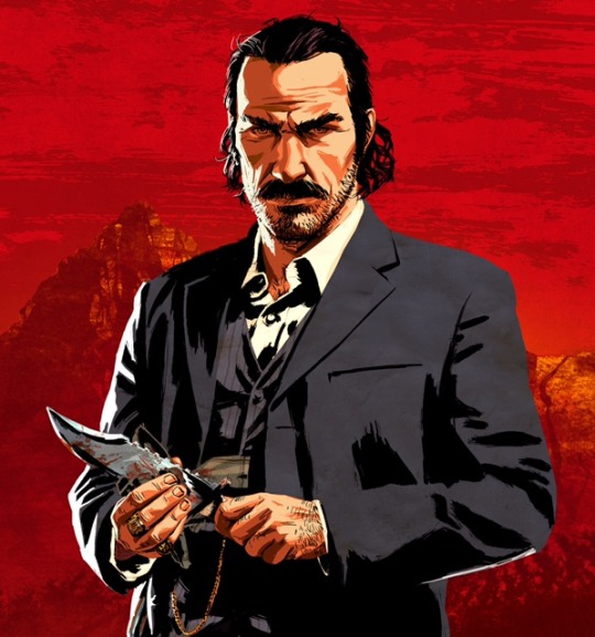
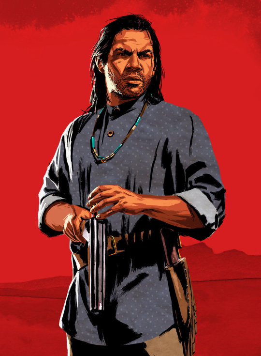
Roxie Vizcarra is an artist, who worked as the senior illustrator of Rockstar Games, who worked closely on the iconic Grand Theft Auto v and Red Dead Redemption 2 marketing campaigns.
The Peruvian-American artist was just out of college- she earned her bachelor’s degree from the Parsons School of Design in New York- when she was approached by Rockstar games in 2009.
Vizcarra was Rockstar game’s first female illustrator. The first project she worked on was Grand Theft Auto IV: Liberty City.
The first game Vizcarra worked on since its inception was the original Red Dead Redemption, released in 2010.
Vizcarra draws her art from spaghetti western movies and holds the work of “Golden age” illustrators such as Bob Peak and Robert McGinnis in high regard.
For most of her career, Vizcarra’s process began by drawing in sketchbooks (she’s a fan of traditional ink), which she then uploads and adds digital colors through Photoshop.
However, for a year or two she has been using Procreate on the IPad, which is very flexible for her purposes. She also takes references photos when she doesn’t have a clear idea of what the illustration should look like, either of others or of herself, in the desired pose.
Vizcarra shows unusual humility; she insists on not taking credit for herself and repeatedly refuses to attribute specific drawings to one person or another, or to go into the why’s and how’s of illustrations.
Vizcarra’s work is really interesting, and it explores the more of the side of markenting. In making covers and posters extremely flashy for the public, and in addition to using references to posters from old western movies, maybe that is what attracts me the most. I really like the western theme, and I always liked the way she created the poster for games like red dead redmeption 2 and GTA, with extremely warm colors, with references of very old artists, who perhaps few remember, but she always tries to put some of them into her work.
Show and Tell Digital Collage research
Terry Gilliam
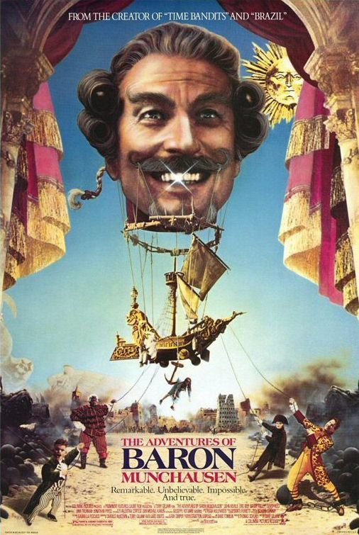
Is a famous American-British director, screenwriter, animator, artist and comedian, and who is known for directing and acting in some of the films of the English comedy group Monthy Python, in addition to making films that are extremely difficult to understand, as if madness were the main character in all his films.
Terry Gilliam began his career as an animator and photographic cartoonist; one his first jobs was for the Help ! Magazine.
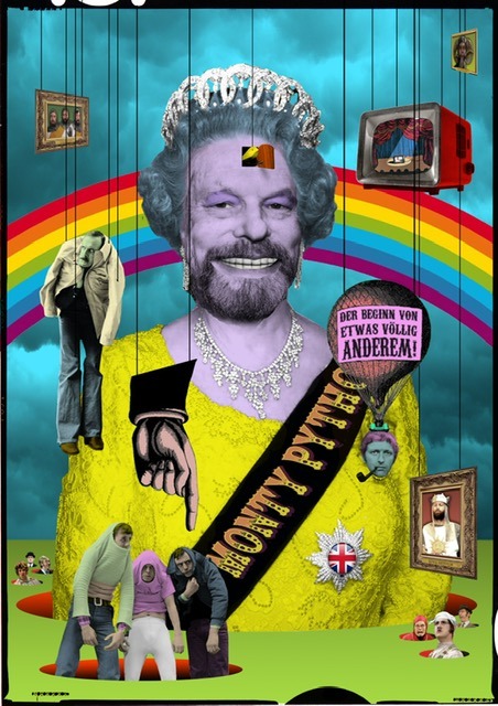
Gilliam preferred cut-out animation, which involved pushing bits of paper in front of camera instead of photographing pre-drawn cels. The process allows for more spontaneity than traditional animation along with being comparatively cheaper and easier to do. He also preferred to use old photographs and illustrations to create sketches that were surreal and hilarious.
Gilliam was one of the founders of Monty Python. At first, he was accredited as an animator ( his name appeared separate from the remaining 5 members in the credits), later he also joined the series as an actor. Their animations linked the sketches of the program and defined the group’s look in other types of media ( such as Vinyl discs, book covers and the opening sequence in the films).
Gilliam polished a unique style, created fantastic worlds, worked with great stars for the biggest studios, and sweated tight budgets to execute his vision, not always sharp but always brilliant.
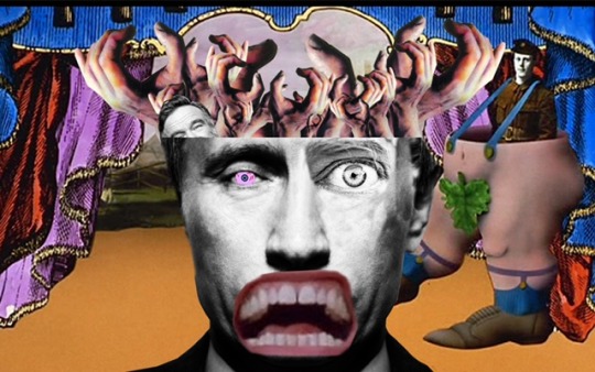
Caco Neves
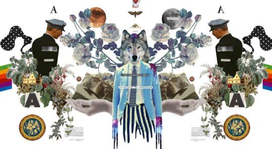
Caco Neves uses digital collage as a platform, he created, for the past 10 years, illustrations for zines, magazines, advertising pieces, vignettes for TV and the web and, more recently, he was summoned by the Vogue art team to create the cover for the Vogue Experience 2017.
After spending a season in London, where he learned to give movement to his creations with the techniques calls Motion Collage, Caco returned to Brazil and, in a moment of creative rest, when he was creating for himself and not for a client, worked on a psychedelic vignette, then he sent it to MTV, to see if they liked the style, and they asked to use this commercial but to make some adjustments.
For Caco, the success of digital collage in the last decade is a reflection of the time we live in. “ The internet brought access to images- digital collections became public- and photoshop became popular.”
He has worked for several national and international companies, and his work is very dear to his collaborators, very much for his creativity, and for the choice of technique.
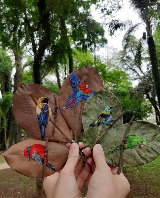
0 notes
Photo

Syne - Midas
A new release with a focus on combining clever arrangements with baroque melodies and lush vocal harmonies.
Syne is an artist based in Houston, Texas. He has a passion for combining instinct with innovation. His music is extremely kaleidoscopic and diverse, channeling a broad range of influences and ideas.
Recently, he set out to release a new ambitious single, “Midas.” The song blurs the lines between a wide range of styles and ideas - from pop to electronica and progressive music, anything goes.
Syne is a purveyor of hypnotic synth textures, as well as crisp electronic beats with a punchy edge. His work on “Midas” showcases a diverse creative approach, as well as the artist’s ability to approach pop music with somewhat of a progressive edge.
One of the most striking features of “Midas” is definitely the fact that the song has many twists and turns. This isn’t your average electro-pop jam. On the other hand, it explores various sonic depths, going for a broad range of sounds.
The drum machine beats are reminiscent of some of those classic 808 tones, with a classic analog warmth that adds character to this release. The synth melodies have a warm retro charm, giving the song a distinctive color.
Last, but definitely not least, the vocals truly shine under the spotlight. Syne is a master at creating complex, yet very direct vocal melodies. His lines are adorned with beautiful harmonies, which add a lot of depth and richness to the textures of the song. At its core, this release embodies the warmth of vintage aesthetics, but it also has a cool modern sound, so it brings the best of both worlds together in a massive way.
In terms of production and recording, the song is also quite outstanding. This release has a big, larger-than-life vibe, which really blurs the lines between indie aesthetics and massive pop anthems. As a result, the song appeals to a truly broad range of listeners, pleasing indie/alternative music fans as well as suckers for a good chart-topping hit!
For those who might not know, “Midas” is named after the legendary king of Phyrgia. He was so obsessed with becoming as wealthy as possible, that he was endowed by the god Dionysus with the power of turning everything he touched into gold. Initially, “Midas” was extremely pleased. However, it did not take long for the king to realize that turning everything to gold was not necessarily just a blessing, but also a curse. This track uses this reference as a powerful metaphor in order to explore other deep topics in life.
So many times, we fail to see the real value of the things that are within reach, and we always seek to achieve wealth, fame or status in any other ways, without realizing that most of the best things we’ll ever have are what we already have. Our relationships, our values, our spirit. Not being able to crawl into the mind of the artist, this is my personal interpretation from listening to the song, which is actually very evocative, and if you want to get the full listening experience, you should definitely check out the track’s beautiful music video as well. The video adds deeper layers to the mix, giving the audience a much more immersive experience.
In addition to the song’s unique style and feel, Syne matched the beauty of this track with an equally impressive music video. The film is essentially an animated feature, with bright and dynamic visuals that perfectly complement the aesthetics of the music as well. The video actually works well with the song, because “Midas” has a strong cinematic feel, which is highlighted by the beautiful animation. Syne’s music style reminds of the work of influential composers such as Hans Zimmer or Danny Elfman, particularly in the way the artist utilizes deep textures and a stunning variety of sounds.
Ultimately, I’d definitely recommend this release to any fan of music that’s accessible.
Fans of artists such as Gotye, Alt J, Radiohead, James Blake, Son Lux, and Glass Animals are definitely going to enjoy this particular single, so don’t let it fall under your radar.
Find out more about Syne, and check out “Midas” via the following link
www.syneverse.com
We also had the chance to interview Syne: keep reading for more!
I love how you manage to render your tracks so personal and organic. Does the melody come first, or do you focus on the beat the most?
Answer:
Thank you. My process for composing varies, but I’m pretty melody-driven, and my main instrument is the piano, so much of the time I start by playing around on the piano and improvising melodies until I have something that I like. Then I build on that, adding other elements like percussion, strings, synths. Other times though, I may be experimenting with different virtual instruments and create a beat or find a sound that I really like and try to build a melody around that, or sometimes I’ll have some lyrics that I’ve written and try to build the song around that.
Do you perform live? If so, do you feel more comfortable on a stage or within the walls of the recording studio?
Answer:
I’ve been performing on stage since I was 9, though in a different context. My career in the arts actually began in children’s entertainment and performance, and I’ve performed with acts like Barney and The Wiggles in arenas and venues like Radio City Hall and in different parts of the world like Canada, Mexico, the US, and Australia. I’ve also performed as a musician and singer for many different kinds of acts and in different genres, playing piano, djembe, Latin percussion, or guitar with different bands, doing solo performances and singing my own compositions or other music ranging from Frank Sinatra in English to Mexican mariachi music and José José ballads in Spanish, and other kinds of gigs.
However, throughout the years, I’ve realized that my true passion is creating, and even though I’ve had plenty of experience performing, I’d say that I’m most comfortable producing music in my own recording space. I haven’t performed as Syne yet, and right now I’m focusing on creating rather than performing, but it may be something I do down the line.
If you could only pick one song to make a “first impression” on a new listener, which song would you pick and why?
Answer:
That’s a tough one. I really like how “Midas" turned out, and I’m also really excited to share a few of my upcoming ones like “Plato’s Cave”, “Fall of Icarus”, and “Forget the Borderlines”, but I think that the first song, “Siddhartha”, is one of my favorite ones, and I think the message of learning how to deal with change is one that everyone can relate to and one that has resonated with many people. Also, I think the aesthetics of the music and the visuals represent the concept of Syne well, so I’d probably go with “Siddhartha”. You can check out the music video for “Siddhartha” here: https://youtu.be/Uu46SO0F1Ts
What does it take to be “innovative” in music?
Answer:
I believe there’s no such thing as an idea that’s 100% new. We can’t create something that’s purely original, but what we can do is create new and unique ways of combining elements. So at first, you have to do a lot of copying. I don’t mean plagiarizing other people’s work, but using the work of other great artists as inspiration, and practice copying or imitating different styles and techniques. The wider and more diverse your sources are, the better. Eventually, you start to understand how different elements make up a whole of something, and you get better and better at breaking them down and mixing them up in different ways. This is how you create your own style.
And this is why I think it’s vital to listen to as many different genres and artists as possible and to study different styles. I was lucky enough to have parents who exposed me to all kinds of music, and so my taste in music is very diverse.
But it shouldn’t stop with music; I think you should expose yourself to as many things as you can and try to expand your interests. Read about history, mythology, astrophysics, or philosophy, take courses or watch tutorials on animation, photography, graphic design, or illustration.
Learn about a new instrument, like the bouzouki or the balalaika. Read about different cultures and new technologies. Be curious, read and listen a lot, be open to learning new things. All of this exposes you to different perspectives and tools that you can use as elements to dissect and put together in unique ways.
The word “kaleidoscope” has been used a few times now to refer to my music, and I like that word because I think it’s a good way to describe how creativity and innovation happen.
Mark Twain said it best: “There is no such thing as a new idea. It is impossible. We simply take a lot of old ideas and put them into a sort of mental kaleidoscope…”
Any upcoming release or tour your way?
Answer:
I am currently working on my next two music video releases, “Forget The Borderlines” and “Plato’s Cave". “Forget The Borderlines” is a departure from the animated music videos I’ve been making and uses real-world footage. The theme is about coming together as one human race and putting our differences aside, and I wanted the visuals to be a very direct representation of current social and political issues and events that people have been experiencing around the world. “Plato’s Cave, like my previous two music videos, “is an animated video, but this one is much more complex and is taking a lot more time and work. This song was actually was where the concept of Syne began, and this will also be the first time I feature my main “Syne” characters onscreen, so I’m particularly excited about this one.
I’ve also been working on an illustrated poetry book for a while now, hoping to release it at some point in the near future. It’s called Mr. Pendlum’s Compendium of Illustrated Verse from the Multiverse, and it contains poems that I wrote and also illustrated. The book is essentially a compilation of my many interests, and the topics range from astrophysics to psychology, ancient history to artificial intelligence, and much more.
I have a second book on the way as well, this one with quirky illustrations paired with silly micro poems and more profound quotes.
Aside from that, I’m working on several other songs that I’ll use as mini-releases, some with vocals and some purely instrumental, which I also hope to create videos for down the line. It’s a very busy time, but I love creating, so I enjoy every bit of it, even the times when it gets frustrating.
Anywhere online where curious fans can listen to your music and find out more about you?
Answer:
Yes, of course, you can find my music, videos, art, poetry, and blog at syneverse.com
If you have Insta, Facebook, Soundcloud, or Twitter, I like keeping in touch! You can find me @syneverse on all platforms.
0 notes
Text
Assessment feedback! :)
This is feedback for your tunnel book! The progress shots on your blog are really interesting too to see the process of making the work.
How has the student addressed the relationship between the binding and book content?
The tunnel book makes a great tool for exploring particular scenes with a lot of depth. The content to me seems to explore relationships and religious imagery. You have used the layers well to create depth in the image and express the different relationships between the people on each layer. The fairy lights compliment the tunnel book as you can highlight the different layers making the book glow.
Which aspect of the book/s (binding, content, narrative, form, etc.) has the student addressed most successfully and why do you think this?
The tunnel book is effective because you have created a scene sort of like a still from a stage play. There's quite a lot of different elements from both images that are considered "high art" (the figures from the paintings) and materials that would usually be classified as kitsch (the glittery paper) however I am a big fan of how you have combined these different elements to create a diverse and striking book! (glitter is the best!) The diverse range of cutout images is successful here because it's not something you usually see and I like how they compliment each other.
The atmosphere created with the fairy lights is a great idea in making the book come to life.
Where would you like to see the work going to next?
I would love to see a really funky cover keeping in the theme of your collaged elements. I especially like the glitter frame you've used in the first layer and you could utilize this in the cover too. The choice of collaged elements in this book shows you have a unique vision which I would like to see more of.
It would also be interesting to see you add more reflective materials and possibly make a series of tunnel books on the same subject matter.
Altered book
How has the student addressed the relationship between the binding and book content?
You have used interventions such as secret containers, blacked-out text and eyes and your own text to allude to themes of concealment and censorship, though I'm curious to learn how this relates to the equestrian theme of the book itself. Are you able to expand upon this, or maybe add a few more clues into the book itself?
Which aspect of the book/s (binding, content, narrative, form, etc.) has the student addressed most successfully and why do you think this?
Your tunnel book makes use of the voyeuristic allusions of the window frame format, and the layering to suggest decadence and hedonism. This notion of 'more is more' is amplified through the addition of tactile elements such as the chains and the glitter, and of course the text, Excess.
Where would you like to see the work going to next?
You have already mentioned the thicker paper for greater structural integrity. This is certainly worth following up further and will enable you to add not only more forms, but also a greater variety of found materials and objects. It would be great to see your books become even more 'excessive'. More glitter. More shiny stuff. More nudity. More lavish dresses and architecture. Just more!
Concertina (Tunnel Book)
How has the student addressed the relationship between the binding and book content? Through using the Tunnel book binding method to display a collage of imagery representing themes of Homoeroticism Catholicism, and Concealment. Also using strategies of symbolism and association - glitter & camp culture, epic statures & the church . etc
Which aspect of the book/s (binding, content, narrative, form, etc.) has the student addressed most successfully and why do you think this? Combining the two traditionally opposing themes of Homoeroticism & religion as content. You have successfully done this by using iconic aesthetic symbolism. Additionally referencing concealment by using layering.
Where would you like to see the work going to next? i’d love to see more layers on this work! i think the white inner edges still have potential to be adorned (i love the disco ball). Also the use of fairy lights could be even more heightened !
How has the student addressed the relationship between the binding and book content?
The use of multiple techniques for the altered book creates an interesting work. The red of the sewing relates directly to the cover of the book, however the connection between the content of the book and the themes addressed is not obvious to me.
I think choosing the tunnel book technique was a very good idea. It allows for the utilisation of the depth, and separates the quite crowded layers, making the image more easy to read. It also suggests the idea of a room, emphasising the disco/night club aspect of the artwork.
Which aspect of the book/s (binding, content, narrative, form, etc.) has the student addressed most successfully and why do you think this?
The use of classical imagery combined with the contemporary colours and themes makes for an interesting artwork. I particularly like the way the collage pieces are taken from different artworks, but fit together stylistically and create cohesion in the artwork. This stops the book from becoming too confusing when combined with the vibrant and glitter papers.
Where would you like to see the work going to next?
I would love to see more alterations in the book. Particularly ones that create more obvious connections between the book and themes, as well as between the themes themselves. It would be interesting to see a more clear overlapping of the homoeroticism and catholicism themes.
The paper of the tunnel book is a bit warped, which is possibly from the glue or the weight of the chains. This can be easily fixed with heavier paper, or pressing the paper after gluing.
I think it would be very interesting to continue using the lights, and explore ways to further emphasise them, such as creating shadows and maybe adding mirrors or a tiny disco ball, to play with the reflections of light, and draw further attention to the disco aspect of the artwork. I would also love to see you continuing to use images from classical paintings in a contemporary setting.
Sketchbook
Hi Sam, I enjoyed the colour of buckram you chose for your sketchbook cover; especially the positioning of the red at the top and how it affects in drawing the eye to a kind of invisible headline on each page.
I've also made a square sketchbook (I think yours is square?) and it's been interesting to see how the shape has affected my note-taking, kind of making centered compositions happen more organically than they would in a rectangle.
I found your altered book intriguing. I think that through the variety of techniques and the mood of the interventions you've made, you've imbued the book and it's unassuming cover with a more complex and possibly darker narrative really well. I like how where you've inserted the small bible, the few strips of paper seem to curve with the space, giving it a visceral feeling as though they were tiny guts.
Your tunnel book's colours are a delight to look at, and the theatricality is off the chain! I think you have a good sense of narrative making and I think your choice of using words for only the last page is an interesting way of presenting information, the text to me reads both as a background(backdrop) and as a possible title. I also admire your experimentation with lights, it's interesting to see how varied even printed colours can look in stronger/weaker lighting. I think you mentioned on your blog wanting the colours of the borders of each page to be more easily visible, I agree with you, perhaps a wider border could do more in helping the cut out figures in visualizing the depth of the book. But it seems you have a good idea about where you could improve with the materials and all so I'm sure you'll figure it out.
Thanks for sharing your work, hope that was somewhat helpful!
How has the student addressed the relationship between the binding and book content?
The notion of concealing an object within a book and especially a religious text holds a very strong metaphor. This was very successful in developing the context for the work and by adding something within builds on the idea of the interior.
Which aspect of the book/s (binding, content, narrative, form, etc.) has the student addressed most successfully and why do you think this?
I find the secret component very compelling and it clearly narrates a story about having to hide something. This is successful because books are full of secrets and hidden information. That is a very prevalent theme and creates an interesting discussion.
Where would you like to see the work going to next?
I think to focus on this concept of hiding something within a book and by exploring this theme further, the work will continue to grow.
How has the student addressed the relationship between the binding and book content?
Altered Book: The theme of overlapping appears to be recurring in your altered book. This is evident in the stitch work text that overlaps the text underneath. As well as the harsh black lines that cover the images and text. This suggests that the text with in the book may not be relevant in comparison to what the artists's message.
Concertina: (tunnel book) The placement of the buildings in the back drop create a theatrical setting for the figures. And create an atmosphere that the audience is viewing a performance. Especially because of the glitter boarder the creates a strong vocal point.
Which aspect of the book/s (binding, content, narrative, form, etc.) has the student addressed most successfully and why do you think this?
The use of the chain is extremely effective in the tunnel book because it contributes to the sense of movement that appears within the frame of the work.
Where would you like to see the work going to next?
I personally really love the hand stitched work and would like to see that developed further. Could you possibly incorporate that in a tunnel book? for example, using stitched over the figures or backdrop?
Great work Sam keep it up. :) :)
0 notes
Text
November 1-15 2018 Astrology Forecast: Jupiter Enters Sagittarius
November 1-15 2018 Astrology Forecast: Jupiter Enters Sagittarius,
November 1-15 2018 Astrology Forecast: Jupiter Enters Sagittarius
By AstroShaman
Jupiter entering Sagittarius is only one of several impactful events involving slower planets in the first half of November. We also have Uranus retrograding into Aries and an extraordinary Mirror Image Double Yod incorporating seven planets! All that, along with a Scorpio New Moon and several more powerful aspect patterns, gives us a lot of astrological juju to work with!
Some resource links occur more than once. This is because many people link to a specific day’s forecast from social media, and might not see an important resource link elsewhere on this page.
Current Retrogrades
Venus thru 11/16
Neptune thru 11/24
Chiron thru 12/8
Uranus thru 1/6/19
11/1 (Thu)
November kicks off with an unusual scenario: three aspects involving only slower planets. What makes the situation even more extraordinary? All three aspects are part of a single aspect pattern!
The aspect pattern is a Mystic Rectangle which peaks tomorrow. Much of what these individual aspects mean is incorporated into that aspect pattern’s interpretation. However, there are some brief additional meanings I’ll note here.
A Jupiter-Chiron trine (28°31′ Scorpio-Pisces) smoothly supports the amplification of healing and mentoring, as well as wisdom gained from a foreign culture.
With a Chiron-Pallas opposition (28°31′ Pisces-Virgo), giving or receiving mentoring in feminine assertiveness and strategy is dynamically energized.
All the important meanings of a Jupiter-Pallas sextile (28°31′ Scorpio-Virgo) are covered within the Mystic Rectangle interpretation.
11/2 (Fri)
Mystic Rectangle Peaks: Juno-Pallas-Jupiter-Chiron
You can gain the wisdom to take committed partnership to the next level, thanks to a Juno-Pallas-Jupiter-Chiron Mystic Rectangle.
Committed partnership is represented by Juno. A sextile from Chiron supports a smooth, powerful flow of wise counsel. Jupiter, giver of joy and life-enhancing wisdom, opposes Juno. And Pallas trines Juno, encouraging you to assertively and strategically seek the wisdom you need.
This Mystic Rectangle also supports you in a partnership that offers wisdom or healing to others. This aspect pattern started on 10/15, peaks today (11/2) and ends on 11/17. Its extraordinary tightness as it peaks – all the individual aspects are within 1/4 of a degree! – gives it extra power.
A Jupiter-Juno opposition (28°41′ Scorpio-Taurus) is part of today’s Mystic Rectangle. Its important meanings are included in that aspect pattern’s interpretation.
11/3 (Sat)
Double Peak Yod, First Peak: Venus-Juno-Chiron
Healing in committed partnerships is powerfully supported – for over a month! – by a Venus-Juno-Chiron Yod. This “Finger of God” aspect pattern started on 10/25 and has its first peak today (11/3). It will peak again on 11/23 and end on 11/28. The unusually long duration and double peak are due to retrograde Venus stationing direct during the Yod.
For most people, this Yod will be most useful in the context of romantic partnership. But healing within creative partnerships is also strongly supported. This Yod also gives energy to mentoring, especially in the arts.
This Yod is an integral part of the Mirror Image Double Yod that peask on 11/6. But since this Venus-Juno-Chiron Yod lasts two weeks longer than that more complex aspect pattern, it felt important to give it its own interpretation.
Both of today’s planetary pairs are part of that Mirror Image Double Yod that peaks on 11/6. The meanings of both aspects – a Venus-Chiron quincunx (28°27′ Libra-Pisces) and a Chiron-Juno sextile (28°27′ Pisces-Taurus) – are incorporated in that aspect pattern’s interpretation.
11/4 (Sun)
A Uranus-Pallas quincunx (0°3′ Taurus-Libra) is part of the Mirror Image Double Yod peaking on 11/6. Most of its meaning is covered in that aspect pattern’s interpretation. As an individual aspect, it also supports insights and breakthroughs to support your feminine assertiveness and strategic skills – if you’re willing to make the necessary adjustments.
11/6 (Tue)
Uranus Enters Aries
An outer planet changing signs is always astrological headline news. Uranus, the bringer of revolution and paradigm shift, spends about seven years in each sign. He transitioned from Aries to Taurus on 5/15, and today (11/6) begins a four-month farewell visit to Aries. Following that, he’ll reenter Taurus on 3/6/19. Uranus will then stay in the Sign of the Bull for over seven years.
Taurus is conservative and reveres tradition. Aries is bold and fiery, and wants something new! In the U.S., Uranus in Aries was marked by liberal breakthroughs spearheaded by President Obama in areas such as healthcare and gay marriage.
Under President Trump, we’ve seen a radical resurgence of conservative values, including a newly conservative Supreme Court that could reverse liberal advances dating back to the 60s. Under Trump’s titanic influence, darker Taurean qualities such as self-centeredness (“America first”), fear of the outsider (immigration restriction) and exploitation of the environment without regard to future consequences are gaining sway. Uranus works fast!
For those in the “resist” camp, Uranus’ four-month return to Aries represents a brief window of opportunity that can dynamically rekindle their revolutionary efforts. Once Uranus returns to Taurus on 3/6/19, given current trends, the forces of conservatism are likely to be further energized.
This is not to say that Uranus’s sojourn through Taurus will only work against those with a more open-minded mindset. In my 5/15 interpretation of Uranus entering Taurus, I describe many ways to make life-affirming use of Taurean Uranus. These include grounding your unique self into everyday manifestation, following your intuitive flashes in everyday life, and redefining your relationship with money and possessions. You can also revolutionize your sensuality and awaken to the living earth.
If you resonate more with these ideas then the values espoused by Trump, know that simply living them yourself makes a difference. We’re all energetically connected, and whatever one person does radiates to all others. When darkness seems to be rising, it becomes ever more important for each person who is dedicated to love to nurture the light.
As I’ve said before, I think we’re moving into a new Golden Age on earth. (In Law of One terminology, we’re transitioning into fourth density consciousness.) The darkness always makes an all-out last stand during such epochal transitions.
But such a shift of the ages is on an invariable timetable, and can’t be stopped. The darkness has had its day, and will return again in the distant future as the great cycles run their course. But here, now, it’s time for the return of the light.
SOLAR FIRE 9, first produced in 1992, is the world’s leading astrology software for Windows. Earlier versions brought an unprecedented level of ease to casting and working with astrological charts. The current version adds many more calculations, extra convenience features, more interpretive text, and exciting new graphic displays. SOLAR FIRE 9 contains something for everyone!
For advanced astrologers and professionals, it has a great variety of high-precision astrological calculations and an exceptional degree of user-customization.
For novices, its innovative point-and-click chart interpretations provide an enjoyable way to learn. Many easily explored options will encourage you to experiment with new techniques.
Mirror Image Double Yod Begins
One of 2018’s most unusual (and visually striking) aspect patterns begins today: a Mirror Image Double Yod containing seven planets. The only personal planet is Venus. There are three asteroid goddesses – Ceres, Juno and Pallas – and three slower planets – Jupiter, Chiron and Uranus. It starts today (10/29), peaks on 11/6 and ends on 11/14.
Such a heavily populated aspect pattern has many possible interpretations, but relationship is front and center.
As it turns out, the Venus-Juno-Chiron Double-Peak Yod that had its first peak on 11/3, which is part of this Double Yod, strongly colors the interpretation of this larger aspect pattern. Healing in committed partnerships, be they romantic or creative, is also a central theme. But with Ceres now conjunct Venus, there’s a new invitation: to observe how your relationships affect your self-esteem and finances.
The other Yod in this pattern contains Pallas, Jupiter and Uranus. This contributes a whole new set of themes, including assertiveness, strategy and passion. It adds sizzling electricity and the possibility of sudden breakthroughs!
Putting it all together, the healing of committed partnerships can become energized and inspired. If everyone involved gives it their best effort, this could happen with surprising speed. (I recommend the 4-Part Nonviolent Communication Process for the interpersonal work, and my free Healing Invocation for the shadow work each partner will need to do within themselves.)
Spiritual awakening and divine inspiration can flow more easily under a Sun-Neptune trine (13°47′ Scorpio-Pisces). Shadow work releases can be easier, and occult practices can proceed with greater ease.
11/7 (Wed)
Scorpio New Moon
November’s New Moon aligns at 11:02 AM EST (15°11′ Scorpio). This provides fresh energy for activities such as transformation and shadow work. The other themes I mentioned in my 10/23 interpretation of the Sun entering Scorpio also receive enhanced juju: merging your resources and energy with others personally or professionally, sacred sexuality and occult practices, and taxes, insurance and inheritances. This is also a great time to increase wealth and power.
Aspects
This New Moon’s strongest aspect is a tight trine from Neptune. This opens a smooth flow of divine energy and inspiration to your New Moon goals. Because Neptune rules imagination and visualization, it also enhances any Law of Attraction work you do related to your New Moon aspirations. Neptune’s presence also amps up the themes of spiritual transformation and sacred sexuality.
This New Moon’s other soft aspects are sextiles from Capricornian Pluto and Vesta. Pluto and Scorpio mean the same thing, so this gives extra power to all the Scorpionic meanings I’ve already listed.
Vesta’s sextile smoothly energizes selfless service. Given her tight conjunction to Pluto and all the Scorpio energy in the air, her secondary meaning of sex magic can also be activated. This uses the power of sexual arousal and orgasm to supercharge your Law of Attraction visualizations.
The New Moon also receives two minor hard aspects. A 135° sesquare from Chiron amps up the shadow work theme, and can energize your own skills as a healer or mentor. A semi-square from Pallas can energize your feminine assertiveness and strategic skills.
Sabian Symbol
This New Moon’s Sabian Symbol is, “A girl’s face breaking into a smile.” Did she got news of a surprise inheritance while practicing sex magic?
Just kidding. To me, the girl represents the feminine receptive principle. Many a smile has crossed my face after saying an invocation and passively receiving ecstatic divine energy.
This being a girl and not a woman also suggests innocence. Jesus said that you must be like a child to enter heaven. The more I’m able to rest in the blissful innocence and emptiness of “beginner’s mind,” the more I have to smile about. Try it yourself!
*****
Share Our Messages with Love and Gratitude
LOVE US @ MeWe mewe.com/join/lovehaswon
Visit Our NEW Sister Site: LoveHasWon Angel Numbers
https://lovehaswonangelnumbers.org/
Commentary from The First Contact Ground Crew 5dSpiritual Healing Team:
Feel Blocked, Drained, Fatigued, Restless, Nausea, Achy, Ready to Give Up? We Can Help! We are preparing everyone for a Full Planetary Ascension, and provide you with the tools and techniques to assist you Home Into The Light. The First Contact Ground Crew Team, Will Help to Get You Ready For Ascension which is Underway. New Spiritual Sessions have now been created for an Entire Family, including the Crystal Children; Group Family Healing & Therapy. We have just began these and they are incredible. Highly recommend for any families struggling together in these times of intense changes. Email: [email protected] for more information or to schedule an emergency spiritual session. We can Assist You into Awakening into 5d Reality, where your experience is one of Constant Joy, Wholeness of Being, Whole Health, Balanced, Happy and Abundant. Lets DO THIS! Schedule Your Session Below by following the Link! Visit: https://www.lovehaswon.org/awaken-to-5d/
Introducing our New LoveHasWon Twin Flame Spiritual Intuitive Ascension Session. Visit the link below:
https://lovehaswon.org/lovehaswon-twin-flame-spiritual-intuitive-ascension-session/
Request an Astonishing Personal Ascension Assessment Report or Astrology Reading, visit the link below for more information:
https://lovehaswon.org/lovehaswon-ascension-assessment-report
https://lovehaswon.org/lovehaswon-astrology/
To read our Testimonials you can follow this link: https://www.lovehaswon.org/testimonials
Connect with MotherGod~Mother of All Creation on Skype @ mothergoddess8
We are a Donation based service for the Planetary Ascension. Thank you for showing your support and keeping our website and Love Energies moving forward! Thanks for supporting your family of light in their time of need to fulfill mission. We are Eternally Grateful!
Donate to Love: https://www.lovehaswon.org/donate-to-love/
Thank You for Supporting our LoveHasWon Wish List. Visit Here: http://a.co/cYUBjRu
Here is our Fund Raising information for The Crystal Schools: https://www.gofundme.com/lovehaswon
Request a copy of our Book: The Tree of Life ~ Light of The Immortals Book
Order a copy of Our LoveHasWon Ascension Guide: https://lovehaswon.org/lovehaswon-ascension-guide/
MeWe ~ Youtube ~ Facebook ~ Apple News ~ Linkedin ~ Twitter ~ Tumblr ~ GAB ~ Minds ~ Google+ ~ Medium ~ StumbleUpon ~ Reddit~ Informed Planet ~ Steemit ~ SocialClub ~ BlogLovin ~ Flipboard ~ Pinterest ~ Instagram ~ Snapchat
,
0 notes
Text
As a new freelance artist and illustrator, it is very hard to resist getting sucked into worrying about “artistic style”.
There’s no denying that creators with a distinctive and cohesive “look” to their pieces have a certain edge in selling their work – viewers who are attracted to one of their pieces will likely enjoy all of them. The repetition of showing visually cohesive work tells a story and creates a brand. People will recognize an artist with a distinctive style by their work, even without seeing a signature. Customers will feel like they are purchasing a true insight into the artist when they buy a piece that is part of a larger visual narrative.
But what is artistic style, and can it be cultivated?
Until recently, I believed I didn’t have a really cohesive visual signature. Although I paint realistic, botanical and scientific subjects and have favourite media, I didn’t feel like my work had any specific attributes that consistently set it apart. Botanical and scientific illustration is still a very broad field. My composition, the colours and lighting in my work, the media I chose to use, the level of detail and choice of focus, the scale I paint at, even my choice of subjects seemed to vary quite a bit from piece to piece.
Some have commented on my consistent choice of botanical/natural science subjects, but that is a field, not a specific style. There are artists within my field who truly stand out with natural science illustrations that are recognizably theirs. Jess Shepherd springs to mind – her moody, sharply shadowed, larger than life paintings are recognizable regardless of her chosen subject, and her fascination with leaves in her Leafscape project reinforced her consistent look with a consistency of subject. By contrast, Lizzie Harper, another botanical watercolour painter, makes paintings with a completely different, but equally distinctive look. Lizzie’s paintings are very sharply stylized, with saturated, bright clear colours applied in precise layers.
It hasn’t been until the past few months that I’ve started to see some really unique patterns emerging in my body of work. When I hang my paintings up in shows now, there are very visible repetitions in my choice of colours, of subjects. The most striking example was a few months ago, with much of my work hanging in three other shows (humblebrag alert), when I handed my studio mate five pieces I still had at the studio. She hung up the display shown below, and I was struck with the many different ways the pieces echoed motifs found in one another, from colours, to patterns, to textures.

Emerging Style: A cohesive collection of my artwork. Black and White, Sage Green and Teal, complex textures and mathematical patterns in botanical illustration
Now, of course, my full body of work also contains some pieces that would not fit as cohesively with the ones above, they just happened to be hanging elsewhere at the time. Some of my art pieces were (and are still) hanging at Rawlicious KW – I selected a collection of brightly fruit and vegetable portraits to display at this funky, raw vegan restaurant.
The art at Rawlicious is also very cohesive with itself, but in a different way – featuring bright, extremely saturated colours, particularly vibrant greens, rose and orange colours and quirky, repeating compositions. I like to focus in on little details like the tangled masses of roots on certain vegetables or the scars and markings on heirloom carrots.
Bright Fruits + Veggies Collage
Wall display at Rawlicious KW
I sincerely believe that true, individual style is something that emerges organically, through regularly drawing a range of subjects, varying media and style and exploring things that interest you. until your own signature starts emerging. In my opinion, forcing yourself to make art that looks a very specific way (ie very closely based on your favourite artist) can be counterproductive. Instead on honing in on what makes your art yours, you’ll end up with a watered down version of someone else’s look.
In the months since these pieces were made, I have continued to make art, mostly botanical and scientific, but also sometimes urban sketching, life drawing or other artistic stretching.
Bumpy Gourd
Decayed Wild Rabbit Skull Study
Gothic Lantern Wall Sconce
I have noticed that most of my recent art seems to complement and refine the themes I identified in the two collections above. My pieces tend to focus heavily on interesting textures and pattern – I love painting lichen, roots, dried curled up leaves, lumps and bumps, and things with interesting repeating mathematical patterns such as spirals or symmetry. I like using contrast to explore textures (which made inktober a lot of fun). I also often love incorporating bright colours (which made inktober quite dreary after a while).
Airboss Rubber Factory
Perhaps unusually in a botanical illustrator, particularly one who loves colour, I don’t often find myself drawn to paint floral subjects. I prefer to find the beauty in overlooked natural subjects such as twigs, lichen and weirdly shaped vegetables. The same sort of pattern has started to emerge in my choice of non-natural science subjects. For example, my favourite urban sketch subjects tend to be old factories or complicated market stalls, rather than grand landmark buildings.
I’ve made a conscious decision to not try to force myself to choose between these preferences or limit myself to them. I’m not sure how my love of vivid colours will balance out with my love of dull-coloured textural subjects and monochromatic approaches over time.
I am continuing to paint whatever subjects interest me, fit within current projects or I am commissioned to paint.
Orange and Spice – Watercolour on Paper
I am excited when I notice some of my recent illustration bridging the gaps between different interests and patterns in my art. My holiday card design of orange and spices is full of bright, saturated colour, but also incorporates the cool 5 point rotational symmetry of star anise.
Dutch Iris – Watercolour on Paper by Lee Angold
I also really enjoyed painting both the bright blooms of the iris to the right, as well as the papery dry petals with their beautiful textural quality. I was amused when my studio mate, looking at my reference photo, taken months ago, commented “Of course, you had to pick the deadest most twisted up one”. It was a funny reminder that I think of my subjects, even (especially?) floral ones, in my own unique way.
I am excited to see how my visual style continues to develop and solidify! Perhaps this time next year I’ll have a new and more developed perspective on my own visual goals!
What is artistic style? Do I have one? Should I care? As a new freelance artist and illustrator, it is very hard to resist getting sucked into worrying about "artistic style".
#artistic style#botanical illustration#branding#bright colours#citrus#colour#floral#geometry#lee angold#lichen#math art#pinecones#rainbow#roots#scientific illustration#signature#spectrum#texture#vegetables#visual style#vivid color#watercolor#watercolour
0 notes