#note to illustrators: don't try to print these colors
Explore tagged Tumblr posts
Text
I'm selling little Snape goods with my art to support my daily life!✨
My fellow Snape fans! Long time no see, I hope you've been doing alright. I'm back once more, after what might be my longer absence on here so far.
I owe you an apologize, and even if I won't develop very deep on my personal situation, I wanted to give you some kind of explanations. I've been leaving far from home in Japan for more than 2 years now; last year, I started to work as a 2D animator for the anime industry in Tokyo, and got through a very difficult experience. Working culture in Japan is far from the one why might have in Europe or in the rest of the world, and the anime industry makes no exception; insane working schedules, very bad working conditions, no consideration of personal life and low salary are basically considered as the norm here. Sometimes I was shamed for only working +50 weekly hours and not commiting to work for free on weekends.
As I couldn't stand the toxic environement anymore, I finally moved to the Japanese countryside where I managed to find a little animation studio that works on my favorite series of all times: Pokémon. My collegues now are all very nice peoples, I feel accepted and respected despite the very rought working conditions; But above alI can now realise my dream and work and be implied on my childhood favorite anime.
However, I get close to no money from my long 6 working days week. I hardly pay the rent, and I rely on my savings for paying bills and food. I'm happy and I'm not in immediate danger: I have been saving money in preparation for this kind of cases for years before moving to Japan; However, I want to continue to pursue my dream and know that in the long run, I cannot afford to leave a life that doesn't allow me to move more freely and meet my family even if it's only one time in two years.
That's why I'm now trying and hope to develop a little side hustle to help cover the daily life expenses while developing my skills for creation and illustration. I have little to no visibility on social medias and it's difficult, but I want to trust time and would be extremely grateful in even a few of you could consider checking my work if interested. Of course I don't exclusively draw Snape, but I'm putting all of my heart in my recent illustrations including Pokémon fanart, food illustrations and sketches on the daily life in Japan. My main tumblr is https://lucie-foselle.tumblr.com/ , I also have a IG page called "tenma_draws_pokemon".
However, I have a little treat for you Snape fans: I recently come up with the idea of making postcard and stickers with some of my Snape fanarts. I'm pretty happy with the result and would like to propose you to get them if you want to either get a little Snapey decoration, want to share your love to another Snape fan, or support me and my work!

Everything is printed, signed and stamped on demand! Note that the colors and result might therefore look slightly different than the pictures. My stamp will also appear in the 2 darker background cards, as featured in the visuals bellow.
Everything is made by me, I print in a small local shop and look for the best quality as possible for the illustrations! I can ship worldwide from Japan, and it would be made with love, care and an immense gratitude.


✨ Poscards (4 patterns available now, can be seen on this Tumblr) ✨
Price: 3$/3€/3£ /pc, worldwide shipping included! ✨ I can make little discount if several items are bought.
Size: 10x14.7 (~3.9x5.7 inches)


The little pumpkin is part of a collection I have on my main illustration Tumblr, you can check at https://lucie-foselle.tumblr.com/)
✨ Stickers (Snape crest pattern) ✨
Price: 3$/3€/3£ /pc, worlwide shipping included! ✨
Size: ~5x6cm (~2.5 inches), might add holographic effect. ✨
You can contact me via DM here or on my IG, and payement is made via Paypal. I plan to launch my kofi page soon and might consider selling other goods and take commisions in the future if I feel like it could interest some of you! 💚 I can either draw and animate, still have to sort it all for 2025! 🤗
Note that I would do my best but I'm just starting to print and ship my art, there might be a little delay in the shipment and the goods might take up to 3 weaks to reach you. Plenty of non Snape pattern are also available so if you are interested do not hesitate to check or ask, my DM are open! 🤗
Even a little like, comment or share gives a lot of support. 💚 A huge thank you to all of you who would have read until now, and would show a little bit of support! ✨ Have a good rest of your week-end, fellow Snapers. 🐍

#harry potter#severus snape#fanart#pro snape#severus snape art#harry potter fanart#my merch#snape#severus rogue#professor snape#art#drawing
25 notes
·
View notes
Text
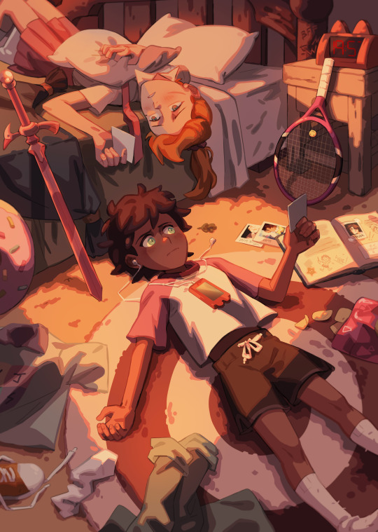
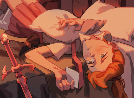
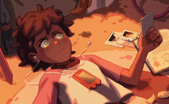
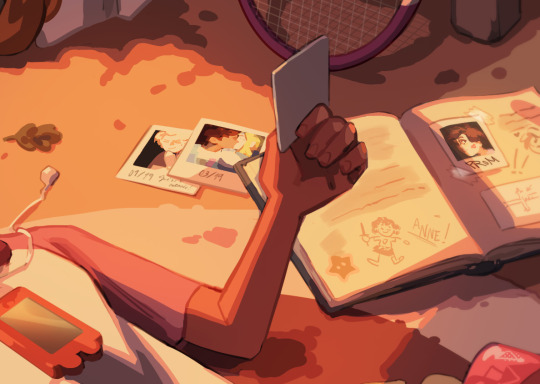
"Only when you broke, only then I realized it was me".
This illustration is based on a Spanish song I love dearly, Bajo el Volcán by Love of Lesbian. Give it a listen! Lyrics are sashanne through and through!
youtube
#note to illustrators: don't try to print these colors#it will drive you insane#amphibia#sashanne#sasha waybright#anne boonchuy#Youtube#my art
472 notes
·
View notes
Text
It's been a few weeks since I had new books to share, but I finally got photos taken of the newest ones so today's the day. Here, have a book:
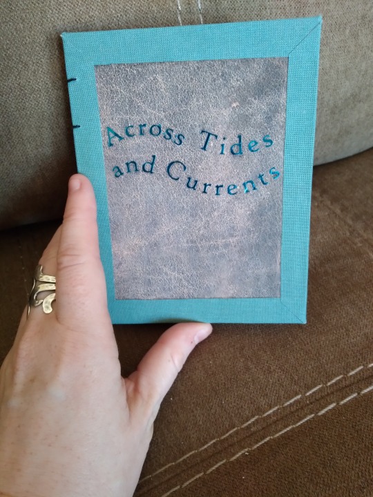
This is Across Tides and Currents, a Good Omens siren AU by Sodium_Azide and @doorwaytoparadise (hi. I hope I tagged you right). My favorite thing about this AU is that, at its heart, it's about learning to communicate with someone who is so different from you that you can't even physically speak each other's language, and yet you've still got so much common ground that you find a way. It's way lighter and more fun than that description makes it sound, though, so go read it if that's your thing.
The cover on this is Lineco book cloth, scrapbook paper printed to look like leather, and blue foil htv. The foil was actually a nightmare to do. The first time I applied it, it wouldn't stick no matter what I did, and the bits that did stick peeled off as soon as I touched them. I had to peel them up very carefully, cut a new image, and try again. Thankfully it worked the second time but I don't know that I'll be using the foil type again unless there's no other way to get the color I want. The non-foil metallic was so much easier to work with.
More book photos under the cut!
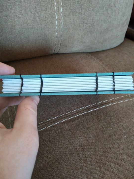
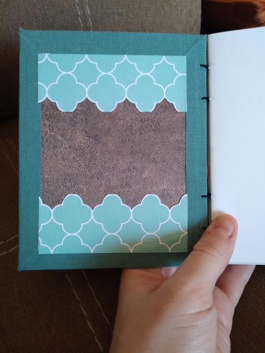
I went with a coptic bind for this one for a few reasons. The first was that I wanted to try one on a quarto-size book to see if I could. I also wanted to try the mitered corners thing I did when I bound Strange Moons, and see if I could have the same effect on the interior. (That bit didn't work out so well; the front is fine but I mismeasured the inside and the lines didn't match up, so I trimmed some pieces of cardstock to cover that up. I really like the layered look though, so that's fine. It's quirky.) The third reason is that not long before I decided to bind this one, the authors published a new chapter after two years of no updates. That's the best possible reason to have to change plans, and the glueless bind means that if they ever do that again I can just redo the stitching to add more pages. Win-win.
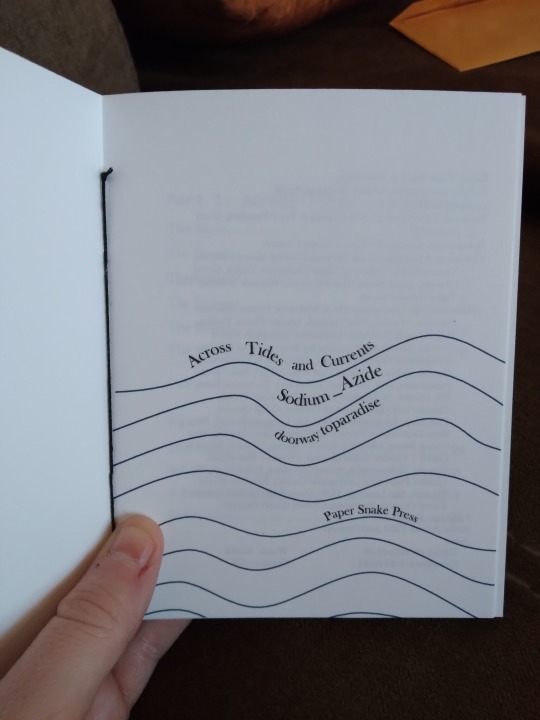
Getting whimsical with title pages here. This took way longer than I thought it would, probably because I don't like graphic design and I did it in Word where I do the rest of my typesetting. Usually what I do is grab an image and put text around it or on top of it and then just play with fonts and sizes, but this time I drew the lines and then made the text follow them. This is the first time I've used the word art feature since...probably 2009? I'd forgotten how. I have no doubt there are better ways to do this but if I'd had to learn a new program at that point I'd have quit. And I do think it was worth it--it's cute and fun and looks about how I imagined it.


Couple of photos of the inside. Sorry the first one's blurry, I had someone trying to get my attention when I took these. The section break image came from rawpixel, I just made it gray instead of black so it's more subtle. The fic has very nice illustrations that I specifically got the artist's permission to print and then I failed to get any photos of them when I did my little photo shoot. They look very nice, though. I swear.
The last image is something I've started including in my latest books. I'm calling them "A Note from the Bookbinder" and it's basically just me talking about why I chose that story, the experience of reading it for the first time, stuff that's going on in the fandom, stuff about the process like the new chapter coming out as I was preparing to print. It's kind of...like marginalia? Part of fanbinding is preservation and that's linked to archival work, and something I know archivists love is marginalia and diaries. I don't like writing in my books and I've never found any fun in journaling, but sometimes that kind of context is important so I'm trying to add it. Someday, decades from now, I may not remember all the details, so I'm trying to preserve them. IDK, this got philosophical on me. Go read about mermaids now. Promise it's a good time.
#bookbinding#fanbinding#snek makes books#good omens#fic rec#i wanted to do this as a mermay project#that did not happen#i finished it in october#happy mertober
47 notes
·
View notes
Text
The downfall of Namie (nambarimasu)
From the perspective of a longtime fan! Note: I know this isn't my usual content but i am waiting for my laundry to dry and it's gonna be a while.
Now I've been supporting Namie since I was in middle school, begging my sister to buy me her last print of Unova is My Home set and her Pokebonvoyage mini art book. She's had an enormous impact on many communities including Touhou, pkmn, fgo. tkrb, arknights, etc, etc but her decline in art is really sad to see.
In defense of Namie, she's needed to streamline her art in order to meet harsh deadlines and I can see how that can contribute to her style changing, but in combination with really bad anatomy mistakes as of late I can't see how it is the main contributor to the change in quality. Before I get into her art, however, I need to discuss the disaster that was her Pixiv Drawfest stream and then her Pixiv interview where she shares some of her ideology when it comes to criticism. During Pixiv's Drawfest 3, she drew this Kokomi illustration, which itself is fine, it was drawn 2 years ago in a hybrid of her older and current style. What was disappointing was her haphazard explanation in comparison to the other drawfest participants including Mika Pikazo being taught how to animate. The purpose of drawfest is to provide artists of every level insight into how professional artist's workflow. What I remember from Namie's drawfest is her "ahs" and "uhms" and onomatopoeia in combination with "I dunno"s and a lack of direction into explaining her process. It was quite disappointing to try to actually learn anything from her process and such a lack of professionalism in comparison to the other participants. One could argue that it's just her personality, but it's a disservice to not take an opportunity like that seriously.

Onto her Drawtube interview, "My personal rule doing work illustrations is giving 110% into the work so I can be proud of it. And if I'm proud of my work, then whatever people say about my illustrations I don't really mind." This was said in the interview posted 5 months ago, yet this FGO anniversary art posted yesterday feels contradictory. There are many anatomy mistakes, one being the blond lady's clavicle being drawn so flatly.

In comparison here's another FGO art piece Namie drew in 2017. All subjects are distinct, the expressions are entertaining, there's so many details that are fun to spot and it feels so lively.

Here's another FGO blonde lady from 2017 where Namie has shown that she did practice anatomy

Let's take a look at a more recent art piece from January. The piece has been put through many filters to the point where the color balance is completely off. Her hand holding the cake is placed so weirdly with a very long thumb.

Let's compare that to another simpler piece from 2017

Going back to her drawtube quote, if the FGO anniversary piece is her 110% now then what percentage was her old 2017 art? Here's another recent piece that looks very odd.

Here's how the underbody anatomy looks like mapped out

Here's my correction to make it make more sense

TLDR: I'm disappointed at Namie's art degrading, she had such a unique understanding of colors and bounciness to her art and I miss it.
#also to anyone who will say my art is ass#this is my bullshit doodle account okay i do serious art too but i decompress here#If you read this far thank u#again im really sad and I don't think i would buy an art book from her with this current style
2 notes
·
View notes
Text
8/28/23 - Notes on the Gallery Space
QUOTE: "Systems are a kind of P.R. which, among other things, push the rather odious idea of progress. Progress can be defined as what happens when you eliminate the opposition."
COMMENT:
These two sentences in the reading interested me because they seem almost contradicting at a glance. The author states "systems" (the opposition, the limitations we are confined to in a space) ignite the spark of creativity, allowing us to progress and create new ways of displaying artwork. Yet, the author also states progress is what happens when the opposition is eliminated. To me, the author is saying that innovation occurs when we try to solve a problem, in this case the problem is exhibiting art work in a way that doesn't feel claustrophobic (salon style) or one where the works shown feel out of reach from each other (modern day white cube style). This limitation forces artists to think about how they want their work to be seen by the public eye before even laying down a stroke on their canvas. The display style should also reinforce the concept through all means possible to create a sense artifice between the work shown and the space it exists in.
It's quite the mission, to make something that is technically interesting, conceptually structural, and ingeniously presented. I believe here is where the opposition aforementioned needs to be transformed into a support character. This is where artists collaborate with curators and galleries to create exhibitions that feel genuine, not just a collection of images on a wall with circular colored stickers next to each work. Perhaps a curator could even select a work or series from an artist's portfolio to focus on, designing an environment that would best communicate what the artist is trying to say. I've personally always thought about this, specifically when it comes to digital art.
3. QUESTION: As digital art seems to be a medium on the rise for both commercial (illustration, graphic design) and more artistically expressive types of works, do you think digital artists should make an effort to publicly display (excluding social media) work made with this medium? Or are they better off leaving their work to only exist in cyberspace?
Digital art gets the short end of the stick in my experience. If there isn't some sort of highly advanced, giant, system of displaying the work (think about visuals at music festivals, installations that cost hundreds of thousands of dollars worth of electronics to produce) then the art just feels like a passing ad on a television screen. Being that digital art mostly exists online, or in printed form, this is definitely something I want to figure out because of the love I have for the medium itself. I just really don't like any examples I've seen (so far) of it being presented for the public eye (aside from social media, blogs, and websites).
Maurizio Gomez.
3 notes
·
View notes
Text
Personalized If At First SVG - You Don't Succeed Try Doing What SVG - Lori Told You To Do SVG PNG, Cricut File
Personalized If At First SVG, You Don't Succeed Try Doing What SVG, Lori Told You To Do SVG PNG EPS DXF PDF, Cricut File, Instant Download File, Cricut File Silhouette Art, Logo Design, Designs For Shirts. ♥ Welcome to SVG OCEAN DESIGNS Store! ♥ ► PLEASE NOTE: ��� Since this item is digital, no physical product will be sent to you. – Your files will be ready to download immediately after your purchase. Once payment has been completed, SVG Ocean Designs will send you an email letting you know your File is ready for Download. You may also check your Order/Purchase History on SVG Ocean Designs website and it should be available for download there as well. – Please make sure you have the right software required and knowledge to use this graphic before making your purchase. – Due to monitor differences and your printer settings, the actual colors of your printed product may vary slightly. – Due to the digital nature of this listing, there are “no refunds or exchanges”. – If you have a specific Design you would like made, just message me! I will be more than glad to create a Custom Oder for you. ► YOU RECEIVE: This listing includes a zip file with the following formats: – SVG File (check your software to confirm it is compatible with your machine): Includes wording in both white and black (SVG only). Other files are black wording. – PNG File: PNG High Resolution 300 dpi Clipart (transparent background – resize smaller and slightly larger without loss of quality). – DXF: high resolution, perfect for print and many more. – EPS: high resolution, perfect for print, Design and many more. ► USAGE: – Can be used with Cricut Design Space, Silhouette Cameo, Silhouette Studio, Adobe Illustrator, ...and any other software or machines that work with SVG/PNG files. Please make sDisney Father's Dayure your machine and software are compatible before purchasing. – You can edit, resize and change colors in any vector or cutting software like Inkscape, Adobe illustrator, Cricut design space, etc. SVG cut files are perfect for all your DIY projects or handmade businDisney Father's Dayess Product. You can use them for T-shirts, scrapbooks, wall vinyls, stickers, invitations cards, web and more!!! Perfect for T-shirts, iron-ons, mugs, printables, card making, scrapbooking, etc. ►TERMS OF USE: – NO refunds on digital products. Please contact me if you experience any problems with the purchase. – Watermark and wood background won’t be shown in the downloaded files. – Please DO NOT resell, distribute, share, copy, or reproduce my designs. – Customer service and satisfaction is our top priority. If you have any questions before placing orders, please contact with us via email "[email protected]". – New products and latest trends =>> Click Here . Thank you so much for visiting our store! SVG OCEAN DESIGNS Read the full article
0 notes
Text

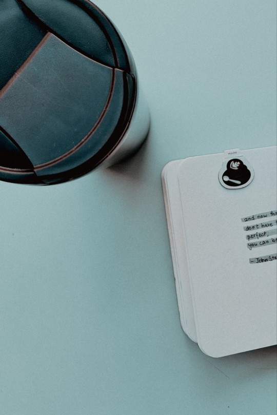
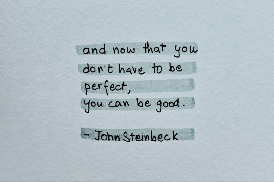
Hi :)
How are you today?
Not perfect? That's ok! Me neither. :)
I read a quote a while ago on Pinterest and wrote it in my notebook to share with you today.
Might still print the actual image to put it in my room.
2 random but important topics to talk about:
1. A friend of mine never liked coffee, and drank some cold coffee to give me company in cafes, but that would be with a lot of sugar and chocolate chips and whatnot. He couldn't bear 2 sips of black coffee or cold brew.
He recently shifted somewhere for work and today he messaged me saying that he just drank one liter of black coffee and then had an energy drink to stay awake and energetic in the office because his head was hurting, because he couldn't sleep, and this was like before 10ish am in the morning. And for breakfast, he had a banana. He is feeling better. But. I don't feel good about it... I mean. When he told me he started drinking coffee, about 10 days back and drank a few cups and cans of black coffee now and then I was like ok yay we can kind of talk about coffee now. But then. Hmm. I am sharing my worry right now. I remember when another friend started taking 4 times the coffee she usually put in little water, to stay awake in the night and work, and it just got really bad because anxiety swept in soon enough. And I see my heartbeat getting faster and breathing getting tougher if I put more coffee powder or shots than usual in my drink... I don't want this to be his solution. It's easy. But it's addictive. Caffeine. And it can go down. Some people I know just chain coffee and smoke and it doesn't seem very healthy. It's really attractive, to be honest, I feel myself slipping into it sometimes too, but, must hold back.
Hm.
Interesting to look at coffee as a concern. Sucks actually.
2. On another topic. I met a new person. :) And she was so so sweet and beautiful and she's a freelance illustrator, artist, chuck the tags. But she has such good energy and I loved her doodles. She was kind and observant and patient and caring and acknowledging and a good listener and not loud. It was good. And she smiled. And other people there smiled and laughed too. It was beautiful. :) I went out after a long time. I am using the word 'was' because I met them yesterday. Anyway! My topic was: she was telling me how she has so many stickers but she doesn't use them because - then they'll finish and I think also where to use them.
I hear so many stationery lovers hoarding beautiful stickers and washi tapes and diaries and not being able to get themselves to use any. I don't face that problem a lot. I do plan and open things when they suit my needs but I don't have a problem opening and using them.
So I just thought I'd share a few tricks. Maybe they'll work for you.
With diaries, if I just can't get myself to write or draw (because what if it's not a 'perfect' work and the diary gets 'spoiled'), I just make a small scribble or a big scribble :P on the first page. It breaks the fear because the first page is already 'ruined' and the second one can't be 'worse'. You can also try leaving one or a few pages in the beginning or just using a random page. I do that too.
With stickers, the question is often where to use them and where will they look perfect and appropriate. So I just pick a few and paste them anywhere in any (mostly private) space. Like on anyone's door or switchboard or a remote, where it doesn't matter what you put and no one is greatly disturbed or offended and it's just aesthetic and fun. I giggle, laugh, and smile a lot doing that. It's like randomly throwing colors, here and there, which don't bother anyone and give me a small project of composition making. I think my approach is, to use the first things (pages of diaries or stickers) quickly and not as 'meaningfully' (like in this case: don't put the stickers on your personal devices like laptops or phones just yet) and you get calmer about the next steps.
This also reminds me, of sticky notes. To keep vandalism minimal, harmless, and little in size, I write funny or motivating one-liners and put them here and there in cafes and washrooms, or park benches. They stay temporarily so I don't think they bother a lot. That's also where my bill origami boats go. It's just fun. And non-pressurizing and just as easy to slip in.
Maybe give the first sheet of your new bundle of wow pages to someone else, and you can choose your favorite and start doing something.
Side note: My " I don't know if I'll be alive tomorrow." mindset kinda helps in this case, allowing me to make the best of today.
What will we do taking the stickers and the tapes to the grave?
Hope that didn't sound gruesome!
Ok, missing readers, bye. :)
Thanks for giving me space to express still! I wanted to use so many emoticons through the sentences but then thought they are after every 5 words so I'll just keep it to words (as much as possible).
Paper: Little journal.
Coffee: Cold coffee (Nescafe gold coffee powder)
#papercoffeeandher#paper#coffee#her#blog#blogpost#new#coffeelove#coffee2023#friend#blackcoffeestory#stationery#stationerylove#youcanbegood#stickers#diaries#good
0 notes
Text

Jean Giraud a.k.a. Mœbius (French, 1938–2012).
"Starwatcher II" / 1985.
Pencils, inks, airbrush.
Used for the cover of Mœbius' art book titled STARWATCHER (Paris: Aedena, hc, 1986).
Also used for the English edition of the same art book published as ART OF MŒBIUS (Epic Comics, pb, 1989). Note: the material for the English edition was a little different from the original French.
(See comments section for the published covers.)
France's influential Mœbius has a number of images that are instantly recognisable. His "Starwatcher" series of images is amongst his most famous, and this particular illustration is possibly one of the most iconic of them all, having generated a number of homages and tributes over the decades.
(Re-post, previously in the first "Genre Art" album, Aug. 2016.)
The three "Starwatcher" images were specifically drawn to be made into silk-screen serigraphs by French art publisher Aedena. "Starwatcher II" was limited to 300 (written out as "CCC" in Roman numerals on the print by hand) signed & numbered pieces measuring 77 x 55 cm.
"This is a truly magical drawing. It is not perfect—the legs aren't quite right—but in this case, it doesn't matter. The face is wonderfully evocative. I could see how someone could fall in love with a face like this. The question that is always asked when it comes the Starwatcher series is, is the character male or female? The answer is, I don't know. Maybe it is a man, strong and masculine, yet sensitive and soft like a woman.
"A strange energy seems to emanate from the horizon. It happened quite naturally, almost by accident. When I was drawing this picture, I was trying to achieve a certain kind of feeling, so I just let myself by carried by the flow, and this was the result. I gratefully accepted it, almost like a gift. Things like this don't often happen in art, but when it does, that's what makes it worthwhile.
"The character is sitting by a monument, waiting for a big vessel to take off. There is a book, which is by Jack Vance. The can is a can of paint. You press a button and all the colors come out. The costume is a blend of western and futuristic. Inside the box is a crystal, and it is a present from a child who lives on this planet. And there is a message in that cube, which says 'don't take all this too seriously!'" —Mœbius
1 note
·
View note
Text
This design started because I updated Inkscape for the first time, after having installed it years ago. I opened a document just to play around with using new and new-to-me features.
Vector drawing rambling below the cut
While messing with Live Path Effects on the corners of a rectangle, I ended up with a shape that looked somewhat...goose-y. I gave it a beak and an eye and a chin strap and was amused by how it seemed like a subversion of 1980s/90s white goose ~country decor~ designs.
I also started experimenting with arranging things in circles. I initially tried repeating transforms, which did make circles, but not cooperative circles. I tried using shapes as lines, and that did place them nicely on any path, but at that point they were lines and no longer technically shapes, and so couldn't be individually edited, which was not what I wanted.
For the record, I never use outlines in any form anymore--if it looks like an outline in my stuff, it's actually an offset path that created an entire new contour shape, which can then be node edited if needed. I don't mind random things happening sometimes, but I'm very picky about outlines 😅
It took an embarrassing amount of time before I noticed the Circular tab in the Align & Distribute dialog (embarrassing because I use Align & Distribute a lot, so that dialog is constantly open.) Once I found that, my love of Align & Distribute only grew more. I made the first frame largely with a combination of circular align, offset shapes, and the star/polygon tool. I was having fun messing with it, but I wasn't getting any inspiration that made it feel complete.
Then, as I was falling asleep one night, my brain said "Needs a bow and some chains." O...kay? I drew the bow after looking up vintage chintz bow prints--it's not at all the bow shape I'd initially thought of, but, like I said, I don't mind randomness--and made a few basic chain link shapes that I placed by hand, and, yes, that's what it needed to feel right. The upper-right image in the sticker was the part I had been working on this whole time; once I added the bow and chains, I thought it would be finished, and offered as a single 3" sticker.

But, no--instead, it opened up the route that led to everything else.
I started playing with arranging the chain shapes into hearts, and looking up flying and standing Canada Geese for reference. (Side note: I used to just trace over things with vectors (when I wasn't trying to draw from memory), but I eventually felt like that led to somewhat lifeless results, so I now draw with references instead of tracing. This is personally amusing because, in the days when I traced everything, I did it because I felt like only referring led to stuff being Too Wrong. Funny to think I've loosened up with age.)
I did take some time to decide on a color scheme. I actually started with something that was meant to evoke the 80s/90s goose aesthetic, but maybe a little more ~wilderness~, then tried just...a buncha color options

I call the top left "1990s Wallpaper Border Colors"
Once I had a few major images, I made the smaller motifs with color variations, and started filling the sticker page. I still have to upload the image to the printer's preview to see if things are far enough part to be cut separately (I have tried various things to help with the spacing; none of them helped), but I'm getting a little better at telling if they're far enough apart or not.
Overall, I just really like making sticker sheets. It's a nice, multi-step problem for my brain to solve. And I also think that's why I took so well to vector illustration to begin with, while I struggle to draw on a tablet: because my creativity is all problem solving, and wrangling nodes and handles into the shapes I want can certainly be a problem 😅

It's Wednesday! Time for Lovely Goose.
69 notes
·
View notes
Text
Thoughts on the Critical Role Oracle of the Moon deck
This is a commentary on the deck as a physical item, particularly geared toward anyone who is wondering about the cards as a deck as a physical item and may be considering using it as an actual oracle deck and are concerned about its physicality.
The cards themselves are of a good size for oracle cards (about 4.7" H x 2.7" W) and have what seems to be the same soft touch matte finish as the book. As I'm not well-versed in art materials, I'm not quite sure how this type of finish would interact with materials while trying to illustrate the blank cards.
The cardstock is great for an oracle deck. If one is familiar with The Fountain tarot, I'd say they're similar. It's firm enough to retain its shape and resist folding but flexible enough for a bit of a riffle shuffle, though not really for a bridge. (Maybe one can bridge it after some wear and use, not sure). At twenty cards, the deck isn't really large enough for an overhand shuffle, but that's expected. I haven't personally found the cards to stick to one another nor are they too slippery. They fan well and easily. The cardstock seems to be sturdy, and I don't feel as if there's any risk of splitting or separating the faces from the stock. I feel as if it'll stand up to wear and regular use. I can't definitely say that as I only received mine today, but that's how I feel.
The color of the print is much closer to the colors seen in the photos modeled by Taliesin and Laura than it is the bolder studio white images. If you're a fan of especially Caemiel Lilium's (@caemidraws) work, you'll be pleased since the toned tan base is a signature of hers. The print retains some lovely color details, such as a subtle halo on Jester for "Joy" and faint detailwork on Caduceus' sleeve.
Also, this is visible in the shop listing images, but I do want to point out: the backs have an sort of galaxy nebula or weathering-type print on the back (just as on the box and booklet cover). It's not a solid color. I think this is a lovely detail given the deck's "lore" as a previously used deck, but some may mistake this for a printing error or that the card / booklet / box is dirty. That's how it's meant to be.
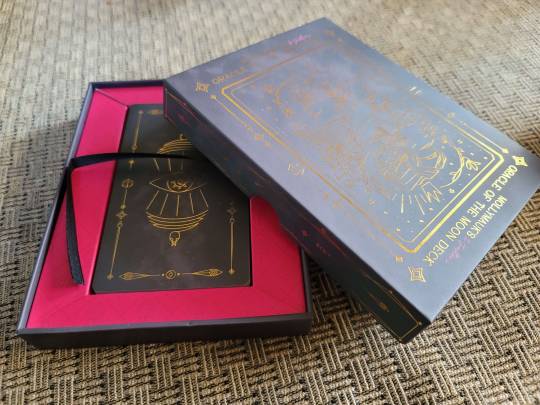
The box is designed well with considerations for regular use. It has little cutouts on the sides of the lid to make opening easier, which I like very much. Like many oracle and tarot deck boxes, this one also has a ribbon in the card bed to help lift the cards out of the box. The cards also fit perfectly into the bed. Perfect height, none of the cards easily slide over the top to be loose into the rest of the box under the booklet.
The booklet is minimal in the way of guidance on interpretations. If you've played around with the Instagram filter, you've seen some of them already. (I have a post listing those right here). The given suggestions (and titles given to each card) are evocative enough in their brevity to work with the deck as an oracle deck, if such is your intention, but if you're someone who likes significant and at-length meanings for a card to perform your readings, you will find it too brief. I will note, the font used for Jester's commentary can be difficult to read and feels somewhat small. As noted in the listing, there are two of booklets; as far as I can tell, they're identical outside of a misprinted copyright notice inside the box that is corrected in the printing outside the box. You can actually snugly fit both booklets into the box, if you wanted to keep both.
Overall, in my opinion, a very lovely and well-made deck, especially in the cards and the box, and I'm very pleased both as a fan and someone who sometimes uses oracle and tarot decks.
The deck's listing in the US Critical Role shop is here.
57 notes
·
View notes
Text
How to romanticize studying : Ways that do not require you to own a million rainbow pens or a pretty desk
(based on this post)
@oitreewrites
1. Keep your desk clean
if you try searching up "study aesthetic" on pinterest, there is a 100% chance that it will be pictures of beautiful wooden desks next to a window overlooking castles or some pretty shit. Now, for those of us that live in a maze of cement buildings and apartments, this seems like a midsummer night's dream (sorry i've been reading too much shakespeare). But, even if you have a basic desk facing the wall, there are many ways to keep it aesthetic. first and foremost, clean your desk.
seriously, get rid of all the waste papers in the corner, and that pile of textbooks that looks like its from the 1800's . if it is clean, i promise you, it will look better.
2. ✨Jazz it up ✨
now, if you (hopefully) have cleaned your desk, you're still not very happy with it. But, here's how to jazz it up
# Print out quotes and plaster them on your wall
# Stick your to do lists, etc., on the wall, and write in black ink, it looks like 63% nicer
# If you're using post it notes, use post it notes of the same color. Do not, I repeat, do not make your wall look like a unicorn threw up on it.
3. Getting in the Mood™
okay, now you have a decent looking study space, now to get into the studying part. first look at all your subjects, all your chapters and figure out the subjects which are hardest and the ones that are easiest. now, if you are a music buff, you probably wanna listen to spotify while studying, right?
well, my love, that is the first step to failure. let me illustrate.
personally, i suck at physics. so, i thought that if i listened to music while doing it, somehow my brain would like it better. seems logical, right?
no.
after a few weeks, i started to suck more, which i didn't think was possible. my grades went from A's to B's, and the worst part was i didn't understand what i was doing wrong.
but, in hopes that you don't make the same mistake, i want to tell you a few secrets:
# If you are doing an easy subject, then listening to music is completely okay, in fact its great!!
# but if you're even 1% unsure, never listen to music while doing it. If you really cannot stop listening to music or you need some ambient sounds to keep you going, use 'i miss my café' or 'noisli'. its waay better.
# but, if you're really loyal to your musical side, you can listen to music, just make sure it doesn't have lyrics, or if you need lyrics, then lyrics in an unknown language is better.
okay this post is getting really long so i should stop now, but i have a few more ideas for part 2, but this post took a lot of braincells so i'll continue only if you guys want me to :)
#okay the last few functioning braincells in my head are officially exhausted#ugghh should i create like a separate tumblr for all this kinda shit??#dark moodboard#dark academia#dark acadamia aesthetic#classic academia#chaotic academia#classic literature#dark aesthetic#dark academism#literature quotes#darkacademism#english literature#dark academia vibes#studying#productivity#productive#study blog#student life#study motivation#study hacks#studyblr#studygram#university#student#study tips#winter studying challenge#hopeful romantic#romantic academia#romantic
261 notes
·
View notes
Text
Genshin impact Hues of the Violet Garden thoughtson the Itadori Festival
Spoilers for the story quest
Day 1
I was squealing reading through the itinerary because Albedo and Klee were coming day 1 and Venti was absolutely going to make an appearance. I was so hyped for more Albedo content XD
Albedos pen name Calx reminds me of chalk and I love that he kept his names *thematic* and I'm proud of myself for recognizing Xingqui's pen name to put Albedo's into context to figure it out before Albedo said it
Watching Klee run around in the background while talking to Albedo upon their arrival is the funniest and cutest thing
It was so nice to see Albedo's big brother-ing I feel like their interactions are always off screen. Not me taking notes on his parenting style for fanfic later lmao. He's so laid back and he is straight up trusting her to behave and she complies because she knows he will actively make sure she's happy and I think that's cool. Even though she's explosive he doesn't raise his voice really. Like gentle. I don't have the words for it but it's so much calmer than what I expected. He really doesn't raise his voice and he doesn't sound sure of himself but he is? Someone who understands people analyze this I can't do it lol
Albedo paints stupid fast and I love this fact. I love more insights about his illustration side hustle and how small the turn around time is its so well fleshed out. Like it's fun to see this side of him. Also he really showed up with zero plan and I love the chaos
It was nice to see Ayato make an appearance.
Seeing who Klee finds most important is so telling not just about her relationships but also Albedo's. I love that Kaeya is always mentioned. I love that Klee and Albedo always put their own parents first and I'm really glad they parallel each other with this I feel like it's more realistic and less cheesy idk. It's precious.
Klee and Yoimiya! There's so much fantastic fanart of them because they would be the perfect friends and its in cannon!!!
I was absolutely bothered by Yoimiya taking Klee away without talking to Albedo first but that may be the stranger danger and years of babysitting kicking in. I know the travler trusts Yoimiya but it didn't sit right. I was very glad we stayed to eavesdrop it really was nice to know we were watching Klee still
Klee is so so so bad at using Albedo's pen name around people even though he specifically asked the traveler to use it while in Inazuma and it was funny. Like there's a book of Albedo's picture with his name and not his pen name and everyone at this event can connect who he is now lol
Alice and Klee having a book together is so precious
Yae is amazing we stan.
I really feel like Venti is hiding these poems or someone else who is old. Like I feel like someone who was there back then is actively trying to preserve the memory. *cries in osmanthus wine*
I would like to see the printer they're using. It's printing text and color but they don't have computers. They have cameras though so maybe they're taking pictures of the manuscript on repeat? I don't understand their tech and I desperately want to.
Day 2
Albedo and Xingqui meet! It's so fun to see them on screen together!
I love Albedo doing his job as Captain of the Invesigation team while everyone thinks he's just some painter lol
Xingqui was not prepared for interrogation and I love Albedo scheming it's fantastic
Xingqui stealing his own books is so in character. I was betting that he made a bad mistype and was desperately trying to fix it but his signature is even funnier
Xingqui churning out writing that fast has me mad jealous lol
I would laugh so hard if Chongyun comes by later but I doubt it lol
I no longer think Venti is hiding these poems. I don't know who those pants belong to. They are brown and puffy
Day 3
Kazduha!!!!!!!!!!!!!!!!!!!!!!!!
Taking a moment to appreciate the characterization of each person. Kazduha hearing the footsteps, Albedo puzzling out a solution to the signature ordeal
I'm beginning to think the Uruu restaurant is the only affordable one because they walked a long long way from the festival to the restaurant and they keep going there. Like it's everyone's go-to place
Who is watching Klee. All the adults are in a room together I'm concerned
Signature crisis averted of course Albedo volunteers to draw things. Kazduha being able to carve is a cool thing I didn't know
Venti and Ayaka, fun combo. I agree with Paimon, very unexpected
The poem drama is utterly fascinating. I'm so glad Venti spelled it out because I did not realize person 5 was the bad guy. Like no thoughts
2 paintings added! They're so dramatic too. Like passerby people who have no context of the poem that Albedo is referencing are probably so confused
Obsessed with the parallels to Kazduha. Like that's so neat
I wanna know who set this up because they're brilliant actually. I hope the person planting the poems gets to be the last inspiration as the schemer
Very excited for the rest of the drama tomorrow
Cutscene video is gorgeous
I just really love these two painting okay it's pretty
Surprised the painting of Kazduha doesn't have red seals on the papers in the background
The one of Ayaka is so dramatic
These make no sense out of context and I love that actually
Albedo really do be painting fast
Also Ayaka using Kazduhas first name is precious, actually
Day 4
I have realized Kaedahara is a family name bc that's how inazuma works and I feel dumb. I realized Ayaka and Arato have the same "first" name and the dots connected
Seriously who is watching Klee
Yae and Venti should never be alone together unsupervised
I feel like the main story just got overrun by a side quest but I have no complaints because it's Kazduha
Xingqui really just chilled and walked around with the squad and I support that so so much
I love Albedo the problem solver its fantastic
Great family drama, I always love more character backstory
They really thought I was gonna figure out who was hiding the poems yeet. I feel dumb. I really thought it was gonna be some NPC but noooo
Albedo painting with ink that shows up with water is the coolest thing. I want to know where he found the paints in different colors. I want to know where he painted this, like I had been assuming he was just painting in the streets clearly this was incorrect
Does this imply Albedo recognized the name? Like Albedo didn't have to ask around for who the name belonged to. I wanna know how they meet I feel like it'd be interesting. I wonder if there will be a spike in Albedo & Scaramouche fics after. Research will be conducted.
Ayato is a schemer and I support it. I love that hes buddies with Yae I think it's neat
#genshin impact hues of the violet garden#di rambles#genshin impact event#genshin impact reactions#hues of the violet garden#genshin spoilers#iradori festival
1 note
·
View note
Text
If At First You Don't Succeed Try Doing SVG - What Brittney Told You To Do SVG PNG, Cricut File
If At First You Don't Succeed Try Doing SVG, What Brittney Told You To Do SVG PNG EPS DXF PDF, Cricut File, Instant Download File, Cricut File Silhouette Art, Logo Design, Designs For Shirts. ♥ Welcome to SVG OCEAN DESIGNS Store! ♥ ► PLEASE NOTE: – Since this item is digital, no physical product will be sent to you. – Your files will be ready to download immediately after your purchase. Once payment has been completed, SVG Ocean Designs will send you an email letting you know your File is ready for Download. You may also check your Order/Purchase History on SVG Ocean Designs website and it should be available for download there as well. – Please make sure you have the right software required and knowledge to use this graphic before making your purchase. – Due to monitor differences and your printer settings, the actual colors of your printed product may vary slightly. – Due to the digital nature of this listing, there are “no refunds or exchanges”. – If you have a specific Design you would like made, just message me! I will be more than glad to create a Custom Oder for you. ► YOU RECEIVE: This listing includes a zip file with the following formats: – SVG File (check your software to confirm it is compatible with your machine): Includes wording in both white and black (SVG only). Other files are black wording. – PNG File: PNG High Resolution 300 dpi Clipart (transparent background – resize smaller and slightly larger without loss of quality). – DXF: high resolution, perfect for print and many more. – EPS: high resolution, perfect for print, Design and many more. ► USAGE: – Can be used with Cricut Design Space, Silhouette Cameo, Silhouette Studio, Adobe Illustrator, ...and any other software or machines that work with SVG/PNG files. Please make sDisney Father's Dayure your machine and software are compatible before purchasing. – You can edit, resize and change colors in any vector or cutting software like Inkscape, Adobe illustrator, Cricut design space, etc. SVG cut files are perfect for all your DIY projects or handmade businDisney Father's Dayess Product. You can use them for T-shirts, scrapbooks, wall vinyls, stickers, invitations cards, web and more!!! Perfect for T-shirts, iron-ons, mugs, printables, card making, scrapbooking, etc. ►TERMS OF USE: – NO refunds on digital products. Please contact me if you experience any problems with the purchase. – Watermark and wood background won’t be shown in the downloaded files. – Please DO NOT resell, distribute, share, copy, or reproduce my designs. – Customer service and satisfaction is our top priority. If you have any questions before placing orders, please contact with us via email "[email protected]". – New products and latest trends =>> Click Here . Thank you so much for visiting our store! SVG OCEAN DESIGNS Read the full article
0 notes