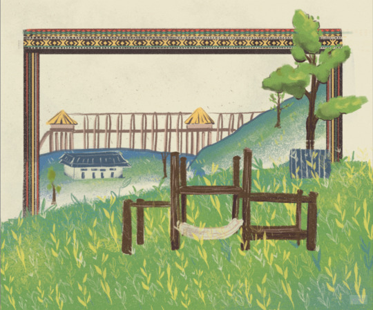
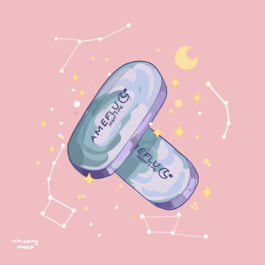
#not sure if im going to stick with the composition of the background but i do like how solas and lavellan turned out
Explore tagged Tumblr posts
Visit Tumblr Blog
Explore Tumblr blogs with no restrictions, modern design and the best experience.
Last Seen Tumblr Blogs


Fun Fact
When “GIF” was named word of the year in 2012, Oxford Dictionaries U.S.A. credited Tumblr for pushing the word.
Text

posting this in part to keep myself accountable and shame myself into not abandoning but also to complain !!!!!!! ive been struggling with a color palette for this for the past hour :))))))))))))
#solavellan#solavellan hell#solas x female lavellan#lavellan#inquisitor lavellan#i know exactly how im gonna render layla (and im excited about this concept)#but its figuring out the colors for literally every other part of this thats making me bang my head against the wall !!!!!!!!!!!!!!!#i do like the sketch tho <3#not sure if im going to stick with the composition of the background but i do like how solas and lavellan turned out#+ i want to keep the wolf bc if u look solas' eye lines up as the third eye for the wolf kinda do u see do u see it#oc: layla lavellan#min ocs#min draws#wip
17 notes
·
View notes
Text
thought i’d make a post showing/teaching my animation process for my most recent finished project!!! animation is really fun, it’s my absolute favorite form of art in the world and i love sharing how i approach it! without further ado, let’s get into it!
1. roughs

the goal here is to establish the big things in the animation. what are the main movements? what is the timing? what’s the general layout of the space the animation is occurring in? in my roughs, i like to use multiple colors to keep things separate and clear. you should also not be focusing on the details either!!! you are trying to get the most basic, fundamental forms down and moving before adding ANY detail. trust me, no artist on earth can crank out a finished animation without first taking this messy, less-than-pretty step.
2. tie downs

at this point, once the movement is down, you can start adding more details and clarifying things. in the tie down stage, you’re refining things— medium details, faces, character clothing, etc. you’re not trying to make it super clean. THIS IS SO IMPORTANT DO NOT TRY TO MAKE A CLEAN ANIMATION STRAIGHT OFF OF THE ROUGHS YOU WILL MAKE MISTAKES THAT ARE INSANELY ANNOYING TO FIX THAT LATE IN THE PROCESS!!! worry about perfect cleanliness in the next step!
3. final lines/cleanup

NOW i start worrying about how clean i want it to be. this stage sucks i am not going to lie. it is tedious and slow and agonizing because every single line has to move in a way that makes sense. DO NOT JUST INK OVER THE TIE DOWNS. if you do that it will look terrible and wobbly. you have to make sure everything is on model, that forms and lines move in a way that makes sense, and that there is no jitter or “sticking” (happens when lines are drawn over lines from the previous frame, which makes the line appear to “stick” in place). additionally, you’ll notice the red lines— these are color separation lines that will not be visible in the final animation. i use these for sappha’s stripes and hair highlights, as well as her two-tone irises. while not visible here, there is also a separate animation layer for final shadows.
4. coloring
and then comes color!! I do my cleanup and coloring in clip studio paint. If you’ve done everything correctly and there’s no gaps between lines, CSP’s fill tool will allow you to pretty quickly and easily fill your cleaned up animation. for this animation, i also threw together a shitty messy background in about 20 minutes and then gaussian blurred it (im not good at painting lol).
5. compositing

once the coloring is done, i move into my fully legal copy of After Effects, and begin compositing. this entails taking the animation elements (cels, backgrounds, etc) and combining them, color grading them, and adding effects like blurs, gradients, and light bleed. your two most important effects in AE are fast box blur and gradient ramp— honestly, you don’t need much more than those two to make a well-composited animation (besides some color stuff like gamma/pedestal/gain). once that’s done, i export it as an MP4 and a PNG sequence, import the sequence into CSP or Toonsquid (my favorite animation app for the ipad), and then use that to export a gif of my final animation!
and that concludes the most basic rundown i can give without writing wayyy too much. if you’ve got any specific questions, please hit up my inbox, i love talking about art and animation with people interested in learning!
27 notes
·
View notes
Note
do you have any tips for amateur/aspiring artists? <3 i'm the same age as you but just coming back to learning how to draw after a many year break. i love your style and how you draw your ocs makes me excited to hopefully draw my own someday!
Hi!!!! Im glad youre coming back to art, it is super fun :))
Short Answer: Draw what you love and dont be hard on yourself! Getting ‘better’ at art all comes down to practice practice practice. And its not worth it if you dont enjoy it.
The fun you have will come through in your art, and others will see it too!!
Lonnnng academic answer under the cut:
warm ups!!!
I am bias to a fast and loose drawing style so i really recommend warmups.
I, not as often as i should, use the website line-of-action.com where you can set up short timed figure drawing sessions.
For these you shouldn’t be focusing on the tiny details, instead drawing really loose stick figures or simple figures to just loosen up your hand and break out of the habit of perfectionism.
Studies!!!
Look at art you love and figure out what you like about it! Try to copy it! Sit down and actually break down how people draw things in ways you like.
There is NO shame in finding inspirations in other artists styles or compositions. Humans have been doing so for centuries. Of course, don’t go tracing or stealing concepts and pacing them off as your own, but tracing in the privacy of your studies can be a helpful learning tool.
Also heres a post that i linked some nice videos for human anatomy drawing that i really like:
Experiment!!
I really recommend regularly pushing yourself out of your comfort zone. Hate drawing hands? Draw only hands! Hate making backgrounds? Make a background as detailed as you can! Always do digital art? Try water color!
In the same vein, i also really recommend using references when you can! Even if you’re drawing stylized, a reference can help you get a better idea of space or proportions. (If you have trouble finding non-ai reference images on google i recommend using the advanced search settings to pull results only from before 2021 💕)
Original Characters
Thinking of making your own little guys??? Thats AWESOME!!! i feel like nowadays in the culture there is a bit of a stigma around having fun with ocs (or im just paranoid <3).
I personally use ocs to explore different facets of myself; fears, desires, and dreams. They can be whatever you want, do whatever you want, for whatever reason you want. It’s a completely harmless way to have fun and explore your creativity! Don’t let anyone make you feel otherwise.
Summary
Sounds corny but, remember who you’re drawing for: You.
Sure, it brings me a lot of joy knowing other people like my art too, but i draw things the way I want to see them, because i love drawing. You gotta just follow the fun and the love and draw as much as you can!!! Hope some, if any, of this helps!
#choco ramblings#i wrote this at 12am and im strugglig to proof read#sorry if i spelt anything wrong or worded something weird#my brain out of juice 💕💕💕
4 notes
·
View notes
Text
Week 8
Progress checkpoint


Document your learning for this week. What theme, common to all of your work irrespective of subject or media, can you identify in all your own work?
This week im dealing with silhouette cutout illustration, which is something im not quite familiar with, and im also developing the tote bag to be BSNB background inspired. i have to admit drawing scenery and background is really hard, im not entirely sure what perspective id use, or what kind of style im going for. my usual style is watercolor based and even when i switched to digital, my redering technique still resemble watercolored a lot. In our project moodboard, we had a lot of Camelia Pham works, because i think her works altho resemble traditional method of rendering, look really mature and classy, suitable for our sudden change of target audience. i tried to learn and incorporate her style into my illustrations, but what i thought was a very quick and easy process requires a lot of experience and developement. Her works are very textured and detailed oriented, compleately opposite to mine, which is very soft, dreamy and dont mind much details. so when i finished with the totebag, i felt very off and defeated.
it was not up to my expectation and plus the foggy mind of covid just add more to the failure i felt.
i decided to draw the 2nd version with another composition

it still look really weird and out of charcter, so i developed entire different sketch hoping it would turns out better

And then i have too much on my plates with theprinting i have to outsourced it to Song Linh
They really finish the painting the way i expected it to be. and honestly im very disapointed that i wasnt able to do it. But i think it's a lesson for me to plan better and do not crumble under pressure. It would be ideal to develope more into the style if we have time, but since our timeframe is very limited, i should've sticked with things that works.
For the common of my usual style, one thing very recognizable is it's very dreammy, round and colorful. since my base was watercolor transit into digital, my works has a very sheer and dreamy, translucent. and it's often nature-oriented.


0 notes
Text
Teaching Friendly Experiment (Illustration) - L02
Knowing I had to create an Illustration piece I picked (teaching + friendly - a poster advertising a friendly class to mean pll) because I think it would allow me to do some cartooning which is the only style of illustration that I have any background in, although its beens years sense I've done it.

I chose to be a but tounge and cheek with the idea just for a bit of fun, here a rough sketch of the composition I wanted to go for.

Heres my final result, I had a lot of fun with the drawing, although I forgot how tedious hand lettering can get. Its a bit rough around the edges but U think it goy my point across well. I think the actual composition of the poster could use some wrk especially with all the wording at the bottom, but as this was an illustrative based experiment, Ill leave it be and come back later if I have time. Overall this was a long overdue brush up on procreate and I think its opened me up a bit more to some less cooperate clean designs that I tend to stick to, Im sure trying something like this when Im in a rut would be a good way to generate some fresh ideas for what I'm working on.
1 note
·
View note
Text
real kids listened to the "Winx Club Special Songs" playlist on loop everyone else is apart of the simulation
anyway heres an out of nowhere ranking of winx club special songs from my least to most favorite cuz i can ahahahha
15. Spotlight nothing wrong with the song, it just doesn't stick out to me or have a lasting memory for me like the rest of them jkgf 14. The World Belongs to Me I liked how different it sounded as a kid and still do now, i just don't really attach myself to slow and chill songs for some reason. also the super abrupt ending always threw me off lol 13. Mambochiwambo I SANG THIS SONG IN A SCHOOL TALENT SHOW AND IT'S SO EMBARRASSING TO LOOK BACK ON PLS 12. Endlessly i'll admit i really appreciate the sweetness in this song now, but as a kid i kinda cringed at the vocals. still do, i dont what about them makes me kinda tilt my head, but it is what it is 11. Fly The only remarkable thing i remember about this song was that it was the theme song of one of my favorite littlest pet shop fairy youtube series (i was really into fairies okay) and i would get so excited cuz i knew the creator was definitely a part of The Club 10. You're the One this was my second choice for something to sing at the talent show. i hate it here but luckily this one had stood the test of embarrassment bc it's so damn catchy 9. Chain Reaction OKAY NOW WE'RE AT THE SONGS I LOVE AND STREAM 24/7 NOWADAYS; this one is only the lowest because it was my least favorite song as a kid. dw i've gained taste now and this is literally SUCH a bop 8. Crazy in Love with You Looking back at this song it was a lot slower than what i'd prefer nowadays, but it was enough to satiate my 13 y/o flora simp/kinnie self. also it's still really sweet so yeah 7. Catch Us if You Can i already heard this from someone else on youtube but it's an interesting speculation, why is this song slept on to such a high degree when composition wise (? im not fluent in music terms jskdghkfs) it's very similar to Heart of Stone. like i get that HOS is better and knocks it out of the ballpark in every single category but like. it's still catchy enough to survive on it's own i think 6. Live My Life ooooooh it's kind of down to the wire now. AISHA MY BABYGIRRRRRL 5. A Kingdom a Child This is the best bloom song hands down. it's so good idk what else to say 4. Superheroes ICONICCCC i know im gonna get flack for placing it in 4th but i just cant help but be biased for these top 3 3. Heart of Stone gawd it's so good. im glad i never bought into the musa/riven toxicity but i sure as hell lived for the drama. who wouldve known musa the fairy of music would have the best songs :O 2. Dreaming in My Way I HAVE NO IDEA WHAT THE MUSIC VIDEO'S CONTEXT IS IM JUST HAPPY TO SEE LAYLA SUCCESSFUL AND NABU ALIVE AND HAPPY. also the vocals go crazy in this omg
1. This Big World
was there ever even a question. this song is fucking art i will never back down on this. Congrats to Winx Club for portraying realistic parental backgrounds seriously and emotionally instead of character quirks. Musa, Stella and Bloom are all queens for this
#winx club#winx club special songs hold a special place in my heart#im serious about that last part im so glad i had stella growing up#tldr musa wins at everything
3 notes
·
View notes
Text
February 12th-February 18th, 2020 Reader Favorites Archive
The archive for the Reader Favorites chat that occurred from February 12th, 2020 to February 18th, 2020. The chat focused on the following question:
When applicable, what about a creator’s art might convince you to check out their comic?
carcarchu
I like a wide range of art styles so it's hard to pinpoint specifics but if an artist is able to draw very attractive looking characters (recognizable character designs, outfits that don't look like they came out of 2004 gap catalogue, characters that can still be recognized even when they change their hair style) then i find that very appealing. beyond that how well an artist can integrate the characters with the actual space they exist in is something i find very important as well. a bunch of floating heads can only carry a series so far. if the artist can make the characters feel like they properly exist in the space i think it can really elevate the series although in practice this is something very difficult to do.
Deo101 [Millennium]
For me, honestly some art styles are very inspiring to me and that will sometimes get me to read just because I want to see the art more and learn from it. Things like textures, colors, character design... It can draw me in just by exciting me as a learning opportunity
chalcara
For me art‘s the hook and story the line. Come for the art, stay for the story, you know?
Funnily I‘m looking less for pretty art and more for good visual story telling. I want the art to show whats going on without having to rely on dialogue.
Cronaj (Whispers of the Past)
I'm honestly very picky about art styles when it comes to comics, and that's a personal issue It has some to do with art styles being attractive to me, but honestly, the most important aspects of a creator's style to me are (1) consistency of style and anatomy, (2) level of completion, and (3) clear communication of what's happening. When it comes to whether or not I check out the comic initially, the main things that come into play with the promotional materials, covers, and/or thumbnails are contrast of the image and cleanness of the rendering. Of course, obviously, my personal tastes play into it. (I tend to like semi-realistic styles, sort of anime-ish but with a twist, or painted styles that may resemble concept art.) But honestly, probably more important than grabbing me initially to begin reading is readership retention. And that's where the 3 qualities I look for come into play: (1) Consistency of style and anatomy: This is probably the most important part for me as a reader. If I can't tell who is who because the characters change appearance from panel to panel, I'm ducking out, because that affects the clarity of storytelling. I also cringe everytime I see a particularly egregious anatomy error. I know what people look like. I see them every day. If I feel pain from looking at an artist's work, I'm not sticking around. (To be fair, everyone makes some kind of anatomy mistakes, but really it's if the anatomy mistakes are really awful to me and aren't as a result of a deliberate style CHOICE. Keyword, C H O I C E.) (2) Level of completion: This really just means that if it looks like the artist rushed through the panels or they were being lazy, I feel like their comic isn't worth my time. I mean, if an artist themselves doesn't care about their work, why should I?(edited)
. (3) Clear communication of what's happening: Once again clarity of storytelling is absolutely essential. If the composition of a large portion of the panels don't clearly show the actions of the characters, I can't follow the story. Aaaaaand as a bonus: Please, please, for the love of all powers that be, please, make your fonts legible. If I can't read the comic without squinting because your text is too tiny or hard to read, I'm not going to try. I have bad eyesight as it is. Take pity on your readers. I'm not going to suffer for your work. I have dropped far too many comics to count because the creator didn't care enough to make sure that the font was legible. And this applies to both desktop view, mobile view, scrolling format, and page to page format. Just.... Make your fonts big and clear.(edited)
sssfrs (JOE IS DEAD)
That's interesting to think about how recognizable characters are when their hair style changes. I might try to use that as a character building exercise
Deo101 [Millennium]
Solid excercise: can you tell them all apart when they're bald and naked?
Cronaj (Whispers of the Past)
OoooooooOOOOOOOOOOHHHH
I
Might partake that challenge
Deo101 [Millennium]
Also it's really fun to draw characters in all sorts of hair and clothes so idk what id do if I couldn't tell them apart when doing that!!! That's like 40% of my art!
Cronaj (Whispers of the Past)
This just convinces me more and more to do AU art
Deo101 [Millennium]
Yeah aus are another 20% of what i draw LOL
Look im drawing the comic most of the time so I wish to partake in non canon things the rest
carcarchu
@sssfrs (JOE IS DEAD) i've read series before where the character gets a hair cut / dyes it and i'm like WHO ARE YOU? IS THIS A NEW CHARACTER?
Deo101 [Millennium]
Oh another good excercise is drawing your Characters in many different styles and seeing if they remain unique when not in yours.
Cronaj (Whispers of the Past)
I want to do all of this
This is stuff I hardly ever have time for
So I am extra attracted to it
Also, there IS a time later in the comic where a certain character's hair gets partially burned off
And then he cuts it pretty short to get rid of the singed edges
And I feel like his hair is like 80% of his character design
So I'm just a little scared about that
Deo101 [Millennium]
Also, @Cronaj (Whispers of the Past) , I am unsure what you mean by "readership retention" with something that makes you interested in a comic, could you explain?(edited)
Cronaj (Whispers of the Past)
By readership retention, I mean aspects of the art that decide whether I'll continue reading past the first few pages
(obviously story comes into play as well, but I won't pretend that the art in the first few pages of a comic don't contribute)
Deo101 [Millennium]
Oh okay, I thought you meant like how many readers have unfollowed or something
Cronaj (Whispers of the Past)
Nah
More like, "oh cool! Your cover and blurb seem interesting. Lemme check out the comic!"
And then after reading the first few pages/chapter:
"ah... Not for me." Or "Nice, I'll keep reading!"
Deo101 [Millennium]
Gotcha
Capitania do Azar
Ohh I don't feel like dissing particular artsyle choices, but I know a few aren't for me. I'm no big fan of ultra realistic, hyper detailed stuff you usually see in super hero comics (other genres pick that style too sometimes and I still don't really appreciate). I particularly like artstyles that are distinct and recognizable, I have a hard time with stuff from different authors that just looks... Like a carbon copy (sometimes, the style being referenced is waaay too obvious and that is always a big no for me) Good use of color is key. Give me some good values too. I want colors to make sense and I am very tired of pink. I also appreciate consistency. If you give me artwork with a more paintery style but then the comic is cellshaded, that might tip me off. But not necessarily (tho I appreciate inner consistency inside the comic itself). Rushed stuff, like mentioned above, is also not a good look, but only insofar as it distracts me from what's happening in the story. Consistency is a very important word here, because I love seeing a common line that is able to take in all the differences that are necessary in character design and backgrounds, but also make me believe that they all could live in the same world.
Oh! And also: if the artstyle involves using lineart, I am really fond of sharp, clear lines with weight variation
sagaholmgaard
I'm curious about what you guys mean with consistency- do you guys not like if an artist's art style changes over the several years it might take to make a finished webcomic? Is it that it peeves you when the backgrounds are done in, say, a painterly style while the characters are done with lineart? Is it when the artists makes ordinary illustration work in a completely different style from their comic pages? (This is genuine curiosity I hope no one's feeling attacked rn ^^)
carcarchu
i personally really like seeing an artist's skills improve and evolve over the many years it takes to draw a series
even at the expense of a more "consistent" final product
sagaholmgaard
Yeah me too, it's one thing i really like about webcomics
chalcara
Can‘t talk about the others, but I get thrown off when one page is sprite comic, the next painterly, third cell-shaded without having a in-story-reasons for those style changes, like flashbacks or pov-changes. But more commonly, the issue’s the classic „comic‘s usually coloured, but oops, this time you only get the pencils because I had no time to update“. If that happens too often and/or doesn‘t get fixed for the archive I just lose investment in the comic.
Art evolution is natural, both in webcomic and published work with a dedicated artist.
Ah, that‘s another source of inconsistency - people switching colourists or even artists around. Once in a while is fine, but if it happens every month or so, I tend to get annoyed by it. It‘s actually why I killed my first webcomic twenty years ago; it was a collaberation and life kept getting in the way forcing me to switch colourists every five pages or so.
carcarchu
oh actually i have read a webcomic where they changed artist's 18 chapters in. i really fell in love with the magical and dark tone of the original artist and was engrossed in the world that they set up. they had a painterly style and it really set the atmosphere of the entire series but then the new artist had a super clean and cutesy art style and the sudden tonal shift really threw me off. in the long run the new artist was actually extremely consistent and better at actually releasing long chapters and very good quality chapters and the writing actually improved too because of it but it was never able to recapture what it was that i really loved about the original art style. also the new artist changed the character designs a little so the heroine was no longer even recognizable as the same person
since it was relatively early in the series i definitely would have preferred if they just got the new artist to actually redraw the first 18 chapters in the new style just so the change wouldnt be so incredibly jarring
chalcara
Any harsh breaks like that will cause some people to break away from the comic, I found. I dumped one of my favourite-for-years comic because the creator got bored by their main character and completely sidelined her in favour of a group of minor characters I had absolutely no interest in.
Didn‘t mean the comic got worse - by all accounts its still beloved by quite a sizable audience - it just wasn‘t for me anymore.
sagaholmgaard
Ahh that I can relate to. I get super attached to the main character and usually have a hard time getting into any spinoffs with the rest of the cast, even if I want to (and im a hypocrite because i also want to make spinoffs for ever side character in my own comic LOL) i guess if the style changed a LOT from page to page that would throw me off too. that feels like the artist is trying to experiment, maybe making sort comedic comic strips would be more acceptable then? Every style would at least be contained to one strip at least
DanitheCarutor
That's... actually a really good question. I don't really go for a specific aesthetic. Sometimes what's going on in the thumbnail attracts me, or it could be the use of color, the style, a character design. I'll check out a comic with just about any art style. I guess maybe if I have an idea of what the creator is going for with their art? Like, the art may have a lot of kinks, but maybe being able to tell what style they're trying to go for makes me want to check out their work? Honestly, I don't have a really strong art bias, as long as the comic is readable I'll go for almost anything. Maybe I won't check something out if the style looks extremely uninspired... like if it were the most generic, based off Japanese cartoons, style ever then I might give it a pass. But even then I do sometimes check it out anyway, so I really don't know! This question is surprisingly hard to answer! To give my last quip about last week's topic, since I don't want to derail the current one. I feel the creator's personal life is no one's business. I understand if they're a legit bad person, but digging into a creator's life to see if they qualify to be supported is... I dunno. This mindset makes me feel that if someone who liked my work ever tried to get to know me, they would be doing it solely to see if I'm good enough for them, which feels really invasive and predatory. I fully understand most people can't just enjoy something, that's how the world is, it just kinda sucks sometimes. The world kind sucks sometimes. Alright! I'm doing with giving my final thoughts on that subject.(edited)
Deo101 [Millennium]
The question is specifically about what draws you to art, rather than what turns you away so if you don't want to rag on any art styles that's not what it was asking for I think! Though yes it's very closely related (and it's not bad to say what you don't like)
Eilidh (Lady Changeling)
I definitely am more likely to read a comic that has a distinctive style - no particular style preferences, really. Interesting use of colour/value is definitely a bonus. But as long as it's engaging and the composition is good/readable, I don't really mind whether the art is "good" or not.
DanitheCarutor
@Deo101 [Millennium] I wasn't trying to rag on anything. I couldn't specify what about someone's art would draw me to their comic, it was easier to the one thing that might not, but I still said that I may be drawn in regardless. Sorry if I came off like a douchebag, totally not my intention. <_<'
Deo101 [Millennium]
No I know, someone earlier said "I don't feel like dissi g particular styles" I'll be honest I was typing my post as you were and so I didn't even read yours til after I said something(edited)
Just kind of a general thing! Feels like it went to what turns us away instead of what draws us in so just kinda a reminder of the op
sagaholmgaard
Readability is definitely important for me to want to continue following a comic, but what about the art that makes me want to read something...? I definitely have a preference toward cartoony styles overall. A solid character design will make me wanna check out a comic. If the main character has a recognizable silhouette and interesting shape language. I also love really bold lineart, especially if it's used to create shadow and contrast. Interesting color schemes too. I think how the background is drawn can really make me want to read something as well. I know BGs aren't people's favorite thing to draw but to me if the setting looks very well though out and designed, that definitely motivates me to check something out. And awe-inspiring sceneries are always hella cool! I read a lot of things outside of my artistic preferences though, but I think these are the things that might make me pick something up based only on the art itself.
keii4ii
I think I tend to find more appeal in certain compositions, which is a more subtle aspect of style. I am a major sucker for evocative use of backshots/ not-showing-the-(whole)-face, for one thing. Compositions that make full use of the three dimensional space around the figure(s) is another (this doesn't necessarily mean putting a lot of stuff around the character; you can have a mostly empty space and still make it feel very 3D).
(I hope both of those things show in my own works... I just love those things soooo much )
Deo101 [Millennium]
Oh I LOVE when a panel like... Cuts a face. Something about it makes me lose my mind every time
DanitheCarutor
@Deo101 [Millennium] Ooh! Lol sorry about that! I was so caught up with off computer stuff that I didn't notice anything else typing while I was. I haven't read the whole conversation yet, but I can see how it would turn to that. "What draws you in" is a hard topic to stay on. At least I imagine it would be since it's hard for me to talk about.
Ah! I admit I really like shots focused on scale, specifically ones were you can feel how tiny the MC is compared to what the camera is focused on. Does that make sense? Like the panel shows this ginormous thing, and it has the MC in it to show how massive it really is. That's awesome when done right.
Deo101 [Millennium]
Tiny little person. Yes. Very good
DanitheCarutor
Tiny people in giant worlds are the best!
keii4ii
I love those too!
DanitheCarutor
Oh, also this isn't a webcomic, but I've been interested in reading Vinland Saga after seeing this page on Twitter.(edited)
Something about extremely hideous expressions on semi-realistic faces jives with me.
FeatherNotes(Krispy)
What draws me in easiest is the design aspect of characters, environment and the webcomic title! It's a bit of a turn off when the title doesn't look polished. That's one of the main draws for me is an intriguingly designed logo with a catchy name that follows through their chosen aesthetic. I've seen many comics that stand apart from the title image they chose and it's a bit jarring to see! Great examples of wonderful execution of these aesthetics are BlackOut City, O'Sarilho, Sink Your HookTeeth and Shadrunners(obvs there are many more) I have to agree with @sagaholmgaard about backgrounds! There are quite a few creators who avoid them and stick to simple colours and gradients that just dont keep me in the comic- though my fave genres include a lot of world building, so BGs in a romance may not be emphasized as much. Lastly, dynamic character design!! I love a wonderfully crafted cast that allows me to read the characters easily no matter what setting or outfit they're in. Also it's really random but i do love an artist who can draw really good shoes?? That is always a draw in for me (edited)
Capitania do Azar
Oh I meant it in the way that if you spend a lot of time experimenting with different styles and techniques, you'll never be good at any of them. Style and approach changing over time is, imo, inevitable and good :) @sagaholmgaard(edited)
@@FeatherNotes(Krispy) I constantly think my logo looks like crap next to other webcomics', so thank you (edited)
DanitheCarutor
Oh god, @FeatherNotes(Krispy). Titles and logos are legit my weakest point, that part of the comic creation process is the worst! I have this cosmic-horror/fantasy comic I've been developing since 2005, and it took me till just last year to come up with a decent title. It'll probably take another 14 years to come up with a passable logo. Lmao!
FeatherNotes(Krispy)
It is really hard! Because that image/logo and name represents the body of work so firmly, its also got to stand strong with what it's representing and stand up to other titles too! Basically, i like to think of something that will help generate top results when i search on google for the title, which to me helps it stand on its own on the web, and sound catchy enough for pitches in person! I don't want to steer the convo away too much from the prompt, but there is definitely more to discuss about titles and their chosen aesthetics
varethane
@DanitheCarutor have you read Golden Kamuy? If you love hilariously hideous expressions in manga, it seems like it may be your jam lol
(it's also set in a specific historical period and contains a lot of really interesting material about the time/place it takes place in)
Also I feel like I have never, even one time in my life, come up with a good title for anything-- both Chirault and Wychwood are placeholder titles that I used just to kinda name the story for myself, which I initially intended to change when something better came along, and then nothing ever did
LadyLazuli (Phantomarine)
I know I'm generally drawn into a comic if it's just... generally a visual feast? And it doesn't even have to be a beautiful feast - just... a feast! A super intriguing artstyle, beautiful or not, is something for my brain to pick apart and enjoy. Detailed backgrounds, intricate costumes, fascinating presentation/layout... all the way to crazy expressions and fun asides, and even some gory or scary bits to make me go EEK. Basically, if I'm reading it, and my hand is twitching with the prospect of drawing fan art, then I'm in for good.
DanitheCarutor
@FeatherNotes(Krispy) Urg that is such a nightmare! And there are only so many different styles you can do for a logo, and so many variations of words, it's like how there aren't any truly original stories anymore. I got lucky with the title for my current comic, it's the most generic thing ever, but fits in a tongue-in-cheek way. @varethane I've never heard of it, but the face compilations I'm seeing are intriguing! Man, I love stupid facial expressions.
Capitania do Azar
@varethane golden kamuy, I see you are a fellow of taste as well
varethane
(I love it so much)
Capitania do Azar
@DanitheCarutor oh idk about the "only so many things you can do with logos", I've seen amazing things in this world, if there's a limit I'm not seeing it
varethane
(I can always tell exactly when I was binging it because there's a big chunk of my phone's photo gallery that's all screencaps of Asirpa making dumb faces)
Capitania do Azar
@varethane guys shooting each other in the woods? I'm always in for that
DanitheCarutor
@Capitania do Azar Lol I guess? I can't see how you can have an infinite number of designs for writing, while still trying to keep it vaguely readable. But I really don't like lettering, so my imagination is hardcore lacking in that department.
Capitania do Azar
Lettering and logo design are their own fields of expertise, it's ok
meek
Hmm I'm similar to a lot of previous responses where I can't pinpoint a specific style or trend of art work that draws me in because the styles of comics I read differ incredibly. That being said, there are some things that I do look for to keep me coming back: 1) Consistency of style/anatomy: unless there's a specific reason for the general art style to change (not including semi-deformed or chibi versions of characters), I appreciate characters staying proportionate or just otherwise consistent throughout the comic. And art evolution isn't something that's at odds with consistency, it can actually help that by making characters more distinct and easier to distinguish from each other. 2) Potential for art evolution: Almost the opposite of the previous point lmao but if I find a new comic and I see the latest page is of a much higher skill level than the first page, I'm immediately hooked. I want to see the journey. And I want to see how far that journey goes, even past the point where the art "gets good". There's at least one comic that I can think of where once it hit the style that it wanted to, the art has stayed consistent for the past several years but so much so it's almost plateaued and become stagnant. It's still good art, by all means! But I want to see it grow and evolve more. 3) Good panel/speech layout: Okay it's not quite art in the same sense but someone else mentioned this above and I think it's important too? There are so many comics I can think of that I couldn't read or I dropped off at a point because reading was a chore, either because of giant or unsightly speech bubbles, tiny or ill-fitting font, a combination of the two, etc. Sure, graphic design and layout is a skillset completely different from pure illustration, but it's one worth knowing because otherwise you could do a disservice to your art and your story.
Cronaj (Whispers of the Past)
@meek Seriously, the text is so important to me, and I consider it a large part of page layout and design
meek
Agreed!! It's something that bothers me with printed comics all the time. I've tried to read so many "classic" graphic novels and I just.. I can't get past the giant text boxes with small font with miniscule kerning and ESPECIALLY if they then add color to it. Please, keep in mind your readers with reading difficulties But to turn this into a positive One of my favorite things that also helps make a comic feel more personal is when the creator turns their handwriting into a font or otherwise have FUN with the speech bubbles
Cronaj (Whispers of the Past)
YES. As someone with bad eyesight, typography is one of my favorite aspects of finishing a comic page.
Deo101 [Millennium]
It also is super important for me with ADHD, reading is hard enough as is! so bubble layout and clarity can really bring the whole thing together and elevate a comic
Eightfish (Puppeteer)
I tried that but got the feedback that my text is hard to read and the way i format my speech bubbles is distracting (: But some people have said they really like it so ¯\_(ツ)_/¯ Though I do think I could have done better with the font. I have good eyesight and bad handwriting do I think i have a much easier time reading weird text than many. Since you guys care so much about text, would you mind taking a quick glance at my comic and telling me how readable it is? It'd be nice getting feedback from random people as opposed to only my readers who felt strongly enough to leave a comment unprompted
meek
Oh man I have this specific panel in mind from some early 2006 Avengers comic of like.. what not to do Basically it was a bright yellow text box with this white/light blue font. It was just. It was a nightmare to read Oh sure!! Definitely send me a link
Cronaj (Whispers of the Past)
Yep! Send me a link too! I'd love to help you out
I also have a good typography book to recommend if you're interested. I can drop it into #art_resources(edited)
Eightfish (Puppeteer)
Here is link: https://www.webtoons.comen/challenge/puppeteer/list?title_no=290620
Thanks for taking the time to give me critique!
Cronaj (Whispers of the Past)
The link's not working, but I can probably find it on Webtoon
Eightfish (Puppeteer)
And I think i dould find a typography book interesting, so yes please do send the link
Sorry, i think the link is missing a slash
Did we both delete the link
Deo101 [Millennium]
did we both delete a
yah
i got it
Eightfish (Puppeteer)
Lol
Deo101 [Millennium]
https://www.webtoons.com/en/challenge/puppeteer/list?title_no=290620
Eightfish (Puppeteer)
Thanks
Cronaj (Whispers of the Past)
I found it
(The font is a bit small on mobile, but the font is fine?)
Eightfish (Puppeteer)
Wait can we move to shop talk?
FeatherNotes(Krispy)
(maybe we can have this discussion on shop talk channel? )
Cronaj (Whispers of the Past)
Sure
FeatherNotes(Krispy)
OH LOL
DanitheCarutor
@Capitania do Azar Oh god, they so are! I envy anyone who enjoys that craft, I'm a lot better than I was, but lettering is still so hard. ;v; At least the fancy stuff is hard, regular speechbubble lettering is easy as long as my hand cooperates.
Cronaj (Whispers of the Past)
There's a book I had to read for a web design course I took, and it is seriously a life saver
It put text in a whole new perspective
DanitheCarutor
I do all my lettering traditionally, but maybe that book would be helpful, I legit hate doing it no matter what medium I use. (sorry for continuing to derail the channel.)
Capitania do Azar
@DanitheCarutor i used a website that converts handwriting to fonts + font forge for tweaks to get personalised fonts
DanitheCarutor
I used to type bubbles out, and I've thought about it for my current comic but I mix up words and letters really bad, and I forget to add words entirely while typing. It wouldn't be so bad if my brain saw the mistakes while rereading everything, although sometimes it takes a couple days or another set of eyes for me to actually see them. When I write the bubbles in with a pen I make a lot less mistakes since it takes more effort to write out each letter, also my brain can keep better track of the ones I do make. I feel like that's an excuse that makes no sense.
Deo101 [Millennium]
no it totally makes sense
snuffysam (Super Galaxy Knights)
I can't say I'm ever especially drawn in by art? Besides the sense of "it looks like a lighthearted action story and I like lighthearted action stories", not much catches my eye. Though, I will drop a comic if I'm put off by the art. Like I can forgive if some things look janky at the start of the comic, but if that jankiness doesn't improve over time, I'll drop the comic. I'll also drop the comic if the character designs are bad (i.e. indistinguishable from each other, or in rare cases just too gross to look at). But again, I can't exactly say "good character designs draw me into the comic" because a lot of comic banners/thumbnails don't really show off full character designs.
chalcara
Varied bodytypes are catnip for me. And I like comics with expressive characters over comics that limit expressiveness to keep the characters pretty.
Eightfish (Puppeteer)
Oh, definitely agree with that second part. Comics where it looks like everyone has had a ton of Botox is a huge pet peeve of mine
Like, eyebrows are not the only part of the face that can move.
Do more
renieplayerone
Yeah i agree with the janky art thought. I think it helps me follow through the jank if i see that the later pages, the artist has shown growth, and i dont want to force anyone into a "gotta redraw it" loop if thats not something they want (of course everyone has their reasons and theyre also valid af) Ill tend to be more forgiving about the jank if i know its someones first webcomic or first comic in general, because you cant learn how to make comics without actually sitting down and making the dang thing. So yeah, the jank can be a double edged sword(edited)
What super draws me in is comics with a great sense of color. While i love anything vibrant, if the softer watercolors are done well, they're chefs kiss. Prime example of that is Stand Still Stay Silent
mariah (rainy day dreams)
I've been thinking about this question all week and I think I finally boiled my answer down to something short, sweet, and to the point. It's gotta be some kind of spooky and some kind of cute I have a pretty broad range of art styles I like and I definitely also read stuff that doesn't fall under those categories, but I think my favorite stories or artists are some blend of those two things. I don't really have a preference between color and greyscale. Like I definitely love a good color feast comic, but if you know how to use your grey tones or even just black and white well it's just as good for me. Maybe that's also just me trying to justify being mostly a greyscale artist to myself TuT
FeatherNotes(Krispy)
@mariah (rainy day dreams) devils candy would def be up your alley then!
mariah (rainy day dreams)
Devil's candy v good
renieplayerone
Devils Candy is amazing
mariah (rainy day dreams)
I love to combination of cute monsters and action also.
DanitheCarutor
@renieplayerone I'm not sure if it fits totally with your preference, but if you're looking for watercolor Lost Honey is gorgeous! https://www.losthoney.com/
mariah (rainy day dreams)
Lost Honey is another great comic great to look at, really interesting world
DanitheCarutor
It's one of my faves! ;v; There is another comic that was half watercolor half digital that I used to love reading (if I remember right pages set in the current time were digital, and backstory stuff was in watercolor.), but it has been discontinued for years now. It was called Toilet Genie/D00R, a comic about a genie who was locked in a public toilet and was awakened by a pug that got thrown out by her owners. It was so pretty, with such an interesting style!
mariah (rainy day dreams)
Oh wow I haven't thought about that comic in 5 years! X'D I didn't read much of it, because I don't think there was much of it available at the time, but yeah, that one was also very pretty (edited)
renieplayerone
Oh those colors are really pretty!!
DanitheCarutor
Right? Lost Honey is total eye candy. @mariah (rainy day dreams) Yeah, it's sad the creator never got to finish it. I think about it every so often since it's one of the extremely rare (semi)watercolor webcomics out there.
Also I'm extra attached to traditional mediums since I work in a traditional medium myself.
mariah (rainy day dreams)
Same. Got that ink wash/watercolor bias.
Eilidh (Lady Changeling)
My current comic is marker shaded but I so want to do something with ink wash after this one...
DanitheCarutor
Yeah, right now I'm working with color pencils since they're cheap but I want to give gouache or acrylic a try for my next project, depending on which story I do.
Kabocha
Hm, the question is... a lil' challenging to answer. I think in a lot of cases, the art isn't necessarily what gets me, but when it does -- Sometimes it's when someone uses a resource I like/made and I can go "OOOH! I know that thing you used!" Screentones are another one that gets my attention pretty quick. Sparkles... And probably effective spot color use. As much as I enjoy many full color webcomics, there are many that get tiring to try to read for one reason or another (usually it's either a font or a saturation issue - too many similarly saturated colors near one another gets tiring to read). Also, soft coloring. Oooh, just... when the art feels like it ought to be printed on those soft-touch covers... Yeah, that gets my attention. ...and watercolor/inkwash, too. ... okay that's a lot of things that grab my attention, but tl;dr: oh hey look at all that cool stuff that people can do!
mariah (rainy day dreams)
That was part of what was so hard for me thinking about this question cuz really, a lot of things get my attention X') and the more I thought about it the more I was like "I like when a comic is like X, but oh also Y is great and I do really enjoy Z as well!" I just ... like so many things. But I think that's better than being really picky. I've meet some folks that are super picky about art and basically only like one style and I'm just like... you're missing out on so many amazing things!
Kabocha
Right? And heck, even in some comics where the style would normally be unappealing (to me), there's just something about the art and the aesthetic that clicks to make it all work together for that project.(edited)
I do think, though, that there's always going to be a special place in my heart for greyscale or screentoned comics. There's just something about art that knows how to effectively make use of shading and contrast to make their work... well, work for me.
kayotics
Art is probably the first thing that draws me in to read a comic. The top, top tier thing that gets me to pay attention to a comic is really strong inks. I love inking, and unusual inking styles. To those who know me, that's probably incredibly unsurprising. I also love really angular styles. Some other stuff I gravitate towards: cartoony styles, expressive faces, and kind of ugly characters. I enjoy seeing characters that might be described as plain or are drawn in a bit of an ugly way. The last thing that draws me in? Hands. If an art style pays attention to hands, then I'm all for it.
mariah (rainy day dreams)
Does a comic have characters with big, crooked, toothy grins? I'm down for the count X'D https://media.tenor.com/images/618576ebcc4f6d2a12438624be77c54f/tenor.gif
varethane
oh hey, did someone mention webcomics done in ink wash/marker?
Chirault was that!
1367 pages of..... ink with greyscale marker..........
FeatherNotes(Krispy)
honestly blows me away that you toned it traditionally like, all of GJS is inked trad, but to ink AND tone in marker is just.....damn
sssfrs (JOE IS DEAD)
I love ugly characters
RebelVampire
When it comes to art, I'd say there are about four factors that will draw me in. First, readability. Can I visually follow wtf is going on in the comic? I have no interest in the visuals if I can't understand what action characters are taking. So the first point is always for if that is true. Second, character distinguishability. Can I tell one character from another? I am notoriously bad even in real life at being able to tell people apart, so when reading for fun, it's super important to me that I don't have to put a lot of effort into telling characters apart (exceptions for identical twins, of course). Third, personal appeal. Do I think the art is pretty or cute? Like, obviously this is subjective so I can't really put into words why I'd find one style appealing and the other not. But ya know, I like stuff I think is pretty to look at. Fourth, backgrounds. If a creator puts a lot of effort into their background scenery, I'm very sold on it. I love beautiful backgrounds, and the effort put into them give me an overall better impression of the comic as a whole. Since it takes some real passion to take care with backgrounds. All this being said, I'm not much of a stickler for art. If a comic is well-written enough, they can fail all these points and I'll still read it. This is just a list of what aspects have to be in the art for it to draw me in.
Eightfish (Puppeteer)
My points are pretty much the same as Rebel's, with the addition of a few things: I adore comics with dramatic facial expressions and consistently excellent anatomy. Also, if the art style is unique? If I feel like I've never seen someone draw that way before? That's ++. So good. I've read comics where I thought the art was good but the story was mediocre, but I've never read a comic where the art met all my points (and Rebel's), where it made me go, "holy fuck," audibly, and then had the story disappoint. Comics where the art made me go "holy fuck" audibly: Excecutioner's Academy: The art is so pointy and colorful and detailed and weird. It's full of personality and life and so are the characters. Warning: hiatus comic ): https://tapas.io/series/Ex-Ac Ava's Demon: You guys know about Ava's Demon, right? With original music and animations ending every chapter, this might be the most effortful comic I've ever seen. https://www.avasdemon.com/pages.php#2611 Sfeer Theory: Everyone looks so different from each other, it's fantastic. Some characters are not conventionally beautiful, yet they're still so appealing. And backgrounds! And a thought-out and unique magic system! https://sfeertheory.com/comic/01-00/ Electric Bones: Backgrounds! Banter! http://electricbonescomic.com/index.php/comic/page-001/ I also loved Prague Race, but unfortunately it was cancelled ):
If anyone else has recommendations for comics with amazing art, I'd love to hear them!
Cap’n Lee (Flowerlark Studios)
For me, it just has to be an art style I like to attract my attention. I generally like realistic art, stylised art, or pretty much any style that hasn’t been done to death (like generic anime art; much as I love manga, I’m really tired of the over-saturation of bland and soulless anime-inspired art). Pretty much anything unique and well executed will grab my attention. I especially like greyscale and limited palettes.(edited)
And just to clarify, I do like anime-style art when it has expression and/or skill behind it; just not when it looks generic and manufactured. Overall, though, it’s the writing that’s ultimately the most important thing to me in a comic, so I’ll enjoy comics for their writing even if I’m not a fan of the art.
#ctparchive#comics#webcomics#indie comics#comic chat#comic discussion#comic tea party#ctp#reader favorites
1 note
·
View note
Photo
ENTM Tumblr Cycle 11
Round 2: Faithful Steed
For Round 2 I brought back our classic “on (or with) a mount” round, in which our models were asked to go and take a shot with their favorite mount in land, sea, or sky. This cycle, we took out all the color to make it a bit more of a challenge. The model who showed us how faithful their mount is in black and white or sepia this round was:
Adam Evershot
Congratulations! That’s the second week in a row for a win, so this is a strong start this cycle for returning competitor Adam! The judges and the community were nearly unanimous this week - all the elements of this image came together, and the night sky made your sepia colored bird really pop out.
Our guest judge this week was Vederah of Aetherflow Media, who was a primary judge for Cycle 10 and a rotating judge during Instagram Cycle 1. Thank you, Vederah! Check out her blog, The 13th Deity of Glamour, if you haven’t read it before. And be sure to visit Aetherflow Media dot com, one of ENTM’s community partners via Hydalaen International.
For all of our models, and their beautiful steeds, the judges have some feedback below the fold.
Judge Vederah
Halia: I love the sense of regality this shot portrays- tells a story about the character through the glamour and mount choice alone. I do feel like the shot is a touch too dark. While I like the spotlight type effect, I think the lights could’ve been spaced out just a touch more so the details of the horse’s face aren’t lost in the background.
Adam: This was a very smart mount choice here. I love how the particle effect of the mount melds nicely into the starry night sky in a way that makes them look like constellations. The only thing is I wish the image was a touch more moved to the left- allowing the moon to move into the right portion of the shot. It looks a bit heavy in the lower left hand corner. Having the moon up to the right would tempt the eye to glide across the entire image more.
Ni’ko: This image reminds me of the last shot of an intro from a 70’s sitcom in the best sort of way. Like I expect someone to come up with some sort of clever theme song about a guy and his mischievous chocobo counterpart. Just makes me smile. I think I just wish a different expression emote would’ve been used on the character- something with a bit more personality to really capture the dynamic of him and his bird.
Yojimbo: I’m a sucker for sunbeams- so I find the lighting in this shot to be quite nice. There was so much potential here, but I think some of that got lost by being so zoomed in on the bird. I think if the camera was moved out more so we could really appreciate the wingspan of the bird (and potentially see what the character is looking at) this picture would’ve been much stronger. Careful with overly centered shots as well. Centered images are great for showcasing glamours, but for most other screenies tends to make the picture feel really cramped.
Kota: I really like how cohesive this shot is- everything from the glam, mount choice, and backdrop all look like they belong together. I just wish the picture was zoomed out some more and panned a bit to the left. That would prevent from clipping the mounts wing and would keep the eye moving across the entire image.
Bria: I know some people prefer high levels of contrast in their black and white images, but I’m the kind of gal who just loves that greyscale. So the coloring of this image is really a treat for the eyes. My only complaint is that the shot should’ve been zoomed out or moved much lower. When the prompt is for a duo mount/character shot, I prefer to see most, if not all, of the mount.
Yomu: I really like the backlighting effect of this shot. Typically Im more of a fan of seeing all the details and wanting them lit, but this just really works for the image. I just wish there was more happening in the background. The dense fog helps the contrast, but also makes the shot feel very stagnant.
Peaceful: I enjoy the level of greyscale here, as well as how the glamour used matches alongside this mount. However this image does seem very busy- mostly because of the background choice. Not only is the character in the center of the image, but so is a large building in the background and taller trees in the foreground. It’s just a lot competing for the eyes attention. A quieter background would’ve drawn more focus on the roe and his steed where it should be for a prompt like this.
Luma: I like the sense of humor in this shot- cat looks like it’s struggling to hold on for the ride of its life. I just wish that there was a bit more to the image. The background is very dark, and flat- so it removes some of the life and brightness that your characters movements are showing.
Judge Kusuh
Bria: I love how elegant your shot looks this week! Your black dress combined with all the frills and flowing mane of your horse makes it seem like you are a part of some great royal procession or something similar! Normally I’d be hesitant to use another photo in a winter landscape after it being last week’s theme, but I think that for this shot it works! I’m excited to see you outside of the cold environment next week though! Your head facing the camera is what makes the shot for me this week. This is a very simple and straightforward shot, so it’s the little details that are going to stick out! Can’t wait to see what you’ve got next week!
Luma: you instantly get points to uniqueness and making me laugh. I’ve seen many version of the “Noble Steed” theme and I must certainly say you’ve taken a very different approach to it! Now, let’s move on to the actual composition of the shot. Your expression alongside leaning back on the dodo really fill the picture with a sense of triumph and valor; a real juxtaposition of what we the viewer see! My main critique here is of two mall things: lighting and setting. For lighting, black and white can be tricky to ‘color balance’, but I notice your shot has a little bit too much brightness on the left hand side of your model. You can tell this my how the border between your white shirt and the background tends to get a bit fuzzy. Just play with the light balance a bit and see what happens! Next is setting: yes the joke is funny and I love it, but afterwards I have to ask, what else is going on here? With the way the shot looks, I can’t tell where you are or what you’re doing, you’re just kind of in a nameless void. Basically, I feel like I could be slotting out your background for anywhere, be it the fringes, Foundation, Kugane, or the like, and nothing would be lost, or gained. When the main theme of the shot is so simple and readily apparent, then I’m going to start looking at other things to keep me interested in the shot, and without any context given via a specific location, it just leaves me kind of lost. Those are only minor things, though, and I still know I’m going to remember your shot for quite a while!
Peaceful, if I was asked what your theme was outside of the given one, I’d say it was “Metallic”. The metal armor and wings on your mount alongside your own plate armor really tie you and your mount together, which I think is a very important thing; if you are with another photo subject, I like the idea of you all matching. The Shire Gear also matches the setting of the Hinterlands which is another thing that ties your picture all together. Here’s my main suggestion for you this week: you appear to be in motion, given that you are both flying and your mount is moving forward. However, you are centered in the shot, which actually cuts out any feeling of movement for me. This is where the Rule of Thirds comes in quite handily actually, as having yourself either to the left or right would preserve the sense of motion; it would look like you were either just entering or leaving the shot. As a rule of thumb to remember: center balance is good for portraits or still subjects, while off-balancing the photo is good for dynamic and mood shots. You’ve shown marked improvement already from last week’s shot to this one, so I can’t wait to see you go further!
Yomu: I’d like to start of by saying that you’ve really nailed the ‘menacing silhouette’ look here, both with your armor, and the way you’ve set up your lights! This plus the perfect placement of where you’re standing makes me imagine that I’m out on a dark and stormy night, I hear strange sounds in the distance, I’m all alone, and I look off into the distance to see this image! It’s spooky, but in a way I really enjoy and want to see more of! I’m sure I sound like a broken record at this point in the critiques but I feel my suggestion for you is one that I’ve found applies to few pictures here: the background doesn’t add to the picture. The theme of being on/near a mount is a very simple one, and to balance that simplicity, every other part of the picture needs to be a deliberate choice. I will say, for this one, the clouded background does feel very deliberate, but I’d need some sort of confirmation on that. If the stormy background was by choice, then my main suggestion would be to zoom out a bit so can see if you’re in the air or just on a really high hill, I feel like I need that knowledge. Either way, wonderful shot this week, and I can’t wait to see more!
Kota: Honestly, I didn’t think of the Manta Ray as one of the first things that comes to mind when I think “faithful steed” but you really convince me! Every element here plays into the tying the whole picture together: the Sui-no-Sato attire, the underwater elements, and the palace glowing in the background all remind me that in this setting, this guy is the typical faithful steed! The fact that your mount also takes up most of the frame also really conveys the size of this sea pancake. Here’s my main suggestion for this week: I know from experience that sepia is a filter that can be really hard to work with, and there are some parts around your face and body that are kind of dark. Having a softer light (like...type 2 or 3) closer to you would balance some of that out! My suggestion is pretty minimal this week because I’m really happy with what you put forward, and I can’t wait to see what you’ve got planned for the next shot!
Judge Terrini
Adam: You have really nice framing for this shot and I love the looks of this Sepia tone to keep things in with a sense of heaven and earth. Your glamour keeps you popping for the most part, but one down side is you legs don't stand out much and your bird fades into the rocks below you. If you had a little more distance between yourself and the rocks you would have avoided the blending from making the shot sepia.
Bria: I don't get much meaning out of this shot except a lady out for a leisurely ride in the snow. You look very striking, but the grayscale makes your mount fade into the landscape and I do not get a sense of comradery that the theme of "Faithful Steed" makes me think of. The Elemental does give a nice illumination for the composition but it doesn't add much for the story.
Haila: This is a very nice use of the Sepia tone by making the Underwaterscape look like it might be on land. The glamour choice connects you with your choice of setting and the coloring helps you keep a stark contrast to your background. The framing gives an impression of a Lady escaping from home but looking back with worry and concern, as if leaving something important behind.
Kota: Your appearance here makes me think of a warlord to rival Yotsuyu. Your lighting is used well to highlight yourself and your horse, but the glamour choice at this angle isn't the most flattering with the clipping. Still a nicely striking image.
Luma: The simplicity of your background is a bit underwhelming, but the expression and playfulness in riding the Dodo is just delightful. The story you're spinning just warms my heart with all the details on your glamour and lighting used to highlight in the monochrome.
Ni'ko: I love how you really brought home the idea of just starting out here in the Shroud, wearing your starter gear with a starter chocobo in the starter zone. Your framing is spectacular, but I think you might have been able to play with the lighting a bit more to pop out in the sepia. Still a lovely shot that plays with the nostalgic monochrome beautifully.
Peaceful: You look awesome with this regal bearing, but you still need to watch your composition. Pay attention to the flow of the picture and ask yourself about everything you see. Are you trying to frame something with the raised wings and do you want to do that? Make it meaningful. Does the dome add to the picture or should you angle the shot so that it's not in frame? Are there any elements of yourself that aren't standing out from the background? If there are, you can add lighting our adjust the angle so that element changes to have a contrasting backdrop. Keep improving!
Yojimbo: The shadowing outlining with the lens flare of light is a lovely effect here, but the pillar of rocks directly behind you ruins the effect a bit and detracts from your style. The left of the image is fairly empty and the framing would have been nicer shifted to the right with that pillar to the left of you than directly behind you.
Yomu: You are a striking figure in your dark glamour on your dark horse against the light backdrop on the light ground. I love the image of you climbing up from the right of the image but I would have liked to have something to the left to imply where you're going and give me a bit more to enjoy here.
Judge Ona
Haila: I am in love with this image. Your composition is spot on. Normally, I don’t like images that are super centered but this one works perfectly. I love the spotlight effect on this, highlighting your face and the horse. I love the shine across the top of his (her?) mane and the draping of the barding.
Your dress matches fantastically with the flowing barding of the steed. It compliments the other beautifully. Your headpiece may blend a tiny bit too much with the background, however it does not detract from the overall image. I love how you are not looking at the viewer. Its almost as if you are sitting on top of this noble steed, proud and wondering where the day will take you.
I would have loved to see a different background. I do not know how this location adds to your image, and although it does not necessarily take away, I feel as though a different location could have added more depth and told a larger story. It looks like it is outside of your home, but I cant quite see enough of it to tell.
Overall, however, I absolutely love this image! Amazing job Haila!
Adam: If someone asked me to capture a bird in flight, I immediately think of outstretched proud wings soaring into the sky. You have captured this idea in this one image! It is fantastically lovely and I am utterly impressed that you somehow managed to make the bird look, well, proud. Smug may be a better word!
Adam, this use of sepia tone is fantastic! It really helps to accentuate the moon and stars and provide a lovely warm feeling to the image. If this was done in a b&w color it would have definitely felt colder and less carefree. I absolutely love how the bird’s body follows the same curve as the mountain range. My only real nit-pick I have is that the birds right wing seems to be paper-thin at this angle. I don’t really know how to fix this, other than to rotate the image, but that may have ruined the composition altogether.
Your depth of field plays to this images’ strengths by sharpening just enough to have the small crisp stars, while causing the aural blur of the bird’s effect. I would have liked to see the tiniest bit of light or separation between the ridge and the underside of the bird, as they tend to blend together the littlest bit. Keep up the stunning images!
Yojimbo: Yoji! That sun flare is beautiful! I love playing with them myself! I love the use of them in JJ Abrams films, and I think that is why they are of special significance to me! Regardless, I love how the flare peaks through the space between Heaven on High and the bird’s wing. Its great placement! I would have liked to see more light on your face and the bird, however. I also would have liked to have you looking at the camera, or just not away from it. Don’t get me wrong, the sun flare is smexy and all, but this competition is about YOU! Next time, try spinning the camera around to throw a light on your face and the breast of the bird!
Final thing, when taking images of a bird in flight, it is important to capture them looking like they are actually flying. When the birds wings and pulled up as you have in this image, it appears to be landing, not necessarily taking off. If you pause the wings when they are outstretched more, it will appear more graceful and less constricted. Overall, I love your placement of the bird in the image, and I absolutely love the contrast in color. I look forward to seeing your next image!
Peaceful: You look so stoic in this image. Your glam and the armor on the horse, both heavier and more battle ready, pair well together. I imagine that you are flying to a battle on your faithful steed. I do love how the wings are outstretched, however they are clipped at the top of the image, and I would have liked to see the entire wing, especially with how centered the image is, to really put the focus of the image on the steed and you, not just you.
I am wondering why you chose this location, as it is a very busy location. With so much going on behind you, it almost causes your facial features to blend a little too much to the building behind. I love the Gubal Library for screenies, however, I think a different angle or a different location would have worked better for this image. I would like to see you play a little bit with the depth of field in your images. Everything is very clean and crisp, and I know too much can be just as bad as none-at-all, so I caution you to go all out and blur the entire background. However, if you play with it a bit, it might work enough to your benefit to give a slight blur to your surroundings and allow for you to shine a bit more.
I look forward to seeing your image next week!
Judge Nadede
Halia Wetyios: This is a nice image from you this week Halia and like how it is lit. However, your image this week is too centered and feels very static. Wish that you would have turned the steed towards the audience so we could get a profile of your mount instead of a side view. Also would have liked for you to maybe do an emote or have your mount moving so that the overall image not feel very static. I would suggest to find ways to make your image interesting and find a way to tell a story with it instead of just a pretty shot. I look forward to what you come up with for next week.
Adam Evershot: Adam your image this week was one of my favorites. I do wish that you had put a lil bit more light to bring out your face more and along the bird’s underside so that it did not blend in with the rocks in the background. Look into examples of rim lighting to get an idea of what I’m talking about. Keep up the good work and can’t wait to see what you come up with for next week.
Ni’Ko Shae: Another one of my favorite images for the week. It is a very cute, almost candid shot that you have taken. I do like how you and your chocobo are interacting with each other. The only thing that I found distracting in your image is the baby choco at the bottom of your shot. Always ask yourself if there is anything in your image that might even seem remotely out of place, and if so, should I chance it or take it out. Overall, good job.
Yomu Kazul: Yomu, another one of my favorites this week. When I think of black and white images, I tend to think of stark contrast between the lights and darks within the image, which you have going on here. Only thing I can think of that I would have liked to see you try would be figuring out how to bring out rim lighting casted onto you, especially on your face to bring it out just a bit more. Keep up the good work!
Kota Tumet: And yet another favorite of mine for the week. Good job Kota. I like this a lot more than what you had submitted last week. I actually like the use of space within your image. Only thing that I suggest working on is lighting, especially close to your face to bring it out just a bit more. I also like the fact that you were the only one that did a mount suited for underwater and have an underwater shot. Good job and keep up the good work.
3 notes
·
View notes
Photo

CHARACTER SHEET: DAISY AUDREY ELOISE CANARD
And she's been living on the highest shelf... Oh, and they come unstuck Lady, running down to the riptide Taken away to the dark side
[TW: sexual assault mentions; eating disorder mentions]
STATS
Birthday: 14 January 1995
Hogwarts House (Primary): Ravenclaw
Hogwarts House (Secondary): Hufflepuff
Myers-Briggs: ESFJ
Enneagram: Type 3
Height: 5’4
BACKGROUND OVERVIEW
Mother: Lilian Ophelia Marie Harcourt Canard
Father: Jacques Didier Canard
Mother’s Occupation: lawyer—business law
Father’s Occupation: stockbrocker
Family Finances: quite wealthy—combination of old money on both ends, as well as parents’ own ambitions and finances
Birth Order: middle child
Siblings: Nicolas Etienne Jeannot Canard (24); Andre Leon Charles Canard (19)
Other Close Family: Aunt Cecile on her dad’s side (who has a girlfriend and is like super cool and a movie producer); she has another aunt on that side who has two kids her and Nic’s ages but I don’t have my notebook on hand so I cant look up their names oh well; Lilian is an only child
Best Friend: Clarke
Other Friends: Annette Grant, Hermes Petros, Toulouse Bonfamille, Stanley Schell, Abby and Tabitha
Enemies: Tito? Lol she thinks so :C
Pets: a cat named Sabrina! Her family also has two dogs named Gigi and Fifi
Home Life During Childhood: her parents were both very busy, but she and her siblings were very close and her dad made a huge insistence on family time when they were together; to this day they have a designated week in late July and winter where they go on vacations together; she’s very close with Nic and her dad; Andre can be a bit of a brat; she clashed with her mother a bit growing up but she’s starting to understand her more
Town or City Name(s): Paris, France
What Did Her Bedroom Look Like: very nice and spacious, big windows with a nice view, she has a canopy bed, everything is in pastel colors, lots of whites and pinks—nothing too loud, everything soft like a Rococo painting, a big walk-in closet, a nicely lit vanity, the artwork in there is carefully selected, everything has its place
Any Sports or Clubs: did newspaper also probably a creative writing club; used to fence and do ballet, but quite around 13/14 years old
Favorite Toy or Game: loved paper dolls
Schooling: one last semester at Pride U; probably did some pretty expensive private school in Paris
Favorite Subject: Composition, Art History
Popular or Loner: Popular!
Important Experiences or Events: was sexually assaulted at 17, her then-boyfriend lied about it and harassed her for months after
Health Problems: undiagnosed anxiety, lowkey makes herself throw up after eating sometimes also
Culture: French
Religion and beliefs: Raised Catholic, she wants to believe in a benevolent God but does not really like the Catholic church; she wants to believe in the goodness of people
PERSONALITY
Bad Habits: worries, limits her food intake a lot haha, has a tendency to keep her emotions inside before lashing out, cries a lot
Good Habits: uh, organized, keeps up with her fitness, ambitious, kind-hearted (in her own way), stylish
Best Characteristic: determined—once she sets her mind on something or someone, she will not quit
Worst Characteristic: scared—her number one limitation in life is that she is too scared to take chances/take risks/do anything without security
Worst Memory: the whole sexual assault thing and also the night she broke up with Tito
Best Memory: oh gosh, probably getting her bike back
Proud of: not much lol, uh maybe her fashion sense, she’s like really insecure though and attributes all her successes to other factors, poor bby
Embarrassed by: e v e r y t h I ng have you seen how much this girl blushes
Driving Style: she’s a fantastic driver—fast, daring, drives stick-shift in heels, cuts tight corners on her motorcycle, she’s fab, best driver of my characters (except maybe for Eva, but that’s cuz Eva has heightened reflexes lol); does have a tendency to speed, but doesn’t do it except on isolated roads
Strong Points: determined, hard working, kind-hearted, stylish
Temperament: gosh im not sure its like a mix of sanguine and melancholic
Attitude: outwardly, confident and determined; inwardly, really fuckin’ anxious and insecure about everything
Weakness: she’s so insecure and not good with criticism and she’s soft little flower it is easy to crush her
Fears: everything—not being good enough is the main one though
Phobias: see above lol
Secrets: not too open about the whole sexual assault thing for obvious reasons, also he like harassed her for months afterwards
Regrets: every romantic relationship she’s ever had because it makes her seem stupid and heartless and foolish
Feels Vulnerable When: uh always? When she’s being emotional, tbh, since she’s been told to restrict that
Pet Peeves: people who assume she’s dumb, people who assume she’s shallow
Conflicts: oh gosh where to begin—the fact that she wants the world to be this good, ideal place where she has the ability to help it, but the reality that class differences/prejudices in other areas are very real and very hard to overcome; her own desire to do more with her life, but knowing that rejecting her family’s values would not be good, and she really loves her family; navigating being a soft woman in a world that otherwise respects hard, sharp ones
Motivation: She wants to be successful and to make a change in the world.
Short Term Goals and Hopes: Graduate, get a good job somewhere in a big city.
Long Term Goals and Hopes: Rise to the top of her career, hopefully get married at one point.
Sexuality: bisexual
Exercise Routine: goes to spin class three times a week, does a barre class twice a week, weight training the other days, very committed exercise schedule
Day or Night Person — Day.
Introvert or Extrovert — Extrovert.
Optimist or Pessimist — Pessimist, though she tries to be optimistic to other people.
LIKES AND STYLES
Music: girly pop, MUSICALS—she’s a huge musical gal, sings in the shower all the time. Loves taylor swift, knows that its problematic to love taylor swift, but does so in that well #feminism way that’s also lowkey problematic ahaha. Her iTunes is mostly musicals and pop and some classical music too, she likes ballet music.
Books: classics and romance novels; also some trashy YA romance; went through a John Green phase in her high school years; her favourite book is The Bell Jar. She also reads those like “Oprah Book of the Month” club books and enjoys them. Gets most of her reading list from bestsellers lists.
Magazines: VOGUE aka the Bible; also Cosmo and Marie Claire and other high-fashion magazines; whatever the French equivalent of Time is, but also Time; started a subscription to the New Yorker whilst she was in NYC and keeps up with it
Foods: has a sweet tooth—loves chocolate. Chocolate-covered strawberries are her favorite. She thinks she can handle spicy, but she can’t really.
Drinks: Margaritas are her cocktail of choice; she loves champagne and lattes
Animals: cats! Also she loves swans and thinks its so romantic that they mate for life, but she won’t admit that lol
Sports: follows Formula One racing tbh and also fencing
Social Issues: Feminism! (she’s like lowkey a bit of a white feminist) Magick Rights! (lowkey also a bit of a problematic activist in everything; she’s trying though) Also involved in environmental issues!! (she works on a turtle fund thing with Stan)
Favorite Saying: “I believe in pink. I believe that laughing is the best calorie burner. I believe in kissing, kissing a lot. I believe in being strong when everything seems to be going wrong. I believe that happy girls are the prettiest girls. I believe that tomorrow is another day and I believe in miracles.” – Audrey Hepburn
Color: Pink!! Any and all shades! Also likes a nice rose-gold. Fond of pastel colors in decorating.
Clothing: Has a very classy, preppy style; lots of skirts and blazers; usually always in heels; most everything is designer and high-end; she takes pride in her style; she also dresses more on the conservative end, but does own a few sexier pieces
Jewelry: very classy, never overdoes herself with jewelry; simple pendants and studs
Games: played the Sims a lot, played racing games with her brothers, Mario Kart fan too
Websites: Instagram—also has a finsta bc she’s hip; tumblr; Pinterest
TV Shows: Downton Abbey, Sex and the City
Movies: The Devil Wears Prada!! (Also Titanic)
Greatest Want: To be successful and make a difference in the world
Greatest Need: To overcome her fears
CURRENTLY
Home: lives in Castle Suites in a very luxurious one-bedroom flat
Household furnishings: everything is impeccably decorated, lots of pastels and golds, there’s a big window in the living room (which has like white furniture and soft lights everywhere, big white rug on the floor, lots of throw pillows), her room has a big bed with lots of pillows and her closet is organized by type of clothes and colour
Favorite Possession: her car
Most Cherished Possession: her motorcycle
Married Before: Nope.
Significant Other Before: Tito (rip); asshole French boyfriend, Michel
Children: n/a
Relationship with Family: huge Daddy’s girl, but Daddy is also very busy and not super around all the time and she doesn’t really confide in him; very close to older brother, Nic, sometimes they feel like they are the only people in the world they can trust; younger brother has a strained relationship bc he can be kinda douche but they love each other; relationship with mother is---complicated, they are very similar and often butt heads because of their differences though and Lilian thinks she knows what’s best etc etc and Daisy is just starting to see her mom in a new light
Car: BMW, she also has a motorcycle
Career: journalism student, editor-in-chief of campus magazine: Social
Dream Career: editor in chief of a fashion magazine that also has like a huge philanthropy side
Dream Life: said career, has not given much thought to the like actual life part of it, but ideally she’d like to be married to the love of her life and have two kids as well
Love Life: uh imma get back to you on that
Hobbies : reading, dancing (she loves dancing), driving, sketching fashions, cleaning (lol), amateur baker, used to be a fencer, writing (she used to write short stories but has not in a while)
Guilty Pleasure : those trashy Harlequin romance novels….
Sports or Clubs: Social, PrideU’s premier campus lifestyle magazine; probably involved in like journalism clubs
Talents or Skills : she’s a great dancer and a fantastic driver; also a good writer
Intelligence Level : she is great auditory learner, very sharp and quick to pick up what she listens too; writes the best out of my characters; reads a lot too; not great at sciences or math, but she tries her best and the hard work pays off; a fan of history, but only as it relates to cultural stuff (wars bore her); the most emotionally aware of others of my characters, can read people well
Finances: wealthy—parents are wealthy each from their individual families and from their own careers, pay for their children
#about#today is a daisy day i feel like ive neglected my beb#character sheet#this is the best i could do gif wise
1 note
·
View note
Text
April 11th, 2019 CTP Archive
The archive for the Comic Tea Party chat that occurred on April 11th, 2019, from 5PM - 7PM PDT. The chat focused on Kitty Kitty Bang Bang by Moe.

Featured Comment:
Chat:
RebelVampire
COMIC TEA PARTY- THURSDAY BOOK CLUB START!
Good evening, everyone~! This week’s Thursday Book Club is officially beginning! Today we are discussing Kitty Kitty Bang Bang by Moe~! (https://tapas.io/series/kkbbcomic)
Remember that Thursday discussions are completely freeform! However, every 30 minutes I will drop in OPTIONAL discussion questions in case you’d like a bit of a prompt. If you miss out on one of these prompts, you can find them pinned for the chat’s duration. Additionally, remember that while constructive criticism is allowed, our focus is fun and respectfully appreciating the comic. All that said, let’s begin!
QUESTION 1. What is your favorite scene in the comic so far and why?
Superjustinbros
Hello!
RebelVampire
hey super~!
Superjustinbros
Coming in and I'd like to give a big shoutout to that header image on the comic's Tapas(edited)
I dunno, I thought it looked badass
RebelVampire
it is a nice header image. although what sells it for me is the logo design. its a really nice logo.
for favorite scene, hmm. ya know, i cant not pick it. the convention scene. that scene legit almost made me cry at how touching it is both with its message about how anyone can cosplay whatever they want regardless of how they look. not to mention the themes of reaching out to others. all wrapped in a nice package of no dialogue so that its the emotions at the center forefront.
Superjustinbros
Yeah.
Also this guy's hair.
RebelVampire
i like his hair and his smile combination. like both scream cocky little shit design wise and i love it cause he kind of is a cocky little shit. XD
Superjustinbros
Oh yes XD
Cocky little shits are my favorite
RebelVampire
another scene i want to show some appreciation too is the scene where we first meet kit's mom. like, i knew it was coming from the chapter title. but i enjoyed the twist it was her step-mom and theres a deeper issue going on. it turned what was easy to guess to something surprising again just by how the story plays out the reveal
Superjustinbros
https://tapas.io/episode/1370747 This is a pretty good page.
Hm, Doug McClure sounds a awful lot like this chap. https://www.youtube.com/watch?v=PUg6e072vgA
RebelVampire
anything in particular you like about it super?
Superjustinbros
The last two panels.
And the followup
https://tapas.io/episode/1371714
dat backside
RebelVampire
i really love the back shot composition. like what a great way to show overwhelming odds
mathtans
Evening. Made it as far as the start of the Bully arc, so late 2018.
Superjustinbros
Yeah. Also ello
I love also how Doug's got like, a million pouches on his belt
I dunno it's a detial I like
mathtans
Yeah, the convention stuff was good. Some of those real-life scenarios that made you want to shake people are good when done right.
Superjustinbros
Yes
mathtans
I'm not sure if I have a big favourite moment, but I have some little ones. Like when that "pinball wizard" thing played as Kit was taking on that nozzle in the gaming store, and it turned out it was the coworker.
The guy at the school in the knight suit, who had the fascination with corndogs. Weird background detail, added some humour to an otherwise tense scene.
RebelVampire
i love the corndog knight
i want a spin-off comic of just them
cause i want to know about them
why are they a knight
why corndogs
so many questions
mathtans
Heh. Made me think of that other bounty hunter, pointy-ears, who also couldn't speak.
Also, did not expect the female reveal there.
And I liked how the scientist flipped out over his research having the higher bounty than himself. Like, that trumped everything else he was in the process of dealing with and he went on a rampage. Amusing.
RebelVampire
yeah the scientists in general was fairly hilarious in everything he tried to prioritize. although i enjoyed that at the end of the mission the crystal wound of broken anyway. cause i felt it was fitting given everything it had been through
mathtans
I thought it was really clever how the rock was used to blind the scientist. Kitty is this weird mix of hyper competent (like when she used the snack habits of that one guy to track him down) and absent-minded (like when she then didn't make a grab for the compound).
I'm not saying that's unrealistic or anything, I can totally see it.
Very "living in the moment" with a dash of forward thinking.
RebelVampire
nah i agree shes a really interesting character. like at first i wasnt sure id like her but some of her plans have been pretty spot. and to be fair a lot of the absent-minded ness you could write off as it her being a kid. so of course shes expected to be a kid and not always think through with her actions.
a more comedic moment i liked was at the end of Mor where Kit and Mary both have to stand there awkwardly making their false apologies to the whole school. this page especially cracks me up just cause of the sheer height diff between the two. i think that makes it extra hilarious https://tapas.io/episode/1215017
mathtans
It's true. And I'm still wrapping my head around the kid thing.
RebelVampire
QUESTION 2. One of the comic’s focuses and highlights are the action sequences found within. Of the characters Kit has pursued so far in her bounties, which has been your favorite? Why is that? Likewise, which bounty did you think had the best fight choreography? What do you specifically think makes the choreography the best one? Do you think we’ll see any of the criminal characters again? If so, what could that mean for Kit? Considering many of the villains parody stereotypes and similar things, what other sorts of characters do you think or hope we might see? Lastly, do you believe Kit will encounter more of her professional rivals? If so, what do you think will happen?
its okay i had my struggles wrapping my head around but the convention scene really cemented it for me for some reason. but that might just be personal association of conventions being largely for the youth.
mathtans
Incidentally, I wondered initially about the use of "der"... and then when Kitty used the term "Hoser" I thought she was Canadian. That proved incorrect, what with the Norwegian thing.
Ahh... yeah, I went to a certain convention for 20 years straight soooo...
Like, I want to ship, but it feels wrong. Normally if they're young I just think of it as cute, or picture them as older, and neither of those things kinda work here.
I wonder how big Kitty's gonna get when she's 20.
RebelVampire
i didnt start going to conventions till i was an adult but at the same time my experiences is that theyre largely dominated by the youth. not to say there arent older adults there. but the youth are the ones always around drawing attention to themselves being loud. but i digress, just wanted to give context for why it worked for me
mathtans
That's fair.
RebelVampire
tbh i just assumed she was full grown. cause i was actually only an inch or two shorter than my full height at 13 cause i sprouted up early
mathtans
As to the question of the moment, I admit I'm not huge on seeing action and choreography, tending to be bigger on characters anyway. Which is probably why that scientist one sticks out so much, since we got his whole backstory and everything.
I am gonna be in for such a shock when my little one grows up, aren't I.
That short gangster guy who stole the boat might return. It was implied.
RebelVampire
and i legit cant imagine kit taller cause she literally towers over everyone. although is she still shorter than her dad? cause if she is, shell probably be his height.
mathtans
I think she is. I'm equally bad at noticing that sort of thing.
RebelVampire
id have to look again just cause it wasnt something i was looking for and her dad was only in so many scenes XD
im torn on my answer to this question of the moment. i think i agree i like the scientist the best cause he got a lot of backstory. not to mention when kit was doing their dialogue for them from the roof i was like "nah shes gotta be exaggerating" then we meet the scientist and nope, he really is just that arrogant and she was spot on. so overally he was definitely the most entertaining
but for fight choreography, im picking the first bounty with the spin off kool aid man. i really enjoyed the use of the environment and just the sheer level of destruction that was visited upon that grocery store
mathtans
She knows her business. I wonder how long she's been at it.
Oh yeah, almost forgot about that one. I liked when Kitty roped the random customer.
RebelVampire
i liked when after the fight ended, the old lady asked if the employee who was buried under rubble basically could get her a new box
MoeAlmighty
And that was most difficult one to come up with
mathtans
The one with the orcs going after cows was also good, not for the fight (which I think was offscreen) but world building. Until then it was sort of, like, what's reality here anyway.
Oh, hello creator.
MoeAlmighty
Hello there all ^^\
mathtans
Rebel: That was a good scene for setting the tone.
Superjustinbros
Hello Moe!
MoeAlmighty
Thank you. It's always a challenge to come up with a beginning for a series.
Superjustinbros
Thanks for this cool comic of yours.
MoeAlmighty
Howdey
Thanks
Superjustinbros
No probs
And yeah all this talk about conventions is reminding me of all the ones I've been going to lately. Comic focused ones and hugely commercial conventions are easily the most populated-by-youth ones.
mathtans
"Annie" con was a clever name.
MoeAlmighty
It was a little play on words. I always like to make those little puns when I can(edited)
RebelVampire
i did enjoy the orcs with the cows. probably just cause of the extreme accent going on in that dialogue. but i also just love this concept that someone would think clearly humans are only good cause they drink milk. like someone really watched those got milk commercials too much.
mathtans
I very much approve of puns. Also Senshi Kitty.
The head orc was milking his time in the spotlight.
Superjustinbros
Puns are always good
RebelVampire
i do agree with you math that i got the impression well see the gangster who got away from the scientist again at some point. what it means for kit? i could see her being extra determined to catch him since he got away last time. but then maybe thats when well see buff elf chick again who is out for revenge.
MoeAlmighty
Defintely. Orcs have always been my favorite fantasy race to play around with
mathtans
biab
RebelVampire
i do appreciate orcs getting some love in a way cause in my experience theyre really underutilized in a lot of fantasy settings. can find elves everywhere, but nobody wants the orcs.
MoeAlmighty
Well nothing is off the table.^^
Orcs have always been treated as the bad guy or the henchman merely due to their monsterous appearence.
RebelVampire
speaking of not elves, i really like that this guy turned out to be the real villain from bully bully https://tapas.io/episode/1348464. partly cause it was a good twist that it was a bully victim becoming the bully. since that is very true to life. but also, selfishly, i noticed this character immediately in the background one time and i was like "ah man what an interesting looking side chara too bad well never learn about him" and then we learned about him.
QUESTION 3. Even in Kit’s dynamic world, she still has some unique mysteries surrounding her. Why do you think Kit is the only female in her family to receive Freyja’s blessing/curse, especially after it’s been so long it’s almost a myth? What do you think the story is behind Kit’s rage modes that seem to take over when she gets mad? What do you think happened to Kit’s mother, and why is Kit so sensitive about the subject of her mother in general? Additionally, why did Mary calling her mother a whore set her off in particular? Lastly, how do you think Kit got involved with being a Bounty Killer? Why do you think her family lets her pursue the career given how dangerous it all is?
MoeAlmighty
Oh yeah the Goblin. I thought it was a perfect opprotunity to not just introduce the Goblins , but I was also playing around with laying out clues in plain site for the reader to notice.
Superjustinbros
That's smart thinking/writing
MoeAlmighty
There are plans for future stories that are straight up mysteries Kit will have to sovle.
RebelVampire
that sounds exciting and like a good challenge for her character too.
in regards to the current question, i want to dissect the fact that kit's specific phrasing about her mother was that mary hadnt even cared who her mother was as a person. and to a degree, i kind of feel like it was projecting that set her off. that kit herself didnt know a whole lot about her mother. so it might not be so much that her mom was called a whore that did it, but that someone would make a bold claim about her mother when kit herself didnt even know her that well and has since lost the chance to get ot know her. but thats just me theorizing.
mathtans
Back, little one's asleep in the crib again. For now.
MoeAlmighty
Mm hm, It would show that Bounty Killers in the world aren't used for just nabbing a bad guy with a hefty sum on their head. Sometimes folks need someone to investigate with the police's involvement and not ask any questions
mathtans
Was Kitty maybe given up for adoption? (Is that what makes her worthy of the cat ears?)
The police were handy against the scientist too, for a little while.
Superjustinbros
That's a good way of expanding upon bounty hunters.
RebelVampire
i dont think given up for adoption fits cause mor said shes the step mom which implies kit's father is her biological dad. that and there is one pic where the dad is with the mom
mathtans
Oh, right. We did see her biological mom in that holiday special though, didn't we? And Kitty must remember enough to have taken up violin playing (on the roof). So... yeah I dunno.
RebelVampire
thats interesting to know that the bounties arent just for nabbing bad guys. although makes me wonder what kit is going to do when shes told to do something shady and just not ask questions
mathtans
Or was that not the biological mom, was that a younger Dar?
I can't see Kit not asking questions.
RebelVampire
that was her step-mom. her bio mom we only see briefly in a pic
https://tapas.io/episode/1279607
mathtans
I wasn't sure if it was her dad remembering another time in that scene though. Like, the previous stuff was a memory.
(I also don't get enough sleep these days.)
RebelVampire
i could see how youd get that interpretation but pretty sure it was the step-mom and the bio mom was just in the picture
MoeAlmighty
There are a lot of things I don't want to say because of spoilers and I'll be answering those kind of questions down the road. But to answer the question pretaining to Mary, they do indeed have some History as hinted.
mathtans
Mary is actually the younger cousin of the short boat-stealing gangster.
It's why her dad went into law.
MoeAlmighty
heh. that is a pretty interesting theory.
mathtans
(I need to have at least one insane theory and one ship per comic chat. I think it's in my contract.)
RebelVampire
puns are also in your contract math. although you already fulfilled that one.
mary's dad kind of spooks me. like hes a really domineering presence and idk if i want to believe hes good or bad.
MoeAlmighty
Truth is, when I created Mary, she was developed as just the rich girl who presented herself as Ms. Perfect while also having the spoiled brat persona as well
Superjustinbros
lol
mathtans
Oh right. Well, those come naturally. I wonder if her dad is part orc.
Superjustinbros
That's one of many ways to describe that
MoeAlmighty
Best way to describe him is that he's a Lawyer... a very wealthy lawyer.
Oh no, he's part Dutch lol
mathtans
Incidentally, I kind of like that Kit's got both cat ears and human ears, it tends to be how I draw my characters too (even if mine are just headbands). But it does make me wonder how the curse might have rewired her brain to deal with the extra input.
Oooh, a flying dutch man.
RebelVampire
all the dads just drink lots of milk
Superjustinbros
What about Doug.
RebelVampire
to be fair if kit's cat ears are more sensitive than her human ones the extra input probably doesnt matter cause one would hear it better than the other anyway. at worst i imagine things just sound even louder XD
mathtans
It's that special beer.
Maybe it's partly why Kat's so on edge at times.
Superjustinbros
mm, beer
Wait, what kind of beer we talkin
MoeAlmighty
It's kind of a mix bag with it comes to her ears. Internally they do connect to her regular ears and she can hear through them, but only if she concentrates. Mostly they just act like a short range radar or a sixth sense. Something like spidey's spider sense.
Ah yes, I've notice some folks like our esteem adventurer. Others not so much
RebelVampire
QUESTION 4. Besides the action, there is still a lot of slice-of-life material to be had in the comic as well. Do you think Kit will eventually tell Bia about her career? How do you think Bia will react to finding out about it? What challenges do you foresee awaiting Bia and Kit as their relationship continues to develop and secrets reveal themselves? Further, how do you see Kit balancing her school life in general with her job? Will she manage to maintain her grades and everything, or will things prove tougher than she expects? In terms of Kit’s regular life, what things are you hoping to see be explored in how she lives her day-to-day life? Lastly, are there any themes (like bullying) that caught your eye from the slice-of-life segments? What about them did you enjoy?
mathtans
It's cool that youv'e thought about that.
Honestly, the bounty-hunters clashing, while not necessarily slice-of-life, felt realistic and added depth to the idea of the job. Also revealed how their methods are non-lethal. And was the first ship I considered.
MoeAlmighty
Ah yes, I had a lot of folks doing a double take when I revealed her age.
RebelVampire
unrelated to the current question, i really hope we get to see more bounty killers in the story just cause they cant all work out as well as buff elf chick. also id really like to get a feel for the age range cause its concerning the gov was like "nah a 13 year old bounty killer? thats fine"
mathtans
That's a good point. Did she register under an assumed name?
Superjustinbros
Seconding Rebel.
MoeAlmighty
Well due to Kit's size, she may or may not of lied about her age when she took the job
mathtans
Also, I feel like the construction job field gets a lot of work in this universe. We only see Kitty's exploits but there have to be other incidents in the world as well.
Actually, magicians too must be a thing. And mimes.
Did not expect the mimes.
MoeAlmighty
Their are plans to explore other parts of world. One in particular is the Bounty Pick Up units sent to pick up the bounties and make out the reports.
Yes, beware the mimes ^^
I will be exploring a lot more of the Magis and how the magic works as well.
mathtans
Silent but deadly.
MoeAlmighty
very
mathtans
That short magic comic did a good job, I thought.
And I liked the money van guy critiquing the pun.
MoeAlmighty
Hm Hm, well not everything can be a homerun for our little cat girl
RebelVampire
yeah i really liked the short magic comic. cause it was funny and really did some good world-building
i also loved the cowboy bank robber
just cause he was a cowboy
and that was ridiculous
mathtans
Oh yeah, forgot about him.
I wonder how Kitty practices her quick draws.
Where do they lock these guys up, anyway? Regular jails seem like they wouldn't be sufficient.
MoeAlmighty
Yes, you don't see that many cowboys these days. But it was a perfect nod for one of the inspirations of the comic
Superjustinbros
Cowboys are fun.
MoeAlmighty
Um, they go to regular prison and go through the same process as the law provides^^
Superjustinbros
Always love one with an appealing design when one shows up.
MoeAlmighty
Very much so
RebelVampire
what sort of lawyer is mary's dad?
mathtans
How do you lock up an orc so that he doesn't just bend the bars?
MoeAlmighty
He's a defense lawyer
mathtans
He lawyers der fence.
RebelVampire
ah so i can say maybe mary's dad defends all these criminals kit tries to send to jail.
MoeAlmighty
Booooo
It's a possibility and her dad is very much against the Bounty Killer and the Bounty Board in general
Superjustinbros
ooh, is that so(edited)
mathtans
Circling back to Bia, it'd be amusing if someone in her family was also a bounty hunter. Kitty admits it and she's like, "oh, okay, I can see how you'd be good at that too".
RebelVampire
just to talk a bit about the current question, i do feel its inevitable kit has to tell bia about her job. cause i mean...kit isnt the most undestructive. just takes one time of showing up burnt to a crisp to school to give it away. but i think bia is gonna take it better than kit thinks shell take it. cause tbf, if i was bia i would not be surprised.
tbf i kind of agree with mary's dad. they might be catching criminals, but holy shit that property damage
mathtans
I feel like Bia might find out not through Kit though. Like maybe even via Kit's brother. Which could strain the relationship.(edited)
RebelVampire
especially the property damage caused by the scientist
cause even if they have the money to fix it, it still takes time
mathtans
Or magic.
MoeAlmighty
Bia finding out Kit is a Bounty Killer is inevitable, and it might happen happen sooner than you think
RebelVampire
it could strain their relationship too. though for some reason i feel for bia itd be more about the age thing than the danger thing if that makes sense. cause the career suits kit. just maybe not when kit is still 13, in school, and all that
mathtans
'Cept her dad is okay with it.
I feel like I'd totally be that dad by the way. Who makes concessions. Then ends up in trouble with mom too.
MoeAlmighty
It is going to a very unique exploring the relationship Kit and Bia have. In many ways, Bia will act more like the straight man of the relationship
Well Edward looks at it more like she's hunting game. expect the part of gutting it and cleaning it for food^^
RebelVampire
i just want to say i really love kit's dad and i hope we get to see him more. he seems just so utterly likeable. like a gentle giant
mathtans
Just want to give a shout-out to the school nun badass. Possibly like the opposite to dad.
MoeAlmighty
He is indeed^^
Superjustinbros
Since the CTP is wrapping up in a bit, I'd like to wish @MoeAlmighty the best of luck with Kitty Kitty Bang Bang, it's got a great artstyle, story, and some good humor.
mathtans
Oh right, pretty good stuff done with only black and white too.
MoeAlmighty
Yes, Beatrice is indeed a beast^^
Thank you so much^^
Superjustinbros
You're welcome! ^^
RebelVampire
yeah i loved the nun. especially her epic entrance and this page https://tapas.io/episode/1188530
like everything about that page is perfect
"Keeper of the Lunch Period"
MoeAlmighty
God help the guilty
mathtans
Indeed.
Probably a bumper sticker on her car.
MoeAlmighty
I'm sure everyone here remembers that one teacher that kept everyone in check at lunch period
best bumper sticker ever
mathtans
Kitty has some nice exclamations too.
Superjustinbros
lol
Anyways, cya till next time, and thanks for dropping by @MoeAlmighty
^^
RebelVampire
COMIC TEA PARTY- THURSDAY BOOK CLUB END!
Sadly, this wraps up this week’s Thursday Book Club chat for now. Thank you so much to everyone for reading and joining us! We want to give a special thank you to Moe, as well, for making Kitty Kitty Bang Bang. If you liked the comic, make sure to support Moe’s efforts however you’re able to~!
Read and Comment: https://tapas.io/series/kkbbcomic
Moe’s Patreon: https://www.patreon.com/MoeAlmighty
Moe’s Twitter: https://twitter.com/theMoeAlmighty
#ctparchive#comics#webcomics#indie comics#comic chat#comic discussion#book club#bookclub#webcomic book club#webcomic bookclub#comic tea party#ctp#kitty kitty bang bang#moe
0 notes