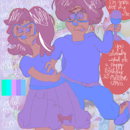
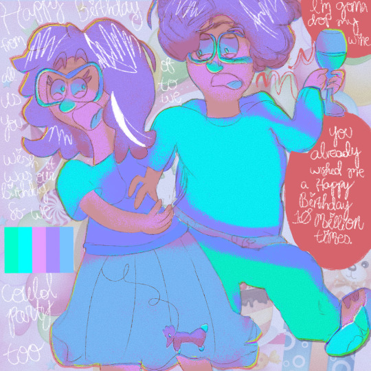
#not super used to doing colors and shading
Explore tagged Tumblr posts
Visit Tumblr Blog
Explore Tumblr blogs with no restrictions, modern design and the best experience.
Last Seen Tumblr Blogs


Fun Fact
The “We are the 99%” Tumblr blog became the slogan for the Occupy Wall Street movement.
Text
WBK - Thoughts on Sakura's eye color

There's some discussion on what color Sakura's right eye actually is? Is it gray? silver? blue?
I would say, a grayish blue.
In the manga version, Sakura's eyes range from silver/gray to bluish gray as the series progresses The inconsistently is probably because he doesn't save that PARTICULAR shade of blue gray, but rather chooses "something close to that area" in the color wheel on CSP + stylistic changes over the years for a manga.
What I notice, is that the Cloverworks anime instead goes for a gray color that matches his hair. Most anime artwork and merch also use the same gray color palette, EXCEPT for the recent Windbreaker x Vasara collab:

Usually the merchandise team gets very strict instructions on how to design things, so i found it super interesting that they called his right eye "blue", and his collar is also blue. Granted it COULD pass as a grayish blue, but its still more of a blue. (It doesn't have a japanese version, only english, so can't cross check ^^;)
Manga covers:


His eye in Vol 22 is definitely more blue than the first volumes.


Interestingly, he's been pretty consistent with coloring Sakura's eye with these particular shades lately
The hex code 7A8BA9 represents a shade of dark grayish blue.
Neat detail, Nii-sensei still has the rights to supervise the series in all the multimedia formats: he supervises the anime and game, looks over the merchandise, do some extra work for the volume releases, and draw bonuses. (12/24 Kodansha interview) That means he has some input on ALL the promotional materials for the series... and if he's ok with the final product, then we as the readers should be OK with it and not nitpick on whether its gray or blue, its really just a dark grayish blue.
And there we go :'D
24 notes
·
View notes
Note
Oh yeah, I’ve been meaning to ask Smiles, what’s your like, process with doing comics? Like where do you start? Dialogue? Or loose outlines of panels, or something?
Someone has probably asked this before but I don’t remember heh 😅
-Sky Floor
I don’t think anyone’s asked me this! This is for long term comics. Short term comics I just think of it and go ham with it lol.
But for long term I start with a script:

As you can see, I change the dialogue a lot and move things around as I work on the comic, but as long as the vibes are there that’s all I really care about. I try to make things clear for myself so I know what I’m going for in the moment.
Then I thumbnail after finishing writing and editing:

Idk how other people do thumbnails but I draw the comic and then try to find good placements for dialogue, characters, and panels. I also write the script to the side so that I know where the dialogue goes (and once again, this changes sometimes but as long as the vibes are there that’s all that matters to me). Since it’s not a serious thing, I try to give the characters distinguishing features that don’t take up a lotta time (Wars’s scarf, Wild’s sideburns, Twi’s markings, sometimes their hair). I also write notes on what I’m going for if it’s not clear enough in the thumbnail, which is silly but it works for me 😅 as long as it’s clear to me that’s all that matters :) For short term projects I don’t care that much about doing thumbnails, but with long terms I want to make sure the pacing is good and things are clear since I’m taking it a bit more seriously. This doesn’t super work well I feel but it’s something I can lean back on when I draw the actual comic itself. Sometimes having to do everything in the moment makes things stressful
And then I work on the comic! I sketch it out, draw the panels and write the dialogue, and then I do a second sketch of the characters and move them all around to fit the dialogue. That way things don’t get too crowded or anything, which I’m still trying to improve! Then I line, color, and shade and voila, a comic page!
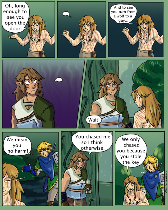
Like I said, things get switched around as I try to make things better, like switching Twi and Wild’s placement in panel 5 and adding another panel at the bottom. It just makes things a bit easier to read, and this happens a LOT. My thumbnails are drastically different than my comics 😅 which might get rid of the point of thumbnails but I guess they’re more like rough drafts of what I’m going for? But yeah! I also have colors I use as reference for the backgrounds and other things
Chapter 3 was a LONG chapter so there’s do many colors here, but I try to add all the colors I use on here just so I can reference back to them. It makes me life so much easier, tho this page got slightly confusing haha. That’s why some things are labeled. I also made sure to get the percentages right to make everything fit. I use refs for all the Links, and their items. Like swords, sheaths, and the Sheikah slate! Having all the refs out def crowds things up for me tho but it’s so much better than whatever I was doing before with all my other comics!
Not a fancy answer but this is basically how I do it and it works for me :) I find there’s a lot of ways to do things, but the most important thing in comics is to make sure things are CLEAR. It’s heavily dependent on visuals obviously, so thumbnails do help with making sure things are clear. This is something I’m still trying to learn and something I’m teaching myself, but yeah! That’s what I got :D
#asks#thanks for the ask eggy!#… I’m not gonna fix that typo it’s funny#pages also help me figure out how many pages a chapter will be#it just eases my conscious#helps me know how much work I have left to do
22 notes
·
View notes
Note
Hiiiiii, dropping in for a brain worm. What's your drawing process like? Like how long does it usually take for you to go from sketch, coloring, layering etc until you hit the final work? Super curious what's your favorite part of the process for a work :)
By the way, love your art. It's so dynamic, quiet yet visceral, loving, sensual, and comforting in a lot of ways. Do a little dance jig whenever I see you on my dash bc I know I'm gonna be spoiled well 🙂↕️
🥺 💞💞💞 wow thank you so much! I just really need ppl to understand they are CLENCHES FIST in love. Rawing nasty but in love
I do have a speed paint of my last Raf piece that I can't post here because his hands are in his junk, but that's on Twitter here.
Most of my art takes 17 - 20 hrs! That Sylus x Zayne x Caleb threesome in their catch 22 fits probably took closer to 35 or 40. This is gonna sound wild coming from a nsfw artist but I actually really don't like drawing the human form. It's too restrictive and I don't like following references very much, I'd rather have more freedom. Replicating the outfits and accessories in this game is EXHAUSTING,,,, but I must. The boner demands it.
Join me below the cut and I'll talk more about my process and the two most influential pieces of art advice I've ever recieved: shade dark to light, and paint with color rather than a darkened version of your flat colors.
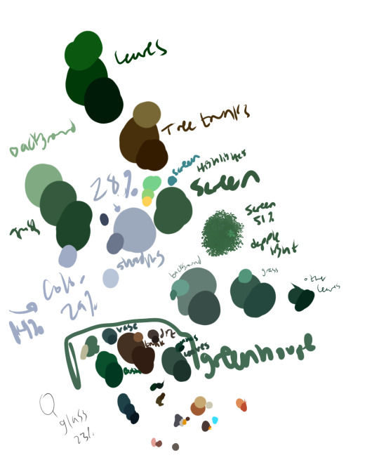
PaInT wItH cOlOr I will now proceed to use my silver dragon Sylus as an example.
I haven't taken an art class since I was in middle school so most of my learning was done on deviant art before it was an ai cesspool. Narrated speed paints and being introduced to other mediums were huge for me. I never learned color theory we go off vibes in this house.
So for my process now, I go through 4 or 5 phases of sketching. My sketches are still a little messy when I'm ready for them to be colored. Standard flat color process, also a little messy. I use one default brush for everything. Like EVERYTHING. When I got csp I messed around a lot (which you can see in my very first posts on this blog) but then when I found a brush I liked I married it. Sketch rendering everything.


I've been drawing dragons longer than I've worked with anything else. Also a lot of creature designing. My favorite step in the process is rendering and my favorite things to render are scales and hair! There isnt anything wrong with using brushes but I REALLY like drawing/rendering individual scales. Tedious is good sometimes
To do my base shading I flatten the color layers and copy it. Then on that new layer I go into tonal correcting and slide the hue around until I find a color I like. I bump up the saturation and lower luminosity, and set that layer to multiply. It's a bit hard to see but if you look on his neck and the back leg behind his tail, its a little blue; using a bit of color in the shadows is an easy way to make pieces more vibrant AND you're getting some backlight in.

And then I erase roughly where there will be highlight. I use a big brush and this takes just a few minutes.
If I want the piece more colorful I'll go in and add more of that backlight, like here with those light purple splotches on his tail, and the yellow edge around the tub, etc;


You can get away with slapping whatever color you want anywhere if you're gonna blend it and if its light/dark enough to work as a highlight or shadow.
Here's one of my spiderverse ocs, she's meant to be iridescent. Again its just a matter of blending colors well enough you can get them to work. And see how her base color is like a very light icy blue but some of the shadows are purple, but then others are a little gray so it's not overpowering.

And I dont use the blend tool, I color digitally like I'm using colored pencils.
And I typically do all the painting on one layer because too many layers is cumbersome! So I can't show you a few layers between the base shading and the final render because its all one layer! These still image tutorials dont work very well for me because its very 'draw the rest of the owl' !

It's also very typcial for the base shading to look naked by comparison. If you zoom in on his face there are a lot more scales. I don't sketch out fine details like this because I know that I want to do them later. Stuff like this you just need a clear image of the final piece in your head I think

If you see lineart in my pics its something I added during the painting process. I feel like it's been a long time since I've done proper lineart, after the sketch step but before flats.
Ok I feel like this is long so I'm stopping now.
19 notes
·
View notes
Text
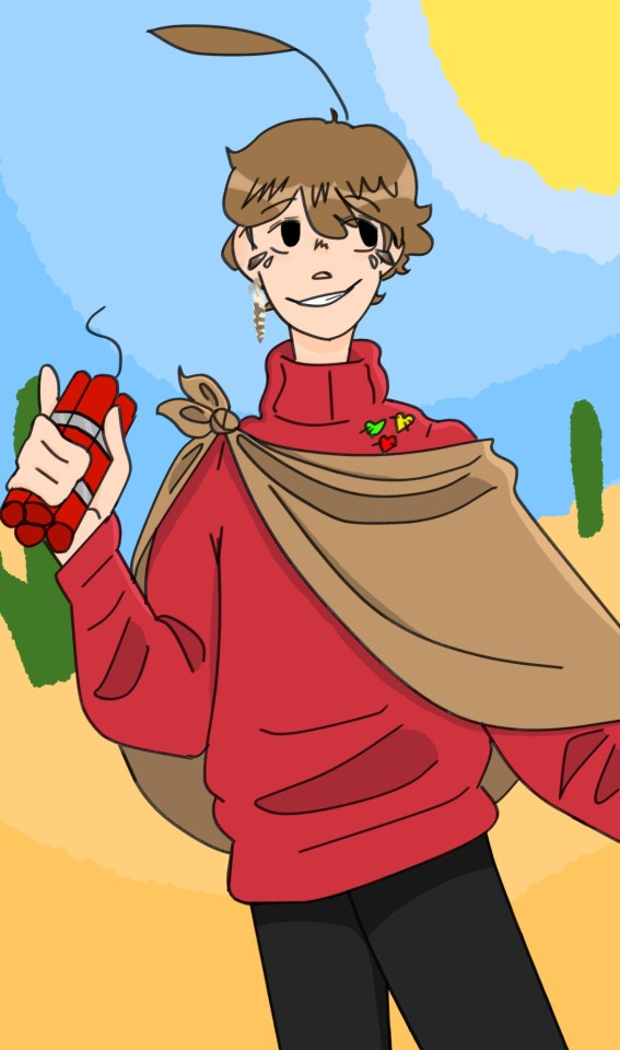
Still getting used to digital art but I'm pretty proud of this
3rd life Grian :D
Please appreciate the little feather details, they are burrowing owl
#art#life series#secret life#trafficblr#grian#3rd life#not super used to doing colors and shading#the background feels kinda slapdashed together but its finr#the background is the background#he gets bombs cus yes
60 notes
·
View notes
Text

don’t you hate it when your brother brings the guy who tried to kill you a bunch of times to your party
original meme under cut

#every now and then i have to draw a little comic strip for one of my aus based on a meme#and make it all up on the spot with absolutely no forethought#sanders sides au#sanders sides fairytale au#sanders sides fanart#roman sanders#remus sanders#janus sanders#creativitwins#i'm probably gonna end up changing janus's design between this and the next time i draw him#i just can't figure out how he should look#don't look at remus's clothes i literally didn't even plan what i was gonna draw before i started doing the lineart#i also didn't use references for anything but the hands#the problem with drawing anthropomorphic animals in this way is that it's really hard to make them show any expression#not that i'm good at that with humans anyway#i guess this is my debut of roman and remus's designs in this au. i'm gonna make little character profiles for them and all the others#idk how long that'll take though cause for some reason i decided to draw 2 full body colored and shaded pictures of each character#that's 12 drawings +the one each i already did for c!thomas and the orange side#i feel like this drawing doesn't look like remus much?#his grey hairs aren't super noticeable so maybe that's why. also the green on his clothes isn't very bright#and he's making a pretty normal facial expression so that affects it too#once again i did not plan this out at all beforehand#this is the 4th au ive made where roman is the youngest character. except in this one he and remus actually aren't twins (clearly)#remus is actually the oldest#so everyone else is in between them age wise#my art
81 notes
·
View notes
Note
how long does it take you to draw your sketches/doodles? also do you have any tips to draw faster? 🙇♀️
I generally take 30 - 60 minutes a sketch,,,, but honestly really depends on how detailed it is.
Like a Chibi will be done in 20 - 25 minutes (Counting in the extra time I spend on minute details like a perfectionist 😭)
I for some reason really like spending egregious amounts of time on random objects too??? Unless it’s the in the background, I’ll spend 40 minutes refining it.
Random characters that are fully colored and rendered with take like 80 minutes.
The comics take usually take an hour or two per page. (If I decide to cross hatch it, my entire day will be gone with 4 pages… so I’ve been trying to find shortcuts. But not without sacrificing the quality for time lol)
I don’t think there’s any trick or magic to drawing faster. It’s really about weaponizing your artistic knowledge, and finding what’s comfortable or convenient for you!
There was a period of time where I would spend 11 or 12 hours on an illustration, and it wASS UGLYYYYY. (Some of these artworks are still available on my tumblr,,, but it’s SO LONG AGO, AND IT WAS MY 1ST OR 2ND YEAR GETTING INTO DIGITAL ART)
Overtime I learned what worked best for me, and practiced till I felt more comfortable with what I was drawing. Eventually I managed to shorten the time to 4 hours or less! Ambition was my biggest enemy but at the same time my biggest motivator. (And it still is LMFAO) 😭
EDIT (bit more to my way too long tangent): ALSO??? BRO DON’T BE AFRAID TO USE YOUR MESSY SKETCH AS LINEART OR DRAW ON TOP OF IT. I’VE DONE IT FOR YEARS NOW AND IT ADDS SUCH A GOOD EXTRA BIT OF TEXTURE,, AT THIS POINT I DON’T EVEN USE LINE-ART ANY MORE UNLESS IT’S A COMMISSION,, (IT’LL ADD LIKE AN 2-4 HOURS TO MY WORK)

#mushyrt#asks#that word minute bothers me so much#I look at it and want to refer to it as the time minute#this sketch took about 3 minutes when it should’ve been 1 minute#BUT I WAS SO HYPERFIXATED ON THE EYESSS#i say these pretty words#but THE REAL TIP IS HONESTLY THE LASSO TOOL#LASSO TOOL IS THE BEST#IT’S MY FAVORITE TOOL FOR MAKING BACKGROUNDS OR QUICK SHADING OR COLORING#OR ALSO THE MASK TOOL#TAKE ADVANTAGE OF THEM#THEY’RE SO GOOD#Procreate mask tool kinda sucksss#SO USE ALPHA LOCK IF YOU ARE A CONFIDENT PERSON#OR NOT AFRAID TO F**K UP#Bro I sometimes draw on 1 layer and use alpha lock and my friends look at me like I’m a menace#BUT IT!S USEFULLLL AND SO EASY#This little tangent definitely should’ve been my answer for the ‘how much do you draw’ question#but I’ve been thinking about it for a long time#AND I’M A MANIAC WHEN IT COMES TO DRAWING 😭😭#even if you rob me of a paper or pencil I WILL FIND A WAY TO DRAW#I WILL SCRATCH INTO YOUR SHIRT AND ROCKS AND MAKE AN ARTWORK OUT OF WATER OR CAT FUR#YOU WILL NOT DEPRIVE ME OF MY CREATIVE ENDEAVORS#This didn’t stick out to me until one of my friends said ‘omg ofc she’s drawing’ under her breath#like I spend every second of free time I have drawing unless I find something else interesting#The only time I’m not drawing is when I’m on the toilet or doing random everyday stuff#I forgot to talk about this but greyscale to color is insanely useful too; it teaches you different values while also being super fast#i tend to use greyscale to color when I do a BW sketch I end up liking#TL;DR - Lasso Tool + Layer Mask + Alpha Lock + Sketch as lineart
60 notes
·
View notes
Text


I’m working on making a navigation post for my blog and rlly liked how these banners came out so I decided to share them :) Full and colored version of the Sukuna drawing here and the Yuuji one here !!
More than welcome to repost with credit!!
#the colors match my theme :)#the Sukuna one was super easy but the Yuuji one oh my GOD#I drew that one back when I used procreate so the quality was SMUSHED#I had to trace over the whole thing#I’m gonna do a Choso and Higuruma one too!! for the Choso one I’m gonna try and get a frame from the animation I made of him and use that#I’ll have to shade it tho >:(#jjk#jujustu kaisen#jjk fanart#jujutsu kaisen fanart#yuji itadori#yuuji itadori#ryomen sukuna#Sukuna#Itadori#ryomen sukuna fanart#yuuji itadori fanart#fanfic banners#nav ryomen sukuna#nav yuuji itadori#my art ryomen sukuna#my art yuuji itadori#my art ✧⋄⋆⋅⋆⋄✧⋄⋆⋅⋆⋄✧#free use ✧⋄⋆⋅⋆⋄✧⋄⋆⋅⋆⋄✧
69 notes
·
View notes
Text

"I think we can help each other out!"
reference images


gosh the color palette in these is great
#wheucto#art#bfdi#tpot#bfdi fanny#tpot fanny#bfdi one#tpot one#xfohv one#FINALLY ITS BEEN COMPLETED AUGH. i'm going to explode now#it was so great it vaporized my computer/silly/hyperbole (krita was actually pretty slow though. mildly annoying)#it was too big of a file to be uploaded to tumblr. i had to compress it <///3#tpot 12 spoilers#i now realize the purple i used is closer to like... a brownish color thats kind of just the faded color in between dark blue / bright red#- orange but thats okay#colors weehooo#also i wanted to try something more painterly#its kinda funny how originally i was mostly just thinking of coloring one and like most of my time was spent doing things other than that.#and then when i colored (shaded? highlighted? i did the shadow as a base color) it was like. super quick lol
55 notes
·
View notes
Text

hands
#no i cannot draw them give me a few weeks i'm learning#started with hand practice because i can do hands pretty well#honestly these are medicre (esp for us) but the colors of the shading are nice#screaming out of the abyss#abyssal art#sonic the hedgehog#shadow the hedgehog#doesn't have to be sonadow but that's the energy i'd bring to my viewing of it so#sonadow#not gonna tag super heavily this piece is only okay#sth
20 notes
·
View notes
Text

Month 12, day 29
Mah boi Flick getting some shade B)
#the great artscapade of 2024#art#my art#Forspoken#Forspoken fan art#Forspoken oc#Forspoken original character#OC: Flick#got an experiment to do on Tuesday when I come back to this#normally when I shade I use a super dark blue and set the layer to multiply#and 69% opacity#but when I did that this time it looked muddy#so I did a hue/saturation/color shift to make the blue shading pretty close to Flick's base color only darker#so we're gonna see if I can color drop from the darkest part of the shading layer#or if I have to pick the blue color I usually paint with and try to recreate the HSV shift from memory#bc it's entirely possible that even the darkest part of the shading layer wasn't maximum opacity for what I use#I'm sure I'll find the right color to use it'll just take a bit of trial and error#on account of how I wasn't paying attention to the exact HSV color shift I was just eyeballin' it#but tomorrow we're back to Blender so who knows I may change my mind by then lol#and decide to redo the shading with a whole different color!#we'll find out together :D
11 notes
·
View notes
Text
looking at this napstabot drawing that was supposed to be a quick flat doodle to show their side profile and thinking about how when i did that evil art style challenge a million years ago (jan. 2024) almost everyone said the opposite of my art style is painterly & textured

guys is that still true
#trousled dumb#ngl that part was always funny to me bc i LOVEEE texture i just mostly only get to use it when i'm shading things or somethin#which i don't do super often because flat colors are a lot quicker + i WILL hyperfocus on the shading and put way too much into it#as evidenced by that fuckass shoulder#granted i'm well aware that one strip of hair there looks very flat. but i dont wanna deal with that i drew this last week 😌#all that being said. i got new brushes semi-recently that work very well with shading fairly quickly. so now I Keep Fucking Doing This#i tried to redraw my human atbb designs last month and overrendered the fuck out of them both. good sai2 brushes have consequences#i owe raikairan on ko-fi my life (they are the Only One making custom sai2 brushes) and they might already be taking it. and thats okay
5 notes
·
View notes
Text
sometimes i feel like a fraud for relying on blending modes to achieve my color palettes and then i remember when i was 14 and thought i was great at coloring but my art looked like this

#and i wondered why my colors looked plasticy and fake…#anyways. i had the tools and blending modes then but didnt know how to use them#ig i have to remind myself that i have a better understanding of color than i think i do#bc knowing blending modes exist does not equal good colors. as my old art showcases#this drawing isnt a super good example of how i used to use blending modes#but it shows how desaturated and bad some of my old colors were#i mean.. they werent terrible. but i definitely didnt push them enough#i blended out the shadows too much and it left everything feeling very flat#i think i do a good job nowadays of letting the shading shine and making everything feel alive and incorporated
3 notes
·
View notes
Text

This is the first color art I've seen of the Yozakuras, so let's talk colors! Specifically, hairstyles. I gotta admit, I was surprised by the official hair colors. In my head, I was picturing Shinzo and Shion with coppery/auburn hair, and I pictured Futaba's hair as white blonde, not straight up bone-white. I'm happy to have correctly guessed Kengo's bright yellow hair, at least—he just feels blond lol. I also pictured Taiyo and Mutsumi having black hair, so I was surprised when they turned out to have red and blue, respectively.
I'm a little mixed on the hair colors tbh. I like that all the siblings are color-coded, but part of me feels like it's a little too much—I mean, siblings having wildly different hair colors AND it's all super bright anime colors like green and purple feels like overkill. I also feel like the excess of clashing colors can overwhelm the eyes when you put the Yozakuras all together in a group shot like this.
That being said, I do like the characterization tied up in the colors. Kyoichiro being the only child to have black hair feels very poignant, especially since he always wears black suits that make him look gaunt and ghoulish. I like the contrast between Kyoichiro (black) and Futaba (white), and the yin-yang element at play with Taiyo (red) and Mutsumi (blue). And I just looooove Nanao's cyan bucket-helmet, since it's a) fitting for the baby of the family and b) a good color for him.
I'm still not sold, but I can already feel the colors growing on me, so maybe it's just a matter of getting used to it *shrugs*
#i also started watching the anime recently which probably affects my opinions on this as well#i don't think the bright unsaturated colors that the anime uses are doing it any favors#with shading the hair colors look strange but reasonable#in the anime they're straight-up garish#anyway this all makes me super interested in seeing the extended family's hair colors as well#did the yozakura mom have anime hair? or the yozakura dad? what about the grandparents' hair?#heck what about the previous house heads#considering how important they become later on i'm willing to bet they have color-coded anime hair in spades#one more reason to look forward to meeting the rest of the yozakuras#mission yozakura family#group tag#brainrot fodder#sage rambles
7 notes
·
View notes
Text
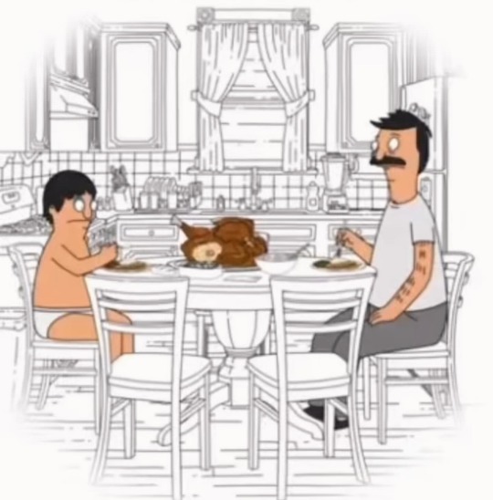
All right, because @babsvibes asked me how I picked colors for my latest Thanksgiving art piece yesterday, I’ve decided to make an official walkthrough of how I do coloring/shading and lighting for my pieces!! This isn’t technically a tutorial, but maybe you can count it as one?? Take everything I say with a grain of salt, though, as I’m just a self-taught artist who still has a lot to learn!!
Usually, the way I start coloring is by taking a screenshot from the show and take the colors directly from there. Having a screenshot is also handy so I can use it as a reference! Is it cheating to take colors directly from the show?? Maybe, but I like doing it so so know the colors are exactly correct.
Using my latest piece of Bob and Gene eating Thanksgiving dinner together, I used this screenshot as both a reference and to take the colors:
Then, to do my shading, I take a shading brush in Procreate and paint in everywhere where there would be a shadow. I’ve trained my eye to look for places where I know light wouldn’t really touch, such as below an arm or neck or directly under a character’s hairline. Then, when I’m done, I just lower the opacity and pick a layer setting that looks the nicest to me. This is what my latest piece’s shadow layer ended up looking like (with the opacity turned up a bit):
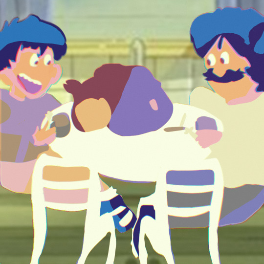
Then, once I’m done with shading, I go on to lighting. I use a new technique now where I just paint in everywhere else (AKA everywhere I didn’t put in a shadow). I used to not even do lighting, because I found it complicated, but I feel it adds a nice touch to my pieces now. The way I do it is kind of tedious, but it’s what I’ve found I can help me understand lighting the easiest. Sometimes I also duplicate my lighting layer, use a Gaussian Blur, then turn the layer to “Add” to create a glowy effect. This glowy effect is usually reserved more for things like torches and flashlights, but I feel as if it gives my lighting an extra “oomph”. Here’s what my lighting layers looked like:

And to make my colors pop even more, I use my phone’s edit feature to go through the process of putting on a nice-looking filter and going insane with all of the features! I’ve found it has a really nice effect.

If I want to go even crazier (yes, I actually do this), I might go into this photo editing app I have on my computer and do even more messing around with filters and colors and the like.
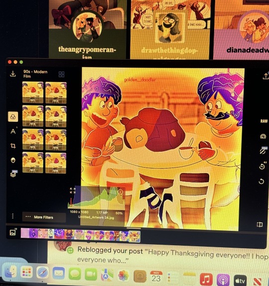
It’s called Polarr Pro Photo Editor for anyone who’s curious!! I also put on my signature in here if I forgot to do it in Procreate.
But that is how I do my coloring and shading/lighting!! I’m still learning and I’m sure I’ll continue to improve. I definitely still have a lot to learn when it comes to shading and lighting!! There are honestly so many ways you can tackle this, so my method absolutely isn’t the end all be all!!
I even have a different technique for when I’m doing a simpler piece or just want some shading that has a lot more texture. I duplicate my color layer, lower the saturation, make a mask, and “paint in” the light really quickly with a super textured brush.
Here’s what it looks like before:
And here’s what it looks like after!
I actually find this technique a bit difficult because my brain works in shadows and finding where shadows would hit, so painting in the light is a challenge. But it can be fun too!!
If anyone has any techniques of their own, feel free to share them!!
#personal#art techniques#special thank you to babs for asking me about this and inspiring this post❣️#i always used to dread shading and lighting (sometimes i still do) because of how difficult it can be but i have a lot more fun with it now#i also adore using as many crazy filters and settings as possible to make my pieces look nice#and random color palettes because slapping those on is always super fun#i am NOT qualified to give out art advice in the slightest so like i said this isn’t technically a tutorial just how i do things#but if you want you can still consider it one!
3 notes
·
View notes
Text
I colored em


>:)
#absolutely do not expect this level of quality from the whole thing lmao#I just got super into it cause I like this drawing a lot#also I don't know if posting this in a reblog is a good idea cause I don't think it will show up in the tags but oh well#I really enjoy this style of shading but it is quite time consuming#I think I mostly associate this shading with my mdzs art cause that's when I started using it#but I went to look back and I don't think I've really used it aside from my first levihan post (good times :') ) where it's way messier#not that there's anything wrong with that but I think this shading shines with clean line art#cause I basically just go ham with the airbrush and lasso tool and a little bit of smudge#and clear sections help with that#I didn't intend to yap about shading for eight million tags but what else is new my blog my rules#I also colored the lineart which I often find too tedious to do :D#don't think I'm even gonna put fandom tags on this I think it won't show#it'll be part of the final product anywayss#violetscanfly
274 notes
·
View notes
Text


First concepts / doodles / first animation in an animating program!
[Video description: Polly tilting her head back and forth. End VD.]
#first image was me mostly trying to nail down her hair#and the bottom is a very rough first animation test. I've never animated in actual animation software before! it's always been photoshop#it's actually super super interesting how they're different. you don't use layers! your lines and coloring are on the same layer#and it works because the program can tell the difference between them. everything is optimized to go super fast. it's very cool#(at least the way I'm using it that's how it works)#I also thought it was over for me after I designed a character with so many unclosed lines and I couldn't figure out how to color her#but it turns out you do it the same way you would shade: by drawing the lines in another color#oh also. up top. that's not polly in the corner. that's angel and she doesn't normally have a wand. I just wanted to draw her with one#all of these are from mid to late january#go my million tags#polly#robot#robot girl#robot oc#animation
1 note
·
View note