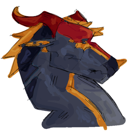
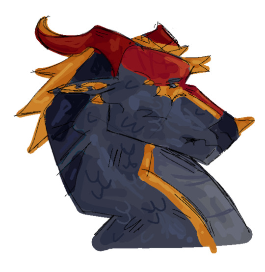
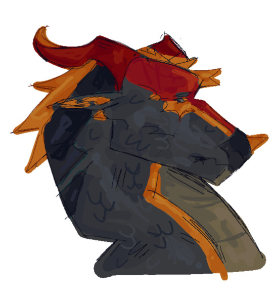
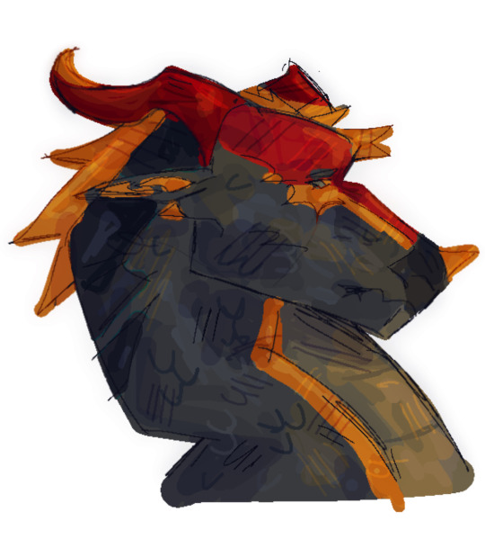
#no references no lineart just vibes
Explore tagged Tumblr posts
Text


text transcription:
Many springs ago, I perceived a sea of flowers upon a lake. I thought to myself that those fleeting colors held indescribable beauty.
The next time I perceived those colors was many years later, when the medic’s tent had blinded me to all but red. The radiance of that shining star was lost on my eyes.
Now, my eyes no longer perceive the subtleties in the colors around me.
But I am content.
For I can now see the most brilliant colors in my universe.
anyways yeah why did they fucking do that to jiaoqiu bro
the planning for this experimentalish comic is under keep reading


#artwork#digital art#hsr fanart#art#hsr#honkai star rail#jiaoqiu#hsr jiaoqiu#moze#hsr moze#feixiao#hsr feixiao#moqiu#feiqiu#moze x jiaoqiu#feixiao x jiaoqiu#it can go either way tbh depending on how you read it but i personally don’t ship feiqiu#this was mostly just jiaoqiu character exploration#hsr 2.5#hsr spoilers#just in case because i actually got fucking spoiled on the plot twist and it made me so mad#experimental comic#being in art school for like 3 weeks really experimentalpilled me#(i just wanted to do something other than lineart lmao)#painted it almost entirely with a singular noise brush because i was going for those memories vibes + jiaoqiu’s blind now#so i was trying to give the impression that he can’t see clearly#for anyone who’s about to like idk get on my ass about depicting blindness wrong#i based all of these visuals off of what i see when i take off my glasses#ill do more research when i wanna get in depth with this concept but for now my -300 degrees eyes are gonna have to be the reference#im imagining jiaoqiu with prescription bottlebottom glasses now
453 notes
·
View notes
Text
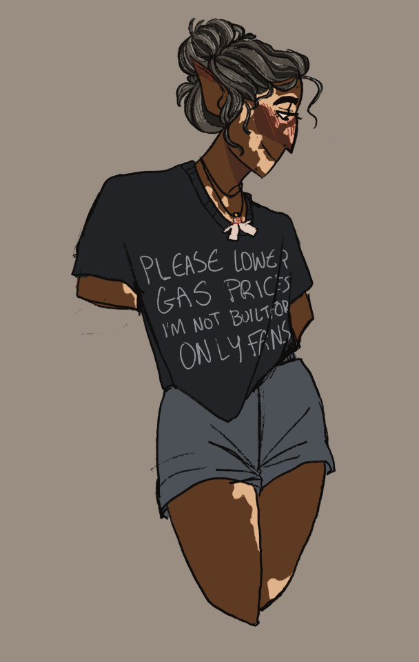
My tablet's almost out of battery so I can't keep working on my Solace sketch page so here's the only drawing that's cooperated with me so far ft. a pinterest t-shirt
#solace has two vibes: gay protagonist in a gothic tragedy w/ catholic themes and Straight* Christian Girl At Summer Camp#unfortunately#i didnt intend for that to be the vibe of this one but that's what it's giving for me. maybe it's the dysphoria talking lol#also! saying this drawing cooperated isnt quite true#everything BUT the arms cooperated so i just decided they werent important#solace riadyr#bg3#bg3 art#bg3 tav#bg3 cleric#elf cleric#bg3 tempest cleric#bg3 elf#my post#jay rambles#oc art#i DO like the lineart & how i colored their hair though#i should make a proper reference so im not relying on screenshots to get their vitiligo down properly#also for artfight#my art#digital art#sketch#digital artist#dnd artist#dnd art#oc artist#maybe their vibe for this one is actually more Softball Gay now that I think about it.#it's fitting they're strong as hell and Cannot Stop Moving Or They'll Die#i think the messy bun is throwing me off but it's the fastest way for them to actually get their hair out of their face
12 notes
·
View notes
Note
Oh uh forgot to ask in the previous ask (the one with the digital piece of candy and scurrying and stuff)
How do you draw art so good
Like
Is there a method you use or is that just the style you've gotten over time?
you've activated my trap card
I'm just gonna preface that this tutorial is from someone who was not professionally trained and didn't have a lot of free time for art, so a lot of the tips I have is short cuts I use to get the best results quickly
If you genuinely want to get better at art then please look at references and practice that is always the best
However if you are like me and only really do art for fun but want to go faster then these are for you pfppt
Overall I'd say my style is influenced by speedpaints I would watch when I was younger, I like analyzing how people do things and what makes something look "good" to me
I always recommend watching them because they will often have techniques you've never seen before or do things a certain way that you can try out yourself
I consume good art, it feeds me
but seriously it can be super helpful when developing your own methodology, or just generally trying something new
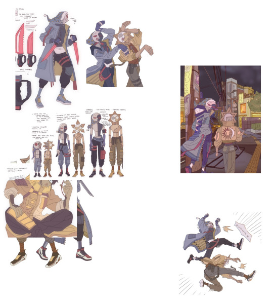
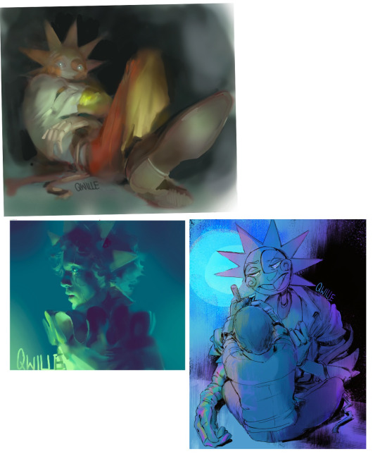
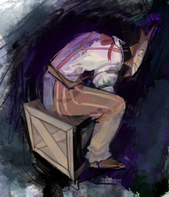
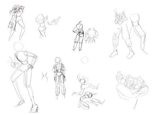
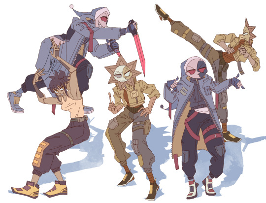
Usually it starts with me pulling some references from artists I really admire and sort of sketching out how they do the things I like
For example 8um8le has like super good anatomy and poses so I focused on trying to replicate how they do that
venemous-qwille is super good at color and pulling focus so that's what I focused on in my study of them
In general I'd say my process is sketch -> silhouette -> color -> shading -> render
I really don't like doing lineart lol

I'd say for the sketch the most important part is using references and just kind of fudging it until it looks correct anatomically/physically
General rule of thumb is spend time on areas of interest, and keep non important areas light (like the stitching on his pants)
I don't do lineart because I think its unnecessary for most paintings I do
I naturally tend to put more time and focus on areas of interest (like hands and feet) and if you use a brush with opacity for the sketch, those areas are naturally going to be darker in the final sketch
Of course this is gonna be different for everyone but it's what works for me
Sometimes I do a really really sketchy layer underneath my sketch/lineart, just so I know where everything is going
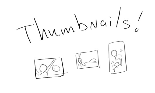
Use thumbnails! They are great to help figure out the general layout of things and what pose I wanna do
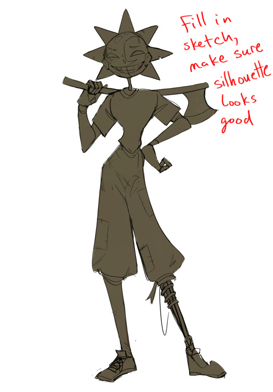
Next is what I call the "silhouette" layer
This is super important for me cause it helps me refine the figure and make sure the pose/anatomy looks correct, also depending on what color I choose for the silhouette helps guide what colors I'm going to use on top
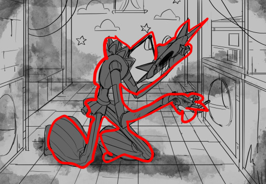
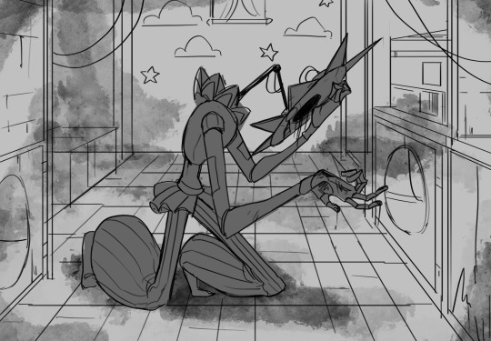
This piece is a good example of how it works. The silhouette shows me how the figure interacts with the background, how the pose looks and if its any good
The silhouette layer doesn't have to be super clean, as long as it follows the sketch decently well and shows where the figure is then its fine
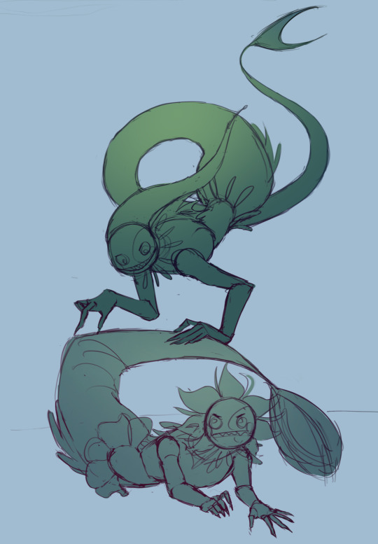
I also sometimes make the silhouette layer multiple colors to help guide shading and vibe
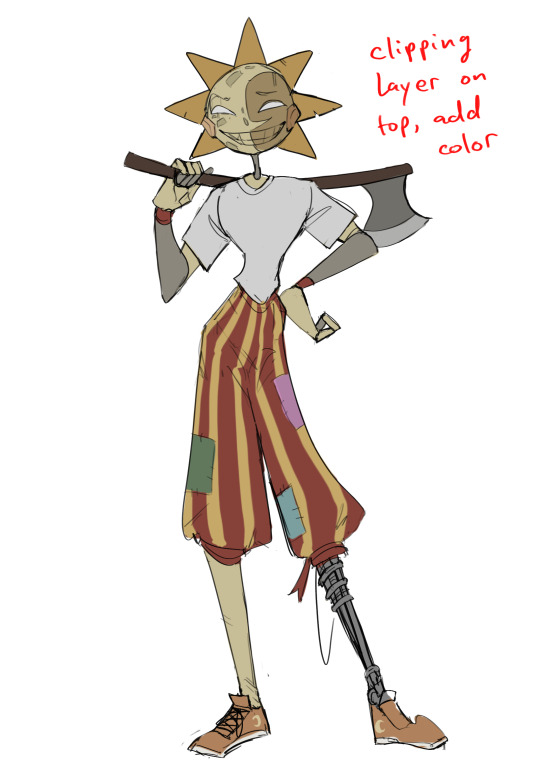
Next is the coloring layer. I usually make this a clipping layer on top of the silhouette layer, or I change the silhouette layer to alpha lock, either way it saves me time on coloring everything in

Sometimes I am super rough with the coloring too, using like an airbrush or my fav watercolor brush just to generically block in color where I want it
Works out cause most objects have like a bounce light to them from surrounding objects, so this is sort of a cheat I use to get that effect without all the work lol
Also don't be afraid to have the lower silhouette layer shining through, having multiple colors sort of subtly shining through the piece helps lots
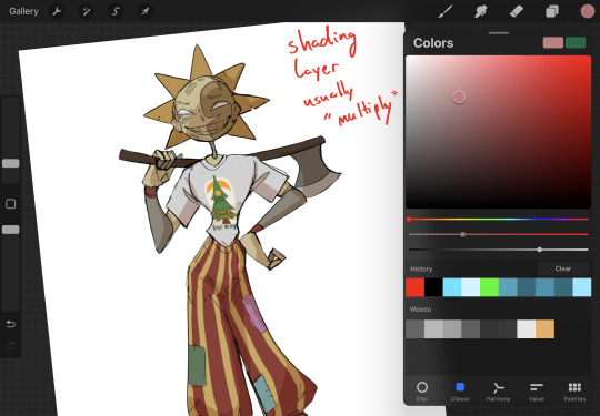
Next is the shading layer, this is usually another clipping layer, usually set to "multiply"
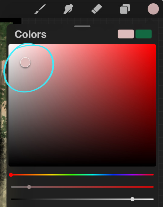
The colors I pick here is usually within this range, any color works, just depends on the piece and vibes.
Since this piece is set in a sunset forest I choose a more desaturated orange for the shading layer
I know there's a whole thing about multiply layer being a crutch (and it kind of it) but it is a useful tool when you just want some darker values across the piece but don't want to go through the process of color picking every single darker shade
Also in my opinion it looks better than picking a darker color and setting it to a lower opacity, idk I just think the color has more "depth"
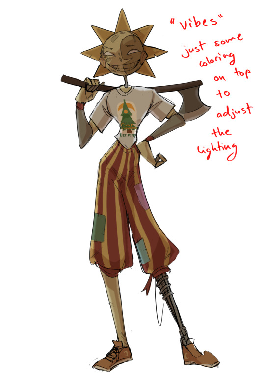
Next is the hardest to explain, sort of the vibes layer
Usually its just a layer of more concentrated color on top of the normal color and I fudge with the settings and values until I get a result I like
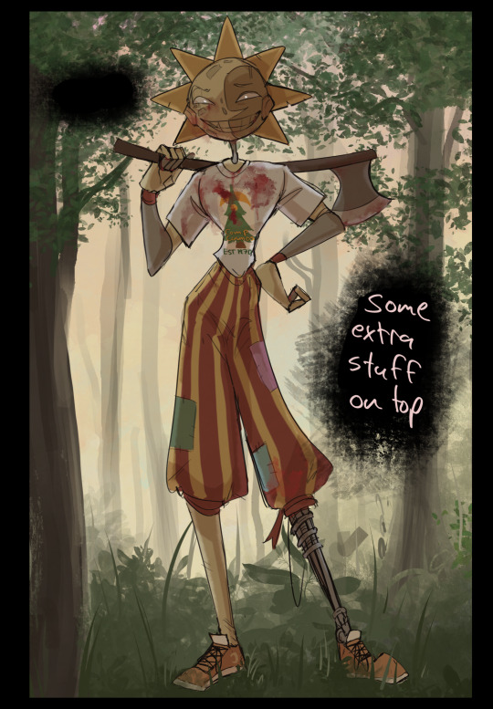
Next is the longest step, is the "extra" or the render stage.
Usually I add a background before this step so that if I need to merge the figure better with the background I can
If I render with a white background but he's supposed to be in a dark forest, its going to mess with the lighting severely
Also this is when I add more "vibe" layers on top to get the figure to match the background better
Backgrounds in general I recommend checking out @/derekdomnicdsouza on instagram he's got lots of great tutorials for breaking down backgrounds simply

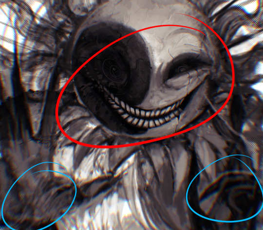
I'd say general rule for the rendering layer is to focus on the areas of interest and spend less time on areas you don't care about
I even blur stuff out on the edges I don't want people to see, partially to save time on fixing mistakes in areas I dont care about (oop), but mainly to help draw the eye to the areas I do want people to focus on

Theoretically parts of the background should like mesh with the characters, parrallel lines are a no no unless they are directing a viewer to look somewhere, things that are perpendicular help bring things together
tbh I'm still not the best at layout and probably need more practice, but overall this is what I like doing
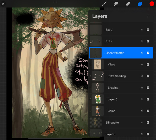
Overall this is what my layer set up ends up being
Sort of a sandwich with the lineart/sketch as the "meat" lol
Color and basic shading below the sketch, clean-up and rendering on top
I like this method cause it's super flexible if I ever want to try something different or try to replicate someone's style
I can make each step less or more messy depending on the end result and can add a lineart layer if need be. Also if there's a part that is straight up not working or needs to be removed its super easy to do cause I can just paint over it on the "extras" layer, color picking from the surrounding area to get the same vibe
Generally rule of thumb for my style is: get the initial layout of colors, form and shading to look good, then the rendering should be smooth sailing
Really the best advice I can give to get better at art is to enjoy what you're doing and become very very obsessed with drawing a silly little guy
You'll eventually get very good at drawing them pfptpf
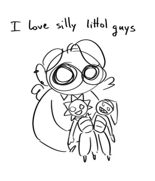
#sundrop#moondrop#long post#art tutorial#fnaf sun#fnaf moon#I draw them way too much holy guac#ask#this is for you asker#idk if anyone else is interested in this kind of stuff#i apologize for ranting lol#also me struggling to spell silhouette like 15 times
116 notes
·
View notes
Text
OC REF SHEETS ✨
HI!!! I finally have updated references for you silly billies

Here is Mori obviously, my favourite flavour of autism 🫶 /pos
Coloured the lineart of it, the art is still old but that’s what I like about it. Old maur maur :’)


ALSO!! I just finished his Mother’s ref sheet!
Her concept drawing has been abandoned in my procreate for literally a year and I finally got back to finishing it!
She is supposed to be a full moon because.. she kind of gives off goddess vibes, you know? The minute you meet her, you can tell she’s the most divine thing in the world.
So here she is!
Meet Mori Moonlet and his Mother, Illumina Moonlet 🌙
#welcome home#welcome home fanart#wh oc#welcome home oc#welcome home arg#welcome home puppet show#my ocs#oc ref sheet#mori moonlet#illumina moonlet#my art#artists on tumblr#tumblr artists#KawaiiAleisha#MY BABIES
118 notes
·
View notes
Note
Hello!
I just wanted to tell you that your art and way of storytelling is AMAZING. You're one of my biggest inspirations, and one of the people who got me into LMK (which I am very grateful for! Thank you so much)!!
I also have two questions for you (if you're not too busy! I dont want to bother you-)
What's your process for making illustrations? Yours look so pretty and they are so wonderful to look at!
And, what's your tips for anyone who wants to make a LMK fan-comic, but is a little scared to get something wrong? (Like good representation and cultural no-nos for example. I've done research, but the internet can be a little confusing and messy about topics like this, so I wanted to ask for help!)
I do hope that I'm not bothering you in any way!
Have an amazing day/night!
This is an oldie ask, apologies, but I do have a better way to answer this now! Typically, when I work on my pieces, I have 4 main phases: Roughs, Lines, Flats, and Renders! I'll use this Nezha piece as an example!
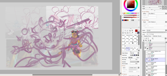
My Roughs stage includes getting references, color themes I may want, and feeling out the general vibe I want out of a piece! For this one, I really wanted to push Nezha's face expression (my main) as well as try to emphasize the speed at which he was moving.
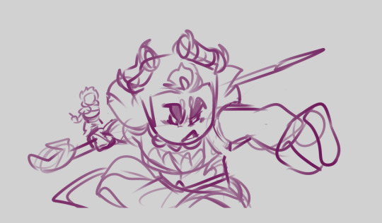
Once I do that, I try to space out everything in the background, and refine the sketch with one more rough draft before moving on to the lines!
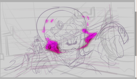
The Lines stage is pretty self-explanatory: this is when I line everything and make additional changes I may not have thought of from the Roughs stage: For this one in particular, I remember wanting to add details of more wear and tear, such as the sash being a bit damaged, or his bracelet getting cracks, or his face being a little scuffed up.
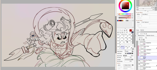
Next up: Flats! This is when I would flat color, as well as adjust the lineart to have colored lines (its already colored in the prior screenshot, but my lineart starts out all black) I find coloring the linart helps make the colors feel more "lived in" for lack of a better phrase
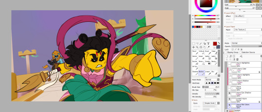
Finally, the render portion, which usually starts with the BG for me most times; I find if I know the environments colors/lighting it helps concrete where light is affecting the characters
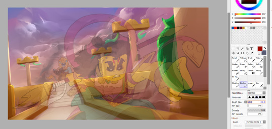
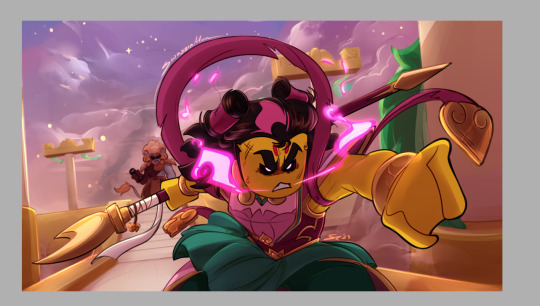
This is your overlays, mutiply, and shine layers in action! Flat coloring makes my soul itch, but rendering really helps quell that pain for me; esp if I get to work with gold/hair shine! I hope that was helpful! And as far as advice for respecting cultural-related things, honestly, as an American I don't know much in the realms of specifics, but I do know to try to have basics understood, which I gather from what has been made thus far within LMK, reading the source material/fact checking information I come across, my own experience of being black in America, and reviewing travel advise funny enough. I wish you a good luck with your artistic journey homie!
73 notes
·
View notes
Text
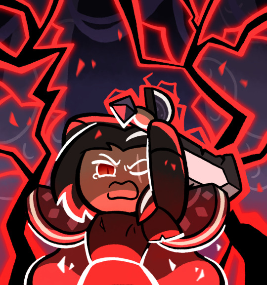
So I’ve been making this
So basically last night, I was listening to some music, specifically Not Gonna Die by Skillet, more specifically a version on YouTube with the intro (because I’m not the biggest fan of Good to be Alive where the intro actually is). Anyways, when it’s night, my imagination tends to be more active and I tend to have more energy. While listening to the song, I eventually got this mental image in my mind of this scene with Dark Choco, and the more it crystallized the more I wanted to draw it. I was going to go to sleep and maybe do it in the morning, but I realized that I probably would forget the vibe and not have as much energy, so instead I decided to power through and draw the idea
It was a bit difficult since I had limited references for the pose I wanted, and I suppose I can admit the sword looks a bit off anatomically, but it looks good enough I think, and lets me keep the eyes revealed
I did eventually have to stop drawing, because my iPad had been worked all the way down to 4% (and it was at 30% when I started, the poor thing), not to mention it was around 11:30 already which is pretty late for me, and my earbuds had been running nonstop for over 2 hours (yes I was listening to the same song, it’s how I keep the vibe). I was at least able to get the pose, base colors and lineart done, and I’m still pretty proud of where I left things last night
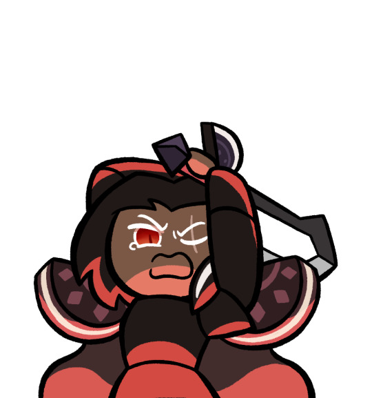
Today was mostly just doing the background and lighting, which admittedly I may have fumbled. I’m not very good at backgrounds and I didn’t know how to draw lightning. I tried my best, but honestly I don’t think I got the image in my head. Didn’t help that my brain was playing the wrong Skillet song this morning
Oh yeah and by the way, the background is supposed to be from this. That’s what I used as reference

The lightning both feels like too much and too little. Like, it’s crowding the picture, and I can’t have more because it’d be way too crowded with it, but also at the same time, it doesn’t feel like enough, like there isn’t as much power as I wanted
Actually wait, maybe I can add some small particle effects to like, enhance the lightning feel. That was in the original sketch but I omitted it in the final. If you see one with that, you know I did that
Edit: I did indeed do that
To be fair though, I don’t think I have the art skill to properly convey the image in my head. Basically the scene is that Dark Choco is using absolutely every amount of his power for this final swing down, so much that it’s too powerful and the Strawberry Jam Sword completely shatters. But also it’s too powerful that Dark Choco’s body simply can’t handle it, and he basically ends up exploding. The scene depicted would be the wind up to that final swing that destroys the both of them
This isn’t necessarily the first time I’ve come up with this scenario, and the setup would basically be that he turned on the Cookies of Darkness slightly earlier, because he didn’t want to destroy his homeland again, and he tried to get rid of them while in the kingdom but not yet at the Citadel, but he ended up failing, so with nothing to lose, he chases after them and decides to put everything into destroying them, even if it likely ends in his death. After this he probably killed Pomegranate and crippled Licorice in some way (I don’t think he’d attack Poison Mushroom), so his final act did have some effect, but he’s still dead by the end of it. And he and his father never got the chance to properly reconcile because Dark Choco thought that could never be a possibility anymore and he had resigned himself to his fate
But yeah, I just don’t know how to convey that sheer overwhelming power and emotion that this scenario suggests. I tried my best though
I also want to submit this to the Dark Cacao Forever contest, but I’m not sure if it’s good enough for it. What do you think?
#cookie run#cookie run kingdom#dark choco cookie#my art#I really did try hard and this and it does look better than most of my others#but I don’t know if it’s really that good or anything
237 notes
·
View notes
Note
Your art reminds me of retro shoujo manga in the best possible way. There is just something about your fashion sense and your line work that gives it these absolutely impeccable vibes.
I just want to study your art under a microscope because its so incredibly pleasing to look at. I rarely ever do art studies but I've literally not been doing anything else for days since I found your account and I'm having a blast.
Also Cae hot.
Ty! ❤️❤️❤️
I’m sure everything I do is influenced by the fact that I read manga since I was kid- all types/genres as long as the characters are lovable. Someone that I recommend, and whose style I look up to, is Irie Aki. Her line work is surreal and seems like it’s moving with how fluid it is.
I’ve also always been into fashion. I believe at one point when I was young I figured I would go to higher education for designing clothes, but chalk that up to the many things I *thought* I would accomplish. In college I took quite a few different general art classes and got taught realism from life studies. Although I default to the cartoony style that I normally put out- it’s funner and faster for me
This is very very rough, but here we go:

I saw this dress recently and saved it to my camera roll for later. So I see this, and yes it’s gorgeous, but I don’t love the neckline. I prefer high neck collars. I change it, but then the silhouette is kind of lacking up top, and more layers are added. Now it’s Spanish looking. I lean into that, putting more pleats into the ruffles than the original dress has. Then when coloring, I tend to see where the dark tones are going to go first (same with lineart- the shadows are the blacks). Grabbing the darkest color from the original, use that as a base. I also want it more saturated because why not. So bright red where the light hits, and something on the same side of the spectrum for the shadow. Shadows are desaturated. Add additional colors by feeling it out. If I was going to add a background or second character I would color balance them together so it’s harmonious in the end. Nothing is strict though, it all depends on what lighting you’re going for

The end result is pretty different from the reference and that’s typically how things go! I think experimentation and understanding your own likes+dislikes is really important! It’s what has propelled myself forward in the most impactful way
*I said it in a previous ask, but having a subject that drives you to keep creating helps a shit ton too. I’m the president of Cae’s fan club, you guys can’t beat me, don’t even try
77 notes
·
View notes
Text
-FAQ-
Hello! I've gained a whole bunch of followers lately and I've been getting a lot of questions about commissions, what my setup is, what brushes I use, etc, so I thought I'd make a post about it to answer everyone's questions at once !
Putting them under the cut <3
Commissions:
Commission prices are listed in my pinned post. You can send me a private message about your commission idea and we can get to talking :) It is helpful to have enough references handy (character, outfit, descriptions etc)
I am generally a fast drawer but I also have a job and a physical disability so there might be moments I can't work on your commission. But that is never longer than a few days at most.
Payment is upfront, the full amount and via paypal only. I know this might seem a bit scary but unfortunately there are a lot of people who end up not paying for commissions and I want to avoid that.
During the process I will send you frequent updates and will ask for input, to see if it is going in the direction you want. You can ask for changes during the sketching progress but once I've started on line-art and coloring, no big changes will happen. (You can for example ask for a different color for a shirt etc, but not for a different prop or pose or expression)
When it is completed, I will send the drawing to you via email. The drawing will remain mine and it is not to be sold or profited of by the person who commissioned me. If the commission is for something commercial/for selling, that needs to be discussed. I prefer to do drawings only for personal use!
For more questions, my dms/asks are open :)
How long have I been doing digital art:
I've been drawing digitally for about 5 years now i think? But before that I've been drawing and painting traditionally literally since the moment I could pick up a pencil.
Set-up:
It's just me and my ipad and apple pencil laying on my bed. I wouldn't even know where to begin for those whole multi-monitor/screen setups ;-; I draw only with Procreate
Brushes:
I tend to play with different brushes from time to time to get different textures, but generally i use the same few for most of my drawings/styles. My favorite one is the Peppermint Brush, for sketching. I use it in every drawing i make! I always sketch with it, and often do the line-art with it as well! And it makes for a nice textured brush for rendering as well! (i used it for a lot of rendering of the armor in this drawing)
The (procreate) brushes i use a lot are
for medieval style: inking - Ink Bleed (for line-art) artistic - Quoll (for coloring)
for general style: calligraphy - Chalk (coloring/rendering) sketching - Peppermint (line-art/sketching)
for realism: calligraphy - Shale Brush (full rendering) Also using the shale brush for smudging and erasing when drawing realistic
for lineart: smooth pencil from this pack by Heygiudi
How/why do you choose a base color:
I tend to look at a few different things when deciding on a base color/color palette.
the overall color of the reference pic
the color i associate with who or what i am drawing
the feeling/vibe i want to give off with that drawing
color has a BIG impact on the vibe of a drawing, so it is something i keep in mind when im drawing.
Using a color as a base to start, helps a lot with my drawing process. It helps me pick out other colors so they match better. It helps me get light/dark values right. And the chalk brush i use, has gaps between the strokes, so the base color will always come through a little. Having the same color come through in the entire drawing, helps pull all the colors together if that makes sense? I always start with a solid base color when i am painting traditionally as well!
Advice:
PRACTICE!!! just keep drawing and practice. I know this is such generic advice but truly practice is The Way. Learn from other artists but don't compare yourself to them. Everyone's artistic journey is different and there's no "good" or "bad". And most importantly make sure that you have fun when you're making stuff :3
I also learn a lot by studying art I admire and love. Figuring out what it is I like about it. (for example, the line thickness or the shapes or texture etc), and try to incorporate that in my own style in a way that is not directly copying or stealing.
#my art#FAQ#frequently asked questions#art process#art tips#drawing process#procreate#brushes#commission info
782 notes
·
View notes
Text
hi everyone!! my wrist is too sore to draw today, so instead i thought i'd share some of my favorite csp assets + how i like to use them! i also linked some procreate brushes at the end of the post!!
lineart brushes:
SU-Cream Pencil: i swear by this brush and i use it very often!! if you lower the pen density and use a gradient map over it when coloring your drawing, it has a nice effect. that's what i did in this drawing here! i also use this brush like i would draw on paper, so as a sketching tool. recently i've been enjoying blending it for shading. the pics below are drawn on one layer; left is more manga style while the one on the right is from a WIP of my singer sargent study, so it can be used for more realistic styles pretty well!


Found Pencil: another pencil brush that feels really nice to use, created by @/pigpenandpaper.
PS style brushes: a recreation of photoshop's (i believe) default brush. very versatile and also blends well!
analog wind variant pen: a nice pen that i like to use for lineart that is intended to have a bit of a sketch look.
zakutoro real g-pen: i used it for the lineart of this piece. although, it was drawn before i started using 600dpi in my works, so the lower resolution might make it look a bit unclear.
sets of rough pens: great for manga lineart with a rougher vibe; some of them have varying line weight.
coloring brushes:
zaku brushes: very nice and painterly mixing! i definitely recommend it for those who like to leave their colors a bit unblended.
softie marker: as the name implies, it's very soft! i like to use it for blush in chibi illustrations.
analog watercolor brushes: realistic-looking watercolor brushes. i recommend using it with csp's default paper textures, or those i linked below!
993 coloring pen: it's very soft and watery, though it can be made more solid by adjusting the paint density. i actually think it works very nicely for lineart too.
rock dog pen: another soft marker brush i like, that i once again also use for lineart and doodles.
thick coating brush set: recommended for paintings that show brush strokes.
cartoon cloud: don't let the name narrow your vision!! this has to be one of the BEST brushes for painting in my opinion, and of course it's great for clouds and explosions but so so much more!! and it's FREE try it try it!!
decoration/miscellaneous brushes:
neon pen
paper textures
symmetry move brush
close and fill without gaps
rope brush
sphere fisheye guide
flash balloon
speech bubble set: a lifesaving collection for comic artists!! dimensions and line weight can be adjusted by using the operation tool.
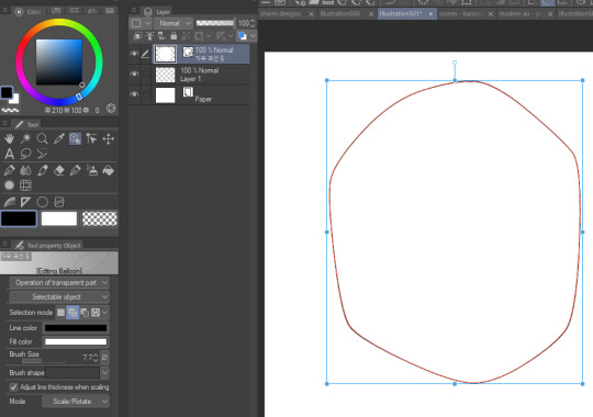
gradient map to use in color mode at 15% and another gradient map to use at 20%: the percentage refers to the opacity of the gradient map layer, but they are just the creator's recommendation and i tend to actually increase it. to use gradient map efficiently, i recommend putting all your colors (and lineart if you want) in a folder. then, right-click the folder, select "new correction layer" and then "gradient map". this allows you to modify the gradient map without worrying about affecting the original colors in case you decide not to use it in the end. to import a gradient map from your downloaded csp assets, click the wrench icon next to the name of the gradient set that's currently in use, then select "add gradient set".


you'll also notice that the creator recommends to use their gradients in "color mode". of course, this is also only a recommendation and i suggest trying as many layer modes as you like! to change a layer's mode, simply highlight the layer and click on "normal" (the default mode) and csp will display the available modes.

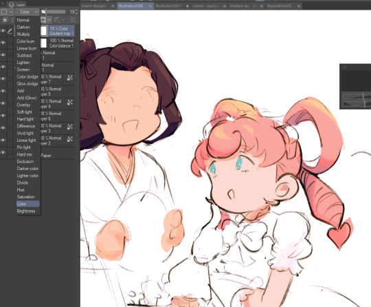
fruit ninja gradient map: fun to use if you want really drastic/vibrant colors! the names of the gradients are cute too, as you can see in the above screenshot!
BONUS: jeremy fenske's free photoshop brush pack: these aren't csp brushes per se, but they can be imported into the program! excellent for environments, i recommend watching fenske's video on how he uses the brushes to get a clearer picture since there are so many in this pack!!
BONUS 2: my good friend clem has a few brush packs for procreate that are ideal for painting,decorating drawings, and y2k-inspired illustrations, i definitely recommending checking out her shop!
in conclusion i hope this post can be helpful to you!! i tried to explain how to use the brushes as best as i could, but feel free to let me know if anything is unclear!! i hope you will enjoy using them! :D
#clip studio paint#clip studio paint brushes#csp#csp brushes#procreate#procreate brushes#brushes#tutorial#art tutorial#sort of hehe
146 notes
·
View notes
Note
since your art style has changed (and i love how expressive and mischievous? it feels now, idk if that makes sense but i admire the heck out of your growth) what does your process look like now? do you use the same brushes as before? do you want to talk about what you love about your work now? i saw your tag about tlt redraws now that you like your art and it made me curious. anyway love your art so much, nori!
hi!! thank you so much for this very cool question!! i guess before i just drew without much putting any thought to like... anything at all haha, only when i started doing comics was when i actively tried to make myself enjoy the process more.
i just thought about what I hated and tried to change it and just do a lot more art studies in my own time and try to really think about everything... like composition ! and like with colors, i didn't like how i only used to use desaturated tones, when i enjoyed more colors in other art i see.
or with poses, i didn't like how everything i drew felt very static to me, it still does but i'm getting better!! so i've studied dynamic-ness and whatnot.
i didn't like how "realistic" i would naturally go with proportions while drawing when my personal taste enjoyed more cartoon-ish and whimsical proportions, so i tried to be a little bit more loose with that but i'm not all there yet. for example, when i do some reference studies in my own time i find myself copying it 1:1 as it is, so now i try to incorporate it into a specific style without just copying it, it doesn't feel like i benefited otherwise!
i'm also trying to currently improve my lineart, i'm finding it much more enjoyable to draw with a thin brush! my lines were often thick and bulky and not super clean.
and yes!! i used to be loyal to like one or two brushes but i'm just trying new things constantly and it definitely affects the general vibe of the drawing, i've been obsessed with pencil brushes but i'm retiring it for a bit for a more jagged brush that i'm obsessed with now lol (still haven't posted anything with that, (working on it) but it totally changed the vibe.)
i feel like i often know when something looks right but i struggle on how to get there at times, but lately i've been seeing more right than wrong and just generally enjoying drawing.... drawing is my favorite thing.... i clocked in 9 hours yesterday on procreate.
#sorry for making this an essay#i just really appreciate the question#very passionate!#thank you for the nice words too!!
88 notes
·
View notes
Note
can you do a style tutorial?? dude there's geniunally nobody else who draws like you, your art is so poetic and divine, it's inspiring
WAAA THANK YOU ANON OH MY DAYS ??? genuinely this is one of the nicest compliments ive ever received on my art omga what .
im not very good at explaining things but eem ill try !!
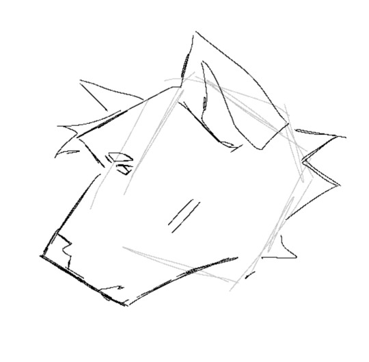
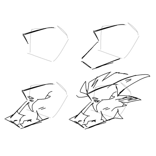
i feel like one of the biggest things is the sort of sketchy/messy vibe .. i use a super tiny brush ('digital brush' on ibis (its a premade lol) on size 1-2) and kind of scribble scrabble sometimes .. i also dont do lineart, i cant be bothered to do allat so i just clean up my sketch using an eraser !
i also stay away from using curves and instead try to use as many straight edges as possible if that makes sense .. also arbitrary lines in the drawing are a must . i think thats one of my fav parts of drawing :)
when it comes to coloring and rendering, i start by adding a darker, slightly more saturated color for shading, then blend it out with a midtone, do thr same for lighting, and then i add details !!
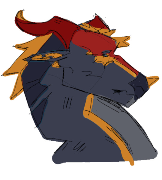
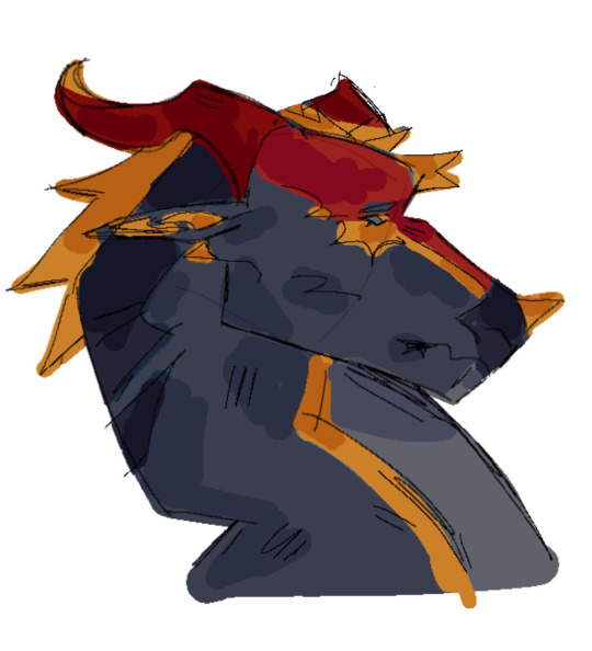
ive also been told that my usage of warmer tones is recognizable, and i achieve that by playing around with the 'color balance' filter on ibis until im happy with the results
for shading, i use a dark color (anywhere between blue and red, depending on the character and environment) for shading and a light yellowy color for lighting on an overlay layer ! then (also on overlay) i use those colors to add more arbitrary lines and scribbles
here i kind of tried to break down my sketching process, idk if it makes sense or not tho😓
my current artstyle is the result of six or so years of constant drawing and growing and experimenting !! experimenting with your artstyle is a huge factor in allowing it to evolve as well as for you to find what works the best .
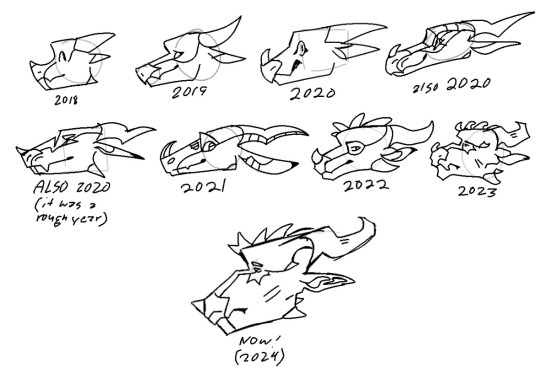
referencing/figuring out how specific artists that you like achieve their artstyles is super good for experimenting !! in 2021 i was a huge fan of bellasaurus and animatedwings, so i referenced their art a lot, picked out what i liked, and incorporated it into my own style :)
i didnt include humans in this because im not very confident when drawing them and still have to heavily reference things lol .. maybe another day
overall just have fun and go with whatever feels right ! below ill attach some of my art pieces broken down if you want to use them as a reference

135 notes
·
View notes
Text
Here ye here ye, another breaking down processes post from yours truly!
For this animation, my plan was to make something I'm proud of AND also something to force me to take my time since with all previous animation works they were all rushed. I normally tend to speed through work as someone whose illustrations are painterly and I like to keep them rough. Also lets be totally honest my other plan for this animation was to animate Mizrox being so sickeningly sweet.
Fun fact, this animation was going to be longer. I had tried to plan out Olrox climbing on top of Mizrak during the kiss to lay on his chest. There was an attempt trying to rough that out and several ref videos It was scrapped because for the life of me I could not figure it out. Also hypothetically if I was going to keep it, I would cut to another angle (perhaps Mizrak's face close up) and then cut to another angle that would make it easier to see that climbing over the top. OR, consider Olrox already sleeping on his chest (im just rambling now but this is basically 'if you were able to do this again' section).
I wish I actually went through a more proper tie-down process because the jump from going from my rough straight to clean was rough (badum tsk) for the first few seconds. Defintely learnt my lesson ALSO Olrox is surprisingly really fun to draw from behind.
I challenged myself to see if I could get the idea of "bigger movements, less in-betweens, smaller/slower movements, more in-betweens." Though the effect of Olrox rubbing his face against his arm may be a little too jarring and I steered quite a bit away from my rough and self-reference video in hopes of making the face rubbing more apparent because I thought the character acting was too subtle and wanted a contrast to the other half of the scene. I reconfigured my CSP animation workspace for this too so it definitely made the process less tedious when cleaning up the animation.
(Which by the way I do record a lot of self-references depending on the section! For things I can't do/uncomfortable doing, I'll end up looking up videos. It's the easiest for me to catch subtle things in body language and also get a feels for the motion.)
Also I'm really satisfied with Olrox's anticipation before his smooch and the shoulder roll at the end even though technically the arc doesn't complete itself. MIZRAK THOUGH, when cleaning up I realised my rough wouldn't make sense because he's already looking at him so there's no need for a turn, and then the lack of a shoulder movement felt jarring, so all of that was done without any thought, wish I did think about it more though.

Now compositing was a monster in its own right and basically me jumping back and forth between turning on and off different layers, but here are all the new things I did; I duplicated and blurred the lines of the lineart, beveled the shadows so it was lighter on the inside, and added a rim of blur so the focus drew towards the couple. Also will absolutely admit that my fanboy ass went "... be crazy and try to mimic the show." The final did not go that route because I thought it was more important to emphasize the mood/atmosphere (Also Olrox is intentionally stylized differently because i wanted him to be softer here and I had to give him eye highlights for plot HELP). THOUGH to say I did not try to mimic the style, the #2 lighting test was my 'attempt' LOL 😭 I can never consume media normally.
Here are the lighting tests I went through. I definitely knew I wanted to go with a morning vibe, though I tested out a night ver for fun and did some edge lighting which led to mixing both version #2 and #3 to make #4.
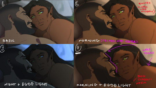
Fun fact, I almost went with #2 due to fear of getting too heavy-handed with compositing and therefore losing the animation (even though I really liked #4 at the time). Thanks to a friend, they also shared the sentiment of liking #4, though pointed out it felt like midday and encouraged me to make the colours warmer and deepen the shadows. It is a really tough balance but I think for a softer scene like this, the more additional layers of comp worked out in the end.
The edge light was a last minute thing because someone told me to add sound and to have light stream in. Also at this point I deadass forgot that you know, Olrox, is a vampire, but hey rule of cute overrules. We can pretend its light not from the sun LOL

Also yay I got to show off my own style a tad, I love paintingggg. It's not as completely fully rendered coz I knew that it would get covered up but I still made sure it was quite clean regardless. I didn't realise how much of it would be covered up even though I did make sure they would fit/make sense for bg LOL
Now we are done!
If you've gotten this far thank you! There's gonna be less frequency of these animations due to the semester starting back up soon and I don't get many opportunities to actually 2D animate (despite it being an animation degree RAH). Also I remembering cringing and laughing a lot when I immediately started putting colour down going "oh i can see the end of the horizon, i have too much power as an artist, people will see this i cant let them see me be crazy"

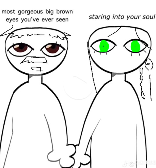
[Here's some memes I drew over while my friend was reviewing my work]
#mystery talks#castlevania nocturne#artists on tumblr#castlevania#castlevania fanart#fan animation#olrox/mizrak#i still keep going “oh no people who worked on the show will see this theyre gonna see im insane /lh”#its ok coz being crazy pushes you to achieve things
91 notes
·
View notes
Note
hellooo!! first of all: I ADORE YOU your art is amazing and your animatics are so gorgeous and inspiring!! I'm sure you've already been asked this question but I couldn't find an answer so I figured it couldn't hurt to ask again: what program(s) do you use to animate? What's your process like?? I've been wanting to try and learn to make my own but I have no idea where to start and I figured I should ask a master :P
ello! I appreciated your kind words :D
sorry about the delayed reply, I thought I could have drawn my process out for you but it turns out I don't have enough time so here I go
I use Clip Studio Ex (still on ver.1) only Ex can do animation If you considering buying it
CSP Pro can only animate 12-24 frames which is difficult to work with
I wish to get back on Toonboom but I'm hella out of practice (It's a good program tho, though just not so friendly with beginners)
My process is to find inspiration first, for example
when I do fan animation/animatic like Hermitcraft or Life series
I just listen to the audio or songs on a loop until I have a rough idea in my head of what I want to draw
(When you start something, Just use the idea of "What you want to draw/express" not what others want to see, Just make sure you're having fun, and we can figure out along the way later)
TIP : If you don't feel like starting making animatic right away, I suggest you make other kinds of art for that Idea first, like some sketching art, illustration for catching the vibe you want to go for, or just character design as a reference! :D
after that, make rough sketches, It doesn't have to be pretty, just do a quick sketch so you won't forget the vibe and energy (it can be on paper, I recommend using a pen instead of a pencil cuz you won't have to delete and redraw, just make a new one, it's quicker)
I make re-sketching sometimes to fix composite or make a better pose sometimes, timing and spacing are also very important to make the movement smooth
I make a line of action guide for some difficult movements sometimes
When I do Lineart I just open all the videos to watch while head empty cleaning Lineart
There are many more processes for professional animators
I recommend you check out videos, there are tons on YouTube
here's some that I learned from
youtube
youtube
youtube
youtube
youtube
105 notes
·
View notes
Text
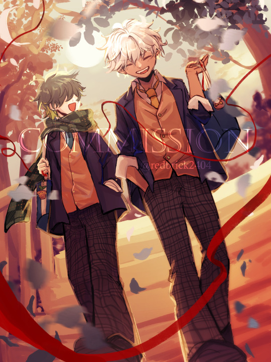
Commissioned by @/ Đức Nhân (FB)
I got the chance to draw his MC (Troy) with Mammon in student uniform this time. The high school romance trope is used so many times but it always have so much potential, I love the carefree vibe of Mammon and Troy in their student days. Thank you so much for commissioning me! ヾ(≧▽≦*)o
Process below the cut:
1. Ideas:
The client sent me some references including high school uniform and sunset and stairs background so I came up with some ideas for the prompt. I tend to sketch out the thumbnail before going into any further detailed sketch. The 1st one was picked in the end.

2. Detailed sketch:
I roughly worked on lighting and composition of the artwork but in more details. Since they're walking together in the sunset, I added an orange overlay to get the overall vibe.
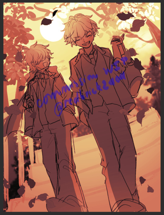
3. Lineart, flat color, shading, and final rendering:
I actually didn't make a completely new lineart with this one as usual because my sketch is good enough, I only cleaned it up a little and continued with the shading. If there was anything I'm not happy with, I would just paintover and use the liquify tool for corrections. The more loose painterly look also suited the carefree vibe of the piece better than the clean lineart and shading look.
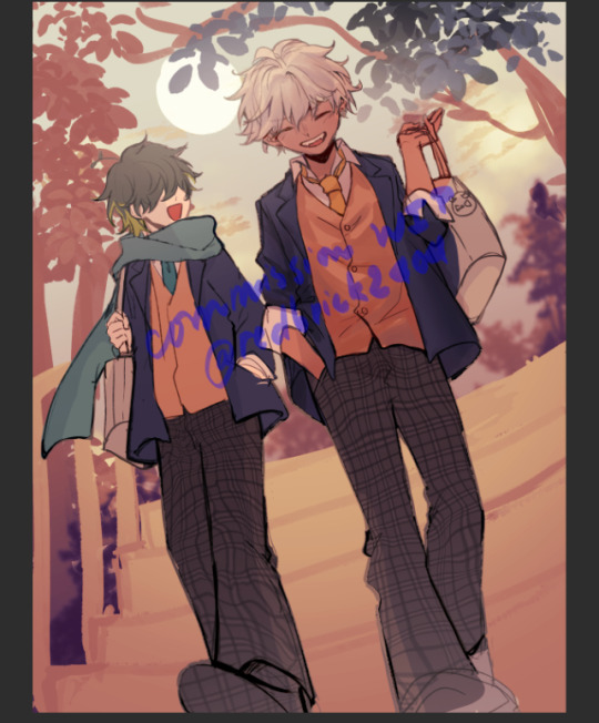


The red thread wasn't there in the first sketch but I think it makes the piece much more dynamic, glad that my client loved it too.
And that's the end, thanks for reading! (o゜▽゜)o☆
137 notes
·
View notes
Text
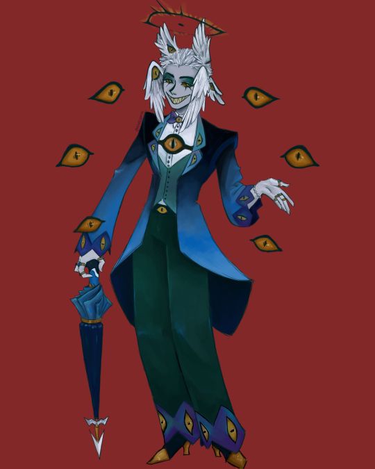
I finally finished the piece for @prince-liest's OC, Tzafael! this really reminded me of how fun character design is (and also that I've completely forgotten how to make digital art, but that's besides the point...) <3
credit to @hogbogglerspirits for the umbrella design! I kind of butchered it so please look at the original and throw lots of love at them
LOTS of notes, draft sketches, brainstorming, etc. below the cut. enjoy!
(note: a lot of what I'm talking about is based on posts prince made under their #tzafael tag, so take a look at those if you haven't yet!)
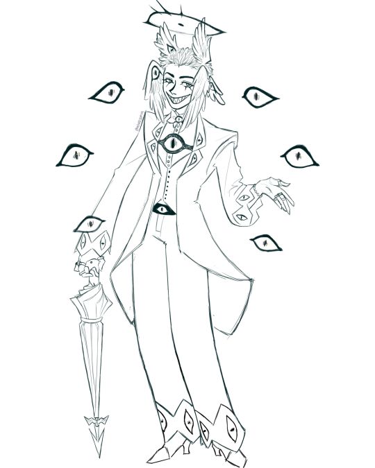
thanks for joining me below the cut! here's the sketch without the colors as a treat (in case you want to color it yourself or something, idk).
notes about making the digital drawing:
holy shit this took me forever -- I was not kidding about forgetting how to make digital art lmao. I forgot how much less forgiving digital lines are and genuinely lost the spoons to even attempt lineart, hence just a sketch below the colors.
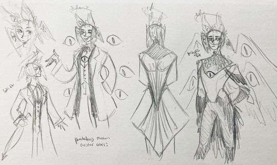
some of you might've seen the original sketch I sent to prince, which the digital version diverges from just a little. it's mostly the halo which I'll explain later, and I finally caved and drew the sixth eye (you can tell I drew and erased it multiple times in the sketch lmao -- still don't know if I prefer it with or without)
here's the original color ref by the lovely @gendermeh! my color scheme ended up looking really different, so some notes about that:
I was looking at references for magpies like this
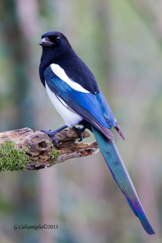
and I wanted to basically follow that color scheme while also being somewhat similar to the original -- dark head/shoulders --> dark top of the jacket, bright blue wings --> bright blue bottom of the jacket, greenish tailfeathers --> green pants, hints of purple --> purplish sleeve and pant ends
I also tried (and mostly failed, let's be real) to capture the iridescence of the feathers -- they look like oil spilled on the pavement or iridescent hematite to me! I think the key ended up being adding bright greens/purples and roughly blending them into the blues or vice versa but I didn't really figure that out until I got to the pants lol.
I'm gonna be honest; I don't remember why I went with this shape for the tailcoat. I just remember being unhappy with the sketch and then trying a bunch of different shapes that mostly looked worse lol -- I think I landed on this because a split tail kind of looks like wings?
KEPT the shoes -- absolutely magnifique. I wish I knew how to color gold better.
added lots of jewelry! they like shiny things :)
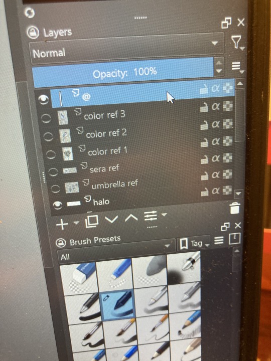
ALSO PLEASE LOOK AND APPLAUD ME. I FINALLY REMEMBERED TO LABEL MY LAYERS!! NO I DON'T REMEMBER WHY THE HALO HAS ITS OWN LAYER.
alright, time for some more design notes/explanations + draft sketches!
but first, a couple disclaimers:
I want to make it very clear that I LOVE everything about the original design. I made a lot of changes based on personal preference/the way I interpreted the character. I was actually planning on making a digital piece that was more faithful to the original design too, but I was just out of spoons for it cause of life stuff.
you probably shouldn't try to read the notes I made in the sketches I'm about to show you unless I say otherwise. most of it is incoherent brain vomit in illegible artist handwriting and I'll transcribe/explain the stuff I think is important :) (the stuff in quotes are direct transcriptions of my notes)
I know my sketches are very messy lol. I only draw for fun, so I usually don't force myself to make stuff any neater than necessary unless it's supposed to be a formal piece. try to bear with me.
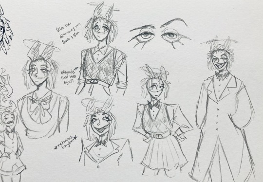
1:
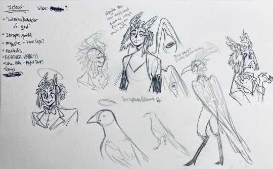
my first few sketches of them! (I think?) this was before I sent prince a laundry list of questions so I was still trying to get a vibe
"magpie -- beak lips?" -- you'll see this in a few sketches; I considered giving them the lipstick design that velvette has since it looks like a beak. I still kind of think it's cute, but 1) I'm pretty sure velvette is the only character that has them, so I didn't want to make it seem like they were related somehow and 2) I thought it might be distracting with how much other crazy stuff I ended up including in their head/face
also, sidenote since it's relevant to what I said about vel: something I realized was important is how one character's design relates to the designs of the rest of the cast. I wasn't sure how much I should've gone for what looked good in a vacuum, how much should be based on what other characters looked like canonically, or what other characters would look like if I also designed them. it ended up being mostly the second option, but it was honestly still a struggle. should I take away some of the tumblr-sexyman-ness (no shade to tumblr sexymen; I love them) because there are other characters that already have it? should I relate their design to sera's and emily's in the show or should I think about how I would've designed sera and emily? should I follow some of the design philosophy of the original show and just throw stuff on there because it looks cool (the answer is yes btw)? decisions, decisions ...
I don't think this showed up really well in most of the drawings, but they actually have a black line down their nose! let's take a look at sera:
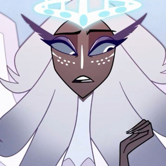
since they're siblings, I wanted to include some similar facial markings. the nose line ended up being the only thing I kept though -- I was going to include freckles, but I have a compulsive need to give every character giant bottom lashes so there ended up being no room T.T I like that the magpie's hints of purple kind of match hers tho!
the wingification of the hair begins! I was still unsure of it at this point, but it was an idea I had since I was kind of struggling with how straight the feathers were in the original.
"maybe the ones on their head count as wings (so only one main pair)" -- I originally just had the 2 pairs of wings on their head, so I was thinking of just giving them 1 pair on their back so there would be still be 6 total. also this middle drawing of them is meant to be their exorcist outfit (I wanted it to be a cross between what the other exorcists wear and sera's outfit)
at this stage, I was thinking of giving them more magpie-like characteristics, so I looked at some references and tried to emulate them in a more human design. this ended up being really awkward so I scrapped it, but I still like the idea that their exorcist mask looks like a bird (kind of like a plague doctor's)
2:
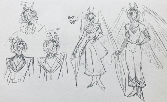
peekaboo! I love the idea of them using the wing hair to cover their eyes lol. (ended up using that idea for my own seraph OC since that's their biblically accurate purpose: to cover their eyes/faces in reverence/humility -- doesn't really fit with tzafael tho lol, so they show their face most of the time)
an eyeball in the bowtie -- pretty self-explanatory. the eyeball motif is important.
the one in the middle is just me practicing drawing the original design, and the one on the right is another exorcist outfit I think. I wanted to include the diamond motif/points that sera has on her dress (the diamonds on the bottom turn into eyeballs, which is why the final design also has eyeballs on tzafael's sleeves/pants)

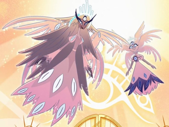
3:
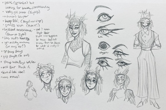
lots of notes on the side based on what prince said in response to my ask
"localized omniscience (power of sight) -- cool + ironic that their sight was supposed to serve God but made them see Heaven for what it really is instead"
another exorcist outfit, this time including the feathers
I was also experimenting with the halo; I was trying to make it look sort of like sera's crown, but that didn't feel right ...
some practice with eyes -- my style is pretty flexible with eye shapes, so I try to make them suit the character. I drew lute's eye and also an actual magpie's as references -- lute's because of the exorcist background and also because they looked appropriately sharp, magpie's for obvious reasons. once again, my compulsive need for giant bottom lashes strikes
there was honestly a lot to balance with the eyes -- I wanted them to look condescending/bored (lowered top lid) but also amused (raised bottom lid) and like a magpie (round) but also harsh/mischievous (sharp, maybe slit pupils like a snake) and similar to sera's (but not too decorated -- also does it make sense for them to look like sera's if emily's don't even look like sera's?)
considered having wings on the shoulders -- the magpie pattern is super cool, so it would've been nice to have that somewhere more explicitly in the design. I still think that might fit in an outfit they would wear in heaven (maybe for formal occasions)
the introduction of the sweatervest! honestly I kind of love this for the way it captures more of the preppy, spoiled old-money upper-class vibe some heaven residents have, but it was scrapped since I couldn't imagine them wearing that while trying to scare the denizens of hell. maybe something they wear casually though.
"yes nictating membrane (on every eye!)" -- AHH I'm so sad I didn't end up putting this to use. I just feel like the whole effect is based on actually seeing them blink, and I don't animate lol.
4:
ugh, the nefarious laughter one ... don't worry I tried harder on a sketch later on lol.
"like the diamonds on Sera + Em" + "diamonds turn into eyes?" -- I draw the diamonds on the sweatervest turning into eyes later.
tried an actual bow instead of a bowtie -- very cute but didn't fit the vibe.
a skirt! I think they would wear a skirt sometimes.
5:
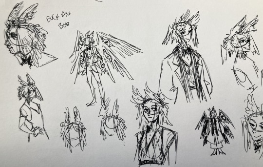
"FUCK ASS BOB" -- asghdk the wingification of the hair continues. unfortunately, I'm realizing at this point that the silhouette of the hair is starting to look a lot like alastor's. I gave a very half-hearted attempt at mitigating this, but it goes back to the thing of how much I am obligated to the original show's designs and what looks cool to me -- I think the wing hair fits them and I didn't want to change it because of alastor, plus my alastor design actually has completely different hair anyway. I did add a third pair to the back to look like a ponytail though.
introduction of the scarf! I was actually going to include this in the final design but uh,,, I forgor. are you starting to see a pattern.
the reason for the scarf is that the "tzafael going to places they know they'll draw attention/can incite chaos" reminded me of that scene in avengers where loki walks into a fancy building looking pretentious af and just casually stabs a guy's eye out. not really the same thing but I felt like the vibe matched. hence, loki's funny little scarf fit.

6:
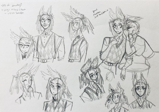
uaoughdfjh it was SO FUN to draw the wing hair, and it was at this point that I realized they had to stay even though I wasn't sure if it was too different from the original.
gossiping with rosie cause that's the first person I thought of -- tzafael also summoned a pearl necklace to clutch because of the sheer drama of it all (your ex-husband did what??)
also started drawing the rings on their hands. magpie like shiny.
7:
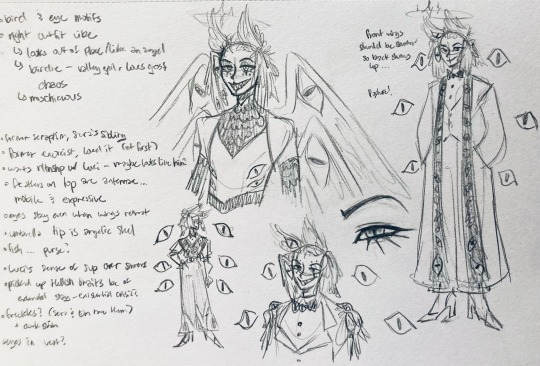
lots of notes cause I was trying to compile the things I still needed to think about/incorporate into the final (I thought this was gonna be the last draft ... haha)
trying to include more bird/eye motifs
"fish ... purse?" -- ha! I forgot I was gonna give them a fish purse. I think I drew that in a later sketch, but not them wearing it.
"picked up Hellish traits bc of extended stay -- existential crisis?" -- I asked prince about the sharp teeth, and their answer implied that they became sharp as they stayed in hell longer, which got me thinking ... I feel like that's actually a great body horror concept. lucifer falling and looking like a normal angel at first, eventually waking up to more and more devilish features and feeling more and more like he's lost his home and his past self ... spooky.
another exorcist outfit -- I actually really like the eyes on the ribs! I never made a final draft for the exorcist uniform, but it would probably look close to what I drew here.
the one on the bottom was meant to be similar to the feathered shoulder pad idea, but this time with the whole magpie (with giant eyes). tried putting the "freckles" (really just dots in this case) over their brows, but that ended up looking kinda weird.
the eye is pretty close to the final design
the one on the right was supposed to be the full final design, but I was totally off lol -- the long trench coat really doesn't give off the right vibe at all
8:
playing around more with the loki vibes of the scarf, also added an eyeball to the chest
I never got happy with the design of the back of the coat -- I think it should probably just be blank at this point. but the sketch here is meant to look like wings/tailfeathers.
yet another exorcist outfit, this time with more magpie motifs. I actually like this one a lot, but I probably should've added the eyes on the ribs from the last sketch. I think I also considered giving them actual tailfeathers at this point.
9:
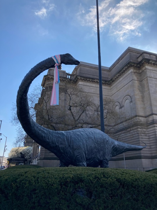
thanks for sticking with me! I promise we're almost done. have a trans dinosaur I saw while I was travelling as a treat <3
10:
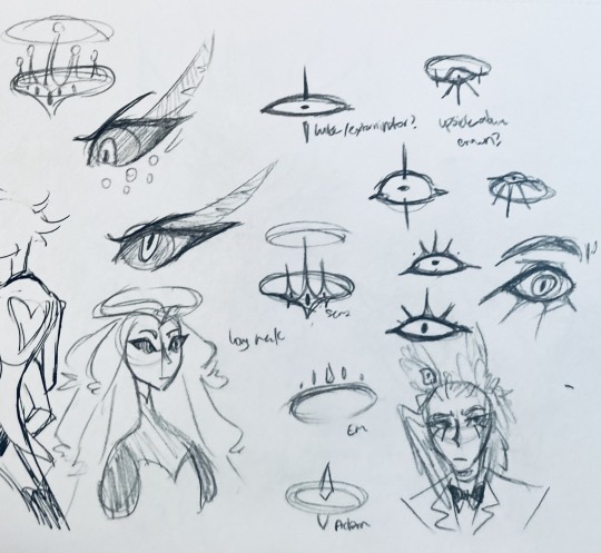
this is after I finished the sketch for the final piece and realized I didn't like the halo design. I drew lute's, sera's, em's, and adam's as refs. (honestly I love the show's idea that each person/people of each rank have a different kind of halo -- I wonder if they can switch them out?)
my main inspiration ended up being the exorcist halo, but I made it look more like an eyeball -- since it always points toward heaven, we can say it's always "looking" at heaven.
(also sera's feather lashes! they're so cute)
11:
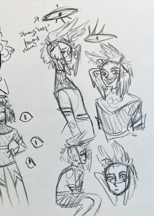
EVEN MORE EXORCIST DOODLES
12:
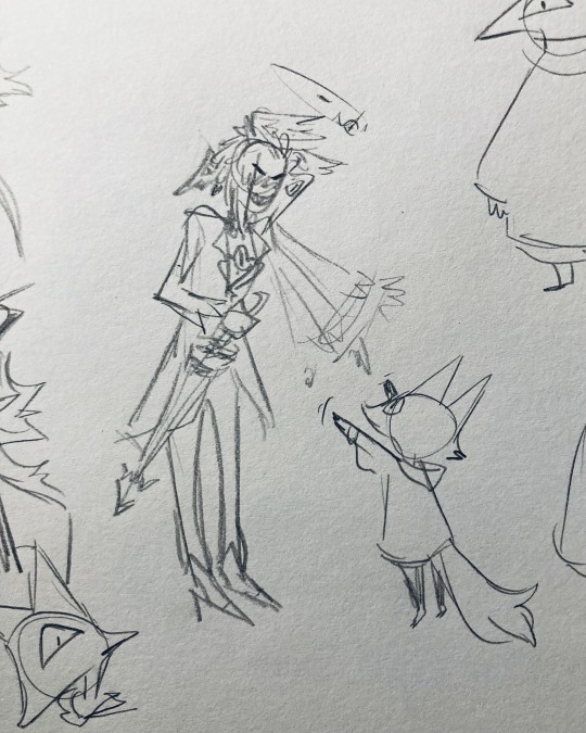
tzafael shooing away my fox demon OC
13:
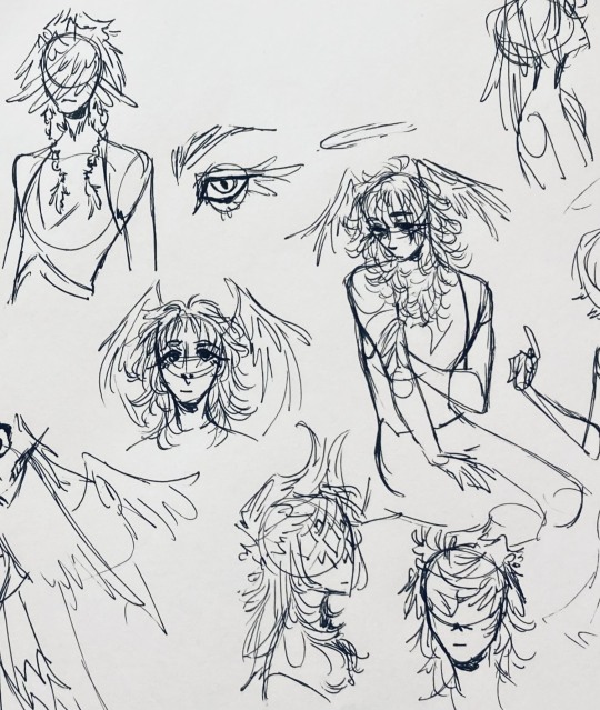
these are actually sketches for my own seraph OC (raguel), but I wanted to include it since it has even more wing/feather hair variations. I also think the idea of the eyelashes being feather-like could've been cool for tzafael.
14:
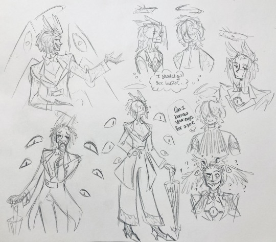
some more OG design doodles
tzafael and raguel together because self-indulgence is the name of the game babey (also wanted to draw tzafael freaked out with their wings flared)
(raguel's blind btw, hence asking for eyes -- tzafael has so many!)
you can probably read the dialogue here so give it a shot. I believe in you.
15:
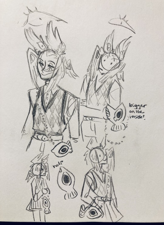
you know what? the fish purse deserves some doodles
16:
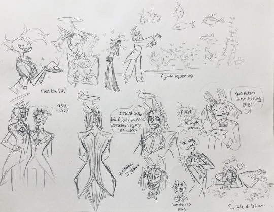
putting them in Situations! I was reading over prince's posts again and I realized there were some funny things I could draw them doing/saying
again you can probably read the words here
angel dust also loves fish (but is apparently bad at taking care of them, hence the suffocating blobfish), so tzafael shows him their aquarium (complete with live fish and flora ofc)
I thought alastor was 8 ft but apparently he's 7.3 ft? so tzafael is enjoying the .2 ft they have on him
trying and failing again to come up with a design for the back of the jacket lol
THE crowley quote
apparently the halo still sends signals from the exorcists -- thought their reaction to the battle at the hotel would be funny
the nefarious laughter (take 2) that I promised -- based on a doodle of alastor viv did that I found
them being sad and curling up in a pile of shiny things like a dragon
OKAY I'M DONE. huge, huge thank you to prince for sharing their OC! this was a lot of fun and clearly inspired me a lot haha. please check out their writing; it's literally so good that I can't read anything else these days. I am chewing on their thoughts constantly.
this was an absolute monster of a post, so if you're still reading, I am both impressed and bewildered at your patience. I hope you enjoyed! (I certainly did!)
#prince (because they are very sweet): I'm excited to see your thoughts!#my thoughts: magpie like shiny hehe#hazbin hotel oc#prince-liest#hazbin hotel#my art#character design#sera hazbin hotel#em hazbin hotel
55 notes
·
View notes
Text

OCtober 2024 day 24: community
@mimiruku it took me months but I finally drew Miruku! I hope you like him in one of my many art styles 👉👈🥺
reference
I think I found my simplified style because this was a delight to draw. Even without colouring I like the lineart by itself, the brush is so nice! It gives more of an ink painting vibe? I'm a big fan hehehehe
And the colouring doesn't take much time but still looks great.
Also I just skipped clothes for this one because I couldn't figure them out but Mimi would prefer no clothes anyways so at least it's in character lmao.
24 notes
·
View notes