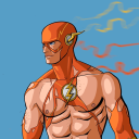
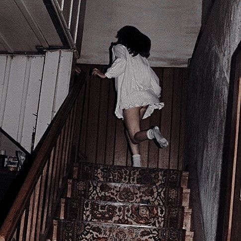
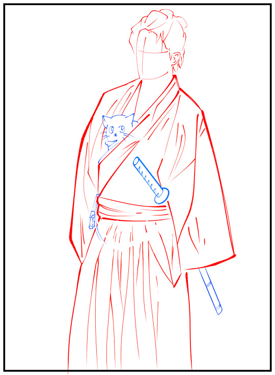
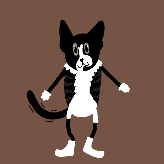
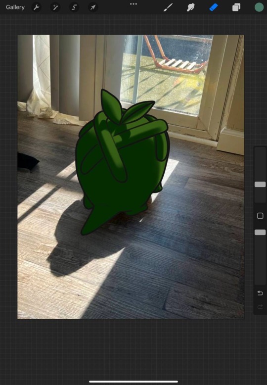
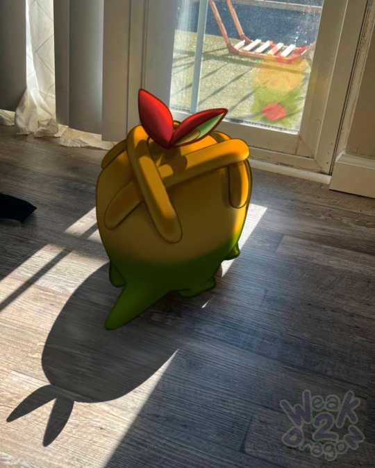
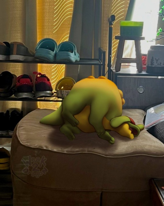
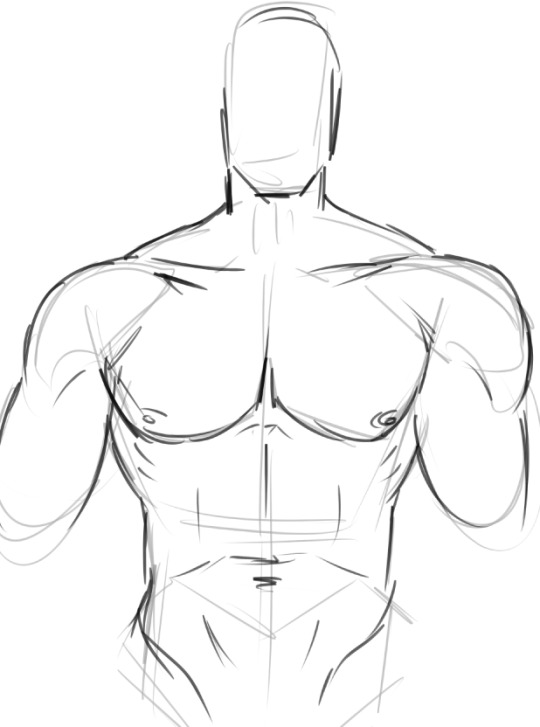
#no difference between these photos just wanted the drawing to look smaller
Explore tagged Tumblr posts
Visit Tumblr Blog
Explore Tumblr blogs with no restrictions, modern design and the best experience.
Last Seen Tumblr Blogs


Fun Fact
There are dozens of funny blogs to kill time on Tumblr.
Text
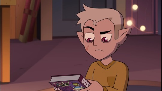
mmm,mbela :)
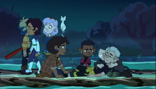
#dbh brainrot has been crazy lately i miss the girls#no difference between these photos just wanted the drawing to look smaller#bela dimitrescu#resident evil#resident evil village#resident evil 8#re8#art#artists on tumblr#100% organic younger money#tw blood
232 notes
·
View notes
Text
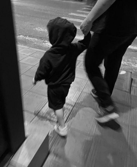
ㄒ卂ㄥҜ ㄒㄖ 爪乇
Kwon Jiyong x deceased!reader
a/n: i found this in my drafts, I've been trying my hand at horror and fantasy because horror is what inspires me most. I'm also Pagan and big into witchcraft and magick. I also love the movie Talk To Me. Lol so all around, I'm just trying something new. Idk if I'll do part two or not. But let me know what you think? If it's not your cup of tea, just keep scrolling lol
warnings: angst, drinking, fatherhood, widowed partner, supernatural, rough draft, probably poorly edited because I'm drunk so excuse the mistakes
wc: 2.2k+
“Daddy?”
Jiyong’s head snapped up, his red-rimmed eyes meeting the small, fragile figure in the doorway. Parker stood there, clutching his worn blanket in one hand and a mess of printer paper and a framed photo in the other. The soft glow of the hallway light cast a halo around Parker’s messy hair, making him look even smaller, even more innocent in that moment.
“Hey, buddy,” Jiyong croaked, his voice hoarse from crying. He quickly wiped at his face with his sleeves, but the evidence was still there—the tear tracks glistening on his cheeks, his long hair disheveled and hanging in his face. “What’s up? Did you have a bad dream?”
But Parker didn’t move. He stayed planted in the doorway, thumb in his mouth, his big eyes studying his father’s broken expression. At just four years old, he was sharper than most gave him credit for. He saw the sadness that lingered like a heavy fog around his father, especially today.
“Do you miss Mommy?” Parker asked softly, his voice barely above a whisper.
Jiyong’s heart clenched painfully in his chest. His head dipped, but a small, bittersweet smile tugged at his lips at the sound of his son’s voice—so innocent, so full of love.
“Yeah, buddy,” he murmured. “I do. I miss her a lot.”
There was a brief pause before Parker shuffled forward, his little feet making soft sounds against the wooden floor. “Want me to tell you a story ‘bout her?”
Jiyong’s throat tightened. Normally, it was Parker who begged for stories about Mommy before bed, eager to hear his father’s colorful tales of her as a strong princess who could conquer any monster. But today was different. Today was their anniversary—the second one without her—and Jiyong felt like he was drowning in the weight of her absence.
But Parker, sweet Parker, had noticed. And he had taken it upon himself to try and mend his daddy’s heart, one story at a time.
“Yeah,” Jiyong whispered, his voice trembling. “I’d love that. Come here, buddy.”
Parker climbed onto the bed with his tiny legs, settling himself on the side where she used to sleep. He handed Jiyong the photo, his little hands careful with the frame. It was the picture Jiyong had taken when she was pregnant—her long hair cascading over her shoulders, that lavender dress flowing around her as she stood in a field of wildflowers, cradling her swollen belly with a radiant smile. She had looked like a dream.
A single tear slipped down Jiyong’s cheek as he stared at the photo, his thumb tracing the outline of her face.
“I wrote a story about Mommy,” Parker announced proudly, pulling out a handful of crumpled papers covered in colorful scribbles and stick figures.
Jiyong smiled through his tears, setting the photo gently on the nightstand. “Lay down, Daddy,” Parker instructed, patting his chest with tiny hands. “So I can read it to you.”
Obliging, Jiyong leaned back against the pillows, his heart swelling with a mixture of love and sorrow.
“Okay, I’m ready,” he whispered.
“First, this is us!” Parker exclaimed, holding up a drawing with three stick figures. One was tall with long hair labeled “Mommy,” another a bit shorter with bright orange scribbles for hair—“Daddy”—and in between them stood the smallest figure with “Parker” scrawled above it in shaky letters.
Jiyong chuckled softly. “Wow, Mommy’s so tall!”
“She has to be tall so she can fight all the monsters,” Parker explained matter-of-factly, already flipping to the next picture.
He nestled closer to Jiyong’s side, the warmth of his small body a comforting presence against the cold emptiness in Jiyong’s chest.
“This is Mommy saving us from a big, scary T-rex!” Parker declared, showing a picture of a giant, lopsided dinosaur towering over their stick figure family.
Jiyong widened his eyes in mock horror. “A T-rex?! How did she save us?!”
Parker jumped up, stretching his arms as wide as they could go. “She had a big sword! Like this big!”
Jiyong laughed, the sound raw but genuine. “Wow, that’s a huge sword!”
Parker nodded vigorously, plopping back down beside him. “And this one is Mommy fighting a hundred spiders!”
Jiyong shivered dramatically, clutching Parker close. “Oh no! That’s so scary! Did she win?”
“Yeah!” Parker grinned. “Mommy stomped on them all! She’s super brave!”
“She really is,” Jiyong whispered, pressing a soft kiss to the top of Parker’s head.
Parker continued flipping through his drawings, each one more imaginative than the last—Mommy building the tallest tower, Mommy making the biggest sandwich in the world. Jiyong listened to every word, his heart both aching and swelling with pride.
Finally, Parker held up the last drawing. “And this one… this one’s special.”
Jiyong sat up slightly, peering at the paper. In the bottom corner were two stick figures—one with orange hair and one smaller, labeled “Daddy” and “Parker.” Beside them was a stick figure cat, “Princess Zoa,” lounging lazily. But in the top corner of the page, drawn on a fluffy cloud next to a bright yellow sun, was another figure—“Mommy,” looking down at them with a smile.
“That’s Mommy in Heaven,” Parker said quietly. “She watches over us from there.”
Jiyong couldn’t hold it back anymore. A sob escaped his lips, and he pressed the heels of his hands into his eyes, trying to muffle the sound.
Parker’s little hands tugged gently at his father’s wrists, his brow furrowed with concern. “What’s wrong, Daddy? Didn’t you like my story?”
Jiyong forced himself to breathe, lowering his hands to meet his son’s worried gaze. He cupped Parker’s face gently, his thumbs brushing away the little boy’s confused tears.
“I loved it,” Jiyong whispered, his voice thick with emotion. “I loved it so much, buddy.”
Parker studied his father’s face for a moment longer before asking softly, “Do you still miss Mommy?”
Jiyong pulled Parker into his chest, holding him as tightly as he could without hurting him. His lips pressed against the crown of Parker’s head as he whispered, “I’ll always miss her, baby. But having you here makes it a little easier.”
Parker’s small arms wrapped around his father’s neck, and for a moment, the crushing weight of grief eased just enough for Jiyong to breathe again.
“I love you, Daddy,” Parker murmured into his chest.
“I love you too, buddy,” Jiyong whispered back, closing his eyes and holding onto his son like he was his lifeline—because, in so many ways, he was.
Jiyong gently tucked Parker into your side of the bed, pulling the covers up to his tiny shoulders with a tenderness that made his heart ache. He turned on Parker’s favorite cartoon—the one with the silly talking animals that always made him giggle. The soft glow of the screen bathed the room in a warm, flickering light, but Jiyong barely noticed. He sat on the edge of the bed, brushing Parker’s hair back from his forehead, feeling the weight of the world pressing against his chest.
It only took about twenty minutes before Parker’s breathing slowed, his small frame rising and falling in a steady rhythm as soft snores filled the room. Jiyong lingered for a moment longer, his eyes tracing the curve of his son’s cheek, the gentle pout of his lips. There was so much of you in him—your eyes, your smile, even the little wrinkle between his brows when he was deep in thought. It was beautiful and unbearable all at once. Parker was the last piece of you he had left, and he clung to that with everything he had.
Carefully, he slipped out of bed, his movements slow and deliberate to avoid waking Parker. The house felt too quiet as he descended the stairs, each creak of the wood beneath his feet echoing in the emptiness. He made his way to the kitchen, his hands trembling slightly as he reached for the bottle of whiskey. The amber liquid sloshed into the glass, and he took a long, burning sip before setting it down on the table.
For a moment, he just stood there, staring at the glass, at the reflection of his hollow eyes in its surface. Then the weight of it all hit him like a freight train. His knees buckled, and he leaned over the table, his shoulders shaking with silent sobs. The grief was a living, breathing thing, wrapping around his chest, squeezing until he could hardly breathe.
With a trembling hand, he reached into his pocket and pulled out your ring—the beautiful diamond he’d spent weeks perfecting with the jewelers, wanting it to be just right for you. He remembered the way it sparkled on your finger, how you’d admire it with that radiant smile of yours, teasing him for being such a perfectionist. Now, it was cold and lifeless in his palm, a cruel reminder of everything he’d lost.
“God, I miss you...” he whispered, his voice breaking as he twirled the ring between his fingers. The silence that followed felt deafening, a void he couldn’t escape.
He downed the rest of his whiskey in one gulp, the burn doing little to numb the pain. He poured himself another, and another, each glass blurring the edges of his sorrow but never quite dulling it. Six years ago today, he’d watched you walk down the aisle in that breathtaking dress, your eyes shining with love and promise. It had been the best day of his life. Now, it felt like a lifetime ago, a memory fading at the edges.
His sobs grew louder, echoing through the empty house as he buried his face in his hands. The realization that you were gone—truly gone—hit him over and over, a relentless tide of grief that never subsided. Two years. Two fucking years since he’d lost you, and the pain still felt as fresh as the day you left.
He was a man of science, grounded in logic and facts. But you? You had always believed in magic, in the unseen, in possibilities that defied explanation. He used to laugh at your silly spells, your whispered incantations in the attic. But now? Now he’d give anything to believe. To have even a sliver of hope that he could see you again.
The memory hit him like a ton of bricks—that one relic you’d been so protective of, the little black box you’d spent hours with in the attic, speaking softly to it as if it could hear you. He’d teased you about it back then, but now, desperation clawed at his heart. Maybe you weren’t talking to yourself after all.
With a newfound urgency, he finished his drink and stumbled up to the attic. The space was cluttered with boxes, dusty and forgotten, each one a time capsule of your life together. His heart pounded in his chest as he sifted through them, tossing aside old memories in his frantic search. Finally, he found it—the little black box, tucked away in a dark corner, hidden as if protecting its secrets.
His hands shook as he picked it up, the weight of it heavier than he remembered. He didn’t have the courage to open it yet. Instead, he clutched it to his chest and raced back downstairs, pausing briefly to check on Parker. His son was still sound asleep, blissfully unaware of his father’s unraveling.
Back in the kitchen, Jiyong poured himself another whiskey, trying to steady his nerves. He placed the box on the table, staring at it like it held the key to everything he’d lost.
“God, Y/N,” he whispered into the stillness. “You better not have been fucking with me.” His voice was hoarse, thick with desperation. He’d try anything at this point.
Taking a deep breath, he carefully removed the lid. Inside sat an intricate hand, carved with strange markings that seemed to pulse under the dim light. He’d never asked how you’d come by it—back then, it had just been another one of your oddities. But now, he prayed with everything in him that it was more than that.
With trembling fingers, he lifted the object out of the box, setting it on the table before him. He read over the simple rules you’d left behind, his heart pounding louder with each word. Pushing the box aside, he grabbed his lighter and lit the candle, the flame flickering like a heartbeat in the dark.
He downed his drink in one swift motion, the fear bubbling in his stomach almost unbearable. He’d never believed in this kind of thing, but grief had a way of making even the most rational man desperate.
With a shaking hand, he reached out and wrapped his fingers around the cold, carved hand. He closed his eyes, his voice barely a whisper. “Talk to me.”
When he opened his eyes, he saw it—a faint shadow sitting across from him. His heart lurched in his chest, fear and hope warring within him. But he couldn’t stop now.
Drawing in a shaky breath, he spoke the words you’d written in your neat, familiar handwriting. “Let me in.”
In an instant, the air shifted, the room growing colder. And then… you were there. Your body, your presence, materialized from the shadows, your soft hand slipping into his. His jaw dropped, his breath hitching in his throat as he took in your familiar features, your eyes shimmering with the same love he’d missed so desperately.
A tear slid down his cheek as he took in the sight of you.
And then, in that sweet honey soaked voice he loved so much, you spoke.
“Hi, Ji.”

© loveesiren 2025 - do not copy, translate, transfer, or repost my work without my permission. if you find my work on sites other than through links i've provided, please notify me.
Tags: @kaylieiskrazy04 @fr3akyyg1rll @heuningpie @sapph1r3x @moondooll @tranquilty @noharaaa @mariaxman @dear-satan @infinetlyforgotten @staryscorner @blu-brrys @come-as-you-are-111 @nicklet94 @vamplivivi @3mma-lovely @hanadulsetaad @sayugarper @forevervibezzzz1 @shieraseastarrs @mooonologyy @skzdreamz @stillpervert @seunghyunwifey @juliskopf @mirahyun @mattsturniolosbabymama @kai-277 @rotten-toenails @i-might-be-vanny @zzhengyu @petersasteria
#kwon jiyong x reader#kwon jiyong#g dragon x reader#g dragon#bigbang fanfic#bigbang#king of kpop#kpop idols#kpop fandom#kpop fanfic#supernatural#horror writing#talk to me
186 notes
·
View notes
Text
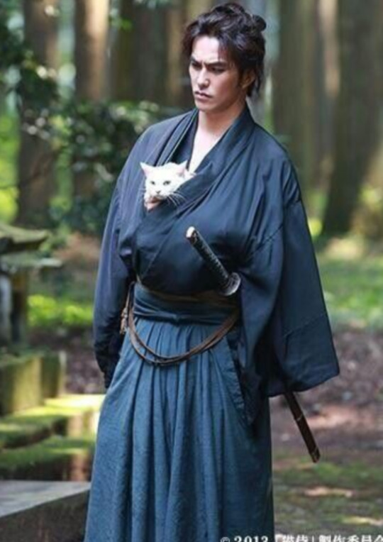
The Ineffable Detective Agency presents more Ineffable Discontinuity and Suspicious Moments: Hawaiian Shirt / Pub Table Guy
Introducing... the extra/background character who makes Aziraphale do THIS, and then immediately has his table at the pub miracled away:
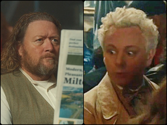
Jon Dan Duncan's imdb profile doesn't list Good Omens, not even as "uncredited" - which seems strange, because his profile does include the above photo of him. Since the actor isn't credited in GO, we don't have a character name or know anything more than what we can see onscreen. So, what DO we see?
First of all, when Aziraphale sees this person, he definitely has A Reaction. We were probably all too distracted by Azi stroking the thin dark duke to notice (as an aside, IS Crowley a Duke? Of what? Hell? Something else??), but after the 90th rewatch, it gets a bit easier to focus on these background details that are probably critically important to the story in ways we just don't understand yet. Look at this:
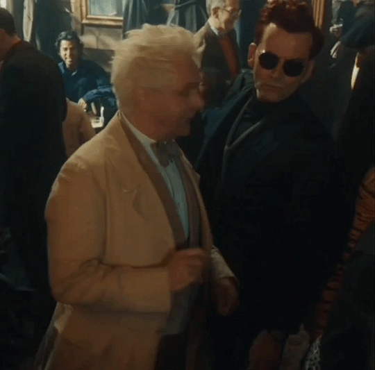
Did he mouth "stop" when he's supposed to be saying "sherry"? Maybe. These LOOKS, though:
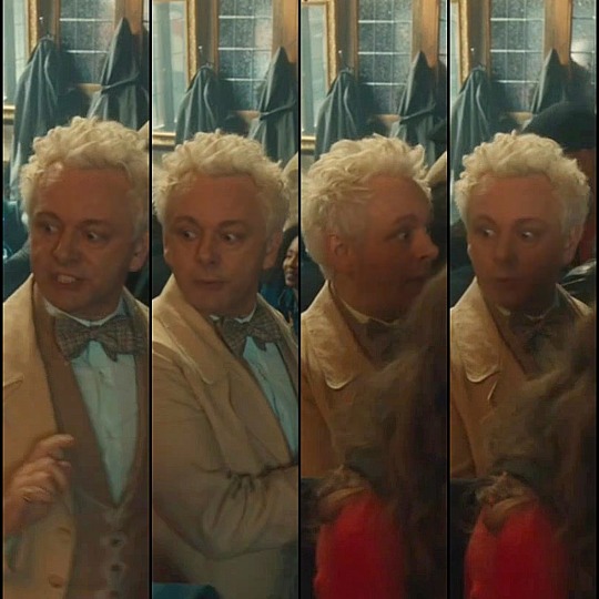
We all know that Michael Sheen's expressions, no matter how tiny or fleeting, are very intentional. Who IS this mystery person??! Immediately after taking his table:
After whoever-he-is loses his pub table, he lingers nearby, and there's an interesting "ineffable discontinuity" - what he's holding in his right hand abruptly changes twice between camera cuts (sound on, if you want context for this small zoomed-in part of the screen, and try watching from your browser if the Tumblr app is cutting off the right edge of the image):
So far, our best explanation for the "ineffable discontinuities" - things that inexplicably and improbably change, like which hand is holding his drink or (coming up next) when he's behind Gabriel and then suddenly in front of him - is that we're seeing multiple timelines that are being knitted together in production to make them look seamless - but who knows? We'd love to hear your ideas! (Also, see the appearing Honolulu Roast sign in the coffeeshop, or Crowley's tattoo and sideburns, or the fandom's newest discovery (from @kimberleyjean and @bbbitchvibbbez) about Gabriel visiting his statue with "both" s1 and s2 Beelzebubs, plus the way the statue's cross is sometimes missing - just to name a few!)
Was the point in this scene with Hawaiian shirt/pub guy's right hand to draw our attention to this page of his newspaper?
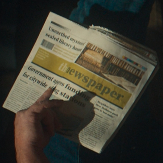

"Unearthed mysteries of sealed library basement" - when Crowley told Shax that Aziraphale was "stock taking in the basement", was it true that there IS a basement in the bookshop? Basements apparently aren't that common in most of the UK, but London is famous for having "iceberg" buildings (where the basements are actually bigger than what's above-ground).
"Government approves funding for citywide charging stations" - We don't know, but it makes us think of all the electric cars used in s2 (it was an indoor set) and of Crowley throwing lightning in the street.
And the smaller headline on the right ... Hmmm. Can you read it? 😅 Maybe "Neighbor says New ------ park gate is ' too --- ' "
And it's not just the pub during episode 2! This mystery character is everywhere!
E1: He somehow starts out behind Gabriel, and then ends up in front of Gabriel with another extra on his arm:
E2: In addition to his appearance in the pub, he's also watching when Saraqael, Uriel, and Michael arrive:
E3: Our mystery character is there again when Crowley makes it rain, wearing his e1 shirt:

E4: We didn't spot him in this episode, but there are only a few minutes of present-day SoHo. Did anyone else see him?
E5: He has a doppelganger in a different Hawaiian print shirt! (Notice the different facial hair, among other things.)
Later in e5 he does actually make an appearance in the bookshop window for a quarter of a second (!!), wearing his e2 pub outfit, and maybe it's his presence that elicits this similar-to-the-pub reaction from Aziraphale?

E6: And back again to his black e1 and e3 shirt with the red flowers, while in line behind The Metatron, and then sitting at a table on the sidewalk, where he remains with the person in the turban who was in line behind him (and who also shows up quite a lot during s2) right up until Crowley drives away:
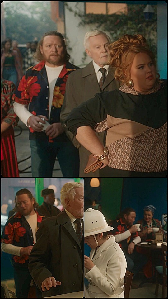
So, why have him wear such a noticable black shirt with red flowers on what are supposed to be three different days? Is he connected, with his Hawaiian print shirt, to the appearing Honolulu Roast sign? Why does he get a doppelganger in e5 - to distract us from his presence outside the bookshop before the ball? Why does Aziraphale react like this - TWICE - upon seeing this person?? (Much to Crowley's great confusion!)
And why does it seem that Aziraphale is keeping this person's presence/ identity/ importance a secret from Crowley?
As always, we'd love to hear your ideas!
Also, here's an earlier post from @theastrophysicistnextdoor about him, with gratitude for the inspiration to write all this up.
With appreciation for contributions from @noneorother, @thebluestgreen, and @embracing-the-ineffable at the @ineffable-detective-agency
Want to see more interesting posts, plus Good Omens clues and metas from all over the fandom? There's a huge collection here!
#ineffable mystery#good omens clues#Ineffable discontinuity#Good Omens extras#good omens meta#good omens analysis#good omens season 2#good omens#Jon Dan Duncan#Ineffable Detective Agency#aziraphale good omens#crowley good omens#crowley#aziraphale
252 notes
·
View notes
Text
Okay in response to this post I’m going to “Erm Ackshully 🤓☝️” y’all’s arguments (but really, this is for shits and giggles and I find y’all’s ideas and this conversation so interesting!!!)
(And logically, yes, I know the show wants you to believe that Hunter’s just immediately scarred/has no pain because they likely didn’t want to fit a healing arc into their limited storytelling time. I get it. I do. I’m just making the argument why it would be easy to argue that they are actually open wounds/why I feel like if they were going to do this arc, they should have considered giving a fraction of the proper weight to to the horrifying consequences of such a severe injury.)
Okay so without further ado! We have Hunter pre-Belos. When we look at him, his original scar is on the left side (his right cheek, but I’ll use left for our argument from now on for simplicity’s sake)
Next, we have Belos leaving Hunter’s body. Notice how the big goop scar on the left side overtakes the original left side scar.
In addition, the small scar on the right is shown to be caused by Belos’s goop.
Therefore, I think it’s safe to say from this double evidence that the scar on the right isn’t just an animation error of his original scar being on the wrong side.
Keep this in mind for later!
Next, here’s Hunter after Belos leaves his body. Note the size, color, and shape of his scars here:
“Calaiti,” you might say to my argument, “Flapjack healed him! That’s why his scars aren’t open wounds and/or why they don’t cause him pain!”

OBJECTION! Evidence:
Remember when I said to remember that one photo? Here’s where that comes into play. Hunter’s scars before and after Flap reviving him have been shown several times to be the same size, shape, and color. Absolutely nothing changes!!! They look the same before and after consistently!!!

Also, notice how Flap’s magic only ‘heals’ the left side of his face and neck. The small scar on the right doesn’t light up at all. Then, the left side scars STILL match the ‘unhealed’ wound on the right after Flap dies!!! Shouldn’t there be a visual difference between the healed and unhealed wounds, then?
I’ll admit, this whole section of the episode has a bunch of animation mistakes. See an example below, where the animators forgot the scars on Hunter’s ears during this scene. Therefore, you could use the argument that the animators just forgot to draw the right side lighting up during the revival sequence if you feel so inclined. Sure!!!
BUT to that, I’ll propose this thought: If the animators wanted to show that Flap was actually healing the scars, wouldn’t it be visually more telling to have the scars be darker and/or bigger before Flapjack reviving him, and lighter and/or smaller after, to show there was some kind of resulting change there? Just because they lit up during the revival sequence doesn’t necessarily mean that was Flap healing him. Visually, again, they look exactly the same consistently before and after Flap ‘heals’ them.
~~~
Moving on to the argument of why Hunter doesn’t have any pain after all this, sure, maybe Hunter was running off adrenaline and the pain hits him later. I suppose that’s fair! Doesn’t mean I like it!!! Doesn’t mean I think he shouldn’t have received medical attention even though he said he was okay!!! If we have time for a whole Hexside arc, I think even if he was in shock (which would likely come with a whole host of medical issues which he is not shown to have imo! (Look up ‘burn shock’)), they should have at LEAST insisted on checking him over instead of taking his word that he’s okay!!! He would have been pissed about it lol but idc, show them sitting his ass down and having a healer look at him to show as writers, you’re treating this life-changing injury with the seriousness it deserves.
And if they didn’t feel like doing it before the Belos fight, I would have even accepted them making time to acknowledge the physical and psychological trauma of TTT somewhere else in the last episode. The most we get is Hunter looking sadly at Willow reuniting with her parents before Darius comes along and starts talking to him. It feels like a huge missed opportunity to skip over any negative consequences or closure for Hunter. We just skip to him being healed and happy with no further lines in the show, and that’s a shame to me!
Anyway, thank you for coming to my TED Talk on me defending my goofy headcanon thesis and why I (seriously) think this whole scene should have been handled with a bit more care and consideration to realistic consequences of such an injury.
(This is still my favorite episode though 🤭)
#the owl house#toh#sorry if this is all over the place I have trouble putting my thoughts in order#I’m aware this is like two separate arguments in one post but I wanted to put all my thoughts in one place#please don’t come for my throat for this is just for fun okay I’m not dying on this hill#also I really liked the idea of necrosis that’s also a super cool headcanon y’all had!#guys help I’ve become a toh critical blog#jkjk I adore this show. nobody else is allowed to criticize it but me 🙅♀️ /j#oh plus I forgot to mention I know they wouldn’t have ACTUALLY shown open wounds on the show but they could have at least implied it#with color changes or something like I mentioned
46 notes
·
View notes
Note
HI I AM COMING TO BEG U FOR HELP HOW DO YOU MAP OH MASTER OF ART
HELLO HI I AM HERE TO AID U MY BROTHER IN ARMS!!!
this got very long and i tried to cover things that helped me when first getting into hand drawing maps, but if there's any other places where you're struggling let me know!!!! ive got a lot in my brain im just going from broad to narrow here :)
BIG SCALE:
great ways to make continents that look like continents include
- peeling an orange or equivalent citrus messily and laying out the pieces of peel, and copying those shapes pros: realistic coastlines that would fit together like in real life, if you get into the nitty gritty these can also serve as tectonic plate templates. cons: messy. might not have oranges on hand. can be hard to scale up and transfer to digital - getting some paper and pouring a bunch of doodads of some kind on it, then clumping them in vaguely the shapes you want and tracing the coastlines. things i have used in the past include dry macaroni, beans, dice, and paper stars. pros: potentially less messy than oranges, more control over the shapes, scales up easily cons: coastlines will be less realistic tectonically if that's a concern (for both of those i usually then take a picture of what i get and start editing in my drawing program of choice from there)
other strats to try: taking a grungy brush in your drawing program of choice, making it Huge, and scribbling a few clumps, then on another layer going in and tracing around the edges to make the coastlines. using a map from real life and cutting chunks out and rearranging/copying/warping them to make a collage you can trace for coastlines. etc
SLIGHTLY SMALLER SCALE:
country borders were, until quite recently, determined mainly by geographical obstacles like mountain ranges, rivers, canyons, oceans, etc that are very hard to cross. also borders will be highly disputed when it comes to warring states or eras without, like, satellites and bureaucracy and such!! making them fuzzy or jagged or having areas where both colors mix or stretches of land where no one knows where either country ends is in fact very fun and cool and sexy
mountains usually are chains, and so are islands. i like to make big curves across the world map where i think it would be cool to put mountains, and when those curves extend into oceans i like to put island chains on those as well. if you choose to do whole ass tectonics with your orange then do those on plate borders
biomes can get really specific in their placement if you want to be hyper-realistic, or you can put them wherever you like. personally i like a little realism a little "fantasy world can have whatever you want in it". deserts are usually on one side of mountains, and on the other is really lush. the higher the mountains the larger the areas and more extreme the difference between the two. outside of that case, youll usually get forest > grassland > desert in a gradient. also remember there are multiple kinds of everything
HOW TO DRAW THESE THINGS
good ways to draw rivers include: tracing blood vessels from photos where you can see someone's veins through the skin, dead trees or lightning, or cracks in stone. theyre all fractals and how detailed you want to get is up to you. BUT they always flow downhill and eventually meet the ocean (the ultimate downhill), usually starting in the mountains. also those fractals all go kinda reverse of what you might think; the ends feed into the main river, not the other way around. i used to mess that up a lot
PROTIP: canyons and the like are almost always old riverbeds. use the same method as you do making rivers, just widen the brush, maybe draw a border around the shape instead of just a line
mountains: personally i prefer using premade brushes for mountains just because the one (1) time i did them by hand it took me like four hours for one mountain chain. this video has some tips on different mountain styles if any of those look good to you, otherwise there are about a bajillion videos like that out there!!
biomes in general: just a little texture is usually plenty! doing some bushy edges on deciduous forests, pointy bush edges on pine forests, a few little grass lines and sand dunes, etc etc is usually plenty to get the point across :)
SMALLER SCALE
roads are personally the bane of my existence. i try to treat them like rivers just a little straighter, depending on what time period you're emulating you might go curvier. also they dont care about maintaining width or what direction the fractal goes in humans just put those shits wherever they walk a lot. in contrast railroads are usually pretty straight, simply because trains are built different than cars or wagons or people
cities are almost always on a source of freshwater and a valuable resource that draws people for work in the early days. also they'll have like 10-20x the landmass of the city itself in farms around them, less if theyre on the coast and have access to lots of seafood, more if theyre more landlocked. those farms can be farther away if theyre more industrialized and can transport the food en masse easily. you also dont have to draw the farms just kinda mention them in the story if relevant
towns can be on smaller rivers, lakes, or even just by natural springs. you wont find permanent settlements in places where water isnt accessible (unless you have magic to fix that which is always a cool detail)
EVEN SMALLER SCALE
city maps i have 0 advice on other than roads get thinner the fewer people travel on them, industry will be on a very different side of town than the rich people for smell and noise reasons, and especially when emulating pre-car times, think about how far you would feasibly walk in a day. if you want characters to be able to know pretty much the whole city that they live in, it's gotta be reasonable for them to walk to the farthest edge of their knowledge and back home (or to an inn) in a reasonable timeframe, if they have a home. also big cities tend to have colleges, trade schools, and a bajillion and one jobs that need doing. magic cities might need mages to maintain infrastructure, non-magical cities need people who light the streetlamps when it gets dark, waste disposal is Hugely Important, etc etc etc
it can sound boring at first but coming up with the odd maintenance jobs people have to do in cities can be a really fun creative exercise, and it might inform how the city is laid out, too!!
IN CONCLUSION
think of the world in layers. landmasses + oceans -> biomes and geographical landmarks -> countries and borders -> settlements -> districts. i literally have those on different layers in clip studio so i can futz with them more easily.
also realism is not the be-all-end-all of this. there's lots of room for symbolism and environmental storytelling in maps, as ive ranted about in the past, and stuff doesn't have to make absolute sense in the real world to work well for your world. breaking the rules is like, art 201 and it applies to ever part of the art in question <3
i hope this helped!!!! again pls let me know if you have any more questions i love helping out :D
#a&a#adv#talking with: ren#i still have to do a bunch of maps for the ehlverse a;ldkfj#ive done emarye the maelands and sieril. i think deltierin has been sitting half-done in my map folder for uhhh a year#and i still need to do the isles of gord and kard#and also because i love torturing myself. i have ocean floor maps to make as well#GOD AND I MIGHT HAVE TO DO A MAP FOR THE LOST WAIT#SHIT I HADNT EVEN THOUGHT OF THAT
8 notes
·
View notes
Text

I was just drawing this concept, I’m still not sure if I want to do much with it
So basically, it’s been an idea semi percolating in my head to make another kid for Menos and Velvet. Specifically, this came from the fact that I’ve noted that Menos’ kids look so little like him, so the idea was to make one that just looks like a smaller Menos. The genes just came in at full force. But then later, when I made the post about forgetting that Ceres is half human, I realized that I should probably add in some non Demon features too
I only made him yesterday because I was bored at work, and I couldn’t think of what else to draw. And I thought he turned out pretty good, so I translated him into digital drawings
I would show you the original picture, but it was drawn exclusively in pencil, and it’s on a darker cardboard sheet, so it’s practically impossible to capture on photo. I just really liked how the pencil sketch came out (my manager came in during my break and sharpened my pencil, so it was darker and less blunt), and I didn’t want to potentially ruin it with my somewhat shaky pen, and I had bright light so I didn’t realize it wouldn’t show with a darker lighting
It also kind of screwed me over when I was trying to translate into the digital sketch (that would be the top left), since it was night time, and I only had my lamp light. So it looks weird, but I had the basic appearance down, and I could refine it now, which is what I did on the top right
But yeah, I guess we talk about design things
So his hair style mostly comes from one of Velvet’s concept hairs, and I thought it works as an in between for Velvet and Menos
But I do wonder if it looks too different from Velvet’s final hair, and if I couldn’t have came up with something more unique for him. But moving on
The non Demon features I decided on are him not having horns, as well as having shorter ears than Demons, though they’re still pointed. Also I had the pink nose originally, but I took it out to make it less similar. I also wanted to give him black sclera, but make his eyes blue like his mom. Though I made it brighter because the regular color didn’t feel right
I also wanted to give him the bicolor, but I’m still working on what his secondary color should be. I asked on Discord, and the pink he has in the top right was what we settled on, but Velvet has pink secondary hair color already, so I debated going back to the dark blue, which is what I did on the bottom. I still don’t know which I should stick to honestly
I’m also not sure if I should give him glasses or not. I think it looks fine, I just haven’t decided on it. He does for now though, and I made it a different shape from Velvet’s as well
Overall, I think he succeeds at looking like Menos while not being a complete clone. I was drawing him, and I think he’s like a softer Menos
But I also wonder if I’m playing it too safe
With the kids in Evoland 2, while I may say that Reno and Ceres don’t look like their dad, I think the designs really succeed in having them look similar to their parents, but while being very much distinct. They are not copies of their parents, they’re their own people
Ceres I think is an excellent example of that. You can tell who her parents are by her design if you look hard enough, but she’s different enough that she looks her own person. It may be in part to aid in the twist about her heritage, but the final product really does exemplify this

And it’s like, by comparison, I feel like I’m not doing enough, like he looks too similar, too obvious who his parents are, and that I’m not being creative enough
Maybe I'm being too harsh on myself, considering the point of this character is that he's supposed to look super similar to his dad, but I feel like I'm not doing enough
It also doesn't really help that I don't know what to do with his character. I have an idea of him being more book smart, and/or he deals more in politics than any sort of fighting, but I feel like maybe it's still too similar to Velvet or something. Like he should be something entirely unique, but I don't know what
And by proxy, this goes for his outfit. I can't really make an outfit without knowing the general idea of the character (at least most times), so I don't know what'd be good there. I just slapped something together on the bottom left
I know this character likely wouldn't feasibly ever exist (I mean, maybe he could, and he was born right before Ceres was taken or something, but it's unlikely still). In my head, he'd exist in some alternate timeline where we had another ending after the canon ending, where we destroy the Project, the timeline no longer loops, and everyone can go home or something, with Velvet and Menos getting together and living in Demonia with their kids (still unsure if they'd be going to the Past or Present, since Fina and Kuro would be going to the Present). Also, the Ceres we know died, but she was born again in this new ending and doesn't get kidnapped. So, like, this kid would in context be the 3rd kid of Menos, 2nd kid of Velvet's, and a prince in Demonia, or what remains of the country as Menos tries to rebuild it, and his life is mostly normal outside of that
I also really don't know what to name him. Maybe I give him a Roman god name like his sister? Or make it a Greek god maybe? Or a mythical king like his dad and grandpa? I'm not sure. A concept in my head is maybe he's named after his grandpa, being Arthus II, but that feels uncreative
Note as I'm finishing this, the name Janus popped into my head. Maybe that could work?
Hmm, I don't really know what else to say honestly. I think I had other points, but I don't know how to work them in
I guess the point of this was, here's this concept I've been working on, I want to show off completed work but also I don't really know what I'm doing with it
He probably needs more refining in his character, but I don't really have ideas to work with either. It'll be a struggle, and that's if I choose to continue with him
#also another note I still don't know how to draw a tieless Menos#at least not with hair resembling his family#which I imagine he's supposed to have#I tried to do that on the cardboard sketch#also the kid has a lighter skin tone in his child self because Ceres has that#her young self has a lighter skin shade than her current self#but this isn't a thing for Reno so I assume it's not a Demon thing#but I gave it to the kid regardless#I don't know what else to put without trailing off too much#evoland 2#evoland oc#my ocs#my art#character design#evoland menos#evoland velvet
3 notes
·
View notes
Note
Do you have any tips for drawing?
Tips for drawing? Hmmm..
I'm still learning myself, so forgive me if this list isn't very long or detailed (ㅎ.ㅎ )
Normally I start a drawing with a reference, so I can get the anatomy correct (a real life reference alongside a character reference of the character/s I want to draw)
I normally go into Pinterest for this, there's lots of good photos to choose from
I then go into IBIS Paint and set up a canvas (the size changes depending on the picture)
I then try to mimick that reference as much as I can (since I can't really draw clothes and stuff on my own yet). This first layer is normally in red so I can separate the layers
Extra stuff I put in blue, just to help differentiate between them
I'm messing around with line thickness, and I've realized it makes the picture pop out more if you have the area where light isn't hitting thicker and the lightened up areas thinner. I also do this to the edges, I don't know how to describe it:


After the line art is done (and cleaned up!), then I draw my character on top of this in another layer in another color (typically a shade of orange or purple). I try to keep the lines thick on the outside and thinner on the inside
I start off coloring by doing everything one at at time, and I normally use a bucket for a base color and then add shadows in areas the reference has (if the reference doesn't have any then I try to estimate where the shadows would go)
Same thing goes for the character, and I take colors directly off of a screenshot
Because I keep forgetting to color the whites of the eyes and teeth, I make my entire background a light shade of gray so I can see the white when I do color it in
When coloring the shading on clothes I try to follow the folds

Sorry these pictures are so big, I forgot how to make them smaller.. (;ŏ﹏ŏ)
I've had some really good drawings, and others that I've thought were really bad. I suppose it depends on my energy and how familiar I am with what/who it is that I'm drawing
I don't draw very much on paper (mainly just for projects and friends), but I do know that if you're drawing something over in marker then moving at a constant pace will keep it from looking odd (and causing it to bleed more in place)
♡ ••┈┈┈┈┈┈┈┈•• ♡♡ ••┈┈┈┈┈┈┈┈•• ♡
Sorry if that wasn't very specific, I'm still trying my best to learn what I can! I hope I can be greater help in the future!
It's also a little different for me because I have only my phone to draw on and I have to use my fingers since I don't have a stylus, so I'd say zooming in a great deal with a large canvas can help if you're in the same predicament ✍️(з_з)
Thank you for the question! I'll let you know if I remember anything else! Please have a lovely day! ٩(。•ω•。)و
7 notes
·
View notes
Text
https://pin.it/1lqc9ZisE
Pinterest Board because I’ve had it awhile and just updated it
Gerard’s house is in the Victorian section, East side residential area. After living in California he wanted something different, something with history and a bit smaller with a big garden. A small Victorian was perfect near little shops where he could come and go as he pleased without so many people. His house is kind of bohemian/modern/well…Gerard.
When you go in it’s just a little foyer, then the living room on the left, further in the kitchen is at the back of the house, full of coffee and snacks, a hidden refrigerator with blood stocked from a volunteer blood bank he uses. The windows here look out over the garden, which is a bit of a mess as garden’s go, full of flowers and grasses and places to sit or paths to wander, it’s small but feels bigger with how wild he has it growing. Now his office is on the right, across from the kitchen, it’s the black and white picture, as well as the shelves of his comics and manga and books he keeps near for inspiration or just to read between whatever he’s working on. then there’s are stairs leading up to the bedrooms are back in the foyer. His bedroom is the biggest one on the right hand side, the hallway full of photos of family and friends, framed drawings of his and of fans art he has collected over the years. In his room the bed is large, black out curtains because why sleep in coffin when the modern era has other options? His cats Mitch and Lotion are usually in here making use of the bed, it’s cozy and he usually has mugs everywhere from drinking coffee or tea or other things in bed while reading or just going down rabbit holes on the internet. His bathroom is across the hall, cozy, lit dimly and a big claw foot tub. There’s two guest rooms, one has Patrick’s things in a drawer, their new relationship something he is cautious but excited about. There is also a recording studio in his basement but I forgot to find a picture, just in case he has an idea in the middle of the night or he or the band needs a space.
However, if you find the small stairs into the attic, you’ll find his safe space. Gerard had a bad relationship with his maker, forced to bait, bewitch, and sometimes kill targets for him against his will, Gerard spent a good ten years unable to shake his maker who had turned him simply because Gee was famous and people would do everything for a famous person wouldn’t they? This has left some trauma for Gerard, who has created this little space in his attic for “low energy” days, it’s mostly large cushions, pillows, blankets, fairy lights, his comfort comics, books, an old laptop used for only streaming services and his favorite shows like Akira, Dark Shadows, and old horror Hollywood movies mixed with Star Wars and other movies. There’s a small keurig nearby, so the space usually smells like his coffee, half empty and half full mugs litter it, which honestly just adds to the comfort and coziness of the little nook he’s created. The window is often half open on clear nights, Gee’s love of the universe and comfort in looking at space and stars met with that, it also offers him a small doorway to his roof if he ever just wants to star gaze.
Overall Gerard’s house is his haven, it’s comfortable and cozy, anyone who visits should pick up on it, and is usually offered something warm to drink, someone to talk to, or just really interesting conversation.
2 notes
·
View notes
Text
Turning the formerly-feral kittens and their mom into public domain characters #2:
Gizmo! The happiest, most excited kitten ever.
As of September 2023, she weighs 4lbs.
I gave them all the last name Jupiter since they got caught in July.
Sapphire is already done
Not drawn yet:
Eclipse Jupiter
Taaz Jupiter
and their mom, Marlena Jupiter.
Who is the father? The world may never know…unless you decide to create him yourself.
Or, it might be this cat?
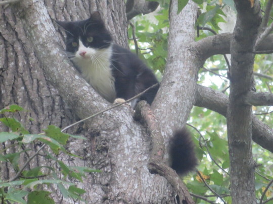
[ID: A zoomed in photo of a fluffy black and white cat stuck up a tree, with a black body, and white chest, paw, and face markings, with whote on its cheeks and in a point up between its eyes. End ID.]
(It got down eventually)
Or this one?
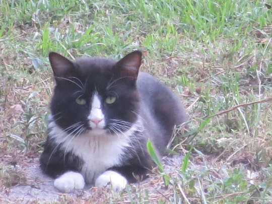
[ID: A photo of a different black and white cat lying on the ground in a sphinx pose, looking at the camera. It has a black body, with white front paws, chest, and a thin white triangle from its chin, up its nose, and between its eyes. End ID.]
We just don't know. Too many people here keep their cat outside, not to mention all the ferals.
Both photos are public domain, and you can turn those two into characters too lol.
Includes a more detailed reference, and more simplified cartoon version, including her white paws are literal mittens and boots.
Feel free to draw her in whatever style you want. Or change her pronouns. She’s a cat. She doesn’t know what gender is. But she could in your version!

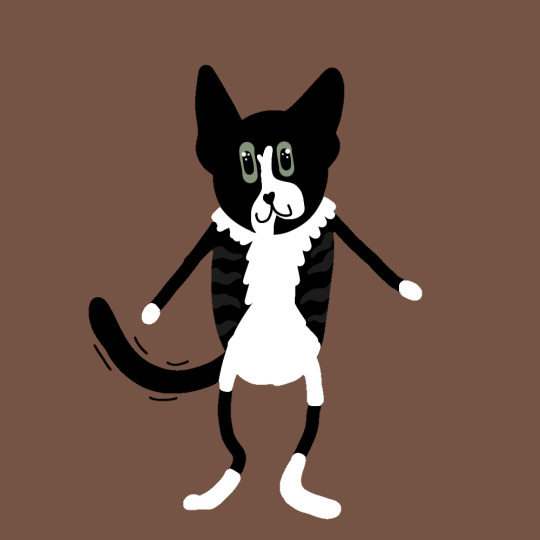
[ID: Three digital drawings, each with the same brown background, showing three versions of a drawing of a black and white kitten labled, "Gizmo". She has a mostly black body, with white on her chest, the inside of her back legs, white paws, and unven white markings on her face, with a two-pronged stripe between her grey-green eyes, over both cheeks, and going down the left side of her chin. The black part of her torso is faintly striped with very dark grey, and her paw pads are mostly pink, with the larger pad on both front paws black, with uneven black spots on three of the four smaller pads on her left paw. The hind paw pads are pink, with question marks. Her tail is long and very fluffy. The first version shows her in more detail, with the limbs off to the sides separately to fit in the square canvas, and then is drawn as a much simply, bipedal cartoon, her tail vibrating happily behind her. In the second version of the cartoon, her white paws have turned into gloves and boots. End ID.]
#eye contact#described images#Public domain#public domain characters#Gizmo Jupiter#public domain cats#lol#furry
3 notes
·
View notes
Text
JeongMee Yoon
JeongMee Yoon is a South Korean photographer and was born in Seoul and Studied and got her MFA at the School of Visual Arts in New York. She is especially renowned for her photo series that she created in 2006 “The Pink and Blue Project”, which was also around the time she got her MFA. This was not her only well-known series, but it is the first one that comes up when you research her. These series of photos immediately draw the eye with their child like imagery of assortment of toys, books, and other things meant for kids. Not to mention, they are separated by color and also reflect a gender disparity between things meant for children with girls’ toys being mainly pink and boys’ toys being mainly blue. But that is just the surface level part of the project. Overall, it shows the view that consumerism and commercialism have on growing minds through media and the things they are trying to sell.

Not only dose this series show a disparity of gender ideals with color, but it also shows how companies market their products and make their products for different genders by making toys pushing stereotypical female and male roles. For example, toys marketing to girls tends to be thing like toy baby dolls and cooking or cleaning appliance while toys marketed to boys tend to have depictions of sports equipment and trucks. Not to mention the clothing, things like clothing is also shown to be extremely gendered as the blue pictures depicting things marketed to boys only depict shirts and pants while costumes tend to be things like superheroes. The pink side however has frilly shirts and dresses and skirts while costumes tend to be things like Disney princesses.
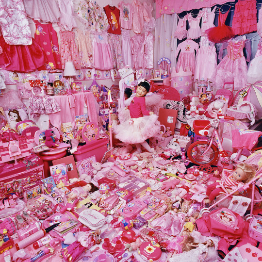
Again, this shows the things that are pushed on impressionable minds in a subconscious level by making these hard lines of what is considered for boys and what is considered for girls and also subconsciously tells them what roles are for girls and for boys. Not only that, but it also limits them at a young age what they are exposed to, again, with the aforementioned line that media reinforces, saying what is and isn’t things boys and girls can like.
On top of that, not only dose it shows how this effects children, but also how they are affected later on in life as the other versions of JeongMee’s series shows the people in theses series show them growing up and while the pink and blues are less prominent, there are some traces left in their life. Showing how this kind of marketing can influence our growing minds and overall mindset of gender and gender roles.
Looking at her other series, she relies a lot on color and obvious compositions that more immediately draw the eye around the picture. With the aforementioned “The Pink and Blue Project” utilizing single dominant colors and pattern from the different toys, cloths and other objects. Looking at the pieces from afar reminds me a lot of larger scale photos that are created with smaller image photos.
0 notes
Text
I think I've just realized something with figurings
My explanation will be using the US currency system, since it's what I'm used to, feel free to see what the pricing is in your country if u want to!
Usually prices range between like $50 to about like $100, even more if it's more rarer/larger in size (the smaller ones usually ranging from $6 to $30. By an blind box or just a mini figure) But with regular sized figurine, it all depends on the marketing involving with the figures.
Shows/series and movies that are popular just for the characters are gonna most likely gonna have a lesser quality look, or feel to them. Since in their mind space of the seller, their focus is on the character, rather than the lore or information that the show/series and movie that are present in these contents. While one is more focus on the media for its content and not for the characters, the details are usually more significant to match the standard of those who mainly focus on the story line.
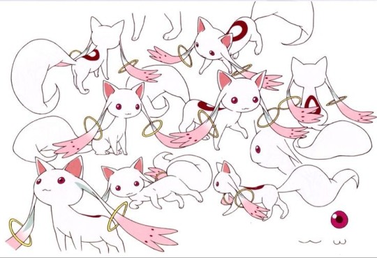
And those who view both, the figurings are more detailed but there's usually nods to the media (these are usually seen in figures that wearing more modern clothes, rather than their typical more fancier outfits they have in their media.) The best example I could think of is the Madoka figuring with the white skirt with pink polka dots on it. Also those who haven't seen the show Puella Magi Madoka Magica series (including the side story) and the rebellion movie, This is containing spoilers but I'll try to keep it light as possible!
(photo for reference, will try to figure out how to give the description later when I'm more awake)

(No credit for this one cause I didn't trust the format of the link imbedded to this screenshot, I don't wanna get blamed for any malware viruses on any peoples devices. But there's lots of other photos of this figurine, this was the less pixelated one I could find. You can look up "Madoka Magica Ichiban Kuji" if you want to see more photos of the figurine)
In the skirt, there is a dot that resembles and eye. The sleeves and two yellow strips. She is wearing a white cat eared beanie with short braided pigtails with yellow bows. The outfit is resembling Kyubey, which is a being. (Was described as a boy in the anime from one of the characters that I will not mention for possible spoilers.) from outer space that traffics them into a deal and violates child labor laws and the children get punished if they do not checked out from the shift correctly.
(Photo of Kyubey, the animated series edition. Kyubey manga and Kyubey anime are two completely different individuals, you can't tell me other wise.)
(Credit: https://pin.it/MG2RJB0T4)
Some have believed the clothes, at least the skirt. Is made of Kyubeys fur, the skirt basically being a pelt skirt or fur skirt. Due to the similarities on the specific dot in the skirt (should be bottom right on the skirt in photo reference) and the eyeball on the right bottom corner of the many Kyubeys in the photo of him, and the similar color pallet that the figuring and the character share. Some even believe the whole entire outfit is just made out of his body, due to the vastness of his kind and the suffering that Madoka went through as a magical girl; as a form of revenge for the trauma that she faced.
Madoka Magica is one of those series that is beloved for so long is because of the flexibility of the plot (which happens due to one character) and for the uniqueness of their enemies that they face, the enemies being usually portrayed as stop motion beings, like paper or crayon drawings. And overall, a diverse of personalities and religion (shown in EP 12 of the madoka magica series, for its diversity of representation.) within each media of the Madoka Magica series (the series, manga, and the Rebellion movie)
With a healthy and a thriving fanbase, expectations are usually high with the merch. Including the simplistic things such as a keychain or a poster. And also for the craftsmanship that's usually shown in this fandoms collection that I've never seen, there was even a wood painting carved piece that looked like it should've been more expensive was really $400 dollars (yen converted to us currency)
(PHOTO IS A HUGE SPOILER IF YOU HAVEN'T SEEN EP 12 OF MADOKA MAGICA!!!!)

(Credit with info on process: https://www.akihabara-premium.com/en/blogs/archives/madoka_magica_ukiyo_e)
That's just one of the many examples of the craftsmanship that's put into the collectibles in this fandom.
Overall with figurines, the quality of the figurines can differentiate from the seller and on how majority of those who usually interact with the fanbase of the figurines that they're from (such as, is it seen more as an aesthetic appeal for its popularity or is it really enjoyed by the fandom.)
#puella magi madoka magica#mahou shoujo madoka magica#madoka magica#drabble#figurines#i need to go to bed#spoilers!!!#kyubey#incubator
5 notes
·
View notes
Text
Journaling:
Asymmetrical Balance: The piece looks well put together however it does not look the same on both sides.
Asymmetry: The piece does not identical on both sides.

Balance: There is just the right amount of influences and opposing forces to the piece.
Composition: The organization of visual elements in artwork.
Contrast: The emphasis of shading and/or size of an object in the artwork.

Design: The process of creating the artwork with all the elements and details.
Directional Forces: The artist adds certain details to artwork for the viewer to look at.
Emphasis: The artist makes a certain part of the artwork the main view point by making it in the center of the artwork.
Focal Point: The place of the artwork where the artist draws the most attention to.

Format: The size and dimensions of the artwork.
Pattern: The overall design of the artwork by having repeated elements.
Proportion: The size comparison between elements.

Repetition: The reoccurrence of visual elements.

Rhythm: The ordered repetition of the main and secondary elements within the design.
Scale: The size relation of one thing to another.
Subordination: Artist marks certain areas of the artwork with less importance generally by smaller size and certain colors.
Symmetrical Balance: The sides of the artwork have exact or similar looks to them or it has a two-dimensional composition.
Symmetry: The artwork has exact or similar sides that a line could go down the middle to show the comparison.

Unity: The appearance of similarity, consistency, or oneness.
Variety: The different elements in an artwork; opposite of unity.
2. Writing and Looking:
An example from the textbook that I found was Silver Coin with Apollo (Figure 12.2) Page #. The artist that made this coin first needed to find metal and make it round even though it is not completely symmetrical. The artist then also had to engrave all the details into the coin.
3. Connecting Art to Your World:
Color has affected my life in multiple ways depending on what I am looking at. The intensity of all black clouds mean that a bad storm is coming which can mean that we need to go inside but it could also be a good thing if the area is really dry and we need the water. When I see light hues of color it reminds me of happiness because they are uplifting whereas darker shades are more gloomy. If I had to pick a color scheme for my life it would be with complimentary colors such as purple and yellow. Yellow would represent my happiness and purple good represent me having not the best day depending on the saturation of the color.
4. Art Project:

5. Photo-Design:

This picture is named "Living in Solitude" which it was photographed on a small riverbank village in Mongla, southern Bangladesh. Shanta is nine years old in this picture and her mom, Khadisha got pregnant from an unknown person. Girls born under this condition are forced to be in the path of sex slavery and the boys will end up working as drug dealers. The photographer showed this story in the picture because the girl looks scared and wants help while there is a man behind her looking at her.

This photograph is called "Roma in Svinia". Svinia consists of two settlements of similar size in Slovakia, one inhabited by Slovaks and the other Roma. The conditions in which the Roma are living there are appalling and the unemployment is almost one hundred percent. The photographer showed this by having a child seem very upset with their living conditions.
0 notes
Note
(Ooc continued below!)
When I started I just went thru and found photos of nothing/empty places (I love taking photos so there were plenty) but now that I’ve started this blog I take photos for it specifically. The trick is framing it as if there is something there, just imagine the way you’d lower your phone and angle if there was a lil kid or cute dog (or the opposite if you’re imagining a giant pokemon!)
Just in terms of courtesy in art I think it’s best practice to use your own photos, plus it means you can customize angles and things like that! I personally make an exception for famous photos/memes that have sort of entered a public domain and are recognizable on their own. Or of course if you have permission from a friend to use a picture they took or an image is free stock. You can certainly work with whatever you get as long as you position/angle your pokemon/subjects accordingly!
When taking your photos it can be helpful to have some kind of prop to reference and draw over, this helps with scale and lighting if you like to render your pokemon like I do! Stuffed toys, boxes, or real animals work great! For example:
I took this picture of a plush Oatchi looking out the window, so the angle is already perfect because I’m focusing on a real pokemon sized object (but it still smaller than the mon I wanna draw!), and I have a little round guy that’s great reference for the shading with that dramatic lighting. In the second picture you can see where I blocked in Appletun and the shadows, and in the last photo I finished out the coloring and more specific shadows/highlights.
In my opinion it makes a world of difference to really “place” them in their environment with shadows beneath them, or in this care I carefully removed oatchi’s reflection and added appletun’s!
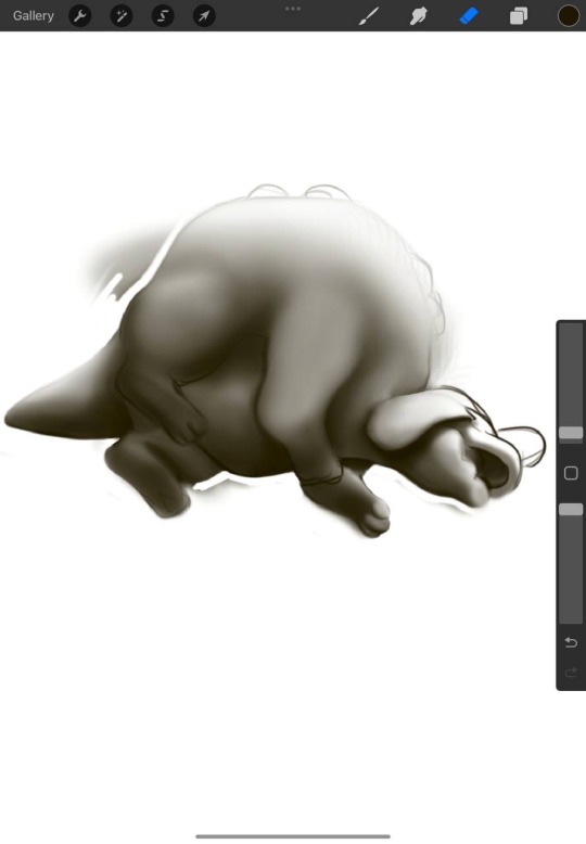
Here is another example (I’m working only from wips I screen shot and saved to my phone, I’m at work sorry) with an isolated image of the shading of Appletun, which I eventually set as a multiply layer over my flat color. Afterwards I also add a color dodge layer to some highlights as well. After that I color pick and add a layer for very small highlights like shines in the eyes or lines just to differentiate between dark areas (you can see above at the bottom of her front toes and the back of her heel)
In this one you can see where I used a liquify tool to make it seem like there was weight on the ottoman, cropped some, and also adjusted the color balance/brightness on the original photo to get the sort of vibe I wanted.
I alternate between lineless and lined styles on here (really just based on my mood lol) but in lines pieces I will also color my lines to make the pokemon seem a bit more real. Like in the second here, I had mostly finished my shading but still had dark lines, but compared to the finished third picture the colored lines look a lot more polished and “real.”
But back to the photo aspect, I think the less polished your photos are the more enticing the drawings end up, just take them as is there really is something there considering things like how far away you are from the subject, the height you hold the camera/angle it. Here are some empty photos I have plans for as examples:
((this is ooc but I need a bit of help on how to "take pictures" of my pokemon...aka I'm trying to draw my pokemon but I don't have any good irl pictures-
That being said I am assuming that they need to be my own pictures?))
((Ooc below!)
Hey there! I’m very very new to the pkmn irl community, but I have a Lot or art experience that’s been relevant to the pics I’ve made for here so far! I’m gonna post a brief answer here and reblog with some pics of my process and what’s been working for me and hopefully it can help you/others!
#ooc2dragon#ooc post#pkmn irl#rotomblr#pokeblogging#behind the scenes#digital art#procreate#photo manipulation#pokemon#pkmn art
39 notes
·
View notes
Note
Would you ever do a tutorial on how to draw tit so well? you are a titmancer!
Thank you! 🧙♂️
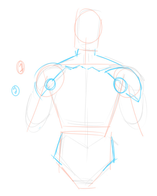
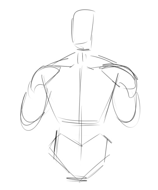
getting used to the Shapes of masculine chest/arms/etc takes some time but tbqh it is sort of just rectangle with more chunks
sketch the body
hes a quick how-to for the front angle and how i sketch the pecs
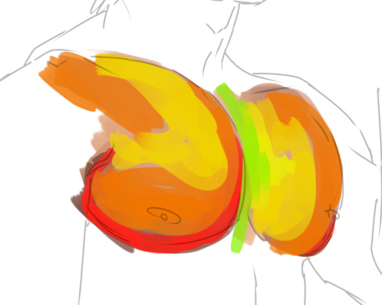
and then I put together a colour palette: i believe skin tones are not just a "base" and then the "darker shadowy colour" and then the "highlight colour"; it is made of so many blue-green-purpley-yellow-orange tones you wouldn't think to include, and all of those together are what creates the illusion of one solid skin tone. Study from real life and use photo references as much as you need. Challenge yourself and get lots of practice! I make a palette from photos when i want to make sure I'm accurate. Here's an example:
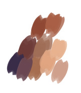
In this, there's light, saturated tones and desaturated colourful ones in deep purples. I tried to get as many different-looking swatches as possible; when I paint, these will blend together and create hundreds of more colours on the canvas. Try to not over-swatch or you'll be sitting there for ages and be focused on perfection.

here, I'm getting the general shapes of shadows. In most real-life situations, shadows are not pure black, and highlights are not pure white. Of course, that isn't always true!
I'm not working from a photo reference in this because I am very very very very used to painting boobie but i REALLY recommend using one until you could do it blindfolded. I use references ALL the time, for colour and shape and lighting and angles I have trouble with. There is absolutely no shame in it; you are creating a strong foundation to draw from :)

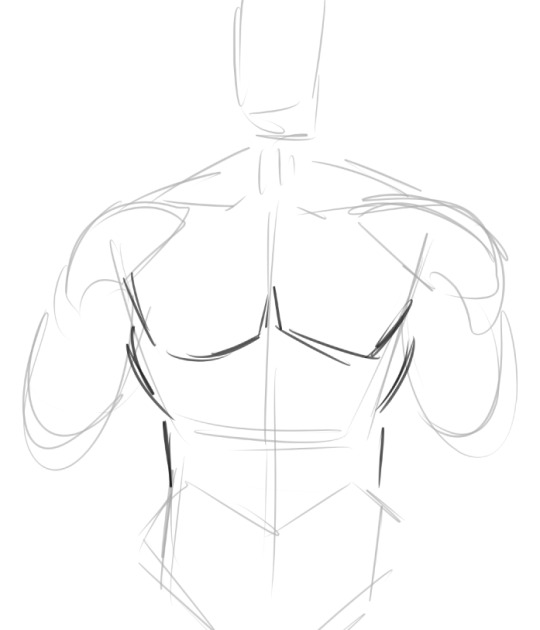
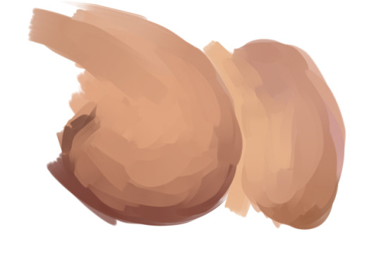
I'm making it very stark so it's easy to see: the top "square" of both pecs is more shaded where it meets the collarbone. Notice how these bits of shadow don't touch; there's a highlight separating them. This creates the illusion of depth! Shading the body is all about shading the simple shapes plopped on top of eachother :)

I added purple to the underarms area; I find that adding a saturated colour fools the eye to think the shadows are more intense without needing to dip into a dark, instense palette. I blended out the colours on the pec to make them less stark: see how the general shape of shading versus shadow is the same on the left and right, but the left is more gentle. A lot of my technique is memorising What Stuff Goes Where; for example, the little triangle directly under the collarbone where it meets the shoulder. The collarbone itself is a strip of highlight, with that darker triangle directly underneath. This makes a HUGE!!! difference in how you perceive the shape.
As a general rule (with basic, diffuse lighting on the subject) I will do a strip of shadow along the bottom of the pec (ending a little above where the nip is at; this depends on how big the pec is. Someone with a smaller one will have a taller shadow!!) and then it is IMMEDIATELY a highlight in a kind of "U" shape. A lot of the form comes from choosing to blend slowly between dark and light versus putting darkness and lightness side-by-side. Practice and study photos and you will see what I mean, I promise!!

And there you have it!! The pec is just one part but it can really level up your apparent skill when you know how to draw or paint one to your standards. :)
Another quick tip: these general rules also apply to breasts, though the shadow at the top near the collarbone is far more gentle; that sharp shadow implies firmness and flatness.
And: when more at an angle, you can draw pecs quickly by doing this:

"the closer tit is dark around the edges" up beside "the right tit is highlighted on the edge"; the contrast between dark and light implies the two side by side :)
See, even without lineart, it implies Mounds:
I hope this is helpful!!!
175 notes
·
View notes
Text
I wanted a patch of the graffiti Bart did the second they got into their base. Idk if it’s too niche for anyone else to want one so I’ll huck it in shop only if someone says they want one.
✨This patch can now be purchase in the shop!
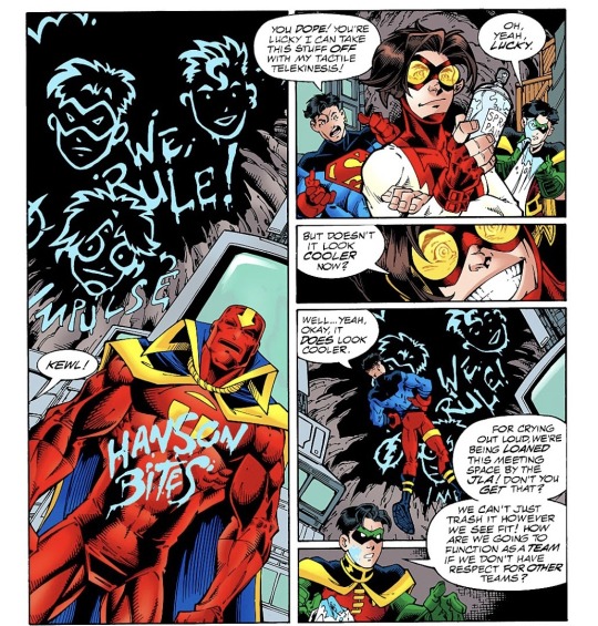
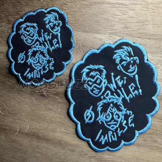
(ID: Image one, a photo of two patches, they both have the same design but are different sizes. They are of drawings if Robin(Tim Drake), Superboy(Kon-el) and Impulse(Bart Allen)’s faces, the text “We Rule!” is written in the space between them. Below impulse is a n arrow and the words “Impulse” labeling himself, to the left of him is a flash symbol
Image two: A part of a page from the 1998 young justice comics comprised of one long comic panel taking up the left half of the page, and four smaller comic panel on the right size of the page. Panel one: A upwards angled shot of the young justice headquarters, to the right foreground deactivated Red Tornado stands with graffiti saying "Hanson Bites" To the left in the background a section of the cave like roof can be seen with graffiti of Robin Super boy and Impulse's faces with "We Rule!" in the space in between them. Impulse, at the bottom is labeled with an arrow saying "Impulse" To the left of him is a flash symbol. Panel Two: In the foreground Impulse cam ne seem smirking, holding a spray paint can. In the background to the left superboy says "You Dope! You're lucky I can take this stuff off with my tactile telekinesis!" To the right in the background Robin says "Oh, Yeah, Lucky." Panel Three: A close shot of Impulse's face grinning, he says "But doesn't it look cooler now?" Panel Four: Superboy's back is to the view as he looks up at the graffiti on the roof and says "Well... Yeah, okay, It does look cooler." Part of Robin's speech bubble overlaps into panel four from panel five and says "For crying out loud, we're being loaned this meeting space by the JLA! Don't you get that? We can't just trash it however we see fit! How are we going to function as a team if we don't have respect for other teams?" Panel five: Robin is partially in scene, a paint stained rag in hand. -ID End)
#young justice#young justice 98#young just us#impulse#robin#superboy#kon el#conner kent#tim drake#bart allen#young justice 1998
123 notes
·
View notes
Text
tumblr kept eating my response to this ask so I'm making a separate post to see if that solves the problem!!
I recommend by starting with the technical aspects of perspective and environments! which does not sound fun. and I might even go so far as to say it is not fun at all. But!! It is important!! Once you get the hang of drawing things in perspective with Math™, you can start doing all this free-handed! So if you feel up to some extra art homework, get yourself a sheet of paper and a ruler >:)
There's two kinds of perspective that I can tell you about, one-point perspective and two-point perspective. I'll go with one-point cause it's easier to explain haha
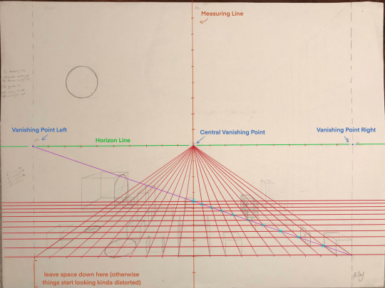
Below I've provided a picture of some of my own drawing homework from a class I took a few years back!! Annotated for clarity lol

So here we've got your Horizon Line (HL) , your Measuring Line (ML), your Central Vanishing Point (CVP), your Vanishing Point Left (VPL), and your Vanishing Point Right (VPR)!
Your HL determines where your horizon is in your drawing, which in most cases will be about halfway up your page! You can adjust this to fit your needs though, depending on where you want your point of view to be :)
The CVP is where your HL and ML intersect! The VPL and VPR are the "edges of your canvas" as it were—anything past these points start to get distorted, perspective-wise.
Your ML is the mvp of Math Perspective Drawing, and you're gonna want a ruler/measuring stick for it! The ML is in the center of your paper. Make some marks at regular intervals (in my drawing here they are all 1 inch apart, but they can be larger or smaller on yours!) up and down your ML. Then, using the same measurement, make marks along the HL. At the bottom of your page, leaving a bit of room below, make those same marks (aligned with the ones on the HL, so that if you connected them, they would make straight vertical lines).
Next step is starting The Grid™
From each mark made on the bottom of your page, draw connecting lines to the CVP (shown in red below)

Now, make a line from the bottom right corner of your "canvas" to the VPL (shown below in purple). Where the purple line intersects with the red lines of our half-formed grid is what determines where our horizontal lines of The Grid™ are located (indicated by light blue x's)!
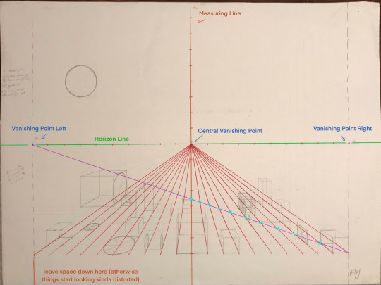
So now we have a grid!! Woo!! Things have started to get a little messy so I'm removing my homework from the background. goodbye homework o7
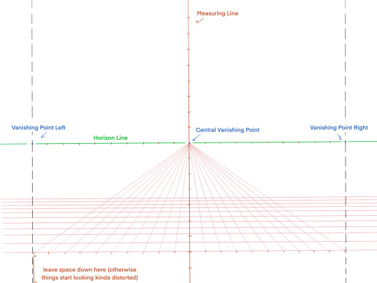
This grid is what enables us to start drawing in perspective! If you wanna skip all the set up feel free to just. Screenshot what I've got here and use that for drawing on lol
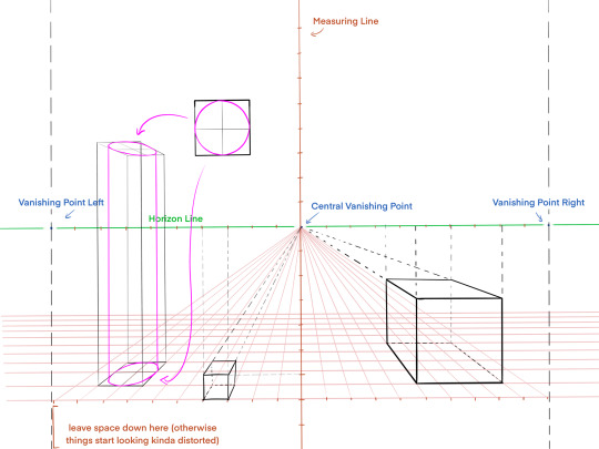
Now we can draw BOXES. cubes, even!! And by learning how to translate other shapes onto the faces of these boxes, you can learn how to draw other things in perspective, like cylinders (seen on the left in pink). There are specific methods for drawing other volumes in perspective, but this post is long enough as is without me going into it haha
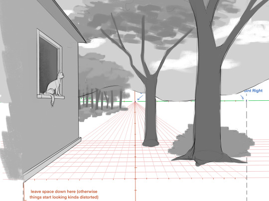
Using this knowledge, you can make all sorts of backgrounds!! Here's a super simple example (plus kitty, of course)
Once you've practiced using perspective, here's a few other miscellaneous tips!
Think about the location you're drawing. What would you find there? Is it a forest, a city, a field? Should there be trees? Boulders? Buildings?
Practice drawing different locations from life (or from photos). I cannot overstate how much this helps lol
Make some objects to distinguish Foreground, Midground, and Background. This is where perspective helps you! Once you can clearly distinguish between these three, your backgrounds start to feel deeper, if that makes sense?
Think about ways to make the ground uneven. Dips or hills in the landscape, small ridges/ledges, whatever fits for the location! Even in places with flat ground like an urban landscape, try to distinguish different levels in the ground, like from the sidewalk to the road. A lot of times, it makes the background more interesting to look at!
74 notes
·
View notes