#naturally i have since lost my tombow
Explore tagged Tumblr posts
Visit Tumblr Blog
Explore Tumblr blogs with no restrictions, modern design and the best experience.
Last Seen Tumblr Blogs


Fun Fact
In 2020, Tumblr had 29.4 million users in the US.
Text
More old stuff!
Monster Hunter Knight
[Image ID] a stylised drawing of a fantasy warrior- he stands tall, wearing black leather boots and arm warmers. He wears a cape draped over his left arm with a hefty shoulder-pad atop it. In his right arm he holds a necklace trinket. In his left arm he has a wicked looking curved sword. He has longish hair and twin scars over his left eye. His cheekbones are sharp and his mouth is covered by his cape. He wears multiple buckled belts across his torso and waists- the lowermost one is bound by a bow. [End ID]

#Think this one came out a lot nicer cos of the contrast#straw_art#straw_oc#oc#art#naturally i have since lost my tombow
1 note
·
View note
Text
Hello my name is Del and I am a New Zealand Artist, under the name Del Fineart. From where I live in my small town in Kowai Bush, Springfield, New Zealand, my personal artistic journey began in becoming an Artist. A few years ago, I joined an adult art class using acrylic paint which I thought would be a great way to meet new people and maybe learn a little about painting never realising that this was going to have such a huge impact on my life. Since then my life is now filled with art from learning new techniques to creating new artwork in various mediums.
Inspired from Jessica Henry’s YouTube Tutorial
I like to do fine art oil paintings, victorian watercolors, colored pencil drawings and one of my favourite, graphite drawings, which is such a beautiful complement to my life. I am a wife, mother, grandmother and now an artist so my days are filled with family, business, and art, and I love every minute.
Where I live is one of the most magical areas in New Zealand called Kowai Bush nestled in the foothills of the Southern Alps in the South Island of New Zealand. The beauty of nature surrounds me with the backdrop of awe inspiring mountains and native bush, bringing inspiration at every turn.
Having grown up surrounded by nature and animals, it is of no surprise that my art has evolved to specialise in animals, especially horses. We have 21 horses presently on our farm that are a large part of our lives as we operate our family owned horse trekking business, Rubicon Valley Horse Treks.
I am so lucky to have these inspirational animals in my life, and I especially love to capture their individual personalities on canvas. I am certainly spoilt for choice in regards to having a never ending supply of reference material right on my own doorstep to incorporate within my art.
Continuing To Learn
From my first lesson in acrylic painting, to now, I find myself craving more knowledge as an artist. I found that online courses were the best option to continue my learning with living in an isolated area and I found the perfect online art course Renaissance Academy of Fine Arts founded by American Artists Jessica Henry and Daniel Hill Riedel. Jessica and Daniel have created the opportunity for students to learn so many different techniques at their own pace within individual modules including classical impressionist art, portrait painting, plein air studies, victorian watercolour, still life painting and drawing using both the pencil and graphite and ink.
I am now presently working on my year two of training within the academy and each module is continuing to challenge me to learn more within my journey of art.
Having had the opportunity to try different mediums through the course, it has allowed me to discover my passion as an artist creating paintings and drawings in pencil and wate color. It is these mediums that I use to create my favourite photorealism pieces such as Duke.
“Duke” Colored Pencil
My Art Supplies
Drawing
With my drawings I am presently using Faber-Castell Goldfaber pencils in various leads but predominantly am using HB through to HB 4. My favourite and absolute must have mechanical pencil is from Staedtler which I use for drawing the finer details within my drawings.
I definitely love my erasers with my favourite being a Tombow Mono Zero 2.3mm pen eraser which allows me to erase really fine lines. My sketch book presently is a Moleskine 8inch by 5inch which fits perfectly in my hand bag to have with me when I have those moments of having to fill in time like sitting in the doctors waiting rooms or waiting for grand children to finish their sport practices and there is nothing more satisfying than drawing to fill those otherwise lost minutes in my day.
I especially enjoy the challenge of drawing from life and my challenge this year is to try to sketch every day.
Coloured Pencils
My must have coloured pencil is Faber-Castell Polychromos which I blend with Gamsol Odourless mineral spirits. My supply of pencils is always continuously growing and I presently have around 70 colors. On saying this, my first two coloured pencil drawing I did was from a small set of 12 pencils which are still some of my favourite painting.
“Gem” Colored Pencil
“Joey” Colored Pencil
I have also just started to incorporate Caran d’Ache colored pencils into my drawings as they have such a beautiful range of colors in neutral and earth tones.
With my colored pencils I have two papers that are personally my favourites which are Fabriano Studio watercolour and Fabriano Artistico Acquarello Hot press watercolour 140lbs. Both these papers allow me to get multiple layers of colored pencil within my drawing with beautiful fine detail.
“Dandelion” Colored Pencil
“A Moment In Time” Colored Pencil
The most important part of creating photorealism is starting with a high quality reference photo and being really patient with the process. It is a slow medium to use with continual layering. The process is very satisfying and I just love the results that can be achieved.
Watercolour
I presently use a Mungyo 18 pan color set on Fabriano Artistico Hot Press Watercolour. For brushes I have a selection of synthetic watercolour brushes that I find work for my style of painting.
I particularly love working in the victorian watercolor style, incorporating my life drawings within the paintings inspired from my garden and farm animals. I like to start with a detailed drawing and then slowly layer my watercolours, finishing with the fine detail.
My Passion
I am continually reminding myself to stay true to myself and to paint or draw what actually inspires me. My inspiration for my drawings mostly comes from around me and I have found that my best work comes from having a connection to what I am working on whether it be one of my own horses to my own flowers from my garden.
My winter rose watercolour is one of those inspirations from one of my art lessons to paint a Victorian watercolour rose from life. With winter upon us here in New Zealand there are not many flowers left in my garden but whilst searching I found this one little rose sparkling in the morning frost surrounded by dark winter foliage that just called for me to forever capture within my painting.
This connection sparks an incredible enjoyment within the entire process from start through to the completion of each piece and I actually find an incredible feeling of loss upon completing a piece especially when working with color pencils which can take over 40 to 60 hours or more to complete a drawing.
Telling a Story
There are many Artists that inspire me, but my favourite is John Sargent Noble. His paintings are so incredible with each telling a story. This work inspires me to create pieces that tell my stories such as my color pencil “Trust” capturing the beautiful connection of trust between horse and man.
“Trust” Colored Pencil
Where To Now?
My art brings me such joy to my life and I don’t think I will ever stop learning. It has created a journey that I would never had found if I hadn’t taken that first painting lesson and I am so grateful for the encouragement that my art teacher and Artist Vicky Peacock founder of Creative Sparks Art and Music School located in Darfield, New Zealand, gave me right from that very first lesson.
This is an incredible journey of learning that not only creates art, but has also created friendships with people from all corners of the world along the way that I am forever grateful for. If you would like to follow me more with this incredible journey of art please visit my new website as I would love for you to sign up for my emails so we can keep in touch.
Del Fineart Website Facebook
GUEST ARTIST: "The Love Of Learning" by Del - #doodlewash #artist #watercolor #watercolour Hello my name is Del and I am a New Zealand Artist, under the name Del Fineart.
#WorldWatercolorGroup#art#artist#Colored Pencil#drawing#featured#illustration#illustrator#inspiration#New Zealand#watercolor#watercolour
0 notes
Text
Final Outcome Development
Materials and Tools
Crayola marker
Paper
A4 scanner
Mac
Photoshop
Illustrator
Planning
At this point in my project, I had prepared a range of skills and research which I could apply for a final outcome. For these, I chose to do a series of posters with a matching style but each being it’s own variation showcasing a different colour and quote. Since the start I have wanted to implement:
Typography: Due to it’s direct nature in communicating a message, typography alone can be used in countless ways to to inflict different reactions from people. With the theme of promoting happiness, using type as a way to cause an emotional response from an audience will mean I can portray the message of my project in an easier way.
Illustration: This has long been an answer to transforming a dull subject into something exciting. Engaging an audience with Illustration means they feel more connected to the work.
Process
After my mid-project project review and looking at the potentials of combining both of these together, I knew illustration wasn’t going to be as prominent as I initially anticipated at the start of the project. Due to this and the fact of having no precursory idea of any specific ideas for illustration in my posters, I thought it would be valuable to sketch several ideas roughly first, before sketching less, more finalised designs. This is mainly to plan out how I could use illustration as a tool, rather than just a criteria to meet.
ILLUSTRATION SKETCHES HERE
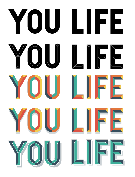
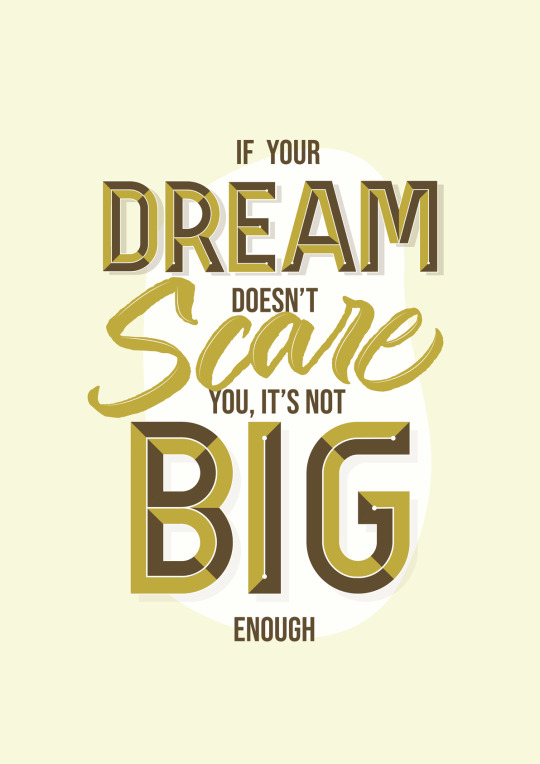
The typography exploration I did at an earlier stage helped me establish the main styles of type I would use: bevelled text and cursive brush lettering. With this decided, the next step was to choose the quotes to use for each poster. I wanted to have something direct and promoting a change in lifestyle, whilst not being too firm and perhaps being confused as aggressive. The quote’s I chose were:
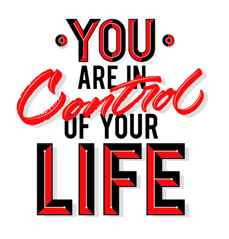
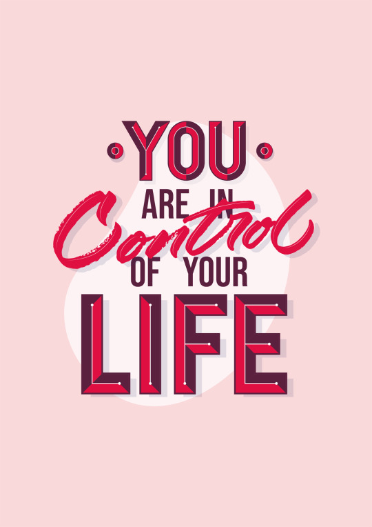
“You are in control of your life”
“It is Ambition that shapes your future”
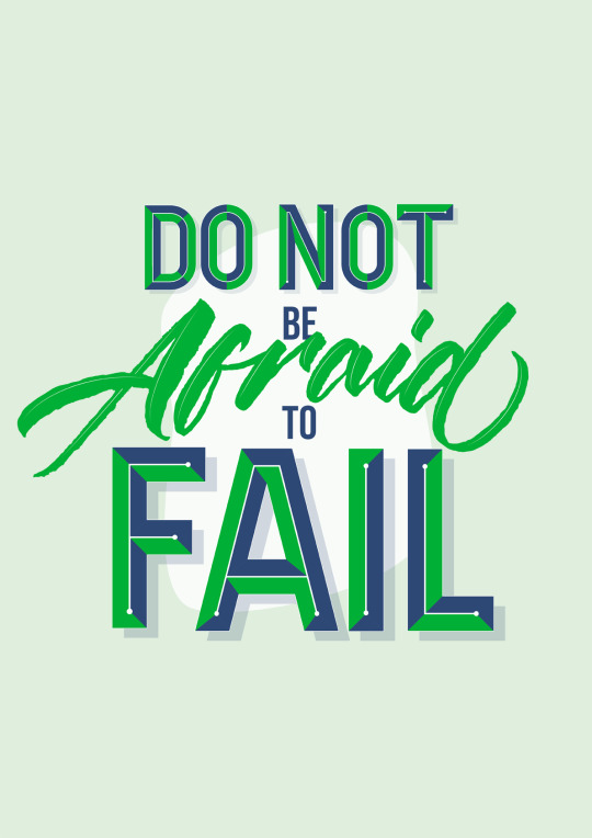
“Do not be afraid to fail”
“If your dream doesn’t scare you, it’s not big enough”
Afterwards, I sketched the typography, which I kept as separate sketches from the illustration so I could combine them together in the most effective way.

What was important when sketching out the quotes was how it read. The hierarchy of the type needs to prioritise the most important parts of the quote. Therefore varying the size, colour and style of the type means it won't read as a neutral and perhaps ‘boring’ piece of text.
With my talk with CJ Rosamond, I was given insight into how a specialist works. Reflecting this, I would try to work in a similar way which is why I chose the process I did. Firstly sketching, then creating the lettering, and lastly creating a final composition with colour choice.
The two tools I practised were the Tombow dual tip brush pen and the crayola broad marker. As well as being mentioned by CJ as a good option, they are two which I have some past experience with using so I would be more comfortable with these.
Tombow Brush Pen

The tip of this pen is thick and soft, allowing for powerful strokes resulting in a bold word being formed. The consequence of this is altering how the word reads, from something elegant to something that holds it’s own power in the way that each line is formed. Although colour will be irrelevant once I vector the lettering, its also important to highlight how bold the colour is, and this ultimately does effect how smooth the lines turn out in illustrator. This is another aspect of how the Tombow brush pen creates something unique, because with something that creates a softer fill, the vector version will have more of a rough quality to it.
Crayola Broad Tip Marker

This in my opinion gave me more control on the letterforms and line weight. The only downside to this it how the marks created aren’t as strong as those created with the tombow, meaning I would have more of a change of struggling to vector the Crayola lettering and coming to something I liked. When using image trace to vector a bitmap image, textures may become over-simplified and the original texture may be distorted or even lost completely, so I had to keep this in mind.
I decided to use the Crayola after experimenting with the versatility of both of the pens. Not only am I more comfortable with this, but I could also use the texture it created to my advantage to add a more hand-rendered quality to the overall poster, creating another level of contrast; this time between the two mediums of digital and analogue graphics.
Final Lettering Development
Now I had everything prepared (sketches, tools and quotes to use) all that was left was to create the final type for each poster. Making sure to keep in mind the hierarchy of the type, I used the typeface “Bebas” for the smaller and less important words with a small point size, so that they could still be read easily but they weren’t the main attraction of the posters. Before focusing on colour at all, I wanted to get the composition of the type to be the main thing making it effective. So choosing a generic colour scheme for all of the posters beforehand meant I could make sure the lettering works in itself.
I used the same process I did in the bevelled text exploration to create the bevelled text in my final outcomes. Firstly creating the base letterforms, then separating these into different smaller sections which imply a bevelled shaped. After this, I used a two colour, colour scheme to draw the colour back as much as possible. The last step which was what separated this text from my previous explorations was the line work I added on top. I did this in order to create a divide between each side of the letter, whilst still keeping it flat colours meaning it didn’t become too complicated as this was a fear I had beforehand.
With the bevelled text completed to what looked like a final standard for the current time, I began on the cursive text. After repeating the words until I found something I was happy with, I used the image trace feature in Illustrator which allows for a bitmap image to be converted to vector paths. The ‘silhouette’ option converts the most black parts of the image to a black fill and the white-most parts to a white fill. This is perfect for lettering in a single colour as it acts as a way to segregate the lettering from the background. After image tracing the lettering and fixing up some minor discrepancies, all that was left was to combine the two styles of type and combine them together along with the more subtle typeface in between.
Choosing a Concept
With the text at a mostly final stage, now it was time to start implementing the various ideas I sketched and now using the actual type and seeing how it would work when applied with illustration. At this point it was unrealistic to work on the 4 concepts at once, so I focused on the first poster and would just recreate the style with the following 3 posters. Some unused concepts are:

The hand featured in the last two examples was an illustration idea I had to signify power. The bold outlines were a style I hadn’t worked on previously, but with the hand I felt like it was necessary and worked best with a strong key line. I have also looked at artists which used bold outlines well, so I didn’t anticipate this being hindering at all.
In a similar fashion the shadowing and highlights were created to be just as powerful as the line work so as to not have one of them be over-powering above the other.

The reason none of these unused concepts were chosen is a mixture of not being satisfied with how they looked in general, but most importantly, I thought thy were bordering on the side of over-complication and almost becoming too much to take in. The illustration definitely takes away from the main quote which these posters demonstrate.
After looking back at workshops such as the ‘Post Up’ typography workshop and the Saul Bass case study, I remembered I had learnt about how minimalism can be just as, if not more effective than something which looks ‘cool’. I have also been telling myself not to make the same mistakes at the beginning of the project by focusing on the look of an outcome rather than the function. Stripping the concept back to just the type alone allows it to be read in it’s full effect. With illustration on top, I feel like both aspects begin to lack and this is why I concluded with this concept.

Final Posters

0 notes