#myowntutorial
Explore tagged Tumblr posts
Text
My Comic Process!
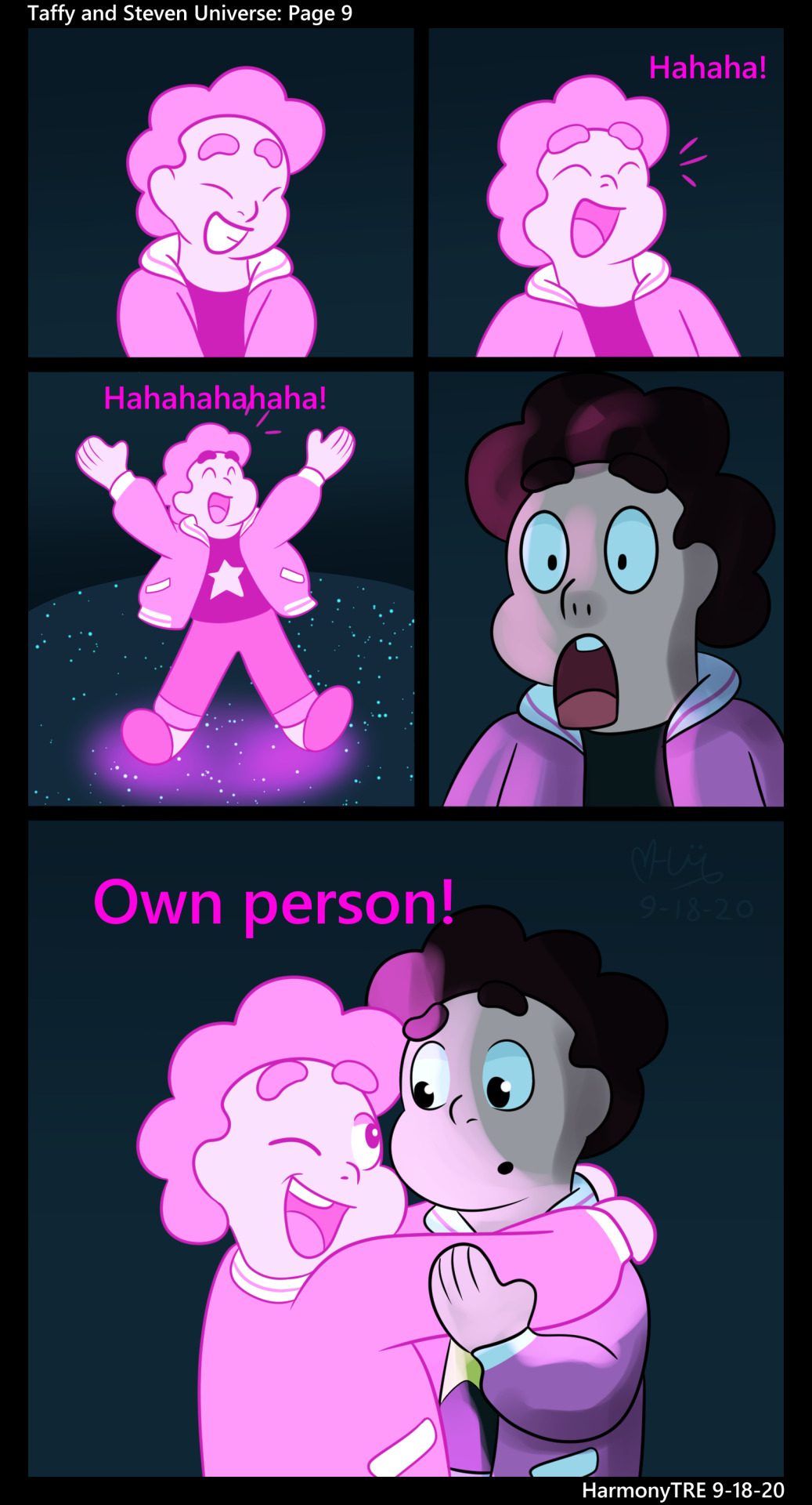
@dimonds456 wondered how I make my comic, so I decided to make a quick post! This comic is my most recent page of @taffyandstevenuniverse . Enjoy! (I didn’t expect to put in so much detail, sorry!)
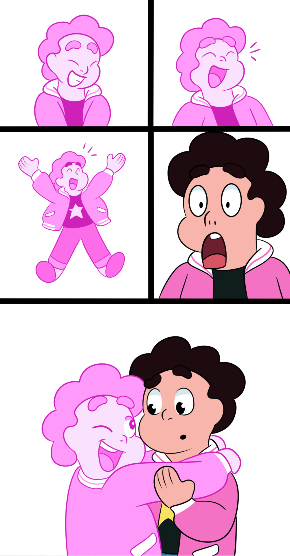
1. I start with a white base and decide the panels. Atm, I go 1500 px wide, then however long it needs to be, lengthening and shortening as I want. I add the panel gutters (I like to use black at 30 px, just straight lines. This can be done, at least in CSP, by tapping a point, holding Shift, and tapping the other point. I use turnip Pen, but it works with brushes and more.) Recently, I’ve added “poses”. These just help me figure out panels and quickly determine POV of the panels, like profile, wide view, etc. They’re done in less than 5 seconds each and are mostly for me (and my friends to guess what the page is like, haha!)

2. I sketch. I kinda uhhhh do this differently than people. the only basic shape I usually do is a circle for the head ummm then I do the rest by sight. It just feels more natural for me, especially if I know the character well enough. For more people I’d reccommend more detailed shapes for volume. (I do that for more detailed humans usually.) My brush varies between either Colored Pencil, Rough Pencil for details, or even a pen if I just want to doodle. (Also, yes I use ctrl-Z a lot. I gotta get out of the habit for faster sketching...)

3. I line! The next stages I usually think less and just become productive and listen to music or think. My hands do most of the work. Adfghjkl. I currently use Turnip Pen at 8 to 10 px.

4. During the coloring stage, I make a layer underneath the actual color layer to turn off and on. Usually a bright contrasting color. I do this to see if there’s any holes especially in white areas, which can’t be seen with the white bg. I make the color on a layer underneath the lines using bucket tool with “refer other layers”. Then I fill in holes and details with the pen. I’m sure there’s better ways to do it, but it works for now. (For this page, I actually put Steven and taffy’s colors on different layers, because Steven’s going to be shaded, but not Taffy.)

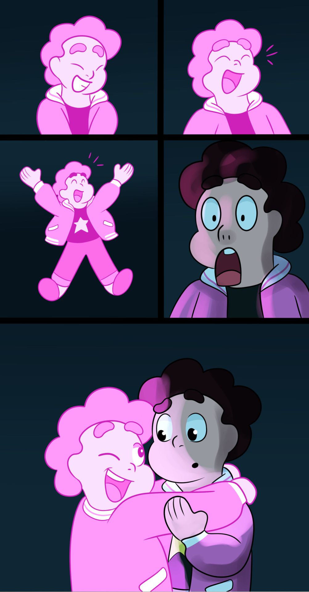
5. Next, I do the background. (I messed up screenshots, so the details of the background appear later, even though I usually do them now.) And since they’re in a cave, I put a multiply layer of a desaturated blue over Steven (40% opacity).

6. Next, I shaded Steven. My shading usually varies, but in this cave I used 100% Overlay/40% Add Glow for lighting (the same pink as Taffy’s hair), and 40% Color Burn/40% Multiply for shading (a blue similar to the cave). Atm, I use Opaque Watercolor. I do it on one layer for shading and lighting before adjusting settings and opacity. Oh, and I do them on layers clipped to the color layer.

7. I then add extra effects and Taffy’s glow. (Again, doesn’t include the background details. I did those earlier, but forgot to make the layer visible when taking screenshots.)

8. Lastly, I add text, a border, signature, and title/extra info. The border is made by making a new layer, selecting all, increasing the canvas size by 150 px on each side (Edit<Change Canvas Size), inverting selection, and filling it with black. I just use the text tool for text. My go-to is usually Segoe UI Semibold. Text size varies from 8 to 15. I also usually have speech bubbles or text boxes, but this time I thought it fit well with the simple background. (Oh right, I decided that the background details made it look cluttered in this scene, so I removed them. Oops.)

I hope this helps and thank you!
#tutorial#comic making#steven universe#myownart#myown#taffyandstevenuniverse#helpful#myowntutorial#HarmonyTRE#steven universe au#pink steven#tall post
11 notes
·
View notes