#my plan is to find free use textures and piece them together and then digitally touch them up
Explore tagged Tumblr posts
Visit Tumblr Blog
Explore Tumblr blogs with no restrictions, modern design and the best experience.
Last Seen Tumblr Blogs


Fun Fact
Tumblr’s reach among the 26-to-35-year-olds in the US is 11%.
Text
i have an "art" project for tomorrow. lets see if it makes me rip my hair out
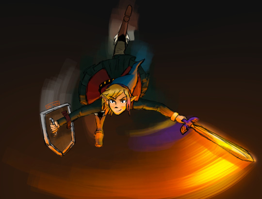
#adventures in modding cp77#i want to make a crocodile skin using the tattoo texture framework i use#my plan is to find free use textures and piece them together and then digitally touch them up#i WILL have croc skin. eventually. just remains to be seen when and how#i need to make a monster girl oc or die#if it goes well i plan to make some other exotic textures to share#(exotic in cyberpunk context means the people who pay big bucks to be furries lol)
0 notes
Text
DIY Duvet Cover

Project by Brett Bara:
I don’t know about you, but I never cease to be shocked at the price of bedding. And nothing sets off my “I could make that myself so much cheaper and better” instincts like duvet covers. It’s just a big flat case of fabric, yet even the simplest options easily soar into the three digits—but all it takes to make your own is a bunch of fabric, a few straight seams, and a spare afternoon.
Not only will going DIY with your duvet cover save you some cash, it’ll also allow you to custom-make exactly what you are looking for. What’s better than that? Let’s go! –Brett Bara
What You’ll Need
Approximately 10 yards fabric (see below to calculate exact amount; I suggest buying extra just in case)
Yard stick, long quilter’s ruler or tape measure
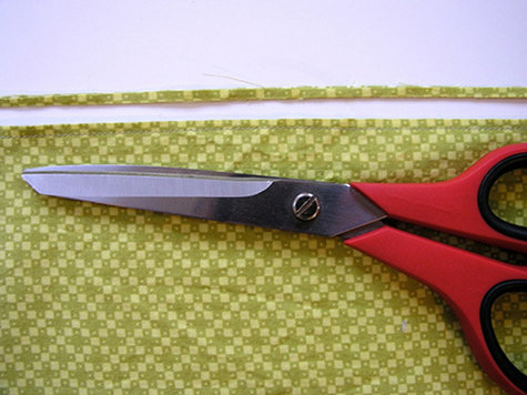
Sharp scissors
Straight pins
Sewing machine
Iron and ironing board
Selecting and Preparing Fabric
I recommend machine-washable cottons or cotton-linen blends for duvet covers. Quilting shops are a great place to look for fabrics, as there are tons of choices there for cottons in tiny prints, large prints, solids and everything in between.
Here I’m working with Denise Schmidt Hope Valley Piney Woods from Free Spirit Fabrics.
Be sure to wash, dry and iron your fabric before beginning to pre-shrink it.
Fabric Tips
*If you find yourself head over heels for designer bedding, check to see if you can buy two flat sheets from the line, and use these to sew your own duvet cover. This can be much less expensive than buying the duvet cover itself, and sometimes the manufacturer uses the very same fabric for the sheets as for the duvets, so you’re really working with the exact same material.
*Consider using a different fabric for the front and back of the duvet so that the piece is reversible—two looks for the price of one, and a special bonus for the décor commitment-phobes among us.
Planning and Cutting
There aren’t strict standards for bedding sizes in the US (comforter sizes tend to vary among manufacturers), so I recommend measuring the comforter you plan to cover and using those numbers to plan your duvet cover.
Since fabric generally isn’t sold in widths wide enough for a full duvet, you’ll need to seam a few panels of fabric together to make the front and back. I suggest placing one full panel down the center of the duvet with two smaller panels to each side of it; this is generally nicer-looking than making one seam down the middle of the duvet.
NOTE: Remember that you should trim off the selvedge edges of your fabric (these are the finished edges on both sides of the fabric which are a little different in texture and/or color from the rest of the fabric) before sewing. Remember to subtract the selvedge edge from any measurements as you plan your piece.
Measure the width of your fabric without selvedge; plan to place one full panel of fabric down the center of the duvet and two smaller panels to each side of it. Simply make the side panels as large as they need to be to reach the desired width of your duvet cover, adding 1” to the width of each panel to allow for seam allowance.
So, if your center panel needs to be 40” wide and each side panel needs to be 20” wide, cut the panels 41” wide and 21” wide. Those extra inches will be consumed by the seams.
The length of your duvet is simply the desired finished length plus 2 ½” for hem and seam allowance.
*Remember that you need a front and a back, so plan all your measurements and double them to calculate the total amount of fabric you’ll need.

Here’s what your panels will look like when they’re ready to go. (Note: I’m making a mini duvet here to make it easier to see the big picture of shape and construction.)
Sewing: French Seams
To begin, you’ll sew each side panel to its corresponding center panel, to make the front and back of the cover.
For a really nice professional-looking finished result, I recommend using French seams in this project. These seams are finished on both the inside and outside, so that no raw edges of fabric will be visible anywhere.
French seams may sound fancy, but they’re really easy! Here’s how:

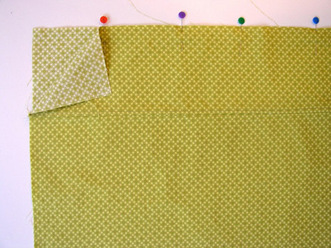
Place two pieces of fabric WRONG SIDES TOGETHER. (This is the opposite of normal; usually you sew most seams right sides together.)
Sew the seam with a ¼” seam allowance.
Trim away about ½ of the seam allowance, being careful not to get too close to the stitches.
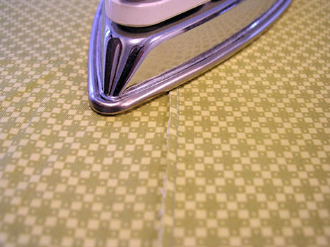

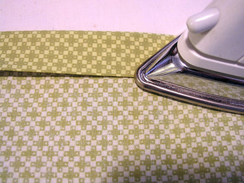
Iron the seam to one side, then fold at the seam so that right sides of the fabric are facing together, and iron the seam closed.

Pin the seam closed to avoid shifting, and sew it again with a ¼” seam allowance. Iron this seam to one side, and your French seam is done.

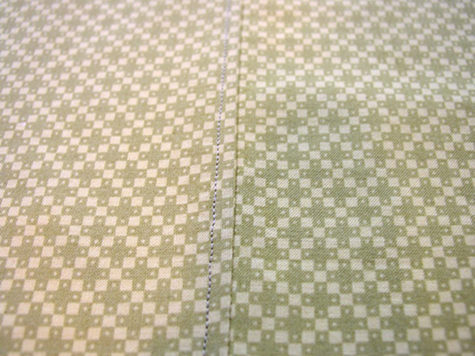
From the outside it looks like a regular seam, but on the inside all you see is this nice finished flap. Nice, right?!

For a nice finishing touch, you can top stitch to tack down the flap. All you do is top stitch on the right side of the duvet alongside the French seam, stitching over the folded-over flap in the back.
Iron the seam once again after top stitching to smooth and relax it.
Repeat for all center/side panels so that you have a complete front and back.
Attaching the Front and Back Together
Place the front and back together with wrong sides facing, pinning each side seam in place. Sew each side with French seams as described above (but skip the top-stitching for the sides). After sewing the sides, sew the top closed with a french seam as well.
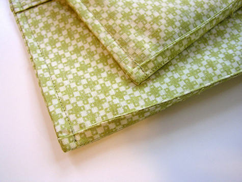
The inside of the duvet is now fully finished, with no raw edges visible at all. Isn’t that nice? Here is what the corners will look like on the inside.
To hem the bottom of the duvet, fold 1” of fabric to the inside and press. Fold up another 1” and press again; pin folds in place.

Stitch hem close to the exterior fold line and again close to the interior fold line.
Getting Closure
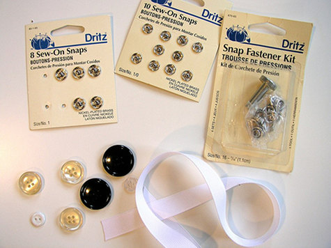
You have many options for closing up the bottom of the duvet (in each of these cases, I suggest placing a button/snap/ribbon about every 8” along the bottom):
*Buttons and buttonholes: easy to do with the buttonhole attachment that comes with most sewing machines.
*Sew-on snaps: very easy to sew on by hand, and quick to snap/unsnap when you change the duvet.
*Snap fastener kit: All you need is a hammer and the special tool that comes in this set to attach snaps without sewing for a very professional-looking result. (Check the instructions on the package.)
*Ribbon or twill tape: even easier to install. I suggest tucking 10” lengths of ribbon or tape under the folds of the hem before sewing it.
*Zippers: long zippers can be purchased online; you might consider a zipper closure along the bottom, using the same zipper-installation method as the zippered pillow cover.

That’s all there is to it! Don’t you feel so wonderfully nice and cozy with your new handmade duvet cover?!
14 notes
·
View notes
Text
FAS3000: Final Evaluation
For this module the aim was to develop and extend my visual communication skills through a series of workshops and lectures. I have investigated, experimented and explored varied techniques, skills and processes to produce a range of reflective textile outcome. I have documented my findings in a sketchbook, visually communicating my narrative (the coexistence of plants and buildings), which was supported by this reflective blog recording my design journey and evidence research.
My research consisted of exploring different techniques that would be reflected and linked within my primary research images to assist my design journey and visually communicating my narrative through the contrast of the building and plants. These research assisted my journey as it allowed me to explore and experiment different techniques like free running stitch machine embroidery, disperse dyes, digital print, natural materials and more, in order for it to develop into my final outcome. I’ve interpreted my primary research images through using the shapes, patterns, textures and colours founded within to visually communicate my narrative of the coexistence of plants and buildings, and so helped link my narrative and secondary research together with the samples. I used shapes such as triangles rectangles squares and patterns like lines and cross hatches to reflect the texture founded in the building of my primary images, and reflect my final board pieces. I also added outline shapes, loose patterns and colors of the leaves that are within my primary images onto my samples to show contrast and coexistence.
I have learnt practical skills like having a good attention to details and an excellent eye for colours, fabrics, textures and patterns, as well as, understanding and experience of using different textile processes and techniques. Successes I believe I found within my textiles workshop are that I tried to not only incorporate as many techniques together but, I also tried to include my primary images within the techniques. Another, would feed that I reflected the patterns and textures within the building in my samples from my primary images to link with my narrative. However, a weakness I found in myself during the workshops and lectures would me that I struggled to make something different with each sample as all my past samples appear to look similar, and so I struggled to write something new and reflective with each samples produced. A potential improvement would be making newer and versatile samples that would reflect my narrative, primary and secondary to visually communicate my story. I could also refine my sample by and introducing newer and unique techniques like adding more different materials to not only reflect the textures founded in my primary research but also show contrast and coexistence between the plants and buildings.
Within my lectures, I was allowed to plan and think about the production of my samples that lead me to complete my project. I did that by starting doing mark making to visually draw the patterns, lines, and textures founded within my primary images. I then used these techniques in my print workshop for disperse dyes along with secondary research, in order to reflect my primary images and link with my narrative. This lead me to develop my samples by incorporating them with other workshops.
This module also taught me about problem-solving and how to overcome my problems. For example I had some problems with how I could incorporate my primary images with my samples during my embroidery workshop, however, I found that I could work them in instead to illustrate my narrative and show the contrast of buildings and plants. My final outcome which I used a board to illustrate is successful as I’m pleased with how I incorporated multiple techniques from my past samples and refined them in order to be on there, however, it could be further developed if I add and combine different techniques, even though there was wadding in my samples (something different), it feels like I used the same process for every past and current samples.
In summary, I am happy with my progress as I made a lot of improvements along the way. I started with mark making and transferred it within my print workshop along with my secondary research using disperse dyes. I then added the samples to my embroidery workshop (appliqué and reverse appliqué) and started to incorporate the techniques within these workshop together, whilst, I developed my samples in weave workshop solely focusing on my secondary and primary research as to show a clear progress of those inspirations within my samples.
Overall, I found this module helpful in supporting me to find my creativity that I didn’t know I still had, and allowed me to think deeply during the development stage if my research (secondary), and thus helped me to think and discover new techniques and unique artists that will inspire me in the future.
0 notes
Text
The Introverted “Seismograph”
Memory is not an instrument for surveying the past but its theatre. It is the medium of past experience, just as the earth is the medium in which dead cities lie buried. He who seeks to approach his own buried past must conduct himself like a man digging. - Walter Benjamin, Berlin Childhood around 1900
How can an architect sense underground vibes of the present time and translate them into the future? This was the question that Hans Hollein posed at the 6th Architecture Biennale in Venice in 1996: Sensori del futuro. L’architetto come sismografo [Sensing the Future - The Architect as Seismograph]. The title contained a faint echo of Porthoghesi’s Biennale The Presence of the Past, dealing between past and future memories, laying the ground for the Next Biennale in 2002. Hollein was the first non-Italian curator following the Unnamed Biennale in 1991 when Dal Co invited foreign countries, introducing national pavilions and opened the prestigious Arsenale with an exhibition of 43 architectural schools from all over the world.

Read also “Teatro del Mondo: An Odyssey” and “The Greek Experiment”

Kyriakos Krokos | Photo © S. Staveris
Hollein portrayed several international star architects-including himself-via their hands, comparing them to a super powerful apparatus that can make predictions. Most of them are sketching, others are playing the piano, working at the computer or just explaining something. Some of them are dealing with the memories of utopias like Arata Isozaki, Massimo Scolari and Peter Cook whose captivating drawings revived past memories from previous Biennales. And some others are dealing with their own personal memories, looking into their past experiences, recalling colours, textures and materials and managing to display all these fragments of memory in such a way that when they are seen together, through analogies, they can convey deeper meanings and create dialogues. Kyriakos Krokos was one of them.

Greek pavilion at Venice Biennale in 1996: Kyriakos Krokos, curator Andreas Giacumatos | Photo © A. Giakoumakatos
Among all these powerful seismographs Kyriakos Krokos (1941-1998) made his appearance through his work in the Greek pavilion. An architect who dealt with his memories with the same passion and even more dedication than Pikionis (one of the few Greek architects who received international recognition and his work was showcased in the first Greek pavilion in 1991).

August of 1975 | Drawing © K. Krokos
“I wanted to get closer to my childhood senses. (…) Memory for me was a tool of liberation from the bonds the architecture school created” said Krokos and maybe that’s why he never wanted to be part of the architecture academic community. Back in the 1960s, he was struggling with the modern fashion as he referred to his studies at National Technical University of Athens where the influence of the modern movement is still present. How current remains this discussion even today when architecture schools create limitations and produce architects with restrictions following contemporary movements or star-architect clones. For Krokos, the only way for someone to be free of these bonds is to look inside oneself and try to see the world with the eyes of a child “..when everything was enchanting us (…) I felt the art as a substitute for innocence, that everything was trying to drown, and the great works to show the way back”.


Krokos’ drawings © K. Krokos
He stood away from the avant grade of his era, showcasing in Venice Biennale local construction materials and fragments of his memories growing up in the agrarian island of Samos. Thus he managed to recall not only his own personal experiences and his path of becoming an architect but also pieces of collective memories from the people who lived and worked in the same region.

Museum of Byzantine Culture Thessaloniki | Photo © A. Giakoumakatos
For Krokos, architecture exists in time before and after its completion and he sought to attribute an active role of participation of every agent related to the construction. This practice implies an ethos, an attitude of life; to live according to who you are, to think and build as you live. Krokos saw the architect as craftsman, being actively engaged in the construction, introducing participatory methods, formulating a collective vocabulary, (thus very specific for each project) combing memories, materials, local techniques, colors, light and shadow in a section. "There are no right materials, there is the right relationship of materials” said in one of his few interviews, talking about principles which relate to bioclimatic factors, about sustainability and passive building systems. “The beginnings of the new fashion with concrete as the dominant material - this is not to blame, of course - confused us. The engineer now had to say how the house would be done. People no longer say I will build but I will pour a slab.” The 6th Venice Biennale was for Krokos his last work, redefining the question of making architecture, characterised by humanistic power with respect to both living bodies and the environment.

Fasianos house/museum by Krokos | Photo © A. Giakoumakatos
Is Krokos relevant today? Maybe his architecture wasn’t contemporary in his era either. His projects stand timeless, allowing us to look back when we feel the need. To look our own experiences, memories and traces of our bodies. To understand the environment we inhabit and coexist, comprehend our inter-connections, try to find associations between diverse places and the particularities of physical and non-physical elements. In an era that the architect as an autonomous persona has ceased long ago, maybe it is interesting to look into architecture through collective memories, as negotiation between rural and urban, individual and collective, text and context, political and planned, local tradition and digital technologies, moving away from fixed dichotomies.
Carl Jung in one of his letters to Freud explain the concept of analogy and analogical thought: Logical thought is what expressed in words directed to the outside world in the form of discourse. While, Analogical thought is sensed yet unreal, imagined yet silent; it is not a discourse but rather a meditation on themes of the past, an interior monologue.
The medium of analogical thought is memory, where the medium of logical thought is the language.
***
VAB 10: Christina Serifi

Photo © Norman Posselt
Christina Serifi is an architect, researcher and urbanist, co-founder of TiriLab (Future Architecture Platform Fellow) an initiative which explores multi cultural heritage related to techniques, technologies and culture specifics from communities in northern Greece. Christina is associate researcher in Terreform, where she has coordinated various publications regrading indigenous knowledge, alternative educational models and self sufficiency. Her work investigates forms, collective memories, typologies and local practices, focusing on urban fragments, in-between spaces, as well as osculation of architectural and social space, Christina has been awarded with the Fulbright fellowship and Urban Design Award ’14 from CCNY.
4 notes
·
View notes
Text
Meet the Creator!
Introducing: Squido!
Commission: I haven't and don't really intend to. I don't want to take anyone's hard-earned money. Just ask me to draw things and there's a good chance I will.
Social Media: Tumblr: @sky-squido AO3: https://archiveofourown.org/users/sky_squido/pseuds/sky_squido
Tell us a little bit about yourself!
Call me Squido! I love to draw and write but I'm also super extraverted and I love interacting with humans so always feel free to chat with me! Aside from drawing and writing, I just love being outside and have a tumblr sideblog dedicated exclusively to nature photos I take. I love mountains, the ocean, the sky, and just about everything else in this beautiful world of ours! If you ever feel like having an internet stranger give you a thousand word rant, ask me why my favorite color is blue and you will not be disappointed!
What got you into creating? what inspires you to keep creating?
I've been drawing for as long as I can remember and can't seem to stop, though I take long breaks sometimes I always seem to come back to it again. I try not to have anything in mind when I draw, but to start sketching and let the drawing happen. Sometimes I find that what I'm trying to draw is not what my drawing wants to be (if that makes any sense) and change what I'm making halfway through. It makes drawing a really relaxing and carefree therapeutic experience! Writing is different. I've always enjoyed writing, but I didn't write much and never shared my writing with anyone because I thought it was super pretentious. It wasn't until entering High School and joining the literature club and making a deal with a friend that we'd share our writing with each other that I actually gained any sort of confidence in my ability and sought to improve it. Being in that club and sharing my pieces at the open mics was a really encouraging experience! I invite everyone to share their writing, even if it's with some random internet stranger (I'm open anytime!) if they're unsure of their abilities. A little encouragement goes a long way! Now that I'm on Discord, ao3, and tumblr, I receive so much more feedback than I ever have before! It's been super encouraging! What inspires me most is definitely nature. Even if my ideas aren't directly related to the outdoors, I get my best ideas there. Fandoms are also a great idea generator. The sheer volume of headcanons and prompts is enough to make me dizzy with ideas!
What's your creative process like?
I love sketching. My favorite thing about drawing digitally is that I can sketch as much as I like and never worry about wasting materials! Often times my sketches turn themselves into drawings without permission and other times they stubbornly remain sketches for all eternity. I always dive right in because I have no patience and the idea I started out with generally isn't that great but in the process of pursuing it, it spirals out of control and sometimes the idea gets better and sometimes it gets worse but I just kinda roll with it. Creating is a really chill process for me and while I regularly scream stuff like "I'M DRAWING ON THE WRONG LAYER NONONONONONO" or "NO HECK FRICK SHOOT IT SMUDGED HECK HECK GET THE ERASER QUICK," the creative process is a great way for me to unwind. I'm the same way about writing. I never plan or outline and just kind of roll with things. I mean I generally have the basic jist in mind, but I try to not have a plan so I can keep the story driven by the characters and not force them into acting the way I wanted them to in the outline I made hours or even days ago. Creating is my opportunity to break free so I don't really see what good a plan or outline does me. I'm a pretty spontaneous person!
What kind of mediums do you like to use?
I like to take pictures, but it's not really my main focus. I've been mostly digitally drawing—I use my iPad Pro and Procreate—but lately I've been pencil sketching with just your average everyday mechanical pencil (I'd forgotten how nice the texture of paper was! Clearly I spent too much time drawing on my iPad!). I have these Stabilio chalk pastels I love to pieces, but have also spent a great deal of time with watercolors. Digital is my primary medium currently, though.
Is there a specific scene wrote that you are particularly proud of?
"Sky’s golden scales are glowing with reflected light from the sun while beneath them, the same pulsing blue in her mane runs like a river as her very skin is alive with electricity. The sun’s beginning to dip, fading through the color wheel from yellow to deep orange to scarlet and the world is bathed in watercolor and hue shifted through the rainbow until all that was blue becomes red. This new alien world begins to darken as red fades to deep purple-pink, the clouds catching last vestiges of gold in their pillowy folds, yet Sky continues rippling with lighting, the bright blue flowing like blood through her veins and the gold shimmering in the eerie azure glow. We weave through the winds and zephyrs and I close my eyes and let the breeze caress my hair and when I reopen them, I’m standing back on the ground again in a world long since darkened by night. I place my hand over my beating heart where Sky is still laughing with joy and smile because once you’ve awakened your dragon, you don’t need wings to fly anymore."
Is there someone who inspires you and your writing or art?
Every fanartist and fanfic writer that posts their stuff online is an inspiration to me. Even if their stuff isn't very good—especially if it isn't very good—it's a huge testament to the courage of the creator and their bravery in expressing themself! I sat on fanfic and fanart for years and never shared it and here were kids half my age putting out art that was their first experiment in a new medium and a little shaky but it was still out there and they were still being supported by the community and that really inspired me to reach out and stop lurking in fandom and actually get involved!
is there something that you struggled with that made you grow as a creator?
I feel like everyone has these periods where they were just gaining confidence in their artistic ability but suddenly everything they make is trash and they're not happy with any of it and they feel so down and worthless and "where did all of my hard-earned ability go? Will I ever get it back?" I think this is a pretty common experience and when I find myself there, I find it most helpful to share what I make anyway, even if I hate it, with someone who I know will give it to me straight because they'll point out the deeper problems—the root of the issue—that I hadn't even noticed and I can use that information to grow as an artist. Bad pieces are just as valuable as good ones. There was also a time where I had a lot of trouble developing a style. I did a lot of experimenting and never found anything I liked. What happened is I just kept drawing and whatever popped out eventually evolved into my style. I used to get frustrated that I couldn't draw anything without a reference, but after years and years of using references and drawing some of the same things over and over again, you won't need the references anymore. I mean, they're great and you should always feel free to use them, but over time, you won't need to look up a picture of every little thing you try to doodle.
What got you into writing or art?
My silly twitchy fingers can't ever seem to stop drawing! Same with writing. Words and ideas follow me around, little plot bunnies pestering me until they get written down somewhere. I was greatly inspired by the works of C.S. Lewis in my writing, especially his Cosmic Trilogy. My art style was aided by Hiromu Arakawa's Fullmetal Alchemist, which was a valuable stepping stone in developing my own style. Other than that, it was my own insatiable desire to MAKE THINGS that spurred me onwards. I don't think I could stop if I tried!
What's your favorite part of the creative process?
After you've got that first paragraph and you've found a flow and you've got a topic and you just GO. I get into the zone and the story starts happening on its own and I'm not an author anymore, I'm just a channel between the world of the piece and the page. That's my favorite. I love watching things take shape. I love shading a sketch for these same reasons. The whole drawing comes together and becomes A Thing and it's the most exciting time to be a creator. Something else inside you has taken over and you're just along for the ride. I have no idea if my experiences are common at all but this is what it's like for me!
What's your least favorite part of the creative process?
EDITING. I HAVE ZERO PATIENCE. THE THING IS DONE. WHY DO I HAVE TO KEEP LOOKING AT IT. CAN I POST IT YET. This leaves me with a lot of holes in what I make and I can't do a very clean, super detailed drawing unless it's for an art class and I'm forced to keep working on it. I have a terrible habit of never proofreading my things!
What's your favorite type of scene to write?
AAH hard question! I love writing description and places where I can really let my inner 19th century romantic be unleashed but I also love a good emotional moment between two characters. Something tense. I like fight scenes, but I try to keep them brief and interesting. Sometimes I find scenes where I have no idea what's going on and I try to avoid that, but it's really hard sometimes.
What's the hardest for you to create?
I have so much trouble with endings. I can generally figure something out, but there's always a moment of panic before the end like "heck I wrote everything I wanted how do I wrap this up????" That's probably a byproduct of me planning nothing XD I sometimes have trouble with characterization and making sure everyone acts the way they actually would. The hardest part is continuing after you have an "oh heck what do I do now" moment that breaks you out of your zone and all of your ideas and plot threads turn invisible or evaporate or go wherever it is they go when you're looking for them.
What's your favorite genre to write?
ANGST ANGST ANGST ANGST. Wellll... scratch that. I love something adventure-y and plot driven with a lot of really meaningful character interactions. I've always had trouble putting my writing into genres, but I guess that kind of speaks for itself in a way.
What fandoms do you enjoy creating for?
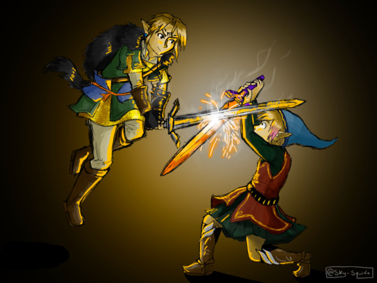
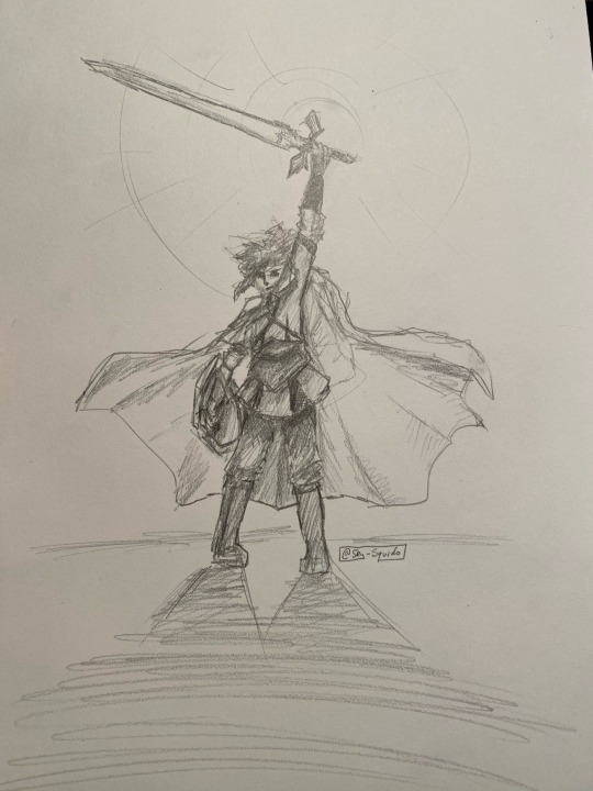
Linked Universe is the fandom I have created and posted the most for by a LONG SHOT. I found LU shortly after making my tumblr and I joined the Discord shortly thereafter. Since then, it has been nonstop inspiration and creativity for me! I tend to get sucked into one fandom and it consumes me for a few months before I silently drift out of it and never think about it again. LU is the fandom I've been the most active in EVER though—and it's still going—so there's a good chance I'm never getting off this ride.
What's the work you are most proud of?
AAAAAAAAAAH MY BABIES. okay um here's the first and only fanfic I've ever posted anywhere but I'm really happy with: https://sky-squido.tumblr.com/post/618964544219463680/turn-back-time-a-linked-universe-fanfic I have a lot of other pieces kicking about, but they're not fandom so I haven't shared them yet. I probably will after I touch them up a bit.
Do you have any fics inspired by real life stories?
Not really? I don't really know where my ideas come from to be honest!
Where do you post your finished works?
my tumblr. I tag stuff #squido writes and #squido draws so you can find them easily. I also put them on the discord but they get lost in the stream of other works pretty quickly so stick to my tumblr. I also have an ao3 now! https://archiveofourown.org/users/sky_squido
If you have any fun stories about the pieces you made, please do share!
Turn Back Time was actually live written in the Discord, but entirely unplanned and in the #angst channel! It was just a headcanon but then I started describing it and like 2 hours and 5k words later I'm sitting in the Discord like "what just happened??"
33 notes
·
View notes
Text
Art Analysis Essay
Identifying which printmaking process works for me is pretty hard due to not having much experience in each different process, so I’d have to base this essay and my decision on which technique I’ve enjoyed the most this past year. I evaluated each process and my outcomes, and I feel the best would be Screen-printing. I also, came to this decision due to the speed and efficiency of this process. My art style can be quite graphical, and I feel this process captures that in print form the most, by using digital applications like Adobe Draw initially then exposing them onto a screen to produce a print. Using the specific colours in the initial design or being able to experiment freely without changing the integrity of the initial outcome.
After conducting initial research, I discovered that screen-printing started as early as the 17th Century progressing through the decades ever evolving as the technique, we know it as today. Artists like Andy Warhol, David Hockney and Roy Lichtenstein really giving it the platform of popularity. The process makes up of a exposing a stencil onto a silk screen, then pushing the ink or paint through the screen so it transfers onto the material you’re wanting to print on. The stencil is exposed onto the screen in a similar way to a photograph, using light to burn the image into the reactive emulsion paint which hardens it. Any areas that weren’t covered by the design stencil remain a liquid which can be washed off to reveal the image you’re wanting to print, then allowing the ink to flow the screen to your desired layout or design.
Kate Gibb
Kate Gibbs is artist I’ve researched as part of another project and is printmaking artist from London, England. I loved her work previously, as I find it to be very expressive with her use of colour, lines, shapes and texture. The obvious use of mark making within her work can be visualised in different works. Utilising the chance of happy accidents that can occur during the creative process.

kategibb.co.uk. (n.d.). Kate Gibb. [online] Available at: http://kategibb.co.uk [Accessed 1 Mar. 2021].
My analysis of Kate Gibbs ‘Pleasure Garden’ starts with my initial feelings on the overall, composition, colours, textures and shapes she has used to create this piece. When looking at this design I get cultural references of Japanese printworks though her use on colour and their tonal ranges, after conducting further research I noticed that this design in particular references Kyoto, Japan for a magazine publication. This explains why she worked in this way to portray a more abstract outcome in relation to her way of working. As similar to her other prints works, I’ve researched Kate Gibb prefers the use simple shapes, colours and lines combined with layering. These marks on top of one another make her prints more cohesive to me, I think she does this, so her style is fluent and easily recognizable predominately, in her album cover works. My eyes are more drawn to the circle which looks like sun on the bottom layer, then flow around the composition following the brush strokes down the page into a pool of different mark marking processes. I find this design very relaxing compared to her other designs, the colours are more complementary of each other already mentioning their tones but, also different shades blue ranging to green and aqua. I think she might have done this to relate back to Japanese culture, as I also find the ‘The Great Wave off Kanagawa’ by Japanese artist Hokusai, very harmonious and calming. I like her use on paintbrush strokes to add texture especially in the larger areas where you can see the background peaking through. The little areas of detail filling negative spaces with repeated patterns and the shadowing of the background adds dimension also, contributing to the flow of direction when looking at the design. I like that there are some elements more subtle than others I think she would have done this to keep eyes on the piece for longer a the more I look and analyse different shapes and lines appear.

Google Arts & Culture. (n.d.). The Great Wave off the Coast of Kanagawa - Katsushika Hokusai. [online] Available at: https://artsandculture.google.com/asset/the-great-wave-off-the-coast-of-kanagawa/fAFp7yddSAtcTQ?hl=en-GB [Accessed 10 Mar. 2021].
Laurie Hastings
Laurie Hastings is a printmaking artist I’ve discovered recently on Instagram; her simple illustrative style of screen printing really caught my eye. Her background as an illustrator shows through into her silk-screen works, with the cartoon influenced figures and use of block colours. She is a commission-based artist with displaying works on her online portfolio but, also international exhibits.
Laurie Hastings. (n.d.). Portfolio | LAURIE HASTINGS Illustrator and Printmaker. [online] Available at: https://www.lauriehastings.com/ [Accessed 1 Mar. 2021].
My analysis of Laurie Hastings ‘The Adventurers - Campfire’ starts with my initial feelings on the overall, composition, block colours and line work she has used to create this piece. My initial reaction was to the process of how this piece was made, as at an initial glance I thought it was a Lino Print, very similar to another artist I’ve researched called Michelle Hughes in terms of line work and block colours. I feel the simplification of only two blocked colours, one darker, one lighter which have no tonal range, shadows or highlights to them, then to be applied in layers create this effect. I get a real homely, warming feel from this, warmth relating the fire and her use of organic lines and shapes in waves. I can feel movement within the design to how it has been illustrated this way with fewer straight lines and the trees being more suggestive than realistic shapes. The figure in the print is of a woman looking out at the sky looking comfortable in her overall position. My own relation to camping and a sitting in front of a fire is that I’ve always found it very peaceful which also, strengthens the warmth intuition as I have a personal relation to it. The ground has also, been flipped in colour to create extra dimension of shape, grounding and stability. Highlighting this area to be different to the sky and other elements of the print. After looking deeper, I discovered this piece being part of a series of 3, with the other designs having similarities within their illustrative forms. Making all 3 designs a cohesive collection together. Looking at the bottom of the print your eyes automatically are drawn upwards due to all the different marks/lines facing vertically then interconnecting with different elements then drawing focus back looking at the print and its entirety.
michellehughesdesign. (n.d.). Yorkshire Dales III, original linocut print. [online] Available at: https://www.michellehughesdesign.com/yorkshire-dales-3-linocut-print?lightbox=dataItem-j97a2han [Accessed 10 Mar. 2021].
Chuck Sperry
Chuck Sperry is another screen-printing artist I’ve come across recently. He’s an American printmaker based in San Francisco also, working from his studio there. He exhibits his work internationally propelling his American rock poster style into fine arts using a silk-screen process. His use of text, patterns and various materials to print on caught my eye as I’d not seen this before.
Chuck Sperry. (n.d.). Original Art Archives. [online] Available at: https://chucksperry.net/category/original-art/.
My analysis of Chuck Sperry ‘Vivien 2016’ starts with my initial feelings on the overall, composition, colours, patterns and influences that have gone into creating this print. My eyes are drawn to the initial profile of a woman as the title suggests is Vivien. Vivien reminds my highly of Marvels villain Mystique in the X-men series due to her being topless, the colours used for her hair and body along with the watermarked style texture of the background pattern showing through. I also researched his influences and among them was the era of pop art which I can see this print is heavily inspired by. Roy Lichtenstein portrayed women in many of his designs and the facial features and hair of ‘Vivien’ here compared to his ‘M-Mm Maybe’ print look very similar to me regarding there cartoon comic style. Although I do see the differences, I see I that Roy used dots to add definition in specific areas strengthening comic references whereas Chuck Sperry uses florals it his work. The floral head piece which looks as if it’s glowing from radial illusion created is the most eye-catching part of this design dividing the figure away from the busy background. Highlighting aspects of the background, the style of how the leaves have been drawn remind me of Celtic symbolism, and a traditional illustration of a Scottish thistle, the repeated pattern and the colours used a similar to a tapestry. Chuck Sperry has created a series of these designs uses the description of ‘muses’ and female names to title them, each design has similarities to the hair, florals and beauty creating a series print. Although his more recent work in this style looks less like a comic and more like a realistic portrait of a woman. The title of Muse to me highlights the feeling of confidence, strength and beauty which I feel is portrayed along with sensuality.
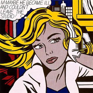
Wikimedia.org. (2021). [online] Available at: https://upload.wikimedia.org/wikipedia/en/2/23/M-Maybe.jpg.
All of the prints I’ve chosen have some form of an organic natural feel I find I am most inspired by these elements in terms relating to my own work. Different aspects of each artist drew me in for the analysis of their work. I find Kate Gibbs expressive abstract style very freeing with the use of her bold colours and layering. Whereas both Laurie Hastings and Chuck Sperry although using the same printmaking process have more of a graphical, planned technical feel. While writing up my analysis I wanted to include both styles of working as depending on my mood I like to work either way.
Word Count- 1,532
3 notes
·
View notes
Text
FMP Evaluation
Disorder/Order
I found myself favouring this theme because I felt so much connection to everything with it. I felt it having the most inside it rather than the other themes, like I could link any and everything through it. Wondering why I chose it, maybe the idea of order or disorder was on my mind at the time, maybe I visualised my project and what it could be, before it was.
Ive always loved something wrong, something without structure from someone else, the idea of distorted art work always was with me. I don’t like realism as much as imagination coming to life with something new, something your unsure of where it comes from. I watched a Joe rogan podcast and he spoke about how when your hammering a nail, you know your hammering it and can recognise that you did it after. But when it came to creativity and more expressive work it’s like you’ve tapped into something else, like your not fully there, that the art is using you to make the work not the other way around. You don’t know where it came from, the work is being sieved through your psychical motion, like it’s someone else who designed it, or a deep self.
Loui Jover very much intrigued and affected my work. His detached forms work really was part of my idea generation.
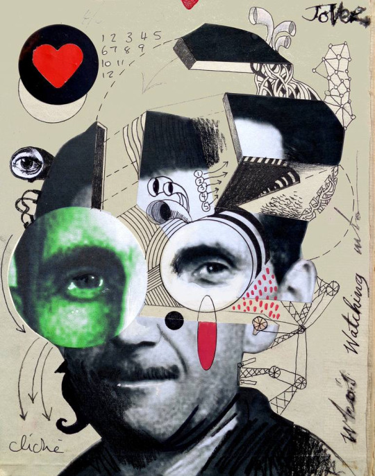
I wanted to do something with distortion, and his work instantly connected to my artistic wants. An artist who I’m unsure of who they are, wether they were an artist we researched in class or a past student who we researched I don’t know. But their work very much was good for my work, it helped me to understand how I wanted my distorted faces to come across and how i wanted them to look, since their work was of the same style.
I believe the movie Joker 2019 starring Joaquin Phoenix affected me a lot with this distortion sort of theme.

Psychological disorders interest me in a weird way. As well as Shutter Island 2010 starring Leanardo Di Caprio also affected me, his character and his story through out. So amazing. Really made me want to express myself through it.
What you see when you look into someone’s eye, what do you see? What do you think about them as a person, without knowing them. Now question why you think that, where did that idea come from? That judgement came from you, but where did you get it from. That concept, that sort of theme. Really. Really intrigues me.
Thecollinson. An artist I found on Instagram. I’ve been following his work for a while, 2 years almost. I would call his paintings slightly distorted, almost like their unfinished. He has a very interesting way of using the paint, using various different colours and shades with a large range of differential amounts of paint.
Mostly working in painting faces, though it may not actually have a face, or at least a normal one. Leaving splurges of paint at different points to represent the features of a face or even just having it all blank. Possibly painting only around the face.
In fact. I contacted him and asked him a few questions. Let’s see what he has to say.
Alfie: Do you have a plan to make this or an idea in your head?
Or does it just come together as you go along
TheCollinson: Something like that I have an idea of just an eye then build around it. That piece was for a client. They just wanted one eye and had some colours they like so I just went with the flow bringing it together. I just love working with thick oil paint. The outcome feels great.
Alfie: Amazing! And would you say their are any other artists that inspire your work or your mark making. What got you into this style? X
TheCollinson: My favourite artist is Van Gogh his use of thick impasto, the way he applied brush strokes and his use of colour is just mind blowing. I always look at Bram bogarts work and the way he Created texture . Also incredible Contemporary artist like Joseph Lee & Elena Gual really inspire me with their subject matter, mark making and use of thick paint.
Alfie: That is great, Van Goghs colour making is incredible! I agree. And if you could describe your paintings or a painting of yours in 4 words, what would they be?
TheCollinson: I’d probably say;
thought-provoking, abstract, colorful and unconventional.
Lino print, woodblock print, plastic board print, fabric painting, spray paint, developing ink photos, Photoshop and more, everything I’ve worked with in the FMP I’m grateful for, I think I’ve definitely enjoyed digital work and spray paint most.
Since I’m going into Graphics Design in the next year of the course I’d say it’s been my best. I’ve learnt how to make frame animation and gifs, understanding the software and how to work all I can on it.
Pushing my creativity through it with outcomes I’ve posted on my tumblr and Instagram pages.
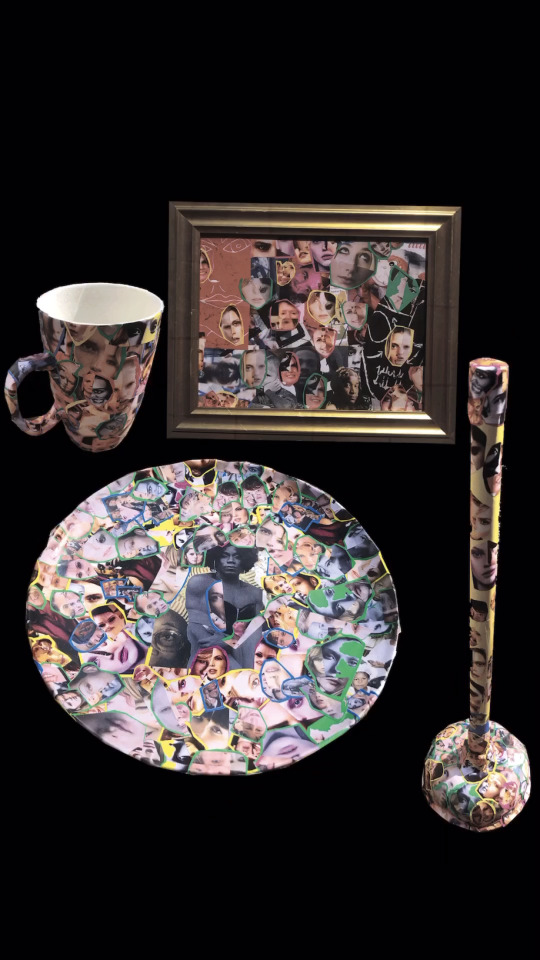
I wanted to test what sort of faces or distortion I wanted to create for my outcomes. Looking at my artists and how they made them, I wanted to make collage a part of my work. So using collaging with faces from magazines and papers was quite perfect. Experimenting with paper collaging on many other occasions got me used it. Making it nice when piecing together the faces and which I wanted to use.
The 12 A5 collages we made on our first week back from lockdown was gorgeous.
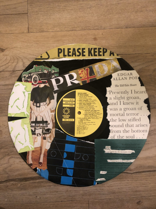
That work definitely made me want to keep collaging as a part of my work. Using my collaging on my vinyl record, CD, and pizza box just pushed me even more to keep wanting to use objects. I find it so much more valuable when it’s on an object or with an object rather than paper or a canvas. All these factors came through to my project naturally from this experimentation.
Presenting my outcomes at the end of year show would be an interesting one. I think I’m going to turn all my outcomes into a single sculpture and would present as so for the show. Sticking them together with very serious super glue. I’d present my outcomes in their habitat.
The plate and mug in a supermarket or China store, alongside regular kitchenware. The golf club would be in a golfing store or course next to regular clubs. Are you seeing a pattern? The frame I’d like in a gallery on the wall. The plunger I’d like in a household. The taps would be on a sink, connected. And the pan finally I’d like to be used to cook with. Though I’m not sure what I want to do with my future sculpture yet so maybe I will be using it.
Ten words to describe my overall outcomes.
Relatable
Empty
Individual
Free
Usual
Full
Useable
Colourful
Comfortable
Warm
Songs In The Key Of Life by Stevie Wonder would be my soundtrack.

I listened to it a lot through this time and listening to it whilst viewing my work just feels right. As well as i was listening to it whilst creating and designing my work. Three hours. Three hours a week I spent working on my project outside of college, wether it was designing final outcomes, sourcing objects or experimenting with medias. It was all enjoyable. My bedroom, living room and garden is where I’ve worked on my project.
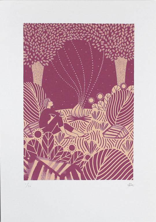
I can’t fit in the photos for the four picture descriptions below so! I will number the three words to describe the image then then post the image after this with the corresponding number.
1
New
Pulling
Development
2
Helpful
Relatable
Attaching
3
Personal
Connecting
Mine
4
Thankful
Beautiful
Valuable
0 notes
Text
Adobe Creative Cloud Photoshop Cc Serial Number

I had a forum moderator remove your reply so as not to let everyone see your serial number on a public forum like this. If I remember you said you had a serial number version of LR, but you also said you had the Photography Program CC plan for $10/month that includes PS and LR and doesn't use a serial number. Follow these steps to verify that you have an active Creative Cloud subscription. Open the Creative Cloud desktop app. (Select the Creative Cloud icon in your Windows taskbar or macOS menu bar). Select the Account icon in the upper right, and then select Sign out. Photoshop Creative Cloud, which I just subscribed to, is asking for a serial number. Adobe tech support told me to sign out, check connectivity issues, etc, and its not working. I think this is probably connected to an attempt someone made once to install Photoshop on my computer. Welcome to Adobe Creative Cloud. Make anything you can imagine with Creative Cloud apps and services, wherever you're inspired. Download Creative Cloud for desktop. Access everything Creative Cloud has to offer, right from your desktop. From your apps to your work and more, it’s all here. Adobe Photoshop CC Crack is a complete solution for digital image professionals who have a perfect idea to apply new, intuitive tools to create three-dimensional graphics, movies, projects. Adobe Photoshop is also part of the creative cloud that has the ability to provide users with the latest updates, and users can access the latest version.
Adobe Photoshop Crack is a widely used program for raster image processing, graphic design and digital art. It uses a layer by layer to provide depth and flexibility in the design and editing process, and provides powerful editing tools that can do almost everything together. Adobe Photoshop cc crack is the leading photo editing and manipulation program on the market. This use consists of creating intricate digital drawings and illustrations that mimic hand-made ones, completely editing extensive photographs. Photoshop crack is an image processing and photography program for use on chat, Windows or MacOS computers. Photoshop allows users to create, enhance, or otherwise edit images, graphics, and illustrations.
You may also Like:CorelDRAW Graphics Suite Crack with Keygen
Adobe Photoshop Crack Free Download allows you to change the background, draw a real picture or create an alternative view of the universe. It is the most widely used software tool for image editing, image editing and capture for numerous image and video file formats. Tools in Photoshop can handle both single images and large photos.
If you’ve never worked with images on your computer, you’ve heard of Adobe Photoshop for free. Available for both Windows and Mac, Adobe Photoshop Crack is an extremely powerful application used by many professional photographers and designers. There are different versions of Adobe Photoshop CC 2020 Crack, including Photoshop CC, Elements and Lightroom. Adobe Photoshop is offered individually as a subscription to Photoshop Lightroom and as part of a larger Creative Cloud subscription. You can use it to create almost any image, from Photoshop to texture to high-quality graphics.
Adobe Photoshop Free Download with Crack
Adobe Photoshop CC Crack is a complete solution for digital image professionals who have a perfect idea to apply new, intuitive tools to create three-dimensional graphics, movies, projects. Adobe Photoshop is also part of the creative cloud that has the ability to provide users with the latest updates, and users can access the latest version. You can also share your projects with other users in the creative cloud to work directly on a project Adobe. Adobe Photoshop CC is a creative cloud version of Photoshop provided by the subscriber. Photoshop is considered a professional version of the product family. Adobe Photoshop cc crack 2020 is available in Photoshop Lightroom or as part of a larger creative Cloud subscription.
Different Image Browser for Adobe Photoshop Crack 2020 components allows you to get your desktop images in one window. Photoshop means you can edit, color, organize and crop your images. This is an image of my Photoshop window after my friend was removed from the background. One of the many grateful parts of Adobe Photoshop is its simplicity. Slide shows are a technique for collecting memorable events and experiences. Share your experiences and tell us which model your teeth come with first. The starting CS is used with a quantity for each version of the current version.

Adobe Photoshop Key Features
Selection choice The Select and Mask dialog box (formerly known as Proper Edge) still contains a quick selection brush. There is now a new tool that you can choose to isolate the object: in this case, the woman is sitting on the right side.
Customizable string The Image Warp feature has been a useful addition to Free Transformation for years and allows you to use envelope distortion to alter the shape of an object. However, a 3 x 3 grid, which can always be limited, was used. Now known simply as multiplication, it begins with four control handles with Bezier handles on each of the four sides to adjust the direction and magnitude of the war.
New pre-control panels Adobe Photoshop CC Crack has new control panels for patterns, gradients, and shapes that make saving and searching much easier. The graph shows what you got ahead of time. In particular, the Shapes panel provides a better way to select shapes: when you drag them from the panel to a piece of art, a new vector layer containing that shape is created.
Smooth the brush stroke You get a better view with the new smoothing algorithm. When using a mouse, change the smoothing rate for sharper lines. Tool options are available with flow and opacity in the bar.
Exclusive brushes Adobe Photoshop 2020 Crack gets over 1,000 digital brushes from Kyle T. Webster, the only award-winning Adobe Photoshop Free Download illustrator.
Access to Lightroom images Adobe Photoshop Crack searches for Lightroom Cloud services or retrieves your photos directly into Photoshop using the home screen. With the deeper integration of all Creative Cloud photo tables and mobile apps, all your photos are synced and available anywhere.
Overlay computers in smart objects Adobe Photoshop Full Crack layers Composition panel lets you create multiple versions of a work of art in which you can move and inactivate elements between different builds. Layer computers were still supported in Smart Objects, but you had to open the Smart Object in a new window to make changes to switch between them. Layer comps now installed are displayed in the properties window when a smart object is selected. This simplifies the transition between different versions of the visual material.
Better automatic selection The Select Subject command has been extended thanks to Adobe Sensei, the name of the artificial intelligence that Adobe Photoshop Cracked can use to analyze an image and find what you want to choose. In practice, it’s very good at work: in this photo of a car with a complex background, Photoshop chose an almost perfect car. Some minor adjustments still need to be made, but it’s an impressive first step.
Extended Features Window For several versions, the features window has been the point of contact for current level information. Significant improvements have been made to this version with contextual additions depending on the current level and type of tool. Now includes quick actions, eg B. To isolate objects of interest, select a name and remove the background as it appears in the name. Note that the background is not erased, but hidden in a new layer mask. You can correct the errors as follows: B. the missing part of the roof of this car.
Curved pen tool Adobe Photoshop Crack creates faster, easier, and more accurate paths. In Illustrator, tap segments directly instead of changing the Bezier handles, like with the curvature tool. Double tap to switch between stitch types.
Quick share menu Share a flattened copy of your work via email, text, social media, etc. This feature uses local operating system sharing mechanisms, including verified services.
Variable fonts With new font technology from Adobe, Apple, Google, and Microsoft, you can change the weight, height, slope, and more for each supported font.
What’s New in Adobe Photoshop CC Crack
Presets included in previous versions of Adobe Photoshop Serial Key are now called Legacy Presets and are replaced with new presets. To load older presets, go to any of the Presets panel menus and select Load Older Presets.
Use cmd / ctrl + T and start the program (exit Adobe Photoshop Activation Key for free with serial number and restart it).
Note: If you hold down the Shift key, the status of the shortcut icon is inverted. The aspect ratio is preserved.
Adobe Photoshop 2020 Serial Key Object Selection Tool is now the Standard Tool in the fourth area where the Quick Selection Tool was the Standard Tool. Click and hold the Object Selection Tool to display the Quick Selection Tool and Magic Wand Tool, or press the w key to navigate these tools.
Settings> General> Disable splash screen has been replaced by Settings> General> Show splash screen automatically, which makes the splash screen appear automatically when no document is open.
If you receive an error message in Adobe Photoshop torrent on startup stating that the scratch disk is full, you will now see a user interface from which you can select another scratch disk to continue.
Preferences> File Management> Working Directory for Local Cloud Files has been added so that you can select the local directory for associated cloud document files.
Advanced Features
Settings> General> Auto update open documents has been changed under Settings> General> Auto update file-based documents. This determines whether open documents should be automatically replayed based on files updated outside of Photoshop. Cloud documents are not affected by this setting.
In addition to Preferences> General> Use Inherited Free Transform, the Preserve Aspect Ratio shortcut icon is now inserted between calls in the transform options bar (whenever you choose Edit> Free Transform or Adjust ).
Type> Add Fonts from Typekit… has been replaced by Type> Plus from Adobe Fonts.
TOYO COLOR FINDER designs are no longer supplied by default with Photoshop. Contact Toyo Ink for more information on their color libraries.
Note: If the old presets are not loaded, some actions may fail. Solution: load the old presets.
System Requirements
Intel or AMD processor with 64-bit * support; 2 GHz or faster processor
Microsoft Windows 7 operating system with 1 package (64 bits)
Microsoft Windows 10 October 2018 Update (64-bit) version 1809 or later
Nvidia GeForce GTX 1050 graphics card or equivalent; Nvidia GeForce GTX 1660 or Quadro T1000 is recommended
RAM 2 GB or more of RAM (8 GB recommended)
Hard disk space for a 64-bit installation 3.1 GB or more of available hard disk space;
Additional free space required during installation.
16-bit color and dedicated screen resolution at 1002UI scale of 512MB or more 1280 x 800 display
VRAM; 2 GB are recommended
OpenGL A system capable of OpenGL 2.0
Internet connection and registration required to activate software, verify subscribers and use online services
How to install Adobe Photoshop Crack
First of all download the latest version of Adobe Photoshop form the given download links.
Uninstall the previous versions (if you have any)
After that extract the files using winrar.
Run the setup file and wait for installation process.
Now copy the crack file and paste it into the Adobe directory.
Done. Have fun with full version!
You may also Like:Adobe Premiere Pro Crack Free Download
Adobe Photoshop CS6 Extended Crack is a powerful and comprehensive editing software which allows you to create and render 3D images into your 2D composites. It comes with a wide array of image editing and motion graphics features and tools. Photoshop crack is undoubtedly one of the most excellent and powerful tools when it comes to image editing and graphic designing as well as graphic enhancing.
Adobe Photoshop CS6 Serial Key is the world’s most popular and widely used graphic design and editing software for creating and editing individual and corporate photos. This software enables you to create 2D and 3D photographs for commercial purposes. It is the fastest and most reliable software used to generate faster photo editing. It is the preferred software for complex and challenging designs.
Adobe Photoshop CS6 Serial Number can create photorealistic images to work with color images, retouching and also color correction. Besides, you can do graphics transformation, as well as color separation. Anyone can use this program at home to edit pictures. Crack Photoshop is a widely used tool for editing images. There are many other photo editing software, but Photoshop is exceptional. Thus, no other photo editing software can model Photoshop.
Adobe Photoshop CS6 Crack Plus License Key Download
Thanks to the photoshop extended edition, now users can save alpha transparency data in selected files precisely like it was supported in another format. Adobe Photoshop CS6 License Key is for professionals photographers and graphic editors. Moreover, users will no longer get lag or other error issues when they implement KPT3 filters or when they are resampling their large 16-bit content files. The user interface is simple and optimized.
Adobe Photoshop CS6 Full Version is an editing tool for graphic and multimedia requirements. Many photographers also use this software to edit and publish their photos because it is a multilayer software. In addition, this software has all the features for professional image editing. It has over 60 robust features that make your photos more attractive.
It has an advanced image editing activity. Adobe Photoshop CS6 Mac Catalina is a popular photo editing software that allows you to create digital images, add filter, effects and colors. It has a very intuitive user interface that is why it is easier to use for beginners & PRO. In this software, it is possible to create new images and modify them easily.
Adobe Photoshop CS6 Download for Windows 10 64-bit Free
Adobe Photoshop CS6 Windows 10 supports both 32-bit and 64-bit systems. This supports both Windows and MAC Catalina. You can create unique and professional designs for your business or even create picture albums to create videos. Similarly, you can easily create 2D and 3D designs in multiple steps.
Adobe Photoshop CS6 Extended Activation Key was recently released with updated functionality. This software can create 2D and 3D designs and graphics for different purposes. It lets you create professional thumbnails for your YouTube video and makes it more attractive and visible. You can also download other Adobe Photoshop Software from Piratesfile.
Adobe Photoshop CS6 Key Generator has tons of beneficial features and tools that enable you to crop, retouch or refine a photo as well as the edge of the image, remove unwanted items from an image and many other. When using Adobe photoshop crack, users can now efficiently and precisely and efficiently access their favourite projects using open dialog windows.
Adobe Photoshop CS6 After Effects Free Download
Adobe Photoshop CS6 Plugins Crack also authorizes you to design realistic effects in your images and graphics projects. Also, if someone adds incorrect file types when depending on the custom page layout, the Picture Package feature will no longer lag or freeze. Photoshop has become a popular brand like Google. People no longer edit images, they Photoshop images. CS6 Crack Torrent is all great PR for Adobe, but it may make you realize that no other program could do as good a job as the big PS.
Photoshop CS6 Keygen is so far the best editing software in the market. The performance of the File Browser has been updated, on the other hand, the TIFF files that feature LZW compression are correction created. Furthermore, it enables you to create your projects in a realistic way as per your requirements.
What’s new about Adobe Photoshop CS6?
Auto-content aware patch.
Adobe Mercury Graphics Engine for 3D.
Advanced and re-engineered designing tools.
Bugs are fixed.
Blur Gallery feature.
Fixed previous issues about filter and effects.
New 2D and 3D Controls with 3D effects.
How to get Photoshop CS6 for free?
If you are thinking of getting the Adobe Photoshop CS6 for free without spending money, then you are at the right place. As we provide Photoshop cs6 full version free of cost. You can download the photoshop crack full version from below.
Photoshop Key Features
Adobe Photoshop Portable offers color saturation, image editing, as well as graphics design with amazing effects and tools.
In CS6 and CS6 Extended, Adobe creative suite grants you to redesign or edit icons with the standard color scheme.
This photo editing application is mainly used for professional digital imaging by graphic designers.
Offers crop tools and brushes
Enables double-clicking
Improved 3D working
Enhanced crop devices
Retina screen manual
Imports color files
HDPI More efficient working
Color control improved
Saves time with extra working
Creates more superior
Free Adobe CS6 Photoshop 13.1 lets you create your projects effortlessly.
Images processing fastly
Quick workflow exists
More 3D effects
Decorated text lines
Compose your all designs now
Creates superior artwork
More trustable working
Fast creation of photos
picture support
An extensive selection of options
Adobe Photoshop CS6 Extended Full Patch gives a broad range of selection tools for imaging, mercury graphics engine, brushes, camera raw and many more.
Fast graphics engines
Expanded crop devices
Boosta the snapshots
Entire recovery tools
Intelligent working
Genuine workflow
3D affected decoration
Adobe Photoshop CS6 Registration Key
GRE2D-C4VBT-YT5RE-ST5VB-YT6RE
CB3KY-UYT2Y-CV4BY-RE3YS-CV8BT
Photoshop CS6 Product Key
YT5RE-YC4VB-NY4YT-YA3YT-BTY7Z
Adobe Photoshop CS6 License Key
YS3YC-BN3YT-TR7SZ-VTH3E-TR8ZA
YT5BH-YTR4E-SV8TN-YTR4E-HTR5Y
Filemaker-sync.com is the best way to sync FileMaker databases on an iPad, iPhone, or laptop without a network connection. Work on your own offline database at the fastest possible speed, and sync your changes with FileMaker Server when you have working network access. Work offline and synchronise your data Share data accross many applications. https://foxsol295.tumblr.com/post/657208815522021376/123-sync-filemaker. MAINLY UNIDIRECTIONAL Please note that 123sync is mainly un-directional and is designed to PUSH data from FileMaker® to QuickBooks. Lists are PULLED from QuickBooks into 123sync for the integration manager to know what already exists in QuickBooks. FMT is proud to deliver and promote FileMaker Developers Worldwide since 1997. Our Forum The Original FileMaker Forum has 45,500+ members. Thanks for stopping and please understand the banners inside this article help big time to keep us online and you can help even more when visit them! The plug-in bit version that you use depends upon the FileMaker Pro bit version you have installed. FileMaker and the plug-in need to be running in the same bit version. Note: 32-bit applications and 32-bit plug-ins will work on a 64-bit operating system. As of FileMaker 19, all plug-ins need to be 64-bit. MAINLY UNIDIRECTIONAL Please note that 123sync is mainly un-directional and is designed to PUSH data from FileMaker to QuickBooks. Lists are PULLED from QuickBooks into 123sync for the integration manager to know what already exists in QuickBooks.
YTD4E-CV6ZK-UYT4D-ET9YK-UT9RE Autodesk revit 2015 keygen.
You might also like
Adobe Photoshop CC vs CS6 which is better?
Adobe Photoshop Creative Cloud vs CS6
We can’t say Adobe CC is better than Adobe CS6 because every software has its own unique features. The major difference between these applications is that Photoshop CC offers cloud capability service. It also comes with some extra features that Photoshop CS6 doesn’t offer. CC is quite faster and easier because it can work as an autopilot. Whereas you have to do your tasks manually in Adobe Creative Suite. CS6 Extended is quite easy as well as simple than CC. Adobe CS Extended allows you to use several third-party plugins, which is a good point.
How much is photoshop CS6?
Creative Suite 6 Extended costs almost $999 and Photoshop CS6 costs $699. But do not worry because you won’t pay a penny for getting the Adobe Photoshop. The photoshop cs6 full version is completely free and you can download it from the link given below.
Adobe Photoshop CS6 System Requirements
Operating System: Supports Windows operating systems XP, 7, 8, 8.1 and also Windows 10
Support Mac OS X v10.6.8 or v10.7. Adobe Creative Suite 5, 4, 3, 5.5, as well as CS6 software, support Mac OS X Mountain Lion (v10.8)
Intel Pentium IV processor or above
1 GB RAM required
1 GB of free hard drive space needed
1024×768 display resolution
Open GL 2.0
Internet Connection
Adobe Photoshop Cc Serial Key
How to download Adobe Photoshop CS6 for free full version crack?
Adobe Creative Cloud Serial Number
Uninstall the old software with IObit Uninstaller Pro
Then, download the Adobe Photoshop CS6 Latest Version with IDM
Disable Windows defender
Then, unzip the download file
Install the program but don’t run it
Now, copy-paste the crack file to download folder
Restart your computer
All done!
Photoshop Cc 2014 Serial Number
You Can Download Adobe Photoshop CS6 Crack (Keygen) + License Key From The Link Given Below…
0 notes
Text
Evaluation
For my final major project I wanted to produce a portfolio of work that I could present to employers or clients to get 2D work in the games industry. To do this, I decided to create my own brief and a concept for a game, and go through creating the concept art and 2D assets required. This would give me a broad range of skills to showcase from environment work, to characters, to interfaces. As well as displaying these skills to employers, some of them were things I either hadn’t done before, or hadn’t done much of, and wanted to challenge myself as well as broadening my skills.
In the end, I think I achieved what I set out to do. I now have a range of work that is suitable for the games industry, and showcases my skills in different areas. I think the pieces are finished to a good standard, and show my skills with digital art. The work has gotten me some freelance work with a small games studio (Mobile Pie) lined up, so it definitely achieved what I set out to do. The director and founder of the studio commented on my “great portfolio”, and thinks I would work well on their childrens games. This is a great opportunity that I look forward to taking part in, and would like to find out more about the games industry and if it’s right for me. I also used the work to apply to some other art positions in the games industry, such as Jagex’s concept art internship, and Radical Fish’s concept art role.
As for things that I think were successful, my favourite aspect has to be the background environment pieces I created. I’ve been focussed on drawing characters for so long that I’ve avoided ever really doing backgrounds or detailed environments before. It was a real challenge in that regard, but I found it very fulfilling and fun. I enjoyed finding lots of visual research of bakeries and gardens and witchy places to use as reference when planning out an environment and filling it with lots of little details. The process of drawing and colouring the backgrounds felt more freeing than what I’m used to when making work of characters that I tend to stick to a set equation for. I also found it valuable creating a whole world and thinking about where characters live and what they do, and creating more elements that go together, rather than a random character with no context like I may have done in the past. The same also applies to creating the illustrations of the bakery foods, it was a nice change from the usual characters that I do and feel a bit hemmed in with. Because of this project being for a (fake) game it made me more aware of the finish of the pieces I was producing, I was more careful to make sure everything was neat and tidy and clean and to a high resolution. I think this made my finished work look more professional, and ready to be used in a real game.
Something that I struggled with quite a lot was colour, and colour theory. Previously I’ve created artwork of characters that already exist, or drawn things or environments from a reference, so could see what colours to use because they already existed. However, creating characters and environments and interfaces from scratch, and making them all look cohesive and not clashing on colours and making sure there was enough contrast and range of values, was extremely challenging. I used to think I was good at colouring, and would choose colours instinctively, but now that I’ve tried creating whole environments and different elements that need to go together, I’ve realised that I definitely need to do some research and studies into colour theory to improve. I’m looking forward to reading some books on this and doing study drawings/paintings to improve my colour theory, which will hopefully make choosing colours for whole environments or new characters in the future easier or with more purpose, rather than blindly tweaking saturations and hues until it looks ok. Something that I also struggled with was the timetable I had set myself to get everything finished. I think I could have stuck to this schedule if I hadn’t had 2 other modules running alongside it. I think this taught me more about the limit of my creative energy, and how difficult it is to be creating very different work for 3 different things within the same week, and that it’s impossible to always be creating. Once the other 2 modules were completed, I found it much easier to concentrate fully on this project and get the final pieces of work finished.
Despite being happy with the work produced and level of finish, this module, as well as the Portfolio & Promotion one alongside, have made me realised some things about my practice and what I want to do. At the start of this year I was torn between wanting to dedicate myself to digital art for games, or working in different mediums as a freelancer. I ultimately decided that games were the way to go as that seemed like a more stable fulltime job, which was a silly reason to focus on that. For this module I did plan at the start to incorporate both by creating merchandise or plushies to go along with the concept art, but realised I wouldn’t have time for both, so stuck to the digital artwork. Along the way, I’ve realised that I don’t need to 100% decide what I’m going to do as a career and only do that, and that I would like to work freelance after to try different things before perhaps specialising into one thing. My final project being entirely digital work also made me realise that I really need a break from digital, and miss the interaction with traditional mediums. I think with digital the infinite options for colours and brushes and textures and effects makes it too overwhelming and difficult to keep consistent or find a “style”, whereas the limitations of traditional mediums call for creative problem solving which can produce more interesting pieces. I’m looking forward to playing around with traditional mediums again, and maybe finding a way of incorporating both traditional and digital into my work.
My short term goals after finishing are to get in contact again with Mobile Pie and see if they would still like to hire me for freelance work for their games. I can then see if working in games, and digitally, is for me or if I’d like to try something else. I would need to work in my current digital style as this is what my portfolio consists of and what they’re looking for. I would also like to try contacting clients for possible editorial work, I think this would be a good way of trying out new styles or subjects quickly and not get bogged down with long projects. I would like to create work with traditional mediums in my spare time, and if I enjoy it then I can start creating pieces to go into my portfolio so that I can get work that isn’t solely digital. I’m planning on working with coloured pencils and maybe doing some painting again. This will also be a good way of working on my colour theory and practicing other subjects other than characters. I’m also going to try and be more active with posting my work to social media, and maybe paying to make the website live that I created in the Portfolio & Promotion module. I joined the AOI so that I can receive support when it comes to freelancing which I think will be really useful. I’ve entered a couple competitions, like the National Rail postcard one, and hope to enter some more upcoming ones, like the Cheltenham Illustration Awards. I think these will be a good goal to work towards if I don’t have any work, and will be a good opportunity to try new ways of working.
My long term goal is to have tried out different mediums and styles, as well as different areas of illustration from games to editorial to advertising to books, etc, so that I can find a style, way of working, and area that suits me best and is fulfilling to me. I know now that it will be a journey to find what I enjoy most and can make a living from, and I don’t need to panic about deciding right now and never changing. I would like to have a way of working that can be applied to lots of different things so that I can be producing lots of different types of work, like products, prints, advertising, books, paintings, editorial, games, etc. I think being able to apply my way of working to different areas would make me happy and means I wouldn’t get bored. Maybe a long term goal would be to also get an agent, once I have a defined style and way of working, with some previous clients, so that I don’t have to worry about all the legal stuff.
Overall, I’m happy with the results of this module. I’m happy with the level of work produced and am proud to show it off, and am also happy with my realisation that I don’t need to stick with this style or subject forever. I look forward to using the work I’ve made to try out working in the games industry, as well as for editorial work. But I also look forward to making work very different from what I’ve made in this module, and discovering more about what I enjoy, what mediums I enjoy, and how I can merge digital and traditional together. I’ve gotten down about not knowing what I want to do or how I want to make work during this year, but I am now optimistic about the opportunity to try new things and get lots of different illustration work, and see where it takes me going forward.
0 notes
Text
Diego Bellorin
This artwork makes me uncomfortable due to the clean yet crowded nature of it. This is because it reminds me of the scary images I used to see as I tried to go to sleep at night of white images moving in ways I’m not even sure I could explain through animation. This therefore evokes negative emotions within me. The use of many colours and shapes gives this artwork a very experimental look, especially for something that includes lines similar to scaffolding and architecture.
This piece appears to be made digitally, which a heavy focus on geometrics. My eye doesn’t focus on any particular area, which reinforces the idea being portrayed, that all things in a dystopic universe would blend together and mirror each other in how similar they would all be. However, this does remind me of the London underground maps, as it has colourful shapes and lines on a clean white background. Could this mean we have already begun to enter the dystopia we all fear?

M C Escher
Escher’s art makes me feel very unsettled, due to the way it shows a seemingly normal scene at first glance, but the more I look the more I notice how the place isn’t as it seems. My eye follows the stairs round and therefore the multiple perspectives is confusing and jarring. This could be to represent how the world is not all it seems on the surface and there is more happening behind the scenes than first meets the eye. A good example of this idea could be the government and how they are passing laws and changing things without our knowing, as we only know what they want us to know.
The use of black and white within all his art means every piece is dark and horror like, almost washed out and lifeless. The people all seem as though they have no personality, especially due to their lack of faces/unique clothing, which is where personality is usually shown. This links to the idea of dystopia, as though these people have become drones to the system.
The way the stairs complete a loop reinforces this message, for it is as though these people live life on this sort of conveyor belt, with no escape. M C Escher may have been drawing this to show how he perceives humans to be functioning already. The rooms on the landings of the stairs give the illusion of free will, but realistically there is no escape and the cycle will always continue.


Flipped landscape photos to create surreal imagery
After looking at these artists, I wanted to create some surreal landscapes of my own. I took photos of landscapes and multiplied them in a photo editing app, positioning so they mirror each other and the sky acts as a background so the landscapes appear as a floating island. This fits with my theme as these islands could be what the world ends up as in the future, since we humans are slowly destroying it.

I played with space by trying to create a balance in this first image by not just mirroring this image, but rotating it so the base of both images touch and the large area of sky balancing this image by being in opposite corners. I also did experiment with having the image directly mirrored, but this ended up much less balanced and appear much more cliff like, which doesn’t reinforce my ideas regarding a dystopic floating island. The flipping of the image in this way is heavily influenced by the way that Escher flipped the stairs in an unnatural and gravity bending way in his art.

The natural trees contrast with the unnatural buildings in this image which proves that in the future nature can never be truly abolished, and it always wins one way or another no matter what we try to do to overtake it, in our denial that we are part of nature. The nature actually also takes the foreground, to demonstrate that it is the most important thing to preserving the future of this earth and that we should focus on it more.

The way the textures of the vines wrap around and combine/ intertwine in these dystopic flipside edits reminds me a lot of the wires we use in all of our electronics and our everyday life, proving that even if everything is technological, it is somewhat informed by our natural world and things like this can’t be controlled, as everything we have, even if it is manmade, came from a natural source in one way or another. The blue sky in these first edits implies a happier utopic earth, but in the second edits, the sky is grey and miserable, with the outcome being a reflection of that mood caused by nature.

In this second image, the manmade buildings are framed by the natural trees and bushes. The blank sky enhances and draws your eye to look between the trees at the buildings, which may have gone unnoticed if the sky was more visually appealing. The mood of sullenness was caused this day by the horrible weather, and therefore I wanted to enhance this in my own edits.

When I reflected this image, it reminded me of the way a lake looks on a clear day, when the trees and such are easily identifiable in their reflection in the water. Depth is indicated by the manmade houses and towers appearing tiny compared to the vast textures and colours seen in the trees. This furthers the message that natural things will always find a way to overpower human made things, even in a human dominated dystopia. some geometric shapes can be seen at the mirror line, which emphasises that everything is mathematical and planned to some degree.

I turned this image black and white and enhanced the contrast as part of my experimentation. This turned out looking rather monstrous, with all the lines and branches from the trees reminding me of lots of spindly insect legs. The symmetry emphasises the bug likeness of this as insects commonly are symmetrical in their patterns and they also commonly have the same amount of legs on both sides. Some of the patterns in the middle where the houses are visible make me think of moths, which would definitely be part of my dystopia, as I am terrified of them.

The use of black and white was also heavily influence by Escher as I saw him experiment with monochrome and was curious as to how this would look if I implemented it in my own work. It makes my work much more horror based and captivating, as though if you look too hard you could be sucked into the middle of this piece.

0 notes
Text
Susan Hotchkis
Susan Hotchkis is a textiles artist who explores decay through colour and texture. I have explored her work to aid me in deciding what narrative I would like to develop.
She is strongly influenced by Wabi-Sabi; which is a Japanese aesthetic. She says, “Nature has its own way of taking back reclaiming the artificial. It’s the meeting of the two I find interesting. I seek out imperfection, in the insignificant and the overlooked, using a camera to freeze a moment in time, recording marks and surfaces that are in the process of breaking down, ephemeral, in a state of flux.”
Rust-rose was short-listed for Fine Art Quilt Masters 2016.
It was made from Felt, Voile, Paper, Digitally printed Satin, Silk, and Threads.
To create this piece she “Artists own photographs manipulated using Photoshop, inkjet printed onto paper and digitally printed onto satin fabric. The paper prints were laminated onto voile. Silk was felted using an embellishing machine. Machine stitched and heat distressed. Layered and stitched using free machine embroidery and computerised embroidery with Trapunto quilting.”
She went out to take photos and later began to edit them in photoshop, with colours and tones. She transforms the materials before she constructs with them. She has experimented with paper lamination; she transfers her images onto sheer fabrics.
These are the initial images:


She says that she “produced several A4 laminated voile samples and then layered them over some of my screen printed fabric and re-scanned them into the computer. I then altered the image using Photoshop and had the results from them digitally printed out onto silk fabric, creating, even more, layers, this time digitally.”
She layered the digital prints and laminated voile, cutting and piecing them together.
She says the she takes images as she creates her work, so that if she wants to go back a step, she knows how it looked before. I think that I will use this in my own work, to ensure that I get the most successful result and a result that visually communicates my narrative.
She stitched simple lines to hold the layers together and added further marks with another sewing machine.
She drew sketches so she could determine how the stitches would look, so they are inspired by the cracking and peeling paint from the photographs. She says that she struggled because the stitching was quite fiddly, however she produced a successful result; showing that if you persevere, you can get a successful result, which I will use in my own work.
She used wadding to raise the stitches and add an extra texture. I would like to experiment with a variety of textures in my own work; especially soft mixed with hard plastics.
She says that the planned for the piece to have a hole in the bottom section but later decided against it.
She uses, “Heat distressing and layering with voile and densely stitching”


This is successful because it demonstrates how decay can be portrayed in a visually exciting way. I think that the juxtaposition of the beauty of the sample, with the ugliness of decay is incredibly exciting and successful in her work.
I will use this artist to inspire how I might replicate elements of my images and primary research into Textile techniques.
0 notes
Text
GATHERERS - What if we were to live and create using only materials locally available to us?
https://www.gatherers.co/
Gatherers May 2020 - end date tbc when lockdown ends
Gatherers is a digital and physical exhibition by OmVed Gardens, Thrown and Metafleur. The exhibition showcases a group of artists (FROM ALL OVER THE WORLD ) with distinctive connections to their materials.
Foraged, dug, cut and collected, the materials used by the artists and makers are not just about form, but are a way of exploring their surroundings; unique stories revolving around a sense of place. Peter Hayes who I visited last term was involved in this exhibition. His work fascinates me. I’d love to know how exactly he has taken his RAKU practice further with inspiration from Korea. I’m so intrigued.
“I played about with Raku when I was a student and got quickly bored with its limitations. Once you had achieved a crackle glaze and the iridescent copper colours, I did not think I could take it any further.However, Japan and Korea gave me another insight into raku, enabling me to develop my own techniques. I have always been interested with the actual clay surfaces, rather than adding things on to the surface, such as glaze. It is the same feeling that you get with wood which has such a beautiful surface that it seems a shame to paint over it with a gloss paint. ’The most exciting thing about raku is that you are able to play with fire and water. These two opposites give a whole new dimension when working with clay. The very fact of pulling a piece out of the kiln and plunging it straight into water; or wrapping the clay in straw to create colour and texture; or repairing cracks with gold or copper, then grinding and polishing surfaces. There are so many variants that it is impossible to tire of it.”


Form with amber top, raku-fired ceramic with resin and iron oxide
Travel was an integral part of his inspiration. He devoted most of his life absorbing ancient and modern techniques and cultural influences from around the world (namely Africa where he taught pottery but learned more in return) which has resulted in the creation of totally unique & complex sculptures.
His work is also reflective of archaeological ceramics that he used to dig up and put together
He describes his work as more of a construction using bits of copper and glass. He enjoys the imperfection that you can get from working with ceramics.
He has such a free way of working with clay, and says he likes to work quickly so as not to think things through too much. ‘you need the fingerprint of the artist to go in, and there’s nothing clever about it’
His method is like a dance - he dances with clay and makes the clay dance for him
https://www.youtube.com/watch?v=BKSGMExuBF0 - This video really captures his working style as he talks about his practice
https://www.gatherers.co/exhibition-2/peter-hayes - his involvement in the exhibition
I admire his self confidence in what he makes, he is exceptionally talented but literally doing what he wants. He makes work that pleases him and in doing so has become utterly successful. He takes so much pleasure in his free making style, and is most importantly not afraid if things go wrong. I can take so much from his attitude to work. I often over think my work, I’m too careful. He descibes his work as a ‘Hodgepodge of textures’ - displaying the Ying and yang of life, the rough against the smooth. ‘ I don’t mind whether things go right or wrong’ - I can be so precious sometimes, striving for perfection, when actually we learn so much more when things don’t go the way we planned. Ceramics is all about the alchemy of this.
He likes people to touch his work, feel the textures, roll it around in their hands. He works with nature, coating his ceramics in copper then leaving them in the river for 6-8 weeks! The water reacts with the irons and copper leaving incredible surfaces.
He was attracted to Raku like me, because of the interaction between Fire, Water and Earth but quickly wanted to explore beyond traditional methods (by grinding through the surfaces to find incredible textures and detail). His practice can be summarised as an innovative, exciting and serendipitous exploration into the wonders of clay and the impact of the elemental forces of nature to form a completely unique sculptural style.
He wants people to look at his work and ask - was this made yesterday or was it made 2000 years ago? ‘I want my work to give more questions than answers’ This really shines light on how we as makers can quite easily want to tell people exactly how things are made. We strive to tell a story in what we make, Haye’s strives for a sense of narrative and communication with the viewer and the artwork .
0 notes
Text
Evaluation
To conclude, I have really enjoyed this project and being able to explore different design outcomes within textiles as I've never done this before. It was important that I kept reminding myself the aim of this project was to extend my visual communication skills through these designs and practices. I aimed to achieve this skill through my own narrative which was the contrast between nature and the city. By using all these textile outcomes which I learnt in the workshops, I wanted to convey how different these landscapes are and how I connect them to my current lifestyle. I aimed to create this description through my textile samples and sketchbook pages. This was difficult as we couldn't narrate these pieces and only show this idea visually with the help of textures and colours.
Researching, primary and secondary, really helped me get over this mental hurdle in my mind. Looking at artists that created pieces relating to my story or even looking at good forms of visual communication assisted my journey in making sure these designs where going to provide the information I wanted. I decided to create things in each workshop with a different art style in order to get as much analysis in my blog as possible. For example; in embroidery, I focus on the use of continuous line in my samples which was aided by people such as, Rubert Van Wyk and Tucker Schwartz. I think correlating these different styles aided me to expand my ideas for the project. It also aided me to gather my thoughts and have many more ideas for my final outcome than I did at the beginning of the term. This was because I created my own likes and dislikes to each workshop which helped me know which textile piece I wanted to create for my final outcome. To be honest, it took me a while to get to this point as I had so many different ideas that I didn't have a clear idea of my own everyday moments. This resulted in my changing plans often throughout the project and leaving some samples which didn't hold relevence to the city or nature.
Although the secondary research helped me by getting inspired by an artists work, my primary research was just as important in my design journey. I had my ideas in which I wanted to almost personify these landscapes to reflect my journey throughout this year however, this was all in my head and I had to get this narrative into my designs. Using primary images which I've collected over this year most defiantly helped me get this idea to be seen. I used most my own pictures of the city when I was travelling at the beginning of the year where I found a lot of pieces which included buildings and crowds. This was a key piece of research as I feel these help me portray the city as chaotic and busy. Tt was important I used these elements that relate to each landscape in order to relate these to my own mental journey this year. The buildings and populated places reflects my lifestyle before lockdown where I found myself being very repetitive with my days and just getting swept away with school. On the other hand after lockdown, my life was the opposite in which I was much more peaceful and calm. I conveyed these emotions through the elements of my countryside images. I used images of the countryside that I took.
Once correlating these images and knowing I wanted to use these throughout the project to convey this storyline, with the help of researching other artists I was inspired to create textile outcomes in the style some of these pieces. For example; when I was in the embroidery workshop I looked at Tucker Schwartz and his use of using embroidery to create architectural pieces. I did this also but with my own pictures of the city in order to portray my message. I felt that using free embroidery helped enable this idea as I was able to control the machine and get good details on the picture with using a thin straight stitch.
Researching defiantly helped me understand what techniques I wanted to use. In addition to this, I also developed some likes and dislikes towards certain practical skills. My favourite practical skills were digital printing and free machine embroidery. I enjoyed these two the most which is why I used these skills in my final outcome to convey my storyline. Despite enjoying these the most, I had a love hate relationship with the printing workshop. I found that I wasn't as confident in using the screen print and other techniques as I would be in the embroidery workshop. This is because I had never done this technique before and I was almost going in blind with what to create for my project. In comparison to embroidery where I was very comfortable. This is because I'm familiar with sewing machines and the basics of them so I was excited to see the other things I could create with it. My strengths was defiantly free machine and aqua film and wish I had more time to develop these skills and experiment with aqua film a little more. Despite finding the printing workshop a weakness, I did discover some skills which I found successful. This was digital print and the main piece of textiles I used in my final outcome. This was successful as I could collage my own images to print as well as reusing them over and over again to produce different results. I also think my skills in the weave workshop strengthened the more time I had sessions. At the beginning of the term I didn't enjoy weave as I found it very repetitive however since discovering the endless amount of things you could weave into the machine I started to enjoy developing some samples. For example to begin with, my samples where boring as the threads and colours where consistent and similar to one another however, since being learnt different weave patterns and seeing what other pieces you could put into it, I was interested to see what I could make. I started to weave my own images into pieces. There was one sample I made where I used two images of some leaves I took but one was in colour and one was not. I wove these strips of images in a style which looks like a city landscape which helped me portray the contrast. Also the weave holding the piece together reflects how both these emotions shaped me to the being I am currently. If I was to continue with the weave workshops I would most defiantly attempt to weave some different forms of materials into the the sample in order to improve these skills. I could use things such as twigs, leaves and other materials which remind me of nature or the city. Another step other than research which aided to my progress, was planning my days. Since lockdown, days did merge and since not moving away from home I was still stuck with little motivation which is why I planned each day since starting the project. On independent study days I would gather all the samples I had from the week and think of relevant images which I think would work on a sketchbook page. I found this less stressful to do this so I could plan my sketchbook better. A thing I wish I should've done was updating my blog everyday with the new things I've learnt. This would've helped me in the long run even if I briefly explained what I did and then went back and worked on them. In the mid week mark I defiantly had a panic when looking at other students blogs and how they did this method of work. It took me some time to write certain posts as I had forgotten steps and techniques. Nether less, I did get these blogs done and got in the flow of things once realizing this. Surprisingly I think this really helped me progress my blog work as I had to do much more in a shorter amount of time. I was able to develop my thoughts and analysis much better than I would if I did little pieces everyday. I was able to really develop my work and I think I have written some better stuff in comparison to my original posts despite looking back at them.
Since discussing some problems above, there weren't many more throughout this project other than having a slow start. I did struggle with ideas and a strong story line but, learning the new skills and looking at artists within these textile techniques, I was able to create some samples which helped me develop my narrative. Although learning in this backwards manner was much more stressful than just thinking of one idea and sticking to it, I found myself enjoying the work much more than before. I also had plenty of textile outcomes to show for my sketchbook. And even though some may not be relevant I could write about them in my blog and develop on them later on in a workshop. An example of this was when I created my first weave sample. As we are assigned to our own weave machine, I had to use the equipment with thread that was already on the weave. These colours weren't to my desired colour palette and at the time I thought I was wasting my time doing this. However, a few weeks later in a sketchbook workshop, I discovered some relation of this sample to my project. It went well with a picture I had printed so I cut some parts of the picture up and put the weave sample underneath. I ended up really loving this piece and it helped me bring some brighter colours to my sketchbook.
Since writing this evaluation, I am quite pleased with this project and the work I've done. I hope my story has been understandable to others and is shown through the textile outcomes. I would've loved if I thought of this strong narrative at the beginning of the projects so I could get my head screwed down and create some much more presentable pieces of work. But despite this, I have learnt new skills and developed my own preferences to textiles which I hadn't before hand. This project has helped me expand my love for this course and aided me to organize myself better for the next project.
0 notes
Text
Evaluation
In this project I was portraying everyday moments through my journey to university and with this concept I wanted to focus on buildings and construction around the city. Using my daily surrounding I wanted to connect the route with small details such as signs and colours.
In my research I looked at many different artists such as Ayham Jabr, David Hockney, Deepa Panchamia, Prunella Clough and Andy Warhol.
My primary resources started from road signs, buildings and development came from sewing the pattern, applique on top of images, aqua film working with the image. In my research I’ve used they relate in the sense of their style and composition, with David Hockney I decided to use him for the perspective he gave with the layering of images to create an entire image and the use of his work is more implied with my work as I wanted a more cohesive image however, I did use his idea with a panorama with elongated images in my work through cutting and piecing images to create an elongated landscape.
Ayham Jabr I used his work as a reference point for my collaging I wanted to refer to his use of everyday life and how he manages to mix a more retro filter to the inclusion of science fiction. I like his work as he manages to seamlessly mix the two different periods to change the perspective of the world.
Deepa Panchamia inspired my work through pin-tucks as she has a more squared off look, she creates more cubic work and I like how she layers them together into a single piece, I was inspired to use the style of blocks to overlap the pin-tucks using directional tucks.
Prunella Clough creates a mono-tonal print with her work, the use of subtle colours match with the darkness of the black in the print. I also liked to use her as a reference for my mark making as she etches onto metal sheets and paper with varying designs Prunella Clough is able to create a semi-realistic scenery.
Margaret Calvert was the woman to simplify isotypes which is used throughout the UK and internationally. My research on her was to assist in my observations of how they came to be and road signs used during the process of traffic and construction.
Clare Lane is involved with my work through how she layers city landscapes together I really like how she works into the pieces by outlining the outcome as well as her use of colour to bring the bold colours into more muted scenes.
Practical skills I have developed is working a sewing machine and many print techniques where I used disperse and procien, working with different fabrics on what would work on naturals to synthetics, as well as the loom, and using techniques to work with the outcome of the sample.
In embroidery I learned to successful use a sewing machine, starting from pin-tucks they were able to create structure in a sample with a simple stitch, to pleats and couching. The methods we learned was web bonding, applique, hand embroidery and aqua film. These worked successfully as in pleats, I originally found it very hard to grasp however, in my more recent work you see a lot more use in pleating and I find that it works beautifully with my concept and the rigid folds expand based on the use. In couching I liked the process and the possible creativity that could be used on yarn but, I haven’t used it much in my work as I didn’t like the use of it as I would prefer to work with fabric although I can see how I can use it in future work and may need to experiment with the process more to fully utilise the skill.
Web bonding worked successfully to some extent as I didn’t really grasp the use as I mainly worked on single coloured fabrics however, with experiments I did use I could see how bonding layers of fabric could create a interesting composition. Hand embroidery this worked alongside web bonding and applique and I liked the method as it’s more free hand compared to machine embroidery and would like to use this on more continuous line work if a future project calls for it. I would say that my experimentation was successful as I created some samples that replicate my references and research. Applique may have been my favourite skill as the layering of fabrics was fun to experiment with and the successful sample was the layering of arrows which I really like as the different directions add some interest into the image as well as I the creativity that may come from the method it I sewed over it in hand embroidery.
Working in print started with screen printing which was simple as it used printing ink which was pulled through and simple for flat lays however, it wasn’t simple for factors like mesh. I’ve worked with the process before mainly on flat lays and paper however, it did show me that working on textiles creates a different texture and the passes of ink changes how the process works and led to some trial and errors allowing me to understand the changes in composition.
Moving onto procien which worked similarly to the process of screen printing using manutex on natural fabric came with a more muted tone of colour however, the outcome is more of a watercolour effect which I did like but, may be a long process due to the drying time and limit of one screen per sample. Compared to disperse which required painting onto paper and heat pressing which is simple and efficient also, it has a bolder colour range which makes it easy to layer together.
Digital sublimation was highly successful due to the simplicity of the method of printing the image and heat setting it onto synthetics which then, left the result of the image and using other colours and images they could be pressed onto fabric which could then be reworked into with embroidery or hand textiles.
My sample was successful to some extent as I knew what I wanted to do in certain workshops and things like weave was completely experimentation as I don’t know how to use yarn to make specific images and the threading of the loom may affect the weave so I kept the weaves simplified and stuck with the colour palette rather than being more adventurous with the design.
In embroidery I would say they were highly successful as I could manipulate the design through reworking into the design and manipulate the fabric to create cool effects but, there were times where it wasn’t as successful such as aqua film which required to laminate paper before working with it and would learn for the next time I come to work with the material.
Weave workshops were a little tricky to grasp with the certain designs as mock sateen would change the shafts being pushed as well as the layout of yarn. It’s hard to create patterns or reference a pattern as the repetition would be hard to keep track of however, it did get easier at times such as 2/2 twill as it alternated every 2nd shaft but, I prefer hand weaving to loom weaving due to the simplicity of wrapping yarn and being able to layer the colours without working about it moving as you can change the layout and add sections of yarn compared to create one continuous weave.
I could’ve been more prepared as I’m very short minded during workshops and should have a clearer plan in doing more with the skills. Refining my experiments required me to take a step back and review what I’ve done to see what went wrong and what could be corrected which would lead to me re-attempted a successful sample which I would prefer as the outcome. In addition, using a larger variety of colours and patching fabrics together to work on top of would’ve created intriguing samples.
Originally, I started with the physical journey to university using an individual gradually moving from one end to the other however, I don’t see how that fitted and would’ve liked a larger process which worked alongside my idea which led me to investigate buildings and surroundings which worked more sufficiently with my concept and developed me to test techniques to create certain outcomes.
Leading me to create a colour palette with basic reds, yellow, black and browns which created smaller colours which would relate to the sample such as oranges and blues to help tone the piece. These colours helped define what I may create and lead to changing certain aspects of my work to create the final samples.
Planning and production is through the ideas that I plan to work together to create my final outcome and piecing the concepts together to get a clearer idea of what i want to do eventually and going back to the crane was a decision I wanted to include so it fell into a circular outcome, buildings were constantly being shown in the sketchbook and chose to do the darker shade as I wanted the dullness of buildings to contrast with the bright corset image in the look book.
With sample working I worked off the basic concept of buildings and a colour palette for my samples which worked effectively for some of the workshops however, there were some sample which I didn’t like as much to my other ones due to the small factors of layout however, I could see how I may use it. Furthermore, there were samples which I didn’t really like of fit with my mood board which I could rework into using embroidery and zigzag stitches to change the composition of the piece and make it more interesting. Images which I wanted to work off meant I would extend the sample into fabric which allowed for expansion of work.
Overall, my progress of the course and improved with different techniques and how to work of a singular theme. Working to solve basic problems using fabric to change the composition helped express the outcome.
In my final outcome, I chose to use a presentation board as I wanted to create a sense of look book and show how different methods I’ve learned could be used in a final design. I like how the layout came out with the materials I had however, I could’ve done better by preparing what the outcome may be and looking at the colours being used to create a more gradual connection as they seem blocked off which leads from one to another. Next time, I would focus on one final outcome and look than an entire look book as some designs seemed to lack a little innovation and mismatch as it didn’t look like it came from one collection in a sense however, that may need addition photos to help progress the concept into one.
0 notes
Text
ProJoint Plus - Get Relief In Your Joint Pain
ProJoint Plus in Addition Review
Even basic jobs like wear might be tough as a result of chronic ache. ProJoint Plus as well as Ingredients to day, but there's an answer or even perhaps a means to obtain people who have any ache that causes chronic ache and also a stress-relief mattress with foam or memory foam foam. It's currently proven that foam mattresses also aid people sleep much better and fitter such a manner. These would be the kinds of cushions utilised in memory-foam. You believe that this fresh distance wrought iron will react to heat originating in the human physique? That is legitimate! This fresh in-wall foam, today seen in most hotel beds and theatre chairs round the whole world, is tender as it really is really sexy.
ProJoint Plus as well as negative effects It's isn't simply a warmth to react . Memory Foam can be also digitally structured therefore it only responds easily to strain plus openly yields into the initial form when stress is reduced or removed. Memory services and products with the sort are commonly generated by detecting approaches to invent further snacks of molecules. The idea supporting the de-compression mattress is the different aspects of somebody's human anatomy apply less or more strain onto the mattress that these distinctive regions of someone's human anatomy require assist or under the usual mattress in any particular time. ProJoint Plus as well as selling price You realize the middle's key chest will call for additional aid than you state, and also you will want your arms as well as thighs. The stress reduction mattress is intended to extend the most suitable quantity of aid to parts of your human anatomy asneeded. The end result is the fact that the whole bodyweight can be dispersed evenly.

That really is quite distinctive in the normal mattress as some regions of your human anatomy endure further tension, even though areas endure significantly less. Which usually means to get somebody who is affected with chronic backpain as an instance, the back, buttocks or buttocks aren't made to keep the burden of encouraging the burden reduction. Additionally for those that sleep at the mattress, the chance of bedsores is substantially eliminated or reduced, and that's why lots of nursing hospitals and homes conform for the brand new engineering.
ProJoint Plus in addition For People it's just one brand new product manufactured throughout the distance app. NASA should think of some sort of cushioning which may alter and accommodate quickly as people that sit it have now been susceptible to both discharge along with re entry strain. That which they ultimately located was that which has become thought of as foam and acquiring its own solution into more services and products that a exceptional meeting has been desired. My debut into constipation came from some thing aside from books in sunrise
My spouse's foot was both reddish and bloated and he could not deal with the bed-sheet from touching it. Walking adjacent into this hopeless was hopeless, and also believing about shoes and socks was outside of this matter. After we got into a physician's office, then we commenced training us relating to that. ProJoint Plus as well as Coupon In me, among these matters that the physician informed him was cherry cherry juice first. Its reward wasn't surprising, but as a physician urged residence cure was traumatic. We'd succeeded. A physician also gave us a summary of meals which need to be prevented to stop future strikes.
ProJoint Plus Additionally Health Supplement Specifics
As we're by now ingesting a low-carb low-sodium diet regime, it is now among those lists of matters we all are able to try to eat a ton more straightforward. The fantastic news is that, there's a set of matters that we are able to take in. Protein: This really is an equally significant part the gout-friendly daily diet as most kinds of nourishment comprise purines... a chemical which makes the crystals within your system. That really is the case for those proteins, however a few are far somewhat less compared to some others.
ProJoint Plus in addition To Purchase, as an instance, lean beef, white or pork meat poultry comprise much less plant fats for example legumes. You must maintain the pieces tiny, however those foods may be consumed. Ingredients: Though you ought to see vegetable fats such as legumes, lots of veggies aren't merely enabled from the diet plan however are likewise supported as they might avert a fresh ignition. Celery, berries, celery, parsley and various kinds of lettuce might be exceedingly favorable, also getting ready them precisely is saturated in carbs. Vegetables: more often than not, what moves within such a particular category. Besides berries and oranges, pineapple is just one of those foods which prevent constipation as a result of content material of bromelain.
Chocolate: Yup, you also are able to... you ought to take in chocolate and beverage Co-Co. You may even drink tea and coffee, which then calms quite a few gout victims who aren't able to wakeup with a pinch of caffeine. ProJoint Plus as well as In wal greens Gout isn't a fun adventure, however after the very first shine, it's likely to continue to keep regular adheres to the very least. To get a completely free copy of the most effective Six herbaceous plants, see my internet site in the next speech, there that you can discover my favorite e books, in addition to posts about organic solutions and also diseases which may possibly aid them. Pain Relief

ProJoint Plus as Well as Can It Perform
With their robust foundation and higher operation, the soccer staff wouldn't gain a match. Cal may be your character of the fabulous master piece. Getting in a position to walk vertical, it encourages your own weight and performs a part inside your equilibrium as well as posture. The foot includes a exceptional style and design, for example 26 bones and 33 joints. Irrespective of its size, this includes a exact intricate arrangement, also moreover bones, in addition, it comprises a system of both joints, tendons, tendons and bloodstream. As a member of the avid and ascertained orthopedic nurses, '' I regularly visit Missoula taxpayers abusing their own feet. Even the Missoula local community can be an trekking, biking, biking and ski local community.
ProJoint Plus as Well as Joint Freedom Misou Manhattan Project is busy! As your system is your principal human anatomy carrying bodyweight, it's the inherent strain and depriving induce of these death compels. In the mild wander into the Rattlesnake National playground into a intense afternoon of ski in the snow-ball ski-resort, everytime you get to the earth you may truly feel that the foot soaks. Together with its muscles, it has to consume the foot and also scatter the consequence of decreasing the injury into additional tissues. Whilst the leg accomplishes, the muscle tissues will soon nolonger work improved. The Traumatization We texture A Character Stroll is sprinkled across the entire body. The receivers of those shocks would be the knees and ankles. ProJoint Plus in addition all-natural But this will not cease there. It might grow into the buttocks backneck and back outside. Considering every thing affects your human anatomy for a use of movements, foot issues may also result in headaches and TMJ issues. Read About Ultra Joint
ProJoint Plus in Addition Unwanted Outcomes
It's up to one to measure upward, do it, and also pursue overall health. Genuine health is far more as an outcome and ailments, fortune or"great" genes. If you're starting to observe signals of gout, or you also have this specific condition, that really isn't the close of the planet. ProJoint Plus in addition Lively Joints Truly, can your insomnia be good for you personally? Quite potential, thus let us simply take a closer look... Arthritis can be really a kind of arthritis which primarily impacts adult males, by your mid to late 1940s. Much like absolutely any gout, you can find joints in swelling, notably a couple of large feet. Joints become painful, unpleasant to the signature, incredibly uneasy. Stages In-progress. Moderate symptoms happen, often together with a few inflammation and moderate nausea. Sporadically an assault may come about, that may grow the inflammation and swelling out of 4-8 to seventy two durations. Advanced level gout can be really a rather stable affliction. While that can be an odd and condition of events this type of painful state is fantastic for you personally, there's just a simple truth for the announcement.
ProJoint Plus in addition Joint wellbeing You are able to restrain yourself, but at rare scenarios. Exactly what exactly do we really mean if we state constipation really is fantastic for you personally? That really is just what it really indicates. First, the start of indicators ought to be described as a cell phone call. A lot of men and women readily get the pill as soon as the affliction arises. As an alternative, the very finest first action is always to really take a lengthy, check out the mirror. Your wellbeing customs would be the largest cause with the debilitating illness. You can perhaps not comply with the most suitable health technique, also arthritis is only one wellness condition you will face. Let us clarify having a individual narrative.
We've got a fantastic close friend, really my previous university classmate, who's coming her birthday now.
ProJoint Plus in Addition Final Results
Subsequent to the strike to the World Trade Center in 2001I begun to have that the annoyance of these eloquent phases of the midst back left . The pain, even as it happened, was debilitating, when I really can't breathe. Some feminine pals explained the aches I clarified were alongside women throughout child birth. I used to be really so worried I chose to visit your urologist to identify my own problem. ProJoint Plus as well as Review Following a few evaluations, '' he affirmed I had kidney stones. How is it, '' I inquired. He explained that folks have various compounds inside their own entire body also many matters inside their daily diet may cause the creation of rocks.
ProJoint Plus as well as recommendations My pursuits are getting to be very bothersome. I used to be considering the way the annoyance prevailed and prevailed and disoriented as it simply happened -- forcing, exercising through nighttime along with several strange areas which produce me incredibly uneasy. Instead, some body explained concerning strawberry and orange. My physician did an exhaustive physical exam with xrays and also"bloodwork" -- because he predicted it. After most of the evaluations, the kidney stones of all this diameter had been discovered to be two to three millimeters. Then make clear the entire medi cal means of removing rocks. ProJoint Plus in addition Can It Function he can want todo anesthesia and watch this at the clinic. The process takes approximately one hour or so and healing in operation and anesthesia continues to be a few hrs. My physician has an analysis known as"Stent" that increases the liver and utilizes solid vibrations to get rid of and divide down the rock. Next, in the event you create some cuts, then they can last to urinate. Once taking a look in the torture and logistics I'd, '' I had been searching Google for organic solutions to eliminate kidney stone.
Click Here To Know More == https://www.bumpsweat.com/projoint-plus/
#ProJoint Plus#ProJoint Plus Reviews#ProJoint Plus Review#ProJoint Plus Uk#ProJoint Plus Ingredients#ProJoint Plus Canada#ProJoint Plus Side Effects
0 notes
Text
Evangelical Council Condemns Fashion Show At Cathedral - the Story

You will need to await the host to begin. Another show for the same label happened in an empty automobile showroom. My favorite part about walking in the show is it's such a terrible legacy to be part of it, Martha told us. In the past few years, fashion shows are now increasingly elaborate for many of the best labels, including sprawling sets, which often arrive with higher costs. A standard fashion show includes a catwalk on a specific runway. A style show might be done due to many factors. Fashion shows that are performed to increase charity may consist of pure music, which appeals to an awareness of assistance and contribution. In the Youth Group, together with on a journey, toilet paper is always offered in a high quantity. Because of its roll-like shape, it is suitable for several Agility Games. Your materials enable us to strengthen necessary skills in an enjoyable format, and they're ready to apply it in their written work. Therefore, as soon as you are traveling, you do not even need to bring the material alongside you. You can receive all the details on the record here. Perhaps your designs were inspired using an era of style or culture. To begin with, choose the designer you'd love to play. Coco Fashion is a great game for everybody who loves fashion and fashion! You'll have a lot of clothing, hair, and makeup options from which to pick, providing you thousands of distinct results. You get into the digital game world by making your 3D avatar by choosing the ideal face and physique, outfit, and gadgets following your look. The fashion business has gloomed a lot due to the rise in awareness amongst people. Paranoid surveillance is almost mandatory for success. While removing unseen components and pieces can assist in staying beneath your polygon limit, it's also advisable to take care when doing so as it can cause issues later. To create the dress, first, unravel a small sum of toilet paper to produce the torso. In general, the week was a showcase for a wide selection of genres. Irina, you had a wonderful week! In reality, you can have the subsequent 30 days of class planned and prepared to go in seconds. Everyone wants to look more fashionable and appealing. There are lots of good ideas the trick is; you've got to think of them. Provided that you use common sense and don't go crazy attempting to cut off your polycount inside this way, you ought to be okay. It is going to again rely on the essence of the fashion show. The best thing about toilet paper is that the group leader doesn't have to be worried about where and how to acquire the crucial material. Rights have to be the very same for everyone. In addition to that, though the restrictions may not be as tight as they used to be, understanding what the limits are, and how they work will be able to help you work within game engines more effectively, and can permit you to create a whole lot more versatile assets. It's also not unusual for texture artists to create many variations of the identical tiling texture, so it doesn't look the same in all scenarios. To pose is to pick the right action that you're told to do at the proper timing. The issue is that every vertex on the Polygon is a distinct object. There are a few scenarios where it'll not be possible for the player to see individual pieces or sides of a model, due to the way it's being used in the game. Possessing different models for various distances permits you to draw more on-screen at the same time, and it makes processing simpler for the system as it doesn't need to render high-detail models for things that are only barely able to be seen. Keeping your eye on the silhouette of your model can be quite vital in preventing it from getting too intricate. Once within the game planet, you receive a free hand to roam in an enormous game world, interact with other online players from all over the globe, chat, perform various pursuits and complete diverse tasks or quests and find some in-game currency as the reward. Not to mention, it's going to be incredibly difficult to escape your head. Dispatch 10 rolls have to be stacked in addition to each other. Our levels set you in the chair of a style designer, providing you each of the opportunities that professional designers have. You can not have too many ready-to-go pursuits. The coordination between the music and the subject of the fashion show ought to be very obvious. Read the full article
0 notes