#my art being transparent feels so unreal
Explore tagged Tumblr posts
Text

have this transparent background beast
#miu himawari#sleepy nurse#my sona#my art#my art being transparent feels so unreal#i just do everything on ms paint so they all always have a white bg if i don't put anything#had to remove it on firealpaca this time#feel free to use her for your shitposting needs (just tag me if you post it)
28 notes
·
View notes
Text
My Thoughts on Homestuck^2
I say this as someone who has been fairly critical of the Epilogues and Homestuck^2 - I think that HS2 (or Homestuck: Beyond Canon as it's properly called now) has the potential to be something positive again. I was really excited for HS2 at first (after not super loving the direction the Epilogues went in) but got really burned out on it. But I'll say a few things on why I think this can work:
Greater transparency in terms of what's going on with it. I think that James Roach and crew are in a position to be really up-front about what's going on and what's to come, and I think they've done that. James has always struck me as being a pretty even-keeled guy, and having worked with him in the past on both Friendsim 2 stuff and when he presents at SAHCon, yeah - definitely a solid choice in terms of organization and being willing to communicate.
I think there's a lot of room to bring the plot around. I'll admit I wasn't a huge fan of everything that was happening in HS2 (weird pacing, focus on Vriska stuff, weird cucking plotline, out of character stuff) - but I really think there's a way to judo throw that shit around into something good. My take has always been "meat and candy are two divergent, slightly-unreal timelines and there's something else going on here" and some of what I saw in the last couple upd8s seems to confirm this. Personally I think that could work well, and the theme of collapsing reality in on itself could work. The fact that the new upd8 starts off with some stuff I thought they'd forgotten about bodes well.
Writing so far is good - feels balanced, good character writing. It feels Homestuck-y but also it feels like its own thing, which I think is a good thing. Also, solid choices for writers - seeing @floralmarsupial on the list alone has me very excited about what's to come!
Art is good too! Very nice balance of styles and some really solid panel work! Nice use of limited motion in classic Homestuck style combined with a good combination of Act 6 bean style and sprite style.
So far, reactions seem to be pretty positive. In the past, some people were profoundly NOT NORMAL about HS2 - going so far as to harass and attack the folks working on it. I can't express how profoundly not okay this is! So far, I see folks being pretty positive about it overall, and I think that's good. The folks who don't like it are not liking it in a normal, not-harassing-the-crew way, which is good.
I trust the team involved - I've worked with several of the people involved on my own projects (Chumi, Kim, James) and I have a tremendous amount of respect for the other folks involved. Like, this is a solid core to build a team around. Kim doing art direction is a good thing.
On a related note, hearing that this is a truly independent thing with creative control in the hands of the current team is a big thing. I have good reason to believe that this is 100% genuine, and that the direction "Homestuck community involvement" is going in is a positive one. It's a process, but it seems to be moving in a positive direction.
Good community involvement, less adversarial feeling - James has been reaching out to the community at large in a way that feels much more open than HS2 was doing before. HS2 got to the point where it felt like it had this contentious relationship with the fandom where it wasn't just challenging readers within the context of the text, but challenging them as readers and fans of the work (if that makes sense).
There seems to be a real commitment to doing this thing in a way that isn't exploiting the artists, writers, and other creatives involved. To working with people in a fair and open way and allowing them to guide the creative vision of the work. And tbh that's one of the most positive signs I've seen from this whole process.
Remains to be seen how things shake out in the long term - especially with stuff like the upd8-to-upd8 pacing (something I felt like was really broken in HS2) and how some of the more contentious aspects are handled.
But I feel hopeful about this, and I would absolutely not have said that two or three years ago. Like, ngl - the whole thing with Jade/Rose/Kanaya hit me hard enough to make a whole divergent post-canon AU
(read Negotiated Consent and its sequels Ways of Being and This Sudden State of Mind, btw - I'm still quite happy with them)
but I've had time to think on this a lot and time to become significantly more involved in well-known Homestuck stuff (specifically Friendsim 2 and co-directing Stuck at Home Con) and, like... idk I feel like the annoyance got replaced with a kind of "I really wish things could be better" bittersweet feeling, because at the end of the day this whole thing is important to me, and there's a lot of folks in this fandom who aren't shit-ass individuals who harass creators, and I think the relationship between author(s) and work can be something good and positive.
So yeah, I would describe myself as "cautiously optimistic" about this whole situation. Homestuck is a work with a lot of baggage - both textually and in terms of fandom/creation history. I don't think that can just be wiped away, but also I do believe it can move in a better direction, and there's clearly still a lot of folks who would like to see that happen.
And yeah, I guess in my heart I'm still one of those people too.
89 notes
·
View notes
Text
ridiculous tarot meditation today
some of the energies mentioned were of
the Morrigan and Babel
Jupiter and the All Seeing Eye
resonated with how the limiting mindsets of people around me
often gave my heavy self doubt more power
than the transient and kaleidoscopic paths of my dreaming
everything was once unreal but people like to use
the concept of subjective reality being the only constant
focus is hard today and my thoughts are so unorganized
the chaos is peaceful however not fear or disruptive
something about the heart space and sacral chakra
something else about heavy sperm flow
her words not even mine and when I wrote them down I also
wrote "what the absolute fuck" in my journaling
generational limitation and generational wealth building
books I'll read and conversations changing around me
came from absolutely nothing in this country
rural Iowa that is not heaven or my field of dreams
the only thing that brought me peace in a world
where I felt like some type of beautiful alien
was the beauty and art and stories of the past
all around the world I travelled in books
universes and galaxies and they all disproved everything
my ears were forced to hear about anything around me
resonate with everything feeling disarrayed now
and how time is a construct I can't quite grasp now
what time is it? what day is it? what the fuck does an hour mean?
something about orange transparent glasses which reminds me
of the orange wings of the cicada brood that spawned this year
they sang so loud they drowned out the birds
speaking of the birds they are crazy today
at least fifty in the jasper having some sort of meeting
usually they do this in the evening but it's been going on
all afternoon in the middle of the day
faith is strong my executive function is dysregulated
tower's burning and the Morrigan's special meteorite
library in the beast's castle and the rose that blooms forever
learning how sweet and graceful my chaos can be
my favorite story as a child was about a boy who went to see
the living Kuan-Yin and ask her three questions
Kuan-Yin is the white statue at my Blue Lotus Temple
and I smile at her whenever I go in to remind my spirit
how to sit still for a few minutes and empty thoughts
the story is about a boy who knew how to make
melancholy princess laugh and it reminds me that
for the last few years I forgot how to laugh
I'd just say things like "that's so funny"
now I keep laughing randomly remembering conversations
my son accused me yesterday of being possessed by a demon
for this obviously uncharacteristic habit
Kuan-Yin told the boy to tell the serpent with seven pearls
that if they gave away six pearls that they'd become
a magnificent dragon and he watched it happen
Kuan-Yin also has a soothing energy of humming
which is like starlight in the throat chakra
falling like soft cyan rain into the swirling sea reflecting
on its surface the energy of the starry night
my mind is a pinball machine again with a mercury ball
loud music and it's hard to tell where it is
most I see where it's been and can't even tell the score
so many bells and sirens and playful laughter
but I'm not afraid just kind of frustrated and bewildered
so that's a nice change to the energy I'm trying to unravel
I see you everywhere and sometimes in a form
that seemed solid enough to make me hyperventilate
which is impossible, right? but the physical symptoms
were very overwhelming and I am known to
totally gaslight myself into and out of things
now my brows are drawing together to make sense
of something that reminds me of something else
I do remember a time I had control of my mental faculties
and from the pattern of everything all this confusion
and distraction technique has a strategy
and hell if I can figure it out so I'll just keep
dancing around until an answer comes to me
I've never been so clueless or ever had this much fun
it's kind of weird to truly believe everything and nothing
somehow all at once but it's my current experience
and then I'll get hit with this wave of pure knowing
and see everything in a vision and forget to breathe
or I see a vision and breathe way too fucking much
I don't even have feet anymore I'm just being swept
and you taught me how not to be ashamed of my feelings
so I write them here and I feel a little cringed out
because I sound like a love drunk fool and not at all
in the form of composure I like to keep myself in
I can't stop smiling and I don't even know why!
now I'll feeling all this extra energy and it's not quite
overstimulating but it's overwhelming and my youngest
just rushed in to tell me his score on dance dance
so that's a perfect opportunity to put it somewhere
the world is fucking mad and I'm right there with it
you've completely disassembled my mind and I feel like
I switched from Artoo to Threepio and for some reason
Threepio always annoyed the shit out of me
but for once I'm not annoyed with myself
okay yeah this is way too many emotions
so much excitement and delight and I need to
go shake my ass because I feel like I'm going to combust
1 note
·
View note
Note
Christa being known as the "White Rose" probably has made her have to dress up to fit the title, to fit people's expectations (read: purity kink) about her. I don't think she got a lot of say in a lot of things, like how she dressed, before and after she got married to Karlheinz😔. How does Christa dress as the "White Rose", and how would she personally dress herself if she got to explore her style?
it has been sleeping in my askbox for so long... even though I really liked how you formulated this ask. Thank you for your patience!
now, my interpretation of Christa's fashion sense gives her the freedom to explore her style. She knows what looks good on her even though she selects it in order to live up the White Rose title😔
Fashion headcanon - a Christa lookbook

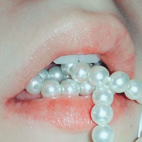
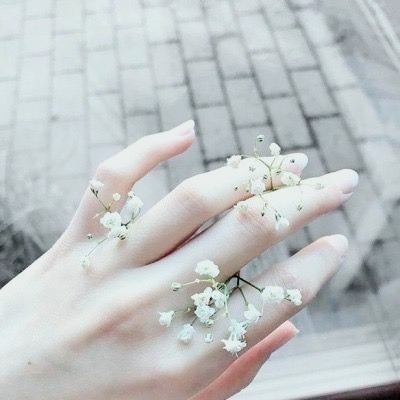
It is impossible to picture Christa as something else than a spectral beauty. An otherworldly creature born like a snowdrop. The palest bloom sprouting out of the slowly warming earth at the beginning of spring. So delicate, so sensitive. Holding a silent power in her closed fists.
All her childhood, she had been the joy and pride of her family - not only did they give her a title, but they fashioned her heart and spirit in the belief of an untouchable persona. The White Rose, meant to be desired from afar.
Vampires do have this sinister obsession for purity... And Christa convinced herself that this ethereal aura was her main shield.
-Unreal loveliness.
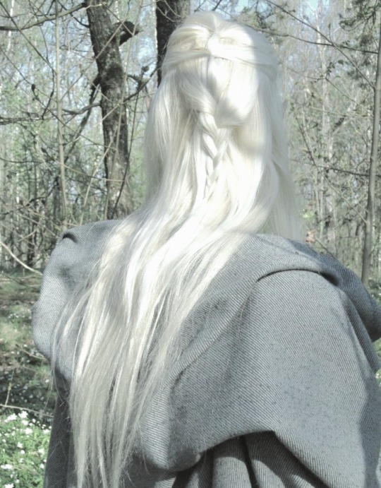
-Dazzlingly pale. A ghost dressed in opalescent silk, blue veins and scarlet gaze, all complimented under the moonlight.
The collision between a Petrarchan beauty, a sad phantom from one of Maupassant's short stories and a woodland queen fairy.
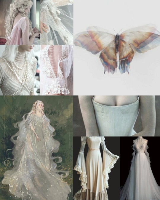
-Edwardian lace. On her sleeves, around her neck and brushing the skin of her ankles
-Like Yui, Christa doesn't like to draw attention to her chest. @nutaella-kookie mentioned in this post how her best assets would be her hips and legs and I agree. But they're so fragile that Christa would always hide her silhouette in long flowing skirts - sometimes so long you can only guess the tip of her shoes, so when she moves it seems like she barely touches the ground. She was gifted with supernatural grace
-And cursed with immense fragility.
-She's so delicately built, most men and women feel like they could crush her when holding her shoulders and giving her body just a squeeze.
-Her oh-so-thin neck is exposed with a modest collar, maybe some off-shoulder covered with a pale, see-through veil that follows the length of her arms.
-Long split sleeves, an inspiration from antique togas or maybe some butterfly/petal sleeves. Something dainty and easy to cover with a mantilla or other veils.
-It doesn't seem like it at first but she layers a lot.
-It is truly a game of transparency and forms. The art of creating an harmonious noble silhouette without making it bulky. She hates massive skirts, petticoats and tight corsets.
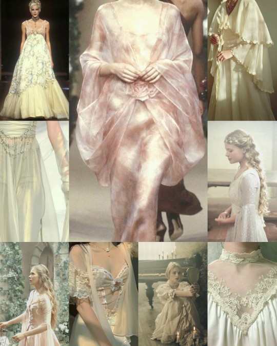
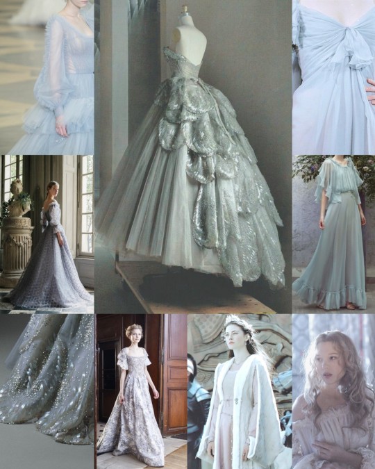
-Being so thin and short, she could never dress with the same regal confidence as Cordelia or with Beatrix's dignified stature. Too-vibrant colours would devour her and she would look ridiculous in ballooning ball-gowns.
-Opts instead for pale dresses with an empire waistline and flared, flowing skirts most of the time.
-Think of 1990s Yves Saint Laurent and Christian Lacroix spring collection
-Prefers the glistening fineness of pearls over gaudy golden jewels.
-The elegant incrustation of moonstones, herkimer diamonds or celestites, the stabilising power of abalone shells, calcite and Tibetan quartz... The Lady of the Tower knows her stones.
-But throughout the years, she began to wear less jewellery. She grew to hate the feeling of heaviness on her hands when wearing rings so now, just like Beatrix, she only keeps her wedding ring.
-One ring and her nails are cut round and short.
-...to prevent her from scratching her maids' face when she's having a panic attack. She already hurt Subaru that way when he was little.
-The cousin of the Vampire King hides her aura of failed divinity with veils and shifty looks.
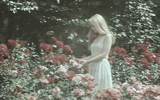
-Starry or plain. Softened hues of pale pink or blue that look almost white - it reminds you of the fainting colour of roses in her garden.

#diabolik lovers#diabolik lovers headcanons#diabolik lovers fashion#diabolik lovers fashion headcanon#diabolik lovers christa#christa sakamaki#christa#cordelia sakamaki#beatrix sakamaki#karlheinz#dialovers#shuu sakamaki#reiji sakamaki#ayato sakamaki#kanato sakamaki#laito sakamaki#subaru sakamaki
144 notes
·
View notes
Note
yes plz
Alright.
It seems that the handful of times my writing has been referenced over on the Three Houses anon meme it’s pretty much always complaining about how I interpret Ferdibert, with a major recurring thrust being that these anons are taking issue with how strongly I read Edelgard as an analogue for Arvis and Hubert for Manfroy and use these readings to inform how I perceive their relationship and the CF postgame. This did somewhat lead me to thinking about FE’s archetypical writing, because it’s undeniable that this series likes to reuse the same plots and characters with variations between games, and whether my repeated use of this metatextual framework in my interpretations of FE16 was turning off some readers who might see me as drawing too much from all these past games they may have never played...particularly as the often-referenced Genealogy remains one of the few games in the series with no official localization and/or localized remake. That got too much into me questioning whether or not I was an elitist though, and because obviously I am - I was playing FE before it was cool, thank you very much - I didn’t think that would be a productive line of inquiry.
Instead then I got to wondering: why among all the various opinions about FE16 I advanced over the year and a half that I was active in that fandom are people specifically taking issue with the ones re: Ferdibert? Ferdibert is easily the less Problematic™ of my two main pairings, and it doesn’t receive the same amount of accusations of fandom oversaturation as the even more popular Sylvix. There is seemingly some tension between its shippers and fans of rival ships, but as all of those that I’m aware of pair either Hubert or Ferdinand with women (ex. Ferdithea, Edelbert) it’s safe to say they’re angling for a different demographic anyway. No, whenever I receive criticism for the way I talk about Ferdibert it’s always internal - that I’m not shipping them the “right” way. Among these include:
That Hubert isn’t really evil and so my comparing him to Manfroy is unwelcome, as are my comedic exaggerations of his villainy and suggestions that his attraction to Edelgard is neither healthy nor respectful and may lead to him quietly usurping power from her after CF has ended;
That I once described Ferdinand as Hubert’s “silver medal” as a way of summing up how their respective relationships to Edelgard will play into their romantic relationship, reflecting Ferdinand’s lack of narrative presence in CF and the relative triviality of the last two Ferdibert supports;
That I acknowledge that Hubert is attracted to Edelgard at all somehow diminishes both characters, rather than offering another interesting angle upon which to build the Ferdibert relationship that remains quite consistent to canon (as one-sided Edelbert is);
And the largest and most obvious of all, one that the others all play into as well - how could I ship Ferdibert when I hate (read: criticize) Edelgard? This glides over the suffocating narrative presence of Edeleth, the implied tension in the Ferdibert paired ending, and other evidence to conclude that the only possible explanation is that I’m a misogynist who will happily sideline FE16′s headlining female lead for her male subordinates just because I can argue (successfully or not) that said subordinates are better written.
Of course most of this just boils down to more petty fandom faction drama, but it still surprises me how much pushback there can be against interpretations that come with so much canonical and metatextual support - and lead to a messy, complicated queer relationship set against a dystopian backdrop and the volatile political fallout that realistically should result from CF. I seriously doubt these complaints even come from impact on fanwork, because most Ferdibert fic and art I see shies away from the political complications of a post-CF world and each of their feelings toward the emperor...they’re not a trio of gay BFFs, that’s for sure. Even non-CF Ferdibert mostly engages with them as a tragic unrealized romance cut short by Hubert’s death rather than trying to make them work in a canon-divergent scenario where the circumstances are vastly different. I’ve seen a few fics work that angle, but they’re definitely in the minority.
All this is to say that I’ll never understand why these are the FE16 opinions that the fandom* chooses to criticize me over, when I’m very clearly writing with a metatextual focus and attempting to ignore the (to me) transparent battle lines of the fandom faction war when I write about the characters I enjoy regardless of which houses they belong to. The darkly comic Ferdibert headcanons shared by me and several of my mutuals don’t even appear to have that much reach in the fandom, even if I’ll maintain that they’re substantially more interesting than some conflict-deprived fluff where the post-CF world is a utopia and Edelgard lives happily ever after with her Two Jewels. That’s just so boring to me.
*Excluding the Khalidstans, who exist in their own bubble where the game, its developers, and all its fans except for the few they like are racist about everything.
3 notes
·
View notes
Text
Mk.gee Creates with Transparency and Intention on Sophomore EP, ‘Fool’ [Q&A]

Photo Credit: Erica Hernandez
Throwing caution to the wind, Michael Gordon better known as Mk.gee, left his East Coast home of New Jersey for the modern Land of Milk and Honey, California. Attending the USC School of Music, Mk.gee began honing his craft and allowing his new home to mold his identity as an artist. Weaving together elements of R&B, jazz, electronica, funk and pop, Mk.gee refuses to let genre stand in the way of his creative process.
Mk.gee released his first body of work, an album titled Pronounced McGee in early May of 2018. The album is as dynamic as the artist, various elements of sound combined with dense lyrics create a sonic catacomb of emotion. Needless to say, Mk.gee’s album debut was a victorious showcase of his raw talent as a songwriter and musician.
Wasting no time, Mk.gee returns with his new EP, Fool, serving as a time-stamp of his growth, both as a musician and a person. We had the privilege to speak with Mk.gee about his passion for music, the construction of his sound, first tour, Frank Ocean and his plans for the future.
OTW: When did you first start making music?
Mk.gee: I started around 7, I started writing on the piano while I was taking lessons. It felt very natural to write music, and it was the only fun thing about playing the piano at the time to be honest. Having a voice early on in both writing and playing was really important for me. It allowed me to find some sort of identity. I started actually recording my own music when I was in middle school/ early high school though. I had a band most of my teen years. They were really talented guys, but it was a really unhealthy environment to be creative and to grow. They put down a lot of my writing and singing. For my 14th birthday, I asked for a Tascam porta studio, so I could just record my own songs and play all the parts. It wasn’t like a “Fuck youm I’ll just do everything” intention, it just happened out of absolute necessity to create without repercussions.
OTW: You’re originally from New Jersey -- did the move to California effect your sound in anyway?
Mk.gee: Of course, hundred percent. I didn’t even really take recording my music seriously until I moved. I primarily saw myself as a guitarist when I first lived on the west coast. I’ve had stuff at that time of the move that I recorded/produced by myself at home in New Jersey, but I’ve never released any of the songs, so I didn’t really have a “sound” beforehand. When I moved, I became infatuated by a lot of music and artists that I was never exposed to on the East Coast. I moved in 2015 by myself kind of abandoning all preconceptions of me and my ego/past-life/etc… with that I learned to become a sponge. Not that I let go of past tastes and identity completely, but I learned how to let everything inspire me because subconsciously I knew no one could call me out and say listening or making a certain type of music wasn’t ���me.”
I was introduced to artist’s like Blood Orange, Jai Paul, Lolawolf, New Order, just really awesome popular counter-culture stuff that I found an identity in.

Photo: Erica Hernandez
OTW: What inspired your pursuit of a music career? Did you ever think you would be getting the recognition you are?
Mk.gee: The music career thing felt like very natural just because I’ve been gigging and writing since I was pretty young. I was inspired by a lot people; I don’t think one person inspired me, but I remember my old jazz upright bass teacher taught me really important life lessons as a musician -- to preach honesty and intention. My parents are really supportive, even though they don’t necessarily love my music, which is cool. I know I would be writing and recording my music, I just didn’t know I would be a full out solo artist. I focused on guitar and jazz for most of my teen years and thought that I would be primarily a session/touring musician.
I’m not sure if I thought about recognition or validation a lot as I grew up, but my younger self probably would be pretty proud that I’m even doing what I’m doing in the first place.
OTW: Your lyrics feel personal, what’s your songwriting process like?
Mk.gee: It used to only be rhythm based. I’ve always been obsessed with rhythm, not just rhythm counterpoint like in guitar/drums but in the way people pronounce things and the way rhythmic words sounded specific to how they come out of people’s mouths. I slaved to this the last record, making the groove/track/beat first then finding sounds that married together really well with lyrics. For this project, I broke that a bit and found some different schools of thought for lyrics and writing. This record I wrote more with just guitar and vocals or synth and vocals just to stress the songwriting more. The process constantly changes though; I get bored easily.
But yeah, vulnerability is adjacent to connection.
OTW: Saying your music is diverse would be an understatement, what inspires your sound? Mk.gee: A lot of stuff. I don’t really believe in like guilty pleasures. I listen to what I like and what makes me feel something. Just anything that moves me. Could be from like experimental electronic/noise music to folk or pop music. I make different music because it’s just a lot more fun Having an album with every song consistently like the last is boring to me. I just like to change and bounce around a lot; that’s just how I like to operate. For this project I listened to a lot of artists like Grouper, Phil Elverum, and George Harrison. I try to find a lot of inspiration in colors and photographs too. It brings the music to a more physical, colorful place. A lot of the writing on the project was to Lauren Greenfield and Nan Goldin photographs/magazines.

OTW: You’re undertaking all of the writing, recording and mixing duties yourself; what spurred the crusade to do it all yourself?
Mk.gee: It doesn’t really come from a selfish point of view. Doing all of the parts just brings together the most organic piece of “me” that can possibly be curated. It makes me really happy and satisfied doing all of the work. I find out a lot about myself through every song and every record because of it. I don’t really like to talk about me doing it all because it becomes distracting to the music.
It’s not about how I did it or where I did it, it’s just about the art.
OTW: You worked on your new EP between tour dates this summer; was the project inspired by your time on the road?
Mk.gee: To be honest, almost all of the songs were done before I went on the road, and some of them before I released the first double EP in May. A lot of people say I’m releasing this music too soon after the album, but I want to catch people up with who I am now as a person and what I’m gravitated towards. Pronounced McGee was done about 2 years ago, which is usually the standard album cycle, but for a 21-year-old at the time, that’s 2 completely different beings, and I’m very conscious of that.
I think it’s good to release spontaneously and freely; it should be an accurate reflection of the artist as they release it, not who you were a couple years ago. It should be a time stamp.
As for the tour, I didn’t write on the road too much. I wrote a lot when I came back being inspired by the shows and traveling. It’s too early to tell what will happen to them though.
OTW: You recently toured with Omar Apollo; what was that experience like? Are you excited to hit the road again any time soon?
Mk.gee: I really couldn’t ask for a better tour partner. Omar is a homie, and the whole crew was just a great hang, really down to earth. The tour got me really excited to hit another one soon, hopefully on the East Coast because my friends and family really haven’t seen me play and sing my stuff ever.
OTW: Do you plan on releasing visuals alongside the upcoming EP?
Mk.gee: Some things are in the work for post release, yeah.
OTW: How did you choose which singles to release first; what made you go with “Come On” and “New Year?”
Mk.gee: I chose “Come On” because it was the good bridge from the old stuff to the new project and the title of the EP, Fool, is taken the song. “New Year”’s color represents the album a bit more accurately.
youtube
OTW: Your song, “You,” was recently featured on blonded RADIO, specifically blonded Midterms pt. I -- how does it feel to know Frank Ocean is a fan of your music?
Mk.gee: It feels a bit unreal still. I screamed so much when it happened (laughs). I’m obviously a huge fan of Frank as well as the radio show. Huge shout out to Joe for throwing me on and showing me so much love. I don’t strive for validation, but it feels good when it happens. I’m extremely grateful.
OTW: Who are you listening to right now? Who are your Ones to Watch?
Mk.gee: I’ve been listening to a lot of The Microphones, Grouper, Lucy Pearl, The Stylistics, etc… My friends are ones to watch for sure. They are making really amazing/individual art right now and they inspire me a ton; Bella Porter, Big Buddy, Orkka, and Umi to name a few.
2 notes
·
View notes
Text
this 'check-up' essay was first submitted in May as a nonobligatory requirement for my philosophy class. i thought posting this here would give me something to look back to in ten, twenty or maybe one hundred years. it'd also serve as an evidence of living in these excruciatingly exhausting times & being a witness to continuing culture of violence, terror & social injustices that the majority of the philippine population face everyday. see this as a receipt manufactured in anger.
Notes and Investigations in Quarantine
I. The first month of the lockdown was perhaps the hardest time I've experienced this year. Just two nights before Duterte officially declared the lockdown of Central Luzon, my cousins and I were still drinking alcohol in a funeral home. We’d lost one of our uncles suddenly and we were granted permit to hold a funeral procession under the suspecting eyes of deployed military members. On my tito’s final night, I remember escaping from my relatives to observe how the streets and highways had looked so surreal in their vast emptiness and terrifying silence. A pandemic sounded too archaic to me to even occur in 21st century. Or perhaps, it was just my petty fears of no longer doing the things I was free to do before this disease brought everything into a halt that got in my way of fully realizing the weight of the current situation to others.
Before the crisis, as much as possible, I rarely stayed at home. We don’t really have internet, nor the signal was any better, so I would always go to my cousin’s house to connect to their wifi. Disconnection from the virtual world just made every day harder to get through. Getting away from my thesis, backlogs from previous sems, and not being able to do a thing about being locked in our home that I abhor, I spent the first two weeks silently crying at night or sleeping all day. I grew tired and ashamed of asking favors from friends and classmates for a certain e-book that I needed for a paper or online announcements in my classes. I thought I was just making another set of excuses to make up for my lack of trying, and that I just didn’t have enough resources to work on my thesis or requirements. But I wasn’t too smart to realize sooner that not everyone under a pandemic is in their sane mind to continue worrying about such trivial things either. Most importantly, I failed again at recognizing my own incapability to work under such emotionally draining times. I was consumed by academic pressure, and my own guilt of having spent five years in a supposedly four-year course that I feared will lead to another extension of semester just because I didn’t work harder back then. I wept for my mother in silence, who all her life worked for our survival, and has been wanting to retire by the end of the year at age 62.
Possibly the worst week I had to endure during that first month was the week where we were given quarantine passes, and I finally had to line up in front of groceries to purchase essential goods. Everyone at our house, including myself, is immunocompromised: my mother has pre-existing conditions relating the heart and lungs, father’s a PWD, and I have weak lungs as well, that were only made weaker due to my years of smoking. The thought of having brought the virus with me at home frightened me so much that I’d spent that week having nightmares. I would wake up in the middle of the night short of breath, trembling and tired. That experience felt unreal. I got through that whole week in panic and fear, intensively exhausting whatever free facebook had to offer to research everything about coronavirus, what systems does it attack, measures to take, etc. I don’t think doing that had done me good, either, because I’d just suspect myself of containing the virus when I notice a quick delay in my breathing that almost led to me calling our local hotline for suspected patients.
Being locked within the confines of our home and being exposed daily to a familial situation that I’ve been struggling to negotiate with for so long just opened wounds that I’d rather forget existed and once again found myself somewhere other than the present. I realized that the more I stay at home, the more my tendencies of repeatedly grasping our current state just naturally come out of me, and it’s something that I’ve been trying to veer away from. If we only had internet and better network connection, at least the feeling of being connected with people in the virtual realm would help me release from this claustrophobic suffocation somehow. I find it petty for a reason, really, and lack of internet connection didn’t really bother me before. But I couldn’t find better ways to keep my sanity amidst a pandemic that wouldn’t put myself and others at risk.
If I were to place myself in that situation again, I’d probably conclude that one of the few things to come out of a crisis like this is the realization of wanting to continue enduring, but it's the ideal kind that's fueled by constant questioning and fiery refusals. Some friends I’d opened myself to in the beginning of the lockdown had told me to be thankful for still existing despite everything, which most had seemed to downplay my inner wars like they were never real. I had succumbed myself into years of battle with self-loathing and depression that I’ve forgotten how to fear for your life when the opportunity gets robbed of you. But life in these times do and will not, in any way, exude that kind of sense of triumph in surviving especially when the act of resiliently struggling is being forced to us by an already exposed broken system that hides itself in the form of a disease. A lot of people I know have told me to just make use of this time to be creative, make art, devote the entirety of my break into my thesis, and dismiss my anger at celebrities who use their platforms to sing ‘Imagine’ for no relevant reason. They basically told me to just be thankful, and I refuse to conform to that. My very guilt lies within the fact that whatever comfort of a household not exactly economically thriving but doing just enough offers, only mirrors those who couldn’t even afford to bask in the assumed promises living under a fractured governance holds. I feel like all these bourgeoisie fronts will only discredit institutional failures committed by those in power to respond to our needs on the basis of equality, transparency, fairness and empathy. I’ve been too vigilant to be too grateful to be alive because I know that would just invite romantic disillusions about life that’d likely betray us in the end and keep our eyes away from propagators of this self-serving idealism.
II. For a week after seeing the controversial Japanese cult classic Battle Royale (2000), I couldn’t sleep properly. Something about it felt familiar, or at least the feeling that it evoked when I saw it was the kind that I'd met somewhere but couldn't really recall. This mystery immediately triggered a second - and third - screening in a row, an attempt to decode my newfound weird fascination with it.
I’m not really the type of cinephile to enjoy films that belong to the action-thriller genre, although admittedly, Battle Royale is objectively of god-tier standards no matter how I keep on trying to steer clear of it - conflict is present, decisions made by the participants are all driven by a single urgency, stellar cinematography, straightforward storyline. As a package, I'd say that the film is a product of both technical and poetic triumph only auteurs aesthetically and politically different from directors behind cliché action blockbusters can achieve. And it left me in a strange quest to answer what had really drawn me into its fractured, vividly violent world.
At first, I was just trying to reassess a cinematic bias that was once unwelcome in my years of involvement with films. But after going through it for the last time, the series of internal and external reassessments had transformed themselves into pleas for negotiation, and implicitly denial of truth.
Why Battle Royale, with its characters struggling to survive the forced institutional (and along with, the philosophical) challenge within a limited time, felt strangely familiar upon seeing it, was because I've seen and have been a witness to the exact same drive of characters and even creators of the film that motivates almost everyone today. I've seen it on people's faces in groceries during my once-a-week shopping routine as the representative of our household. I’ve felt its energy through the empty shelves of essential products most people are accused of hoarding. I’ve watched it through locals in long, excruciating lines where they loudly accuse one another of subtly slipping themselves in while those who lined two hours early before the store opens tirelessly let things go. I notice it within me, whenever going out for these routines & find myself always in a rush and panic, sweat dripping from thirty minutes of walking from our house to the market under the sun.
It would be absurd for many to compare an intensely exhausting day under a lockdown with a film whose portrayal of explicit violence committed by teenage kids in response to the survival challenge imposed by their totalitarian government had Japan’s cinema board infamously censor it from the world. But the film’s concept didn’t exactly emerge from the vacuum either. When the ever-incompetent World Health Organization officially declared the global spread of coronavirus as pandemic, most of us, unprepared and uninformed, were forced to make use of whatever means and resources we have in order to make ourselves stay alive, while the politically and economically powerful few didn’t have to bother a second in their lives scavenging for food while putting themselves at risk. Like characters in Battle Royale, we are armed differently, and it isn't even based on choice¸ because most of us simply didn’t have that luxury to start with. A film may be just a film, but it may be brutally speaking of investigation and observation of daily realities we face more than we would like to acknowledge.
1 note
·
View note
Text
Same day post part 2
Just so it will not be a longer post with a thousand pictures, I make a new one to continue.
After seeing the Diablo 4 announcement, I was inspired enough to create something from the artwork:

I spent the better part of a day making this. An still not perfect. First I modeled the whole thing, then I realized I have a lot of parts that are repeating, and some parts don’t need bottom face etc.. I ended up separating the model, taking it apart, and do the unwrapping for the parts only, then hand painted, and re-assembled it again. As a still model it looks quite well, I’m also quite proud of the bloody carved wooden section that was entirely my creation without reference, not even showing in the concept art.
Of course it would have been better to have the red and orange parts being separate and create them as a flag (that I’ve learned later on in Unreal, but didn’t have the capacity to go back to this model after spending a day making it. And mainly since I don’t understand yet how to add different textures to different parts of the model etc..But as a standalone model it was quite good for myself I think. I try to add Sketchgfab embed in a separate post maybe:
https://skfb.ly/6OAzq
I added it to UE and figured out how to add UI popup to “press E to ring the bell” and added functionality. The popup only shows when the player is near the bell:
youtube
Cool :D Now I can make sort of interactable objects as well . Eventually I can make the the bell, make sure that the flag parts behave as cloth, add interaction to it. Maybe animation or a particle visual effect to the sound.. Then to tie it to gameplay elements, like opening a gate after sounding the bell. The whole world is not consistent in this one yet, forest music, bloody carved wooden bell, and nice sunset.. But elements that play together. This is how a game is made. Models, sounds, animation, interaction etc..
My goal is to make 1 level, like an island and polish it to tell a story. Something that can be lunched, other people can download it, start up, press play in the main menu, see a short cinematic, then receive control over a character and they can run around the island, collect items, open up doors and read about the story etc..
I had the concept in my mind a while about the main character being a stone statue, slowly breaking up, and then awakening to the world, and the game would end by the player turning to stone and cinematic to show hundreds of years passed and the hero awakens again making the gameplay circular. I can make an island with a mountain or a big terrace with a stone temple in the middle. The character then awakens, climbs out of the temple (tutorial) and explores the island where he finds 1-2 villages with simple quests, the goal is to reach the dock with big ships and to convince a ship captain to leave for the mainland.
Simple, but to execute it to a level I’d be able to present in any shape and form I need a lot more learning. Probably concept art as well.I’ll probably just use reference material and make something in 3D. Much easier than to draw..
Next step: Wait for black Friday and buy the buy the auto materials and the world creator.
I also had an idea about the hero awakening and there is a big shockwave of air and pushing away the sea around the island revealing the full shape of the island. Not sure what shape though but I think it would be a cool idea. Like a dragon or a skull or some symbol..
I was also thinking about an origin story that talks about a star fallen to the earth, or that gods that created the world fought themselves and knocked down a star from the sky, and it fell to the world. Something that creates the hero and with narration that the hero is not good or evil, but his actions change the world. “Sometimes small thongs change you, sometimes you are the small thing that changes the world”. And the story would be about how actions of the hero will shape the world, and something along the line that this is cyclical and the hero once his task is finished will vanish and return when needed.
I want the world to be something with the feeling of a SAO s01 world (not in terms of trapped players, but the fantasy aspect, the houses and the areas etc. Something like .hack/Sign fantasy, where bizarre and unknown shapes are dominating the landscape.
I must gather reference pictures of what I’m thinking of. Something to convey fantasy elements like medieval atmosphere.
I was also thinking about a game where the gameplay is partly engineering, where the character is trying to solve medieval challenges with a modern mind, like how to transport water. Not strictly medieval, but ( in terms of dark ages ) solutions but to make “modern” solutions with medieval means and available materials etc..
I also checked out the conan exiles Devkit, that seems to be a great resource for learning everything, but heck, it takes ages to load anything.. But it will surely be useful to figure out stuff. I looked at palm trees that used 1 texture, part transparent, part not transparent.. But even they made models differently. at a different tree they used a different method, having 1 solid texture and cutting from it with UVs. Crazy..
I’d say I know like 1000 more, if lunching a game would be a loading screen with 2 398 000 segments, I know 1000 more than before, and I’m now at around 8% of knowledge, let’s say, I’m at 80 000 / 2 398 000 in completing a game (knowledge and implementation) with everything. I’d imagine after having the world creator and personalized the auto-materials, I’d be at around 10%. Building the first island with trees and foliage and everything without gameplay would toss me to 15-20%. Other assets, houses, temples, etc would push me to 30, all the props, tables, apples, flags, etc makeing sure that there’s a route to play on would bump me to 40-45%. Gameplay modelling, character modelling, , NPCs and AI to 60%, music, sound effects etc (if I make them myself) to 80%, and the rest is just gameplay interactions, and polish, to make sure that it can be played through, closed where it should be closed etc, bug testing etc. 100%. If I ever reach that, making a full game from there would be much easier, just add more story, more areas etc..
The main problem is I’ve not seen any good high level overview of the questions I have and I have to learn everything from my mistakes.. Making a simple 3d model is easy. But when you need to add more materials? Do you need only 2 material slots and add the same material or make a separate UV unwrap for separate parts of the model? what do you do if your model has cloth? I’m afraid I make a good island with foliage and at later it turns out I need to re-make it since nobody alked about navmesh.. Do I build a house as a model that has no insides and transitions to inside with a loading screen or make one that has insides modelled as well and the door just opens and the character can move in?
0 notes
Text
tonight i have to write about the subject of transparency for my sister’s project
i drank about 2 or 2 and a half shots of whiskey in order to write this, because writing is hard.
i think some people can write well if they don’t feel anything about a subject, just by getting enough thoughts together and drawing enough lines between them, but i can’t do that. i can only write if i feel strongly enough, and the problem is that usually i don’t feel very much about anything, or else those feelings are faint feelings that lack any single strong direction. like if you’re in the black space between stars, still affected by their gravity, but it would take you lifetimes to be pulled toward any one of them. i drink in order to feel strongly about things.
another problem is that i often don’t feel like my emotions deserve to be written down, until i’ve shown people these feelings. and certain feelings are better-received than others.
people like reading about love and hopelessness, but not about the frustration you feel when you walk into a mail office wet in the rain after you forgot your money at home, and then you text someone you’re very in love with and you try to get her to feel bad for you. you feel guilty that you’re trying to do this, and she doesn’t seem to be very sympathetic to how you’re feeling and you get frustrated and sad and guilty so you sit there for like 15 minutes trying to cry so at least your emotions can feel real and not just dumb. meanwhile she talks about how she’s upset over something and you’re trying to show that you care, but really you don’t, can’t, and you want to so badly, maybe so that she can like you, maybe so that you can be someone worthy of loving her. you wonder if you love her at all.
most emotions aren’t pretty. john darnielle wrote a song called autoclave. he says “no feeling that’s worth having can call my heart its home”. i feel this a lot.
tonight i have to write about transparency. transparent feelings. transparent like sheer fabric blowing on a breakwater as the sun is setting. in the pictures my sister took i wasn’t very transparent. you can’t see my face. i look like i’m hiding behind something, muffled by something, enveloped in something.
do you know how i felt standing there? my whole body was cold. i was hungry and irritable, but excited because i would be featured in her art project.
the first time i tried writing about this, i wrote about how i felt in a bus going to a village called jiufen, where hayao miyazaki used as a reference for the beginning section of spirited away. i was going there with alex. there were so many people on that bus, and they pushed and shoved me, and i bumped against the rails and walls of the bus. while i stood there i thought about how when i got home i could write about how frustrating it was to inhabit a physical body, and how i wanted to be a ghost and float through the ceiling.
michelle messaged me an hour ago, telling me she didn’t understand the prompt—did she have to write about transparency as a visual motif in photography? i told her i think she had to write about the feeling in the pictures, like wanting to be a ghost floating through the ceiling of the bus, like how i felt that day.
i told her that i often felt like every part of my body and all my thoughts and feelings were some unwelcome presence in the world, drawing too much attention to themselves. and it wasn’t some kind of belief about my worth, you know. because my parents tell me this all the time, that i’m thinking too much. but these aren’t feelings i get from thinking, they’re convictions that come from my gut and i’m trying to find the right words to describe them. the way you sketch rough lines to figure out the best way to depict a form on paper. it’s actually a physical sensation. like when i can find something to reduce my thoughts, reduce my presence in this world, alcohol, music so loud my ears hurt, and i want to melt in it, let it carry me away. when this happens i feel like i have direction. i feel like i’m standing in front of some large object in space and everything in me is moving toward it, approaching it, and i am dissolving in its heat and light.
i don’t like yukio mishima but i understand how he felt that death was the only way to approach beauty.
is this what it means to be transparent?
the feeling of being drunk—and i’m not drunk enough—the feeling i felt taking the bus home with you to taipei, where everything felt so real because i felt so unreal.
i don’t know if my feelings on the subject of holiness are directly linked to my own feelings of discomfort in existing, but i think a lot about how holiness is really something that’s always there, a river flowing red hot under a thin layer of earth. our existences are like something too ugly and the holiness has to hide itself. so the less we exist the more it can come through. i think a lot about how holiness is like night, like silence, something we can’t ever hope to understand, that in its very nature conceals and confuses.
1 note
·
View note
Text
Weekend Top Ten #370
Top Ten Videogame Protagonists
Games, eh? Don’t you just love ‘em? I mean, the good ones at least. Or sometimes even not just the good ones. Sometimes ones that are a bit pants but somehow get under your skin. Or, if not exactly pants, then just kind of “OK”, sort-of-a-little-bit-mediocre, but they scratch an itch that needs scratching, especially if they’re mobile games and you’re after something relatively untaxing but time-wastey.
Sorry, where was I?
Anyway, a funny thing about games is the concept of the protagonist. Games – even narrative games – are different from other forms of art and media because of the issue of control. You are supposed to be the protagonist. And in narrative games – or games that can roughly be described as following a narrative, which is to say, not sports games – designers can either present a protagonist who is themselves a fully-formed character, or they can offer a nonentity, a blank slate upon which you can draw your own personality. Are you Mario or is Mario you? It’s Duke Nukem versus Gordon Freeman. A character versus an avatar.
So here we are then. My favourite video game protagonists. The main characters; the ones you play. Some of these I think are cool characters in their own right; some of them are, like I implied above, silicon avatars, canvases, a means for you to interact with the world. And that’s alright; that’s what they’re there for. But they do it so well, in such a way as to help elucidate greater meanings for the game in question. I always felt – to digress a little around the same topic – that in the original Knights of the Old Republic, I created a character out of whole cloth; they were me, it was as if I were playing through the events of the game. They were a digital representation of my psyche. But in Knights of the Old Republic II: The Sith Lords, because the demands of the plot necessitated my character to jump through certain hoops, I began playing as that character; assuming a role, so to speak. Rather than “what if I were a Jedi,” I began playing as “what if I were this Jedi; what would I want this Jedi to do?” I found this very rewarding, even if the second game is somewhat inferior to the first.
But I can’t quite remember why I felt those things, which makes me want to play both games again.
Where was I? Oh yeah – top ten game protagonists. Press A to start.
Guybrush Threepwood (The Secret of Monkey Island, 1990): a perfect example of playing a character. Guybrush is fully-formed and all you do is point him at stuff. Witty, silly, naïve, heroic; you don’t shape his character, and with only one real path through the games, all you do is pick which one-liner he’ll deliver next.
Lara Croft (Tomb Raider, 1996): although mostly a blank slate, the iconography of Lara – shorts, vest, combat boots, two huge guns – helped reinforce the character you were playing; tough, no-nonsense, fully capable, physically adept, a female Indiana Jones.
Kyle Katarn (Star Wars: Dark Forces, 1995): almost machine-tooled to be the perfect Star Wars fan-service character – Han Solo but a Jedi! – Katarn is admirably sarky through his entire life, a voice of cynicism even when in full-on hero mode. This is supported in cut-scenes, whilst in-game you get to indulge in wish-fulfilment, especially in sequel Jedi Knight, the first game to really let you wield a lightsaber. The element of choice was revolutionary in those days, allowing you to embrace the Light Side or the Dark, with requisite powers and different endings, and Katarn reflected your player choice perfectly.
Manuel Calavera (Grim Fandango, 1998): like Guybrush, Calavera is a complete character; indeed, he’s more realistic and nuanced than Guybrush, despite being a skeleton with a clunky polygonal head. Beautifully brought to life by Tony Plana (Ugly Betty’s dad!), Manny is funny, earnest, and quietly heroic, and you feel for him sufficiently to want him to complete his quest even when trying to negotiate the weird rotational control system and walk across multiple pre-rendered backgrounds to get to the next objective.
Joanna Dark (Perfect Dark, 2000): like Lara Croft, Joanna Dark is mostly character through iconography: a futuristic catsuit, nifty-looking fun, and funky sci-fi spy gadgets. But by speaking in cut-scenes we get more of her identity, even though it’s still a thin characterisation; she’s basically Lady James Bond but in the future. However, being Lady James Bond but in the future is a fantastic hook, and a nice turn in cut-glass upper-class deadpan goes a long way.
Luigi (Mario Bros., 1983): Mario and Luigi began life virtually interchangeable, just two different avatars, their very look dictated by the constraints of the hardware. But over time, as Mario became a veritable superhero, Luigi began to plough his own furrow as the more timid, more peaceable brother. His scaredy-cat antics in Luigi’s Mansion helped solidify this, and his meme-worthy Mario Kart side-eye hinted at a desire to score one over on his brother from time to time. Although still, really, a fairly blank slate game-wise, his is a story of character through decades of hints and gags and side-appearances.
Conrad B. Hart (Flashback, 1992): another blank slate, literally this time, as you play as an amnesiac with no idea why you were outrunning hoverbike-riding bad guys in the opening cutscene. Conrad sticks in my memory, though, through his beautiful animation; despite the stylised polygonal character design, he looked and felt fully human as he ran, rolled, and leaped across the screen.
Duke Nukem (Duke Nukem, 1991): a near-perfect marriage of game icon and game play; Duke embodies the very essence of Duke Nukem 3D. A brash and loud platform/shooter character in two original outings, it’s the seminal classic FPS for which he will always be remembered. Crass, vulgar, offensive, violent; all this and more. He’s a rather unlikeable character, but in leaning into his outlandish, boorish machismo, 3D Realms created a hilarious game which reflected the persona of its star to a tee. I’d love to see him brought back in a way that parodied the current culture of toxic masculinity, although I fear a good portion of the audience wouldn’t see the joke.
Dizzy (Dizzy – The Ultimate Cartoon Adventure, 1987): he’s an egg! Like, a walking egg! What’s up with that? Back when other folk were getting down with Mario or even Sonic, I was enjoying Britain’s bedroom coder equivalent. Characterful and cartoonish when that was virtually unheard of in games, Dizzy felt like a breath of fresh air, even if he probably smelt like a sweaty omelette.
Gordon Freeman (Half-Life, 1998): whilst “blank” characters are common in FPS games – Doom, Quake, Unreal, etc – Half-Life made that a feature. Gordon’s muteness became a character trait; was he traumatised, otherworldly, indifferent? As his messianic legend grew in Half-Life 2, and he became surrounded by believable and verbose characters, his silent demeanour and unconventional behaviour (really just standard FPS tropes) became more and more incongruous, and delightfully commented upon by those around him. Gordon Freeman represents, parodies, and explores every notion of player-character as transparent avatar, and does it utterly perfectly, creating his own distinct character even as he just utterly gets out of the way of you playing. You are Gordon, even though Gordon is really a nothing. Masterfully done.
I should have laid down some ground rules… the main one, I guess, was that all these characters had to debut within that game, which meant no Sam or Max, sadly. And though I’m listing their first appearances, in some cases it was a subsequent game where I fell in love with them (for instance, although I’d played Dark Forces, I became a fan of Kyle Katarn after playing and adoring Jedi Knight). Finally, I hope it’s obvious, but these are protagonists, not just game characters; the people you play as, properly, in a game (so not, say, Garrus from Mass Effect, even though you can control him during combat; the protagonist is still Shepard). This means no Elaine Marley or Alyx Vance. And though I’ve included “vessels” such as Dizzy and Freeman, I have excluded characters like Shepard, who really are just blank slates, to the point where you can even control what they look like (J.C. Denton nearly made the cut, though, as he does have a little bit more of a character of his own).
0 notes
Text
Reflective Journal Week 5/6
In week 5 and 6, we continued our work on building our galleries. I learned how to import bits of artwork into Unreal so I could use them on blocks to use as the texture, to emulate artwork being hung up on a wall. I had to save images from online as PNG’s so they’d be transparent and press IMPORT on the assets menu at the bottom of Unreal then dragged them onto my canvas.I also learned how to add sounds into my game by using speakers to create the point where the sound will play from. I also learned how to use attenuating to adjust the sound radius and the intensity of how loudly I hear the sound.
I feel good about the work I produced. It’s been a productive day and I’ve grasped the basics of designing with Unreal really quickly and I’ve been designing efficiently. as a result, especially structurally.
But what I could do to improve my work further is to spend more time with the small details, making my gallery look more like a gallery with extra space, with a wider variety of canvas’ being used for the artwork with different arrangements of the work to make the arrangement look artsy like the art itself.
0 notes
Text
“Upon Touching that which He has Touched”
Dylan Smith
The following essay was written as an assignment for Dr. Julie Bates’s Samuel Beckett: Afterlives, a Sophister English Literature module at Trinity College Dublin. It is a response to a visit to Trinity’s Beckett archives.
In response to: “Reflect on the experience of consulting Beckett’s archival material in M&ARL. What additional understanding (if any) did you gain, that might not have been available had you been restricted to the published versions of Beckett’s works?”
Upon touching that which he has touched — he, a Nobel laureate, prolific writer, and man who seems all at once contemporary, recent, and of a time long gone by — one feels, I think, pressure to achieve some profound communion with Samuel Beckett. Beckett’s work is widely available[1]; Beckett, however, remains elusive within this body of work. He seems to have meticulously nullified himself within his writing; he often nullifies self altogether[2]. This nullification is an integral and valuable part of what Beckett has accomplished, yet it engenders his work with an unignorable spirit of absence — a spirit which often drives fans and scholars to seek such a communion outside of what Beckett has published.
Trinity College Dublin, then, is an ideal location for pilgrimage. Not only did Beckett (unhappily) study and teach at Trinity, but Trinity’s Manuscripts and Archives Research Library houses a significant collection of Beckett artifacts, which library staffers enthusiastically treat as relics. These relics include letters written by Beckett[3], personal photographs of Beckett, manuscripts and notebooks filled with the man’s barely legible scribble. When one observes and handles these artifacts, Beckett is no longer distant, abstract, or impersonal; the broad strokes painted by the man’s history and sparse interviews begin to be filled in.
Further, our guide at the library hoped to offer an opportunity for deeper illumination. She insisted that such archival visits are crucial for undergraduate literature students, and that students ought to engage with archival resources seeking, to paraphrase, something which can only be learned by being in the presence of literary artifacts. According to the archivist, experiencing these artifacts is important, particularly in the case of manuscripts and their marginalia, because “you can always go back to what the author intended.” Through her eyes, access to such artifacts provides an opportunity to peer into some ideal, unrealized text – some version of the text that’s, theoretically, closer to that which existed within the author himself than the final, published version.
After my visit to the archives and my experience of these artifacts, however, Beckett remains elusive. Dr. Julie Bates[4] has suggested the notion of Beckett being “the end of literature”. Seen in this light, Beckett looms as an apocalyptic figure: He not only signifies an important, influential moment in late modernism, but the resurrected sprit of modernism is engendered in the man himself. Beckett is modernism resurrected and returned to Earth – his work the epitome of Elliot’s wasteland uprooted from its war-torn source and transformed into something perpetual and inescapable.
If we accept that modern literature, free of conventional plot, characters, or formal structures, must be “decoded”, its images, textures, themes and aesthetics parsed for some meaning or message; then, too, must Beckett be decoded. The mystery of the two – the art and the artist – are intrinsically intertwined. They are both points of access to and obstruction from the truth or meaning which they contain and seek to impart. If we view Beckett’s literary work as a vehicle with which he sought to impart meaning – meaning which he himself contained – then understanding Beckett becomes paramount in understanding such meaning, especially when the literary work itself falls short in its role as a didactic or heuristic tool. Beckett’s work, in particular, seems susceptible to such attempted excavations; his plays and novels are characterized by an extreme reticence to didacticism or heuristics. In short: they have no obvious meaning. Beckett too, in his life, expressed a similar reticence to being decoded. Thus, the obsessive fetishizing and aggrandizing one sees at the Trinity Manuscripts and Archives Research library is understood. These literary seances are a frantic attempt to contextualize and decode that which refuses context and obvious meaning — attempts, ultimately, that are deemed necessary as a means to procure meaning from a dense and obscure body of work, written by someone who was often a dense and obscure man.
But Beckett’s rapture has missed me. Beckett, ultimately, is entirely separate from his artistic work. Intertwining Beckett with his work, with the supposition that knowing about Beckett can help us understand his work – or even that Beckett’s work requires reality-bounded “decoding” at all – seems to violate the very spirit of modern literature.
Per Virginia Woolf:
“The writer seems constrained, not by his own free will but by some powerful and unscrupulous tyrant who has him in thrall, to provide a plot, to provide comedy, to provide tragedy love interest, and an air of probability embalming the whole so impeccable that if all his figures were to come to life they would find themselves dressed down to the last button of their coats in the fashion of the hour. […] Look within and life, it seems, is very far from being ‘like this’. […] . . . [I]f a writer were a free man and not a slave, if he could write what he chose, not what he must, if he could base his work upon his own feeling and not upon convention, there would be no plot, no comedy, no tragedy, no love interest or catastrophe in the accepted style. . . Life is not a series of gig lamps symmetrically arranged; life is a luminous halo, a semi-transparent envelope surrounding us from the beginning of consciousness to the end” (Woolf, 160).
Woolf articulates a potent distinction between past writers and those of modern literature. Woolf’s modern writer, without being beholden to conventional elements of plot and realism, is free to pursue the spirit of modern literature, that is, a literature primarily concerned with the internal realities of life. Woolf’s modern literature is a literature of feeling; she elevates it as being the more authentic mode. Only through pursuit of the spirit of modern literature can a writer authentically express; without it he is merely under the control of a mechanical tyrant.
What, then, is Beckett, if not one of Woolf’s modern writers? While not an internal-monologue-ist like Joyce, Beckett frees his work from a sense of practical or external reality. Beckett, writing in the tradition of the Nouveau Roman, removes from his work notions of plot or “love interest” to probe truths about internal reality, interrogating the nature of memory, consciousness, or the passage of time. Beckett’s characters are concerned with being characters, rather than people; his environments concerned with being environments rather than locations, etc. Beckett’s works of fiction are concerned with being works of fiction, and not catalogues of real-life events.
This prompts the question: What does the Nouveau Roman expect of us as readers and students of literature? John Sturrock, in his examination of the New Novel, interrogates the aesthetic project of the Nouveau Roman: “. . .[T]he property common to all nouveaux romans is that they embody the creative activity of the novelist – they display the novelist at work” (4). Sturrock explains that what defines the New Novel is a primary occupation with novelistic process; nouveaux romans are concerned with highlighting the very status of literature as a medium. According to Sturrock, “The New Novel, then, refuses to be a vehicle of documentary facts about the real world, to abrogate the function of other types of writing, or of other media” (16). Sturrock argues that the New Novel evades the responsibility of other types of media – that responsibility conventionally being one of objective meaning. The new novel refuses interpretation in the conventional sense, as it is not concerned with conveying in the conventional sense. Rather, its aesthetic project is one of form; the primary meaning of a Nouveau Roman lies in its method of subversion. More saliently, the Nouveau Roman creates meaning primarily through its relationship to convention. The value, then, for a student and critic of the New Novel, exists primarily within the discrepancy between the realities of the novel’s composition and our own expectations of it.
Alain Robbe-Grillet, New Novelist himself, collects his observations on the Nouveau Roman in his series of essays, For a New Novel. “Each novelist, each novel,” he writes, “must invent his its own form. […] The book makes its own rules for itself, and for itself alone” (12). Robbe-Grillet is insistent on the integrity of the Nouveau Roman, its ability to create its own meaning in its subversion of its own rules. “What [the author] was trying to do is merely the book itself. . .. [T]he work remains, in every case, the best and the only possible expression of [the author’s] enterprise” (13), he argues. Implicit in this statement is the assertion of the impossibility of sourcing meaning outside of the work itself. The work is the whole and absolute articulation of its own meaning, through the tension it creates between its “rules” and its own violation of those rules, read against the broader background of literary convention.
Thus, reading Beckett’s novels and plays as examples of the Nouveau Roman requires a faith in their facility to wholly articulate their own meaning. Further, we understand this meaning not on the basis of the work’s relationship to practical reality, but rather its relationship to literary convention and its conjuration and violation of its own set of “literary rules.” If we are to remain faithful to the literary project of the Nouveau Roman, as well as Beckett’s role in its implementation, then we must resist the urge to ground our reading of Beckett in knowledge of the man’s own life. Photographs and letters are no more informative that photographs of or letters by any other person, living or dead. Incomplete or edited manuscripts have value merely as separate works; never, however, must we view them as ‘alternate’ versions of a published work. Doing so questions the integrity of the work and implies a source of meaning outside of the text itself. To attempt to decode or externally source the meaning of Beckett’s work is to lose much of what makes Beckett’s work rich — mainly a careful subversion of conventional meaning across both the page and the stage. The fetishization of Beckett manuscripts wholly misses the point of Beckett’s aesthetic project: to create meaning through formal discrepancies which exist intact within the works themselves. Emphasis on Beckett artifacts as interpretive catalysts distracts from legitimate means of interpretation, such as formalist or comparative analyses, which consider the unique formal and aesthetic accomplishments of Beckett’s work.
[1] If sometimes inaccessible
[2] Or, at least the conventional self – an argument can be made that Beckett is constructing alternate expressions of self-hood or “I”-ness.
[3] Beckett requested that correspondents destroyed his letters upon reading them. Those in Trinity’s possession have been preserved against S.B.’s explicit wishes.
[4] Beckett scholar and Trinity lecturer
0 notes
Text
Task 2
Introduction
In task 2, I am asked to begin prototyping my user interfaces and post any idea generations or concepts I create. pre production is essential as I can better visualise what I want to create and draft it and then fully implement it into unreal engine. This is especially important for the industry as when you have other people working on the same project, The pre production is how you can share the vision and general idea of what you’re trying to create.
I’ll also take into consideration human factors during this process.
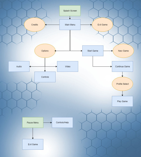
Here’s a simple flowchart detailing the way the menu system will direct the player into the game. It begins with a splash screen during the loading process. This gives the player a visual queue that the game is starting up. Then the main menu is opened with the following options:
Start Game > Takes the player to additional options
Options > Lets the player change game options
Exit Game > Exits the game application
Credits > Plays Credits for the game
If the player selects ‘Start Game’ they are then asked to either choose between starting a new play through or continuing from a previous save. Upon selecting start game the main menu will unload, the level will load and the player character will spawn.
Whilst playing the game the player character can pause and find an additional window detailing the player controls. The game can also be exited from this menu. I’m planning on having the player controls in the pause menu as it can be accessed at any time. Fighting games in particular like Mortal Kombat are notorious for having long combos that you have to remember and navigating the menu to find them is annoying. I want to avoid that in my game and have the pause menu be direct access to the control list.
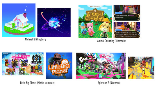
Whilst looking into some potential colour themes for my game I came across an artist and game dev called Michael Shillingburg who has a really unique and colourful style that I love. His great visuals would be perfect for a game aimed towards children and so I’ll definitely be looking at his work for inspiration when developing visuals for my project.
I also found an interesting detailing the differences between photo-realistic and stylised game worlds. I’ve decided to go towards a minimalist stylised approach and this needs to be seen in my menu/hud too.
‘The significant difference between realism and stylized is that with realism you are restricted to making things look ‘real’ while enhancing their visual language. With stylized you are free to play with the shapes and colors, exaggerate or remove details to enhance the look and feel in any direction. Doing so with realism would break the illusion of reality as it wouldn’t be viewed as what we perceive to be as ‘realistic’, it would not belong in our world.’ (Aava, 2017)
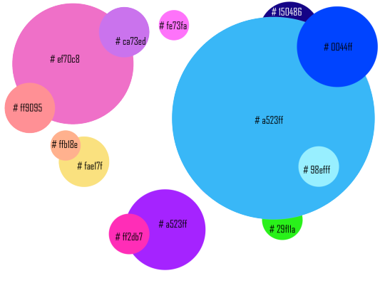
I created a colour pallete in photoshop by using the eyedrop tool and taking colours that I liked from art in my moodboard. There are a lot of colours however this is spread across the game environment, particle effects and UI/UX so not all of these colours will be seen all at once. Instead they’re spread across different environments to not overwhelm the player.
Game Title


Here’s my concept title graphic for my project. I also created an animated GIF to visualise how I’d have the title animate in game. A good use of this animation would be during a splash screen/loading screen. The pulsing animation gives the player visual feedback that the game has not frozen and it’s just taking a moment to load the next area. I chose the name BabyBot as most games popular with younger audiences have short names because they’re easier to search for online like ‘Fortnite’ or ‘Splatoon!’. The alliteration also makes the name easier to remember.
To create this graphic I simply typed up the title ‘Baby Bot’ changed the leading of the font to reduce the space between the words then I went into the effect and gave it a thicker stroke. I chose pink and blue as they’re both colours that are common on my colour palette.I like how the gradient creates purple in the middle too.

I then used the timeline tool to create 5 frames of the stroke reducing and enlarging. This gives it the movement.

I’ll use what I learnt in the future when creating animated features of my menu system. As I concept more of the projects assets I’ll also stick to a general aesthetic so it all blends together well.
My main inspiration for the title was LittleBigPlanet and it’s similar use of bold colourful fonts. I chose the name Baby Bot as it’s short, uses alliteration and refers to the robot characters which use baby like proportions which are common in cute characters. (Large Head, short limbs)
HUD Draft
I’ve created a draft for my HUD for my project.
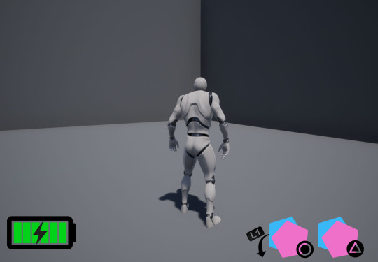
I’ve drafted a health bar and ability interface so far.

Here is a gif showing my concept for the ability interface. The player character will have four abilities that they’re able to activate with circle or triangle. They can hold L1 to activate the alternative ones. The symbol representing each ability will move forward to make it clear to the player what button activates what ability.
When the abilities are on cooldown the symbol will become transparent and then pop back into full opacity when it’s ready to be used again.

Here’s a gif showcasing my idea for the players health bar. As it’s a robot I thought it’d be fun displaying the health as a battery. As the player loses health it decreases and changes from green to orange to flashing red. This uses colours to represent the players health without relying on numbers. I have chosen this because younger demographics such as children will be able to see at a glance the characters health without having to stop and read text or percentages.
Splash Screen
Here is my wireframe. I took inspiration from games in my moodboard such as animal crossing. The splash screen in animal crossing is the game title with a simple (press start) button underneath. I will follow a similar format for my splashscreen.

I then went into photoshop and created my finished concept from my wireframe.
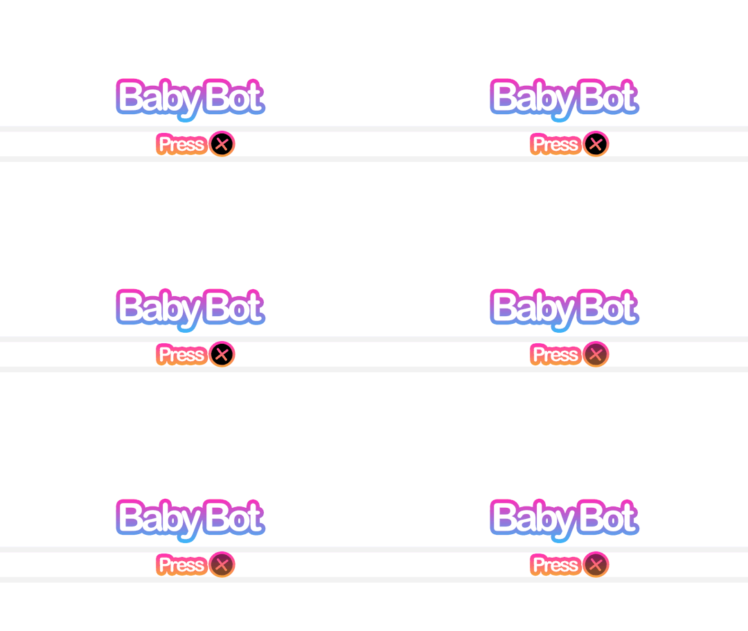
Here’s the splash screen which will prompt the player to press X to continue. I might add additional information like a company name or a project build. The reason why I changed ‘Press Start’ to ‘Press X’ is because I’m building this project with the playstation controller in mind and children will have an easier time finding the X button rather than the start button.
Main Menu
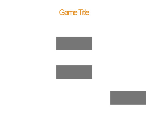
I’ve drafted up my main menu with another wireframe. I plan to have three buttons which I planned before in my flowchart. Start, Exit and Credits. After creating my wireframe I then went into photoshop and used the 1920x1080 resolution as that’s what’s most common at the moment with monitors. I tried to keep withing the blue guidelines provided by Photoshop.
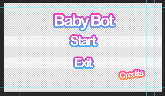
It’s a transparent background so it will showcase the game environment behind it. I’ve chosen a transparent background to give this menu a clear difference from the splash screen.
Here’s a GIF showing how the player will scroll through the options.

I like showing the exact button itself as it leaves no room for confusion on what the player needs to press. I’ll add a sound such as a click whenever the player scrolls through different options to give an additional indicator that they’ve moved their selection. When adding sounds to a game however it’s important to think about how often the player is going to be hearing that and if it’s going to annoy them. That’s why you don’t want anything set too loud or shrill.
Credits Screen
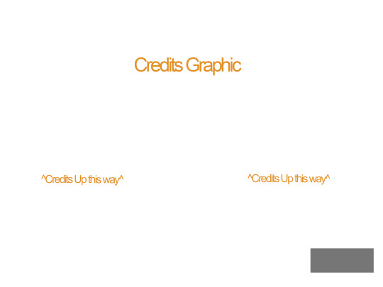
Here’s a draft for the credits screen. I kept to the same structure in my wire frame except that I moved the title slightly lower and larger so it overlays over the moving credits. I did this because the slow pulsing animation on the title is pleasing to look at.

Pause Menu

Here’s the pause menu when the player presses ESC or Option/Start. It has a transparent background and two large buttons. When creating my concept in photoshop however I put a slight angle on pause to make it appear more playful.
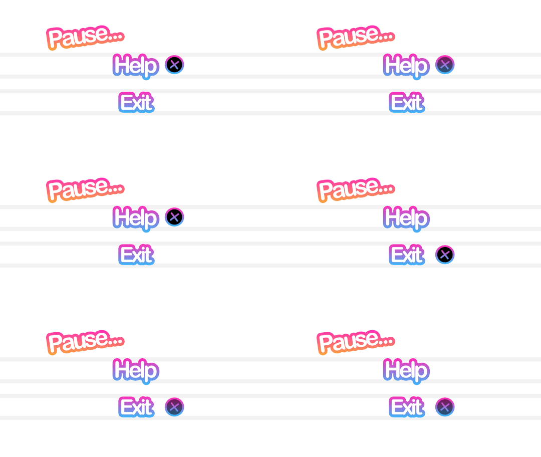
The widget will come to the viewport and blur the gameplay behind it. This is so the character can still see what’s happening onscreen even when the game is paused. They’re also able to open up the help menu which will display the character controls.
Controls Menu
When the player selects help the player is taken to this menu. When creating the wire frame I went back and looked at the credits menu and kept to the same format. This is to simply keep the menu system to a similar structure as I don’t want every page being wildly different. Games in the industry usually have a set style and stick to it throughout which I what I’m aiming to do.
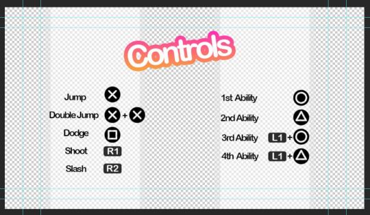
Here’s the controls menu to remind the player how to use their abilities. I added the transparent white walls so the black text stands out more. The rest of the screen will show the game environment behind it. The title “Controls” is also animated as you can see from this GIF.

In-Game Dialogue
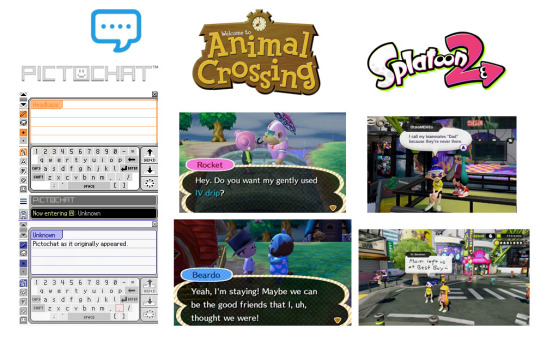
Here’s a moodboard of some ways of displaying text which I think will work well with the style I’m going for. I like the vaporwave aesthetic which often appropriates styles from 1990s-2000s. I’ll keep these three in mind when designing my dialogue display.
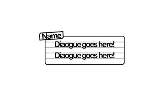
Here’s my draft dialogue box that’s heavily inspired from pictochat but I made the name box larger and off centre similar to animal crossing. I’ll also have different colours for the different character so it’s clear who’s speaking. I’m tempted to have the white background on the box slightly transparent so it doesn’t obstruct the players view of the game.
Here’s a draft dialogue box for sidekick character ‘3LLA’ (pronounced Ella) as she warns the player of the antagonist’s return and reminds them how to dodge attacks/dangers areas.
Here’s a draft one for K!NG who’s a malfunction buggy robot who acts as the main antagonist. I wasn’t too happy with this as I felt it was a little bland. I decided to go back and use filters such as offset and wave to mess up the text. I also made duplicates and switched off parts of the RGBs to get the shadows behind the first line. I like how the white text stands out against the background. I’ll use this method to create the distorted glitch affect for K!NG’s dialogue.
I’ll be having recorded voice lines playing alongside so I’m not too concerned with it being hard to read as it’s kind of the point with K!NG. None of his dialogue is informative to the player anyway rather it’s just ramblings of a mad robot.
Evaluation of Task 2
I enjoy pre production as it helps me organise my thoughts and ideas on the current task. It allows me time to look at games in the industry and select what I like and don’t like. I looked at games suited towards the same demographic and what I found was bright colours and simple layouts were favoured over more complex menu systems such as something you’d see in a game such as Fallout or Skyrim.
My biggest inspirations were LittleBigPlanet, Hello Kitty Roller Rescue and Splatoon. Animal crossing was also great when coming up for ideas for my in game dialogue.
Feedback I received from peers was that my idea generation was clear but to think more clearly on interactive elements I could add to my menu. I agree that an interactive element would make my menu system much more interesting. Interaction is also great for keeping the attention of younger audience which my game is aimed towards. In task 3, I’ll build my scene which will act as the backdrop for the menu and see what appropriate interactions I could add. I’m thinking of creating an urban scene to set the scene of the game from the get go. Appropriate interactive elements would be flickering lights or birds sitting on buildings which can be clicked on.
References
Aava, K. (2017). Realistic vs. Stylized: Technique Overview. [online] 80.lv. Available at: https://80.lv/articles/realistic-vs-stylized-technique-overview/ [Accessed 5 Oct. 2018].
0 notes
Text
How I Achieved Little Success From Working With The Best
Note: This article was originally posted on Medium.com as “Little Success From Working With The Best?”
For the past 4 years as a student at BYU Hawaii I’ve been working on different products and have really struggled to be profitable with them.
The frustrating part is that I’ve had really successful people who have been my mentors during all of this. Frustrating, because I have learned so many amazing things from them; they’re incredible people & entrepreneurs.
I figured if anyone would have a chance at succeeding in entrepreneurship it should be me! Their support and willingness to help me has been more than I could ever ask for.
Last night I was searching for answers as I usually do in trying to figure out this entrepreneurship thing. Again I was feeling so down and frustrated because I feel like I can’t get it together.
After many searches my last search query was “I’m a crappy marketer”. I’ve been coming to the conclusion for the last while that the lack of success I’ve been having must be attributed to my crappy marketing skills & wanted to see what I could find to help.
I found two articles in particular that were just what I was looking for. I learned so much from these articles and felt like it addressed exactly what I’ve been struggling with.
YOUR PRODUCT ISN’T GOOD ENOUGH The first article is called “You aren’t bad at marketing your product, Your product isn’t good enough!” Ionut Neagu in this article talks about how people had been approaching him to get advice on how to build their business/sell their products and were complaining that they haven’t been able to figure out the marketing for their products. They believed the reason they aren’t finding success is because they lack the money and/or marketing skills to promote it. He talks about how the lack of money or skills is not the problem but that the problem is with the quality of the product. He touches on 4 products that he has been successful with and how did it with little marketing. He says:
1.TRANSPARENCY REPORTS — WHY THEY WORKED “To be completely honest with you, I haven’t spent more than a couple of hours promoting our transparency reports. Usually, I’m just submitting them to ManageWP.org, and sometimes asking a few people on Twitter to take a look. Yet they still get mentioned at WordCamps, people talk about them on blogs, podcasts, and they have a really wide reach in the niche. Why? Certainly marketing isn’t the reason. I have spent waaay more hours/money trying to promote our other articles… The answer is the content quality on its own… unique insights that can’t be found elsewhere and that actually help people with ‘something’ will always work, and will always come on top of other content that might not be so revealing. 2. ZERIF LITE — OUR MOST POPULAR FREE WORDPRESS THEME — WHAT HAS MADE IT Before releasing Zerif Lite we already had 10+ themes launched, and I spent good money and time promoting all of those themes. However, when Zerif Lite landed, right from day 1 it generated 1,000% more sales and downloads than all of the previous themes combined! At that point, it wasn’t that hard. I reached out to some popular blogs, insisted they listened, and at that moment I wasn’t afraid to pay for their attention and for having Zerif listed everywhere I could. The theme was already way better than all the other free themes out there, so the promotion worked right away too. People started to write about it, it was much easier to promote it, and it felt a lot less like I was pushing it onto everybody. It all felt natural. 3. REVIVE OLD POST — WHAT MADE IT A MUST-HAVE PLUGIN Revive Old Post is our top social media plugin. It takes your content and shares it automatically to your various social media channels. It has been in the WordPress.org repo for 4–5 years, and we only acquired it around 2 years ago. The funny thing is that nobody does any marketing around it, yet EACH week (just Google it) there are blogs mentioning it, there are loads of people naming it their favorite plugin, and there are even videos on YouTube talking about it. Let me emphasize on this again; we aren’t doing anything to promote this plugin directly at the time of writing this, it seems to promote itself. Just like with the transparency reports, the idea and the way of approaching it is unique. It was the first plugin of its kind, it helps people, and it does it all for FREE. Building a product that is unique and helpful, or that’s 10x better than anything else on the market isn’t easy, certainly. However, if you don’t consider yourself a genius marketer then this is what you should absolutely do! 4. WHAT MAKES BLOG POSTS VIRAL THESE DAYS On the one hand, there’s so much noise that it’s really hard to surface with a new product/thing. But at the same time, if you build something that people consider amazing, almost no marketing is required, or the marketing work will become super easy. If a guy who hasn’t written more than 20 articles in his lifetime can get his post viewed by 100,000+ people and with 0 marketing, then probably you can do it too. Just focus on producing something awesome. And do it before you devote endless nights to promoting the thing… There indeed are people out there who are marketing geniuses, or who have loads of resources that they are willing to invest even if the return isn’t coming for a while. But if you aren’t one of them, your best chance is to focus on your product first.
HOW TERRIBLE COPYWRITING SKILLS MADE ME A SOUGHT AFTER MARKETER The 2nd and the last article I’ll mention here is from Bhavani Esapathi and is called “How my terrible copywriting skills made me a sought after Marketer” She says: “Growing up, I hated the word marketing I began to slowly warm up to the idea of marketing as I got older and that’s not only because I needed money for food, shelter(etc.)…. With the rise of…social media I saw another world of marketing, one that wasn’t…reliant upon shoving stuff upon people who probably didn’t care that much. In fact, to me social media marketing is the very opposite of shoving stuff onto those who don’t need it, it’s about carefully weeding out the ones who don’t need it and the ones who do I ventured into the fancy world of arts marketing…and as an entitled millennial, what do you mean I need an MBA to prove I know how to attract an audience? Doesn’t being raised by a technology qualify me somewhat as a birth right? I soon realized how wrong I was, not only was I a bad marketer but a terrible one in the best of my days. What kept me going was this streak of brilliance between extravagant moments of failure, something I couldn’t quiet put my finger on. After a good few years of being a miserable arts marketer who could deliver results with just as much odds as a kid in an arcade machine. I took it upon myself to find what bridges most of my successes. There must be a pattern that determines if one of my brilliant campaign or strategic ideas will take off or slowly disintegrate… I realized that most of the copy I wrote were evidently very fake and unreal thereby proposing mistrust than anything. Note to self: do not try to sell something that you don’t genuinely believe in… If you don’t resonate for the company/product you’re working with then you’re not going to be able to portray genuine likeness which often comes from being true to your audiences so being real and comfortable was a big part of the things that I succeeded at…you’re better off finding someone who’s not only interested in you but unusually excited which makes them perfect to market your products and services. …most industry-standard agency work demands strategic writing that can strip you of genuine emotions in an attempt to embed addictive ones. Because I’m a writer attuned to my sensibilities, because I know what I like… I need to find the right thing to write about otherwise I might as well be pretending to transcribe Ancient Greek…. I consciously acknowledge the things I could never promote or blog about so if you think you’re a bad writer or a not-so-great marketer, you probably just haven’t found the thing that makes you a good one yet. So the next time you’re stuck contemplating how to ‘market’ your work better ask yourself ‘why isn’t this work inspiring me enough to show off?’”
CONCLUSION: Both of these articles have taught me a lot and am still letting it sink in. For now, what stands out is to do what inspires you! Consciously acknowledge the things you could never promote or blog about or anything wouldn’t like doing, be honest with your self. I’ve learned that when you are true to what inspires you, the quality in your products, blogs or whatever your goal might be will come through. I’ve learned to start with being true to the light that inspires you and then the marketing/selling part will come much easier. I think with having this in mind, i’ll start on the right foot & have better success moving forward.
0 notes
Text
Mark Lecky
Ahead of his exhibition at Gavin Brown’s Enterprise in New York, and forthcoming retrospective at Wiels, in Brussels, Mark Leckey talks to J.J. Charlesworth about what it means 'be' in the midst of a world where images have become things
https://artreview.com/images/custom/w829h466/content/112/581b75fbd1a211de1861e6f61762b373_0.jpg")
By
JJ Charlesworth
The Universal Addressability of Dumb Things, Hayward Touring Exhibition, Installation view (2013). © the artist. Courtesy the artist and Gavin Brown Enterprise, New YorkGreenScreenRefrigeratorAction, 2010. © the artist. Courtesy the artist and Gavin Brown Enterprise, New YorkA Month of Making, 2014 (installation view). Photo: Thomas Müller. © the artist. Courtesy the artist and Gavin Brown’s Enterprise, New YorkMark Leckey photographed at Gavin Brown’s Enterprise, New York, May 2014. Photo: Jeremy LiebmanCirca '87, 2013. © the artist. Courtesy the artist and Gavin Brown Enterprise, New YorkFiorucci Made Me Hardcore, 1999 (film still). Courtesy Galerie Buchholz, Berlin/CologneStills & Trailers, 2012 (installation view, Galerie Buchholz, Cologne). Courtesy Galerie Buchholz, Berlin & Cologne
Mark Leckey is busy printing objects, or perhaps they’re copies of objects. It’s April, and between phone calls from my car and Skype calls from his kitchen, Leckey explains what he’s putting together for A Month of Making, a May–June exhibition at Gavin Brown’s Enterprise in New York, which itself anticipates a solo exhibition at Wiels, Brussels, this coming September, and which is a continuation, of sorts, of Leckey’s remarkable curatorial project, The Universal Addressability of Dumb Things, which was commissioned by the Hayward Gallery and toured the UK throughout 2013. For the Gavin Brown show, Leckey is getting together some state-of-the-art 3D printers, which he’ll set to work to print out solid versions of already existing objects, objects scanned to become digital information, which in turn will produce new objects: copies, or ‘dupes’, as he’s calling them.
There’s always been a restless, impatient enthusiasm to Leckey’s exploration of our culture’s mixed-up, obsessive relationship with both things and images, and the experience of our own fascination with and enthrallment to them. It’s an exploration that has become increasingly ambitious as it has encompassed video, object, installation, ‘performance lectures’ and eventually, with The Universal Addressability…, the business of curating too.
‘I DON’T WANT TO LOOK AT THINGS, I WANT TO BE IN THEM’
The 2008 Turner Prize-winner first came to attention for his breakthrough video Fiorucci Made Me Hardcore (1999) – a nostalgic elegy for the energy of subculture in Britain during the 1970s and 80s, a kind of biographical recollection composed of other people’s footage. Sequences of people losing themselves in the moment were edited in a manner somewhere between documentary and decelerated pop promo. But these were images, also, of people adopting self-images – style, dance moves – becoming images, as it were. And closer in, that video seemed to set up the question Leckey has been elaborating answers to ever since: what it means to be alive in a culture of images, and in some way, to live with and through them, while at the same time flirting with the possibility of becoming other to oneself, to become an object, or a thing. As Leckey declared during a discussion at the ICA a few years ago: ‘I don’t want to look at things, I want to be in them.’ It’s a desire that seems to resonate with our current moment, in a culture that, though everywhere mediated by images and networks, puts huge store in the transparency of connectedness, of our access to and implication in everything virtual. ‘Always on’, in the thick of what is seen and said onscreen, we have begun no longer to distinguish between the ‘here’ of the material and the ‘there’ of the virtual, the image.
Things, objects, artefacts, artworks: plugged into and playing off the groundswell of recent cultural thinking around the question of the division between man and machine, alternative states of consciousness and the terms of human subjectivity in the age of the network, The Universal Addressability... was a wunderkammerlike accumulation of incongruous objects, mixing artworks with manufactured goods, ancient artefacts and ultramodern technology, the real and the virtual: a high-tech prosthetic hand next to a medieval hand-shaped reliquary; a Doctor Who ‘Cyberman’ helmet alongside a stone gargoyle; video sequences from the virtual world of Second Life next to a video essay by the autism campaigner Amanda Baggs. Crisscrossing ancient and modern, The Universal Addressability… riffed on the irrationalistic, ‘technopagan’ return of an ‘animistic’ worldview, in which things are no longer merely the inert, passive objects of human intent, but become, in the explosion of the age of the network, quasi-alive, enchanted…
So where does the current interest in 3D scanning and printing come from? “When I was asked to curate a show,” he says of The Universal Addressability…, “I didn’t feel that comfortable with being an ‘artist-curator’, so what I tried to do as much as possible was to make the curated show into my own work. And one way to do that was to continue the exhibition somehow, to make something out of it. So when The Universal Addressability was at Nottingham Contemporary, I had as many of the objects 3D-scanned as I could. Later, I had some trouble with getting the objects printed in Brussels ahead of the [upcoming] Wiels show, so Gavin [Brown] suggested we bring some printers into his gallery [in New York] and do the production there, as an event – what, in the geek world, they’d call a ‘maker space’. So we’re going to produce those, and the rest of the works I couldn’t scan will be printed up as cutouts or something similar – I’m calling them ‘generations’ or, even better, ‘dupes’.”
He came up with a nice line for the press release, he muses: “‘They might be lossy, they might be “de-generations”, but they might be better suited to the world as it is today, because they are more “bits” [data bits] than they are atoms.’ But that’s getting a bit clever,” he says self-mockingly. “I’m doing it more because I can. I just want to see what it might throw up, and be a bit irresponsible.”
IRRESPONSIBILITY IS DEFINITELY ONE OF LECKEY’S STRENGTHS: NOT JUST AS A SUCK-IT-AND-SEE APPROACH TO INTUITING WHAT MIGHT WORK, BUT RATHER IN TERMS OF NOT TAKING RESPONSIBILITY FOR THE CONSEQUENCES – POLITICAL OR ETHICAL – OF WHERE YOUR INTUITION TAKES YOU
Irresponsibility is definitely one of Leckey’s strengths: not just as a suck-it-and see approach to intuiting what might work, but rather in terms of not taking responsibility for the consequences – political or ethical – of where your intuition takes you. It’s to be found in Leckey’s particular quest for a kind of affirmation of oneself in the experience of an artwork, even if it reveals the ambiguities and problems of such affirmation and risks the possibility of losing oneself to it. ‘Critical distance’ is something Leckey has a problem with: chatting for a moment about what he thinks he’s going to say on a discussion panel that evening at Tate Modern as part of its Richard Hamilton retrospective, he elaborates: “The big difference between British art and American art is about distance – Hamilton always had to maintain a kind of critical distance, he was never willing to just ‘succumb’ in the way I think American artists like Andy Warhol and Jeff Koons do. Their relationship is about trying to be as ‘integrated’ as possible, they’re trying to be that thing.” Whether there’s a critical residue in the kind of complicity that Warhol or Koons adopts – with commodity capitalism, with consumerism – has been hotly debated. But one gets the sense that Leckey wants to go beyond this, to provoke and incite further thought about the purpose of taking a step back and the value of throwing oneself in.
Immersion and distance, thing and image, the febrile oscillation between the sight and sound of pop culture and how to step out of it, to allow some reflection, some thinking to take place – all of this is perhaps given its most concise expression in Leckey’s ‘Koons bunny’ film, Made in ’Eaven (2004), a CGI mirage in which Koons’s iconic 1986 stainless-steel sculpture Rabbit is recreated in a simulation of Leckey’s London flat. As the virtual point of view wheels around the sculpture, we notice there’s no one reflected back in the mirror of its featureless, polished head. It is intoxicating to watch, an unreal doubling-up of impossibilities. Made in ’Eaven is something to do with desire – having what you can’t have, by just plain nicking it – but also a kind of crisis of materiality – of the sculptural object, and of the human body too. It’s a work that in many ways anticipates the scorching of the discourses of older media – sculpture, painting, photography, even video – in the critical fallout of the emerging networked culture of the noughties, though Leckey is cautious not to get too caught up in the voguish rush to see everything as entirely converted by the advent of digital culture.
“I’m apprehensive about what we’re doing in New York,” he says. “One of the reasons is that there’s a bit of a rush [among artists] to be the first to get your hands on this stuff [3D-printing technology]. And it’s not a question of being involved in a post-Internet-art type of discussion – I’m not interested in that… Actually, it’s about the fact that I have a problem with experiencing objects in the world, so I have to turn that object into an image before I can experience it as an object.” Rather than being tinged with digital-age anxiety, Made in ’Eaven is a celebration – not of an object, but of the desire for it, a form of wishrealisation in which the experiencing subject is removed from its own materiality, and that of the object, for both to exist in a moment of suspension, or resolution, or even oblivion. A sort of ecstasy.
Leckey mentions, half-joking, that he has sometimes thought of himself as ‘a bit autistic’. But it’s perhaps more the case that autism has become a kind of metaphor for a broader difficulty many of us face as society tilts from one where our relationships are with other people, to one where our relationships are increasingly with things. No doubt that could sound like an echo of Marx’s much misused discussion of ‘commodity fetishism’ – ‘a definite social relation between men, that assumes, in their eyes, the fantastic form of a relation between things’ – and it’s too easy to jump from there into the truism that, hey, we’re talking to our machines and they’re talking to us. Nevertheless, we soon find ourselves having to think through the consequences of a culture in which the division between man and technology, subject and object, has become a good deal more fuzzy than before, and we may be in uncharted waters… As Erik Davis, the Californian cultural critic whom Leckey cites as a big influence, anticipated in his article ‘Technopagans’ back in 1995, ‘we surround ourselves with an animated webwork of complex, powerful, and unseen forces that even the “experts” can’t totally comprehend. Our technological environment may soon appear to be as strangely sentient as the caves, lakes, and forests in which the first magicians glimpsed the gods’.
It’s a development Leckey has forayed into previously, with his GreenScreenRefrigeratorAction (2010), a performance-into-video in which Leckey voices, through digital modulation, the inner monologue of a black Samsung fridge-freezer, as it tries to explain itself to itself and the world around it, in a doleful stream-of-consciousness that takes the matt-sheened appliance from its own dimensions and internal technology, to ruminate on the world of vegetables and subterranea, eventually finding itself drifting in space, between sun and moon – which recur in the fridge’s monologue as the quasi-mythic representation of the hot-and-cold of its heat exchanger circuit.
Leckey’s interests might have shifted throughout the last decade – from an obsession with pop culture, subculture and the figure of the dandy in earlier films such as Parade (2003), and in his band collaboration DonAteller, with fellow artists Ed Laliq, Enrico David and Bonnie Camplin; to the high/low culture face-off of his BigBoxStatueAction performances (2003–11), in which Leckey’s giant speaker stack confronts icons of modernist British sculpture, such as Jacob Epstein’s Jacob and the Angel (1940–1); to his later multimedia performance lectures, the Internet-driven epiphany of dematerialisation In the Long Tail (2009) and its antithesis Cinema-in-the-Round (2006–8), with its more reflective inquiry into the physicality of images via, among others, Philip Guston, Felix the Cat, Gilbert & George, Homer Simpson and Titanic (1997). And yet between them one can trace the peregrination of Leckey’s restless attempt to grasp some form of truth about the predicament of experiencing and being in the current moment, as things, images and selves become interchangeable.
“I’M A POP ARTIST – I BELIEVE IN THE IDEA THAT YOU’RE ESSENTIALLY A RECEIVER, THAT YOU OPEN YOURSELF UP TO, AND YOU ALLOW WHATEVER IS CURRENT TO COME THROUGH YOU AND ABSORB IT INTO YOUR BODY”
From a critic’s point of view, Leckey’s tracking and anticipating of the crosscurrents of contemporary culture, his promiscuous remixing of sources from popular culture and ‘cultural theory’, present an artist increasingly attentive to the relationship between an event and how we reflect on it, the immediacy of experience and its mediation – the loop between art and criticism. And Leckey’s work is looped in another sense, working almost always in and out of the work of others: the anonymous footage of Northern Soul and Rave clubs in Fiorucci; Koons’s Rabbit, invoked and wished into being in Made in ’Eaven; sculptures by Epstein or Henry Moore in the BigBoxStatueActions; Leckey’s own figure seen only in reflection in the curves of a stainless steel Pearl snare drum, in the video Pearl Vision (2012); the elaborate cultural composites of the lectures; or the scanned, recut objects sourced out of The Universal Addressability… Authorship and signature style are nowhere to be seen here in their old guises, and this relates, perhaps, to Leckey’s attitude towards how to embrace the experience of the currents that make up a moment in history. “I see myself in a tradition of Pop culture,” he says. “I’m a Pop artist – I believe in the idea that you’re essentially a receiver, that you open yourself up to, and you allow whatever is current to come through you and absorb it into your body and somehow process that, and that’s how the work gets made.”
Leckey’s current efforts are focused on a new video, a sort of ‘memoir’, the first glimpses of which were seen in his recent exhibition On Pleasure Bent (2013), at the Hammer Museum at UCLA. In the ‘trailer’ video of the same name, we find a dense collage of brief sequences that might recall a British adolescence through fragments of music and film, invoking an woozy eroticism that drifts between the lattice of fishnet tights and of electricity pylons, the branding of Benson & Hedges cigarettes, cathode-ray-tube RGB dots, Kate Bush and Kenneth Williams. Seductive and seduced bodies of the past, absurdly rendered in the photocollage Circa ’87 (2013), in which Leckey has cut-and-pasted himself, stripped down to his shorts and sat at a snare drum, as an oddly scaled-down figure surrounded by an admiring throng of big-haired 1980s ladies. For all the attention to the impersonal future and past of technology and society in his recent work, it’s an awkwardly comical reminder that Leckey’s work remains rooted in the problem of remarking on one’s own being – on its capacity for memory and for action, for desiring and being absorbed, for being embodied while potentially ‘out of its head’ – being both subject and object. Of what it means to be in the midst of things.
0 notes
Text
First new painting
Beginning with the general theme of play in digital spaces that I identified as having been the main undercurrent of most of my work this year, I sat down to draw up some ideas through working spontaneously onto some paper and a canvas panel. I knew only that I wanted to explore the general imagery of interfaces of digital communication in combination with the digital textures of virtual forms and spaces, such as objects from video games. I have been considering how different forms of communication on different social media relate to their respective online cultures, and how each form of digital communication might have its own space and intangible atmosphere. I wanted to try and realise my own perceptions of each of these interfaces into tangible spaces that real people shape and colour with their collective behaviour; this is a fairly abstract goal that I feel will underpin my exploration of the subject of dangerous play online through painting. For this reason I picked out heavily textural media – focusing on oil paint and pastels - to begin recreating digital scenes with. This is an element of my work which I have been tentatively experimenting with in ways that I have found to be quite successful. I have so far received feedback from a handful of crit sessions that my experimentation with mixed media such as photo transfers, layering of semi-transparent surfaces for paint or drawing, and use of gloss have helped in the past to draw the viewer into the tiny images I have been creating by appealing to the sense of touch. I have started to consider these very tactile imaginary worlds I have been building as potential mirror-image versions of the screens many of us virtually build our second lives into. By producing images framed by surfaces on a consistently small scale, I am working with a kind of visual that is familiar to me through its similarity to the imaginary spaces – behind phone screens, computer screens, or game console screens - I have potentially spent a thousand or more hours on in the last year alone – considering that I spend around 3 hours a day online, which is seemingly a fairly average figure for people my age. If I were to continue to make reference to the huge amount of digital imagery I surround myself with on a daily basis while responding to it in a way that is viscerally textural, I feel I might be able to explore the idea of online and offline communication about the common anxieties created by and the needs for nuanced human connection that may not be met by online communication.
I find this idea very engaging, probably because it pertains to my own sense of identity, which I have cultivated in part from immersing myself in communities online made up of people for whom real-life communication is inconvenient – such as for people facing social stigma, like closeted gay women or for mentally ill people - or impossible due to distance. I am not at all certain of my specific subject matter yet, but I am very occupied with my own fears about the impermanence of digital spaces of safety that people have built, and know that I want to “play” with this fear using mixed media. I intend to refine this idea into something physical – imagery that validates this digital sense of safety that is projected up at us through screens by translating it into unique and hand-made marks that cannot be switched out of existence with the blink of a light or the failure of some obscure electrical component thousands of miles away, as a line of text or a photograph or a person’s entire presence online potentially could be.
I had not fully considered this idea of digital transience when I sat down to work, and had brought mixed media to the studio only with the idea of channelling my own appreciation for the ability to share a childlike openness to play – such as through sharing absurd memes borrowing artwork from 1990s kids’ cartoons, or playing videogames with friends, which are both sometimes seen as embarrassing and time-wasting activities – that can come with online freedom to observe and communicate anonymously. I wanted to use cheap or cheap-looking materials like crayons or magazine cutouts or lumps of brightly coloured polymer clay to recreate peaceful recognizably digital scenes in a slightly loose and naïve way, referencing the physical and emotional experiences of navigating online spaces. To counteract the fact that these experiences are completely coldly immaterial, I began to draw the words from a text from a friend I met online and communicate with almost exclusively in this way. I began with the colours of the hugely popular messaging interface – Whatsapp - that we maintain our friendship through, and tried especially to reference the exact shade of green that all Whatsapp users are familiar with as the background colour for texts sent from their own device.
However, I found did not want to include the ‘bubble’ shape of a normal text message; I wanted to try and remove this frame for communication and produce an image that makes reference to this unreal depthless interface while also clearly presenting a re-imagining of it as an actual plane of some sort, through use of bulky forms and perspective. To imply in an implausible and slightly ridiculous but symbolically obvious way that this space is a homely and inviting one that friends might share, I included the forms of a chair, a table and a picnic blanket in a rounded and pixelated ‘low polygon’ style by grating a pastel at an angle against the panel board surface so that raised grains of canvas would be coloured while blank canvas would show through where my pastel had not touched. I thought that this looked almost like a digital texture glitch. I worked around this, smoothing areas of pastel colour with white spirit to imply some depth, marking out the ‘glitched’ areas as a kind of negative space and drawing on the idea of digital objects clipping in and out of existence. I tried to give a slightly eerie atmosphere to the image by creating a seemingly huge space in sickly colours with no discernable boundaries –emphasising this by drawing a recognizable picket fence around the objects in the foreground, but using few other signifiers of depth or landscape forms - but with some kind of energy of its own, adding clouds blowing across its sky at a sharp angle.
I produced this painting fairly intuitively, and was intrigued by the outcome. Overall, I think I find the image to be oddly humourous. The forms standing in a neatly fenced grassy field are almost like crude farm animals in a child’s peaceful drawing; this is contrasted with the fact that they are slightly grotesque as written letters made bulky and highly textured, that they are almost threatening as things that may or may not be implied to be alive, since they are the only forms around to be interacting with the people’s furniture in the foreground, and that they are in an ominous-feeling environment in rich but unappealing colours. I find this a fairly accurate representation of the way I think about digital spaces for communication; they can be extremely comforting as places to maintain contact with others without any of the stress of leaving the house or being seen, and places where any kind of media is made accessible and there can be a great deal of creative energy and play. However, this is also a form of communication where some of the participants’ identities are inevitably lost or poorly translated through a lack of physical presence, and where language as a result seems literally disembodied in an alarming way. The lumpy word-forms and strange colours and hay painting technique I used here seem quite fitting to me for this reason.
However, without first hearing my explanation in words of my process arriving at this image, I’m not sure what a viewer might be able to draw from it. By giving a fair amount of definition to the letter forms, I believe I may have made it too difficult to tell that these are actually the characters ‘w’ and ‘h’, and the clue of the blues and greens in the background probably isn’t enough on its own to make it clear that this is a response to digital imagery. For this reason I don’t think that this is necessarily a good piece of work, since it probably wouldn’t encourage any kind of conversation about the topics I wanted to draw into it. However, as a first test of scale and mixed media, I found this to be very useful; the combination of a small surface and the dense and easily blendable paints and pastels allowed me to immediately get stuck into making painted images about painting. I could see this kind of painting method being used to explore the ways we respond differently to painted work seen in person in relation to the ways we respond to art that is based online, such as video streamed performance or interactive digital images.
0 notes