#modelingy
Explore tagged Tumblr posts
Photo


Burger On The Grill
Part 4: Building a Burger--Perfect Patty
After completing the donut tutorial by BlenderGuru, I was challenged to create something similar by myself, so I chose to make a burger. Last time, I formed some shapely buns. But what is a burger without meat?
Modeling
I meshed by first attempt at a burger patty by starting with a cylinder and following reference photos. I ended up with a shape I liked, but the topology was not distributed evenly enough for the Displace modifier I planned to use next.
My next step involved retopology. I started with a torus this time, chose just enough major segments to match my shape and limited the minor segments to 6. I deleted all vertices in the inner loop of the torus and used Grid Fill on the top and bottom to close the inner hole.
The proportional editing tool allowed me to deform the torus to roughly match my first shape. Then, I sized up the torus so that it just contained that first shape, subdivided the whole thing by two, and added a Shrink Wrap modifier to match the outline of the first shape perfectly.
Later, this Shrink Wrap modifier would causing my render to be completely black and empty. Applying the modifier before rendering corrected this issue.
Modeling the Patty by Sanctus – Blender Procedural
My next step involved making the patty lumpy. I subdivided the patty by two again, and then added a Displace modifier with a Cloud texture. Fiddling with the Size of the texture and the Strength of the modifier got me something I liked. Lowering the Midlevel eliminated the strange horizontal distortion around the perimeter of the patty.
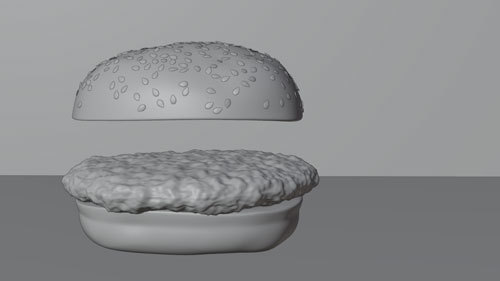
Yes, look at that yummy clay! It was really coming along nicely.
But what about texturing?
Texturing
My first attempt used an image texture for everything from diffuse color to bump, but since the image lacked the quality I wanted, I eventually turned to procedural methods.
Texturing the Patty by Sanctus – Blender Procedural
To get the oily effect on the surface of the meat, I played around with two methods. The first was to allow a noise texture to influence the roughness in the Principled shader as in the tutorial by Default Cube.
The second, which I preferred in the end, began by adding a Glossy shader. I set the noise texture to influence the bump of this Glossy shader. A Mix shader was used to combined the Glossy and Principled shaders, and a Layer Weight node plugged into the Fac of the Mix Shader allowed control over the gloss based on which normals were facing the camera.
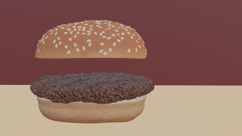
Here is a screenshot of the burger in Eevee. You can barely see it, but I went to the effort of adding grill lines to the patty.
Adding Grill Lines to the Texture by Default Cube
To sear in the grill lines, I added an Image Texture node, created a new image named "Grill Lines" and selected this node with Node Wrangler to see only its effect on the patty. I marked a seam on the underside of the patty in a circle and unwrapped the UVs. With Texture Paint, I used the Stroke with method Line and held down Alt as I clicked to drag a line across the top of the patty. After doing this to the top and bottom, 5 on each side, I saved the "Grill Lines" image.

A MixRGB node on Add combined the Grill Lines Image Texture with the Noise Texture before feeding the result into the Color Ramp.
See Meat Texture node layout at the top of post.
Follow me to keep watch for the next part!
Review the previous part.
See overview for links to all parts of this tutorial series!
See more of my work: Check out my archive.
Join me on my journey: Follow me on tumblr.
Support my creative profession: Buy me a coffee on KoFi.
#blender#tutorial#burger#patty#3d art#art process#blender guru#food art#meat#beef#grilled#texturing#materials#3d artist#art#digital art#3d render#blender3d#blendercommunity#blendertutorial
3 notes
·
View notes
Photo

Greetings from Barbados 🇧🇧😍 _________________________________ Einer der schönsten Sonnenuntergänge 🌅 auf dieser Welt 🌎!!! _________________________________ ..Just enjoy this Moment 🤗😇😌 _________________________________ #durham #highpoint #losangeles #la #newyork #nyc #scoutme #elitemodel #imgmodels #workselfie #office #face #skin #fashionista #fashionblogger #styleblogger #hairstyles #oversized #eyes #fun #foodporn #modelingi #fresh #suit #suitandtie #dressshoes #josephabboud #mensfashion #dapper #comfort (hier: Barbados Airport)
#comfort#office#fashionista#workselfie#elitemodel#durham#skin#hairstyles#face#highpoint#la#styleblogger#imgmodels#suit#nyc#josephabboud#oversized#dressshoes#eyes#losangeles#foodporn#newyork#modelingi#dapper#suitandtie#scoutme#mensfashion#fun#fresh#fashionblogger
0 notes
Photo
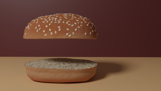
Burger On The Grill
Part 3: Building a Burger -- Shapely Buns
After completing the donut tutorial by BlenderGuru, I was challenged to create something similar by myself, so I chose to make a burger.
Modeling
I started with a UV sphere. To get rid of the shading distortion at the center point, I deleted several rings and filled it with a mesh as in the image below.
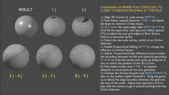
After using several reference photos to distort the sphere, I had a lumpy bun for my burger.
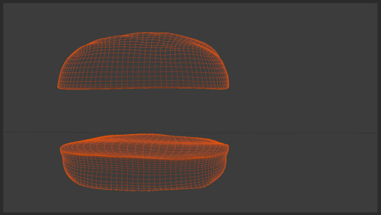
But what about the sesame seeds?
Adding Seeds
After modeling a single sesame seed from a reference image, there were two approaches I tried to apply seeds to the bun.
The first method used the particle system to distribute points on the bun and instance a seed on each point. This is the method I used for my donut sprinkles. Overlapping is an issue with this method, and there was no easy way to deal with it.
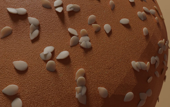
Months after I completed my burger, the second method became a possibility, so I tried again using geometry nodes.
Blender 3.0 Beginner Geometry Nodes Tutorial (Donut part 9) by BlenderGuru
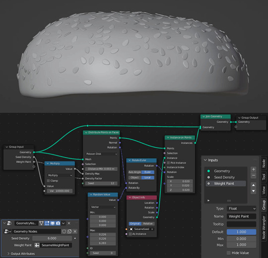
For the extra rotation that allows some seeds to stick out of the bun, see the Random Value node. I have non-zero values for the Max X and Y values as well as for the Z.
Texturing
Texturing was the next challenge. There are two distinct textures on a bun: the crust and the soft inner bread.
How do you go about separating these two textures when they are on the same object?
There are several ways.
The first I tried was to select polygons and assign different materials, but this leaves you with very uniform results, not the best look for an organic object.
The second way was suggested by DefaultCube in this tutorial and basically involves drawing a gradient on the bun to divide the two materials, but with an uneven cut in my very lumpy bun, a horizontal line could not give me the results I wanted.
So I looked into a third way and separated my textures with vertex color paint.
Mixing Materials With Vertex Color by Hola Mundo!
I colored sections in Vertex Paint Mode and added a Vertex Color Node to control the separation of both the shaders and the displacement.
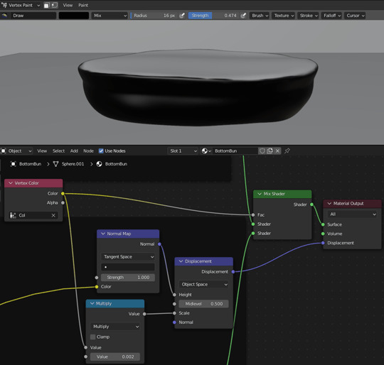
Notice that the Vertex Color node connects to the Fac socket of the Mix Shader to control the separation of the shaders.
Vertex Color also connects to a Value socket of a Multiply Node which then connects to the Scale node socket of the Displacement Node. This Multiply node thus controls the area where the displacement is applied and, by the second value, the scale of that displacement.
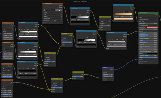
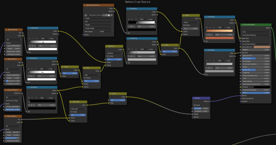
For the crust, I applied texture painting to the bun so that the top and bottom had more browning than the middle. A couple of noise textures produced bubbles. A voronoi texture produced cracks. Subsurface scattering softened my bun from hard plastic into an organic material. Another noise texture provided bumps.
See Top Crust Texture and Bottom Crust Texture node layouts at the top of post.
For the bread, I messed around with procedural textures for while and came up with something that resembled vomit... before turning to BlenderGuru once again.
How to Make Realistic Bread by BlenderGuru
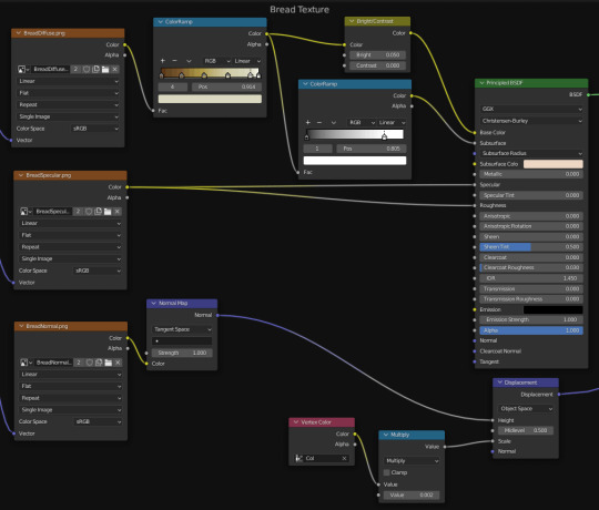
I turned a reference image into diffuse, specular and normal maps with the help of Photoshop and the Nvidia NormalMapFilter plugin.

I sampled colors from reference images and used ColorRamp nodes to recolor the grayscale diffuse images and procedural textures. Otherwise, selecting colors, especially for the subsurface scattering, was a lot of trial and error.
See Bread Texture node layout at the top of post.
Follow me to keep watch for the next part!
Review the previous part.
See overview for links to all parts of this tutorial series!
See more of my work: Check out my archive.
Join me on my journey: Follow me on tumblr.
Support my creative profession: Buy me a coffee on KoFi.
#blender#tutorial#burger#bun#3d art#art process#blender guru#food art#bread#seeds#crust#texturing#materials#3d artist#art#digital art#3d render#blender3d#blendercommunity#blendertutorial
1 note
·
View note