#mind that i watched s1 relatively close to one week before s2 premiered
Explore tagged Tumblr posts
Visit Tumblr Blog
Explore Tumblr blogs with no restrictions, modern design and the best experience.
Last Seen Tumblr Blogs


Fun Fact
1,644 Tumblr posts in 1 second.
Text
swear when i watched severance s1 and went looking for content on tumblr there were really little to go on for. not even quality shitposting. fandom is too damn big now im a little scared
#mind that i watched s1 relatively close to one week before s2 premiered#but i get it but boi i do hope the hype won't die in a bad way
4 notes
·
View notes
Text
S7: both here and there, pt1
The best word for S7 --- from a data standpoint --- is polarizing.
The datasets have been pretty volatile, and that’s telling in and of itself. I’m sure by now you’ve heard about the earliest Rotten Tomatoes’ score for S7, at 13%. As word spread, I’m not kidding when I say I gleefully refreshed every five minutes to watch the votes jump up another 200 or so --- while the actual score inched upwards like molasses in January.
Crowd-sourced ratings --- Rotten Tomatoes, IMDB, Yelp, Good Reads, Amazon, etc --- aren’t unknown quantities anymore. We know the first round of reviews, the majority of the time, will produce the highest ratings. After that, it’ll slowly drop until it reaches an equilibrium (when a few votes could no longer tip the score). A break in that established pattern --- of the low votes coming in first --- is a bad sign. Displeased viewers are more likely to just turn off; it takes shit getting real --- or personal --- to get action from the angry ones.
A little context: the first 200 or so votes had an average of about 1.9, which is beyond abysmal. If it’d been a 2.5 to 3.0, that’d signal dislike. 1.9 is verging on serious rage --- and every time someone put out the cry that the average wasn’t climbing fast enough, it simply drew more attention to the developing schism.
S7 now has 2758 votes, 1.4 times more than S1-S6 put together. The fandom moved at a fever pitch, and many of those calls were exhorting fans to vote a flat 5. To still only get a 3.9 average means almost 700 people gave the season the lowest possible score. That’s one-quarter of the viewing populace. One-quarter.
Let’s hypothesize the first 250 or so votes were a single cranky group. If everyone else was generally happy to give 4s or 5s, S7 would be at 91% with a 4.2 average. Without access to the actual breakdown, the only conclusion is that there was no single negative push. The anger continued, even as a larger group tried to cloak that anger with inflated values.
And that’s just the simplest example of polarization and volatility I’m seeing in every dataset, which is why I waited a bit longer to report in. As a warning, there is no single value to say this season was good or bad; we’re going to have to consider all the data in context before we can pass judgment.
We’ll start with the usual datasets to get a sense of estimated viewership and audience engagement and get the broad strokes. In the follow-up I’ll get into more datasets that will round things out for a fuller picture.
an explanation about Netflix ratings
For those of you just tuning in, Netflix is a black box. They never share the specific viewership data, and even the ‘trending’ is calculated based on the viewer + other various data. (Your trending on Netflix is not automatically the same list as someone else’s.) The few times anyone’s tried to capture viewing data, naturally Netflix swears the numbers are all wrong.
The closest we can come is Wikipedia’s page analysis, which apparently correlates to Neilson ratings. That means we’re extrapolating that we could expect the same behaviors from viewers for digital shows. These aren’t the ‘real’ viewer numbers, but that’s fine. I’m using them for comparison, after all, so what really matters is the change, not the total.
a note about the two core datasets
The wikipedia dataset and the google dataset are essentially measuring audience engagement. The drawback is that past 90 days, google’s dataset is combined into weeks, plus it’s relative. To compare multiple seasons, I’m stuck with by-week values. I prefer wikipedia’s dataset for this finer-grained look, because I can get down to the day.
However, I’ve taken the two datasets, merged by week, and compared. They map almost exactly, with a caveat, The release-week values for wikipedia are always higher than google’s by around 5%, and the between-release lull values on google are higher than wikipedia’s by about the same. The truth probably lies somewhere in the middle, but without actual numbers from google, eyeballing is it probably good enough for my purposes.
post-release tails comparison
A little over two weeks in, first thing is we check the tails, which are a measure of how long engagement lasts after a season’s release. There’ll be a peak, and then interest will taper off until it hits a threshold, usually the level of audience engagement in the lull between seasons. Sometimes, the tail is relatively flat and long (ie S6). In others, the tail is a bit steeper, indicating a quick drop-off (S3-S5). But it’s also a factor of how high the peak reached, in that some seasons will have farther to go (S1, S2) before reaching that lull threshold where the ‘tail’ ends.
After S6 (yellow line) reversed the falling trend, S7 (dashed green line) is following the same path. If you were expecting a tremendous rise (or fall), you’d be disappointed; the surprise in S7 is that it has no surprises in this dataset. It’s holding the line established by S6, albeit at a higher engagement rate.

This graph takes the above, and adjusts so the peaks are equalized. Now we can see the tails in a better comparison.

S7 wobbles in equal measure to balance out S6; the most we could say is that S7 is holding the line. It neither gained, nor lost. Because the two graphs above are daily, there’s a bit of noise. To streamline that, we’ll take the same data but gathered into weeks (Friday to following Thursday, as releases are always Friday).
comparing the first four weeks of every season
Here we’re comparing the totals for the first week of all seven seasons, then the second week, etc. (S7′s data is incomplete for the 3rd week, so that green bar will probably increase.)

Even here, there are some interesting details hiding in the data. Basically, the rate at which S6 built on S5 is pretty close to the rate on which S7 is building on S6. And the fact is... that’s not how multi-seasons stories usually work.
comparing viewership peaks across seasons
As comparison, this is google’s interest over time tracker for House of Cards:
If a series is expected to go out with a bang, there's usually a spike for the final season, but all the seasons before will steadily degrade, and often by a regular percentage. A quick comparison of several multi-season, serial, shows (Orange is the New Black, Unbreakable Kimmy Schmidt, Stranger Things, Daredevil, TrollHunters) seems to indicate the House of Cards pattern would be considered a successful show. Whenever it peaks, about 20% of those viewers will drop out, and after that, the numbers hold mostly steady, with perhaps a 5-10% drop at most. (Trollhunters breaks this mold with a 50% drop for S2, and a finale that almost matches its S1 peak.)
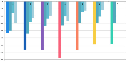
With that in mind, let’s look at the rate of change from one point to another: the peak of season A to the peak of season B. They’re floating so you can see better how the drop from one affected the next.

After S1, 31% of the audience dropped VLD. Of the remainder, 20% quit after S2; after S3, a further 20% didn’t come back for S4. This is where you can see S4's damage: 28% didn’t come back for S5. All told, between S1 and S5, 68% of the viewers quit the show. If VLD had been a Netflix original, S5 would have been its last season.
But thanks to marketing or hype, 17% of those lost viewers returned for S6, which in turn influenced the return of 22% more viewers for S7. None of the other shows had a mid-series rise, let alone a second increase. Viewership hasn’t caught back up to the levels after S2, though, but if I were to say any point turned around the sinking ship, it’s clearly S6.
It’s too soon to say whether S7 will take that further, or if S7 is just holding onto the lead S6 put in place. We won’t really know that until S8.
weekly rate of change to see patterns
Some of the seasons peaked on the 2nd or 3rd day, so I started from that point; starting on the release date (with lower numbers) would camouflage that peak and defeat the purpose of this comparison. The question here is: can we see a pattern in viewership engagement over the first month after a release?
With rate of change, the smaller the drop, the lower the difference. Frex, look at the 3rd and 4th weeks of S5. The difference between weeks 3 & 4, and weeks 4 & 5, is only 1%. That means the engagement level was dropping at a steady rate across those weeks.
Now you can see the real damage: S4. Basically, a week after S4′s release, 78% of the audience checked out. Next to that, S5 regains a tiny bit of ground, and S6 increased that. So far, S7 is holding steady with S6.
Again, S7 hasn’t lost ground, but it hasn’t really gained, either.
pre- and post-season context: measuring hype
What none of these graphs show, so far, is the context of each season. For that, we need to look across all the seasons. Again to reduce the noise (but not so much it’s flattened), I’ve collected days into weeks, starting on friday, ending the following thursday. The release week is marked with that season’s color.

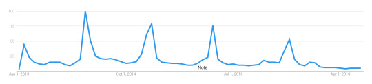
I know it’s kinda hard to see, here, sorry. To throw in a different dataset for a moment, here’s a simple track of all searches for ‘voltron legendary defender’ from May 2018 to now.
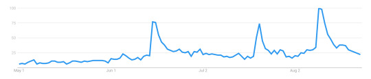
This pattern echoes across several other datasets, btw. There’s a spike for S6, which never entirely drops off, and then we get a second spike for the premiere at SDCC. (Which is also the first time a between-season premiere has skyrocketed like that.) After SDCC, the base level stays high.
In other words, does S7 appear as a larger spike because it began from a higher base rate? How do we compare season-to-season, when one starts at a radically elevated position compared to the rest?
The question became how to untangle hype from viewer reaction to the season. Here’s the viewership levels for S5, S6, and S7, again consolidated into weeks.

After S5, things dropped pretty low. A week before S6, reviews, a trailer, and some wacky marketing hijinks lured a lot of people back in. Two things happened between S6 and S7 that are worth noting.
The first, two weeks after S6, was the announcement that Shiro was no longer a paladin, and his link with Black had been severed. This weekly graph blurs the details slightly, but the drop you see in the next two light-gray columns actually starts the day after that announcement.
The second gray bar is SDCC, where S7E1 premiered. In the gap between then and the week before release, the levels drop back to the new (higher) baseline. Excitement was high, propelling audience engagement. If hype is meant to increase engagement, and these datasets are capturing the same thing to some basic degree, there’s a value in what the pre-season week and post-season week could be telling us.
the narrative in the data
If the week-prior is high, it means audiences are engaged due to pre-season marketing, trailers, rumors, and reviews. If the week-after is high, it means audiences are excited and engaging directly with the show itself. In other words, you could say week-prior measures how much people are buzzing or getting ready, and week-after measures how much they’re re-watching or encouraging others to watch.
For S1 and S2, the week-prior was really low. After S1 there was a splash in October, but not big enough to keep energy up through to S2. Both S1 and S2 had much higher week-after rates. The simplest reason would be that people who’d seen the season were now talking about it and raising buzz on their own, thus propelling further engagement.
Until S7, S3 had the highest week-prior engagement --- and the first time there was a drop, comparatively, in the week-after. S4 follows that trend, with a much larger drop. S5′s before and after are close to equal, which to me says that whatever excitement was ginned up prior, the season didn’t have much of an impact one way or another. It feels almost apathetic, actually.
S6 reverses the trend; people went into it barely more excited than they had been after finishing S5, but for the first time since S2, there was a post-release rise. Audiences were engaged again. Even with the drop from the post-season news, it wasn’t so far SDCC couldn’t rocket it back up again. But if you look at the graph above for S7, once again there’s a slight drop in the week-after.
Given the level of week-prior excitement (especially with the SDCC spike still fresh in people’s minds), the lack of post-season buzz is noticeable.
To get a better look, I’ve isolated the rate of change for each season, comparing week-prior and week-after. S1 and S2 had such extreme amounts (744% and 156% increases, respectively) that it torqued the entire graph. I’ve left them off so we can focus on S3 through S7.

After S3, engagement dropped by 9%, indicating a less-enthused audience after seeing the season. S4 went further, dropping by 27%. S5 managed a small increase of 4%, and S6 increased engagement by 18%.
S7 has a 2% drop. Not as bad as S3′s, but nowhere near the huge spike we should’ve seen, had the pre-season hype been borne out in the season itself. That excitement didn’t quite pop like S4; it’s more like a slow leak.
comparing across datasets
One more thing before I wrap up this first post. Google’s data is on the left, and Wikipedia’s dataset is on the right, with the weeks marked that include the actual release date. (I did this in excel so the images don’t line up quite right, but hopefully it’s good enough to illustrate.)

With Wikipedia’s daily values added in a Fri-to-Thu week group, there’s only one week before a strong drop. With the Google calendar-style (Sun to Sat), S7′s second week goes even higher, and the drop is steep.
In the Google numbers, 2/7ths of the green bar is ‘now showing on Netflix,’ and the remaining 5/7ths is the hype-based engagement levels. The same goes for the week following, which in google’s dataset is even higher; 5/7ths of that, plus the last 2 days of the week before, equal the S7 green bar on the Wikipedia dataset, on the right.
And that means there was enough traffic in five days to propel an entire week to even higher than the week that contained the first two days of the season (which usually loom over all others by a noticeable degree). It’s even more remarkable when you look at the Wikipedia dataset, which is arranged to run from Friday to the following Thursday -- and which does have a drop-off.
I’ll be tapping a few more datasets to unpack this anomaly, in my next post. I’ll warn you now, they paint a very different picture of S7.
part 2 can be found here
77 notes
·
View notes