#microinteractions
Explore tagged Tumblr posts
Text
Ghibli Isn’t Just a Vibe—It’s a UX Principle
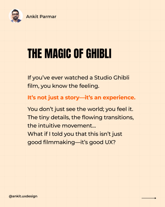
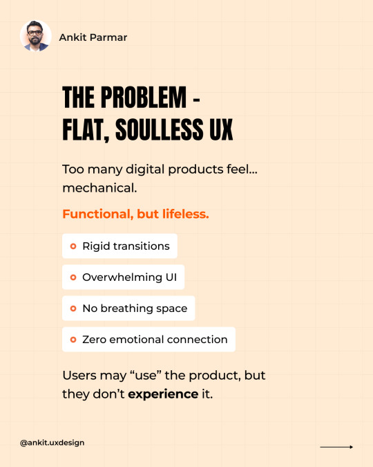
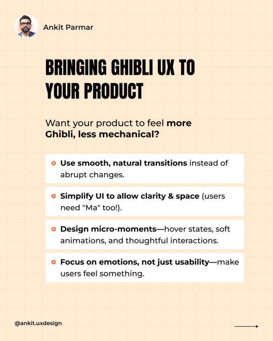
Ever watched a Studio Ghibli film and felt completely immersed? It’s not just the art—it’s the way the world moves, breathes, and flows. Now, imagine if your product’s UX felt the same way. Too many digital experiences feel... mechanical. They work, but they don’t feel. 🛑 Rigid transitions 🛑 Overloaded UIs 🛑 No breathing space 🛑 Zero emotional connection Users use them, but they don’t experience them. Ghibli teaches us a better way: ✅ Microinteractions – Subtle, natural movements that make UX feel alive. ✅ "Ma" (Negative Space) – The power of pauses, clarity, and letting designs breathe. ✅ Seamless Flow – Effortless navigation, like a perfectly told story. ✅ Emotional Connection – Because great UX isn’t just functional—it feels right. Want your product to feel more Ghibli, less robotic? 🔹 Use smooth, natural transitions instead of jarring shifts. 🔹 Let UI breathe—simplicity beats clutter. 🔹 Design for micro-moments—hover states, animations, thoughtful interactions. 🔹 Make users feel something, not just complete tasks. Because UX isn’t just about usability—it’s about experience. Have you ever used a product that felt like a Ghibli-level experience? Drop your thoughts below! ⬇️

2 notes
·
View notes
Text
The Evolution of Motion UI: Enhancing User Engagement with Microinteractions
0 notes
Text
Motion That Moves You | By Lollypop Design Studio 🎨
Design isn't just what you see. It's what you feel. At Lollypop Design Studio, we breathe life into digital interfaces through motion, emotion, and purpose-driven design.
This snippet showcases our latest work — a mobile-first experience enhanced by subtle, delightful micro-interactions that guide the user and amplify brand identity. Every swipe, bounce, and fade is crafted to keep users engaged and moving forward.
💡 What We Focused On ✔️ Human-centered design ✔️ Smooth, strategic transitions ✔️ Visual hierarchy through motion ✔️ Brand-consistent experience
🧠 Design that converts. Motion that matters. We don't just design screens — we create moments.
🔗 Want to elevate your digital product? Visit us → www.lollypop.design 📩 Let’s chat → [email protected]
For more, visit our site: https://lollypop.design/
Check out our Projects: https://lollypop.design/projects/
Get a free consultation: https://lollypop.design/project-enquiry/
#ui ux company#ui ux design#uidesign#ui ux development services#web development#web design#motion design#microinteractions#mobile ui design#LollypopDesignStudio#creative design#designinspiration#product design#digitalexperience#tumblr design
1 note
·
View note
Text
Tiny Touches, Big Impact: Microinteractions in Healthcare Apps – 2025
The smallest details often create the biggest user experience wins. In 2025, microinteractions—like button animations, subtle feedback, and gesture-based responses—are redefining how users engage with healthcare apps. Want to learn how these micro-moments can boost trust, clarity, and user satisfaction? 👉 Explore the blog here
🚀 Build intuitive healthcare apps with the perfect UI/UX strategy. 🌐 Visit us: www.naskay.in 📩 Email: [email protected]
#healthcare#artificial intelligence#health and wellness#microinteractions#uxuidesign#mobile app development
0 notes
Text
Making Healthcare Apps Feel Human with Microinteractions

The future of healthcare is digital, but that doesn't mean it should feel cold. Microinteractions breathe life into healthcare apps, offering warmth and clarity through minimal design touches.
Employing microinteractions in healthcare apps can make users feel heard and cared for. A soft animation when sending a symptom report or a slight vibration when saving health information indicates that the app is paying attention.
These seemingly insignificant features can propel significant gains in user satisfaction and compliance.
Checkout this blog to learn more!
1 note
·
View note
Text

Rando Loops: Optimized Experience & Animations Update
#Rando Loops#UI Design#UX Design#Motion UI#Interface Animation#Smooth Interactions#App Update#Design Evolution#Playful UI#Mobile UI#Game Design#Dribbble#Creative Process#UX UI#App Experience#Interaction Design#Digital Product#Visual Design#Microinteractions#Mockup#Case Study Coming Soon
0 notes
Text
🎨 Ready to flex your web design skills? It’s quiz time! Put your knowledge to the test and see if you’ve got what it takes to be the ultimate design pro! 🖥️💡
What is a current trend in web design for enhancing user engagement in 2024?
A) Overuse of text-heavy pages B) Incorporation of dynamic animations and micro-interactions C) Ignoring accessibility guidelines D) Limited use of multimedia content . . ➡️For more information, please visit our website: https://zoofinc.com/ ➡Your Success Story Begins Here. Let's Grow Your Business with us!
👉Do not forget to share with someone whom it is needed. 👉Let us know your opinion in the comment down below 👉Follow @ZoofSoftwareSolutions for more information . . ✔️Feel free to ask any query at [email protected] ✔️For more detail visit: https://zoof.co.in/ . . .
#WebDesignTrends#UserEngagement#DynamicAnimations#MicroInteractions#ModernWebDesign#2024DesignTrends#UXDesign#InteractiveDesign#CreativeWebDesign#Devopsservices#WebappSoftwareDevelopment#BestITservice#ZoofUnitedStates#ZoofIndia#SoftwareCompany#StartUpTechnology#Mobilefriendlywebsite#TechnologyConsulting#GrowBusiness#WebsiteDevelopment#SoftwareConsultant#ZoofSoftwareSolutions#Zoof#Zoofinc#MobileAppDevelopment#AwardWinningCompany#BestSoftwareCompany#digitalmarketingtips
0 notes
Text
Looking for ways to enhance user experience on your website? 🖥️ Microinteractions are the small, subtle animations and feedback that make a big difference in how users interact with digital interfaces.
Explore how these details can transform your site in this insightful article on the Benefits of Using Microinteractions in Web Design
0 notes
Text
Advanced Webflow Animations to Wow Your Audience

In the ever-evolving world of web design, Webflow has emerged as a powerful tool that empowers designers to create visually stunning websites without needing to dive deep into coding. However, to truly captivate your audience and leave a lasting impression, advanced animations within Webflow are essential. These animations not only enhance user experience but also keep visitors engaged, increasing the likelihood of conversions. In this article, we delve into the intricacies of Webflow animations, exploring advanced techniques that will help you create dynamic, interactive websites that stand out in the digital landscape.
Why Advanced Webflow Animations Matter
Advanced animations in Webflow are more than just visual flair—they are a crucial part of the user experience. Micro-interactions, scroll-triggered animations, and page transitions can guide users through your content seamlessly, making navigation intuitive and engaging. In a world where users have limited attention spans, these animations can be the difference between a bounce and a conversion.
Key Components of Advanced Webflow Animations
1. Micro-Interactions for Enhanced User Experience
Micro-interactions are subtle, often overlooked, but they play a significant role in creating an intuitive user interface. These small animations occur in response to user actions—like hovering over a button or filling out a form field. They provide immediate feedback, making the user experience feel smooth and responsive.
In Webflow, you can create micro-interactions using the Interaction panel. By setting triggers such as hover, click, or scroll, you can design animations that respond to user input, making your site feel alive and interactive.
2. Scroll-Triggered Animations
Scroll-triggered animations are a powerful way to reveal content as users scroll through your site. These animations can range from simple fades and slides to complex sequences that build a story as the user progresses down the page.
In Webflow, scroll animations are set up by creating scroll triggers that activate at specific points as the user moves down the page. This method is particularly effective for storytelling websites, portfolios, or product showcases where revealing content in stages enhances the overall narrative.
3. Parallax Effects for Depth and Movement
Parallax scrolling creates a 3D effect as the background moves at a different speed than the foreground, adding depth and movement to your site. This technique can be used to create a sense of immersion, drawing users deeper into your content.
Webflow allows for easy implementation of parallax effects through the Interactions panel. By adjusting the movement of elements based on scroll position, you can create visually striking effects that make your site stand out.
4. Page Transitions for Seamless Navigation
Page transitions help maintain a cohesive user experience as visitors navigate through different sections of your website. Smooth transitions between pages can reduce cognitive load and make the site feel more polished and professional.
Webflow provides the tools to create custom page transitions, whether it’s a fade, slide, or more complex animations. By utilizing these transitions, you can maintain user engagement and prevent jarring changes that might disrupt the user experience.
5. Dynamic Content Animations
For websites with constantly changing content, such as blogs or e-commerce sites, dynamic content animations can make a significant impact. These animations can be applied to content that is pulled from a CMS, ensuring that new content appears with style and consistency.
Webflow’s CMS integration allows you to animate dynamic content easily. Whether you’re highlighting new blog posts, showcasing products, or updating portfolio pieces, dynamic content animations ensure that your site remains fresh and engaging.
Best Practices for Implementing Webflow Animations
1. Keep Performance in Mind
While animations are visually appealing, they can also impact site performance if not implemented correctly. Ensure that your animations do not cause lag or delay in loading times. Use Webflow’s performance tools to optimize your animations, compress assets, and test loading times to ensure a smooth user experience.
2. Consistency is Key
Maintain a consistent animation style throughout your website. This includes using similar motion paths, easing functions, and timing. Consistency helps in creating a cohesive user experience and ensures that animations feel natural and intentional.
3. Prioritize Accessibility
The user experience should be improved by animations, not hindered.Always consider accessibility when designing animations. Provide options for users to disable animations if they cause discomfort, and ensure that your animations do not interfere with screen readers or other assistive technologies.
Inspiration and Resources for Advanced Animations
To take your Webflow animations to the next level, it’s important to draw inspiration from various sources. The Webflow showcase is a great place to start, as it features projects from top designers who are pushing the boundaries of what’s possible in Webflow. Additionally, consider exploring platforms like Dribbble and Behance for innovative animation ideas.
Conclusion
Advanced animations in Webflow are more than just a trend—they are a powerful tool to elevate your website, engage your audience, and drive conversions. By mastering techniques such as micro-interactions, scroll-triggered animations, parallax effects, and page transitions, you can create a website that not only looks stunning but also delivers a seamless, immersive user experience.
Whether you’re designing a portfolio, an e-commerce site, or a blog, implementing these advanced animations will set your website apart from the competition. Remember, the key is to strike a balance between aesthetics and performance, ensuring that your animations enhance the user experience without compromising on speed or accessibility.
Website Here:- https://intorque.com/webflow-development/
#Webflow#AdvancedAnimations#WebDesign#MicroInteractions#ScrollAnimations#ParallaxEffects#PageTransitions#UserExperience#DynamicContent#WebDevelopment#Accessibility#CMSIntegration#StorytellingWebsites#EcommerceSites#InteractiveWebsites#ImmersiveExperience
0 notes
Text
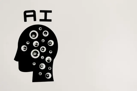
Unleash Your AI Potential with No-Code Tools
#nocode#lowcode#ux#digitaltransformation#pearljam#appdesign#graphicdesign#aftereffects#branding#motionuidesign#loopanimation#motiondesign#brandidentity#animate#microinteractions#vectorgraphics#svganimation#svgator#illustration#animation#webanimation#software#appdevelopment#webdesign#mobileapps#lyonnais#paidopartnership#lyonnaise#svg#svgatorxtwine
0 notes
Text
"Revolutionize Your Website in 2024: UX/UI Design Tips for an Exceptional User Experience"

Introduction: In the fast-paced digital landscape of 2024, user experience (UX) and user interface (UI) design play a pivotal role in determining the success of a website. As users become more discerning and technology continues to evolve, it's essential for web designers to stay ahead of the curve. This article will explore the latest trends and provide actionable tips to enhance your website's UX/UI design for an unparalleled user experience. (Read More)
01.Mobile-First Design:

With the majority of internet users accessing websites through mobile devices, adopting a mobile-first design approach is crucial. Ensure that your website is responsive, with a design that seamlessly adapts to various screen sizes. Prioritize mobile usability and functionality to create a consistent and enjoyable experience for users on the go. (Read More)
02.Dark Mode for Eye Comfort:

In 2024, dark mode has become more than just a trend – it's a user preference. Incorporating a dark mode option not only adds a touch of modernity but also reduces eye strain, especially during prolonged periods of screen time. Provide users with the flexibility to choose between light and dark modes for a personalized browsing experience. (Read More)
03.Microinteractions for Engagement:
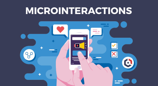
Microinteractions are subtle animations or design elements that respond to user actions, providing feedback and enhancing overall engagement. From button animations to loading indicators, incorporating microinteractions can make your website feel more dynamic and responsive, creating a delightful user experience. (Read More)
04.Voice User Interface (VUI):
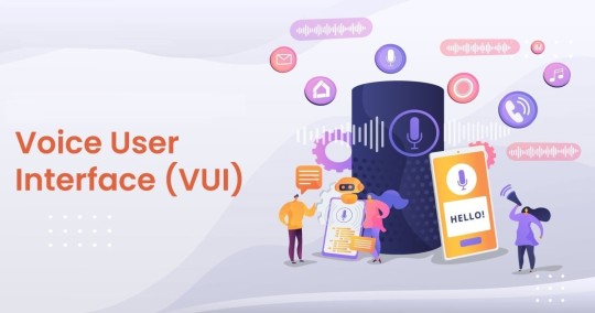
With the rise of voice-activated devices, integrating Voice User Interface (VUI) elements into your website can enhance accessibility and convenience. Consider implementing voice commands for search, navigation, or other functionalities to cater to users who prefer hands-free interactions. (Read More)
05.Personalization and AI:
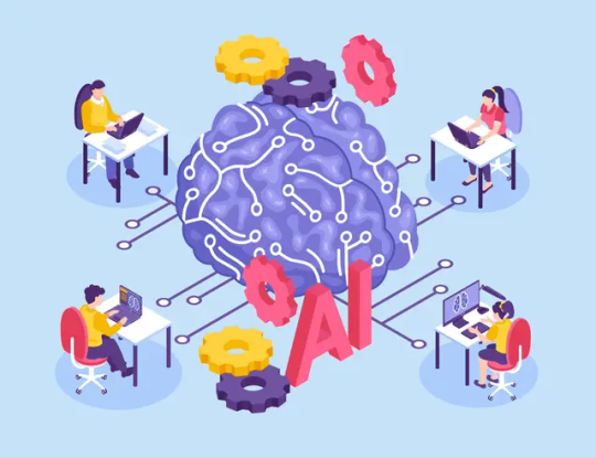
Leverage the power of artificial intelligence (AI) to personalize user experiences. Utilize data-driven insights to understand user behavior and preferences, offering personalized recommendations and content. Tailoring the user journey based on individual interests can significantly improve user satisfaction and engagement. (Read More)
06.Accessibility Matters:
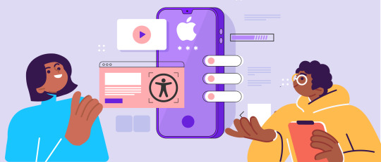
Make your website inclusive by prioritizing accessibility features. Ensure that your design is compatible with screen readers, includes alt text for images, and follows accessibility standards such as WCAG (Web Content Accessibility Guidelines). An accessible website not only broadens your audience but also aligns with ethical design principles. (Read More)
07.Faster Loading Times:

In the age of instant gratification, users expect websites to load quickly. Optimize images, minimize HTTP requests, and utilize content delivery networks (CDNs) to reduce loading times. A fast-loading website not only improves user experience but also positively influences search engine rankings. (Read More)
08. Simplified Navigation:

Streamline your website's navigation to guide users seamlessly through the content. Implement clear and intuitive menus, use breadcrumbs, and strategically place calls-to-action to help users find what they're looking for without frustration. A well-organized navigation structure enhances usability and overall satisfaction. (Read More)
Conclusion:
In the dynamic landscape of web design in 2024, prioritizing user experience and user interface design is non-negotiable. By adopting mobile-first strategies, incorporating dark mode, embracing microinteractions, integrating voice user interfaces, personalizing experiences with AI, ensuring accessibility, optimizing loading times, and simplifying navigation, your website can stand out in delivering a top-notch user experience. Stay ahead of the curve, adapt to emerging trends, and continually iterate to provide your users with an exceptional online journey.
Visit Our Website: www.impulsion.in
#UXDesign#UIDesign#WebDesignTrends#MobileFirst#DarkMode#Microinteractions#VoiceUI#Personalization#Accessibility#FastLoading#SimplifiedNavigation#WebDevelopment#AIinDesign#DigitalExperience#UserCentricDesign#WebAccessibility#TechTrends#InclusiveDesign#ResponsiveDesign#DesignThinking
0 notes
Text
Interesting UI/UX trends to look out for in 2024
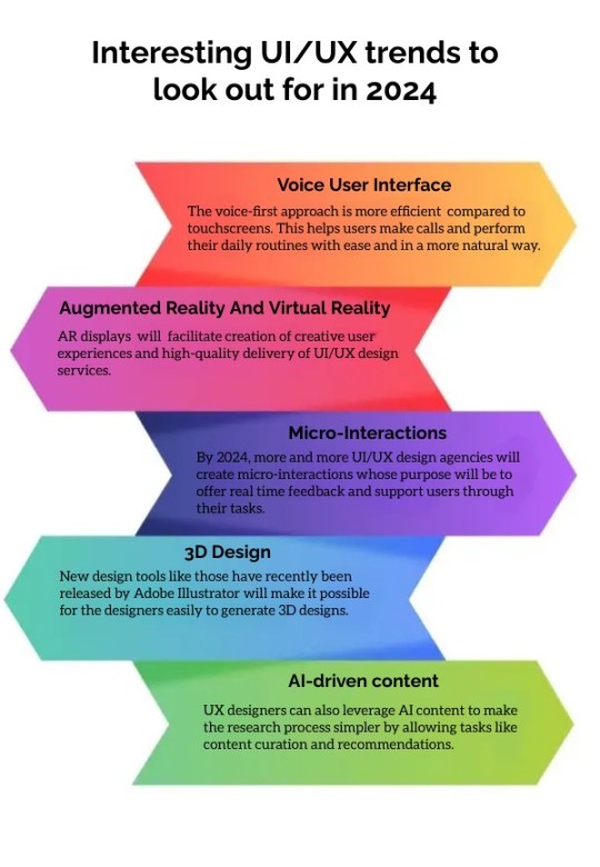
In this exploration, we delve into the exciting and innovative UI/UX trends that are set to shape the digital landscape in 2024, paving the way for enhanced user engagement, seamless interactions, and a more visually captivating and user-centric digital experience.
#VoiceUX#3DUI#Microinteractions#ARUX#AdobeIllustrator#bestGraphicdesignCompanyinCoimbatore#UI/UX#UI/UXtrendsin2024
0 notes
Text
The Art of Visual Storytelling: Exploring Threads Multimedia Microblogging
Visual narrating is an amazing asset that empowers us to convey feelings, share encounters, and spellbind crowds. With the ascent of web-based entertainment and microblogging stages, the speciality of visual narrating has become the overwhelming focus. Media microblogging stage created by Meta Stages, engages clients to recount their accounts through a blend of pictures, recordings, and text. In…

View On WordPress
#CreativeExpression#DigitalArtistry#DigitalStoryteller#DigitalStorytelling#Microinteractions#MultimediaMicroblogging#OnlineNarratives#ThreadsMicroblogging#VisualContent#VisualStorytelling
0 notes
Text
Top 5 UI/UX trends in website development for 2023
In the rapidly evolving digital landscape, user experience (UX) and user interface (UI) design play a crucial role in the success of a website. Staying up-to-date with the latest UI/UX trends is essential for businesses to deliver exceptional online experiences and engage their target audience. In this blog post, we will explore the top five UI/UX trends that will shape website development in 2023. Discover how RPlus can help you incorporate these trends into your website design and elevate your online presence.
Dark Mode:
Dark mode has gained immense popularity and is expected to continue as a dominant trend in 2023. It not only enhances the visual appeal of a website but also improves readability, reduces eye strain, and saves device battery life. Implementing dark mode can create a sleek and modern user interface that appeals to users across various industries.
Microinteractions:
Microinteractions are small, subtle animations or feedback that provide users with an engaging and intuitive experience. From button hover effects to loading animations, microinteractions add depth and interactivity to the user interface. They can enhance usability, guide users through the website, and create a delightful user experience.
Voice User Interface (VUI):
With the rise of voice assistants and smart devices, integrating voice user interfaces into websites is becoming increasingly important. VUI allows users to interact with a website using voice commands, making navigation and information retrieval more convenient. Incorporating voice search and voice-guided interactions can significantly enhance the user experience and cater to the growing demand for hands-free browsing.
Minimalism and White Space:
Minimalistic design and ample white space continue to be popular trends in website development. Clean layouts, simplified navigation, and generous white space create a visually pleasing interface that promotes focus and clarity. Minimalistic design not only provides a modern aesthetic but also improves usability and enables users to find information quickly.
Augmented Reality (AR) and Virtual Reality (VR):
AR and VR technologies are revolutionizing the way users interact with websites. These immersive experiences allow users to visualize products, explore virtual spaces, and engage with content in a more interactive and dynamic way. Implementing AR and VR elements can create memorable experiences, enhance product demonstrations, and increase user engagement.
As website development evolves, incorporating the latest UI/UX trends is crucial to stay ahead of the competition and deliver exceptional user experiences. Embracing trends such as dark mode, microinteractions, voice user interface, minimalism, and AR/VR can transform your website into a highly engaging and user-friendly platform. Partner with RPlus to bring these trends to life and create a captivating online presence that captivates your audience.
Ready to implement the top UI/UX trends into your website? Contact RPlus today and let our expert team help you elevate your online presence. Stay ahead of the curve and provide exceptional user experiences with our innovative website development solutions. Partner with RPlus and unlock the true potential of your digital presence.
#rplus#UIUXtrends#WebDevelopment#WebsiteDesign#UserExperience#UserInterface#DarkMode#Microinteractions#VoiceUI#AR#VR#DigitalPresence#OnlineExperience
0 notes
Text


True Detective 1x03 The Locked Room
#true detective#rust cohle#rustin cohle#marty hart#kind of obsessed with this microinteraction#like Marty starts pouring it without asking and he for sure knows it's gonna get turned down??#then dumping it back super passive aggressively#and its not in the gifs but the girl also seems to notice this exchange and looks uncomfortable for a sec#like that was all so unnecessary whats his problem#also rust looks so awkward and uncomfortable in this whole scene ahhhhhhh
202 notes
·
View notes
