#mdes comics and graphic novels
Explore tagged Tumblr posts
Photo
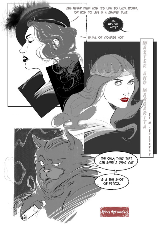
My first take on Master and Margarita characters (essentially, just Margarita and Behemot cat) and some lettering. It’s the first time I’ve drawn a cat in a really-really long time, I must admit. Personally, I wasn’t very happy with my current black ink technique: I spend way too much time on some secondary lines, which end up as a complete mess sometimes. So, I decided to go for the grey scale this time and see how this works for me (I quite liked this technique, to be fair). I as well go for a comic in a grey scale in the first semester, just to save time and improve on the drawing more complicated scenarios.
13 notes
·
View notes
Photo


Poster designs for an assignment from the Comics Production module at the University of Dundee (MDes in Comics and Graphic Novels)
Goal was to create a poster for a comics company that is releasing a new App, hence all the outward-facing blank screens (to feature comic titles)
#comic art#comics#poster desigh#poster#illustration#psychadelic#digital art#photoshop#photoshop practice#mdes comics and graphic novels#university of dunde#comichaus
4 notes
·
View notes
Text
Dundee Comics Masters students work on live project with the Beano
Dundee Comics Masters students work on live project with the Beano
Students studying on the MDes in Comics & Graphic Novels programme at the University of Dundee have been working with the comic team on the Beano to produce art based on scripts featuring classic characters such as The Bash Street Kids, Bananaman and Minnie the Minx.
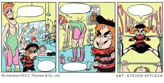
Art by Steven Affleck
The project is part of the Comics Production module, and fulfils the ‘live’ brief aspect of the…
View On WordPress
#Beano#Creating Comics#DC Thomson Media#John Anderson#Leon Strachan#Minnie the Minx#Phillip Vaughan#Professor Chris Murray#The Bash Street Kids
2 notes
·
View notes
Text
Reflection on Comics Production
As a MLitt student, taking the Comics Production module was a challenging yet meaningful experience. For starters, I have never learned how to draw nor how to use visual editing tools. I did not take the Creating Comics module in the previous semester nor any course on scriptwriting. In other words, I am just a beginner to the comic scene. Therefore, I was thrilled when the module started.
On the first day of the semester, we were given the task to write our own script entry for a 2000AD competition. I did not expect the first thing I do for this class was to produce a story independently, with no prior sessions on how comic scripts work or how to write a comic story. Upon learning about the project, my classmates started to discuss on their ideas right away while I was still worrying about how to make a story. Taking the direction of science fiction, I began to look for inspiration…
Back in December, I went to Denmark and visited a science fiction exhibition in the Brandts, an art museum in Odense. The exhibition content was richer than I thought, ranging from the themes of dinosaur, earth’s core, under the sea, space, Egypt myth, alien, cyborg, superhero, utopia/dystopia, etc. It showcased re-imagined props, models, landscape designs, books, and movie clips. I found them intriguing and useful for brainstorming and visualizing some early ideas for the comic. The exhibition showed how much potential the science fiction genre can offer to widen the scope of storytelling. I really like the idea of robots are evolving and blending in our lives. It makes me question the difference between humans and machines. I decided to include robotic characters that disguise as humans in the story.

Picture from The Painted Skin (2008).

Picture of K/DA Ahri from League of Legends by Riot Games.
I had the idea of modernizing a Chinese folktale, The Painted Skin, as a monster disguises herself as a beautiful woman to lure men and rip their hearts out as her meals to maintain her façade. Similarly, Ahri, a character from my favourite game League of Legends, is a nine-tailed fox from the Asian folklore who also has to absorb human essence in order to stay in her mortal form. In the game’s alternate universe, Ahri is part of a virtual music group “K/DA” made by Riot Games to promote a set of in-game skins. I was hoping to create an intergalactic band like the “K/DA” that travels across the planets to perform, but they are actually robots that have been sucking out the happiness from their audience to become more like humans.
Whenever they perform live, their music would absorb the enthusiasm from the crowd, leaving them depressed and lifeless. However, their music is not strong enough to manipulate strong and deep emotions. As a literature student, I believe that only humans are capable of writing literary pieces that can truly move the others. Therefore, I introduced a poet as the main protagonist who goes around with his poems. One day, a band member took the poet’s collection and decided to turn his poem into a song. In the end, when the band performed it, the song was so genuine and powerful that it drove the audience crazy and killing themselves. This would grant the robots so much “human energy”.
In mid-February, Monty dropped by the studio to give the class some advice on the project. I showed him the synopsis and he pointed out that the protagonist does not really have a motive. He suggested me to write more about the poet and his active investigation into the band. He explained this would allow the readers to attach and follow the poet around to participate in the discovery of the truth together. By the time the secret is revealed, it will have a bigger impact.
However, I could not think of any legitimate reason for a poet to wander around the band to do investigation. And I do not have any poetic verse on my mind to put into the lyrics to show how “powerful” these poems are. Therefore, I realized this character is not suitable for my comic anymore. I changed his character to a detective which I believe it has a more reasonable motive to get suspicious over the band and can carry out some form of investigation.
I amended the synopsis to the following:
“Following a detective who connects the mystery of increasing depression rate to the intergalactic music band Soulstealers, he investigates before the band is going to perform on his planet. During his talk with the band members, he leaves his poetry collection to them as they are interested in it. After a surreal experience at the concert, he is diagnosed with depression as well.
“At the clinic, he is told an ancient folktale of the Painted Skin, where a monstrous creature had to consume human hearts to maintain its disguise as a beautiful woman. He becomes determined that the band is going to threaten the galaxy with their music, but no one believes in him.
“The band releases a new song in the final planet of their tour which results in a mass suicide of the audience. The members are impressed with the effect of the new song as they acknowledged the poetry collection as their inspiration to produce music that can suck out the most human emotions possible. Unzipping their skins in the backstage, they reveal themselves as robots, who are trying to become humans.”
As my plot was becoming a sound story, I began to work on the scriptwriting and drawing thumbnails. I honestly had no idea on how to start writing a script and what a thumbnail is. All I knew about script is the Courier font. I felt helpless – there was no workshops or lessons on planning out a story or putting pen to paper. In a desperate move, I decided I would try to learn them by myself. I went to the library to look for books on writing comic scripts. I found a book by Peter David called Writing for Comics & Graphic Novels which I thought would be perfect to helping me out!
In the book, I have learned about the Marvel style and the full script style. I have learnt that the speech balloons are mostly kept “anchored” (148). When naming the characters, the book suggests linking up words associated to the characters, to find some cultural references related to these traits and to create some social scenarios to build up their personalities (on how they would react). I named the two of the band members Maria and HALi, which are references to Maria the robot from Metropolis (1927) and the HAL the computer from 2001: A Space Odyssey (1968).
Following the guidelines, I wrote the first page for my comic and doodled some thumbnails alongside with dialogues, so I could pair them with the right amount of words in each panel:
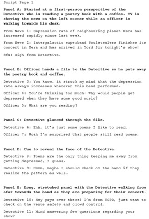

In mid-March, the class had a meeting at the studio where we got the chance to let our instructor, Phil, to check on our works. Besides approving my story, Phil commented that the formatting of my script was not very common as I named each panel by alphabetical order like the book did. Therefore, I updated the script in the correct format and started to draw the thumbnails properly. With the rundown of the story in mind, I drew the thumbnails, then updated my script on top of that. In this way, I could make sure each panel can include the right amount of information.
When visualizing the idea, I took inspiration from a newly-released Netflix sci-fi anthology – Love, Death + Robots. In one of the episodes, Good Hunting, it involves a nine-tailed fox/ “huli jing” (wicked fox lady in Chinese). The setting is in a steampunk colonial Hong Kong, which is my hometown. In the end, the fox lady infused her ancient magic with modern technology and became a robotic nine-tailed fox to hunt men. This is a perfect source for my story as it also references to the fox folktale and having charming performers revealing themselves as robots. I just thought the episode is stunning and amazing and see so much potential in my story as well.

Picture from Good Hunting in Love, Death + Robots (2019).
My classmate, Thanos, told me he would scan his hand-drawn thumbnails and edit them on Photoshop. I do not know how to edit drawn images on Photoshop. Therefore, I used the Comic Life 3 software that my professor has recommended me, to make my own framing for the panels. I printed the frames out, and drew on top of it by hand, then scanned them in again to become my final thumbnails. I have also shown my thumbnails to the MDes students, to see if they could understand my instruction through an artist’s perspective. Tony gave me some suggestions on the speech balloon placements and reading orders.
After updating the script, I have sent my work to my fellow MLitt students in the course, so we could cross-check each other’s work and exchange feedback. One of the advices from Thanos was to add a defining font for the band in the comic so to act as a branding and leaving visual hints of their robotic natures. Story-wise, they told me to add more clues, foreshadowing and explanation that the band has to consume human emotions gathered from their live performances. In terms of writing, Holly suggested me to proofread on my grammar as I sometimes describe the scene with present tense but sometimes with past tense.
After receiving feedback from my classmates, I moved on to finalizing my script. I ran through my work to Cam Kennedy when he dropped by the studio. I was so glad and relieved when he said that my story was well-presented. Encouraged by his words, I referenced the formats of my classmates and did one last amendment to the script and added the synopsis in the cover.
Looking back on the project, I am quite satisfied with what I wrote, given that this is my first time writing a comic script. When writing for each panel, I just knew how much contents to include. I realized that this could be a difficult step as my fellow classmate Holly had to cut down some exposition. I think this might be something that I am good at and should focus on improving this skill as my strength. On the other hand, character design, formatting and grammar are something that I should pay more attention to. I am grateful for Monty’s advice about the character’s motive and Holly’s help on proofreading the grammar of my writing. I wish I could have spent more time researching for comic scripts in the archive so to catch up with the script formats.
The second project in the module began as we were invited to the V&A Dundee during the second week of the semester. The class visited the V&A exhibition together and I felt like we were on a field trip which was very fun. Until we were told to make our own webcomic for the V&A website, in which they did not provide any “MLitt exception” like the scriptwriting option for the 2000AD project. I was devastated and felt helpless once again. I suggested to write an article by interviewing my class when they are producing their webcomics. Chris then suggested: “how about you make a comic on making the comics!” Phil also suggested that I can incorporate real life photos with the comics by visual editing tools. I began to ask my MDes classmates if they would be willing to help me to do some extra drawings and interviews.
A week later, the V&A Dundee staff came to listen to our ideas. My idea was to interview my classmates on making their webcomics at different stages of the project. When I told them my plan, it sounded very vague because I did not have any visual support to visualize the comic. Phil told me about a software called Comic Life which provides templates and visual aids for making a comic. The V&A staff reminded me to make the contents accessible to everyone – by explaining the context of the project and using easier phrases instead of comic jargons. After that, I tried out the programme and made the decision of making four issues of comics consisting of four panels each.
In order to give a sense of what it would look like, I mocked up two issues for the presentation. I edited my personal photos and placed them on some photos I have taken at the V&A and the DJCAD studio as the background. I wanted the photos to look like they were “drawn” so I processed them with different filters. Here are some slides I have presented:


After getting the approval and some advice for the presentation, I began to have small talks with my classmates and checking on them in the studio. I tried to take notes of who has material that is suitable for each of the issues, hence allocating them in different issues and reaching out to ask them for one piece of cartoon-style portrait of themselves. I was a bit worried if they would reject me since this means taking some of their extra time to draw and interview for me. Luckily, they were all on board and excited to see the idea comes to life.
I dropped by the studio for a week after the class is done with the 2000AD project so I could interview my classmates and took photos of their working areas. One of the difficulties for me was paraphrasing my classmates’ answers as I did not want to fill the whole panel with words without stripping away the gist of their words. I was worried about not following the unspoken rule of keeping each bubble under 25 words. However, I realized that the nature of this comic is more like a comic essay, so it makes sense to have more words.
The rest of my work was rather simple: I just had to wait for my classmates to submit their drawings to me, process their works and edited them to match the composition of each panel. I decided to unify the colour format of the comic to orange and blue which was inspired by the V&A Dundee website’s colour scheme.
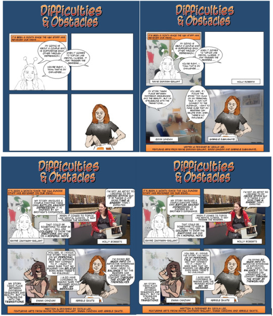
When the V&A staff came by the studio for a final checking, they told me to amend the branding by using the full title of “V&A Dundee.” Phil asked me to adjust the speech bubbles so the words would not get so close to the edges. I tried to change the shape of the bubbles from circles to squares and changed the font from “Antihero Intl BB” to “Digital Strip.” By doing so, the gaps in the bubbles were widen while not covering up too much space of the overall panels. However, during the final presentation, Phil reminded me that this issue was still very visible and told me to use Photoshop to edit the lettering properly. Rayne kindly took me to the library and showed me how to do the work as I worried that it would “squeeze” the words as I resize them. Apparently, if I hold “shift,” I could adjust the size of the words in proportion which was a very helpful tip!
While working on this project, I really tried to capture all the important bits of the process and show the readers what it is like to make a comic. I wanted to do justice for all my classmates who helped me – to let them show their efforts and brilliant ideas behind each panel and to keep my webcomic as a record for the class to remember. Collaborating with the V&A Dundee was a really big deal and would look great on my resume so I wanted to give all I can offer to this project. There were many first-times in this project and seeing my comic coming together as a whole really surprised me for how far I have come. I have learned the spirit of “never say no” and be brave to give everything a try – luckily, my classmates were kind and patient to teach me through my mistakes and instructors gave me some helpful advice along the way.
The third project is the logo design which marks my first time of using Illustrator. I did not plan to make my own brand, so I did not have anything on my mind for a logo. The only thing I had been working on for this module was the blog so I decided to make a logo for the blog – Man Man Loi. It is a Romanized English for the Cantonese words 漫慢來 with the literal meaning for each word being “comic,” “slow,” and “come” respectively. I named my blog this way to symbolize my journey through this module – taking small steps in learning new skills and progress as a comic student. The phrase can mean “take it slow” in English. I believe in the attitude of “patient work makes a fine product” which comes from a Chinese idiom. If I ever take this brand to my work in the future, I would like it to represent my attitude in working as an editor with this belief.
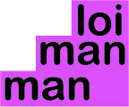
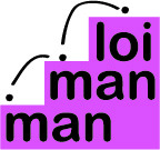
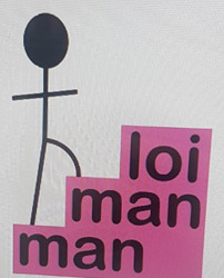

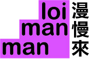
Since the phrase is related to “taking steps,” I wanted to use stairs as the shape of the logo which symbolizes stepping upwards to the goal. Since reading English text is from top left towards the right hand side, the original line up of the words would read in a descending manner which did not match the concept of stepping up. Therefore, I changed the starting point of the words from the bottom left. There were also scrapped designs of a stick figure walking up the stairs or the dot of the “i” bouncing upwards. However, they looked ridiculous with my ammeter Illustrator skills and did not really help to signal the motion of going upwards. Therefore, I decided to keep it simple and only showed the English and Chinese words on a pink staircase. For the Chinese words, I struggled between placing the words on the stairs or on one side vertically so I asked my friends and they all prefer the latter one.
All in all, I cannot believe that I have made it through this module. Every task was a new challenge that sounded so impossible for me in the first place. Everything was very over-whelming for me and I had a tough time adapting to them. I remember something Phil told the MLitt students in the beginning: “Don’t let your limitation limits you.” These words pushed me forward to accept these challenges and I have come to realize that my limitations opened new ideas for me as well. For example, if it was not for the “no MLitt exception” in the V&A Dundee project, I would not have thought of making a comic about making comics! These experiences encouraged me to try new things and not be afraid to ask for help. I kept asking my classmates along the way and they were all very nice: doing an extra drawing for me, spending time to do an interview, teaching me on how to use different programs, reviewing my works etc. I have realized that my classmates are my biggest assets and I am forever grateful for that.
0 notes
Text
Technical hitches- So, my original blog plan got a little ruined. I’m here to say now though, that this one should stay up and running, and no amount of my own foolishness will stop that! So, introductions aside this will be the process blog for my MDes Comics and Graphic Novels Project; a 12 page prologue story for a much older plot I’d started way back in 2013!
0 notes
Photo

Assignment for the Comics Production module at the University of Dundee’s MDes in Comics and Graphic Novels program.
Goal: to design a poster for comic book company that is launching a new App--must feature outward facing screen.
#comics#illustration#comichaus#mdes comics and graphic novels#university of dundee#photoshop#zombies#read comics#digital art
1 note
·
View note
Text
Creating Comics / week 8
Following last week’s feedback I’m moving on to the actual work on the main comic for this semester. The Doom Battle comic has to be put aside (I spent a lot of time on it, realised it’s taking me aaages to complete at least one page, so my guess is that I have to double my current drawing speed in order to get the work done).
There are a few reasons why I decided to go for Master and Margarita as a theme for an adaptation. Most of the points are described in my first blog post (week 4), but there are a few more on top of them.
To start off with and as it was previously mentioned, I’m a huge fan of the novel itself. The author (Mikhail Bulgakov) also worked as a medic in my hometown in Russia. There is still a museum not far from our house, so I can call it a certain emotional connection too I guess. It’s the similar feeling to “you know, this celebrity used to live in our neighbourhood before getting famous” thing, but it’s not a celebrity, it’s the author who wrote some absolutely surreal stuff, which I find cool.
The original novel has transformed into loads and loads of different forms of adaptations including plays, musicals, live action films, animated films and, of course, comics. According to Wikipedia (surely), there are about 5 different adaptations. I managed to find some more interesting examples. Some of them are rather a collection of art prints/illustrations rather than comics though. A lot of artists create Master and Margarita themed artwork, but not a complete comic. Personally, I will not be drawing the whole story too, it’s massive, just a certain piece from it. Anyway, there are tons of amazing artwork and also artwork that is not that amazing, but still very stylish and mood-reflective. Below is one nice Master and Margarita comic book page that I find very stylishly drawn:

Original link here: http://idlehandofcolinalexander.blogspot.co.uk/2011/05/master-margarita.html
Now, when I think of my own adaptation of Master and Margarita, the first thing that comes to my mind is the visual style of it. I decided to keep things monochrome just like in the concept page posted here some time ago. I would like to try more sophisticated colouring at some point, but I think that: 1) monochrome totally suits the novel’s atmosphere and will only support its general ‘mood’; 2) monochrome is also less time consuming, which is an important factor considering the time limits I have.
Now the content: for my variant of adaptation, I’ve chosen the part where Margarita meets Woland (aka Satan) for the first time and gets invited to the annual Satan’s ball where she has to host the important event as a Queen and meet all the guest from Hell. She receives a hint that once the ball is over, Woland wight grant her a wish. At first, Margarita thinks that if she gets the precious chance, she’ll make Latunskiy (a literate critic who ruined Master’s reputation) die or at least, make him suffer for what he’s done to the future of Master’s novel. After meeting the guests from Hell who are forever cursed to suffer for all the crimes they’d done (and especially one particular character, Frida), Margarita thinks that her emotional pain for Master’s literature “failure” is nothing in comparison to what Frida has been experiencing through decades, so she might as well change her mind when it comes to the granted wish...
0 notes
Photo
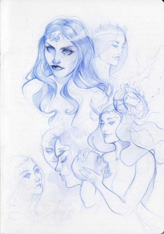
Some quick pencil take on Margarita’s character before I proceed to the comic drawing... I think it would also be useful for me to maybe create some more detailed and focused concept sheets for each character (which I’ve never done properly before), but my concern is that I might get stuck with them for quite a while trying to create proper illustrations rather than actual concepts. So, I shall probably leave this idea for just now and move on to the actual work. I’ll keep the idea of creating concept sheets for the future, especially when it comes to the main MDes project.
1 note
·
View note
Text
Creating Comics / week 7
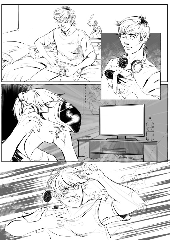
On this week’s ‘Creating Comics’ class we were supposed to share some comic book concept ideas, maybe some progress we’ve achieved so far. I think in my case it wasn’t all that good as I felt I was slightly behind the others with only two sheets of... Well, not even the character concept art, more like ‘general style idea materialised on paper’ (one digital, one pencil, both focusing on Margarita *guess I’m stuck in my comfort zone here*). What I did have on top of that though, was some progress for Doom Battle, which is not very relevant, but quite useful to some extent as I had a chance to try my skills with panels’ layout for the first time etc. To be very fair, I think I did quite well considering it was my first comic (I’m still working on...). It was very useful to also hear some feedback from Phil and Monty. Both of them said that the line-work and style (especially on the first page *above*) are nice. I’m personally very happy with the dynamics in the last panel. I also like (and appreciate) the fact that I finally crawled out of my comfort bubble and drew a teenage guy with some expressive face emotions. Oh, and the backgrounds. Backgrounds are an absolute STRUGGLE for me. Not because they’re difficult to draw, but because they’re quite boring to draw. Plus, obviously, I can’t always remember how exactly a TV table or a cupboard look like (well, I know the general outlines, but it needs to look good in the picture + perspective). So, basically, it takes more time to do the necessary research and compose the layout of a panel in a correct relation to characters and their emotions. After a class though, we had a brief chat with Daniel from our course about drawing backgrounds and environments (and Daniel draws this stuff just amazingly), and I obviously complained about my lack of interest in drawing pretty much everything apart from the characters. The advice I got from Daniel was just extremely simple, straight forward and genius at the same time: “just think of the backgrounds/objects/environments as if they all are characters”... It’s so simple yet so motivating. I’ve never thought of it from such perspective. So this advise is definitely the one to take on board.
Now about some criticism...
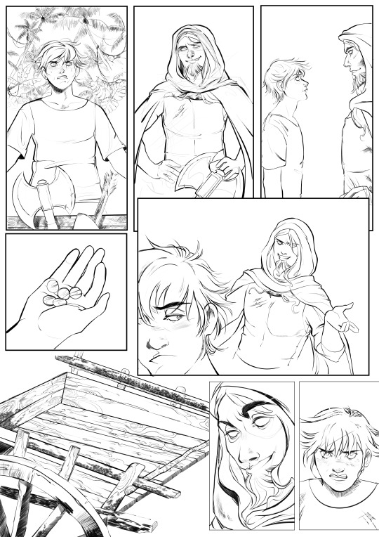
So this is Doom Battle’s second page, which took me ages to draw. The reason is obvious: the bloody palm trees in the panel 1 and then the cart (panel 6). There is something I realised: I’m horrible with zooming. I’m absolutely dreadful when it comes to zooming. It just doesn’t need to be zoomed in THAT much. Monty, for example, said to me that face expressions in this page are lovely, however, the *too much* zoomed and not efficiently detailed backgrounds actually ruin consistency of the comic. Phil did mention that sometimes rough lines (especially in the backgrounds) add more atmosphere to the general style and make the drawing look effortless, yet rather masterful. *At this point, I immediately thought about Otto Schmidt, Babs Tarr, Mirka Andolfo...* I do, indeed, agree with tutors. In my case, I shall stop zooming in images too much and always keep an eye on the general look/consistency, otherwise I’ll be spending way too much time on drawing palm trees that nobody will pretty much pay much attention to while reading a comic.
...And the main point of the received critical feedback: please move on to the actual module comic art work. Having Doom Battle as well is nice, but it’s clearly not a priority, especially at the end of October. *I agree*
#mdes comics and graphic novels#creating comics module#semester one#comic book panels#comic book#inking#photoshop
0 notes
Text
Creating Comics / week 4
This week’s class was helpful in terms of narrowing down the scope of the topics I had chosen for working on this semester’s comic. Initially, I had three main ideas:
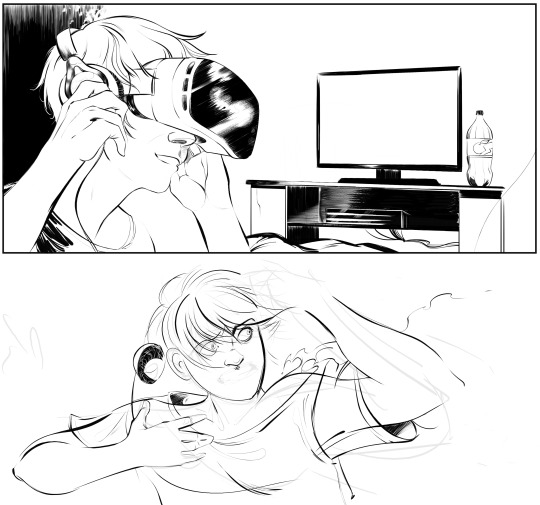
Continuing work on the side project. I was asked to illustrate a ready script for an anthology. It’s considered to be a 7-page comic, the final deadline is the end of October. Essentially, this is going to be my very first proper comic with panels, inking and everything from A to Z. After discussing it with the tutor though, we both agreed that it would be better to keep this project outside the ongoing module (prioritising the university’s module first) . Working on the ready script written by somebody else would make the assessment more complicated + I feel it wouldn’t be very fair to either. So, a side project it is. Below are some panels in progress... That look quite like a mess at the moment.
An adaptation of The Master and Margarita novel written by M. Bulgakov. I think that writing a whole new script would be quite challenging for me right now. Although I’ve always associated myself with the drawing community, I barely had a chance to spend most of my time on drawing some more diverse content. I would like to dedicate the first semester to practising drawing the actual comics (focusing rather on more active scenes, facial expressions, new types of characters, and panels’ layouts). The Master and Margarita was the first thing that came to my mind when I thought about adapting an existing novel to a comic book. I wouldn’t illustrate the entire novel, but would choose a certain chapter (or even a part of it). The novel itself allows a large scope of opportunities for experimentation, really: it contains fantastic philosophical, smart, witty, ironic dialogues, diverse characters. There are at least 6 existing novel’s adaptations to comics/graphic novels existing already! I also mentioned to the tutor an idea of combining the classical novel with some different art style it’s not originally associated with (like, steampunk, for example). But I’m not sure whether I could manage doing so. Will see.
An adaptation of a short novel written either by Julio Cortazar or Janusz Leon Wisniewski. Both authors are well known novelists who have written some beautiful short novels with unexpected endings (that make them so exciting to read). I think one of such novels could become a great starting point for an adaptation...
Taking everything into account, I think I’d be more interested in working on Bulgakov’s novel’s adaptation. I think the best thing to do is to start drawing some sketches to get my mind (creative vision) working.
0 notes