Text
Semester 2/ Reflective Essay
Part 2: Logo Design
I found the logo design task quite an interesting one. I found some inspiration by looking at the signatures used as logos, which can be seen used by many artists (although it is pretty much just a signed image, the artist also uses his handwritten signature as an official logo for the website and merchandise):

I personally find the idea of using the initials as a logo a nice one, especially if it is done in a signature style. Although my logos are quite far from my initial inspiration sources, I find that this is something I can work with and develop it into something more sophisticated in the future:

I chose one of the created logos for my business cards that I made for the Edinburgh ComicCon:

I drew the over image in one night, and that stack the logo to the back side of the card just to see how it looks like. It might not be ideal just now, but I think it looked quite alright for the a first try:


1 note
·
View note
Text
Semester 2 / Reflective Essay
Part 1: COMICHAUS Project
General
The Blasphemy comic has been quite a hit and miss for me. Despite all the initial excitement I had about it, I think my final result is still pretty far from what I would expect from myself performance wise. Nevertheless, I find that both Semester 1 and Semester 2 comics-related projects have both been a great practice before the final, Semester 3 comic. Both of the projects gave me enough insights for being able to distinguish my strengths and weaknesses when it comes to illustration process. In both projects, I made exact same mistake, which I hope I will not repeat in the third Semester. It is, in fact, spending too much time on the first pages of a comic. I tried to follow Phil’s advice, and maybe start working on a few pages at the same time. The result I achieved was pretty disappointing, and was mainly linked to the way a divided my time among all the parts of the strip. I quickly sketched the positions of figures throughout the entire comic, and never dedicated enough time for the backgrounds, which were left to be drawn the last. Ironically, the backgrounds were the trickiest, so it is visible that they look rushed in some panels. In its turn, it is even possible to notice that some panels were done at different times, which ruins the overall visual structure of the strip. It also did affect the style consistency . It is especially visible in my submission on the initial deadline, at the end of March. Some panels looked okay-ish, and then there were absolutely hideous ones.
When I was submitting the ComicHaus project for the first time, I knew it was not going to be a successful assignment for me. During the drawing process, I never checked coursemates’ works in the BOX (some people submitted it earlier, and there was an opportunity for seeing others’ work). When I saw most of the submitted assignments during the Skype feedback session, I was impressed with the consistency most people can maintain. I am still trying to find my particular drawing style, and, as I mentioned previously, it does affect the consistency of my work. Fortunately, we were given extra time to touch things up and submit an improved version if we wanted to. It was the time for me to save this sinking boat of shame and try to redeem my skills in my own eyes. To some extent, I did succeed, but the again, there are still pages that I am not happy with: especially, Page 5 and Page 6. Those two are a visual representation of an agony. The pages 1, 2, 3, and maybe 4 are okay-ish, but still far from what I would like to see from myself. The updated result overall looks better than the initial submission, but there is lot of space for improvement.
Characters and Linework
For Blasphemy, I first started with a few simple character sketches, both traditional and digital. I did not give myself enough time and thinking space to maybe develop the characters a little bit further, as I had a few interesting ideas about them. The one that involved combining both main characters into one seemed the most exciting, and I was quite ready to go for it. However, I then decided to abandon such concept just to not make the production process even more complicated. The proper character development progress began when I started off with the first page.
I was not keen on the idea of drawing traditionally perceived humanoids from the very beginning, so I made them look very much like humans, adding a few different features to them (pretty generic though, I must admit; things like elf-ears are probably the most common ‘addition’ to any alien character ever existing + most of my friends who saw the first page had an immediate association with Startrek, which is not necessarily a good thing). I also was willing to give ‘my’ aliens a bit of high-tech vibe (taking some inspiration from Ghost In The Shell)... The plan was big and ambitious, the result has not quite hit the bar. It would be smarter to keep things simpler, but achieving more quality by doing so. I started off full of excitement, but when the reality along with the other module deadlines reminded about themselves, I had to wrap the initial plans up keeping in mind that I should be smarter with my timing next time. (On this note, I managed to organise myself as much spare time as possible during the summer period to make sure I dedicate myself to the final project at the very maximum.) The other characters are… pretty much just characters. The good thing about the Blasphemy comic, however, is that I did not use any references for the characters. I drew them completely out of the head, and I was nicely surprised when I found out that I can draw hands pretty quickly. I am not very keen on the drawing technique I utilised during this project (personally, I don’t think I would buy my comic). For the upcoming projects, however, I would like to go for a little bit more stylised drawing approach, and I am working on it at the moment by practising some random sketches on paper and ClipStudio.
I drew both this course’s comic projects digitally, and I find it a useful approach, but there are significant drawbacks to it as well
1) It makes [my] drawings look very stiff. I am personally a fan of more brave, rough linework (Otto Schmidt is a good example in this case), but I find it difficult to achieve that when drawing digitally. I find my pencil sketches much more live, as they got a certain flow to them. I can’t say that I can achieve that right now with a graphics tablet. I usually set the line stabilisation bar to the maximum, to make sure the linework looks properly, but I find that it also slows down the process a wee bit and therefore makes the linework more artificial to an extent.
2) Zoom is still my worst enemy. It can be particularly seen in the first panels of the first page, and then obviously, once the time starts running out, I make those horrible wacky backgrounds to fill up the empty space, which is essentially a huge contrast to what has been done in some other panels. Again, no constancy here either.
The original pages were not drawn in black-and-white scale: I used different tones of purple, which were later converted into b/w in Photoshop (see first two pages as an examples below):


Converting the pages into the b/w scale, however, did help with making the ’uglier’ panels look a little bit more decent.
Conclusion
Taking everything listed above into account, I think that Blasphemy has been a good practice for me, because I once again (after the first Semester 1 comic) did distinguish my main weaknesses in the multiple page drawing process. I also think that I should not underestimate traditional illustration when it comes to the final project. I am considering an option of doing all the pencil work traditionally, and then use digital inking/colouring to finalise the comic strip.
1 note
·
View note
Photo

Although I’m not a huge fan of posting ‘progress pictures’, I somehow decided to share this one. Mainly because I really wanted to try a different colouring technique to what I’m used to, and I think several layers look sort of cool at this stage just now. The drawing is super raw just now, so I can’t wait til I have some spare time to finish it.
0 notes
Photo


Converted a relatively old pencil sketch into a digital illustration.
0 notes
Text
Creating Comics / week 8
Following last week’s feedback I’m moving on to the actual work on the main comic for this semester. The Doom Battle comic has to be put aside (I spent a lot of time on it, realised it’s taking me aaages to complete at least one page, so my guess is that I have to double my current drawing speed in order to get the work done).
There are a few reasons why I decided to go for Master and Margarita as a theme for an adaptation. Most of the points are described in my first blog post (week 4), but there are a few more on top of them.
To start off with and as it was previously mentioned, I’m a huge fan of the novel itself. The author (Mikhail Bulgakov) also worked as a medic in my hometown in Russia. There is still a museum not far from our house, so I can call it a certain emotional connection too I guess. It’s the similar feeling to “you know, this celebrity used to live in our neighbourhood before getting famous” thing, but it’s not a celebrity, it’s the author who wrote some absolutely surreal stuff, which I find cool.
The original novel has transformed into loads and loads of different forms of adaptations including plays, musicals, live action films, animated films and, of course, comics. According to Wikipedia (surely), there are about 5 different adaptations. I managed to find some more interesting examples. Some of them are rather a collection of art prints/illustrations rather than comics though. A lot of artists create Master and Margarita themed artwork, but not a complete comic. Personally, I will not be drawing the whole story too, it’s massive, just a certain piece from it. Anyway, there are tons of amazing artwork and also artwork that is not that amazing, but still very stylish and mood-reflective. Below is one nice Master and Margarita comic book page that I find very stylishly drawn:

Original link here: http://idlehandofcolinalexander.blogspot.co.uk/2011/05/master-margarita.html
Now, when I think of my own adaptation of Master and Margarita, the first thing that comes to my mind is the visual style of it. I decided to keep things monochrome just like in the concept page posted here some time ago. I would like to try more sophisticated colouring at some point, but I think that: 1) monochrome totally suits the novel’s atmosphere and will only support its general ‘mood’; 2) monochrome is also less time consuming, which is an important factor considering the time limits I have.
Now the content: for my variant of adaptation, I’ve chosen the part where Margarita meets Woland (aka Satan) for the first time and gets invited to the annual Satan’s ball where she has to host the important event as a Queen and meet all the guest from Hell. She receives a hint that once the ball is over, Woland wight grant her a wish. At first, Margarita thinks that if she gets the precious chance, she’ll make Latunskiy (a literate critic who ruined Master’s reputation) die or at least, make him suffer for what he’s done to the future of Master’s novel. After meeting the guests from Hell who are forever cursed to suffer for all the crimes they’d done (and especially one particular character, Frida), Margarita thinks that her emotional pain for Master’s literature “failure” is nothing in comparison to what Frida has been experiencing through decades, so she might as well change her mind when it comes to the granted wish...
0 notes
Text
Creating Comics / week 7
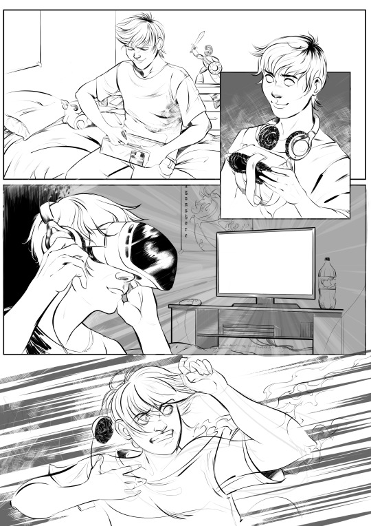
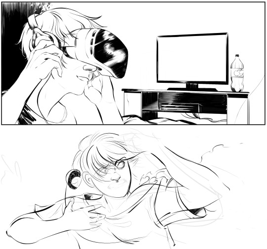
On this week’s ‘Creating Comics’ class we were supposed to share some comic book concept ideas, maybe some progress we’ve achieved so far. I think in my case it wasn’t all that good as I felt I was slightly behind the others with only two sheets of... Well, not even the character concept art, more like ‘general style idea materialised on paper’ (one digital, one pencil, both focusing on Margarita *guess I’m stuck in my comfort zone here*). What I did have on top of that though, was some progress for Doom Battle, which is not very relevant, but quite useful to some extent as I had a chance to try my skills with panels’ layout for the first time etc. To be very fair, I think I did quite well considering it was my first comic (I’m still working on...). It was very useful to also hear some feedback from Phil and Monty. Both of them said that the line-work and style (especially on the first page *above*) are nice. I’m personally very happy with the dynamics in the last panel. I also like (and appreciate) the fact that I finally crawled out of my comfort bubble and drew a teenage guy with some expressive face emotions. Oh, and the backgrounds. Backgrounds are an absolute STRUGGLE for me. Not because they’re difficult to draw, but because they’re quite boring to draw. Plus, obviously, I can’t always remember how exactly a TV table or a cupboard look like (well, I know the general outlines, but it needs to look good in the picture + perspective). So, basically, it takes more time to do the necessary research and compose the layout of a panel in a correct relation to characters and their emotions. After a class though, we had a brief chat with Daniel from our course about drawing backgrounds and environments (and Daniel draws this stuff just amazingly), and I obviously complained about my lack of interest in drawing pretty much everything apart from the characters. The advice I got from Daniel was just extremely simple, straight forward and genius at the same time: “just think of the backgrounds/objects/environments as if they all are characters”... It’s so simple yet so motivating. I’ve never thought of it from such perspective. So this advise is definitely the one to take on board.
Now about some criticism...
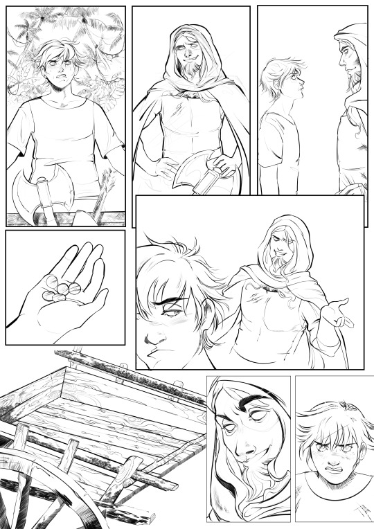
So this is Doom Battle’s second page, which took me ages to draw. The reason is obvious: the bloody palm trees in the panel 1 and then the cart (panel 6). There is something I realised: I’m horrible with zooming. I’m absolutely dreadful when it comes to zooming. It just doesn’t need to be zoomed in THAT much. Monty, for example, said to me that face expressions in this page are lovely, however, the *too much* zoomed and not efficiently detailed backgrounds actually ruin consistency of the comic. Phil did mention that sometimes rough lines (especially in the backgrounds) add more atmosphere to the general style and make the drawing look effortless, yet rather masterful. *At this point, I immediately thought about Otto Schmidt, Babs Tarr, Mirka Andolfo...* I do, indeed, agree with tutors. In my case, I shall stop zooming in images too much and always keep an eye on the general look/consistency, otherwise I’ll be spending way too much time on drawing palm trees that nobody will pretty much pay much attention to while reading a comic.
...And the main point of the received critical feedback: please move on to the actual module comic art work. Having Doom Battle as well is nice, but it’s clearly not a priority, especially at the end of October. *I agree*
#mdes comics and graphic novels#creating comics module#semester one#comic book panels#comic book#inking#photoshop
0 notes
Photo
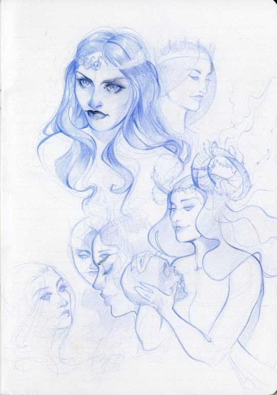
Some quick pencil take on Margarita’s character before I proceed to the comic drawing... I think it would also be useful for me to maybe create some more detailed and focused concept sheets for each character (which I’ve never done properly before), but my concern is that I might get stuck with them for quite a while trying to create proper illustrations rather than actual concepts. So, I shall probably leave this idea for just now and move on to the actual work. I’ll keep the idea of creating concept sheets for the future, especially when it comes to the main MDes project.
1 note
·
View note
Photo
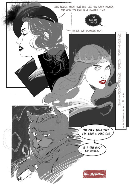
My first take on Master and Margarita characters (essentially, just Margarita and Behemot cat) and some lettering. It’s the first time I’ve drawn a cat in a really-really long time, I must admit. Personally, I wasn’t very happy with my current black ink technique: I spend way too much time on some secondary lines, which end up as a complete mess sometimes. So, I decided to go for the grey scale this time and see how this works for me (I quite liked this technique, to be fair). I as well go for a comic in a grey scale in the first semester, just to save time and improve on the drawing more complicated scenarios.
13 notes
·
View notes
Text
Creating Comics / week 4
This week’s class was helpful in terms of narrowing down the scope of the topics I had chosen for working on this semester’s comic. Initially, I had three main ideas:
Continuing work on the side project. I was asked to illustrate a ready script for an anthology. It’s considered to be a 7-page comic, the final deadline is the end of October. Essentially, this is going to be my very first proper comic with panels, inking and everything from A to Z. After discussing it with the tutor though, we both agreed that it would be better to keep this project outside the ongoing module (prioritising the university’s module first) . Working on the ready script written by somebody else would make the assessment more complicated + I feel it wouldn’t be very fair to either. So, a side project it is. Below are some panels in progress... That look quite like a mess at the moment.
An adaptation of The Master and Margarita novel written by M. Bulgakov. I think that writing a whole new script would be quite challenging for me right now. Although I’ve always associated myself with the drawing community, I barely had a chance to spend most of my time on drawing some more diverse content. I would like to dedicate the first semester to practising drawing the actual comics (focusing rather on more active scenes, facial expressions, new types of characters, and panels’ layouts). The Master and Margarita was the first thing that came to my mind when I thought about adapting an existing novel to a comic book. I wouldn’t illustrate the entire novel, but would choose a certain chapter (or even a part of it). The novel itself allows a large scope of opportunities for experimentation, really: it contains fantastic philosophical, smart, witty, ironic dialogues, diverse characters. There are at least 6 existing novel’s adaptations to comics/graphic novels existing already! I also mentioned to the tutor an idea of combining the classical novel with some different art style it’s not originally associated with (like, steampunk, for example). But I’m not sure whether I could manage doing so. Will see.
An adaptation of a short novel written either by Julio Cortazar or Janusz Leon Wisniewski. Both authors are well known novelists who have written some beautiful short novels with unexpected endings (that make them so exciting to read). I think one of such novels could become a great starting point for an adaptation...
Taking everything into account, I think I’d be more interested in working on Bulgakov’s novel’s adaptation. I think the best thing to do is to start drawing some sketches to get my mind (creative vision) working.
0 notes