#main differences are color palette and his ears!
Explore tagged Tumblr posts
Note
Hello, I’ve always been impressed by your design decisions so I wanted to ask: are there any Pokemon or trainers that have really spoken to you design-wise? Not necessarily your favorite, but left a strong impression on you.
Hope the rest of your day goes well! ^^
Aw thanks so much! I love character design, it was my first passion before storyboarding actually
Here's my faves:
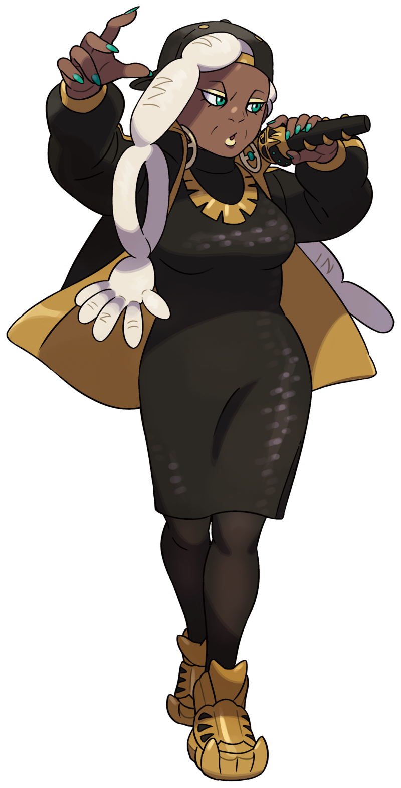
RYME!!!! They nailed that older gen rapper look. Backwards cap, sequins, lots of gold and a puffy jacket! Also I'm not quite sure this is the intention with her shoes but they kinda look like grillz which is sick. I'm a sucker for a limited palette so the black, gold with turquoise accents in her nails, mic, earrings and eyes spoke to me. Also OF COURSE her hair (you're gonna se this pattern for the next two LOL). Making her locks look like a skeleton??? Genius. I love the hand bone for the front and the hip bone for the back. Literally one of the coolest trainer designs pokemon's ever given us.
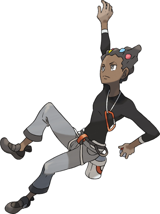
GRANT! Just an immediately readable design. Oh, he looks like a rock climber, must be a rock type gym leader. Simple fit, I love a sleek black top. The carabiner, climber straps and chalk holder add a little more complexity to the design but not too much. It's a smart choice with how wild his hair is. I feel like if you do too much in the fit AND the hair, you risk your design feeling overdesigned and busy. I love that his hair is meant to look like a rock/cliffs with the holds! The holds add a nice dash of color without being too much.
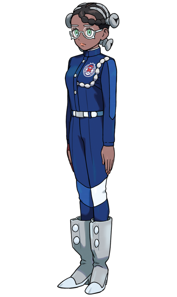
AMARYS <3 It's the fact that she's in uniform but still has a design that immediately caught my eye. But to her being in uniform, I find it really cool that the other Elite 4 members really alter theirs or have accessories that make the uniforms feel like their own or really different but Amarys doesn't really. It goes to show how rigid she is and gives you the impression that she's a very "follow the rules" kind of person. Her main accessory seems to be her boots which just LOOK heavy, and sleek and look like they have bolts in them. It really makes her design feel bottom heavy and grounded which I feel is appropriate for a steel type trainer. Now, hair. Look at her hair. SO GOOD. I loveeee that pokemon is utilizing black hairstyles like this. Her hair being screws that kinda resemble banto knots is so CUTE. The could have left her hair at that but the braid across her forehead adds a nice asymmetrical aspect to her design. It's so cool that it mirrors her pocketwatch chain, creating a focal point on the school crest. And lastly her glasses! Super cute, I think it's cool that it gives the illusion of bottom lashes which makes her eyes feel a little more droopy or sad than they really are. It just really brings her facial features all together and helps sell her personality.
802 notes
·
View notes
Text
ac·cou·tre·ment
down bad joe, who's such a good boy. wears his suit proper but can't wait to undress you.
sub!joe. 18+ content (smut heavily described). fem!reader.
saw this bracelet and this shirt and decided to do a line and write some sub!joe. throw in the fact that i saw sinners last night and i was like, yeah, we're so back.
8.8K words. read part 2, 'room service'
talk--hozier
bloodbath for birds--squalloscope
sub!joe masterlist | joe burrow masterlist | main masterlist
_________________________
The Honors come every year.
And every year, Joe’s always looking for something comfortable and easy to wear. It’s not that Joe’s not a fashion guy; it’s that he likes comfort more. However, comfort must strike the delicate balance with your outfit as well. It’s a team effort now—coordination of accessories, and color palettes, ensuring silhouettes are cohesive. Which leaves him here, in the bloom of December, fretting over this year’s color palette. Last year was a simple royal blue and black affair to match the space themed pant chain he wanted.
This year must be different. It has to bring something new to the table. Joe’s looking for something fun and maybe even a little shocking. But he doesn’t have much mind left. Even if this is a job he’s happy to take on because he also gets a hand and first viewing of the dresses, gets to watch you twirl in the a-line skirts, shimmy into the bodycons, knowing that no matter what you wear, he gets to peel you out of it at the end of the night, Joe is utterly lost. He doesn’t have the foggiest idea of what to do or where to go for inspiration though you’ve supplied more than enough with your Pinterest boards. All the colors are starting to bleed together. Every suit’s starting to look the same. The names of each board are getting blurry in his vision. All stemming most notable from the fact that he didn’t sleep great the night before--a sniffle tickling in the back of his throat that he needs to get a handle on. A sniffle that’s been lingering since Wednesday. It’s not getting worse, but not necessarily getting better either.
Joe is supposed to be napping. He’s not even supposed to be looking at your Pinterest right now, or worrying about the NFL Honors. Your order came firm, but sweet as you tucked him into the sofa up to his chin in the fluffiest blanket in the house after filling up his water bottle, Rest, baby. A command that came after you brought him a can of ginger ale, a bag of throat lozenges with a cup of tea as well. The cup of elderberry tea with manuka honey has long since been consumed. Joe made sure of it, because the warmth and the viscosity of the honey did help his throat. Now, though, the sofa’s too big and a little cold without you there at his feet.
Joe’s not sure how long you’ve been in the kitchen. You were sitting with him on the couch, arm resting on his ankles, flipping through channels. But now you’re lost to his vision, only in his ears can he hear the symphony of sizzling, cabinets, and jars. Joe was somewhere between falling asleep and deeply asleep--just enough awareness to know that he wasn’t fully awake and just enough asleep to know that he’d lost some amount of time without any exact measure on it. When he cracked his eyes, he was stretched out completely, TV still softly playing but his toes only dug into couch cushions instead of your thighs.
And that’s all it took. The moment Joe realized you weren’t there on the couch, that you’d disappeared into the kitchen, he woke up fully. Sleep is persistent though. His eyes blink close every minute or so even with his laptop on his stomach. Yet, Joe's a stubborn man and he refuses to go back to sleep until you’re there again, at his feet or next to him.
The blue hue of the screen is just bright enough to keep Joe’s attention for small bursts of time. But not enough for him to sink into his thoughts and really focus on the task at hand. He had just enough energy to make it through practice. Now that he’s home, his brain has gone fuzzy. Everything feels like it’s moving slower than normal. Not quite a fog. This is more akin to the feeling of coming up from anesthesia. Joe is aware though it all feels and sounds so distant from him. Like he could be watching himself from the outside.
The buzz of his phone drags his attention from the laptop. He groans as he stretches out for the device before he stares down at the text from his personal assistant. Dior’s reaching out if you want to work with them for a custom look for you and your partner for the NFL Honors. Interested?
Yeah, sounds cool.
Perfect. I’ll get them in contact with you directly here shortly.
“Baby?” your voice carries from the kitchen.
Joe freezes. He should pretend to be asleep, but if you’re calling him then he’s already been caught. You already know he’s not sleeping. It doesn’t sound urgent. Whatever it is. Joe untangles himself from the cocoon, getting his laptop and phone down onto the coffee table before he stands. He rounds the corner to see you stretching up, but not quite getting to whatever it is you’re reaching for, given the huff that pushes over your lips. “What’s up?”
“Can you help me and get those mixing bowls down from that fourth shelf? I can’t reach.”
The cabinets reach to the ceilings and though there’s never really much that you or Joe put beyond the first three or four rows in the cabinet, reaching up to the fourth can be challenging even for Joe. “Of course, sweetheart.”
You hover just behind him. Joe slides into the place you were standing and though he much more confident in his stretching to be capable of reaching the bowls, the heat of your hands inches and only inches from his back seeps through the thin cotton t-shirt. A steadying presence though he doesn’t need it. A reminder that Joe knows you better than he probably knows himself. You are always right there, right within reach.
Joe secures the cranberry colored Pyrex bowls into his grasps and brings the all lot of them--three total as they nest one inside of the other--down. Just as the bowls click against the counter, your hands slip up and under his t-shirt. You move into the space of Joe’s side, chest pressed into his ribs. The trail of your fingers is rather soft, like you might not even know you’re doing it. Joe’s trying to keep himself composed, torn between a laugh at how it starts to tickle and the satisfied sigh from the feeling of your body flush against him. That is until he coughs, catching it into the crook of his elbow. Now all he has left in his chest is a slight wheeze from whatever is slipping down the back of his throat.
“Thanks, love,” you hum, “I appreciate it. Now, go actually sleep. You’re not fooling me.”
“How’d you know?” He’s not ashamed of being caught. There’s a sixth sense the two of you share about each other, but still Joe thought he was being pretty sneaky.
“Sound of you tapping on the keyboard earlier and the click of the trackpad.”
“I was—” Joe starts and then his voice cuts out, the pitch rising before all sound leaves him. He clears his throat and tries again. “I was trying to sleep, but it’s not the same when you’re not there.”
Your ever watchful gaze cuts to him, even as you start pulling the chicken from the dutch oven. The steam billows from the opened mouth. “Did you finish the tea?”
“Yes.”
“Have you had a lozenge?”
“No.”
Your brow arches. The onions, celery, garlic, and carrots smell heavenly as the steam remnants make their way over to his nostrils. The fact that he can still mostly smell is a reassuring sign. Joe knows what that looks mean the moment it dawns on your face. Pursed lips, a high cut eye. There will be no amount of reasoning that will win against you now.
Joe raises his hands up in surrender. “Okay, nurse. I’ll go pop a lozenge.”
“Soup will be done in like twenty minutes. But after you eat, I want a nap out of you.”
“You promise to cuddle with me?” It’s a Friday and Joe’s hoping you’ve handled all errands while he was at practice.
“Yes, I promise to cuddle with you.”
“By the way, Dior will be reaching out to me soon about a custom look for the both of us for the awards. So even though I wasn’t sleeping, I wasn’t bullshitting around.”
“I don’t really care if Jesus called you. You need rest since I know you won’t be convinced to not start Sunday.”
Joe snorts, pushing off the counter’s edge to slip in behind you. The loud care, the persistent eye over him—Joe wouldn’t trade it all for a thing, not even to get rid of whatever was pestering him at the moment. His arms slip around your neck, loosely, and he presses just a fraction of his weight into you. Part of Joe is relieved you hadn’t pushed him about the game Sunday. He knows it’s probably irking you not to say something. The demands for naps, and the tea, and the lozenges are a replacement in the wake of such silenced objections. The actions replacing the words.
“Are we just ignoring the part about custom Dior or?” Joe’s whispered question wisps down the side of your neck.
“We can worry about custom Dior once you’re feeling better. But get a date and I’ll get the time off.”
The crook of your neck is so warm, so inviting. Joe can’t resist settling in closer to your throat, nose pressed into the thumping flesh. Your perfume is soft and sweet—a vanilla base with something earthy underneath. Joe can’t place it—sandalwood or musk. All he knows is that you smell like home, like warm sheets and home cooked meals. A scent Joe chases in his dreams when he’s away from you.
“My poor baby,” you coo. Your voice rumbles, refracted in a way that makes it deeper than normal through your bones back into his ears. But Joe can only hum when your nails scratch over his scalp. “You still need to grab a lozenge before you get to snuggle up on me.”
“Yes, yes, I know. Just,” Joe inhales again and it cuts off the thought for a moment. “Just need a minute here.”
He’s met with silence, only broken by the click and soft taps of your work. Your palm slides up and down his forearm, making his spine melt. Joe could cease to exist in a moment but as long as that moment is with you that’s all that matters.
“Ten second warning.” Your voice is a whisper. Sounds like it could get swept up in a strong enough wind.
“Hmmkay.” Joe takes his remaining seconds, presses another to deep inhale of your perfume and natural musk into his lungs, and then pulls away, slowly bringing his awareness back to the kitchen. The chicken that’s resting in the bowl, pulled away from the bones now. The slightly charred vegetables sitting in the small personal serving blender, like you’d been intending to start it up but waited on like you had another thought. Maybe as to not startle him? But Joe’s not sure. Just feels like whatever was supposed to happen was paused.
“Lozenge. And then soup. And then a cuddle and nap,” he recounts to himself, reorienting to the new objectives.
“In that exact order.” The command is paired with a tap, a gentle pat to his ass.
Joe laughs, a blush creeping up his cheeks as he covers his behind with his hands. “Wine and dine me first. Jesus,” he calls out, departing the kitchen.
“What do you think I’m doing right now?” you holler back.
Loving me, Joe wants to say, but can’t get it over his lips before another cough creeps up his chest. He takes a swig of water first before unwrapping the lozenge and then slips back down into the cushions, under the blanket and stares at the TV--seeing but unseeing as he waits for you.
________________
Joe’s seen the dress before. The blush pink velvet over your curves, the sweetheart necklace and cinched waist that Joe swears was painted on you. And Joe’s seen it before, but each time you’re in it, it’s like seeing it for the first time. Over, and over again. Up and down he tracks the lines of your body.
The dress leaves your shoulders bare, begging to be marked, to be bitten, the longer Joe looks at you. While there’s no sleeves to the dress, there is a bit of a bow effect that starts at the neckline, fabric that circles out before it reconnects back to the bust, creating loops for your arms to slip through. Not quite capped sleeves--you distinctly asked not to have those--but a dramatic middle ground that creates a nice line of movement for the eye to take on the otherwise simple ensemble. The skirt of the dress drapes to the floor and is form fitting around your hips and thighs. And to think this all started with a singular picture--a gold bracelet dazzling that spells out, I love you, replicated now on your wrist.
This all started with one singular click.
When the Zoom meeting to start the process loomed just days away before you both, Joe began pestering you--he could admit that and would admit it if pressed--about your input. Though Joe was the one to take the reins when it came to getting the ball rolling on styling for events, he felt uninspired. He wanted out of his comfort zone, but wasn’t sure what that looked like. Your boards were nice, but they felt common. He’d seen those dresses and those suits a million times over. He needed something that would set you both apart, bold, but still classy. So Joe pestered, and he pestered until you sent him a brand new board to look through.
Right there at the top was a 1960’s bracelet--gold with only a few small cut diamonds and letters written in all caps in a not quite cursive but not fully printed font that spelt out, I Love You, photographed on burgundy velvet and that’s all Joe needed. It’s a subtle piece, understated, and still charming. The Dior team hadn’t been able to secure the original bracelet itself. It’d been auctioned off on a UK based jeweller’s site and then resold from that owner to someone else, down to a blackhole it appeared. But the website still had decent shots and measurements that the team had been able to work with to replicate the bracelet.
And Joe only really had a few sentences for them, to describe what he wanted. You had a few more words to describe your desires, but the core of it was simple: The ‘It Couple’ in Old Hollywood Glamour. And by God, did Dior deliver. Especially with you in that fucking blush colored dress. You look good enough to eat, for Joe to unravel you on his tongue until his mind has left his body and made him just a shell of himself—yours for the taking, a sacrifice, body laid bare and weathered.
“I’m going to need a fire extinguisher because I swear you’re going to set that room on fire,” Joe groans.
Your laughter bubbles from your chest; it makes the lines of your collarbones dance. Joe tracks the movement with his eyes, but wishes he could trace the dips and valleys with his tongue. He doesn’t stare long, can’t afford too given the rather tighter fit of the dress pants. You look up from the stylist helping you into your shoes over to Joe--he’s finishing up the last few buttons on his black dress shirt, his cream velvet tuxedo jacket still hanging on the rack for him.
Your voice carries over the room to him, a taunting and haunting laugh behind it. “I still can’t believe I’m getting you into a properly tailored suit.”
Joe can’t believe it either, but it fits the theme. It is out of his comfort zone and still comfortable. He ensured that there was still an extra inch in the cut so it wouldn’t feel like it was suffocating. But it’s not as slouchy as the custom Alo suit, not even by a long shoot. “When standing next to you, I have to come correct. You’d bury me alive if not.”
“I’d unbury you though afterwards.”
“You always do,” Joe hums, turning to get a look at himself in the mirror. But your gaze is hot on him. If a look could carve him open, yours would--the pouty lip, the look up at him from beneath your lashes--coy, but the tiny curl to your lips tells him everything. You would and will crack him. Leave the window of his chest open and heart beating for full display. You always unbury him, always bring him to the brink--and sometimes over--but never leave him down alone. A fact Joe knows backwards and forwards.
And this hotel room really isn’t the place, not with his stylist and assistant around.
“And you’re sure these aren’t too tight in the toe?”
“No, it’s fine. There’s enough room.”
Joe takes the opportunity to regroup. The black dress shirt is decorated around the collar in kiss shaped lipstick stains. They range in various shades of pinks and reds to match your dress. And a couple of the stains fall down to his chest—one placed oh so delicately over his heart. All your markings, half a day spent with body paints and a tester shirt. Though it seemed ridiculous that you kissed a dress shirt over and over and over again, applying, taking off, and reapplying different paints, the end result is more than worth it.
Your heels click with your approach, a steady sound, a confident echo. Before Joe can reach for the cuff links, your fingers are tugging at the collar of the dress shirt that Joe just finished tucking into his pants. You undo the top button. The second one follows suit. “There,” you muse, fingers now trailing down to his wrists. Thankfully his pants are securely zipped now but the delicious points of your new nails make his stomach swirl. Fucking hell if he shouldn’t wish that he could take you now, but he does watching now at every prick of the pointed nail tips.
The gold and red accents are tiny on your nails. Joe watched in fascination as the nail tech attached each nail in the mini lamp, and hand painted on each detail. Her sponge and fingers were covered in gold chrome, red, and blush pink by the end. And your nails sparkled in the glossy finishing coat. Joe watches those same nails now as you work the cuff links into place, mesmerized by how confident you move and how well you manage given the extra fractions of nail that’s not usually there.
“Trying to slut me out?” he teases.
“Not unless you want me to.” The grin is devilish as your eyes cut upwards, a warmth and glitter to them that Joe never wants to see leave them.
Joe’s not sure if he really wants that, but he loves the lingering gaze, how your eyes rack over his chest just barely peeking out from the undone buttons, like you want to devour him. He’d let you. Joe would let you suck every ounce of himself off his bones and let the marrow of them become broth. It’s insatiable really--a hunger that’s just never fucking satisfied never quieted. Only locked away. Only tampered down momentarily.
The tug at his sleeves lets Joe know that you’re done, that the cufflinks are assembled and he takes hold of your waist, fingers brushing over the soft material. “And if I ever wanted to?” he whispers.
“It’s a good thing I only require explicit permission.”
You don’t linger in his hold. You turn instead to grab the suit jacket and Joe lets you go, half aware that the two of you aren’t actually alone. With you, Joe has a habit of forgetting that he’s not always alone. With you, everything else can melt away, fade into the background. He can worry less. It’s addicting. A high that Joe only gets when he’s with you. A high that he only wants with you.
Joe finds the opening of sleeves and you help drape the jacket over his shoulders. The deep cut of the lapels paired with the now billowed opening of he dress shirt makes Joe feel even taller, the lines echoing each other and elongating his torso. Not that he needs it, but he has to admit it does look good.
“Buttoned?” Joe starts securing the jacket closed. “Or unbuttoned?” He pops the button and lets the jacket fall open at his side, slipping his hand into the pants pocket. The action gives just a tiny glimmer to the gold watch on his wrist, to match your bracelet.
“I’m always going to vote unbuttoned if you’re asking me,” you laugh, carefully as you lean into the back of him, as to not get the makeup decorating your face onto the light colored coat.
Joe wants to ruin that too--make the mascara run, smudge the soft painted lipstick across his cheeks and yours. But not right now. He shouldn’t do it right now. You can see it though, in the way your hands slide across his stomach, dancing dangerously close to the third button. “The way you’re acting I think I’m going to have to go buttoned,” he laughs.
“I like a challenge.”
In the end, after only a half second decision, Joe leaves the jacket unbutton, knowing he’s never going to put up that much of a fight with you. The car ride is smooth, his hand slipped into yours, your fingers intertwined around his. A comforting weight as the two of you review the game plan--who Joe needs to make sure he talks with, where to go after the awards should the food suck, which side his speech is tucked behind the peaked lapels of his suit jacket.
“There’s an after party, right?” you ask.
There’s usually one every year. Joe nods. “I’m sure you’re going to want to get out of those heels first so we can make a pitstop to the hotel first.”
“My hero,” you laugh, easing a kiss to his cheek before you double check for a stain left behind. “No transfer.”
“Damn, and here I was hoping there’d be one.”
“You’ve got me draped around your neck, bubs.”
“One more never hurts.” He shrugs once, and then presses a soft kiss to your temple.
It’s bashing at the back of his teeth, how much Joe really don’t give a fuck about this awards anymore. Not with your perfume dancing in his nose and how you’re pressed into his side. How you look carved by the gods, placed earthside for the kind of myths and legends that will come years from now about your beauty.
Or at least the stories he’ll tell your kids, and the grandkids and that’ll be just the same.
Joe’s out of the car first, but reaches back inside to take your hand and help you down onto the carpet. The camera’s are bright flashes, only the halos of their bulbs echoing in the red and fading dots of Joe’s vision. He takes a second once you’re stable on the ground to place a few pieces of your hair back into place, straightens out the faux sleeves around your biceps and does a quick swipe at the skirt to keep it behind you, out of your way as you walk.
“Perfect,” he grins.
“Thank you, baby.”
The earrings are long to accent the hair style and the bareness of your shoulders. A perfect addition to the bracelet, as they echo the same kind of chain weaving. It’s understated but bold--proclamations draped over both of you of the other. Not possessive as is needing to be claimed, but voracious--a way to boldly announce who the two of you belong to. Freeing and greedy as it is. Your lips on his collar, the bracelet dazzling around your wrists, him on your arm. You belong to each other out of choice, out of desire, out of that insatiable fucking desire.
Joe wouldn’t have it any other way.
The two of you pose on the markers, inching your way down the red carpet. Joe keeps his hand wrapped yours. “Oop,” you laugh and Joe flashes a glance your way to see you fighting with the skirt.
“Here, let me,” he whispers and then releases your hand to stand in front. He shimmies the skirt out of the way for you and you fix the top, using his body to hide the moment.
“Stepped on it when we shuffled sideways.”
“Got it. I’ll lead then. So we have no more mishaps.” Joe waits for you to finish the shifting of the top before taking your hand again and crossing up the carpet to the first interview.
“God, you two look stunning.” Joe tries to read the name of the mic, to see which platform or outlet this is but catch the name before you express your gratitude. He slides in next to you, ensuring he doesn’t step on the skirt of your dress.
“And such a gentleman,” the blond haired woman laughs. “I saw that little step mishap and Joe, you just swooped in, like Superman--shielding them from the camera. Very sweet of you.”
“Thanks. Was just the right thing to do,” he returns, his laughter a little stilted. What else was he supposed to do? Leave you hanging? Never that. Not even for a single second. The squeeze of your hand relaxes him though and he lets the comment go--for now.
“Okay, I have to ask, I know there’s big nominations and categories you’re in, but out of the two of you who came up with this look? I mean it truly, you both look ah-mazing.”
“We have customs from Dior,” Joe answers. “Uh, had to switch it up, bring out the classics. She inspired the vibes. The bracelet,” Joe raises your combined hands to show off the piece of jewelry, “started it all. One of her Pinterest--am I saying that right?”
You nod with a small tuft of laughter escaping you. “Yes, you are.”
“Okay, one of her Pinterest boards and I don’t know, it spoke to me. So, we’re here now. Replicated after a 1960’s piece, right?”
“Yes, the original bracelet is from the 1960’s. But you don’t need me to say all that. You got it.” It’s soft encouragement. Joe knows he knows it, but it’s nice to have your reassurance, that you’re right there for him in the sea of the crowd.
“Oh, that is gorgeous.” The woman leans in a hair closer to get a look at the details before standing back to her full height. “And so we’ve got a bit of a vintage vibe from the bracelet that’s brought us here, I love that. Talk to me about this kiss print collar though. What is going on there? I know you’re bold with prints--some florals, and vibrant colors with some of those tunnel fits. But this feels like a totally new direction for you.”
Joe shrugs. Knows it’s your lips on his shirt. “Her,” is all he says with a smile.
“Oh, her idea or her lip print? Which is it?”
“Just her.”
And that’s all there really is too. It’s all Joe wants to say, because the two of you know what it means. That’s all that matters. You bump into his arm, a gentle brush paired with a teasing grin on your lips. One Joe is sure his smile matches. That part is just for the two of you-a secret that can dance in the words not said.
The interviewer laughs. “Okay, I get it, I get it. You are stunning. I mean it, so stunning. I can see why Joe is so inspired by you.”
“Thank you,” you return softly to her before the rest of the interview turns to Joe and his nomination.
And in every interview, Joe is sure to praise you, credit you for the inspiration behind the look and each time there’s a small shared grin, the unstated but clear truth. That Joe is carrying you in all senses of the phrase, proud to show you off. Thrilled and blessed to call you his. The first step inside of the building is an exhale for Joe. Done with the carpet, Joe feels that the breaths come a little bit easier as you cart him around, half a step in front of him as you greet some of the other players and their dates for the evening.
Here, now, is your time to shine, for you to scan the crowd before depositing the both of you in front of the people Joe said he wanted to talk with before his social battery totally tanked in the evening. And where Joe’s doing most of the talking, your eye is focused, head on a swivel as you greet and chat to a couple people on the side, but always watching him. All Joe has to do is cut his eyes for just a second and there, still next to him is you in those long dangly earrings, your hand still safely tucked into his.
He’d only need to give your hand two squeezes if he needed an out and you’d swoop in, find something in the room---the refreshment, or the drinks--to get him away from the conversation. Always within arms reach. Resting in his palm and on his shirt, a weight that feels nearly weightless on and next to him, a presence so right that Joe notices when you’re gone. Every step, every conversation, steadier with you next to him.
You are there, next to him, painted into that gorgeous fucking dress that he keeps looking at, keeps watching the way you move in it. Even just sitting, the material looks like a second skin. He knows it was made for you, sewn to accentuate your figure, but it really does make you look like a goddess, someone to be adored. He’s so distracted that nearly every conversation gets into into falters because he can’t keep his eyes off you. Joe ought to be more ashamed of himself. Yet, he can’t find himself to care.
You snort as you lean into him. “Your category is next. Should I get a tissue for your drool?” you whisper.
Joe laughs. “What I need is to talk to you.”
Your shoulders drop, where you’d be sitting with your back arched perfectly, you recline back. “Then talk to me,” you urge, flicking your gaze up at him. “Tell me all the things you’d do.”
Caught--like he knew he would be. “I’ve got quite a few things in mind.” The announcer starts to call out the new category and Joe exhales, knowing he needs to stay focused for the camera that's going to pan over to him. “But first, the show must go on.”
“Won’t be too much longer,” you promise, your voice low, dripping with authority and sticky with the timbre of your desire. An octave that makes Joe’s stomach jump.
He shifts, sits up a little bit in his seat, catching the pan of the camera. Joe peers into the lens for a moment and smiles but can feel that carving gaze--the look you give where you’re smiling, looking through your lashes like you’ve got a fucking secret. And you do. Joe does too, even if it’s stitched onto his chest for all the world to see.
He hears his name, catches the way your hand slips out of his to clap. But the thing that rattles in Joe’s ears, well after he’s climbed the steps, and slipped the speech out of his left breast pocket is the simple sentence you whispered to him in the tight and brief hug the two of you shared on his way to the stage, “You make me so proud, baby.”
Joe can barely read his speech. Even if he was the one trying to start it, asking for it, it never ceases to rattle him how quickly, how easily you can make him crumble. How all it takes is just one look, one phrase and Joe’s no more than a collection of atoms and cells, liquified. But Joe’s well practiced, has played a dangerous game like this before. He takes an inhale, gets through the speech, takes his award and walks backstage, watching you the entire way.
Because you’ll find him. Like you always do. You know how to sneak out from the crowd, weave your way through to the back. You’ll roll your shoulders back. No one can really say no to you; it’s not just Joe who's weak to the magnetic pull, the charm, the confidence. You could charm a snail out of its shell. Joe poses for a few pictures, blinks back the flash of the bulb in his vision. He is proud of himself too, but likes knowing he makes you proud too.
“So handsome.”
Joe looks up to see you, like you blossomed out of the flash of light--one moment not there and then the next spontaneously you appear. Like he blinked you into existence.
“I couldn’t compare to you.” It’s soft and falls without Joe really thinking when he takes in your visage again.
“Good thing there’s no competition here.”
Joe doesn’t care about an after party anymore. The second he’s alone with you again, the award safely tucked away to be shipped to him later and the two of you climb back into the SUV, Joe doesn’t give a single fuck about the after party. Not with the soft graze of your nails over his calloused palms, not with the soft murmur of your voice against the shell of his ear, the drag of your lips making his spine shiver. “You said you had a few things in mind earlier, still need to talk to me?”
It’s a fleeting thought, that Joe should be more careful, more mindful of the driver. But there’s a hot wisp of your breath, the sharp delicious points of your nails. There’s no thoughts, just Joe turning and laying claim to your mouth with his. His hands cupping your jaw. The kiss is tainted with the bitter edge of your lipstick, but fuck does Joe love it.
Loves the rumble of your laughter from your chest as you slip your fingers into the hair at the nape of his neck. Joe loves the way you scratch at the peak of his chest exposed by the undone top two buttons. He fucking loves that you recline back into the seat, body turned sideways. The move pulls him up in his seat.
“That’s not an answer,” you laugh as you push him back down, tracing along the prints on his collar.
What Joe needs is you, legs draped over or against his shoulders, the heels, and the earrings, and the bracelet still resting against your body and the heat of nothing but sinful desire. An elixir of both your arousals seeping onto the sheets that Joe would be nearly tempted to eat up himself.
But his lips won’t cooperate. Not until you grab his chin, forcing his eyes onto yours. “Tell me.”
It all comes up in hushed whispers against your cheek. “Want your makeup ruined,” Joe starts, voice rough and ragged. “Want to make sure your body can never forget me.” Because your mind won’t--Joe knows that. Know you couldn’t forget him. He inhales, hand sliding to your waist. But he wants to ruin you, run you into and through the mattress, make you writhe beneath him, chant his name over and over again. Decorate your shoulders in the bites that he’s wearing.
You arch up into the touch, the softest of sighs leaving your throat as he teases over your stomach. He continues, a raspy whisper against your cheek, “Want it to be fair. Because if I’m pretty when you make me cry, then Jesus fucking Christ, you’re going to be gorgeous when I make you cry, leave streaks across your cheeks because it feels that good. And it should be fair, right?”
Your fingers dig into his jaw, pulls his face back from the press of your cheek. “We’re not making a damn after party. Tell me we’re not going.”
Explicit permission. “We’re not going to a fucking after party.”
The second the lock latches beneath him, the dam breaks. The fissures leaked in the car ride. The concrete crumbled in the elevator, teasing nips and soft long kisses. But the moment the door clicks behind Joe, there’s no more reason for self control. No more reason to pretend that he’s something more than just a man.
Only a man. But he’s your man and by God, he is going to tear you asunder. Leave both of you bare and empty, breathless and relieved. You drop a few inches and Joe shakes his head. “No, the heels stay on.”
“Oh, is that so?”
Joe kneels, helps you back into the shoe as you use his shoulders to stay steady. His hands are full of you, his face pressed into your lower abdomen, hands full of your hips, Joe inhales, catches just the faintest whisper of your arousal--and he moans. Such a pitiful sound before it cracks his chest. He kisses at the dips in your pelvic over the fabric, pulls you in closer and closer and closer to him.
The skirt is long but Joe’s not deterred as he pushes it up and up drapes what he can over his head before he sinks his teeth into the meat of your inner thighs. Your step goes wobbly above him, his name falling from your lips in a shaky exhale. He soothes the ache with the swipe of his tongue and pushes up on his knees, nose brushing over the crotch of your panties as he goes.
It’s damp, and there with another deep pulled inhale is the smell of you. Sings out to him, makes all the noise in his head go quiet. Just you, the heat of your body against the cold hotel air. And him.
You and him like it’s always meant to be.
Joe grabs the band of your panties with his teeth and pulls them down until they hit your knees and then he rolls them down with his fingers, eases the material over your heeled feet. Tongue licking over the whole over you, not between the slit, but over you, a mess waiting to be consumed.
“Joe, fucking hell.” It’s heaved over your chest, a little muffled, but the grip tightens on his shoulders.
That’s what he wanted to hear. That’s what he needed. Just you, the whine over your chest, the way his name falls in two parts instead of one. He teases the sensitive skin with the tips of his fingers, up and up, and up until he’s peeling open the center of you, tongue darting up and in before he pushes up to circle your clit.
“Oh, shit,” you heave again. “Oh, fuck.”
Over and over and over, he laps from you, darts at a time, teases. Not enough to make you sink into pleasure, but just enough to rattle your edges. Just enough to make you sweat. Your knees shake on either side of his head and Joe’s laughing, he’s fucking laughing at how much he loves making you weak in the knees, loves letting himself be used like this. Of volition and with honor.
But he doesn’t take you over. Not yet, can tell by the way your thighs clench and how your arousal drips down onto his chin that your pussy is aching for more, but not yet. It takes a solid minute for Joe to fish himself out of the fabric but when he’s free, and he sees the shattered look on your face, not upset, just wrecked, he knows the night’s just begun.
The zipper on the dress is thankfully accessible from his kneeled position as he has you turn, your back to him now. Joe is slow to take it down, inch by inch exposing your skin to the frigid air of the hotel room. Goose bumps litter your spine and Joe kisses them down, over each of your vertebrae.
He unearths you. Slips your arms free. Peels the dress off you inch by inch. Takes your flesh between his teeth as he reveals more and more of you to him. Until the dress is a puddle and there’s only you—bare except for the earrings, bracelet, and heels.
Joe can’t help himself. Your breathing hard and shaky, the anticipation making you relax into his palms rather than tensing when he runs his hands up your outer thighs.
“I need you to lay back on the bed for me. Don’t do anything else. Okay?” He breathes the words into the arch of your spine, hands still roaming over your stomach.
“You can sound more confident than that.”
Joe exhales, mouth opening to take another graze at the dip in your lower back. Knows he can be more domineering. But god, the grovel in your voice makes his mind blue screen. And all he can do is groan at the command—knows that’s what is is that you want him to do. Joe pushes up, resting his weight on his knees again, chest pressing into your back. His fingers dance between your folds, circling your clit as he goes. Watches more and more of your body melting into him. And he finally, after hearing the sweet shuddered moan that erupts from you, finds his voice and mind again.
“Lay back on the bed and do not do a single thing else.” His voice is thick but firm.
You step out of his hold wordlessly and take the four or five steps to the bed gracefully, kneeling into the mattress. An arch in your back that fills his vision with the globes of your ass, the back of your thighs, the tensing muscles of your shoulders and triceps and calves. All dancing in the haloed moonlight through the still opened blinds.
The suit jacket is easy to peel out off, thanks to the earlier decision to leave it unbuttoned. Joe pulls himself up off the floor and watches you. You lay against the pillows, hips tilted so that your legs lay in an a jagged angles—like you’d been sleeping in your side, and turned but only your shoulders. One leg lays further down on the bed than the other.
The cuff links hitting the dresser the TV is on brings your attention from the window back to Joe. He rolls the sleeves up, taking another button out of the loop. “You’re beautiful, you know that right?” He asks, working the button of his pants open and the zipper down.
“I know.”
“And you know that when I’m done with you you’ll still be beautiful right?”
You grin, turning your hips in alignment with your spine again. It’s slow, never an inch hurried or rushed as you ease open your legs to Joe. Your arousal shines in the dark. He can follow the trail of it over your inner thighs, what slips down behind you and below to the sheets. “Let’s find out shall we?”
Joe slips himself out of the shoes, eases the pants down and that’s all he has the time for. All he has the mind for because that soft challenge in your voice itches the scratch. Drives him absolutely wild. It’s only inches but they feel like miles before he lays his mouth on you, drags from bottom to top with the tip of his tongue and Joe doesn’t need another thought to devour you.
All he needs is him. And the sweet sounds you make. The dig of your nails into his shoulders. The click of your heels when your ankles meet at his back. You’ve locked him in and Joe has nowhere to go or to want go.
Your first orgasm rips through you, a long and low sound. He keeps his fingers at a steady push, in and out, not faster than before and not slower, knows even as your pussy clenched around him and you hiss that you can’t handle it that you can.
“No, no, don’t take me out,” Joe urges, watching you take hold of his wrist. “You’ll miss me if you do.”
“Fucking hell,” you heave, easing up on the grip. “Swear I’ll cum again if you keep up.”
Joe grins, drags his nose back down the seam of your pelvis before sucking at your clit again. Because that’s what he wants. Just wants orgasm after orgasm from you.
Your hips rut up to meet his tongue. Joe ruts his hips into the sheets, his cock aching but knows he can’t give you that just yet. He will, but the delicious taste of you, the tug of his hair by your palm, keep him hypnotized.
The second orgasm quakes through you. A hiss pressed through your teeth. His name lost between the “shit I’m—,” and the dragged out “Goddamn”.
“Such a beautiful pussy. God, just look at it,” Joe heaves, pulling you open with both his hands. It’s only a small reprieve, just enough of a break to bring you back to your body, let you reconnect with yourself before he goes back for more. That and it is a rather divine sight, how could he not take a moment to savor this?
He teases his fingers along the edges, not inside just at the puffy rim. Feels your pussy clench at his touch. Your back arching off the bed with a sharp gasp from your lips. Joe ruts again into the mattress. God, you’d feel so fucking good on his cock. But how can he deny himself such an exquisite sight of you open, clenching, and dripping wet for him.
The glob of spit surprises even Joe—doesn’t know where the thought started and when the action took over but he spits all the same, swirling it around in your sensitive nub. “Oh God. Joe, I can’t. Shit I can’t. I can’t. I can’t.” A broken sound. You chant it over and over. “I can’t,” you whine.
“You can. I know you can. Please.” He needs it. Another orgasm from you, the shuttered and broken sound of you begging.
“Baby, please,” you huff, the ending of the word swallowed up by the cracking sob. “Joe, please. I can’t. I can’t.”
“Please. One more. Just one more,” he begs into your crotch, nipping at the seam of your pelvis, dragging his lips towards your inner thighs. “For me. I know you can. Please.” There’s just the center of you, ripe, puffy, and open for him. He teases another lick over you, just barely touching and you hiss, though your center quakes, clenching on the flat of his tongue. “She’s begging for it. I know I am.”
It’s a laugh, but it’s swallowed up by a sob too. The utterly broken and choked sound. It goes straight to Joe’s cock, makes his own chest rumble with the satisfied moan at the sound. “Fuck, God.”
Joe eases himself up, heart thundering in his chest as he goes, kisses over your thighs, over your stomach and there in the soft hue of the moon, he spots something glistening on your cheeks. “God,” he groans, dropping his head into your throat for just a brief moment. Joe continues on to kiss over your cheeks. “That’s it.” His stomach swirls, hips still covered in his boxer briefs rutting into yours.
“Please, baby, I can give you one more. Just need you close. You can do that, right? Stay closer to me.”
Your fingers are already dancing though at his buttons, popping that third one completely. Then the fourth. The tips are still sharp and Joe loves that you dig them into his muscle. His mouth falls open against yours, harsh exhales feeding each other. “Yeah,” Joe agrees. “I can stay close to you.”
The shirt falls open but neither you or Joe make moves behind that to rid him of the item. Instead, Joe seals your mouth into a kiss--salty thanks to the tears that have streaked down your cheeks. His hips, clothed and his cock still tucked away, still rock against your core. Each minute movement makes you whimper. A soft and throaty sound. Joe can’t get enough of it, wants to hear it over and over, until he’s fucking you without actually being in you, just the material and his hips pressing into your overly sensitive clit.
Your nails dig into his ribs, pricks of fire, like spurs in his skin. All that to make him rut into you harder. The sound of your orgasm choked in your throat, body spasming beneath him. Joe doesn’t stop, not even with the bite of your teeth into his shoulder, through the shirt. It might bruise. The action does hurt, but Joe doesn’t care. Can only focus on you, and the way you sob beneath him. The way you sob for him.
“Baby, shit, so good,” you cry. “So good to me.”
“Can I get even closer?” Joe whispers into your ear.
“You can have it all,” you laugh. “But tell me first, can I give you a matching set?” Your lips drag along his throat. He knows what you’re asking. “You looked so pretty today with my kisses all over your shirt.”
“Somewhere I can hide it please.”
That’s all you need, you push up, lips latching to his left pec, rip in the dip of his breastbone, over his heart. And it’s messy, teeth, and tongue, and it feels so good. Feels so fucking good. It feels even better when Joe bottoms out into you. He won’t last. God, he couldn’t. But that fix--Joe needed that fix of you, the warmth of you wrapped around his cock. The way you take him like he’s built for you, like he was carved and left on this earth just for fucking you.
Billowed shirt and all, Joe drives his hips into yours, chases down the feeling of you, the sound of your choked moans, wonders what the pillow looks like, if it’s streaked like he wanted. He hadn’t ruined your shoulders like he wanted, too focused on your pussy, but there’s always next time. There’s always time. His orgasm hits him fast with little prompting, didn’t need much help given all his dry humping earlier. Joe drops his head into shoulder and grazes his teeth over the bone, a raggedy and long moan punching over his chest.
Your skin is warm and the room is cool.
There’s two distinct clunks to the floor and then your toes are brushing over his hips and he knows it was your heels. Your nails run along his scalp. The smell of you is glued to his nostrils--your arousal, the humidity of your sweat, the prickings of your perfume still attempting to put up a fight.
No words are needed immediately as the two of you stay wrapped up in each other. Until you sniffle and then Joe drags his head up from your neck. He’s slow, careful as he pulls himself out of you, knows there’s definitely an ache settling in for you. Just like there is for him, the spots at his ribs and chest are still throbbing from your work. Joe eases over and flicks on the bedside lamp.
Your cheeks are a mess of mascara and streaked foundation. If it didn’t hurt bad, Joe’s sure he could get hard again. You laugh though. “Proud of yourself?”
“Very,” Joe whispers, pressing a soft kiss to your lips.
It’s all slow and sluggish afterwards. Joe peels off the bed first, helps you up next. The shower is wide and the water gets hot fast thankfully. You kiss his skin under the hot shower, working the washcloth over his back. Joe’s careful as he helps remove the makeup, gentle around your eyes with the spare white cloth.
Under the sheets, cozy in his pj pants and you in an old t-shirt, baggy and boxy over your body, you two face each other. Joe’s arm over your waist, your leg threaded through his. “How bad is the mark?” Joe asks, lips brushing over your forehead.
“My best work,” you laugh. “You need anything? I’d have it room serviced because I think my legs will need 12 hours to re-solidify.”
Joe’s laughter is breathy and spacey. He wants to kiss you again, say thank you, like he always does and likes to do, so that you know he’s never taking you for granted. But he’s not sure he gets it out. There’s a whisper, but he doesn’t catch the words. Wouldn’t know if it was your voice or if it was is at this point. Joe’s not even sure he gets an answer out to your question either. Just sinks and lets the steady brush of your knuckles over his chest lull him under.
184 notes
·
View notes
Note
hi just wondering if u have any advice on how to find your signatures? like signature color, signature scents, signature jewelry etc

✧・゜: finding your signatures・゜✧:・゜


omg i love this question so much! finding your signature elements is literally one of the most fun parts of building your personal aesthetic. it's like creating your own character design for the main character (you!).
i spent years feeling like i was just collecting random pretty things without any real cohesion. then i realized that having intentional signatures makes you memorable and gives you this sense of identity that feels so grounding. so here's my process for finding yours!
⋆.ೃ࿔:・ signature color ・:࿔ೃ.⋆
this one's actually more intuitive than people make it seem! start by noticing:
what color do you naturally gravitate toward when shopping?
which color consistently makes you feel confident when you wear it?
what color are most of your favorite items already?
which color feels like "you" even if you can't explain why?
for me it's a specific shade of light pink (surprise surprise). i noticed i kept buying everything in this color without even realizing it. your signature doesn't have to be just one color though! it could be a palette of 2-3 colors that work together.
pro tip: once you find it, add little touches of your color everywhere - phone case, water bottle, bookmarks. it creates this subtle cohesion in your life that feels so satisfying.
⋆.ೃ࿔:・ signature scent ・:࿔ೃ.⋆
this one is so powerful because scent ties directly to memory! people will literally think of you when they smell your signature scent elsewhere.
get sample sizes before committing (i wasted so much money before learning this)
wear a potential signature for at least a week straight
notice which one you keep reaching for without thinking
consider different concentrations (perfume, lotion, hair mist) for layering
my signature is a vanilla sandalwood that's slightly sweet but not too young feeling. i have it in everything from perfume to hand cream so the scent follows me subtly.
⋆.ೃ࿔:・ signature jewelry ・:࿔ೃ.⋆
the key with signature jewelry is choosing pieces you can wear literally every day without getting tired of them:
what pieces do you feel naked without?
which ones go with everything you wear?
what has personal meaning beyond just looking pretty?
i have these tiny star earrings i never take out and a delicate chain bracelet with my initial. they're subtle enough to go with everything but still distinctly "me."
⋆.ೃ࿔:・ other signature elements ・:࿔ೃ.⋆
there are so many other fun signatures you can develop:
a signature nail color or style
a signature accessory (headband, hair clip, specific bag)
a signature drink order (baristas at my local café start making mine when i walk in)
a signature makeup look (for me it's barely-there makeup with winged liner, or douyin makeup)
a signature phrase or greeting
the best signatures evolve naturally and feel effortless. if you're forcing it, it's probably not right for you! and remember signatures can evolve as you do - mine have shifted slightly over the years while still maintaining their essence.
what signature elements are you drawn to already? i bet you have some emerging ones without even realizing it!
xoxo, mindy 🤍

#finding your signature#signature style#personal aesthetic#signature scent#signature color#signature jewelry#personal style#aesthetic development#personal branding#main character energy#personal identity#style guide#aesthetic building#signature elements#personal style journey#creating your aesthetic#style signatures#aesthetic cohesion#personal style development#style identity#aesthetic elements#scent signature#color palette#personal color theory#jewelry essentials#everyday jewelry#style consistency#style foundation#aesthetic consistency#personal flair
101 notes
·
View notes
Text
(OLD) HSR REDESIGN MASTERPOST
continuing my previous post, here they are! these had been made in a span of, like, a month i think? may of 2024 probably. mostly because i hate complex designs.
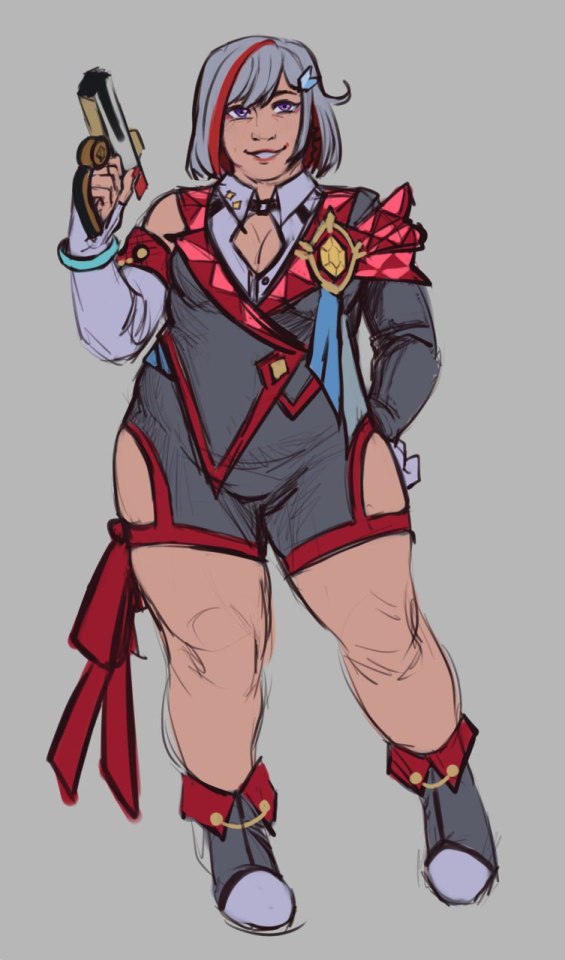
1. starting with my favorite girl Topaz! not much has changed, really - mostly I just made her fat(ter). boots with different heights annoy me, so i just made them the same height. that and a lot of miscellaneous details like moving her hairclip.
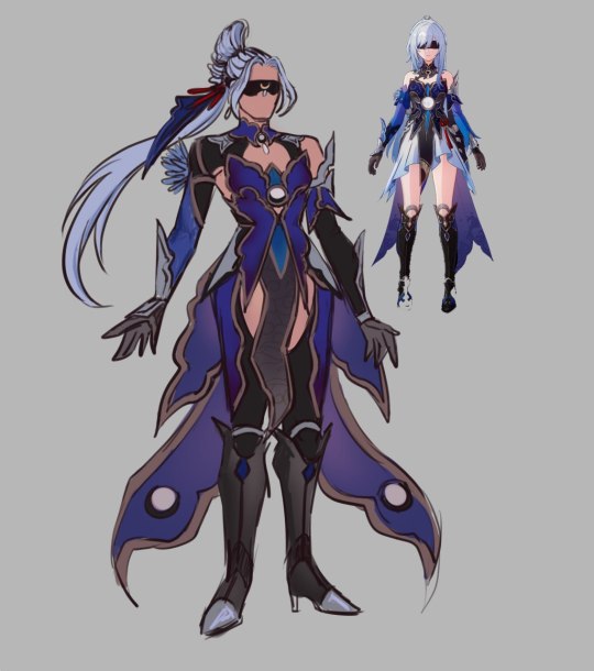
2. Jingliu next! would you hate me if i said i despise her design. because i do. this one was done just out of pure spite and its my redesign i do whatever i want (i find her aesthetic and color palette to be pleasant, not the design, which is why i did it in the first place). tho it is pretty old by now and im not that into it nowadays. I'd left in the signature hsr/hi3 style sexiness to her fit, making her gorgeous chestpiece the main focus. i hated her hair looking the way it looks, so id given her a new hairdo. not much more to tell there
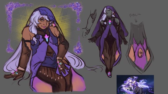
3. Black Swan! her lingerie really annoyed me. i wanted her to look like a chapel

4. Aventurine my boy.. i love him lots. first, the aforementioned Sigonian ornament in his hair, and studs in the ear. gave him more piercings and some tooth gems to make him look more expensive. other than that not much else changed! the fur on his coat made fluffuer, coat itself flashier, and ive removed his glove (idk why) and, more importantly, made his pants fit him better so they won't bunch up at the ankles.

5. Acheron.. my darling badend Raiden Mei... made her design less complex basically. this one is the one im the most proud of honestly!!
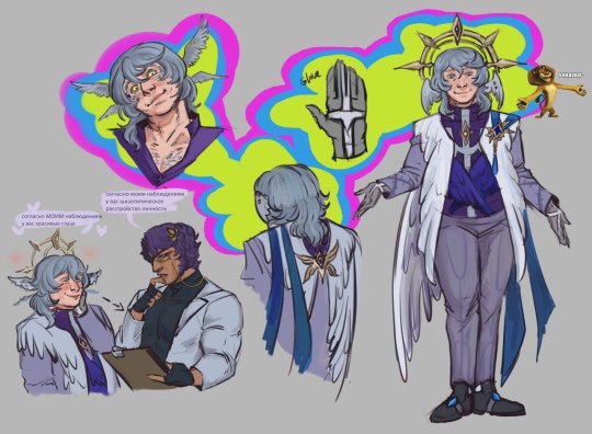
6. Sunday Oak... boy do i have things to say about him! basically just made him fatter and his design less complex. did that before he came out as a unit, so idk. reworked the halovian thing, i hc that they as species have feathers growing out of their faces, and instead of body hair in general. and a lil sketch of him crushing on the doctor

7. final one! Hanabi, Sparkle! basically just reworked her dress into a kabuki theatre inspired fit. and gave her flashier makeup.
#hsr#hsr redesign#hsr topaz#jingliu#jingliu hsr#aventurine honkai star rail#hsr aventurine#black swan#hsr black swan#acheron#sunday honkai star rail#sunday hsr#sparkle hsr#sparkle x black swan#dr ratio x sunday#miron art
59 notes
·
View notes
Text
Monte Cristo Villains appreciation post
THIS MOVIE ISN'T TALKED ABOUT ENOUGH OMFG
Something that I really love about Monte Cristo 2024 is its villain trio. I love how each of them is different in every aspect from the other.


(first of, the pictures are gonna be shait)
They all have a different hair color, black, blond and brown/gray. But the hair cuts are also never the same. Villefort (Laurent Lafitte) 's hair are a bit messy, still taken care of, but not neatly put together. And Morcerfe (Bastien Bouillon)'s hair are long, straight, and or messy, or just tucked behind his ears. While Danglars (Patrick Mille)'s hair have two very different state between the first and second half ; first he just does not give a fuck about them, they're long, dirty, tied at the back of his head and then everyone can fuck off, but then they're neatly trimed, brushed, with pretty curls, they look like the softest hair ever.
This is also the case with the facial hair : Vi has a zappa beard, a mustache, and then a soul patch beard, Mor has nothing, completely beardless, and Dan has a full on grown beard, it's Santa Claus.
Those hair also change between the first and second half of the movie, but the change is, again, different for the three. Vi's don't change one bit, maybe a few white hair here and there (I think his soul patch beard is gray in the sh), but that's really just it. Mor's completely lose their volume, they seem almost greacy , full of gel, but they're still the same length, and color obv. Now Dan's, it's a complet Disney-Chanel-Makeover, the color is totally different, gray to brown, they're cut short, they're not dirty anymore, they're the silkiest hair ever observed on earth, and damn he takes care of his curls.
Those changes are of course here to show the change of the character himself ; Vi's been through nothing, he was just chilling in his house, ordering executions here and there, you know, nothing crazy. Mor went from a happy young man to a war veteran, sent his best friend to jail for life and betrayed half the planet (and lost an eye). Dan got rich, crazy rich, he was a captain, so a working man, and became one of the, if not the, richest man of France.
Now the color palette of each character!
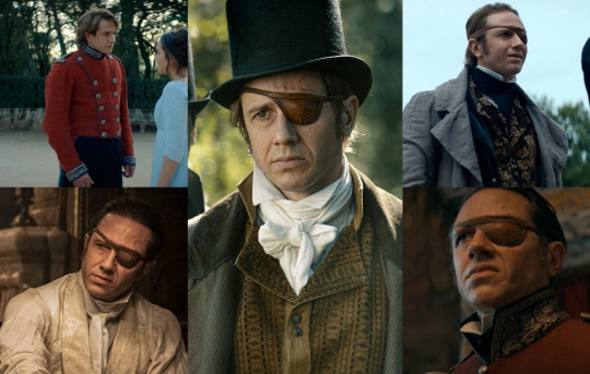
Let's start with Mor. Mor's main color is red, obvously because he's a soldier, he's in the army, and the uniform is this bright red, but per extetion it's also browns and beiges. "But the jacket in the third pic is some sort of green!" stfu. Let's say it's khaki. Even the eye patch is a warm brown. The white suit is a light beige, the black suit is a dark brown. (at the end of the movie, the duel, he's in blue, no clue why)
I think the red is also linked to all of the people he killed, with his own hands, at war. Red like the blood he shed.
coincidence : Bastien Bouillon's eyes are brown.

Blue and Black are the colors of Vi. He's often in black, but when light hits the cloth, it has a blue sheen to it. That's because his prosecutor uniforme (fifth image) is black. But quite often he's dressed in a very dark blue.
The black could also be linked to all of those executions he ordered. Like Mor, he killed people, but not with his hands, he did it from the comfort of his office. Black like the robes of death.
coincidence : Laurent Lafitte's eyes are a very dark brown, almost black.

and Dan is more in the green and turquoises, which is logical since he spent most of his life on the sea and got rich thanks to it. So green and turquoise like the sea and the money.
coincidence : Patrick Mille's eyes are blue/green.
And finally, the words they use to speak about Napoleon.
Dan doesn't care about politics, he calls Napoleon "The Emperor" even tho he isn't anymore, even tho he's exiled and the most hated man in France at the moment. Mor is a soldier, he fights for France, so Napoleon is "The Usurper" and his followers are "traitors to their country". Vi's the King's Prosecutor, he thinks he's untouchable, above all else, so he calls Napoleon by his name and his followers "Napoleonic agent", he's not afraid of the name, he isn't dramatic, just simple, straight to the point, like an execution.
Also last point ; one's a Count, one's a Prosecutor and one's a Baron.
That's it. Thanks for coming to my Ted Talk.
#monte cristo daily#laurent lafitte#bastien bouillon#patrick mille#gerard de villefort#fernand de morcerf#danglars#movies#movie analysis#character design#characterization#pierre niney#movie 2024#the count of monte cristo#le comte de monte cristo#le comte de monte cristo 2024#fypage#fyp#for you page#explore
37 notes
·
View notes
Note
Alr, ramble ahead but after seeing the Rainbow episode I’ve had a desperate urge to redesign and reimagine it. Small warning for body horror.
-
One of the main complaints I have for this episode is the lack of backstory for the Rainbow curse. I mean I get this is a content farm and Gametoons does a more episodic story structure, but we got Black’s backstory, Spectrum’s backstory, and Har, Mo, and Nee’s backstory. The only other backstory I think we didn’t get was that fire demon Sprunki, but no one likes that guy so he doesn’t count.
So for this version, the Rainbow curse is instead this collection of code that’s used to customize Sprunkis. When Mr FunComputer made the Sprunkis, he stored any leftover code somewhere in the lab. It remained inactive and harmless until Black comes back for some reason and fights Gray and Wenda.
The fight results in the Code waking up and immediately it becomes unstable. Code without a vessel is extremely volatile and fragile, so it instinctively latched onto the nearest “empty” host, which was Grey. Thanks to his monochrome color and his durability, Grey can temporarily house the Code without dying, but it’s still extremely painful.
Moments after being taken over by the Code, Grey immediately starts to change physically. Since the entire Code is so unstable, it’s trying to make multiple Sprunkis out of one vessel, resulting in not only a rainbow color palette, but also different body features like wings, horns, ears, etc, all growing in the wrong places. I also like to imagine that it’s physically changing Grey on the inside, things like multiple hearts, lungs, stomachs, things that that.
Along with physical changes, the Code is also trying to implement multiple personalities and voices inside Grey, resulting in him losing control to hundreds upon thousands of unfinished Sprunkis. For extra angst, I also like to imagine Gray is still completely aware, he’s just become part of this messed up mind hive where, even if he surfaces for a minute and is able to communicate to the outside world, he’s still accompanied with dozens of other voices possibly talking over him. Like if he tries to call out to Wenda or anyone else for help, his voice is completely overlapped by dozens of others, making his voice intelligible.
And yea, despite Gray being able to temporarily hold all this code, it’s still way too much for him. The code is basically trying to implement an entire planet’s worth of Sprunkis into one body, so that much strain and pressure will eventually rip Gray apart and kill him if nothing is done. The Code would also lash out at nearby Sprunkis due to its vulnerability of it still being developed, possibly trying to kill anyone who gets too close.
As for how Gray would be saved? Honestly no clue, either it’s the same solution with the color remover, Mr.FunComputer gets involved, some deus ex machina with Wenda, or something else. Either way, Gray’s gonna be leaving with a lot of scars and trauma which is nice.
And that ends the proposed rewrite. Not much else to say other than I like angst.
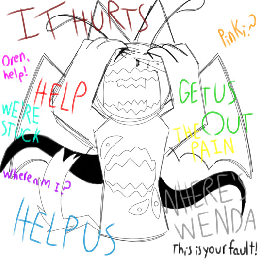
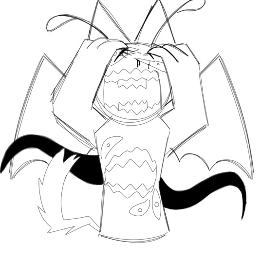
A shitty sketch could never possibly do this concept any justice but I HAD to illustrate this
If I may add one small thing onto this concept; what if every sprunki that Gray dissolves gets absorbed and joins the hivemind? :3 I think that'd be pretty neat
#art#digital art#fanart#au#alternate universe#sprunki#sprunki incredibox#incredibox sprunki#incredibox#gametoons#gametoons sprunki
38 notes
·
View notes
Note
Hii!! May I please have some headcannons with Gundham, Kazuichi, and whoever with a gyrau s/o!!! Please and thank u!!
Gundham Tanaka and Kazuichi Souda with a SHSL Gyaru S/O
here's another gyaru s/o fic i did with mondo, shinguuji, and kaito! it was rather recent too since when was i posting in 2022 what the fuck. i didn't add any characters because i realized i had three that i have already done so there's more mwahahahahaha
i love gyaru's rawr rawr i'm so excited to write this ty anon
-Mod Souda
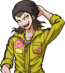
Gundham Tanaka

❤ It's clear you two are a couple. You both have a very eccentric way of speaking which makes you guys such a good couple wow, nobody is surprised when you tell them you're together. They can probably guess that. With you two having voluminous hair and heavy eyeliner, it's as if your aesthetics were compatible. Though being in two different subcultures, the overlapping stylistic details adds a charm to the times you've walked together hand in hand. Your both overdramatic way of talking makes people group you together.
He departs from the barn, quickly making his way back to the main building, where you wait on your phone. He doesn't have to look for you. Your appearance is eye-catching. Your loose shirt, a more casual one, is heavily wrinkled from how quickly you put it on this morning. You're not even wearing any of your iconic belts. You wanted to join him despite how early it was. Your eyes flick up to his once you hear him approaching. "Are you done?" You ask. You turn your head towards him, makeup still perfectly done (you focused more on that then your outfit, which you did last). Before he can respond, you squint at his name tag. "That's cute." He grumbles and unpins it. His mind was too busy for a proper conversation. He was logging all of the animal's names in his head and the medications and treatment they needed it. While you two walk, he places his hand on the small of your back, a simple form of affection to tell you he was still paying attention. But when you yawn, it breaks his thought process. "You're tired?" You nod. "Sorry, I didn't mean to yawn like that." "Nonsense. Perhaps we can arrange an hour of slumber." You nod. "Can it be more than an hour?" He hums, thinking for a second. "As many as you need, my dear enchantress."
❤ Oh my god if you wear more dark colors or purples (else a goshikku gyaru) you could absolutely be the same color palette as him. Purple and black pleaded skirt with eyeliner in your waterline omggg. Or a zip-up with skeletons on it.
❤ He absolutely loves your style, he adores anything vaguely alternative and subnormal. Ur definitely getting some more romantic nicknames like "my muse" or "my agony".
❤ Ya ya ya it's unhygienic but you can share makeup if you can't find something (aka you probably left your eyeliner in your purse but completely forgot).
❤ You will scream and cry when you tease your hair and then you go to visit animals with him and a giraffe just starts licking it.
❤ But the hamsters love your hair / wigs.
❤ You can probably convince him to wear more eccentric earrings.
❤ And necklaces. Omg matching necklaces. From the one dogtag he wears, you can convince him to wear a chain or a bunch of layers of silver.
❤ I doubt he has social media so he doesn't see your persistent presence, but he will take pictures of you with the animals for some posts.
❤ When you start using a bit of his lingo online no one questions it.
❤ Also in the scenario thing above I fought the urge to say you were playing dress to impress.
.
Kazuichi Souda

❤ He was so nervous around you. He wasn't as bold as he was with Sonia. He'd give you compliments and then promptly walk away after you say thank you. It takes you and your boldness to finally get him to have a lingering conversation ("No, no, you get back here"). He's such a charmer, you loved the conversations, and whenever you gave him compliments back he was fighting the urge to completely melt.
❤ You post a lot of photos of you two together. You just love his pink hair and it tends to fit your layout perfectly. Some of them aren't just cutesy selfies, it's things like him with his jumpsuit tied around his waist as he's too focused on his work to realize you have your phone pointed at him. He's started to do the same to you. Taking pictures as you're posing yourself for your own camera. You love the candid photos he takes of you so much you end up posting them instead. He loves your online presence. He's gonna pick up the slang you use and it's gonna be funny LMFAO.
Upon entering the house, he spots you sitting on the couch with a sugary snack in your hand. You immediately smile. "Sorry," you say, "I couldn't help myself." He was planning on a real meal for tonight, but of course, you've indulged in the popular snacks you love so much. At least your well, that smile on your face says as much. He kicks off his shoes, leaving them scattered by the door. You study him for a moment, wondering if his sour mood is because of you or whatever job he had outside. "Are you good?" You ask mid chew. He eyebrows furrow a bit and he nervously scratches at his jaw. "I lost the necklace you gave me." "What?" "I took it off and I don't know where it went, I'm an idiot." You place your snack aside and stand, approaching him. "Dude," you place your hands on his cheek. "It's not that serious. I have a thousand of them. I'll get you another one." "But you gave me that one." "And I'll give you another 'that one'. You worry too much." He sighs, placing his forehead against yours, the small thunk drawing you back, but you don't pull away. He's constantly fearing offending you or disappointing you. But you always assure him that things are alright. The simple things he stresses over are never things that will push you away, and he needs to understand that.
❤ He loves it when you scratch his back with the long, decorative nails. Or when you massage his scalp when he's trying to sleep. His small, half-awake hums are soooo cute.
❤ He'll want you to do his hair. He trusts your stylistic abilities with his life. You're not going to be able to do the dramatic makeup on him, nice try. But hair yesss. He'll want to add small braids to your style as well.
❤ His work is a little too messy for you and if he gets motor oil on you you're gonna fight the urge to throw a fit. On your yellow shirt? Kaz. You piece of shit.
❤ ^ Frantic cleaning-related google searches.
❤ ^ On the rack beside the front door, you keep your shoes far away from his.
❤ He gets you a lot of those glitter, bajeweled (or whoever it's spelled) reusable cups. He uses them a lot for himself though. He wanted an excuse to have them, and you definitely figured this out LOL.
#danganronpa#x reader#gundham tanaka x reader#kazuichi souda x reader#kazuichi soda x reader#peko pekoyama x reader
48 notes
·
View notes
Note
what are your favourite designs for c!awesamdream (be it clothing, hair style, species or sth else?)
!!!! Squishes you. Hello friend<3
Sam is Puppycat you see. He's a creeptaur usually when I'm designing him. I actually made references a while back for different breeds of creeptaurs, because I very briefly went insane over the idea of making a whole host of lore and culture for creeper hybrids.

The main four types here are Chinese Mountain Cat, Lynx/Snow Leopard, Pallas, Tiger. Lynx/Snow Leopard is crossed here is because Lynx already came with a bobbed tail, so I used a snow leopard tail for the "long tailed" version.
Sam is a mix between the upper right and the lower left. Pallas/Lynx. He's got the Bigger Paws but he's Fluffier. He also has the bobtail. His mother was a longtail pallas and his father was a bobtail Lynx.
(This is a really old art reference so likely I'll go back and redo these with the added color palettes I have for different biomes. And likely add more cat types.)
Sam also has the ability to become bipedal with a special ring that a lot of hybrids purchase from Hypixel! You twist it left to assume a more human-shaped appearance, while twisting it right to assume your True Form. Not everything in the world is made to perfectly accommodate all shapes and sizes of hybrids (Foolish is like 20 ft tall) so the ring helps people who would like to be able to get through doorways without bonking their antlers or getting their wings caught.
(Punz has a similar ring and uses it to hide their bee features. While the ring was invented purely to be helpful to the general populace, it doesn't change the bigotry and xenophobia that still remains.)
Dream is a bit trickier. I usually picture him as a human when reading fics, but I don't always consider him to be Actually Human? I like to think of Admins as their own species, something that can often pass as human but is just A Little Off.
So he's a human-looking person with long, dark blonde hair that turns white-gold by the time prison happens. Its curly when its well taken care of; Dream does not take care of himself for a long time.
Sam's hair is short, dark green, and very fluffy, vs Dream's hair being silky. He's a head taller than Sam, but not as broad-shouldered as Sam. He has top scars, has gotten magical bottom surgery via XD,
He's absolutely covered in freckles, full-body, and they get fainter in the winter and darker in the summer. Sam has dark green spots under each eye. His skin is green, and fuzzy with fluff in certain places. Dream is missing a middle finger on his right hand and a pinkie finger on his left post-prison.
Depending on how I feel, sometimes I give him lava burn scarring that starts at his upper arm and creeps up to the left side of his face, around the upper jaw, ear, and forehead. Its usually very faint, a pinkish color.
Pre-prison he has a scar on the back of his hand from a manhunt where he cut it up on some rocks, and a slash across the nose from his duel with Techno.
Yellow and gold are big colors in Sam's wardrobe, followed by white/cream, brown, occasionally black, and hints of red. Dream's wardrobe is always primarily green and black, with ender eye blues and enderman purples. The only red he tends to wear is the friendship bracelet he has that represents Sapnap. And the blood of his enemies. Normal things like that.
Post-prison Dream eventually gets a netherite enchanted cane. It does about as much damage as a netherite shovel and when it hits someone it can set them on fire. Dream and Sapnap think its very funny to test on Sapnap (blazeborn and immune to fire damage.)
#suds asks#suds soapbox#my writing#I get to be insane and think about them and rotate them in my head#thank you for this gift
33 notes
·
View notes
Text
I've found a slightly higher quality version of that leaked trailer, and I've scrubbed through it looking specifically for clips from Interstellar Song Contest
For reference, this is the outfit the Doctor's wearing in the "We're so staying" clip;

So that orange shirt will be one of our main markers of ISC footage.
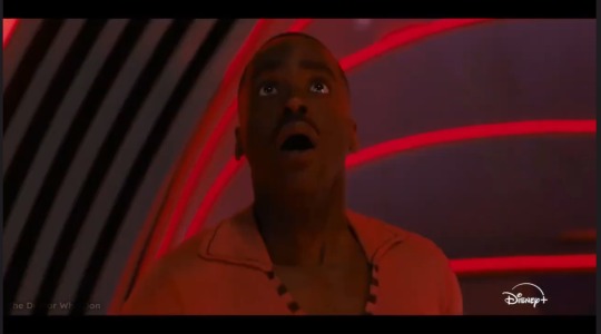
Here's the Doctor in an indoor space with black accents and red lighting, reacting with shock or fear

In the trailer, that shot cuts straight to this shot of the Doctor flying backwards. I'm not convinced these shots go together in the actual episode - rather than that black and red hallway, it looks like we might be in space? Or some larger and more shadowed indoor area (possibly a shot of the crowd from onstage)? That's definitely the ISC outfit, though
Do some of those objects at the bottom look kind of like skeleton pieces? Of a lizard skeleton or something? Could this shot actually be from Wish World, or some sort of lead-in to Wish World at the end of ISC? Is he being transported to the Bone Zone?

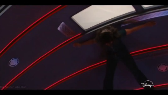
Back in the hallway, Belinda is getting flung upward and smacked into the ceiling
(Looks a little like a meme format waiting to happen tbh)

More black and red, which seems to be the ISC color palette. This one definitely looks like a view of the auditorium seating from the stage. At first, I thought the mass of small objects rising upward looked like drones or something...
But I think they might actually be people? (This is a little more evident in motion, I think. You can make out what looks distinctly like arms and legs). I think the entire audience is being lifted out of their seats here
The youtuber from the breakdown I watched earlier said he thought he saw a spaceship exploding in the ISC episode (like the opening of the audio drama, which I assume he'd listened to and was looking for elements from). iirc, he was talking over the clip from above. But nothing there really says spaceship explosion to me?
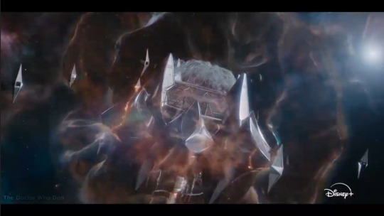
This is the closest thing I could find to a spaceship explosion. Its aesthetic doesn't really scream ISC (I'm getting more ancient space cult). And if it is from ISC, then it looks less like a spaceship and more likely to be the entire space station the contest is being held on. Also not totally clear if the special effect here is supposed to be flames/explosions, or more reality warping

Finally, we get this shot with very different lighting and color palette, but the ISC outfit. The Doctor is covering his ears, and there's a little bit of blur, which reminds me of the disortion effect from that clip where he's holding his hand out on the Tardis.
A reality warping effect could certainly be related to all the people getting flung around and levitated. That seems to be the main takeway we can get from this trailer: the Interstellar Song Contest might be the point where reality really starts to fall apart.
11 notes
·
View notes
Text
Tfp GL2 Redesign, again
It's almost been six months since I last did my redesigns, and it’s about time I did another.
Design timeline & explanations undercut
Jack
Out of everyone he was the hardest to think of an outfit for. I wanted him to look visually interesting but without taking his grey color pallet. It took some trial and error but eventually I got to this. He's rocking the skirt and jeans combo that I think looks pretty cool. It's functional while being aesthetically appealing. Outside of just looking nice the reason I gave him a skirt is for well 1. I don't think I have ever seen a main male character wear one that is not super effeminate (or exist in the first place) 2. It can give another reason why Vince would bully Jack outside of just being a “loser/social outcast” while also bringing attention to the issues gender non-conforming people face and 3. It helps unite the trio over their shared troubles of not fitting into what society expects of them.
It's hard to see but Jack has a moon symbol on his shirt as a callback to June saying he wanted to be an astronaut when younger. He also got a black eye from the for mention bullying with a bandage covering up some other injury. Jack's got a little bracelet that looks like Arcee on his right hand. On the left which you can't see at all some bandages too. No real reason for the shoes then just to complete the look.
Raf
Most of the time trying to make him was spent figuring out the hair. While the black person with pure white hair is very visually appealing it has been a bit over done. I wanted Raf to have something a bit different so I added a brown tone. I at first tried giving him dreads but I couldn't find anything I liked/that would fit. It was annoying figuring out the middle ground of messy but controlled.
The rest came pretty easy, classic sweater vest over white button down, shoes and socks that I made green to match his eyes, with red shoes plus glasses that I thought looked nice. He also has a big scar on his face that I like to think he got when shot by Megatron. It would resemble something akin to a lighting strike scar. He also has some freckles but you can't see them.
A sling bag instead of a backpack since it's used more outside of school while fitting his outfit more.
Lastly, a bumblebee themed wrist brace. I think it would be cute when Bee gets his new colors Raf points out how they match now. Kinda like a foreshadowing Easter egg. Instead of it being support for needing a cane it's to help with especially bad JIA in his wrist. (Juvenile idiopathic arthritis) It also gives more meaning to “old man” nickname Miko gave Raf.
Miko
My God, were the colors a nightmare to figure out. The main reason my old Miko design was mostly two colors was because figuring the color palette was too hard for me. It was easier but it did not look like Miko enough. *Sigh* I'm pretty sure for their canon designs Miko has more colors than the rest of the kids combined. Regardless, I love how she turned out! I think I got a good middle ground for the “canon look” and my own interpretation.
Here's the timelines:
She has multiple scars on her face from the past “adventures” Miko has had. With how little self preservation this girl has Miko got to at least have some injuries from it. Pink shirt with a cat skull combo on it for cuteness and a bit of darkness. Dark blue overalls as her og design always looked like she had them to me. Some fingerless gloves that I think fit her vibe and her stockings being similar color to the little guys on a canon design belt. Gold colored shoulder pad for a “armor look” and a belt for a tail that matches her tail. In complete honesty the reason she has one is that I also wear a tail too irl. (FOR FASHION, SO DON'T GET ANY WEIRD IDEAS!!!!) Plus the way the animators animated Miko’s hair was kinda like cat ears lol. So it definitely helps the orange cat vibe Miko got going on. A bunny plushie that looks like Bulkhead on her waist. To once again reference the little guys she had and because it's just cute. With shoes that also match her hair.
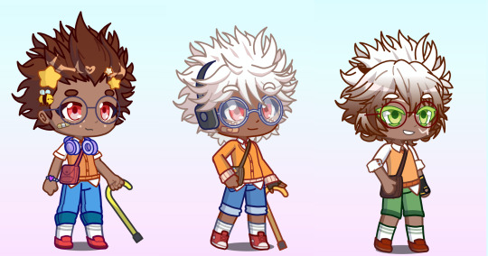

#their eyes might be my favorite part#just so satisfying to look at#transformers#maccadam#tfp#transformers prime#tfp miko#miko nakadai#tf#tfp jack#jack darby#raf esquivel#tfp raf#gacha life 2#gl2#tfp redesign
13 notes
·
View notes
Text
im so sorry it took me so long to answer these oml but YES i'd be happy to show how i draw and color :)
— SKETCHING
please note that i almost always sketch traditionally first lol it's just a lot easier for me to determine how the drawing is placed that way, but i always go over and re-sketch it digitally
for magolor i always start with a basic egg shape (lmao) and then i add his ears. then I draw the scarf; it's easy to determine the shape and dynamicism based on where the bottoms of the ears are located
then i usually add the cape and hood together. where and how these are placed and what these look like in general are very important because they're the main area that perspective is directed to (the ears and everything else is important too ofc!! but the hood and cape usually help demonstrate where he is looking and how he is moving the most). then i add everything else, usually his hands last!
— LINEART
ohhhhhh god my worst enemy. Hope youre sitting down because this will be embarrassing LMAO
lineart is easily what i struggle with most and is more often than not the most time consuming and grating step for me. If i had a choice i would drop it in a heartbeat, but my style is so dependent on thick lines and shapes that it's difficult to 😭 a hole i dug myself into unfortunately ITS FINE THOUGH. ANYWAYS I'm getting sidetracked
i use my finger to draw all my digital art, which means i usually have to use a Heavy stabilizer to avoid shakiness and staggered lines. Unfortunately ibis paint's stabilizer is actually dog water and doesn't even stabilize more than half the time (in which case i have to repeat lines over. And over. And over again until i get it right) but when it does like me and works properly it's very helpful!
i always use the soft school pen bleed brush as my main tool for lineart. This brush has been my best friend for everything, i even use it for sketching idk it just really like the way it looks lol. sometimes i change the aspect if i want the lines to look more ,, chalky?? or smoother depending on the work

i don't really use this tool much but for this specific piece, force fade was my partner in crime
also i think i need to mention that i use so many layers for this. So many layers lol like to the point it's embarrassing. and at the end i merge most of them (except for the gear patterns, rings on his ear, and eyes + hands, which usually need to be by themselves as they're colored separately) Thank you for layers
and i end up with this!
— COLORING && SHADING
yippee yahoo the fun part !!! the part that i love the most
at this point, if i havent already, i always create a folder for convenience in organization because this is the part that i stress the most about what details are on which layers lmao
then i add ANOTHER layer below that for the color, then i put every single color used on their own separate layer!
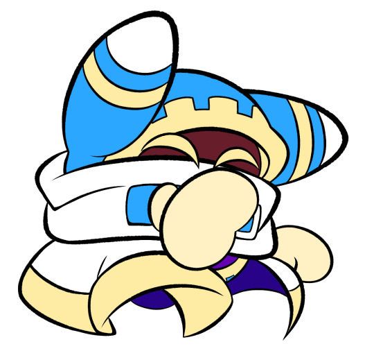
now, for shading, if im working on larger pieces with more complex shading, i'll usually plan it all out. normally when just drawing magolor, i don't really need to do this anymore because i'm so used to it lol, but for funsies i did it here anyways
then i use the bucket tool to fill them all in
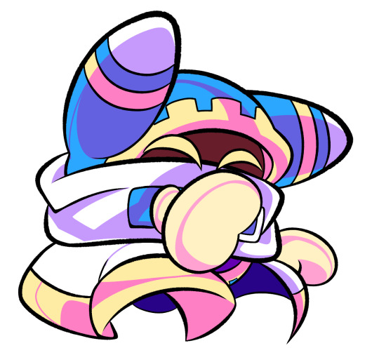
i usually have a set color palette for all the characters i draw (though the way i shade white differs. A lot between my work as you can probably tell fhdfgf). For every color, i have two specific tones that are associated with the shading. for example, indigo + violet are shaded with my blue, pink + light orange (or lighter pink depending on my mood lol) are shaded with yellow, etc.
so, i shade the other areas with the 2nd shading color
a big tip i can give for coloring is to look at a color wheel when you draw. i know that sounds like. Such basic advice LMAO but that seriously was a huge help for me when developing my shading and something i learned while studying — if you notice, in all of the shading in my work, all of the colors used are analogous on the color wheel. note that not ALL combinations will work together like others obv !! but it's a huge step in knowing where to go with it
then i add other extra details like extra lighting, halftones (if i feel like it // if it fits the work), glow to his eyes, and color the lines and ta-da!
another tool i use a lot especially with my more recent art are blending modes, especially multiply. i use a clipping layer to add a dark color (usually a dark blue or purple) and set it to multiply, then erase the areas that emit light

and this is the end result! this is a very very basic demonstration of it fhdjg i was a pretty messy with the lighting and erasing in this example but you get the general idea right
and that's how i draw :) i hope this was helpful, and thanks for asking and being so patient with the response!
#ask#magolor#kirby#macdraws#ive wanted to make a tutorial for So long and finally found a bit of time to do it lmao
145 notes
·
View notes
Note
oooh I'm intrigued. What was the creative process to create Spelldon? :0
oohhh well when i started the cover, i got a lot of creative freedom and was allowed to give my take on both valentine and spelldon so they'd have comic-specific designs. spelldon was the biggest challenge ofc, i was told he should look similar to casta fierce since they're siblings, the rest was up to me. i knew the fans had been waiting a long time to see these two so i started by doing a bunch of research, like rewatching Why Do Ghouls Fall In Love and that webshort casta is in, to immerse myself in the monster high world. my first thought was what if spelldon has curly hair, a dangly earring and a cool jacket… i like when a character's fashion/style reflects their personality so I basically build on that. i wanted him to stand on his own and not just be "casta but a boy", so I tried stuff like flipping their style and color palette while keeping elements like makeup, studs and the hairstreak to see what looks cooler. where casta's colorful dress and long hair are at the center of her design, i thought spelldon could have the opposite. then I also had to make sure he stood out from valentine, since they'd both be wearing a lot of black. so I thought what if he wears a lot of accessories, maybe that could make him unique? what if his hair has a different silhouette than valentine's? stuff like that. and then finally, I'd work on stylizing and simplifying the design so it's easier for the comic artists to adapt!
worked on the cover and design at the same time so time ran short but that's some of the main ideas. it was a wild process and put a lot of love into it! at first i just designed his face (cus that's what i'd mainly be drawing for the cover) but Mattel liked him so much i ended up fully designing him, which you can see now in the comic! thx for asking♡︎
#ask#this is smth ive been keepin a secret for like half a year so its been real fun to watch it all come to fruition#its like designing an oc and bam some time later he has a personality and a comic written about him...#i feel very lucky to have been given this opportunity!
35 notes
·
View notes
Note
can you take us through the process of how you design a character?
ooo? This is a question/remark people say a lot, I've noticed. Wondering how I go about designing a character or how watching me draw is an interesting learning experience overall.
I mean, I've explained it here and there, given tips here and there when my friends ask me, but I don't think I've ever made an actual. post about it. Just given tips inside of Discord servers here and there.

So, yeah, I can give you guys a basic breakdown of how I design characters, as well as stylization of characters from other medias. It's gonna be a big post but I hope you guys. find an answer you're satisfied with? Question mark.
sorry in advance, btw. this is going to be LONG since I wanted to cover all my bases with this one ask🙂↕️🙂↕️since, like I mentioned, a question/a compliment I get a lot and y'know, I know friends like Klai and Pins would find this interesting since they like to call me TEACHER when I yap about art stuff 🙂↕️🙂↕️🙂↕️
so erm. sorry. long post. I've been doing. a lot of those lately huh.
// ORIGINAL CHARACTER DESIGN - Designing from scratch!!
Designing a character from scratch is probably what anonie meant when they asked this question, and so, that's where I'll start! This is also the question most people have when they ask me how I design a character so 🙂↕️🙂↕️
Character design from scratch is my main part as an artist! This is why, when I approach designing a character from scratch, there are three core components that I consider! (or when I'm redesigning a character.)
Posing, color palette, and that reoccurring "pop!" factor! What the fuck does that mean. I'll tell you!

For characters, three main things are important to me when designing from scratch; everything else is honestly debatable if I can get those three things down to satisfaction.
A good pose strikes confidence for you as an artist! And, for all intents and purposes, it can strike confidence for your original character as well! (if they're the confident type.) They're here, they're hot, and they know it! Having a good pose can make the difference between a good character design that you're happy with and a character design you're not overly wild over. Confident characters stand with a strut to them, a certain flair of elegance, their chest puffed out; it's a sign that they're going to take the day and make it their own! Shy characters are more withdrawn; they sink into themselves and they simply wish the day passes them by. Your pose will say a lot more about your oc than you might assume.
The color palette will say a lot about your character! Seriously, a color palette is either going to make or break a character design. Of course, it also matters where you place these colors, which one is your main color(s), and things like that. But the colors you HAVE in your color palette really matter! Usually, before I go into a character design, I already have a designated color palette that I intend on working with, and that can reduce otherwise unneeded stress!
Of course, you can always change the color palette if something in the color palette ends up not working, but starting off with one? Makes things so much easier, I promise. It works even better if you have an intended aesthetic in mind. Like gothic.
Sometimes, the color palette I work with is as limited as just two colors, like this one. Minus the skin tone and heterochromia in the eyes, this character design only uses two colors. Magenta and Black.
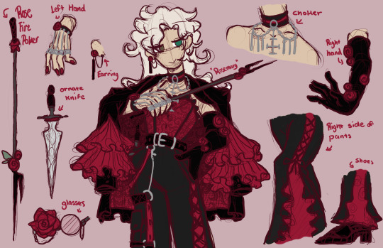
Finally, there's that last one. The reoccurring "pop!" factor. In Rosemary's case, it's that reoccurring rose motif that's on his gloves, earrings, wrist, glasses, and more. But, generally, the "pop!" factor can be anything... just so long as it makes your character "pop!" in a sense. It could be roses, it could be a marking that appears multiple times on their body, it could be anything... just so long as it pops out in a sense.
That's the joy of designing a character from scratch. You're in complete control of everything; you're the master of the castle perse.

Again, the three things I focus on in a character design from scratch are the character's pose, the character's intended color palette, and any "pop!" factors the character might have. Looking at Finality, I can point out each right now, and even tell you the thought behind the design! Now, will I do that NOW? girl there's still more POST left.
But, for Finality? His pose is bored but one of lying in wait. (I mean, look at the background. He's on the moon! Not much you can do BESIDES wait, I feel like.) His color scheme, like him, is very cool-centered, being comprised of blues, white and black, and very minimal soft yellows. As for his "pop!" factors, I bet you noticed the wings, segmented tail, and the horns by now. That is what I mean by "pop!" factor. It pops out from the rest of the design; it's usually something you notice in a character before everything else.
So... yeah! Posing, color palette, and that reoccurring "pop!" factor! Those are the three things I usually focus on when I'm designing a character from scratch. Of course, it's not the end-all-be-all for a character design checklist, but usually, if I have those three things when I'm going into it, I can come back out with a character design I find mildly nice!
Of course, its different when you're designing a character FOR someone FROM scratch. Sometimes, its all about "would they think they're hot?" and if the answer is yes?
You're getting somewhere!!! (/j but also, true story.)
---
// ORIGINAL CHARACTER DESIGN - Designing from a character picrew/character designing tool!! (especially when the character is someone else's character!)
Designing from a character picrew or character designing tool (such as a dress-up game) is a different battle altogether... because the character design was done for you already, now all that's left is to draw it for yourself!
And, again, a question I've gotten a lot is how do I transfer from additional medium (in this case, the picrew) to my own style. So, I'll tell you how!
Exhibit One. YOU. I think this is the most... well-known? Picrew character I've ever translated into my style.
For Bet, what was most important for their translation in my style was. Probably their hair? Since, the way their clothes and everything else fall in line with the way their hair is flowing. And that's how every Bet drawing I've ever done ends up flowing; it flows with the way their hair flows.

Exhibit Two.... hi Cleo! Gay ass murder queen 🙂↕️🙂↕️sorry gamers, I could NOT see her ass dating a man. (/ref)

For Cleo, the focal point of her translation into my design came with her coat. Similar to Bet and their hair, everything flows with Cleo's coat. As well as this, Cleo's role as a DBD killer was important to me, so I also added some blood to her coat (with the mun's permission/approval)

When translating picrew to your style... I think that the most important thing to focus on is the thing that flows best in your style, since usually everything will follow the piece of their design that flows the best!
In addition to this, picrews and character designing tools can be limited in what they're able to actually achieve! So, it's important to add in those smaller details you otherwise wouldn't be able to, such as the collar added to Cleo's choker, the blood on Cleo's coat, or the specific way Bet's suit is tailored to fit their person.
If you're looking to translate a picrew or something similar into your own style and don't know where to start... well, that's where I start. Having a focal point to start with and making sure everything flows in a similar way so its not feeling clunky is. honestly SUPER key for me.

Having a picrew can be so nice when you have a character you want to give an appearance but you're having trouble drawing them, or just, not having the time or energy TO draw them, but it can always be a little tricky translation-wise.
Sometimes, the art stylization is too different from your own, and sometimes the color drop looks off, so you have to eyeball your own close match (like I had to do with Bet's hair color when I drew them for the very first time), and sometimes, it's just... not turning out how you want it at all.
But that's how I do my translation from picrew to art.
---
// ORIGINAL CHARACTER DESIGN - Designing for characters based on universe settings!! (aka, designing for an essence or alternative universe!)
Another question/compliment I get a lot is about my essence skins (as well as my Halloween series designs), and the main thing is just... how do I do it?
And honestly, it's all about the character, personally! Let me explain. Hear me out, even.
Exhibit one. Dennis and Sadie (from the Azidoazide Laboratory essence)

And exhibit two. Saae Avente. (from the Emerald Masquerade essence)
When designing a character for an essence or alternative universe, for me personally, it's the most important to me that the character design is reflective of the character itself. Let me explain! Please... (/j)
In addition to the big three, posing/palette/"pop" item, the character itself is very important to the design! Think about it, what kind of person is this character supposed to be? Kind? Mysterious? Flirtatious? Villainous? Their character should translate into their design as well!
Having a character design representative of who they are (or, who they're perceived to be) can not only make designing them easier in my personal experience, but you personally get a design you utterly adore more than if you design them without their character in mind.
Give it a try next time you design a character with this kind of universe/essence thing in mind. Once you get in the zone, you can also knock out an essence of 13 people in just 2 days like me! (For legal reasons, if Four is reading this, this is a joke.)
"But what about when you're designing a character whose entire front is a red herring-" Design them as what people think they are as the red herring. If they're all kinds of fucked up but appear as kind and quaint, draw them as the kind and quaint person people assume them to be. If they're a nice person but have an intimidating aura and appear frightening, draw them as the frightening person people assume they are. If they're a good person but just look. so-so and unapproachable... draw them as the so-so and unapproachable person!
Initial impressions, especially in the context of character designs, are everything! Look at Saae's initial design as the emerald attendant, and come back and tell me if he looks like a psycho killer <3
---
// ORIGINAL CHARACTER DESIGN - Designing based on a canon character's design!!
This section will primarily relate to personaifcations of self, based on different videogame/animated characters, or just... sonas.
Designing an original character (such as an OC or sona) based on a canon character's design can always be... a little tricky. Since, there's so much that you as an artist are capable of working with, it can become overwhelming if there's too much to work with, y'know?
Ultimately, when working with a canon character and designing something new from it, you gotta break it down in chunks, otherwise, you'll get overwhelmed and crash.
When I design a sona (especially with a fandom source in mind), I break it down into the following categories BEFORE I proceed.
What is their source character? (ie, which character is their design based on?) What is their character role? (ie, what is their purpose? Huston's a for-hire hitman, Lyra's an idol, Lynx is a magician, etc.) And, what kind of character are they supposed to be? (Playful? Strict? Stern? Delusional?)
Sorting the sona process into those three categories makes things (for me, at least?) a lot easier to process, digest, and turn into a design.
Take Tricksty for example!

Based off DBD's "Trickster", Tricksty is one of the many character sonas I have under my belt! Similar to Trickster, she's a (deranged) K-pop idol! She's very lascidasical but inherently, a little fucking coocoo and (in the most fucked up sense of the word), playful! Meaning, in order to pull off this sona design of a sona based on DBD's Trickster, I'd want to keep those elements as I designed her. Making her pop, with the neon hints that Trickster's design has while keeping (that god AWFUL) yellow and pink color palette and neckline jewelry. It was hard (/j), but by god, I made it work.
And if I can make Trickster's ugly ass into a pretty woman (pretty much a pain in the ASS), then you can conquer even the most intimidating project you have on the backburner because like I could do it but am I good enough to do? Which, yes. Yes, you are, and I will explode anyone who thinks otherwise >v<
For sonas and character designs based on existing characters, the best course of action is simply to take it slow, take it one step at a time. Iron out the wrinkles, refine the details, and simply focus on getting it from point a to point b. it's better to have a failed design to rework later than it is to never properly get it out there and become frustrated because of it. Failure is simply a starting point to future success.
Again, it always comes down to the big three, but it's important to think, "what would I do if I were them?" Sonas in particular, its easiest when you put yourself in their (probably fucked up) shoes. Like yeah my ass went to jail and got executed but I want to look CUTE in this jumpsuit so how would I pull that off.

---
// CANON CHARACTER DESIGN - Designing from a canon (human) character's design!!
Canon characters can be the trickiest character designs to do. Because they have a character design already... but you still want to make a character design that's still them but representative of you as an artist. In which, the advice I'm about to give might honestly not be... that helpful if you're looking for genuine advice but.
Draw them however you want. It most likely won't be harming anyone else, and if people don't like it, they can simply scroll past.
Whether its a redesign, an au design, or just fanart with a headcanon in it, design in a way that makes you happy! It's a headcanon for a reason!
If it ain't broke, don't fix it, y'know. If a design makes you happy, who gives a damn!

Take the roommates, for example. Cheng Xiaoshi and Lu Guang (the ONLY time I'll be dropping their fr fr names) don't look anywhere near this in the source material, but at the end of the day, I'm not really drawing this for anyone but myself, so, I should draw them in a way that makes me happy.
Let me stick stickers all over roommate one's face because that's what I think would be fun! Let me draw roommate two almost exclusively in greyscale because that's what I think would be the most fun for me!


You only live once. And if you try to force yourself to stick strictly by canon, you might hate the experience of drawing a canon character and never draw them again!
It's okay to have fun. It's okay to experiment with a character design, adding your own touches, headcanons, etc. You'll always have more fun drawing and designing what you want HOW you want. Who cares what a person you'll probably never see again afterwards might have to say.
If you can't do things for the sake of your own joy and happiness every once in a while, especially in a medium like art? What are you really doing it for?
Drawing what you want, whoever you want, however you want, if for nothing else other than your own personal enjoyment.

---
// CANON CHARACTER DESIGN - Designing from a canon (non-human) character's design!! (aka, a ginjika!)
oh my god im almost done im almost FREEEEEE. WOOOOOO YIPPEEEEE YEAHHHHHHHHH.
So, designing a character (typically a non-human character, or a character with animalistic features) and turning them into a human can be a fun experience or it can land you on a "top ten most wanted" list, its all about personal vibes! Typically, we call these kinds of character designs "ginjikas". And, its something I'm... known for doing a decent amount.
Which, it's something I'm known for, something people enjoy seeing, some designs so enjoyed that other people have drawn for themselves and made. amazing shitposts with /j And I just figured, while I was on my explaining arc, it'd be a good time to explain how I get to their designs!
In which... it's honestly all about the vibes. Combined with the big three from the first section and "draw what makes you happy" from the latest section, there's no one particular way to create a gijinka of an animalistic character.
Of course, you have to keep certain details in mind, like the animal they are, their general movement, what they're made up of, etc. But, beyond that? That's the best part; you have so much creative freedom and liberty to draw them as you want!
Mister Tail is made of fire, snarky, floats, and he's just. a bit of a menace! And I love him! I love this design for him!

The Joy Joy Gang fucking haunts my nightmare but their human designs are so special and fun to me, there's a certain... joy 🙂↕️🙂↕️that they bring me when I draw them, even in shitty low quality.
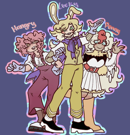
Shadow and Hello Kitty's alternative designs?

Hell, even the SAME character design can look very different at different points in the timeline. Because I CAN.


I can't stress this enough. Have fun with your craft. If you can't have fun with it, if you can't look at a design and it doesn't make you happy to draw it, even poorly, you're being too restrictive and too hard on yourself.
Your art is your art, and especially with ginjikas? Design them in a way that sparks joy.
Because if it doesn't spark joy, if it doesn't make you smile when you see it, you're doing it wrong. Draw with the vibes in mind, draw them in a way you enjoy, in a way you don't mind coming back to.

...
I can give you all the tips and advice in the world, sure. For all the pointers and resources and everything I can give, there's something much more important than that all. I can give you advice, I can help you, I can break down my art process all the live laugh love day but.
If you're having fun, at the end of the day, that's all that really matters.

that's what 16 years of drawing has taught me. They say experience is the best teacher, right? So, take these tips and tricks if you want, I got plenty of knowledge to spare! But, experience it for yourself, and I'm sure you, anon, and everyone else curious reading this, will find the tricks that work for you too.

If you have any more questions concerning this, guys, feel free to ask, I'm more than happy to help out where I can!
#// calamity chats !! yay yay !!#// skittle anon asks#( my art advice arc. woah. )#( im so sorry this is so long guys. sobs. )
11 notes
·
View notes
Text
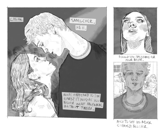
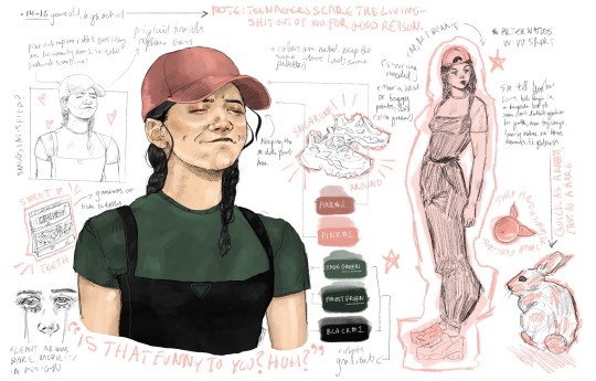
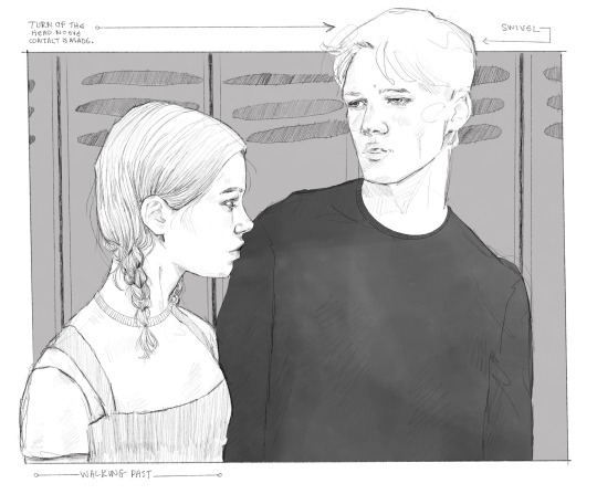
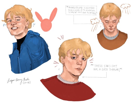
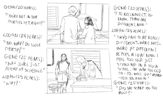
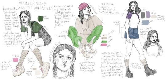
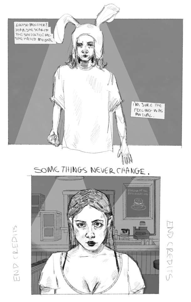
growing pains
It’s only been nine years. They’re not in their thirties yet—and won’t be for a while—but it’s worth noting that things are different. Maybe it’s them, maybe it’s the boardwalk, or maybe—well. Logan is a different person than when he was a high schooler. He’s less assured than he was. That could be it. Louise is almost certainly different than she was then, but even now she still hates his guts. Maybe some things don’t change after all.
Notes Transcription
Main Episode Outfit Variations
Louise would be into layering, I think. She’s multifaceted, practical, and resourceful. Harsh structure in conjunction with more layered pieces; tendency towards color blocking, but she keeps it sharp. She’d be into casual, pragmatic clothes. If not very structured, she has loose-fitting, draped fabrics like sweatshirts or heavy pants (cargo material, corduroy, denim?)—draped and bulked, but not baggy. Something easy to run and move in; sneakers or combat boots.
Not opposed to dresses. Keeps it compact, simple lines. No frills but does lean into triangle shapes or rectangular blocks. Color blocking => neutrals will take up negative space, highlight colors are accented.
Sticks to main colors (green and pink) for consistency, but relies on neutrals like beige, black, and brown. Less cool-toned than Tina, either spring or autumn coloring. Bright colors are muted with exception of a highlight, usually pink (hat or laces). Green varies from lime to olive to sage to forest, etc. whichever tone is appropriate.
Occasional purple or blue in reference to the snowball fight/sled episode with Logan (he was in blue, Louise was in purple). Louise could lean into purple (imposing, mysterious, feminine but still intimidating) for off-episodes. Not frequent, though; too similar to Tina’s color palette.
Hairstyle options include braids, pigtails, or just loose. I’m growing partial to braids; they feel utilitarian, almost boyish, useful. Could emulate the bunny ears under the cap.
Beanie vs. Baseball Cap. I like the beanie, but to me it lends to this aspect of laziness? Not the worst, but i like the structure and sharpness of the baseball cap. Also obscures the eyes occasionally, or could be worn backwards.
Timeline + Basis
Loosely, 9 years post-canon timeline (ambiguous). Louise is 18, Logan is 25. The age gap is too big for them to feasibly be in high school together, so the second storyboard shot by the lockers is him visiting the high school for some errand (maybe Cynthia needs him to deliver something, maybe he’s got a younger sibling by now?), Louise passes by him in the hallway and doesn’t move to accommodate him (almost slams into his shoulder) and he almost looks back at her but continues on. He recognizes her when he visits the diner, which he later frequents because it’s one of the closest places in town that has good food that’s affordable and keeps him out of the house.
That’s one of the reasons, anyway. He isn’t conscious of it, although Gene picks up on it early on an often gloats to either Louise or Logan, both of whom are baffled or irritated at first. Linda is overly supportive of the idea to the point of humiliation, Bob doesn’t want to think about it and refuses to see it, and Tina writes extremely detailed romance novel drafts about it.
Logan becomes ‘aware’ in the following year, then feels really gross about it and avoids the diner for months until confronted (member of the family is up for debate). Realistically, nothing ‘tangible’ happens between them for three years (kiss? Weird face touch? Jealous outburst? Freudian slip? Something fun, idk [Louise: 22, Logan 29]).
I think Louise regresses at this point, and tries to distance herself like that episode of iCarly when Sam realizes she’s in love with Freddy and literally institutionalizes herself in a mental ward. Very much LALALALALALALALALA I can’t hear you, that didn’t happen. Logan is not feeling great at this point. Heart-to-heart with Bob snaps her out of it.
One more year of slow burn, actual relationship starts (Louise: 23, Logan 30).
Logan gets married, eventually, in his early thirties. Gene is an unintentional omnipresent narrator.
Additional Notes
Keep Logan in primary colors (mostly red or blue), but keep him out of dark neutrals/monotones (no black or charcoal gray), because it’s too heavy of a countermeasure against Louise’s color blocking—too unbalanced.
Decent height difference, although it varies depending on Louise’s shoes (sneakers or platform boots, she’s usually in sneakers in the restaurant). She’s right over his shoulder (?)
Concept comparison of them both around the ages 14-16 are for comparison only. Their ages do not coincide.
Occasional pet names, always mockingly derogatory.
Montage shots of her leaning over the counter while they talk. He used to sit in the booth seats but eventually began sitting at the counter instead. No reason. It means he can talk to her more easily and bother her with less effort.
They’re the kind of couple who publicly argues over the pronunciation of ‘egg’ type beat. Bickering keeps it exciting for them, but they make it a point to apologize in any serious disagreements, usually by the end of the episode. Similar difficulty in admitting when they’re wrong, often attempt to compromise by sharing/taking on blame in some equal capacity. Sometimes this is healthy, sometimes it’s more de-facto.
Mother-in-law beef goes crazy
#louigan#bobs burgers#louise belcher#louise x logan#logan bush#basically logan visits hometown after living some life and getting his education. it’s a little under a decade later and he likes to think#he’s changed for the better#but seeing his childhood home has changed so much unsettles him somehow. at least his archnemesis still hates his guts#for now anyway. gene hasn’t forgotten about his reduction from he was eleven. sure the timings off#but Logan and Louise are going to reconnect and then get married. they’re just a little ahead of a schedule it looks like#my art
145 notes
·
View notes
Note
Review Kyrri? My first neopet.
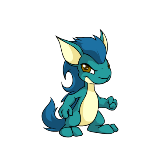
Kyrii are vaguely weasel-like, but that's probably not what you remember them for. If you're like me, you remember them for A) having extremely luxurious manes, and B) being smug and vaguely conniving. The design itself is fine albeit somewhat plain, but it's those additional traits that help them stand out a bit. (They're also allergic to apples—not the only species with an allergy to a certain food, but I feel like they get it played up the most.)
Visually, Kyrii have a standard bipedal pose with a complimentary lighter tint of the main color used for the underbelly, including the jaw, and the inside of their ears, which have a nice teardrop shape to them. The mane, arguably the driving concept behind the species, is also very pretty, having lots of curves and swishes to it that really give it that full, rich look. I also like how the tail and the mane are one unit, so the tail looks like the hair and vice versa.
In terms of customization, Kyrii got the short of the stick. They're not the worst by a long shot, but the big problem here is the face. It's too short, too wide, a little too round, and it doesn't taper the way it should. Technically speaking it's a subtle difference, but it really does majorly change the way the species looks, and not in a good way. They also lost that vaguely smug look, possibly due to having the head turned upwards more.
On top of the face, the body also got a bit screwed up, as both the stomach and forearms became too bulky, whereas originally the Kyrii was a pretty lanky species. Other odd decisions including running the underbelly up onto the jaw, which kind of affects the way the mouth reads even if it has a nice shape to it, and reducing the amount of shine in the mane. On the plus side, the mane itself at least looks better—it's much fuller than it was originally and the really janky shape of the fur on top of the head has been majorly improved.
Favorite Colours:
Royal: Royal Kyrii are a good example of how badly customization messed up the species, as they went from being quite beautiful to incredibly awkward, in part due to their faces being too wide and round and in part due to some weird decisions on the clothing (such as the Royal Boy loosing his cape and large sleeves and the Royal Girl loosing the entire back of her dress in addition to her hair braids no longer wrapping around the back of her head).
However, the original designs are fantastic! Both versions are good and have their own unique flavor (something royal pets sometimes struggle with). The Royal Girl has a lovely elegant look with a long muzzle, pretty dress, and a very nice turquoise and white color palette. The Royal Boy has a primarily maroon palette with an extra over-the-top mane and a vaguely swordsman-like outfit.
The poses are also full of personality, especially with the long-defunct battledome art bring us these gems:
10/10 no notes.
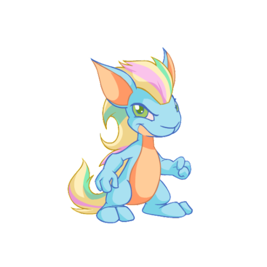
Pastel: Pastel pets are usually just taking a pet and applying pastel colors to the design as-is, so the pastel Kyrii really stands out by having the addition of stripes added to its mane. This gives it a very distinct look and adds a fun rainbow aspect to the design. The palette itself is also nice, juggling five colors at once without it feeling overwhelming or too busy. Just really nice!
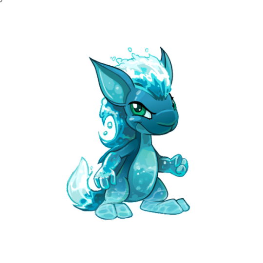
Water: Water is a very hit-or-miss colour and it depends entirely on how good the art is, but thankfully they really nailed it with the water Kyrii. The white-foam mane draws attention to the most important part of the design and has a good amount of depth, especially int he darker areas at the base, while the body has a nice subtle gradient, highlights, bubbles, and ripples to give it that water-y feeling.
47 notes
·
View notes
Text
Yui Nagomi / Cure Precious
UUUUUUUUUUUUUGGGGGGHHHHH
So, idk if you know this or not, I don't really like Delicious party.
This is by far my least favorite season of the entire franchise. I was bored out of my mind watching it, with the rare moment where I felt something being anger. I don't get the appeal at all. Especially when KiraKira is RIGHT THERE.
At least this made me appreciate KiraKira a lot more, that's something I guess.
And let me tell you a story, back in the day, the reason I took a massive break from Pretty Cure was this season. No, not because of the season itself. But because whenever I expressed my opinion on it online, I was BASHED SO HARD. It was a tirade of harassment that went on that anyone who didn't like Delicious Party was a tasteless asshole who hated the entire franchise. It was bad. I actually got BANNED in some places solely because I expressed my opinion.
Like... is THIS really the season you want to be that protective about?
youtube
AzenZone made a REALLY GOOD video review of this season and he points out so many of its problems, not just as a story, but as a Pretty Cure story in general. He also goes into a lot of production trivia that I did not know about, but make a lot of sense why the season turned out the way it did.
So, if you want a detailed explanation, he explains it better than I could. Go watch his video!
ANYWAY BACK TO DESIGNING.
Unfortunately I can't say the designs are a plus for this season either. I didn't like them when they were first shown to public, and I still don't.
Their biggest problem is that they're SO BUSY.
There's so many patterns and colors and details in these designs that feel unecessary.

And Precious has the same issues.
With her, I kinda feel like she's trying to rip off Cure Whip a bit.

You have the red and yellow lower layer skirt, you have the animal ears (Yui's are fox ears), you have the gloves, you have the paw toes.
EXCEPT HER PAW TOES LOOK SO MUCH WORSE
So yeah, ALREADY, points are taken away for this design trying to copy another.
And not having understanding of what made Whip's Design good.
You see, the point of the lower layer of Cure Whip's skirt is that it's meant to look like a strawberry shortcake, which is a symbolic showing of how she got her powers.
But what is Yui's main food-related connection????
...
Idk. She likes eating.
...
That's it.
Though at least the fox ears make sense because of Kome-Kome. That's something I guess.
And hey, she's not ALL out of theme. Here's some positives!
ALL of the teammates have this clothing piece of unity being this apron. And I think Yui's looks the best.
Mostly because she's wearing her teammates colors, AND these are the accent colors in the apron too!
So the color palette isn't too much of an issue.
I LIKE that she has her teammates colors consistently plastered throughout her design.
I like the hair. The hair is not an issue for me.
Yeah, so I think the biggest problem with this design is how BUSY it is.
As I said, you have so many different patterns and details going on that it's hard to focus on.
You have some sharp patterns being her lower skirt layer., and her dress tails, and her boots, and the shoulders, if you can see it.
BUT THEN you have a ton of round stuff fighting for the same amount of focus.

I think my least favorite is this top.
Look, the noodle bow is a neat idea on paper, HOWEVER, it's such a busy design element that if you want to do it, everything around it needs to be more plain in comparison so your eye is drawn to it.
That's not what they did. Because the shoulders are also so detailed with four different patterns going on that you just don't know what to focus on.
IT'S A CLUTTERED MESS.
IT BUTCHERS THIS UNIQUE DESIGN IDEA.
Oh yeah, same with the bow. Busy. Cluttered. A mess.
So... yeah, I'm sorry, I can't say I really like this design. I don't like how busy it is. I don't like the stockings.
C Tier.
OH AND ONE MORE THING THAT TICKS ME OFF THAT'S NOT A KNOCK ON THE DESIGN, BUT I STILL NEED TO SAY IT.
So when Delicious Party came out, I heard a lot of people say "OH! THIS IS OUR FIRST CHUBBY CURE! WHAT GREAT REPRESENTATION!"
And I was like "What the hell are you talking about?"
NO. SHE'S NOT CHUBBY.
HER BODY TYPE IS THE SAME AS MOST OF THE OTHER CURES. THERE IS NOTHING CHUBBY ABOUT HER.
SHE'S JUST WEARING A BAGGY VEST.
HELL YOU CAN TELL THIS WHEN YOU PUT HER NEXT TO OTHER CURES. SHE DOES NOT LOOK ANY CHUBBIER THAN THE OTHERS IN ANY WAY.
Even in some shots where her torso looks wider SOMETIMES, it's STILL not chubby. That's just a classic animation inconsistency.
I'm sorry, but if THIS is what you consider a chubby character, I AM SERIOUSLY CONCERNED FOR YOU AND YOUR HEALTH.
STOP CALLING YUI CHUBBY! SHE'S NOT!!!
#pretty cure#precure#character design#character designs#delicious party precure#delicious party pretty cure#cure precious#Youtube
3 notes
·
View notes