#made it to put on my carrd site that im making lol
Explore tagged Tumblr posts
Visit Tumblr Blog
Explore Tumblr blogs with no restrictions, modern design and the best experience.
Last Seen Tumblr Blogs


Fun Fact
In 2020, 44% of users from Denmark used Tumblr daily.
Text

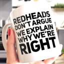
me! (+marion berry the red panda) <3 anyways would you guys believe me if I said my favorite color wasn't pink
#my art#strawberridraws#sona#art#sona art#digital art#digital illustration#red panda#chibi#cute#made it to put on my carrd site that im making lol#very fond of Marion berry... may post more drawings of him . later#do you guys like the wonky sparkles#I did it on purpose for an 'aesthetic' choice#but idk lol#I like them but maybe others might find it annoying so#I went insane and merged all my layers at some point anyways so eh\
10 notes
·
View notes
Text
Blaze Midyear Evaluation 2024
Alright its the middle of the year. Let's discuss somethings to clarify how I want to plan out the next few months in this rare Official Blaze Silverwolf Blogpost™ where I'll give a short introduction about myself to new followers, discuss my art goals, and what I'll do with my current posting manners.
Blaze 101 A comprehensive repost of a tweet I made a few days ago, here’s a short intro and the websites that I frequent.
I’m Blaze, old enough to exist. A furry artist in law school too. Weird huh?
My main hobbies include playing games like Cities Skylines 2, Guild Wars 2, and Fortnite, playing instruments, and drawing. I’ve been at it for 10 years and currently looking for ways to tell stories through other mediums.
Not all my art is being posted on twitter though! I’ve been posting my art on other sites for archiving reasons or because twitter recently has been on a downturn.
deviantArt, for art posted from 2014 until May 5, 2024.
Cara, for all art posted starting 2024.
Tumblr, for art posted from 2015.
I also hang around bluesky, and have been tending to use that for a while now as a main social media site. Just like a sticky situation, my time is divided between the two. But (as much as possible), the silly text posts on bluesky get mirrored over to twitter (or the other way around). This ensures you all get the best “blazexp” ever.
You won’t have to wonder what username to find for those sites, since I use only one username: itsdablazewolf
For those who want to get pinged every time I post art, I also have my discord server and my telegram channel.
You can find the links to those at the front page of my carrd here: https://itsdablazewolf.carrd.co/
Current art goals Off to the subject matter of this post, recently been in a (forced) state of reflection. Recently I’ve been posting finished poses once a week. This was to keep an online presence at the same time trying to keep some standard of quality I’ve been satisfied with. For the past few days, I feel like my art could be pulled up a little bit higher.
Ok, it's hard to put that feeling into words, so I’ll take a chart from the internet.

https://www.deviantart.com/shattered-earth/art/Art-Cycle-329593292
Here I am. I'm on an “art low”! This means I see things in my art which were once perfect, but now sees them as an opportunity to learn from and improve more. (Something something anatomy… perspective… things I keep putting off because I’m too scared to get through lol)
There is an inspiration board just floating around for me and my artistic endeavors and I believe it is time for me to hunker down and focus on improving instead of finding ideas, half-making paintings, just to post something every week. Yall can handle me slowing down on finished pieces right? Right? :)
Once-a-week posting This means that the sacred time of posting on Sunday (Philippine 🇵🇭 time) will be adjusted. Won’t be posting finished pieces as much while I try to learn the tips and tricks of making better art. Think of it like I'm going to school and social media (specifically, posting finished art pieces) is at a lower priority right now.
So please expect less background pieces and more chicken scratchy drawings for now. Occasionally some pretty finished work will pop out now and then, but I don’t want to get ahead of myself. Think of it like a house renovation. You can still use the house, there will be some growing pains and ugly spots. But when its finished, it’ll look a lot better for the long term (hopefully!)
Tl;dr - Blaze is going to focus on learning how to improve art over creating art for social media.
This has already happened before, but this is the first time I’ve explicitly announced it.
Commissions? I will try to open commissions before my semester resumes. It's a goal this summer to get through one batch of commissions. Price point will still be the same, and slots will probably be around 3-4. Lets see!
Tl;drs Hi im blaze.
I have art goals. I will pursue these art goals over posting art like before. I will also open commissions before my semester starts.
Ok bye :D
1 note
·
View note
Note
hi! can i ask how u made ur carrd like what are the settings? ty!
omg YES i love carrd making hi anon. if there’s anything specific u want just lmk!! under the cut bc its long... i make most of my carrds on desktop so this is very desktop based.... to all of u who do ur carrds on mobile honestly kudos i cld never
uhm also when i say long like this is v long bc i added a lot of reasoning to my settings n tips that i’ve picked up on making carrds (plus the screenshots) i hope it helps tho ^_^ apologies if u knew most of this stuff tho bc i explained... everything...
some notes before we get in: for colors i usually just base everything off the sidebar image and use a color picking website (i use this one) to get the the html codes for colors. the site i use also generates a palette which i also use! ur free to use anything tho obv. the font i used is “inter”
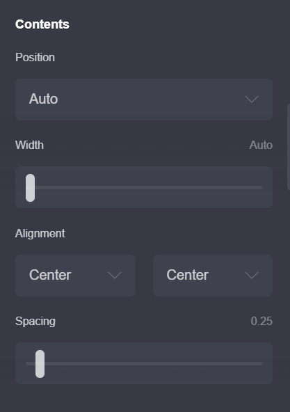
1. ok first here are my page settings! i wont include my animation settings now ill leave that to the end.. these r rlly the only settings that i’ve changed so i’ll just post these.
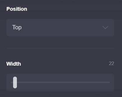
ok i dont rlly change much except for these two, the position is set to top not center (which is the default) b/c esp w carrds like the one i have now i dont like the header portion moving depending on the height of the container underneath... does that make sense? that’s just super nitpicky of me LOL but if u do end up making the carrd n playing around w the settings u’ll see what i mean
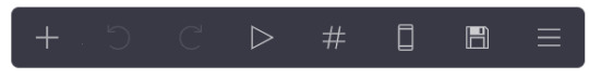
the width is set to 22 bc i like small carrds! play around w this as u see fit, i also change it depending on how it looks like in mobile (im very thorough lol) if ur wondering how u can do that on desktop, its this phone looking icon on this bar on the top right of the screen: (the 6th icon!)
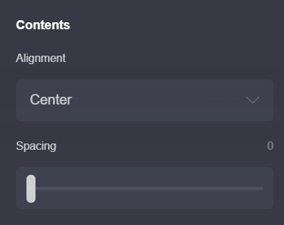
the next pic is also default settings except my spacing is set to 0. i’ll explain why later! the alignment also doesnt really matter w/ this carrd. u can play around with it tho!
2. this is for the home page!
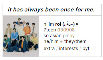
first i’ll explain how this is set up: the title box and the box under it (i’ll call it info box) are both containers! here is why i put set the spacing to 0 earlier: if u put 2 containers theres going to be space btwn them and to achieve this kind of look (ig) i just set the page spacing (in the page settings) to 0. however this means that everything is going to be pressed up against each other so i usually just add dividers (which are transparent [color code is #96969600]) i wont post a screenshot bc the settings r default, except for the margins which u can play around with to see what works for u (it’s set to 0.375 for me rn)
here are my settings for the title box

most of these r pretty standard except for the padding and border. the reason why i didnt tick the bottom part is bc of the container w all my info underneath. both containers have borders so the bottom & top border of those containers wld just merge n create a thicker border which isnt what i was looking for... anyway.
then i just add a text element & just write my title! idt my settings for that r relevant so i wont add it (the text size is 0.875)
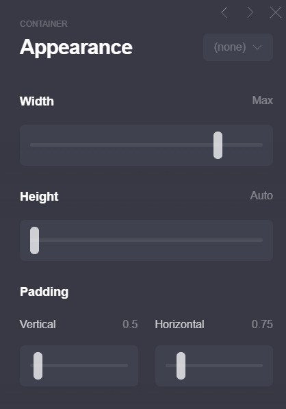
next is the info box! here are my settings:
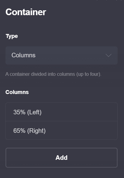

btw this is a container with columns!! those can look p wonky on mobile so make sure to have these settings on so that they wont look awful on mobile!!

oh also i wont post a screenshot of my text settings (text size is 0.75 + line spacing is 1.25) if ur wondering how i changed colors for some of the text the format is basically just [text]{#color}
for the image size i set the width size to full (or full column) that depends on u (and how much text u put in the info part) i just prefer how it looks like when the image width is set to full bc that way no part of the image is cut off... really depends on u and what image ur using though so just play around w/ it!!
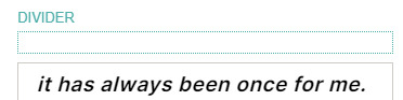
and in terms of spacing, i have a divider on top of the title box b/c otherwise the whole thing is just too high up for my taste
ok now to explain the header part and how i got my title/info box to stay “fixed”

so... im ngl. i dont understand how the header function works (help) so uhh i wont go as into detail here. but what worked for me is adding a header marker (the plus thing on the bar > control > change section break to header marker) right after the info container, then adding a section break (this one is called #wala bc wala here means ‘nothing’ in bisaya lol) and a transparent divider right after it. i hope its visible in the pic... anyway this is the only method i found that makes the carrd work lmao. it rlly doesnt matter what u name the #wala section break bc its not gonna show up so u might as well just use a keysmash
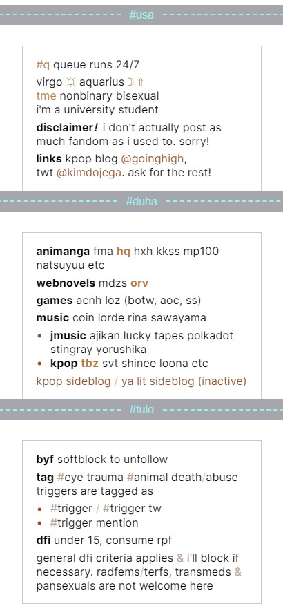
3. the extra info!! (extra, interests, byf)
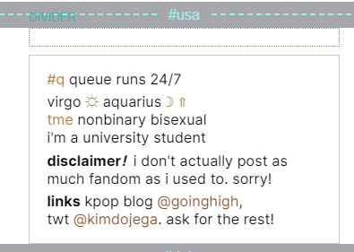
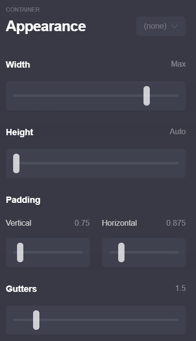
this section will b shorter compared to the first two LOL anyway. first i started off w a section break (#usa which means 1 in bisaya hehe), then a transparent divider for spacing, and then a container! theres nothing fancy abt this container it has the exact same settings as the info box above so u can just duplicate that container and change the container type from columns to default.
then just add ur info and ur done!! repeat w whatever extra info u want to add (i only had 3 to add so it looks like this for me)
4. oh before i forget, these are my animation settings!! (page > the triangle thing)
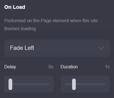

u can preview the on load animation by clicking the triangle button on the top right bar, but for the on section change animations u have to save then preview it on ur carrd itself :/ kinda annoying but yeah... i usually never set anything above 0.5 seconds for on section change animations bc im impatient LOL
these r completely optional tho... i just think animations make the carrd look smoother & more fun!
thats it i think! here are some tips i have
1. this tip is abt how carrds can differ when on mobile! i sometimes fiddle around with the mobile settings to make sure my carrd looks the way i want it to on mobile! bc mobile sometimes fucks up the spacing and it annoys me LOL... example here:
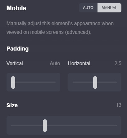
u can find these settings if u scroll down a bit on the page settings and switch mobile from auto to manual (like in the screenshot) most of the settings i dont touch except the size setting, i just fiddle around w it and see how my carrd looks in the mobile view until im satisfied
2. this isnt rlly necessary but its smthn neat i picked up! if u check ur section break settings and check hide footer u can get rid off the “( made with carrd )” text on the bottom! i think it just makes the carrd look a bit neater, esp since the page spacing is set to 0 so it might look a little squished under the container...
3. i like to use all elements of my carrd efficiently (ig? heres the engineering major jumping out) and idk if u noticed, but if u click on the title (”it has always been once for me”) or the image (which is... of tbz..) it actually takes u back to the home page ^^ idk i just think small things like that r neat
thats it for real!! i hope this wasnt too much of a hassle to read or follow through, and if u have any questions dont hesitate to dm me or send me an ask, even if we arent mutuals!! i hope u have fun making this carrd <3
#anon#ask#carrd#also rip this is one of the simpler carrds im using rn#i bolded some stuff so it doesnt get lost in the midst of my rambling... oops
22 notes
·
View notes