#love the lines directing the eye to the focal point
Explore tagged Tumblr posts
Text
This came out so beautifully 😍

Oh my God, this is so unbearable
Make it stop— this is more than medical
All I want is to feel beautiful inside and out...
You're the one that can save me from myself
Destruction, triple nine, I need your help
All I want is to feel beau t i f u l . . .
#love the lines directing the eye to the focal point#love thiiiiis#dr baggs#megalosomnia#other's art#other's oc#fan works#cw hypnosis
161 notes
·
View notes
Text
expectations / sampo koski


Pairings... Sampo Koski x Reader
Contains...! smut, teasing, dry humping, making out, fingering, handjob, size kink, belly bulge, slight!manhandling, pussydrunk!sampo, creampie
AFAB Reader.
2,022 words.

Sampo Koski.
You loved his lips because they hid his perfect teeth that always complimented his sly smile.
And you hated his lips for those same exact reasons.
You loved his eyelids because they hid his alluring eyes from view.
And the reason you hated his eyelids? Take a wild guess.
“What’d ya say we get out of here, doll? Find some placed a little more… private.”
His arm slinging around your shoulders broke you out of your train of thought as he whispered in your ear. You turned your head slightly to take in his expression.
Sampo shot you a playful wink, lips curled up into his signature smirk that you loved— hated dearly.
“Nice try, Sampo. Not happening.”
He pulled you in closer to his frame. His arm that was hanging around your shoulders slipped lower. Choosing to entangle around your waist instead. Sampo’s fingertips danced along the hem of your shirt, causing a burning heat to swirl within you.
“C’mon, doll. You’re only foolin’ yourself. Let your good buddy Sampo make your dreams come true.”
He was so infuriating. Who the hell talks about themselves in third person like that? What an egotistical jerk.
But you couldn’t deny that his words held some truth to them.
Almost all of your dreams were plagued by Sampo. But none of them were pure in nature.
Countless nights you would wake up from a heated dream. Sampo being the main focal point, of course. Each time you would stare up at the ceiling as you attempted to catch your breath. Hand snaking into your sleep shorts to relieve your frustrations.
But it wasn’t enough anymore. You needed to be satiated by the star of your wet dreams himself. As much as you hated to admit it.
You turned your head away from his piercing emerald gaze. Earning a mocking coo from Sampo.
“Aww playing hard to get… are we, doll? Ya know… the walls are pretty thin. I can hear the way you call— no, moan my name late at night.”
Your face grew hot upon hearing his confession. You could have sworn you were being inconspicuous. But you couldn’t have been more mistaken.
Fuck.
You could feel his smirk against the shell of your ear. His hand, now snaking its way under your shirt. Inching closer to your clad breasts.
“Can I let ya in on a teeny-tiny secret, doll?”
His words piqued your interest. You turned your head back in his direction. His eyes were half-lidded now. His smirk etching deeper into his features.
His free hand came up to cup your chin. Sampo’s thumb swiped over your parted lips as the rest of his fingers held you in place. Forcing you to watch as his eyes darted down to your lips, then back up to your puzzled eyes.
“I have… sweet dreams about you too, doll. And you wanna know somethin’ else?”
He paused once more for effect. Still tracing your parted lips. As his other hand came up to squeeze one of your breasts over your bra. Eliciting a sharp gasp from you.
Your attention was fully on him now, just what he was betting on. Sampo had you wrapped around his finger faster than you could say—
“Please… tell me…”
Sampo chuckled at your shift in demeanor and eagerness to hear more.
Too easy.
“I touch myself while thinkin’ about you too, doll. Scandalous, I know! But… I just can’t help myself… you understand, right?”
He leaned in closer to you. Noses brushed against one another’s as Sampo took in your flushed face. Awaiting your response.
Your mind was reeling from his filthy confession. You had to pinch yourself. To make sure this wasn’t just another one of your dreams.
Before you knew it, you were pushing in closer to him. Lips captured Sampo’s as your hands came up to grip his exposed sides. Pulling a breathy whine from the blue-haired man.
You did a bit of exploring yourself. Running your hands up and down his midsection. Fingertips tracing his prominent v-line. Sampo whimpered against your lips at this. Piquing your curiosity.
Don’t tell me the Sampo Koski was all bark and no bite. Oh, this was going to be fun.
“Follow me.”
You huffed out as you pulled away from his soft lips. Taking his hand out of your shirt and interlocking it with your own. Leading Sampo to your room in a hurry.

The moment you locked the door behind the two of you… you were all over him. Sampo let out a pathetic moan as you pushed him up against the wall. Your hands continued their exploration along his body as you so pleased. Living out all of your wildest dreams.
“F-Fuck, doll… what’s gotten into ya?”
He huffed out, bringing his hands up to grasp the back of your thighs. Hoisting you up into his arms. You took this hint almost instantly. Wrapping your legs around his pretty waist.
Sampo captured your lips once more. Pulling you in deeply as he ushered you both to the bed. Carefully sitting atop the edge of the mattress as you continued to make out.
He let out a muffled grunt as you unintentionally ground down on his erection.
You enjoyed that sound… more than you’d like to admit. And so… you did it again, but this time with more merit.
He whined even louder this time as you pulled away from his lips. Opting for taking in his flustered state instead.
Sampo was blushing furiously. His eyes were squeezed shut as his teeth scored his bottom lip. His hips began moving on their own, desperately chasing for more friction.
“Aww, I think I like you best like this, Sampo.”
It was your turn to coo in faux sympathy. Enjoying the rare moment of silence from the usually talkative man.
Your movements came to a halt. Causing Sampo to whine desperately. His eyes shot open, hands gripping your waist in need.
“Why’dya stop, doll. P-Please… I need more!”
The Sampo Koski begging you for more? Oh, this was too good.
“Shh… relax. Why don’t you take these off for me?”
You whispered. Tugging on the loops of his pants. Sampo took the hint. Making quick work of unbuckling his belt. Pulling his pants and boxers down far enough for his cock to spring free. He then opted for taking off his gloves and his gear. Sampo’s shirt being the last article of clothing to come off.
Intense heat pooled in your core at the scenery of Sampo bare before you. You took in the sight of his length standing tall, all because of you. You could feel yourself soaking through your panties.
“I showed you mine only fair if you show me yours, doll.”
Sampo quipped out. Letting his eyes wander down your frame as his hands tugged at the hem of your shirt. You gave him a quick nod, giving him the green light to tug your shirt off over your head. Your bra was quick to follow in suit.
You climbed off his lap briefly, ridding yourself of your pants and panties before leisurely climbing back into Sampo’s lap. He couldn’t take his emerald eyes off of you. Sampo was completely entranced by your bare frame.
“Better than I could’ve ever imagined, doll.”
He admitted, large hands coming up to cup your breasts. You expelled a sigh of relief as Sampo’s thumbs came up to play with your nipples. You let your eyes roll back as your hand snaked between your bare bodies. Your fingertips carefully wrapped around the base of his cock. Beginning to pump his length as you so pleased.
“S-Shit, doll… don’t stop…”
Sampo whined as one of his hands trailed down to your midsection. His thumb found your clit, rubbing it almost instantly in slow tight circles. You both moaned in unison as you continued to please one another. Completely lost in the pleasures. And you have barely even begun.
Sampo’s ring finger found your entrance. Dipping it in slowly as a gasp was pulled from both your lips.
“Fuck, doll. You’re so w-wet… this all for me?”
You nodded furiously. Picking up your own pace against his cock as Sampo slipped a second finger inside your needy cunt. All the while his thumb still circled your puffy bud with the right amount of pressure.
His large hands were so skilled and calculated, and it definitely showed. Especially behind closed doors.
“More, I-I need you inside me… Sampo.”
You whined, tugging on his wrist. Signaling for him to stop as your hand untangled from his throbbing cock. Sampo’s hands opted for squeezing your hips instead. You began lining the head of his leaky length up to your entrance.
Sampo’s eyes were locked on the view of you slowly inching your way down his cock. Large hands squeezed your hips harshly as he finally bottomed out.
“This pussy is so perfect… so t-tight and wet, and it’s all for me. I must be the luckiest man alive, huh?”
Sampo whispered out between gritted teeth. Reveling in the way you began moving your hips up and down on his cock. With the help of Sampo himself. He began moving you quicker atop his lap, thick thighs twitching beneath you as he allowed himself to succumb to pleasure.
“Hah… Sampo, you’re so b-big… look…”
You took one of his hands in your own, pulling it off your hip and moving it to your lower tummy instead. You held his hand over your midsection and pressed down. Allowing him to feel the slight bulge his cock was causing.
The last remaining bit of Sampo’s composure was lost after feeling the way his cock bulged against your lower tummy. Before you knew it, you were being hoisted up. You gasped as Sampo sat up from the bed with you in his arms.
On instinct, you wrapped your legs around his waist for the second time tonight. Only this time with his cock buried deep within you. Sampo captured your lips as your back pressed up against the nearby wall. You couldn’t help the way you whined against the blue-haired man’s lips as he fucked up into you with so much vigor.
You ran your tongue along his bottom lip as Sampo continued to thrust into you harshly. Hitting your sweet spot perfectly each time. Skin slapping against skin was all that registered in your mind as you felt your orgasm quickly approaching. You gripped onto his shoulders for support as you pulled away from the kiss, gasping for air.
“Sampo I’m gonna- ah-!”
Your eyes rolled back into your head as you came all over his cock. Legs twitching around his waist as your walls fluttered severely around Sampo’s thick length.
“Fuck, fuck- fuuuck…!”
That was all it took for Sampo to reach his own high. His nails dug into the fat of your thighs as his hips stilled inside you. Heavy balls kissing the underside of your pussy as his load shot deep inside you.
There was too much. You could feel it trickling down your inner thighs as Sampo’s cock began softening inside you. You both shared the same air as he rested his forehead against yours. Trying to regain any semblance of composure.
“Fuck, doll. Did I live up to your expectations?”
Sampo chuckled. Pulling out of you slowly with a sharp hiss. Carrying you back to the bed. Knowing full well that your legs were too shaky to stand on, at the moment.
“You surpassed them.”
You admitted, warmth spreading across your cheeks once more. Sampo pinched your cheeks playfully as he leaned over you from where he stood in between your legs. He laughed playfully as he lowered himself onto his knees before you.
“Good, good. That’s exactly what I wanted to hear…”
Sampo hooked your thighs over his shoulder. His breath fanned over your messy pussy, pulling a sharp gasp from your lips.
“Sampo… what are you-“
“Relax, doll. I made a mess, so I’m simply down here to… clean it up. I promise this will surpass your expectations too!”

#sampo koski#sampo koski x reader#sampo koski smut#sampo hsr#sampo x reader#sampo smut#hsr#hsr smut#hsr x reader#honkai sampo#honkai star rail#honkai star rail x reader#honkai star rail smut#honkai star rail sampo#sampo honkai star rail#hsr sampo
793 notes
·
View notes
Text
Code Red, Code Blue. Chapter 1: Acquainted.

Synopsis: When the BAU is led to a case in Seattle, with Seattle Grace Mercy West as the focal point. And after an unfortunate incident involving two cups of hot coffee and a ruined pair of scrubs, Spencer meets a girl that changes his whole life.
Pairing: Spencer Reid x Lexie Grey
Warnings: Typical CM discussions of crimes, typical Grey's discussions of gore and medical talk (very minimal, though!), meet-cute, literally one (1) offhanded "killing yourself" joke
Word count: 3.0K
Notes: My baby.. she's finally finished... Please enjoy, I spent way too long on this!
Likes are appreciated, but reblogs and comments help writers more!
Wednesday, September 29. 9:42 AM in Quantico, Virgina.
Spencer had only ever been to Seattle once.
Working in the BAU took him all over the country. Cases popped up in every corner, in every state, in every place you could possibly imagine. He had seen nearly every part of the vast landscape that was the US of A.
The last case that had led them across the country to Seattle was The Seattle Strangler, back when Gideon was still on the team. Spencer had mixed emotions about that thought. But he was a professional and he was going to do his job.
Their current case was as close as you could get to clean cut and dry in their line of work. Women in their 20s being stabbed. Pretty simplistic, right?
The one connection each murder had, though, was that every single woman was eventually directed to Seattle Grace Mercy West. And while the hospital was a fairly major one, it was a Level 1 Trauma Center, after all, which meant a lot of patients, it was definitely raising a few alarm bells in their heads. Each woman was also eventually declared dead at that exact hospital.
It could never hurt to check every possible lead, could it?
Spencer used two fingers to rub at the sleep clinging to his eye still. He tried, and failed, to stifle a yawn as he shifted in his seat. Although he was quite used to struggles with sleep (hence his dependence on caffeine), it never truly got any better.
“Late night?” Morgan inquired. He propped his arms on the top of Spencer’s seat, peering over the other man’s shoulder.
Spencer shrugged. “Couldn’t sleep,” he replied. He frowned softly, continuing to try and rid himself of the tiredness that stuck to his lashes before he was interrupted by another yawn.
God, he could really use some coffee right now.
He glanced down at his watch and his frown deepened. They still had at least another two hours until they would land.
Spencer would consider himself a fairly patient man. He didn’t mind waiting, hell, he most often played the waiting game in his job as a BAU agent. But right now, sitting on that jet running on only five hours of sleep with not a drop of caffeine in sight, he was feeling just one moment away from simply losing it.
Not like it would actually happen, though. Spencer wasn’t that kind of guy. He was calm and reserved, even in the face of adversity.
Hotch’s voice cut through Spencer’s internal monologue for the moment, snapping him back into reality. “We’re going to head to the police station first,” he began, casting a glance over each BAU member in eyesight, “After we get all the necessary facts, we’re going to head to the hospital. Sound good?” He was met with a round of nods from everyone and he nodded back.
~
Wednesday, September 29. 11:23 AM in Seattle, Washington.
Lexie needed a goddamn break.
Being a surgical resident had to be a punishment designed in one of the seven pits of hell. How dare she desire to save people's lives, right?
At least it was better than being an intern.
She loved her job, don’t get her wrong, being a surgeon was her dream. It’s just that she couldn’t remember the last time she got more than four hours of sleep a night and she was just so tired all the time. From running around constantly to several hours long surgeries to forty-eight hour shifts.
Not to mention the constant drama and tragedy that filled the Seattle Grace Mercy West halls. You couldn’t turn a corner without hearing about someone sleeping with someone else’s boyfriend or about another MerDer breakup or another surprise pregnancy. Really, sometimes it was just ridiculous.
Lexie herself had been the victim of that good ol’ SGMW drama. She was trying to pull herself free from the clutches of it all, but it always seemed to follow them all. Like some sort of curse was placed on that very hospital.
But that was besides the point. The point was that she needed just one moment of peace, away from all the chaos of the hospital and the drama. Was that so selfish of her?
The sound of sneakers shuffling and her racing heart filled Lexie’s ears as she rushed through the halls. The occasional ‘excuse me’ slipped from her lips, trying not to crash into everyone that was in her way.
When your attending pages 911, you don’t walk - you run.
Her feet skidded to a stop as the familiar emergency room came into view, nearly making her trip with the sudden halt. Her movements seemed almost practiced with the near mindless way she moved - triage gown, tie in the back, gloves. This wasn’t her first trauma, and it would be far from the last.
“What do we have?” Bailey’s voice cut through the millions of other noises filling the room - the rustling of fabric, the snapping of latex gloves on skin, the chatter of voices. The ER was ever far from being quiet.
“28-year-old woman stabbed fifteen times in the torso, majority in the chest,” Owen shot back. He rushed forwards when the glint of red and blue lights followed by the sirens that would follow them for the rest of their lives came into view, and the rest of them marched behind.
“God, overkill much?” Cristina muttered low to Meredith. Bailey, who heard everything always, shot a glare over her shoulder. Cristina threw her hands up in defense, eyes wide and eyebrows raised. Her face fell the minute Bailey turned away and she shook her head with a quiet scoff.
The doors to the ambulance flew open and out rushed a woman on a stretcher. “BP is 158 over 92, HR is 92,” an EMT announced. Owen cursed under his breath as he took the railing of the stretcher into his hands.
“She’s hypertensive,” he announced. Quickly, other hands began to grab onto the stretcher as well, guiding the women into the hospital doors. He barked out a few names and different orders and Lexie slowly loosened her grip on the railing as her feet quit keeping pace before stopping entirely. She watched as the woman was rushed towards a trauma room, a frown falling on her lips. Trauma was never a pretty sight.
With a sigh she made her way to the receptionist desk near the ER entrance doors where a few of the other residents left behind had gathered.
“That’s the third stabbing in less than two months,” April remarked. A little frown began to form on her lips as she flipped the chart in her hand. “And they’ve all been women in their late 20s.”
She didn’t have to say it. They were all thinking it. The glances exchanged spoke a thousand words.
“You don’t think..” Meredith trailed off. She shot a look towards Cristina, then glanced back at April. The current hypothesis wasn’t looking so hot.
“It’s probably just a weird coincidence,” Lexie was quick to interject. Her words did little to quell the tense energy that filled the emergency room. “I mean, Seattle’s a big city. Plenty of crazy people doing crazy things. I’m sure they’re not related.” She waved a hand dismissively. Then she added, “It is getting close to the holidays. Don’t crime rates increase during the holiday seasons, or something?”
The pager attached to her hip beeped. She groaned, a pout appearing on her face at the sound. She unclicked it from the waistband of her scrub pants to take a glance at the numbers displayed on the screen and she sighed once more. It was Derek.
With a murmur of, “I’ve got to go,” that was met with a few dismissive waves of goodbyes from her fellow residents, she made her way towards the elevators, absolutely not ready for whatever Derek had in store for her now.
~
Wednesday, September 29. 2:17 PM in Seattle, Washington.
One thing you never want to hear in a hospital is silence. And that’s exactly Lexie had been greeted when she emerged from the imaging room, a stack of paperwork and scans ordered by Derek in hand. She couldn’t quite put her finger on it, but something was absolutely happening and she’d be damned if she was left out of it.
It all started to make sense, though, as she made her descent down a floor of stairs and she noticed a group of her coworkers crowded behind a corner. Mentally she counted heads - Cristina, Meredith, Alex, Jackson, April.. All five of them in the same place at the same time, clearly hiding from someone (or something?), always spelled trouble.
Cautiously, she made her way towards the group. She tried to stand on her tip-toes, trying to look over their shoulders to see whatever the hell it was that was making them all stop in their tracks, but to no luck.
Finally with a huff, she decided to pipe up. “What are we looking at?” Her sudden appearance obviously spooked them, as they all nearly jumped at the sound of her voice, but they quickly relaxed when they realized it was just Lexie. She flashed a little smile that was short lived and didn’t quite reach her eyes with an utterance of ‘sorry’.
“Them,” Meredith said. Lexie leaned to the side and she followed the finger that Meredith pointed with. Never would have Lexie guessed what would be standing before her right now.
There, talking to the Chief and Owen, was a group of people that certainly didn’t look like they belonged together. One man in particular, though, stood out among the rest - a tall man with curly brown locks and the most beautiful face Lexie had ever seen. “I heard they’re FBI agents,” Cristina cut in, knocking her out her little lovestruck daydream, and Lexie’s head snapped so quickly to look back at her, it’s a wonder it didn’t break.
“What?” Was all she could manage in response. “FBI, wh-” She shook her head, trying to clear her head from all the thoughts racing through it. “What would the FBI be doing here?” Her voice dropped low, almost to a rushed whisper.
Cristina shrugged. “Hell if I know.” Lexie frowned. And just as she opened her mouth, ready to say more, Owen gestured in the direction of their little gathering. And when the group of supposed FBI agents looked at them, they all took off, scattering away in their different directions, like roaches when you turned the lights on.
Except for Lexie. She was frozen in place, her blood running cold in her body when their hard eyes locked on her. She forced another smile, a nervous little giggle escaping her as heat washed over her cheeks in heavy waves. She raised her free hand to offer them a half-hearted greeting before pointing behind her with her thumb and then promptly spinning on her heel and hurriedly trying to escape the embarrassment that was that interaction.
~
Wednesday, September 29. 2:45 PM in Seattle, Washington.
Spencer had drank approximately four-and-a-half cups of coffee since landing in Seattle, and he was not quite satisfied yet.
Would he ever truly be satisfied with the amount of caffeine he consumed? Could anyone, really? The answer didn’t really matter. Not to him, anyways. Especially not now, when the tiredness ran bone deep and the day was nowhere near close to being finished. So, he was going to get another cup.
“I’m going to get some coffee,” he announced offhandedly as he pushed himself up from his seat.
Morgan raised an eyebrow at the young genius as he started to make his way in the direction of the coffee machines. “Really?” Morgan said. “Another cup of coffee? Seriously, kid, you’re going to kill yourself with all that caffeine and sugar you consume.” Spencer waved a hand in response and Morgan could only shake head with a small smile falling over his lips.
“Oh, you’re getting coffee?” JJ perked up, craning her neck slightly to catch Spencer’s eye before he disappeared. “Do you think you could get me a cup, too? Please?”
Spencer nodded. “Cream and sugar?” A grin split across JJ’s face at the idea that he remembered what she liked in her coffee. Although, with Spencer, he couldn’t have possibly forgotten in the first place. “You know it!” she called out to him. “You’re the best, Spence!”
“No problem,” he called back to her as he turned the corner.
The trek to the elevator and up to the coffee carts was not a particularly long one, but it did give Spencer enough time to get lost in his thoughts. His movements almost ran on autopilot as he got on the elevator and pressed the button with the number four painted on it.
His feet moved for him, guiding him in the direction of exactly where he wanted to be. Ideas and different theories of their current case filled his head as he walked.
All of this to say - he was not paying attention. Not one bit. Not even as he mindlessly ordered two coffees - one mocha latte with room for sugar and one black with cream and sugar. Not as he began to round the corners that he was starting to become familiar with from turning around so many times due to his near caffeine addiction.
Not even as another body rounded the same corner as him.
It wasn’t until the harsh impact came, the colliding of two people knocking hard into each other and hot coffee being dumped all over each other, that he really came back to reality.
Lexie gasped as the coffee crashed right onto her, burning through her scrubs and stinging her skin. She glanced up, wanting to look whoever just ruined her scrubs in the eye, and it was like the whole world slowed for a moment.
It was cute supposed FBI agent guy.
Her jaw went slack, practically hitting the floor, and all she could do was stare. She almost wanted to pinch herself, check if any of this was really real, but the hot coffee burning her skin told her it was true.
“I’m so sorry,” The words fell out of Spencer’s mouth in an instant. He glanced around in search of something, anything, that could clean up the mess he just made, but he was coming up empty. “Really, I am so sorry-”
Lexie shook her head. “It’s fine-”
Spencer’s eyebrows pinched together. “I just spilled hot coffee all over you, it is not fine.” Lexie could feel her heart skip a beat.
“No, really, it- it’s fine,” she chuckled. “I have another pair of scrubs in my locker, it’s okay.” Spencer didn’t seem satisfied with that answer.
Now it was his turn to shake his head. “Can I make it up to you? You know, for.. getting you doused in coffee and ruining your scrubs.”
Lexie hesitated for a moment. While he was very cute, and seemingly very sweet, she barely knew this guy.
But something inside her told her to take her chance.
“Uh,” she bit down on her bottom lip. She waited for a beat. “Yeah,” she found herself saying, “Yeah, why don’t you buy me a coffee?” Spencer’s whole face lit up at her answer.
Could you blame him, though? Even covered in coffee, the woman before him was absolutely stunning.
“My name’s Spencer,” he finally added. “Spencer Reid. Doctor Spencer Reid, actually.’” Lexie arched a brow at him, head tilting to the side. “Doctor, huh?” she echoed. “Are you, like, new around here, or something? Did you transfer from another hospital?”
“Oh, no. I- I’m not an MD, I’m, uh.. I’m a PhD.”
Lexie slowly nodded her head. “Right,” she muttered. The smile on her face couldn’t seem to budge. “Well, I’m Lexie,” she stuck a hand out to him, “Doctor Lexie Grey, MD.” They both grinned at her words before chuckling. Spencer found himself thinking her name was beautiful. He glanced down at her outstretched hand and then so did she, and for a moment they were both just staring at her hand.
Finally, he spoke up again, “I- I don’t do handshakes,” he spit out. “The number of pathogens passed during a handshake is staggering. It’s, uh- it’s actually safer to kiss.”
Lexie nodded her head once more and let her hand fall back to her side. She ran her palm down the side of her thigh, subtly trying to wipe the gathering sweat. A part of her was tempted to ask if he wanted to kiss her, but she held off. For now.
“So, are you a germaphobe, or something? Or do you just know a lot of different facts?”
“Both, actually,” he said. “I, uh, I have an eidetic memory, so I remember everything I read. A lot about bacteria.”
“An eidetic memory?” Lexie echoed. “Really?”
Spencer nodded, a smirk worming its way onto his lips as he began to rock himself on his heels. “And an IQ of 187 and I can read 20,000 words per minute.”
“Oh, so you’re some sort of super genius, is that what this is?”
Spencer shrugged and his smile seemed to grow. “I don’t think intelligence can be defined by arbitrary measures. But for all intents and purposes, I am a genius.”
“You know, that’s really weird, because I actually have a photographic memory,” Lexie said. She tilted her head to the side again. “Does that make me a genius, too?”
Spencer chuckled. “Well, being a doctor isn’t an easy thing to achieve. Especially being a surgeon. I would imagine you have to be fairly smart to become one.”
Lexie’s own smile seemed to grow as well. “Well, Dr. PhD, why don’t you tell me a little bit more about yourself?” She nodded her head in the direction she came from before she started to walk. And Spencer found himself following behind her.
For some reason, Spencer felt like he wasn’t going to regret spilling coffee on her.
for @gghostwriter bc i don't have a taglist <3
(if you would like to be crcb taglist, let me know!!)
#spencer reid#lexie grey#spencer reid x lexie grey#code red code blue#code red code blue series#crcb#crcb series#criminal minds#grey's anatomy#spencer reid scenario#spencer reid fandom#spencer reid fluff#spencer reid imagine#spencer reid fanfiction#spencer reid fanfic#spencer reid fic#lexie grey scenario#lexie grey fluff#lexie grey imagine#lexie grey fanfiction#lexie grey fanfic#criminal minds fluff#criminal minds fic#criminal minds fanfiction#criminal minds fandom#grey’s anatomy fluff#grey’s anatomy fic#grey’s anaomy fanfiction#grey’s anatomy fandom
68 notes
·
View notes
Text
AI tells:
hair is always windswept- unclear why AI loves sending strands of hair in every direction but think about how an artist would depict that and why- would the hair at least be moving in a realistic way or does it just float all over the place/blend into the background? Does it melt into faces/jewelry?
Symmetry- do buttons line up? Do both sides of a persons jacket/necklace/earrings all match? Is one shoulder very ornate and the other plain? Typically, artists notice those things and will typically account for them.
Hands- do the hands look like, you know, HANDS? Normal amount of fingers?
eyes- uncanny valley/major differences in pupils/whites
Background- does light/shadow work like it should? If someone was hand drawing their piece and put light in the background but none reflecting on the main focal point...why not? AI just creates mindlessly but human creators do not. Also, with a fully rendered background, does it LOOK like a person drew it? Do the trees make sense? Do things look like someone took the time to draw it or does it kind of melt strangely, branches going nowhere, foliage that floats into nothing?
Upload pace- is someone dropping fully rendered pieces every single day (look at Rokki and how often she drops things)
mistmatched styles- most artists have a pretty discernible style much the way writers do. They may dabble in other styles but the skeleton of the way they draw things will still be there. If you lined up all the pieces of art, could you confidentially say the same person drew them?
Have you ever seen their process? A lot of artists post their start to finishes now so you can see the layers, showing off how they got from a-b.
#this isn't a total catchall but itll definitely help#the hair one is particularly telling because it often is too hard to rerender#anyway as always anti AI#i know its annoying but there is SO MUCH of it in the tags right now and people just dont know#theres no shame in not knowing- AI creators are TRYING to fool you
68 notes
·
View notes
Note
do you have any tips for drawing dynamic poses? i always love the way you draw bodies!!
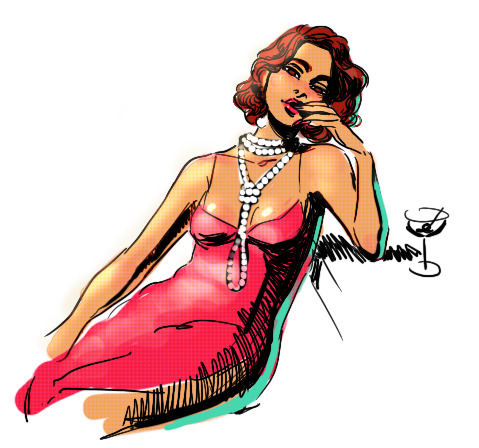
i know this has been said a million times but the way i draw bodies significantly improved after i started drawing more frequently from reference. if i cant find a reference for a pose on the internet, i'll just use myself or a friend. i spend an unfortunate amount of time just standing in front of my mirror looking at my own joints. pay attention to where your body curves!!
other than that though—honestly my anatomy/pose knowledge is a whack amalgamation of art tips i've accumulated over the years (i miss old school deviantart/tumblr style art tutorials). i also like to look at how artists i admire draw bodies—what details to they include, what anatomical short-hands etc
i think i'm still figuring out how to draw dynamic poses, but here are some cheats i've picked up (under the cut coz this got long again):
gonna use this stray!tim as a base
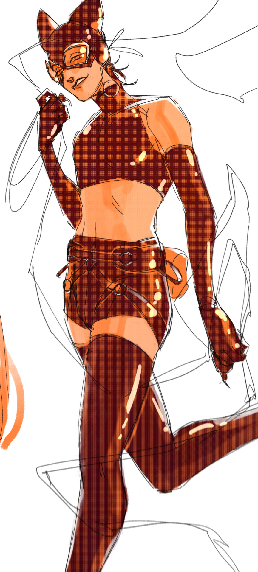
the easiest way for make up a pose is to start roughly with the head, collarbones, ribcage, and pelvis — you can build everything from there
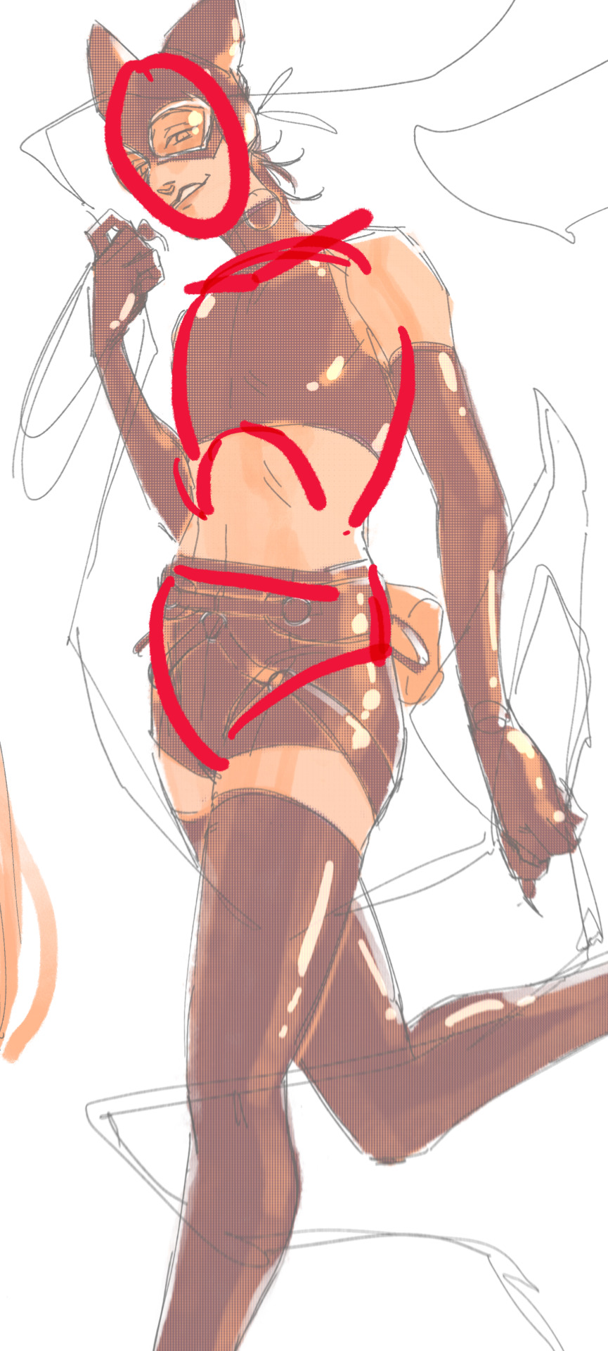
here's a couple more of what i mean by the ribcage-pelvis deconstruction:
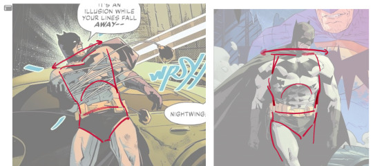
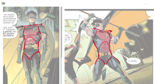
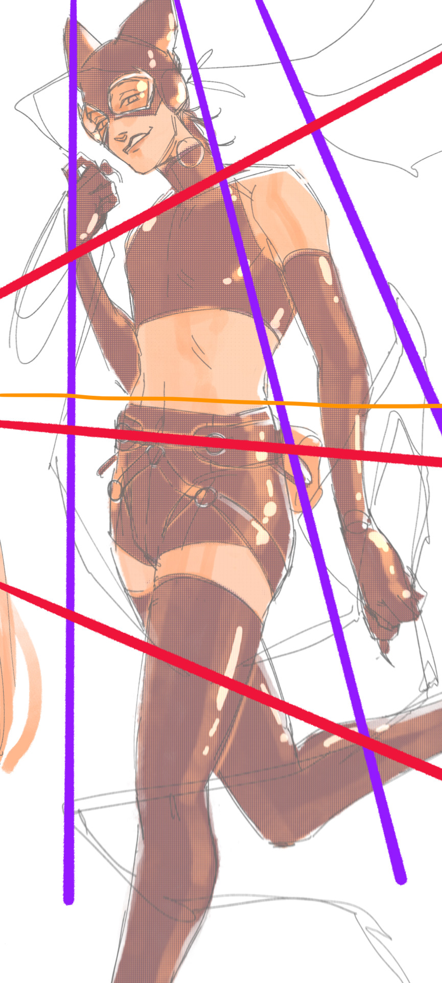
2. push your perspective a little!! imo things look more dynamic if you move your sight-line up or down—the horizontal orange line here. if you look at the panels above, the sight lines tend to be a little low, at around the character's torso or waist. i did the same below with stray!tim
to do this i usually try to get a sense of the space im working in by putting in some sloppy perspective grids
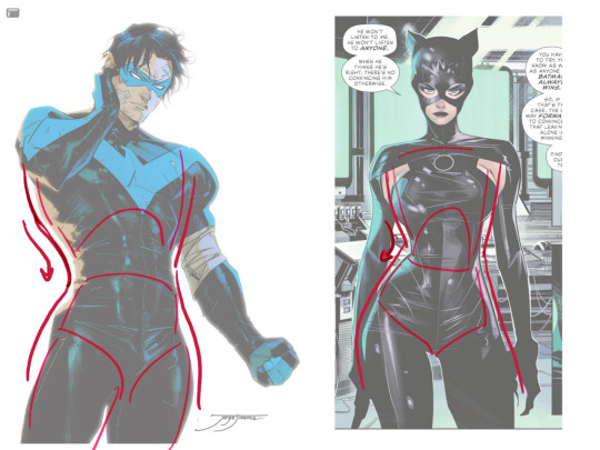
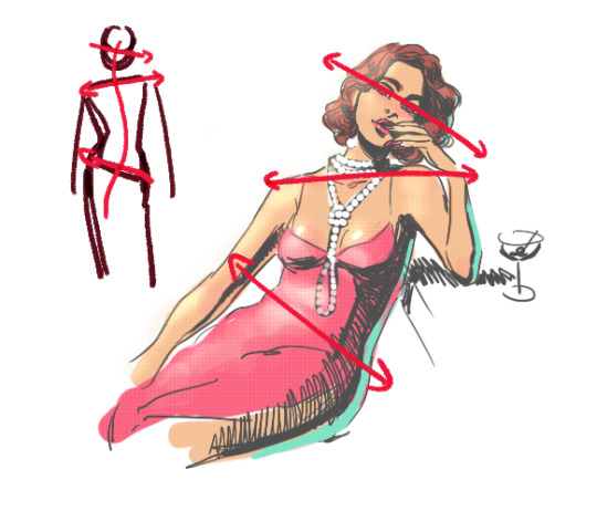
3. S curves!!! exaggerate the lines of the body. the body naturally has parallel horizontal lines—an easy way to get a body to look less rigid is to tilt those horizontal lines which in turn curves the vertical line of the body
this is what a mean by horizontal lines—usually i use the eyes, shoulders, and hips:
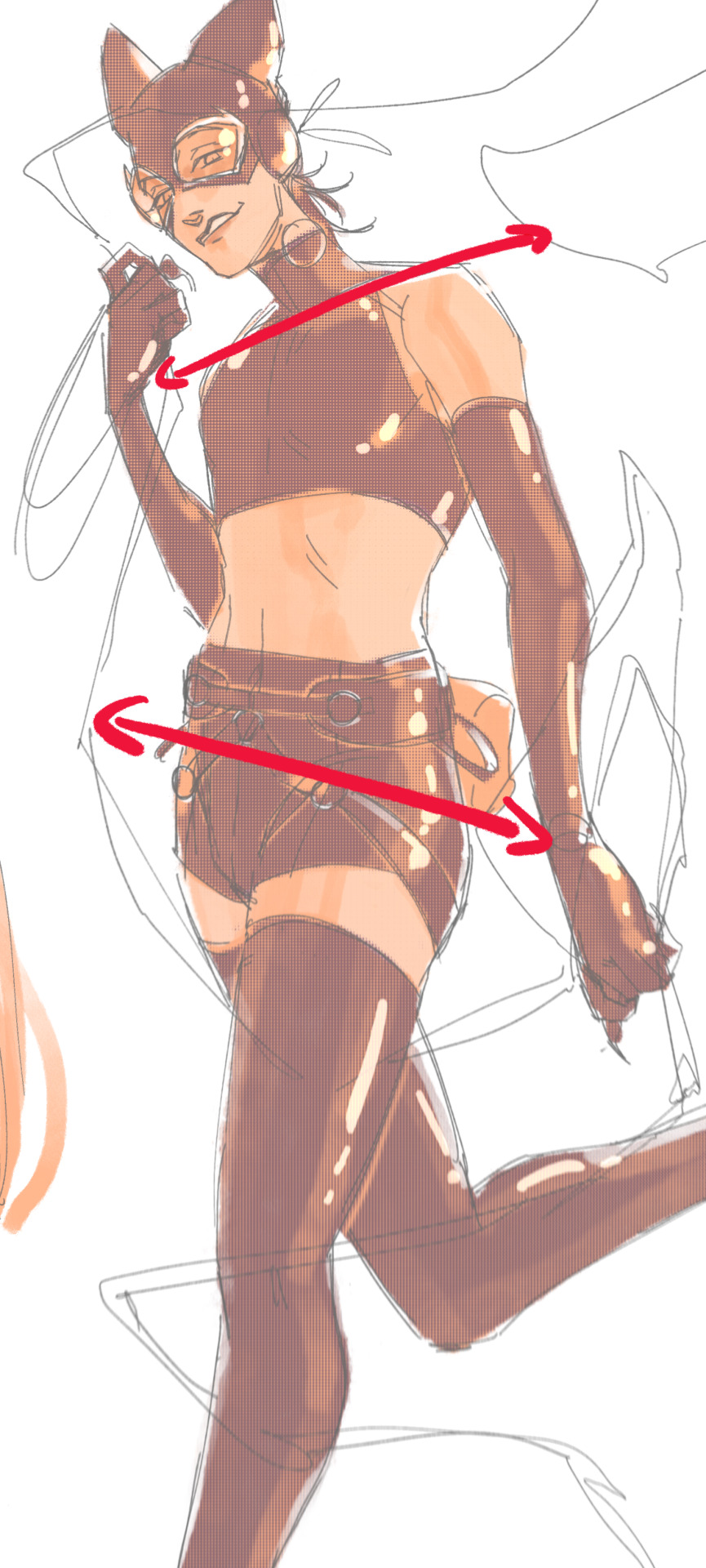
i'm gonna use caterina as a better example—usually you want the horizontal lines to sort of zigzag:
i've also picked up a couple visual tricks that don't exactly add dynamism to a pose? but they do give a static pose a little more oomph. a lot of this is done by visually highlighting one specific point of the body
for our purposes, i'm gonna make the focal point tim's face
motion blur! there are a couple ways to do this. i actually dont like working with traditional motion blur because you have to mess around with selections, so i usually fake motion blur using postional perspective blur:


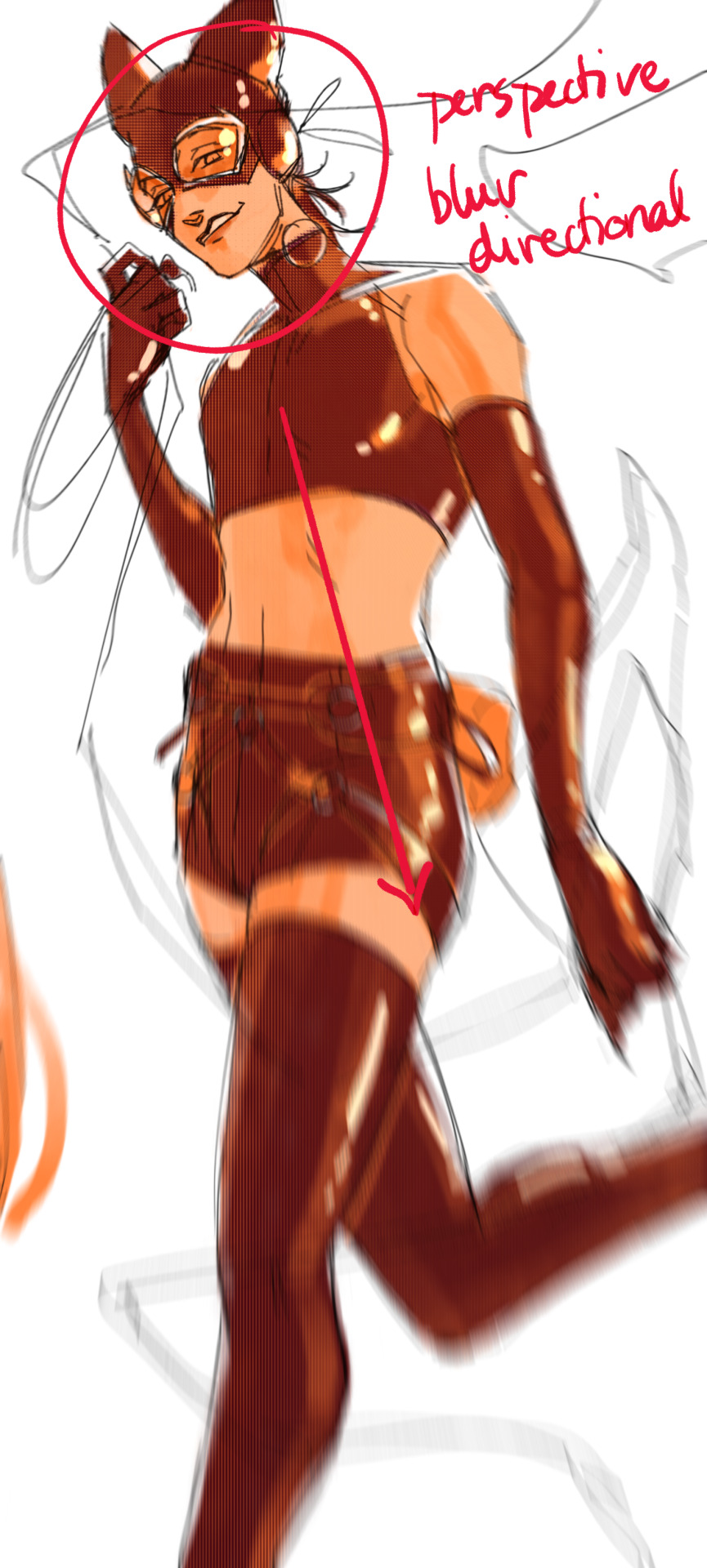
2. gradient lighting—you can add a lot of depth this way. usually i like setting the gradient in the direction of the focal point, e.g. tim's face
below, i added a layer above the base drawing, used an airbrush to get this gradient, and then set the layer to color burn and lowered the opacity. you can also clip the lighting layer to the base drawing and set it to multiply

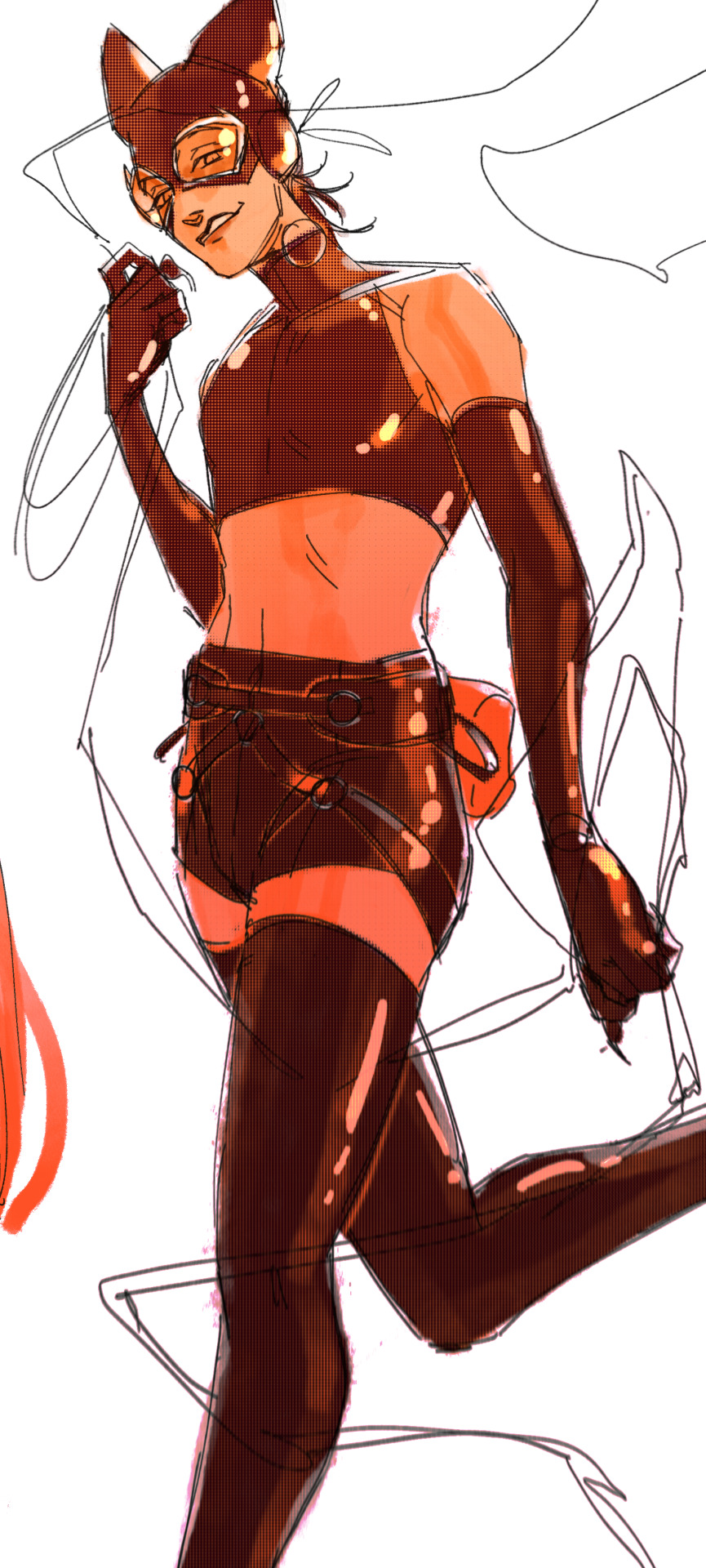
below, i did the opposite—instead of adding a gradient shadow, i added gradient light. i set the layer to add this time (instead of color burn) and then lowered the opacity again.
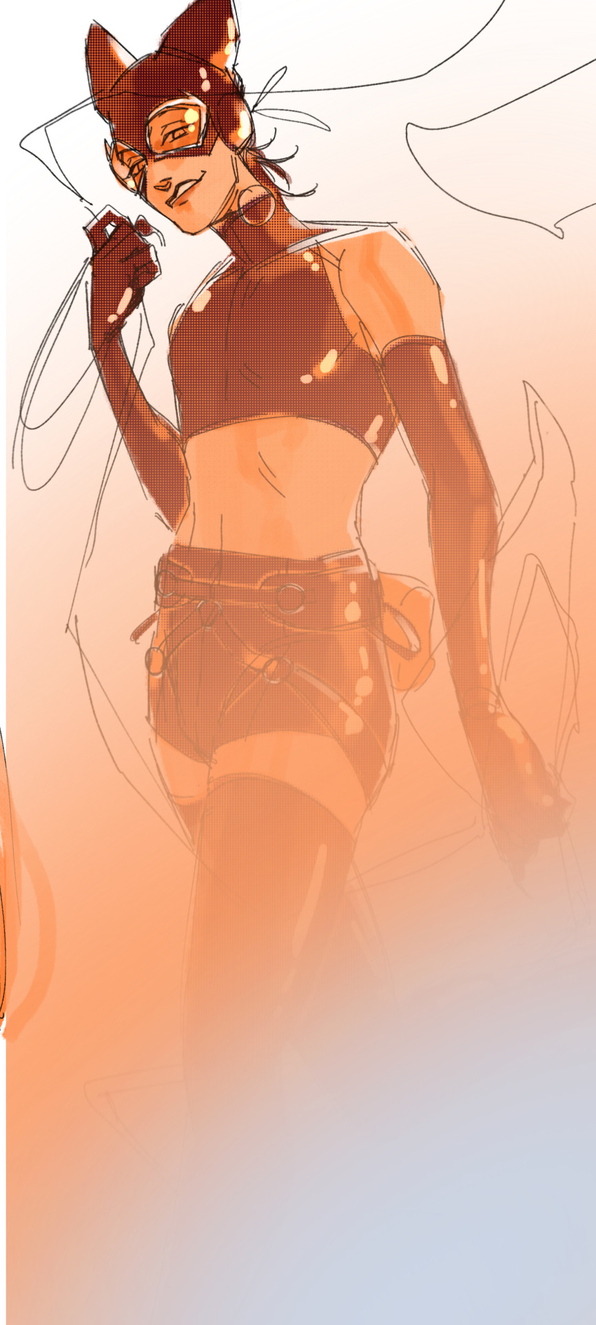
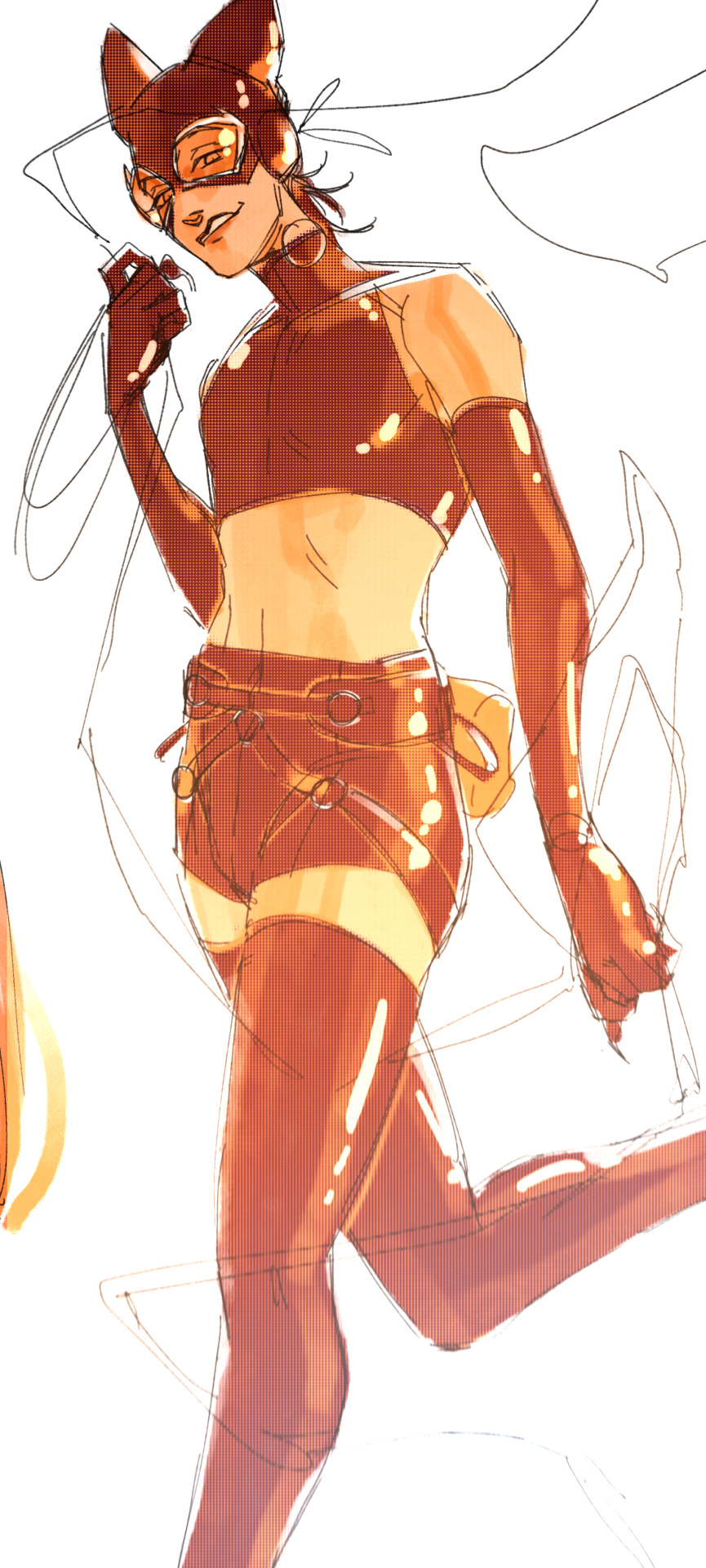
this kinda serves to desaturate the parts of the piece that are less important (ish i was kinda sloppy here), driving the eye to face—the most saturated. the motion blur does a similar thing, where the only thing "in focus" is tim's face
the gradient also sort of adds a directionality to the piece—it starts at the bottom right corner and goes up towards the upper left, causing your eye to follow that same path, which drags your gaze up tim's body
here's what it looks like when i combine 1 and 2:

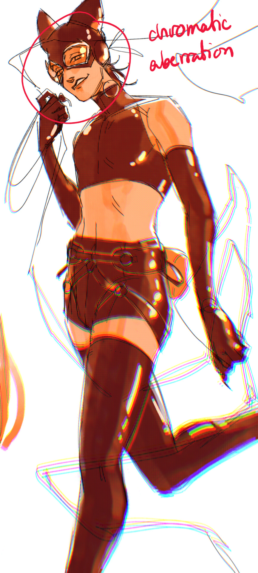
3. chromatic aberration's been pretty popular recently. it does a similar thing as perspective blur but with more eyestrain (although i went with a really exaggerated version below just to show you what it does) but it looks cool!
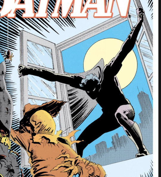
bonus cryptid tim as a reward for getting to the end :-)
#red talks#sart#art tutorial#YeAH UH this got long lmaooo i was on the bus for a Sec plotting this out so#also i am neck deep in a reincarnation/regression manhwa stress hyperfixation so i havent had the brain space to draw#so you get this instead!#if anyone wants recs lemme know lol#thank you anon :)))
68 notes
·
View notes
Text
MDNI| 18+ | Keegan x Y/N | Fem
TW- mentions of weapons, sexual content & adult language.
“Claim Me.” (Final Pt.)
God, you were sore in all the right places.
But as much as you would love to put all the blame into this morning's work out session.
There was no argument that Keegan did a number on you last night.
You still couldn't fathom how he simply demolished your inner walls. Repeatedly bulldozing his way in, chipping away parts and taking each piece to reconstruct you back together to suit him and him only.
Recrossing your legs for the 20th time today, you squirm in your office chair, fighting the urge to extinguish the wildfire of arousal.
It was a struggle to maintain focus with last night's performance replaying, distracting you from paperwork that was due by the end of the day.
Deep rooted embarrassment swarms with unquestionable desire. As frustration weeds, you finally force yourself to step away from your desk, taking a break to go and walk around the company.
Surely, some fresh air will do the trick.
After walking aimlessly for some time, you wandered into the company's armory. There you saw the regular bunch, fucking around per usual.
Soon, the overlapping voices gradually hushed with all heads in the room turning in your direction. A few soldiers quietly snickered and whispered amongst themselves, thinning your eyes in suspicion, but decided it was better to not ask any questions.
Somehow, last night, word had gotten out and rolled over into today's hot gossip. Unknowingly to you, the swirl of rumors had knitted a blanket of awkwardness, swaddling you completely.
"You have fun last night, L/N?" Asked a random soldier. By the sound of his tone, he was definitely a dared. The question alone had your cheeks glowing with palpable embarrassment but, as hard as it was, you kept your cool.
"Depends on who's asking?" You retort as you faced the giggling soldiers, folding your arms defensively across your chest, giving them an audacious look of ‘Just try and fuck with me.’
At this point, Keegan had just strolled in, placing his rifle meticulously on the leaden gun rack, paying no mind to the room’s current focal point. It wasn’t until what he overheard that made him see nothing but red.
“You were playing with yourself last night?”
“Actually, I wasn’t, Corporal Neece.” You shot back moving a hand to your hip, rolling your eyes to the back of your skull, disgusted that this was even up for discussion.
“Riiight…then, you must’ve been playing with your imaginary boyfriend.” Neece meddles on, getting a kick out of how red your face had turned. “Awe, don’t be so bashful, Y/N.”
Your mouth flops open and right as the natural instinct to slap the ever living shit out of this man, Keegan’s large hand seized your wrist and stationed himself on your front lines. His veins bulge on the verge of bursting with rage. Curling his fingers tightly into a fist, Keegan’s piercing gaze waned in on the now mousey soldier.
“How about this, Corporal. I’m the boyfriend. Do I look real enough to you?” Keegan attested, taking a step forward and cornering Neece with fear lodging itself in his throat, he frantically nods when his back pressed against the cool metal of the weapon’s cabinet. “Good. Now, get lost…all of you.”
Keegan’s authority was never one to be messed with and when he started barking out orders; it meant business. Everyone scrambled, heading Keegan’s order before they all scurried off.
All, except for you.
“I didn’t need you to come to my rescue.” You said sharply, snatching your wrist back, desperately trying to conceal the humiliation you felt. “I’m perfectly capable of handling myself.”
Keegan scoffs. “You’re not denying it this time, Sweetheart.”
“There’s nothing to deny. We’re just friends.” You repeated your infamous rebuttal.
Taking a finger, Keegan gently guides your face, lifting your chin up so your eyes meet with his frosty blues. You innately hold a breath in when you feel his other hand snake to the small of your back. “Are you done? Because I’m getting real sick of this little game you’re trying to play right now. We both know what happened. You know damn well that we have something…something real…”
Your bottom lip backpedals between your teeth when Keegan’s thumb skates across, reimagining how they perfectly molded to his last night. With the heat between your bodies radiating, you lean into Keegan’s supportive embrace, perching your arms over his shoulders, no longer denying the insatiable chemistry.
Resting his forehead on yours, Keegan’s next words bristled your skin with goosebumps.
“Claim me.”
Right on cue, you pull Keegan’s skull balaclava up to the bridge of his nose and without a second to spare, your lips collided fervently. Keegan deepens the kiss as his tongue eagerly invades your mouth, exciting a few soft moans out while you relish on the taste of his control. Keegan’s hand falls to cup the shape of your ass, flawlessly it manipulated underneath his palm, his pants grow uncomfortably tight when the flashbacks of last night begin rolling in. The fire of arousal continues to spread when Keegan lightly nips at your bottom lip, your hips take initiative, desperately gyrating against his, igniting primal urges of his own.
Just as stars began to fill your vision, a husked voice took you both by surprise, nearly pissing yourself in the process.
“So you two are an item.” Logan casually publicized with a studious expression. “Could’ve fooled me, to be honest.”
Panicking, you immediately shoved Keegan away with enough force that the air in his lungs come out as a hushed grunt and his expression sours at friendly distance you created as well as the stammering excuses that started pouring from your mouth. Logan’s hand eventually comes up in protest, putting a pause on you.
“You don’t have to explain yourself, Y/N. You two make a cute couple. I’m just happy Hugh Hefner over here finally found a good one.”
#call of duty#cod mw2#call of duty fanfic#mw2 imagine#spotify#cod keegan#keegan cod#keegan p russ#keegan russ smut#keegan russ x reader#Spotify
91 notes
·
View notes
Text
Art Advice: Composition pt. 1 - Leading Lines and Focal Points
Composition is a vast topic that would take a long time to talk about in full, so I'm breaking it down into parts of more manageable size. This article is for people who draw/paint and for photographers.
In this issue, we will talk about guiding the viewers' eyes using: I. Leading lines II. Focal points
Every artpiece (drawing/painting or photograph) has visual pathways that guide the viewer's eye from one point to another in the piece, whether you intended to include them or not. It's important to be aware of them and learn how to use them to your advantage.
I. LEADING LINES
One way to guide the viewer's attention through a piece is by using explicit and implicit lines. An imbalance in these can cause your drawing to appear lopsided. (Imbalance, however, can also be used to your advantage; we'll talk about that later in this article.)
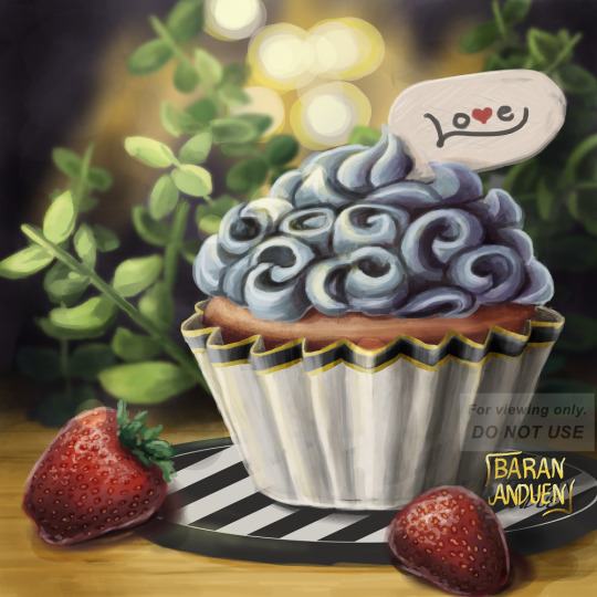
"Cupcake Love" [link]
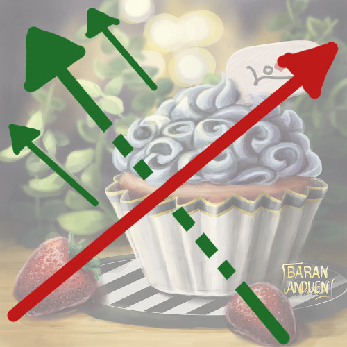
Explicit lines are easier to identify: they're actual lines in your drawing. Here, we have three explicit sets of lines:
The sprigs of greenery: the two main ones are shown by the solid green lines on the diagram on the right. Here, they have a top left ↔ bottom right motion;
The black and white lines on the coaster, running in the opposite direction; and
The creases on the cupcake paper, fanning out from bottom to top.
Implicit lines are harder to spot, but your subconscious does catch them, so it's important to train yourself to see them. Here, there is an implicit line, marked on the diagram by the red arrow, that goes from the strawberry on the bottom left (notice its alignment) to the "Love" sign on top of the cupcake (notice that the "L" also forms an arrow that points back to the strawberry).
There is also another implicit line (shown by the dotted green arrow) going from the strawberry on the bottom right and connecting with the explicit lines formed by the sprigs on the top left.
🌱Tip! For people drawing: While training yourself to see implicit lines, a good way to spot them more easily is to flip your canvas. When working traditionally, you can use a mirror or take a photo of your work (make sure you paper is straight/not bent, and that your camera or mirror is perpendicular to your paper). You may not notice where the implicit lines are, at first, but you're more likely to spot a skew/slant this way.
The "red" and "green" lines here are perpendicular to each other, giving the painting a balanced appearance, despite the cupcake being off-center. You may have noticed that, if we were to remove the "Love" sign, we would still have more bottom left ↔ top right lines, from the sprigs behind the sign. So there is not just one bottom left ↔ top right line; there are more, and this also contributed to the sense of balance.
II. FOCAL POINTS
Another way to guide the viewer's eye across the canvas, or make them pay attention to a specific area, is to use focal points smartly.
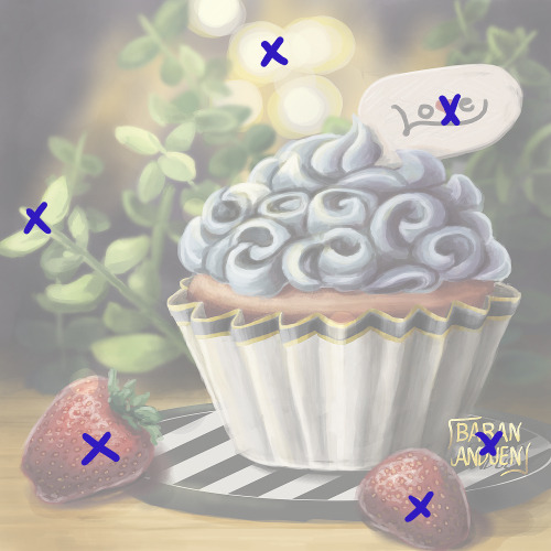
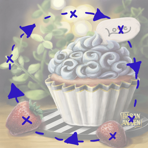
Here, I've marked with Xs the secondary focal points of the painting (the main focal point being the cupcake). These are the points on which a viewer's eye will rest (after spotting the main subject first).
Like with leading lines, you want to use these to guide the viewer's eye around your piece in the way YOU want. This visual pathway can vary from piece to piece. You can try to arrange them in such a way that you keep the viewer's eye within your drawing, as opposed to leading it off the canvas. In this painting, they form a circle, but they can have any number of shapes.
IMBALANCE CAN WORK FOR YOU...
So far, we've talked about maintaining a balanced composition and keeping the viewer's eye from wandering off the canvas, but there are situations where you may want to do the opposite, to achieve a certain effect. For example:
To create a sense of bigness of smallness, or of open spaces
To cause an uneasy feeling in the viewer
To guide the viewer's eye in a specific direction
Let's look at some examples:

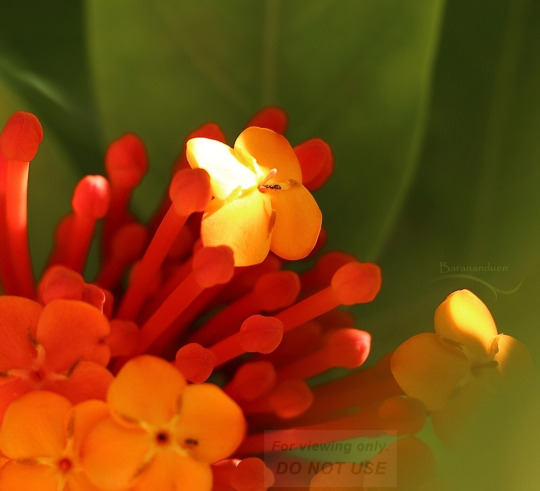
from my photography account: @barananduen-photo
These two compositions have very strong bottom left → top right leading lines (explicit), and nothing bringing the viewer's eye back. The focal point(s) are also all clustered toward one end of this line (in these cases, they're in the bottom left). This is done intentionally to create a feeling of open-ness.
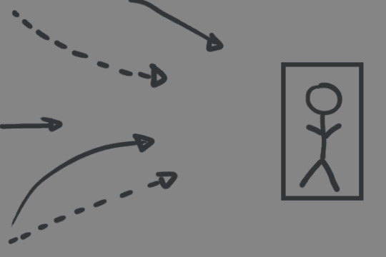
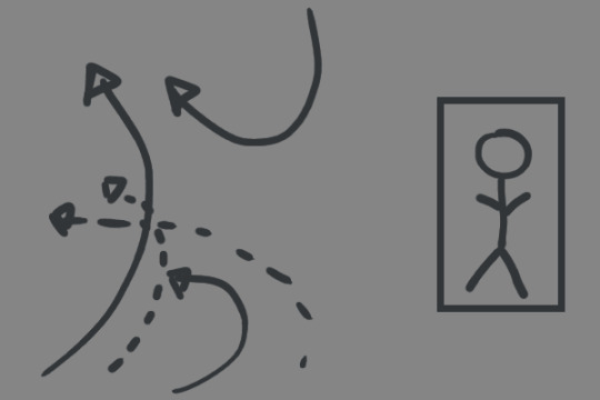
You could also use a group of leading lines all pointing toward one focal point off to one side, to create a feeling of both isolation and focus/stress on said figure ("all eyes on..." type of concept). On the other hand, keeping the focal figure on one side, but, instead of lines pointing toward it, using curves leading away from it, can create a feeling of exclusion or loneliness for the figure.
So, you can use imbalance in composition in different ways to convey different messages.
...OR AGAINST YOU
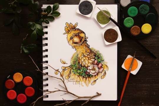
"Christmas Chocobo" [link]
This (the painting by itself), on the other hand, has pretty bad composition. I have one leading, explicit line: bottom right ↔ top left. If you take away all the stuff I placed on and around the sketchbook, that composition is not really doing anything for me. The subject is centered, and there's nothing in the spaces around it, so it's not creating a pleasant sense of open-ness. It just looks skewed. There's a weak implicit "swoop" in the feathers on the bottom right, but it's not enough. The figure balances off a little bit because it's very bottom-heavy, so the body of the bird is like a horizontal mass.
The photo as a whole is more balanced out, because there is an implicit line going from bottom left ↔ top right, from the orange/reds paint wheel, through the bird, and to the paints on the top right (and this line is top-heavy). There are also various items forming a circle around the painting. Also, the darker leaves on the top left blend more into the background, keeping the bottom right ↔ top left explicit line of the painting from extending farther (therefore not diminishing the effect of the bottom left ↔ top right implicit line mentioned before).
🌱So the important takeaway is: Learn to identify leading lines and focal points, and arrange them to suit your purpose, whether it be creating balance or breaking it, and experiment to see when breaking it is good and when it is not.
CLOSING
Composition is a very important skill for both drawing/painting and photography, but the way each of these two types of artists goes about it is usually the opposite: While, when drawing, you start with a blank canvas and fill it up, when making (I prefer this term, used in German, over the English "taking") a photograph, you usually (unless you're doing still life, etc) start with a whole scene that you have to figure out how to fit into the frame.
For this reason, I'd like to encourage both types of artists to try each other's medium as an art exercise in training your sense of composition, because changing your approach often leads to you discovering new things you can use.
For people who draw: Take your phone (or camera if you have one) and try to frame things "artistically," taking into consideration the things we've discussed in this article.
For photographers: Try making little stick-figure doodles (for drawing/painting, this is called "thumbnailing") of what you'd like a scene to look like. This is something you can use in the planning stage before a photo session, sort of like a "wishlist."
And, like I said, there are more topics in composition, but this is a good chunk to digest in one sitting, so we'll leave the other topics, including other ways to guide the viewer's eye, for future Art Advice Articles.
I hope you found this helpful, and see you next time! 💗
MORE ART ADVICE ARTICLES
You can find the index to all Art Advice Articles [here] including:
How to Deal with Art Block
How to Have a Positive Outlook
Advancing in Art: The 3 Ps
The Misconception Behind "Study Realism"
How to Develop Your Own Style (coming soon!)
How to Photograph Traditional Artwork (coming soon!)
etc.
#composition#art advice#art tips#art help#art resources#artists on tumblr#photographers on tumblr#art#photography#how to#art tutorial#photography tips
32 notes
·
View notes
Text
Karaoke Neon Signs: Light Up Your Singing Experience
If you love singing, nothing sets the mood quite like karaoke neon signs. Whether you’re hosting a karaoke night at home, decorating a karaoke bar, or creating a fun space for friends to sing, these vibrant, glowing signs add excitement and energy to any setting. With their bright lights and customizable designs, karaoke neon signs not only capture the fun of singing but also create an inviting, lively atmosphere that encourages people to get up and perform.
Why Karaoke Neon Signs are Perfect for Any Karaoke Space
Karaoke neon signs are more than just decoration—they’re a symbol of fun and entertainment. Here’s why they’re essential for any karaoke setting:

Set the Perfect Atmosphere When it’s time to sing your heart out, the right ambiance is crucial. A karaoke neon sign instantly transforms a dull space into a dynamic, energetic environment, making everyone feel like a superstar.
Encourage Participation Neon signs are attention-grabbing, and having a karaoke neon sign around sparks excitement, encouraging your guests to take the mic and join in.
Highlight Your Love for Music For any music lover, karaoke neon signs represent the joy of music, providing a focal point that shows your passion for singing and entertainment. Whether it’s a neon mic or musical notes, a karaoke neon sign creates a direct link to the world of music and fun.
Perfect for Home or Business Whether you’re decorating your home karaoke setup, creating a theme for a karaoke bar, or even for a party venue, karaoke neon signs enhance any space. They’re ideal for creating a cozy, yet energetic, environment for friends and customers to enjoy.
Boost Your Business Appeal If you own a karaoke bar or entertainment venue, karaoke neon signs are an excellent way to draw in customers. Their glowing, eye-catching design makes your business stand out, attracting both seasoned karaoke lovers and first-timers looking for a good time.
Popular Designs for Karaoke Neon Signs
There’s a wide variety of karaoke neon signs to choose from, each offering its own unique flair. Some popular designs include:
Microphone Neon Sign: A classic and bold representation of karaoke, this design brings a fun, musical touch to any space.
Music Notes: Neon music notes or staff lines create a sense of rhythm and melody, adding a musical vibe to the area.
“Karaoke Night” Signs: A neon sign with the phrase "Karaoke Night" is perfect for creating excitement and alerting guests to the fun.
Neon Lyrics: For a personalized touch, consider neon signs featuring your favorite lyrics or songs.
Customized Text: Customize your neon sign with your bar’s name, slogan, or even a personalized message like “Sing Your Heart Out!”

Why Karaoke Neon Signs Are Beneficial for Your Space
Here are a few reasons why karaoke neon signs are the perfect addition to any karaoke setting:
Eye-Catching Designs: Neon signs are hard to miss, so you can be sure that a karaoke neon sign will attract attention and create a buzz in the room.
Create a Fun Vibe: A glowing neon sign elevates the fun factor, making it a perfect conversation starter and mood setter for karaoke enthusiasts.
Durable and Long-Lasting: LED neon signs are energy-efficient and built to last, offering durability and longevity that will keep the party going.
Add Color and Excitement: Neon lights are perfect for creating vibrant, colorful settings that get people excited and ready to sing.
Why Choose HandmadeT Neon Sign for Your Karaoke Neon Sign?
HandmadeT Neon Sign is your go-to source for high-quality, customizable karaoke neon signs. We specialize in creating neon signs that perfectly match the energy and vibe of your space. Whether you’re designing a personal karaoke corner at home or outfitting a commercial karaoke bar, we’ll craft the ideal sign for you.
Here’s why HandmadeT Neon Sign is the right choice for your karaoke neon sign:
Custom Designs: We offer a wide range of neon signs that can be fully customized to your preferences, whether you want a neon microphone, music notes, or a personalized slogan.
Eco-Friendly LED Technology: Our LED neon signs provide bright, vibrant lighting while being energy-efficient and environmentally friendly.
Premium Materials: We use top-quality materials to ensure your karaoke neon sign is durable, long-lasting, and maintains its glow for years to come.
Excellent Customer Service: From initial concept to final delivery, our team works with you every step of the way to bring your vision to life.
Sing in Style with a Custom Karaoke Neon Sign
A karaoke neon sign is more than just a decoration; it’s a way to elevate the entire karaoke experience. With a glowing neon sign, you can create an exciting, inviting atmosphere that inspires everyone to grab the mic and sing their heart out.
Get in touch with HandmadeT Neon Sign today to design your custom karaoke neon sign and light up your space with music, fun, and creativity!
0 notes
Text
Virtual Sketchbook 2
Journaling -
Unity and Variety - Unity refers to how blended together the elements of an artwork looks looks. Variety refers to how much the different elements of an artwork contrast. These two principles of design are opposites both referring to how much or how little the elements of a piece of art work together.
Example:
Balance - Balance refers to the state in which the elements of an artwork have reached a visual equilibrium. An artwork may gain balance through either symmetry or a lack thereof.
Example:

Emphasis and Subordination - Emphasis refers to the method by which an artist draws attention to an aspect of their work. Subordination refers to the method by which an artist draws attention away from an aspect of their work. Both principles are about drawing a viewer's attention. This is done by the usage of size, color, or contrast.
Example:

Directional Forces - Directional forces refers to direction to which an artist draws your eyes. This principle is used to draw the viewer's eyes to a focal point of the art piece.
Example:

Repetition and Rhythm - Repetition refers to the many usages of a visual element, which can create unity. Rhythm refers to the usage of a sequence of elements with differences.
Example:

Scale and Proportion - Scale refers to the comparison of the size of one aspect of an artwork to another. Proportion refers to the relationship between the different sized aspects of one whole piece.
Example:

2. Writing and Looking -

Figure 3.9a, Tobit Burying the Dead, by Andrea di Lione contains linear perspective, implied lines, focal points through high contrast colors, implied light, and implied mass.
3. Connecting Art To Your World -
I am someone who puts effort into what I wear when I go outside. Color always affects me in the process I go through when choosing an outfit. Whenever I want to wear one piece of clothing, I must find another piece that looks good with the first one. Influenced by TikTok, something I have recently gotten into doing when choosing an outfit is using the color wheel. I first choose the hue, the base of the color, I wish to wear. I then look for whatever color is directly across it, these two colors are complementary. I am able to choose a piece of clothing that is higher or lower in value to that complementary color. If I had to pick a color scheme for my life, it would be the near neutral color scheme consisting of beige, tan, brown, and other colors because outfits consisting of one of these colors are the ones I love to wear the most.
4. Art Project -

This comic tells the story of how whenever I am feeling down, it always makes me feel better to buy a Lego set and put it together.
5. Photo/Design: Logos -
Group 1. Layout
The logos in my everyday surroundings include on my clothes, my shoes, the cars on the road, the stores I pass by, my devices, the food I buy, and the items I carry. The logos and brand names I see around me in my life include GAP, H&M, Levi's, Nike and the Nike swoosh, the NB of New Balance, Adidas, Converse, Crocs, Toyota, Honda, Hyundai, Ford, Jansport, Swiss Gear, HP, Dell, Apple, Lego, Extra, Walmart, Publix, Dunkin, Coca Cola, Pocky, Lays, Doritos and Marvel.
I know about these logos and brand names because they are on the clothes and shoes I wear, the stores I pass by, the online media I consume, the food I buy, and on the cars I see on the road.. A logo or brand name such as those listed above can be found quite literally anywhere in everybody's lives and on anything they interact with. Logos help to distinguish the item that you see or interact with, and it lets the company that made it tell you, "I made this, and this is my brand, so you should buy all the other things I made". That logo was put together by a group of people who set out to highlight their brand as being one of a kind, building off of pre-existing typefaces to make something of their own.
0 notes
Text
Top 5 Must-Do Activities on an Amazon Jungle Tour from Puerto Maldonado.

Settled in the focal point of the Peruvian Amazon, Puerto Maldonado offers spearheads an entry to one of the most biodiverse locales on earth. Whether you're a nature fan, untamed life sweetheart, or fundamentally searching for an escape into the profundities of perfect rainforests, an Amazon jungle tour from Puerto Maldonado ensures an unprecedented experience. Here are the main five must-do exercises that ought to be on each wayfarer's agenda:
1. Wildlife Watching
One of the most exciting parts of visiting the Amazon wilderness, particularly on Manu Reserved Zone Puerto Maldonado tours 9 days, is experiencing its different untamed life. From the notorious pumas and monster stream otters to bright macaws and fun loving monkeys, Puerto Maldonado's wilderness abounds with life. Guided tours frequently incorporate early morning or night journeys, when the backwoods wakes up with the sights and hints of its occupants. Master guides will lead you through secret paths, expanding your possibilities spotting subtle species right at home.
2. Canopy Walk and Zip-lining
Experience the rainforest according to an alternate point of view with an overhang walk or zip-lining experience on a Manu biosphere zone Pto Maldonado tour 8 days. Suspended high over the backwoods floor, these exercises offer stunning perspectives and an opportunity to notice the wilderness covering very close. Navigate solid scaffolds between transcending trees, feeling the adventure of being encircled by lavish plant life and the calls of colorful birds reverberating through the air. It's an invigorating method for valuing the Amazon's colossal biodiversity and stunning landscapes.
3. Piranha Fishing and River Cruises
Take part in traditional Amazonian exercises like piranha fishing or leave on relaxed river travels along the Madre de Dios River on Jungle tours from Puerto Maldonado. These excursions provide bits of knowledge into neighborhood culture and the natural significance of the river frameworks. Whether you're reeling in a fierce piranha or peacefully drifting past dense riverbanks, these experiences connect you deeply with the rhythms of life in the rainforest.
4. Night Safaris
As sunset settles over the wilderness, set out on a night safari to observe something else entirely of Amazonian wildlife. Furnished with spotlights and directed by master naturalists, investigate nighttime animals that arise under the front of obscurity. From energetic tree frogs and subtle night monkeys to shining eyes of caimans reflecting in the waterway, each nighttime experience reveals the Amazon's supernatural charm.
5. Indigenous Community Visits
To understand the Amazon's cultural and ecological significance, visit nearby native networks. Participate in cultural trades, find out about traditional practices, and gain bits of knowledge into reasonable living inside the rainforest. Many visits offer chances to partake in handicraft studios, traditional functions, or instructive discussions driven by local area individuals. Valuing the profound association between native people groups and their common habitat is an opportunity.
Discovering Amazon Trips Peru - Your Gateway to Unforgettable Amazon Jungle Tours in Puerto Maldonado
Amazon Trips Peru offers immersive Amazon jungle tours in Puerto Maldonado, blending adventure with sustainability. With expert guides, eco-friendly practices, and tailored itineraries, they ensure unforgettable experiences. Explore diverse wildlife, canopy walks, and cultural exchanges with local communities, promising a rich and responsible journey through Peru's rainforest.
0 notes
Text
Transform Your Garden with Unique and Stylish Paving Options
As the days get longer and the weather warms up, it's the perfect time to refresh your garden and create an inviting outdoor space. Whether you’re looking to host barbecues, gatherings, or simply enjoy a peaceful retreat, the right paving can make all the difference. Here, we explore a variety of modern paving options that can enhance the beauty and functionality of your garden, including Crazy Paving, ELITE (Sawn Edges), Indian Stone Paving, Linear Paving, Paving Circle, Smooth Sandstone Paving, Textured Paving, Tumbled Paving, natural stone, and natural paving stone.
Crazy Paving
A Unique and Eclectic Choice
Crazy Paving is an exciting way to add a unique touch to your garden. This style involves using irregularly shaped stones to create a mosaic-like effect. The result is a visually appealing, one-of-a-kind pathway or patio that brings a playful and artistic vibe to your outdoor space. It's perfect for those who love a bit of whimsy and creativity in their garden design.
ELITE (Sawn Edges)
Sleek and Modern
For a sleek and modern look, consider ELITE paving with sawn edges. These stones are precisely cut to create clean, straight lines, giving your garden a polished and sophisticated appearance. This style is ideal for contemporary gardens where a neat and orderly look is desired. ELITE paving can be used to create stunning patios, pathways, and even driveways that stand out with their refined elegance.
Indian Stone Paving
Timeless Beauty
Indian Stone Paving offers a timeless and natural beauty that can enhance any garden. These stones come in a variety of colors and textures, providing a versatile option for different design preferences. Known for their durability and classic appeal, Indian stones are perfect for creating patios, walkways, and other outdoor features that will last for years to come.
Linear Paving
Modern and Streamlined
Linear Paving is perfect for those who prefer a modern and streamlined look. This style involves using long, narrow stones to create a sleek and elongated appearance. It’s ideal for contemporary gardens and can be used to create visually striking pathways, patios, and borders. Linear paving adds a sense of direction and flow to your garden design.
Paving Circle
Focal Points with Flair
A Paving Circle can be a great way to create a focal point in your garden. These circular designs draw the eye and can be used to highlight specific areas such as seating spaces, fire pits, or garden features. Paving circles add a touch of elegance and can be a striking centerpiece in your outdoor space.
Smooth Sandstone Paving
Elegant and Comfortable
Smooth Sandstone Paving is both elegant and comfortable underfoot. Its smooth surface makes it ideal for areas where people will be walking barefoot, such as around pools or in seating areas. Available in a variety of colors, smooth sandstone can create a warm and inviting atmosphere in your garden.
Textured Paving
Adding Depth and Interest
Textured Paving can add depth and interest to your garden design. These stones have a rough surface that can create a rustic and natural look. Textured paving is ideal for pathways, patios, and areas where you want to add a bit of visual and tactile contrast.
Tumbled Paving
Rustic Charm
Tumbled Paving stones are processed to create a worn, weathered look, giving them a rustic charm. This style is perfect for creating a cozy, cottage-like atmosphere in your garden. Tumbled paving is versatile and can be used for patios, walkways, and other outdoor features to add a sense of history and character.
Natural Stone
Authentic and Durable
Natural stone is a popular choice for garden paving due to its authentic look and durability. Each stone is unique, providing a variety of colors and textures that can complement any garden style. Natural stone paving is long-lasting and can withstand the elements, making it a reliable choice for outdoor spaces.
Natural Paving Stone
Versatile and Beautiful
Natural paving stone encompasses a wide range of stone types that can be used for various garden features. Whether you prefer sandstone, limestone, or slate, natural paving stones offer versatility and beauty. They can be used to create everything from patios and pathways to garden borders and decorative elements.
Conclusion
With so many paving options available, you can easily find the perfect style to suit your garden and personal taste. Whether you prefer the unique charm of Crazy Paving, the sleek lines of ELITE (Sawn Edges), or the timeless appeal of Indian Stone Paving, there’s a paving solution for every garden. By incorporating these paving styles into your outdoor space, you can create a beautiful, functional, and inviting area to enjoy throughout the warmer months.
0 notes
Text
Charles Rodriguez - Virtual Sketchbook 2
Journaling
Asymmetrical balance - The various elements of a work are balanced but not symmetrical
Asymmetry - Lack of symmetry
Balance - An arrangement of parts achieving a state of equilibrium between opposing forces or influences.
Composition - The organization of visual elements in an artwork
Contrast - The juxtaposition of strongly dissimilar elements; dramatic effects can be produced when dark is set against light, large against small, bright colors against dull
Design - The process of organizing visual elements and the product of that process
Directional forces - Pathways that the artist embeds in a work for the viewer's eye to follow.
Emphasis - A method an artist uses to draw attention to an area; may be done with central placement, large size, bright color, or high contrast.
Focal point - The principal area of emphasis in a work of art; the place to which the artist directs the most attention through composition.
Format - The shape or proportions of a picture plane.
Pattern - All-over design created by the repetitive ordering of design elements.
Proportion - The size relationship of parts to a whole and to another
Repetition - The recurrence of visual elements
Rhythm - The regular or ordered repetition of dominant and subordinate elements or units within a design with related variations.
Scale - The size relation of one thing to another
Subordination - Technique by which an artist ranks certain areas of a work as of lesser importance; areas are generally subordinated through placement, color, or size.
Symmetrical balance - The near or exact matching of left and right sides of a three-dimensional form or two-dimensional composition
Symmetry - A design (or composition) with nearly identical form on opposite sides of a dividing line or central axis
Unity - The appearance of similarity, consistency, or oneness
Variety - The opposite of unity; diverse elements in the composition of a work of art
Writing and Looking

Title: Francisco Goya, BULLFIGHT: THE AGILITY AND DARING OF JUANITO APINANI (Page 4.4)
The instructions and ingredients used for this artwork is any sort of pen or pencil, draw across the horizon line to help portray the foreground and the background, distinct the vanishing point, draw in the shadows and shade in from where the light is coming from, and draw good geometric shapes to add detail on the human and the bull.
Connecting Art to Your World
A personal experience of how color has affected me was that not only is it pretty fun to do in art class all the way back in school, but also because it helps add more personality to my artworks. Normally I do black and white since it's easier and it doesn't take as long, but whenever I decide to do color, I always have a fun experience doing so. It helps my drawings pop out more and make it stand out. It's fun to try out different colors as well to help with what works and what doesn't. Color is always a valuable asset for art as a whole.
Art Project

This is a small cartoon I made for this project, it's basically just fanart with some humor in it, which is something I've always loved. My favorite type of art is always fanart since I can draw my favorite characters from movies, video games, tv shows, and many other types of media. It relates to me because I always liked the more funny aspects of fanart and how silly they can be.
Photo/design
Group 4: Interactive Design
1) This is my Steam library collection, it helps to know what games I have, what were my most recent ones, and what games I should try out next.

2) My Amazon feed helps me what items I'm looking for and what items I should be interested in checking out.
Url: https://www.amazon.com/?tag=amazusnavi-20&hvadid=675149238673&hvpos=&hvnetw=g&hvrand=12727895269756421398&hvpone=&hvptwo=&hvqmt=e&hvdev=c&hvdvcmdl=&hvlocint=&hvlocphy=9012321&hvtargid=kwd-29088450&ref=nav_custrec_signin&hydadcr=15243_13597374&gad_source=1Links to an external site.

3) My SCF Dashboard helps me indicate what classes I have, what homework is due on the calendar, what my grades are in each class, what emails I've gotten, and it allows me to do many of the work I do for my classes.
Url: https://scf.instructure.com/

4) The playlist option whenever I want to listen to music on Youtube allows me to continuously listen to music whenever I just want to relax. It can also allow me to shuffle the music so that I can listen to different types of music every time I listen or it can allow me to loop music so that I can just listen to it on repeat.
Url: https://www.youtube.com/watch?v=OcnuAHbI2WI&list=PLOzDu-MXXLliO9fBNZOQTBDddoA3FzZUo&index=13Links to an external site.
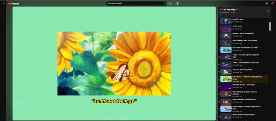
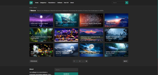
5) This website is able to let me interact with live images and let me download them so that I can have a live wallpaper on my computer.
Url: https://livewallpapers4free.com/category/nature-live-wallpapers/page/2/Links to an external site.
In my opinion, what makes a good interactive design on a website or an app is the overall aesthetic and the accessibility. Take Youtube's for example, it's simple, nice, and being able to access anything on there is a piece of cake. The intent of this website is to help provide entertainment for the user watching. It can also provide information, drama, music, and many other things the user might want to see. It's an app that can help the user just have a moment to relax and enjoy themselves. I would definitely say all of the features on Youtube serve its purpose. Like I said before, its simple, quick, and easy to maneuver. Youtube's design is definitely user friendly and is meant for all types of people to enjoy.
0 notes
Text
Sketchbook 2
A. Journaling

Balance
Balance as a concept in design would mean ensuring the visual weight of elements are evenly distributed across a design’s layout. A few examples I can think of for symmetrical and asymmetrical balance in nature could include a butterfly's wing pattern/design and crab claws respectively.
Emphasis and Subordination
To create emphasis or subordination in design would mean creating a visual distinction from the design that either captures or retracts the attention from the viewer. A luscious bouquet is a great example of the two, since the flower and foliage bring elements that enhance the desired color and texture while creating cohesion by diminishing harsh lines throughout the bouquet.
Unity and Variety
The principle of unity in design means creating a sense of overall harmony through the appearance of a cohesive whole. Variety seeks the same harmony through the incorporation of many balancing elements in a design. Cityscapes and individual buildings can reflect variety and unity respectively; the singular building will have characteristics that a make up the building wholly, whereas the cityscape will be made up of not only buildings but other resources that will make the landscape seamless and harmonious.
Directional Forces
Movement is about creating a sense of flow and visual interest. By leading the eye around an image or object, designers can control how a viewer experiences a piece. A tree can be a great example for movement, as the bare, dark, and elongated trunk usually leads the viewer to look up to its vibrant and flourishing canopy.
Repetition and Rhythm
Repetition is used to create a sense of flow and movement through a combination of previous design principles. Through repetition comes pattern, which are "all-over" designs that span across the entire layout. Rhythm is a result of the previous two, where they are both used to create a sense of harmony and flow through the use of primary or secondary elements in a design. We can find all three of these concepts in mosaics and patterned tile designs, whose repetition allows for the simplest method of rhythm to be wrought.
Scale and Proportion
Scale is the size of one object in relation to another, whereas proportion is the size relationship of parts to a whole. You see scale more evidently when comparing regular items to their respective "tiny art" copy. Proportion is seen a lot in landscape photography, where gigantic mountain ridges are small and in the background and the largest subject in focus could be something as small as a pebble on the road.
B. Writing and Looking
The piece I chose fro this section was Francisco Goya's Bullfight (fig. 4.12a in Chapter 4 unit 4). In the work, Goya is able to include a dramatic use of directional force through highlights and triangles/rectangles in the matador and bull to make them focal points in the piece; elements of contrast through chiaroscuro; rhythm in the repetition of the crowd and the position of the matador and the bull; balance in the positioning of the crowd and the two main subjects in comparison to the foreground; the scale of the bull in comparison to the matador to insinuate a more terrifying creature; and the color, brushstrokes, and thematic elements secured the sense of unity and harmony needed to bring this piece together.
C. Effect of Color
I've always loved being outside, mostly due to the sense of escape it gives me from the rest of the world. I feel like I can breathe and relax when I am in nature, and have found that I get the same emotion when I am surrounded by colors that complement natural hues. I've noticed that greens under cooler tones seem to calm me down more, where more saturated colors liven me up and brighten my day. I would probably associate myself with earthly colors, as I prefer spending my day outside, but the natural color scheme would make me feel at peace even when inside.
D. Art Project

E. Photo/Design


Photojournalism is defined as the use of photography to tell a story in the moment, whether it be for news or a vehicle for social change. Of the two examples, Yunghi Kim's "Mourning Freddie Grey" impacts me most, as it is a tragic event I remember being televised back in 2015. The photograph depicts four young black men after a peaceful protest following Freddie Grey's funeral in Baltimore, who had been murdered while in police custody due to their inability to follow safety procedures. The men pictured stand frowning, resolute, and tears running down their faces. The photograph shows the intense mourning and anger felt throughout the entire community, and Kim is able to capture it greatly in part from the black and white overlay and proximity to the young men.
0 notes
Text

Hands of Fate
Weekly Illustration 8 - Shadow Play
Topic Selection:
Shadow Play:
Creates dramatic contrasts between light and darkness.
Utilizes shadows as primary elements to tell stories or create forms.
Rays:
Incorporates beams of light or radiating lines.
Evokes a sense of energy, movement, or divine intervention.
Perfect Rectangles:
Focuses on clean, geometric shapes.
Emphasizes symmetry, precision, and minimalist aesthetics.
My Final Choice: Shadow Play
My final selection for this Weekly Illustration was Shadow Play. The choice was driven by my longstanding fascination with incorporating shadows into my photography and designs. But unlike my previous works where shadows only complemented the focal point, I wanted to spotlight shadows as the unequivocal centerpiece in this composition. Admittedly I love shadows within design, they are inherently dramatic and add significant emotional depth to compositions, guiding the viewer’s eye and underscoring hierarchy within the design.
Design Insight and Background
Shadows have been used in art, design, and photography for centuries, serving as a powerful tool to add depth, create mystery, and enhance emotional impact. This technique dates back to ancient times, where shadows played a role in storytelling and religious ceremonies. In art and design, shadows help to create a sense of contrast and focus, drawing attention to certain elements by playing with light and dark. Photographers use shadows to bring realism and drama to their images, directing the viewer’s gaze and emphasizing certain themes. The aesthetic appeal of shadows varies greatly—from subtle and soft to bold and striking—depending on the artist's goals. Regardless of the approach, shadows are effective in evoking emotions ranging from suspense to serenity, proving their enduring value in the visual arts.
Keywords for the Aesthetic of My Design:
Horror
Drama
Contrast
Spotlight
Fear
Concept and Creative Solution:
This piece evolved from an initial idea of creating an illustration, but after Faye's words to "do something different" echoed in my mind, I shifted towards photography. I took advantage of the unique settings at my workplace, an escape room, offering numerous opportunities for dramatic photography. I knew I wanted to create a horror-themed composition using shadow play, and I was fortunate to have access to what was essentially a haunted house. Capturing this image was challenging; I had to manage a handheld spotlight, a prop hand, and the camera simultaneously. But, by holding the spotlight in my mouth and practically juggling the rest, I utilized the unique environment and props to craft a chilling narrative through shadows.
Key Design Decisions:
Hard Shadows: Chosen for their dramatic impact and ability to create strong visual contrasts.
Use of Spotlight: Focused light intensified the drama and highlighted the central theme of the composition.
Light Framing the Subject: Carefully positioned lighting accentuated the subject, guiding viewer focus.
Circular Frame: A choice that not only concentrated the viewer's attention but also added an element of intrigue and completeness to the composition.
0 notes
Text

Drift:
I feel that this poster works well with the use of colour using a black backdrop with a contrasting light creme colour to make the poster more striking. Incorporating the blurred effect within the lettering adds to the visual interest of the poster and makes the text more of a focal point. I also love the use of lines in the poster directing the eye up and down towards the information, whilst keeping the viewers focus on the center of the poster.
0 notes
Text
Virtual Sketchbook #2
1. Journaling
The principles of design listed in Chapter 4, in my own words are unity & variety which ensures a balance between cohesion and diversity, like in interior design where a room's color scheme is complemented by different textures. Balance distributes visual weight for stability, seen in symmetrical architecture. Emphasis & subordination highlight focal points while supporting elements enhance them. For example when graphic design posters have bold typography and smaller details. Directional forces guide the viewer's eye through implied lines. Repetition & rhythm establish patters and flow, like in music. Scale & proportion maintain harmonious relationships between elements, this can also be seen in fashion design.
2. Connecting art to your world
A personal experience where color affected me was attending a funeral. It was a sad experience where everything seemed to be black. The color black, with its dark and intense appearance, made the atmosphere feel serious and gloomy. It felt like the sadness of the occasion was absorbed by the black color, making everything feel quiet and solemn. Despite all the black, I noticed small touches of other colors, like flowers or decorations, which reminded me of happier times. Thinking about this, if I had to choose a color scheme for my life, I'd want a mix of seriousness like black but also moments of brightness and happiness, symbolizing strength and finding joy even in difficult times.
3. Art Project


4. Discussion
Group 1: "Logos"
Apple
Nike
Starbucks
Amazon
Google
Toyota
I am familiar with these logos because they are part of my everyday surroundings. The Apple logo is on my laptop and phone, which I use regularly for work or personal tasks. Ive been exposed to the Nike logo through various sports apparel and shoes that I own or have seen in stores. Starbucks is a brand I see very often, as I love coffee and go there a lot. I mostly order things online so, Amazon's logo is on packages that I receive regularly. I use Google for web searches and its logo is a familiar sight whenever I open my browser. Lastly, I see the Toyota logo on cars driving by or parked in my neighborhood, as well as in advertisements and dealership signs.
My understanding of the value of logos are that they serve as visual identifiers that represent a brand's identity, values, and reputation. I think they are crucial for establishing brand recognition and differentiation. A designed logo can cause an emotional connection and influence consumer behavior. The value of logos lies in their ability to communicate brand identity effectively and leave a lasting impression on consumers.
0 notes