#loja saarinen
Explore tagged Tumblr posts
Text
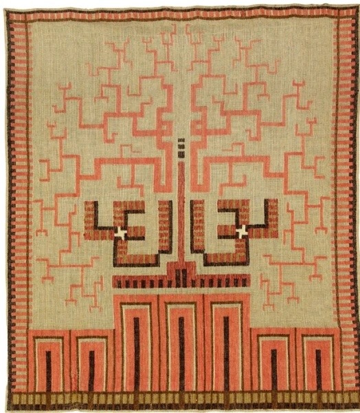
Loja Saarinen (designer/weaver)
Tree of Life Tapestry
circa 1933
#loja saarinen#tree of life#tapestry#textile art#textile#textile designer#textile design#fabric art#finnish artist#american artist#finnish art#finnish#finnish textiles#textiles#tapestries
716 notes
·
View notes
Photo

Loja Saarinen and Eliel Saarinen, Study for the Festival of the May Queen Tapestry, 1932. Watercolor and gouache with pencil underdrawing on tracing paper. Cranbrook Art Museum.
156 notes
·
View notes
Text

Loja Saarinen (March 15, 1879 – April 21, 1968) was a Finnish-American textile artist and sculptor who founded the weaving department at the Cranbrook Academy of Art in Michigan. She also led her own studio, the Studio Loja Saarinen. Via Wikipedia
5 notes
·
View notes
Text
Freakin' Tiquen 2023 - Destination Detroit Part 4 - Cranbrook
#1937 Paris World&039;s Fair#Antique Stores#Carl Milles#Cranbrook#Cranbrook Academy#Detroit#Eero Saarinen#Eliel Saarinen#Europa and the Bull#George Booth#International Style#Jussi Mäntynen#Loja Saarinen#Lynx and her Young#Mary Perry Chase Stratton#Michigan#Musée d&039;Art Moderne de la Ville de Paris#Pewbaic Pottery#Pipsan Saarinen-Swanson#Robert F. Swanson#Saarinen House#Sunglitter#Tor Berglund
0 notes
Text

Ester Helenius - Loja Saarinen (1916)
69 notes
·
View notes
Photo
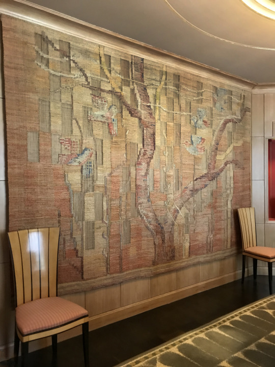
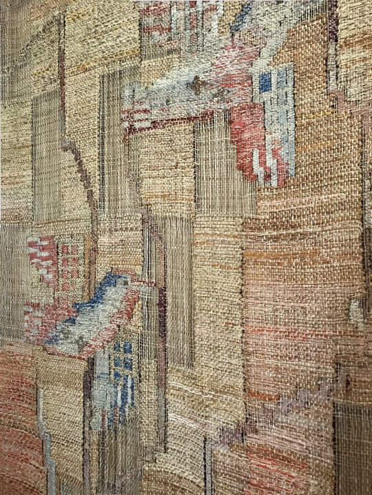
wall hanging view and details in the dining room of the 1920′s home of the Finnish-American architect Eliel and wife Loja Saarinen - the Saarinen House is one of the historic landmarks at Cranbrook Institute and Museums
https://center.cranbrook.edu/visit/saarinen-house
#cranbrook#saarinen#eliel saarinen#saarinen house#tapestry#weaving#wall hanging#dining rooms#art deco#1920's#home tours#museums
5 notes
·
View notes
Photo


Promoção pre-carnaval Desconto 30% a vista no pix cupom FOLIA2023 www.resinaecia.com.br Mesa Saarinen tampo em Resina- consulte preço Whatsapp 11 940128844 Prazo de fabricação 20 dias uteis - fora de São Paulo mais prazo de transporte (CONSULTE) Resina & Cia - a Loja de Fabrica #mesadejantar #apartamentodecorado #apartamentonaplanta #varanda #designer #guarulhos #apartamento #meular #apartamentopequeno
0 notes
Photo

Study for the Festival of the May Queen Tapestry, Loja Saarinen and Eliel Saarinen, 1932
Watercolor and gouache with pencil underdrawing on tracing paper 28.5 x 26.5 in. (72.39 x 67.31 cm) Cranbrook Art Museum, Bloomfield Hills, MI, USA
#art#painting#loja saarinen#eliel saarinen#art nouveau#modern art#women artists#female artists#20th century#20th century art#1930s#watercolor#gouache#pencil#finnish#american#textiles#cranbrook art museum
85 notes
·
View notes
Text
Eliel Saarinen’s Hvitträsk retreat
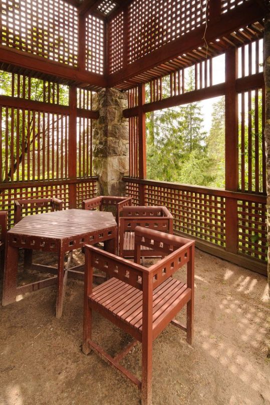
Finnish architects Eliel Saarinen, Herman Gesellius, and Armas Lindgren created this artistic, lakeside retreat for themselves between 1901 and 1904. The three men had established their partnership a few years earlier, shortly before their graduation from the Polytechnic Institute in Helsinki. They built Hvitträsk, located about 19 miles west of Helsinki in Kirkkonummi, Finland, to consolidate their practice and to escape the congestion and noise of city life. It was named after Lake Vitträsk, on which it was built. Hvitträsk literally means White Lake.The complex included a shared studio, homes for each of their families, and several service buildings. The architects arranged their studio and homes around a central garden courtyard.
Saarinen and his partners, Herman Gesellius and Armas Lindgren, made their home a northern outpost of high culture. Friends and visitors included composers Gustav Mahler and Jean Sibelius, novelist Maxim Gorki, sculptor Carl Milles, and many others of artistic temperament. This is where the plans were drawn up for the Helsinki Railway Station, the National Museum of Finland and the monumental Munkkiniemi-Haaga project, among other grand works.
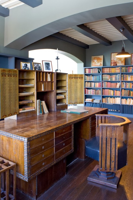
The buildings at Hvitträsk embody a mix of a local interpretation of the English Arts and Crafts Movement, late 19th century Romanticism, traditional Finnish building materials, methods, and spirit, and a healthy dose of Jugendstil, the Germanic and Scandinavian version of Art Nouveau. Saarinen, Gesellius, and Lindgren carefully crafted buildings of stone, plaster, shingles, and logs that are completely at ease with their heavily forested and rocky surroundings. Like other Arts and Crafts designs, it is both rustic and sophisticated with colorful glazed tiles and patterns used throughout the house. There is the frequent use of giant tapestries hanging from the wall, draping down over the back and seat of a built-in bench, and culminating at the floor as a rug (see the incredible “Liekki” rug designed by the painter Akseli Gallen-Kallela in the living room). It certainly would have been the antithesis of the Neoclassical and Victorian architecture that had become so popular in the decades before its construction.
Perched on a steep hillside overlooking a beautiful lake, Saarinen’s own house at Hvitträsk offered spectacular views. It was also center stage for several romantic storms- to cut a long story short, Eliel Saarinen’s first wife Mathilda fell in love with Herman Gesellius. Eliel then met Gesellius’s younger sister Loja, a textile designer and sculptor, whom he married after. It was the childhood house of their children; Pipsan Saarinen who later became a designer, and Eero Saarinen, who would become a famous modernist architect in his own right.
The Saarinens emigrated to America in 1923, and Eliel soon took a position as the first president of the Cranbrook Academy of Art in Bloomfield Hills, Michigan. Hvitträsk then became a summer home for this extraordinary family - with an architectural addition from Eero Saarinen who rebuilt the North Wing during the 30s. Hvitträsk is now open to public during the summer.






#eliel saarinen#eero saarinen#loja saarinen#pipsan saarinen#Eva Lisa Saarinen swanson#hvitträsk#hvittrask#Herman gesellius#armas lindgren#finland#architect#architecture#interiors#design#designer#furniture#arts and crafts#akseli gallen-kallela
230 notes
·
View notes
Photo


Inside the Saarinen House in Bloomfield Hills, 1930s
Tony Cenicola/The New York Times
17 notes
·
View notes
Text
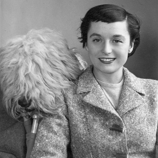
Florence Knoll
Florence Marguerite Schust era hija de Frederick Emanuel (1881-1923) y Mina Matilda (Haist) Schust (1884 -1931). Nació en la panadería de sus padres el 24 de mayo de 1917 y quedó huérfana a los doce años. Su padre, Frederick, era de de origen europeo, hablaba el alemán como lengua materna. La familia de su madre, Mina, nacida en Michigan, procedía de Canadá. Florence Schust creció en Saginaw,…
View On WordPress
#Architectural Association#Cranbrook#Eliel Saarinen#Florence Knoll#Hans Knoll#Harry Hood Bassett#Kingswood School#Knoll#Knoll Associates#Loja#MUJERES#The Papers
1 note
·
View note
Text
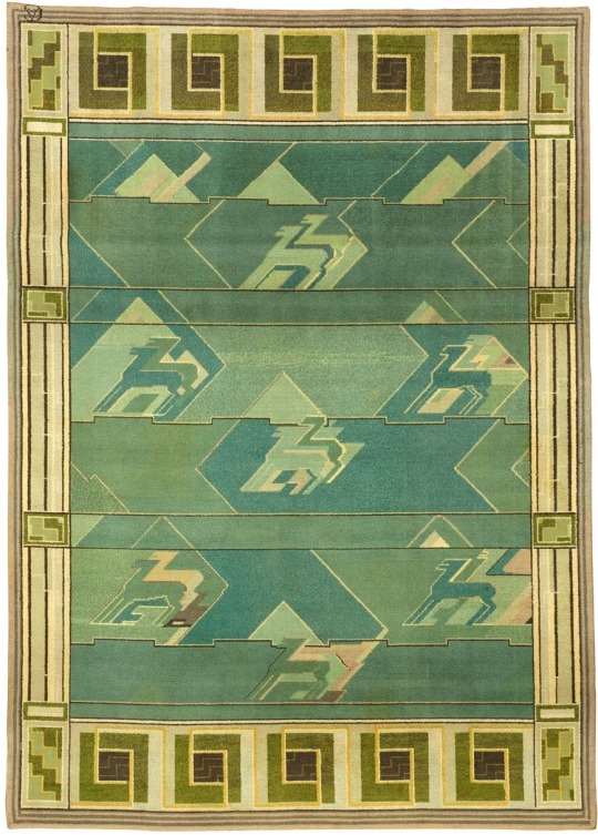
Studio Loja Saarinen (maker), Maja Anderson Wirde (designer)
Rug With Animal Motif
1932
#loja saarinen#maja anderson wirde#textiles#textile design#textile#fabric#modern art#textile designer#art history#textile art#graphic arts#abstract#1930s art#1930s style#1930s fashion#animal motif#rug#rug design#rug designer
32 notes
·
View notes
Text
The Historic TWA Terminal and Lockheed Consellation at JFK
Presentation:
As I passed the control stopped convertible and entered the https://moneymofo.com/ entryways of the Eero Saarinen-planned TWA Terminal with its winged, flight-proposing rooftop at JFK International Airport on a mid-September day, nothing, I noted, had changed, then again, actually the traveler registration counters flanking either side were refreshingly without lines. Maybe that ought to have been a clue.

Mounting the dozen steps and afterward redescending those that prompted the natural Sunken Lounge, I looked at the Solari split-fold appearances and flights load up, its boards intermittently flipping and clattering like stacking poker chips, however they just uncovered clear squares. There were no flight numbers, no occasions, and no objections.
However by perspectives on the vintage aircrafts on the slope through the floor-to-roof calculated glass showing TWA's red-and-white uniform, yet deficient with regards to a solitary stream motor, my objective today must be marked "history" or, even "flying history." Perhaps that was suitable for the "gear" I brought: a carry-on comprising of a clipboard and a pen.
The scene before me was a suspended one. The time frame music and the declarations repeating through my head moved me to the one I was not in.
"TWA Starstream Flight 802 to Paris, presently loading up at entryway one," they said.
My eyes, examining past the area of the once popular and recognizable Brass Rail Restaurant toward the double, fundamental terminal interfacing tubes actually secured with bean stew red pepper covering to the flight zone, I completely expected to take in at least one Boeing 707-320Bs with their gruffly pointed, radome noses, 35-degree cleared wings, and Pratt and Whitney JT3D-3B low detour proportion turbofans.
However the Lockheed L-1649A Starliner Constellation, speaking to the apex of-cylinder improvement, demonstrated that the time safeguarded and portrayed "out there" was not the one my psyche attempted to persuade me actually existed "in here." Instead, it was twenty years sooner, of the 1960s, and I had entered a saved pocket of time.
THE TWA TERMINAL:
As an articulation, portrayal, and improvement of the post-World War II-filled, innovation encouraged business carrier industry and the then-named Idlewild International Airport whose development came about because of it, the TWA Terminal was and is a compositionally tasteful image, all things considered, It catches the impression of trip with its wing-taking after shell and the liquid, open inside underneath it.
Not at all like a large number of the present single-building, various carrier offices, it follows its starting point to 1954 when the Port Authority of New York concocted its terminal city idea. Foreseeing the requirement for framework to take into account expanding travel interest, it executed an arrangement in which each significant transporter would configuration, manufacture, and work its own terminal, encouraging, all the while, brand character. In spite of the fact that the TWA office was the design reaction to the Port Authority's masterplan, its aircraft affiliation was one of its goals from the beginning, as expressed by the undertaking commission, which previously looked for a proficient ground activities framework, yet optionally needed "to furnish TWA with publicizing, exposure, and consideration" with it.
That the picked site for it was at the peak of the air terminal's frontage road, established the expectation nearly as much as the solidified substance which framed it, and that it actually does today, regardless of the two-decade stretch since the aircraft's downfall, fills this post-transporter need.
Eero Saarinen, a Finnish-American engineer and originator and now and again thought to be a mid-century ace, was picked to change both Idlewild's and TWA's vision into solid reality in 1955. Following his own genealogical roots to his dad, Eliel Saarinen, a draftsman, and his mom, Loja Saarinien, a material craftsman, he could guarantee that the ability went through his veins similarly as uninhibitedly as did his blood when he was conceived in 1910. In the wake of examining model in Paris, engineering at Yale University, and plan at the Cranbrook Academy of Art in Michigan, he changed material into stylish capacity in such manifestations as the St. Louis Gateway Arch and Washington-Dulles International Airport.
In spite of the fact that Eero Saarinen accomplished his objective of making a theoretical portrayal of trip in the TWA Terminal, its motivation was rarely unquestionably decided, some proposing that a thumb sorrow into an emptied grapefruit skin brought about the possible bended, concrete, evenly situated rooftop areas that flawlessly spilled out of the wharfs that upheld them and were just isolated by tight lookout windows. The four met at a roundabout swinging place point.
The rooftop's wing surface arch or camber proceeded in the blood red and white inside by methods for the upper walkaway upheld sections that converged into both floor and roof as though they were vital to them. Its absence of rectangularity was clear in its different highlights. The flights of stairs, for example, were bended and its terminal and takeoff relax associating passageways were more similar to barrel shaped cylinders.
Its general articulation was one of 1960s neo-futurism and space-age Googie design.
Notwithstanding what at last end up being Saarinen's compositional accomplishment, it additionally turned into his heritage, since a year after he assessed its superstructure in 1961, he died at 52, never having seen his completed item.
While it was expected to serve little cylinder aircrafts whose limits never surpassed a hundred, it was not fit to TWA's thin body planes, for example, the 707 and the 727, considerably less its widebody ones, including the 747, the L-1011 TriStar, and the 767, requiring the expansion of jetbridge-associated loading up satellites.
After the transporter's 2001 end, its unique terminal anticipated reason or safeguarding. Its destruction, at any rate, had just been saved. In 1994, it was assigned a New York City milestone, at which time then Chairwoman of the Landmark Preservation Commission, Larie Beckelman, remarked in "The New York Times," "This is maybe the quintessential present day structure, communicating development and the entire idea of flight."
After eleven years it was put on the National Register of Historic Places. With its essence in any event guaranteed, it actually anticipated the two "p's"- protection and reason.
THE TWA HOTEL:
Safeguarding and reason, in the function, became different sides to a similar coin-that is, reestablish the 392,000-square-foot terminal to reproduce its 1960's magnificence and fill in as the anchor and hall to another different sides for this situation, two rectangular, dark glass structures with 512 lodgings created by MCR/MORSE and four building firms at a $250 million or more expense.
Draftsman Richard Southwick, who regulated the undertaking's rebuilding, noted of the TWA Flight Center, "(It was) the ideal image of post-war good faith, the wizardry of flight, and the style of mid-century current engineering."
Its first visitors were acknowledged in May of 2019.
As a "entryway," it contains the Sunken Lounge with the Solari flight load up; a mixed drink relax; a Sundries Shop with vintage duplicates of "Life," "Time," "Great Housekeeping," and "Family Circle" magazines; a good old shoe sparkle station took care of the edge (obviously); a TWA Gift Shop whose each thing, one way or different, shows the aircraft's logo; a 10,000-square-foot wellness focus with a cycling studio, treadmills, ellipticals, a spa area, and fitness coaches; and the Paris Café by Jean-Georges, which possesses the impression of the first one, alongside that of the Lisbon Lounge, on one of the two mezzanines and serves cooking roused by TWA in-flight menus. There is likewise 50,000 square feet of meeting and function space.
The two tube shaped cylinders the "Saarinen" to one side and the "Hughes" to one side lead, by method of halfway, initially nonexistent patterns, to the two seven-story glass, metal, and solid lodging structures, which were needed to be complimentary to, yet recognizable from, the milestone terminal.
Seven layers of triple-coated, 1,740-pound, protected, floor-to-roof glass guarantee in-room quietness, in spite of the way that slope maneuvering airplane are just yards away.
Rooms, which either neglect this scene or the terminal, lease for $250 every night, with lower estimated spans bookable for travel travelers who just look for a short rest and a shower.
The rooftop includes the Infinity Edge Pool and perception deck, alongside a bar.
Just the "Saarinen" tube, back on the principle level, leads out-or, in the opposite bearing, in-to this protected pocket of time, as communicated by the two story assignments or times on which the lift at its end lands: "1960s TWA Hotel" and "Present Day JetBlue," as per the two fastens the traveler can press to go there.
THE MUSEUM DISPLAYS:
While the Eero Saarinen planned terminal can be viewed as an aggregate, retro, yet living field, a few regions serve to complement it in historical center structure.
"Situated in different spots all through the previous TWA Terminal-the core of our inn just as in the function place and in the zones that associate our inn flight cylinders to JetBlue's Terminal 5, the shows (curated by the New York Historical Society) permit guests to encounter the stream age through valid antiques, intelligent presentations, and individual accounts," as per the TWA Hotel site.
Its 2,000 things hail from the TWA Museum in Kansas City, just as from the previous carrier representatives who gave them away.
"Shows center around TWA's set of experiences, including Howard Hughes residency as proprietor, TWA outfits from 1945 to 2001, and Saarinen's advancement of the terminal at Idlewild Airport," the site proceeds.
Focusing on the last's significance, Mike Thornton, New York Historical Society guardian, expressed, "The Saarinen terminal is a landmark to the positive thinking and vision of the fly age. These presentations welcome individuals into the fabulousness and fun that Saarinen and TWA endeavored to make and encourage."
A work area, o
1 note
·
View note
Text

STUDIO LOJA SAARINEN


Loja Saarinen (March 15, 1879 – April 21, 1968) was a Finnish-American textile artist and sculptor who founded the weaving department at the Cranbrook Academy of Art in Michigan. She also led her own studio, the Studio Loja Saarinen. Via Wikipedia
13 notes
·
View notes
Photo
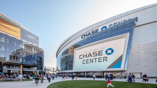

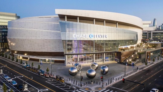

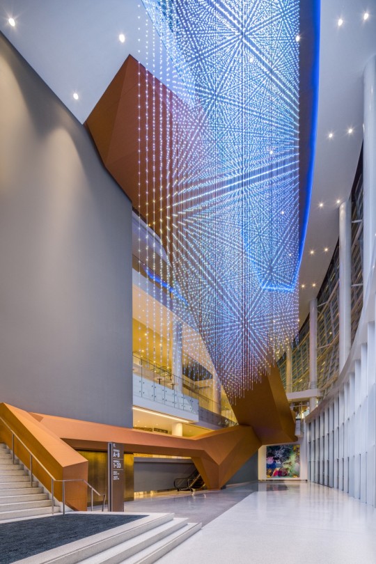


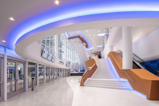
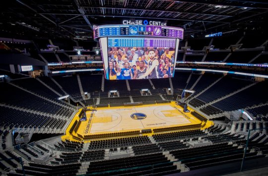

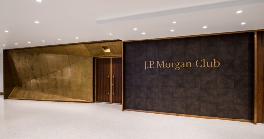
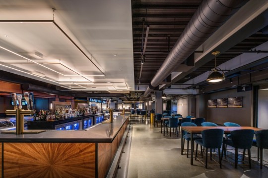

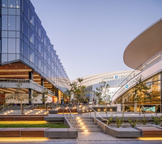
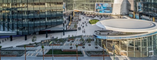
CHASE CENTER - Mission Bay - San Francisco, CA
by: @manicaarchitecture @GenslerDesign @swagroup @landscapeforms @chasecenter photo by: @jasonorear
Por 47 anos, o Golden State Warriors jogou na Oakland Arena, o segundo estádio mais antigo da National Basketball Association no final da temporada 2018-2019. O sucesso escandaloso dos Warriors - três campeonatos da NBA nos últimos cinco anos - enchia a casa todas as noites com os trabalhadores nativos de Oakland e a elite da indústria de tecnologia do Vale do Silício. Os Warriors são amados em Oakland, a meia-irmã mais progressiva e corajosa de São Francisco, e apropriadamente, talvez, o Oakland Arena estivesse em algum lugar entre uma obra-prima funcionalista e um lixão de meados do século, distinto por seu revestimento exterior de diamante, formato perfeitamente cilíndrico, enorme estacionamento e quase ausência de amenidades. Golden State precisava de uma atualização. Eles optaram não apenas por uma nova arena, mas também por uma nova cidade.
A equipe se estabeleceu em um local de 11 acres no bairro de Mission Bay em San Francisco, um dos únicos grandes terrenos subdesenvolvidos remanescentes perto do famoso centro denso e caro. Um antigo pátio ferroviário e distrito industrial, Mission Bay foi criado em grande parte com aterro, incluindo o lixo do terremoto de 1906. O local oferece vistas da baía da antiga arena e, mais importante, do vão leste da Bay Bridge, que adorna o logotipo do time. É um dos cenários mais espetaculares do cenário esportivo americano - rivalizado apenas pelo Oracle Park, o estádio de beisebol dos Giants a cerca de 800 metros ao norte.
The Warriors e seu arquiteto de design, Manica Architecture, com sede em Kansas City ( Gensler foi responsável pelos interiores e o Grupo SWA fez o plano mestre da paisagem), enfrentaram um desafio singular: Como projetar uma arena para atrair fãs cuja riqueza, em muitos casos , eclipsa a dos próprios jogadores. A ascensão do Golden State coincidiu com o alardeado boom tecnológico da Bay Area, e o time está entre os ingressos mais procurados da cidade para bilionários, titãs da indústria e o fluxo de milionários que os seguem. No novo Chase Center, desenvolvido a um custo relatado de US $ 1,4 bilhão, eles não precisam mais construir uma favela.
Desses bilhões, o setor público não contribuiu com nada. Equipes atléticas ricas se tornaram campeãs em extrair dinheiro público para o que são, essencialmente, ativos privados - uma tendência que continuou mesmo com o aumento das evidências de que subsídios públicos são investimentos ruins. Uma das poucas exceções é a Califórnia, onde os eleitores aprenderam a praticar: a nova arena da NBA de Sacramento também foi financiada por fundos privados, assim como o novo estádio de futebol de Los Angeles. Quanto à equipe de propriedade do Golden State, eles aparentemente não precisavam de ajuda pública: eles venderam os direitos do nome para Chase por US $ 300 milhões, e a equipe arrecadou mais de US $ 2 bilhões em pré-vendas de ingressos e suítes e patrocínios antes mesmo de a arena de 18.000 lugares ser aberta - com uma lista de espera de 44.000 clientes. Em outras palavras, aquele US $ 1,4 bilhão já parece um investimento inteligente.
Um poderoso símbolo do capitalismo em estágio avançado O resultado final parece bonito o suficiente. O tambor externo do Chase Center se assemelha a uma casca de maçã remontada, de acordo com David Manica, AIA, o fundador da empresa. Anteriormente um arquiteto da Populous, ele projetou ou contribuiu com arenas e estádios para os Houston Rockets da NBA, Houston Texans da National Football League e times de futebol no Brasil, Catar, Rússia, China e outros lugares. Manica me disse que aprecia a adoção do estilo contemporâneo pela NBA, em comparação com, digamos, a preocupação do beisebol com a história e a nostalgia. O revestimento do Chase Center é de fato ultra-branco e moderno, sugerindo a aparência brilhante de um super iate. As metáforas ficam realmente misturadas, no entanto, com a inclusão de centenas de fendas retangulares destinadas a evocar cartões perfurados dos primeiros dias da computação. Eles dão ao exterior algum interesse visual,
A característica exterior mais atraente do centro pode ser uma praça de entrada - aproximadamente do tamanho de duas quadras de basquete - emoldurada no lado leste por um pavilhão de vidro que abriga um anfiteatro (projetado pelo SHoP) e no oeste pela própria arena e uma enorme tela de vídeo montado na fachada do edifício. Uma passagem pública circunda todo o tambor, descendo da praça de entrada através de uma atraente passagem semelhante a um desfiladeiro no lado sul e através de um paseo repleto de restaurantes e a maior loja de times da NBA no lado norte. Uma série de escadas e praças no lado leste têm vista para a baía. Esse é o site do ChaseO elemento de design mais encantador do centro: um mosaico do tamanho da parede pelos muralistas Precita Eyes, um coletivo local, retratando a Bay Area em toda a sua glória descolada - casas vitorianas, trens BART, guindastes de carga, bicicletas baixas, um jogo multiétnico de playground basquete, não um iPhone ou logotipo corporativo à vista. (Menos encantadora é "Seeing Spheres", uma instalação de arte de Olafur Eliasson que consiste em cinco globos espelhados que são tão descaradamente instáveis no Instagram quanto esteticamente duvidosos.)
No interior, o Chase Center tem linhas de visão relativamente íngremes e uma tigela de assento apertada projetada para mostrar o basquete e permitir algumas configurações de concerto diferentes. Manica me disse que o centro embala muito mais recursos em um envelope de construção de tamanho médio do que quase qualquer outra arena. O saguão principal, por exemplo, apresenta um átrio de quatro andares pontuado pela era espacial, floreios ao estilo de Saarinen e alguns passeios dramáticos em escadas rolantes ao ar livre. Todo o lugar tem um toque escandinavo limpo, com a madeira branca e loira como as cores dominantes ao lado do azul royal e amarelo dourado dos Warriors. Um lounge no andar superior, o Modelo Cantina, paira sobre a linha de base da extremidade norte do que parece quilômetros acima do chão, projetado em parte para ter uma boa aparência na televisão. Manica disse que queria que os espectadores em casa reconhecessem a arena,
Por mais que seja uma peça de arquitetura, o Chase Center também é um poderoso símbolo do capitalismo em estágio avançado. A verdadeira ação está nos lounges: lounges nas vigas, lounges no subsolo, lounges no lado norte, lounges no lado sul. Salas com nomes de bancos, cerveja e companhias aéreas. Os fãs com assentos no chão e próximos ao chão não têm mais apenas uma visão íntima da ação; eles também têm acesso a lounges embutidos sob os assentos do nível inferior. Até mesmo o torcedor médio na tigela de assento inferior pode visitar um dos dois salões em lados opostos da quadra, cada um com bares, barracas de comida, mesas de bistrô e cabines. É de se perguntar o quanto os fãs de basquete ao vivo no Chase Center vão realmente assistir.
Especialmente porque a arena possui o maior placar / tela de vídeo da liga, medindo 25 metros por 15 metros - quase tão grande quanto a própria quadra. Junto com telas menores e iluminação de realce em toda a tigela de assento, facilita alguns shows de luz doce e pode ser recolhida para concertos e outros eventos. É tão grande que o chassi inclui ainda mais telas para os fãs no assento inferior, que provavelmente estão assistindo essas telas nas telas dos lounges.
Ausência radical de estacionamento O Chase Center, mais um símbolo de um bilhão de dólares do poder corporativo, foi acusado de contribuir para a notória onda de gentrificação de São Francisco. Isso pode ser verdade no geral, mas Mission Bay em si era uma folha em branco - não havia nada para enobrecer. O bairro agora consiste em grande parte de campi corporativos e institucionais planejados com torres de tamanho médio, e os vizinhos dos Warriors incluem ícones de tecnologia como Uber, Dropbox e Cisco. Mas não tem nada do charme dos bairros densos e históricos da cidade. Até o Oracle Park, apenas um quilômetro ao norte, parece mais integrado ao tecido histórico. Como Mission Bay envelhecerá, ninguém sabe.
Ao contrário da maioria dos parques de escritórios - e da maioria dos grandes empreendimentos esportivos - o local de Mission Bay tem acesso a transporte público, e o Chase Center, em sua curva mais radical, ostenta quase ausência de estacionamento no local. A Oakland Arena usava um estacionamento de superfície com 10.000 vagas que também servia ao Oakland Coliseum. No Chase, os fãs que não vêm por Maybach ou quadcopter pessoal podem chegar a pé, de bicicleta (com um posto de manobrista dedicado para bicicletas), de balsa (com serviço especial para jogos) e de metrô leve - uma parada Muni surge imediatamente na frente do a praça de entrada. É a mesma linha que atende o Oracle Park, portanto, os fãs ecologicamente corretos devem saber o que fazer.
A indústria de tecnologia incubou, ao longo dos anos, sua parcela de arrogância, e nos perguntamos se o Chase Center também foi construído em uma bolha, se acabará ficando mais no MySpace do que no Facebook. Desde 2012, os Warriors esgotaram todos os jogos, não por causa do Oakland Arena, mas apesar dele. O Golden State pode descobrir em breve, no entanto, que o barulho do outro lado da baía - a antiga arena era uma das mais barulhentas da liga, uma vantagem para o time da casa - tinha mais a ver com a extraordinária corrida dos Warriors. O ruído pode diminuir rapidamente se a equipe parar de vencer, não importa o quão boa seja a nova arena ou o quão barulhenta ela foi projetada. (Manica disse que trabalhou com engenheiros acústicos para reproduzir a acústica favorável, senão a estética, da antiga arena.) Uma lesão na superestrela Steph Curry contribuiu para uma queda no início da temporada, e Golden State tem atualmente um dos piores recordes no basquete. O que acontecerá com os novos camarotes de luxo se o Golden State perder seu toque? Da mesma forma, por mais invencíveis que Google, Salesforce e Twitter possam parecer hoje, o que acontecerá com todas essas vantagens corporativas se a revolução tecnológica da Bay Area parar ou mudar para outro lugar?
0 notes
Photo


Some Cranbrook branches! 🌿 Eliel and Loja Saarinen
1 note
·
View note