#like they're just big green leafy things they don't look that distinctive
Explore tagged Tumblr posts
Text
There should be a Tobacco PvZ plant that hurts the zombies when they eat it
because tobacco is bad for you, of course

Here's my rendition of what it would look like
maybe he could also attack the zombies with smoke, similar to a fume-shroom.
#pvz#plants vs zombies#smoking tw#tw smoking#I was going to draw like a full plant but actual tobacco plants are horribly generic looking#like they're just big green leafy things they don't look that distinctive#so I dried him out and gave him a cigarette head#it works for magnet-shroom doesn't it?#pvz fanart
20 notes
·
View notes
Note
Thoughts on the sawsbuck evolution?
I'm a big fan of winter deerling and sawsbuck with its fluffy legs <3


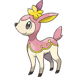
Deerling is pretty simple, but I do like the design quite a bit. The specific shape of the colored areas combined with the lovely gold accents just looks really pleasing to the eye. I also like the spots (appropriate for a fawn) and the cream-colored base.
With that said though, the face does bug me. It has that kind of generic nondescript muzzle and sideways mouth that always bother me. Pokemon don't have to be anatomically correct all the time obviously, but something a little closer to a proper muzzle would've worked better, especially when the evolution has one. (The legs are also a little wonky, but that's not quite as bothersome as the face.)
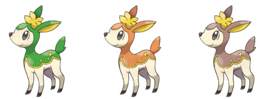
In terms of the seasonal forms: First, I should mention how crappy it is that we never get the other non-spring forms due to the season mechanic being scrapped. Why not correlate the forms to the user's season instead of in-game seasons? Or even better, why not just have different forms appear in different climates? Winter in snowy, icy climates, Spring in rainy climates, Summer in general climates, and Autumn in cold-but-not-freezing climates. Or hell, just introduce items to change the forms, I don't care, just bring them back; they're really the main concept of the entire line and it doesn't work nearly as well without them.
Anyway, with that said, Deerling's different forms are just kind of recolors, and while they all look fine, I do find the difference between it and Sawsbuck to be jarring. Why does Deerling not change its design but changes colors, while Sawsbuck changes its design but not its base color? Some consistency would've been nice. I also kind of feel like you could've just not introduced the season thing until Sawsbuck, seeing as Deerling doesn't do too much with it. Still, like I said, all of them look nice. Summer's probably my least favorite--I would've preferred a less saturated forest green--while autumn and winter are tied for my favorites.


I was today years old when I learned that Sawsbuck is S.A.W.S.buck, IE Spring, Autumn, Winter, and Summer.
Anyway, as a whole, I do like these guys fine; the markings still look very nice (though I do question the spots. Wasn't the idea of spots on Deerling because its a fawn?) and the seasons are implemented and distinctive. Part of me wonders if they should've kept the different base colors of Deerling to differentiate them even more, but part of me also likes the subtle brown.
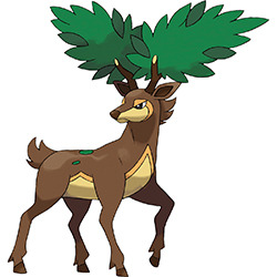
Between all of them, summer is once again my least fav. Aside from some seemingly random choices (why is it the only one to not have chest fluff? Why is it the only one to have its tail going up? Why the fur on the back of the head?), the green is once again a bit too intense for my tastes and clashes with the brown when it comes to the back spots, and the leafy antlers are a bit much and distract from the actual deer.
Autumn form has a similar problem with the antlers, but at least the colors are nicer on that one and the overall design is better. However, I do wish the color was more orange-y to match Deerling and to keep it from looking so similar to the spring form. Speaking of which, I also feel like those two look too similar; the colors are close, and the bodies are near-identical except for the antlers. Summer form's changes may be random, but they at least make the design a bit more unique.
Spring is looks pretty good, but only having a few small flowers on the antlers feels a hair understated. Feels like they could've worked more of them into the chest fur, in place of the spots, or around the legs. This would've helped with the aforementioned issue of it looking a bit too similar to the autumn design.
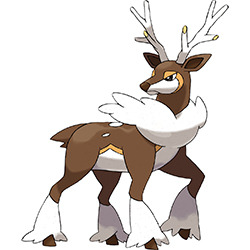
Winter, meanwhile, is probably my fav. I really like the contrast of the white and how nicely it compliments the brown and yellow, but I also like how it's actually adapted to the season it represents, with a full-on winter coat.
Also, as a final note: while normal/grass makes sense, I do question if these guys could've gotten away with different typings, just for fun. Grass/water for spring (it's wet out), normal/grass stays for summer, grass/ghost for autumn (spook season), and grass/ice for winter. Might've added a little extra something.
Overall, these are some pretty nicely-designed deer with a simple but unique gimmick that really needs to make a comeback. As a whole, I'd say the summer forms are my least favorite, while the winter ones are my favorite.

98 notes
·
View notes