#like its nit necessarily that deep
Explore tagged Tumblr posts
Visit Tumblr Blog
Explore Tumblr blogs with no restrictions, modern design and the best experience.
Last Seen Tumblr Blogs


Fun Fact
Tumblr posted its first advertisements in May 2012 and subsequently earned $13M in revenue.
Photo

Signs in the Second House
♈︎Aries / Mars in the 2nd House:
The parents were each other’s first loves or they were at a relatively young age when the child was conceived. The relationship they have with each other tends to be immature and there is a theme of being competitive with each other. They did not necessarily plan to have a child. Their road to marriage or union was very impulsive and this is reflected in the native’s value system. Native always feels like they have to fight to deserve the feeling of a sense of comfort. Also, Aries 2nd house tends to be an impulsive spender especially when their self-confidence is low. They tend to self-sabotage when they don’t see their own value in circumstances. They eat, drink and walk fast. And despite the contrary belief, they have a high pain tolerance. They tend to dress younger than their age, especially females prefer to dress tom-boyish. With everything from music to a restaurant they want to be the first one to discover its existence. They feel the most valued when they feel like they are trend-setter.
♉︎Taurus / Venus in the 2nd House:
The parents had a very sentimental relationship and they felt like they were each other’s true love but they might have been too possessive with each other which might have had caused them to slow each other down on their way to success or being an individual. During the time the child was conceived they were so sure of themselves that this child could be the best thing to ever come to this earth. The native with this placement values her/himself and is sure that they deserve everything. They might become lazy once they go retreat into their comfort zone and be stubborn about ever coming out. They might be fixated on the material goods a little too much. They like to eat… a LOT and dress up. But even when they dress up they know that they do not have to get out of their comfort zones, therefore, prefer to wear comfortable clothing and they always look on point. They feel the most valued when they are in love. Not necessarily with someone but anything.
♊︎Gemini / Mercury in the 2nd House:
The parents might have met when they were students or decided to meet up thanks to the word of mouth. The parents are very mischievous with each other, they never had a dull moment within their relationship. But it could’ve had been tiring for each party and their on and off relationship just became too confusing. When the child was conceived they were anxious about it but still enthusiastic. They might have already had children before the native or decided to have more after their birth. Gemini in the 2nd house values their siblings the most and is very possessive over them. They have a way of others feel immediately comfortable around them through their ways of communication. One way to make these people uncomfortable is to give them the silent treatment or being rude through words. Other than that, they have very creative ways to make themselves feel at ease. They like to eat, dress up, listen to a variety of different music. What they like the most for pleasure is always in constant change.
♋︎Cancer / Moon in the 2nd House:
The parents might have had a co-dependent relationship with a lot of emotional ups and downs from the get-go. When the child was conceived it might have caused a lot of break downs within the family or was a hidden secret. With Cancer in the 2nd house, the native is hyper-aware of their emotional needs which is in constant change. It is hard to pin down for them to understand what they like. Being or feeling at home is essential for these individuals to feel relaxed. But if they had a terrible home life growing up they may seek their comfort else-where. They value mothers and women a lot. Their favorite things are based around the feminine energy surrounding them. They might be emotional eaters, if they feel depressed they might not want to eat anything at all or vice versa. They like to listen to music that is on the darker, deeper side. They do not just listen to music to have fun, they are invested in the tunes on a deeper level. They are very artistic themselves. The way they dress tend to reflect what they are feeling on the inside. If they are not able to communicate how they feel they might as well just wear it.
♌︎Leo / Sun in the 2nd House:
The parents probably were in love once, yes… but were not mature enough to handle each other. Ego-wars can be a theme here. They were two kids who had kids and their lives together were out of a sitcom. When the child was conceived there was an innocent joy around the whole event or a lot of drama. For the native with this placement pleasure and sensualism is at high importance. They find immense joy in food, music and fashion etc. They might come of show-off-ish with the things they own, which they have to watch out for. They are at their happiest when they feel secure. They are very creative when it comes to cooking and art in general. The clothing they wear might be very in-your-face. They like to stand out with their beauty. They also love to dress up children who are the things they value the most in life. Another warning would be to watching out for being too materialistic or self-indulgent.
♍︎Virgo / Ceres in the 2nd House:
The parents probably met at work or in a classroom environment. There might have been anxiety within the relationship. The thing that kept the relationship together was constantly coming up with problems to fix. The parents might have stayed together out of habit rather than love. When the child was conceived some health issues might have had occurred concerning either the child or the mother, or both. The native who has this placement is very nit-picky about the things they consume (food, fashion, art, material goods). They are prone to self-sabotaging even if just one thing in their life is out of place. Being in complete comfort and peace is something they want a lot but can’t achieve because of too much concern surrounding it.
♎︎Libra / Venus in the 2nd House:
The parents liked each other a lot but it wasn’t as deep as they portrayed it to be. They might have looked good together perhaps but their points of view could not be further away from each others’. The child was conceived when the parents were following the steps to building a perfect family portrait… but nothing in this life is perfect. However, the quest to find this perfection is now have transferred to the child. The native with this placement values equality and harmony the most and strives for perfection. Having a partner on their side, plus a good salary seems to be one of the rare things to give them a sense of peace. They have got a good eye when it comes to fashion and art, even food presentations. They are one of those people who are closeted critics when it comes to all things artistic and beautiful because they want it to be theirs.
♏︎Scorpio / Pluto in the 2nd House:
The parents were very obsessed with each other. Like Halsey wrote in her song they might have had mistaken the warning signs as butterflies. From their passionate relationship came out a beautiful child, but probably once the child came into the picture the relationship ended or should’ve had ended right there. Or, the union of the parents changed drastically for the better or worse. Nothing was ever the same. The person with this placement has strong desires for material goods and bodily sensations. This is good and bad at the same time, as with everything in this universe. Intensity gives them a sense of comfort or they are so good at calming down the intensity surrounding situations, being used to that from their parents’ relationship. They have a great passion for fashion and all things beautiful. They are here to force peace and harmony down our throats.
♐︎Sagittarius / Jupiter in the 2nd House:
The parents might have met abroad or at college or through a religious constitution. There might have been a lot of distance within the relationship maybe literally or figuratively. One would assume though when they first met they were totally in awe of each other. Perhaps to the point of they became each other's whole world and once the union broke everything took a very aggressive turn. They always try to out-do one and other. When the child was conceived the parents were very happy and optimistic about the whole deal. The child either made their love for each other bigger or if they had issues the child’s presence made the issues grew. Now the native of this placement does the same effect on material goods and bodily sensations. They might become too lazy and self-indulgent once they reach a certain level of peace and comfort. They are very flamboyant with the clothing they wear. Always trying to outdo whatever is fashion at the moment. They have their own rules when it comes to defining what is beautiful.
♑︎Capricorn / Saturn in the 2nd House:
The parents might have met at work, and maybe one of them was more successful than the other or, perhaps one was even the other’s boss... Or one parent was older than the other which lead them to have a father-child / mother-child dynamic in the relationship. The marriage might even be an arranged marriage -- only learning about each other through the word of mouth. Either way they got together because they were on a mission rather than being in love. Even with having a child, they were very careful about it. They wanted everything to be right so there was a lot of concern and emphasis on the birth just like their own relationship. The child might be the only child of the parents or the last child. Out of the two parents the native probably values the father the most or at least his opinions. The way the parents lived and their relationship with the material goods influenced the native greatly. They are not good at valuing themselves or most other people for that matter. It is a lesson they have to learn. They have to learn that not everything in life is about success and money. They find it hard to settle down and be at peace with life because of being too ambitious and desiring power over others.
♒︎Aquarius / Uranus in the 2nd House:
The parents had a very strange relationship. Unexpected things happened to them all the time. Perhaps before they became lovers they were close friends or chose to become just friends after their union. The child perhaps was a surprise for them both or changed their lives in an unexpected way. The parents had to throw away all of their plans for the future. The native with this placement values being a rebel and uniqueness, also their friends. Having people they can trust around them is very crucial for them to have a peace of mind. They have strange habits surrounding food and have a unique taste in art. They are almost hipsteresque about everything. They like the idea of influencing people with never seen or done before things. The native learns to be more laid-back within the years, finding out planning things out too much only calls for more unexpected interferences.
♓︎Pisces / Neptune in the 2nd House:
The parents had a very confusing relationship. They might have fallen blindly in love with one another which lead them to follow a path they were not yet quite ready for. One parent might have influenced the other and caused great self-undoing in their part. The child was conceived during a period in their relationship when there was a great deal of question marks surrounding them. The native is very selfless when it comes to their own peace of minds, always putting others comfort before theirs. They do everything they can to make other people be comfortable in their presence. But this can also follow a pattern of them playing the victim saying “I never get to do what I want to do”. They are very idealistic when it comes to beauty and very imaginative about expression through art. They are not very good at being smart with their money and mostly love to spend it for other people. Their relationship with consumption is also very confusing. They either go all in or nothing. There’s no in-between.
(Art: "Jupiter and Juno on Mount Ida" by Antoine Coypel)
#the Second House#Zodiac Signs#astrology#aries in the second house#mars in the second house#taurus in the second house#venus in the second house#gemini in the second house#mercury in the second house#cancer in the second house#moon in the second house#leo in the second house#sun in the second house#virgo in the second house#ceres in the second house#libra in the second house#scorpio in the second house#pluto in the second house#sagittarius in the second house#jupiter in the second house#capricorn in the second house#saturn in the second house#uranus in the second house#aquarius in the second house#pisces in the second house#neptune in the second house#2nd house#house placements#Jupiter and Juno on Mount Ida#Antoine Coypel Ii
2K notes
·
View notes
Text
Hot-blooded (sasusaku oneshot)
Summary: Sasuke is a hot-blooded young man. He just forgot that.
Or,
Due to technical difficulties, the Sharingan's recording function is temporarily unavailable :(
In which,
Sakura is oblivious, Sasuke is too but then he isn’t, Sai spares no feeling, Naruto is confused, and Kakashi is having too much fun to intervene.
AO3 Link
Ko-fi
Feedback is always appreciated. Please also consider buying me a cup of coffee if you like what I do.
It started with a tickle inside his nose as he felt something crawl down the cavern of his left nostril.
“Sa-Sasuke-kun!”
Sakura’s focused green eyes went wide before him. The tongue depressor she had inside his mouth scraped against his bottom teeth as her otherwise steady hand quivered momentarily.
Snot, then – he decided with a vague sense of shame, feeling the trail of the watery substance creep ever closer to the precipice of his upper lip. It had been chilly at night in the hospital lately, but he’d been too offish to bother requesting more blankets. Well, that and few nurses bothered to (or dared) come to his room if they didn’t have to.
He didn’t blame them.
Really.
Covered in invisible chakra suppressing seals as it was, a whole room at the quiet end of a corridor reserved just for him when the hospital was still bursting at the seams with casualties from the war? He could have kissed Tsunade.
If he could get within 10-feet of the Hokage without the entire Anbu pinning him to the ground, that was.
But back on the topic, Sakura looked frantic for some reason as she hurried to lower the tongue depressor from his mouth. “Wait- Sasuke, let me-” She made to stand from her seat, placing a gentle hand on the bandaged stub of his arm, but he shifted away from her on the hospital bed and wiped at the incendiary evidence of how lame he felt at that moment.
When he brought his hand down, he paused and examined the blood on his knuckles. His first thought was to wonder if some wound had reopened.
It was common occurrence for Sasuke. He’d become desensitized to the little nits and pricks of negligible injuries, and, in the throes of battle especially, he would often find the blood before recognizing the pain associated with it.
But then the ticklish feeling in his nose caught his attention again, and he glanced down to see more and more drops of blood landing on the front of his hospital gown.
Not snot, was his second thought as Sakura shoved a handful of tissue paper in his face to staunch the blood.
And when her other hand came around the back of his neck and her warmth drew near to his side, and she started lecturing him to keep his head tilted down, not up, he was still deciding whether a nosebleed was a better or worse thing to have in front of her.
.
.
.
.
“Maybe this is one of the consequences of overtaxing your eyes,” Sakura said, and he couldn’t help noticing the way the deep green shards in her irises contracted as she stared back into his eyes.
He hn’ed distractedly, trying not to shift against her soft palms on both sides of his face. He was uncomfortable with the proximity of their positions as well as the fact that her breaths smelt of mint and something distinctly Sakura. His hands—well, hand…was clammy, and his stomach felt funny.
She’d been behaving differently—than he expected. Though he wasn’t sure exactly what he’d expected. He didn’t know her. Not anymore. And what he was learning of this new her bothered him.
He supposed what got him most was the anchored grace she carried as his primary physician when his prevalent impression of her was still the little girl that used to chase him around the village, that blushed and stammered, that wore her heart on her sleeves. Not to say he wanted her back – Sakura had grown, good for Sakura – but that girl had been familiar.
This one was not, and she was uprooting something deep inside him.
Then he felt it, the tickle in his nostril, and pulled away from Sakura’s hold.
“Sasuke-kun?” She blinked. He pressed the back of his hand to his nose to avoid staining his clothes again. “Again!?” He averted his gaze sheepishly and reached for the box of tissue at his bedside.
“This is the fourth time this week!”
Of course, she was counting.
“I swear, it could be a side-effect of all these seals for all we know! I can’t even heal you in this room.” She gestured in exasperation around the room, her choppy haircut almost bristling, and he found it amusing. She was getting angry.
.
On a second examination, he wasn’t sure what exactly was so amusing about her getting angry.
And yet it was.
“It’s just a nosebleed, Sakura. There’s no need for you to heal me,” he said, and she immediately deflated, hugging her arms to her chest.
“I know.” She smiled stiffly.
He frowned.
While he had spoken with the intention to calm her down, this outcome was not quite the one he’d hoped to achieve. It was unfair that she blamed him for resorting to monosyllabic answers when every time he formed a full sentence, she would find a way to take it negatively.
“It’s not the seals.” He checked the tissue paper and winced at how much blood there was. The blood hadn’t let up, so he pressed the tissue to his nose again. “They’ve always been used on prisoners.”
“But not to this degree!” She reached for his face. “You need to pinch the bridge…”
He avoided her hand and did as told himself. “Other prisoners don’t have a Rinnegan.”
Her hand dropped back to her side. She was silent for a moment, but he knew it was not for lack of a comeback as she kept her unwavering gaze on him.
“You’re not a prisoner, Sasuke-kun,” she said after a second. “You’re a patient. My patient. So just focus on recovering, and I promise you’ll be out of here before you know it.”
It was just an argument of semantics. But she smiled, such conviction in her eyes, and he decided he liked her way of putting it better.
.
.
.
The weather was nice when he was finally allowed to leave his room for fresh air, and although Sakura never said anything, he just knew with a startling certainty that she’d played a big part in convincing whichever prejudiced councilperson that he hadn’t been lying in wait for an opportunity to burn down the entire village when people weren’t looking.
Beyond what the eyes could see, he sensed the prickle of surveillance from a team of Anbu. A gauging kind of stillness rippled across the hospital’s semi-crowded corridors that Sakura led him through.
He didn’t need to be told, either, to know Sakura was going to accompany his strolls every time. That he was her charge, she was accountable for his actions, and whatever stakes she’d put down to have him walking outside in the daylight, he would need to protect.
He decided to be on his best behavior, and perhaps he should start with keeping his eyes on the ground and not looking at anyone in the eye to make sure he couldn’t be framed for trying to put people under a genjutsu. He knew how much his Rinnegan frightened others, even those who had no idea what they were looking at.
It had been humbling, he decided, to realize Sakura had no qualms about looking into his eyes, at him, when he’d been so sure he’d crushed her beyond repair with those very eyes.
They arrived at an empty corner (or more accurately, a hastily evacuated corner) of the courtyard, and she plopped down on the nearest bench before tapping the space next to her. There was a childish sparkle to her gaze, reminiscent of an older time long gone, and the nostalgia inside him half expected her to allude to the prospects of a date.
But he knew she wouldn’t, and she didn’t. Still, his stomach trembled with what he’d come to acknowledge as gladness. He was glad that little girl wasn’t completely gone.
To what end, was yet to be determined.
He sat down beside her, a good few inches between them.
He closed his eyes and leant back, face to the sunlight. The wind picked up around him, tousling his hair and skimming across his skin, tugging at his empty shirt sleeve. It was still strange not to have that arm.
“You know, Naruto and Kakashi-sensei wanted to come with us today.” He looked from the black chakra seal on his wrist to meet with her eyes. His own narrowed, part in confusion as to why the sudden subject, part in a grimace at how close this peaceful stroll had been to being the exact opposite. He thought he saw Sakura flinch, but he couldn’t be sure. There was no reason for her to.
“They got held up in a meeting with Tsunade-shishō,” she added.
“Hn.”
“It would have been nice to have our team together again.”
“Aa,” he said, not necessarily agreeing.
Sasuke stared at her as the silence between them grew. Judging from Sakura’s increasingly uncomfortable demeanor, he supposed it was the awkward sort of silence that people disliked. Because he was who he was, awkward or not hardly mattered, but he decided to do her a favor and break it.
“There’s a leaf in your hair.”
He hadn’t wanted to point it out. He liked the sight of her with it. Something about it undid ever so slightly the kempt doctor look and let him think about young, dirt-lodged fingernails combing through pink locks to untangle sweaty knots after a particularly difficult C-ranked mission.
“W-where?” She went abruptly from breathing a sigh of relief to running her hand through her hair, frantic yet also careful so as not to muss it up. The result was that the leaf remained firmly in her hair. “Is it gone?”
He watched a few more of her unsuccessful attempts before intervening.
“Stay still.”
She obeyed and became very still. He wasn’t sure if she was even breathing as his fingers thread through her hair (finer and softer than he’d imagined) and slid the tiny leaf down its length. The corner of his mouth quirked, despite himself, in amusement as he observed her cheeks taking on the lively flush of a tomato.
The immediate next moment, all the colors drained from her face.
“Sasuke-kun!”
He blinked, confused, before registering the warm heat rolling down across his lips.
Fuck.
.
.
.
.
It wasn’t like nosebleeds were foreign to Sasuke, but they usually accompanied the ringing numbness of being punched in the face, whether that was in training or actual combat.
And even then, they were few and far in-between. And never this often.
And for some reason always his left nostril. If there was even a reason. He could be eating or just sitting around doing nothing and the blood would start flowing.
Today, he was shaving and almost thought he’d cut himself.
The nosebleeds were annoying, even more than the bursts of phantom pain, (and not the same type of annoying as Sakura, he noted in a corner of his mind). He disliked them all the more because Sakura just happened to be there to catch every single instance of him bleeding out of his nose like some ailing wimp.
Sure, he was her patient. They were in a hospital, she in a white lab coat and he in a fucking gown, and the power imbalance between them couldn’t be anymore subverted. But this. This was pathetic.
Sasuke was never one for vanity. He didn’t try to impress anyone, but there was a certain degree of decorum his Uchiha pride demanded he maintained, and he had reasons to believe non-combat-related nosebleeds were rather high up on the list of things that sullied reputations. Directly behind Harem Jutsu-related ones, to be specific.
So, imagine his surprise, and great chagrin, when the coin was finally dropped by none other than Sai.
“You have strange tastes just like Dickless, Traitor-kun.”
It was hard to decide which part of that sentence was more offensive than the other.
Sasuke looked from Sakura, her back turned to speak with an Anbu member about his progress, to glare at his replacement on Team 7 and attempted to be as menacing as someone with tissue paper in their nose could be.
“Hah?”
Black irises stared back at Sasuke from behind the Lion mask. Sai shrugged. “I don’t get why you’d get excited over Ugly.”
Although Sasuke had sworn to himself he would punch Sai the next time the socially incompetent creep referred to Sakura as ugly, he simply found himself frozen in the spot.
“Well, seems they’re done. I’d best be going. Later, Traitor-kun.”
With a methodical wave of goodbye, Sai was gone with his Anbu teammate.
“Sasuke-kun, good news!” Sakura came back to his side, bright smile on her face, and his stomach did that damning flip again. He could feel the blood creeping up his throat even as he met eyes with her.
“Are you okay?” Her expression turned concerned, and she came up even closer to try and check his temperature, prompting him to take a step back, half-afraid of burning her with the heat on his face. “You look flushed.”
“Fine.” He avoided her gaze and pulled up the front of his baggy hospital shirt to shield as much of him from her as possible. “Just the nosebleed.” And his heart sank with great rue at the reminder of what these nosebleeds had meant this whole time.
“Oh, well they said I can bring you to the main wing for some tests. Let’s go tomorrow so I can finally take a look at it.”
“There’s no need for that.” He immediately regretted how quickly and harshly he’d said it.
“What? Why not?” She sounded affronted, but it just so happened that he cared very little right now.
“Just forget about it.” He turned sharply to head into the bathroom connected to his room.
“Sasuke-”
He slammed the door behind him and collapsed back against it.
Taking a deep, stabilizing breath, Sasuke could only sigh at the red-faced idiot staring back at him in the mirror.
.
.
.
“Hoooh?” Kakashi, who’d dropped in to visit, drawled in a way that was deliberately sleazy. He was peeking over his orange Icha Icha book with a glint of shrewd amusement in his eyes that Sasuke had since his genin days decided he did not like. It had usually meant something he did not wish to discuss was going to be discussed, and Kakashi was going to enjoy that discussion at Sasuke’s expense.
True to his Anbu roots, the man had a penchant for noticing things that others usually would not, and it was only due to his blatant disinterest for anything not porn that many in Konoha could sleep at night.
Sasuke, unfortunately, would not have that luxury tonight.
“What?” He griped from his bed as he pressed tissue paper to his nose. Sakura had left the room due to an emergency in another wing, but the effect of her presence remained. He had wished this would not happen around Kakashi.
He knew acting irritated was only going to encourage Kakashi to pursue the topic with extra teasing efforts, but it was either he passed off the flush to his skin as ire or let it be seen as what it was: utter mortification.
Kakashi closed the book in one quick motion, slipped it into the pocket of his vest, and sat back in his chair, looking completely smug underneath his mask. “It appears you’ve come over to this side as well.”
“Excuse me?” Sasuke breathed in abject horror at the implication. He was most definitely not in league with Naruto or Kakashi. Or, god forbid, the Ero Sennin.
“I understand where you are, Sasuke.” Kakashi held up his hands in a placating manner. “Trust me, I was once like you as well. My nasal lining is thinner than average and I get nosebleeds easier than others.”
…Oh. Sasuke relaxed a little. He was about to respond with a noncommittal Hn when Kakashi continued.
“It mortified me as a child because I would bleed constantly just from seeing beautiful women around the village. I was such a serious kid.” Kakashi sighed fondly before a stunned Sasuke. At Sasuke’s expression, the man gestured to himself. “Why do you think I started wearing this mask?”
“Because it made you look cool?” Sasuke offered, almost beseeching. Anything else. Anything but that.
Kakashi shook his head with facetious gloom. “Even now I’m washing blood off of it at the end of the day.”
Sasuke’s mouth dropped open. Since coming back, he had been thinking about perhaps spending more effort to get to know his sensei to make up for lost time, but this wasn’t at all what he had in mind.
“I…don't think that’s the case for me, Kakashi,” he said carefully, lest he stepped on any of the man’s feelings; though a part of him wasn’t entirely sure those feelings should even be protected.
“I had a lot of denial at first, too. I was miserable. It got easier once I accepted what I felt.” Kakashi got up from his seat and approached Sasuke with a grim look in his eyes. Sasuke suddenly felt open and vulnerable, with his only arm occupied by the nosebleed and unable to defend(?) him. “You need to embrace who you are, Sasuke.” The man reached for him, and he nearly flinched from the head pat. “Kidding!”
Sasuke blinked up at his sensei.
“You should have seen your face, my boy.” Kakashi laughed heartily and stepped back, hands in his pockets. “Sakura told me about what’s been going on with you. It’s just the seals.”
Sasuke scowled, both angry and confused, which was never a good thing considering his track record. “What?”
“The seals. It’s rare, but I’ve seen it happened when people tried to use their chakra while under these seals, especially for dōjutsu.”
He held Kakashi’s gaze suspiciously, freshly sore at being made fun of. But the matter-of-fact tone was one his sensei reserved for teaching, and he knew this was worthwhile information. “But I’m not trying to use any,” he said.
“Oh, I can tell.” A teasing smirk crinkled Kakashi’s eyes. “How I just wonder what you’re unconsciously using around our lovely Sakura.” Sasuke’s jaw locked as the older man wiped away an imaginary tear from his eye. “I’m happy for you, Sasuke. I was afraid my cute students were going to grow old alone.”
“Kakashi,” he said warningly, and Kakashi laughed.
“Don’t worry, I won’t tell a soul about this.” He winked. “It’ll be a secret between us closet perverts.”
The heat on Sasuke’s face intensified, and he was glaring at his sensei so hard, the man might have burst into Amaterasu-fire if it hadn’t been for the seals restricting his chakra.
.
.
.
.
“This is not normal, Sasuke-kun,” she said as they were returning from another stroll.
Sasuke agreed, but not in the sense that she’d meant. “Hn.” He didn’t meet her eyes as he dabbed at the blood in his nose. At least it dried up quickly this time.
“You have got to let me check it out.”
“Haven’t I?” He paused. “And haven’t you?”
She gave him a pointed look, arms crossed. “I was practically wrestling you just to look inside your nose!”
Which was particularly unhelpful for his…condition.
He crumpled up the bloodied tissue paper and put on his annoyed face in hope to get her to drop the subject. But there was also a creeping sense of resignation that he was getting worse and worse at handling Sakura. (Then again, nothing he’d ever done had deterred her before, so it was a small mystery how he’d gained the otherwise confidence in the first place.)
“And you said nothing was amiss.”
“Which is why I need to give you an actual checkup!” She threw her hands up. “I don’t understand why you’re being so stubborn about this!”
He stopped abruptly and turned to hold her glare for a moment. “Nothing’s hurting.” Except his pride.
“That doesn’t mean anything. Don’t you turn your back to me! We’re not done here!”
He continued down the hallway toward his room and didn’t look back.
.
.
.
.
He could feel her eyes boring into his back and kept still just to maintain the theatre, even though he knew she knew he was awake. A part of him felt like the child she must think of him, that he was depending on mere layers of blankets to keep himself insulated from the things that he feared.
It was an interesting thought, fearing Sakura—when he could think of much more unpleasant company to be with. But her presence had always unsettled him in some abstract, primal way, and learning just why that was finally, brought not only insecurity but also guilt.
For having trampled on her feelings with every turn of his heel.
For still doing so even now, as it appeared.
He felt her lean against the bed and tensed, anticipating some kind of touch. It never came.
“I’m sorry if you think I was overstepping.” There was a sigh mixed in with her whispered tone. “I’ve just been…” Her sentence died down to silence, and there was another sigh. “Good night.”
When she pulled away, he had a sudden, inexplicable urge to grab and pull her back. One he had to stop himself from acting on.
“Hn.” He grunted when she neared the doorway. It was the only sound he trusted himself to make.
She was silent, but he had no doubt she’d heard him. “I have the shift tonight. Call me if you need me, Sasuke-kun.” And she left after switching the lights off and resealing the door as per protocol.
He had no idea what sort of expression she had made with his back turned, but he hoped, and imagined, it to be that small smile she always gave that meant he had been forgiven.
.
.
.
No one shared walls with him. It was quite obvious when he lay awake at night and didn’t have to listen to the traumatized screams of the other patients.
He was glad, then, that neither could they hear him when he woke up shouting at the darkness.
He was in a pool of his own sweat, heart beating its way out of his ribcage and non-existent arm hurt as if skewered by a thousand senbons. He dug his fingers into his shoulder blade, and, at that moment, would gladly give up the rest of the arm if it meant the pain would stop.
A pitiful noise escaped his throat. He eyed the call button glowing a soft red in the night.
All he had to do was reach for the button and Sakura might just punch through walls if it meant getting to him even a little bit faster. His teeth bared in a poor-humored smirk. He let go of a shaky breath and turned resolutely away, banishing those thoughts back to the shadows where they belonged.
He didn’t need her.
But he supposed he did want her.
He wanted her. He wanted Sakura. Here. Now.
Still, he wouldn’t press that button. Night terrors were hardly emergencies, and this wasn’t even something Sakura could fix. Imagine the paperwork she would have to deal with afterwards just because he decided to act like a spoiled child.
He wouldn’t press the button. But, staring at the door, he found himself wishing she would come anyway.
That wasn’t how life worked, though. He wasn’t Naruto, but he too was an orphan. He knew how it was. You either ask for or take what you want, or you simply fall through the cracks.
But then he saw the seal over door start to recede silently, and his eyes went wide. He pushed himself up on the bed, taut with anticipation and disbelief, as the door opened with excruciating slowness. A part of him, the misanthropic, world-weary part, was just waiting for it to reveal someone else and crush any crumb of hope he might have had to fine dust.
It was a stupid thought and he knew it. The moment the seal burnt away, he could tell it was her chakra on the other side of the door, humming ever so gently as always, if not a little dulled and frazzled from the late night.
But it was easier than addressing the gratefulness that was welling up inside his lungs.
After what felt like an eternity later, Sakura’s familiar figure walked in and closed the door, the seal mending itself together behind her. Even without the aid of the Sharingan, he easily found green eyes in the dim moonlight.
“Sasuke-kun?”
It was only when he needed to respond that he realized he’d been holding his breath.
“…Sakura.”
He dropped back down on the bed, all strength vacating his muscles, and screwed his burning eyes shut. His hand still cradled his shoulder loosely, and he felt, rather than heard, her hurriedly approaching his bedside to bring her hand over his.
“Does it hurt?”
“Aa.” He didn’t mind the useless question like he usually would. Only congratulated himself on successfully keeping his voice from cracking.
She didn’t say anything as her fingers squeeze over his, gently but firmly.
“Do you…” He began after a while, opening his eyes to find hers. “—just come to my room for no reason at night?”
If she thought he sounded accusing, he was glad she didn’t apologize; because he wasn’t trying to be. She took some time deciding how to answer him, and he was oddly pleased she didn’t look away as she did so. “I overheard you screaming from nightmares last week and well—” Her gaze darted away for a fraction of a second, where she bit her lower lip, before settling back on him. “I just worry.”
He grunted breathily from the pain and a poignant frustration.
Of course, she had. And of course, she did.
He cracked his eyes open again and attempted to determine her expression in the darkness, fearing it was pity. It wasn’t. She just looked sad and hurt, and he didn’t entirely understand why.
He could feel that now familiar tingle in his nostril again, and the blood soon came spilling down across his mouth. He made no attempt to hide from her widening eyes. It was perhaps his fate, he decided, to have her always witnessing him at his most ugly, most shameful, like he wasn’t already enough of a miserable wreck in front of her.
“Sasuke-kun!”
Her hand flinched away from his to reach for the box of paper tissue, and an inexplicable feeling of emptiness gripped at him.
“No.” He held her back by the wrist and met her startled eyes. “Just…” He grimaced from another sharp lance of pain and might be squeezing her harder than he meant to. If it hurt her, she never protested and only remained quiet. Patient. As always.
And he reasoned. And argued and bargained. What was one more prideless moment before her?
“Just stay like this for a bit.”
.
.
When he woke again, it was almost morning. The pain was gone, but not her, who sat dutifully at his bedside. She told him her shift was about to end, and he finally let go of her hand.
“Thank you,” he said just as she was about to leave. His scratchy voice was loud in the silence of the room, and he hoped she would hear the apology within. She said nothing and only smiled the way he’d hope she would the night before.
.
.
.
.
.
There was a thundering march of footfalls barreling down toward Sasuke’s end of the hallway, and the stupid face that jumped to the front of his mind made him close his eyes in sufferance.
“Bastard!” He heard the muffled voice from the other side of the wall and pinched the bridge of his nose, already sensing an incoming wave of migraine.
“Oi, Sasuke bastard!” Naruto practically kicked his way into the room, the seal dissipating like embers around him, and right away was all up in Sasuke’s personal space, grabbing his shirt and dragging him to his bare feet. “What is this about you possibly dying and refusing treatment!?”
“What are you even-”
“Don’t you lie, Sakura-chan just told me! Do you know how worried she’d been, you incorrigible bastard!? Why can’t you just do as told for once in your life!? I didn’t bring you back just so you can go die to some perfectly curable disease!”
Beside being mildly surprised that the idiot even knew the word incorrigible, Sasuke was too speechless to even be properly annoyed. He hadn’t the slightest idea what the idiot was talking about.
“Answer me, bastard!” At his stunned silence, Naruto started shaking him. “What the hell’s wrong with you?”
“St-stop that, idi-” He winced, feeling the pressure on some of the smaller, more persistent cracks in his bones that Sakura had left to heal naturally. She had said it was healthier for the body, but he also suspected some outside pressure forcing her hand to keep him hospitalized and in suboptimal condition.
“Naruto!” Sakura’s voice got them both turning toward the door. In a split second, the blond was smacked audibly upside the head and promptly dropped Sasuke back against the bed. Sakura stepped in between him and Naruto, her back to him and hands on her hip.
“Ow! Sakura-chan! Why-”
“He’s a patient for god’s sake. Not everyone has monstrous healing like you. Manhandling him like that, are you crazy!?”
“Me!? You’re getting mad at me!? What about the bastard? He’s the one trying to die!” Naruto pointed an incriminating finger at him.
“If he really is then you’re not helping!” She turned to him, and immediately he felt every cell in his body respond to her hands on his chest, checking the bandages under his disheveled shirt. “Are you alright, Sasuke-kun?” No. No, he was not. Surely, being hyperaware of what her presence could do to him did not help his situation. “Did anything reopen?”
“I don’t th-”
When he glanced down, he stared at the dot of blood blooming on her white coat sleeve and decided then and there the entire universe conspired against him.
His hand shot up to cover his face, but it was too late.
“Bastard!” “Sasuke-kun!”
The speed at which the colors drained from his teammates face was as if they were the ones bleeding out, which would have been funny if Sasuke wasn’t busy regretting ever being born. Naruto sprung into action and started ushering Sasuke backward.
“L-lie down, bastard! Don’t you die on us!”
Sasuke let out an unintentional oof as he was heaved by the torso a few inches off the floor and deposited back onto the bed.
“Calm down, idiot!” Blood freely flowed from his nose during his feeble attempt at fighting Naruto’s seemingly herculean strength, the blond relentlessly trying to pin him on his back. It was frustrating because they were supposed to be equally handicapped. “I’m fi-”
“No! Naruto, he has to keep his head down.” Sakura joined the fray and extracted Naruto from him before she once again was too close. She guided him to sit on the edge of the bed and, in stark contrast to the firm fingers at the back of his neck, started to gingerly wipe at the blood on his face with tissue paper.
“I can do it myself, Saku-”
“Kakashi-sensei, get out of my way!” Naruto said, and Sasuke snapped his gaze to the door where Kakashi was trying to calm the blond down while remaining resolutely in Naruto’s way, causing him to become even more agitated and vocal. Sasuke would have slapped a hand to his face had his only one wasn’t busy trying to wrangle the tissue paper from Sakura’s hold.
Distracted from yelling at Naruto, Sakura’s hold slackened, and Sasuke took the chance to take over. She glanced back at him in a quick assessment before releasing him and returning her attention to Naruto and Kakashi.
Now, Sasuke had few ideas of the politics that went on outside of hospital walls.
Sakura only gave the good news, and Naruto spoke in future tense, borderline grandiose in the things he promised would happen once he got through to the ‘old fogeys,’ to quote his words. Kakashi just gave Sasuke porn (which he had leveled a disdainful scowl at, but eventually read anyway out of boredom).
What little Sasuke did know, he’d overheard from the doctors and nurses that wandered too far down his hallway, and he knew it wasn’t looking good for him.
All things considered, he really didn’t need—this. This whole situation. With both Sakura and Naruto screaming and arguing like children, Kakashi being too amused for someone who was supposed to be the mediating adult, and Sasuke trying to get them all off his case. And failing miserably.
“I have to go get help! Sasuke bastard’s dying!”
“Now, now, I think you’re overreacting a little, Naruto. Plus, isn’t his doctor already here?”
Naruto whipped around, a hint of sharp canines amongst his bared teeth, and pointed at Sasuke. “Bastard, tell us what’s wrong now.”
“Stop aggravating him, stupid Naruto!”
“Why are you on his side!? He’s the stubborn asshole here!”
“I’m on no one’s side! You need to—”
Sasuke chuckled, effectively silencing the entire room as all eyes gathered on him. On another day, he would have lamented being the center of attention, but right now, he just felt oddly light-hearted as he tried to contain his amusement, his entire frame shaking from his effort.
“Sa-Sasuke-kun?”
“Oh no.” Naruto’s voice was a breathless whisper. “Sasuke bastard broke.”
Kakashi just hummed contemplatively.
When he’d gotten a hold of himself, he lifted his gaze to each of the room’s occupant, from Naruto’s slack-jawed confusion, to Kakashi’s smiling eyes, and finally Sakura’s blushing awe. It was just like old times.
“You’re not really dying, are you? Was it because I punched you too hard?” Naruto appeared next to him as if he wasn’t just royally pissed a moment ago and pulled at his sleeve with an almost pleading look. “Is it chakra related? Would lending you some of Kurama’s help?”
Sasuke had a feeling that might just make the problem worse. “Hn.”
“What the heck does that mean!?”
“Naruto.” Sakura warned. Naruto coughed.
Kakashi came to stand before them. “Aw, isn’t this a lovely sight. Your old sensei’s heart is melting.”
“Kakashi.” Sasuke glared at the man, who grinned wider under his mask.
“Look, I’m sorry for yelling. Just, I don’t want you to die, bastard. We just got you back.”
“Aa.” He moved the tissue to check if the blood had stopped. It had. He crumpled up the bloodied tissue and tossed it into the bin. Noticing Sakura’s concerned gaze, he added. “I’ll be fine. They're just nosebleeds, Sakura.”
“Sasuke-kun, when they’re this often—” Sasuke tried to ignore the smirk Kakashi was giving him out the corners of his eyes. “—it could be something serious. I just want to run some blood tests to make sure.”
“Let her take a look at you, bastard!” Naruto prodded at his arm. “You’re not afraid of needles, are you? What kind of shinobi is afraid of needles?”
He spared the blond a brief glare before returning to Sakura. Her eyes were sad again, and he felt guilty that he’d neglected to realize this was bothering her so much.
“Fine.”
“Yes! That’s what I’m talking about, bastard!” Naruto slapped his shoulder painfully, earning another half-hearted glare from him.
“Really?”
“Hn. Nothing’s wrong with me. But if it’ll put you at ease, you can see for yourself.”
“Good news all around, then,” Kakashi said, but Sasuke hardly noticed.
Sakura gave him a wide grin as she thanked him profusely, and where he would have pointed out that her gratitude didn’t make sense, Sasuke simply found himself staring at the way her entire demeanor has brightened and how the light danced in the green of her eyes. Belatedly, he caught onto her alarmed look and resisted the urge to sigh, partly because it would spray blood everywhere.
“Sasuke-kun!” “What is it, Sakur—Bastard!?”
And there was shouting as Naruto worked himself into a frenzy, clattering as Sakura knocked over a tray getting the tissue paper to him, and unrestrained laughter as Kakashi stood back and watched it all unfold.
As his teammates fussed over him and chided their sensei for not helping, Sasuke kept his head down and cupped his palm over the nosebleed, a small smile hidden beneath his fingers.
#sasusaku#サスサク#uchiha sasuke#haruno sakura#humor#slight crack#crack treated seriously#friendship#budding love#fanfic#team 7 fluff#naruto
127 notes
·
View notes
Text
Parting the veil - Spaus
Fandom: Hetalia Pairing: Spaus, (Spain / Austria) Word count: 2319 Rating: All audiences Warnings: Historicised attitudes towards Islam do not reflect the author’s views. Summary: Roderich isn't the best at travelling. Still, he'd gladly do so in order to spend time with his new husband. The Spanish landscape betrays things about Antonio he'd rather keep silent himself. It seems like Antonio has separated himself from his past through a sheer curtain and when visiting Roderich feels like he can almost see through it, see the ghosts that move on the other side. Everything is so foreign to him, will he be able to eventually harmonize with Antonio? Read on AO3: X
I was requested to write a Spaus drabble, apparently, I can’t write drabbles and instead put out a whole ass fic. So um- have this? @fandomghost I hope you like it. Special shoutout to @katemarley for recommending me Innsbruck ich muss dich lassen when I was nerding to her about German renaissance music <3
At least there were mountains. Roderich was grateful for the snowy peaks of the Pyrenees that decorate the horizon visible from his window. They were the only familiar sight because he was in all other aspects “fast entheimt”. Unfortunately, now that they had reached Zaragoza, a city with a name so foreign that he wouldn’t have discredited as the name of an ancient Persian magician in a novel, the mountains were far more distant and only visible on clear days. The name of the city wasn’t the only thing that was foreign to him, when he and his consorts had crossed the mountains he had felt like the very bedrock that Spain was made of was unlike his own, down to the small crocus like flowers that bloomed in the meadows that their guide had explained to him were rare ‘false saffron’. In Zaragoza, he’d been given a room in the palace of the catholic monarchs that had taken residence there after Isabel I of Castile had married Ferdinand II of Aragon but that in the streets was still referred to by the people as the palace of Aljaféria. Though that royal marriage had unified Spain and was the reason he could stay there to visit his Antonio, Aragon was by no means gone. Her belongings and her culture were still found all over the province. However, he wasn’t to meet her until later that month. He felt like in a way, simply by travelling the land he already had met her. She wasn’t the only shadow of a nation that he felt. Besides Spain, that is to say, Castile and Aragon, there was a third presence within these castle walls, an invisible presence, a ghost from the past.
Roderich had never fully realised the reality of the occupation by Arabic forces in the peninsula. When he had Antonio in front of him in Aachen, a fierce proprietor of Christendom, speaking Latin with a quintessentially Romanesque tongue… He had somehow thought that as the occupiers left the peninsula, Antonio was a roman again. That when they left, they took everything with them, left no traces, that whatever was left was carefully purged by his new husband. Yet these walls told a different story. In a moment where he’d been free to roam the halls, he’d let himself be spellbound by the strange arabesque masonry, the ever-spiralling geometrical decorative patterning in the friezes, the archways, the capitals. One gallery from where he could reach the stonework, he had secretly pressed his fingers against it, half expecting it to give way like bee’s wax due to how much it resembled a honeycomb. He let out a quivering breath and whispered the name: the Umayyad dynasty, the caliphate of Cordoba. That strange shadow that seemed to hide in the corners in the palace. Had he made a mistake when marrying Antonio? How much of his husband was still Moorish?
Antonio was always secretive and defensive about his time isolated from the rest of them. Roderich never pressed him for answers. He’d lie in bed next to him and watch Antonio’s quiet breathing and think to himself that Antonio must’ve suffered a lot. Yet he looked at how his own hand looked like porcelain against Antonio’s chest, and he wondered.
These thoughts were tumbling over each other as he was staring out the window, his letter to the bishop abandoned in front of him as his quill was resting idly between his fingers. He felt sick to the stomach again, he’d always get such bad Heimweh, if only Toni could just always visit him in Austria… that would be a perfect world.
“Ah, there you are!”
Antonio snapped him out of his reverie by materializing in the doorframe and looking at him like he was trying to figure him out, like studying a puzzling little flower, like a false saffron, and wondering whether it was edible or not.
“Have you truly been cooped up in here all-day writing? Come, this won’t do, come out and catch some fresh air.”
He’d already strode over and made to pull Roderich along by the arm despite the young man’s protests that it was too hot outside and that he’d tan.
“I gathered some courtiers, we’re going to play music in the courtyard. If you sit in the gallery you won’t tan. Just join it’ll be great. Did you play that Viol a lot?”
‘That viol’ was the lovely Soprano viol that Antonio had given to Roderich when they parted ways after their second visit. Roderich had been familiar with the more European Vieille already and had taken to the instrument like he’d never played anything else. It helped that it was a gift from Antonio, so whenever he missed him too much he could take out the viol, lovingly caress the little wooden face that was carved into the end of the neck with incredible craftmanship, and then by playing and studying bring Antonio a little closer. He’d carefully press down on the strings and would imagine Toni listening and smiling. He’d been playing it when sad or lonely so often he started to feel like he expressed his feelings better through music than through words. So to Antonio’s question, he gave a firm affirmative nod and looked at the case that contained it when he brought it with him here.
“Well bring it! I want to hear!”
Roderich’s heart quickened. He had fantasized about what would happen if he’d play in front of Antonio, that Antonio would listen and understand- that he could say what he wanted to say without words. That Antonio instantly recognised that he’d studied hard just to please him. But now that the moment was here, he felt suddenly nervous.
“Ah, very well, I’ll play for you. But not for your court.”
Antonio looked a little taken aback but then agreed with a smile
“We’ll have fewer instruments then, but it agrees with me.”
Roderich tried to read Antonio and see if he wasn’t upset but he couldn’t tell. He took the dear instrument and tagged along, all the while trying not to be deafened by his heart nervously pounding in his ears. Antonio retrieved his vihuela de mano from the group of courtiers and declared they wouldn’t be joining them until later. They seemed a little disappointed, but Roderich observed from the doorway that the confident way in which Antonio declared he wouldn’t be present, rather than asked to be forgiven for not joining made no one even think of questioning him. He smiled; this is what he adored in Antonio.
Antonio took him to one of the palaces many open courtyards and sat him down underneath the strange honeycomb arches on a railing. With just the two of them in an enclosed garden Roderich thought of the many courtly romance novels he’s read and blushed a bit. Antonio caught on and with a grin took his hand and kissed it.
“So, are we going to play music? Or was this all an elaborate plan of yours so we could exchange kisses?”
Antonio was already scooting a bit closer and his smirk grew. Roderich frowned as his blush deepened but couldn’t hide a smile.
“Don’t tease me, Antonio.”
He leaned in and gave Antonio a small kiss on the cheek.
“I had every intention to play music for you."
Antonio nodded and sat back a bit and gave Roderich a tender smile that sent a warmth spreading through his chest. Roderich got in position and put the viol between his legs. He took a deep breath and took the bow to the strings. He took a deep breath and started to sing. It was the song he’d been singing ever since Innsbruck’s precious valley had been swallowed between the pine trees as they had crossed that fateful bend in the road that meant saying goodbye. Roderich had never been good at travel, he was in his essence a very rooted person. He needed the mountains, the pine trees, the fresh crisp winter air, he needed his home. At first, he had thought that this crippling nervousness that took hold of him when he was in unfamiliar territory had to do with the type of creature that he was: wouldn’t it make sense for countries to have to be close to their lands? But the more other’s he met, the more he learned that isn’t necessarily the case. He sang the first tender lines of ‘Innsbruck ich muss dich lassen’, which he had been practising to bring him solace ever since he had left. He had adapted the original choral piece by giving the higher register to his viol and himself singing a fragile tenor second voice.
“ISbruck, ich muß dich lassen ich far do hin mein strassen in fremde land do hin mein freud ist mir genomen die ich nit weiß bekummen wo ich jm elend bin.”
It had every property of a learned piece of music, despite its secular subject. In his opinion, the choral harmonies showed a Pythagorean harmony and evoked the harmonies of heaven. It was in every aspect a thing of technical ingenuity. But it was out of place. Singing about Innsbruck and his land in the Spanish summer heat just fell flat. All the emotion he could usually put into it, about missing home and struggling with travel didn’t seem to communicate either.
“Groß leid muß ich yetz tragen das ich allein thu klagen dem liebsten bůlen mein ach lieb nun laß mich armen im hertzen dein erbarmen das ich muß von dannen sein.”
The second verse, about parting from your lover was yet another thing very recognisable for him, as he and Antonio often spent large stretches apart from one another. Antonio, however, seemed more concerned with picking dirt out from under his nails than listening. He knew Antonio didn’t know much German, but he hoped he would at least get the gist of it. His voice wavered slightly as he tried to keep Antonio invested in the music all through the last verse.
“Meyn trost ob allen weyben dein thu ich ewig pleyben stet trew der eren frumm nun muß dich Gott bewaren in aller thugent sparen biß das ich wider kumm.”
A pledge of faithfulness to the one you’re leaving. It was silent for a moment between them after he finished and Roderich felt like he’d swallowed a brick. Antonio perked up again and took his vihuela.
“You did not enjoy it.”
He must’ve looked hurt because Antonio winced and reassuringly pet his hand.
“Ah no! It was good! I could tell it was technically perfect.”
Antonio was a terrible liar though and with one stern look, Roderich managed to get him to sigh and tell the truth.
“It was just- all the same. And a bit sad, but mostly just that it was the same thing three times, and all the rhythm stayed the same and the distance between the cords stayed the same… It made me feel like I was either at church or just- really bored.”
Roderich was confused, “But- isn’t that what music is supposed to sound like? With regular harmonies? I read in a book-”
Antonio cut him off: “That’s exactly it! It sounds so learned, so lifeless! Shouldn’t music be sweeping? To slowly build and make you feel this- this- Ecstasy! wait, I’ll show you what I learned!”
He started strumming the vihuela. “Ok, you clap along.” Roderich uneasily started clapping, a little off-beat because of the strange rhythm Antonio was creating.
“This is an old one Roderich so you might know it. Hmm, maybe not the words it’s easy, you just sing the refrain with me I’ll do the stanzas. Ok, it’s Santa María, Strela do día, Móstra-nos, pera Déus e nos guía. Got that?”
Antonio was tapping his foot to the rhythm and slapping the wood of his vihuela in between the plucking. Then he suddenly stopped and took a ring of keys of his belt and handed it to Roderich. “Here, shake this- hmm this would be better if we had more players.” But he kept playing until Roderich got the hang of it. Then he started singing with it, the refrain was relatively straightforward but once Roderich got it, Toni started to make strange variations on it that threw him of again.
“No, it’s ok Roderich, you just keep singing the regular version and I’ll vary upon it. Also, the rhythm is rha-pa-pa-pa, rha-pa-papa-pa-pa. Yes, like that.”
Once they sang together like that for a while Antonio inserted stanzas between the refrains where the end of the sentences ended in long drawn out undulating notes. They were unlike anything Roderich had ever heard in a church at home or even at the fair! Though they were singing about Mary, about asking god forgiveness for sins, Roderich felt strange with what was happening. He wasn’t very good at it, but it felt like Antonio was pulling him along in a wild dance. Just as he’d gotten the hang of it, Antonio sped up and harmonized with him. Roderich could feel his body sway from side to side, almost without his will and they moved in perfect unison, rising and falling. He felt his sadness slowly fading and he smiled while singing. The thing Antonio had said about sweeping you away, about ecstasy, he was starting to understand it now. This strange rhythm, and the way Antonio intuitively reacted to what he was doing… it was almost sensual. When they finished his cheeks were red and he was slightly out of breath. Any passer-by would’ve suspected them of exchanging kisses in the garden after all. Perhaps he might as well… He enthusiastically threw himself forward, wrapped his arms around his neck and kissed Antonio on the lips. Nothing as chaste as before, the vihuela awkwardly between them. Antonio was clearly surprised but not complaining.
Hi! Welcome to this fic exploring the musical differences between Antonio and Roderich (and perhaps, by extension in their personalities). The music, however, isn't the only historical reference going on in here.
This fic is set very shortly after their marriage so anywhere between 1520 and 1525. They're still trying to figure each other out and getting to know the other's culture. Or at least, Roderich is.
The Moorish occupation of the Iberian peninsula was in that time seen as a very dark page in Spain's history and after the Reconquista Spain was portraying itself as an extremely Christian country (perhaps overcompensating slightly?). The time in Al Andalus, however, was a time when music, poetry and science flourished in Spain and the land and culture are still very influenced by it. The palace they're staying in is evidence of that. (Look up a picture it's gorgeous).
Roderich is starting to notice these Islamic influences in his new husband. And as a Christian man living in the 1500's they make him warry (not to speak of the attacks of the Ottoman empire on Austria in that time). However, the thing he ends up enjoying immensely about Antonio in this fic, his music, is something that is extremely Moorish.
Moorish music was seen as highly skilled and highly superior music even after Christianisation and Moorish musicians were still employed by the court a lot for special events.
There are two characters in here that aren't canon: the kingdom of Aragon and the Caliphate of Cordoba. The Kingdom of Aragon is a fierce lady that's the bane of Antonio's existence even though right now they're unified.
The pieces that both of them play are from their respective countries, and links are included in the lyrics. Roderich's is a contemporary piece by Henrich Isaac. If the lyrics look strange that's because that's the original 16th-century german. Antonio's piece is older, It's one of the many cantiga's de Santa maria. These canticles were written for King Alfonso X, who made a great contribution to early Spanish Christian culture. They're in the Galician dialect of Spanish that's super close to Portuguese.
As for their instruments, there are three instruments mentioned. The first being Roderich's viol. This is a predecessor to the modern-day violin, but also to the cello. It belongs to the family of the 'viola da gamba'. it was developed in 15th-century Spain. They are played upright in the lap with a bow. You can see one in use here:
https://www.youtube.com/watch?v=qLgJPBDzS6o
The viol bore some resemblance to the vielle, an older and more northern European relative to the instrument, that is actually played underneath the chin. The experience with the vielle is what made it easier for Roderich to learn the viol.
https://www.youtube.com/watch?v=pdps64D-u-g
finally, Antonio is playing the vihuela da mano. While this seems yet another instrument of which the name resembles 'violin' it actually resembles a guitar more!
https://www.youtube.com/watch?v=duHMeCndpjo
And let's not forget about the important percussion instrument: Antonio's keys.
Have any questions about historical things I forgot to explain? please don't hesitate to shoot me a message or comment on this fic and I'll gladly elaborate.
#Spaus#aph Spain#aph austria#historical hetalia#spaaus#bringbackhetalia2020#bringbackhetalia2k19#juliwrites
55 notes
·
View notes
Note
Honestly, the show is very good. The main problem is the wack episode releases being months apart. The fandom has changed around season 2 and are full of salt just insulting the show, creators, characters, everything. I personally have loved nearly every episode and anything "cringey" or secondhand embarrassing I don't bat an eye at because whatever. Just be careful when dealing with the fans a lot of them at this point choose to nit pick and tear the show apart instead of enjoy the episodes
I mean... it’s a Y7 show????
Like, not to knock kids media, cause shows like AtLA and SPoP have shown you can have kids media that is deep and thought-provoking and tackles complex issues and have complex character development and storytelling and like, I wouldn’t necessarily be putting ML on that same level but, as someone who’s been bingeing it for the last two days, it doesn’t strike me as like, useless fluff either???
So what I mean when I call attention to the fact that it’s a show aimed at very young children is that, while it may touch on mature themes (bullying, lying, manipulation, emotional neglect and abuse) and even have somewhat complex world-building (I love everything that’s been revealed about kwamis so far, and while the show itself probably isn’t going to go into all the possible places it could, there is so much to dig into here wrt the worldbuilding, there’s so much fic fodder and you could go some deeply intense places with some of this), it’s still, at the end of the day, a show meant to be consumed and understood by seven-year-olds.
That’s the target demographic. The fact that there are so many pieces here that adults and others of all ages can enjoy and dig into is a testament to how good the show is, not how it’s failing. And frankly, I think it’s doing a very good job of balancing a storyline that can be understood and appreciated by the target demographic while also hinting at broader overarching themes that everyone can enjoy. Some of the cheese is a bit over the top but even then I find it cute, and I bet the kids who its aimed at just eat it up. But I haven’t seen much in the way of holes that I’d really care to pick at, because sometimes, ‘just because’ or ‘it’s magic’ is a perfectly good explanation for a show like this!
So far, I’ve enjoyed every episode I’ve seen. The things that frustrate me are more due to my desire for instant gratification (am I absolutely dying for the love square to finally resolve and become a relationship? yes. i admit it. do i blame the show for sticking to the formula on which its based which kind of necessitates dragging that out as long as humanly possible? not really, tbh. i’d rather drag out the foreplay (for lack of a better term) than have a quick and thoughtless resolution to the relationship which then turns into the typical ‘on again/off again, the only drama we can come up with now is to keep breaking them up’ sort of thing.
#miraculous ladybug#Anonymous#asked#honestly the cringe and the cheese are half of the charm for me???#idgi
12 notes
·
View notes
Text
VIRGO.

Virgos are seen as cold because they prefer to seek reality as opposed to make believe. The ideology of creating bonds through the unspoken doesn’t necessarily speak to them unless it involves actions grounded to back it. They value authenticity in others as it offen is followed by a directness that they can count on. To most people Virgos seem boring because of the lack of “sponetanity” in their approaches to romance or even friendships but In reality they hate wasting their time and even more so they hate looking like a fool more than any sign because a miscalculation is a sign of lacking in maturity in their eyes. They hold themselves to an unreasonable standard so because of this slights that many of us shrug off as mistakes are like a million nuclear warheads crashing down into the Virgo native. They want perfection not in the world around them but mainly in what they put their time and energy into. A need to protect themselves from stupidity is very important as mediocrity in any fashion of their psyche will immediately be torn apart by the Virgos unforgiving mind. This is where Virgos loathing of being “corrected” or failing to receive “immediate results” in something they’ve put time into comes in. They are so hard on themselves and often see every mistake before anyone else as the angry angels in their minds are constantly shouting at them every waking second to be “better.”
The concept of virgin alloted at Virgo much more represents “repression” and “purity” a constant chase to constantly upkeep the ideal of earthly perfection. Unatainable and reserved, working and servicing as a means of hiding ones on desires through the work.
People with Virgo placements aren’t any less sexual, they’re not any less emotional or any less spiritual they just have a more grounded approach to these topics that accompanies a certain level of honesty, integrity and sensual passion.
Sexually they have strong desires, some that would make the devil blush. They long for a committed forever union though which conflicts with the more impulsive and pleasuring sides of sex that are associated with the “I.” You see Virgo thinks much about the “we” or “us” side of sex which can make it impossible to have sex for solely their own ego purpose. Sex for Virgo is always for the sake of another which is why masterbaiting or even the pursuit of emotionless sex is more so for the health benefits than to actually “bond.” Virgos are so good at “detachment” in sex as they often likely only get sexually involved with someone they see a future with. Virgos ideally want to spend an eternity with their sexual partner and give their all to the idea so likely they are extremely picky and disinterested in many no matter how beautiful they may be. They have a high libido that is more apparent once they grow comfortable with a particular partner. Because Virgo is apart of the 6th house the need to have sex daily or to relieve nervous tension can be a immense expression of sexual desire for them. The more they want to have it - the more that means they want you. They have a berry sensual and physical admiration for the body which gives them the talent of nurturing or touching every crevice of ones body in comeplete ecstasy. They’re adaptable and greatly skilled in the act of taking in ones body and pleasuring it as if they were apart of its creation.
Virgo like Capricorn doesn’t take their daily life as a joke and can be the types to throw away pleasure for success so in the case of Virgo the more they augment and take cautious steps to implement you in their daily schedules and thoughts the tighter their feelings and passions for you.
They’re immensely loyal and dedicated without second thought and have an easy time submitting and settling down once in love which often takes years to happen. They aren’t the types to open up quickly and cannsuually maintain a level of straight faced/emotionless composure in the early moments as they gauge their inner feelings for you. Once a Virgo does make up their mind they like Scorpio can disappear or pull away during the time they use to get ready to commit as a means to ready themselves for the nature of the commitment.
Virgo is co-ruled by Chiron so much of their nature is shown in their immense desire to heal and aid others. In less evolved Virgos this can show its self as unnecessary nit-picking, critical behavior, emotional obsession or even controlling behavior.
The more evolved ones can heal through touch, intimacy, doing for others through a helpful yet distanced way that allows others to make their own choices but enough to where they know Virgo is present to aid when necessary, by understanding and being compassionate even when logic is no longer present.
Virgo is a complex sign and these people have so many layers, more then I could cover in a single post but Virgos have such strong feelings and even though it may seem as if they’re shy and on the more emotionally cool and self introspective side they do have a deep inner pool of feelings and passions that they hold deep within and often express through actions and more physical means. Overall they do best with more non-verbal expression of feelings but don’t ever be fooled a soothing wave of feeling exists beyond that modest eye.
313 notes
·
View notes
Text
Keep Your Friends Close and Your Partners in Crime Closer...
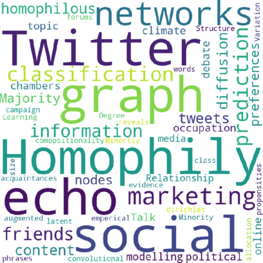
To understand why people, succeed or fail, look at their circle of friends. Like it or not, people’s fates are closely connected to their human networks. While human networks can be beneficial – a friend can be a referral to a lucrative new job, for example – there can be negative effects as well: What happens when someone doesn’t know influential people? A limited human network, Jackson said, can hinder opportunities with deleterious effects on society. It helps explain why social immobility and inequality exist today.
The deep connections that people nurture underlie important political and economic establishments and they have become so intertwined, that one risky move can literally bring the world’s economy to its knees and spread financial distress across the network. For example, the 2008 recession was brought about by a group of tight nit individuals who decided to move their money to the wrong places and at the wrong time, thus tailspin the world’s economy.
Another way that social media can negatively impact homophily is through the job market. Take the importance of networks in employment, for example. In almost all professions, a high percentage of jobs are found via referrals. A person’s employment becomes heavily dependent upon a circle of friends and connections for help in accessing the know-how and opportunities to get good jobs. A person’s fate is closely connected to that of friends.
Combined with homophily, the general tendency of people to interact with others who are similar to themselves, this can lead to large and persistent differences in employment across groups, especially by ethnicity and gender. A group that is poorly employed ends up offering few opportunities to its members, as none of them have friends who are well-employed or experienced in navigating the labor market. In turn, this discourages investment in education and participation in the workforce. The more homophilic a society is, the greater the resulting inequality and lack of social mobility can be. The benefits of technological advances and globalization have been enormous. In 1980 over 40 percent of the world’s population lived below the poverty line, while now less than 10 percent do. Poverty is far from being erased, and that line is pretty low, but the progress is actually quite amazing. Technological advances and increased connectivity have also had several side effects. One is that the externalizes in networks, like the financial networks mentioned above, can move further and faster than ever before. This does not necessarily mean that the network is “too connected’’ but that we have to use our network knowledge to better regulate the extreme connectivity and resulting externalizations. The same is true of diseases and the consequences of pockets of unvaccinated people. Along with this is another trend that is reshaping our networks. We have better technologies to find and connect with other people who are similar and think similarly to ourselves. This comes with benefits, as it can be great to connect with someone with common interests and who can offer advice and empathy; but it also comes with the costs of creating echo chambers and increasing homophily. It may not be that technology is making our networks too connected, but instead that it is making our networks too biased
0 notes
Text
Call of Cthulhu: an over long analysis
In trying to give any video game a fair review, one faces difficulties, because games try to be and to do such a varying range of things. I think this is especially true of Cyanide’s Call of Cthulhu. There are so many metrics by which one could measure the game. Is it engaging? Is it scary? Does it do what it does well;? Is it well made? Is it true to its Lovecraft source material? Is it true to its roleplaying game source material? Is it worth the price? If you are short of time, and I would not blame you if you were, then very quickly: yes; no; yes; depends what you mean but no; sort of; yeah and that depends but probably not. If you are not short on time, then let me explain myself (in very great detail) by taking these points in turn. It is difficult to appraise the game without spoilers, but I will warn you when they are coming. If you do not want them, skip to the next heading.
Is Call of Cthulhu engaging?
Yes. Not the most engaging game, mind, but its story, characters and general sense of intrigue carry the game. There are technical problems with the writing that I will deal with below, but those are the video game equivalents of bad grammar and spelling errors (of which, while we are on the subject, I noticed a bit in the subtitles and item descriptions). Despite the animation problems, also mentioned below, the characters are well fleshed out both through direct speech and context. The graphics are nothing sensational, but are definitely good enough to create a world you want to explore. One of my favourite things, though, is that the game does not treat you like an idiot, nor does it leave you behind. My problem with the few investigation-based games I have played before is that they are determined to leave no man behind, so they bash you around the head with everything that they have lying around. Call of Cthulhu does not do this. Cut-scenes and mandatory conversations make sure you know what is going on even if you are not paying attention to anything else that is around you, but if you are looking at the details in the world, even the ones that are not in any way highlighted by the big buttons that appear over everything that you can interact with, then you can start to piece together why things are happening, as opposed to just finding out that they are happening. Intelligence, time and exploration are rewarded with details, but none are essential for understanding the gist of the story. It is difficult to say much more without spoilers, so here are some SPOILERS:
While Officer Bradley was clearly the best character, standing out from most modern video game characters you see today by being wonderfully human, but not in a broken, flawed way, I want to prove my point about good characters by pointing to Charles Hawkins. While this character is never explicitly explained, we know he has been in on everything since the beginning. He is literally a wife-beating monster and definitely a villain of the piece. But he is also conflicted and caring. He genuinely wants what is best for Sarah, even if that means abusing her. He is a bad, angry man, but he is trying to do right. And the beauty is that the game never actually tells you this. It shows you. No one really ever says anything about Charles’s character, but reading into what he says and watching what he does really gives you a feel for his character. Which is impressive for a character with such little screen time.
Is Call of Cthulhu scary?
No. I do not play horror games so I am not the person to ask really. Or maybe I am the perfect person to ask. Either way, for what it is worth, I was not scared by this game. I hate being chased and a couple of sequences made me tense up in my chair, but I would not take that as a massive indication of anything. The same fear of being chased is what made me stop playing Mirror’s Edge and that game is very far from scary. In the game’s defense, however, jump scares are cheap and I hate them and this game seems to aswell. I counted exactly two and one of them was mostly just a creepy musical trill and the other one was so obviously coming it did not even startle me. So Kudos there.
Does Call of Cthulhu do what it does well?
Yes. What I mean by this is, if you boil the game down to what it actually is, it does that well. What that means, is that it is a very good walking simulator. If that is not what you want, do not play this game. This is a walking sim with some very light RPG elements and a few sections where, undoubtedly, someone higher up the chain came in and said “we need a stealth section!” or “we need a combat section!” or “we need a horror section!” or “we need an action section!” and the developers obliged, put in one instance of each and moved on. These sections, except maybe the fun but very basic stealth section, are by far the weakest parts of the game (oh my, that combat section!). The exceptions are the many puzzles, which, like the plot in general, do not treat you like an idiot. Except for one part of one, which honestly feels like the developers made a mistake (what is supposed to be the clue for where to look for the answer instead just straight up gives you the answer, despite the fact that all the stuff for actually reasoning out the answer is right there in the game!).
I only have one problem with the walking simulator nature of the game. There are a few sections which are clearly only there to pad out time. Most of the game is a pretty tight linear tour through the story, but occasionally you are given an adventure game style ‘puzzle’ that just boils down to, “walk around this area you have already walked around for ages until you find the thing that you have to poke to make the story progress”. Anyone who has played the game will know what I mean by ‘the bust bit’. And there is another section which might work as a horror piece, maybe, but just seemed to me to be “run around this same small area 5 or 6 times till we arbitrarily let you out”. ‘Lamps’ is the clue word for that one, if you’re curious as to what I mean. But these are nit-picks. Generally the game is an excellent walking simulator.
Is Call of Cthulhu well made?
That depends on what you mean. Games are hugely multifaceted, but what often differentiates a good game from a poor one is the ability of its developers to work to its strengths. It would be an unfair criticism of Indie darling Limbo to say that it had bad facial animations. It definitely did, but this is not a problem because the characters effectively have no faces. This seems like a facile point, but I think it is important to remember that Cyanide, the developers of Call of Cthulhu, have previously been known for the Styx games, a few Games Workshop titles, a buttload of cycling games and little else. Call of Cthulhu is not triple-A, but it’s not Indie either. The game, at least visually and narratively though, tries to do everything a triple-A title would attempt to do, as opposed to the usual Indie approach of making at least one aspect in some way minimalist. This is not an excuse, merely something to keep in mind as I say that the animation is some of the worst I have seen in games for a very long time. It’s not quite as funny as Mass Effect Andromeda’s, there is not quite enough going on for it to be quite as bizarrely broken. Dialogue lines would come out of characters whose mouths were shut, arms would constantly drift around like they had slightly confused minds of their own and I hope the ‘facial expressions’ were enjoying their trip to the uncanny valley.
The writing was a bit all over the place as well. Writing, mind, not story or character construction. There is a reasonable amount of choice in the game, but an annoyingly large number of the lines of dialogue do not seem to match up with the choices you make. In the first main scene, you can go straight into a conversation with someone and mention in one conversation branch that you know that a character is a big deal on Darkwater island, and then immediately choose another conversation option where you reveal you have never even heard of Darkwater island before. In a subsequent scene, a man told me he would meet me somewhere later, but then, when I got there, my character had several lines questioning why the man was there. There are numerous moments like this and it really takes you out of the experience every time it happens. A similar issue is present whenever you enter an enclosed space and your vision starts distorting. I only knew that this was a representation of the main character’s claustrophobia because the developers mentioned it in press releases. I did not notice any mention of it in the actual game.
A bit more nit-picky, but there are a few times when the game simply does not tell you something that would be useful to know. The most egregious of these is when they give you something which has limited uses but do not tell you either that it has limited uses or how many uses are left until you have used them all up. It is never a particularly large problem, but it would have been nice to know.
Still, looking at the game as a technical work, I must say that the graphics are nice. The art style has a Dishonored feel to it, which I personally have lots of time for. It is not quite as stylised, but the game is generally very pretty, which is a good thing too since you will spend a lot of time shoving your camera into every corner of it.
Is Call of Cthulhu true to its Lovecraftian source material?
Ah, the fun question. The answer really depends on how much of a deep dive you want to do. But before I jump in, it is important to note that the developers explicitly said their game was based on the table-top RPG, rather than Lovecraft’s stories. What follows, then, is a piece of literary critique (read: w**k) and not necessarily a criticism of the game. It will also be absolutely riddled with SPOILERS:
Call of Cthulhu gets a lot right about the common conception of the Lovecraftian aesthetic: the green tinge that permeates everything gives it a distinctly Cthulhu-y vibe, the rural town is a common motif of Lovecraft’s (the game is very Shadow Over Insmouth here) and Cthulhu as an entity is almost used well. As I said at the top, SPOILERS! Cthulhu actually shows up, for about one second, in one of the game’s four endings and is presented as an unstoppable, maddening, world-ending force. This is doing Cthulhu right. There is no fighting Cthulhu: once he has been awoken from his fhtagn, the world will crumble around him. The only hope one has is to prevent that from happening, so it is appropriate that, if it is allowed to happen, the game gives you no chance to resist. The game also takes a good approach to sanity and curiosity. Fuller is the character who most explores the concept of curiosity and it is shown to warp and twist him as it opens his mind to new possibilities. This fear of curiosity is at the heart of Lovecraft’s writings. The game also plays with sanity, another of Lovecraft’s main themes, although most of the mechanical implications of that are better discussed in relation to the Call of Cthulhu table-top RPG.
However, there is one thing that the game gets seriously wrong about Lovecraft. In those moments when the game is scary, the story itself is not one of cosmic horror. Much horror is about holding a mirror up to humanity. It is about showing and exploring our darker sides. Werewolves explore our animal nature, vampires (at least traditionally) were an exploration of sexuality, serial killers explore human psychopathy, zombies represent rampant consumerism. The monster, at the end of the day, is us. This is not the goal of cosmic horror. Lovecraft is not writing stories about people. His horror is metaphysical. “The most merciful thing in the world, I think, is the inability of the human mind to correlate all of its contents” is how he begins his story The Call of Cthulhu and this one sentence, I think, underpins all of his work. His protagonists go mad not because they saw something scary, they go mad because they saw something they cannot explain. Their very understanding of reality is thrown out of whack and they are shown that the safe, pedestrian, societal lives they thought they were living were facades: the ignorance that our subconscious chooses for us to protect us from realisations about the universe and our tiny, utterly insignificant part in it. His entities are often not even evil, they are simply so alien and disinterested that we matter as much to them as ants matter to us. This is why Lovecraft was so revolutionary, he moved away from the traditionally biblical kind of horror where the monsters are manifestations of our own sins and turned instead to the secular world of science for his horrors. “The sciences, each straining in its own direction, have hitherto harmed us little”, he continues in Call of Cthulhu, “but someday the piecing together of previously disassociated knowledge will open up such terrifying vistas of reality, and our frightful position therein, that we shall either go mad from the revelation or flee from the light into the peace and safety of a new dark age”. I say again, Lovecraft is not telling stories about people. He is telling stories about the universe and our inability to understand or cope with it. The truth that science will one day unlock, Lovecraft seems to be suggesting, is that we do not matter at all. This is cosmic horror. But Call of Cthulhu (the video game, that is) seems to miss this. Pierce’s sanity (or insanity) progression comes the closest. I say more on this mechanic below, but the final choice that Pierce must make is the most Lovecraftian moment of the game.
There are four endings to the game, one default and three others unlocked through story actions, which is a system I like. On a very quick side note, I also really like how there is a save point just before the end, allowing you to go back instantly and replay the endings you did not choose, but only if you unlocked them (I unlocked three of the four endings on my first play-through). Suicide and accepting the ritual both present “go mad from the revelation” endings, each with a different but totally appropriate flavour of madness, while the ‘it’s over’ ending represents a flight back into a dark age, Pierce sticking fingers in his ears and yelling “la la la it’s all a dream!” I also like here that you have to unlock all but the ritual ending. I was annoyed with this ending until I found this out. The game does not really give you any reason to complete the ritual. The Leviathan and the cult have all clearly been bad the whole way through the game, there is not ever any good reason for Pierce to surrender at the last moment and perform the ritual. Having it as the default, though, makes this lack of motivation slightly more excusable, as it represents Pierce simply surrendering to what he has been told is his destiny, as opposed to having worked for the will to fight back in some way. The fourth ending, the counter ritual, is by far the poorest, which is a shame because it could so easily have been fixed. You know that Drake is planning something, but Pierce, or at least my Pierce, was never told exactly what that was. My Pierce would not logically even have known that there was a counter ritual, never mind how to do it and certainly never mind what it actually does (a point that I am still completely in the dark about). This is something, as far as I can tell, that the game never explains, even if you do choose this option. Just a little bit of exposition, probably delivered by Drake, would have cleared this all up.
But I digress. Call of Cthulhu is essentially a game about people. It is about a group of people who are more or less tricked by some powerful alien being into doing its bidding. And as I said above, it does this well. But in being about people and their struggles, it fails to focus on what Lovecraft himself actually focuses on. Now, a quick disclaimer: I do not know for a fact that Lovecraft was a racist and viewed minorities as ‘less human’ than white people (although there is evidence for this in his work), but I am going to assume this is the case, at least in some way, for what I am going to say. I think it is telling that most of the cultists in Lovecraft’s work are minorities, because this distances even his human villains from the (I think) exclusively white protagonists of his stories. This separation between the human and the alien is completely ignored in the sequences in which Pierce is visited by the Leviathan in prison. The fact that the Leviathan would take humanoid form and use human manipulation tactics to get Pierce to do what it wants is totally non-Lovecraftian. Where is the horror at our utter inconsequentiality here? Cthulhu is scary because it does not care about us, we matter so little there would be zero point in it or any of its ... associates (for want of a better word) attempting to use tactics to manipulate human kind. In The Call of Cthullhu (the story now, not the game), Cthullhu pretty much tells people to come and they just do. No need to take human form, no need to use psychological methods. Lovecraftian horrors use us like the dumb insects that, compared to them, we are.
Further the visions that haunt Pierce are visions of people, mostly, and the awful things that they do to each other. He questions his senses, but he never really questions his position in the universe or what it would actually mean if all the things that he is seeing were true. Lovecraft’s protagonists usually do believe what they see and this is what drives them mad, while Pierce is driven mad by questions about whether or not to believe what he sees. The biggest crime though, the moment that really made me feel that the developers had missed the point, is in the after-credits half of the ritual ending. Here we see the cultists all engaged in a murderous brawl, screaming with delirious madness as they punch and kick and bite each other while, presumably, Cthulhu gets on with the important job of destroying the world just off camera. But this is the wrong kind of madness. Sure, everyone would go mad as their understanding of reality snapped at the vastness and alien-ness (alienitude? alienosity?) of Cthulhu, but for all of them to just go kill-crazy? It doesn’t make sense. That does not seem to be the madness that comes of having your entire knowledge of reality shattered. It feels more like a madness that makes a flashy ending to a video game.
Is Call of Cthulhu true to its roleplaying game source material?
Yes, broadly. Firstly, I am not a CoC (which is what I’ll call the rolepaying Call of Cthulhu, because this is getting stupidly confusing) expert. I have played and run a few games, but it is not my main game. That being said, I think I know enough to say that Call of Cthulhu does a good job of translating CoC into a video game. Its plot is a little more big-leagues (bigly) and showy than your average CoC game, but that is fine. It’s the same thing that happens when a film is made from a TV series. And in this regard, Call of Cthulhu is hardly a huge offender. This might just be me, but I really like stories that know how to reign in their scale and Call of Cthulhu does a pretty good job of this. With the exception of one particular sub-plot (which is by no means overblown just a little elbowed in (the whole painting sub arc, btw)), everything is pretty well contained and not much is thrown in to escalate things to stupid levels as the game progresses.
Call of Cthulhu continues the well-practiced trend of CoC games of being incredibly linear, but while this is an actual problem for roleplaying games, where the only limitation is imagination, in a video game, which is fenced in by budget and deadline constraints, this linearity is not so much of a problem.
An area where Call of Cthulhu differs from CoC is in its use of skills. The skill list for 6th edition CoC (which is the edition I know, so don’t pester me about 7th ed) is over 50 skills long. Call of Cthulhu, on the other hand, has 7 skills. This means you never have those horrible moments where you absolutely NEED a successful library-use roll or else-you-will-all die-in-the-next-encounter-because-you-did-not-know-the-monster-is-weak-to-salt-but-you-put-all-your-points-into-Fast-Talk-so-I-guess-you-are-all-just-going-to-die-and-no-I-am-not-still-bitter. This, I feel, is an improvement. It could be argued that it reduces the scope for roleplaying, but with the limited conversation options and the actually quite well written and characterised Pierce, you are never going to be totally in control anyway. Call of Cthulhu is also paced very much like a CoC game as well, with slow, social information gathering at the beginning, ramping up to more action/horror moments later. This does make some of the skills more useless later on in the game, but this is not a major problem and a difficult one to avoid (and certainly one that CoC games usually fail to avoid). Also like CoC, there is, I think, a clearly right thing to do at character creation, but while in CoC it is because some skills (I’m looking at you, operate heavy machinery) are simply pointless, in Call of Cthulhu character gen is the only time you can use experience points to level up Occultism and Medicine, something you are definitely going to want to do and something the game does not do a good job of telling you.
CoC’s main selling point, as a system, is its sanity mechanic, something that Cyanide obviously spent a great deal of time looking at when making Call of Cthulhu. I have heard that some people did not think it was used well, but I have to disagree. Sadly though, to explain why I have to make liberal use of SPOILERS!
In CoC, sanity is effectively your character’s long-term health bar. Your sanity level sticks around from adventure to adventure with very little you can do to raise it if it falls. It is, in many ways, your character’s expiration date. It goes down whenever you see something Cthulhoid, but there is a random element to it. Clearly, this would not work for Call of Cthulhu, not in the same way anyway. If Call of Cthulhu were a CoC game, it would take at most three or four sessions, and that is not really fast enough for a character to melt completely into a gibbering puddle of insanity. So Call of Cthulhu does something very different and I think it does it very well.
At the beginning of the game, you have some control over your sanity being reduced. The most clear example of this is when you have the option of whether or not to read the Malleus Monstorum. But as the game continues, you have less and less choice over whether you get to see sanity-breaking stuff or not. It basically just happens to you. This means that really, your loss of sanity is almost 100% controlled by the game’s story. Therefore the moment that you break mechanically is also the moment that weird stuff starts happening, by necessity, in the story. Pierce starts to have visions, some of them obviously fake, some of them much more plausibly real, and because his sanity has broken we know that we are in a situation where we should be questioning everything, as opposed to earlier in the game when the lines were much more clear cut. This is a co-opting of mechanics by story, which I have not really seen before in a game. The game gives you something that appears to be in your control but then slowly and subtly takes it back. You could see this as a reduction in player autonomy, because it really is, but I think this fits very well with the themes of destiny and inevitability in the story. It also produces an organic way to show the deteriorating mental state of Pierce without it being exposition-y. If we had felt, right from the beginning, that the sanity bar had nothing to do with our own choices, the moment when Pierce breaks would have felt contrived. But by giving us that illusion of choice we are engaged with the progression of that sanity bar in a way that we would not be otherwise and when it finally shifts from stable to psychotic, we do not see this as a simple narrative move, we see this as an organic part of the story and the choices we made in it, even if really it is not. I also love how the sanity manifests itself. It is subtly done and I think interesting debates could be had about what is real and what is not (I have strong feelings about when the last time we really see Colden is, for example). A brilliant example of this is how we shoot Fuller in what is obviously a dream-scape and then come back to what we think is reality and find we have shot him there too. But this, itself, is also shown to be an illusion when, in one of the ending sequences, we hear him talking to a nurse. It is all very Inception-y and I really like it. It was a nice subversion of expectations, as I was expecting the sanity meter, as a player influenced mechanic, to be able to affect only aesthetic things and maybe minor story elements. I noticed this exactly once (a painting had blood spatters on it which disappeared when I approached), but the way the game takes control of the mechanic and allows it to have serious narrative impact, while a removal of player autonomy, was very refreshing.
Is Call of Cthulhu worth the price?
At time of writing, Call of Cthulhu is selling for £40. It is not worth that. You can go and pick up Divinity Original Sin 2, a game that is basically empirically perfect, for £10 less than that and get at the very least ten times as much play time out of it. Where the price point of Call of Cthulhu should be for you is something only you can decide. £15 seems like a more reasonable price point to me. What I look for is usually a strong enjoyment/hour ratio as opposed to a good hour/money ratio, and Call of Cthulhu has a very good enjoyment/hour ratio, but this is certainly helped by its short length. At the end of the day, I would say that whatever you would be willing to pay for two engaging, thoughtful, just below Hollywood tier films is probably the right price for Call of Cthulhu. Especially since the game has basically no replay value. In many ways it is very average, but if you have a thing for walking simulators or Lovecraftian worlds, then this game is a must buy for you. But maybe wait until the price has dropped.
#Call of Cthulhu#Cthulhu#Lovecraft#Game Review#Essay#Cosmic horror#Literary analysis#Roleplay#HashtagsHaveNoSpaces
2 notes
·
View notes
Text
SAMSUNG’S ODYSSEY G9 DOES THE WORK OF THREE MONITORS
I have been a technology cheapskate most of my life. I’ve rarely bought a monitor brand-new; I’m pleased to say I pieced together my current three-screen articulating swing-arm setup primarily from Craigslist and hand-me-downs. But this fall, I had an opportunity to temporarily replace my three aging displays with the most ridiculous, most advanced gaming monitor ever made: the super-ultrawide, super-curved, ultra-high resolution 49-inch Samsung Odyssey G9.
The Samsung Odyssey G9 is a monitor so big, so wide, so curved, it can fill a midsized desk and wrap around your entire field of view. It’s also simply a phenomenal screen: speedy (240Hz, 1ms, G-Sync, and FreeSync 2), high resolution (5120 x 1440-pixel), and bursting with brilliant color thanks to a QLED panel that tops out at an eye-searing 1,000 nits of brightness. I’m not kidding when I say I have to avert my eyes when I launch Destiny 2 in HDR, and I could swear I felt the flames the first few times my Star Wars: Squadrons’ TIE Bomber blasted an X-Wing into oblivion.
As they say on Reddit, I have ascended — and the past few weeks have been a gaming and productivity experience like few I’ve had before.
But gradually, I’ve been coming back down to Earth.
DESIGN
The Odyssey G9 is a showstopper, and I don’t just mean that figuratively: last January, attendees of the world’s biggest technology show were dazzled by its unprecedented curvature and sci-fi inspired frame.
When I put that same monitor on my humble IKEA sit-stand desk, the effect is otherworldly. Compared to my old hodgepodge of screens and rat’s nest of cabling, this G9 looks like a terminal aboard a Star Trek spaceship... even if my physical keyboard and its long braided cable ruin the illusion a bit.
The sheer size of the Odyssey G9 and its broad-shouldered stand do limit your options. I’m lucky that my small-form-factor Ncase M1 can fit behind the screen, and there’s just enough clearance (a little over six inches) for my Audioengine A2+ speakers to fit underneath the monitor at the stand’s highest position. But if I had a bigger PC or bigger speakers, I might have also needed a bigger desk — or else had to use the included 100mm x 100mm VESA adapter to mount the nearly four-feet wide, one-foot deep, 31-pound screen to the wall. My current monitor arms can’t carry nearly that much weight, though you can buy some TV arms that do.
As it is, I’m a fan of the way this monitor brings my whole desk together. Two DisplayPorts and an HDMI 2.0 port let me switch between three video sources easily, including a side-by-side mode which lets me display two at once, effectively giving my PC and game console (or a second computer) each their own 24.5-inch, 2560 x 1440 displays.
There’s also a two-port USB-A 3.0 hub and a 3.5mm audio output, which worked perfectly with my keyboard’s USB and 3.5mm audio passthrough. As you can see from my photos, I can do a lot with only a single visible cable thanks to those ports. And while the narrow V-shaped stand might seem a little minimal for a monitor this hefty, it takes a decent shove to get it to tip forward even at its highest position.
You can adjust the monitor’s settings using a tiny five-way control nub underneath the power LED, and it’s remarkable how much you can tweak — including the ability to crop the entire panel to 4:3, 16:9, or 21:9 aspect ratios instead of stretching out the image. You can effectively have a 27-inch HDR panel for your game console or TV whenever you need. It’s just a shame that the monitor’s biggest benefits don’t necessarily translate to its side-by-side mode, where your 240Hz HDR screen generally becomes a pair of 60Hz SDR ones.
PRODUCTIVITY
My first big test for Samsung’s Odyssey G9 wasn’t a console or even PC gaming — last month, I co-hosted The Verge’s industry-famous Apple event live blog, capturing every screenshot you saw. I normally run three monitors because I switch tasks like mad, and if there’s a better multitasking test than an Apple event, I haven’t met it yet.
At first, I wasn’t sure this epic screen would work. Most apps and websites aren’t designed to display across the vast expanse of a single 32:9 monitor, so you have to live in windows. I couldn’t simply toss one or two apps onto each monitor like I usually do. But while Samsung doesn’t ship the G9 with any good windowing software and Windows 10’s default Snap is woefully insufficient, Microsoft’s free downloadable FancyZones windowing manager worked wonders.
l built my own set of dedicated snappable spots for the Apple live stream; The Verge’s live-blogging tool; Slack; a browser window to keep track of any Apple press releases that might pop during the show; and even a narrow strip of Windows Explorer so I could see which images I’d already captured and weed them out as necessary. The only other wrinkle was the additional Chrome extension I had to download to ensure YouTube could launch “full screen” in a browser window, instead of taking over my entire ultrawide monitor.
In general, while I did occasionally miss my two vertically oriented monitors for scrolling long webpages, Google Docs, and Tweetdeck, I found the G9’s gigantic horizontal expanse of real estate nearly as effective for most tasks. Where I could only squeeze four narrow columns of Tweetdeck onto my old portrait-orientation screens, the G9 would comfortably fit five, plus a 30-tab web browser, a nice vertical strip of Evernote for note-taking, and our Slack newsroom alongside.
I wouldn’t say it’s better than having three screens for work, but it seems like a sufficient substitute — except maybe that toast notifications now pop up in the corner of my eye where they’re pretty easy to miss. Still, it’s nice not to have to match color, contrast, and brightness across three screens at a time, or adjust how my mouse crosses from one monitor to the next. Having a single, vast, unbroken expanse of real estate that’s always the same distance from my face (as I spin in my chair) is an absolute treat. And while the Odyssey G9’s unprecedented curve does tend to catch ambient light, the matte screen does a great job of diffusing any glare.
The ultrawide aspect ratio didn’t work as well for video as I hoped, though. While you might imagine 32:9 being great for movies, I had a hard time finding anything I could play in ultra high definition that wasn’t 16:9. Most streaming platforms won’t easily let you access their 4K and HDR content on a Windows machine to begin with — YouTube’s the primary exception, though Netflix works if you’ve got a recent Intel processor and use Microsoft Edge or the native app — and you’ll want 4K to take advantage of a screen this high-res and this close to your face. The 4K YouTube videos I played were definitely clearer than 1080p — I could really peep these pixels in Dieter’s iPhone 12 video review. And while standard 16:9, 1080p content does display just fine full-screen with black borders on the sides, it feels like I’m wasting a lot of screen real estate that way. Plus, the blacks are a bit gray, not the deep inky black you’d get from an OLED screen — particularly with HDR on and Samsung’s iffy local dimming enabled.
GAMING
The first thing you should know about gaming on the Odyssey G9 is that you’ll want a serious graphics card to go with it. Technically, 5120 x 1440 resolution isn’t quite as many pixels as a 3840 x 2160 4K UHD screen... but remember we’re also talking about a monitor that goes up to 240Hz. To properly review the Odyssey G9, I borrowed an Nvidia GeForce RTX 3080 to get enough horsepower, since my GTX 1080 couldn’t even run games like Death Stranding or Destiny 2 at 60fps smoothly at that resolution.
The second thing you should know about gaming on the Odyssey G9 is that it may not be quite as immersive as you’re imagining.
Don’t get me wrong: having an X-Wing cockpit wrapped all around you is an epic experience, and it feels like a true advantage to be able to use my peripheral vision in competitive shooters like PUBG and CS:GO. But it wasn’t long until I noticed something weird going on.
Look carefully at these images: notice how the sides are warped? Imperial deck officers and Novigrad Temple Guards aren’t generally this pudgy.
I tried game after game after game on the Odyssey G9, digging into my Steam, Epic, and Uplay libraries and tweaking a variety of settings, and this is simply the reality: every 3D game gets warped when you’re viewing it in a 32:9 aspect ratio, and there’s not much you can do about it. Changing your field of view in a game doesn’t get rid of the effect; it simply changes how much of the game world appears in the center of your screen (where things look normal) and at the edges (where they look stretched and zoomed). I actually pulled out a tape measure and checked: video game content that measures 4.75 inches at the center of the display can get stretched to a full 12 inches at the edges.
Now, this isn’t Samsung’s fault; it’s just the way games are built. Most games have a single virtual camera that exists at a single point in space, and while Nvidia once proposed changing that (see link above), the company’s Simultaneous Multi-Projection doesn’t seem to have made it into any of the games I tested. And in games with pre-rendered cutscenes, like Final Fantasy XV, you’ll be watching them at their original aspect ratio.
But before you write off 32:9 ultrawides right now, there are three things I’d like you to consider:
You might get used to it.
It’s not that distracting in some games!
2D games aren’t affected at all.
Let me give you some examples.
CS:GO and PUBG are incredibly competitive, nail-biting games where focus is everything, where you always need to have your gun at the ready and be scanning for any sign of movement. I don’t have time to turn my head left and right to appreciate the scenery or think about whether it’s warped. The G9 simply gives me enhanced peripheral vision, and it helps — not hurts — that things which appear in the corner of my eye are zoomed in by default. I got used to treating it as my peripheral vision and nothing else. (The 240Hz also comes in pretty handy in games like CS:GO where you can actually hit that frame rate.)
Genshin Impact, Abzû, Rocket League, and BioShock Infinite are games with gorgeous, colorful worlds whose proportions aren’t “normal” to begin with, and I love having them wrapped around me.
In Destiny 2 and XCOM 2, I found I could forgive the warping because of the enhanced field of view and the ability to easily zoom whenever you want. It’s nice to see more of the battlefield at once in XCOM while planning out how my soldiers will move each turn, and it’s pretty cool to aim down the sights in Destiny without the typical claustrophobia that comes with zooming in, since you’re still able to see what’s going on around you.
2D / 2.5D games like Worms W.M.D and Disco Elysium do look fantastic on the G9 — when you can find ones that actually support an ultrawide screen. That’s not a given: I managed to launch Soldat at 5120 x 1440 resolution, but it didn’t stretch across my monitor. Games with fixed widths like Streets of Rage 4 and Hyper Light Drifter won’t either. Even Disco Elysium only offers 21:9 support, not 32:9, unless you apply a hack.
And for every one of the 3D games that worked, I also found a Borderlands 3 or The Witness or Goat of Duty or The Witcher 3 where the warped geometry really bugged me, either because I wanted to sit back and look at the beautiful vista or because the edges of my screen were moving faster than the center.
In games like the hack-and-slash Mordhau or the road-tripping Final Fantasy XV, the distraction can also be when a piece of geometry that’s critical to the game constantly looks wrong. (Your Mordhau sword or axe often extends into the warped area of the screen; the road itself in FFXV looks curved instead of flat!)
Frankly, the most annoying game I played on the Odyssey G9 was figuring out which games would work in the first place. Here, I have to shout out Rock Paper Shotgun’s Katharine Castle, whose brilliant example-filled guide showcases nearly three dozen titles that do work, complete with GIFs so you can see for yourself. But if you’re willing to work at it (and understand the risks), a community at the Widescreen Gaming Forum (WSGF) and PCGamingWiki can help you hack and patch many existing titles to work at 32:9, too.
For instance, I installed a trainer that let me run Death Stranding at full-resolution 32:9, with an infinitely adjustable field of view, instead of the 21:9 that designer Hideo Kojima and company shipped.
Using a common tutorial, I hex-edited my Persona 4 Golden .exe and remarkably wound up playing what was originally a 480p PlayStation 2 game — and later a 720p, 16:9 PlayStation Vita game — at a glorious 3840 x 1080 at 32:9. (I do still need to figure out how to un-stretch the UI.) And there’s an old, unmaintained program called Widescreen Fixer that helped me revisit an old favorite:
I wouldn’t say the community is robust enough that you could necessarily find a fix for any game in your library. But the WSGF does now have a Discord you might want to check out.
THE ULTIMATE ULTRAWIDE, BUT THE BEST MONITOR?
The Samsung Odyssey G9 costs $1,479.99 — a premium price for a premium monitor like nothing else on the market. You can find other 49-inch 32:9 panels for less, but none with this combination of resolution, brightness, curvature, and refresh rate. The closest you can come is last year’s $1,200 Samsung CRG9 which maintains the resolution and brightness but with half the refresh rate at 120Hz and a notably less pronounced 1800R curvature — which, I imagine, wouldn’t be as good at giving you convincing peripheral vision in games.
If you’re looking for the ultimate ultrawide, this is currently it. I’m just not convinced that I am, personally, even if I had that much money earmarked for a new screen. For $1,500 and the enormous amount of space the Odyssey G9 consumes, I could buy a 48-inch LG OLED TV instead. I’d get a screen just as gigantic for my multitasking, but taller, with 120Hz G-Sync and FreeSync support, incredibly deep blacks, HDMI 2.1 for variable refresh rate for the PS5 and Xbox Series X, and no need to troubleshoot aspect ratios for my videos and games. Linus Tech Tips has a video that dives deep into the pros and cons of that LG screen, and I came away fairly convinced.
It wouldn’t be the same experience that the G9 offers, of course, and I might regret it if Nvidia and AMD ever dust off Simultaneous Multi-Projection for real. The TV might also cut off access to a large portion of my desk, and I might not be able to place my PC and speakers within easy reach without blocking a bit of the screen. But I’d have a more obviously future-proof setup; an equally, if not more gorgeous image; and a lot less ambient annoyance when I want to game. At the very least, here’s hoping Samsung adds HDMI 2.1 to this epic monitor next year.
0 notes
Text
Vizio M-Series Quantum TV review: Lots of TV for less than you think
New Post has been published on https://appradab.com/vizio-m-series-quantum-tv-review-lots-of-tv-for-less-than-you-think-2/
Vizio M-Series Quantum TV review: Lots of TV for less than you think
When you buy a new TV a crucial decision is how much you’re willing to pay for improved image quality. Just about any cheap TV these days delivers a “good enough” picture but if you want to realize the benefits of the best-quality sources — specifically 4K video with high dynamic range and gaming-friendly extras — you’ll need to spend more. The Vizio M-Series Quantum offers step-up features that let it outshine cheaper models, but it remains eminently affordable.
Like
Affordable
Excellent picture quality
Supports variable refresh rate
Don’t Like
Lackluster smart TV system
Mediocre remote
Worse performance than some more expensive TVs
In my side-by-side tests, the M7 couldn’t match the picture quality of my favorite TV for the money, TCL’s 6-Series, but it also costs a lot less. It’s bright enough to bring out highlights in HDR and still put out relatively deep black levels, resulting in an image with plenty of punch and contrast for the price. And it’s the cheapest TV on the market with Variable Refresh Rate, a gaming feature found on PlayStation 5 and Xbox Series X/S (and some video cards) designed to reduce tearing and other artifacts. The M-Series also comes in a wallet-friendly 50-inch size, while most good-performing TVs start at 55 inches. Add it all up and you have an appealing package for anyone who doesn’t want to spend up for the TCL.
Design
Externally there’s not much to differentiate the M-Series from other TVs on the market. Its color is all matte black, with a slim plastic border on the top and a thicker, metallic bottom edge above spindly stand legs. The look is decidedly middlebrow.
Vizio’s basic remote got a facelift this year, with more rounded keys and a prominent “WatchFree” button to join more recognizable streaming service shortcuts such as Netflix, Hulu and, uh, Redbox at the top. Otherwise it’s pedestrian-looking with too many buttons, and I prefer the simpler, more focused clickers of Roku or Samsung.
The company has made more changes to its SmartCast system but again it falls short of Roku or Android TV, or even LG or Samsung’s proprietary systems. The main home page is packed with TV show, movie and channel suggestions you probably don’t care about, and the stuff you’ll probably use most — the streaming apps themselves — are denigrated to a single row.

Although the platform now has 64 apps, including most major names, it’s still missing heavy hitters like HBO and HBO Max, Sling TV and ESPN. And finding new apps is a pain: Instead of a simple channel or app store that lets you search for, add and delete apps, you have to scroll the row through to find what you want. You can arrange app tiles to taste but I was also annoyed that none of them can be deleted.
The search function in the upper left of the home page only finds TV shows, movies and videos, not apps themselves — I searched “HBO,” for example, and the most relevant results were YouTube videos. In its favor, search results do span different apps including Apple TV, Disney Plus and Amazon Prime, but they don’t include Netflix. Roku’s search is much better in general.
To watch any of the hundreds of apps that aren’t part of Vizio’s on-screen system you can use the cast function on your phone to connect to the TV. The TV supports both Google’s Chromecast function and Apple’s AirPlay. The M-Series doesn’t have any voice capability built into its remote but the TV will work with Amazon Alexa and Google Home speakers.
Key TV features
Display technology LED LCD LED backlight Full-array with local dimming Resolution 4K HDR compatible HDR10 and Dolby Vision Smart TV SmartCast Remote Standard
The M-Series Quantum is one of the cheapest TVs with full-array local dimming — my favorite addition for LCD picture quality because it improves all-important contrast and black levels — but different models in the M-Series have different specs. In short, the M7 I reviewed is less impressive on paper than the M8.
The number of dimmable zones is an important specification because it controls how precise the dimming can be. More zones doesn’t necessarily mean better picture quality, but it usually helps. The M8 is also brighter than the M7, at 800 and 600 nits respectively. I didn’t review the M8 but based on these specs I’m guessing it performs a bit better than the M7, but not as good as something like the TCL 6-Series.
The rest of the M-Series specifications are the same on all models. Quantum dots allow the TV to achieve better HDR color, which was borne out in my measurements.
The M-Series has a 60Hz refresh rate panel — Vizio’s “120 Dynamic Motion Rate” is bunk. It lacks a setting to engage motion estimation and motion compensation (also known as MEMC or the Soap Opera Effect) as found on the more expensive Vizio P- and PX-Series, as well as TCL’s 6 series. Vizio supports both major types of HDR, HDR10 and Dolby Vision, in the M-Series. So does every other major TV maker except Samsung, which lacks Dolby Vision support.

Here are the M-Series’ other specs:
4 HDMI inputs
1 analog composite video input
1 USB port
RF antenna tuner input
Ethernet port
Optical digital audio output
Stereo analog audio output
New for 2020, the M-Series supports eARC (on HDMI 3) as well as new gaming-centric features, namely Auto Game Mode/ALLM and Variable Refresh Rate. This is one the least expensive TVs we know about that can handle VRR, a graphics feature found on the PlayStation 5 and Xbox Series X/S (and some video cards) and designed to reduce tearing and other artifacts. It won’t be as effective as TVs with true 120Hz input capability like Vizio’s P series (the M-Series maxes out at 60Hz input), but it might be better than not having VRR. We’ll know more when we have the chance to test this TV with the new consoles.
Picture quality comparisons

Click the image above to see picture settings and HDR notes.
David Katzmaier/CNET
While certainly not at the same level as the TCL 6-Series or Sony X900H, both of which scored an 8 in my tests, the Vizio M-Series’ image quality earned a solid 7. That’s the same score I gave the Hisense R8 Roku TV, which is in the same price ballpark as the M7, but if I had to choose I’d take the Vizio’s superior contrast, processing and black levels over the R8’s brighter picture.
I spent most of my side-by-side time comparing it to the TCL and the Hisense H9G, both of which are more expensive. The Vizio fell short of the contrast and brightness of those two sets but in its favor showed an even-keeled, balanced image with good shadow detail and color accuracy.
Click the image at the right to see the picture settings used in the review and to read more about how this TV’s picture controls worked during calibration.
Dim lighting: In late October The Invisible Man seems like an appropriate comparison movie, so I fired up the Blu-ray in my dark basement and tried to be brave. In dark scenes the Vizio was good but it couldn’t match the inky blackness, or overall contrast, of the more-expensive Hisense and TCL. Throughout Chapter 1, as Cecilia Kass (played by Elizabeth Moss) pads around and ultimately flees her darkened house, the shadows, letterbox bars and night sky appeared markedly lighter on the Vizio than the other two, leading to a less realistic picture.
Details in shadows were very good on the Vizio, however, matching the TCL — I could make out more of the art and furniture in her bedroom (4:35) on both sets than on the Hisense. Blooming and stray illumination, for example in the pause icon and progress bar from my Blu-ray player, as well as the white-on-black “Two Weeks Later” lettering at the end of the chapter, was also minimal.
Bright lighting: The M-Series was a decent if not spectacular performer in a bright room. With LCD TVs light output is one of the major things you pay extra for, so it’s not surprising that the affordable M-Series is dimmer than many of the more-expensive TVs I’ve tested. It’s still brighter than budget models like Vizio’s V-Series, but at least one like-priced TV I reviewed, the Hisense R8, is brighter than the M-Series.
Light output in nits
TV Brightest (SDR) Accurate color (SDR) Brightest (HDR) Accurate color (HDR) Hisense H9G 1,239 1,238 1,751 1,498 TCL 65R635 1,114 792 1,292 1,102 Sony XBR-65X900H 841 673 989 795 Hisense 65R8F 717 717 770 770 Vizio M65Q7-H1 595 424 588 480 Vizio V605-G3 200 178 225 193
Vizio’s Calibrated picture mode delivered the most-accurate bright-room picture, which is well worth the loss of nits compared to Vivid in my opinion. The M’s semi-matte screen finish reduced reflections better than the TCL albeit not as well as the Hisense, and was worse than either one at preserving black-level fidelity.
Color accuracy: In its best picture modes, namely Calibrated and Calibrated Dark, the Vizio was exceedingly accurate according to my measurements even before calibration. In the The Invisible Man its image did appear just a bit duller and less saturated than the TCL, however, an issue that could be due more to a black level disparity than anything. As Cecelia sits at the dinner table for example (16:55), her skin tone looked a bit paler than the TCL, and the wood and plants of the kitchen looked less rich. Again the Hisense trailed a bit in color accuracy. In the end all three were quite accurate with SDR and it would be tough to point out differences outside a side-by-side comparison.
Video processing: The Vizio M-Series behaved like I’d expect from a 60Hz TV in my motion tests, meaning it didn’t reduce blur as well as higher-end sets with a 120Hz refresh rate. I’m not particularly sensitive to motion blur, but if you are, a true 120Hz TV like the TCL 6-Series or Vizio’s P-Series might be worth a look.
The M registered proper 1080p/24 cadence but exhibited motion resolution of just 300 lines. Vizio does offer a Clear Action control that improves that number to a respectable 900, but as usual it introduced flicker and dimmed the image, so most viewers will want to avoid it (note that if you have VRR turned on, Clear Action can’t be activated). Unlike some 60Hz TVs there’s no option to turn on smoothing, aka the Soap Opera Effect.
Input lag for gaming was good in both 1080p and 4K HDR, with a result of about 27ms in the Game picture mode — that’s a bit worse than the TCL 6-Series at 19ms but still perfectly acceptable. As usual with Vizio I appreciated being able to reduce lag in other picture modes too, such as Calibrated Dark, by turning on the separate Gaming Low Latency toggle. That yielded the same 27ms result, a big improvement over the 52ms (in 1080p) and 68ms (in 4K HDR) of lag I measured without GLL engaged.
Uniformity: The M-Series had no major issues in this category, with a nicely uniform image across the screen and little or no variation at different light levels with full-field test patterns. In mid-bright full-field test patterns it showed a bit more variation than the other two, but in program material differences were tough to discern. From off-angle — seats to either side of the sweet spot in front of the screen — the Vizio didn’t maintain black level fidelity quite as well as the other two, although it was roughly good at maintaining color.
HDR and 4K video: As usual the biggest differences between displays emerged when I fed them the highest-quality HDR video, first from the Spears and Munsil HDR Benchmark Blu-ray. The Vizio looked very good with the montage of footage but the TCL and Hisense performed better. Both displays beat the Vizio for contrast — with deeper, truer black areas and brighter whites. In the snowclad mountains, for example, the fields of white and cloudy skies were brighter on both, leading to better impact and pop, while in the night cityscapes and amusement park the TCL and Hisense delivered blacker shadows compared to the grayer Vizio.
In its favor the M-Series kept blooming in check, with minimal stray illumination in dark areas around the honey dripper for example (2:48). Color was also good, with saturation and vividness a tick higher than then TCL especially in reds like the flower (3:30) and significantly more accurate overall than the Hisense, which appeared too garish and unrealistic in comparison.
Turning back to The Invisible Man, this time on 4K Blu-ray, the Vizio again lagged the other two although as usual the differences weren’t as drastic with a standard movie as they were with test material. Dark areas in Chapter 1, for example the depths of the walk-in closet and the go-bag cozy, were again inkier on the TCL and Hisense, leading to better realism. The Vizio did preserve shadow details best but the others were still solid and more impressive overall.
The biggest difference, however, was in the brilliance of highlights, for example the strip lighting and fluorescents in the tech lab (5:37) — compared to the other two, the Vizio looked much duller, without that characteristic HDR pop. In more balanced scenes, like the kitchen in Chapter 7 (25:38), the Vizio again seemed slightly duller than the others, with more muted highlights and washed-out dark areas like the cabinetry and shelving.
Geek Box
Test Result Score Black luminance (0%) 0.005 Good Peak white luminance (SDR) 595 Good Avg. gamma (10-100%) 2.22 Good Avg. grayscale error (10-100%) 0.73 Good Dark gray error (30%) 0.66 Good Bright gray error (80%) 0.58 Good Avg. color checker error 0.80 Good Avg. saturation sweeps error 0.75 Good Avg. color error 1.03 Good Red error 1.04 Good Green error 0.98 Good Blue error 2.56 Good Cyan error 0.65 Good Magenta error 0.77 Good Yellow error 0.21 Good 1080p/24 Cadence (IAL) Pass Good Motion resolution (max) 900.00 Good Motion resolution (dejudder off) 300.00 Poor Input lag (Game mode) 27.57 Good HDR10 Black luminance (0%) 0.006 Good Peak white luminance (10% win) 588 Poor Gamut % UHDA/P3 (CIE 1976) 97.63 Good ColorMatch HDR error 4.05 Average Avg. color checker error 2.74 Good Input lag (Game mode, 4K HDR) 27.47 Good
Vizio M65Q7-H1 CNET review calibration results by David Katzmaier on Scribd
0 notes
Photo

New Post has been published on https://lovehaswonangelnumbers.org/karmic-tools-weekly-forecast-may-10-16-2020/
Karmic Tools Weekly Forecast: May 10 – 16, 2020
Karmic Tools Weekly Forecast: May 10 – 16, 2020
By Kelly M. Beard
The video version of this forecast, as read by Kelly, is available here.
The Karmic Tools Weekly Forecast covers the current planetary transits which affect people in different ways and to various degrees of intensity. Take notice when it is a Personal planet (Sun / Moon / Mercury / Venus / Mars) interacting with a Social (Jupiter/Saturn) or Collective planet (Uranus / Neptune/Pluto). And pay extremely close attention when it is a Social planet interacting with a Collective planet because that means something *big* is brewing that will move large groups of people along their evolutionary paths. Tuning in to the energy and rhythm of the planets can serve as a useful *guide* as you move along your Individual Path. It also helps to understand your place within the context of the larger Social & Collective Story. Below, you will find out how these energies tend to manifest, as well as guidance and direction.
*NOTE* There are some days when there are NO CONTACTS (besides the Moon), please note that there are no missing entries, we just list the actual Activations of each week + the day they happen.
Weekly Forecast: April 26 – May 2, 2020
5/10 ~ Mercury (learning & mind) ~trine~ Jupiter (education & consciousness):
This energy is great for expanding your mind, learning something new or taking a class. It’s time to plan for the future and start getting organized. However, you may feel less disciplined and more creative, which is fine in the beginning, but eventually focus & discipline will have to be engaged to ground your new ideas, thoughts or concepts. You have to ask your Self, ‘How bad do you want it?’ If you are self-aware, awake & alert, you will be able to see (and seize) the opportunities as they present themselves. It may ‘appear’ to be luck, but it’s really more that you were in alignment with the Cosmos, present & positive, and ultimately, able to trust & follow your own instincts. Practice, there is no perfection. Being optimistic & looking for opportunity in every experience will magnetize the positive and naturally repel the negative, leading right where you want to be! Take advantage of this good energy to connect to whatever it is you that are trying to create in your life at this time.
5/10 ~ Sun (core essential Self) ~sextile~ Neptune (vision & imagination):
This energy activates your ability to dissolve the ego (momentarily) and allow your SoulSelf to shine through! Your Spiritual center, base or practice comes up – how is it supporting you? If you’ve gotten away from your practice, this energy will make it easier to connect to your Spirit, your intuition and the vision for your life’s purpose, at this time. You may find where your contribution is most valued, when you step outside your Self and see how others’ needs are important. Find a need and fill it … in your own deliciously unique way, as you will be more giving & compassionate naturally, under this influence. Your physical energy may be low as a result of Neptune channeling the Sun’s Source Energy inwardly to re-charge your Spirit. Otherwise, it could be projections of all kinds, yours and other people’s as well. Best to spend some intentional solitude, preferably in nature if/when/where possible.
5/10 ~ Saturn Retrograde 1* AQUARIUS:
This is Saturn’s first time in Aquarius since 1991-1993 and today brings its first retrograde before it goes back for one last look around Capricorn and we move into very new territory when it goes forward at the end of September. It is a good idea to get clear on what you’ve learned in the last 2+ years about your own reality, as well as the reality of the world and define your own terms around the Capricorn House Issues (if you want to get personal). Otherwise, we all can see how a certain reality & purpose has played out and run its course since 1988. On social/collective levels, what have we learned? The 1980’s is when Reagan got the ball really rolling on corporations becoming people and people becoming consumers. Can we be done with that, please?! At the same time, the incredible technological breakthroughs of the 1990’s helped us connect globally, expanding our little individual worlds in ways that can never go back. Meaning: you cannot unknow what you know or unsee what you’ve seen. So how can you visualize more humans becoming more responsible stewards of Earth and more respectful of Mother ~ the Source of ALL LIFE? We can’t control the rest of the world, but we can make our own individual choices and we will have to, going forward, because we are stepping into a new reality and claiming a new purpose by Fall 2020 when Saturn goes forward and moves fully into Aquarius by the end of this year, initiating a whole new reality & purpose for humanity, in general.
Saturn Retrogrades every year, giving us a tremendous amount of stabilizing energy that you can direct consciously on your own behalf. Every year, Saturn asks us to clean up/clean out and upgrade your reality in some department of life. You can look to any area of your life that requires you to upgrade & fortify because it has essentially run its natural course and is more/less worn out. But you can also look to your Aquarius House, and see if those Areas of Life it represents, also may require some much-needed focus & dedication. Saturn often gets our attention by creating blockages & delays, pointing out weaknesses & oversights, and during its retrograde, there are reports of folks feeling like they are being ‘held back by the elbows’. But it doesn’t necessarily have to be that way. A better use of Saturn’s amazing energy is to slow down and check in with your personal base. How organized are you in general? Are you naturally focused and self-directed or do you succeed more often when you have a structure? This is a time to develop or fortify your Inner Authority to make choices & decisions on your own behalf, with courage & confidence. Take time to organize your thoughts or create a plan or strategy for adjusting to the changes (seemingly) being forced on you at this time. Start with small, manageable goals because accomplishing them will also give you the momentum & fortitude to go after the bigger goals. It’s time to release fear & doubt and redefine your reality on some level, if nothing else, for the new year alone.
5/11 ~ Mercury (ideas, thoughts & concepts) ~square~ Mars (desire & actions):
This activation can be a tough one for some. If your beliefs are out of alignment with your actions, if you are not self-aware or act-out unconsciously, being selfish or childish, then watch out, because squares test you to grow and change in some way. Often, this also means that you are suppressing your nature in some way, which is never really a good idea. When you suppress your Soul, it can make your human more sensitive or defensive, taking things personally as a threat or challenge. If you catch your Self feeling irritable for no apparent reason, try to step back and gain some perspective before responding to your own thoughts or another’s words. Mercury & Mars getting together, in this challenging way, can provoke debates and, in some people, actual fights, so be careful. The deeper aspect of this activation is that some part of you wants to express, perhaps in a new way, and your monkey-mind has got you all off track. Mars demands that you know who you are and what you want, and is the Divine Masculine part of you, which is supposed to hold good boundaries, protect you and negotiate on your behalf in the world. If you know something that you are not acting on, this can be frustrating. If you are acting in ways that are not allowing you to think things through, this too can cause accidents, problems and delays. It is best to pull inward until you are clear. And also keep in mind, you may not be out of alignment in the above ways, but those around you may be and will likely have no context for what they are feeling and therefore, become indiscriminate with their choices & actions.
5/11 ~ Mercury Enters GEMINI:
Mercury and Mars are entering the sign right before the sign that they will retrograde, so this is the warm up, basically. Mercury moving into Gemini is special because it is home base and where it’s strongest. For the next 3-weeks we will be exploring – or supported to explore – our own consciousness and how we have mentally processed the last year of life. The last time Mercury was in Gemini was May 2019 – how have you grown, mentally? What have you learned in the last year? What new ideas, thoughts & concepts were born over the last year? Now, look at this process as preparation for it to linger next month in Cancer, when we will have to review how we FEEL about all that we learned in the last year. It is going to be an important personal review in light of the worldly issues going on because Cancer always tunes us into our personal needs & necessities. Use this time & energy as preparation for the retrograde and pay close attention to any choices or decisions you have to make at this time.
5/12 ~ Mercury (your thinking) ~trine~ Saturn (structure & organization):
This energy is good for deep thinking. You are sharp and your standards are high because you are in ‘strategy mode’. This is a more solitary energy though, so communications with others may be hampered a bit because it is time for you to hold your own, at some new level. It’s time to focus on the details that hold the big dream together, all the little things that make the grand vision work. Some respect that attention to detail while others may consider it nit-picky but it is what the energy supports at this time so don’t worry if others don’t understand. By the same token, you may also feel a little overwhelmed by the many “little things” that cannot be denied or delayed and thus a sense of urgency to get it all done. Beware of a tendency toward pessimism, depression or overwhelm. Try to stay focused on all the blessings that you do have and all that you have already accomplished instead of what’s still on the list of things to do (in life). This energy is not intended to make you feel bad about all the things left yet to do, but encourage you to begin the necessary steps for manifesting your dreams. This energy just makes you focus on the practical side of manifesting. Clear the debris, and begin to lay a new, clean, solid foundation beneath your goals. Saturn gets you present to the necessary steps and Mercury helps you think clearly.
5/12 ~ Mars Enters PISCES:
As I said above, this is a warm up to Mars also lingering in its home sign of Aries, later this Summer. So as it enters Pisces, this gives us a chance to dream up the new desires, direction & individual purpose about to be born in each of us. Mars is about who you are and what you want and we are dreaming that anew! In Pisces, you get to explore your spirituality, your imagination and your dreams. Does any of that even play a role in your life? Of course, it does for some more than others but if you are a staunch realist, this gives you permission to loosen up and dream a little over the next 2-months. Liberate your normal way of thinking for just a moment this week and consider this: If all your bills were paid, all your needs taken care of, what would you choose to do with your time, energy & money? You have to quiet the ego who wants to know and control everything, and surrender to your imagination and then, ask the real question: what do you truly desire? For your Self, for your family & community, for the world? Many of us share a vision of a progressive humanity that uses technology as a tool, rather than worship it like a god. Many of us share a vision of a connected humanity that honors the deepest value of the Mother, the land and the soil that feeds & sustains life on this planet rather than rape, pillage and slowly kill us all. There has been an awakening and an interruption in your normal flow, use this as an opportunity to explore territory you normally don’t allow yourself to explore and see what you find. If we hold that Light and that vision of the Aquarian Age really representing freedom, equality & reverence for all life, then we can magnetize that into our reality.
The last time Mars was in Pisces was Nov 2018 ~ what do you remember about that time? I remember Venus was retrograding then too! We were re-dreaming our lives then too. There was more emphasis on relationships but now it’s on our ideas, thoughts and concepts that inform our personal choices & individual actions. We are re-dreaming our world in many ways but I encourage you to use this energy to activate your own imagination so when Mars Retrogrades in Aries you’ll have access to some creative solutions or at least a new vision for your own life that will be reborn on the other side of 2020.
5/13 ~ Venus Retrograde 21* GEMINI:
Here we are! Today Venus goes Retrograde in Gemini and that brings the official review of our ideas, thoughts, concepts and any indecisiveness or inner duality that no longer serves will be released so that you can create a new life, going forward. It’s not too late, in fact, the 2-part Introduction will be useful & relevant to refer to periodically over the whole entire cycle April 2020 – Dec 2021 but especially at the beginning, middle and end of cycle so feel free to Register HERE to Receive Replay + Custom Goodies (birth info required). If you would like your own Venus Reading + Custom Guide, it will still be useful & relevant whether you get it now HERE or in the next 6-months or so. Details HERE
Right now, she is about to disappear from the evening sky, reset her entire cycle and come back as the Morning Star. Our overall archetype for this cycle is the StoryTeller ~ we will spend the next 9-months, releasing Shadow Trickster and the many narratives that no longer apply. We will assess the value of our ideas and the effectiveness of our mental processes that inform our values & priorities. Then, around Spring Equinox 2021, she will disappear from the sky again for a time and come back as the Evening Star and we will launch 9-months of Reclamation. The StoryTeller will continue to guide us but then we will be Reclaiming the Inner Pioneer that is excited about a new adventure and new prospects in unexplored territory, which essentially, is what 2021 looks like already. Completely. New. Ground. Let’s use this Summer’s Retrogrades to reset ourselves and realign within so that our GPS can be set to Beauty & Balance for the Beings of Earth. Don’t look back as much as imagine forward ~ what do you want to be a voice for? What is burning to be expressed through you? How can your thinking & perception skills improve so that you are naturally a creative, critical thinker that understands all aspects of a situation?
Also, for those of you who haven’t gone into the Venus Article HERE or the introduction, know that a Venus & Mars Retrograde in the same year is special and personal. But in addition to our own individual evolution, every time Venus lingers in Gemini or Sagittarius, humanity’s consciousness evolves and we become more and more aware of our innate connection to eachother and all life. Venus only crosses the Sun every 113-130 years and she last did that in the years 2004 and 2012, when we were all alive and witnessing humanity’s consciousness evolve even while participating. This is what it looks like at the end of one era and the beginning of a new era – literally. Since we only get a mere 100 years (if we’re lucky) we can only do our part but it is an exciting time to be awake and on Earth – wow!
5/14 ~ Jupiter Retrograde 27* CAPRICORN:
No matter what your Sun Sign or where your Jupiter is in your chart, this is the best time for really checking in with your own beliefs & philosophies, in this case, around Capricorn Issues of responsibility, structure, family & work obligations and most of all your purpose. That said, it is affecting my Cardinal Babies the most directly, those of you with Aries/Libra/Cancer/Capricorn activated in your chart. Jupiter is expanding the Capricorn zone for a whole year, so the other areas are being affected by default.
As I’ve said before, any retrograde planet indicates a time to slow down and recognize the shift in the energy. Try not to qualify it as ‘good or bad’ but simply look for any kind of *turn around*. Often, we don’t stop to reflect until we are blocked by some (seemingly) outside force. Many have been experiencing a testing of their faith and ability to continue to believe in a positive outcome for all involved. It’s hard to keep a positive attitude when we know there is so much work to be done to restore balance, in ourselves and the planet. But that is the thing about faith, if you keep it in the “idea/concept” realm and never test it to see how it works for you personally, then it is a lot easier to lose along the way.
Faith is an active principle. We are being challenged to dream up a new and better Story for ourselves & the planet. What do you believe? Part of my work as the Mystic Mentor is reminding you that your Soul Work is an ongoing, lifelong process. We get to work on this monthly, annually and in a bigger way, like now, every 12-years. Where Neptune represents our spirituality and connection to God/Source, Jupiter is our faith and personal code that we live by, our individual Truth.
Jupiter is also one of the *benefactors* in the Heavens and the lessons include how to better your life: education, consciousness, justice, integrity and truth to start with. Jupiter makes things bigger, so when in Capricorn, it’s expanding your conscious awareness around the Purpose of your life and the Story you tell with how you choose your responsibilities or obligations. It’s time to get serious about the big picture of your life – what are you co-creating with your resources & choices? How is it time to branch out on your own in some way? With Jupiter, it is always time to expand in some way, and that is customized for each individual (depending on your Capricorn House). Another one of Jupiter’s gifts is inflation so when it retrogrades, deflation can occur in that Area of Life for you so it’s good to be alert.
One of the blessings of this year’s Jupiter lesson is that we are supported to stop reaching outside of our Selves for guidance & clarity and turn to our own inner guidance to direct us. What do you believe to be true or possible for you? for humanity? for the planet?
Every year, Jupiter retrogrades giving us a chance to edit our stories, individually and collectively. With Neptune continuing its journey through Pisces, we are so supported to activate the Imagination to assist this year in a bigger way than usual that can manifest tangible results. If you pull back to re-evaluate and tune-in to a greater vision for yourself, rather than try to force your will, you will feel stronger and more centered, which enables you to be more effective in the world. Work smarter, not harder. Make the necessary adjustments being demanded of you at this time. Edit or rewrite your personal Story and it will ultimately empower you.
Retrogrades demand that we contemplate the (true) source or hidden cause of our motives. There may be an imbalance. What you’ve been subconsciously thinking about or even acting out in some way, may come to the forefront and demand attention. You may have an urge to make a sudden decision regarding self-preservation. Any new plans impulsively implemented at this time will most likely need a revision (re-vision/new vision) somewhere down the line. Closer to Jupiter going Direct (9/12) things may begin to take shape in unexpected and wonderful ways that even you couldn’t dream up! So use the next 4-months to reflect on how you’d like to improve your life and the world.
5/15 ~ Sun (core essential Self) ~trine~ Pluto (purification & transformation):
This energy makes you want to get things done, by any means necessary and you may tend to come on a little strong – but it’s all good. The work you want to do, is work that needs to be done and in doing it and facing things head-on, you will gain insights about your Self that fortify your foundation so that your life can evolve to the next level organically. This intense and powerful energy is transformative in nature and will provoke you to think deeply about your life; what you need, desire and deserve. You may find that some aspects of your life need to be reformed or released – go for it – this energy makes reform and release easier than usual. It’s a good time to make an impression or an impact on others, but be sure to keep it on the Highest level possible. Any actions or statements used to manipulate others for selfish gain can/will backfire on you in a big way. This is a positive, uplifting, transformative energy – use it as such to clear the debris and create the life you were born to live.
*******
LoveHasWon.org is a Non-Profit Charity, Heartfully Associated with the “World Blessing Church Trust” for the Benefit of Mother Earth
Share Our Messages with Love and Gratitude
LOVE US @ MeWe mewe.com/join/lovehaswon
Visit Our Online Store for Higher Consciousness Products and Tools: LoveHasWon Essentials
http://lovehaswonessentials.org/
Visit Our NEW Sister Site: LoveHasWon Angel Numbers
https://lovehaswonangelnumbers.org/
Commentary from The First Contact Ground Crew 5dSpiritual Healing Team:
Feel Blocked, Drained, Fatigued, Restless, Nausea, Achy, Ready to Give Up? We Can Help! We are preparing everyone for a Full Planetary Ascension, and provide you with the tools and techniques to assist you Home Into The Light. The First Contact Ground Crew Team, Will Help to Get You Ready For Ascension which is Underway. New Spiritual Sessions have now been created for an Entire Family, including the Crystal Children; Group Family Healing & Therapy. We have just began these and they are incredible. Highly recommend for any families struggling together in these times of intense changes. Email: [email protected] for more information or to schedule an emergency spiritual session. We can Assist You into Awakening into 5d Reality, where your experience is one of Constant Joy, Wholeness of Being, Whole Health, Balanced, Happy and Abundant. Lets DO THIS! Schedule Your Session Below by following the Link! Visit: http://www.lovehaswon.org/awaken-to-5d/
Introducing our New LoveHasWon Twin Flame Spiritual Intuitive Ascension Session. Visit the link below:
https://lovehaswon.org/lovehaswon-twin-flame-spiritual-intuitive-ascension-session/
Request an Astonishing Personal Ascension Assessment Report or Astrology Reading, visit the link below for more information:
https://lovehaswon.org/lovehaswon-ascension-assessment-report
https://lovehaswon.org/lovehaswon-astrology/
Experiencing DeAscension Symptoms, Energy Blockages, Disease and more? Book a Holistic Healing Session
https://lovehaswon.org/lovehaswon-holistic-healing-session/
To read our Testimonials you can follow this link: http://www.lovehaswon.org/testimonials
Connect with MotherGod~Mother of All Creation on Skype @ mothergoddess8
Request a copy of our Book: The Tree of Life ~ Light of The Immortals Book
Order a copy of Our LoveHasWon Ascension Guide: https://lovehaswon.org/lovehaswon-ascension-guide/
**If you do not have a Paypal account, click on the button below:
If you wish to donate and receive a Tax Receipt, click the button below:
Donate with Paypal
Use Cash App with Our code and we’ll each get $5! FKMPGLH
Cash App Tag: $lovehaswon1111
Cash App
Donate with Venmo
VENMO
Support Our cause in the creation of the Crystal Schools for Children. Visit our fundraising link below:
LoveHasWon Charity for Crystal Schools
Support Our Charity in Co~Creating the New Earth Together by Helping Mother of All Creation. Visit our fundraising link below:
Support Mother Earth!
Support Us on PATREON
PATREON
Support Us Through Our LoveHasWon Wish List
LoveHasWon Wish List
We also accept Western Union and Moneygram. You may send an email to [email protected] for more information.
***If you wish to send Donations by mail or other methods, email us at [email protected] or [email protected]***
**** We Do Not Refund Donations****
MeWe ~ Youtube ~ Facebook ~ Apple News ~ Linkedin ~ Twitter ~ Tumblr ~ GAB ~ Minds ~ Google+ ~ Medium ~ StumbleUpon ~ Reddit ~ Informed Planet ~ Steemit ~ SocialClub ~ BlogLovin ~ Flipboard ~ Pinterest ~ Instagram ~ Snapcha
0 notes
Text
Phil's Epic Fill-a-Pix Adventure (Nintendo 3DS) Review

Publisher/Developer: Lightwood Games
Price: $7.99
As regular readers know, I'm a big fan of Picross games. But my interest in puzzles extends beyond Picross, of course. I like Picross puzzles because they scratch my itch for solving logic puzzles, and do so in a way that doesn't necessarily demand deep concentration. There are many variations of logic puzzles that I find similar satisfaction in, and like probably many of you, one of the ones I spent the most time with was Minesweeper. In that game, you're presented with a grid filled out with numbers and unrevealed spaces. The numbers indicate how many adjacent squares contain mines. Using this information, you have to logically deduce which squares contain mines and which are safe.
Fill-a-Pix is quite similar to Minesweeper. Instead of seeking out and flagging mines, however, you need to use the numbers to determine which squares on the grid should be colored in. As in Picross, correctly filling in the grid will create a picture of some sort. Grid sizes can be scaled up or down to adjust the difficulty, with larger boards requiring a massive amount of time to untangle. While I don't recall seeing Fill-a-Pix puzzles in any physical puzzle books before (I haven’t picked any of those up in years), I've certainly seen them around online, playable in PC web browsers. I'd venture to say that anyone who enjoys Picross puzzles should enjoy Fill-a-Pix as well.

Phil's Epic Fill-a-Pix Adventure is Lightwood Games's entry in the category. I believe it's the only Fill-a-Pix game available on the Nintendo 3DS, so if nothing else, it has that going for it. The framing device is that Phil has just returned from traveling around the world. He took pictures in various places using his special camera, and he needs your help to develop them. There are ten real-world locations represented in the game, each with ten or more puzzles to solve that show off sights and items found in that place. The puzzles vary in size and complexity, with the largest of the bunch coming in at 100 squares wide. With that many squares in play, the pictures can sometimes be extremely detailed. For example, one of the puzzles in Japan is a hot cup of instant noodles. It's such a large picture that squares are used to shade the cup and make the steam look extra-realistic.
Clear times will obviously vary depending on your skill, but I measured my time spent on each of the larger puzzles in hours, not minutes. In total, you're looking at a length comparable to a full-length RPG, if not longer. The opening set of puzzles alone took me several hours of playtime. It's hard to argue with the value for your money here. You'll likely get your fill of Fill-a-Pix by the time you reach the end of it all. Like many collections of logic puzzles, however, it can be very difficult to stop playing. You can hardly leave a puzzle partly finished, and it's all too easy to start up the next one as soon as you've finished the last.
My main criticism of Phil's Epic Fill-a-Pix Adventure is somewhat related to the size of the puzzles, actually. While the blank pictures vary in size on the menu screen, that doesn't seem to have any direct connection to the actual size of the puzzle. Perhaps you're looking for a shorter puzzle and choose the smallest frame from the menu. Well, you might have picked the simplest one, but you may have also signed up for a behemoth. Until you hop in, you can't know. There's no penalty for quitting after you've picked a puzzle, so it's as easy as pausing and hitting a button to go back out, but I would have preferred a little more information about this on the puzzle select screen. I also would have liked it if there were more quick puzzles, as I found the balance of the included puzzles heavily tilted towards the multi-hour ones.
One neat thing that Lightwood Games did is to allow the player to use a larger brush and an auto-fill button if they wish. Basically, if you use this tool, solving the puzzle is just a matter of sniffing out the right spots on the map and hitting the button to automatically fill in the only logical squares. Should that prove too arduous a task, you can also hit the shoulder buttons for a clue as to where the next solvable location on the grid can be found. I don't recommend using any of these tools unless you're truly looking for something mindless, however. It sucks the challenge out of the game entirely. I greatly appreciate the developer providing these kinds of options for the player, though. It's always nice when you can choose your level of challenge without losing access to any content.
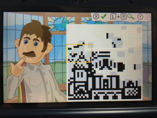
The game is played in its entirety with buttons. It works well enough, but I would have liked the option to use touch controls. It feels strange to play a puzzle game like this without that sort of option available. I also would have appreciated it if there were a couple more pieces of background music to choose from. The one piece that is in the game is quite nice, but as mentioned, this is a bit of a long haul. A little musical variety would have been nice. While I'm picking nits, I also would have liked it if there were a little more fanfare upon finishing a puzzle. The music doesn't even stop, and you more or less just get dumped back to the menu after a simple overlay appears telling you what the image is and how long you took to finish it.
At any rate, the puzzles are the important thing here, and they're quite good. The theme works nicely, and I was happy to see that the subjects didn't just consist of the usual suspects for each location. There's a ton of content here for the price, and the basic concept behind Fill-a-Pix is more than strong enough to keep your attention for hours on end. While it's missing a few options and features that I feel would have made for a more solid overall experience, little of that matters when you're in the thick of uncovering an amazingly-detailed monochrome image, piece by piece. If you like logic puzzles, this one should certainly be up your alley. You can find Phil’s Epic Fill-a-Pix Adventure on the Nintendo 3DS eShop for $7.99.
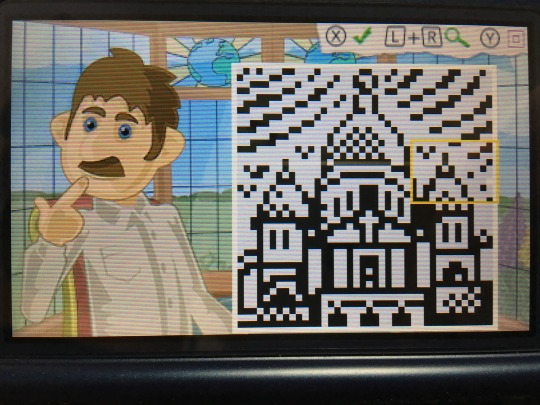
Disclosure: Lightwood Games provided me with a free digital copy of this game for review purposes.
#reviews#nintendo 3ds#gaming#puzzle#fill-a-pix#phil's epic fill-a-pix adventure#lightwood games#eshop
2 notes
·
View notes
Text
War
“Henry have you seen this?” Charles demanded indignantly, plopping his laptop on the table in front of him. Henry looked up from his book to see what had outraged his friend this time—and was surprised to see his own name in bold in the blog post he was reading. “No,” was all he said before turning back to his book. “It’s ridiculous. It’s blatant slander,” Charles was fuming. “Why, what is it?” “It’s a review of the student lit magazine, but I don’t know why he bothered since he seems to hate pretty much all of it. Especially you.” “Well,” Henry shrugged, “to each their own.” “I can’t believe he said all this about you. Just listen, this poet—he means you—appears to us singularly deficient in all those important faculties which give artistical power…He has no combining or binding force. He has absolutely nothing of unity. What does that even mean?” “I guess he thinks I have too much going on in my poetry. It’s a fair criticism, in some ways.” “There’s more though, like,” Charles scanned the article to find his place again, “here—the writer—why doesn’t he just use your name?—the writer’s idiosyncratic excellences, which are those of expression, chiefly, and of a fitful (unsteady) imagination. Can you believe that?” “Well, I’m glad he thinks I have some ‘excellences’.” “He said you have a fitful and unsteady imagination!” “It’s better than saying I have none at all.” “I think he’s the idiosyncratic one, do you hear the way he writes? No one talks like that anymore, no one writes like that anymore—it’s just pompous. And then he goes on for seven paragraphs about your grammar.” “Really?” Henry asked, though he did not look particularly interested. “Just pointing out the smallest, most nit-picky ‘mistakes,’ which I think he might realize are not mistakes at all, just the way people talk, if he ever deigned to interact with anyone less pretentious than he is.” “Caring about grammar doesn’t necessarily make you pretentious.” “I know, but it’s not just that, it’s…it’s everything. Everything about this article screams I’m better than you. Like this line here—this is certainly his best poem, but even these few stanzas have their defects, which are obvious even to the slowest observer. Maybe he thinks so, but I don’t see anything wrong with them, I think your poem is beautiful.” “Thanks. I guess it is a little condescending, but I really don’t see why you’re so upset about it.” “You haven’t heard the worst part yet. He puts in your entire poem, the one about the dying year, and then quotes some poem by Tennyson, and then,” Charles was so incensed that he had to stop and take a deep breath before he could read the offending passage. “We have no idea of commenting, at any length, upon this plagiarism—which is too palpable to be mistaken—and which belongs to the most barbarous class of literary robbery.” He looked up at Henry to see the reaction, and was, if anything, more indignant to see that Henry did not seem phased by it. “He called you a plagiarist, Henry.” “I noticed.” “You’re not even a little bit upset about this?” “Well, I know it’s not true—I’ve never read that poem so I don’t see how I could have copied it—so what difference does his opinion make?” “But if other people read it, if they believe him—“ “Who is he, by the way, I didn’t look before.” “I…don’t know,” Charles frowned. “There’s no signature.” “What about on the homepage?” “Let me see…” he found the page in question, rolling his eyes at the blog’s title—The Raven and the Writing Desk—and its design, which looked like something a rebellious teen might have done in high school. “I’m not sure…the blog description says ‘I put the Poe in poetry’—maybe that’s his name?” “Poe? Hmmm,” Henry paused thoughtfully, “I’ve never heard of him.” “But that’s not the point. He called you a plagiarist, we have to do something about this.” “Why?” Henry saw Charles preparing to explain exactly why, probably at some length, and decided to make his counter-argument first. “It’s on a blog no one’s heard of, written by someone no one’s heard of, about poems no one’s read. If, by some chance, someone does read it, and they want to know, I can tell them the truth.” Then, realizing the truth of this, he asked “How did you come across it anyway?” “That’s irrelevant,” Charles protested. “If I did, someone else might too.” “Well, there’s nothing we can do to stop them.” “But it’s—“ “Not a big deal. Charles, really, let it go. It’s not a big deal.” Charles looked at him in amazement. Not a big deal? Being called a plagiarist, publicly slandered, pettily insulted for no reason at all? It would have offended Charles to see this happen to anyone, but to Henry of all people—the sweetest, kindest man he knew… Henry had never intentionally hurt anyone in his life and had done absolutely nothing to deserve such cruel treatment. Perhaps Henry could shrug it off, but Charles was not going to stand for this. Snatching up his laptop, he retreated to his room, where he began at once to hammer out a scathing response.
#realizing that I hadn't mentioned any of them reading Poe at any point was such a blessing#I had way too much fun writing this#so it's probably going to be part one of a slightly bigger thing#but we'll see#charles sumner#henry longfellow
1 note
·
View note
Link
via medium.com
Blair Neal
Sep 19, 2016
(This is the online version of this article — if you prefer, a formatted PDF is available on my website here for easier reading offline
Additionally, if you are the owner of any images and would like them removed or credited differently, please contact me.)
An artist has a large range of ways they can display their work. Cave walls gave way to canvas and paper as ways to create portals into another human’s imagination. Stained glass windows were early versions of combining light and imagery. Electronic displays are our next continuation of this same concept. A photon is emitted; it travels until it reflects off of or passes through a medium. That photon then passes into your eyeball and excites some specialized cells — when enough of these cells are excited, your brain turns these into what you perceive as an image.
Stained Glass Example — Source
However, standard computer monitors, LED video walls and projection screens offer only a small glimpse of the range of possible visual illusions. Any traditional display can be augmented or used in an unusual way. New displays and technologies are still being actively developed and researched. Some content is suited precisely to being shown on a standard display, like a webpage. Other content is better suited to a space that exists beyond the screen’s surface and enables a sort of suspension of disbelief that this thing is really there. We continue to find new ways to construct the image of new destinations within the eye.
Knowing the range and limits of these different displays is similar to a painter really understanding their choice of paint and surfaces. Spray paint behaves very differently than oil, watercolor or ink. Drying times, color depth, texture, reflectivity, ability to blend colors — these are just some of the characteristics the painter must consider when choosing a medium for their new work. The textures of canvas, concrete, metal also impart a particular surface aesthetic. The same considerations can be a part of a digital artist’s practice when they work with displays.
Additionally, musicians use what is called extended technique to explore the absolute limits of what sounds are possible with their instrument. Mastering an instrument with classical training is one dimension. Extended techniques demonstrate a deep understanding of how these devices function and respond to human input. Things that may sound like mistakes at first can be honed into highly expressive new tools. Violins can be made to sound like cellos with the right bowing method. Video and film artists like Nam June Paik and the Vasulka’s have been exploring extended techniques for displaying video since their inception — but it is important to continue this tradition. There is still much to discover.
Nam June Paik’s Wobbulator
The purpose of this article is to collect and consolidate a list of these alternative methods of working with displays, light and optics. This will by no means be an exhaustive list of the possibilities available — depending on how you categorize, there could be dozens or hundreds of ways. There are historical mainstays, oddball one-offs, expensive failures and techniques that are only beginning to come into their own.
This document will hopefully serve as a reference for artists who are curious about pushing their content outside of a standard screen. Some implementations are incredibly practical and achievable on small budgets, and some require very specialized patented hardware that only exists in a lab somewhere. It is important not to get bogged down in the specifics of the technology, but to recognize that these all exist on a spectrum of information transference that employ light, medium, and brain. By keeping things in these simple terms, you are free to mix, match and re-appropriate to tell new stories.
Contents
Notes on Standard Displays
Brief Note on Holograms
Pepper’s Ghost
Projection on Static Transparent Materials/Scrims
Projection on Water or Fog
Volumetric Projection
Diffusion and Distortion Techniques
Transparent LCD/OLED
LCDs with modified polarization layers
Volumetric Displays (Mechanical/Persistence of Vision)
Volumetric Displays (Layered screens)
Electronic Paper
Flexible Displays
Laser Projectors
Head Mounted Displays (VR/AR/Mixed Reality)
Plasma Combustion
Physical/Mechanical Displays
Appendix and Other References
Notes on Standard Video Displays
It is worth discussing a few notes about the standard displays that most digital artists use. Many of the other things discussed in this article aren’t standalone technologies, but rather techniques that modify or adapt pre-existing technologies into new applications. Each of these technologies could fill several books, so we’ll just touch on some relevant bits.
Standard Monitors
Image Source
These can be a range of different technologies. Cathode Ray Tubes or CRT displays were common up until about 2005 but are difficult to find these days — they do have a lot of unique properties (not necessarily good ones..) that aren’t available in many standard modern displays. Right now, the most common display is the Liquid Crystal Display or LCD and it is in most laptop screens, desktop monitors, commercial TV’s and so on. LCD’s have a backlight, a rear polarizer, a glass layer with electrodes and liquid crystals that react to electrical changes, and a front polarizer. Each pixel has a set of 3 sub pixels with red green and blue color filters that can be combined at different levels to recreate their millions of colors.
Things like Quantum Dots are on the horizon to further improve LCD’s color reproduction and accuracy by allowing more precise tuning of light wavelengths. Plasma displays were contender for LCD for a while, but they have become less popular. Pixels in plasma displays are individually lit which result in a deeper contrast compared to LCD’s. Organic Light Emitting Diode displays or OLED displays operate in a similar principal to Plasma and have started to become more and more common. OLED has a lot of interesting properties since it can be made smaller and thinner than LCD or Plasma, this means that flexible displays and transparent displays are a much more viable option with OLED. OLED is still quite expensive in comparison to LCD’s at the moment, but this will change as the market shifts. MicroLED is another technology that works in a similar fashion but is still very new.
Standard monitors are affordable for most applications, are high resolution which makes them ideal for applications when the view is standing up close, have a decent color and dynamic contrast range, accept a variety of inputs, and are long lasting. Their brightness is suitable for primarily indoor applications. Brightness of these is generally measured in nits or candela/sq meter — most laptop screens are around 300nits at maximum. For outdoor applications, you have to source specially made outdoor monitors that are weatherproof, can withstand a variety of temperature fluctuation, and have a considerably higher brightness rating — some available ones can do 1500 nits or more which would be almost painful to look at up close in an indoor setting.
Of course, these displays have their limitations. They are only viable up to a certain size for a single unit. Most of the largest max out at 120in or 305cm of diagonal image. Past this, they must be tiled together to form a larger video wall, and there are inevitable lines or bezels between adjacent units. Even those larger video walls start to reach a limitation at a certain point where Projectors or LED video walls are a more economical choice. The color and dynamic range of these monitors appears to be decent, but it is actually not as good as you might expect — we are missing out on a whole range of visible colors. Most standard displays are also locked at 60hz refresh rate (the speed that the screen is redrawn every second) which is perfectly fine for most applications like movie watching, but things like gaming monitors have started jumping to 144hz or more. Even though our brain’s visual refresh rate is about 60hz (a huge oversimplification), there are some intriguing things that can be done with a higher refresh rate. Imagine scrolling this page up and down and having it look as natural as a piece of paper moving up and down instead of the commonly jittery experience. There are also researchers looking into using high frame rate or high temporal resolution displays to do things like turning normal displays into higher resolution displays — here is an incredible survey of a range of options with computationally augmented displays. Consumer displays are also typically two dimensional and flat, even if displaying 3D content with glasses or another method.
Projectors
Image Source
I have covered projectors in depth in another article so I won’t go into detail with them here. It is important to remember that they are not much more than a fancy implementation of a light source, an imaging element and a lens. They are best for darker environments, but they tend to be the most economical choice for large scale imagery. It is also easier to blend multiple projectors together more seamlessly.
LED Video Walls
Image Source
LED Video Walls are another common option for displaying digital art on a large scale (also called LED Displays — not to be confused with LED Monitors where the light source is simply the LED backlight). These are usually comprised of individual tiles that are linked together and driven by a special display driver box that addresses the tiles from a standard monitor input. The tiles are generally either single all-in-one RGB LED’s or larger individual R,G and B LED’s that are placed close together. The primary spec of an LED wall is its pixel pitch, measured in millimeters. If you are viewing a wall close up, you want a low pixel pitch — some of the lowest available are around 1.6mm. Larger pixel pitch like 16mm to 20mm is perfectly acceptable if your viewer is really far away from the screen because their eye won’t be able to discern individual pixels as easily. LED walls are also one of the only display types that can be viewable in direct sunlight. Some of them are 3000nits or more of brightness, which explains why they are the display of choice in places like Times Square.
They have a wide variety of models and applications. Some are used as jumbotrons in stadiums, as high end storefront signage, or are used as sculptural stage elements. Some move towards the spectrum of lighting elements and are extremely high pixel pitch. These large pixel pitch tiles can be used almost as “transparent” elements because when the audience is far away, they are able to see through the frame — as in this video wall. Stage lighting examples are the LightSlice, Vanish, and the Saber. Some manufacturers also provide custom LED tile work and can do more unusual shapes like spheres or triangles.
The primary drawback of LED walls is cost, although the prices have been dropping rapidly in the past few years as these become more commonplace. Finding price points for certain elements isn’t usually publicly available but it can cost around $2000 for an individual tile and the driver box can be $5000–10,000. Most LED walls are typically rentals due to the large cost of purchasing them. They do last a long time in the case of purchasing, but even a modest sized wall at a high resolution can run into the hundreds of thousands of dollars very quickly. The cost of installation (for rental or permanent) can also be an additional hurdle since you typically need an experienced technician to set them up and get the pixel mapping established. They also have a particular aesthetic that is suited to viewing from far away. Up close they can be uncomfortably bright, and their pixels can be a distraction. Some stage designers will overlay a black or dark grey rear projection material or even acrylic overtop of the LED’s to soften them and provide a more diffuse look.
Brief Note on Holograms
To get this out of the way early, It should be mentioned that none of the displays mentioned below are in line with the definition of a hologram. A hologram is closer to a photographic medium as it captures an imprint of the light waves that bounce off an object. Most of the media headlines these days with the word “hologram” are typically talking about simple optical tricks or AR. Holograms have taken on a cultural meaning that differs from the scientific definition, similar to the cultural rebranding of “synesthesia” or “literally.” This article by Oliver Reylos has a concise summary of what is considered holographic and what isn’t. In his words:
When viewing close-by objects, there are six major depth cues that help us perceive three dimensions:
Perspective foreshortening: farther away objects appear smaller
Occlusion: nearer objects hide farther objects
Binocular parallax / stereopsis: left and right eyes see different views of the same objects
Monocular (motion) parallax: objects shift depending on how far away they are when head is moved
Convergence: eyes cross when focusing on close objects
Accommodation: eyes’ lenses change focus depending on objects’ distances
Almost all of the displays or techniques in this article have some holographic properties like parallax or multiple viewing angles, but are primarily in a class of their own. Would you call an oil painting a sculpture?
Pepper’s Ghost
Pepper’s Ghost Diagram — Source
Pepper’s Ghost is a classic illusion — it has been around for over a century and is still making headlines. 99% of the time, when you see a headline with the word “hologram” it is talking about Pepper’s ghost.
Historically, the effect comes out of Phantasmagoria, a fascinating tradition of theater illusions that were developed in the 18th and 19th centuries that frightened audiences with never before seen images of spirits and floating otherworldly beings. The Magic Lantern is another one of these early theater effects and it is one of the earliest forms of the projector. The name Pepper’s Ghost comes from John Henry Pepper who popularized the effect in the mid-1800’s with his friend Henry Dircks (who arguably developed it before Pepper). However, the illusion was first described in the 1600’s by an Italian scholar named Giambattista della Porta in his book Natural Magic:
Wherefore to describe the matter, let there be a chamber wherein no other light comes, unless by the door or window where the spectator looks in. Let the whole window or part of it be of glass, as we use to do to keep out the cold. But let one part be polished, that there may be a looking glass on both sides, whence the spectator must look in. For the rest do nothing. Let pictures be set over against this window, marble statues, and suchlike. For what is without will seem to be within, and what is behind the spectators back, he will think to be in the middle of the house, as far from the glass inward, as they stand from it outwardly, and so clearly and certainly, that he will think he sees nothing but truth. But lest the skill should be known, let the part be made so where the ornament is, that the spectator may not see it, as above his head, that a pavement may come between above his head. And if an ingenious man do this, it is impossible that he should suppose that he is deceived.
Pepper’s ghost is very easy to implement. The simplest version involves a transparent reflecting surface (a sheet of glass, plastic, or a half silvered mirror), and an image source (a monitor, projection screen, or a lit source). There are two versions of this effect that are commonly used — the classic one from the 19th century typically involves two separate physical spaces and specialized lighting. The modern version of Pepper’s ghost involves a digital screen (monitor, or projected image) and a half silvered mirror or specialized film designed to be invisible to the viewer. This version is also used for teleprompters where the camera lens is positioned behind the mirror facing the speaker. Both are essentially the same in principal.
Glass mirrors are the most accessible way to achieve this effect (it can even be done with reflective plastic and a smart phone), but at a certain point it becomes difficult to scale the glass to be large enough. For stage productions, there is specialized plastic film that can be employed to reflect much larger surfaces. Musion is the primary company that comes up while searching, and another is Arena 3D. It is worth noting that Musion claims a patent on a version of this 100+ year old technology and has hit “imitations” with lawsuits in the past. It is also easy to source your own film from 3M or other sources in Asia — another version of the film is manufactured by DuPont.
Image of reflective foil setup for stage production — Source
Carefully controlled lighting is essential for this effect to look its best. The source of the image must be bright in comparison to the surroundings behind the transparent surface. The observer should also be in a very dark space so their own reflection doesn’t show up in the mirror. It is also helpful to have something slightly visible behind the transparent surface so that your floating image has something to float overtop of and give the viewer the parallax depth cue. The effect can be striking if combined with props behind the mirror — like a person sitting on a chair or animations that swirl around an object. However, there are limitations to this depth effect.
Pepper’s Ghost Pyramid — Source
Peppers ghost is still very much a 2D effect and does not present an image in three dimensions. It is just a mirror reflecting another flat plane. Parallax between the reflected image and the background is what gives our eyes the illusion of the content floating in mid air. A false sense of 3D can be achieved depending on your source and how the reflecting surfaces are arranged. There are some implementations of the effect that put 4 mirrors in a pyramid shape under a monitor (some have marketed themselves as holograms — sparking controversy). By having the monitor display a different image for each mirror, the observer gets more of a 3D view as they walk around — even if it is just 4 discrete viewing angles. Head or eye tracking would have to be employed to make the effect a little more convincing, but then it would only work for one observer at a time. As it usually functions, the effect may look best from one vantage point, especially if you are trying to align it with an object behind the surface. This misalignment can be minimized by having your observer be further back so when they move their head, the parallax isn’t as great as if they are right in front of the screen.
Projection on Transparent Materials and Scrims
Image of Bill Viola’s The Veiling — Source
Projecting on semi-transparent materials is essentially a variation on the Pepper’s ghost illusion. It is also an effect that has been used in theater for a long time. In contrast to Pepper’s ghost, this technique uses a transparent material to catch (not just reflect) the light from a projector. The viewer can still see through the material, but the projected light is scattered and appears to be transmitted from the material. Viewers can still see through the material allowing for a depth effect from parallax, but the illusion is still flat and two dimensional.
The implementation of this technique is one of the cheapest and most accessible on this list. You will need a semi transparent material and some means of projecting an image. The material you use depends on the scale or size of the end result and the type of effect you are going for. You also must consider whether you want to use front or rear projection. Rear projection (with the viewer facing the projector lens) will produce a noticeably brighter hotspot depending on the material used and where the projector is, and front projection means the image will spill behind the surface a little bit which may result in some doubling.
As far as materials to use, on a small installation you may be able to get away with just a piece of fabric like tulle or netting — things like bridal veil material. White fabric will catch and transmit light the best, but sometimes black can still work and give you a similar effect with the fabric appearing more “invisible.”
If you are trying to have an image appear on a storefront window or piece of glass, you will need a specially engineered film that is nice and transparent but still collects a lot of light from your projector. The proper film for glass can be very expensive for large pieces, so keep that in mind. One source has it at almost $1200 for a piece that is 2.2m by 1.2m. Here are some possible vendors for this kind of film: [One] [Two]. You can get away with cheaper materials, of course, but the effect may be very different. Cheaper or DIY material may be either more opaque (yielding a brighter image but less transparency) or too transparent (yielding a faint image). Projecting on glass will certainly show something if there is significant dust on it, but the effect will be very dim.
Lucinda Child’s piece “Dance” featuring scrim projection
To achieve much larger images for theater or stage, fabric is the most economical choice for a scrim. You can get very large seamless swaths of fabric for the purposes of stage projection. Some fabric will have larger holes in its netting which will make it more transparent but will also cause your projected image to be less bright as well, in addition to dropping the sharpness and fidelity of the image. Here is a great resource for more info on stage scrim projection materials, including silvered fabric. You can also layer these materials to get several planes since the light is passing through. The cone of light from the projector will cause the image to be larger or smaller on each depth layer depending on whether you are projecting from the front or the back. You can also only go so far with layering before your light runs out or just gets out of focus.
Similar to the requirements for Pepper’s Ghost, this technique requires very controlled lighting. You will need to balance the ambient light that is hitting your fabric so you can preserve the illusion of a floating image — otherwise it can just look like a standard projection screen that you can see through. Contrast is key here. It also helps to have the space behind the image not be completely dark to give the image more dimension. If the viewer can see behind the image then they get the layered effect and the sense of parallax that helps it appear more 3D even if it is still just 2D.
Content that works best on any of the semi-transparent materials tends to be imagery that does not fill the entire projected rectangle. The optimal approach is to have your content sit on a field of black, so that that it appears to have no bounds. A vignette or feathering on the edges can also help if you have elements that enter and exit from the sides, otherwise the viewer will see harsh edges. Semi transparent material also causes the projections to have a slight glow to them — the light beams get slightly diffused when passing through the material which tends to soften the sharpness of the image a little bit.
Projection on Fog or Water
For this technique, instead of a static material like cloth, you can use water, haze or another atomized fluid to catch light and provide a semi-transparent screen.
Water Screens
There are two types of water based projection surfaces — either the water is moving upwards or falling downwards. For an upward blast, these rely on a high powered water jet and a special attachment that spreads the water into a large flat half circle screen of water and mist. The size of the screen is limited by physics and the power of the water pump — most companies can generate screens that are in the range of 20–30m wide and about 6–10m high. This mist is then usually hit with rear projection by a high powered projector. This results in a semi transparent screen that can be hidden or revealed at the flip of a switch in the middle of a body of water.
Falling water screens are much more manageable to install indoors. These have a mechanism that just pushes water through spaced out nozzles on the top piece and collects and recycles the water in a basin on the bottom. Some systems are even able to selectively open and close the top nozzles to allow water to fall in different ways.
The effect of water screens is very unique due to the haze of smaller water mist particles causing a halo and giving the 2D image more volume. There is also a textural quality to the water and mist that you should plan on, as it can add some glow and reduce sharpness a bit. Rear projection works best on these screens, so there will be a persistent hotspot behind the content, but this may not impact too much depending on your setup. Front projection is possible, but you run the risk of doubling the image onto other surfaces behind the semi-transparent screen.
Fog Screens/Laminar Flow
These screens rely on a steady controlled flow of haze or water mist to create a thin layer of semitransparent fog that can be rear protected. A series of valves directs the mist into a narrow sheet, and the projected light is refracted off the particles. The haze can be water or oil based.
This technique works best indoors because of minimal air currents and the light contrast needed for the best illusion. Due to physics, this technique is limited by the screen size that can be created. A lot of commercially available screens can only get to something like a 2m by 1.5m size. The width can be extended with multiple mist units, but the height is the primary hindrance since the mist gets less dense after a certain distance from the valves and fans. Also, since this screen is so transparent, the viewer will get a strong hotspot from the projector and the content will shoot right through onto adjacent surfaces. Commercially available units are available, but aren’t cheap — some are almost $20,000 or more. DIY options also exist, but require a lot of materials. Getting the haze production right in a DIY setup is probably going to be the biggest challenge since most fog machines tend to accumulate in an enclosed space rather than dissipate.
Volumetric Projection
Volumetric projection is a technique that is a much more technical application of projecting into a thin sheet of fog. Instead of having light come from a single point, it uses multiple light sources or specialized optics. By combining these sources with the additive quality of projected light, this technique is able to create dimensional images with multiple viewing angles. There are a few scientific papers out there on similar processes, and we’ll discuss laser plasma displays later on that share some characteristics.
Light Barrier by Kimchi and Chips is likely the first piece to use this technique. With Light Barrier, the artists project images onto an array of parabolic mirrors. Using custom software that analyzes where the pixel’s light ends up after hitting the curved mirrors, they can approximate the path of light from each projected pixel. When this is done for the entire array of mirrors, they can calculate where in 3D space each pixel path intersects another after hitting the mirrors. The projection area above the mirrors is filled with haze from a fog machine — the medium for these intersecting light beams. If more beams illuminate a particular location in 3D space, then that spot will appear brighter. By hitting several of these overlapping spots together, the combined focal point becomes brighter, and images can be formed in the haze. There are other ways to achieve similar variations on the effect that involve multiple projector sources, but this gets logistically complex and expensive very quickly.
This technique currently has its limitations. Making recognizable images requires a calculation engine and custom software, meaning you can’t just drop in any content and have it show up in 3D. The workflows for generating content based on depth maps are improving, but there is also going to be an upper limit to how fine the details can be. It may take several dozen converging pixels to make a recognizable voxel — so once we have higher resolution projectors we might be able to put together even more complex visuals. Full color projection with this technique is also a challenge because the overlapping colors add together and change the colors for different viewing angles. White is also going to show up the best for an effect that is already going to be slightly faint compared to other projection methods. Nonetheless, it is an exciting area of discovery and still has a lot of potential to explore.
There are also variations on this idea that don’t involve fog or specialized optics. A simple way is to use layers of fabric — the image will be the same on each layer but will get larger or smaller on each pass. There is also the method employed by the Lumarca where a grid of thin strings are stretched to make a large volume. Each string in the volume can then be precisely mapped by a few columns of pixels from the projector. When the location of each column is then mapped to a known 3D space, it becomes easy to render simple graphics on the array of strings that appear to have volume. The strings transmit the light a bit, so it is easy to see from all sides. This method also has some density and fidelity limitations but is also easy to scale.
Diffusion and Distortion Techniques
This is a challenging category to compartmentalize, but there is a lot of great work to consider here. Sometimes you don’t need a cutting edge display or experimental hardware to do something new. By placing different optical materials in front of a monitor, projection or LED video wall you can create something that doesn’t feel like a standard display at all. Of course it can be a little more challenging to show sharp coherent images with a techique like this, but sometimes a piece is much more about playing with texture and motion more than legibility.
Mary Franck’s piece “Diffuse Objects”
There are a few examples of this kind of work. One of the more striking examples of this kind of thinking are Mary Franck’s pieces Diffuse Objects and Gilded and Unreal. They combine a standard LCD screen with custom formed materials. The content show on the screen interacts with the materials in a way that gives the light and imagery more physicality than it would on a flat screen.
Another piece in this area is Lucy Hardcastle’s Qualia. This is a touch sensitive version of a 3D object that has light passing through it. I’m only speculating on how this works, but from the video it looks like it is projection (note DLP projection rainbow bands) from underneath into a 3d form that has been frosted. I suspect the touch sensitivity is done using IR light and a camera in a similar way to rear projection touch tables.
If you’re not into diffusion and blur, you can can be a more precise with your light redirection techniques by using fiber optic materials. Yeseul Song’s Glow Box is a fabricated object that uses fiber optics and a projector to produce low resolution images that have been bent through the fiber optic cables.
Yeseul Song’s Glow Box
Working with fiber optics can be expanded into longer or larger forms as well. MIT Mobile Experience Lab made something called The Cloud in 2008 that was a large cloud shaped structure that had hundreds of fiber optic strands coming off of it like hairs. Each strand could be individually illuminated and from the video it seems there is an interaction method to let people touch strands and have them respond. Very basic imagery and text could be rendered across the fiber optic strands with what I hope wasn’t an individual LED per strand, but in 2008 that may have been the only option for a shape that unusual.
If strands and pixels aren’t your thing, there is also a material called Ulexite that is essentially a natural fiber optic rock. Also called “TV Rock” this material has a crystal structure that appears to project the image of whatever is on the bottom of it to the top surface. I’ve only seen small pieces of it, but if you had a larger polished piece, you could do some unusual surface mapping effects that would look very different compared to just glass or densely packed fiber optic strands.
In another related direction, some scientists are investigating a technique that uses specially formed plastics that geometrically model caustics so that the final material can display a coherent image when light is focused through them just right. Here are some examples of this technique in practice — One two.
Finally, there are techniques that are just doing a low resolution diffusion or reflection of light like pixel displays. There are tons of examples of this Jason Eppink’s Pixelator is a piece that co-ops public advertising monitors in NYC and distorts them into more pleasant abstract designs using diffusion and foamcore frames. Jim Campbell’s work has been a great example of this kind of low resolution image making for a while as well.
Transparent LCD and OLED
LCD’s are a transmissive technology (in contrast to Plasma or LED that are emissive technologies). This means that light passes through a medium to get to your eye. The backlight that is used for LCD’s is meant to provide a strong and very even field of light that gets passed through the actual liquid crystal/polarizer element. Essentially, the backlight is a flat light box that you can fade up or down, but it doesn’t have much else to do with creating the image itself.
A liquid crystal element can function perfectly fine on its own, without a proper backlight. This means that an LCD can effectually work as a transparent monitor if you are keeping some sort of light source between the screen and the viewer. Using an LCD this way yields a lot of interesting possibilities.
A common usage is to put an object in a box with a strong, even light behind it, and have at least one side of the box be a transparent screen. This allows you to superimpose sharp graphics that appear to float overtop of the object inside. This can be combined with a standard touch screen for interactive transparencies. Also, since LCD’s do such a good job at blocking light, when they are displaying black they are nearly impossible to see through, providing a unique reveal effect. A bright point light source can be put behind them to use the LCD as a sort of projection mask — resulting in a variation on a normal projector (your projected image will probably be fuzzy without focusing lens elements though).
Some artists and studios have also been able to source custom LCD elements that are closer to the LCD’s that are used in old pocket calculators with only a few elements that can be turned on and off. Pieces that come to mind are Hypersonic’s Patterned by Nature and Iris by Hybe.
A challenge with transparent LCD’s is sourcing usable ones. There is the DIY route, which I cover a little bit in the appendix — but the visual results aren’t great. Only a few commercial vendors supply these screens, and because it is a specialty item, they tend to be more expensive than comparable screens with backlights. You may also be limited by certain available sizes — making it difficult to scale these to a large application. Even if the screens were tiled together, at least one edge needs to have the driver board on it, so its not as easy to tile them together like normal LCD walls. The color reproduction with these tends to be a little duller than the vibrant colors you’re used to. Their transparency can be cloudier compared to regular glass since the polarizer and liquid crystal layers are sandwiched in there as well. I’ve found that black, white and gray content is the most striking on transparent LCD’s.
Samsung’s Transparent OLED — Source
Transparent OLED’s, however, are a different beast. OLED is an emissive technology and therefore does not require a backlight. This means that brightness and color reproduction will be much better compared to transparent LCD. Their brightness still isn’t going to rival a normal display, so don’t expect to use them outdoors or in a brightly lit space. Also, in contrast to a transparent LCD that works equally on both the front and back, for now transparent OLED is only visible on one side since the emissive element is designed to point in one direction.
Transparent OLED’s are still very useful for a lot of creative applications like being applied to a storefront window without blocking the view or applied onto a mirror so that graphics can be superimposed on top of the mirror. You can also position a camera directly behind them when doing magic mirror digital effects. You can stack multiple OLED’s in front of each other for a layered effect, but there is a caveat. There is a significant darkening effect that occurs when looking through the panels, it’s like a few stops of a neutral density filter — so when you stack them, they get darker and darker as you go backwards. There is also a larger display driver that comes off the back about 8 inches down the long side on the models I have seen, so this limits your ability to layer them closely together for a volumetric display.
As of the end of 2017, transparent OLED screens are not currently being manufactured anymore. Samsung is the only company that ever made these 55” panels — so even if you see Planar or other companies selling or offering transparent OLED, they are always using the Samsung panels on the inside but possibly their own drivers. The reason for Samsung’s decision to end-of-life these display panels is not public knowledge, but there is some speculation as to why. The probable reason is that these screens were difficult to manufacture and had a low yield rate of functional units which would make them less profitable to continue making.
Now that Samsung has stopped manufacturing these panels, be extremely wary of anyone offering them for sale since their lifespan and quality could be questionable. There are probably less than 100 currently available globally and there is no telling how pristine they are. Just like standard OLED, there is a big potential for screen burn-in and loss of luminance over their lifetime. Renting is the best suggestion for anyone looking to use them for an installation. Some potential rental sources I’ve come across are ABComRents and Oxygen Eventworks.
LCDs with Modified Polarization Layers
Karina Smigla-Bobinski’s SIMULACRA — Link
Besides being turned transparent, LCD’s have another trick up their sleeve involving light polarization. By removing one of the polarization layers, the screen will look white to a viewer until they look through another polarizer. Below, I’ll attempt to describe how this works.
A full explanation of the science behind wave polarization is a little bit outside of the scope of this article, but there are some links in the references section as the end of the article. This video is a pretty solid explanation of polarized light and its usage with cameras. I encourage you to look into it because there are a lot of other great effects that can be employed via polarization. My explanation will be simplified in order to stay concise.
LCD Structure — Imace Source
You may remember from Physics class that light sometimes behaves as a particle, and sometimes as a wave. This light wave has a frequency, an amplitude and a rotation or polarization. As stated before, an LCD works by employing a backlight, a pair of linear polarizers, and a liquid crystal layer. When all of the light particles come off the backlight, they do not have a uniform polarization — they are just going all over the place. As they pass through the back polarizer, specialized molecules embedded in thin columns absorb any light that doesn’t have a particular polarization. The polarized light then passes through the liquid crystal layer. When the liquid crystal receives current, its molecular structure changes and it provides a transparent tunnel that can be variably twisted. The twist in the liquid crystal gives us a way to electronically modulate the rotation of the light wave.
As the light exits the liquid crystal and arrives at the front polarizer — this is where the magic happens. The front polarizer is the exact same material as the back polarizer, but its physical orientation is perpendicular to the back polarizer. This offset orientation effectively blocks or absorbs light of a particular polarization. If the light passes through the liquid crystal without being twisted, you will get a black pixel. If the liquid crystal twists the light 90º so that it passes through the front polarizer — you will get a white pixel. With the red/green/blue color filters on each pixel, the video signal is able to tune the wave orientation passing through each color to produce the millions of colors we see on an average display. Again — this is a very simplified explanation that glosses over a lot of important details related to different LCD technology.
So with all of the above in mind — if we remove the front polarizer, what happens? Now there is nothing to absorb the light that passed through the front polarizer and the viewer will just see white light. However, if you put a polarizer back in front of the screen, everything will appear normal again. This polarizer doesn’t need to be right on top of the screen either. The polarizer can be in glasses that the view puts on or it can be placed meters away from the screen.
Moving polarizer layers on top of a modified LCD
There are a lot of interesting possibilities available for these screens, but actually getting one to try is another matter. See my notes in the appendix on how you might make one yourself from an existing LCD.
Flavien Théry’s La Porte — Link
This technique is great for an unusual reveal to the viewer since it just looks like a white screen otherwise. The polarizing film can be placed at any distance from the screen and still allow the screen content to be visible, as long as the film is between the viewer and the modified LCD. You’ll notice that depending on the way that the film is rotated relative to the screen, you can get things like inverted or warped colors since you are blocking different orientations of light. Also, due to the properties of polarized light, the content can be seen via the reflection off of other objects, or if you stick the polarization film on top of a mirror. The artist Flavien Théry has some amazing pieces that employ modified LCD’s and polarization film. In his piece La Porte he has a small door shaped object made of reflective material on top of a modified screen and the content is only viewable through the reflection on the door.
Flavien Théry’s Contraires — A somewhat mind-bending use of modified LCD’s and polarizers
Unrelated to LCD monitors, light polarization is also a technique that can be used with projectors as well. Many 3D movies in cinemas have different systems to pass the light through a polarizer (either dual projectors with separate polarizers, or a spinning polarizer in sync with the framerate). To preserve the polarization of the light, many of these setups also require a specialized silver screen material or paint. The view is usually given either passive (each eye has a polarizer in a different orientation) or active glasses (which shutter each eye in sync with the projector) to ensure that each eye sees the image that is intended for it. I haven’t found a good shareable example of polarized projectors being used in an unusual or artistic way, but there are definitely some possibilities out there.
Volumetric Displays (Mechanical/Persistence of Vision)
viSio Volumetric Swept Volume Display — Source
With Volumetric Displays, there are a couple different flavors, and in this section we’ll cover displays that work with the principle of persistence of vision, and are also known as swept volume displays. Volumetric Displays have been discussed in science fiction for decades and have been researched extensively since the 1960’s. Here is a 1969 paper from Bell Labs on a technique that uses a loudspeaker to vibrate a reflective mylar sheet in sync with a CRT to make an image volume.
This type of volumetric display usually uses a 2D display element in addition to a mechanical apparatus to move the display quickly enough (either laterally or radially) to give the illusion of volume. You can buy persistence of vision (POV) LED toys at carnivals and festivals that are the same basic idea that is found in the more complex setups discussed below. Crayola even made a toy a few years ago called the Digital Light Designer that let kids draw on one of these displays in real time. There are also more sophisticated LED based setups such as the viSio or voLumen that are mentioned in the links section.
These volumetric displays allow for one of the best impressions of 3D physicality and presence because the viewer can walk around and view different angles of the same image. The downside is that their mechanical nature makes them difficult to scale to larger displays with finer resolution, and the fact that they are moving so quickly can make them quite dangerous in certain situations. Some techniques can also be difficult to capture reliably or smoothly on video because the refresh rate may be out of sync with the camera’s frame rate.
There have also been attempts at combining mechanical motion with more sophisticated displays like CRTs, projectors or LCDs. One of the earlier successful examples of these screens is Barry Blundell’s volumetric cathode ray tube work. He did some experiments in the 1990’s that used a specially designed glass tube, a spinning phosphor plate and multiple electron guns. Here is a video of that display in action.
Barry Blundell’s Cathode Ray Sphere -Source
The Perspecta by Actuality Systems came in 2001 and followed a similar approach, but used specialized projectors and a rotating screen instead of electron guns. Here are some stats on the capabilities of the early version of the Perspecta:
“This computation is performed on a high-end NVIDIA GPU within the Volume Rendering Unit, and the results are stored in the Core Rendering Electronics (CRE). The CRE drives three Texas Instruments DMDs (Digital Micromirror Device) at approximately 6,000 frames per second with these slices, which are projected onto a diffuse screen that rotates at 900 rpm. The result is a crisp, bright, 3D image that can be viewed from any angle.”[Link]
Perspecta Diagram — Source
A more recent version of this type of display is the Voxiebox by VOXON. It uses a high speed scientific projector and a rear projection platform that is moved up and down extremely quickly. The movement of the platform, the refresh rate of the projector and the content that is being drawn are all synced together by software. As the platform moves, a different slice of a 3D image is projected. As these slices are projected, the viewer’s brain assembles them into a persistent volumetric image.
Currently the Voxiebox system has a perceived volume of about 25cm x 25cm x 12cm. The Z axis resolution of the Voxiebox display is primarily limited by the frame rate of the projector and the lateral motion of the projection platform. There are also challenges with scaling this display to a considerably larger size for a number of reasons. Moving a much larger platform up and down a greater distance at a rapid pace isn’t outside of the realm of mechanical possibility, but it would be a different engineering challenge to make this display several meters wide and move up and down a few meters multiple times in a second. A larger platform also requires a brighter specialized projector, which comes at its own cost.
Perceptually, the Voxiebox style of display is suited to some particular visual aesthetics — it is better at showing certain types of graphics than others. The projected light is additive on each slice, so while one surface appears solid, it also combines with the light behind it — this is similar to the issues faced by volumetric projection in the other section. This makes very dense imagery move towards the white end of the spectrum as different slices add together for the viewer. Vector style imagery with points and lines tend to be more successful ways to represent solid shapes.
Another example of a mechanical volumetric display is Benjamin Muzzin’s piece Full Turn. He took 2 LCD panels, stuck them back to back and spun them at very high speeds. The power and video signals were passed in using a specially designed slip ring. The bottom ring is fixed and has one end of a cable attached to it. The top layer spins with the LCDs and maintains electrical contact via metal brushes that run in circular channels. As the LCD spins faster than the refresh rate of the screen, it allows it to render volumetric images that move and shift. In comparison to the Voxiebox, this particular implementation presents a different challenge when trying to form coherent 3D images because of the radial motion as opposed to lateral motion.
Volumetric Displays (Multiple Layered Screens)
There are a few different types of this type of volumetric display. One type is known as a Light Field Display or a Polarization Field Display and uses a series of layered LCD’s (or other transparent media) to create an illusion of depth via parallax. This is a simplified explanation because there are a lot of nuanced variations on this concept. The Nintendo 3DS is a well known version of this type of display — it uses 2 stacked LCD’s — the bottom one alternates dark bands so that each eye sees the version of the image that is intended for it.
By stacking each display on top of the other, you are able to create volumetric effects with 3 dimensional content, or more slipping parallax effects with 2D content. The depth resolution is limited by how many displays you can stack on top of each other. It also becomes more difficult to backlight all of the stacked displays so that everything is visible. Each display, its components and polarizing film will cost a little bit of luminance and clarity for the viewer. If the screens are far apart, there is also the possibility of internal reflection between two adjacent screens that can impact the contrast.
MIT Media Lab’s Polarization Field Display — Source
When using this type of display technique to show content, there are a few different approaches and challenges. The most straightforward method is to chop up your images into different depth layers so that you can achieve parallax by displaying each layer on a different screen. This is similar to the method of hand drawn cel animation where the background landscapes are on a different layer than the characters. To achieve more of a 3D volume effect with this method, you would have to incorporate viewer eye or head tracking into the display software in order to display multiple viewpoints in real time. The screens are also only viewable on 1 or 2 sides of a cube, instead of 4 or 5 sides. Your Z-dimension is constrained by how many displays you can stack on top of each other. Blending colors across multiple screens is also a challenge. Stacking dark colors will turn muddy at the end and stacking red green and blue won’t necessarily make white as with other additive light methods. Color filters also impact the brightness, and some projects use grayscale monitors instead.
Getting a video signal to each display is another technical challenge, depending on how many layers you are trying to drive. If you have 6 stacked displays at 1920x1080 — you need to be able to render six 1080p streams at once and keep them all synced together.
LightSpace Technologies has a display that was formerly known as the Depthcube that uses a high speed projector and a series of about 20 LCDs that are used as optical stops, so that each layer of depth can be halted at the correct location. By using special antialiasing techniques, the physical space between the layers can be smoothed so it doesn’t feel so stepped. Here is a writeup with more technical details on how it works. This display has been in development since the early 2000s and has been commercially available at an unknown price point. The primary use case of one of these displays has been in engineering or medical applications. Here is a video of it in action.
Depthcube Diagram and Image — Source
There are some versions of layered screens or display volumes that don’t stack multiple LCDs but combine them with things like layered Pepper’s Ghost, multiple projections on scrims, transparent acrylic, or LED cubes.
Around 2016, Looking Glass Factory developed Volume which was poised to be an affordable multiplane display. It achieved its effect by means of a projector and about 12 layers of angled material that catches a small sliver of the projector’s raster. They used a custom plugin for Unity that allows you to drop a 3D scene into their renderer and have it slice it up appropriately for their volumetric display. In 2017, Looking Glass Factory changed their technology and introduced the Holoplayer One. The Holoplayer One is more of a lightfield display than a layered screen and it uses a high resolution screen, a high density lenticular film and retroreflective material to create a stereoscopic view with 32 different viewing angles. It uses a depth camera for interaction and a Unity Plugin pipeline for rendering custom content. There is also a version of the Holoplayer they are working on that can be combined with a Pepper’s Ghost effect and they are calling it Super Pepper.
Diagram for the Holoplayer One
There are also many pieces or products out there that use a 3D volume of individually addressable LEDs to create a layered volume with more viewing angles but a lower visual fidelity.
Electronic Paper Displays
Electronic Ink Display Example — Source
Electronic Ink or Electronic Paper displays are still a relatively new technology and are mostly found in electronic readers. They have some unique visual qualities that set them apart from any other display in this list.
There are a few different kinds of technologies that are considered E-ink displays, but the common one is a monochromatic electrophoretic display. These work by suspending charged particles in a fluid. A top and bottom layer with embedded electrodes sandwiches this fluid layer, and when the charge changes on a layer, the ink particles are pushed to the top, or pulled to the bottom. When the black ink particles are on top, they absorb light and appear black, and when they are pulled to the bottom layer, that pixel appears white because it is reflecting more light.
This display mechanism means that they do not transmit their own light (except in a few consumer models where a backlight has been added for night reading). Since they are only visible via light from the environment, this means that bright environments aren’t nearly as much of a negative — and that makes them one of the only displays in this list that are viewable in direct sunlight. These displays are also incredibly low energy since they only use energy when changing the screen contents — without power, the screen would potentially hold its image indefinitely.
However, because of the way the technology works, the refresh rate of the screen is very low which makes it unsuitable for a lot of motion graphics. When the screen refreshes, there are also some ghosting artifacts that appear on parts as the ink particles reposition. Some screens will momentarily make all pixels black in an effort to normalize everything and prevent artifacts. Some screens can indeed refresh faster, at the expense of contrast and clarity artifacts. For more on the refresh rates of e-paper displays, check out this resource. They are also typically able to only display monochrome images or a certain level of grayscale — displaying color with these is still an application that is in development but much closer to a consumer reality. Other methods of creating e-paper displays with graphene are also being researched, with the added bonus that they have the potential to be flexible as well.
Making use of E-ink displays in artworks is unfortunately impeded by the fact that purchasing a standalone screen of a significant size is very difficult. A lot of e-paper screens are also made fairly small — usually less than 12in, so even if you could modify an existing e-reader display, it wouldn’t be very large. The consumer demand for these is primarily in e-readers so there is little incentive for the manufacturers to make screens that can be addressed as a normal video monitor with an HDMI input for example. Only recently have companies started producing and selling consumer models or development kits that connect via USB, but only in limited quantities. There are several e-ink development boards that can be addressed with a micro controller, but they are about the size of an index card or smaller.
Visionect is working on development kits for 32" e-ink screens that could potentially be tiled together to create a much larger display, but their price is still quite high compared to traditional displays. Some companies are also working on developing larger e-ink based “pixels” that can be tiled together to make incredibly large architectural elements that can change or be combined with projection mapping.
Larger E-Ink tiles for architectural usage
Flexible Displays
LG Flexible Display — Source
Flexible displays have been appearing in tech news for years, but very few have reached consumers due to their niche uses and currently high cost of production. A few smartphones, such as the Samsung Galaxy Round or Galaxy Note Edge, have these in the form of screens that have a slight wrap around the edges or a curved body. OLED technology is typically used for these flexible displays, although flexible E-ink screens are also being researched. Here is a demo video of a flexible screen.
Making flexible LCD’s isn’t impossible since there are curved TV’s out there, but the cost implications may be huge. OLED, on the other hand, can be manufactured in very thin layers on a plastic substrate. OLED’s also emit their own light, so there is no need for an additional backlight. The screens can be bent or rolled a considerable amount, and only one full edge needs to be connected to the display driving electronics. There is also a greater potential for these to be manufactured in unusual shapes other than rectangles.
Unfortunately, aside from the smartphones that were mentioned and a few curved TV’s, the market demand isn’t incredibly high for these yet. Manufacturing plants will need to adjust to suit their specialized production, so the price is still much higher than LCDs. The market will need to be convinced that a flexible display is a must-have item in order to boost production and lower costs, but the use cases aren’t incredibly compelling yet. One of the intriguing uses of a flexible display is that it can potentially be utilized as a user interface element. The flex of the screen could be sensed by software and used as a gesture in addition to swipe and tap gestures. We will see more and more about flexible displays in the next few years as the technology continues to advance. Here is a 2017 video that features several different flexible AMOLEDs including ones that are used in the iPhoneX.
Laser Projector/Laser Displays
Robert Henke’s Deep Web — Source
Laser projectors have some really unique visual characteristics that make them ideal for the right content and application. Most of them work by shining a combination of different colored lasers (red, green and blue) onto a motorized mirror that moves incredibly fast. They have been around for a while, but due to several factors they aren’t used very regularly in art pieces and performances. Here is a thirty minute video from the International Laser Display Association (ILDA) showing a range of different visuals that can be achieved with lasers. They are are understandably confused with other laser video projectors that usually use a more traditional display and lasers as a light source.
The primary hindrance in working with lasers is that they are quite dangerous. While staring straight into a 10,000 lumen projector may feel uncomfortable, it is not nearly as likely to blind you. A laser light beam is so concentrated that it can cause serious damage by literally boiling the cells in your eyes until they burst and scar. Even a 1 milliwatt laser can cause permanent damage to your eyes if you stare at it, but 5mw and above is where your eye’s natural reflex to blink won’t even protect you — see more details on laser safety here and here. Consumer laser pointers are comparably low powered and will be 1mw to 5mw. Laser projectors on the other hand are going to be 485mW, 1W, 2W or more. Brightness essentially correlates with wattage with these. High wattage beams can be fire hazards or burn the skin if used irresponsibly. It is recommended or required that you use specialized eye protection when working with these lasers because a stray reflection for only a few milliseconds can cause damage. Different states and countries have varying restrictions on the use of lasers in live events and most places require a licensed operator or a variance. The restrictions are typically on which direction the lasers shine, and how far above or away from the audience they should be shining. Some laser projector vendors provide the necessary usage variance when purchasing them.
The danger factor is unfortunate because lasers have a very unique aesthetic. The sharpness of their beam gives them a vector quality that is almost impossible to represent with the pixel density available in today’s projectors and displays. The scanning motion of the mirror makes the drawn lines sort of infinitely continuous instead of being comprised of discrete elements. The Vectrex of the 1980’s had a similar aesthetic.
Example of an image drawn with a laser projector — Source
This mechanical method of drawing has its limitations in that the mirror can only move so fast and draw so much in a given “frame.” If a laser projector tries to draw an image that is too complex, the image can appear to flicker because it can’t actually draw all of the points needed in a single frame, so its “framerate” drops. This flicker effect is painfully obvious when laser projectors are filmed, which makes them an unlikely choice for something you plan to document. Most laser projectors have specifications on how many points per second (pps) they can draw — some of the low end ones can do 20,000pps or 20kpps, and higher end ones can do double that or more. 20,000 points sounds like a lot, but 20,000 per second means you only get something like 330 individual points per frame if you’re trying to draw at 60fps. This means you have to be smart about your content and economical about where your image complexity is.
Additionally, since the laser doesn’t scan left to right, top to bottom like the electron beam in a CRT television, it means you can’t just order your points all over the place, send them to the projector, and expect it to work out. Ideally, the beam should move as little as possible to its next point so that the motor isn’t trying to draw one extreme side and then another — the time it takes to move the mirror that far can have a serious impact on its draw speed. This also means that you’ll really only ever see shape outlines on these kinds of projectors, because filling in a shape would take far too many mirror motions and your eye wouldn’t see it as continuous anymore. The motion of the mirror also limits the “throw ratio” of the projected image. The width of the projected image is typically much smaller than a lot of video projectors that you may be used to — this means you need to be much further back from a surface if you want a larger image. The good news is, compared to video projectors, you’re losing a lot less light when you increase the scale of your image. The specs on a laser projector don’t always clearly tell you the expected width, so you will have to put on your math goggles to figure out the size at a given distance.
The other thing to consider about laser projectors is their contrast and their color reproduction ability. Regular projectors still have issues with their black levels because they are still shining light even when the scene is black, and this lowers their overall dynamic range. Laser projectors don’t have this problem because they only project light where it needs to be, so their lines really pop. However, you’re less likely to have access to a laser projector that can cover a wide color gamut — some cheaper projectors will only give you about 7 colors by mixing red, green and blue lasers. High quality projectors can do a wider range of color mixing. Dimming the beam can also be tricky unless you are using a high quality projector with a good blanking control.
Vanishing Point by United Visual Artists — Source
Head mounted displays
Hugo Gernsback’s Television Goggles — 1963
Head-mounted displays (HMDs) could have their own article by themselves, but they are worth briefly mentioning here. These displays have been around in some form since at least the 1960s. These can be divided into two types depending on whether they are used for virtual reality, augmented, or mixed reality.
HMDs for virtual reality are typically a standard display (primarily OLED these days) and optics that are strapped to a user’s face. Current consumer examples would be the Oculus Rift, HTC Vive and Samsung Gear VR. Software renders a separate image for each eye, and sensors in the headset (or external tracking cameras) allow the software to adjust the rendered camera position to give an illusion of your head being in a virtual space. The brain is extremely sensitive to latency between your head movements and what it expects your eyes to see. If the latency or delay between those two is too high, the sense of immersion is lost and some users can experience motion sickness. To counteract this, the tracking devices and displays are engineered to keep this latency as low as possible. The refresh rate of the display is usually higher than most 60hz monitors, which means that your content must be able to run faster than 60fps as well. The graphical demands of high fidelity virtual reality also means that these will still be tethered to a PC for now (except for the Samsung Gear VR). For AR devices, the computing and display elements are encapsulated in the same device, to allow for more free range wandering.
Toshiba’s 2006 Full Dome HMD — Source
HMDs for augmented and mixed reality have a lot of different display methods depending on the manufacturer and the end goal. Eventually, the difference between augmented reality and virtual reality displays may only be a switch or fader that dims out the “real world” as the generated graphics are given more emphasis. Google Glass uses a prism/projector technique. Microsoft Hololens uses an unusual method of edge lit holography or a waveguide element. Magic Leap is rumored to be some kind of retinal projection technique, but very little is known about it at the time of this writing. In addition to sensors like accelerometers and gyroscopes used to track head position, some of these displays use cameras to augment their visuals. By using computer vision techniques, devices like the Hololens are able to track physical objects in front of the user and augment them accordingly. By combining all of these tracking systems, these displays are able to make elements appear “holographic” since they can render different angles as the user walks around.
Plasma Combustion
Image from paper Fairy Lights in Femtoseconds — Source
This kind of display acts in a similar way to Volumetric Projection, but it is considerably more dangerous and expensive. There are only one or two companies working on this display type right now, and one is Aerial Burton. There is limited information on how this display actually works, so take my layman’s explanation with a grain of salt. This display technique works by focusing high powered lasers onto a point in space. When the energy at that point gets hot enough, the air molecules get ionized and release some photons. Aside from ionized plasma, fluorescence is one, and cavitation is another when involving a fluid medium. Here is a demonstration video of the Aerial Burton display:
Two forms of Aerial Burton’s displays — one with a fluid based medium and one based entirely in air — Source
This display unfortunately has many drawbacks that are similar to those of a laser projector. They still work by moving a mirror very quickly, so there is a limited number of points that they can draw at a given time. There is also an added crackling noise component because of the tiny explosions needed to make the visuals. These tiny explosions can also emit an ozone gas that can be potentially harmful if used in an enclosed space.
Another set of researchers in Japan have been working on a much smaller implementation of this same technique that they are calling the Fairy Lights display system. The primary difference is that this version is touchable. By firing the lasers much faster than the Aerial Burton method, the images are smaller and not as bright, but much safer. The tangible element can be used as an additional cue for interaction with the display. They still have similar drawbacks related to visual fidelity (number of dots per second) and added popping noise (their paper says about 22dB of noise is added when using the display). Here is a video featuring some of the interactions and visuals that can be produced.
Image from paper on Fairy Lights in Femtoseconds — Source
Physical/Mechanical/Kinetic Displays
Image of a Flip-dot Display — Source
Some artists also work with display surfaces that don’t emit light or use optics at all. Most of these displays are entirely custom and work with a massive array of motors or other electromechanical means. Haptic communication is another big one that is being explored with this type of “display.” The line between sculpture and information display is really blurred with these, so its tough to quantify exactly what falls into a display and what is just a lot of motorized elements.
There are some commercially available physical displays such as Flipdot displays. There are just a few vendors for these in the world. These work by using electromagnets to flip a metal disk that has different colors on each side. They are capable of fairly simple graphics since they are essentially just binary pixels. There have been a few installations that have figured out how to make them switch fast enough to do full video representations. There is also an audio component to having so many elements mechanically flipping at once, as in this video of a large 588x216 resolution screen. There is also the potential to develop them to have the discs spin completely 360, which when combined with a variable speed, they would be able to represent grayscale values instead of just on-off.
Danny Rozin’s PomPom Mirror — Source
There are a ton of other variations on this same concept that either use an array of motors or electromagnets. The artist Daniel Rozin has been exploring this concept for years with a ton of different materials — trash, wood, penguin dolls, metal balls — etc. There are also pieces that take this concept into a third dimension and use elements suspended on wires to represent limited forms in 3D. The same concept has been applied to a fleet of drones that were used to render low resolution volumes.
These physical displays continue to get more sophisticated as the years go on. This display was created out of special spools of thread that had a gradient of colors on them. By knowing the motor’s position, the software was able to know which color was currently on the front of the display, allowing them to render pixelated portraits of user generated photos. This one called the Megafaces Pavilion was made of thousands of actuated LED elements that were used to render people’s faces for the 2014 Sochi Olympics.
MegaFaces Pavilion for the 2014 Sochi Olympics — Source
As mentioned, these kinds of physical actuated displays are also used in conjunction with projection to add haptics as another layer of interaction and collaboration. The inFORM from MIT has been the classic example of this for the last couple years. Some researchers are even working on ways to use electrical signals to simulate textures on touch screens — but a full writeup on the future of haptics and displays is one for another article :)
MIT’s inform Haptic Display — Source
Closing Notes
These are just a few of the possible options for display types and techniques of working with light. Once you find a research paper on one, there are a million other paths in the references of that paper. I hope this gave you a good idea of the range of amazing technologies out there — from the DIY $5 option to the theoretical and fanciful. There are other effects we didn’t explore in detail like stereoscopic displays for home 3D movie viewing, lenticular effects and many more. There are also a lot of technologies that never took off, either for reasons of cost, complexity, or ownership. Things like CamFPD’s wedge display, or Electrowetting displays (similar to e-ink) were ones that had great commercial potential only 10 years ago, but never ended up taking off for one reason or the other. Some techniques are quite old and were never acquired as intellectual property and will eventually be available in the public domain. There are whole conventions devoted to advancements in display technology, but much of it never reaches the general public or the artistic community. Lots of great options, ripe for use or modification. The more we experiment and use these technologies, the sooner we’ll get to advance the ones on the fringe. If interest in these alternative displays increases, they will become more normalized and costs will come down, opening the door for even more experimentation.
We’ll be seeing a lot more display developments in the next few decades, so keep your eyes open and see which ones might be a good fit for your artistic vision.
Image: Adam Diston — Cutting a Sunbeam 1886
Acknowledgements:
Thanks to a ton of people for taking the time to read this and give me comments and extra content, it is truly appreciated. A partial list: Kyle McDonald, Elliot Woods, Deborah Johnson, Matthew Ward, Jesse Garrison, Matt Parker, Ali Tan Ucer, Dan Moore, Sean Kean, Jamie Zigelbaum and others.
Appendix A: DIY Notes to Remove the Polarizer from your Monitor
Image of attempting to slowly scrape the film off of a monitor with a razor blade
Since these screens aren’t typically manufactured like this, you will have to open the screen up and remove the polarization layer off yourself. Similar to my notes on making your own transparent screen, this involves opening up the screen and potentially breaking your monitor casing, electrocuting yourself, or cracking the delicate LCD. I broke 2 screens before I got this right, and every manufacturer applies their polarization film differently. Sometimes you can peel it right off, and sometimes it will be applied with adhesive and require a few hours with a razor blade and some acetone to dissolve the adhesive. The film tends to have a “grain” to it, so if you start on a corner and that corner of the film snaps off, try the opposite corner. Pull very very slowly — one wrong move, and you’ll crack the glass holding the liquid crystal in place. The film itself it also very sharp — paper cut style — I sliced my hands up more than once. Patience is the name of the game.
Once you have the film off the screen, you may be saying “Hey! What gives — this film is all blurry!” The explanation is that manufacturers combine the polarization layer with a diffusion layer to improve viewing angles, but this makes the film difficult to use if it is not sitting directly on top of the screen. However, there are tons of online vendors for sheets of linear polarization film that do not have diffusion. If you’re not in the DIY spirit or need to get this done on a massive scale, there are screen vendors listed in the references section that do have the ability to remove polarization film from very large displays and are closer to the supply chain than a consumer could get.
Image of my failed attempt at removing the polarizer — moved too quickly and cracked the glass
Appendix B: Notes on DIY Transparent screens
You can modify an existing LCD monitor to be transparent by opening up the monitor and removing the backlight yourself. Insert boilerplate copy about how you should not attempt this without understanding that you may completely break your screen or cause personal injury/electrocution and the author assumes no responsibility — please be cautious and safe.
Speaking from personal experience, this is a difficult modification to perform on monitors from the factory, quite simply because they are not designed to be used this way. I have done this to 4 or 5 different LCD screens and there is a tremendous amount of variability in how different manufacturers assemble their screens, so there is not a consistent guide that would work for each screen. You may be able to open the screen up, but that may require breaking the internal plastic tabs that hold it together — ensuring that you can’t quite put it together again. You must also go very slowly to ensure you aren’t going to crack the screen or rip or damage the delicate electronics inside.
Once you have it opened up, the backlight and LCD screen are often sandwiched together with a metal frame that must be carefully wedged off. One of the long edges of the LCD panel is going to have a very fragile thin plastic flex cable that traverses the whole side. This flex cable essentially controls each column of pixels individually, so if any part of it gets damaged, you may lose that part of the screen or the screen entirely. Removing this element and its PCB from the rest of the case and the backlight is probably the hardest part of the whole process. Additionally, some screens have an additional diffusion film that is bonded to their polarizer for the purpose of improving viewing angles — unfortunately, this layer makes content behind the screens get completely blurred out.
They used to sell things like transparent LCD’s before they could make affordable high definition LCD panels that can fit in today’s projectors. They were sold as bulky glass panels that could be connected to a computer and placed on top of an overhead projector.
Other resources, oddballs, optics, and more
Please comment or send me a message if there is something else you’d like added here!
Mist/Water Vapor/Fabric/Material:
· Fog Screen
· Heliodisplay
· io2 Technology Mid Air Display
· Periscopista — interactive mist installation
· Tsunami Water Screen
· Silicon Rod Projection Surface
· Aquatique Vendor of Water Curtains
· LCI Jet Screen
· DIY Fog Screen
· Projection on Half Silvered Mirror
· Colloid Bubble Film Display
· Fog screen with Head Tracking
· Interactive Fog Display with tracking
· Holovect 3D Projection display
Pepper’s Ghost:
· Glimm Displays Film Vendor
Volumetric Image Displays:
· Volumetric/Computational Display Survey PDF
· Wikipedia Entry
· Hackaday list of POV displays
· Long Exposure Photo Volume
· Water and Oil Surfactant
· voLumen
· Hublot Sphere
· Holovizio
· Sony RayModeler
· Volumetric Display based on Mylar Beam Splitter and LED Backlit LCD
· Patent on varifocal beamsplitter volumetric display
· 360 Light Field Display
· Multiple projector and rotating screen display
· Overview of other volumetric displays
· Paper on progress in Volumetric Displays
· Actuality Systems Overview
· List of Publications from Gregg Favalora on Volumetric/Autostereoscopic displays
Layered Volumetric Displays:
· Lumarca
· Tensor Display
· Layered LCD with Polarization Layers
· Layered Pepper’s Ghost example
· Crayolascope
· MIT Tensor Display
· Puredepth
· DepthCube Info
· LightSpace Tech — Maker of DepthCube
Diffusion/Light Distortion:
Diffusion and Light Refraction techniques:
· https://yeseul.com/Glow-Box
· http://pleaseenjoy.com/projects/personal/abstractor/
· https://jasoneppink.com/pixelator/
· http://www.maryfranck.net/portfolio/diffuse-objects/
· https://www.lucyhardcastle.com/qualia/
· https://www.youtube.com/watch?v=R00IvqcI9jU&app=desktop
· https://www.sofiaaronov.com/refraction
Volumetric Projection:
· Light Barrier by Kimchi and Chips
· Birth of light by WOW
· 3 projector rabbit
Laser Projector:
· Kvant Lasers
· United Laser
· Phaenon projector
· X-Laser Projectors
· Guide to Laser Shows
· Nightsun Specialized Illuminators
Lenticular/Light Field:
· Leia Inc. Light field Display
· Nvidia Near-Eye Light Field Display
· 2007 Exhibition on Stereoscopic Displays
· Parallax Barrier Display
· Compressive Light Field Projector
· Studio Roosegarde — Beyond Lenticular
· Multilens display for multiple views
Flexible Displays:
· Problems Facing Flexible Display Manufacturing
· Flexible OLED overview site
· Holoflex Flexible 3D Display
Head Mounted Displays:
· Toshiba Head Mounted Display 2006
Mechanical/Physical Volumetric Displays:
· DIY Helical Display
· Lumarca
· Perspecta Systems Wired Article
· Perspecta Systems Article
· 3D printed Helix Display
E-Ink Displays
· 32" Electronic paper development kit
· Notes on E-Ink Refresh Rate
· Dasung 13.3" E-Ink/Paperlike Display for $1300
Haptic Displays:
· MIT inForm
· Ultrasound Haptic Display
Transparent LCD References:
· Custom Display Manufacturer based in Korea
· Transparent OLED 2.0" Panel Vendor
· Iris by Hybe
· Potential Vendor: Crystal Display Systems
· Hypebox Transparent LCD product
· Transparent LCD Bus to Mars Lockheed Martin Project
· Evoluce for Transparent LCD and OLED
· CDS Transparent Faq
· Planar Transparent OLED
· Stimulant writeup on Planar Transparent OLED
· Pro Display Vendor
· DIY Screen Removal
· HybeBox pre-built transparent LCD display box
· “Transparent” LED Wall (spaced out slats)
· Hypersonic — Patterned by Nature
LCD with Modified Polarizing layers:
· Polarizing Filter Source — API Optics
· Polarized Light Explanation Video
· Brewster’s angle
· Lynx Modified Polarizer Advertisement
· Flavien Théry
· Flavien Théry Artist Page
· Simulacra by Smigla Bobinski
· Ryo Kishi
· Dual Polarizer Layers
Physical Mechanical References:
· Random international Light Points
· Sand Drawing with Magnets — Sisyphus
· Studio Roosegarde — Flow — Fan Display
Miscellaneous/Unusual/Light Art:
· Large Lenticular Print
· Another Great survey of various display tech
· Microlens Array Example
· Paramagnetic/Electroluminescent Paint
· 3D Printed Optics Lightguide
· ClaytricSurface Haptic Deformable Screen
· Spatial Light Modulator Wiki
· Fiber Scanned Displays
· Edge Lit displays
· Oddball Television History Links
· Measuring luminance of a surface
· Dynaflash High Speed Projector
· Quantum Dots
· Liquavista e-ink
· Color e-Ink Info: Interferometric Modulator Display
· Qualcomm’s Mirasol Color e-Ink technology
· Good Resource for Hacking CRT’s
· Printed Optics
· Cinema Snow Globes
· Encoded Mirrors by Florian Born
· Vibrating projection lens and lenticular combination
· Solace by Nicky Assmann
· 360 Video Rigs
· Project FEELEX Haptic Research
· RePro3D Parallax Display
· Cylindrical Lightfield Display
· HaptoMirage
0 notes
Link
via Politics – FiveThirtyEight
The most important effects stemming from Justice Anthony Kennedy’s retirement will be on how the Supreme Court rules on landmark cases on issues ranging from abortion to gerrymandering. But there are fewer than 20 weeks between now and the midterm elections, and Kennedy’s announcement also has the potential to affect the composition of the next Congress.
Betting markets see the news as a wash as far as the midterms go.1 But betting markets are sometimes pretty dumb, so let’s work our way through a pair of decent arguments I’ve seen for why Kennedy’s retirement is more likely to help Republicans than Democrats politically:2
Argument No. 1: Kennedy’s retirement will help Republicans close the “enthusiasm gap”
One way that Kennedy’s retirement could help Republicans is by narrowing the enthusiasm gap between Democrats and Republicans. Here’s how National Review’s David French puts it:
Heading into the midterms, Republicans were desperately worried about an “intensity gap.” Democratic voters seem prepared to turn out in huge numbers. Republicans — while holding firm in their support for President Trump — lacked the same excitement. Special elections were swinging strongly Democratic, and even though the generic preference numbers were trending closer, most observers thought Republicans would struggle to get their voters to the polls. I’d say those concerns are eased a bit today.
After all, for an immense number of base GOP voters, judges aren’t just an issue. They’re the issue that drives them to the polls. Republicans are all over the place on immigration policy, trade policy, and foreign policy. Divisions in the party are deep and real. Those divisions disappear when judges are on the line. We can debate all we want about Russian influence on the 2016 election (or about the effect of the Comey letter), but one thing is certain — if Evangelicals and other conservatives weren’t afraid of the impact of a progressive Supreme Court on their fundamental liberties, Donald Trump doesn’t win. A new Supreme Court pick will galvanize the entire base for months.
This is a well-argued case. French is certainly right that an enthusiasm or intensity gap is a massive risk for Republicans. If the midterm elections look more like the special elections we’ve had so far this cycle, in which Democrats turnout significantly outpaced Republican turnout, the GOP is very likely to lose the House and the Democratic wave could reach epic proportions. But without that enthusiasm gap, control of the House looks like more of a toss-up, at least based on the current generic ballot average.
Democratic candidates will undoubtedly also try to use the Supreme Court as a wedge issue. If and when Trump’s nominee is confirmed, they’ll pivot to telling their voters about how a Republican-chosen replacement for Ruth Bader Ginsburg (who is 85 years old) or Stephen Breyer (79) would be an even bigger problem and how it’s therefore crucial that Democrats take control of the Senate.
The catch, though, is that the Democratic base is already very motivated: Motivated by the Russia investigation, by Republican efforts to repeal Obamacare, by Trump’s overall unpopularity, and so forth. They might not need the additional motivation, whereas Republican voters perhaps do.
Also, there’s some evidence Republican voters are more motivated in general by the Supreme Court than Democratic ones. In the 2016 national exit poll, 21 percent of voters said that Supreme Court appointments were the most important issue in their vote, and they split 56-41 for Trump.
But let me pick a few nits with French’s claim. One questionable assertion is his idea that “a new Supreme Court pick will galvanize the entire [Republican] base for months.” That may understate how many other stories the Supreme Court pick will compete with for attention. The news cycle moves very quickly these days, and Trump’s nomination of Neil Gorsuch for the Supreme Court last year was a major news story for only a couple of weeks. The death of Antonin Scalia and the Republican refusal to consider Barack Obama’s nomination of Merrick Garland also did not gain much traction as a news story in the 2016 campaign given how much else was going on.
Perhaps, as the exit poll data implies, the Supreme Court was an overlooked issue in 2016 that was more important to evangelical voters and other parts of the Republican base than the media assumed. But it was not necessarily a top-of-mind issue to these voters. The exit poll question specifically prompted voters to think about the Supreme Court. But when Gallup and other pollsters ask open-ended questions about what issues are most important, the Supreme Court doesn’t really register. Nor does abortion, for that matter, with issues such as immigration and the economy rating as being much more important.
Also, assuming Trump has his choice confirmed by the Senate before the midterms, the Supreme Court will arguably be more of a backward-looking issue in 2018 than it was in 2016. I say “arguably” because Kennedy probably won’t be the last justice to retire under Trump; liberals Ginsburg and Breyer are retirement risks, as is conservative Clarence Thomas. Still, in 2016, voters were deciding on an open Supreme Court seat and not just the prospect of further vacancies.
Finally, even if base motivation is crucial in midterm elections, it’s worth considering the effect on swing voters. In 2016, voters preferred Hillary Clinton’s prospective Supreme Court appointments to Trump’s. Despite that, Gorsuch was a reasonably popular nominee last year. But he was replacing another conservative justice whereas a replacement for Kennedy could potentially produce a big ideological shift in the court. For instance, If Democrats can frame Trump’s nominee as threatening Roe v. Wade, they could find public opinion on their side, as voters oppose overturning Roe v. Wade by more than a 2-to-1 margin.3 The nomination is also coming against the background of a midterm election, and voters tend to view the ruling party skeptically at the midterms, seeking to elect members of the opposition party to check its power.
Argument No. 2: Kennedy’s retirement will put red-state Democratic senators to a tough vote
Five Democratic Senators — Indiana’s Joe Donnelly, Missouri’s Claire McCaskill, Montana’s Jon Tester, North Dakota’s Heidi Heitkamp and West Virginia’s Joe Manchin — are up for reelection this November in states that Trump won by double digits in 2016. There’s also Alabama Democrat Doug Jones, who isn’t up until 2020 but who already has to carefully calibrate his positions in one of the nation’s reddest states. As The Washington Examiner’s Phil Klein argued, these Democrats are in a tough position:
The difficulty faced by red state Democrats is that even in a more conservative states, a substantial portion of their base is going to be fiercely anti-Trump, and opposed to any of his judicial nominees. At the same time, particularly in the very red states (Missouri, North Dakota, Indiana, and West Virginia) where Trump won big, it’s going to be really difficult to vote “no” on a qualified Supreme Court nominee.
While it won’t be an easy vote for any of these Democrats, especially so close to the midterms, there are also some mitigating factors for them. One is that other than Jones, all of the senators already voted on Gorsuch, with Heidkamp, Manchin and Donnelly voting aye and McCaskill and Tester voting nay. If in doubt, they could just vote the same way on Trump’s next nominee.
Another is that it could plausibly be to these Democrats’ advantage to demonstrate their centrist and independent streak by voting for Trump’s pick. Heitkamp, for instance, has already run ads bragging about how often she votes against Democrats and with Trump’s position. Sure, the Democratic base would be upset with her — but there aren’t a lot of Democratic base voters in states such as North Dakota, and almost all these states have already held their primaries anyway.
Finally, there’s one Republican potentially put in a tough position by Kennedy’s retirement. That’s Nevada’s Dean Heller, who voted for Gorsuch, but who faces a tough re-election in a state that isn’t known for its cultural conservatism. And unlike the Democrats,4 Heller’s vote could fairly easily prove to be decisive. Republicans don’t have much margin of error with only a narrow 51-49 advantage in the Senate, and they have possible issues with senators ranging from Susan Collins (who might object to a nominee she saw as a threat to overturn Roe) to John McCain (who could miss the vote because of illness).
The Gorsuch nomination went well for Trump, but this one could be tricker
So the arguments for why Kennedy’s retirement could be a political boon for Republican are persuasive — but only up to a point. And they seem to be using Gorsuch’s nomination as a template for how things will go this time around when that won’t necessarily be the case.
Gorsuch’s nomination was one of the most successful episodes of Trump’s presidency; he was a fairly popular selection with swing voters, but also one who pleased conservative activists. Republicans were also able to “nuke” the Supreme Court filibuster with relatively little backlash, perhaps in part because Democrats had already ended it for most other types of nominations.
Supreme Court nominations are not always cakewalks, however, as cases such as Harriet Miers and Robert Bork (and Clarence Thomas) attest. There are several potential risks to Trump and Republicans:
Trump could nominate a relatively moderate justice, in an effort to keep Collins and Alaska’s Lisa Murkowski on board and to put maximum pressure on red-state Democrats, but then face a backlash from conservatives.
Trump could nominate someone very conservative, but at the price of actually putting votes such as Collins’s and Murkowski’s at risk and of turning off swing voters.
Trump could nominate someone who had vetting issues, or someone who triggered a debate about qualifications, or someone who was seen as too much of a political crony. Historically, these sorts of justices have had trouble getting confirmed.
On balance, Kennedy’s retirement probably offers more political upside than downside for Republicans, but it’s a long way from a slam dunk. And this is not a White House where things always — or usually — go so smoothly as they did with the Gorsuch pick.
0 notes
Photo

Huawei P20 Pro review: The Galaxy S9 killer 40MP, the world’s first triple camera, 5X Hybrid Zoom, artificial intelligence in all the ways, and the most unique color on any smartphone ever. These are just some of the features Huawei is hoping will make you check out its new flagship, the Huawei P20 Pro. This isn’t the first 40MP smartphone — Nokia had the 808 PureView and Lumia 1020 in 2012 and 2013, respectively — but this is the first time we’ve seen such numbers on an Android smartphone. We crowned last year’s Huawei flagship Mate 10 Pro as the best smartphone of 2017, but does the P20 Pro pick up where its sibling left off? With the standards set by smartphones like the Samsung Galaxy S9 Plus and Google Pixel 2 XL, Huawei has a fight on its hands. Let’s find out how it stacks up in our full Huawei P20 Pro review. Kris and I have both been using the Huawei P20 Pro for about two weeks since the phone was announced in Paris. The software is still in beta, and we’re running build number 8.1.0.106 (SP9C432), with the 1 March 2018 security patch. Above you’ll find the video review, where Kris mostly focuses on the camera, while in this written review, I’ve also expanded on other areas of the phone. Although we do have the P20 as well, this review focuses on the flagship P20 Pro, and references parts of the P20 experience where applicable. Show More Design The Huawei P20 Pro borrows several design cues from the iPhone X, with a vertical camera placement on the back and notch atop the screen. It stands out with three cameras and the unique twilight color, which awakens everyone’s inner wish for a real-life unicorn. Whatever your palate, Huawei has a P20 color for you. There are four or five colors depending on which model you choose, with the regular P20 coming in a champagne gold color that’s not available with the Pro. For the P20 Pro, Huawei offers black, a majestic midnight blue, and pink gold. The twilight color offers a new kind of color gradient — it actually shimmers in the light. The pink gold version also has a gradient, but its range is much more muted. Whatever your palate, Huawei probably has a P20 color for you. Beneath the screen is Huawei’s fingerprint sensor, which is flat, wide, and allows you to unlock your phone while it’s laying face up on a table. I’m normally a bigger fan of Huawei’s rear-mounted fingerprint sensors thanks to their added support for summoning the notification shade, but the P20 Pro’s scanner is still fast and reliable and supports gesture controls for navigation. The power and volume keys on the right offer nice feedback and the power button has a nice accent color. The bottom houses a speaker, microphone, and USB Type-C port. There’s no headphone jack, but an adapter comes in the box. I’m not an audiophile so I usually pick convenience over function, so I’m fine with Bluetooth audio. It’s the easiest solution and the P20 Pro works well enough in this regard. The back of the P20 Pro in twilight is stunning. It’s my favorite smartphone color ever. Despite that, the glass back feels fragile, and I kept mine inside Huawei’s official black rubber silicon case — hiding the glorious color. The camera bump at the top left has a lot of sensors, though it hides them well. The laser for the autofocus is hidden inside the black bit in the middle of the main camera module. The flash also contains a color temperature module. It’s a clever design from Huawei, and gives the appearance of things happening by magic, which fits with how AI comes into play throughout the phone. The P20 Pro brings a different design language to previous P-series devices, which isn’t necessarily a bad thing. It looks stunning, feels great in the hand and helps the phone establish an identity of its own. Display The P20 Pro offers a 6.1-inch AMOLED display with a rather awkward 18.7:9 aspect ratio. That extra 0.7 is due to the notch. Let’s get this out of the way: I’ve used the iPhone X for months and after a while, the notch just doesn’t matter. More phones are adopting the notch design, and you’ll have to get used to it eventually. If you really hate it, you can also turn it off on the P20 Pro, rounding the corners and turning off the extra pixels for a more standard-looking experience. The P20 Pro’s got a great panel, offering the vibrant blacks and deep colors all AMOLED panels do. The biggest issue for me is the resolution. Like with the Mate 10 Pro, Huawei opted for a Full HD+ panel. Huawei CBG CEO Richard Yu has told us several times the company chooses Full HD+ over Quad HD+ due to battery life concerns, but there’s likely another reason. Considering how the Mate 10 Pro also had a Full HD+ display, it seems Huawei saves a few features for its luxury flagship. On top of the better fingerprint sensor position, the Mate RS has a Quad HD+ AMOLED panel. We put the P20 Pro through its paces in our testing lab and it’s bright — very bright. Its top brightness of 600 nits under bright lights bests the Galaxy S9 by 26 percent, which achieves just 475 nits. Most surprising, the LCD display on the P20 is actually 23 percent brighter than its Pro counterpart, albeit with a cooler display. The P20 Pro achieves a color temperature of 7,212 Kelvin. The P20 is 9 percent cooler at 7,841 Kelvin. After testing Samsung’s latest flagships, we found Huawei’s displays are set to be about 200K warmer than the Galaxy S9s. Samsung is known for having the best displays, but the AMOLED panel on the P20 Pro is up there as one of the best on a smartphone. It’s a pleasure to use and ticks all the right boxes. The eye comfort mode works really well. Despite only being a Full HD+ display, it’s fantastic for anything you throw at it. As always, there’s a bevy of color-tuning options in the settings if you don’t like the look out of the box. Performance The P20 Pro is packed full of the hardware we’ve come to expect from a flagship Huawei device. It’s powered by HiSilicon’s Kirin 970 chipset and, like the Mate 10 Pro, has a lot of AI features thanks to the built-in NPU. It’s backed by 6GB of RAM and 128GB of storage, alongside the Mali-G72 MP12 which handles most tasks well. The GPU isn’t quite on par with the Adreno 630 in the Snapdragon 845 on the Galaxy S9, but it held its own in our testing. The regular P20 drops the RAM to 4GB, which doesn’t have too much effect on performance, at least according to the benchmark scores. The P20 Pro beats the best flagships of 2017, including the Mate 10 Pro and OnePlus 5T, but the Galaxy S9 produces results from another world. A large part of this is likely to be the Snapdragon 845 CPU, as the Galaxy S9 results are on par with our initial testing on Qualcomm’s latest processor. The P20 Pro’s benchmark performance is great right now, but it’ll likely be bested many times in the coming months. A lot of devices are going to launch with the Snapdragon 845, so we’ll have to wait until Huawei’s next Mate device to see how good its 2018 performance can get. These benchmarks show how good the performance of the Snapdragon 845 is. Like our initial benchmark scores, the Snapdragon 845 sets a new standard for AnTuTu performance. The Kirin 970 inside the P20 Pro is significantly better than the same processor inside the Mate 10 Pro (which scored 178466), but as a generation older, the Kirin 970 can’t keep up with the Snapdragon 845. These two benchmarks show that while there is a gap between the performance scores of the Snapdragon 845 and the Kirin 970, it’s a smaller difference than it has been in previous years. In particular, the Mali G72 GPU inside the Kirin 970 is close to the performance of Qualcomm’s Adreno 630 GPU, and this is reflected in actual usage of both devices. In day-to-day usage, the P20 Pro never misses a beat. The phone is fast regardless of what you throw at it. 6GB of RAM usually results in about 2.5GB to 3.5GB of free RAM at any given time. I’ve yet to see the phone stutter at all, even with a lot of apps running in the background. Huawei claims the AI allows it to remain fast over a longer period compared to other flagships, but we’ll need a longer time with the P20 Pro to confirm if this is true. Hardware Porsche Design Mate RS… in red! The P20 Pro doesn’t have expandable storage. If 128GB isn’t enough for you, Huawei hopes you’ll spring for the Porsche Design Mate RS, which comes in 256GB and 512GB variants. The P20 Pro is IP67 certified, offering dust and water resistance up to 1 meter for 30 minutes. The regular P20 is only IP5X rated, so it’s splash proof, but doesn’t offer anywhere near the same level of durability and protection. There’s no headphone jack, which may be a deal breaker for some users, but personally, I don’t mind. The phone comes with USB Type-C headphones in the box, which offer crisp sound but are otherwise unremarkable. There’s also a USB Type-C to 3.5mm adapter so you can use your existing headphones. If wireless headphones are more your preference, like me, there’s support for Sony’s LDAC codec and HWA 990 Kbps high-res audio over Bluetooth 4.2. There are also stereo speakers with Dolby Atmos support. These speakers are pretty good, and deliver loud volume without too much distortion. I find them a little louder than the Galaxy S9, though Huawei’s silicon case muffles audio a little. Dolby Atmos is a useful addition and offers a stereo-like effect during audio playback. Like other Huawei phones, the P20 Pro comes in dual-SIM flavor. Dual-SIM functionality isn’t new to most smartphone ranges, and even the Galaxy S9+ has an optional dual-SIM variant. Unlike most others, you don’t need to get a different variant of the P20 Pro to get two SIM card slots. When you do have two SIM cards in play, both can access 4G LTE, and you can customize which is used for data and for calling. Like previous Huawei devices, the P20 Pro allows you to disable the on-screen keys and use gestures on the fingerprint sensor to navigate if you prefer. A tap on the sensor takes you back a screen. Pressing and holding takes you straight to the home screen. A horizontal swipe launches the recent apps overview. Personally, I don’t like this and have stuck with the on-screen keys. Huawei backs up the fingerprint sensor with its face unlock feature. It’s not as secure as Apple’s Face ID, so it can’t be used for payments and other secure transactions, but it’s lightning fast. In almost any condition, including pitch black, it unlocks your phone so fast that you don’t even see the lock screen. We tested it in the back of a moving taxi, in a dark room with little to no light, and in day-to-day usage, and it’s the best way to unlock your P20 Pro most of the time, assuming you’re OK with the heightened security risk. With direct sunlight behind you, however, the face unlock doesn’t work — just like Face ID on the iPhone X. Battery The P20 Pro has one major advantage over other 2018 flagships up its sleeve — a 4,000mAh battery. Most flagship devices come equipped with a battery ranging from 3,000 to 3,5000mAh battery. The P20 Pro brings the same battery capacity as the Mate 10 Pro, which we crowned as the best smartphone for battery life last year. It’s great to see a company not conform to battery capacity norms. A large battery combined with Full HD+ resolution results in exceptional battery life on the Huawei P20 Pro. Nirave The battery life on the P20 Pro doesn’t disappoint. During nearly two weeks with the device, the battery lasted around two days on average, with around six to seven hours of screen-on time. During my flight back to San Francisco from the launch event in Paris, I used the phone as my Kindle device and reached San Francisco with over 50 percent battery left, after over 9 hours of solid screen-on time. The testing numbers also reveal a similar story. Overall, the P20 Pro offers better battery life than any other device we’ve tested, including the Mate 10 Pro. Our Wi-Fi browsing test cycles the same set of webpages and drains the battery from 100 percent to 0 percent, with the display set at 200 nits brightness. The P20 Pro lasted 11 hours and 28 minutes, which is better than the P20 at 10 hours and 17 minutes, but not as good as the Mate 10 Pro which lasts for 13 hours straight. In our video playback test — where we loop a 1080p video at 200 nits brightness — the P20 Pro lasted 12 hours and 21 minutes, while the regular P20 lasted for 10 hours and 20 minutes. The P20 Pro proves to be much better than the Mate 10 Pro and Galaxy S9 Plus here, which lasted for 10 hours and 40 minutes and 11 hours and 16 minutes, respectively. Interestingly, last year’s LG V30 also proves to be a champion here, lasting for 12 hours and 20 minutes. Samsung phones are known for offering a ton of features, but battery life has always been a concern. The P20 Pro offers 11 percent more average battery life than the Galaxy S9 Plus, which is actually less than we expected, given the 12 percent larger battery and lower resolution display. Huawei has improved battery life with updates in the past, though — the Mate 10 Pro battery life got significantly better after its first update — so we’d expect the P20 Pro battery to improve with age. Overall, the battery life is arguably the best we’ve seen from a flagship smartphone to-date. Whatever the task, the battery will easily last you a full day or two. For many users, it’ll last much longer. During our time with the P20 Pro, using the camera didn’t seem to have too large an effect on the battery as we spent three hours shooting with the phone in Paris with the display at full brightness and the battery only drained 18 percent. The P20 Pro comes equipped with Huawei SuperCharge, which charges your phone to full in just 90 minutes. The P20 also has SuperCharge and is even more impressive, charging to full in just 72 minutes — faster than any smartphone we’ve tested. In 30 minutes, the P20 Pro charges to 54 percent, while the regular P20 charges to 65 percent. In 60 minutes, they charge to 87 percent and 95 percent respectively. By comparison, the Galaxy S9 Plus and S9 take 96 and 93 minutes respectively, despite both having 500mAh-smaller batteries than their P20 counterparts. Camera They say big numbers help sell phones. If that’s the case, Huawei has plenty of these to lean on in the P20 Pro’s camera. There’s the world’s first triple camera, a 40MP main sensor, 3X Optical Zoom, 5X Hybrid Zoom, 4D Predictive Focus, 102,400 maximum ISO, 2μm pixel size, 4-in-1 Hybrid Focus system, 960 frames per second slow-motion recording, and more. The camera also has Huawei’s new AI-assisted stabilization (AIS), which lets the P20 Pro take long-exposure shots without a tripod. The three cameras combine to make an incredible trio that produce great shots in all conditions. Each camera serves a different purpose. The main 40MP sensor captures rich color, the 20MP secondary monochrome sensor captures additional details, and the third 8MP telephoto lens is used for zoom and additional focal length. They make for an incredible trio which produces great shots in all conditions. Kris goes into more depth on the make-up of the camera in the video review, and Adam has rounded up all the facts on Huawei’s triple camera in our walkthrough below. The 40MP main sensor will be a draw for many users. I remember working retail when the Nokia 1020 was launched. I experienced first-hand how many customers came into the store asking for the phone with the 40MP camera. The P20 Pro’s camera will likely have the same effect for Huawei, at least outside the U.S. where it will appear on store shelves, but without the turn-off of Windows phone OS. By default, the camera shoots images at 10MP, which is where the 2μm pixel size kicks in. The main camera actually has 1μm pixels, but by default, the P20 uses a process called pixel binning to combine the light information from four 1μm pixels into a larger 2μm super pixel. See the full-res photos Huawei P20 Pro Samsung Galaxy S9 Plus You can shoot at 40MP if you want, but remember, the smaller 1μm pixels are less sensitive to light, and you can’t zoom in, so you’ll only want to shoot at full-res in well-lit conditions where zooming isn’t necessary. By using pixel binning rather than just having 2μm pixels in the first place, the 40MP camera offers more versatility. As a result, you can take rich 40MP photos in great lighting, and still get excellent low light performance when lighting conditions aren’t as good. The 20MP monochrome lens also has a part to play in the overall pictures, as it captures three times as much light information than the RGB sensor (because it has no color filters). The result is images with more detail, increased sensitivity to light and less noise in shadows. The P20 Pro combines the data from both sensors to capture vibrant, richly colored and nicely detailed pictures, regardless of the lighting conditions. The third lens really sets the P20 Pro apart from other smartphones. It offers 3X optical zoom and captures about a ninth of the standard frame (so if you have the grid overlay on, you’ll always know what you’ll get at 3x). In darker conditions, the smaller f/2.4 aperture results in less light sensitivity though, so even when you’re zoomed in, the P20 Pro is still using all three cameras. Just cover the telephoto lens at 3x zoom to see it in action. There’s also a noticeable shift in the colors when switching between 1x and 3x zoom. The P20 Pro also brings the world’s first 5X Hybrid Zoom, which combines the 3X Optical Zoom with additional detail from the main sensor to achieve a 5X Hybrid Lossless zoom. It’s fantastic. From graffiti on buildings in Paris to bottles of wine in a restaurant’s wine rack, the Hybrid zoom is a lot of fun to use. I’ve spent many moments zooming into pictures, and even when pixel peeping, the result is excellent. Regular 3X Optical Zoom 5X Hybrid Zoom Many companies have claimed lossless or hybrid zoom in the past, but the P20 Pro seems to be one of the first devices to actually deliver on this feature. The 5x images naturally aren’t as good as they would have been with 5X optical zoom, but they are very similar to the level of detail from the 3x. As Kris says, it’s nice to know you can digitally zoom in a bit and still maintain image quality. The P20 Pro lets you zoom in up to 10x digitally, but we wouldn’t recommend going past 5x if you still want crisp detail. The telephoto lens is the only one that officially comes with OIS, but an iFixit teardown seems to show OIS in all three lenses. Regardless, the P20 Pro also uses AIS across the board. It analyzes the frame and ditches small parts of the edges to keep everything stabilized. 4D focus also predicts where a subject is moving and keeps it in focus, so you have smooth overall footage with locked-on focus. To see how AIS compares to EIS used on the Pixel 2, check out the video review above. Captured using a long exposure with night mode AIS is responsible for what both Kris and I think is the biggest highlight on the P20 Pro camera: night mode. If you’ve tried to shoot a low-light, long-exposure shot by hand, you’ll know the resulting image is usually full of noise and image shake. AIS solves this by stabilizing the image long enough for you to capture a four-second handheld long exposure at night that’s crisp and blur-free. Add in the excellent low-light sensitivity and detail of all the sensors combined, and the results are simply amazing. On the P20 Pro display, all these images look fantastic. It’s only when you begin pixel peeping on your computer that you start to see where the P20 Pro falls down. As Kris mentions in the video, however, this raises an important question: what constitutes a good photo? Is it the one that produces the most realistic colors, or the one that makes them pop the most? Is it the one that maintains detail at the expense of added noise, like the Pixel 2, or the one that looks great on your phone but like a painting up close? Your answer will determine if the P20 Pro is the camera for you. If you want true-to-life images with more detail when you zoom in, the Pixel 2 is the better camera for you. But if you want images that look the best before you start crawling the pixels, the kind that will look better on social media, then the P20 Pro might be for you. The P20 Pro’s 24MP selfie camera is definitely an example of more megapixels not really translating to better photos. Millions of pixels aren’t much good if the photo captured is soft. Even with all of Huawei’s effects turned off, selfies have a noticeable smoothness that shouldn’t be there. It is possible to take some good pictures with the P20 Pro’s front camera in good lighting, but the images are too soft and artificial for my tastes. With such a reflective rear panel, you’re better off just flipping the camera over and using the back as a mirror to take the perfect selfie! The front and the rear camera both have a portrait mode, but both are a little hit or miss. Software-assisted bokeh couldn’t handle Kris’ wild hair (as most phones can’t). It faired a little better in my own test shots, but it’s not on par with the Pixel 2. However, the rear camera also comes with a feature only Huawei offers, which I got a lot of joy out of using on the P20 Pro and the Mate 10 Pro. Slide all the way to the left in the camera and you’ll enter aperture mode, called wide aperture mode on past Huawei devices. The P20 Pro allows you to capture images using the main sensor, and adjust the focal point and aperture size both pre- and post-capture. This isn’t a new feature — The Galaxy S9’s live focus feature does it too — but the P20 Pro’s aperture mode allows you to change the aperture from f/0.95 to f/16. Unlike the Pixel 2 and other devices which only offer one type of Portrait, the P20 Pro leaves the customization up to you. By default, it’s set to f/4 which produces a natural amount of bokeh like other devices. If you prefer more bokeh, you can change it to f/0.95. If you don’t like much or any bokeh in your photos, then the f/16 option is designed for you. Aperture mode works well for selfies, as you can adjust the amount of bokeh in the shot, and if the cutout is all wrong, remove as much background blur as possible. Similarly, if you take a great picture and decide you’d prefer to have your focal point elsewhere, you can easily change it. The P20 Pro is aided by the Kirin 970’s Neural Processing Unit (NPU), which helps with all of its AI features. These features are most apparent in the camera. Alongside the AIS which allows you to take excellent photos and video, there’s also automatic scene recognition. The scene recognition can be good, but Kris and I both found it occasionally got in the way of taking excellent pictures. Once you get to know the AI’s attitude to photography, you can take advantage of the suggestions you like and ignore those you don’t. This is because Huawei now lets you deny automatic scene recognition changes as they pop up or you can disable AI assistance entirely. Sometimes you’ll find yourself fighting with the AI, trying to take a regular shot while it keeps changing settings on you. For example, there are dedicated portrait and night modes in the camera, but the AI will automatically switch to portrait mode when it detects a human face in the frame or launch into night mode in the dark. Of course, this can be helpful, but if you don’t like fake bokeh or aren’t after a long exposure it can be annoying. One of the new scenes recognized in the P20 Pro is waterfalls, but the phone automatically tries to take a long exposure for that dreamy water effect, but this isn’t always the best way to capture it. Once you understand which scenes the phone is good at tweaking, the results can be fantastic. The AI can automatically detect food, dogs, and cats (with separate modes for each of these pets), and it can boost colors to provide a more vibrant image. Similarly, the greenery mode really makes grass pop out of an image and the blue sky mode makes even dreary skies look nicer. It’s not the most accurate look, but it’s amazing on social media, which appears to be Huawei’s goal. Personally, I liked it when it automatically switched to portrait and night mode, but Kris found it a nuisance as there are already dedicated modes for these. I also like it when it switches to greenery, food, or dog scenes. The results are usually much better for social media. The P20 Pro is the first smartphone with the ability to shoot up to 102,400 ISO. This feels like a number that’s big for the sake of being big. A photo shot at that ISO would typically have enough grain to completely ruin the image, which is probably why you can’t select anything above ISO 3,200 in Pro mode. During our briefing and the press conference, Huawei made a big deal about the P20 Pro’s 4D predictive tracking, which uses AI to predict where a moving subject is headed to maintain focus. In Huawei’s demo it worked well, and it mostly delivered in our testing. We found the autofocus struggled to stay locked on a moving subject like flowers blowing in the wind, which you can see in the video review. It’s not terrible, but it’s not as good as it was on stage either. Another big AI camera feature is assisted framing, which helps non-photographers capture images with better composition by giving them various tips based on their photos. It doesn’t seem to work right now. There doesn’t appear to be an option in the settings for it and neither Kris nor I saw it pop up on its own at all. It’s more than likely coming in a future update. We’ve reached out to Huawei and will update when we have more information. One thing that I do find a little strange about the P20 Pro camera is the location of HDR. By now, almost every smartphone offers an automatic HDR option, but Huawei insists on keeping this option hidden away in the modes menu. Night mode can act as an HDR replacement in certain shots — such as a high contrast shot with a bright light source — but it doesn’t work all the time. Instead, you need to open the HDR mode and there’s no way to make it automatic. We wish Huawei would change this. There are a lot of other features still to touch on with the camera. The Ultra Snapshot mode launches the camera in 0.3 seconds from screen-off. Unfortunately, it only captures a 7MP image in 18:9 aspect ratio and there’s no way to change this in the settings. Since the image is taken so quickly, there’s no AI scene recognition either. Fortunately, you can change the function of the button shortcut in the settings menu, which I did. The camera is plenty fast enough once you launch it, and I’d rather have more control over my images, so I changed the shortcut to launch the camera without taking an image. Huawei P20 Pro Camera samples: The P20 Pro also captures 960 frames per second slow-motion video recording like other recent flagships. It’s a fun feature to use and it’s relatively easy to get the timing right — I struggled a little at first, as it happens almost instantly when you press the capture button — but it’s not as fun as the Galaxy S9 Plus. Samsung’s flagship brings an automatic slow-motion mode, so you don’t need to perfectly time the shutter, which makes taking slow-motion video a lot more fun. Before the P20 Pro was announced, the rumors had me excited. Since the launch of the Nokia Lumia 1020, I and many others have been waiting for a replacement. Back then I wouldn’t have pegged Huawei as the company that would offer it, but the P20 Pro has the camera we’ve all been waiting for. The P20 Pro is the flagship smartphone camera we’ve all been waiting for... It features all the hardware you could want in a camera and takes stunning photos. Nirave It features all the hardware you could want and gives you the tools to take visually stunning photos. The AI features get in the way a bit, but once you learn how to make it work for you, the results are amazing. The 5X hybrid zoom is a highlight, but the night mode has me wanting to go out and take pictures just to see what it produces. You could give 40 people the same scene and they’d take 40 different pictures. The phone is designed to allow you to take the photos you want, albeit with a focus on social media, sharing, and being visually appealing on a smartphone screen rather than blown up on a computer. The versatility of the camera sets it apart from the competition and no two P20 Pro pictures are the same. Indeed, with some training on the different modes, you could give 40 people the same scene and they’d take 40 different pictures. Therein lies the problem though. While phones like the Galaxy S9 and iPhone X are designed to have no learning curve, there is one to the P20 Pro camera. If you’re not willing to invest time to truly understand it, it’s not the camera for you. If you are willing to learn how to use it, the results speak for themselves. Software The P20 Pro runs on Android 8.1 with Huawei’s EMUI 8.1 interface on top. Huawei’s interface has come a long way since the days of the P6, but it remains a polarizing experience — you either love it or hate it. Personally, EMUI is as functional as any other interface for me. It has some quirks, but it’s on par with any other OEM skin out there. EMUI 8.1 brings the same packed feature set from EMUI 8 on the Mate 10 Pro, with a couple of small additions. Like the Mate 10 Pro, PC Mode works with nothing but a USB Type-C to HDMI cable and works well enough. I’ve yet to see a need for using your smartphone as a PC, and my constant travels make me the type of consumer Huawei is going after. That said, if you want an easy solution to using your smartphone as a PC, the P20 Pro’s Desktop Mode does the trick. Oddly enough, the biggest new software feature on the P20 Pro is the ability to “turn off” the notch. We’ve touched on it above, but it’s a noteworthy feature that we hope comes to other Android smartphones. Huawei’s face unlock is a software-based feature that proves, at least for unlocking your smartphone, you don’t need a lot of additional hardware for a great experience. As part of EMUI 8.1, Huawei has also added six more automatically detected scenes in the camera, including fireworks, dogs, cats and waterfall. It also added NPU tricks to the album. We’ve not really been able to test this, but Huawei says it uses AI to give each photo an aesthetic score based on how pleasing it is, and displays larger thumbnails for the photos with the highest scores — all to make your gallery more appealing. The P20 Pro also sees the launch of the Huawei AI Engine (HiAI), an open framework for developers to make use of the NPU’s AI features. In China, the company has worked with partners to add enhancements to the camera, like a vision recognition feature similar to Bixby Vision, automatic filters for photos, and a voice assistant. There are no plans to bring these features to other countries, but the engine is open to developers around the world. Polarizing though it is, EMUI offers a ton of customization options, once you dig into the features. You can add options to the navigation, make use of tons of gesture controls and knuckle shortcuts, choose how you want to navigate your phone (using gestures or the default on-screen keys), customize the status bar, and more. I like the ability to display the network speed. It’s proven helpful when trying to troubleshoot my data while roaming. There’s also an always-on display option buried in the security settings. If you’ve used a Samsung Galaxy device over the past few years, you’ll have likely experienced a similar feeling. The Samsung Experience — formerly known as TouchWiz — was polarizing at first, but with hundreds of millions of devices sold, it has become a mainstay. EMUI is somewhat similar. Personally, I have no issues with it, but chances are you already know how much of a deal breaker EMUI is for you. Specs Huawei P20 Huawei P20 Pro Display 5.8-inch Huawei FullView IPS LCD 2,244 x 1,080 18.7:9 aspect ratio 6.1-inch Huawei FullView OLED 2,240 x 1,080 18.7:9 aspect ratio Processor Huawei Kirin 970 Octa-core CPU (4 Cortex A73 2.36GHz + 4 Cortex A53 1.8GHz) + NPU Huawei Kirin 970 Octa-core CPU (4 Cortex A73 2.36GHz + 4 Cortex A53 1.8GHz) + NPU GPU Mali-G72 MP12 Mali-G72 MP12 RAM 4GB LPDDR4 6GB LPDDR4 Fingerprint Scanner Front mounted Front mounted Storage 128GB 128GB Cameras Rear cameras: 12MP RGB f/1.8 + 20MP monochrome f/1.6 dual-LED flash, PDAF+CAF+Laser+Depth auto focus 4K video recording at 30fps Front camera: 24MP sensor with an f/2.0 aperture, fixed focus Rear cameras: 40MP RGB f/1.8 + 20MP monochrome f/1.6 + 8MP telephoto f/2.4 with OIS dual-LED flash, PDAF+CAF+Laser+Depth auto focus, 3X optical zoom, 5X Hybrid Zoom, 4K video recording at 30fps Front camera: 24MP sensor with an f/2.0 aperture, fixed focus Battery 3,400mAh Non-removable Huawei SuperCharge 4,000mAh Non-removable Huawei SuperCharge IP rating IP53 IP67 SIM Dual SIM Primary SIM: 4G Secondary SIM: 2G/3G/4G Dual SIM Primary SIM: 4G Secondary SIM: 2G/3G/4G 3.5mm headphone jack No No Connectivity Wi-Fi 2.4G, 802.11a/b/g/n/ac with Wi-Fi Direct support 4x4MIMO Cat 18 Bluetooth 4.2, support BLE support aptX/aptX HD and LDAC HD Audio USB Type-C NFC Wi-Fi 2.4G, 802.11a/b/g/n/ac with Wi-Fi Direct support 4x4MIMO Cat 18 Bluetooth 4.2, support BLE support aptX/aptX HD and LDAC HD Audio USB Type-C NFC Software Android 8.1 Oreo EMUI 8.1 Android 8.1 Oreo EMUI 8.1 Colors Twilight, Black, Midnight Blue, Champagne Gold, Pink Gold Midnight Blue, Black, Pink Gold, Twilight Dimensions and weight 149.1 x 70.8 x 7.65mm 165g 155.0 x 73.9 x 7.8mm 180g Gallery [/section] Huawei P20 Pro: The Galaxy S9 killer! The P20 Pro is Huawei’s most ambitious smartphone to date, combining flagship features with an incredible camera. A number like 40MP is bound to get people interested, and the phone lives up to its billing as a photographic masterpiece, though it takes some getting used to, like any good DSLR. The biggest Android competitor to the P20 Pro is the Samsung Galaxy S9 Plus, and which you should buy depends mainly upon your preferences. If you want a phone that can take great photos without having to learn too much, the Galaxy S9 Plus is the way to go. If you want a phone to take great pictures in every condition, and you’re willing to put a little time into learning the many settings and options, the P20 Pro is for you. The P20 Pro is the best Huawei smartphone ever made and is one of the best devices now. It has a sublime camera, outstanding battery life, a color unlike any other. In short, it delivers a flagship experience surpassed by none. Nirave Both devices are flagship through and through, yet they feel very different. I’ve long been a fan of Samsung’s flagships, but the company has made great devices for many generations — the S9 Plus is just the latest. It has few noteworthy features, but it’s mainly more of the same. The P20 Pro is the best Huawei smartphone ever made and is one of the best devices now. It has a sublime camera, outstanding battery life, a color unlike any other. In short, it delivers a flagship experience surpassed by none. What are your thoughts on the Huawei P20 Pro? Is the world’s first triple camera, with its 40MP main sensor, a big deal to you? What about the unique color or the excellent battery life? Let us know in the comments below! , via Android Authority http://bit.ly/2JBd3nK
0 notes
Text
Introduction
HP has placed its newly launched top-of-the-line laptop in a rather interesting proposition. Laptops with this calibre are usually either heavier, with even heavier specs. Then, there are also laptops with similar specs but are thinner and lighter, but, obviously, much more expensive. The HP Omen in that sense hits the sweet spot because it carries serious power without being over the top, in a form factor that is neither too heavy nor too light, and costs relatively lower that the counterparts mentioned above.
This is the new HP Omen. The first Omen was launched in 2017. It had great specs, but came with a lot of issues. Its touchpad wasn’t great, it was incredibly un-robust and it had connectivity issues. HP took note of the issues and completely redesigned the Omen, to give us the new Omen 15 and Omen 17. The price was slightly lowered too. We will review the HP Omen 17, and see whether HP’s overhaul and redesign impresses us or not.
The Omen 17 can be configured between a Nvidia GeForce GTX 1050Ti, GTX 1060 and GTX 1070. Sadly, no option for the GeForce GTX 1080 here, which is disheartening because there is also a 4K Omen 17 available. A GTX 1080 is a must for a 4K screen. The 4K version would obviously shoot up the starting price of ₹1,59,990 considerably too. Most laptops in this category cost ₹1,80,000 and above, and HP’s pricing would win many buyers looking for a top-notch gaming laptop.
All things said, we are impressed with HP’s proposition with the Omen 17. That is mainly because of the overall package offered by HP – the specifications, the form factor, the weight, and the price. None of this would make sense if the laptop didn’t perform well, and that is what we are here to talk about, so lets get to it.
The version we received for review was the Omen 17 an009TX, which comes with a FHD screen and a GeForce GTX 1070. We will delve deeper into the specs in its respective section.
Design
Our first look at the Omen 17 reveals a very modern looking machine, with a lot of carbon fibre touches and angled corners. Mind you, this is only ‘carbon fibre finish’, not actual carbon fibre. Still, the design choices made by HP are bold to say the least. It is nowhere close to the understated and boring Omen of 2017. This one definitely looks like a gaming laptop because of HP’s obvious design choices.
We wouldn’t call the Omen 17 overly bulky, like the ASUS G752, which was way too bulky to be realistically carried around. The size of the Omen 17 is actually pretty practical and pretty manageable. Yes, it would feel heavy if you’re carrying it around everyday during your public transport commutes, but it wouldn’t be much of an inconvenience if you’re taking short trips with this laptop.
The entire body of the Omen 17 is made of plastic. At this price range one would expect brushed aluminium, but hey, this isn’t really meant to be a premium feeling laptop, so HP’s choice is justified. The lid has four triangles, two of them with carbon fibre finish, and the other two in matte brushed black finish. The red Omen logo looks super classy. The words “O M E N” sit on the bottom of the top lid and they look really good in red. Each triangle is surrounded by red accents, which come together to make an “X”, which looks really clinical and classy. We have repeated the word “classy” couple of times, it’s because we mean it. Gaming laptops seldom look classy, with a few exceptions aside (ASUS Zephyrus anyone?), but the Omen 17 pulls it off really well.
HP has revamped the airflow and cooling on the Omen 17. The size of the vents are big, and they look sufficient enough to cool an i7 and a GTX 1070 sitting inside the laptop. The vents really look like exhausts of a high powered sports car. HP calls this design “inspired by Fighter Jet and Spacecraft.”
The laptop’s lid can be opened using one hand, something we always look for in laptops and appreciate. The interior lid is thankfully made of brushed aluminium that feels great to touch. HP has given a lot of thought to the design it seems. They didn’t go all out cutting costs, they did it only in the right places. A full sized red backlit keyboard sits in the centre, with five programmable keys on the left and Bang & Olufsen speakers on the top. The power button is a glossy parallelogram like button on the top left corner. Below the keyboard is a fairly large touchpad. Our only caveat in the design is the placement of the touchpad. It is placed slight more towards the left and is kind of awkward when using in conjunction with the keyboard. More on how the keyboard and touchpad perform later.
The Omen 17 has all the modern ports, and a little more. Most of the ports are placed on the left side. You get Mini DisplayPort, HDMI, ethernet, USB 3.1 (Gen 1) Type A and Type C, headset, microphone and an SD card reader. The Type-C port supports Thunderbolt 3, which we appreciate. The right side has a pair of USB 3.1 Type A ports and a power plug connector.
The Omen 17 weighs around 3.7 kg. Similar offerings from Asus and MSI weigh above 4 kg. Some laptops, like the EVGA SC17, weigh more than 5 kg. The dimensions of the Omen 17 are 1.30 x 16.65 x 11.97 inches. This makes the Omen 17 lighter and smaller than the Alienware 17 (4.4kg).
Display
Opening the lid reveals a very good looking 17.3″ matte finish anti-glare screen. Like we mentioned, this is a 1920 x 1080 Full HD screen. There is also a 4K Omen 17 available, which we might review in the future. The screen supports Nvidia G-SYNC, and a refresh rate of 120Hz. It covers a colour gamut of 72%, and offers 291 nits brightness. This is an IPS panel, means great viewing angles and colours.
The brightness levels are enough for sunlight legibility, no problems there. We would have liked a better contrast ratio than 976:1 though. Overall, we actually love this screen. The colours are solid and vibrant, the viewing angles are wide.
The black levels at 0.34 nits makes for really deep and dark blacks, which makes for an absolutely pleasing movie watching experience. The Omen 17 renders 176% of the sRGB colour gamut, which is insane! That makes it much better than other desktop replacements like the Alienware 17 (113%) and the P57Xv7 (112%). This even puts the HP Omen screen ahead of many desktop gaming monitors.
Brightness uniformity is an issue we experienced though. Around 10% of the screen’s brightness is lost along its top and bottom edges. It isn’t really noticeable, but if you look carefully, it is. Response time is another aspect we’re not that happy about, at 30.4 ms from Black to White, since we’re used to 25 ms from other gaming laptops.
The inclusion of G-SYNC adds considerable immersion while gaming, and honestly, it is a feature that we cannot do without now, we’re spoilt by it! We are confident that the Omen 17 will give you plenty of “WOW” moments while gaming.
Overall, the screen on the Omen is great for gaming and movies. We would have appreciated some software to make adjustments to the screen’s colours though. Many gaming laptops offer this and at this price range, it is a slight disappointment that HP hasn’t offered this. Buyers of this laptop would be aware customers that would like to have these features.
Keyboard and Touchpad
HP has gone for a full fledged numpad keyboard, with programmable keys on the left side of the keyboard. The keyboard overall is mixed bag. Our first observation was its weird alignment, that makes it feel kind of “off” the centre. It takes time getting used then. Then, when used together with the touchpad, the alignment feels even more awkward. However, with time, the alignment grew on us till we forgot about its awkwardness.
Other caveats with the keyboard are the single-height Return key, and the mal-aligned ‘up’ and ‘down’ keys. These are a big no-no for gaming keyboards. We appreciate that HP decided to change the half-sized ‘up’ and ‘down’ in the previous Omen 17, but still, proper alignment would have been better. The arrow keys are placed one level down the entire keyboard, and this adds to the awkwardness feel when using the keyboard for both gaming and typing. This isn’t necessarily a bad thing, but since almost all keyboards in the world offer aligned arrow keys, this change brings in unnecessary burn-in time for the user.
Enough with the caveats, let’s not let them take away from what this keyboard really is: a powerhouse and an absolute pleasure to use. The ‘WASD’ keys are highlighted in red. The entire keyboard is LED-backlight with red highlights. The keys have perfect spacing (key travel at 1.5mm) and feedback. Both typing and gaming are super comfortable, once adjusted to the layout. The keys are very tactile, almost like a pure mechanical keyboard, with an actuation force of 68 grams.
Since this is a 17 inch laptop, means you get plenty of palm rest space. In comparison, the 4 x 2.2-inch touchpad seems small, but really, it isn’t. The touchpad is far better than the ones we’ve used in other laptops, but still, is not at the level of accuracy of MacBooks. Makes us think, will Windows laptops ever offer Apple level touchpads?
Still, the performance of the Omen 17 touchpad is good. It supports multi-finger gestures, and they worked perfectly without any delay of mis-reads. The mouse buttons are firm and have good feedback.
Audio
The Omen 17 comes with dual Bang & Olufsen speakers. As expected from laptop speakers, the bass is lacking and the highs and mids are overstated. Nothing new there. The Omen speakers in particularly have a liking for mids, which are crisp and clear without distorting too much. They are capable enough of filling the room with sound. If you’re watching a movie with friends, the speakers will be sufficient. Nevertheless, we recommend headphones or external speakers for proper audio experience.
Performance and Gaming
Here are the specifications of the HP Omen 17-an009TX:
CPU: 7th Gen Intel Core i7-7700HQ 2.8Ghz, TurboBoost 2.0 up to 3.8 Ghz
RAM: 16GB PC4-19200 DDR4 – 2400
Storage: 256 PCIe NVMe TLC M.2 SSD and 1TB 7200 rpm SATA HDD
Display: 17.3″ 1920×1080 LED Backlit 16:9 Aspect Ration screen
Video: NVIDIA GeForce GTX 1070 8GB DDR3 RAM
The i7-7700HQ is a latest gen processor made for gaming and multimedia. The CPU is free of any throttling issues. The Omen 17 runs between 3.4-3.5 GHz when connected to a power outlet. On battery, it unfortunately varies between 2.6 and 3.6 Ghz, with an average of 3.1 Ghz. Overall, the CPU performance was as expected. In real life usage terms, everything in the Omen 17 feels snappy and smooth. Applications launch fast, loading times are short, no problem there.
The NVMe Samsung SSD performed really well on our CrystalDiskMark 3 tests, better than its Gigabyte and MSI counterparts. It scored sequential read and write speeds of 1736 MB/s and 1212 MB/s. The 1TB HDD performed as it should. The HDD is more suited for dumping game files and multimedia.
Now, lets talk about the graphics card. The Omen 17 respectively comes with an Nvidia GeForce GTX 1070 with 8GB of RAM. The GTX 1070 currently is the second fastest laptop GPU, after the GTX 1080. The GTX 1070Ti and 1080Ti have not been launched for laptops. The laptop version of the GTX 1070 performs at the same level of the desktop GTX 1070, and sometimes, depending on cooling solutions, even better. In our case, the Omen 17’s GTX 1070 performed better than its desktop counterpart, and that is ONE BIG positive.
We were able to run Witcher 3 at Ultra settings super smoothly, with the full GSYNC experience. Our experience was the same with Rise of Tomb Raider. The Omen 17 managed to maintain framerates of 100fps upwards at 1080p. When compared it its competitors, the Omen 17 was 3% slower than the ASUS G752VS in Witcher 3. It is pretty evident that the Omen 17 can handle modern games pretty well, at full settings. It is also considerably future proof when it comes to gaming. The laptop also supports VR.
When gaming on battery power, we were disheartened to see the GPU throttling down its frequencies by about 20%. There is no way to get around this.
Battery Life
With a big and powerful machine like with Omen 17, one walking in would obviously not expect the battery life of standard laptops. With the 86 watt-hour Omen 17 battery, we managed to get the laptop last for 2 hours and 12 minutes with general surfing using WiFi and full brightness. The ASUS G752 got us almost 3 hours and the Alienware got us 2 hours 46 minutes, so the Omen 17 lags behind in that department.
We reduced the brightness to 50% and that is when we managed to get 3 hours 39 minutes of battery life, which is a fairly respectable score. When playing Rise of Tomb Raider, 47 minutes was our best score. Using HP’s battery saving profile got the Omen 17 to last about 4.5 hours.
The Omen 17 supports rapid charging, which means that you can charge 90% of the battery in 90 minutes. The remaining 10% will take an additional 30 minutes to charge. We tested this and the claim by HP holds accurate. One worthy point to mention is that HP claims a maximum of 12:45 hours battery life on this laptop. We have no idea how HP managed to come up with that figure as the maximum juice we could get out of this laptop was 5:49 hours, and that was with WiFi off and brightness at 30%.
Heat and Noise
Most notable changes from the previous Omen 17 is the change in design of the exhaust fans. These changes aren’t just aesthetic, they are pretty practical and functional. This Omen 17 has two large fans, connecting to four copper heat pipes, that allows better heat dissipation and cooling.
Heatmap – Bottom
Heatmap – top
Under stress, the Omen 17 gets hot most notably on the area above the keyboard, near the speakers. The centre of the keyboard does get hot too, but not so much like the top. On the bottom, there is some heat felt in the centre and some on the top sides, but this heat is considerably less than the top. The palm rests remained cool even after a two hour gaming session.
The highest temperature reached by the GPU during gaming was 69 degrees Celsius. When overclocked, it reached 73 degrees. The CPU, under stress tests reached 90 degrees, which we felt was pretty high, since the CPU’s specification states 100 degrees Celsius as the maximum core temperature.
Noise level – Idle
Noise Level – Under Load
Noise levels of the Omen 17 are respectable. When idle, the laptop was silent. Although, it got significantly louder when running graphics intensive games. We ran a test with cryptocurrency mining where the Omen 17 was at its loudest, and the fan noise could be heard across the room. During these levels of noise, we highly recommend using headphones.
Webcam
The Omen 17 uses HP Wide Vision HD Webcam, that supports 1280 x 720 resolution at 30 frames per second, with a Field of Vision at 88 degrees. The webcam also support Wide-Dynamic Range. The are dual array digital microphones for video chat and communication. The camera is certainly of better quality than the ASUS and MSI counterparts. The pictures are vivid and capture colour pretty well. However, there is noticeable visual noise.
Conclusion
There is a lot to love about the HP Omen 17-an009TX. It comes with the latest generation Intel Skylake i7 processor, a GeForce GTX 1070, a 17.3 inch 1080p screen with 120Hz G-SYNC support, USB 3.1 Type A and Type C ports with Thunderbolt 3 support, and six programmable keys. Those are top of the line features for this day and age. HP has done a good job in keeping its price below INR 2 lakh, at ₹ 1,79,780. A lot of laptops with similar specs cost upwards.
The question here though, is, is the Omen 17 worth it? We like the build quality and looks of the Omen 17. The screen is gorgeous, minus a few hiccups. The keyboard is awkward and takes time getting used to, but still is great to type and game on. The laptop runs well under load and cools well too. There are a lot of areas of improvement for the Omen 17, and we hope that HP will address those issues in future iterations. Rest assured, as a complete package, the Omen 17 definitely has something to offer for someone out there, for those looking for this kind of a package.
We would recommend the Omen 17 to anyone who is looking for a well rounded, top-of-the-line, feature rich, good looking, future proof and comparatively pocket friendly gaming laptop. HP offers good value here, i.e., if you’re looking for value in a high-end segment.
HP Omen 17 Gaming Laptop Review
Introduction HP has placed its newly launched top-of-the-line laptop in a rather interesting proposition. Laptops with this calibre are usually either heavier, with even heavier specs.
HP Omen 17 Gaming Laptop Review Introduction HP has placed its newly launched top-of-the-line laptop in a rather interesting proposition. Laptops with this calibre are usually either heavier, with even heavier specs.
0 notes