#lights in transit
Explore tagged Tumblr posts
Text
yes, yes, boba fett finds it strange and uncomfortable when people can see his face and this is one of the major reasons he almost never removes his helmet (in the expanded universe anyway), but another factor that i think isn't explored nearly enough is just how much his helmet shapes how he sees the world. it grants him 360° vision, lets him interface with his weapon systems and slave I, and automatically dampens loud noises and dims bright lights. imagine going through the vast majority of your life seeing the world through that lens and then suddenly taking it away. removing his helmet for any significant length of time likely isn't just uncomfortable for him but downright disorienting.
#boba fett#boba fett meta#so much is made of how mandalorian helmets have all these powerful‚ often perception-altering features#and how many mandalorians spend the majority of their lives wearing them#i'm surprised there aren't more references to the difficulties such mandos might have adjusting to NOT wearing them#not just socially but like on a sensory level#there's one description in the boba fett junior novels that i really love#where bitty!boba gets his helmet knocked off his head by another bounty hunter#and the barrage of light and sound is compared to water being poured over his face#like it's that jarring to him#and that's when he was still a kid and hadn't yet experienced literal years of wearing his helmet every day!#so imagine what it's like for him when he's an adult making that transition#star wars#mandalorians
918 notes
·
View notes
Text

transfems your wangxian
#WEI YING REDO YOUR HAIR DYE PLEASE!!!#i was deep in thought about whether wwx would be combat boots or a sneakerhead#commentary on her shoe choice welcome#they got married and then simeoultaneously(??) realized and transitioned#lan wangji looks like she goes to church. she could not care less for the light of god#i think she eventually realizes she can be butch AND transfem#and then comes full circle and starts using He/Him again#wwx was an effeminate twink and already wore a bunch of womens clothes and used She/He so the change was less dramatic#RIP wei wuxian you would have LOVEDDDD barking#rip wei wuxian you wouldve loved leashes#btw idgaf about putting this in the main tag. look at my fucking lesbians#mdzs#wlwangxian#lan wangji#wei wuxian#wangxian#lesbians#t4t#art#my art#mo dao zu shi#mdzs fanart#fanart#modern au#the grandmaster of demonic cultivation#sketch#doodle
825 notes
·
View notes
Text
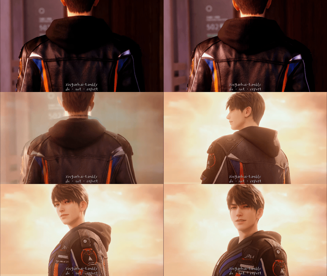


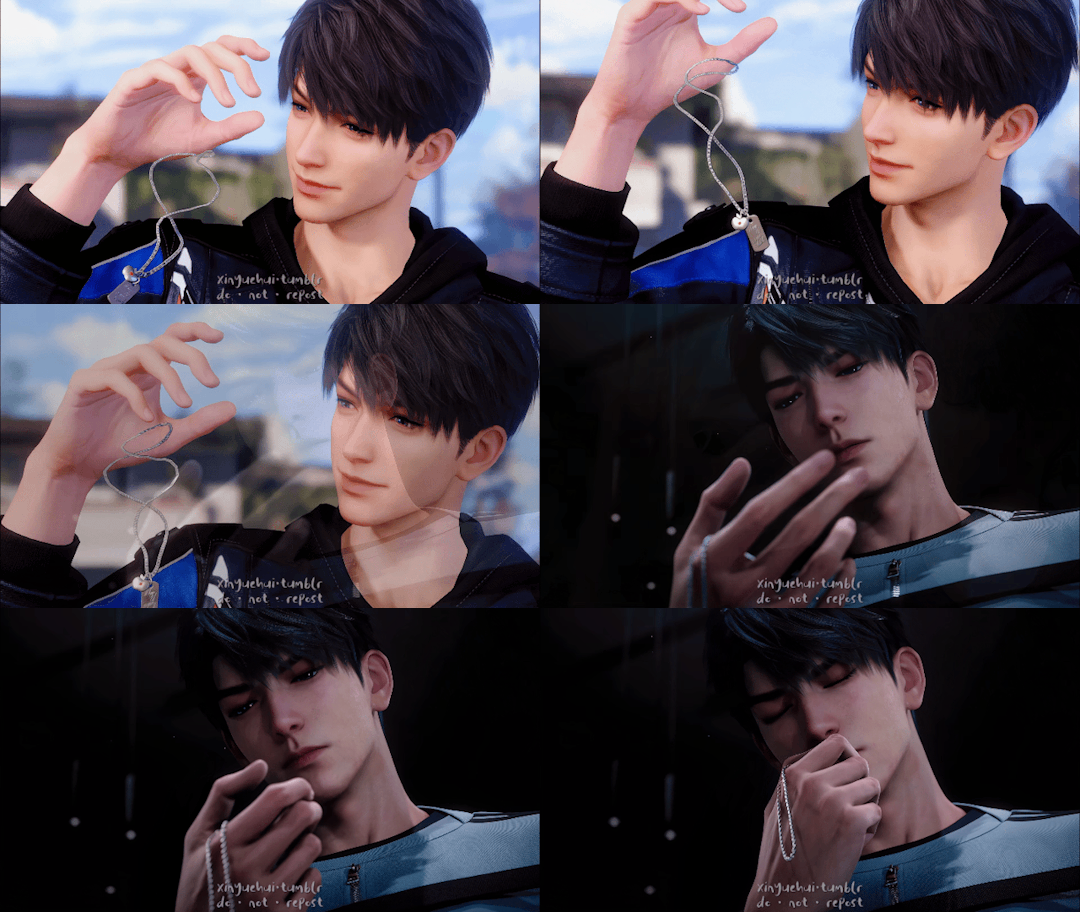


Why the long face?
#love and deepspace#恋与深空#love and deep space#xia yizhou#caleb#夏以昼#dailygaming#dailyvideogames#gamingnetwork#videogamepoc#gamingedit#3d animation#video games#*5#otome#otome game#after seeing that crazy transition in the trailer i decided to make my own transitions 😭😭#no longer soft 🥺 EVIL NOW 😈#i know theyve tweaked his model slightly but its crazy how subtle facial expressions changes everything#the warm lighting before in contrast of the cold lighting that sharpens his features now (also sharpen physically bc better graphics lol
250 notes
·
View notes
Text
a letter from a sailor to her lover. || beidou x reader
On the open ocean, Beidou is left with her thoughts. Of course, she ends up thinking of you—and tonight, she chooses to write them down in a letter to you.
notes. been obsessed w sailor song by gigi perez ,,, ooo the sapphicism. also this is short as hell but i kinda like it, might make it a series or smtg for bei
cw. fluff

To my dear heart,
We’ve just made landfall in Snezhnaya. It’s a damn cold place—I always think I’ve gotten used to the cold every time I go back, but I keep eating my words. I guess the Tsaritsa’s love isn’t so warm, huh? It makes me miss those summer mornings where I’d wake up in your arms. A little sticky, a little sweaty, but warm. The sunrise never could outdo your smile.
I miss you. And it’s got me thinking about the ways to describe how I love you.
I know, I know. I’m no poet. I’m a pirate captain! But… a mutual friend of ours keeps sending me to fetch all these literature books, so I figured I’d flip through a few pages on the journey back. Might as well make use of the time, right? Indulge me, please, sweetheart, just this once.
I thought, first, that I love you the way the ocean loves the moon. You move me, coaxing me into rhythm. You are there, always—for my highs and for my lows, for when I’m strong and when I’m weak. But the moon shines so far in the sky, and I hold you too close to my heart to bear the distance.
I thought, next, that I might love you like an anchor loves a ship. You hold me steady on stormy nights, when the waves crash harsh and high. And I carry you with me wherever I go. But you are more than just an anchor.
So I thought instead, that perhaps I love you the way a navigator loves the north star. With faith and certainty in its presence, a guiding light in the darkest of nights. I know you will shine forever in my night sky, but I think I would miss you too much during the day.
So I’ve thought about it lot, but in the end, sweetheart, I think I’ll only know how to love you as myself. I’ll come and I’ll go but my love for you will always stay right there in your hands. I’ll love you like a sailor; and you’ll always be my safest harbor. Today, tomorrow, and all the tomorrows after that.
Yours entirely,
Beidou
PS. Please don’t tell our mutual friend i’ve been reading her books. She might fine me extra…
#sev.writes#beidou x reader#writing letters are kinda fun#theres something so romantic abt it#it feels kinda like looking like stars. when i read a letter im glimpsing a snippet of u in the past in the moment u wrote this#in the time of transit you might have changed. something knew might have happened#but right now all i have is this version of you i find in your words#like how dead stars still shine because of the time it takes light to travel#does that make sense ??? idk. im fever delirious
200 notes
·
View notes
Photo
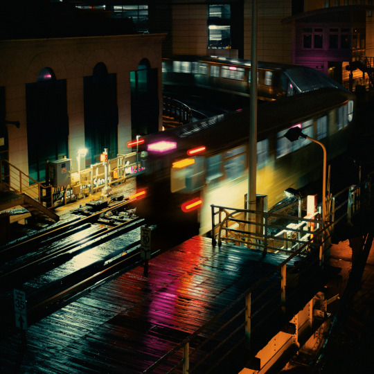
Pink around the Bend
#nightography#night#light trails#cta#the loop#chicago#cta pink line#illinois#long exposure#transit#train#july#my work#photography
140 notes
·
View notes
Text

horizon zero dawn (remastered) | aloy 36/?
#horizon zero dawn#hzd#aloy#the moonlight was doing wild things to these lupine flowers so i had to stop#full disclosure i used the “advance time and quickly snap a pic while the lights go crazy in the transition from light to dark” trick-#and combined it with the original lighting in editing to get her illuminated a bit more :)#hzd aloy#horizon zero dawn remastered#hzdr#hzd pc
105 notes
·
View notes
Text
Me: [waking up at 3 a.m. in the morning, eyes bloodshot] Vampires described as pale, elegant, but also very strong, leaping with predatory feline grace when hunting or fighting. Bella being put in ballet classes as a child by her mother. The climax taking place in a ballet studio.
Twilight as a ballet, Twilight as a ballet, TWILIGHT AS A BALLET—
#twilight#twilight meta#twilight renaissance#i am obsessed with this idea guys#first scene: ballet bella as a young girl dancing freely as she pleases#then her mother enters and once she notices her she falls#even bella’s clumsiness could be portrayed balletically#and then her mother meets phil in a pas de deux and ballet!bella sadly waves them goodbye#the stage’s warm phoenix lights transition to cold and wintry forks#yeah no this is GOLD#bella and edward’s romantic pas de deux in the meadow scene#or a dance musical. but nah a ballet is better#also the shapeshifters are also graceful!!!111!#omg ballet new moon!!!!!!1!!1#the cullens and the shapeshifters facing each other like the jets and the sharks#jerome robbins would be GAGGED#ART
50 notes
·
View notes
Text
impromptu meta at 2 — oh wait 1 in the morning thank you daylight saving time
the thing about light yagami is that we all know he is repression incarnate. and we also know that kira was born out of his desperate need to justify sort-of-accidentally killing two people. and so therefore kira isn't what light's repressing, not at the outset; kira is an extension of his repression.
and the death note and his need to hide it very quickly takes over light's life. so it's easy to say that light is light yagami on the outside and kira on the inside, and maybe light feels that way. but. kira is just as much a persona as light yagami. a more hidden persona, but still not the real him, whoever that is.
and the thing is that no one sees past that. ever. most people obviously fall for the charming boy act, but even the detectives — L, near, mello — god, even ryuk stops at part two. i think a lot about how L set up the mock execution because he thought that kira would have killed his own father if necessary. can you see light doing that? eighteen-year-old light yagami who said "if anything happens to you, dad — i'll see that kira gets the death penalty. i swear it."? remember when ryuk laughs at how good an actor he is afterwards and light doesn't look at him?
light never thinks kira is evil. even in yotsuba arc he acknowledges that they think very similarly, just that kira has gone too far. (ha, ha.) for all of death note light yagami is light yagami, who says if kira wins then kira is good, who has convinced himself he is doing the right thing. he gets frustrated when other people don't perceive him the same way — lind l tailor, misa killing police chiefs while pretending to be kira — but the anger has nowhere to go other than murdering more people.
light yagami is kira is light yagami. but L, ryuk, everyone doesn't manage to see through kira in the end.
and after L dies, well. no one will ever measure up to L, in light's eyes. he almost idolizes him in the weirdest way possible. so maybe, he thinks, if the only person in the world who could ever possibly see all of him (this isn't true, it's just what light believes) thought he was just a murderer, then maybe —
i think he hollows himself out in the second arc. in the anime he seriously considers killing sayu; in the manga he never does that but justifies his unwillingness to himself by saying that this way soichiro and light won't come under suspicion (they weren't going to in the first place). light doesn't really have a sense of self. L said he was evil and of course L is wrong — was wrong — will always be wrong — but isn't it easy to play into that stereotypically evil image of himself? especially after soichiro, his last moral compass, dies: isn't it easy to nullify misa's memories, to say she's not intelligent enough to be my partner, to kill kiyomi in the most painful way possible?
("light would have done the same things in the first arc!" sure. but not with that much callousness.)
it's just. it's tragic, you know? light has always pretended to be nicer than he is but he isn't the cold any-means-necessary person they thought kira was either. he is constantly playing someone he thinks he is but he can never escape being light, in the end.
does this make any sense do i sound insane
#death note#light yagami#it is. really fucking important to me that L never figures it out in canon actually.#you could argue maybe he does through yotsuba#but i dont think so#i think yotsuba light was so desperate to be moral that he didnt have much of a personality anyway#anyway this is why i am convinced transition could save light yagami#i should probably have written this at a different time to make it sound better but i hope this is . understandable.#it somewhat annoys me when people imply that light is kira internally#like yeah. he's awful. he's misogynistic and an asshole. i like the sadist hcs also#but that's not All of him. it's not#no one sees him in the end. no one fucking sees him at all.#the disciples are sort of an exception to this paradigm because they both know light is kira and think he's right#and misa has lived with him for five years! five entire years!#but misa never really had an interest in understanding him either
59 notes
·
View notes
Text

Spooky Earthrealm Boys 3/4 — JIANGSHI RAIDEN 🩸‼️
i went so very hard on this did i even need to bro oh my god ????? anyways here’s your weekly sleep paralysis demon under the cut 🥳🥳🥳

#actually so obsessed with how the colors turned out in this one#IM GETTING BETTER AT TRANSITIONS IN LIGHTING AND SHADOWS IN TJE SKIN AHHSGSH#mk1 raiden#raiden mk#mortal kombat#mortal kombat 1#mk1#mk1 fanart#mortal kombat fanart#mk fanart
61 notes
·
View notes
Text
Another day at Bob's

#bobs burgers#bob's burgers#gif#day#night#day into night#house#alley#back alley#transition#lights on#dusk
85 notes
·
View notes
Text
So much of the narrative around the trans experience centers around pain, dysphoria, and negativity. We have to plead using these desperate expressions of our own suffering as a way to receive some baseline decency. This pain is very real, but it can become consuming.
Fuck that. Let's get some trans joy in here.
To those further along in your transition- do you remember the first time you looked in the mirror and liked what you saw?
To those earlier in your transition- remember, you have this to look forward to. Treasure that hope <3
#I'm saying this now#because I'm slowly having this moment#sometimes when the angle and light are just right#I dont hate my nose and chin as much#and I consider them the main holdouts of my masculinity#trans#transgender#transitioning#trans joy
202 notes
·
View notes
Text
youtube
Please look at my new favorite video @amtrak-official you have a true train fan in your midst
#tacoma#sound transit#light rail#public transit#vocaloid#good shit#can you tell my partners autistic#it doesnt get better than this#washington#washington transit#shit post#Youtube
93 notes
·
View notes
Text

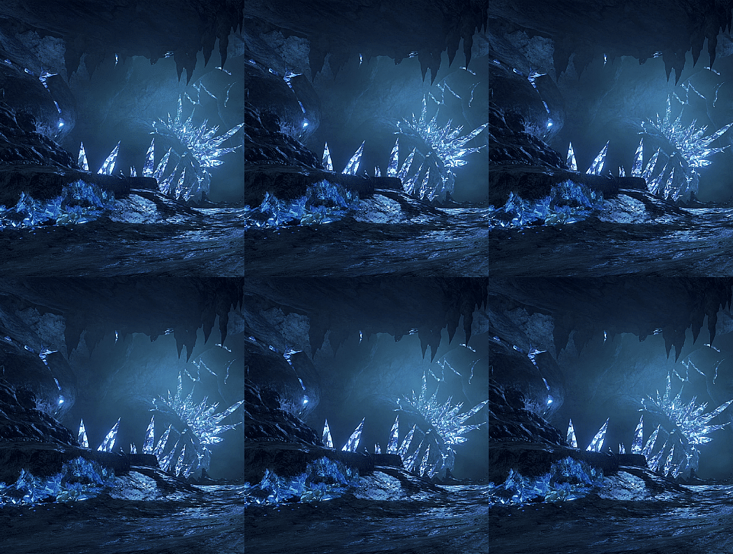
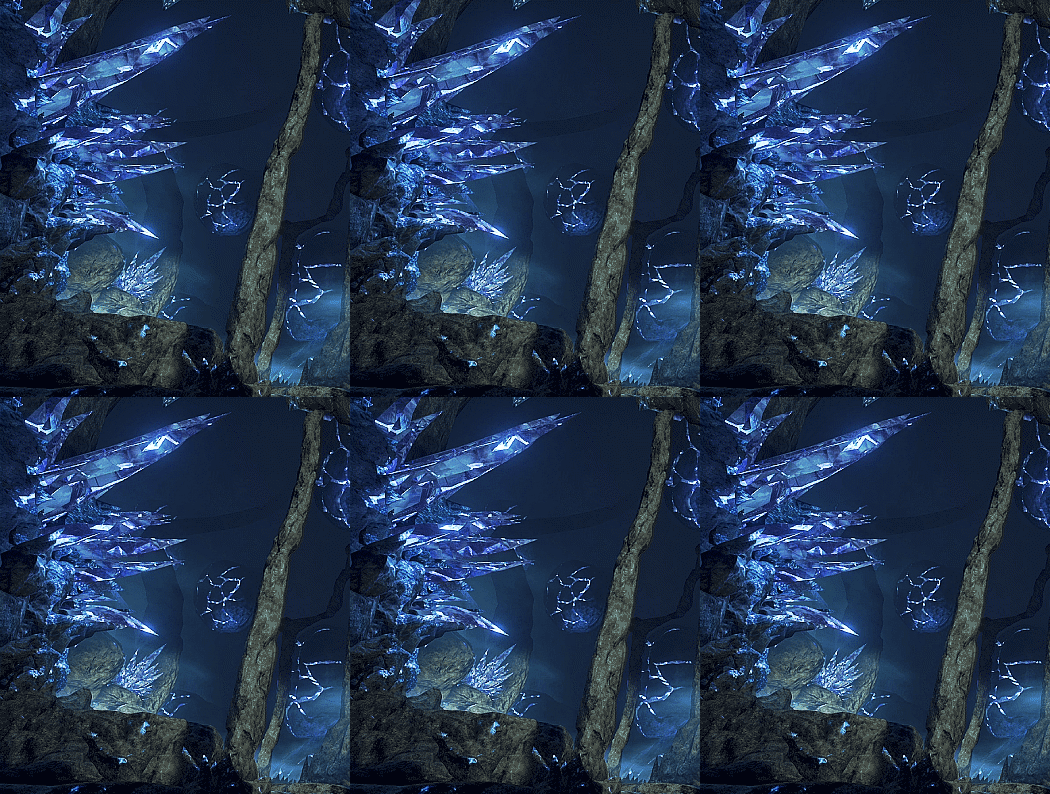
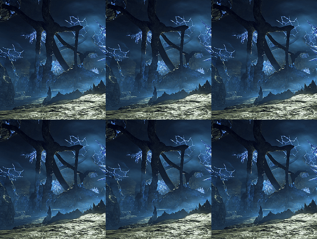
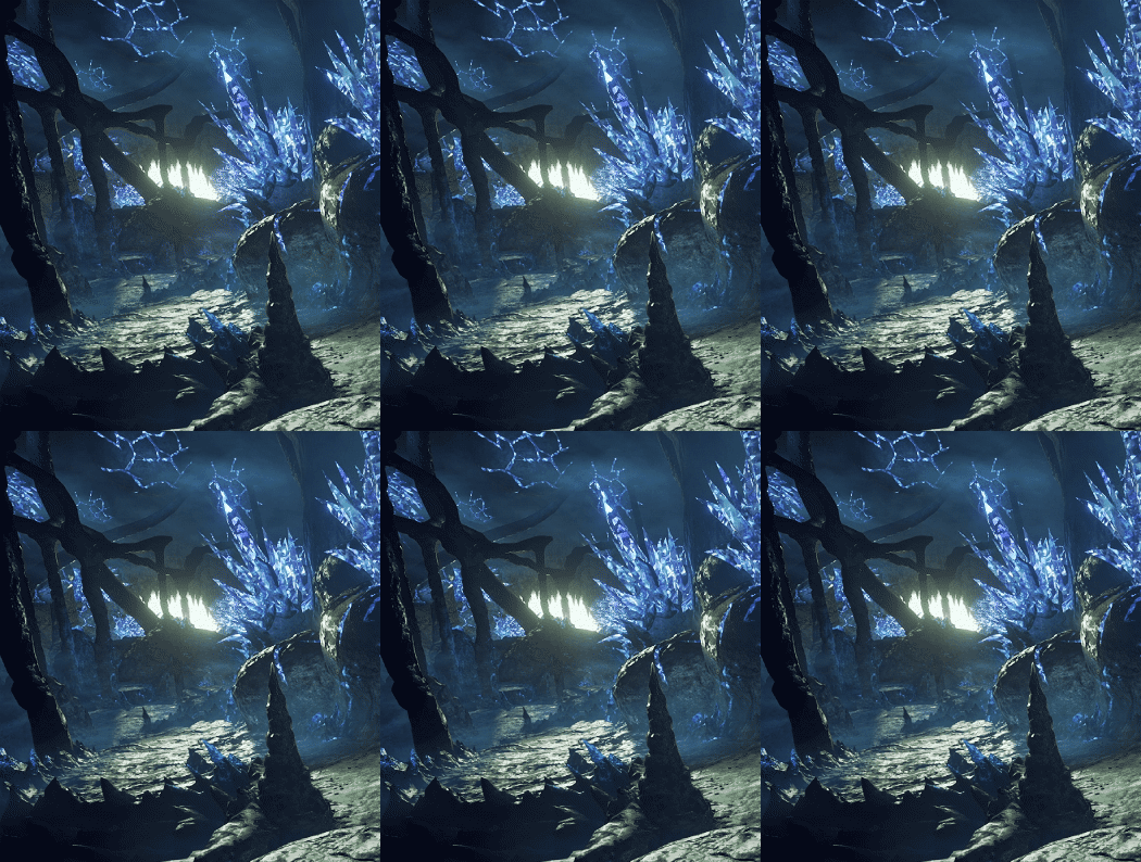

Kingdom Hearts 0.2 Birth by Sleep - A Fragmentary Passage - Depths of Darkness
#kingdom hearts 0.2 birth by sleep a fragmentary passage#kh0.2#depths of darkness#realm of darkness#my gif#they did a good job making the realm of darkness look distinct from the realm of light#because this place really does feel like nowhere we've ever been before#the rocky pathways with no sign of organic life make me feel like i'm on the moon or an alien planet#it's interesting how fallen worlds feel like they're all stitched together between areas like this#aqua can simply walk from place to place without needing a ship or keyblade glider to fly her to a new world#though who's to say how long it takes her to do all of that#as if the realm of darkness is one big ever growing expanse of land without any known boundaries between worlds#we know that all worlds used to be connected in the realm of light long ago and i'm guessing that's the case in the realm of darkness#it's never been split or fractured by keyblade wielders so it still follows its own rules and laws of nature#that'd be pretty interesting#we see this area start as a rocky wasteland that transitions into flat sandy terrain from the destiny islands#but you have to walk through a huge blinding light to get there first which is really unusual#it makes me think of how terra and aqua were guided to destiny islands by a bright light#and how destiny islands appears as a ball of light on the world select menu in bbs#but why portray it that way? we've been shown before what the world of destiny islands looks like from afar with the CoM world cards#and it's not like they even needed to include it on the world select screen in bbs because it's not a world you can even visit on your own#i don't know what it's all supposed to mean yet but#i believe the islands are more significant than we know at this time and this game continues to raise a lot of questions#it's certainly called 'destiny' islands for a reason
236 notes
·
View notes
Text
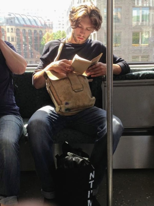
#travel#explore#reading#books#guys#wanderlust#transportation#city life#urban#bookish#metro#train#people#books and reading#bookworm#public transit#city#light academia#student life#cityscape#📚
30 notes
·
View notes
Text
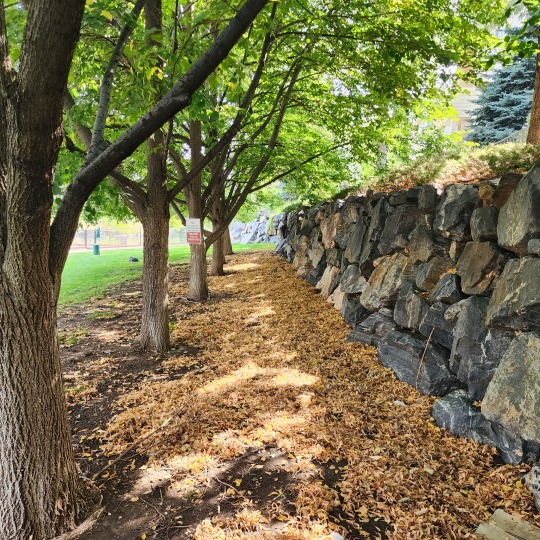
#Photography#Nature Photography#Autumn Aesthetic#Seasonal Transition#Tree Lined Path#Fallen Leaves#Stone Wall Vibes#Dappled Light#Colorado Outdoors#MissedMileMarkers
49 notes
·
View notes
Text


TRON: Legacy | 2010
Remember me saying like a month ago that I was learning to make gifs? Well, here we are! I'm working on some gifs of the coup scene (which should be better than these since the limited colors allow for more freedom in the choice of frames).
These should fit as discord banners! They are all >10MB and >960px. I think they're actual size is around like 840px?
#tron legacy#they're kinda bad but that's ok for a first-time gifset#i'm absolutely obsessed with the opening sequence#listen: hear me out#the way this movie has the amber lights and beige city lighting contrasting the rest of the movie?!? like hello?!?#also I found out why people don't make gifs of this#this freaking scene is a huge file esp in the line->city transition bc of all the colors#whatever man#snowing's gifs#gifs
42 notes
·
View notes