#letterpressed
Explore tagged Tumblr posts
Visit Tumblr Blog
Explore Tumblr blogs with no restrictions, modern design and the best experience.
Last Seen Tumblr Blogs


Fun Fact
Tumblr was attacked by a cross-site scripting worm deployed by the Internet troll group GNAA on Dec 3, 2012.
Text
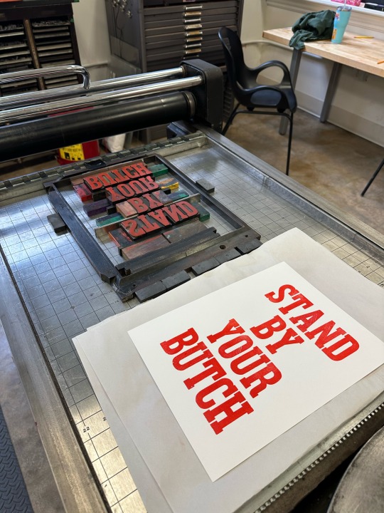
We are often asked if multiple ink colors can be used on a single impression. In this video, Jared letterpress prints a phrase about museums showing that 6 ink colors is possible. The phrase “Museums are not neutral” was printed with red, orange, yellow, green, blue, and purple ink using our Washington hand press. The wood type used is 15 line pica in size and the typeface is French Clarendon.
Our museum, like all museums, is not neutral. People often argue that museums should be neutral or that museums can’t be “political.” However, museums actually are cultural institutions that originate from colonial acquisition and they are about power. History is often written by the victors. It is important for museums to focus on multiple sources and perspectives, especially historically underrepresented groups. Promoting diversity is important to understanding a more holistic history of events.
#museums are not neutral#museum#sacramento#history#letterpress#printing#art#asmr#printmaking#old sacramento#oddly satisfying#rainbow#public history#museum studies
15K notes
·
View notes
Note
I want to put your pngs into one of these bad boys:

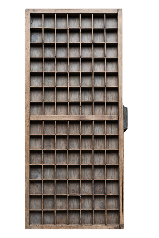
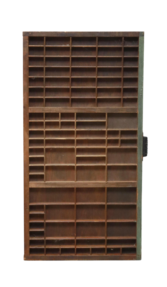
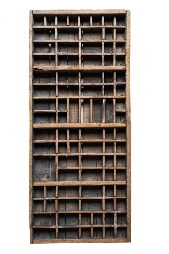

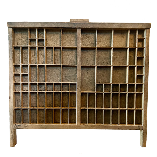


Please do!!!
#sorry tumblr won't let me post these in high res#letterpress tray#printers tray#california case#png#pngs#transparent#transparents#moodboard#artboard#imageboard#sticker#stickers#collage#collages#mixed media
11K notes
·
View notes
Text

Letterpress print on black linen cloth. 24point clearface heavy. This took 4 hours to set the type btw.
Text reads: “I fantasize about a dildo with nerve endings. I type "how to fuck a partner with my clitoris" into the search bar. The results are articles & reddit posts with tips for helping your boyfriend find your clit. I realy think str8 folks should have to search through dozens of search results about Dyke sex before finding whatever they were actually looking for. Anyway. I imagine pulling my leather harness over my hips, the black silicone connecting just above my clit. They kiss me and trace the scars on my chest. They let me touch them & they touch my silicone, they guide me inside of them. I'm not sure what this would feel like, A dildo with nerve endings does not yet exist. But I know it would be as close to heaven as i'll get.”
#my art#lesbian#butch lesbian#queer#messy queer#stone butch#queer desire#letterpress#trans#transsexual#t4t#lesbian writer#lesbian artist#trans writer#trans artist
9K notes
·
View notes
Text

A nice librarian gave me this and I really like it.
751 notes
·
View notes
Text

published in FRUITSLICE
preorder my book
#poetry#trans poetry#bookbinding#book arts#letterpress#lgbtq#transgender#poem#poems#writing#queer#trans#queer art#spilled ink#quotes#chest binding#ftm#binder#literary magazine#trans poets on tumblr
535 notes
·
View notes
Text


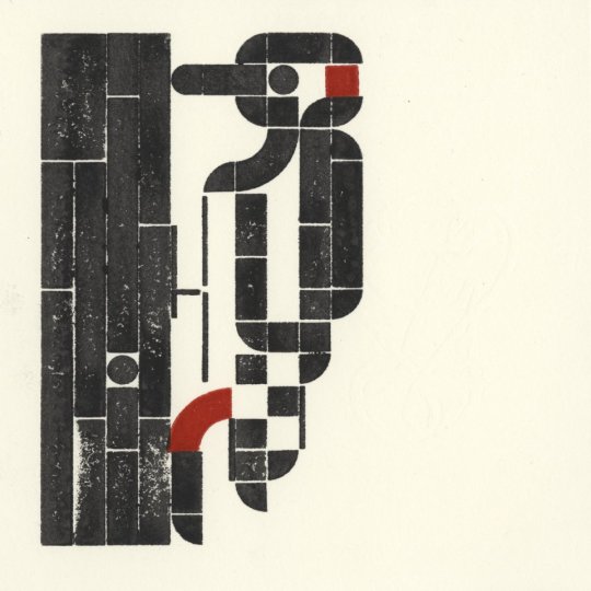
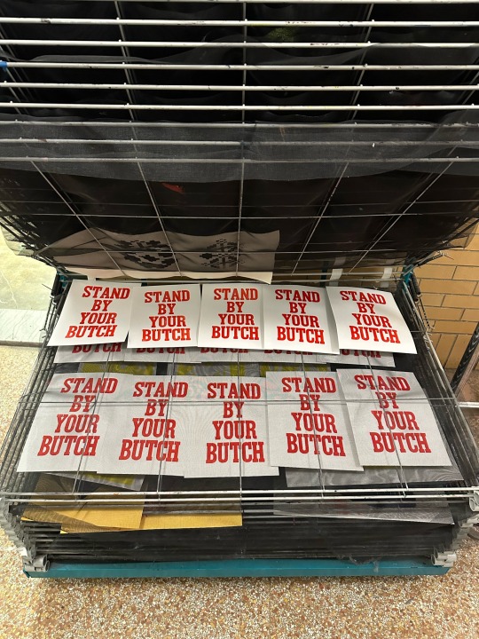
sometimes it’s hard to be a woman (loving woman) instagram | twitter | prints
🩷🤍🧡🩷🤍🧡🩷🤍🧡🩷🤍🧡
I finally got this print scanned & tidied up a bit! I have a few Real and Beautiful hand-pulled prints remaining (including a couple of discounted ones that are slightly off-center) (dm me!) but you can also buy digitally printed prints at my inprnt shop!
#katieakipresentsthewasteland#lesbian artist#lgbtq art#lgbtq#queer#printmaking#letterpress#printing#prints#wood type#traditional art#traditinal media#butchfemme#butch#lesbian#lgbtq artist#wlw#sapphic#sapphic art#dyke#femme4butch
561 notes
·
View notes
Text


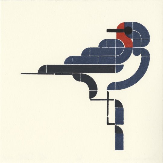


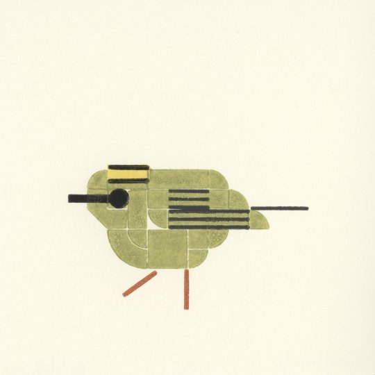
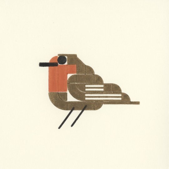
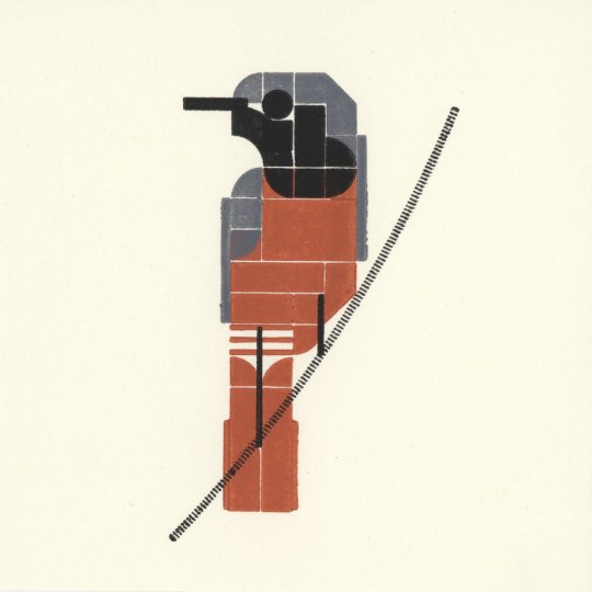

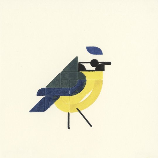
50 vogels – a project to print 50 birds each with 16×16 LEGO pieces. Made by Roy Scholten and Martijn van der Blom, 2018. Prints are available to buy, and a book is coming in October. More info available here.
via printmag
2K notes
·
View notes
Text
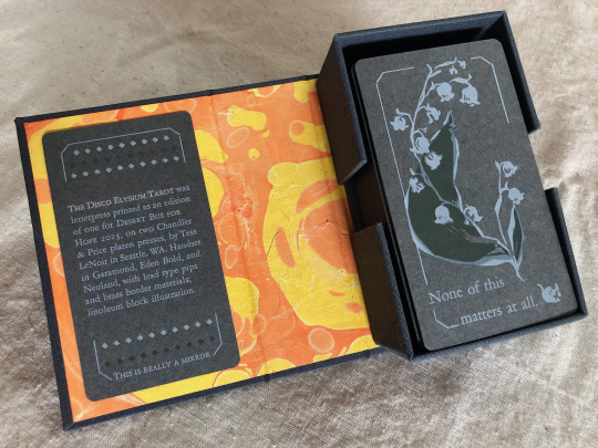
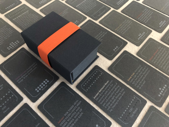


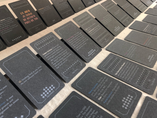

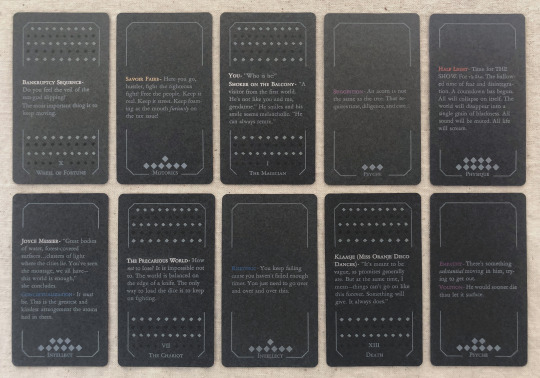
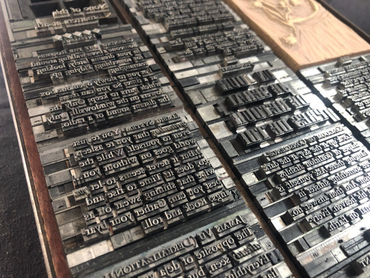
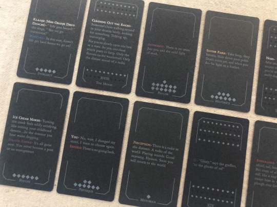
[image description: photos of The Disco Elysium Tarot, printed letterpress in an edition of one from handset lead type and linoleum blocks. It is a complete 78-card tarot deck printed primarily with white text and illustrations on medium grey cardstock, in a custom dark grey hardcase box with a hand-marbled orange and yellow endsheet. The backs of the deck are decorated with an illustration of a sprig of may bells, and a quote from Smallest Church in Saint-Saëns: "None of this matters at all." The interpretive meaning of each card is expressed on its face with a small excerpt of the game's text. The Minor Arcana are divided into four suits of Harry's Attributes—Motorics, Psyche, Physique, Intellect—and each card in that suit is a quote from a skill under that Attribute. The Major Arcana are assigned quotes from other sources like NPC dialogue or Thought Cabinet problems & solutions. Pips for the Minors are counted with diamonds like the game's skill points; each actor or title is printed with their in-game color, but made shiny & metallic with bronzing powder.
each piece of text was set in handset lead type, assembled from individual pieces for each letter and space, and printed relief on a chandler & price clamshell press. end description.]
🎊🎊 Desert Bus for Hope starts for 2023 on nov. 11th and i have made an item this year for the craftalong that will be up for giveaway between 6am-12pm on Monday the 13th! 🎊🎊 It is a full tarot deck based on Disco Elysium and it has several pieces of my heart & soul in it but NOT my blood because i put a bandaid right on that :) donations for this and any other auctions & giveaways for Desert Bus go to Child's Play Charity.
notes: i did not make a whole new interpretive model for this deck, apologies, that was outside of my scope. it's generally compatible with a Rider-Waite model, with Motorics for Wands, Psyche for Cups, Physique for Swords, and Intellect for Disks. (full distribution of text listed by card, linked below. any spelling or transcription errors you find there, i promise i fixed them in print—that's copied from my digital mockup which was copied hastily from screenshots.)
i also do not track hours on these kinds of projects because that way lies madness, but i will say: i knew how much time it would take to print it. it was a lot but i was not worried about it, i know how to print. i was very worried about how much time it would take to absorb the sheer amount of text, and distribute it across the cards, and really get an array i believe in. i was right to worry, and i have absolutely had a few anxious nightmares about discovering the Perfect excerpt that should've gone in and i missed it, and the suit of Intellect made me want to lay on the floor a few times, but still! i believe there's many versions of a deck you could make from this game and this one is a good one.
i think the Minors fit really well with the double-edged sword of Harry's skills, their advice, their priorities. the circular way the Fool-World assignment works out makes me smile every time. The colors on The Star came out so nice. i think Justice fulfills some of my favorite things about Kim's character & purpose in the story. i worried sometimes that editing to such short clips would lose too much of the politics of the game, but of course you can't really take them out and they're especially present in the Majors—the Devil and the Hierophant, The Star and The Sun. i've wanted to design a tarot deck for years and i love this game deeply and i let this idea percolate for a few months and it never stopped making me laugh so here it is, & given a beautiful purpose :)
i also literally could not have done this without xyrilin's Disco Reader and the FAYDE On-Air Playback Experiment to navigate the dialogue and skill checks. Really couldn’t have tied the whole concept & colophon in its final bow without the Disco Reader :)) thank thank thank, they're so fun to investigate that it was honestly very difficult to focus on my task instead of veering off and exploring every branch in an extremely disorganized way.
actual printing went well honestly, very few problems! i think that means i'm getting pretty good at planning one of these monstrosities, although perhaps it also means i'm not challenging myself enough. hmm. no that's silly there's 78 ding dang cards in this thing. anyway the drop & replace formes worked well, no registration issues. mum convinced me to overprint another half a deck's worth of cards when I was printing backs & borders and of course she was right :/ there were a handful of cards that actually had better line breaks and fewer lines total in true type than in the digital mockup, so i needed all the spares I had to put those new short quotes into the appropriate border breakage. next time i will not question her.
handset in Garamond, Eden Bold, and secret Neuland.
WIP : full text card assignments
bonus photo of the kind of trash notes i always take to plan things like how many borders were printed with space for short excerpts vs long excerpts, and how many of those are majors vs. minors, because they have a slightly different frame at the bottom edge, etc.
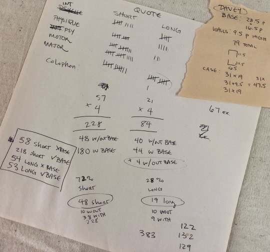
[image description: they are truly garbage notes, i tell you. half of it is written at angles to the other half, many numbers in the math problems are not labeled, mistakes are scribbled over. it gets me there but it doesn't look pretty. end description.]
#desert bus 2023#desert bus for hope#disco elysium#book arts#letterpress#letterpress printing#handset type#printmaking#db2023#finished works#long post
876 notes
·
View notes
Text
letterpress dashboard simulator
🖌️ slapdash-setter Follow
you can just do a shitty lockup. no one cares. be who you want to be
🗜️ century-oldstyle-stan Follow
ummmm no you can't???? your type will fucking wiggle
🖌️ slapdash-setter Follow
fuck you fuck you fuck you fuck you fuck you fuck you
24 notes
🗜️ century-oldstyle-stan Follow
people will just defend the worst printing practices known to man on this website
3 notes
✒️ lines-and-linocut Follow
I spend sixty hours on designing a fucking poster and I get a million comments about how $30 is too much to charge for it. how about you try it
340 notes
🗝️ key-to-the-quoin Follow
people on here really forget that Gutenberg was a fucking hack. he didn't invent shit
#type invented in china and/or korea #so was paper #presses were using in wine and cider making #people just love their white guy blorbos
23.1k notes
🏫 sacramentohistorymuseum Follow
We're going to print a bike for national bike day!
198.3k notes
🗄️ mind-your-ps-and-qs Follow
anyone know where I could get a historical press for cheap? under $50?
🗝️ key-to-the-quoin Follow
UNDER $50??? are you kidding? you'll be lucky to get one for under $200
15 notes
🪧 linoscribes Follow
kissing my metal type on the mouth
🗜️ century-oldstyle-stan Follow
it's made of lead. are you insane
🪧 linoscribes Follow
getting lead poisoning because I love my type so much
🗄️ mind-your-ps-and-qs Follow
it's actually probably not lead! and if it does contain lead it's stabilized in the alloy! you can totally kiss your type :D
🗜️ century-oldstyle-stan Follow
or maybe. consider. don't
35 notes
#dashboard simulator#fake post#fake posts#letterpress#tumblr dashboard#sacramento history museum ilsym#booklab op#typography#printing press#unreality
202 notes
·
View notes
Text

Bug Out Birthday Letterpress Card by luckyhorsepress
133 notes
·
View notes
Text
We have officially reached a viewership level that has never been obtained by another museum before! All of us at the Sacramento History Museum are in disbelief.
We would have never thought that our institution, a small nonprofit museum in Sacramento, California, could reach this many views, but we are incredibly thankful for all of those who take the time to watch our videos and for your support.
In this video, Howard letterpress printed a headline announcing “Sacramento History Museum Reaches One Billion Video Views On YouTube” while using our Washington hand press, which was manufactured in 1852!
#museum#history#sacramento#old sacramento#art#letterpress#printing#asmr#typography#youtube#printmaking
23K notes
·
View notes
Text

“Dyke church” promotional dental dam.
Photopolymer relief print on latex dam, 6x10”
#lesbian#my art#queer#messy queer#trans artist#lesbian artist#butch artist#dental dam#lesbian art#lesbian printmaker#trans printmakers#dyke church#printmaking#queer printmakers#letterpress
3K notes
·
View notes
Text


A Poultry Piece Feathursday
Here are four hand-colored illustrations from A Poultry Piece written, illustrated, designed, and hand-printed in 1978 by Carol J. Blinn at her Warwick Press in Easthampton, Massachusetts, in an edition of 250 copies signed by the artist/printer. The book is a brief memoir of Blinn's time in Warwick, Massachusetts, "a picture post card New England town," and her most cherished memory of raising ducks and geese, particularly Pekin ducks: "It was not only the Pekins' beauty that attracted me, it was their cleverness." She writes:
Many years have passed since leaving Warwick and those ducks and geese behind. Living in Warwick enriched my life and I often yearn for another country home. . . . The building where I have my printing shop has a canal running behind it. Early in the morning I often see three sparkling white Peking ducks lazily swimming up the muddy water course. Standing quietly and watching, I hold my breath, secretly making believe they are mine.
Carol Blinn is among what we call the Pioneer Valley School artists. She apprenticed with the legendary master printer Harold McGrath at Leonard Baskin's Gehenna Press before beginning her own work as a printer, artist, paper decorator, and founding Warwick Press in 1973.
This book is dedicated to Blinn's friend Ron Masse who "helped share my anxieties & joys in the writing of this book. (What he actually did was egg me on.)" Our copy is another donation from the estate of our friend Dennis Bayuzick.
View posts on other Pioneer Valley artists.
View more Feathursday posts.
#Feathursday#Carol J. Blinn#Carol Blinn#A Poultry Piece#Warwick Press#Pioneer Valley School#Peking duck#American Peking#domestic ducks#ducks#letterpress printing#fine press books#Dennis Bayuzick#birds#birbs!
210 notes
·
View notes
Note
I want to know more about the guy who threw three tons of type into the Thames, please! Thank you!!
So first, thank you for this ask. I love talking about this guy, and you gave me an excuse to fact-check all of the absurd things I’ve learned about him over the past year or so and, as a result, learn even more absurd things about him. But oh man, where to start. So those tags were about a guy named Thomas James Cobden-Sanderson (often written about as T. J. Cobden-Sanderson, TJCS here for efficiency). He was an absolutely fascinating dude – quit like three or four different career paths before actually becoming a lawyer and just fucking hating it. He was hanging out with his buddy William Morris (yes, THAT William Morris*) lamenting his lack of satisfying work when Morris’s wife Jane (yes THAT Jane Morris**) suggested he try his hand at bookbinding. (Side note (there are going to be so many side notes): TJCS is the one who coined the name “Arts and Crafts” for the decorative arts movement that Morris basically founded, and TJCS was hugely influential in that circle as well.) He started a bookbinding apprenticeship and just kind of blew everyone away. He was crazy good at it much faster than he should have been, and he founded the Doves Bindery (named after the nearby pub, not the bird) with capital from his wife.
(The biggest side note: TJCS was a hard core Wife Guy, and Annie Cobden-Sanderson was insanely cool in her own right. She was a famous suffragette, was arrested and imprisoned for demonstrating in the lobby of parliament, and was an evangelist for vegetarianism. This whole post could be about her, actually. TJCS thought she was so cool that he took her name – he was T. J. Sanderson, she was Annie Cobden, and when they married, they both took the name Cobden-Sanderson. She went to the U.S. in the early 20th century to teach the suffragettes there what she had learned protesting in England, so I feel like she is in part responsible for my right to vote. Love her.)
Okay, but back to TJCS. Our very talented, very egotistical, very tempestuous little dude was Not Satisfied binding whatever books came in the door because he had big feelings about what the Ideal Book should be. To that end, he teamed up with printer and engraver Emery Walker, William Morris’s former partner at the Kelmscott Press (yes, THAT Kelmscott Press***) to found the Doves Press so that he could create the most beautiful books by printing only the most beautiful words. TJCS was the “visionary and fanatic” (his words) and Walker was the technician. TJCS commissioned a new typeface to be used exclusively by the Doves Press. It was based on some of the most beautiful typography ever created – the capitals based on Nicholas Jensen’s 15th century roman that’s still considered one of the standards of perfection in type design (if you’ve ever used Centaur or read a book set in it, that’s kind of the contemporary version of Jensen’s roman). The Doves Press was unexpectedly successful and it along with Kelmscott Press laid the foundation for what would be the fine press movement of the 20th century. The Doves Bindery now only bound Doves Press books, and if you have a local library or museum that has examples in their collection, it’s well worth the trip to go look at these books.

(The opening of Genesis from The Doves Bible, widely regarded as one of the most perfect books ever printed, image from Jonkers Rare Books.)
Of course, “tempestuous” and ��egotistical” are not a great recipe for long and healthy partnerships, even when coupled with “very talented,” and TJCS and Walker had a mega falling out. TJCS was a perfectionist the level of which it is hard to overstate. Walker was… not. He was a printer. You printed your pages, and that was that; sometimes there were going to be errors. Also, he liked to make money. The Doves Type was widely regarded as the most beautiful typeface in existence, and there were lots of folks willing to pay to use it in their own printing pursuits like advertising and other commercial work. I’m sure you can imagine how well this went over with TJCS. After what seemed like endless fighting, a mutual friend, Sydney Cockerell****, suggested a compromise: TJCS would get exclusive use of the Doves Type for the rest of his life, but Emery Walker would own it and could do whatever he wanted with it once TJCS died. Walker figured this was the best he was going to get and agreed. TJCS agreed at the time, but as he got older, he got even more tempestuous and obsessive, and this is where the river comes in. Dude grabbed all of the matrices and punches (the stuff you would need to make more of the Doves Type) and literally threw it into the Thames. Fine, now the only Doves Type that exists is what’s in active use by the Doves Press. That was not good enough for our good friend and Weird Little Guy TJCS. No, in addition to throwing the matrices and punches into the river, he ALSO threw every last piece of type in the workshop into the river. This is fucking hilarious because it’s not like a print shop just has a few copies of the alphabet laying around. A working press (even a small one) like the Doves Press had literally more than a ton of type in the workshop. TJCS was so petty and so determined that only HE would ever get to use this type that he made almost TWO HUNDRED trips to Hammersmith Bridge to dump type in the river.
And the story doesn’t even end there! And I’m typing this alone on my couch instead of trying to retell the abridged version over drinks with friends, so guess what? You get the rest of the story too! The Doves Type is still to this day considered one of the most beautiful typefaces ever created, and I get to introduce you to another single-minded, obsessive little guy who REALLY REALLY wanted to create the most accurate digital facsimile possible of the Doves Type. His name is Robert Green, and at first he was just looking at the texts printed by the Doves Press and trying to recreate it from the printed pages themselves. He did a pretty good job. In his quest, read everything he could about TJCS and the Doves Press, including TJCS’s diaries. I’m not sure anyone before Green really took literally TJCS’s declaration that the type had been “dedicated & consecrated” to the river but Green sure did. He even figured out that TJCS’s bridge of choice must have been Hammersmith. And then he started digging around. Almost a hundred years after TJCS donated it to the Thames, Green found a piece of the Doves Type in the mud under Hammersmith Bridge. With help from Port of London Authority divers, more than one hundred and fifty pieces of the Doves Type were recovered, and Green was able to revise his facsimile based on actual specimens.
The absolutely insane consequence of this is that YOU, dear friend, can buy your own license to the Doves Type and use it for whatever unhinged purpose you can dream up. Whether your interests align with TJCS and you also want to create the Ideal Book, or you feel like typesetting your favorite shitpost, one of the most beautiful typefaces ever cut is at your disposal.
Feels a little silly to put the footnotes under the cut given how long this got, but we're running solely on vibes now, so here we go.
*Founding member of the Arts and Crafts movement, iconic designer, you definitely know who William Morris is. Or at least you've seen his wallpaper.

**Similarly, textile artist, muse and model for the painters of the Pre-Raphaelite Brotherhood and Arts and Crafts movement, you know who Jane Morris is.

***If you know Kelmscott press, it's likely because you know The Kelmscott Chaucer. It is widely considered one of the most beautiful books ever printed, and it's likely that you've seen images of its pages if your interests run bookish at all (and I kind of assume they do if you've managed to read this far).

****Okay, so I footnoted Sydney Cockerell mostly to talk about his younger brother, Douglas. You probably don't know who Douglas Cockerell was, but I think you should! The fine binding tradition in England is an incredibly vibrant community of artists, and many of them can trace their education directly to TJCS through his apprentice Douglas Cockerell. Cockerell quickly became a giant in the craft and trained a generation of bookbinders himself, notably Bernard Middleton, another deeply talented binder and teacher who taught many, including Dominic Riley, from whom I have been lucky enough to take classes.
#so this definitely got away from me#but yeah everyone loves to hear the story of the Weird Little Guy who tossed a literal ton of printers type into the Thames for spite#t. j. cobden-sanderson#william morris#jane morris#the doves press#bookbinding#letterpress#fine press#long post
35 notes
·
View notes
Text

34 notes
·
View notes
Text
sometimes it’s hard to be a woman (loving woman)
making something for the innumerable country music superfan butchfemme lesbians out there (also other butch/butch-loving identifying country music superfans) (but you know)
also in red:
90 notes
·
View notes