#layout architecture art visuals concepts
Explore tagged Tumblr posts
Visit Tumblr Blog
Explore Tumblr blogs with no restrictions, modern design and the best experience.
Last Seen Tumblr Blogs


Fun Fact
Tumblr has a low social media market share in South America.
Text


Building exploration for whimsy businesses
#Digital 2D#Animation#Architectural Concepts#Environmental Concept Art & Design#Visual Development#Book Illustration#conceptart#illustration#design#sketch#pencil#goth#gothic#fairytale#character#oc#study#visual development#environment#background#layout#cafe#bookshop#fantasy#house#shop#town#autumn#artists on tumblr
4 notes
·
View notes
Text

Having a nice summer drawing and painting...! Trying to rework my sorely outdated portfolio haha
#illustrations#layout#bg paint#animation art#2d art#digitalart#digitalpainting#architecture#buildings#pub#perspective#perspective drawing#perspective art#concept art#visual development#cute art#cute illustration#technical illustration
5 notes
·
View notes
Text
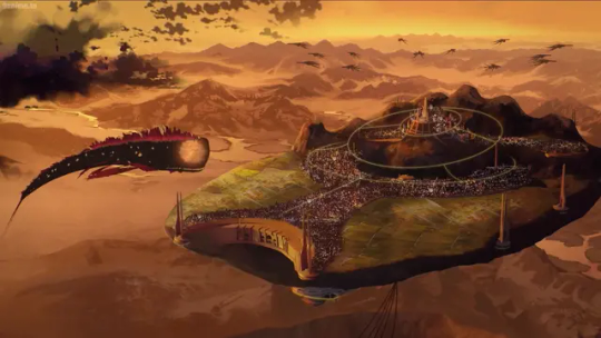
General Monstra Analysis
Appearance and Design: The images showcase Monstra's massive, whale-like exterior with purple Gravity Dust crystals and bat-wing-like fins, aligning with its description as a Leviathan-class Grimm. The interior features dark red fleshy walls, bone spikes, and gothic architectural elements, reflecting its organic ship nature.
Role and Destruction: Monstra served as Salem's mobile base, housing her inner circle and the Relic of Knowledge. Its destruction by Oscar Pine using The Long Memory's kinetic energy is a pivotal moment, consistent with the narrative in "Ultimatum."
Atmosphere: The art emphasizes a menacing, otherworldly vibe with red and purple tones, enhancing Monstra's role as a terrifying Grimm entity.
Monstra Features (Bullet Points)
Exterior:
Humongous sperm whale-like structure, dwarfing other Grimm like Nevermores.
Lacks eyes, with an orange glow similar to a Seer and a visible skull interior.
Purple Gravity Dust crystals enable flight; gray rocks adorn its body.
Five pairs of red bat-wing-like fins for aerial mobility.
Interior Layout:
Dark red fleshy walls, bone spikes, and cartilage-like floors with Grimm markings.
Translucent membrane doorways and dangling veins create a gothic, organic feel.
Patrolled by Seers as scouts for Salem.
Bridge:
Located atop Monstra's skull, featuring Salem's bone-like throne with Grimm markings.
Allows Salem to command Monstra and clear smoke for vision.
Rooms:
Torture chamber with Grimm-like hooks and an opaque ceiling, used for Oscar's interrogation.
Private quarters with cartilage floors and bone beds for Salem's agents.
Relic of Knowledge room with a pillar and Grimm Liquid pools, rigged with an alarm.
Landing Platforms:
Bone-like pads under wings, resembling gills, for airship access.
Surrounded by large Tempests.
Powers and Abilities:
Slow flight via Gravity Dust.
Clears smoke from its head for visibility.
Spews Grimm Liquid to form rivers, geysers, and spawn various Grimm (e.g., Sabyrs, Beowolves, Apathy).
Residents:
Housed Salem, Hazel, Cinder, Emerald, Neopolitan, Tyrian, Mercury, The Hound, and Oscar (temporarily).
Destruction: Destroyed by Oscar Pine in "Ultimatum" using The Long Memory, with its body dissolving over time.
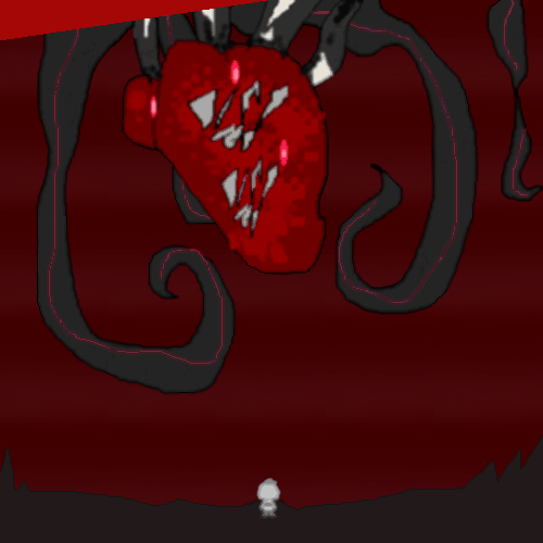
Analysis of Team RWBY Fighting Monstra's "Heart" (Concept Art)
Image Context: One image depicts Team RWBY (Ruby, Weiss, Blake, Yang) battling within a chamber resembling Monstra's "heart," characterized by pulsating red veins, a central organic structure, and a fiery, chaotic environment.
Narrative Implication: This suggests a climactic confrontation, possibly an attempt to strike at Monstra's core to weaken or destroy it from within, aligning with the "Hangar Bay Fight" concept noted in trivia.
Visual Elements: The heart-like structure, with tendrils and a glowing center, symbolizes Monstra's life force, making it a strategic target. Team RWBY's silhouettes indicate a coordinated attack, emphasizing their unity against Salem's creation.
Artistic Style: The use of vibrant reds and purples, combined with shadowy figures, heightens the dramatic tension, consistent with Monstra's overall aesthetic.
This analysis ties the concept art to Monstra's lore, highlighting its role and the potential significance of the heart as a battleground.
(Unforntately, RWBY Never get truly involved...)
Concept
#rwby#rwby shitpost#rwbyfandom#rwbyfndam#rwbyfndm#rwby fndm#rwby fandom#yang xiao long#rwby yang#rwby yang xiao long#RWBY villains#rwby foils#rwbypost#rwby post#rwbyshitpost#rwby comments#rwby comment#fandom rwby#rwby foil#rwby salem#salem#rwby ruby#rwby ruby rose#weiss#ruby rose#ruby rwby#ruby rose rwby#ruby#rose#salem rwby
10 notes
·
View notes
Text
BLOG
KASHYAP KALITA
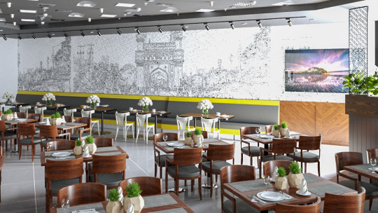
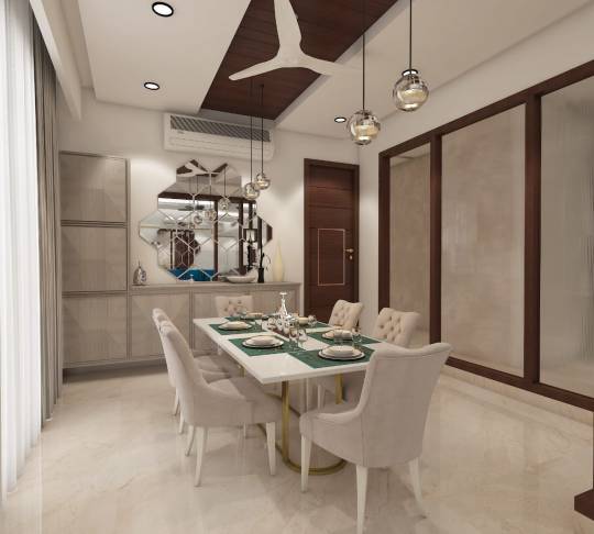
Designing a Contemporary Cultural Café: A Harmony of Heritage and Modernity
Designing a café isn’t just about tables and chairs—it’s about curating an experience. The café shown above exemplifies how thoughtful design can beautifully merge cultural roots with modern aesthetics, creating a space that feels both familiar and fresh. Let’s walk through the concept and key design elements of this stunning café space.
Concept Overview: Culture Meets Contemporary
The guiding vision behind this café was to create a welcoming, sophisticated environment that reflects local culture while staying aligned with current interior design trends. The highlight? A massive hand-sketched mural wall depicting iconic local architecture—like the Charminar—acting as a storytelling backdrop for the space.
Key Design Elements
1. Cultural Mural Wall
A monochromatic wall mural becomes the focal point of the entire space. The hand-sketched effect gives a raw, artistic vibe, showcasing architectural heritage in a subtle yet powerful way. It not only celebrates local landmarks but also draws customers into a narrative of place and pride.
2. Color Palette & Accents
The overall palette leans toward earthy and neutral tones with a deliberate splash of chartreuse yellow to bring energy and highlight the seating bench. The color scheme is modern but not sterile, keeping the ambiance relaxed and inviting.
3. Furniture Style
The café uses mid-century modern wooden chairs paired with dark tabletops, striking a balance between comfort and elegance. The contrast of warm wood tones with cool grey seating cushions adds dimension and richness to the setting.
4. Diverse Seating Arrangement
The café layout includes both formal dining tables and a long bench-style seating area along the mural wall. This mix allows for flexible usage—whether it's a casual coffee chat, a remote work session, or a full meal.
5. Decor & Table Settings
Each table is adorned with small potted plants or minimal floral arrangements, reinforcing a sense of freshness. Table settings are kept clean and practical, enhancing usability while maintaining visual harmony.
6. Wall Art & Lighting
A vibrant framed artwork toward the entrance adds a pop of color and a visual break from the mural. The overhead track lighting is both functional and atmospheric, casting an even glow and spotlighting the mural with precision.
Materials & Finishes
Walls: Textured tiles with a monochrome print
Furniture: Polished wood and matte-finished metal
Flooring: Sleek, large-format tiles for a clean, seamless look
Lighting: Recessed lights with directional spotlights
Sustainability & Biophilic Design
The inclusion of indoor plants and natural wood finishes not only enhances aesthetics but also contributes to well-being. These touches align with principles of biophilic design, which improves air quality and adds a sense of calm to the urban setting.
Conclusion: A Café Designed to Connect
This café isn’t just a place to grab a cup of coffee—it’s a destination that encourages connection: with local culture, with others, and with oneself. Through a clever blend of textures, tones, and storytelling elements, the space speaks to both heart and heritage. It’s the kind of place that invites you to sit a little longer, look a little closer, and leave a little more inspired.
3 notes
·
View notes
Text
Predators: Killer of Killers
It was curious to me that the Predators franchise continues to find its way into mainstream media, this time in the form of an animated film. Naturally, I decided to give it a watch.

Poster Predator: Killer of Killers As expected, it is a 3D animated film, following the visual trends made popular by titles like Arcane and Blue Eye Samurai. This hybrid approach has become the go-to for many recent projects. It blends painterly 2D aesthetics such as color blending, outline textures, and illustrative styling with the technical precision and realism offered by 3D animation. Narrative:
The core concept centers on the theme of "the hunter becomes the hunted." The film is structured around three separate sub-stories that eventually converge in the present timeline. While the structure is ambitious, the storytelling itself feels rather weak and, at times, implausible. The Viking segment was the least convincing. Vikings belong to a time far removed from modern science, let alone alien technology. In this story, the lead character somehow figures out how to use the Predator’s armlet. That moment stood out as completely unrealistic. There is simply no plausible way for someone from that era to understand, let alone activate, such an advanced piece of tech. It seemed like a narrative shortcut that undermined the integrity of the world the film was trying to build.

Ninja's reveal The Ninja storyline felt the most believable. Ninjas are traditionally associated with stealth, sensory awareness, and tactical thinking, so his resourcefulness fits well within those expectations. Although he interacts with some futuristic technology that stretches believability, the execution stays within an acceptable creative range.
The third story, involving a pilot from the 1970s, featured some of the most visually exciting sequences, especially during the flight scenes. However, the idea that the character could operate alien machinery, and even pilot the Predator’s spacecraft, stretched logic beyond its limits. This subplot relied heavily on spectacle but failed to make its core idea believable.
Ironically, each of these three stories had the potential to work better on its own. They felt stronger as independent narratives and became less compelling once the Predator and the futuristic tech were introduced into them.
Backgrounds and layouts:
Where the film shines most is in its world-building. The backgrounds and layouts are beautifully crafted and feel similar to the kind of concept art or loading screens often seen in fantasy games. Each timeline is established with rich visual language.
The Viking era makes a strong impression through its cold and misty landscapes. The use of darker, muted colors and the design of Viking ships help build a convincing arctic environment.
The Japanese middle-ages storyline also stands out. Traditional architecture, costume design, and visual motifs make the setting feel authentic and immersive.
The 1970s are portrayed with a mix of subtle visual cues. From the sky’s lighting to the aircraft design, and even small character details like keychains and tags, the setting feels thoughtfully considered and rooted in the period.
The alien planet also delivers. Its desolate, war-torn aesthetic communicates a post-apocalyptic environment with barren landscapes and harsh lighting. The absence of vegetation and the broken structures give the space a haunted, battle-worn feel.

Background from Predators: Killer of Killers
Animation and Post production: From an animator’s perspective, the film falls short in several areas. The Viking sequence, in particular, suffers from stiff motion whenever characters are not actively engaged in combat. The animation lacks fluidity and feels underdeveloped in slower scenes.
Example of a shot that feels unfinished
On the upside, the fight choreography is handled with care. The fast camera movement and dynamic angles help mask some of the roughness in the animation. Still, a few shots feel like they could have used another animation pass to achieve a more polished final look.
Takeaways:
The film contains some clever cinematic techniques that I found inspiring. One example is how it transitions between scenes. In one sequence, the Ninja throws a smoke bomb. The next shot cuts to a far exterior view with smoke drifting out of a window. Then, it cuts again to a full-screen shot filled with smoke, which slowly fades to reveal the next action beat. This smooth transition helps move the story forward without relying on excessive animation.


Clever shot-making during the action sequence
Another well-executed moment is the reveal of the Predator in the Ninja arc. The filmmakers use silhouette and selective lighting to build anticipation. Even though the audience knows what is coming, the framing and light placement manage to maintain a sense of mystery.
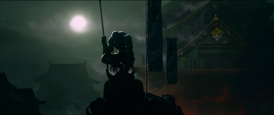
Predator reveal shot
A final detail worth noting is the use of crop circles. This visual reference appears during the pilot’s abduction scene, when the camera pulls back to reveal a circular formation in the field below the UFO. This is a clever way to root the story in real-world mythology. It taps into cultural memory and adds an extra layer of believability to an otherwise fictional moment.
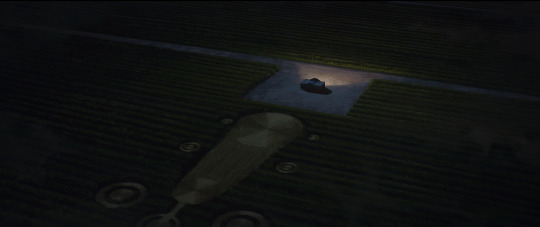
Crop circle reveal after abduction
Incorporating references that are widely recognized yet remain unresolved, like crop circles, is an effective way to make a fictional idea feel more grounded and believable. These elements tap into collective curiosity and help the audience connect with the story through familiar mysteries.
References:
Watch Predator: Killer of Killers | Disney+ (2025). https://www.disneyplus.com/en-gb/browse/entity-12b8b235-d856-4999-9d1c-c474ccd018e8.
Image:
Lu_M (2025) Predator: Killer of Killers. Review: how to make an awesome animation action film. https://cuttothetake.com/predator-killer-of-killers-review/.
#2d animation#reflection#visual development#animation#predator killer of killers#disney#disney plus#art
2 notes
·
View notes
Text
Graphical design principles in ancient Indian art
The Golden Ratio and its prevalence in Indian architecture: The Taj Mahal and other structures demonstrating the principle of perfect proportions.
The influence of symmetry and asymmetry in ancient Indian art: How balance is achieved through both repetition and variation.
Understanding the concept of "rasa" in Indian art: How emotions are expressed through visual elements and color palettes.

Visual Communication
Purpose: To convey information visually rather than through text alone.
Application: Logos, posters, websites, packaging, ads.
Working Principle: Use of imagery, typography, and layout to quickly attract and inform the viewer.
FIRST PRACTICAL KNOWLEDGE 👈.
Process Workflow
Brief/Objective – Understand the goal.
Research – Study the target audience, competitors, and theme.
Concept Development – Sketch ideas and layouts.
Design Execution – Create digital or physical artwork.
Feedback & Revision – Refine based on input.
Final Output – Deliver in proper formats (print, web, etc.).
Second Practical Knowledge 👈.
Get more video lesson on @technolandexpart
#ai image editing#ai generated art#ai artwork#ai generated#ai image#ai generated content#ai generated picture#ai generated images#ai model image#3d ai image#3d animation company#3d animation#3d animation studio#image processing#ai image creation#ai image generator#ai image processing#color art
4 notes
·
View notes
Text
WOII: Week 11 - Postmodernism
Postmodernism emerged in the late 20th century as a reaction to the ideals of Modernism, which valued progress, rationality, and universal truths. While Modernism sought clarity and order, Postmodernism challenged those foundations, asking: perfect for whom? truth according to who? and embraced contradiction, irony, and play.
In design, this meant rejecting minimalist ideals in favour of bold colours, layered typography, and chaotic compositions, as seen in the work of Paula Scher. Postmodernism is also deeply self-aware, often parodying itself, mixing styles, and leaning into fragmentation.

These ideas parallel poststructuralist theory, which similarly resists fixed meanings and questions the systems that shape our understanding. While poststructuralism operates through critique and theory, postmodernism expresses that skepticism culturally and visually—through design, architecture, and media like The Simpsons or BoJack Horseman, which break the fourth wall and critique their own narratives.
We explored these concepts in a class activity by creating postmodern-style advertisements in pairs or small groups. Starting with a personal object, we photographed it and designed an ad using principles like typography, fragmentation, plurality, and distortion. Through slogans, graphics, and unconventional layouts, we reflected on how our designs resisted traditional advertising logic.
As noted in What Is Postmodernism, “Postmodernism shattered established ideas about art and design, bringing a new self-awareness about style itself.” This reminds us that design isn’t neutral—it always carries cultural, political, or social meaning. Postmodernism invites us to examine the assumptions behind style, question whose perspectives are prioritized, and embrace ambiguity.
Ultimately, postmodernism doesn’t offer neat answers—it thrives in uncertainty and constant reinterpretation.
If Modernism asks: How can we make the world better through design?
Postmodernism replies: Whose world? Whose version of "better"? And isn’t it fun to mess with that question?
Word Count: 282
------------------------------------------------------------------------------
References:
“What Is Postmodernism? · V&A.” Victoria and Albert Museum, www.vam.ac.uk/articles/what-is-postmodernism?srsltid=AfmBOopGbaTVVlExTY3z0m6QP6lE4hwC_BRqRnQeOYo0s1_dyTGHLDjv.
------------------------------------------------------------------------------
2 notes
·
View notes
Text
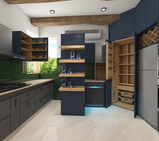
A Journey Through Kitchen Arch Design History
An architectural feature like an archway adds a unique, compelling, deep appeal to any space, including the often-overlooked kitchen. Over recent years, the fascination for kitchen archway design has surged as homeowners aim to amplify the aesthetics and practicality of their kitchen spaces. Such arches offer a fluid, eye-catching linkage between rooms, fostering an aura of openness and hospitality. Regardless of your home’s stylistic orientation — traditional, modern, or a blend of both — a well-executed kitchen archway can drastically boost your interior design.
The kitchen arch design, a familiar sight in many homes today, boasts a rich history that stretches back centuries. Its journey is one of adaptation and evolution, reflecting changing architectural styles, societal needs, and even technological advancements.
Let’s delve deeper into this fascinating story:
Ancient Beginnings (2nd Millennium BC): While the earliest documented uses of arches appear in Mesopotamia, primarily for structural support in larger buildings, they planted the seed for their future application in kitchens. This period laid the foundation for the technology and concepts that would shape arches in the years to come.
Roman Innovation (1st Century BC — 5th Century AD): The Roman Empire witnessed a golden age of arch construction. Their mastery of the technique extended beyond aqueducts and bridges, potentially reaching domestic spaces like kitchens in grand Roman houses. However, concrete evidence of everyday kitchens incorporating arches remains elusive.
Medieval Transformations (5th Century AD — 15th Century AD): During the Middle Ages, the focus shifted towards smaller, more practical kitchens within castles and manors. While grander architectural features continued to utilize arches, their presence in the typically smaller and more utilitarian kitchens of the era was quite limited.
The Rise of Domesticity (17th Century — 19th Century): As the concept of domesticity gained greater emphasis, kitchens began to occupy a more prominent role within the home. The Georgian era (1714–1830) in Britain, for instance, saw kitchens incorporating elegant rounded doorways and arch-shaped windows, adding a touch of sophistication to these increasingly important spaces.
Modern Influences (Early 20th Century): The 20th century brought various architectural movements that significantly impacted kitchen design. Art Deco (1920s & 1930s), known for its geometric shapes and clean lines, embraced the arch in a more stylized and modern way, offering a fresh interpretation of this classic element.
Post-War Functionality (Mid-20th Century): Following the Second World War, housing trends prioritized practicality and efficiency in response to changing needs and realities. The “Frankfurt Kitchen” (1926), a pioneering design that shaped modern kitchens, emphasized a streamlined layout with straight lines and minimal ornamentation, favoring functionality over elaborate design elements like arches.
The Return of the Arch (Late 20th Century — Present): Recent decades have witnessed a resurgence of the arch in various design styles. Tuscan-inspired kitchens often feature arched doorways and windows, evoking a sense of warmth and traditional elegance. Meanwhile, some contemporary kitchens utilize recessed arches to create visual interest and delineate specific areas within the space, offering a more modern interpretation of this timeless element.
Beyond their aesthetic appeal, arches in kitchens can offer some practical benefits as well:
Openness and connection: Arches can visually connect different areas within the kitchen, fostering a sense of spaciousness and encouraging a more seamless flow between spaces.
Light and ventilation: Larger arches can facilitate the flow of natural light and improve air circulation, making the kitchen a more pleasant and healthy environment.
Storage and function: In some instances, arches can be incorporated into cabinetry designs, providing additional storage space or creating unique display areas, offering a functional element to their aesthetic charm.
From its ancient origins to its modern interpretations, the arch continues to add a touch of history, elegance, and functionality to kitchens across the globe. As design trends evolve, the future of the kitchen arch remains open to creative expression, ensuring that this timeless element continues to grace our kitchens for years to come.
source: https://medium.com/@FMDcabinets/kitchen-arch-design-a-timeless-journey-through-history-b1e209826372
7 notes
·
View notes
Text
I will actually continue a bit from my previous post, about one of personal important point, the location-centric nature of the original AHS. That's something modern AHS lacks and that the "classic" AHS was built around. Each location having its own filming techniques, color palette and architectural design ; each location being explored in role, through history, being given a past and a set of people connected to it. The amount of details poured into these locations and the sets was insane - and that's something a lot of today's AHS viewers do not get for one simple reason.
Back when seasons like Freak Show or Hotel aired, there were friggin' promo videos, and behind-the-scenes videos, and bonus videos released on official AHS channels and accounts. It was interviews with the set designers, with the actors, with the producers and script-writers, tours of the sets, videos of the special effect crew making the props or shaping the costumes. And this gave you such a glimpse into the effort made in there - for example I distinctively remember how they pointed out that the columns of the lobby in Hotel have Venus flytraps sculpted on them. It is not something you clearly see in the show, it is not something pointed out to you, but the bonus videos showed you all of this in detail.
But today? Not only have they stopped creating those kind of videos, so that to find behind-the-scenes content you have to follow the personal accounts of the actors or of the special effects makers, but they also REMOVED THE OLD ONES so that a lot of additional and promotional material is just gone... You can still find the most gorgeous concept art and layout maps for the sets of Freak Show, with each caravan being thought to reflect the personality and history of its inhabitant. I haven't seen a single location-concept for any of the recent AHS seasons. Just costume concept, and general visual vibes, and that's if one is lucky.
#ahs#american horror story#i love ahs#but unfortunately what i love is becoming a distant memory#and it makes me feel so old that a show not that recent#still somehow abruptly changed in a way that the audience cannot return to a feeling that was just a few years ago
6 notes
·
View notes
Text
Animation
Reinvention in story telling
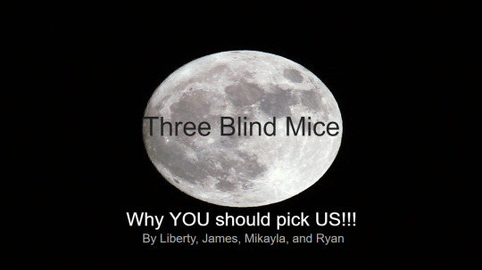
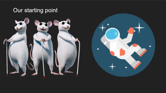
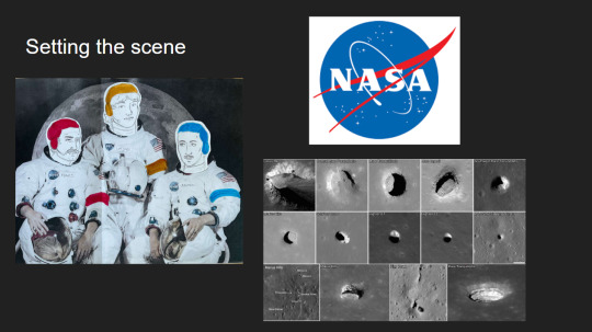
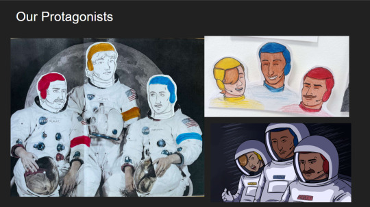
Three Blind Mice, Epic/Historical, Space Age (1957-present)
Week 3, 22-28/04/24
Monday
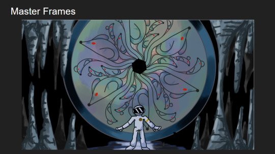
Did a zine workshop during the morning, I made a sad little zine with some bits of rough potential visuals for the project.
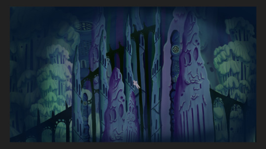
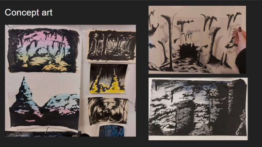
I then jumped straight into creating concept art and trying to figure out how to combine natural cave formations with architectural features. What I ended up doing that day was creating this rough pencil of some stalagmites and drawing arches and doorways on top of it.
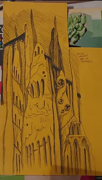
Using this as a starting point I went off and photocopied it a few times, which I then cut up and collaged together on a page to gain a rough idea of what this metropolis could look like.
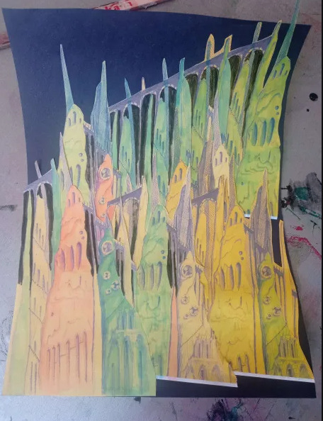
This is what I ended up with. I love how the buttresses came out but the perspective of the piece looks completely wrong, making it look cluttered without purpose. I tried colouring parts blue and pink to separate it a small bit, but I think the main issue is that all of the structures are the same size even at a distance, in future I'll have to make the ones in the back larger and more hazy looking whereas the ones in front smaller and more detailed. This was just an experiment so its not too important.
Later that evening I did a colour study of scenes from Akira to develop my understanding of cel shading, I also watched a few videos on the production of Akira. It ended up being very useful and I found myself very surprised with Akira's colour palette. I quite literally colour dropped the colours from the scenes and and did rough drawings of the scenes using them, I was really surprised to see that the colour I dropped was the same as the one in the scene. It was absolutely fascinating.
Tuesday
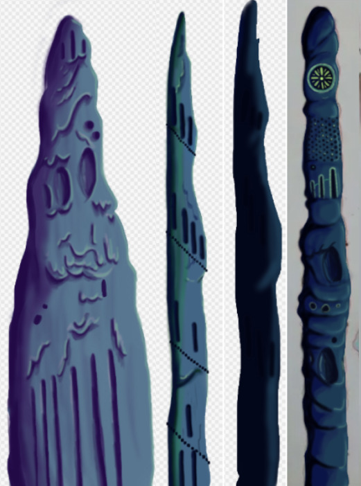
I further looked into combining architecture with cave structures by doing a quick study on Antoni Gaudi's building designs and did a study on different stalagmites.
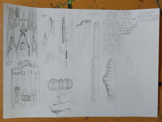
Looking at Gaudi's designs was interesting as he uses lots of organic shapes that almost look like they're melting in a way, and in other works like the Sagrada Familia he has lots of towers with unique features.
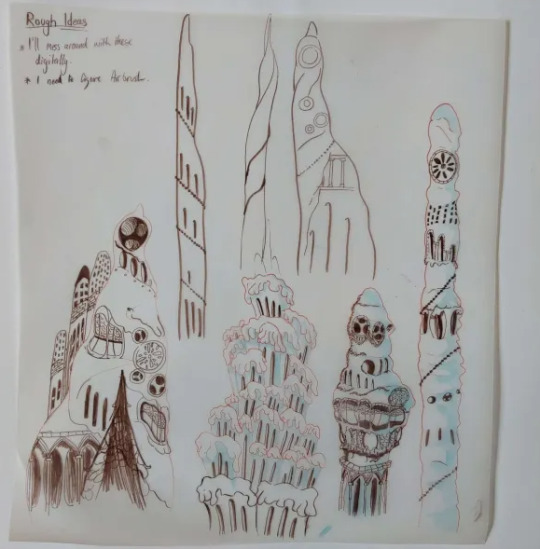
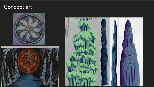
I tried combining these features to the stalagmites I studied to gain unique structures that would be believed to have belonged to an underground metropolis. I ended up with some nice designs, I worry a small bit that they might be too detailed but overall I'm happy with them, I still think these designs would have to be further developed but I don't have the time to do so.
At the moment my plan is to individually recreate these digitally and then photoshop them together in different ways to gain the illusion of having more designs than I do.
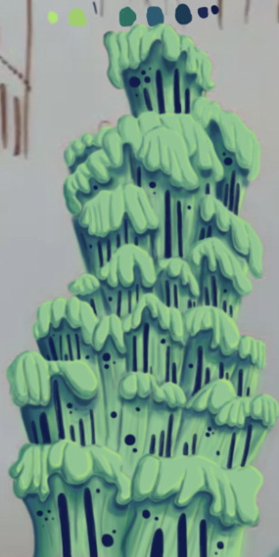
The photo is a small bit fuzzy but this was the first structure I recreated digitally. This took me around 6 hours to do, which was mainly because I've never done a proper digital piece before, so it took me a bit of time figure out what worked best and what short cuts I could take. I actually drew on top of a picture of my original paper sketch instead of redrawing it.
I created this solely using the air brush tool, and I love how it turned out, it looks so drippy. The only thing I can say really is that I wish I got it done a bit quicker, and that the values were much darker on my personal monitor.
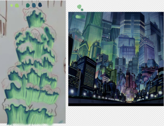
I used the background from Akira as a reference for the colours.
Thursday
I made 4 more structures, significantly much more quicker too. While I spent too much time on the first one it gave me the experience needed to bang these ones out quickly and more efficiently. These were also done using the airbrush tool. For the backgrounds we actually made it a point to solely use airbrush as a way to commemorate the animations from the 70's/80's.
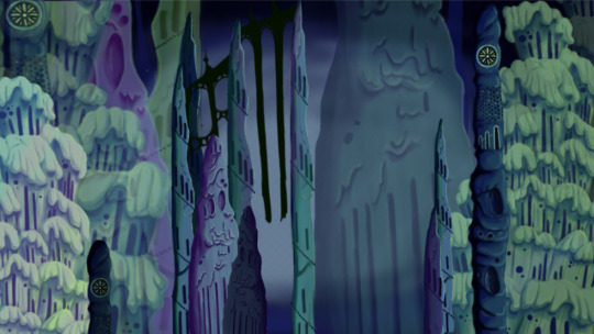
Since most of my pieces were done I got started on piecing them together. I tried making the buildings further back bigger and transparent and the ones closer to the viewer bigger. This was as far as I got on Thursday. If I'm being honest I'm not happy with the layout. I was using the Akira background as a reference but then realised it wouldn't work as the light source in the background is from behind, in my background the light source is from the front. I knew I definitely had to redo the layout.
Friday
We did a pitch workshop with Paul and Yvonne and then as a team discussed how we would go about our pitch . We discussed who would say what, what we thought a funder would want to know before investing in a project, we worked out costs, how many episodes, how many animators it would take to animate it in a year and ect...
We also did a few rehearsals in the studio improvising our lines and timing ourselves to get a feel for it. We decided that I would open and close our pitch, introducing our Nursery rhyme, genre, & time period while also setting the scene for our animatic.

Before work I managed to redo my background, I thought this one turned out way better. The perspective looked way better than last time too. I feel like with more time I could develop this further but I don't have that time so this is what I have and I'm happy with it.
Sunday
youtube
I made the presentation for our project, and the team went on call to rehearse our pitch. We did this twice.
2 notes
·
View notes
Text


Tales of Dusktown
Visual development project for Tales of Dusktown. This one is bookshop and cafe as main businesses and apartments above for main characters to live within. Many different fairytale creature live within Dusktown. They need time to rest and socialise. Dusktown is fictional town inspired by steampunk and victorian era within modern time. Gaia's shop is where folk can come to buy their groceries and fresh vegetables. Fluorite's flower shop is where faeries sell their most precious home grown plants and flowers from nearby forest in which they reside in.
#Digital 2D#Animation#Architectural Concepts#Environmental Concept Art & Design#Visual Development#Book Illustration#conceptart#illustration#design#sketch#pencil#goth#gothic#fairytale#character#oc#study#visual development#environment#background#layout#cafe#bookshop#fantasy#house#shop#food#vegetables#town#autumn
0 notes
Text
What is the Interior Designing?
Interior design is a multifaceted discipline that involves the art and science of enhancing the interior of a space to create a more aesthetically pleasing and functional environment.

It goes beyond just arranging furniture and selecting color schemes; it encompasses a deep understanding of architecture, human psychology, and the creative utilization of space.

Interior designers work with various elements, including color, lighting, furniture, fabrics, and spatial arrangements, to transform an empty space into a cohesive and harmonious living or working area.

Historical Evolution:
The history of interior design can be traced back to ancient civilizations where the layout and decoration of living spaces were driven by practical needs and cultural influences.

As societies evolved, so did the concept of interior design. The Renaissance period witnessed a shift towards more ornate and decorative interiors, showcasing craftsmanship and opulence.
In the 19th century, the Industrial Revolution brought about mass production, making furniture and decor more accessible. The 20th century saw the emergence of various design movements, such as Art Deco, Modernism, and Postmodernism, each leaving its mark on interior design.
The Role of Interior Designers:
Interior designers play a crucial role in shaping the ambiance and functionality of a space.

They work closely with clients to understand their needs, preferences, and lifestyle, translating these into design concepts. Beyond aesthetics, interior designers also consider safety, accessibility, and environmental sustainability in their designs.

Their expertise extends to selecting materials, coordinating color schemes, and integrating elements that enhance both the visual appeal and the functionality of a space.
Key Elements of Interior Design:
Space Planning: The effective use of space is a fundamental aspect of interior design. Designers must consider the layout of rooms, the flow of movement, and the optimal placement of furniture and fixtures to create a balanced and functional environment.
Color Palette: Colors have a profound impact on the mood and atmosphere of a space. Interior designers carefully choose color schemes that align with the client’s preferences and the intended purpose of the space. Warm colors may evoke a cozy feel, while cool colors can create a calm and serene ambiance.
Furniture and Furnishings: Selecting the right furniture is essential for both comfort and style. Interior designers choose pieces that complement the overall design, considering factors such as scale, proportion, and functionality.
Lighting: Lighting is a critical element that can dramatically influence the perception of a space. Interior designers strategically plan the placement of lighting fixtures, taking into account natural light, task lighting, and ambient lighting to create a well-lit and inviting atmosphere.
Textures and Patterns: Incorporating a variety of textures and patterns adds depth and interest to a space. Whether through textiles, wallpapers, or materials, designers use textures and patterns to enhance the visual appeal of interiors.
Accessories and Artwork: The careful selection and placement of accessories, artwork, and decorative elements contribute to the overall aesthetic of a space. These details reflect the personality of the inhabitants and add a finishing touch to the design.
Technology Integration: In the contemporary era, technology plays a significant role in interior design. From smart home systems to innovative lighting solutions, interior designers integrate technology seamlessly into their designs to enhance convenience and efficiency.
The Design Process:
The interior design process typically involves several stages, each crucial to the successful completion of a project:
Initial Consultation: This phase involves meeting with the client to understand their requirements, preferences, and budget. It is an opportunity for the designer to gather information and establish a rapport with the client.
Concept Development: Based on the client’s brief, the designer develops a concept that outlines the overall theme, color scheme, and design direction. This stage may involve creating mood boards, sketches, or 3D renderings to visually communicate the proposed design.
Space Planning: The designer creates a detailed plan for the layout of the space, considering factors such as traffic flow, furniture arrangement, and functional zones.
Material and Furniture Selection: This stage involves choosing materials, finishes, and furniture that align with the design concept. Designers consider both aesthetics and functionality, ensuring that selected items meet the client’s needs.
Implementation: Once the design is finalized, the implementation phase begins. This includes coordinating with contractors, overseeing construction or renovation work, and managing the installation of furnishings and decor.
Finalization: The designer conducts a final walkthrough to ensure that every detail is in place. This may involve making any necessary adjustments and addressing any issues that arise during the implementation phase.
Client Approval: The completed project is presented to the client for approval. Client feedback is essential, and revisions may be made based on their input.
Project Completion: With client approval, the project is considered complete. Interior designers may provide additional services, such as maintenance recommendations or assistance with the arrangement of personal belongings.
Challenges and Trends:
Interior designers face various challenges, including staying updated with evolving design trends, working within budget constraints, and addressing the unique needs of each client. Additionally, environmental sustainability has become a growing concern, leading to a greater emphasis on eco-friendly design practices.
Several trends have shaped the field of interior design in recent years. Minimalism, characterized by clean lines and a focus on simplicity, has gained popularity. Biophilic design, incorporating elements of nature into interiors, has also become a significant trend, promoting well-being and connection to the environment.

The rise of smart homes has influenced interior design, with designers integrating technology seamlessly into their projects. From automated lighting systems to smart appliances, the incorporation of technology enhances both the functionality and efficiency of modern living spaces.
Educational and Professional Pathways:
Becoming an interior designer typically involves formal education and practical experience. Many designers hold a bachelor’s degree in interior design, architecture, or a related field. Some pursue advanced degrees or certifications to specialize in particular areas of design, such as sustainable design or healthcare design.

Conclusion:
Interior design is a dynamic and evolving field that combines creativity, technical expertise, and a deep understanding of human behavior. It has a profound impact on the way people experience and interact with their living and working spaces.

From historical influences to contemporary trends, interior design continues to shape the aesthetic and functional aspects of the built environment.
As society evolves and individuals seek personalized and functional spaces, the role of interior designers remains pivotal. The ability to transform an empty room into a well-designed, harmonious environment requires a unique blend of artistic flair, technical proficiency, and a commitment to understanding and meeting the needs of clients.
Whether creating a cozy home, a productive office, or a vibrant commercial space, interior designers contribute to the creation of environments that enhance the quality of life and reflect the unique personalities of those who inhabit them.
#architecture#interior design#interiors#luxury home#modern home#home interior#home decor#home design#decor#home#interior decor#interiors design#interior architecture#interior accessories#interior door#interior decorating#interior decoration
4 notes
·
View notes
Text
What are the 5 Basics of Interior Design?

Interior design is the art of transforming spaces into functional and aesthetically pleasing environments. Whether you're revamping your home or considering a career in interior design, understanding the fundamentals is key. In this blog, we'll unravel the five basics of interior design that serve as the foundation for creating captivating and well-balanced spaces.
Space Planning:
At the core of interior design is the strategic allocation and arrangement of space. Space planning involves determining the optimal layout for a room, considering factors such as functionality, traffic flow, and furniture placement. It's about finding the right balance between an open and inviting atmosphere while maximizing the utility of every square foot.
Color Harmony:
Colors have a profound impact on the mood and atmosphere of a space. Establishing color harmony involves selecting a cohesive color palette that complements the purpose of the room and reflects the desired ambiance. Whether it's a calming monochromatic scheme, a bold complementary palette, or a neutral backdrop with accent colors, the right color harmony can transform a space.
Furniture and Furnishings:
Choosing the right furniture and furnishings is a crucial aspect of interior design. Consider the scale, proportion, and style of furniture to ensure it aligns with the overall design concept. The arrangement of furniture should facilitate easy movement and conversation while enhancing the visual appeal of the space. Thoughtful selection of furnishings, including rugs, lighting, and accessories, adds layers of texture and personality.
Lighting Design:
Lighting is a design element that can dramatically influence the mood and functionality of a space. A well-lit room considers natural and artificial lighting sources to create a balanced and inviting ambiance. Lighting design involves selecting fixtures that complement the overall aesthetic, as well as strategic placement to highlight architectural features and focal points.
Texture and Patterns:
Texture and patterns add depth and visual interest to interior spaces. Incorporating a variety of textures, such as smooth surfaces, plush fabrics, and tactile materials, creates a sensory-rich environment. Similarly, patterns, whether through wallpapers, textiles, or artwork, contribute to the overall design narrative. Balancing the use of texture and patterns ensures a harmonious and visually engaging interior.
Explore Interior Design at IIFD:
Unlock the doors to the world of interior design at the best Interior Design College in India like IIFD - Indian Institute Of Fashion & Design (@iifd). IIFD courses are crafted to provide aspiring designers with the skills, knowledge, and industry insights needed to excel in the dynamic field of interior design.
Visit IIFD - Indian Institute Of Fashion & Design official website or contact at +91 9041766699 to learn more about how IIFD can guide you on your path to mastering the basics of interior design. The Indian Institute of Fashion and Design (IIFD) offers comprehensive courses that seamlessly blend creativity with technical expertise. Your journey to creating harmonious and captivating spaces begins with IIFD!
#Basics of Interior Design#Basics of Interior#Basics of Interior Designing#Basics of Design#iifd#education#iifd chandigarh#careers#Interior Designing#Interior Design College#Interior Design careers
3 notes
·
View notes
Text
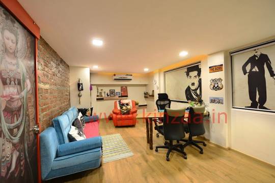
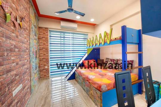
Luxury Living: Kinzaa’s Top-tier Architectural and Interior Designs in Mumbai
In the bustling heart of Mumbai, where the city's pulse resonates through its architecture and interior spaces, one name stands out – Kinzaa. Renowned for its top-tier architectural and interior designs, Kinzaa has become synonymous with luxury living in this vibrant metropolis. In this blog, we embark on a journey to explore the opulent world crafted by Kinzaa, delving into the details of their transformative creations that redefine Mumbai's skyline and interior spaces.

The Kinzaa Aesthetic: Where Luxury Meets Innovation
At the core of Kinzaa’s success lies a distinctive aesthetic that seamlessly blends luxury with innovation. Each project undertaken by Kinzaa is a testament to their commitment to pushing the boundaries of conventional design. The architectural marvels and interior spaces they create are not just structures; they are living works of art that reflect a keen understanding of modern living infused with timeless elegance.
Cityscape Statements: Kinzaa’s Architectural Wonders Unveiled
Mumbai’s skyline is a canvas, and Kinzaa paints it with architectural wonders that captivate the eye and stimulate the imagination. From sleek, modern skyscrapers to avant-garde residences, Kinzaa’s architectural designs redefine the cityscape. The interplay of form and function is evident in every structure, with a focus on creating spaces that are not only visually stunning but also purposeful.
Luxury Redefined: Interior Masterpieces by Kinzaa
Step inside a Kinzaa-designed space, and you’ll find yourself in the lap of luxury. The interior masterpieces created by Kinzaa elevate the concept of opulence to new heights. Meticulous attention to detail, premium materials, and a keen sense of style characterize their interior designs. From grandiose living rooms to intimate bedrooms, Kinzaa transforms spaces into havens of comfort and sophistication.
Mumbai Mosaics: Kinzaa’s Contemporary Visions in Architecture and Design
Architectural Fusion: Bridging Traditions with Modernity
Kinzaa’s ability to seamlessly blend traditional elements with modern design principles is a hallmark of their work. The architectural fusion seen in their projects is a delicate dance between the past and the present, creating spaces that are not bound by time. Whether it’s incorporating traditional materials into a modern structure or infusing ancient architectural motifs with a contemporary twist, Kinzaa’s designs tell a story of harmonious coexistence.
Sculpting Lifestyle: Kinzaa’s Signature Touch in Mumbai Residences
The mark of a Kinzaa-designed residence is not just its physical presence but its ability to shape the lifestyle of its inhabitants. Kinzaa understands that a home is more than just walls; it is a sanctuary, a reflection of the people who dwell within. Their signature touch is evident in the thoughtful layout, intelligent use of space, and the seamless integration of technology to enhance the living experience.
Urban Oasis: Interior Inspirations from Kinzaa
Elegance Redefined: Kinzaa’s Architectural Brilliance in Mumbai
Elegance is not just a design choice for Kinzaa; it’s a way of life. Their architectural brilliance lies in the ability to infuse even the grandest structures with a sense of grace and sophistication. Whether it’s a high-rise commercial building or a sprawling residential complex, Kinzaa’s touch of elegance sets their projects apart in a city known for its grandeur.
Mumbai Marvels: Kinzaa Architects’ Iconic Interior Designs
Kinzaa’s portfolio is a gallery of iconic interior designs that have left an indelible mark on Mumbai’s landscape. These are not just spaces; they are statements that redefine what is possible in interior aesthetics. Kinzaa’s iconic designs are a testament to their ability to push boundaries and create interiors that are not just visually striking but also functionally superior.
From Concept to Reality: The Kinzaa Design Process

Conclusion:
In the realm of luxury living in Mumbai, Kinzaa stands as a beacon of innovation and style. Their top-tier architectural and interior designs have redefined the city’s landscape, creating spaces that are not only visually stunning but also deeply functional. As Mumbai continues to evolve, Kinzaa’s influence will undoubtedly shape the future of architect and interior designers company in Mumbai, this dynamic metropolis. For those who seek the epitome of luxury living, a Kinzaa-designed space is not just a residence; it’s an experience crafted with passion, precision, and a profound understanding of what it means to live in the lap of luxury in the city that never sleeps.
#architectinmumbai#interiordesign#home interior#interior design#architecture#residential interior designers#architect in mumbai#project management#architecturelovers#kinzaa
2 notes
·
View notes
Text
Harmony and Balance: The Art of Aesthetics
The Golden Ratio and its prevalence in Indian architecture: The Taj Mahal and other structures demonstrating the principle of perfect proportions.
The influence of symmetry and asymmetry in ancient Indian art: How balance is achieved through both repetition and variation.
Understanding the concept of "rasa" in Indian art: How emotions are expressed through visual elements and color palettes.

Visual Communication
Purpose: To convey information visually rather than through text alone.
Application: Logos, posters, websites, packaging, ads.
Working Principle: Use of imagery, typography, and layout to quickly attract and inform the viewer.
FIRST PRACTICAL KNOWLEDGE 👈.
Process Workflow
Brief/Objective – Understand the goal.
Research – Study the target audience, competitors, and theme.
Concept Development – Sketch ideas and layouts.
Design Execution – Create digital or physical artwork.
Feedback & Revision – Refine based on input.
Final Output – Deliver in proper formats (print, web, etc.).
Second Practical Knowledge 👈.
Get more video lesson on @technolandexpart
#ai image creation#ai generated#ai artwork#ai image#ai image generator#ai image editing#3d animation services#3d image#3d image processing#3d animation company#3d animation#3d animator#3d animated film#3d artwork#art&design#artandesign#image processing
5 notes
·
View notes