#kate carin interview
Explore tagged Tumblr posts
Text
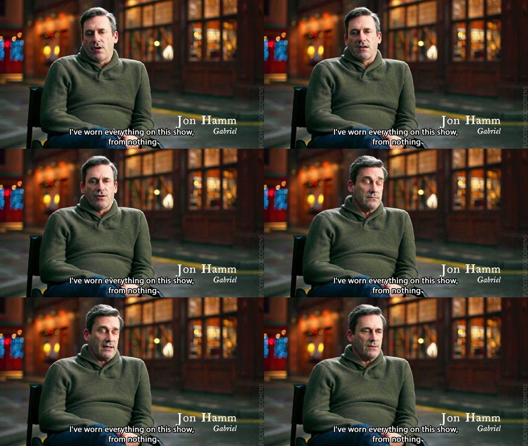


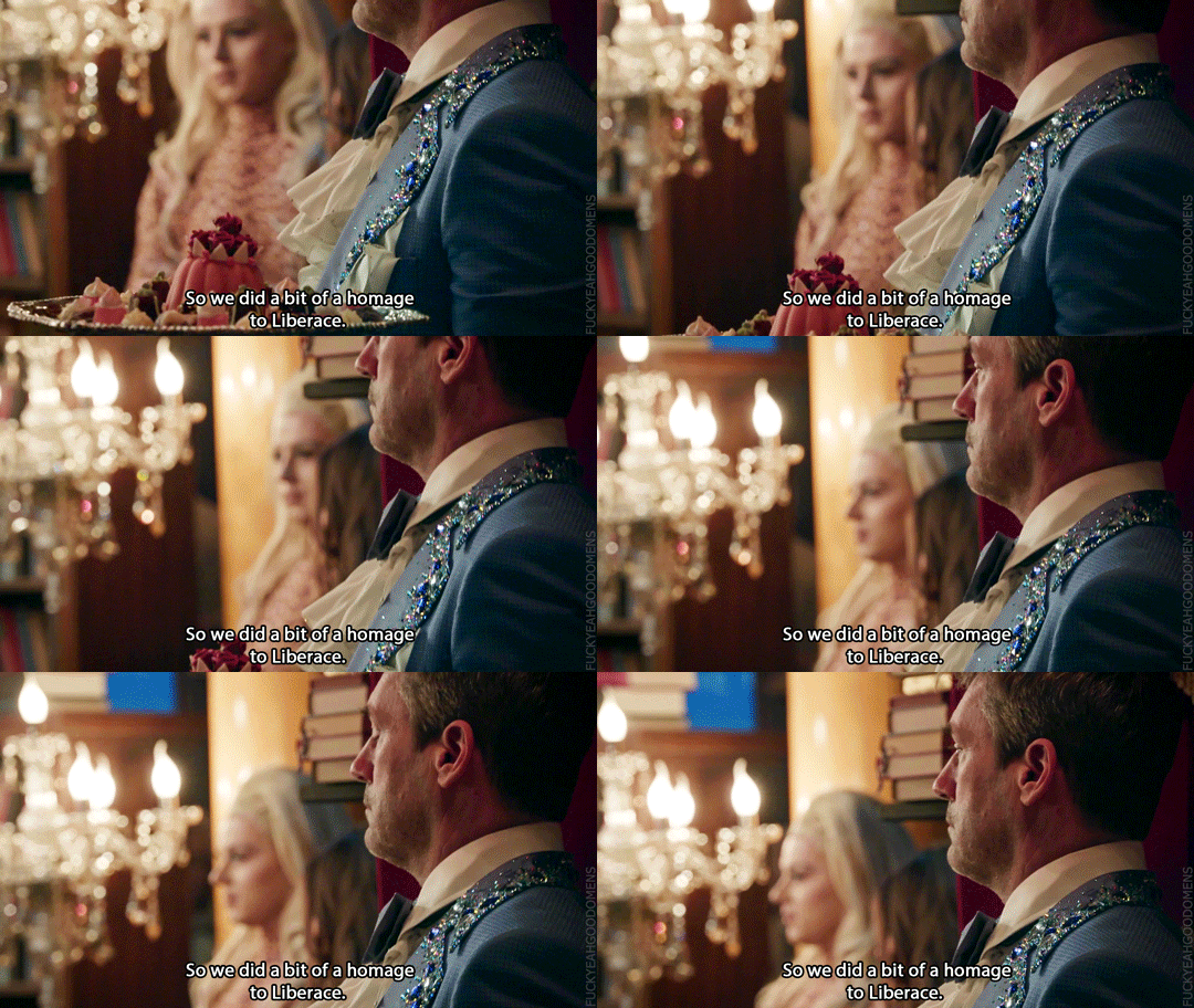
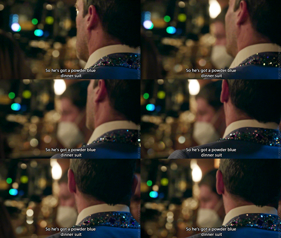


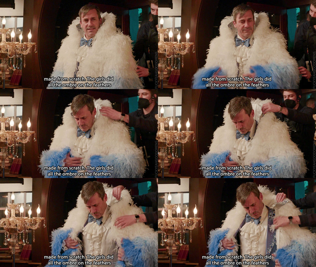
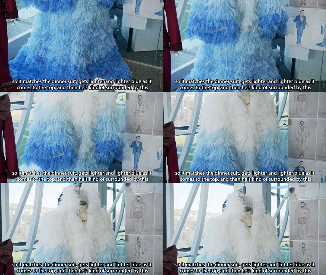

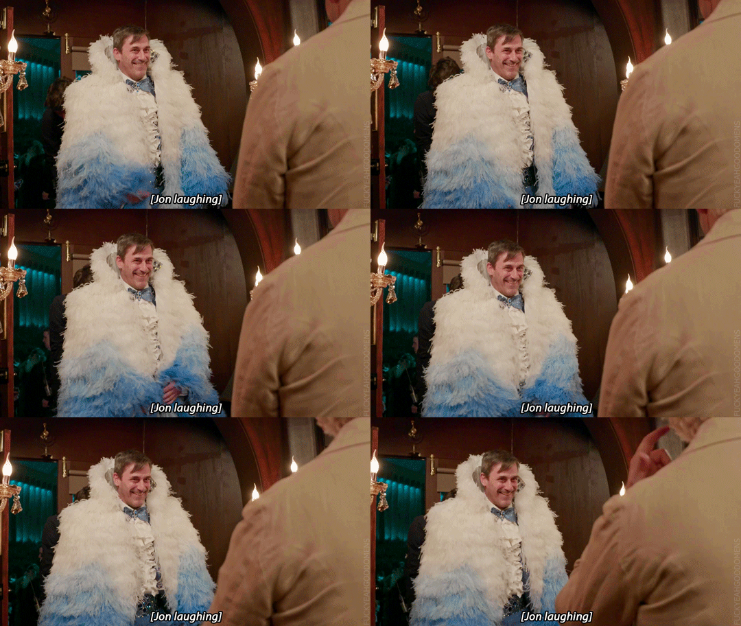

Jon Hamm: I've worn everything on this show, from nothing to a rug wrapped around me to a beautiful bespoke suit.
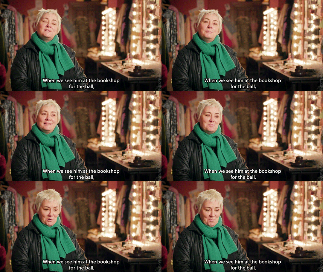
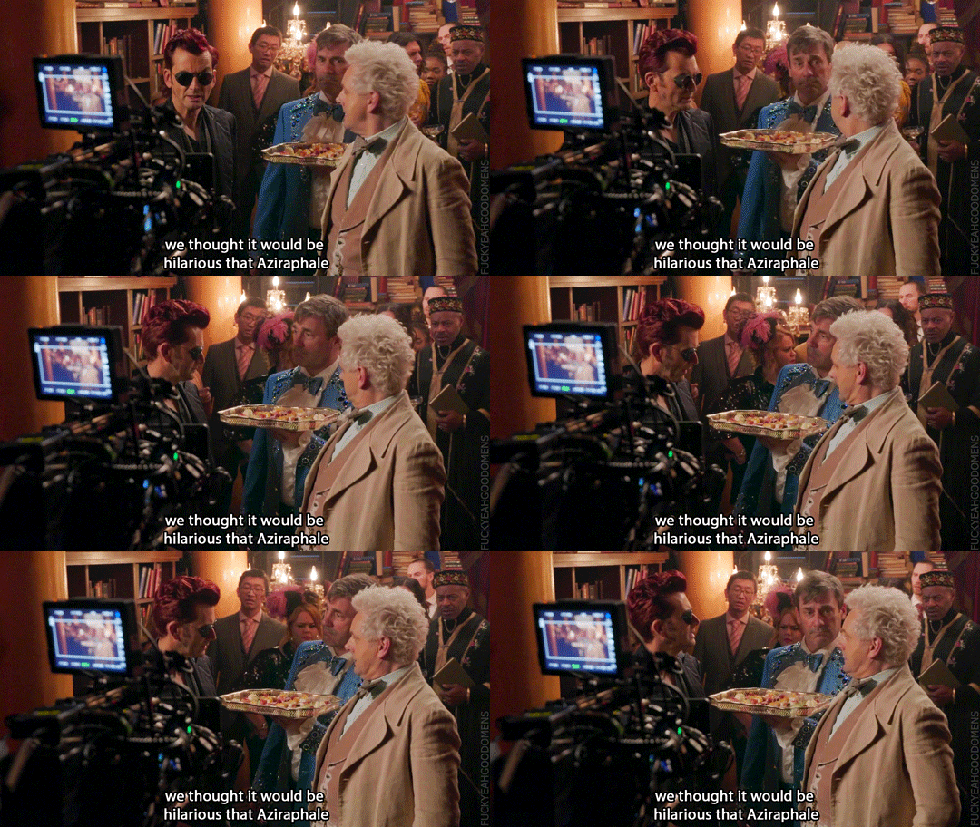
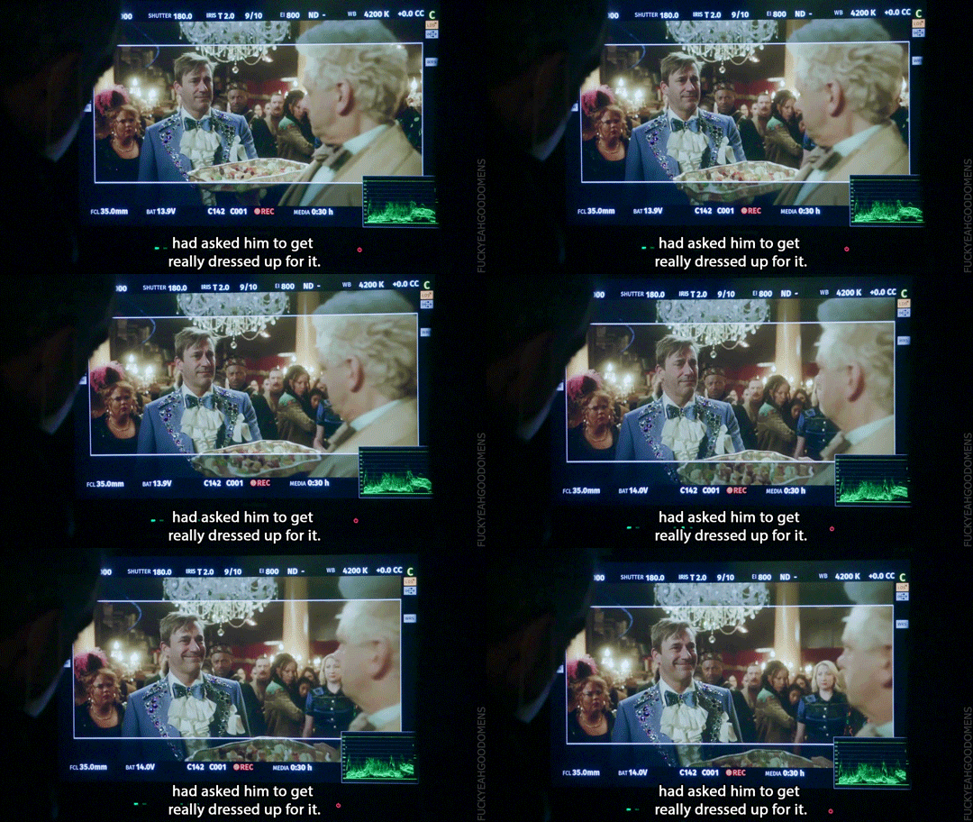
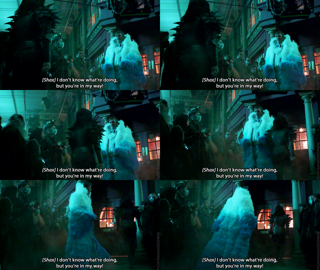
Kate Carin (Costume Designer): When we see him at the bookshop for the ball, we thought it would be hilarious that Aziraphale had asked him to get really dressed up for it. So we did a bit of a homage to Liberace. So he's got a powder blue dinner suit that's encrusted with rhinestones. And then Douglas asked if we could do some sort of coat to go on top of it for one of the scenes when he leaves. So, of course, we didn't do just a coat. We did a huge ostrich feather coat, which we made from scratch.The girls did all the ombre on the feathers so it matches the dinner suit, gets lighter and lighter blue as it comes to the top, and then he's kind of surrounded by this halo of white feathers.
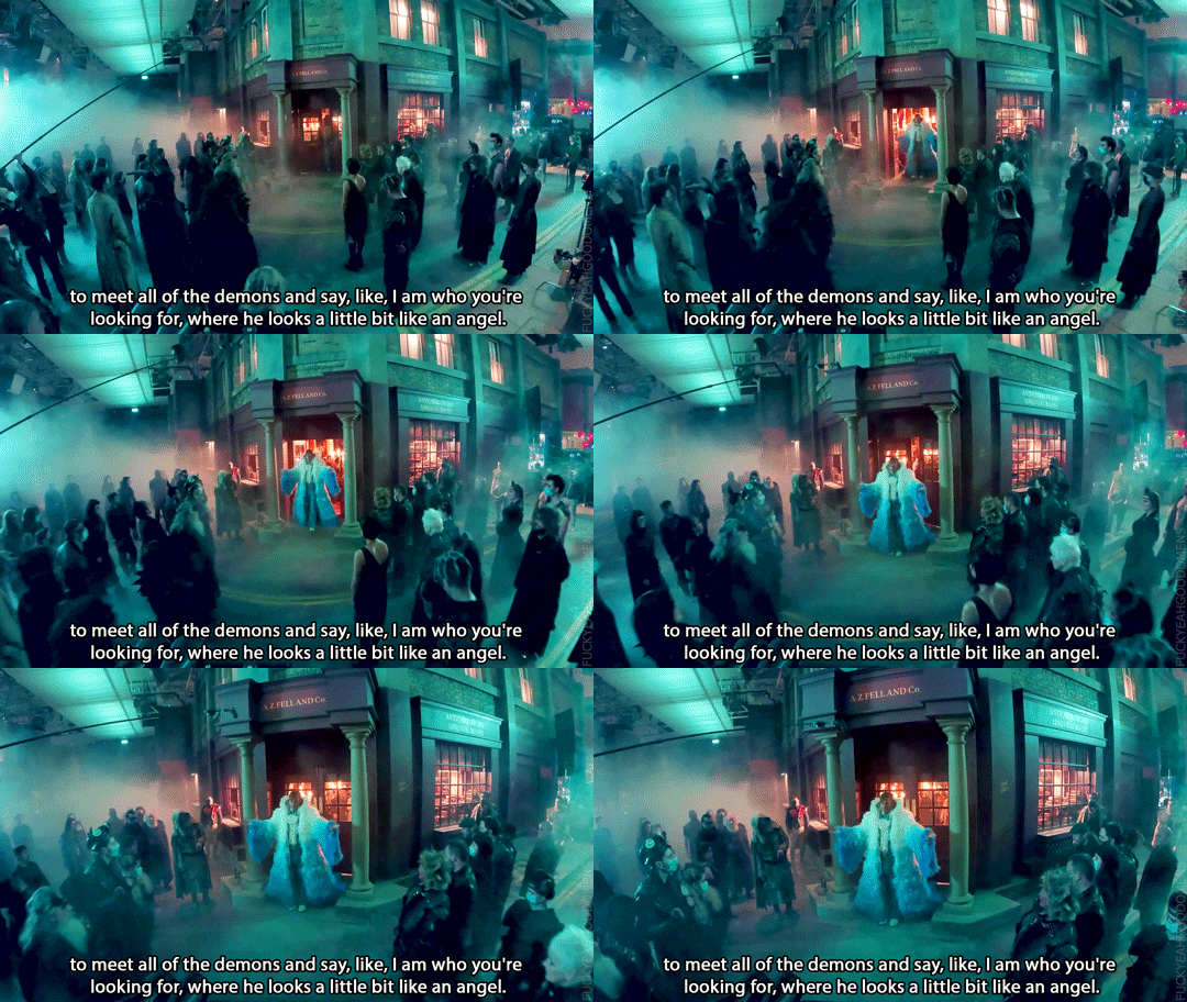
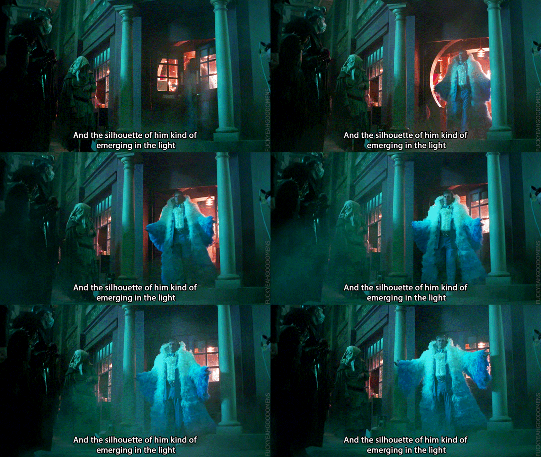
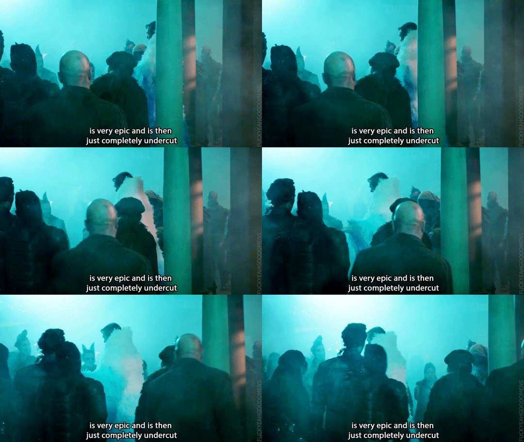
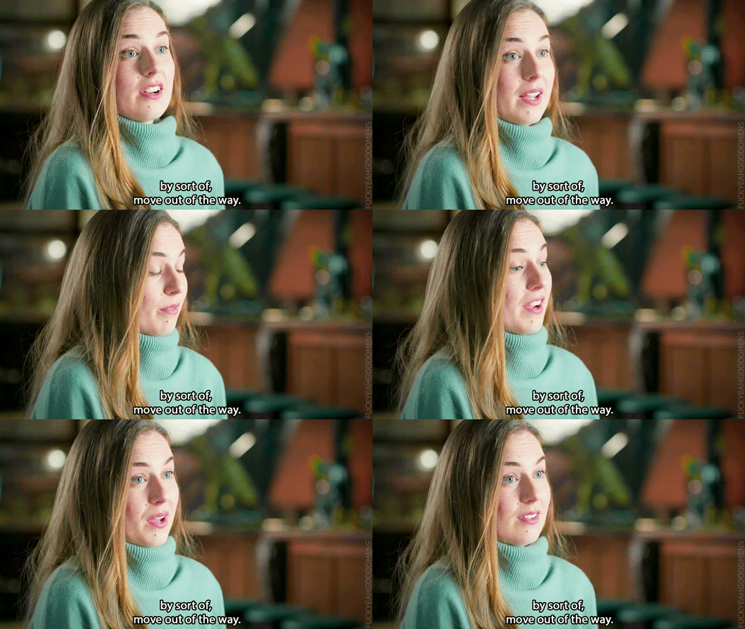
Sarah-Kate Fenelon (Producer): There is a shot when he emerges from the bookshop to meet all of the demons and say, like, I am who you're looking for, where he looks a little bit like an angel. And the silhouette of him kind of emerging in the light is very epic and is then just completely undercut by sort of, move out of the way. (video)

#good omens#gointerviewedit#goodomensbtsedit#jon hamm#gabriel#jim#kate carin#sarah-kate fenelon#bts#fun fact#costumes x-ray#2ep5#2i5i15#interview#jon interview#sarah-kate interview#2i5i16#s2 interview#kate carin interview#liberace#jim's coat#bts photos#photos#concept art
7K notes
·
View notes
Text


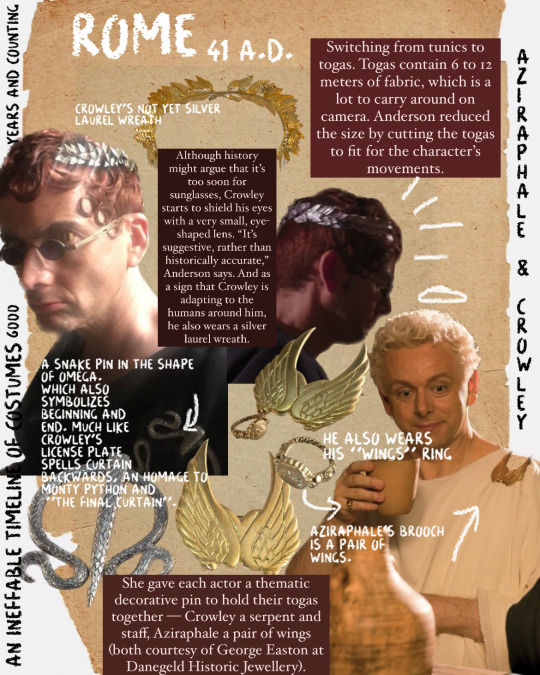


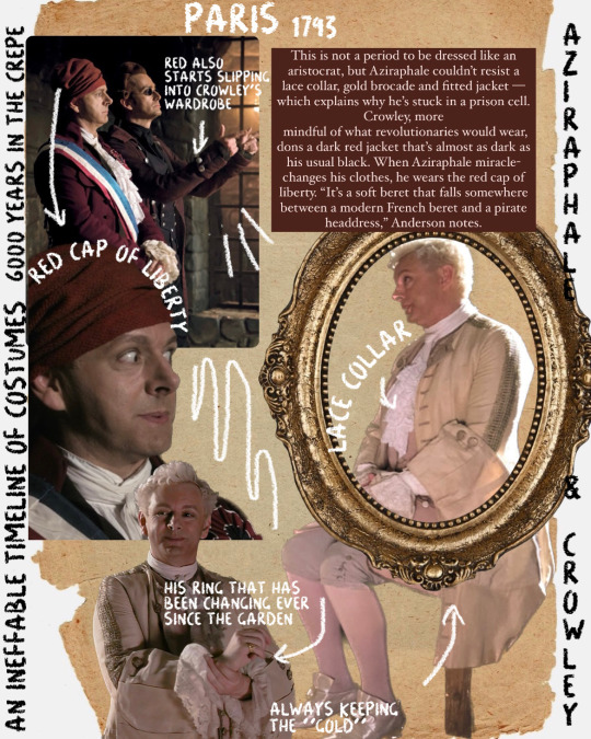

An Ineffable Timeline of costumes:
Where I gathered every official source detailing the costumes for s1 and s2. From interviews with Claire Anderson, lead costume designer for season 1 to Kate Carin, lead for season 2.
Part 1.
And part 2 and part 3. ♥︎
Extra!
If anything is not mentioned, it’s because there were no “official articles” talking about the costume.
Also because I have read some tags saying “this is not accurate” “this is not this” etc. , let me just remind you that the costume department is not here to make things 100000% accurate. Claire Anderson and Kate Carin both had the creative freedom to craft attires and make them believable for the time period. I collected all the sources in Part 3 if you want to read them yourself. This is about experimenting and giving it credibility without it being down to a T.
#crowley#aziraphale#good omens#good omens fun facts#ineffable husbands#neil gaiman#terry pratchett#good omens costumes
2K notes
·
View notes
Note
how much do you think he makes?? i understand that this is pr hate and you do not want to say
I can’t really tell you how much does he make, cause I have no idea, but I’ll try to explain why he makes more than the average.
First of all, let’s remember who his agent is - JEN FCKING RAMEY!!
Jen is the main reason, why J is still so requested - Jen has always been an agent for female models and JORDAN IS THE ONLY MALE. Can you imagine how important J is to her? She was IMG’s vice president,when they scouted Jordan. She was KATE MOSS’S agent. CAN YOU SOMEHOW IMAGINE HOW HUGE HER POWER IS? She has contacts all over the world,all over the industry: magazines,famous fashion houses,photographers,stylists,etc. What else does a model need? When your agent is one of the biggest figure in the industry of fashion?
Just check Jordan’s first runaway shows : MOSCHINO, RALPH LAUREN, NAOMI CAMPBELL FASHION SHOW FOR RELIEF, DSQUARED 2, VERSACE, BALMAIN, TOMMY HILFIGER. Then check the advertising campaign for Tom Ford in 2015??? Really? Just because they liked Jordan’s appearance?? Fashion industry doesn’t work that way baby.
They made J Carine’s favourite, that’s why he’s a part of BOF 500.
He collaborated with Frame and has his own line.
And he’s the face of Paco Rabanne
and all the magazine covers and editorials and advertisings he does.
+ he already has his own contacts/relationships over the “celebrity” people. + the rumours about his sexual life(for ex. Paris Hilton,Bella Hadid,Hailey Baldwin etc. All these people are too famous and the rumours make society interested in Jordan and his life and he is (of course) more requested because of that,cause people want to read interviews and know who he really is.)
And are you still surprised why does he make more money than the average? :)
5 notes
·
View notes
Text
Here’s All the Fashion News You Missed This Week
New Post has been published on https://financeguideto.com/awesome/heres-all-the-fashion-news-you-missed-this-week/
Here’s All the Fashion News You Missed This Week
View this post on Instagram
The day has arrived! Happy x Nature website is up and I can’t wait for you to explore and shop our happy little world we created. Our tale is a love story really. A love of nature and all things natural. We love how nature attains beauty appear so easy and effortless. And, that’s been our inspiration for our way and for our commitment to the environment. Our aim is simple- making you and nature happy with easy, free-spirited fashion that minimise our impact on non-renewable resources. From the factories and mills we choose to packaging and garment tags, we’ll explore every option, always go looking for eco-aware solutions. The skinny jeans is employing 2 plastic bottles … Recycled. The textiles we prefer are a big one of the purposes of our mission of endeavours to make a difference for this generation and generations to come. Airy cotton voiles, earthy laundered cottons and cotton flax are mixed with organic and recycled cloths. We’re especially aroused about Repreve( r ), made of recycled plastic bottle yarns. There’s no throw-away paper on our fashion. We use eco-friendly fabric tags and no plastic. Our shipping bags are bio-degradable and will decompose in only 12 to 18 months … so order everything you love, with no worries! We’re always looking for new ways to ensure that generations to come will be happy x nature. Take the scenic road with us! HAPPY SHOPPING [?]~ ATAGEND
A post shared by Kate Hudson (@ katehudson) on Apr 4, 2019 at 4:04 am PDT
Kate Hudson has Launched an Eco-Friendly Fashion Line
Perennial hippie chick Kate Hudson is getting into the ready-to-wear biz. Her new line, Happy x Nature — pronounced “Happy by nature”- is classic boho with an eco twisting: many of the garments are made from textile sourced from recycled plastic bottles and all of the shipping packaging is biodegradable. The line, which launched Thursday, appears to be online-only and is comprised of the various kinds of frilly floral garments, fringe jackets, turquoise accessories and cowboy boots favoured by Mary-Kate Olsen circa 2005. It’s easy to imagine person buying the entire collection for their annual Coachella trip. In an interview with WWD, Hudson describes the Happy x Nature customer as someone who is “inspired by the flowers and the colourings that you insure there in the sky and the sun.” The line is likely to be run separately from Hudson’s athleisure line, Fabletics, which she founded in 2013. “[ Fabletics] is about honouring your body and the importance of being healthy and being active.[ Happy x Nature] is about fun and being free-spirited, but paying attention to how we treat our planet and how we create less waste, ” she said.( WWD)
View this post on Instagram
Paris light @maxmara
A post shared by Carine Roitfeld (@ carineroitfeld) on Mar 24, 2019 at 4:20 am PDT
Carine Roitfeld has a New Job
The former editor of Paris Vogue may have recently announced she was stepping away from her publication CR Fashion Book to focus on her branding agency, but that didn’t stop her from taking on a new role. Earlier this week, Carine Roitfeld was named a’ style advisor’ at the Karl Lagerfeld brand, and will help define the direction of the brand in the wake of the founder’s recent passing. “I know all the Karl codes, so I want to make sure we feel a bit of Karl in the collections. Even though he was German, Karl had French savor — sophisticated, always very feminine, ” Roitfeld told WWD. Roitfeld’s first collecting is inspired by the viscerally modern Bahaus artistic movement, which is heavily associated with Germany in the 1920 s and 30 s, and will be released after springtime 2020.( WWD)
Hailey Bieber for Levi’s.
Hailey Bieber is the Face of Levi’s 501 Jeans
Levi’s classic 501 jeans were first introduced in 1873 and throughout the course of their 146-year historythey’ve never had a model representing them- until now. This week Levi’s announced Hailey Bieber, who took her husband’s name after covertly marrying Justin Bieber in September 2018, as the first-ever face of Levi’s 501 jeans. “The 501 is the incarnation of Levi’s’ democratic principals…It’s worn by minivan mamas in the suburb and hipster kids in cities and everything in between, ” Levi’s chief marketing policeman Jennifer Sey told WWD. “It never felt right before but we love Hailey’s energy and optimism. It felt like the right time to associate a face with 501. ” Bieber said that she grew up “borrowing” Levi’s cutoffs from her daddy, Stephen Baldwin, and asserts, “they construct me feel like me.”( WWD)
View this post on Instagram
It’s understandable why Jared (@ siliconhbo) looks confused. @patagonia will no longer sell its ultra-popular co-branded logo vests and apparel to financial firms and other brands that don’t share its values. “We’re in business to save our home planet, ” is the company’s new mission statement. Full story on Patagonia’s #fleeceheisman at the link in our profile. — #waitwhat #patagonia #patagoniavest #bcorp
A post shared by Adventure Journal (@ adventurejournal) on Apr 3, 2019 at 12:10 pm PDT
Patagonia Will No Longer Sell Fleece Vests to Finance Bros
“At the highest levels of power in the finance and tech industries, there is one gold criterion, one unifying symbol that binds together all self-styled masters of the universe, all the titans of industry: the Patagonia Nano Puff vest with an embroidered corporate logo, also know as the Power Vest, ” wrote Katie Notopolous in a Buzzfeed story breaking the news that the eco-friendly outerwear company is becoming more, um, discerning to its implementation of who they sell to. Buzzfeed was able to confirm that Patagonia has shifted their policy on corporate sales clients, and will focus on selling their wares to socially responsible B corps from now on. As the story runs, Binna Kim, president of the communications bureau Vested, try our best to place an order for the vests and received an e-mail respond that read, “Patagonia has nothing against your client or the finance industry, it’s merely not an region they are currently marketing through our co-brand division.” Ooof.( Buzzfeed)
The post Here’s All the Fashion News You Missed This Week appeared first on FASHION Magazine.
Read more: fashionmagazine.com
0 notes
Text
Here’s All the Fashion News You Missed This Week
View this post on Instagram
The day has arrived! 🙌 Happy x Nature website is up and I can’t wait for you to explore and shop our happy little world we created. 💛💛💛💛 Our story is a love story really. A love of nature and all things natural. We love how nature makes beauty look so easy and effortless. And, that’s been our inspiration for our fashion and for our commitment to the environment. Our goal is simple – making you and nature happy with easy, free-spirited fashion that minimizes our impact on non-renewable resources. From the factories and mills we choose to packaging and garment tags, we’ll explore every option, always looking for eco-aware solutions. The skinny jeans is using 2 plastic bottles… Recycled. The fabrics we choose are a big part of our mission of striving to make a difference for this generation and generations to come. Airy cotton voiles, earthy laundered cottons and cotton flax are mixed with organic and recycled fabrics. We’re especially excited about Repreve®, made of recycled plastic bottle yarns. There’s no throw-away paper on our fashion. We use eco-friendly fabric tags and no plastic. Our shipping bags are bio-degradable and will decompose in just 12 to 18 months… so order everything you love, with no worries! We’re always looking for new ways to ensure that generations to come will be happy x nature. Take the scenic route with us! HAPPY SHOPPING ☀️
A post shared by Kate Hudson (@katehudson) on Apr 4, 2019 at 4:04am PDT
Kate Hudson has Launched an Eco-Friendly Fashion Line
Perennial hippie chick Kate Hudson is getting into the ready-to-wear biz. Her new line, Happy x Nature — pronounced “Happy by nature” – is classic boho with an eco twist: many of the garments are made from fabric sourced from recycled plastic bottles and all of the shipping packaging is biodegradable. The line, which launched Thursday, appears to be online-only and is comprised of the kind of frilly floral dresses, fringe jackets, turquoise accessories and cowboy boots favoured by Mary-Kate Olsen circa 2005. It’s easy to imagine someone buying the entire collection for their annual Coachella trip. In an interview with WWD, Hudson describes the Happy x Nature customer as someone who is “inspired by the flowers and the colors that you see there in the sky and the sun.” The line will be run separately from Hudson’s athleisure line, Fabletics, which she founded in 2013. “[Fabletics] is about honouring your body and the importance of being healthy and being active. [Happy x Nature] is about fun and being free-spirited, but paying attention to how we treat our planet and how we create less waste,” she said. (WWD)
View this post on Instagram
Paris light🖤 @maxmara
A post shared by Carine Roitfeld (@carineroitfeld) on Mar 24, 2019 at 4:20am PDT
Carine Roitfeld has a New Job
The former editor of Paris Vogue may have recently announced she was stepping away from her magazine CR Fashion Book to focus on her branding agency, but that didn’t stop her from taking on a new role. Earlier this week, Carine Roitfeld was named a ‘style advisor’ at the Karl Lagerfeld brand, and will help define the direction of the brand in the wake of the founder’s recent passing. “I know all the Karl codes, so I want to make sure we feel a bit of Karl in the collections. Even though he was German, Karl had French taste — sophisticated, always very feminine,” Roitfeld told WWD. Roitfeld’s first collection is inspired by the viscerally modern Bahaus artistic movement, which is heavily associated with Germany in the 1920s and 30s, and will be released in spring 2020. (WWD)
Hailey Bieber for Levi’s.
Hailey Bieber is the Face of Levi’s 501 Jeans
Levi’s classic 501 jeans were first introduced in 1873 and throughout the course of their 146-year history they’ve never had a model representing them – until now. This week Levi’s announced Hailey Bieber, who took her husband’s name after covertly marrying Justin Bieber in September 2018, as the first-ever face of Levi’s 501 jeans. “The 501 is the embodiment of Levi’s’ democratic principals…It’s worn by minivan moms in the suburbs and hipster kids in cities and everything in between,” Levi’s chief marketing officer Jennifer Sey told WWD. “It never felt right before but we love Hailey’s energy and optimism. It felt like the right time to associate a face with 501.” Bieber said that she grew up “borrowing” Levi’s cutoffs from her dad, Stephen Baldwin, and claims, “they make me feel like me.” (WWD)
View this post on Instagram
It's understandable why Jared (@siliconhbo) looks confused. @patagonia will no longer sell its ultra-popular co-branded logo vests and apparel to financial firms and other brands that don't share its values. "We're in business to save our home planet," is the company's new mission statement. Full story on Patagonia's #fleeceheisman at the link in our profile. — #waitwhat #patagonia #patagoniavest #bcorp
A post shared by Adventure Journal (@adventurejournal) on Apr 3, 2019 at 12:10pm PDT
Patagonia Will No Longer Sell Fleece Vests to Finance Bros
“At the highest levels of power in the finance and tech industries, there is one gold standard, one unifying symbol that binds together all self-styled masters of the universe, all the titans of industry: the Patagonia Nano Puff vest with an embroidered corporate logo, also know as the Power Vest,” wrote Katie Notopolous in a Buzzfeed story breaking the news that the eco-friendly outerwear company is becoming more, um, discerning in terms of who they sell to. Buzzfeed was able to confirm that Patagonia has shifted their policy on corporate sales clients, and will focus on selling their wares to socially responsible B corps from now on. As the story goes, Binna Kim, president of the communications agency Vested, tried to place an order for the vests and received an e-mail reply that read, “Patagonia has nothing against your client or the finance industry, it’s just not an area they are currently marketing through our co-brand division.” Ooof. (Buzzfeed)
The post Here’s All the Fashion News You Missed This Week appeared first on FASHION Magazine.
Here’s All the Fashion News You Missed This Week published first on https://borboletabags.tumblr.com/
0 notes
Text
Art F City: ONLINE PREMIERE: “Ways of Something – Episode 3”
vimeo
Participating Artists (minute by minute): 1. Carine Santi-Weil, 2. Nicolas Sassoon, 3. Tom Sherman, 4. Kim Asendorf and Ole Fach, 5. Rafaela Kino, 6. Alex McLeod, 7. Kate Wilson and Lynne Slater, 8. Aleksandra Domanović, 9. Systaime, 10. Erik Zepka, 11. Adam Ferriss, 12. Rodell Warner and Arnaldo James, 13. Debora Delmar Corp, 14. Brenna Murphy, 15. Nick Briz, 16. Carlos Sáez, 17. Jenn E Norton, 18. Juliette Bonneviot, 19. Luis Nava, 20. Vince McKelvie, 21. Claudia Maté, 22. Evan Roth, 23. Shana Moulton, 24. Sabrina Ratté, 25. Jordan Tannahill, 26. Vasily Zaitsev feat. MON3Y.us, 27. Ann Hirsch
With John Berger’s death this month, the online premiere of Lorna Mills’ “Ways of Something, 3” feels particularly poignant. While Mills’s “Ways of Something” wasn’t conceived strictly as an update, as 117 person re-interpretation it effectively functions as such. To complete this piece, Mills invited over 100 artists to remake all four parts of Berger’s 1972 BBC series “Ways of Seeing”, minute by minute. Each artist was given 60 seconds of of video��doled out on a first come first serve basis—with the sole condition that they would need to retain the text used in captioning. What they did to the captioning font, the visuals, the sound, was entirely up to them.
The result is almost certainly the largest video exquisite corpse in existence. Similar to the first Surrealist conceived exquisite corpse drawings, where each half is made blind of the other, each artist creates a minute without knowing what will come before or after it.
Visual themes naturally emerge. The first episode examines how the contemporary context changes the meaning of reproduced art, while images include reproduction, the sublime, search, photoshop and surveillance. The second episode, which explores sexism in art, takes a different path. Pop stars, 3D rendered figures, identity politics and gaming take on a greater presence. Unsurprisingly, the figure is everywhere. And by the third episode, the fact that the participating artists have seen the previous two iterations more clearly affects the piece—as Mills notes in our interview, participating artists begin referencing each other. Screens are a big theme this time around, as is any kind of reference to digital manipulation.
I sat down with Mills to discuss all this—the history of the project, how it has evolved and how she evaluates its success as an artist. We also talked about how all the participating artists were paid for their work—a rarity in the world of New Media (and in the art world as a whole)—and thus a blinking beacon of success if ever there was one.
You’ve said the title “Ways of Something” suggests something propositional—that you won’t know what you have until it’s complete. Now that the four videos are complete – and the third is being released with us for this online premiere, does the name still work for you? Has it taken on any additional meaning?
The name still works for me. It’s still propositional but expansive as well. I was wrong about thinking that I’d know what I have once it was complete. I’m still too close to the project.
And the conceit itself? How did that come about?
I was initially invited by the One Minutes in Amsterdam to curate a selection of one minute videos. Coming up with a theme and doing an open call for work didn’t excite me so I was wracking my brains for an interesting way to approach this. I thought about one minute animated gif videos, but that wouldn’t work since they wouldn’t be gifs they’d be video, so dumb idea. Then I happened to stumble upon a Facebook post by Jaakko Pallasvuo with a link to episode one of “Ways of Seeing”. The video in the youtube link was close captioned and it was that small distinction that made the whole idea crystalize since it is the abrupt change in text style and text handling that reinforces the idea of visual discontinuity that overlays John Berger’s beautiful “BBC voice of God” narration.
After episode 2 I did part company with the One Minutes and continued the project with my own resources.
Other than Jaakko Pallasvuo, who had an obvious impact on the work, are there other artists or projects that influenced you? (I always think of the tumblr Cloaque, which is similarly collaborative and exquisite corpse like in nature, in the sense that the artists were essentially making their minute without knowing what the visuals before or after their piece would look like.)
I absolutely love Cloaque, but I wouldn’t say it was an influence. Organizing the artist GIFs for Rea McNamara’s “Sheroes” project every month for almost a year was the sort of experience that made me confident that I could wrangle a lot of artists as long as the parameters were clear. It was a much more direct influence.
Minute 26 of “Ways of Something” by Vasily Zaitsev feat. MON3Y.us
Did your approach to selecting participating artists change in any way since the first episode? Have you ever worried that you might run out of artists to work with? (117 artists is a huge number of artists.)
The first episode was full of artists I had worked with previously (with only a few exceptions). My thinking at the time was that since I had a tiny budget for fees, I wanted to invite people who had made work for my previous projects when there was no money.
Once the first episode was done I was able to expand the pool of artists to more people who I hadn’t worked with previously. There’s also a long list of artists I begged who just didn’t have the time. After episode 2 was shown, I was also approached by a lot of artists who wanted to be in it, but by then I was working on 3 and had already invited the artists for episode 4.
As an artist-curator, I think of the minute-by-minute framework, the use of text, and the resulting tension between continuity and discontinuity, as my art. When I invited artists to participate, I was inviting them to participate in my art piece. I didn’t initially take that position, but as time went on I had to recognize that I had abdicated the responsibilities of a curator, and the term ‘collaborator’ was disingenuous as well. My choices of artists were personal and idiosyncratic—I didn’t hold any conceit that I was presenting a ‘community’ as is common with most curators —if that had been my intention, my choices might have been different.
Other than tech specs [the size of the video, dimensions, etc], I created a structure that they had to adhere to, but anything within that structure was their art, not mine. Since the project’s completion, I’m finding many more artists that I’d like to work with, but there will be other projects in the future.
Do tell! Are you planning anything now that can be discussed?
Nothing definite, I can only say that I won’t repeat this particular structure and turn it into a career formula.
Are there specific artistic approaches or working experiences you had while making the third episode of “Ways of Something” that distinguish it the other episodes?
Not really. I’m not sure if that’s a strength or a weakness for the whole project. After watching episodes 1 and 2, episode 3 seems to flow much easier and I wonder if it’s because the audience gets used to the abrupt rhythms that are built into it with every jump cut between artists.
Speaking of strengths and weaknesses, how do you evaluate the success of the series? I think obviously, there’s the professional angle—its public reception—but what, for you, makes the work successful? What did you learn through the process of making the piece? Is there anything you’d do differently?
The public reception has been nice, I have no complaints, but I rarely focus on that when I evaluate the project. For me success of any artwork means that nothing needs to be added and nothing needs to be taken away.
For “Ways of Something”, it’s only natural that some minutes would be stronger than others, but I still waste time trying to figure out what I could have done differently, even when some of the issues were out of my control. I was not directing my fellow artists on how their minutes should look. I only offered an opinion if I was asked. If they were confident of their work then I was too.
I did the project one episode at a time with tight deadlines because of screening opportunities. If I were to do it again I would work on all four episodes at once to give the invited artists more choices for their minutes. I would have also given myself less punishing deadlines which may have freed up a few more invited artists that couldn’t deliver in time. Changing any circumstances around a project will change the artworks.
Minute 25 of “Ways of Something” by Jordan Tannahill.
How has the work evolved since the making of the first episode? Have artists been influenced by what they’ve seen done in earlier videos? Has that knowledge made for stronger episodes?
One thing I thought funny was that in episode 3 some artists started appropriating from other artists, which is fitting since the original episode is about colonialism, theft and the accumulation and display of private property. Jordan Tannahill was using emojis like Carla Gannis does and he even used one of her Garden of Emoji Delights in his minute. Vasily Zaitsev, the Russian WW2 sniper, used a selection of other artists’ works from his project money as error.
By the way, I’m not so sure that all the subsequent artists looked at previous episodes.
Ha! It never occurred to me that some artists might not look at the previous episodes. Do you consider this work an update on Berger’s original series or is that even possible? (Now, I’m wondering if some of the artists didn’t watch the full BBC series too?) Are there some Berger episodes in greater need of an “update” than others?
No. The intention was not to strictly update his work. Artists were invited to update, illustrate or contradict what he was saying. The choice was theirs.
In my opinion, the original episode 2 is painful television, he made a lot of maddening assertions about how women see themselves and then the latter half of the show is a 70’s consciousness raising session. Episode 2 of “Ways of Seeing” is definitely dated in many ways, but that doesn’t mean that it’s irrelevant today. The hypocrisy of the male gaze and the judgements made of the women who they like to look at still enrage so many of us.
How does the piece change with each install and different logistics of site? It’s obviously a different experience to view online versus a screening at TRANSFER or an install at The Whitney.
As the episodes have been produced, they’ve been screened in small and large venues across the globe. The complete project is a good two hours of art video watching. (I used to be able to tell people that I was a nice video artist because my work was mercifully short.) To me the optimum screening experience was at the Carnegie Museum in Pittsburgh. Lauren Goshinski of the VIA festival set it up so the space was full of bean bag chairs and other lounging furniture, way better then having to lie on a bed of nails. The Gene Siskel Theatre in Chicago was pretty swank too, which I liked.
The Whitney show was the first time I saw it as an installation and I’m almost inclined to prefer that set up to a screening. The audience got a sense of how broad the approaches were to the narration.
What is the future for “Ways of Something”? Are there venues you’d like to see it screened at? Collections you’d like to see it in? How will it exist online? (I hear you’re making a website.)
We are putting the finishing touches to the web site, so that will be launched soon. As for venues and collections, I think the National Gallery of Canada should acquire it and of course I want to see it in as many public and private collections as possible.
I should also mention when “Ways of Something” is acquired by a collection, it’s not just me, all the artists are credited in the acquisition.
When “Ways of Something” is purchased, do all of the artists get paid?
Of course. The money from sales of the editions, as well as all the screening fees that I have collected, have been divided up equally with the participating artists. It should also be noted that my Gallerist, Kelani Nichole of Transfer, worked very hard negotiating all the sales and very generously took a much smaller than normal cut. Basically, both of us are saints.
from Art F City http://ift.tt/2kHqAO6 via IFTTT
0 notes
Text


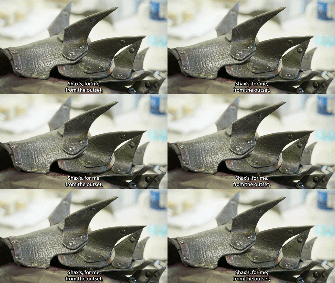


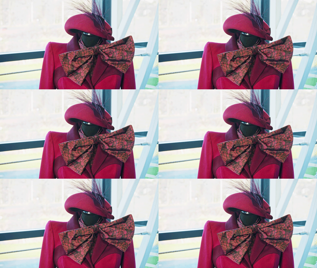
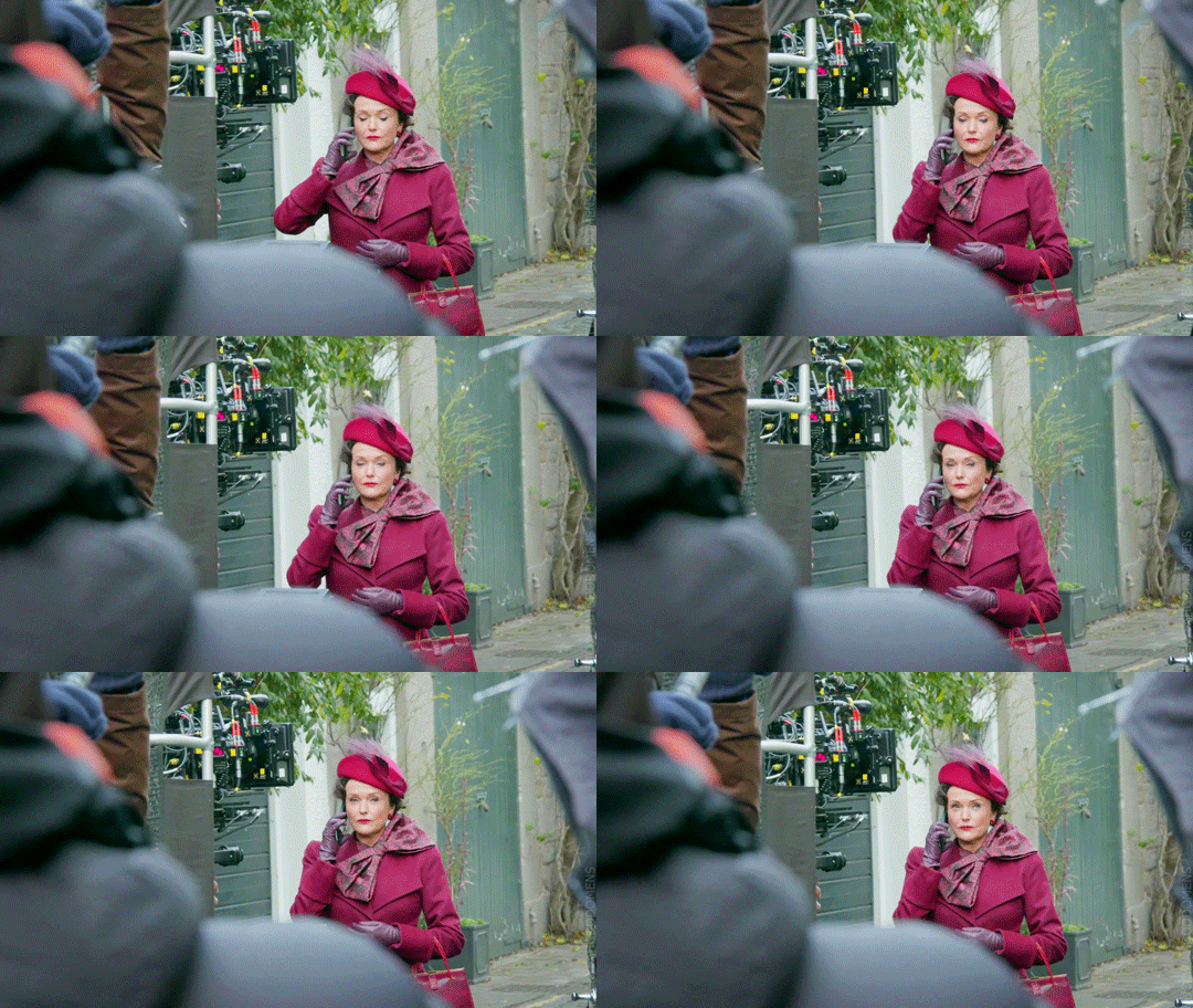
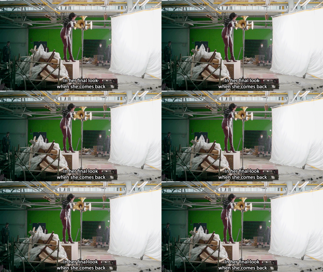
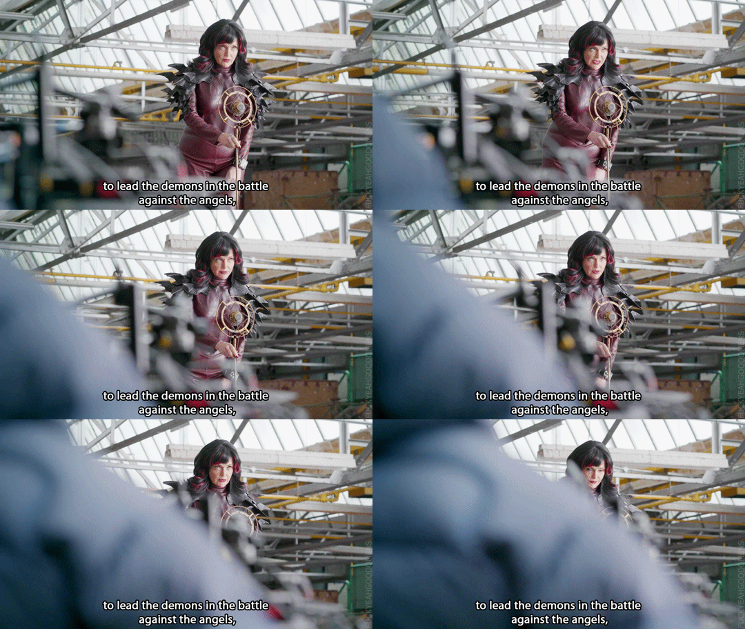

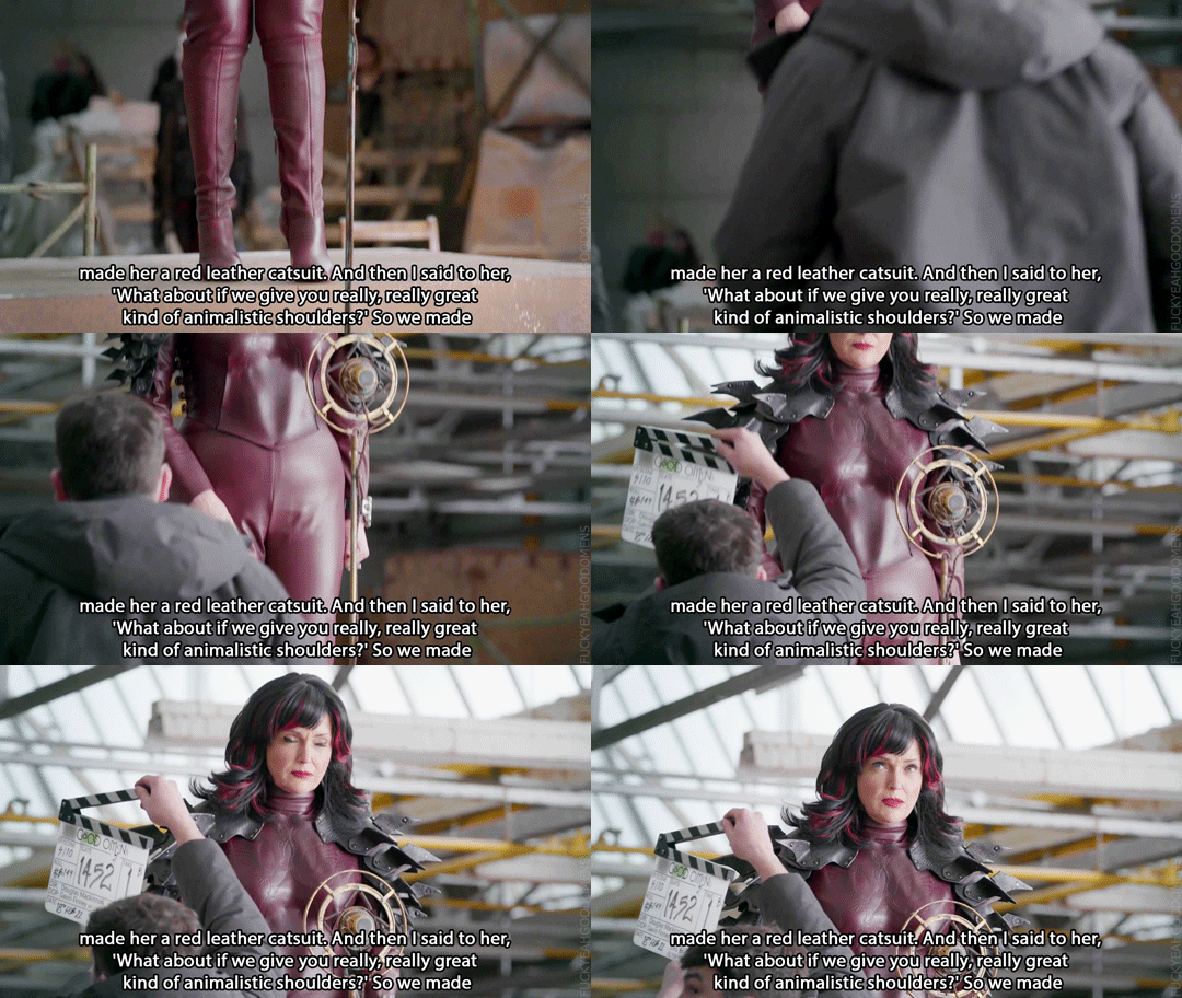


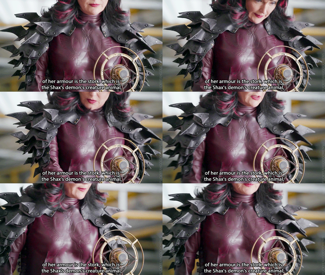
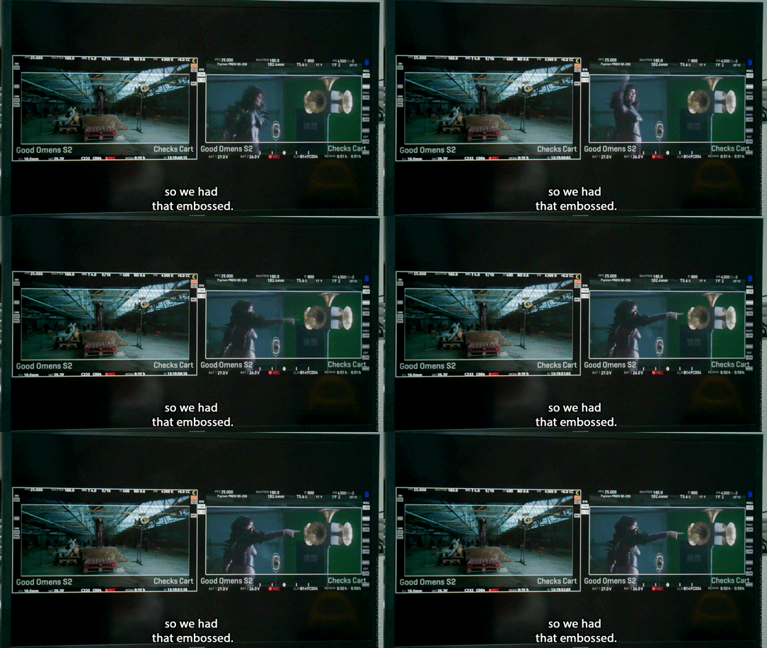



Kate Carin (Costume Designer): I was very adamant that I would need manufacturing on this job, because it gives you an opportunity to create things that you can't just find on the shelf and you can then really create worlds. I felt that Shax's, for me, from the outset, was always going to be red. In her final look when she comes back to lead the demons in the battle against the angels, I said to her, 'Will you wear a red leather catsuit?' And she said, 'Yes.' So we made her a red leather catsuit. And then I said to her, 'What about if we give you really, really great kind of animalistic shoulders?' So we made her huge leather, scaly shoulders, which she also donned, no problem at all. You'll see on the front of her armour is the stork, which is the Shax's demon's creature animal, so we had that embossed.
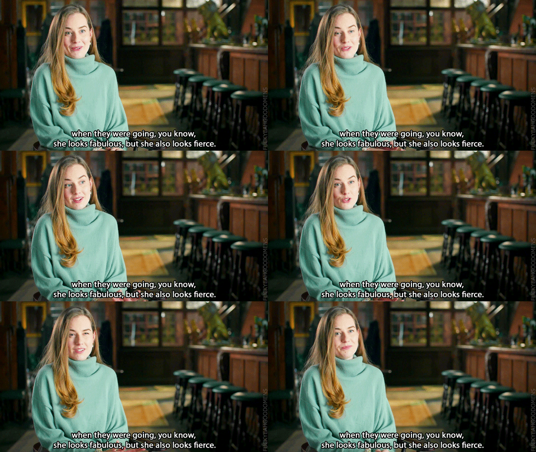
Sarah-Kate Fenelon (Producer): It's like the Neil Gaiman version of whata demon would wear when they were going, you know, she looks fabulous, but she also looks fierce.
Miranda Richardson (Shax): It's amazing. My many pointed armoured breastplate, which is very useful for anything that anybody wants to get rid of before a shot. I can just tuck up there. I've got my phone up there, I've got my script sides up there, coffee up there, you know. (video)
#good omens#gointerviewedit#goodomensbtsedit#miranda richardson#shax#shax's costumes#kate carin#sarah-kate fenelon#bts#fun fact#costumes x-ray#2ep5#2i5i6#interview#miranda interview#sarah-kate interview#s2 interview#kate carin interview#shax's animal#photos
2K notes
·
View notes
Text

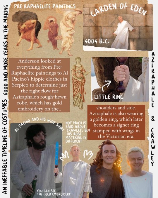

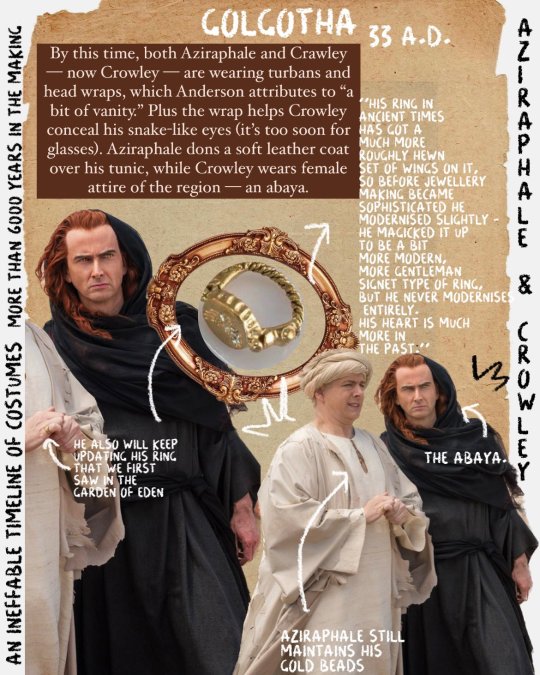
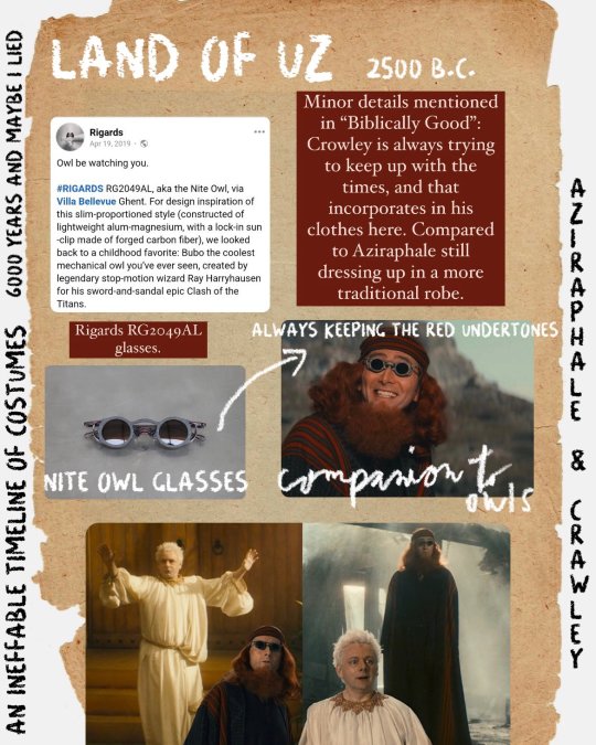
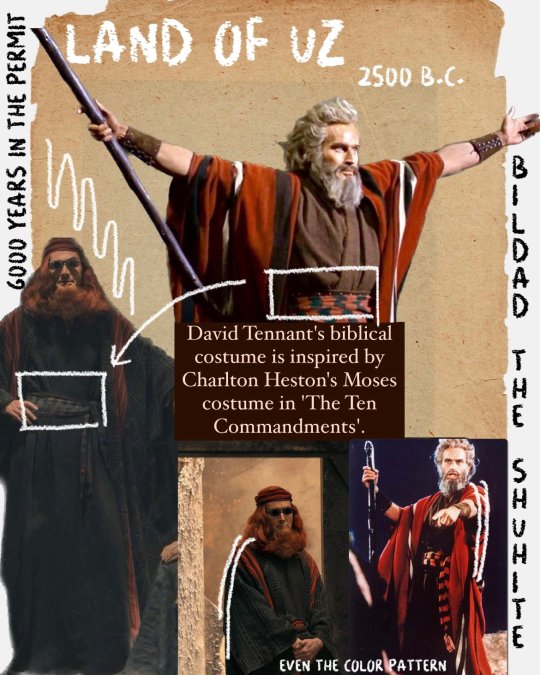

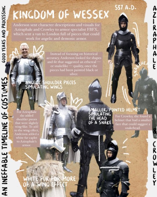


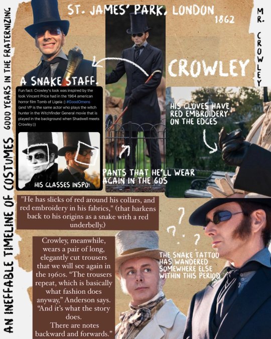

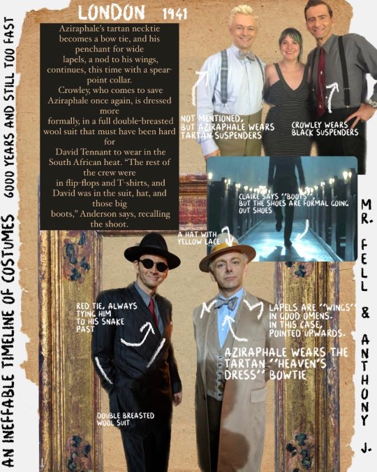

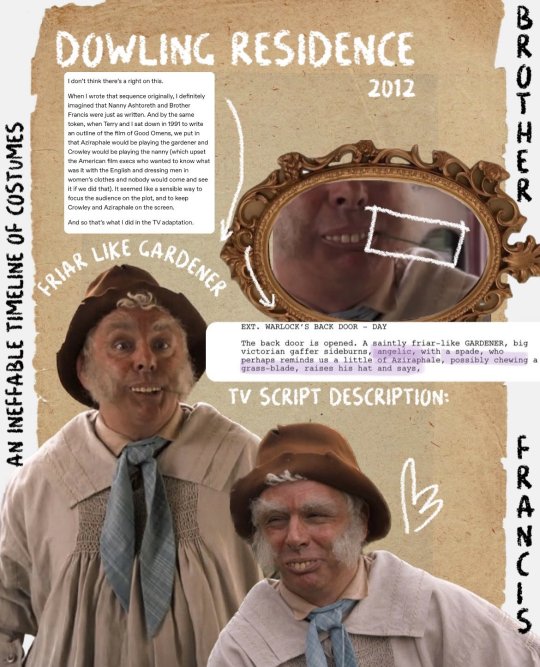
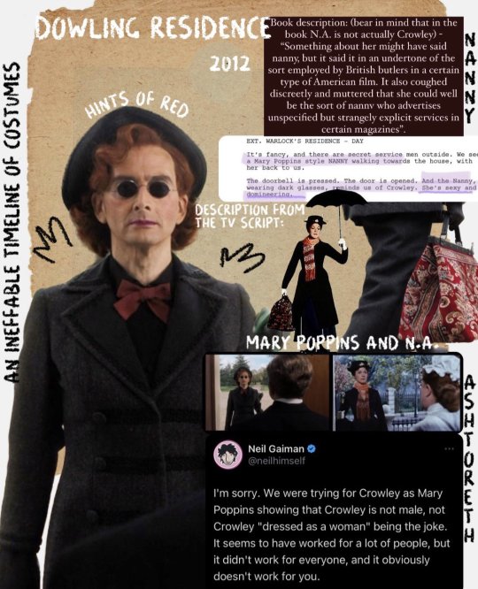

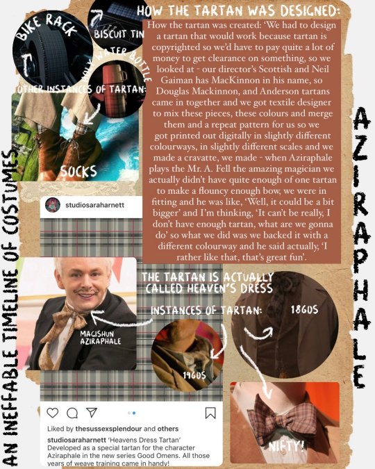


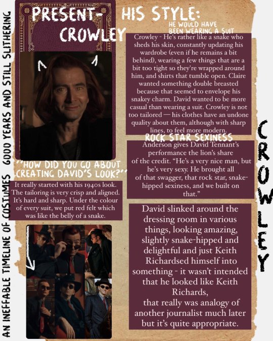
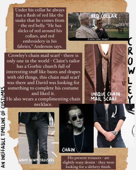
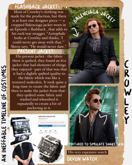

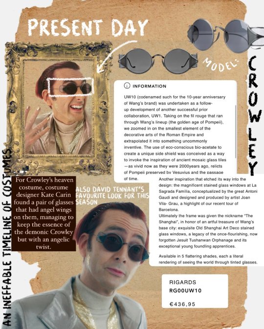

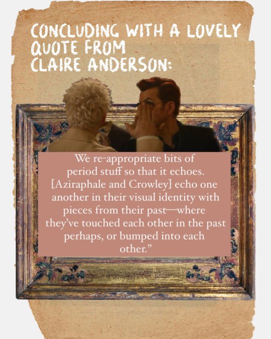
An Ineffable Timeline of costumes:
I had done this previously in separate posts, but I did want to keep the timeline in order (the mess was bugging my brain). Well mostly in order, I had to switch up Golgotha and Land of Uz so that they could fit better.
So, hello again! (or for the first time). I gathered every official source detailing the costumes for s1 and s2. From interviews with Claire Anderson, lead costume designer for season 1 to Kate Carin, lead for season 2.
Some things of course I was not able to put here because there was nothing official confirming or describing the costume choices.
Some extra bits:
Something I did not add here from the X-ray section of GO2, was that Kate Carin mentioned that Aziraphale’s detective look in episode 3 was a sort of “Noir Detective”. But not much else was said about how it came to be, except for the obvious raincoat and hat and case he is carrying. She also talked about rhinestones being glued to Aziraphale’s magician cape in his act in 1941. But that is a fairly noticeable detail as well (I believe) so I did not add it here.
Some very important things to keep in mind:
Nanny Ashtoreth in the book is never directly alluded to be Crowley. There have been debates about this, and that is why I included in the slide of “Brother Francis” the reply Neil gave addressing exactly that. For the TV show, it was decided that both Nanny/ Brother Francis were going to be Crowley and Aziraphale (radio omens too). For the book, well you can read it/ see by yourself that even though one nanny showed up, it is never said to be Crowley.
I had read some tags previously saying “this is not accurate” “this is not this” etc. so just a gentle reminder that the costume department is not here to make things 100000% accurate. Claire Anderson and Kate Carin both had the creative freedom to craft attires and make them believable for the time period. I collected all the sources (below) if you want to read them yourself. This is about experimenting and giving it credibility without it being down to a T.
Some arrows are not specifically pointing to a specific thing. They are there to guide you find what is in the text.
The Sources:
Ineffable Con
SYFY Claire Anderson
SYFY 2
Claire Anderson Costume Designer
Film School Rejects Claire Anderson
RadioTimes- Hair
YouTube Kate Carin interview
Youtube Wrap Party Podcast
Including the behind the scenes videos from Prime “Biblically Good” and “Grave Danger”.
#good omens#crowley#aziraphale#ineffable husbands#neil gaiman#terry pratchett#good omens fun facts#good omens 2#easter eggs#good omens costumes#claire anderson#kate carin#timeline of costumes#only aziraphale and crowley#i will do one for the other characters
125 notes
·
View notes
Text
@duchess-shax


Kate Carin (Costume Designer): I was very adamant that I would need manufacturing on this job, because it gives you an opportunity to create things that you can't just find on the shelf and you can then really create worlds. I felt that Shax's, for me, from the outset, was always going to be red. In her final look when she comes back to lead the demons in the battle against the angels, I said to her, 'Will you wear a red leather catsuit?' And she said, 'Yes.' So we made her a red leather catsuit. And then I said to her, 'What about if we give you really, really great kind of animalistic shoulders?' So we made her huge leather, scaly shoulders, which she also donned, no problem at all. You'll see on the front of her armour is the stork, which is the Shax's demon's creature animal, so we had that embossed.
Sarah-Kate Fenelon (Producer): It's like the Neil Gaiman version of whata demon would wear when they were going, you know, she looks fabulous, but she also looks fierce.
Miranda Richardson (Shax): It's amazing. My many pointed armoured breastplate, which is very useful for anything that anybody wants to get rid of before a shot. I can just tuck up there. I've got my phone up there, I've got my script sides up there, coffee up there, you know. (video)
#good omens#miranda richardson#shax#shax's costumes#kate carin#sarah-kate fenelon#bts#s2 interview#sarah-kate interview#miranda interview#costumes x-ray#fun fact#shax's animal#kate carin interview#photos#good omens costumes#costume design
2K notes
·
View notes