#justynart
Explore tagged Tumblr posts
Text
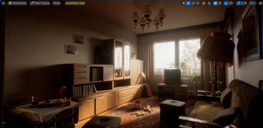
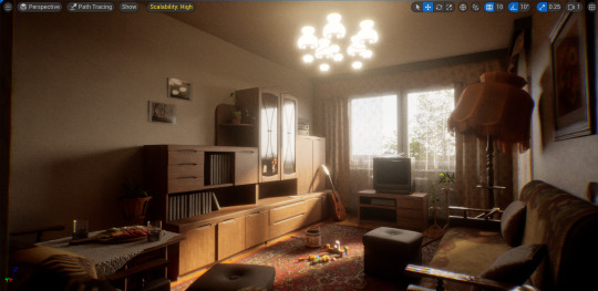
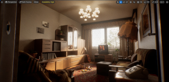
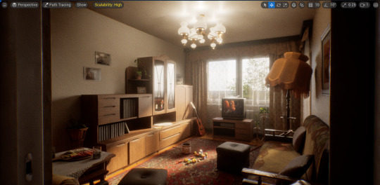
Lights On
Progression of adding emissive materials and point lights:


#justynart#3d art#research#practice#substance painter#unreal engine#av realisation#advanced production#blender
7 notes
·
View notes
Text

Kim Possible 👀
COMMISSIONS: open!! Message me for more info! :)
#artists on tumblr#animation#justynart#art#art commissions#digital art#commissions#artists on instagram#illustrators on tumblr#artist#kim possible#throwback#disney art#fanart#character art#character#concept art
394 notes
·
View notes
Text
Glass Rendering Issue
The biggest struggle I faced after moving onto using path tracing was how the glass was rendering. As shown below, glass placed behind glass would render as black which isn’t realistic, especially when compared to the reference image to the side:
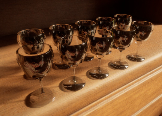
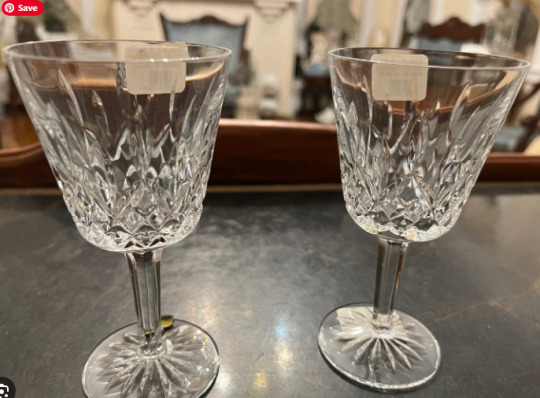
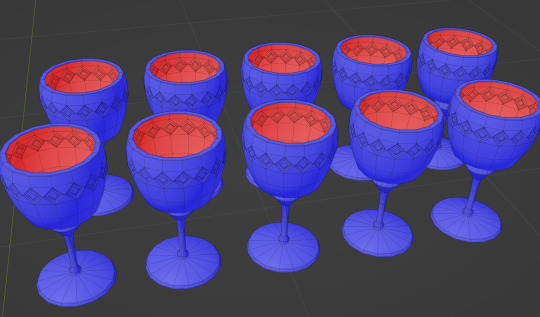
After adjusting shader nodes and settings didn’t help, and after I couldn’t find relevant solutions on UE forums, I thought the issue could be caused by the mesh so I revisited my model and deleted all interior faces. As shown below, this helped to minimise the problem but did not solve the root of it. Although the glass is clearer, you can still see the stems of the glass behind rendering as black:

I then revisited the UE documentation and found a very thorough explanatory video about path tracing by William Faucher. In this video he went over glass in detail and helped me realise that my issue stemmed from my post process volume settings. In order to get rid of the blackness, I simply needed to increase the max bounces under path tracer rendering. An increase in bounces allows for light rays to penetrate further before being eliminated.
Results after increased bounces:
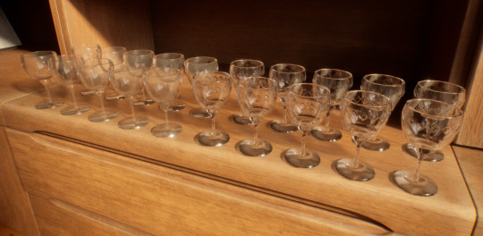
The left half of the glasses have my old glass shader applied vs the right having a newer simpler shader. In this example you can see the blackness is gone and the glass renders much more realistically. I also reimported my older model with interior faces included.
#justynart#3d art#research#reference#practice#substance painter#blender#unreal engine#av realisation
6 notes
·
View notes
Text
Elements of Storytelling & Symbolism
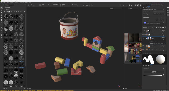
Storytelling is just as important as lighting in my project. I wanted to create a simple prop that could be universally recognised as a symbol of childhood, such as colourful wooden blocks. I modelled the pieces to look as though a child had been playing with them and placed them on the carpet with the light spill acting as a sort of spotlight, highlighting its significance as the focal point.

Since I’d like to be able to showcase this area quite close up, I spent a bit more extra time on the texturing process, making sure the wood of the blocks was readable through the use of a wood grain height map and worn down paint around the edges. I also edited a quick product label for the bucket in photoshop using royalty free images.
#justynart#3d art#research#reference#practice#blender#substance painter#av realisation#unreal engine
3 notes
·
View notes
Text
Lighting Off vs On Render Test
#justynart#3d art#research#practice#reference#substance painter#unreal engine#av realisation#advanced production
5 notes
·
View notes
Text
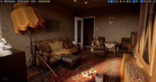
Overall Progress

#justynart#3d art#research#reference#practice#substance painter#unreal engine#advanced production#av realisation#blender#maya
3 notes
·
View notes
Text
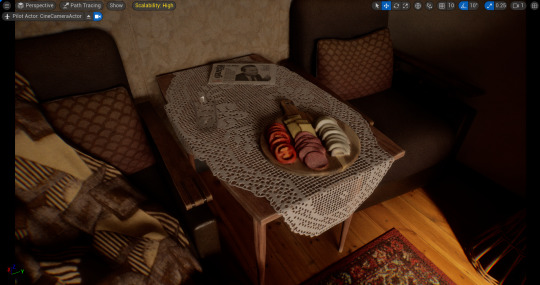
Doilies
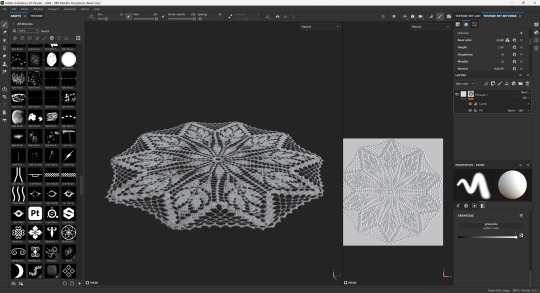
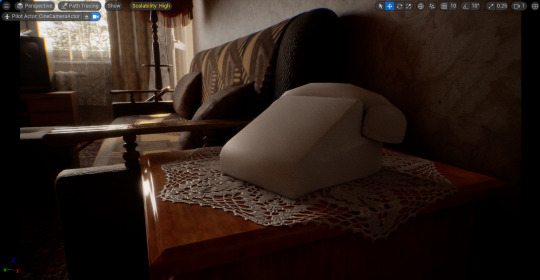
To create the doilies I started by creating very basic planes covering the areas I wanted them to be places on.
For example, I wanted one to be on top of the side table, with the ends hanging off, so I simply extruded the edges and beveled the corners for a softer edge.

I used doily patterns on black backgrounds as a base for creating the final textures. I achieved the final look by using masks for opacity and adjusting the height map for some dimension to avoid the final textures from looking like paper.
2 notes
·
View notes
Text
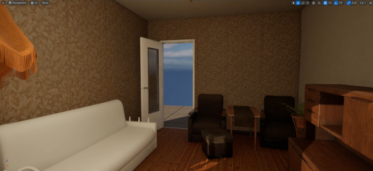
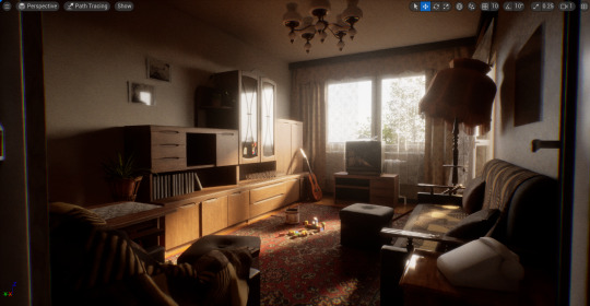
March vs Now
My environment at the end of March:

Vs now:
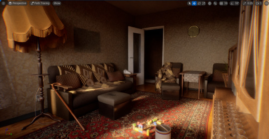
Detail:

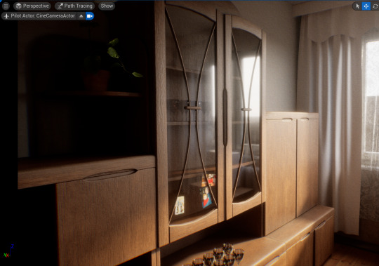
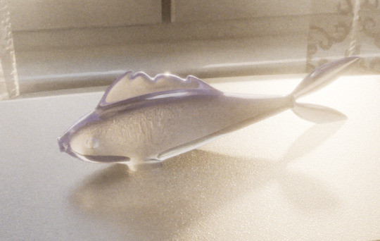
Main areas of progress:
hallway modelled (90% finished, 2 textures missing)
textiles textured
lighting mostly figured out: down to playing around with settings and how far I want to push it
glass fixed
started on detailing (clutter, signs of use, personality, etc)
#justynart#3d art#research#reference#practice#blender#substance painter#uv unwrapping#unreal engine#eastern europe#poland#av realisation
3 notes
·
View notes
Text
Cloth Simulation in Blender
After finishing the modelling of the armchairs and sofa I spent some time revisiting ways of simulating cloth in Blender. Having already made curtains, I was fairly confident in making a draped blanket for the sofa. With so slight sculpting adjustments I was happy with the result and moved onto creating pillows.
For the pillows I followed this quick tutorial:
youtube
As shown in the clip, I made the pillows by creating a subdivided plane and extruded it. After applying the cloth modifier to it I turned the pressure up to 5.0 and disabled gravity to prevent the pillow from falling through my scene.
Here are the blanket and pillow results:
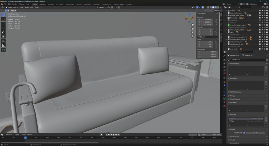
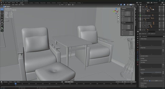
After creating the pillows I also sculpted them a bit for added realism by squishing them into the seating to indicate that someone would have been leaning against them.
For now I am happy enough with how these came out and will be using them as placeholders, but I still want to try using Marvelous Designer for cloth assets to see if I can achieve better results.
#justynart#3d art#research#practice#reference#blender#advanced production#cloth simulation#3d environment#environment art#Youtube
5 notes
·
View notes
Text
Modelling Using Curves
As I'm reaching the stage of beginning to texture the major assets I've been modelling, I also started to add some less significant detail that are still crucial for achieving realism such as cables, sockets, etc.
After modelling the main part of the floor lamp I went on to create the cable and switch that can be seen coming from it in reference photographs.


I modelled the cable with the use of a curve. I just added some geometry to it and was able to manipulate it so it looked like it laid naturally on the floor.
After this I shifted my focus to the woven planter that can also be seen in several photographs like here:

Although the concept of it seems very complex, I was very confident going into it as I used what I learned while following the Rattan Rocker lesson I did in semester 1. Again, like with the cable, I used almost only curves to model this.

I started by creating a single vertical curve, arraying it in equal increments, duplicating and flipping it, and lastly I used circle curves and manually resized alternating vertices either inwardly or outwardly to create the horizontal woven pieces.
#justynart#3d art#research#reference#practice#blender#advanced production#environment art#3d environment#3d model
6 notes
·
View notes
Text
Going Live 03 - 3D to 2D
Although our team continued to create stylised 3D tests for environments we were getting quite similar results overall and couldn't get close to what we had in mind. After receiving feedback from Wild Child about how animating in 2D over 3D backgrounds could pose technical issues we shifted our focus to wards an entirely 2D workflow.
I started off by looking into the UPA/00's Cartoon Network style we were using as reference and created a background test.
Reference:

Latest 3D tests:
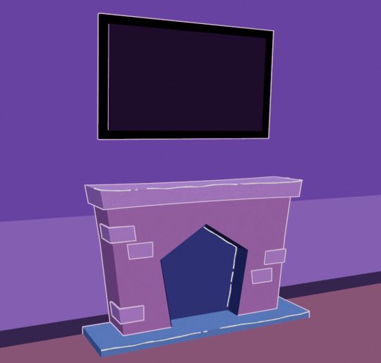
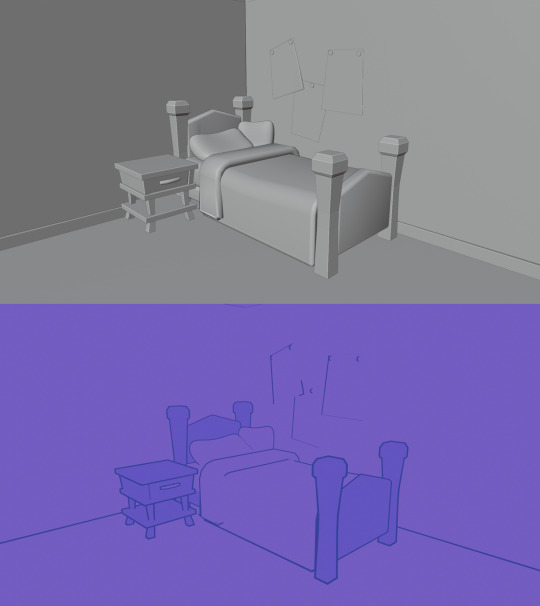
Background style concepts:
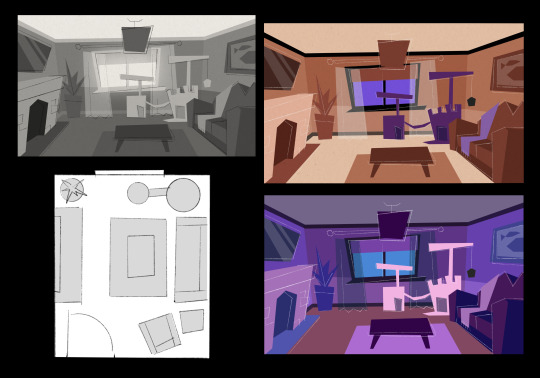

Using 2D allows for more instant control over how things look within the scene. It's easier to adjust areas if changes are proposed and generally easier to make 2D animation work over 2D environments.
#justynart#going live module#3d art#research#reference#practice#blender#inspiration#upa style#background art#layout art#environment art
5 notes
·
View notes
Text
Ink to 3D Grass
As my first hybrid test I wanted to start off with something simple. Inspired by Cody Ginty's brushstroke tree I wanted to create a simple grass card.
I started by using traditional ink on paper, creating various brushstroke clumps until I found one I liked.
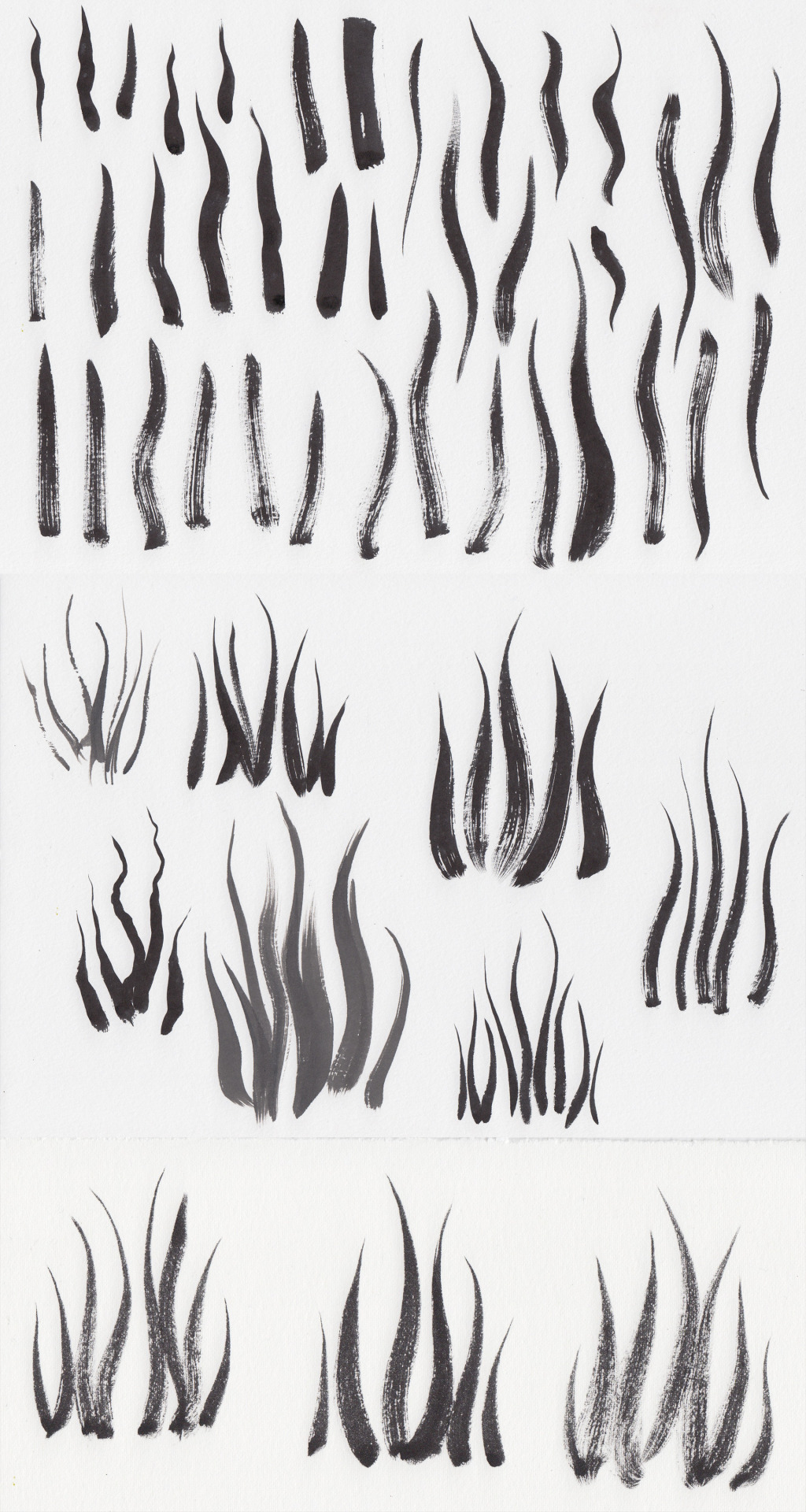
Once I found the brushstrokes I liked I scanned them and prepared them in Photoshop. First I inverted the image, then adjusted the threshold until the black against white was sharper and cleaner, before finally adding a colour gradient as shown below:

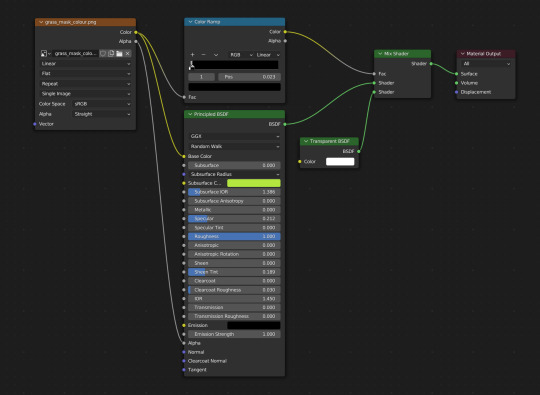
Once my scan was prepared I created a simple plane in Blender onto which I applied the grass as a texture in the shading editor workspace. To make the grass appear as though it is 3D I simply duplicated the plane and rotated it 90 degrees.
The final render (top: cycles, bottom: eevee):


Reflection:
Initially I planned to use the black and white image as a starting point in Blender but I struggled with adding colour that way so instead I added the colour gradient in Photoshop. I'll have a more in depth look into Blender's geometry nodes and create a second test.
Another change that could improve the result would be using two different ink scans instead of the same one in order to avoid the unnatural symmetry that can be seen in the final result.
3 notes
·
View notes
Text
Photogrammetry Test
After the photogrammetry tutorial with Dr. Dylan Gauld I wanted to do a small test of my own using a simple object such as a converse shoe.
I set the shoe on a small side table that I could easily walk around to get photos from all angles and added four markers to improve the results.
I used 3DF Zephyr to process my photos and found it as easy to use as Metashape which is the software we used during the tutorial.
Point cloud result:

Mesh result:

Texture result:

I was very happy with the first attempt and imported the model into blender where I removed some of the unnecessary mesh and rendered a 360 turn to showcase the final scan:
This result was achieved with 31 of 34 photographs (3 were N/O). Some data is visibly missing and could be fixed with a more thorough scan. Overall, I am very impressed with how much this method captured and will definitely use it where I think it will be beneficial for my project. For example, small decorative trinkets, clutter and food.
2 notes
·
View notes
Text
New Direction
Although I enjoyed learning and testing ways of using 2D and traditional art in 3D I wasn't sure what direction I could take my practice. However, a theme I also wanted to explore for some time (prior to even applying for the course) has been nostalgia and finding a way of capturing childhood memories.
After my meeting with Sean he directed me to the project "80s-Style Korean Apartment" by WoonJu Park who tackles those exact themes. An interview with the artist can be found below where she goes into thorough detail as to how she went about creating this piece:
I found this interview very encouraging as WoonJu had a fairly similar background to myself. This was her first big 3D project as an artist who mostly trained in 2D environment art.
She shares her entire process from reference gathering to careful planning and methods of capturing certain objects through photogrammetry.
2 notes
·
View notes
Text
Retopology and UV Unwrapping Basics
As I’m nearing the end of modelling my character I wanted to get the hang of retopology basics by practising on a very simple model. I chose to do this using the cowboy hat I made for my character and decided to retopologize it using Maya to expose myself to the software more.
I followed a basic tutorial by FlippedNormals on YouTube which went over the same process as Sean did during an earlier 3D workshop. The process:
Import the model and select ‘make the selected object live’ (this will make the object unselectable and the cursor will snap to its surface).
Select the ‘Modeling Toolkit’ in the top right of Maya; ‘Quad Draw’ tool.
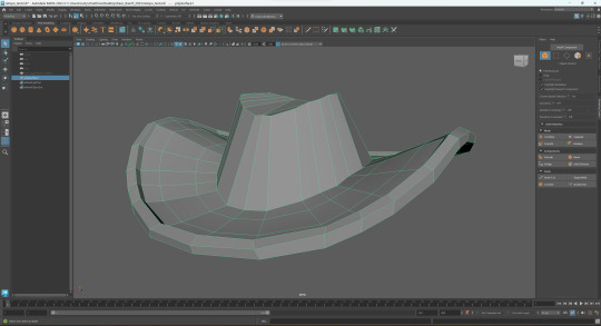
I then exported the lowpoly version and used Blender to UV unwrap the hat.
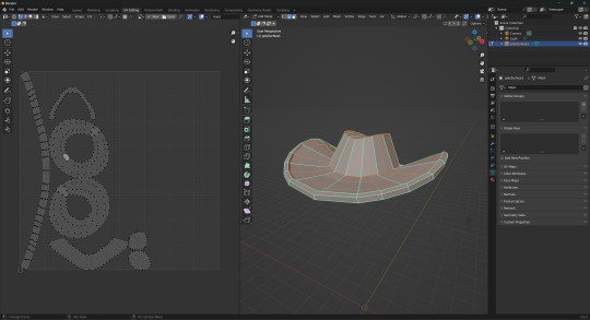
After this I exported both the low and high poly versions of the object and imported them into Substance Painter where I baked the UV maps.

The purpose of this exercise was for me to go through the process of retopology, UV unwrapping and importing into Substance Painter without focusing on the look of the object. The next step will be to practice texturing using SP.
2 notes
·
View notes
Text
Final Montage
youtube
In my final montage, my gran narrates, and in a way directs, the video through a monologue. I asked her to talk about what memories certain photographs brought up for her.
This really helped me find a good balance between longer shots and stills with photo overlays, as the photographs fading in and out were somewhat distracting from the subtitles. The longer shots allowed me to showcase the full room while also providing some breathing room for the audience.
To finalize the video I added some adjustment layers that would help tie all the different shots and stills together. I used noise, scratch, dust and a vignette which helped pull the main focus into the center of the montage.
Scratch overlay used:
I'm very pleased with how the final montage turned out. I was very lucky to find a family video with music in it as it provided an authentic and unique soundtrack which complimented the monologue very well.
#research#practice#3d art#justynart#reference#unreal engine#av realisation#advanced production#Youtube
0 notes