#josef albers papers
Explore tagged Tumblr posts
Text

Construction Study, ca. 1927, Bauhaus Dessau,
Student: Lotte Gerson,
Three dimensional piece of paper from Josef Albers' course at the Bauhaus.
Albers annotated photographs of this construction with the statement that it was over 80 cm tall.
Silver gelatin print, photographer unknown, possibly Edmund Collein
#art#design#architecture#stairwell#stairway#staircase#stairs#study#three dimensional#papercut art#paper cutout#bauhaus#dessau#lotte gerson#josef albers#photography#1927
25 notes
·
View notes
Photo

Josef Albers Study for Homage to the Square 1964 Oil on paper 30.8 x 33.3cm Collection of Preston H. Haskell, Class of 1960 © 2014 The Franz Kline Estate / Artists Rights Society (ARS), New York / photo Douglas J. Eng
360 notes
·
View notes
Photo

Josef Albers
”Soft Edge–Hard Edge”.
, 1965
colour silkscreens on heavy paper
103 notes
·
View notes
Text
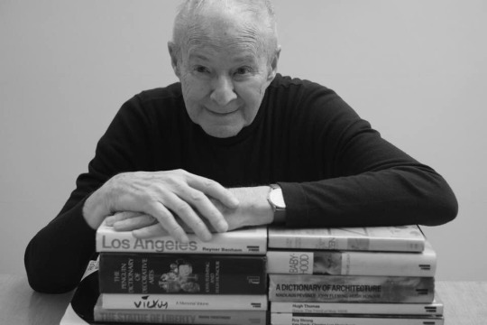
Gerald Cinamon
Chief designer for Penguin Books with a flair for pacing illustrated nonfiction, such as with Pelican’s Style and Civilization series
Gerald Cinamon, who has died aged 93, was one of the most skilled book designers of his generation. For 20 years from 1965 he was Penguin Books’ main designer of arts and architecture titles, becoming its chief designer in the mid-1970s.
A master of the paste-up method of layout, Cinamon was particularly adept at pacing illustrated books. From one spread to the next he would shift visual emphasis from vertical to horizontal, wide-angle to close-up, empty to full, synchronising these switches of treatment with key points in the text.
His debut for Penguin in 1961 coincided with two key events for the company: its acquittal in the Lady Chatterley’s Lover trial, and its employment of Germano Facetti, who recharged its cover designs for a new decade. But it was Kaye Webb, new editor at the Puffin imprint, who instigated the body of work for which Cinamon would become best known.
Webb had compiled a volume of her husband Ronald Searle’s St Trinian’s cartoons, and handed Cinamon, then a freelancer, “a box of jumbled clippings” from which to create a Penguin edition. He would paste up layouts at his kitchen table in Notting Hill, west London, surrounded by manuscripts, proofs and the aroma of Cow Gum, downing tools when his daughters returned from school.
The St Trinian’s Story (1961) led to further commissions for illustrated Penguins, and Cinamon unintentionally became a specialist in this field, at a time when letterpress was rapidly being replaced by offset litho as the means of printing books.
Where type and images had previously occupied two discrete planes – pictures on their own pages, often on coated art paper – litho enabled designers to place picture and text side-by-side, and Cinamon took advantage of this, interweaving halftones and line images with set type to make a verbal–visual narrative. His flair for sequencing nonfiction books led him to become the main designer of Pelican series of the 60s and 70s such as Style and Civilization and The Architect and Society.
The integrated method was also crucial to John Berger’s Success and Failure of Picasso (1965). There the author indicated precise points within the text where images were to be placed. When Cinamon inevitably found that this was not always possible, Penguin dispatched him to Geneva to resolve the layout with Berger.
In 1966 Penguin launched a hardback imprint, for which Cinamon designed A Fortunate Man: The Story of a Country Doctor, written by Berger and with photographs by Jean Mohr. The contrast between these two books for Berger demonstrates the span of Cinamon’s repertoire, despite the contextual similarities (same author, same publisher, single-colour print, a hand-held format).
Where Success and Failure’s layout rolled line by line with Berger’s polemic, A Fortunate Man’s images did not correlate with points in the text, and this allowed Cinamon to “write” the text–photo combinations, and the overall rhythm, in his own way. His arrangement is particularly effective in contrasting man with his rural environment: 45 pages pass before a human figure appears in the photographs.
Though sometimes categorised as a proponent of the objective, modernist Swiss style of graphic design, Cinamon’s solutions to briefs were far broader than that tag implies. His colleague Tony Kitzinger remembers his outlook as being “Swiss, tempered by New England”.
Born in Boston, Massachusetts, Jerry was the younger son of Pearl (nee Hirschberg) and Max, a liquor salesman. He initially studied at Massachusetts School of Art, and in 1953 joined the US Navy. He was then accepted by the department of graphic arts at Yale University, where his teachers included Alvin Eisenman, Armin Hofmann, Norman Ives, Josef Albers, Herbert Matter and Paul Rand.
Graduating in 1957, Cinamon received a Fulbright scholarship for the Ecole des Arts et Métiers in Paris, but found the approach there outmoded, so drove to Switzerland to study further with Hofmann in Basel. He was thus influenced first-hand by several key strands of the modern movement, from the Bauhaus to the new American advertising.
On the way home from Europe he met Diana Philcox, a recent textiles graduate from the Central School of Arts and Crafts in London. In New York Cinamon freelanced for publishers, and took up a one-year contract at Standard Oil of New Jersey (subsequently Exxon). In 1959 he and Philcox married, and in the following year moved with their twin baby daughters to Britain. Cinamon’s first clients in London included New Left Books and the Jewish-interest publisher Soncino.
After more than 20 years with Penguin, he left in 1985 to form a partnership with Kitzinger, who said of his former partner: “When I think of Jerry I do not see the kind of designer who shuffles little bits of paper around on a sheet. He would know, in advance, what he was realising.”
In 1987 Cinamon guest-edited a special issue of the trade journal Monotype Recorder in memory of Hans Schmoller, the exacting production director at Penguin (1949-76), who had been a “father figure” to him. He also wrote on the work of artist-designers including Talwin Morris, Ben Shahn and Emil Rudolf Weiß.
His biography of the type designer Rudolf Koch (2000), includes an apparently stray anecdote about a “young Berliner” who in 1933 had applied to become one of Koch’s students but had been turned away. The young Berliner was Schmoller.
Cinamon’s third daughter, Hannah, died in 2023. He is survived by Diana, their daughters Sara, Kate and Beth, eight grandchildren and a great-granddaughter.
🔔 Gerald Earl Cinamon, graphic designer and author, born 27 July 1930; died 15 February 2024
Daily inspiration. Discover more photos at Just for Books…?
13 notes
·
View notes
Video
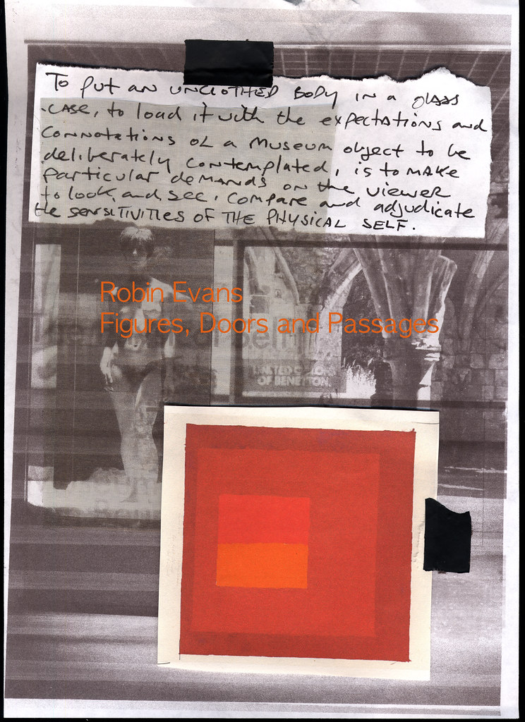
Openings and Conclusions 6 by Russell Moreton Via Flickr: Collage on paper, written fragments and images from Peter Greenaway, Josef Albers and Robin Evans. Photo montage of The Physical Self (Greenaway) and Waverley Abbey UK. Visual research as part of The Waverley Project/Obscura and Reading Room. On the horizon, then, at the furthest edge of the possible, it is a matter of producing the space of the human species-the collective (generic) work of the species-on the model of what used to be called "art" ; indeed, it is still so called, but art no longer has any meaning at the level of an "object" isolated by and for the individual. Henri Lefebvre, Openings and Conclusions. from On Installation and Site Specificity (introduction) Erika Suderburg
#Research Collage#Working Notes#Interior Documents#Visualisations#Architectures#Spaces#Place#Embodiments#Practices#Texts#Material#Mappings#Drawings#Site#Localities#Mark Dion#Peter Greenaway#Herzog and de Meuron#Henri Lefebvre#Robin Evans#Kate Whiteford#Colin Renfrew#Remote Sensing#Archaeology#Rodin#Beuys#The Sensitivities of the Physical Self#Josef Albers#Waverley Abbey#Cistercian Monastery
3 notes
·
View notes
Text

Josef Albers (German/American, 1888-1976) Untitled c.1944 Oil on blotting paper, 22.2 x 27.9 cm.
14 notes
·
View notes
Text

Josef Albers Structural Constellation (JAAF: 1954.3.1) 1954 Pen and ink on graph paper
3 notes
·
View notes
Text
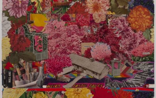


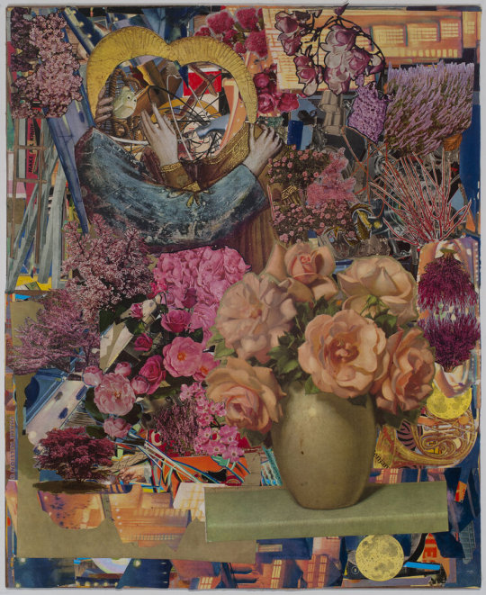
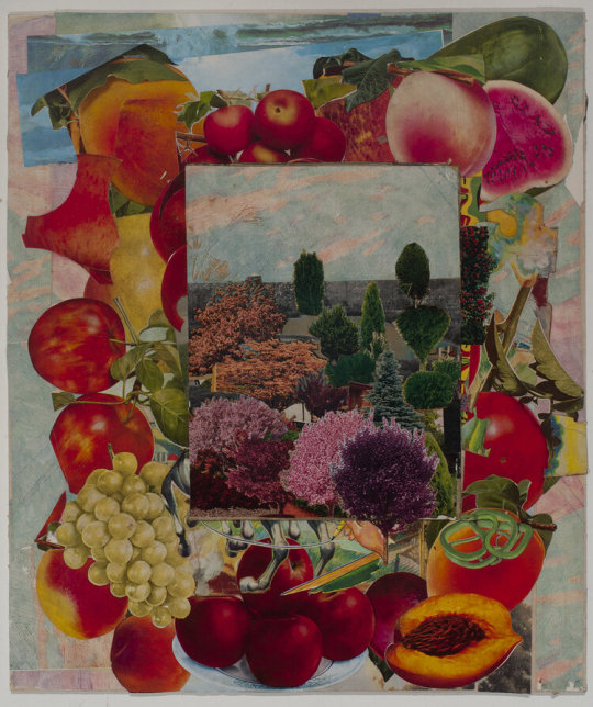


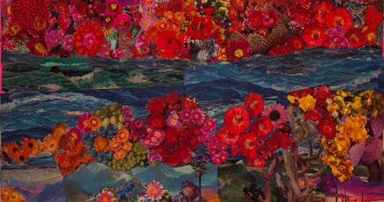
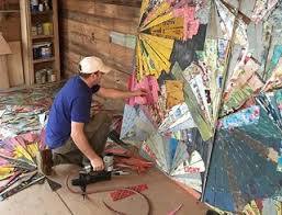

More collages by Lance Letscher.
Lance Letscher’s collages are accumulations of tiny bits of paper taken from a myriad of sources. His compositions, driven by a piecemeal aesthetic with a meticulously obsessive sensitivity to color and content, evoke both the expansiveness of the cosmos and the complex detail of microcellular life forms. Crafted with a rich and vibrant vocabulary eliciting discovery by his viewers, Letscher’s works engage us with their poetry and intricacy.
Since the late 1980’s, Letscher has used the raw materials of wood, marble, old books and paper in such a manner as to remove them from their original context. As a youth, he cleaned out vacated rental properties owned by his grandparents and developed a curious habit of imagining other people’s lives from the traces left behind. Trained as a printmaker, Letscher’s early career focused on intensely conceptual sculptures of marble or wood: a doll-sized marble wheelchair, a dwarfed piano of wood, a rumpled child’s pillow in marble. In the mid-1990s Letscher shifted from his conceptual sculptures towards paper and collage but took away from his experience as a sculptor incredible patience and ability to focus on labor-intensive compositions. He began to collect antique paper, ledgers, old notebooks, diaries, letters, record covers, magazines and books from thrift stores, junk-shops, used-booksellers, and even dumpsters.
He meticulously organizes and stores these weathered materials, which he later surgically deconstructs and deploys, creating new narratives from shards of a memory. Letscher’s geometric and contemplative juxtapositions of color and pattern call to mind the classic craft of quilt making, which he has cited as an influence. Other frequent comparisons are to a wide and varied roster of other artists: Josef Albers, Piet Mondrian, James Castle, and Martín Ramírez, among others. Letscher’s most recent works explore notions of locomotion, technology, and the creative impulse at the heart of human nature. Letscher re-visits his sculptural roots as his collages leap into three dimensions, using vibrant colors and letters to cover the surfaces of such varied subjects as guns, motorcycles, rockets, tools and toy planes. A diligent and nearly constant worker, Letscher follows, with enthusiasm and gratitude, wherever his source materials lead him.
Lance Letscher attended the University of Texas where he received both his Bachelor of Fine Arts and his Master of Fine Arts. He later apprenticed for Amado Peña, an artist known for his Southwestern-style prints. He currently lives and works in Austin, Texas. His work is held in public and private collections around the country and has been reviewed in Art in America, The New York Observer, and Harper’s Magazine, among other publications. A full-length monograph of his work, Lance Letscher: Collage, was published in 2009.
https://www.tayloepiggottgallery.com/.../48.../biography/
11 notes
·
View notes
Photo

Josef Albers, “White Lines Squares,” 1966,
Set of 6 Lithographs in brilliant colors on paper,
Image 6 x 6 inches / Sheet: 7.5 x 7.33 inches,
Courtesy: Cerbera Gallery
#art#geometry#geometric#square#red#green#black#blue#josef albers#white#lines#1966#lithograph#cerberagallery#abstract#abstraction#abstract art
51 notes
·
View notes
Text
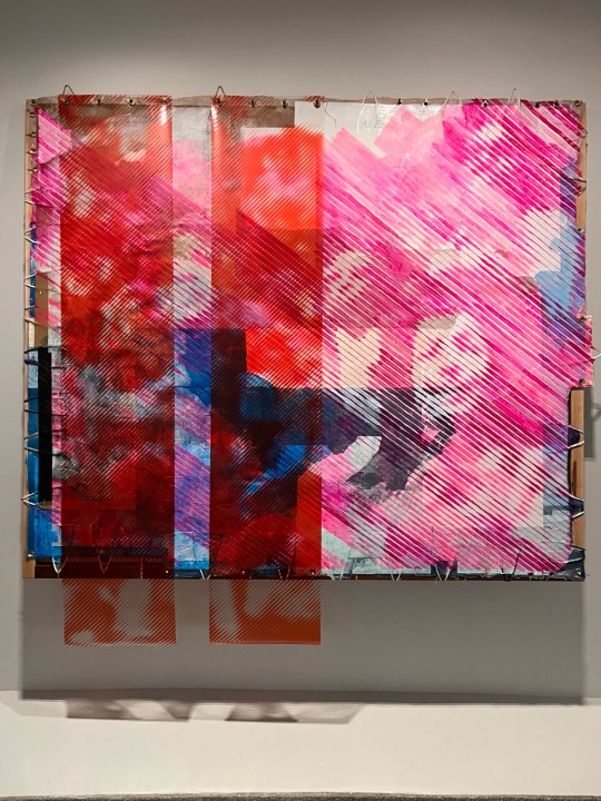
TOMASHI JACKSON
Day Glow (Backlash), 2022
From the Guggenheim Museum description card:
“Acrylic, Yule Quarry marble dust, and paper bags on canvas, linen, and textile with PVC marine vinyl, mounted to wood with brass hooks and grommets Tilton Gallery, New York
Tomashi Jackson creates vivid, research-based works in various media to investigate underacknowledged histories primarily related to the civil rights movement, a time that held great (unrealized) promise for the democratic ideals of equality and justice. Jackson's Day Glow (Backlash) incorporates images from this period that are painted on linen and vinyl as if printed in halftone, thus rendering them only partially legible. Because the images are more difficult to see at close range than from afar, discerning the work requires movement around the piece, thus implicating the viewer in the codification and transmission of history. In their semi-visibility, Jackson's diffuse figures also engage art historical legacies of abstraction, particularly as they relate to color theories advanced by Josef Albers, an influential artist and teacher whose book on the subject, Interaction of Color, was published in 1963.”
5 notes
·
View notes
Text


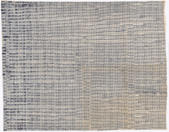
This week's theme is repeating elements: images containing identical or similar visual units stamped, pasted, drawn, or painted at regular intervals across the surface of a support. Variations in the color or placement of these units can lend a great deal of visual interest in what might otherwise read as boring wallpaper patterning.
In the Malian mud cloth at top, the same elements continually shift out of alignment with one another, defeating our expectation of symmetry and producing an endlessly fascinating pattern. Anna Albers challenged her textile students to create "woven" patterns using a typewriter; in this example, I find visual appeal in the contrast between the two very rigid patterns, as well as in the slight inconsistency of individual key strikes. Ruth Asawa used a laundry stamp reading "BMC" (for Black Mountain College in North Carolina, where she was a student and also the supervisor of the student-run laundry facility) to produce a dense overall pattern where every inconsistency adds to our perception of a wavy, undulating surface.
Bamana peoples, Mali, Africa. Bogolan Wrap, made before 1910. Cotton and dye, 54 1/2 x 34 1/16 inches. Metropolitan Museum of Art, New York.
Anni Albers (American, born Germany, 1899-1994). Studies made on the typewriter, not dated. Typewriter printing in blue ink on paper mounted on board, 10 1/2 x 6 1/2 inches. The Josef and Anne Albers Foundation, Bethany, CT. Source.
Ruth Asawa (American 1926-2013). Untitled (BMC.145, BMC Laundry Stamp) c. 1948-49. Stamped ink on fabric sheeting, 36 3/4 x 45 1/2 inches. Museum of Modern Art, New York.
1 note
·
View note
Text
2D CLASS - VIBRATING EDGES - Monday 10/23/23
This class will use the lab hours from 8-9:30 am to complete assignments for last week.
I will begin the lecture for today at 9:30 to explain today's assignment.
TODAY'S ASSIGNMENT:
Last week, students created the illusion of four colors using only three.
Color theory allows artists to create visual illusions by use of contrasting colors.
Today you will engage in a new design that will allow you to create a sense of motion or action by using colors and shape to give that illusion.
One trick to this assignment has to do with using colors that are vibrant or at its brightest tint.
ASSIGNMENT FOR MONDAY AND MATERIALS
2 BRISTOL PAPERS
ACRYLIC PAINTS
SCISSORS
GLUE STICK
VIBRATING EDGES
Create a cut and paste design using two colors that when placed together can create simultaneous contrast.
Remember this is a cut and paste.
A) Paint two large Bristol papers ( 9x 12 )
B) You will use one as a surface sheet .
C) Use the second to create shapes that you lay over your surface sheet.
Think about the following:
What colors can cause vibrating reaction to each other?
Bright colors or opaque?
Cool colors in contrast to warm ?
Complementary colors ?
And then what shapes when painted in those colors could create a vibrating , animated, active edge.
See below several examples from previous students:

A

B

Homework 1 for Tuesday
You will create 2 assignments using a 6 inch square that depicts an Analogous color scheme within a square composition.
Each assignment (2) will be created using the following:
6 inch square
with 2 inserts
Showing three colors.
Remember, Analogous schemes are colors on each side of any given color.
You will have three colors in each six inch square.
This will be done in the Sketchbook.
The Josef Albers painting below is using four colors , for the analogous you will be using only three.
The outcome will look similar to this painting below.

All the assignments done this week are helping you create visual scientific experiments to understand color theory in the spirit of Joseph Albers.
These assignments are helping students develop color schemes and ideas that are going to prepare you for the midterm.
Homework 2 For Tuesday
Using a ruler and acrylic paint , make a 6 “ square in your Sketchbook.
a) Now fill the square with small swatches of mixed color.
b) No color should be repeated.
c) Do Not use Black, Brown, Grey or White as color, these are known as neutrals and are not included in the color wheel.

student work above and below

1 note
·
View note
Photo

Josef Albers
Study for Graphic Tectonic, c. 1942
Ink on paper
17 x 22 inches (43.2 x 55.9 cm) Framed: 19 1/4 x 24 1/4 inches (48.9 x 61.6 cm)
Currently showing at:
David Zwirner 24 Grafton StLondonW1S 4EZ until April 15th 2023
1 note
·
View note
Text

This is the work I made in todays workshop. A 2D into 3D workshop where we folded pieces of A4 and A3 paper into 3D forms. Starting with a two airplane workshops, these are my terrible attempts at making paper Aeroplanes. I made three of them and none of them could fly
After that we were aloud to made one or many free standing folded paper sculptures using whatever paper we liked.
I settled on using some of the many coloured paper sheets I had braught with me with the intention on making the paper airplanes. I used these coloured paper sheets to create the first thing that I could think of...
A Toblerone Box


First I made the triangle box shape out of yellow coloured card, then I used the same folding method on sheets of reddish-brown paper and white paper to symbolise the chocolate and caramel, putting these folded papers inside the yellow one, creating a Babushka doll effect.
I then took many close up photos of the gaps in-between the folded papers as they were stuffed inside the yellow Toblerone box shape.
these photos are very abstract and colourful, you would not know what they are or what's in them if I hadn't told you.


Then I started editing the photos on my phone to change the colours, with great results.


I found these looked like a triangular version of Josef Albers "Homage to the Square series of paintings where he investigates and shows how different colours interact and absorb or repel each other. The Elasticity of colour an how fluid it could be. Bellow is an example of his "Homage to the square" artwork.

The other ones look like an abstract sun set, in the shape of a crescent moon. and I also really like how they are all very Pop Art.


1 note
·
View note
Video
Openings and Conclusions 6 by Russell Moreton Via Flickr: Collage on paper, written fragments and images from Peter Greenaway, Josef Albers and Robin Evans. Photo montage of The Physical Self (Greenaway) and Waverley Abbey UK. Visual research as part of The Waverley Project/Obscura and Reading Room. On the horizon, then, at the furthest edge of the possible, it is a matter of producing the space of the human species-the collective (generic) work of the species-on the model of what used to be called "art" ; indeed, it is still so called, but art no longer has any meaning at the level of an "object" isolated by and for the individual. Henri Lefebvre, Openings and Conclusions. from On Installation and Site Specificity (introduction) Erika Suderburg
#Research Collage#Working Notes#Interior Documents#Visualisations#Architectures#Spaces#Place#Embodiments#Practices#Texts#Material#Mappings#Drawings#Site#Localities#Mark Dion#Peter Greenaway#Herzog and de Meuron#Henri Lefebvre#Robin Evans#Kate Whiteford#Colin Renfrew#Remote Sensing#Archaeology#Rodin#Beuys#The Sensitivities of the Physical Self#Josef Albers#Waverley Abbey#Cistercian Monastery
3 notes
·
View notes
Text

Charity shop find yesterday. The cover features artwork by Josef Albers ('Factory', 1926), an abstract representation of buildings, windows and chimneys using simple forms and a minimalist colour scheme in gouache and crayon on paper. Albers produced a number of large stained glass windows for public and private buildings and this is presumed to be a design for a work in sandblasted glass.
The book cites another example of his work, 'Fugue' from 1925, which he created in glass although, unlike most of his glass work, was only 25 x 66cm. It is very similar to the one posted above, applying the same palette and a similar arrangement of vertical and horizontal lines.
Albers also produced furniture and taught furniture design.
The colour scheme reminded me of the White Stripes whose public image was to always dress in only those three colours, and they also released an album called 'De Stijl', named after the Dutch art and design movement, so I was wondering whether there was any connection between De Stijl and Albers, or indeed the Bauhaus art movement. A very quick Internet search tells me that the former movement did influence the latter.
Brief outline using info pilfered from Wikipedia:
De Stijl is Dutch for "The Style". It was an art movement founded in 1917 in Leiden, consisting of artists and architects. The term is also used to refer to a body of work from 1917 to 1931 created in the Netherlands.
The Staatliches Bauhaus commonly known as the Bauhaus (German for 'building house'), was a German art school operational from 1919 to 1933 that combined crafts and the fine arts. The school became famous for its approach to design, which attempted to unify individual artistic vision with the principles of mass production and emphasis on function.
The school existed in three German cities—Weimar, from 1919 to 1925; Dessau, from 1925 to 1932; and Berlin, from 1932 to 1933—under three different architect-directors: Walter Gropius from 1919 to 1928; Hannes Meyer from 1928 to 1930; and Ludwig Mies van der Rohe from 1930 until 1933, when the school was closed by its own leadership under pressure from the Nazi regime, having been painted as a centre of communist intellectualism.
I will do more work on this later.
0 notes
