#its so pretty and artistic and all these religious motifs
Explore tagged Tumblr posts
Text
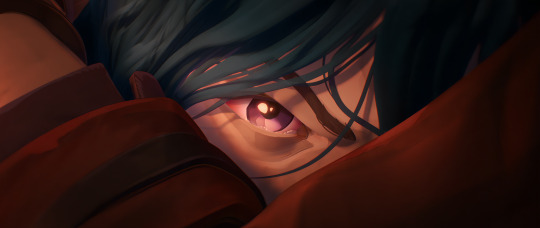
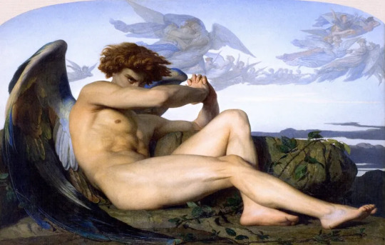
wait hello?
#its so pretty and artistic and all these religious motifs#THE SHOT WITH VI UNDER THE BLOODY WINDOW LIGHT..#im obsessed with how human everyone looks#like jace's big ass chin. altho i was wishing his mom looked more like him. but also like the white hair streak says sm#jinx's movement is sooooooooo good its so unique and u literally understand her like i get her#also the voice acting augh.. all the crying scenes are so good#powder just as little girl. i feel her tbh. im so..#i love the plot so bad im going crasyy#but im forreal so obsessed with the character designs its so good its sooo. its so.. like idk their personality shows so much idk..#like the goggles? augh#fuck its so good. the themes.#rex.txt#arcane#<- i intend to talk abt this more..#wait no sorry jace's chin isnt big its just so normal like its so perfect. but his mom's chin does look short in comparison
20 notes
·
View notes
Text
[For clarification, I read David Wyllie's translation, obtained from Project Gutenberg.]
From Wikipedia:
Vladimir Nabokov rejected [the religious/psychological/sociological interpretations], noting that they do not live up to Kafka's art. He instead chose an interpretation guided by the artistic detail but excluded any symbolic or allegoric meanings.
In Nabokov's view, the central narrative theme is the artist's struggle for existence in a society replete with philistines who destroy him step by step.
Hey Nabokov, why are you so stupid and so wrong?? This was one of the single most densely symbolic and allegorical texts I've ever read in my life...
In 2007, Ralf Sudau took the view that particular attention should be paid to the motifs of self-abnegation and disregard for reality. Gregor's earlier behavior was characterized by self-renunciation and his pride in being able to provide a secure and leisured existence for his family. When he finds himself in a situation where he himself is in need of attention and assistance and in danger of becoming a parasite, he doesn't want to admit this new role to himself and be disappointed by the treatment he receives from his family, which is becoming more and more careless and even hostile over time. According to Sudau, Gregor is self-denyingly hiding his nauseating appearance under the sofa and gradually famishing, thus pretty much complying with the more or less blatant wish of his family. His gradual emaciation and "self-reduction" shows signs of a fatal hunger strike (which on the part of Gregor is unconscious and unsuccessful, on the part of his family not understood or ignored). Sudau also lists the names of selected interpreters of The Metamorphosis (e.g. Beicken, Sokel, Sautermeister and Schwarz).[12] According to them, the narrative is a metaphor for the suffering resulting from leprosy, an escape into the disease or a symptom onset, an image of an existence which is defaced by the career, or a revealing staging which cracks the veneer and superficiality of everyday circumstances and exposes its cruel essence. He further notes that Kafka's representational style is on one hand characterized by an idiosyncratic interpenetration of realism and fantasy, a worldly mind, rationality, and clarity of observation, and on the other hand by folly, outlandishness, and fallacy. He also points to the grotesque and tragicomical, silent film-like elements.
There we go! Finally some good analysis!
Volker Drüke (2013) believes that the crucial metamorphosis in the story is that of Grete. She is the character the title is directed at. Gregor's metamorphosis is followed by him languishing and ultimately dying. Grete, by contrast, has matured as a result of the new family circumstances and assumed responsibility. In the end – after the brother's death – the parents also notice that their daughter, "who was getting more animated all the time, [...] had recently blossomed into a pretty and shapely girl", and they want to look for a partner for her. From this standpoint Grete's transition, her metamorphosis from a girl into a woman, is the subtextual theme of the story.
Ehhh.... Bit of a stretch there, buddy... Grete's metamorphosis, imo, was incidental, not central. Her 'metamorphosis' serves as a handy contrast to Gregor's, balancing the story's themes, but it's for sure not the star of the show.
If this text was a big dish of mac & cheese, then Gregor's metamorphosis is the cheese sauce and Grete's metamorphosis is the teaspoon of dijon mustard added to balance the flavours.
Grete is important, no doubt. Her contrast adds that finishing finishing touch to the dish which elevates it to perfection.
But ain't nobody calls it "mac & mustard", and if you think we should then I think you're either being facetious, are cynically attention-seeking, or have simply gotten high huffing your own farts.
(the macaroni noodles are Marx's theory of alienation btw)
Just finished reading Franz Kafka's "The Metamorphosis".
Jesus, what a haunting book... Going to be rotating that whole thing in my mind for a loooong time...
It's all about disability, yeah? That's my main takeaway of the book's themes. Disability, and the burden that caretaking becomes within a capitalist society.
Poor Gregor 😭
15 notes
·
View notes
Text
“...Try as I might, I could not find any clear reference to Dothraki artwork. Vests are described repeatedly as painted (AGoT, 83, 193), but apart from the exceptional one made for Viserys (AGoT, 329), how they are painted doesn’t seem to ever be mentioned. One might fairly call Dothraki hair braiding and belling an art (AGoT, 30), but while the number of braids matters, it doesn’t seem like the quality or artistry is ever commented on. The statues that line the way to Vaes Dothrak are all captured, the “ancient monuments from all the lands the Dothraki have sacked” (AGoT, 324) and Vaes Dothrak itself lacks its own building style, instead being a mix of styles of peoples the Dothraki have enslaved (AGoT, 326-7).
Drogo’s palace has just “rough-hewn timbered walls” and Daenerys smiles to herself at the contrast between the expected grandeur and the actual building (AGoT, 327), apparently devoid of decoration. It’s possible that the bride-gift weapons (AGoT, 86) were decorated – the materials in question were clearly lavish – but we are not told. Later, Daario Naharis has a decorated arakh (in the shape of a naked woman, because of course, ASoS, 482), but he is very much not a Dothraki. However, the contrast between the long descriptions his clothing and weapons get (ASoS, 476, 482) and the minimal description of the Dothraki is striking; Martin can give detailed descriptions of finery when he wants.
In stark contrast, actual ‘horse cultures’ – to the surprise, I suspect of no one – have well developed artistic traditions. In addition to what we’ve already seen of the intricate and finely decorated clothing of the Sioux, we should add painted scenes on tipis, pictographic histories called ‘winter counts‘ showing the events of a year. Likewise, we’ve already discussed traditional Mongolian clothing, which can be beautifully decorated. The Mongols had an art tradition too, especially in sculpture, with a very distinctive style of scroll-patterns and animal motifs dating back into the bronze age! That the famous stone tortoises of Karakorum (Chinggis Khan’s capital and the clear inspiration for Vaes Dothrak) have been transformed into just the “plundered gods and stolen heroes” of other cultures (AGoT, 324), is quite disappointing.
I could find but one instance of Dothraki music – the chanting of the ‘crones’ of Vaes Dothrak (AGoT, 410-1), accompanied by a war horn and later drums. Martin does not relate the words of that chant to us or its content (likely because Daenerys does not know), instead choosing to describe the “withered dugs [that is, breasts]” of the old women “sway[ing] back and forth, shiny with oil and sweat” (AGoT, 410). I will admit, I found myself questioning this authorial choice in what in this particular moment ought to have been described. But Khal Drogo doesn’t sing. None of the male Dothraki seem to sing. They do not recite poetry, not engage in clever wordplay. There is, it seems, not one ‘Antarah ibn Shaddad among them.
By contrast, the Sioux have a complex music tradition (as, of course, do other Great Plains Native Americans), with multiple genres performed in different ways for different occasions – war songs, songs to tell stories, songs of religious import or ritual function and so on. Anthony McGinnis also notes how oratory was an important part of diplomatic rituals between native peoples and was quite developed, with meetings that “consisted of many elaborate orations, an art form at which the plains Indians excelled. These flowery, metaphorical speeches continued for hours…” (McGinnis, op. cit. 86, concerning an 1851 peace meeting between the Shoshonis and Cheyenne at Fort Laramie).
Likewise, the oldest surviving work of Mongol literature, The Secret History, preserves even older passages of poetry common on the Mongols. Sets of alliterative verses, üligers, also demonstrate an oral literature built around poetry from before we have written evidence (the Mongols, like many nomadic peoples, adopted or developed writing relatively late and it is always, as an evidentiary matter, difficult to peer back through the earliest of writing into the yet older oral tradition). The Mongolians also have a rich musical tradition, including refined instruments. The morin khuur (‘horse-fiddle’), is a two-string string instrument with the first string traditionally made of 130 hairs from a stallion’s tail and the second 105 hairs from a mare’s tail (the wiki link has a short sound sample of playing – it’s quite pretty. There’s also traditional folk morin khuur playing on youtube). There are wealth of forms of expressive culture on the Steppe.
Far from being brutish, unmusical and inarticulate, nomadic cultures tend to prize artistic and musical performance and expression. I brought up ‘Antarah before and while he is not from one of the cultures that Martin points to, he is a horse-borne nomadic warrior-poet. Where are the Dothraki victory songs? We have Drogo’s campfire described to us (AGoT, 191), but there are no songs, and only “women dance” while “men die” (from all of the murder, which we’ll get to in a moment). That doesn’t match the richness of cultural expression from actual nomadic cultures. Manly nomadic men played music, recited poetry, sung songs, danced dances, and gave orations. They were humans and engaged in human expressions of feeling!”
- Bret Devereaux, “That Dothraki Horde, Part III: Horse Fiddles.”
30 notes
·
View notes
Text
Not to be off topic on the main here but as a pretty boy enthusiast and a fan of Guilty Gear; I've gotta say, I'm not entirely thrilled with the decisions made for the Strive designs.
Guilty Gear's always been kinda unique in that it's a fighting game that has a lot of variance in the body types of its characters. Well, specifically its male characters - there's a bit of variation in the female body types as well but this is undermined by the fact that the women of Guilty Gear are all well endowed with a few exceptions like Ramlethal and May but honestly, that's a discussion for another time. In any case, fighting games have historically been a genre where the male characters are either grotesquely buff or slender anime pretty boys and there's little in between.
Guilty Gear managed to pretty admirably give a lineup of men who, while they were all muscular, did not have what I lovingly call Street Fighter Syndrome in that they were all the same degree of Totally Jacked. For a few examples just look at the differences between Sol Badguy and Axl Low (I'm going to be using their Xrd/Rev designs)
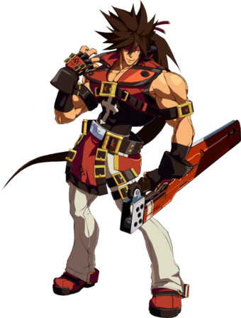
Sol is top heavy; he has a very defined chest and arm region - which reflects his fighting style as a character whose main weapon is a sword that's much more bludgeoning weapon than anything sharp - and has a notably slender waist with similarly slender hips, legs etc. His 'hourglass' figure's been a part of his design from as early as I can remember but with the turn of Xrd, the artists were able to exaggerate his body type to what I like to think is what was supposed to be its natural extreme.
Contrast that with Axl Low

Who isn't actually particularly muscular but rather just possesses a very average male figure with especially defined legs. Axl isn't buff, he isn't thin, he doesn't look like he exercises religiously outside of maybe being someone who runs/does marathons - but that's okay because it's still an acceptable body type for some random breadass british dude who's having a grand old time figuring out his place in the world. Axl just looks like a guy.
All of that is to say, Strive does away with all of the nuance of these great, varied designs to just make everyone the same flavour of 'stereotypically fighting game buff' and I absolutely despise it. And here's what I mean.
Enter Ky Kiske.

Ky's as generic slender anime pretty boy as you get. Even if he's similar in build to Sol in that they're both more defined in their chests and arms than they are in their legs, Sol is obviously the broader and more muscular of the two. Ky looks, well, pretty. His arms are particularly thick, his neck isn't particularly defined, he has very delicate facial features - thin jaw, fair hair, flowing clothing that accentuates his grace and technique as a swordsman more than it serves to intimidate or display his body. And Ky has always been designed like this. This is his Xrd design, but here are a couple of his older looks as well:


Man had always been a slender figure with his belt pulled a bit too tightly and his general figure loose and unfocused on his non-existent musculature. So, please, please for the love of god tell me why Ky looks like a completely different character for Strive?
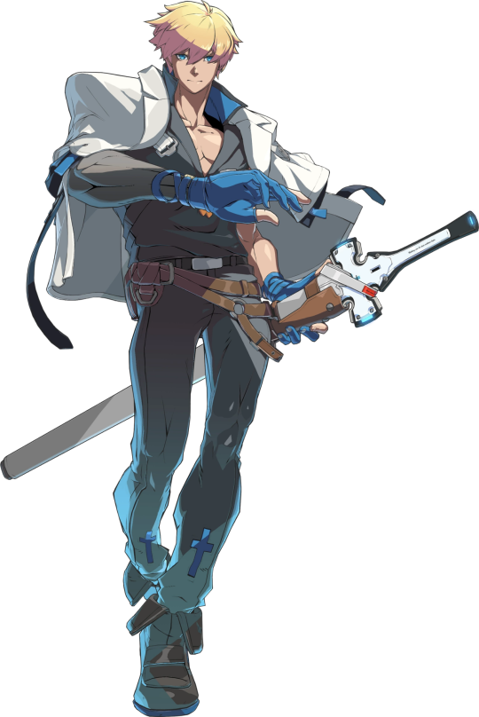
THERE IS SO MUCH WRONG HERE I COULD WRITE A BOOK - but the spark notes version:
Why is his body so much fuller?? Ky has been a twink since inception, one cannot change their body structure/type to spontaneously develop a broader waist/hip when for the past 20 years, Ky's been sporting notable disparity with these measurements.
Getting rid of the loose flowing silohuette is troubling enough considering that's just kinda the look he's had for a hot minute, but his colour scheme is so wildly off. Black and greys are Sol's colours - and as Sol's contrast character limiting that to just the coat hanging over his shoulders is clever I guess but it is in no way enough to visually discern Ky from Sol from a distance or, indeed, when they're fighting and shit starts getting crazy. Ky's always sported a white and blue motif and if y'all were gonna give him waist fillings the least you could've done was keep his colour palette consistent.
I hate the way they phoned in his cross motif. Ky is a pretty devoutly religious man and that was openly obvious in prior designs. Now his cross motif is limited to the shape of his sword's hilt/guard and two pitiful dark blue crosses above the hem of his pants which aren't even noticable because his pants are fucking dark grey--
HE'S INDISTINGUISHABLE FROM HIS FUCKING SON
And this, ultimately is the big problem I have with the new designs for Strive. Guilty Gear has always had very striking and recognisable silohuettes and designs which made liberal use of things like body type to distinguish and characterise its characters from one another. This sort of bombastic and detailled designwork stopped the characters from blending into each other and it did wonders for keep track of characters when there was a lot going on - even if they mirrored each other or were literally based off of another character from the series.
Ky Kiske and his son, Sin are visually very, very similar. Their physical differences are the only thing we have to distinguish them since they share a colour palette and the character designers for Xrd took advantage of the fact that Ky was much more on the slender side to create visual contrast between him and his son who looks like this.

Sin has a stocky build. He's heavily muscled, his design is built around showing off how jacked he is. He barely has a waist, has arms for days, you could slice cheese on his abs - and because he has short hair, in Xrd, they did a pro gamer move and had Ky grow his out.
Now, however, in Strive - how are you meant to tell the two of them apart? Not only has Ky cut his hair short again, but his body type is no longer slender but rather is the same stocky, heavy set/buff build that Sin has - something that really doesn't suit the aristocratic swordsman that Ky's always been.
By beefing up the characters, the designers for Strive have erased a vital, vital part of the character of their characters and it's a damn shame because Guilty Gear was one of the few fighting games left that had genuine variety in muscular body types and forms without fetishising or exaggerating the human form to disfiguring degrees.
#ginger rambles#guilty gear#guilty gear xrd#guilty gear xrd revelator#guilty gear xrd rev 2#guilty gear strive#discourse#listen y'all gotta be fucked up if you fucking think I'm not still mad about this#DID Y'ALL SEE WHAT THEY DID TO CHIPP#HELLO#HE'S A SHINOBI WHY IS HE SO BULKY WTF#And Ky's always been a twink why not just keep him as a twink#and let's not even talk about what they did to zato and axl#God I get mad everytime I think about it hhh#sol badguy#ky kiske#sin kiske#axl low
44 notes
·
View notes
Note
tell me more about millais and the whole "steal ur wife and have a happy marriage with her lmaoo" and the whole pedo thing??? im intrigued
At the top of my head and very quickly without bothering myself with checking things online cause I’m a bit lazy sorry (though I’ve been over this story for quite a while, I trust my instinct)
When the Pre-Raphaelites appeared, they were the bad boys of London. Reasons:
1) Fucked around, mostly Rossetti
2) Broke academic rules by painting in excruciating and vivid details that weren’t possible with the naked eye (like Holman Hunt painted every single blade of the grass—your eye can’t see it unless you stare closely at it, so academically, that was ugly)
3) Used redheaded women as models. Now, Victorians were absolute fucking lunatics, but the ideal beauty to them was some corpse-looking Morticia Adams. Black hair and pale skin, was top notch. Blonde, blue-eyed beauty came second, probably. What mattered was the pale skin. It was a trend among Victorian women to paint purple and blue veins to look as dead as possible because the frailty of women in a society that told they literally were good for nothing except breeding was the Latest Trend. Redheads, however, were considered cursed. Case in point: the greatest pre-raphaelite muse, Lizzie Siddal: she was not only a red-head, but her skin was also darker than most prefered. Not that she was anything but a white woman, just not white enough to look like you were already flirting with tuberculosis and ready to die fashionably at 40 (though Lizzie was famous for being constantly sick and bedridden. And addicted to Laudanum, like a good Victorian).
4) Basically what gave them the name: PRE-raphaelite. To explain quickly: academic painting privileged the art that resembled Raphael's paintings: harmonious, made of volumes through precise shadowing, mannerist in its style. Line and drawing prevailed above colour. This is linked to formalism so I’m just gonna wrap it up quickly: drawing was considered the intellectual form of art (because in the 16th century people were like ‘oh, astronomy is a science!’ and 'oh, mathematics is a science!’ and people were like, 'well shit, we gotta find a reason to call arts a science too’ and the Renaissance worked that out by explaining that drawing was basically a form of science. Take Da Vinci). The Pre-raphaelites said: fuck that noise, and privileged colour. They used techniques to brighten their paintings (like a layer of white paint applied to the canvas before they applied the preliminary drawing, which made the colours stand out, and then finished it off with wax varnish, which makes it glow. If you ever see a PR painting live, note just how vivid it is. It looks like it’s never gonna wear off, it’s incredible). So with this, they basically said the Royal Academy was a bunch of piss babies who knew jack shit about painting (the accusation of being dumbasses included).
5) …but to be that guy, you had to LIVE the life. So, if you privilege medieval thinking, lifestyle and theology, what you gotta do? BE that medieval knight Victorians thought were oh so Chivalric. Again, famously, Lizzie Siddal is known to be the bad girl of this revival: she refused to wear crinoline and whatever shit the Victorian ladies wore. She wore loose dresses, no corsets and overall dressed like the engravings on Tennyson’s Idylls of the King. She was actually lauded for her commitment like, even Ruskin at one point saw Rossetti as a piss baby rock star wannabe who never finished his shit, but this girl? She committed.
So you see, when these guys popped up, Victorians scowled. BADLY.
But they knew that, to conquer the hearts of promiscuous dandies and hypocritical high-society, laudanum-ridden, arsenic-eating uptight douches and douchesses, they had to get to the loins of one man: most important art critic of his time, single-handedly responsible for elevating William Turner to the True Genius of English Painting: John Ruskin.
Now, just WHO was John Ruskin?
First of all, this little shit was overtly religious. Protestant kind, so you know what you’re in for. This guy studied Turner back and forth, knew everything about him, wrote extensively of his genius and was responsible, as I said, to consecrate him to the memory of British sea painting. Except he purposefully left a bit out, one particular episode of Turner’s life that, to Ruskin’s mind, would ruin his reputation.
Turner was a freak. My man has ENDLESS erotic drawings that go from curious artist look into the Vagina from full-blown pre-victorian porn. And Ruskin kept it all locked away inside his drawer.
The thing was, Ruskin was brought up surrounded by art. This guy looked at Roman statues of women, with their perfectly waxed peepees and toned arms supporting perky breasts and DEAD ASS though this was what women looked like.
So he married Effie Gray, a woman in everything respectable, a prosperous marriage for the good ol’ Victorian lady and dude.
And for the next five years of their marriage proceeded to REFUSE to even touch her.
When the pre-raphaelites pop up, Ruskin attends their very first exhibition and writes them a glowing review. Immediately they go from nut-heads to pop stars. But among them all, it was clear that it was John Everett Millais who was the most talented. So Ruskin took him under his wing.
His first assignment was: paint my portrait. But the pre-raphaelites did something the British academics didn’t: to paint nature, they went outside and painting the motif by looking directly at it. And Ruskin, who praised this mode of making art, had in mind the precise spot he wanted to be painted on: a waterfal or some shit in Scotland, where he owned a cottage.
This cottage was not big. It was actually rather small—you know, in pretending-to-be-a-peasant-is-so-much-fun! victorian fashion. And what does this absolute buffoon does? He invites Millais and his wife Effie in to paint his portrait.
Now I want you to imagine this woman, who has been pushing down 5 years of Horny, putting up with this dude’s shit, enclosed in a tight space with this man—who was older than herself—and incidentally, a handsome looking young fella who paints nicely.
I insist on this thing that Ruskin didn’t touch his wife because he thought women looked like statues because he actually told her. He told her he found her repulsive because—what do you know!!! The peepee’s got some pubic hair! And women menstruate! And like, we’re real fucking things, not Pygmalion's wet dream forged over and over again! She actually wrote a letter to her father detailing this (if you watch the show Desperate Romantics, the scene were Effie confesses this to Millais, the actress is actually reciting this letter word for word).
So when they return to London after the painting is done, they just… Fall in love. I mean, shit, what was she supposed to do?
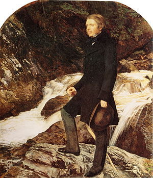
The face of a man who doesn’t know he’s about to be shit-whipped by his pupil, painted by none other than his protegée, this same pupil.
But remember: no matter what Victorian fangirls say, and whatever that Victorian TV show tries to show you, this society was absolute utter shit for women. Effie Grey presented an annulment proposal to her marriage, and society collapsed on her. She was actually blamed for the fact that Ruskin wouldn’t consummate the marriage. And because she had grown quite close to Millais, she had to prove before the entirety of Victorian society that she was a virgin. Oh, yes. It’s what you’re thinking.
Those open-your-legs-wide-and-let-me-insert-this-not-at-all-friendly-looking-metal-utensil-up--your-private-canal-to-prove-you-are-a-virgin. This, mind you, was back then as utterly humiliating as it sounds now, and to make matters worse, Mr. I-only-fuck-clean-shaven-pussy claimed she was mentally unstable.
Either way: annulment conceded, and she married John Everett Millais. The two went on to a lifelong of fucking and 8 children. Check Millais’ painting Peace Concluded and tell me those two idiots did not die happy together.
I kid you not: until Millais’ death, Effie was socially ostracized. She was even barred from being present in social events where Queen Victoria was, proclaimed by the Queen herself (because remember kids! Victorian society absolutely sucked because it was none other than our favourite imperialist who made it so!) even after she ordered Millais the first Laureate painter. It was only when Millais was dying that in his death bed he BEGGED to lift that stupid shit and she conceded. I just honestly believe Effie didn’t give a shit at this point, because my girl was happy.
So, you ask, what happened to Ruskin?
Don’t think he got off easy lmao. He had his own demise. He wasn’t seen with good eyes after the whole annulment debacle. But of course, being the pissy adult he was, he had to make things worse.
Enter Rose de La Touche.
You see, Rose de la Touche was Ruskin’s pupil. She is, as far as we can tell from his writings, the only woman he ever called attractive and revealed to be attracted to her. When, you ask?
When she was fucking 9 years old, the first time he met her.
He became tutoring her when she was 14. At this point, this ugly ass vulture was way past his 40s. Rose’s parents actually made it worse if my mind doesn’t fail me, but I’m not certain so I won’t address them. Either way, he pretty much groomed her and she grew infatuated with him. He actually made plans to marry her once she turned like, 18 or something, like a good pedo.
The only reason Rose didn’t marry Ruskin? Effie Gray stepped in. Not that she was that interested in what was to happen. The thing was, the reason for the annulment was that Ruskin was impotent, and if he fucked a healthy girl and she got pregnant, she’d be in the shits. But either way, I think it was easy given that he was like 40 years older or some shit. Rose actually declined to marry because she wanted the marriage to be unconsummated, but this time around, ya big Pedo declined! I wonder why was it so easy the first time, and so hard now that he found himself a neat little child to corrupt, right?
At some point, even fucking Rossetti intervened. Now, Rossetti was the rock star of his time: he fucked everything that moved, he got into affairs with the wives of his pupils while Lizzie lingered between life and death at his home, and it took him some 9 years to finally keep his promise to Lizzie and marry her ass. He was the last person you’d expect to say a thing. But you know you’ve fucked up and that you’re a perverted piece of shit when THIS IS THE GUY who steps in to say 'hey, Ruskin, big fan, but you really gotta tone it down cause even I’m not a pedo, pal’.
Now listen: yeah, there’s a lot of speculation about Ruskin’s 'love affair’ with Rose de La Touche. Did he really fall in love with her when she was 9? We don’t know. We don’t care either, because it doesn’t make him any less a fucking pedo. Like, yeah, good art critic, nice theory on the whole Modern Painting book, but this dude had some serious issues.
And there you go
11 notes
·
View notes
Text
11/11/11 Tag Game
tagged by: @confunderewrites ! ahhh! these are great questions! thank you, thank you, thank you.
Rules: Answer 11 questions, ask 11 questions, and tag 11 people to answer them
1. How many abandoned WIPs do you have, if any? Which one would you most likely pick up again if you had to?
several, including a goosebumps-inspired horror story and a very julie of the wolves tale told from the wolf pack’s perspective. that said, most of these come from my pre-college days, so i’m not terribly inclined to resurrect them.
butbutbut! the one wip i’m trying to salvage has been mentioned previously as the crazy complex story i’ve cut in half, leading to [ stray ] and hopefully an urban fantasy wip down the line. once upon a time, this wip was on fictionpress, but ah, i deleted it wholesale when i decided it was dumb. i really, really regret that (don’t ever do it, friends!), and the only reason it’s still on my radar today is because i recycled a few ideas/characters for a roleplay.
2. Do you have an OC that floats in and out of different stories? i.e. your guinea pig for alternate universes. Do they have their own story?
my immortal. haha this party-hardy character has a tendency to pop up as a supporting character in different wips. it’s very... “always the bridesmaid but never the bride,” you know? they could have their own story. maybe. we’ll see.
3. If your WIP was being made into a movie, would you want to be hands-on or hands-off? As in, what level of creative power would you want?
for stray, i’d have a couple firm ground rules, but so long as the core message is in tact? nah. i’d actually look forward to the differences, because seeing someone else’s creative take on the same idea sounds delightful.
4. What’s a trope that everyone loves but you can’t stand?
this is tough. i don’t think there’s a trope i can’t stand whatsoever. well-done tropes are well-done tropes, and even if i might not fawn over one quite as much as others, i can respect why it’s popular.
so changing the question a bit: what’s a well-loved iteration of a trope i can’t stand? the tuxedo and martini agents in the first kingsman movie. tonally, that movie is a mess, and i didn’t like how the first half built up the kingsmen as emblematic of an ideal/positive masculinity only to become... well, the exact same james bond power fantasy i’ve seen a thousand times before. no lie. it was kind of a bummer. ¯\_(ツ)_/¯
5. For your characters, do you have specific face-claims in mind or do you leave it up to reader interpretation? (within reason of course)
i have some vague face claims in mind, but those face claims are still only approximations. ideally, i’d be a good enough artist to draw the characters myself, but alas! my own sketches are just approximations as well.
i’m actually happy to trust a lot of a character’s appearance to reader interpretation. so long as the broad strokes are there, i love the unique details people come up with on their own.
6. What is your oldest WIP?
ahahaha. so again, the og wip i’m currently trying to partition out is the oldest wip still standing in some form, but! to actually shed a little more light on it... it was an urban fantasy story that featured eight major characters and rotating perspectives. so you know. kinda crazy in scope.
in short, a demon, an immortal, a werewolf, an average human, a fairy princess, two seraphim, and death himself all want to stop the apocalypse, but they can’t see the forest for the trees. they’re all so consumed by their own issues and so convinced of their own righteousness or another’s evil that actually working together is nigh impossible.
i think of it like a stageplay with a single set. like. the point isn’t the apocalypse itself. it’s how all these wildly different personalities clash and create a puzzle of unreliable narrators. in theory, the goal is to try and uncover the real “truth” everyone’s talking around, but by the end, we’ve turned the very concept of an objective truth on its head.
suuuuuper lofty. /coughcough;
7. Is there anything your characters have done while you were writing that just came out of nowhere?
love. my characters falling in love (and i mean real love, not just a crush) almost always comes out of nowhere. i never plan on it, and one day i’ll write an exchange, note a little bit of chemistry, then step back and just. oh. yeah, i guess they’re a thing now.
8. Is there a writing decision you were surprised you made? (ex: killing off a character, taking the story down a different path, etc.)
i usually have things super plotted out, but sometimes certain themes kind of creep in. for example, i have a tendency to flirt with christian motifs, then one day all those threads finally came together and i realized i’d written something honestly kind of blasphemous? :X
i liked the low-key commentary on trends in u.s. christianity, but not being religious myself, it also felt kind of mean. it was also pretty preachy, so. ;P
9. Do you bounce ideas off people when writing? Or do you tend to wait until the first draft is completed?
so in a lot of ways i’m addicted to the relief of someone else saying “yeah, this is a good idea.” i want it. it inspires me to keep running with whatever i’m doing. but on the other hand, if i get a vote of confidence, i’m terrified of losing it. i want to keep checking in. i want to keep asking about new ideas. it’s no bueno, so while i like bouncing ideas off other people, it’s generally better for me to keep most things under wraps. at least until i’ve finished a first draft.
10. What is your favourite place to write?
at home. curled up on the couch with a blanket. surrounded by the soft peeps of my birds and the millennial elevator music known as chillmix.
11. Two of your protags from two different WIPs just switched places. How do they react?
in stray, an unnamed character well-equipped to handle the criminal underground breaks out the guns (both arms and firearms), then turns to lily and tells her point-blank that he admires everything she’s trying to do. lily.exe is broken.
meanwhile, in unnamed character’s world, carter’s unconscious, foaming at the mouth, and probably bleeding. he was just told all those things that go bump in the night are real, and realizing he’s a fragile human, he fainted. on the way down, he hit his head on a nice man’s expensive coffee table. that nice man is attempting cpr.
Tagging: [ @illthdar ][ @multifacetedscorpio ][ @quartzses ][ @shaping-infinity ][ @honiewrites ][ @penzag ][ @scribble-dee-vee ][ @theswordofpens ][ @thelittlestspider ][ @bookenders ][ @waterfallwritings ]
Your questions are:
1. using one sentence summaries, can you tell me about your wips?
2. what inspired them?
3. which of your ocs do you most identify with?
4. if you’ve ever cried while reading, which book cued the waterworks?
5. how do you conduct research for your wips and what’s the most interesting thing you’ve discovered in said research?
6. thus far, which scene has been the most difficult to write?
7. which of your ocs do you like the least?
8. which pov and tense do you prefer to write in?
9. do you write poetry?
10. who is your writing role model?
11. if you could give your younger writer self some advice, what would it be?
9 notes
·
View notes
Text
How to decorate my wedding with flowers
«I am a flower lover, but I don't know how or when to use them on my wedding day. What are the key elements to decorate a wedding with flowers? »
How to decorate my wedding with flowers? If you are a love of flowers , no you can not miss this little guide with ideas for decorating your wedding with flowers . You can also create a thematic line and unify the various spaces that are at weddings. As you know, the flower is a symbol that can be present at your wedding.
In this article you will find 12 + 1 moments, places or key elements, which will serve as a reference when flooding your wedding event with flowers.
Flowers in your wedding headdress Probably, before your wedding, you will try different headdresses to see which one you feel most comfortable with. Have you thought to include small florets and flowers in your t Ocado wedding ?
«You can do it in a subtle way or quite the opposite, enhance the flower as the protagonist of your hairstyle.»
Once you have chosen the theme of your wedding and the set of flowers that most represent you as a couple, you can incorporate some of the flowers and corsages in your headdress. You can echo your wedding headdress with flowers in a subtle way, or quite the opposite, enhance the flower as the protagonist of your hairstyle.
If you want to know more about wedding headdresses, I recommend that you give a look at the article " Touched Wedding ". Here you will find all the necessary information to choose yours.
Bridal bouquet As in the bridal headdress, another item that can not miss the flowers, is in your bridal bouquet . Create your bridal bouquet depends entirely on your creativity and desire to innovate, since there are infinite combinations possible.
"Brides used to carry the bouquet with orange blossoms to hide the body odor."
In ancient times, the bouquets brides wore them to scare away evil spirits and especially Greek Wedding bouquets were composed of branches of laurel and garlic. In the Middle Ages, where there was no habit of cleaning, brides used to carry the bouquet with orange blossoms to hide body odor.
If you want to know more about the types of bouquets that exist, the meaning of each flower and other curiosities, I recommend that you go through the article " R masters girlfriend " where you can clear all your doubts.
The boyfriend's on
The r amillete groom , Boutonnière or pinned is a floral motif which is usually a miniature copy of the bouquet carrying the bride during the wedding. It is not a mere miniature version of the wedding bouquet, but, in addition, the groom ends up giving it his personal touch and making it his own.
This corsage is placed on the left lapel of the groom's jacket and helps to differentiate the groom from the rest of the guests
"Its use has been extended to more direct witnesses and relatives."
Although formerly was an element that used only the groom and best man , today, we can see that its use has been extended to witnesses and relatives .
Sometimes we can find corsages that do not have any flowers, but it is an element chosen by the groom / boyfriends in a creative way to stand out at the wedding. If you want to see some ingenious boutonnieres, read in b odas.net .
Wedding invitations
Another floral element you can use in your wedding are the wedding invitations with flowers sent to your guests by mail.
Today there are incredible invitations, which decide to incorporate a natural element such as flowers inside. This flower is usually the flower chosen by the bride and groom for the whole theme of the wedding or a similar flower .
«We don't want your pachucha and mustia flower to reach your guests.»
Flowers of any kind can be sent, but they are usually dried flowers that maintain their color and intensity regardless of the time that passes. We don't want your pachucha and mustia flower to reach your guests.
You can check the trends of 2019 in invitations, in the following link: “ Wedding trends 2019 ”.
Bridal car
Ecorar d tradition of the bridal car c on pretty flowers for weddings and other arrangements, it is a tradition that traditionally lies in the hands of friends of the couple. In addition to serving as a bride and groom during the link, a bridal car full of flowers informs the whole world that a newly married couple is going inside.
«These flowers also usually follow the theme chosen by the bride and groom for the wedding day.»
Although there is a custom of letting the bride and groom's friends decorate with or without tricks, the boyfriend's car, flowers can be used for it. These flowers also usually follow the theme chosen by the bride and groom for the wedding day.
Decorate the ceremony with flowers The ceremony is one of the most important and emotional moments of the wedding. During the ceremony, you will say “ Yes I want! "Surrounded by your loved ones and you will eventually become " husband and wife "," wife and wife "or" husband and husband " 😀
Then we talk about how to decorate your ceremony flowers , wedding whether it is religious or civil. It will also serve you for ceremonies outdoors or indoors.
Benches and chairs of the ceremony To give your personality ceremony and awaken a cozy feeling among the attendees, you can decorate the place and the chairs where your guests will sit with flowers . It is usually a practically essential and visually very attractive decorative element.
«Placing floral arrangements on your benches will define the main area where the ceremony will take place.»
In the case of being b , the floral arrangements are placed on the side of the bank that makes a corner with the main aisle, through which the bride will enter. Wicker baskets, wooden boxes, candles and countless original ideas can be used.
In the case of s individual illas , flower arrangement placed on the first chair of each row on the corner of the aisle.
Placing floral arrangements on your benches will define the main area where the ceremony will take place.
Main hall of the ceremony
Another place that does not go unnoticed for your guests is the main hall of the ceremony . This hall usually decorated with a carpet on which will parade the bride to go to the altar.
«From garlands on the sides with candles that define the corridor or petals as a carpet, to artistic drawings with petals on it.»
These bridal shades can carry all kinds of floral decoration on top. From garlands on the sides with candles or petals imitating a carpet, wild flowers or even artistic drawings made with petals on it.
To decorate your hall with a floral theme, you can take as inspiration some of the bridal rugs that you will find in Emedemujer.
Bridal arch and altar Bow and Bridal Altar is where you shall give the "Yes I want!". This place is inevitably a place to which all eyes will be directed, so it must be properly decorated and collect your essence as a couple.
«A good floral decoration will make it unforgettable for everyone that day.»
In these elements you can place flowers that are in tune with the bride's bouquet, the theme and the wedding pantone chosen by the bride and groom. A good floral decoration will make it unforgettable for everyone that day.
wedding decoration flowers Triumphal departure of the bride and groom After the ceremony, we will proceed to exchange signatures and triumphant Alida s boyfriends .
Normally, when the bride and groom have finished the ceremony and are about to leave, the guests throw on them, kilos and kilos of rice to attract abundance and fertility.
«It is a much less aggressive alternative for the couple and leaves a wonderful fragrance in the environment.»
Another alternative option to rice is the release of flower petals on the bride and groom. It is a much less aggressive alternative for the couple and leaves a wonderful fragrance in the environment. Do you dare to try it?
wedding menu
Is your banquet composed of a closed fixed menu? Or on the contrary, it consists of food stations where your guests can serve themselves? Be a kind of feast or another, you can create a small minutes that specify the guests all the dishes you can enjoy during your wedding reception.
«It can be accompanied by a replica of the flowers of your wedding bouquet.»
With flowers to decorate your wedding, this bill can be accompanied by a flower like that was mailed with the invitation or a thumbnail of your bridal bouquet.
Decorate with centerpieces
As for the table centerpieces for the banquet, there are countless styles and variants. You can find high, low, simple, overloaded, lush centerpieces and everything you can imagine. The limit? Your taste and imagination!
"If you could take a picture of the before and after, there would be no doubt about the important role they play in decorating your day."
The flowers will be great in centerpieces of your wedding and encourage space creating a unique atmosphere and full of personality .
The floral works of centerpieces are very personal. Seeing the work of your florist, you will know what her type of floral art is.
If you could take a picture of the before and after the banquet, with and without flower centerpieces, there would be no doubt about the important role they play in decorating your day.
Event chairs
Once the ceremony ends and the cocktail is served, it's time to give way to the wedding banquet .
If you want your wedding flowers flood, in addition to the classic centerpiece, you can create a small bouquets or floral arrangements to decorate the chairs for your guests .
«To differentiate the places and tables of your guests and make it easier to identify the seats.»
You can play with the colors of the flowers to differentiate the places and tables of your guests. In this way, the identification of the seats will be easier and everyone will find their table quickly.
Lamps with flowers for events One of the trends of this year 2019, has been the introduction of nature in enclosed spaces . It consists of creating the feeling of being in the middle of a forest or jungle based on hanging flowers and plants.
A very elegant element that creates this feeling of internal nature , are the lamps on which floral arrangements are hung .
«Promotes the emergence of more intimate and welcoming spaces among guests»
Flowers decorate with these lamps, creates a nvironment pleasing to smoothing excessive white light and encourages the emergence of more intimate and cozy spaces among the guests.
Small corners Decorate unexpected wedding places with flowers A very good way to signal the boundaries of marriage and define the space where it will take place is decorated with floral ornaments small corners to make your guests know they are in the wedding.
«Don't let your guests get lost!»
There are a thousand and one types of corners that will guide your guests to avoid getting lost, marking the places to which you want them to go. From chill outs zones, to signs that mark the way to the guests. Do not let your guests get lost!
Food and drink stations
You can also include small flower arrangements in your m those snack, food, drinks , etc.
«A trick, pay special attention to the color palette to stimulate the appetite of your guests.»
Floral arrangements will add a more sophisticated touch to your table and encourage your guests to serve without fear. A trick, pay special attention to the color palette to stimulate the appetite of your guests.
Wedding cake
The classic of classics wedding where you can not miss the floral touch is on your wedding cake .
«The flowers will give a touch of freshness to your desserts and will make the arrival of that moment even more palatable.»
If you have chosen a ENORA s cake for your wedding or TATION with desserts that you like, you can include floral decoration on together, behind, or from any angle and perspective you can think of . The flowers will give a touch of freshness to your desserts and will make the arrival of that moment even more palatable.
Talk to the patisserie you are going to hire to work out the details and what you ought to give them if you want the whole wedding is in tune with the type of flowers you have chosen.
If you want to know what this trend will mark 2019 as a dessert, I recommend you read " 15 Wedding Trends 2019 ". You will find ideas as crazy as a hanging wedding cake.
Wedding cake with flowers
Decorate your wedding with flowers. Important tips I trust that if you have reached the end of this article it is because you love flowers and for you, their presence on your wedding day is a “must”.
Finally, I would like to give you two tips on flowers as decoration, to consider your wedding day:
Attentive to the time of the year. Choose a type of seasonal flower to ensure that the flowers have better color and size.
For complementary floral arrangements and the bridal bouquet, it is essential to keep the flowers hydrated and to be cold. The longer the better!
And here the article How to decorate my wedding with flowers ?. I hope you liked it and that you can put it into practice. If you need help with the choice of suppliers, the selection of the theme and the design and coordination of your wedding, I am the wedding planner in Murcia that you need to delegate these tasks.
If you want me to be part of that world and help you plan the most wonderful day of your lives, you can contact me through any of the means you will find here on the web.
Thanks so much for reading. If you liked it, please leave a comment. And don't forget to subscribe to my newsletter and my social networks.
1 note
·
View note
Text
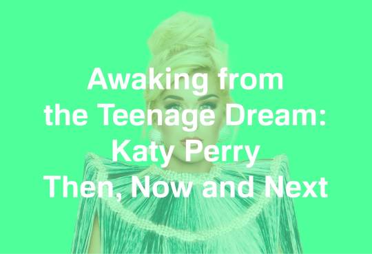
The year was 2010. Emo was just starting to die out (long live the scene). I was studying to become a secondary school teacher, and Katy Perry was shooting whipped cream out of her boobs...
Second albums, more often than not, fail to live up to the hype. And yet, Teenage Dream has somehow endured.
While Perry’s 2008 debut, One of the Boys, launched her into the mainstream, it really hasn’t aged all that well. On tracks like ‘Self Inflicted’ and ‘Fingerprints,’ she tries way too hard to emulate Paramore’s bold pop punk. On others, she attempts to rebel against her gospel roots by turning the bawdiness up to 10.
It can also come off pretty juvenile at times. The singer was almost 25 when she sang on the title track: ‘So over the summer, something changed/I started reading Seventeen and shaving my legs/And I studied Lolita religiously/And I walked right in to school and caught you staring at me.’
But let’s be honest: Even though it’s been declared ~problematic~, you still jam out to ‘I Kissed A Girl’ when you hear it, don’t you? I hadn’t listened to ‘Ur So Gay’ before this, either, but its slinky, jazz-infused vibe absolutely slaps.
Like Teenage Dream is also a product of its time, presenting pop at its most sugary, hook-laden and bombastic. It managed to spawn 5 No.1 singles, the second album in history to do so after Michael Jackson’s Bad, as well as a documentary, Part of Me. There’s even a deluxe edition, cleverly titled The Complete Confection. It was Perry at her peak.
You know the title track, of course. Evoking images of cherry red lipstick, tight denim and driving down an empty highway in summer, Perry desperately clings to the memory of young love, breathlessly pleading ‘don’t ever look back, don’t ever look back.’
‘The One That Got Away,’ meanwhile, is its bittersweet sequel, Perry's lovesick nostalgia now tinged with regret. Yet, the only thing I really remember about the song is the video starring Cassian Andor himself, Diego Luna, as Perry’s past love, the beautifully dishevelled and tortured artist of my dreams (Dear God, that penetrating stare...) He’s also the only reason why anyone bothered to watch Dirty Dancing: Havana Nights, if it wasn’t already obvious.
First single ‘California Gurls,’ on the other hand, is pure pop exuberance at its most campy and carefree, indicative of a more innocent time when it wasn’t driven by algorithms or social media. ‘Firework’ is still a go-to empowerment anthem for just about every kind of montage imaginable. ‘ET’ (featuring a pre-’presidential’ Kanye) is heavily-synthesised cyber pop that doesn’t get nearly enough love.
But Teenage Dream, in retrospect, has quite a few misses. ‘Peacock’ is just one big, long, glitchy dick joke. ‘Not Like The Movies’ is big ballad schmaltz. The brassy soft rock of ‘Hummingbird Heartbeat,’ meanwhile, opens with a hell of a line: ‘You make me feel like I'm losing my virginity/The first time, every time when you're touching me.’ And I’m pretty sure ‘What Am I Living For?’ is partly plagiarised from Justin Timberlake’s ‘My Love.’ Even Pitchfork awarded Teenage Dream a rather tame 6.8 in their recent retrospective review.
By the time Perry released Prism in 2013 – her ‘darker, moodier’ record - she had shifted further into ‘inspirational anthems.’ There was the inescapable mega-hit ‘Roar,’ the saccharine power ballad ‘Unconditionally’ and the Eastern-tinged ‘Legendary Lovers,’ complete with wellness and spiritual motifs.
But it wasn’t without its bangers: ‘Dark Horse’ (featuring Juicy J) jumped onto the trap pop bandwagon just in time with its subterranean bass and eerie, otherworldly synths. Even the slick, 90s-indebted ‘This Is How We Do’ has a certain charm.
Prism also marked the point where Perry’s invincibility began to wear off. Where the masses once lapped up her candy-coated antics, they were now calling her out for wearing braids in the video for ‘This Is How We Do’ and dressing up as a geisha during a performance at the American Music Awards.
And they would only get louder during her era of ‘purposeful pop.’ Released in the aftermath of the 2016 US election, Witness was meant to cement Perry as ‘Artist. Activist. Conscious’ - as her Twitter bio read at the time. She had joined Hillary Clinton on the campaign trail. On Instagram, she was quoting the likes of Socrates and Plato. She was Woke now, and she was telling anyone who’d listen.
Yet you’d be hard pressed to find much trace of this ‘purposeful pop’ on Witness, bar the first single, ‘Chained to the Rhythm.’ Written with Sia and Max Martin, the singer implores listeners to ‘put your rose-coloured glasses on and party on’ amid whirling, colourful synths.
The rest of the record, however, is made up of either soppy, overly sentimental ballads (‘Save As Draft,’ ‘Pendulum,’ ‘Into Me You See’), awkward lyrical turns and CHVRCHES/Purity Ring knock-offs (‘Hey Hey Hey,’ ‘Roulette,’ ‘Deja Vu’).
Funnily enough, Purity Ring’s Corin Roddick produced some of Witness’ better tracks: ‘Mind Maze’ and the soaring ballad ‘Miss You More, along with ‘Bigger Than Me.’
Final track ‘Act My Age,’ meanwhile, feels like a pre-emptive strike against the criticism Witness would inevitably receive (‘They say that I might lose my Midas touch/They also say I may become irrelevant/But who the fuck are they anyway?’).
Then there’s the godawful ‘Bon Appetit’ (featuring Migos) with its food-related double entendres. It was ‘Yummy’ before ‘Yummy’ existed. Seriously, I just wanna see Orlando Bloom say he likes this song with a straight face...
But I will still defend ‘Swish Swish’ to the death. Do the lyrics suck? Yeah, but Perry’s never been the strongest lyricist. But its pulsing 90s house beat does a lot of the heavy lifting, along with Nicki Minaj’s spitfire verse.
The promotional rollout for Witness, meanwhile, proved just as messy. Among the most infamous was a 72-hour livestream, where voyeurs got to witness Perry sleep, meditate, do yoga and welcome a random assortment of guests, including Gordon Ramsey and activist DeRay McKesson. Then there was the meme-laden video for ‘Swish Swish. She literally served herself up on a platter in the clip for ‘Bon Appetit.’ She tried reigniting her feud with Taylor Swift on James Corden’s Carpool Karaoke. Needless to say, it reeked of desperation.
Looking back, though, you can’t help but feel a little bad for Perry, trying so hard to please only for it to blow up spectacularly in her face. So devastated, it sent her to the Hoffman Institute, which offers an abridged version of therapy. As she later told the Guardian:
‘I think the universe was like, ‘OK, all right, let’s have some humble pie here […] My negative thoughts were not great. They didn’t want to plan for a future. I also felt like I could control it by saying, ‘I’ll have the last word if I hurt myself or do something stupid and I’ll show you’ — but really, who was I showing?’
But although Witness lacked the perkiness of Teenage Dream or the cartoonish charm of One of the Boys, it shines best on its darker moments.
‘Dance With The Devil’ has the kind of smoky allure that wouldn’t look too out of place on a BANKS album, while ‘Power’ is a revelation. Produced by Jack Garrett, what could’ve been yet another dull empowerment ballad is turned into a gritty, groaning slab of vaporwave pop, with sultry sax riffs that sample, of all things, Smokey Robinson’s ‘Being With You.’ It’s electric as fuck. You believe it when Perry sings: ‘’Cause I'm a goddess and you know it/Some respect, you better show it/I'm done with you siphoning my power.’
If the singer had just done away with the whole ‘purposeful pop’ concept and stuck with Garrett, Roddick and Terror Jr’s Felix Snow as her core producing group, Witness probably wouldn’t have been half the failure it was. It could’ve had a chance to grow on people, the kind of slow burn Perry could’ve gotten away with at this point in her career. The cyberpop dystopian feel also could’ve gone hand in hand with her newfound wokeness, echoing people’s fear and anger in the aftermath of Trump’s win. But alas, we’ll never know...
While the rollout for Witness over the top, Smile’s was lacklustre and wildly inconsistent.
First single ‘Never Really Over’ came out a whole 15 months before the release of Smile to little fanfare, along with a hippie-inspired video to match. ‘Harleys in Hawaii’ later followed, which also stuck with the flower power aesthetic. Other singles - ‘Daisies’ and the title track – seemingly came and went without a trace.
So how did Katy Perry get to this point? And is there any chance of coming back?
It’s hard to say. A lot of artists go through a rough patch or two: Miley's twerking antics divided audiences when she released 2013’s Bangerz. Taylor Swift’s reputation divided audiences. Only in recent years has Lady Gaga’s ARTPOP been vindicated. Such is the nature of music and pop culture in general. It’s fickle, just one vicious cycle after another; an endless quest for trend-bait that'll never end.
Right now, disco pop is going through a renaissance, while hyperpop reigns supreme. Dua Lip and Charli XCX are basically untouchable at the moment. TikTok has taken over from Top 40 radio when it comes to breaking hits, while the gap between album releases has also grown shorter and shorter. Even the nature of fandom has changed, shifting from old-school elitism to the bloodsport that is ‘stanning,’ along with an unhealthy amount of ‘endless simping’ (to quote a close friend of mine).
Perry, meanwhile, has failed to keep up, choosing to play it safe in order to avoid further scrutiny. But in doing so, she strips away the humour, the mischief and other idiosyncrasies that fans fell in love with in the first place.
But what choice did she have? As Junkee’s Sam Murphy notes in his own piece about Perry’s rise and fall:
‘At that point, you have two choices as a popstar — hunt for relevancy or make what comes naturally to you. Perry chose the former and came unstuck. She inserted vague wokeness into her songs as cancel culture infiltrated pop, tacked on rap features as hip-hop became the dominant commercial genre, and worked with producers who may have been able to find her credibility.’
(Full disclosure: I started writing my piece on Perry back in December 2020, so the timing of Murphy’s piece and mine is purely coincidental).
Even if you don’t believe in cancel culture, no one actually wants to be cancelled. It’s just not good for PR, especially for someone with an image as glossy and as carefully put-together as Perry’s. Even now, she continues to atone for Witness, telling the LA Times: ‘Having more awareness and consciousness, I no longer can just be a blissful, ignorant idealist who sings about love and relationships […] Even my travels have afforded me a new perspective on cultures, class systems and the inequality around the world, not just in the United States,’ though she carefully avoids the subject of politics on Smile.
But redemption is possible. Swift – Perry's one-time nemesis - was a total pariah back in 2016, mocked for her Girl Squad, for diddling the Hiddles while on the rebound from Calvin Harris and criticised for remaining coy on her political leanings. Now she’s earning indie cred with two of 2020’s biggest albums, folklore and evermore, and has thrown her support behind a number of social causes.
The devil works hard, but Swift’s PR team work harder. I might not be her biggest fan, but Taylor works Kris Jenner levels of mastery when it comes to rebuilding public sentiment. Thanks to her newfound indie cred, you’ve almost forgotten about the pastel atrocity ‘Me!,’ her 2019 duet with that insufferable drama kid cliché, Brendon Urie. Shifting her songs away from petty grievances to more original storytelling was also a smart move.
But while Swift has managed to move on, Perry seems to have fallen into the same adult contemporary trap as Gwen Stefani, Kelly Clarkson, Christina Aguilera and Pink, one that ensnares many female artists over 30 (Though many have also managed to escape – Gaga, Taylor, Beyonce, Rihanna, Kesha, Robyn...)
As ‘woke’ as the industry and fans at large might think themselves to be, they’re still pretty ageist. There's still an expectation to ‘mature’ your sound as you age, to become more ‘serious.’ No more fun, no more experimenting, boomer. But when you do end up filing away the edges, you’re called dull, generic and past your prime. Perry said as much on the aforementioned ‘Act My Age. You just. can't. win.
And yet, many female artists over 30 have created some of their best work yet in just the past year or so: Hayley Williams made the dramatic shift from pop rock to low-key, Radiohead-inspired tunes on her solo debut, Petals For Armor. Fiona Apple’s Fetch the Bolt Cutters was hailed by critics as her most bold, urgent and visceral. Jessie Ware’s What’s Your Pleasure? was a cut of understated disco pop elegance. Carly Rae Jepsen, meanwhile, released an equally stellar companion to 2019’s Dedicated.
At this point in her career, Perry could afford to follow a similar path to that of the Canadian singer. Once the meme value of ‘Call Me Maybe’ wore off, along with her mainstream appeal, Jepsen finally had a chance to discover real creative freedom, pushing her sound to greater heights and earning critical acclaim, all without having to compromise her love for catchy hooks and bold synth pop arrangements.
A couple of years ago, a Reddit user made a post about participating in a focus group held by Perry’s label to discuss why she’s ‘no longer one of the[ir] most notable female pop artists,’ and ‘what can [they] do with her image or marketing to make you care about her again?’
It’s depressing to think that an artist as accomplished as her needs a focus group to help solve her identity crisis. There really is no easy answer. Hopefully, Perry will be able to return more vibrant and assured than ever, on her own terms...
-Bianca B.
0 notes
Photo
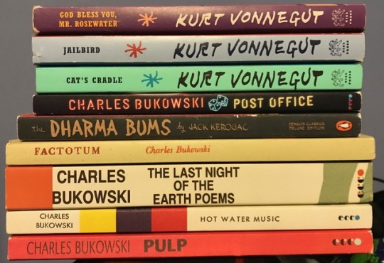
You could say it was a year of Bukowski and Vonnegut, looking at these books. This is a collection of my favorite books I’ve read in the past year (my non-academic ones), and I’m going to briefly review them.
God Bless You, Mr. Rosewater, Kurt Vonnegut
This is by far my favorite Vonnegut. This year I read it for a second time, and I’m thankful I did. The themes sank deeper the second time through. The main character of this book is a large sum of money—the plot is the story of Eliot Rosewater, heir of the fortune. In this book Vonnegut takes aim at old money America (Rosewater=Rockefeller), American familial heritage, and anybody who’s out for more than they deserve. The perverted tendencies of Eliot beg us to examine all of our own tendencies. It is nearly perfect, however, Vonnegut falls short in fleshing out fully the psychology of Eliot--especially his wartime killing of German fireman. 4.5/5
Jailbird, Kurt Vonnegut
This one was a bit more forgettable but my third favorite Vonnegut. Walter Starbuck flashes back on his entire life while being released from jail. He was Nixon’s scapegoat, and always dealt a raw hand—although he was afforded the chance to become a ‘Harvard man’, a motif that recurs in the book. This book, like other Vonnegut works, asks how one might act if you encountered a large sum of money. In this book, Vonnegut attempts to explain his understanding of the events of the 20th century (Particularly 1910s-1980s). Everything is owned by a single ominous corporation, even the prison he’s being released from. 4/5
Cat’s Cradle, Kurt Vonnegut
This book can best be summed into a single question: how does our implicit value system function? Vonnegut examines this question while surveying an island that has fallen into a banana-republic-like state, except there are no bananas. Throughout the book, the sayings of Bokononism--local religion--appear. This religious value system is a stand in for formal religion and tries to ease the islanders amidst their tragic lives. Bokonon’s objective is to provide lies that serve a better purpose than a terrible truth. 3/5
Dharma Bums, Jack Kerouac
If you like long-winded sentences and discount Buddhism, this is the right book for you. Yes, it has passages that are incredibly profound, particularly about self-discovery in relation to transcendence. But most of this book is taken up by tales of wine-induced parties, climbing/hiking, and a west-to-east-back-to-west coast backpacking trip for the narrator. There’s nothing especially notable concerning the plot, but Kerouac remains one of the most quotable Beat writers, sprinkling in lines like “One man practicing kindness in the wilderness is worth all the temples this world pulls” or “Finding Nirvana is like locating silence” or even the abrasive “Pretty girls make graves” suggesting that pretty girls bring more children into the world, and therefore more death. Kerouac’s thesis seems to be: we ought to shrug off the middle-class lawn home-owning American narrative and instead backpack up and down highways and mountains. A thought for the young. 3.5/5
Post Office, Charles Bukowski
Although most of Bukowski’s work is autobiographical, this book is a near exact recount of the life he lead leading up to its writing. Bukowski opens with a post office statement of ethics, and then Henry Chinaski proceeds to break every code listed. Bukowski works in nearly every aspect of a post office, then quits. By the end, I found myself with a soft-spot for the work done by postmen across the nation, and quietly hoped he would return to the job. It’s easy to romanticize the work discussed as a postman, but Bukowski’s constant non-complaining always strikes the reader as clear and caustic. 4/5
Factotum, Charles Bukowski
This is the most violently sexual and remarkably lazy book Bukowski has written. Here, we are given a picture of a young Henry Chinaski roaming across the United States, job to job, woman to woman, brawl to brawl, relative stability to absolute poverty. We see Bukowski admit his own sickness, and his various attempts to self-medicate with booze and women. Bukowski is a Kerouac without the Buddhism and jazz. The classical music lover roams around the country abusing women and stealing from employers. 2.75/5
Last Night of the Earth Poems, Charles Bukowski
His last collection of poems published while alive, Bukowski does some of his best work. The imagery isn’t as vivid as his early works, and the trope of “I’m an old asshole” isn’t as central to the collection. But nevertheless, Bukowski creates some of his most clear and impressive poetry. “Let Me Tell You” is a favorite, and this is a simple one-page statement on the construction of hell, and as always, Bukowski is a master of repetition. “We Ain’t Got No Money, Honey, But we Got Rain” is my favorite Bukowski poem, painting a story of a relentless rain in California during depression days. It illustrates a picture of Bukowski’s youngest childhood memories. “Man with the Beautiful Eyes” is another favorite from this collection, where Bukowski also explores childhood innocence, at the end postulating that the world will be a cruel place once he grows up. 4.5/5
Hot Water Music, Charles Bukowski
This is a collection of short stories, and it paints the most filthy picture of Bukowski's life I have read to date. There is the usual themes of sex, filth, classical music, and the broken artist. Admittedly, I read this while sitting on a beach in Siesta Key, Florida, so I don’t recall much. 3.5/5
Pulp, Charles Bukowski
This is my favorite work of Bukowski’s I’ve read--it’s his last published work. The plot can be described as a sci-fi noir detective novel, starring Nick Belane, private detective. He is hired by Lady Death to find late French author Celine. He is also tasked to sort out a possible cheating wife and find the ‘Red Sparrow’. The book is allegorical to Bukowski’s own life, the Red Sparrow is a parody of Bukowski’s publisher Black Sparrow Press--John Barton being a parody of John Martin, his publisher. Lady Death is representative of Bukowski’s impending death, shocker. Bukowski doesn’t relent at any point in this novel from his usual slightly-satirical voice and obscene sexcapades. Bukowski is at his humorous peak in this book, writing witty jokes and an absurd sci-fi story line. This book is distinctly different from Factotum or Post Office because Nick Belane, unlike Henry Chinaski , always has a case to crack, a hunch to check on, a lead to see out, and this leads him on adventures only Bukowski could make believable.
Honorable mentions:
Ham on Rye, Charles Bukowski, 4.75/5 (the ending gives it an incredible status)
Man Without a Country, Kurt Vonnegut, 3.5/5
Catcher in the Rye, Salinger, 3.74/5
9 notes
·
View notes
Text
Character Design in Magical Girl Raising Project: Arc 1
One of the things that immediately caught my attention about MGRP was the character design. The outfits don’t go together as a lineup in the way traditional magical girl outfits do, rather they exemplify each individual character’s abilities; this allows the viewer to learn a great deal about the character just by looking at them.
I’m sure other people have made similar posts, but as a passionate character design enthusiast I’d like to discuss my personal thoughts on the character design in Arc 1. I’ve tried to keep everything as spoiler free as possible. And yes, I do plan to do the other arcs, so stay tuned!

Snow White - 7/10
I actually like Snow White’s design, but with all the competition, I need to be a bit strict. Her outfit may not be as interesting as some of the other characters’, but that seems pretty intentional; Snow White is *supposed* to be the cliche, idealistic magical girl protag, so the artists didn’t have a lot of wiggle room with her design. Considering that, they at least managed to give it some unique elements. I especially like the bows on her boots and the ribbons on the front of her top that look like suspenders.

Ripple - 5/10
Ripple’s design has always been confusing to me. I don’t hate it per se, I just think there’s a little too much going on in it. It’s supposed to look like a cross between a kimono and a bathing suit, but really it just looks like a bikini with some fishnet accents and... pom poms? That’s at least one too many things for an outfit. I do like the scarf though, and the shuriken shaped hair accessory.

La Pucelle - 9/10
La Pucelle’s design was the first one in the series to get me really excited. It’s a simple and expressive costume that represents her personality and motifs as a magical girl. It sticks to two central themes, dragon and knight’s armor, and doesn’t have any unnecessary elements that stray from this theme. The frills add a splash of femininity without being overwhelming, and the muted, earthy colors are pleasant to look at. Altogether, La Pucelle’s design just seems very... cohesive. It’s well thought out.

Cranberry - 8/10
When I first pulled up this image, I planned to give Cranberry a 7, then it changed to a 7.5, then to an 8. The more I look at her design up close, the more I find myself liking it... but that’s kind of the problem. The fact that I didn’t take notice of the interesting parts of her costume until I sat and stared at it for five minutes means that her design is a little too ornate to appreciate at a glance. I think the main culprit is the huge purple roses; they grab your eye, and that’s the only thing you notice. I consider the jacket and tights to be the most fun parts of Cranberry’s design, so it’s a shame that they aren’t more noticeable from the get-go.

Ruler - 10/10
I consider Ruler’s design to be one of the most successful ones in the entire series. It sticks to a single theme and it’s immediately recognizable, but at the same time, it has those subtle, unique accents that make it fun to look at. The little diamonds in her hair and on her ears. The vertical stripes on her tights and bows on her shoes. The black lace adornment at the bottom of her dress. Every detail comes together perfectly to encapsulate Ruler’s vision of herself as royalty.

Yunael and Minael - 4/10
My favorite parts of their designs are definitely the speech bubble halos. It’s a cute idea that combines two aspects of their characters in a simple and effective way. Which makes it all the more disappointing when the rest of their designs are fairly, well, dull. They’re not bad, they’re just nothing very new. It’s also annoying how I can never tell them apart.

Tama - 7/10
This one boils down to personal preference; I’m not a huge fan of animal-based costumes, and I’m not really a dog person, so I didn’t love Tama’s design at first glance. But for what it is, it’s actually very well put together; the crop top and leg warmers are cute, and it follows my rule of sticking to a central theme. I respect it as a design, and don’t really have any formal critiques, it’s just not my thing.

Swim Swim - 5/10
I really feel like I should hate Swim Swim’s design. A swimsuit, headphones, bat wings, and whatever those weird tentacle things are? In one outfit? I mean, I know that 5 out of 10 isn’t a stellar ranking, but someone who breaks all my rules of good outfit design should at least be below Ripple, right? But oddly enough, I don’t mind Swim Swim’s design. Maybe it’s because the color scheme is consistent enough to tie together the unrelated elements. Maybe it’s because Swim Swim is actually a little kid and it makes sense for her to design a Mary Sue OC with bat wings as her avatar. Or maybe I just think that little garter on her leg is cute.

Hardgore Alice - 8.5/10
I couldn’t figure out whether to give an 8 or a 9, so I finally said fuck it and brought decimals into this. I’m sorry. Truthfully this design is a 9 in my book, but I’m afraid I may be letting the fact that Hardgore Alice is my favorite character in the series affect my review of her design. So I had to knock her down a peg. Well, half a peg. Anyway, despite pretty much looking like something I could pick up at any gothic lolita store, I like this design a lot. Is it just because I like Alice in Wonderland? No. Well, maybe. But I also like the muted colors and overall simplicity. And the bunny, of course.

Calamity Mary - 8/10
Whatever your opinion of her character may be, Calamity Mary’s got style. The fringe on her sleeves, the holster at her leg, the giant spurs on her boots; Calamity Mary is a cowgirl, and you can tell. The wild-west attire looks modern without being overbearing, there isn’t too much or too little going on. My only complaint is that I wish the hat was bigger and more pronounced! The hat is such an important part of an outfit like this, and I feel like it gets kind of lost with its size and shape as is.

Magicaloid 44 - 6.5/10
I have very mixed feelings about this design; all in all, I think it was the hardest on this entire list to rank. It is unique and relatively centralized, but it’s also kind of... clunky. Looking at it, it’s hard to understand what’s going on, and that’s a problem. Are those spiky things supposed to be her hair? If so, why do the bangs look so out of place? What’s up with the crown icons on her arms and legs? Is her skirt poofy or flat? I can’t help but overthink everything when I look at Magicaloid’s design, so although I don’t hate it, it kind of irritates me.

Top Speed - 9/10
Top Speed has another one of my favorite character designs in the show. Her design is a seamless combination of magical girl and witch, all in warm Halloween colors. I love her chunky braids and cape, the lace around her hat, and the frill on her sleeves. She’s immediately recognizable as a witch, but these little feminine details also help her fit into the magical girl ensemble.

Weiss Winterprison - 3/10
Um... yes. That’s a coat. Okay, next.

Sister Nana - 7/10
It’s hard for me to decide whether or not I like Sister Nana’s design. Impulsively, at a glance, I’d say I like it, but I can’t quite put my finger on why. The religious motif isn’t really my thing, but the simple black and white colors with a splash of red in the shoes pleases me. I also think the cross shape is used very creatively, especially with the neckline. I can’t really tell what those cushion-like things on her legs are supposed to be though.

Nemurin - 10/10
Maybe I should have given this one a 9.5 because I think overall I still like Ruler’s design the most, but Nemurin is certainly a very close second, albeit for very different reasons. Nemurin’s design isn’t as straightforward as Ruler’s or Top Speed’s are, mainly because “pajamas” is an incredibly broad category, and the artists have more room to be creative. Despite this, her design is wonderfully balanced, it doesn’t seem stuffy, and the colors work nicely. The long, dragging pigtails, the little clouds in her hair, the uneven socks; everything about Nemurin’s design tells us that this is a girl who likes to sleep and dream all day.
Thank you so much for reading my silly post, I hope you enjoyed it or it at least gave you a few things to think about. Feel free to tell me what your favorite design is in the tags!
#mine#magical girl raising project#mahou shoujo ikusei keikaku#character design#character discussion#outfits
18 notes
·
View notes
Text
142 tattoos on the ankles from 2019

Unlike other areas of the body such as the back or neck, the ankle has been a very recurring area for many years to tattoo various designs. That's because it's an invisible, intimate zone, but we can show if we wear shorts, a skirt, or a swimsuit ...The main disadvantage of this area of the body is the space. Unlike other areas of the body such as chest and shoulder, large ankles can not be adapted to the ankle for space reasons. However, it allows for smaller designs that do not produce a worse result.Although it is a very sexy area, one can emphasize the fact that there are more women opting for this area of the body, as it can be a very sexy area in certain female designs and can add a distinctive touch to the design.The stars, the branches, the flowers, the butterflies, the footprints and any design that can be made in the shape of a border can be a very good choice for this area of the body, creating the feeling that the design covers the entire area covers. Other designs that are used, even if they do not serve as frames, which does not mean that they can not have an original result, are: crosses, letters, several small insects and other small motifs. A design that is very present in this area of the body and is one of the most commonly tattooed on the ankle is the rosary. Many women, even some men, tattoo a rosary in this area of the body, usually with the cross on the instep. It may be a beautiful design, but we already know that it has religious connotations.In order to tattoo something on the ankle, we first need to know what we want, ie for other areas we can first think about the body area and what design, but this does not happen with the ankle, unless we have Clear that it will be a small design. As we have said on other occasions, the tattoo, which is presented in small dimensions, does not mean it loses meaning or achieves a worse result. It is necessary to work very well on the details, and the meaning can be the same or stronger than in a tattoo that is realized in large dimensions.

The ankle is an area of the body that many women and men have chosen to get tattooed. Together with the wrist, it is the favorite place for women and girls. This girl is wearing the word "Believe" (believe) tattooed with a butterfly.
Tattoos that simulate bracelets or anklets that surround and adorn this body part are very typical.

A tattoo with many big and small stars on the leg. The tattoo was made on the ankle, foot and part of the leg.
Which animal is that? The union of an insect with the head of a rabbit?
Small cross at the ankle. Fantastic tattoo for a girl.
Various designs on leg, foot and ankle. Among other notes, flowers and a sol key.

Flowers, a fish, a marine tattoo and other different motifs on the ankle and instep of a woman. Asian designs.
This girl has tattooed different letters of the Greek alphabet.
Another photo with different tattooed stars, some of which are completely black and others are tattooed only with the contour.

This girl tattooed a reptile on the instep.

A crown over a heart.

Of the strange symbols of black ink.

Other spectacular and small designs on the girls' ankles. This seems to be the form of a state. What do you think it is? Maybe it is Texas?
Climbing plant in browns and greens with small thorns around the ankle.

Very easy this tattoo. A simple flash that was tattooed on the foot.

Motorcyclist with his bike on the knuckle of a man. This type of tattoo is chosen more by men.
A tree that starts at the ankle and ends at the calf.
The sun and the moon, engraved like details. One of the most positive elements of this type of design is the contrast between warm and cold colors.
Another drawing of an anklet that ends in a heart.
Tattoo of a red lion. The idea is very good, but not so well done, because the proportions were not taken into account.

Beautiful picture in which we can distinguish a dandelion and a colorful frame with greens.
Girl with a colored pencil and a star at the ankle.
Little daisies. The smallest tattoo of all these designs.

A Canadian patriot who has tattooed the flag.
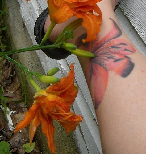
A big flower at the ankle. The photo is perfect because it shows the real flower and the tattooed one. The similarity is fantastic.
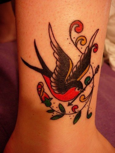
Old School Style Swallow Tattoo.

In this case, the anklet is a rosary selected as a tattoo for that body part.

Simple flowers. The disadvantage is that the color of these flowers is very little alive, they seem to be faded.

Beautiful design for the ankle. I am fascinated by the tattoo of this picture.

Various winged animals surround the knuckle of this girl.
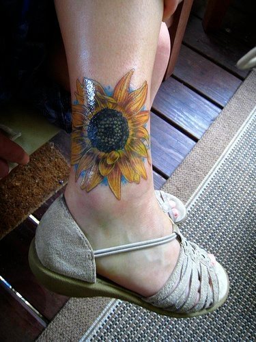
Photo of a sunflower. Personally, I do not like it. The blue background may be a good contrast, but in this case it was not a good idea.
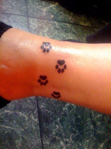
The little animal footprints of this girl around her ankle.

It seems to be beautiful cherry tree flowers that are tattooed at the foot to the ankle.

This design is a dolphin, though the choice of colors and the way it was made is difficult to properly assess the design.
The pairing of sun and moon, which is tattooed at the ankle, is often repeated.

Tattoo of a bracelet with tattooed letters on the ankle.
Tattoo of a frog that seems to rest on black branches. We could have given the branches some color because they look like completely different designs.

Another drawing of a bracelet on the ankle. A major drawback was that the old design was not redesigned because it created a separation and inconsistency between the different elements.

Strange elements that are used here because they are not very common in tattoos, even if they are used every day. They are kitchen appliances.

A rosary around the ankle that ends at the instep.

Original drawing of a bracelet that seems to have various symbols or images that, even if they are small, are full of details.

Tattoo of a musical instrument or rather its grip. An original design with an elegant result.

Silhouette of a girl trying to reach the sun, a drawing that is in harmony with optimistic people or dreamers.

Another tattoo of a colorful and pretty flower.

Climbing plant with hardened forms, thin and sketched, which give a very realistic result.
Rosaries are a very recurring element in this area of the body, for my taste a design that has lost its meaning and originality because it repeats itself very much.

Very small tattoo on the knuckle of a girl who loves butterflies.
Drawing of a tribal element in purple and black tones.

Romantic and lovely tattoo on the ankle of a woman or a man.
Large number of designs on both ankles. This girl loves tattoos.
Arabic letters on the ankle.

We do not understand very well what we wanted to portray in this picture, we dare to say that it is an abstracted rose bush, but we do not know exactly.

It seems that this drawing is still incomplete, at least I would add some color or black ink.
Very elegant tattoo on the ankle. If you are a girl you like this photo.

A loose branch engraved on the instep would, in my opinion, have a more agreeable result if, for example, it had been accompanied by a flower or a butterfly.
This girl has tattooed both legs. On one leg we see the ankle wearing different kinds of tattooed flowers and on the other leg a little clover and the number five.
More photos and pictures showing ankle tattoos. In this case, there are several appointments.

Again, the word "believe" is used for a tattoo.

Large flowers with vivid colors, combined with branches with very aesthetic shapes.

Different stars in different sizes and colors.

Drawing at the ankle with an unknown symbol.

Green clover with a letter M.
Letters with pink, green and red stars. There are some big and some smaller stars.
A new design of a rosary that revolves around the ankle and hangs on the instep.

Stars and braided suns.
Beautiful tattoo with blue-green wings.
Pink slippers flanked by turquoise flowers.

Simple drawing of a blue curved line and points of a darker shadow.

Original drawing connecting the links between Sweden and the United States.

A tattoo artist working on a drawing that looks like a flower surrounded by leaves.
Tattoo on the ankle with dedication.

A flower of red and black color.

Tattoo the Converse logo on both ankles.
A swallow at the ankle of a girl.

Skull with red ribbons on the calf.

Indian feathers with pendant. Green, red and blue colors.

A red and yellow tribal with Arabic letters.

Flower at the ankle. It is undoubtedly a Hawaiian-style flower.

A small tattoo honoring Kenya with the outline of Africa.

Greek letters on the knuckle of a girl.

Tattoo depicting a rosary at the foot.

This person has tattooed small Chinese characters, the same theme is repeated in the tattoo below, but with larger dimensions.

Oriental letters.

Some colorful floral patterns on the top of the foot are very fashionable among girls.
Pink and purple braided flowers around the ankle.

Fine flower climbing plant, perfect as a tattoo in this area of the body.

Small tattoo of a butterfly in the green water.
Black-white stars emanating from the calf and reaching to the ankle.

We've seen this design before.

Romantic design with the shapes of a heart and a rose, simple and named.

A green rosary in honor of his father.

Big tree without big leaves. It starts at the ankle and reaches to the calf.
A star between the ankle and heel of a girl.
A flower with a wide range of vivid colors, combined with a rather original result.
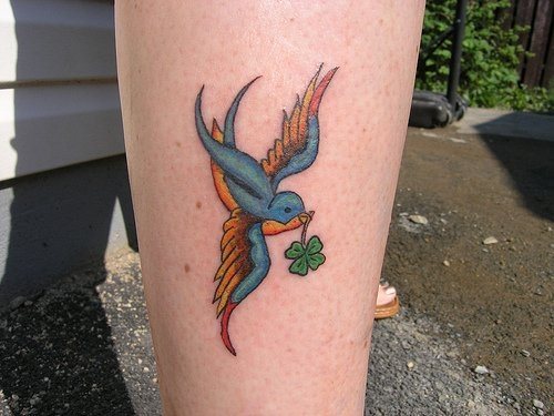
Flowers, birds, trees and other natural motifs are common among girl tattoos.

Tattoos with different imprints of humans and animals.
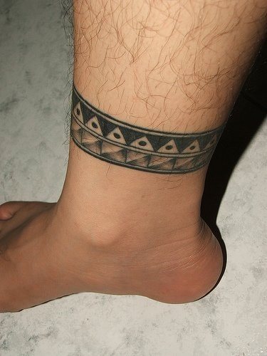
Bracelet like an anklet on the leg of a boy.

Mortal is what this man engraved like a bracelet in his ankle.

Several tattoos on leg, ankle and foot.

Tribal design with a flower in blue and pink tones in the middle.

Skull with a bow on the leg.
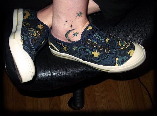
The moon and the tattooed stars match the sneakers in this photo.

The character of Lilo and Stitch, with a funny expression and rich colors.

Om symbol between ankle and heel.

Peacock-like feathers on the ankle.

A rose with rich colors and black features.

Tattoos with flowers on the foot and calf.

Skull with flakes on the calves.
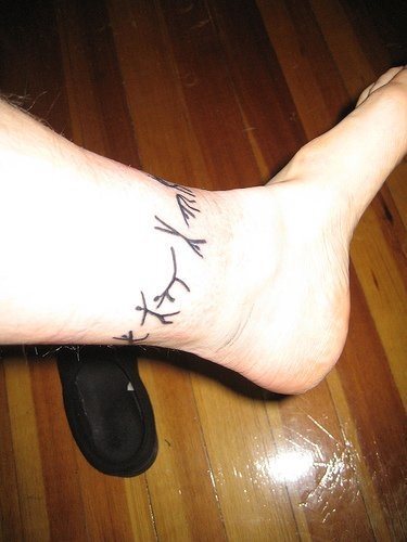
Original tattoo with rock paintings around the knuckle of a boy.

Crossbones with an imprint of a dog in the middle and a shaded orange and yellow. Everything together with the name Xero.
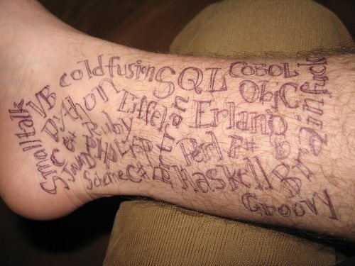
An original design with a mixture of letters of different styles and sizes.
As you can see, the bracelets on the legs are also very much needed.

A Hawaiian flower of black color, as if its silhouette had just been impressed.
In ankle tattoos is also room for declarations of love.

Flowers woven around the knuckle of a girl.
A little sun.

A cross on which a fabric and a somewhat strange background hang seems to be the backdrop of an apocalyptic film.
Blue-toned salamander with small spots.
Oriental letters.

A cross with a scroll, but it seems to be empty.

An insect crawling between a row of flowers.
A large flower with black lines giving it brilliance and being accompanied by other smaller flowers.

A flower without filling and color, even if it does not give a bad result.

Silhouette of a star of black color.

In a ladybird with little selected tones, the saturation does not seem to be correct.
Inverted symbol. Tattoo on the leg only with black ink.

Very successful pirate at the knuckle of a girl.

Tree without leaves near the knuckle of a man.

Curious image of a blue diamond engraved with tribal lines.

We see again flowers turning around the ankle.
The sun and the moon look good on every part of the body.

It looks like Alice in Wonderland's cat, surrounded by a beautiful round frame.

A swallow above the ankle. Read the full article
0 notes
Text
“Alien: Covenant”
-I fucking loved this film, utterly and wholly because Ridley Scott let his freak flag fly
-this film is mythological in stature; combining Greek gods, Mary Shelley, Old Testament, haunted houses, the cosmos; goddamn delightful
-as the first shot implies, the android David is our protagonist
-in fact this film starkly makes me realize that he is kinda the whole key to the “Prometheus” saga (which makes it separate from “Alien” saga) +everyone else plays second fiddle /he is an id for Ridley
-this might be Fassbender’s greatest performance yet; he is given great leeway and pedestals for the character and hits all of them on the bullseye
-I think the little opening mini movie is marvelous; deftly setting up the idea of mortality and creation
-nice to Guy Pierce play Weyland young, allowing him to put his distinctive gravitas stamp on the character
-the shot of David at the piano is a scrumptious shot that exists inside the film and by itself
-the scope of the space station with the yellow sail, immediately tips us off this will be a grand adventure, far away from the tight corridors of “Alien” and very much its own thing, in the 50’s sci fi mold +I love it
-didn’t expect a person to burn to death in their cryo sleep chamber. A sharp note to unsettle our nerves
-Fassbender plays a second, pretty much identical looking android named Walter, and his very small adjustments become pronounced the more we see him interact, creating a separate identity
-he is much more docile and very tender to the grieving Daniels (the wife of the burned man)
-Daniels is played by Katherine Waterson, who has a moppet look but fierce convictions
-I find her scene mourning his loss and their shattered co life together very moving and well done +interesting to note a woman getting over a man’s death when often in films it’s very much the opposite
-what is up with both films in “Prometheus” saga making the pilot the most amusing character, and a name actor playing them? Ideas Elba before, Danny McBride killing it here
-I laughed out loud when the Daniel’s ex is revealed to be James Franco; face timing while rock climbing without a safety rope is exactly what his reputation would infer he would do
-I find the use of McBride humming along to the transmission to the tune of John Denver very amusing +again echoing Elba playing Stephen Stills’ “love the one you’re with” (and I suppose the disco in Scott’s “The Martian”). 70’s music in the 22nd century. Interesting motif
-I like how the film establishes billy crudup’s character as a total chickenshit, unable to handle the responsibility of leading the crew +interesting detail where it talks about him being super religious, referring to his fellow colonists as “my flock”, leaving him thought to be unsuitable to delegate and survive under pressure
-crudup of course ignores waterson’s perfectly good advice and reservations, which makes me wonder if the morale of the Universe is “He should have listened to her; the story of the cosmos”
-it is very strange to see so such forest and green land in this series
-I particularly like the line “do you hear that? Nothing. Absolutely nothing”
-the chemical warfare of “Prometheus” is very pronounced as the black substance makes its way into the victims ears noses; again, this directly clashes with the Ripley saga but it’s doing its own thing here and and is pretty consistent
-nice little moment as Walter tries to comfort Daniels’ reservations by simply stating “it would make a lovely spot for a cabin” then walks away; contrast to Crudup’s character overselling how great he finds it, and continues to rattle off how over worried he found Daniels, this smothering her and make her apprehensive +brevity is the soul of wit is set up here
-good god, there is a ton of blood here, a smattering of it
-I find the scene where the first infected strobes out and spurts blood out his back to be effectively creepy
-I’m considering the creature in this film (“neomorph”) a in between. Not as well designed as the giger perfection, but a huge step up from the black sea liquor from “Prometheus”. It is startling and very well directed
-a masterful little shot as a dead colonist is shown partially in frame, his wedding ring clearly in shot, another man cupping his head, and whispering to his mouth “I love you”; succinctly setting up their same sex love and marriage
-the neomorph is definitely far more animalistic in this film. It’s given unhuman like movements, that suggest more primal instincts
-I cannot do justice to the goosebumps I felt as the party was lead by its stranger savior and we see the charred bodies and landscapes
-the stranger savior is at this point revealed to be David (with iggy pop type hair at first) who then hijacks back the film, rightfully so
-immensely hilarious moment as David shoulder knocks Walter, and adds “Hello there, brother”
-David is giving me Dr. Pretorius (“Bride of Frankenstein”)/Dr. Moreau (“Island of Dr. Moreau”) vibes +ie creators who bent the structure of biology and didn’t care who got destroyed in the way
-there is a long, long scene where Walter and David take turns playing the flute that is frankly worthy of an entire essay in itself
-firstly, it’s a big fuck you to anyone who was dismayed by the flute segment in “Prometheus” +there it was five seconds, here it’s like 10 minutes and two identical people are doing it at the same time
-secondly, they are playing the fucking theme to “Prometheus” on said flute +those is self-reference in the scale of Mel Brooks (and makes me think Ridley was grinning during the Sean bean-“lord of the rings” scene in “The Martian”
-the line to Watler from David “just blow, I will take care of the fingering”
-it is revealed that David unnerved people by being so human like in temperament that future versions like Walter were “streamlined”/neutered, so that Walter can play but not compose +there’s going to be a whole genetic modification bit coming up, but now I realize how eugenics/forced sterilization this sounds
-the contrasting glee in David’s voice and unease in Walter’s eyes as David relates how he was around their creator when he died, and David notes “he was stupid and weak, like all humans”
-the whole scene the camera is robotically swerving around clearly adding to the tension the audience feels in witnessing this unorthodox meeting
-needless to say, the film takes a monumental leap and variance in tone hereafter
-David mentions that Shaw (From “Prometheus”, last seeing going with David as a decapicated head) died, but she was “so kind to me” and David loved her -“much the same way Walter looks at you” (Daniels disagrees) “oh, does he call it ‘duty’? I know the difference”
-Ridley is really digging into the horror elements of the film as the neomorph comes up the wall and severs a woman’s head, leaving it floating in a full sink +the neomorph is eating her shoulder, shoring carnivore habits for the time in this universe
-one of the strangest moments (and there will be plenty coming up) where David and the tall albino neomorph are communicating via breathing
-the most emotion David has is when crudup kills it and David screams “how could you?!? He trusted me!”
-crudup has a equally odd non sequitur where he threatens David to “tell me what is going on, or I will destroy your perfectly calm composure”
-this film is bizarre and exploitive in the extreme
-for those that are keeping track, the importance hierarchy is as follows David neomorphs/xenomorphs humans +we are fucked
- my favorite sequence in the entire film as we see (via David’s memories?) that he dropped the entire payload of black goo/chemical weapons upon an unsuspecting engineer population (who look totally different from ones we saw in “Prometheus” in facial structures and eyes) and they die as the goo descends upon them like locusts. +it seriously looks straight out of Exodus as God wrecked his vengeance upon Pharioh
-so yes, that was the charred bodies we saw before
-we see the lair of David as it is littered with graphs, illustrations, designs of his work in the goo into the neomorph and beyond + his response, dripping with sarcasm: “idle hands are the devil’s anything”
-we are officially one step closer to classic “Alien” universe as the first facehugger is introduced (to kill crudup)
-Daniels is trying to reach Tennessee (Danny McBride) as still others are getting slaughtered, the neomorphs are clearly the hounds to David’s Satan
-line of the film as crudup wakes up to see David, asks him what his religion is, and he responds “Creation”
-a early beta of the xenomorph is here (still not quite Giger 100), as he splits from Crudup’s chest after the question, and he dances, mimicking the moments of David +David looks like a puppet master pulling the strings
-more facehugger madness as others go after the remaining human sheep
-much like “Prometheus” this multi million dollar film has a strikingly low opinion of humanity + at this point, two films in, the expendable nature of the vast majority of people therein is a feature, not a bug
-positively bizarre sequence as David tempts Walter to his side, kissing him(self) on the lips, before ripping out his neck battery, depowering him
-I neglected to mention just before that my second favorite line of the film, after Walter cited a line then asks who did it, David answers Byron but Walter correctly notes “No, Shelley. If one section of the orchestra is off, it changes the entire symphony doesn’t it?”
-David has officially gone too far
-David coos “no one knows what it is like to dream and be perfect like myself”
-remember early when I said the importance scales? Well, since Ridley seems to see David as a propionate of creation, therefore a creator it would perhaps follow as such Artists Art People
-possibly subliminal moment where David corners Daniels and she’s asks what really happened to Shaw, and David says “this” then forces a kiss upon Daniels +so did this robot, who was too human for other humans, teach the neomorph to rape?
-Walter is back (they made a few safety measures since David) and this we get to see someone hitting his own face repeatedly +it is fucking weird to see this brawling action in a Ridley Scott film
-Tennessee is here to save the day, but now the brute pronto xenomorph is here, and this murder is getting more grisly by the second
-David asks Walter to decide whether to reign in hell or serve in heaven as he reaches for a knife
-the sequence where Daniels is held by a straight line as she keeps falling over the side of the ship, swings and shoots at the proto xeno is jaw dropping
-is Tennessee the giant claw dropper of doom as he uses an arm to crush the proto xeno? Seems like it
-you better believe I was eagle eyes to see if it was Walter or David helping Daniels
-aboard the main ship there is a unidentified life form aboard, but where are the co pilots?
-in a scene straight out of the sleaziest slasher from the 80’s (like prime “Friday the 13th”) the co pilots are having shower sex (to some r&b music) when the xenomorph puts his phallic tail between their genitals +then impale tongue’s the guy’s head. Sexploitation!
-every close up on Fassbender’s face is a mini master class in suspense
-I fucking cannot believe they brought back the xenomorph point of view, the first time since “Alien 3”
-this second proto xeno is slobbering like the cerberus he is
-my heart is pounding like a jackhammer the entire time Daniels is staying barely ahead of the creature
-“care to lend a lady a hand?” might be the mantra of this depraved series
-the subtle continuity of the cabin comes up as her face screams in terror as she realizes David is here, and there are no cabins in hell
-one final twist of the screw as David coughs up some proto xeno eggs and looks upon the vast laboratory of human frogs to dissect
-this film took everything I loved about “Prometheus” and kicked it up ten notches, while adding many many more layers of cosmic craziness. Oh, and blood. + I am fully confident the “Prometheus” saga will gain a cult following and be seen as one man���s tremendous exploitation of his own creation(like David?) and a particular, articulate and demented journey into space hell.
-I myself feel the flames get higher and higher, and wonder if I will be making repeat journeys to this particular corner again. I feel it to be so.
#alien covenant#ridley scott#michael fassbender#danny mcbride#katherine waterston#billy crudup#prometheus#alien series#long reads#alien franchise#film#art
178 notes
·
View notes
Text
Egyptian ‘Amarna’ Period Art
Otherwise known as the ‘Let’s Get Funky with Gender Portrayals’ Period.
The Amarna Period, or The Amarna Breakaway is what ancient historians call an era during the 18th Dynasty of the New Kingdom (during the later half of the 14th century BC) in which Egyptian art saw a drastic style change under the pharaoh Amenhotep IV, who changed his name to Akhenaten during his reign. Under his father, Amenhotep III, a new cult surrounding a version of the creator sun god Re-Harakhty was pushed and began to be associated with royalty as Amenhotep III established himself as the earthly personification of Re-Harakhty. This was expanded further by his son, who firmly established and developed the ideologies around Re-Harakhty, and whose name was subsequently shorted to Aten, represented as a sun disk. Commonly you’ll have people saying that this new prominence of the Aten was a form of Egyptian monotheism, which isn’t true. This was Henotheism. The other gods were still acknowledged to exist, but their importance was now largely downplayed.
Now The Aten is a creator god who is both male and female, and the creator of all the universe. And the pharaoh, as the living version of the Aten on earth, had to reflect that. Thus, as a result, we see some radical changes occur in Egyptian art very, very quickly.
First, some context:
Before this period, common styles and motifs in Egyptian art reigned for thousands of years, right from the early dynastic period with Namer of dynasty I. Though there were many changes, mostly back and forths with representations of the human figure, largely, things stayed the same or were hearkened back to. The reason for this, is basically the Egyptians loved continuity, and the Pharaohs loved to associate themselves with great pharaohs of older periods to show their connection. Plus, the images themselves served a function dependent on the Egyptian world view, and when there was little change to that, there was ‘little’ change (though still variation) in art.
A very important thing to understand, is that the images of the Pharaoh, whether they be relief or statues, were representations of the ideal male human form. Were they portraits? Yes and no, they were more like idealised portraits sometimes and, depending on the period, not portraits at all. If you wanted to know what perfection to the Egyptians looked like, then you look at the image of the pharaoh, who in turn, dictated what perfection was by choosing how he was represented. This changed. Not often, but it did. Let me show you.

Take, for example, this statue of Menkaure and his wife, of Dynasty IV of the Old Kingdom. Look at him, he’s youthful. He’s standing straight and strong. His body is muscular, his waist is small, his shoulders are broad, and he’s striding forwards like a strong, young man ready to lead. And better yet, his wife is lovingly supporting him with an intimate gesture.

Now turn to the 1st intermediate period. Look, Inhurnakht, the king of Upper (southern) Egypt in Dynasty XI is skinny. Strong, visible muscles have fallen out of favour, but the broad shoulders are there, and an even smaller waist and hips. His eye is pronounced, his nose is continuous with his forehead, his wearing a full length wig, a pointy kilt, and beads around his neck. Note how his wife is smaller, and lighter coloured beside him, a common motif. She is smaller, because she is not as important as him. Still, she’s intimately supporting him. The servant feeding him is even less important, so he’s smaller again.

Annnd now we’re at the Middle Kingdom. Look, Sesostris I is muscular! Do you like the Old Kingdom? Because he did and that’s why we’re back to some old styles. The eye that was pronounced before is now back to being small, he’s muscly, he’s got broad shoulders, and the boy’s got thighs that could crush heads. (look at that ass.)

What about Middle Kingdom statues? Now we’re getting into portraiture, yet still idealized. In this image of Amenemhet III you can see attempts at realism. A new kind compared to before. You can see the lines of his face which have been carved on his cheeks, the emphasis of his eyebrows, the cutting by his lips to make his expression stalwart. Almost sad. Because that’s how a pharaoh should look, of course. He’s the ruler of Egypt. He has to maintain order and hold back the chaos of the world. It’s his duty.
I think my point is proven. Let’s get onto the New Kingdom.
So, how were things just before the Amarna period? Well lets look at statues

...Not so different than the middle kingdom but there are differences. Namely the face of Thutmose III here is youthful again, with a reversion in realism. His face is symmetrical, his eyes are large, his eyebrows and eyeliner is artistically pronounced, and he’s happy with a smiling expression. His shoulders aren’t so broad, his head is enlarged, but his form is still fairly muscular and strong though not quite so much as Sesostris I.

The same can pretty much be seen in Amenhotep III’s statue, Akhenaten’s daddy. Symmetrical face, pronounced eyebrows and eyeliner, youthful face, smiling lips, enlarged head, not so broad shoulders, and still a little muscular.

And here he is in relief. Look, same eyebrows and eyes. Same youthful face.
So... what about his son? What changed?
A lot.

This is Akhenaten. This is how he presents himself. This is the new perfection. He is not only pharaoh, but the living, earthly form of The Aten, the creator god that is both male and female. He gives life to all with his ka. He is not only the man, but he is the woman too. He even refers to himself as “The Mother Who Gives Birth to Everything and Who Creates His Subjects with His Ka.” And how he presents himself reflects that. His face is elongated and androgynous, his arms are thin, he has a pronounced chest that are almost breasts, his belly is full and fertile, he could bear children with those hips, his thighs are thicc, and though you can’t see it here, that ass is thicc too. That is his perfection and how he should be.

This style is a whiplash change compared to the style of the pharaohs that came before him. Moreover, whole motifs are radically changed, and new ones are created.

The most heartwarming of them? Family scenes. For the first time, we see loving images of the pharaoh and his family being intimate. Here on this stela, Akhenaten is kissing his daughter, while his wife Nefertiti looks on, holding their other two daughters. You just don’t see this. Certainly not with daughters. Not only does it show he loves his family, but it also shows how important they are, especially how newly important the Queen is. Look, she’s almost equal in size to him. They rule is practical equals under the rays of the Aten who holds out life in its little handsy rays. Look at the style here too. Thick thighs and ass on both of them, bellies too, thin arms, and elongated faces. Their daughters are shown with elongated skulls as well.

Here’s an unfinished statue of Akhenaten again, lovingly kissing his daughter.

Another family scene showing affection.

And look. A mourning scene. One of their daughters has died and for the first time we see a pharaoh and his queen mourning the loss of their child.

In the tomb of Ramose we see the king and queen again, practically equal in size under the life giving rays of the Aten.

Here is the late Amarna style, more fully developed. Note the elongation, the bulging bellies, and thick thighs that both genders share. This isn’t only perfection for the male form, it’s perfection for the female form too.

A probable Akenaton, more realistically portrayed. Despite the extremes of the style taken out, the breasts are still pronounced, as well as the belly. Also note how his shoulders aren’t so broad compared to his father’s, and all strong muscle is gone. That is not the ideal anymore.

And the famous Nefertiti bust. Though more realistic here too, the Amarna style is still very much present. Her neck and face is still elongated for instance.
There are many more examples. I suggest you look them up, especially images of the princesses who show interesting elongated skull forms. Never a period have women been so important as women as in the Amarna period. Compared to others, screes of information emerge about important women in this period. Why? Well, it’s probably because, hey, the feminine is important too and is represented in the pharaoh.
So, what happened after Akhenaten’s rule? His son, Tutankhamun (originally named Tutankhaten) became king. He rejected the Aten, and restored tradition. Traditional gods, traditional motifs. The powerful priests whom Akhenaten had taken religious power got their power back under Tutankhamun. The temples that Akhenaten built were purposefully destroyed over the successive pharaohs of Ay, and Horemheb. Akhenaten was attempted to be forgotten. Yet, despite going back to traditions in life, and thus in art, influence of the style remained, gradually decreasing, but still present in the lithe forms of the 19th Dynasty art, such as that of Seti I and Ramesses II at Seti’s temple at Abydos.
Some examples of remnant Amarna style:

This is a scene from the tomb of Tutankhamun. And look. Some Amarna elements haven’t disappeared after all. Tut’s belly still bulges, his arms are thin, he has no muscle, and his ass is pronounced.

Or what about this one of Tutankhamun again at Horemheb’s tomb in Saqqara? We can still see thin arms, belly fat, and elongated heads and faces.

What about Horemheb as king? Much more tradition is restored, but his figure is still relatively graceful and thin, and his ass is still pronounced.
So yeah. That’s it, really. I just wanted to show a taster of a period in Egyptian art that radically pushed the gender boundaries in interesting ways for a short period of time, but one that had lasting significance, despite its later forceful rejection and return to identifiable male and female separation. As has been found by DNA analysis of Akhenaten and Tutankhamun, this imagery wasn’t the result of genetic disorders that feminized the body (though genetic disorders were to be had, thanks to incest), this was an artistic and stylistic choice. And one that reflected religious belief. That’s not to say it wasn’t portraiture in minor form, a slightly elongated head did run in the family, and Tut’s hips were very feminine, but it’s important to remember that Egyptian art didn’t have the same function as we view art as having today
If you would like to know more about Egyptian art, I suggest to read Gay Robins’ book The Art of Ancient Egypt. If you would like to know more about Akhenaten, his rise and reign, Donald B. Redford’s Akhenaten: The Heretic King is also good.
10 notes
·
View notes
Photo

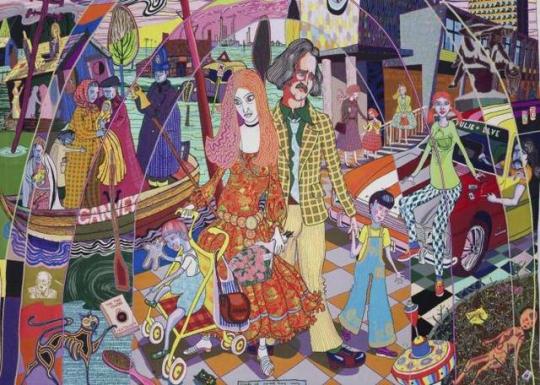


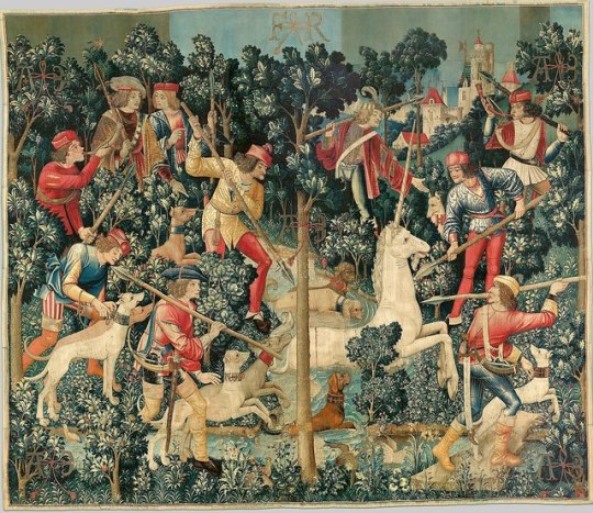

Grayson Perry
Born 24th March 1960 in Chelmsford, Essex. He now lives in London
Contemporary artist, ceramic vases, tapestries and cross-dressing. He loves to use and explore classical forms as well as bright colour in which he depicts subjects ‘at odds with their attractive appearance’. There are a lot of autobiographical elements in his work such as Claire (his alter ego), Alan Measles his childhood teddy bear as well as a lot of sexual references. (I read his autobiography “Portrait of the artist as a young girl” (2007). Perry’s first sexual experience was when he tied himself up with his pajamas, this was when he started to become aware not only did he deeply enjoy fetish and bondage but he also enjoyed being humiliated. He began wearing women's clothes from a young age (his step mums) and started secretly going out dressed as ‘Claire’ he took the clothes to some public toilets and would change in there, afterward he would go into town tottering about in his kitten heels. His stepdad used to beat and humiliate him, he was eventually thrown out at the age of 15 by his biological dad as he continued dressing as Claire even after being caught.
Perry’s Tapestries
Grayson created a 15m x 3m piece called the Walthamstow Tapestry in 2009. In showcased hundreds of brand names surrounding large figures in stages of life from birth to death. The small images clustering among the brand names are of other matters relating to modern life. Mothers push prams, children talk on their mobile phones, soldiers aim rifles, a suicide bomber prepares to detonate himself. Even smaller motifs turn out to be litter, the detritus of modern urban existence – discarded detergent bottles, carrier bags caught in the branches of trees, beer cans, McDonald's wrappers and even, for some reason, a stray pair of underpants apparently wafting through the air. Perry says: "In the end, I will always err on the side of making something pretty and not worry about something's being a stage set for an idea."But it is clear that the tapestry conveys a comment on the particular significance of brands in modern life, and the almost religious weight they carry. "It's almost like a religious fresco celebrating obscure gods and beliefs," he says.
“explores the emotional resonance of brand names in our lives and our quasi-religious relationship to consumerism.”
“The variety of small differences”; 6 tapestries that tell a story of Tim Rakewell. Some with characters, incidents, and objects. They tell a story of class mobility, aesthetic taste defined by the social class you grew up in. His sketches are translated using adobe photoshop to design the finished images and tapestries are woven on a computer controlled loom.
Historical Tapestries
Tapestry is one of the oldest forms of woven textile. In Europe, the great period of tapestry weaving ran from the second half of the 14th century to the end of the 18th century. Best known for wall hangings that have been woven generally referred to as tapestries. Owned by the elite... Henry VIII was known to have had over 2000 tapestries hanging in his palaces... they add colour to a room and keep out draughts, providing a practical use along with the entertainment use in which they give food for thought, tapestries reveal a portrayal of fashionable life in the 14th-18th century.
-These pieces were woven so that so they could be rolled up and transported across seas easily etc.
-Wool is the most popular material as its readily available and easy to dye. It’s naturally strong and offers flexibility.
-Metal threads can be used to add depth to and intricate detail.
tapestries are created by weaving coloured ‘weft’ threads through plain ‘warp’ threads. Warp threads are stretched on a loom. The main idea behind weaving is that most of the weft threads do not run all the way across the warp instead back and forth through specific parts.
0 notes
Text
32 Facts Meme.
I’m so late to this meme dear lord but I refuse to pass on filling it in at this point now.
I’m 3 under because I ran out of ideas whoops.
I guess I’ll start this by saying Vulture isn’t actually from Japan. Her move to Japan was recent to work with her team more personally rather than through online communication.
She’s actually from Conway, South Carolina. Or well more specifically that’s where she was born and were her father lives. Her mother moved to North Myrtle Beach a few years back so she kinda lives in both spaces.
She has at least one family member in every state, her family is huuuuuuge on her fathers side its ridiculous.
Speaking of family, back home she has a dog, or well her father does at least. His name is Pistol, he’s a Boykin Spaniel/ Plotthound cross and they got him when Vulture was about 14.
I don’t have a voiceclaim for her yet but I’ll say she’s got a fairly strong accent?
Her birthday is 5th September and she’s a Virgo Sun, Sagitarius Rising and Cancer Moon. She’s planned out her full natal chart with the help of online resources as well, Vulture goes hard with horoscopes.
Vulture, despite being named after a scavenger bird, is actually pescetarian with a leaning toward vegan.
On that note, her favorite and main brand of soaps and stuff is Lush.
It usually takes her a couple of hours to get ready to leave the house. She’s content to lounge around in the house with little effort made but she’s more appearance focused if she’s going out anywhere. She has corset lacing down to an art of about 10-15 minutes, most of her prep time goes to makeup and hair. The first because she’s big on pretty gradient lips and perfectly filled in eyebrows, the later because having long-thick hair is hell to deal with no matter what.
The exception to this is going to tournaments, teams generally have to have a group aesthetic and jersey going on so its not worth her time to do her usual eyeshadow and killer eyeliner wings for that.
On that note, all her corsets are real and steel boned, rather than for costume/fashion which use plastic bones. She hasn’t bothered with any tight lacing as it stands -due to requiring 18-22 hour a day wear, whilst minor waist training needs about 8- but she’s big on authenticity and the shape achieved this way.
Outside of her corsets, a lot of her clothing is either altered or made by herself, a lot of Gothic clothing that is her style doesn’t cater to her body type so she’s had to adapt and has always been adept with craft anyways honestly.
She really doesn’t like wearing pants very often, too constricting, she basically lives in skirts and dresses with any pants being extremely baggy for comfy home wear mostly.
Her hair is dyed :V its naturally blonde so she saves a ton on bleaching. She keeps to mostly not super neon shades when dying though? This red-pink is the brightest she’s ever gone honestly.
She went through a embarrassing emo+scene phase at 13 like many of us do, her penchant for black never left at least.
Vulture collects pins and brooches, she has this oldish bag thats covered in ones she’s collected over the years.
She smells like violet, cranberry and vanilla.
Whilst she is kinda at a crossroads religiously, Vulture is very interested in occult and witchcraft related topics. A large part of her focus is astrology and crystals more than anything else? She’s dabbled a little in tarot though, owning a couple of sets she doesn’t use very often.
I mentioned this to Lex before, but arcana wise she’s either The High Priestess or Justice.
Vulture has a very close spiritual connection to birds in general? They mean a lot to her tbh.
Talent wise, lets talk about who are mains are in Overwatch. Her big mains are Mercy/Lucio/Ana with a heavy leaning towards Mercy in her channel headers and icons. It’s not uncommon to see artwork of her fursona in Mercy’s gear when she needs a avatar for any audio focused videos.
Outside of Overwatch, her favourite games include the Fallout Series, Animal Crossing, Silent Hill, she plays a lot of games on a ton of platforms tbh.
Her fursona being a vulture/griffin/sphinx hybrid of sorts. She doesn’t show her face online if she can help it so a lot of fanart for her uses this!
Back at home she has a board just for her fanart that is slowly but surely getting overrun, and she’ll generally pay to get a print off the user or a commission for a new header for her twitch or youtube channel if she really digs their art style.
Vulture is ambidexterous, because I couldn’t decide which hand she wrote with.
She’s Mary Lane in a Reefer Madness AU
In a gem AU she’d probably be Purple fluorite, her music motif is definitely something to do with an electric violin.
Her Guilty Pleasure song is Iris by the Goo Goo Dolls. Its cliche at this point but honestly she’d probably want it to play at her wedding.
With EA being basically her top musical artist I might as well mention which of her songs she likes best. Her favourite lyrical EA song is Shallot, her favourite instrumental is probably Syringe
She customizes her ringtones to every person in her phone, because she has too much free time and enjoys being able to know who is calling by sound.
She’s also very musically oriented really, she regularly makes playlists when the mood hits her.
Vulture uses petnames semi-often, if she’s calling you darling or sweetheart she either likes you or she’s judging you, its very contextual.
4 notes
·
View notes
Text
Proposal
Ideation
One of the main reasons for choosing this topic is because of my love for music and my love for art in general, so I decided to marry those two things and concentrate on the art on album covers. I also find it interesting how the album art is the first thing people see and judge, even though an album is mainly all about the music. I also find interesting how the more iconic album covers over the years came to be so iconic, for example the cover for The Velvet Underground & Nico. Or the iconic yellow banana painted by Andy Warhol, Sgt. Pepper’s Lonely Hearts Club Band by The Beatles, Nevermind by Nirvana, or the many iconic album covers by Pink Floyd such as The Dark Side of the Moon, The Wall, Wish You Were Here and many more. The reason why I find this so important is that the album art is the first thing you see when you buy an album - and although we do not like to admit it, most of us do in fact judge books by their covers. A possible focus for this field could be ‘the importance of album covers’ or similarly, ‘what makes a good album cover?’. One of these topics or something similar I think would be quite interesting and significant to research further, because most people love music, and album covers are the first thing people see and concentrate on before they listen to the actual music in the album. The kinds of things I think I will go into are: the importance of having a clear marriage of themes between the album art and the music, the significance of any typography on the cover, the significance of colour, and especially how that colour relates to the themes of the album, and many more. I think this subject will be of significance to others because even though most music is accessed through digital means nowadays, I think album art is still as important as it was 50 years ago. ‘The artwork is a way of representing an album in short form; it is like a shorthand vocabulary for musical history. When others see the artwork, they are more likely to recognise it, talk about it, interact more’ (Gravell 2014). This quote sums up why I think it is imperative for everyone that album cover design stays important, and a significant part of creating an album.
Research and development
The main subject for my research is ‘what makes a good/effective album cover?’ and will be concentrating on what elements make an album cover an effective way of conveying the albums themes and overall feel, for example, a black metal album cover would have to be effective at portraying the themes of black metal. For example if there was a picture of a light-hearted little rabbit in a field of flowers, it would not be effectively conveying the themes of the album. A more effective cover would be something like a person in a frightening mask at night time, because the best album covers you could recognise what kind of music they were without even reading anything on them - they carry the themes of the album through the cover, which is the first thing the listener sees.
One of the first articles I stumbled across I thought was quite effective at trying to describe the importance of album artwork, the article was titled. “It’s what’s on the outside that counts: the importance of album artwork”(Dotiyal 2017). Straight away, I thought the title alone was exactly the kind of thing I was thinking, that it is what’s on the outside that counts (certainly to an extent). Dotiyal goes into what things make album art good in portraying its theme, he even interviews someone from the band Radar who said a very interesting point, “Unless an album has a really strong theme or concept, I don’t think cover art needs to be related to the music whatsoever.” I thought this point was very interesting because previously I thought album art had to have a clear correlation to the themes of the music, but if no clear themes are present, the cover does not need to relate to anything. This could be true for more avant garde music where a clear theme is not present.
‘Does cover art matter in the digital age?’ (Fernandes 2017) is a good take on the importance of album cover design, as she goes into a lot of detail into the importance of album cover design throughout history, which I think, is a very interesting and relevant topic. Especially today, when the digitalisation of music has potentially reduced the importance of album cover design.
Another good article I found on the internet titled ‘How to make an impact with your album artwork’ (Jackson 2014). The reason I liked this article is that it lists specific examples of album art, and firstly explains ‘why it works’ which goes into the elements that make it an effective album cover, and ‘how to make it your own’. Which goes into what kind of elements to choose if you were to make a similar looking album cover which I think is a great idea. For example, one of the albums she lists is ‘Are We There’ by Sharon Van Etten and she explains - “Heart-wrenching wistfulness is a much-used motif in Sharon Van Etten’s material, and the artwork for her latest LP channels that. Who hasn’t bent their head out of a car window hoping the fresh air will relieve you, at least briefly, of emotional hopelessness?” Jackson also does another interesting analysis that I like of another album cover, “This trippy artwork is mystical, wondrously pretty, and incredibly detailed. Plus, it’s a spot-on reflection of the bands chaotic-yet-melodic brand of garage-psych. Both are instantly mesmerizing.”(Jackson 2014)
‘The importance of having good album artwork’ (Melina 2015) is also a very good example of explaining the importance of having good album artwork, although it doesn’t go into as much detail into specific album covers and what makes them effective like Jackson, however it does explain what makes a good cover generally. She does this by first explaining ‘The purpose’ for album artwork, which according to Melina is ‘to attract listeners to your music’, which I do fully agree with, however I do think there is more to it than that. Melina does go into more depth, and explains the ‘two secondary purposes for having good album artwork’ which are first to ‘exemplify your songs on the album’ and secondly ‘to express yourself as an artist’. I like these ‘secondary’ purposes too because like any kind of art, I think it does need to express yourself as an artist, and of course the importance of exemplifying your songs through the album art.
The next article I found is probably my favourite so far, as it goes into a lot of detail into what makes a good album cover, and lists specific examples. It is titled, ‘The importance of album artwork’ (Shah 2016). As Shah states, “The artwork serves as a portal into what the listener can expect from an album, and even what kind of musician lies behind the creativity. Strong album covers make a statement, because after all, this imagery is an opportunity to make the right first impression.” I think this is a perfect description of why album covers are important and is described in a succinct, descriptive and informative way. Shah also goes into the specifics of what makes a good album cover, like the colours, compositions, themes, and explains how one specific example is effective.
“The shift from the vibrant illustrations and shapes found in Steinweiss’ and Flora’s covers to the high-contrast photographs on these albums hints at a possible cultural shift starting to focus more on personal image.” (Maria 2018) in this article, Maria explains the different cultural factors that went into the design of album art in the 20th century, like the rise of psychedelia in the 1960s for example - and how that changed artwork on album covers. I think this is an interesting concept and Maria goes into a lot of detail when explaining the different cultural changes in each decade since album covers were first invented in 1938 to the present day.
Critique & explanation
A lot of interesting concepts and theories have come up since I started research on this broad topic, I could go many different ways from here. I think a good concept to start with is also a very relevant concept today, and is the digitalisation of the music industry, and how album art still plays an important role in the albums overall themes and subjects, ‘fast forward to now, when everything is streamed online, and album art is often reduced to a small digital square. However, that does not mean that album art is any less important. In fact, it is more important than ever when it comes to music promotion and music distribution.’ (Seydel 2016) Seydel makes a good point here, that even though the actual size of the way people view album art, from a 12 x 12 inch physical thing - to a very small space on an already small screen, albums are still fundamentally reliant on their art to actually advertise and distribute the album. Another concept I think would be interesting to look into further is the differences in album artwork between the many genres of music, and what kind of album cover you would expect from a specific genre like punk, rap, or metal. As well as this, the reasons/stories/motifs behind the album artwork of some specific examples. Barker does this to a few specific artists in his article on the importance of album artwork – for example, ‘Rage Against The Machine's seminal self-titled record features a Buddhist monk undergoing self-immolation in religious protest. It's a harrowing image made iconic, and it ties in with the politically motivated content of the album.’ (Barker 2017). There are definitely many questions emerging from my research, some more specific and unambiguous than others, but I think all have interesting concepts and ideas. I think it will be hard to narrow in on one specific question, but on the plus side, I have lots to choose from.
Action plan
Firstly and most importantly, I still need to hone in on what my specific question is for the essay because I have been researching a rather broad topic and have lots of potential contenders. I also still need to find out how I am going to structure the essay, but that would first depend on the question/topic I choose of course. Some particular methods of research will include what I’ve been doing so far mostly, which is using google and google scholar searching for blogs and websites that have some varying and interesting points about album cover art. Whether it be why they are important, their history, what makes an effective album cover design, or what types of designs would be on specific genres of music – as long as it fits under my overall theme of album cover design. The relevant ones I have saved in my Tumblr blog, along with some interesting images of album designs I found for visual aid. As for any ethical issues I may need to consider, I don’t think there will be any with this subject, so I don’t feel it’s necessary to complete an ethics form. Over the summer, I will need to generally read more and do more research on this broad topic to try to hone in on a specific question for my essay. While doing this I will also update and edit my Tumblr blog with new content and even more images to go along with it.
Bibliography
Barker, C. (2017). "On The Importance Of Album Artwork: Visual Hooks In An Auditory Medium." Retrieved 14/04/2019, 2019, from http://www.bulletmusic.net/features-1/album-artwork-in-the-digital-age.
Dotiyal, M. (2017). "It’s What’s On the Outside That Counts: The Importance of Album Artwork." Retrieved 10/04/2019, 2019, from https://acrn.com/2017/08/31/its-whats-on-the-outside-that-counts-the-importance-of-album-artwork/.
Fernandes, V. (2017). "Does Cover Art Matter in the Digital Age?". Retrieved 20/04/2019, 2019, from https://www.baeblemusic.com/musicblog/8-16-2017/does-cover-art-matter-in-the-digital-age.html.
Gravell, D. (2014). "Three reasons album artwork remains important." Retrieved 12/04/2019, 2019, from https://www.blisshq.com/music-library-management-blog/2014/12/02/three-reasons-album-artwork-remains-important/.
Jackson, J. (2014). "How to Make an Impact With Your Album Artwork." Retrieved 16/04/2019, 2019, from http://blog.sonicbids.com/how-to-make-an-impact-with-your-album-artwork.
Maria (2018). "The Evolution of Album Covers." Retrieved 14/04/2019, 2019, from https://wp.nyu.edu/fogdv2/2018/09/18/the-evolution-of-album-covers/.
Melina, V. (2015). "The Importance of Having Good Album Artwork." Retrieved 11/04/2019, 2019, from http://blog.symphonicdistribution.com/2015/08/the-importance-of-having-good-album-artwork/.
Seydel, R. (2016). "Why Album Cover Art Will Always Be Crucial For Success." Retrieved 25/04/2019, 2019, from https://blog.landr.com/album-art-absolutely-crucial-success-2016/.
Shah, D. (2016). "The Importance of Album Artwork." Retrieved 12/04/2019, 2019, from https://humanhuman.com/articles/the-importance-of-album-artwork.
0 notes