#it was so catchy and for what??
Explore tagged Tumblr posts
Text
Something something. Making Solas a liar in Veilguard actively brings back a problem they fixed working on Inquisition.
On December 20 2019 VGS posted an interview with Trick Weekes about their work on Solas. This whole sentence is a link so its large enough for mobile but also disclaimer this is before they changed their name so deadname warning.
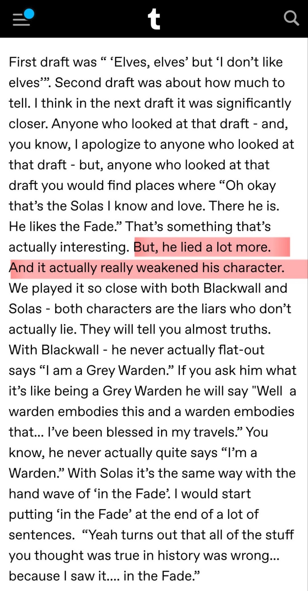
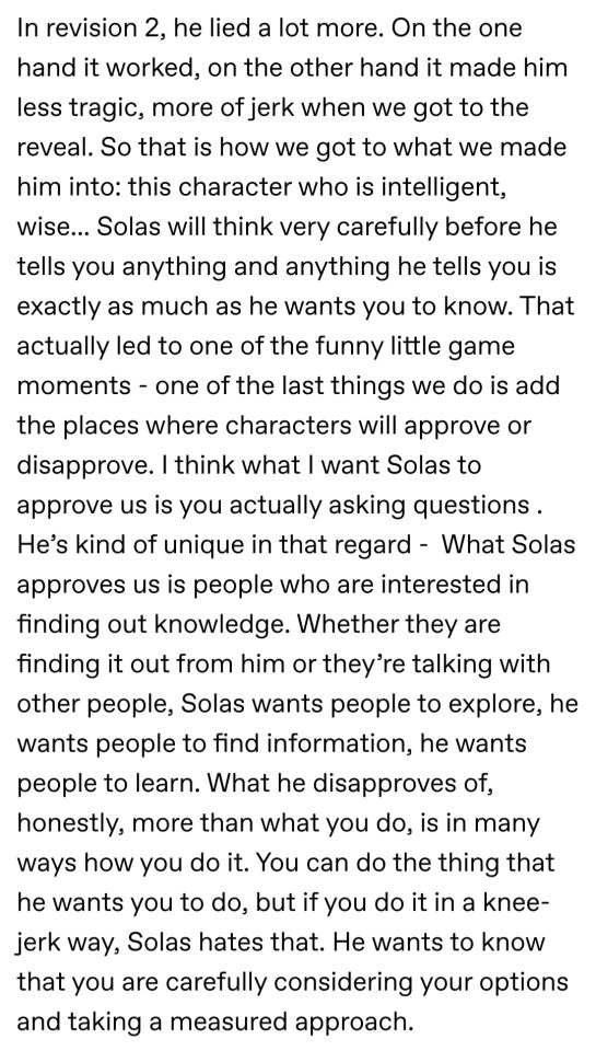
Here's a transcription I found here which is where i took the screenshots above. Since I know not everyone has 40 minutes to listen to an online radio interview.
I however highlighted the main point since most of you are not reading the screenshots anyway but skimming through. Rant under Read-more. Also bc i try to not be too negative on people's dashs but also i wanna ramble some more.
"But he lied a lot more. And it really weakened his character."
You can tell this happened during the game. Solas lies only once within Inquisition. He says something he can't be vague about and you push him so he lies, badly. He usually tells the truth vaguely. Typically Solas lies no more than Blackwall.
I fully believe that if in Inquisition your inquisitor figured out that Solas was Fen’harel and asked him bluntly to his face he'd confess. He might even be impressed. But why would you ever start to think that. No one assumes that their coworker is actually Poseidon regardless of how much they love the beach and ocean.
He hides in your expectations.
You can't ask him about being an ancient elf or being Fen'harel of myth because those aren't very probable. They're astronomically low to be truth within that universe. And outside, no one finished DA2 and went i wonder if one of our next companions is the Dread Wolf. Sera said, impossible things can't be surprises. He doesn't have to lie so when the truth comes out it's becomes obvious on a second playthrough.
They then actively bring back a problem they fixed in Inquisitions development. That they were open about fixing. That having a character that outright lies to you makes you have no intention of even hearing out the character. It retroactively undercuts Inquisition bc i see people trying to find Solas' lies in it when they aren't going to find any beyond the court intrigue.
It undercuts any lore we do get from Solas bc people dismiss it outright as being a lie from Mr "I abhor blood magic". I feel like shaking people's shoulders like no, dont do it.
They retconned him guys i have proof from 2019.
And its like if you hate Solas is this even satisfying? Like that's not Solas. His motivations are gone (that's a whole other post) and so is his core personality trait. It's like they went here's the Dreadwolf but during the ten years they replaced the smug asshole who was insufferably right with a 20 yo senior chihuahua that doesnt have any teeth.
My favorite villains are those that tell the truth. Because nothing hurts more than the truth. Can you imagine if he told you the truth. If he told you horrible things that you dismissed as lies to only be true. Wouldn't Varric’s death have more weight if he told you Varric was dead only for you - for everyone - to see him in the Lighthouse. If it was a spirit who took his shape to help you or even because it saw something worth reflecting in your memories.
So you dismiss him until it's revealed near the end oh he was telling the truth and you have an oh shit maybe he was right about other things but its too late to try and stop any of the truths he told you which could be from allies/companions betraying to stuff about Ghilan'nain and Elgarnan.
Like the only way to redeem Solas was to listen to him and by going out of your way to address problems he sees and you can find the alternative to tearing down the Veil by a series a little puzzle pieces throughout the game.
Have it be he will only listen to you if you listen to him. That he'll reject your other solution bc why the hell would he trust you if you couldnt extend the same.
Like Solas couldve been a great villian and he should've been great for both the haters and those that liked him. Not only the romance but for those who became his friend. Like i keep coming back to if i hated Solas would i be satisfied with Veilguard.
And the answer is no because that isnt Solas.
Tricking him has no weight bc he's an idiot in Veilguard like not even in the ending bc doesn't notice you switch the dagger around like right in front of him but none of his actions make sense. Ppl have mentioned the regret prison makes no sense for Elgarnan and Ghilan'nain bc they don't have regrets.
Attacking Solas has no weight because he literally needs the shit kicked out of him by a dragon for it to even begin to work. They literally need him to be at deaths door before its realistic that Rook could take him in a fight.
Redeem has no weight bc of the massive retcons to his motivations. They had to retcon the post credits scene bc even if Flemythal went hey i don't want you to do this Dai Solas wouldve went okay but that doesnt solve my other problems with the veil including the corruption of spirits and the fact its in literal shambles so i guess is still coming down.
I'm just disappointed. By the end of Trespasser they had a great villian and they just tossed it to the side and reverted him and people are arguing about a character who's sole defining trait in Veilguard is a problem they solved before Inquisition launched.
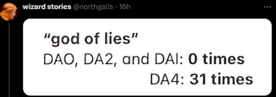
Basically we can sum it up with a screenshot.
#veilguard critical#solas analysis#datv critical#a bit#its more veilguard disappointment#but that's not as catchy#TIM in me 3 is a better enemy than solas#no i will not elaborate#and its like i love things about Veilguard#choosing gender and pronouns and having it matter within the game should be the standard for character creation games like this#and also how ur character feels about themselves#i don't even use it and i truly believe it's that groundbreaking and great#I remember being so excited pre launch like yeah you can really dig deep into your rook and what else could they use this flesh out your pc#feel free to use any speculation for fics like the varric thing#did alt text for the first time lemme know if i need to change anything
436 notes
·
View notes
Text
"i get to thinkin' 'bout your sun-kissed face / and a quiet place i could give you all my time"
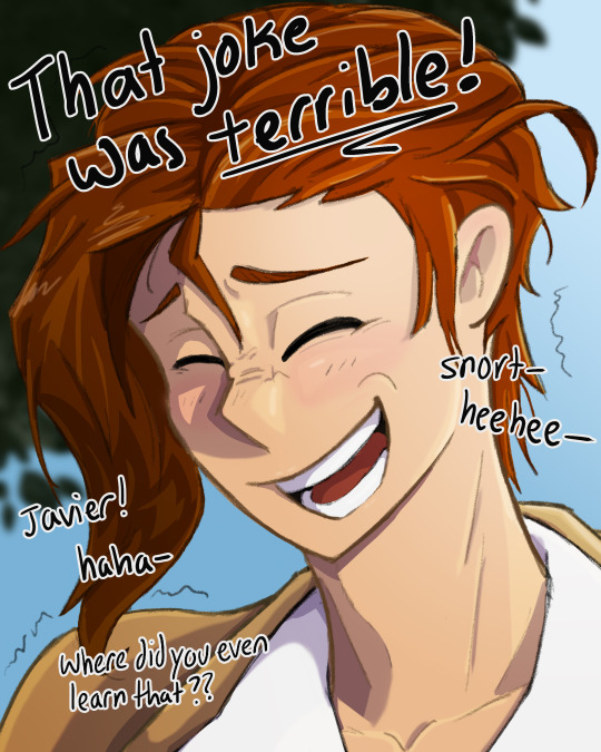
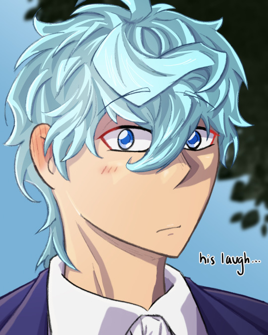
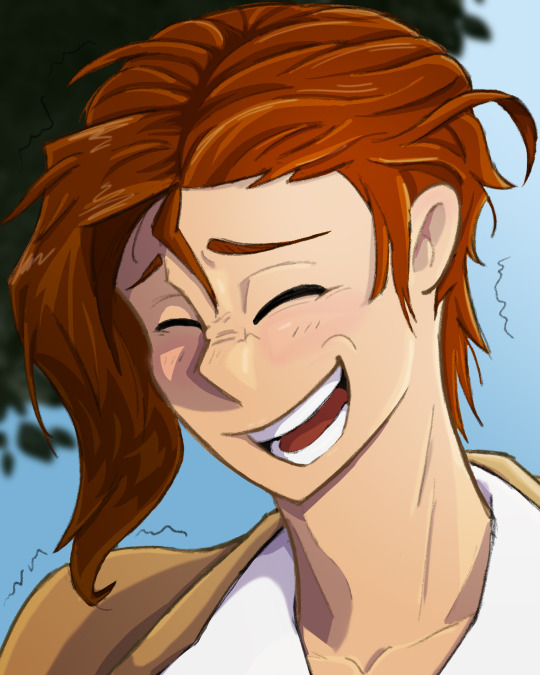

textless :3
based on a self-indulgent headcanon that lloyd laughs like a goofball and very easily at terrible jokes. he snorts and giggles and wheezes, his nose wrinkles and his grin is all sorts of lopsided. he has to hold himself from falling over, and crinkles form underneath his eyes, and he's laughing so so loudly and javier thinks it's the cutest look in the world. lloyd really should laugh more often, take it easy more often. it suits him.
#tged#the greatest estate developer#lloyd frontera#tged lloyd#javier asrahan#tged javier#the greatest estate designer#llovier#javilloyd#llojavi#lynn's art#caption lyrics are from sunkissed by khai dreams#i dont know how to explain it but that song is llovier to me. like in a “domestic / at the end of our journey” kind of way#its also very catchy so its been in my head ALL WEEK. AND BECAUSE I ASSOCIATE IT WITH LLOVIER. IVE BEEN THINKING OF LLOVIER ALL WEEK#their hair was a pain in the ASS to draw btw. how do yall do it#how the hell does the illustrator do it???#javier specifically you. shaking you your hair is so hard#what do you think the joke javier said was#i didn't really think that far about what kind of terrible jokes javier would make and what kind of jokes lloyd would definitely laugh at
244 notes
·
View notes
Text
The Shimmering Voyage Vol. 4|Genshin Impact
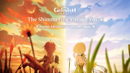
Genshin Impact's Version 4.0 Commemorative OST album "The Shimmering Voyage Vol. 4" is now available!
The album's three discs "Summertime Excursion," "Romance Without Words," and "Curiosites Esthetiques" feature 67 remarkable tracks composed by the HOYO-MiX team, each one an original composition from Genshin Impact.
youtube
youtube
youtube
Click below to listen to "The Shimmering Voyage Vol. 4"
Spotify
iTunes/Apple Music
#genshin impact#genshin impact updates#genshin impact news#official#genshin impact ost#the simulanka music is so catchy and for what....#Youtube
194 notes
·
View notes
Text
This user has whistled the security breach daycare theme while out in public on multiple occasions.
#and I’ll do it again!!!#it’s so catchy and is such an easy tune to whistle on repeat you gotta#I like to think of it as a dca fandom bird call#if someone joins in your automatic best friends#I actually do this quite often#I’d actually be impressed if someone knew what it was and called me out on it#dca fandom#daycare attendant fandom#this user
756 notes
·
View notes
Text

#one piece#sanji#black leg sanji#everysanji#summit war saga#ch522#ft. luffy#ft. zoro#ft. nami#ft. usopp#ft. chopper#ft. robin#ft. franky#ft. brook#i watched come from away the musical about 9/11 recently (usual disclaimer about the passage of time here)#and the music is so catchy and for WHAT. i'm an islander i am an islander#welcome to the rock. like come on that's so catchy#watch the tony's 2017 welcome to the rock video on youtube its so.#(it starts about 2 minutes into the video you can skip the speech)
88 notes
·
View notes
Text
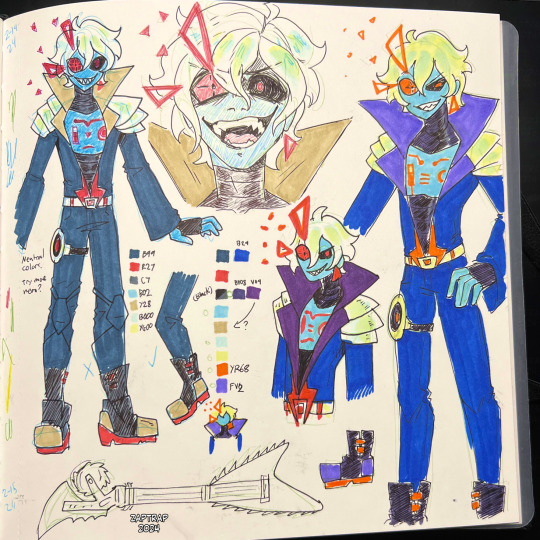

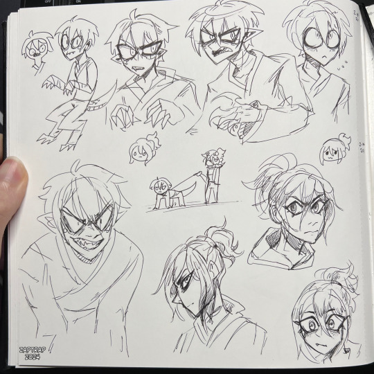
more sketchbook doodles feat. prime empire nindroid jays
#i dont have a catchy AU name for PENJ lmao its just under the nindroid jay umbrella#ninjago#my art#jay walker#nindroid jay#nya smith#jaya#im also trying to figure out how to draw nya so ill like....maybe like her more or smth idk#she just doesnt click with me even tho theres aspects that i like a lot so idk what the issue is ???#plz help me like this character i wanna have fun too lmao#SSRNJ
166 notes
·
View notes
Text
alright, here it is: ZENO'S COLOR GUIDE 3.0 !
here, i'll have three "chapters" regarding color:
CH1: how i color in illustrations
CH2: color and character design (in zeno's case)
CH3: how zeno makes his colors cooler
CH1: HOW I COLOR IN ILLUSTRATIONS
it must be noted that, as of lately, i heavily use halftones in my art and the way i use them for gradients effects my color choices. of course you don't need to use halftones if you don't want to, as it's just my personal choice, but anything regarding halftones here could (probably) also apply to regular gradients!
when choosing colors in an illustration, i usually have three things in mind: mood, character, and contrast. we'll be using "gloomy bunny naptime" as an example here.
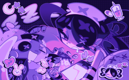
MOOD: what's the vibe of the piece? for example, here in "gloomy bunny naptime", wanted a mellow, sleepy vibe, so purples and pinks seemed like the best choice. these colors also have a dreamy effect due to being common in real-life early mornings/summer nights - basically, i tend to use associative colors in illustrations.
i usually only use a pallete of 3-7 colors, though of course more characters calls for more colors. for multi-character pieces, i would actually make a "rainbow" of colors based on the mood of the piece - essentially, a bank of colors to use for your colorful casts based on the actual rainbow. you can alter this based on the saturation levels you want! hope that makes sense. i'm not the best at this though, so i would heavily recommend looking for guides from artists who are more skilled in that department.
CHARACTER: velvet is the focus of the piece, and as a character her palette is made up of many purples and pinks. of course, it's easier because she and ribbon both have similar designs, but i would still recommend using colors based on/complementary to the focus character's pallete, though this is a rule that can and should be broken if needed. gradients can be used to provide a smooth transition from color-to-color and add depth to the piece, as well as showcase velvet's pallete. when making any gradient, you probably want to have a vibrant middle color. this is difficult to achieve in most art programs, so i'd do it like this:
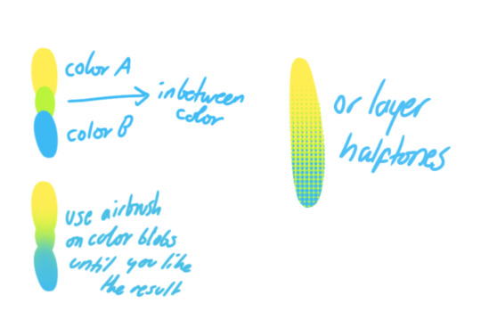
you can use gradients in lots of cool ways to make stuff pop! (i think this collage shows i use too much purple and pink though.)

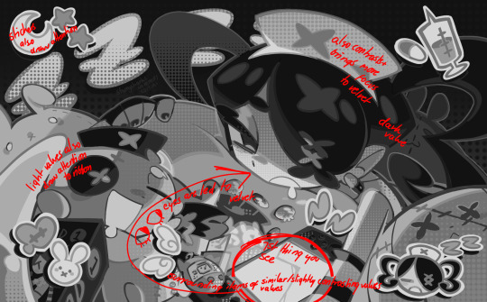
CONTRAST: the context of the piece also aids the color through contrast. (that's a lot of Cs!)- we see that velvet is just waking up, and the light from her switch is glowing brightly. i wanted to convey something like her switch suddenly turning on in the middle of the night, waking her up - so the console emits "light" in the form of illuminating the contrasting color of pink against the purples. it might seem specific to this piece, but what i'm trying to say is that contrasting colors can lead the eye to the focal point of the piece, that being velvet herself. because a great deal of the rest of the piece is dark, we look at the contrasting switch screen - the brightest thing in frame - and our eyes move around and up to take in the focal point character. at least that's how i wanted it to be ;w; i guess you could convey it as something like this?
CH2: COLOR AND CHARACTER DESIGN (IN ZENO'S CASE)
this is where i start to get annoying, so stand back! when deciding on colors for a cast of characters, there are many factors: time period, variety, personality, and more that i can't think of.
TIME PERIOD: this one is simple. for example, a futuristic time period (such as that in x-calibur) calls for colder colors, such as greens and blues. for characters involved in futuristic professions such as space exploration, this works incredibly well. for modern time periods, less focus can be on colors and more on the shapes of the clothes, but this is not a shapes tutorial! i don't have any ancient times oc stories, but i'd probably use earthy and warm tones.
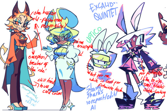
VARIETY: this is also rather simple. i try to be aware of the palletes that i used, and the similarities they might have with other characters. i try to use similar colors for characters who belong to certain organisations or have a uniform, but of course, it's not like catholic school students adhere their entire look to their uniform, so this is a rule that can be broken yet again. art is all about learning things and breaking them, remember that!!!
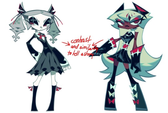
color can also be used for symbolism. my absolute fav example for this is vivica and octavia - the amount of red in their designs is supposed to represent the amount of freedom/passion/anger/confidence they have or are allowed to express under their different circumstances. as vivica belongs to a strict organisation, she has far less red in her design, showing her emotions are stifled - meanwhile octavia has it as her main complementary color because of her freedom to express her emotions, though those emotions may be destructive because of her circumstances.
PERSONALITY: what colors are associated with your character's personality? i actually usually refer to magical girl groups to see what's commonly associated with different colors. here's the main trend:
red: hot-headed, passionate, firey
orange/yellow: bright, happy-go-lucky, sunshine personality
green: wise, mellow, kind
blue: serene, graceful, elegant
purple: magical, regal, fancy
pink: usually the main character (though this because magical girl anime tends to be marketed towards young girls), sweet, relatable, determined
of course these are only stereotypes from one genre of anime, and different colors have tons of different meanings. color theory is the best way to learn this! these colors can also express different moods, which ties into ch1. i myself constantly ignore these rules - v-con, a bombastic hyper DJ, is purple (though he does have yellow accents) for example. basically, i just take them as a general rule and try to have them in mind while drawing.
CH3: HOW ZENO MAKES HIS COLORS COOLER
this might be the most important part of this guide. once again, there are a few things to consider here: filters, hue, overlays, and more!
FILTERS: for ibispaint, you can use an adjustment layer on your whole piece to use a filter. i usually only use brightness/contrast here - upping the brightness (or darkening it based on the mood of the piece) and upping the contrast. this helps to better express values and intensify the colors if that's what you want. i often use it in all my pieces to some extent.
hue/saturation/lightness is also helpful in moderation. you can alter the hue - though it usually only helps if you bring it back or forward by just a few points, or the entire pallete will change. saturation is what it sounds like, and slightly over/desaturating the piece can help with atmosphere. lightness is what it sounds like - lightens the colors in the piece. i don't use it at all.
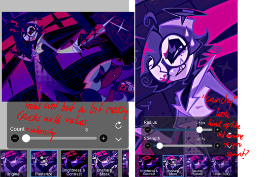
posterize and sharpen mask are some that i've used recently. posterize can add some crazy effects to your art, but i'd probably need to edit it slightly after using it because it can mess with certain colors.
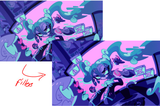
HUE: it's a layer type that can change the overall hue of the piece. i usually use it at a low percentage for atmosphere. kind of like a gradient map but nothing like it? idk
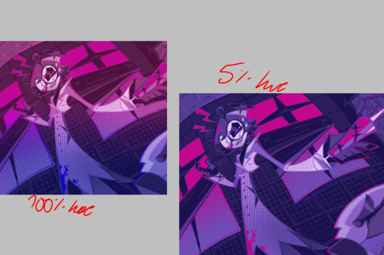
and OVERLAYS: i just use a very saturated blue/purple color over the entire piece at a very low percentage, around 5-10%. it can wash out the piece at too high a percentage.
and that's basically it! sorry it kind of derailed at the end i spent like 2 hours on this and got super tired. goodnight i'm going to sleep please also look at other artists etc etc. bye.
#zeno's art#long post#color tutorial#liar by korn is actually a really catchy song yea the lyrics are weird but its so good tbh#peak drums and bass and guitar and vocals and then the lyrics are hot booty. this is what nu metal's all about people#ask questions if you want#about nu metal or art i dont care
364 notes
·
View notes
Text
The worst thing about watching the digital ticket is that you can't just look up these BANGER songs after you watch it. like wdym i can't listen to facade, ash to ash, and step on your grave on repeat for 3 hours straight D:

#AND I HEAR YOUR RICH#I GRANT THEE STARLIGHT#IT NEEDS OREGANO#ash to ash is so ridiculously enchanting#and facade is so catchy it's been on loop in my head#and what is there to even say about step on your grave#starkid#cinderella's castle#cinderella's castle spoilers#for the songs at least
51 notes
·
View notes
Text
oh my god, so high school is SO funny
#i fucking love it#what a great song#i love the sound production melody too#so catchy and so 90s somehow#and so fucking scathing 😂#she is brutal and i know most people will not catch it
91 notes
·
View notes
Text
Really good underappreciated subtype of folk song is when the verses are like my name is roger o'neill and I killed 200 people in coleraine in 1825 / because they put me in gaol for murdering my entire family / I burnt down a whole bunch of houses with black powder after locking everyone inside / now they're transporting me and when I get to van diemen's land I'm going to kill 200 more people and the chorus is like fa la la fiddle dee dee yippee yay!!!
#irish example but scotland is SO guilty of this too idk what they put in jacobite tunes to make them so catchy. other than the music#🎵#jory.txt
24 notes
·
View notes
Note
please draw captain vul realistic birdman next
piece of cake. captain on deck!
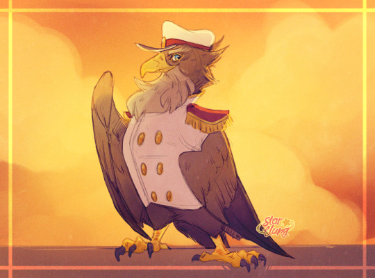

#flat colour version under the cut. he's more brown than purplegold that's just the lighting.#he's already way more realistically a bird than dedede so i'm not sure what you expected#he's obviously a white tailed (sea) eagle btw. if you're wondering.#*had* to be haliaeetinae obviously. yellow beak + feet check. right beak shape check. brown + white feathers check. crest tufts checkish!!#ergo... white tailed eagle. i think i'm correct. thanks for coming to my bird ted talk!#“vul” who does he think he's kidding he is clearly an eagle. then again 'captain eag' isn't.. uh... as catchy. so it's fair.#also he has no gloves so according to my biology hcs he doesn't get talons for hands. wings only.#steering the halberd with his primaries like in Valiant (2005).#also this is the funniest ask i've received thus far. realistic birdman. sure! absolutely. i don't necessarily do requests though.#my art#captain vul
127 notes
·
View notes
Text
you know how in that episode where dean turns on the radio and a taylor swift song plays and sam thinks dean is going to switch stations or talk bad about the song,,, but dean raisese the volume and shrugs instead.
yeah, this is me trying to say that i think sam would do the same thing for the song 'espresso' by sabrina carpenter.
#supernatural#sam winchester#dean winchester#spn#sam and dean#the song is so catchy#and clearly a bop which is what makes me believe sam would react this way
20 notes
·
View notes
Text
I won't lie the lyrics are not what I expected of rockstar Lestat. They seem like something he wrote on the fly (in a fit of indignation). I know that in the book his lyrics aren't exactly poetry, but the way Lestat (as described by Louis) speaks...
"What rage you must feel as you choke on your sorrow."
"I’m always on the other side, face pressed up against your longing."
It feels entirely different to this:
#i dont hate it!! it IS fun and catchy#but its giving modern popstar and thats kinda boring imo#im not judging too heavily tho. this show hasnt let me down befors so im excited to see what else they've come up with#and i have theoriesTM about rockstar lestat but i'll save that for another post#iwtv#interview with the vampire#lestat de lioncourt#*before
20 notes
·
View notes
Text
the electric company doesn't like you
#I've been listening to this on loop for the last 24 hours#I am totally fine haha#it is so catchy#danny rebus#william jackson harper#manny spamboni#dominic colon#the electric company#the electric company 2009#the electric company song#the electric company doesn't like you#guess what I'm listening to#song I'm obsessed with rn#pbs kids#pbs kids go#sent this to a friend and they were like is that chidi from the good place haha#and yes it is haha#childhood stuff#childhood video#childhood nostalgia#childhood tv shows#posting in the palace
20 notes
·
View notes
Text
So yeah I'm kinda obsessed with Still Alive and Want You Gone
#portal#portal 2#GLaDOS#chell#chelldos#want you gone#still alive#they're very catchy#and#guess what#apparently#mili#did a cover of still alive years ago#so i love that#project mili
46 notes
·
View notes
Text
me today, listening to songs about death and the end of the world and how all things will reach their end in time

#they're so catchy#and for what#depeche mode#fall out boy#hozier#music#oh and also that new paris paloma song#that was good too#but also the theme of hope and new beginnings really just hit me so hard and made it all so much better
237 notes
·
View notes