#it was fun adding in the shitty white outline on the sprite
Explore tagged Tumblr posts
Text
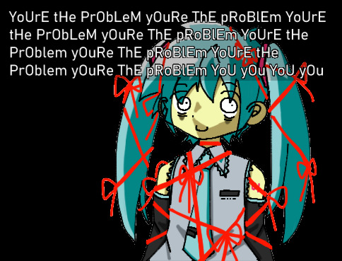
people on twitter were drawing miku as various horror antagonists. so here we are
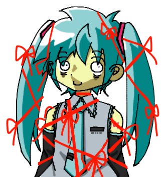

#re:kinder#technically#hatsune miku#vocaloid#it was fun adding in the shitty white outline on the sprite#and it was freeing to emulate a style that is so skrunkly
60 notes
·
View notes
Text
woah a pq sprite edit tutorial ft. mod kk (paint tool SAI)
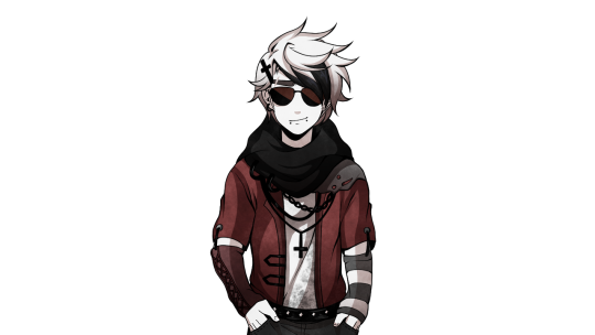
MOD KK....: SO UH. this is primarily to help a pal of mine, but like i thought it’d be good to make a post / tutorial in general, so here’s a tutorial which features the process of how i did this dave
since i use sai, this is a tutorial mainly for sai, but you can follow along easily on other art programs since functions are similar and etc. the link to the sai i use can be found here.
tutorial starts under the read more:
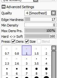
BEFORE WE START, any sai users, here are my brush settings regarding lineart / linking, and in general, these are the settings I use for all my art and edits. Size wise, I usually draw with 1, but for line width, I’ll change between 1, 0.8, and 1.5.
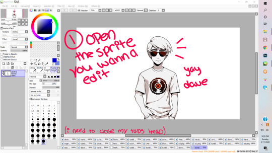
1. So first and foremost (wow, look the way I’m typing got more formal), you want to open the sprite you want to edit on. Here I have Dave. A good resource for sprites / assets from PQ is from this blog, in case any one needs it.
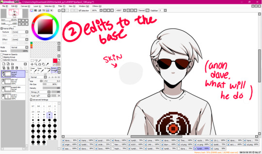
2. If you need to, make edits to the base. Usually, if not the hair, I’ll make an edit to the character’s shading colour or their face. In this instance, it’s going to be the latter. So in this picture, what you want to do is colour pick from his skin, make a new layer and on that layer, you’ll ‘erase’ (draw over) his expression.
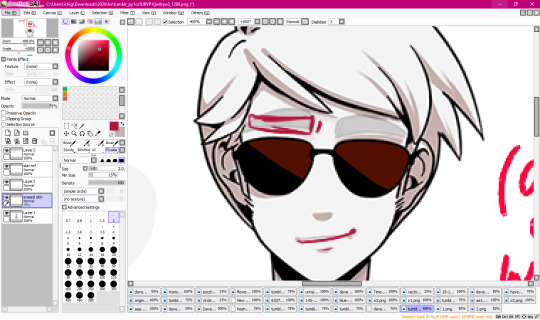
2.1. Lower the opacity on the coloured over layer so that you can see his original expression- mainly I do this so I can see the proper placement of his facial features and such. Here, I’ll sketch the change I want.
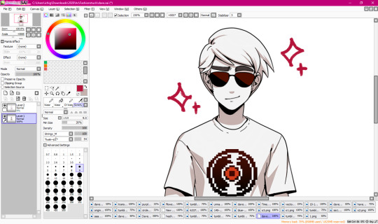
2.2. After it’s sketched out, I’ll line it proper and fill it in, and now he’s like smug (shame that it gets covered up by his bangs in the finished edit).

3. Now we’re to the fun part! Well, onto the more fun parts. Here is where we’ll start our sketching. Sketching isn’t mandatory, especially on smaller, minor edits such as changing shirt colours or adding small accessories, but if you want do things like drastically change their haircut, or to give them a new outfit entirely, sketching is probably a good idea. Anyways, lower the base’s opacity, and then decide what kind of outfit you want to sketch on your base, and do it.

4. After sketching, you’re gonna line! Lower the opacity on both the base and the sketch- though that’s probably a given. Completely optional, but I tend to put my layers in a folder set for organisation purposes. Also, please name your layers, it’ll help you good (OKAY SO LMAO. I forgot to take the screenshot of me mid lining, so I eyeballed all my finished lines out to make it look like it was incomplete.)

4.1: Anyways, yay! The lining’s complete. I know this is supposed to be a tutorial, but process photos are fun too.
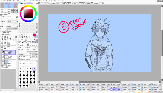
5. Now we’re onto pre colouring. I say pre colouring because this is like setting the base for colouring? Yeah. Anyways, I’ve made another folder set for colouring, pulled the base sprite into it, and then set a coloured background under the base for transparency and etc- I usually go with a colour which will contrast the piece’s main palette, which in this case, is blacks and shades of red.

5.1. Now we’re going to put the base colour into the newly created lineart. What we’ll do here is turn the transparency on the base sprite down till it’s completely gone, and then we select every inside of the lineart.
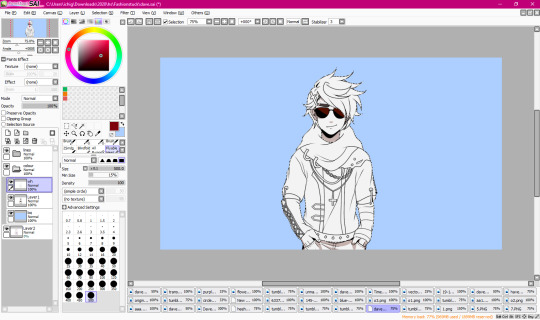
5.2: With the base ‘white’ (the greyish white) colour from Dave’s original sprite, we’ll fill the lineart.
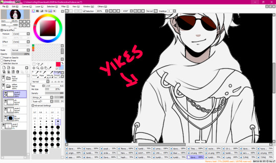
5.3 However, after this, you’re going to want to check your transparency because it won’t always be perfect- actually, it won’t be perfect. Usually, you’ll get that small, shitty white outline which overall imo ruins the piece when it’s transparent.
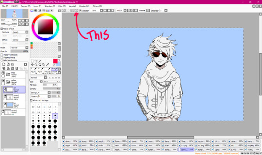
5.4. What you’re going to want to do to rid of this, is- going back to 5.2, after you’ve filled it, and you still have the selection on, you’re going to reverse the selection (arrow pointing to it, ‘pologies for non sai users because I don’t know the equivalent), and then erase. It’ll seem like you’re just erasing the background, but I swear it’s worth it.
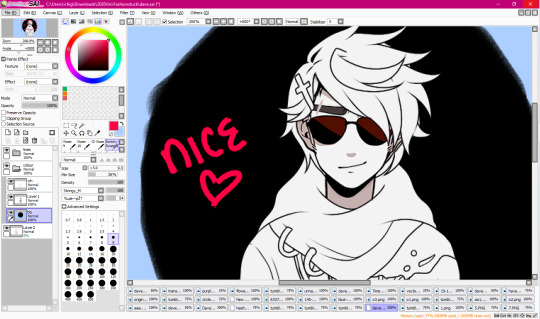
5.5 See? Now it’s clean. Yay!!!
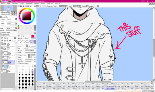
5.6 After that’s figured out, you’re going to want to redirect your attention back to the base sprite, and then erase all the shit that’s leftover from it, such as Dave’s sleeve which is poking out from the side, as shown in the pic.
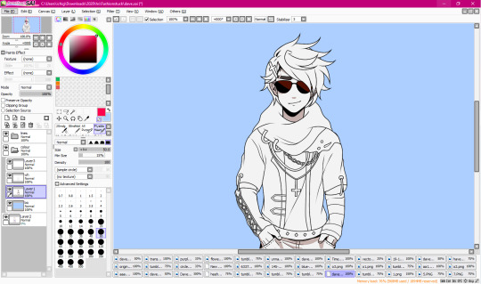
5.7 Bam. And now he’s all cleaned up proper and ready to roll.
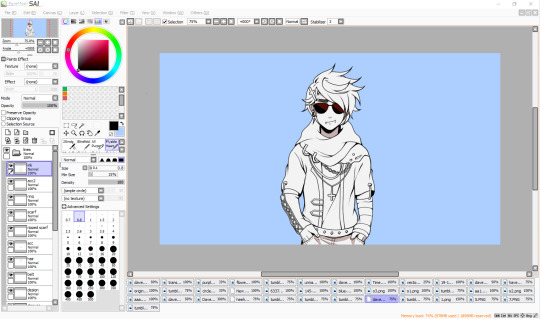
5.8 A completely optional step, but my favourite since I love lining. What I usually do, so that the lines look smooth(er), and more precise with the style, is that I ink it a bit to create line width variation in certain parts of the sprite, and also to create shadows.

6. Finally on colouring- I’m probably numbering all this shit wrong, but you know what, I sucked at math. Anyways, colouring- figure out your palette, and basically base colour parts of your sprite. The blackish part on the shirt is an airbrush texture.
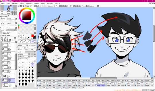
6.1. Tip: If you’re using dark greys or blacks, I’d recommend just picking the exact shades from other PQ sprites so they’re all??? Idk, the same? To put it simply??? Yeah.
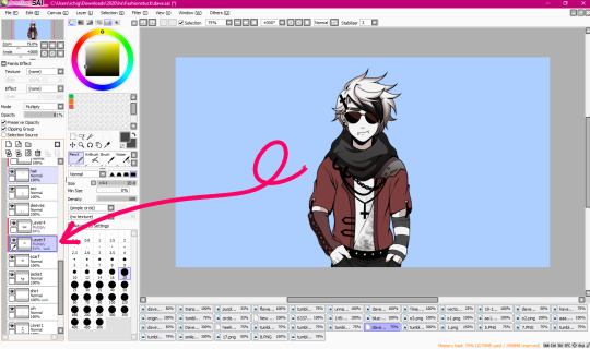
6.2. Shading is- another probably basic thing, but I’m explaining my particular process, but how I go about shading is by making a clipping layer over the layer I’m currently shading on to ensure that it only colours on that part. Then, I put it on multiply, and then toggle around till I get a good mid shade. To each their own, however, these are just my tips and tricks that I use personally.
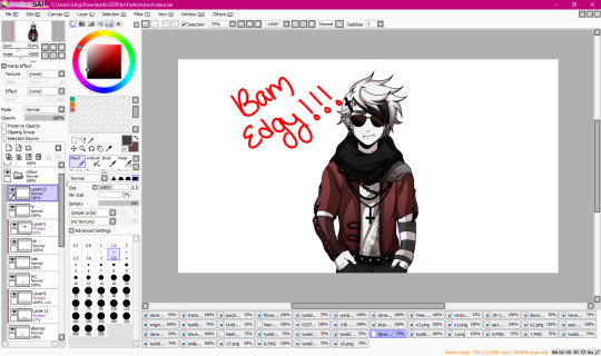
6.3. And after you’ve shaded your entire piece, you’re done! Yay, he’s edgy now!

6.4. Though I did make my end sprite with a texture, and for SAI users, it’s relatively easy. Just open the png file of your sprite so that all your layers are in one and it’s a happy pic, and then go to to the textures drop down menu and select your texture. For this, I decide to use the grunge texture. I also used this texture on my Derse Prince edit, and I used a TV screen texture on one of my Hal edits. I don’t know if texture packs come with other art programs, but if they do, just experiment and see what you like! It’s not obligatory, but it’s a nice touch for some edits.

Other than that! We’re finished! I hope you enjoyed- apologies if anything said was over complicated haha ;;.
#mod karkat#kk edits#sprite tutorial#homestuck sprite edit#homestuck sprite edits#pesterquest sprite edit#pesterquest sprite edits#homestuck sprite tutorial#pesterquest sprite tutorial#homestuck edit#pesterquest edit#dave strider#im not mass tagging this im lazy;;;;;#also that carpel tunnel is kicking in lmao
183 notes
·
View notes