#it was by no means saturated dont get me wrong
Explore tagged Tumblr posts
Text
cupboard Finally cleaned up from our 'vacant apartment leaks water through entire building' adventure. some of the 1970s press-board Definitely warped, and i gently wiped the whole interior down w/ clorox wipes and gave the water stains a spray of lysol Just For Fun. i put down new liners, too, bc what the fuck im already in there so i might as well
next on the list is rewashing our entire mug collection, getting the rest of the dishes done, and disinfecting the entire bar and the half of the kitchen exposed to Mystery Apartment Water
#i waited until my day off so i could do it in bursts#and ALSO so i could make sure that cupboard had 1000000% Completely Dried Out#maintenance was like 'its fine! nothing structural was damaged it attaches at the ceiling :)'#but like bestie..... All My Mugs Go In That Cabinet#and the water leaked from the ceiling down the back of the pressboard and through the bottom#it was by no means saturated dont get me wrong#they got the leak fixed fast enough i only had Three Water Leaks in my apartment#but again. pressboard cupboards. from the 70s.#im not risking our entire mug collection (several of which are irreplaceable or gifts) on a Hunch
3 notes
·
View notes
Text
My Favorite Cheap Art Trick: Gradient Maps and Blending Modes
i get questions on occasion regarding my coloring process, so i thought i would do a bit of a write up on my "secret technique." i don't think it really is that much of a secret, but i hope it can be helpful to someone. to that end:

this is one of my favorite tags ive ever gotten on my art. i think of it often. the pieces in question are all monochrome - sort of.
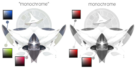
the left version is the final version, the right version is technically the original. in the final version, to me, the blues are pretty stark, while the greens and magentas are less so. there is some color theory thing going on here that i dont have a good cerebral understanding of and i wont pretend otherwise. i think i watched a youtube video on it once but it went in one ear and out the other. i just pick whatever colors look nicest based on whatever vibe im going for.

this one is more subtle, i think. can you tell the difference? there's nothing wrong with 100% greyscale art, but i like the depth that adding just a hint of color can bring.
i'll note that the examples i'll be using in this post all began as purely greyscale, but this is a process i use for just about every piece of art i make, including the full color ones. i'll use the recent mithrun art i made to demonstrate. additionally, i use clip studio paint, but the general concept should be transferable to other art programs.

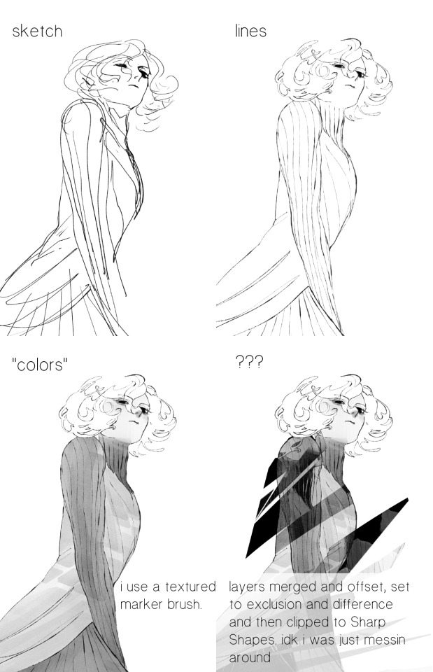
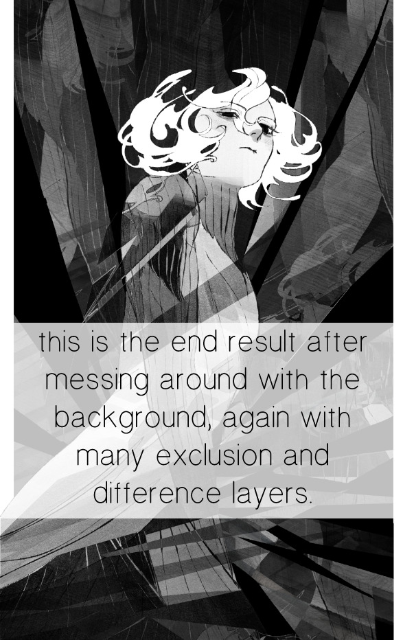
for fun let's just start with Making The Picture. i've been thinking of making this writeup for a while and had it in mind while drawing this piece. beyond that, i didn't really have much of a plan for this outside of "mithrun looks down and hair goes woosh." i also really like all of the vertical lines in the canary uniform so i wanted to include those too but like. gone a little hog wild. that is the extent of my "concept." i do not remember why i had the thought of integrating a shattered mirror type of theme. i think i wanted to distract a bit from the awkward pose and cover it up some LOL but anyway. this lack of planning or thought will come into play later.
note 1: the textured marker brush i specifically use is the "bordered light marker" from daub. it is one of my favorite brushes in the history of forever and the daub mega brush pack is one of the best purchases ive ever made. highly recommend!!!
note 2: "what do you mean by exclusion and difference?" they are layer blending modes and not important to the overall lesson of this post but for transparency i wanted to say how i got these "effects." anyway!
with the background figured out, this is the point at which i generally merge all of my layers, duplicate said merged layer, and Then i begin experimenting with gradient maps. what are gradient maps?
the basic gist is that gradient maps replace the colors of an image based on their value.

so, with this particular gradient map, black will be replaced with that orangey red tone, white will be replaced with the seafoamy green tone, etc. this particular gradient map i'm using as an example is very bright and saturated, but the colors can be literally anything.
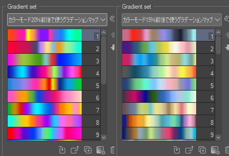
these two sets are the ones i use most. they can be downloaded for free here and here if you have csp. there are many gradient map sets out there. and you can make your own!
you can apply a gradient map directly onto a specific layer in csp by going to edit>tonal correction>gradient map. to apply one indirectly, you can use a correction layer through layer>new correction layer>gradient map. honestly, correction layers are probably the better way to go, because you can adjust your gradient map whenever you want after creating the layer, whereas if you directly apply a gradient map to a layer thats like. it. it's done. if you want to make changes to the applied gradient map, you have to undo it and then reapply it. i don't use correction layers because i am old and stuck in my ways, but it's good to know what your options are.

this is what a correction layer looks like. it sits on top and applies the gradient map to the layers underneath it, so you can also change the layers beneath however and whenever you want. you can adjust the gradient map by double clicking the layer. there are also correction layers for tone curves, brightness/contrast, etc. many such useful things in this program.
let's see how mithrun looks when we apply that first gradient map we looked at.

gadzooks. apologies for eyestrain. we have turned mithrun into a neon hellscape, which might work for some pieces, but not this one. we can fix that by changing the layer blending mode, aka this laundry list of words:

some of them are self explanatory, like darken and lighten, while some of them i genuinely don't understand how they are meant to work and couldn't explain them to you, even if i do use them. i'm sure someone out there has written out an explanation for each and every one of them, but i've learned primarily by clicking on them to see what they do.
for the topic of this post, the blending mode of interest is soft light. so let's take hotline miamithrun and change the layer blending mode to soft light.

here it is at 100% opacity. this is the point at which i'd like to explain why i like using textured brushes so much - it makes it very easy to get subtle color variation when i use this Secret Technique. look at the striation in the upper right background! so tasty. however, to me, these colors are still a bit "much." so let's lower the opacity.
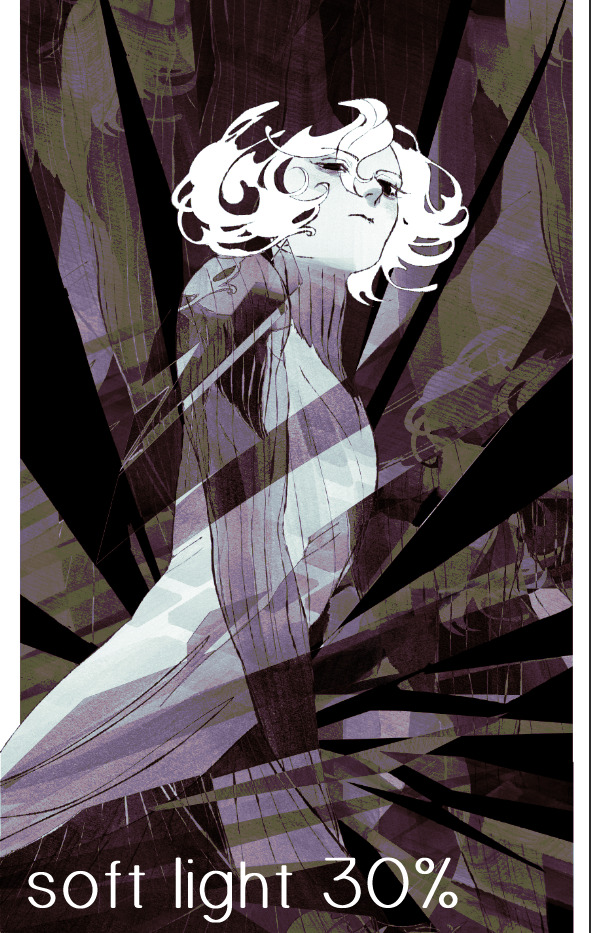
i think thats a lot nicer to look at, personally, but i dont really like these colors together. how about we try some other ones?
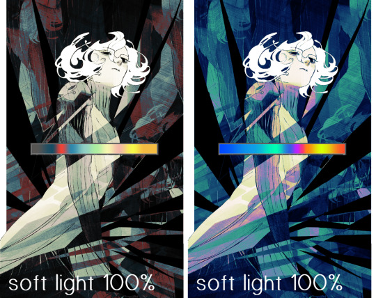
i like both of these a lot more. the palettes give the piece different vibes, at which point i have to ask myself: What Are The Vibes, Actually? well, to be honest i didn't really have a great answer because again, i didn't plan this out very much at all. however. i knew in my heart that there was too much color contrast going on and it was detracting from the two other contrasts in here: the light and dark values and the sharp and soft shapes. i wanted mithrun's head to be the main focal point. for a different illustration, colors like this might work great, but this is not that hypothetical illustration, so let's bring the opacity down again.
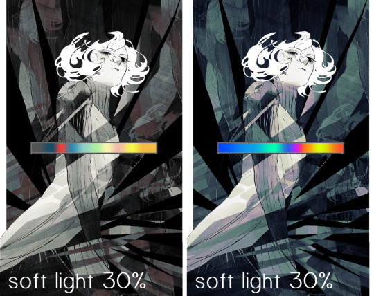
yippee!! that's getting closer to what my heart wants. for fun, let's see what this looks like if we change the blending mode to color.
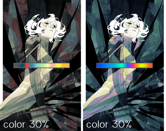
i do like how these look but in the end they do not align with my heart. oh well. fun to experiment with though! good to keep in mind for a different piece, maybe! i often change blending modes just to see what happens, and sometimes it works, sometimes it doesn't. i very much cannot stress enough that much of my artistic process is clicking buttons i only sort of understand. for fun.
i ended up choosing the gradient map on the right because i liked that it was close to the actual canary uniform colors (sorta). it's at an even lower opacity though because there was Still too much color for my dear heart.
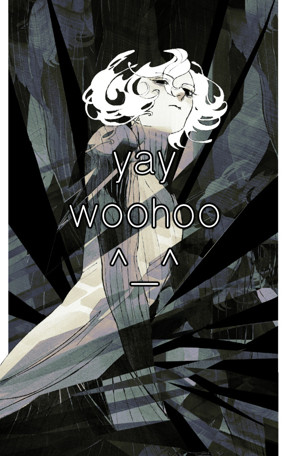
the actual process for this looks like me setting my merged layer to soft light at around 20% opacity and then clicking every single gradient map in my collection and seeing which one Works. sometimes i will do this multiple times and have multiple soft light and/or color layers combined.
typically at this point i merge everything again and do minor contrast adjustments using tone curves, which is another tool i find very fun to play around with. then for this piece in particular i did some finishing touches and decided that the white border was distracting so i cropped it. and then it's done!!! yay!!!!!
this process is a very simple and "fast" way to add more depth and visual interest to a piece without being overbearing. well, it's fast if you aren't indecisive like me, or if you are better at planning.

let's do another comparison. personally i feel that the hint of color on the left version makes mithrun look just a bit more unwell (this is a positive thing) and it makes the contrast on his arm a lot more pleasing to look at. someone who understands color theory better than i do might have more to say on the specifics, but that's honestly all i got.
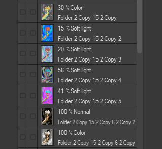
just dont look at my layers too hard. ok?
2K notes
·
View notes
Text
some v5/site spoilers. just my general thoughts LOL
holy shit the new site absolutely FUCKS it feels so. Alive. also the new volume so far kicks butt i love that uni actually got her gamer speech back 🫡 🫡 not to mention the art in the epilogue like. Got damn ! that shading makes my brain itch. AND A NEW CHARACTER HELLO????? actuslly holy ahit thinking of it i think that's like. reboot bonez. like barry's original love interest
i saw the site on mobile and honestly its SO much more accessible now and refreshing. i will probably check it out on pc later though
im so glad we got pretty much Every Single Character in the cast page now even the minor ones because I've been ao curious about them and we knew jack shit of them unless you check tumblr every fucking day. so thats one hell of a good change. the animations and icons also help bring the characters more to life and DOES kc animate well. seriously I can't emphasize enough how much i loved the cast pages they were so fun to read and skim through !!!!
im also glad kc explained the backstory of hemera and barry so the fandom doesn't shit on them for no reason. in this economy we live in we get barely any characters who react to trauma in ways that are considered bad or harmful/through anger 💔
the content warning thingamajigs and saturation bar is also rly handy so i dont get a content warning every 2 seconds
OK gushing over let me talk about some neutral/negative things imo. these are not just related to the relaunch but just. the comic in general
alright so this is basically just nitpicking but there are So Many Fucking Lesbians. nothing wrong with being lesbian i am one myself LOL but literally more than half of the frmale-aligned cast is a lesbian which kinda sucks a bit because. yknow. wheres the representation for other identities
also yeah. all the other crit blogs u were right unis definitely getting really fucking babified. girl has no fuckin flaws or anger or anything of the sort shes just an innocent uwu cinammon roll . head in hands
and my biggest nitpick of all. Cuddles. yeah he's the big bad villain but. he's so cartoonishly evil man. like in his bio it basically states every single bad thing a human (anthry?) person can do and it's just so hard to take it seriously im sorry. like it blatsntly states something along the lines of "there's no trauma or anything of the sort that led to him being like this" and im like. girlypop. thats not how people work. people just don't wake up one day and go "o fuck yea im gonna start hurting animals and torturing people and driving them to suicide and feel good doing it because i want to!!!!!!!!!!" like. No. Not At All. It's just not how shit works yknow. someone HAS to have reason to do shit like this and enjoy it, and not because they're big villain of the narrative and/or because the creator said so. hell BOWSER has more depth than cuddles. bowser is a hopeless romant. he's power hungry and constsntly soing risky, dangerous, or just over the top shit because he wants peach to love him and because he wants to earn respect amongst his people. and he also has a soft a side, being a father and even sometimes helping his arch nemesis whenever someone stronger than him appears and he doesn't want to lose respect, and evn though he does this to feed his ego, he ends up accidentally helping others in the process
.......okay sorry i did not mean to go into that bowser rant i just really like him Oksy. but my point is that just bowser is a character from fucking nintendo and is really cartoonish and yet has more depth and reasoning than the main villain from a webcomic about medical malpractice and trauma. the way cuddles is written overall just gives off vibes of a kid who doesn't actually know how to write stories and assumes the villain has to be the Big Bad for no rhyme or reason
but. overall. i can tell kc and the z//cp staff worked their asses off to get this volume and site done and did they hit the nail right in the head. excited for whats to come
thank u for listening to my thoughts gamers
ps. sTOP LOOKING AT ME WITH THAT SHIT EATING GRIN DORITO HEAD
13 notes
·
View notes
Text
ok lets see how far i can go. im gonna startt. kim just gonna start.
fair warning this will either seem like incoherent rambling because my thoughts are hard to formulate or just me wanting to be rude about the sequels past we love katamari despite never playing them (i wrote this line after i finished the whole post)
anyways im about to list alot of king's outfits over the games and then rate them on 1) whether i like them personally (partly removed from context), and 2) whether i think they actually fit king. im doing this for absolutely no fucking reason and honestly im scared ill be very wrong or biased but im mnot being paid to do this for gods sakes im writign a tumblr post. i wont get cancelled for getting king incorrect. anyways
katamari damacy

(im probably going to switch between using game screenshots and transparent images)
1#: yeah i like it. he looks stupid and i like it. the cape and whatever the collar is called, in combo with the chain and gold accessories looks so silly. he doesnt look like a king besides the crown. he looks like he wants to be cool but doesnt know what that means but he knows nobody will question it cuz hes the king after all.
headdress: perfectly over-loaded. you have way too much going on. you dont need those blinking lights. and you really dont need those patterns and colors. can i try it on
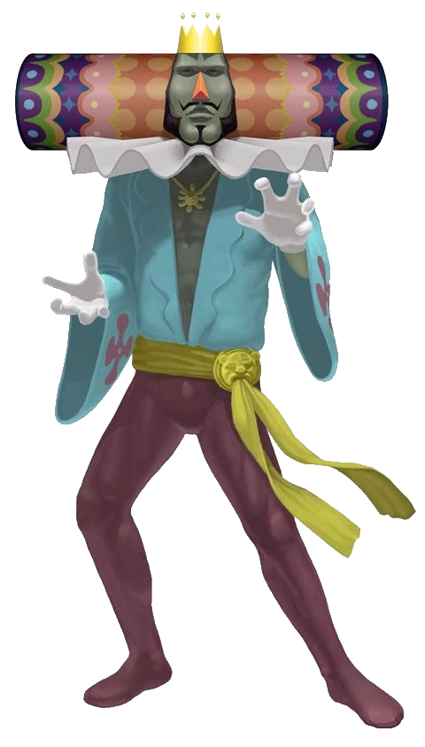
2#: well its hard to say since this is the first one. and of course the first one fits him cuz. its the first one. but i think it gets his impression off very well. its a prussian blue v neck and a golden chain, with sort of maroon tights and a golden belt with the face of a lioness. bracelets and rings, and of course the triangle ruffle collar and purple flower pattern cape. its a mixed warddrobe, kind of silly, i think it works well with how you cant really take him seriously, too. rude and hurtful, yet also he. dresses like this. a kings crown, cape and collar, but his personal style underneath it. also expresses how he may be king, but hes not really taking that as being his role - rather, being himself means to be king. or being king is like, a side thing, not as important as just doing what he wants. maybe a bit of a reach, dont know if i managed to explain what im feeling properly... also, his actual clothing besides his headress isnt actually complicated, which is an interesting contrast. you would think he wants you to pay attention to his face, and not his body. he is egotistical, it makes sense that he wants you to look at him and pay attention to him in general, but the emphasis on his face is interesting.
headdress: absolutely fits. very extravagant in a way that works. the colors arent bright as hell either, which im glad they did because if they were neon and too flashy itd look too obnoxious. well itd look bad but also hes not about exactly "standing out". he loves attention, but he still has his style, and that style IS colorful, but not neon. i think it fits him well, it teeters on being over the top and subtle at the same time, like complex embroideries perhaps
we love katamari

1#: also like it. has the same color scheme of blue top and magenta purplish bottoms. though here its a bit less saturated and lighter in color. the flowers on the sleeves are a nice touch since hes no longer wearing his flower cape, and the golden ankle ring, as hes wearing nothing on his hands but his wedding ring.
headdress: neat!! i like this more than katamari damacy, but just because its kind of cute. well i like them both, but this one is easier to draw (lol) and the color scheme is nice. the lights are now flashing from the spaces of color, instead of looking like round lightbulbs, if that makes sense, and it seems more casual this way, somehow.
2#: it kinda fucks me up. but judging king in we love katamari, from how different he is compared to katamari damacy, this outfit seems kind of perfect to showcase how (almost eerily) laid back he seems to be in we love. his ruffle collar is now smoothed out, its wiggly instead of sharp. hes wearing a very wide sleeve light cyan top, a purplish flower on each sleeve, with a squiggly cut on the lapel, open to reveal his chest and a golden chain, with a piece that looks perhaps like a flower attached to it. he now has a band wrapped around his waist instead of the golden belt, with a golden lioness head piece holding it in place. lighter wine color tights. its so- i dont know. king starts off obviously excited at the fanbase and attention hes getting, so its curious he puts down the iconic outfit and gets into something so comfortable. he wants to stand out less, all of a sudden. its still very much a king outfit, but he dropped so much, i wonder why. hes laying back as usual to let prince do his work but hes really leaning into it now. not just that, but he seems almost less hurtful than katamari damacy. more open. hes still full of himself, but its toned down, muted. his occasional interjections talking about his childhood and papa are offputting in the sense that its unusual. and this outfit is unusual, too, in comparison. katamari damacys impression is that hes pompous but a bit silly (and also just a dick), we love katamaris impression is that hes egoistic- but aimless. he seems more forgetful and more lost in thought. the cape missing could also be symbolic of his openness, even if a bit cheesy. i noted that his cape might also hold some emotional weight similar to the crown, but thats based on my feelings.
headdress: reflects the casuality. its got a smaller color palette now, less patterns, and more flat spaces of color. reminds more of his headdress patterns in his childhood. its also longer now, but i dont have anything to add for that.
me & my katamari

this is where i start to get a bit iffy in general. the games are no longer directed by keita, and king doesnt actually progress any. he stays the same or changes purely because different people are writing his dialouge. me & my katamari seems to have no story otherwise, or cutscenes, even - so from here on i suppose i do get biased but there isnt much character to go off of. however- i did not play any of the games besides the first two, so i am watching gameplays.
1#: i think its alright. i dont really like the combo of colors, it feels weird with the super yellow thin cape, but it is a swimsuit style thing. i wish they changed the collar, though, or outright removed it. it feels wrong to be in there.
headdress: ehh too neon, doesnt help with colors.
2#: this is. alright, its ok. the swimsuit is relatively simple too, thought the yellow cape doesnt seem like something hed wear, especially since its supposed to be a swimsuit- a cape would make it very hard to swim, though kings zaniness could get him to wear a cape if it means looks over functionality. it isnt his normal cape of course, though im a bit sad the flower pattern is entirely missing here, or even a hint of it. instead its a swimsuit.. something... with wine and orange, and what looks like a necklace. its not a necklace exactly, but i dont know the name for this. its also got a lioness head. i dont really get the golden armband around his left arm, but eh. i think its passable overall but straying further from kings personality, though given he is just like. having a splash and having fun. and it is skin tight, which isnt really that important, but its not swimming boxers or something. swimming suit still with a touch of decency. i guess it wouldve been repetitive if this one also had a v cut, but to continue onward from we love katamari, if it had to be real casual and open as a sort of conclusion to we love katamari, i could imagine something similar to this swimsuit, but its a one-piece that covers his legs and chest but leaves his arms free. idk though. i also added this bit in an edit, so now im starting to think about actually sitting down and redesigning it, but im uh. not able to rn. and you cant save edits as drafts. oh well.
beautiful katamari

1#: really very stupid looking. i think the sleeves and puffy pants are very funny but boy i dont like this. dont really like the colors. id try it on myself tho. again, with the wiggly collar- this straight up just doesnt change in all games after we love katamari.
headdress: meh. not a big fan. its getting a bit boring now.
2#: not sure what to say. king wouldnt wear this. its really not his style. it looks more like a jesters outfit, and the lack of shoes makes it look even stranger. the weird random opening that shows a bit of his stomach is also a bit nonsensical, alone in terms of how the hell this piece of clothing works. the pants are too puffy- stripes arent something that make sense as a pattern for him. and the whole theatrics thing, with king talking to you from behind curtains he opens up, on a stage like background, feels out of character. hes not one for theatrics (literal). he likes admiration but he performs by showing off what he can do physically, not through theater or a play. not that its said he does, but the theater bit is just weird. doesnt fit him as a character.
headdress: in combo with the outfit it just doesnt make much sense, it doesnt really harmonize. its alot of shapes and colors, but not with much consideration. the colors seem to be random. the headdress and outfit are kind of at equilibrium with how much they catch your attention. obviously the headdress is more saturated and in game it has blinking lights, but you do have to look longer at the outfit, and it kind of sticks out with how it seems like such a weird pick for him. also it is just kind of a silly looking thing. maybe im just looking too hard though.
also ill b real im just getting more mad at the gameplay. the physics are missing and the katamari feels way too fast and responsive, which is frustrating me, and the game is basically back to basics with you and king and nobody else, which makes kings lines disappointing, but once again, i handle watching a game and playing it differently, and i already have bad feelings about the sequels besides we love katamari as they arent directed by keita, and king is such a specific character. the gameplay part is irrelevant though but it is making me want to watch it less. lol.
katamari forever
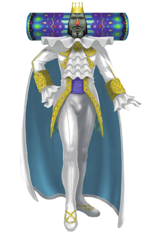
1#: curious! i like this outfit, removed from context. i cant say i like it as a king outfit at all, but i just like this type of outfit. fucking. no idea what that thing hes wearing at his collar is called but i have a little soft spot for that thing. hehe. dont care that its a king outfit though.
headdress: i like the colors! its mainly blues, purples and greens, but i like it. the patterns work fine for me. still boring though.
2#: this is hard. katamari forever has a bit more substance, but the whole plot literally is that king loses his memories. though he IS wearing this before he loses his memories. he has dialouge as he has levels, but technically, roboking is the main character in this. doesnt really matter, you can choose between either of their levels at free will i believe. thissss outfit is. sssssss. i dont know. the direction its taking with the fancy dandiness isnt out of place for *a* king, but it is out of place for *the* king of all cosmos. his suit and whole shebang being so bright is incredibly juxtaposed to his comfy darker pallette of katamari damacy and we love katamari - yet hes still the same character? hes not changed. he still belittles prince for low scores and small katamaris, still pretty egotistical. his outfit doesnt reflect anything on a deeper level. if anything just reflects a change in taste, but thats really not that interesting. theres cutscenes (finally) but these say nothing as hes asleep in those cutscenes. so theres nothing more to pull out of that. his responses to low or high scores seem to be mostly the same, and rather short, to be honest. when he requests something, its also pretty short. theres not alot to take out of that.
touch my katamari
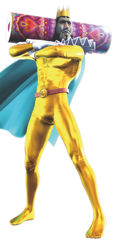
1#: scared. scared of touch my katamari. i dont like this outfit but also i just dont like kings 3d model. like i dont need to tell you his face his scary and uncanny looking. its not that bad in this image but if you see even one closeup of his face its just. uncomfortable. his collar is sharp and triangle-y again, though.
headdress: i like the hearts hehe. thats about it though. dont like the fabric overlay over the texture, was kind of unnecessary. i want to spare you from looking at a closeup of the kings face though.
2#: man i dont know bro
im also getting tired and Hooo shit look at the time. i know i shouldnt do these things but you know how it is. i dont know why i did this, to be honest, but i just felt like talking a bit. my mind is a little too full on things around the cosmic family(s) and im already thinking more about queens family. oh well. i have no idea whether to tag this. i suppose i would conclude it here, despite the indeed dry touch my katamari review... this is just my little thing for me. im sure if i tag it with the katamari tag Nothing bad will happen. im going to sleep.
extra:
THIS IS AMAZING KATAMARI not tap my katamari. you can see the edge of the title literally right there in the image but i was too distracted by their whismy.

queen ❤️
amazing katamari is just a mobile endless runner so theres no story but i will say: i like this! its cute! its simple, and a combo of the katamari damacy and we love katamari outfits. yea its not special, but its ok! though again with the collar... would've liked if they kept either one or the other collar piece. but thats about it, no deep analysis. i just think this render and art style is cute in general, so exclude this from the review. headdress is neat too. again nothing special but atleast it isnt so neon, mainly pinks purples and blues. completely taking it as being cute art though.
bonus AGAIN:

roboking. there will be no outfit review its just king but robo. hes also an entirely different character anyway so an analysis doesnt make sense. but i like that his belt looks stupid and his colors go pretty well, purple yellow blue. and that his eyes are always angled down. i just like robots. all im putting him here for is to say i think his pathetic self is entertaining and i kinda wish katamari forever was better. it couldve been good. but yeah ending this off with sad little roboking. thanks for reading. bye bye
25 notes
·
View notes
Note
What color do u associate with each member of the duck/mcduck/coot family? All of em :D

picked out some specific colors for some characters but for some of them (like characters that dont appear that much) it gets more vague. for characters in black it means idc abt them sorry
HDL are their main dt17 colors, Della is the color of her scarf and Donald is a dark blue to me (bc black+blue, lol (and his hat))
Green as a whole fits Gladstone (and red with Fethry) but i feel like more saturated versions of that makes sense. DT17!Gladstone specifically is a paler green. Because Fethry's red i made the rest of his family red ¯\_(ツ)_/¯ Daphne is yellow because i associate her with her hair, and Goostave is blue (to make Gladstone green) and desaturated because.. hes a very serious looking guy
also AMJ are their lottc colors because that was the first time i met them!
for the most part these are vibes based tho. and probably wrong. anyone is free to add on with what colors they associate the characters 👍
#ask#duckverse#webby is mspaint pink to me but thats probably just cuz its close to her bow color and thats how i doodle her LOL#thinking about it and looking at my dt47 designs would probably give u the colors i associate with the versions of them in my head LOL#plant talk
11 notes
·
View notes
Text
The more i see people looking at new pieces of art n immediately going "oh think of the shipping potential!" The more I wanna give all aro people in my life a dollar for having to put up w/ this shit
I do not have enough dollars for this but you get what I mean?
Ship stuff feels so inescapable like people will only see characters as potential love interests w/ 0 other interesting look into their relationship or dynamic or anything else w/ their character aside from the ship
Like i just saw some gifs for some animation I havent watched that looks cool that 0 even slight romantic implications or chemistry n OP was excited about yaoi potential
N im jus
Idk man I'm tired
Dont get me wrong! I love shipping and i am not immune to some fun romance stuff but its so Saturated it just gets exhausting sometimes, yknow?
10 notes
·
View notes
Note
i just want to say. i really love your art so much .your art style is the kind of art style that id have to work really hard to divert from how i normally draw to achieve, and to think that the way u draw is just your natural way of drawing amazes me so much. the figures you draw have so much form to them. theyre not smooth they look like theres fat clinging to their muscles and skin over thatfat. i want to say that they are unattractive like they dont look polished and clean they look like regular people but that quality is what makes your art attractive to me so its a bit paradoxical.
its not just your art though youre a really good fucking creator overall. all of your projects are so well visualised and i love how much you pay attention to smaller details its really obvious that you have a talent for good writing and that youre smart and you have good stories and good ideas. your art is inspiring your games are inspiring. youre a really good creator and a good artist and everything you make is of such a high quality. theres a lot of nihilism with art online people think digital art is saturated butthat shit doesnt apply to you because you are completely one of a kind. youare so talented man and you are so cool if i wasnt poor id be paying you money just to be alive so youcan draw more
so thank you so much for the art you post it actively makes my day better everytime i see it. i hope you never stop drawing and creating because your art is some of the best ive ever seen and everyone is better off for having it in the world. and i hope things improive for you and stay good for ever. and um . oh fuck i cant attatch images. i draw a haruka of yours i thought u might like to see :) sorry for mucho texto i gots carried away
this was hard to think of an answer to. But i wanted to say thank you, genuinely thank you. This was extremely sweet and really uplifting to read. It was easy for me to sink into a really bad funk due to so much in my life going wrong, that I just stopped working on any of my projects. I'm trying to encourage myself back into creating what I used to really enjoy doing, and I think im slowly getting back to that. Messages like this help a lot. I never thought I'd be considered one of a kind, and that positive feedback is almost hard to accept right now, but I'm gonna try. You're an extremely kind person and I really needed a message like this, so thank you. And if you have any pictures you'd like to show me, I guess you can reblog this and attach it there. Thank you in advance for any art you've drawn of my concepts. it means a lot. Genuinely, it means so much.
27 notes
·
View notes
Note
i feel the need to say first and foremost that this is not about anything in specific, just some of my thoughts on this fandom
i dont come here(cookie run fandom) anymore because I honestly feel this fandom is too agressive and has Lots of problems
i understand some part of the aggressiviness comes from trying to make things better(sometimes) and maybe there are times that its needed, but it started to get too much, too normalized and saturated.
and i have never been a target to this type of thing, not at all! but ive seem how this fandom treats people that did something wrong once(and didnt even try to explain it to the person!) or someone that was trying to discuss a serious topic and said a opinion that not many people shared, for example
im not talking about people that groomed someone or was racist, no, im NOT defending this type of people, im talking about people who did things that couldve easily been dealt with by talking and explaining or just having some RESPECT FOR THE OTHER.
this. kinda of scares me! this fandom is too aggressive! and I know this isnt going to change anything, but I mainly made this ask in hopes i could take somethings out of my chest
(my first language is not english + im still learning, so some of the meaning i was trying to put in the phrases may not come through or be the same as i intended, sorry about that!)
ㅤ
#fr#cookie run#crk#cookie run kingdom#crk fandom#cookie run fandom#cookierun#cookie run community#cookie run confessions#cookie run kingdom fandom#cookierunkingdom#anon confession#confession#cookierunconfession#cookierunfandom#cookierunconfessions#cookie run ovenbreak#crob#crob fandom#crob community#cr kingdom#crk character
8 notes
·
View notes
Note
I don’t understand why fans need Tom to be A-list. He doesn’t even seem to want that for himself. He doesn’t go to any events, he doesn’t take any brand deals, he just does his work and goes home lol Let him be for goodness sake 😅 There are plenty of actors with great careers who are not A-list. He is still very young, his career will always be evolving.
I'm sorry to be this blunt on your blog destiny, but what the hell is this anon saying? Who in the world works in any profession and doesn't want to work to be at the top? Of course, Tom wants to be and is working to be the best in his industry.
When Serena was playing tennis, did she not want to win her set?
When England was playing in the euros, were they not aiming to win the tournament? They lost, but the aim was there, no?
I dont remember the last time Timothee went to a chanel fashion show, but he was recently an ambassador and got paid more than any actor or influencer who gets invited to Loewe lol. Even Austin with YSL, correct me if I'm wrong, but when was the last time he went to a fashion show? He didn't need to. When you are an a-list actor, you don't have to be in the trenches by heavily saturating yourself in the public to make a name for yourself. It's why Z wears archival despite being an LV ambassador.😭
Anon, idk if you've been following Tom long or not, but Tom himself has said that his priorities have long-since changed for his career.
He has mentioned before how back when he was getting a lot of fame for playing Spiderman, he came to LA with stars in his eyes (like many people lol) and dreams in his mind of becoming the biggest most successful young movie star in his age bracket. He was even seriously considering uprooting from London and moving to LA (I think Nikki put a stop to that rofl 🤣).
He then quickly realized (probably due to EXPERIENCE 👀) that being super famous isn't really all what it's cracked up to be. 🥴
As crazy as it sounds, not all actors want to be "movie stars". Some actors just want to ACT. Like, acting is seriously their passion. Some actors just want to make good movies and then be able to just chill and not have to deal with the craziness that comes along with a lot of fame.
You can't (imo) really measure acting and compare it with playing a sport. With acting, you're not really supposed to be competing against anyone but yourself. Are YOU growing as an actor? Are YOU improving? Are YOU feeling fulfilled? Are YOU making the movies that YOU want to make?
Some actors, are perfectly happy not really being in the limelight. It doesn't mean they're not successful.
Tom has said that now all he cares about is making movies with good people that he loves and cares about. It's less about being the biggest actor or being the "next Tom Cruise" for him, and just enjoying what he does. 🙂
I think a LOT of actors feel this way tbh. SOME actors of course want to be a movie star (I think Glen has been pretty honest about wanting this), but other actors just want to work with great directors, a great cast, and a great script. They just want to do the stuff they grew up watching and loving. It's not so much about being the "best" or being the "biggest star". Some actors, like Austin for example, just want to finally be able to get the chance to do the type of acting work that they've been dreaming about doing since they were young, instead of constantly being typecast or pigeon-holed. 🤷🏾♀️
I just don't think it's fair to claim that the Anon was wrong in her assessment, or that Tom is somehow not successful.
I personally think that Tom is doing just fine, and must be doing what he wants to be doing!
5 notes
·
View notes
Note
is there going to be smut in any of your upcoming works? youre so good at writing it i miss it sm
hi love, thank you so much for the compliment and enjoying my fics it means the world💞
to answer your question, most likely not. smut is honestly hard for me to write, i wrote it in the past because thats what was popular at that time. plus theres a lot of amazing smut writers out here that can write those fics way better than i think i could. theres a lot of smut on this app (no hate!! dont get me wrong i like a good smut fic as much as anyone else, but its true tumblr is pretty saturated in smut content) so im sure you can find what youre looking for anywhere.
i like writing fluff, angst, and hurt/comfort fics the most so i think thats what im going to stick to for now. if that changes ill let you know!
4 notes
·
View notes
Text
fallout 1 rant
god i hate trying to find content of other people also struggling with fallout 1 but all you can see in comments is just people shitting on the person struggling bc "lol skill issue you're supposed to find this thing in x y and z how do you not know" when A-there is a ONE HUNDRED PAGE MANUAL to the game that's just... a literal walkthrough in place of a proper in game tutorial. but this manual is stylized in it's writing, is a pain to realize exists (i only discovered it on accident bc i was in the game files trying to fix a bug), isn't scanned properly (several pages are the wrong orientation or just off), and long as hell. If you had the physical copy back in the day, it made sense, it was something to read and skim while on the ride home from the store and the game downloaded. B-the game is buggy as hell. Some quests or obvious dialogue are broken bc of bugs C-piss poor in-game direction for the player. you NEED to have read the manual to get the most out of the game, or even play. i feel like the game relies on that so much to do it's heavy lifting the game itself suffers for it, in a way.
I'm really struggling with quests bc the quest tracker is shit. Local area maps gives you no info other than like.... a vague floor plan. The game wants you to barter with some random NPCs that aren't merchants at times just bc they want you to encounter the function.... but barter is slapped onto everyone, even when they have nothing. Choose the wrong stats or anything in the beginning? you're shit out of luck make someone new. Exploring a dungeon is exhausting bc lootable objects blend into the background.
Some stuff i've only discovered by chance, either in game or someone mentioning it in passing, or watching a streamer play the game and see him interact with stuff. You literally cannot play this game without some sort of outside help LMAO. if you could, congrats!
i've finally found a proper walkthrough i think that will finally help me. It tells info straight forward. My first time playing i couldn't even leave the vault without dying bc of bad resources bc of my bad build. I personally HATE builds and crafting one, so since then i've just tried only following examples. I think i eventually got out before but then I also couldn't figure out how to enter a location bc NOTHING WOULD SAY just click the lil green triangle in the game when you enter the green bubble (and even later when i tried looking up help). I've gotten the farthest i've ever gotten recently, after finally figuring out how to enter locations but god my own brain suffers from its own pitfalls. Took me forever to figure out how to even enter vault 15. reading dialogue HURTS bc my eyes strain against the saturated green text on dark green for so long. thats not just a this game issue tho it's also a problem for me in modern fallout games if the text is too saturated i will not read terminals and i try to spend the least amount seeing it. Also not a fan of the fat jokes against one npc but it's a product of its time and just another me problem.
sucks hard bc i really want to like the game but with everything compounded makes it such a boring slog other than like... the few easter eggs and fun encounters i came across traveling between towns. I'll probably end up relying on watching Jabo's playthrough of it but im gonna give it one last go. properly adjusted setting from the start and properly following a walkthrough. not gonna patch the game with a fan patch just bc i dont care about it enough to put in the effort LMAO
hopefully i can eventually enjoy the game properly myself this way on my final attempt. I wanna like the game and have fun so bad but i might just have to accept it's not for me.
jesus im glad i never actually streamed playing this game bc i would have just felt so insecure with all my struggling and it doesn't help just how *mean* fans of old fallout are. Not all of them, but it's sad how it seems like the nice ones are the minority.
i just hate struggling in games if i'm the only one playing. I'm happy to struggle with others in a multiplayer. struggling on my own is what i already do irl im not dealing with that shit in a game that's helping me escape lmao
as shitty as bethesda games can be, they worked several miracles getting fallout into a format that's just far more accessible, easier to get started and understand, and still make sense. Bethesda know best how to make a genre of a game just... more casual and easier to digest. Not everyone's cup of tea, sure, esp depending on the genre (not a lot of people like starfield but i love it. a lot of people love most space games and i hate them LMAO). New Vegas, everyone's beloved, i don't think would have been loved by so many if it wasn't bethesda general easy to consume format with og fallout creators (tho maybe just fallout 2). best of both worlds.
if bethesda didn't snatch up the IP, fallout would have died in the 90s LMAO. but sadly, i just think a lot of people would have preferred that. it is what it is. people be wildin.
6 notes
·
View notes
Text
human color is super complex because we have three different layers of melanin and genes that change the concentration of each type! and then our skin and hair responds to sunlight and environment by changing color even more, so every human is some combination of red, yellow, and black melanin, just like digital colors are a combination of red, green, and blue. << EDIT: i'm wrong, it's more complicated than that, sorry
it's a shame that we can't elegantly use the standardized color level or texture level descriptors for writing because that would make it easy, but you should ask hairdressers about this stuff because they actually know.

both of these examples in the OP are colors that will probably turn blonde very easily when exposed to sunlight (and also lift very easily with bleach) because they don't have much melanin in them. people will call them different things depending on the context. a kid in an all-white school with hair this color will get called brown-haired or light brown, in a more diverse community (or sometimes at the hairdresser) he would be called dark blonde or even just blonde. my partner has hair this color and reads as "a blonde" to most people, even though his hair isn't on its own particularly bright.
this color is also sometimes referred to as "mousy brown" but that usually has a negative connotation of plainness and, at least in my experience, usually refers to this level (level meaning how dark it is) of hair combined with an ash undertone (green) which produces a "grey" type of effect. and the people in the OP don't look ashy (green) to me.
some suggestions from the notes: "sandy" - totally possible but "sandy hair" is often correlated with a semi-melanin-deficient skintone (i dont mean regular white person i mean some variety of carrying the redhead gene) with very light eyebrows and freckles so keep that in mind
"ginger" - probably not, gingers are a type of redhead in most usages, some people use "ginger" as a catchall referant to redheads and some people mean a specific kind of redhead, but these two colors above look like non-redhead-gene (missing a layer of melanin) type people so I wouldn't call them ginger, even though that's frustrating because the literal color of ginger root with the skin still on it is very close to the pictures, for some reason the COLOR "ginger" is something else.
edit: "strawberry blonde" - no, strawberry blonde is specifically blonde hair with a lot of red in it, or a redhead with very low color saturation
color and especially human color descriptions are SUPER LOCALIZED to your personal experience, culture, and ethnicity so if anything i said above sounds insane to you that's purely a difference in lived experience and doesnt mean either of us is wrong!
i think OP would be completely safe with "light brown" or "dark blonde".


Assume you have not forgotten all descriptive words in your moment of need, and that you can speak this language. Regrettably, circumstances do not permit you to spend more than a paragraph scrupulously describing the effect of highlights, and the audience is not necessarily interested in the tiny specific variations of hair color in white people. WHAT COLOR. PICK ONE. GO.
9K notes
·
View notes
Note
You are welcome for the discussion <3 im just always glad to see st fans who are mature about sexual topics, and sometimes ill see stuff that makes me feel unwelcome as someone who reallyyy loves the sex appeal in the band/their music and it being a big factor of my appreciation of them. Im not actually offended at all by the term baby making metal and i get surprised by the vitriol people have towards the term. Art can be sexual but also be meaningful in manyyy different ways, i can appreciate the many layers of the music and ves's emotional vulberability in his art while also not acting like hes an infant who accidentally put sensuality in his music yknow (emphasis on SOME of the music, no im not saying atlantic or blood sport is sexy because just no)? I just feel like with how much personal attachment people have to the band (because yeah the music is SAD and ves has obviously been through awful things so i get being protective or being legit triggered by peoples hornier interpretations) things can get out of hand quickly in spaces ive observed in the fandom. Though perhaps ive just observed particularly bad places in the fandom in all fairness, im pretty new here and all having been listening to them for 2-3 months now. Tumblr doesnt seem too bad but ive seen stuff on twit that really angered me with the insults being thrown around and stuff that honestly seems infantilizing to ves (no, dont sexually harass him. Ive seen vids where people screamed "daddy" at him and.. ew. But like, i doubt hes offended by people having hornier interpretations on various songs as long as you dont get downright absurd and weird about whatever hes been through irl). Im rambling but i have Many Thoughts, genuinely didnt mean to have a long discussion but oops it happened. Thank you for discussing with me, kissing you on the mouth too (if youre cool with it of course lol)
If we're all in horny jail, Vess is the warden lol. Like he's the king of sexy fanservice and we're all just here soaking it in (darling? I think we've saturated 😳). To clarify my earlier answer, I loooooove me the sex appeal side of the music. It's just not why I'm a fan, if that makes sense. I'd be no more or less into them if Vess was fully clothed and decided to wear underwear for once (but I'm definitely not complaining about his current... attire loooool. don't search anything related to II on my blog it's embarrassing and I would be a total hypocrite to say that all sexualization is wrong.) It's totally normal to associate the music with sexuality considering, ya know, like a good chunk of his discography is sensual in some way. Bro literally wrote a song about vore as a romantic metaphor. If anything, it's a little unusual to insist that the music isn't sexual.
I'm not annoyed by any of the thirsting on a general level, just when that's people's only takeaway from the music (again, I would be incredibly hypocritical to take a hard oppositional stance lmao). But, that's also my personal opinion and not an objective judgement. I can't expect everyone that heard the summoning on tiktok to deep dive into the lore and discography, so baby making metal is just the only impression some people have lol. And that is okay no matter how I personally feel about it.
It's one thing to be a little miffed about booktok claiming Vess as their sex icon (referring to the reasons in the last ask), it's another thing to get huffy on his behalf about things that YOU'RE uncomfortable with. It's something that twitter fandoms overall seem to really struggle with. They're adults; if they were uncomfortable with contextually-appropriate thirsting, they can assert that boundary themselves. Again, I was in the dream smp fandom on twitter since 2020—the aggression with enforcing boundaries on the person they're a fan of is super unnecessary and, if anything, totally disrespectful as well.
In my experience, the Tumblr community tends to be a little older on average, so the discussion here is generally more mature and level-headed. Obviously you'll get a few dickheads in the bunch, but everyone here is pretty chill even if they disagree. The ability to articulate your thoughts in long-form text posts makes for a more rational medium for discussion imo. Honestly, twitter is a bit of a waste of time if you're looking for a positive, proper fandom experience. It's a platform optimized for rage engagement and echo chamber discussion, neither of which make for positive community building.
I'm starting to ramble and lose the plot a bit too lol. Also I am down to make out anytime anywhere. I'll bring the water bottles if you bring the toothpaste (nothing more intimate than scrub-a-dub-dubbing the chompers pre-smooch sesh 😘🩷)
#im gently caressing the folds of your wrinkly ass brain and placing the softest lil kiss on your brain stem#the neurodivergent urge to overexplain every single idea you want to share lol#elkkie is an opinionated little shit#<- new tag lets goooo#askkiel#anon.ask
1 note
·
View note
Text
HEY
i gotta know why do gbc games look like that you know the look. weird, dark-saturated colors, and light-desaturated colors. i think of it in terms of pokemon sprites. like,,, just go to the spriters resource and see what i mean BUT I GOTTA KNOW WHY!!!!! gbc games had like 8-bit color so why did they end up looking like ntsc-atari2600 colors. dont get me wrong, i love it. but why??? yk!
1 note
·
View note
Text

i wrote my response in the tags at first because this whole post is just buildup to my joke at ULTRA C but actually i wanna make something clear.
i am not talking about how good the art is.
i am talking about if the animated 2dmv manages to create an impact that is complimentary to the song or expresses the same emotions as the song in a way that is digestable and also more complex if you poke around a bit.
RAD DOGS has amazing art. the art-based animation is fucking fantastic. Rella is an amazing artist, i dont want to take away from that. the everything else is iffy. there's about three transisions that are overly flashy, it's distracing when in-game (which, for these specific mvs, is important to consider!) and they're overused - when you're watching to try and judge the mv, you get sick of it pretty quickly.
RAD DOGS is propped up by Rella's artwork.
A more... egregious example of this is Jackpot Sad Girl, where the lighting and posing make it difficult to see anything (which i guess is the point but it doesnt make for a very effective mv) and it just feels cluttered, it lingers on the wrong things for too long and the good sections, i.e. where two members are singled out and placed in front of a glowing screen during the chorus, are done badly, i.e. there is a neon pink screen that is the most saturated thing in this mv and doesn't fit thematically, either. these are all problems i have with RAD DOGS. (ahem ahem akito turns the screen neon orange. it's literally more saturated than his unit colour i checked.)
RAD DOGS suffered from being an early game mv in the exact same way as Jackpot Sad Girl. it's the first 2dmv for vbs. it doesn't fit toya's vibe. it's just nowhere near as good as any other vbs 2dmv. play RAD DOGS and Forward side-by-side, and you'll get it - Forward is more than just art, animations and effects. (i mention Forward because it release earlier than RAD DOGS. however it released with a 3dmv which has a lot and i mean a lot of problems too, again these are most more egregious in another 3dmv, namely Newly Edgy Idols. vbs, overall, has pretty decent mvs in the early game.)
i'm not doing a full analysis of RAD DOGS. but it's a bad mv, compared to other vbs mvs. the fact that the only thing you mention on a post about the mv is the animation and artwork is either proving my point or showing that the proseka fandom has yet to seperate art from mv. you literally have mizuki and ena, they're seperate roles and you are directly told that they both take equal effort. if you can seperate lyrics from melody you can do this.
(for the record, i'd also rank ULTRA C pretty low. it's funny to joke that it's an acid trip but the mv is. not good. what the fuck? why? that's not symbology that's just symbols. why does brain have carbon-60 in it?/ref)
again, sorry if this was a little harsh. i dont mean to be, im just kinda a little autistic about this and it annoys me when people conflate it for something else.
og tag response below ↓↓
#prev i didnt mean that rad dogs is bad!! youre right its a great mv BUT it falls into the catagory of mvs where they couldve simply been#better if they weren't setting the stage for future mvs to be good. other such mvs are newly edgy idols and jackpot sad girl!#and yeah! the art is fucking fantastic as is the animation! thats mostly whats propping it up though#and im trying to judge the actual mv not the art included yknow? like i care more about whatever mizukis doing than ena! le motion!#crazy is that good BECAUSE of guu (the guy who did the mv). art's amazing but by itself its not much in comparison to other sekai 2dmvs#ofc this is my opinion. im not god this isnt gospel
vbs 2dmvs come in three genres:
RAD DOGS - suffered from being an early-game mv, didn't know what vbs mvs were supposed to be like. relies on animation and flashy transistions, but is better than just zooming in-and-out on the key artwork. (this one actually has two key artworks but whatever)
CRaZY - masterpiece. never feels boring, gets the point of the lyrics across in two languages at once, (the play of baiburu/bible always gets me) shows emotions fully, honestly one of the best mvs in the game. explores akito's relationship with every member of vbs fully, incl luka. i could talk for hours.
ULTRA C - arata gave the kids acid by accident and is currently scrambling to find ken before ken finds him
#ramblings#pjsk posting#i know noone will see this sorry for putting you on blast prev. no hate ofc not ur fault i didnt make stuff clear in my shitpost
468 notes
·
View notes
Text
2022 kpop wrap up
bro this year did not let up for a second
quick thank yous
wjsn chocome super yuppers thank you for making camp kpop again
fromis_9 dm was the first choreography i learned this year thanks for letting me be a sexy queen for a bit
taeyeon INVU music video was so aesthetically in sync with endwalker that it blew my tiny weed addled brain
pixy villain goth bitches rise up
twice celebrate yeah i cried when they renewed ok
dance class staples
viviz bop bop i didnt watch queendom2
ive love dive you already know
aespa illusion sluuuurp
b side spotlight
rocket punch in my world
red velvet bamboleo
purple kiss singles were ass but their bsides were gold
twice basics fuuuuck yeah dude
itzy racer vocal fry queens
wjsn done dont disband dont disband dont disband
fav post-izone project
i cant even tell you how much joy i get out of seeing most of the izone girlies thriving. yena, yuri, chaeyeon, and eunbi all made fantastic solo songs, wonyoung, yujin, chaewon, and sakura are tearing it up in ive and le sserafim respectively, and I even got peeks of nako and hitomi throughout the year. like, my tiny heart cant take it.
i loved eunbi in izone, i loved her when i watched produce 48 this year, and as a soloist in 2022 she absolutely impressed me. her icy voice and house instrumentals are just what i need and i thoroughly loved glitch and underwater
fav songs i changed my mind about
okay O.O literally had me by the throat until the let me be your super heroooo and then i lost interest. I think I had hit superhero mental saturation from existing on the internet for the last five years and hearing the word superhero was somehow the last straw & i was just like fuck this song. I was wrong dude. several months later, my bedtime edibles would hit and I'd be typing O.O into the youtube search bar multiple nights a week.
also
billlie gingaminga yo
I reluctantly got into boy groups this year
I got into kpop back in 2013 because the goth bar near me had a monthly kpop night. the bartenders were mean as fuck but made unbelievably strong drinks, and they would project the music videos onto a huge screen and my roommate and I would get sloshed and try to twerk to HyunA. It was a simple and beautiful time. but. the DJ who ran the event was such an unabashed EXO stan and we would spend half of the night drunkenly talking shit about her not playing enough girl group songs.
it makes zero sense for me to still have this chip on my shoulder, especially in a year where pretty much everyone agrees that girl groups dominated the industry, but I've been admittedly ignoring boy groups for the majority of my time as a kpop fan and it just started to feel unfair.
drag me for this but Blessed-Cursed got its claws into my brain. I was sick of not knowing what naega byeonhae meant. I liked doing the silly anime pose choreo during Thunderous. I'm like, vaguely aware of who the members of Seventeen are. wow. truly in my growth era. dont ask me about nct tho
who i'm watching for 2023
Fifty Fifty had a no-skip debut mini. higher is fantastic dizzying bubblegum pop, log in is?? cyber girl crush?? lovin me is smooth af, this mini is just so polished for a debut
CSR ohhh myyyy goddd are they filling such a sorely needed niche in kpop right now. I couldn't get into pop? pop the fuzzy effect sounded vaguely horror movie to me, but loveticon is wonderful I can't wait to see what they do next.
period
basically nothing i can say about these tracks, if you listen to them you feel the impact
le sserafim antifragile
ive after like
newjeans ditto
i hope 2023 is better for yall
kep1er good luck truly
itzy blink twice if you need help burying jyps body
loona unionize
closing thoughts
I got to see Twice play in new york and that was sick. thats all
0 notes