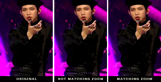
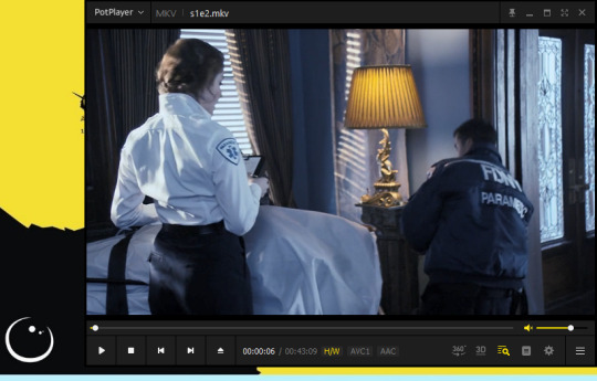
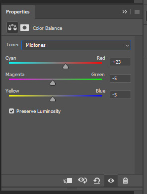
#it kinda... looked less yellow in photoshop
Explore tagged Tumblr posts
Visit Tumblr Blog
Explore Tumblr blogs with no restrictions, modern design and the best experience.
Last Seen Tumblr Blogs


Fun Fact
Tumblr Inc. has $15.1M in annual revenue.
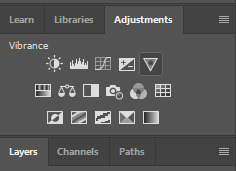
Photo
4 hours and 1 cigarette break study
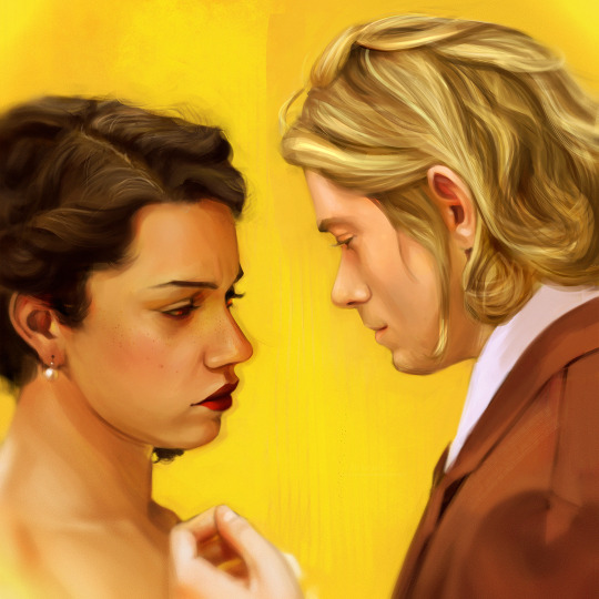
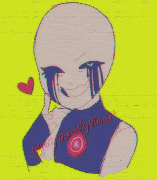
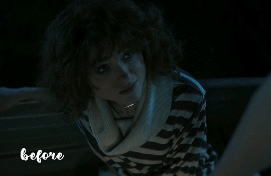
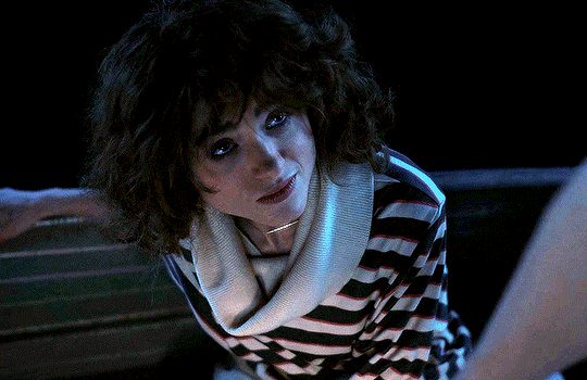
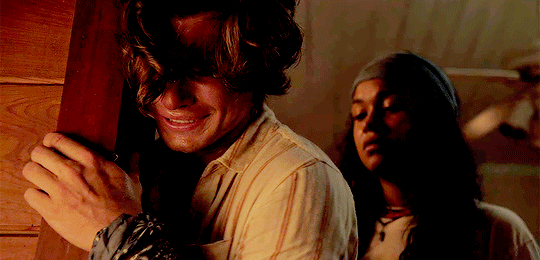
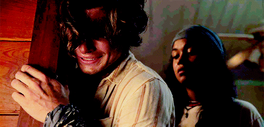
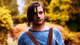
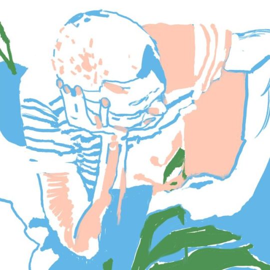
[I.D. A digital painting of Laurey Williams and Jud Fry from Oklahoma! West End 2023 revival. Laurey is a woman in her 20s with long dark curly hair, Jud is a man in his 30s with long blonde hair, he’s wearing a brown suit. The painting depicts a wedding scene from the end of the show — a moment before their kiss. End I. D.]
instagram | twitter
#oklahoma!#fanart#anoushka lucas#patrick vaill#laurey williams#jud fry#laurey x jud#oklahoma west end#oklahoma 2019#**#Illustration#study#yellow#musicals#musical theatre#it kinda... looked less yellow in photoshop
58 notes
·
View notes
Note
I hope you don’t mind asking but you consistently have some of the best 911 gifs. How are your gifs so sharp? And the coloring so good? Could you do a little tutorial about your giffing?
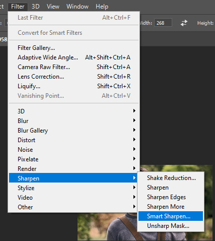
omg thank you!!! this gets pretty long so i’m putting the tutorial under the cut
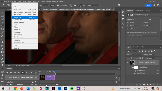
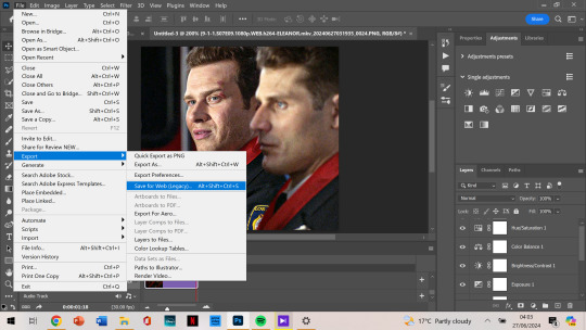
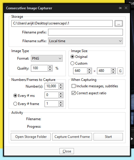
so firstly, i use kmplayer to screencap. the most important part though is the quality of the episode you have. you always want to work with 1080p, and my file is around 2gb. that is how my gifs always turn out ‘the best’ as you say 🤗 of course, colouring and sharpening help a lot, but if you don’t have a good download, your gifs can be helped but won’t be the best possible.
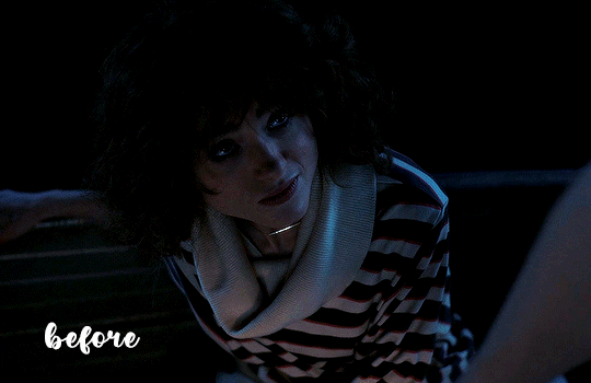
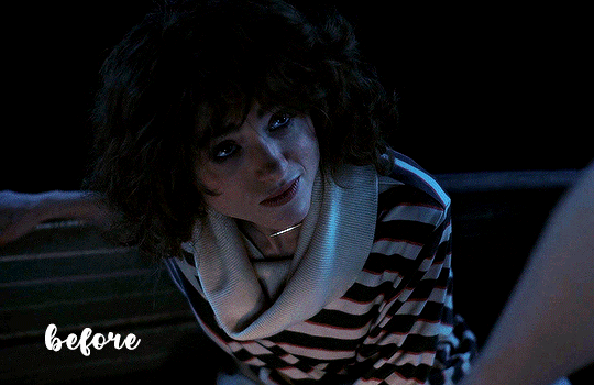
this is the gif i’m making having only been cropped and sharpened. i’m gonna show you how i make a gif and my colouring process (which, for this one, is admittedly pretty short and simple compared to what i usually do.) as you can see, it’s dark and pixelated and doesn’t look that appealing, no matter how handsome they both are.

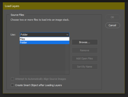
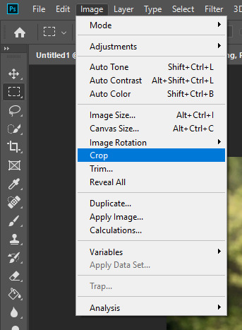
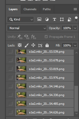
also, i forgot to screenshot this before i started but the screenshot below shows the action i use to basically get all my screencaps organised to make one gif. this is after you’ve got the screencaps into photoshop in a stack.
i can’t find the original post with the action, and i’m not sure how to share it on this post… but if it’s not that important in the scheme of this post, there are many other posts out there with actions you’ll be able to easily find and download.
anyways. so this is gonna go through the process of making a gif assuming you’ve done the process of importing the frames and sharpening. (i would normally cut out my taskbar but there are so many screenshots, it would take foreverrrr)
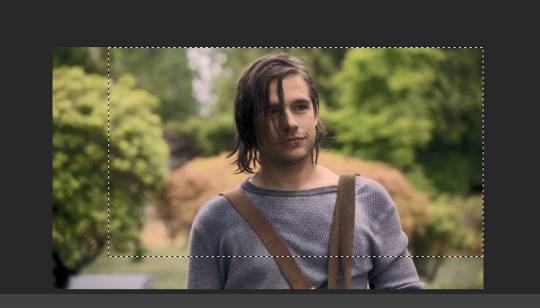
the next step would be cropping. this is the original:
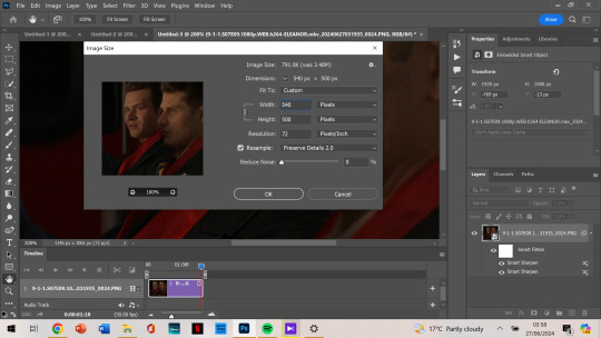
and i’m doing a 540 x 500 gif. i like mine to be bigger so i can only get the person/people i want in the gif (sorry eddie) but sometimes if i want that it’ll be smaller, usually 540 x 400.
anyways, i crop from the edge and make it a little smaller so i don’t get the white border around it. and then i move the gif away from the top and right edge of the gif just by 3-5 pixels. which i already did here and then zoomed in:
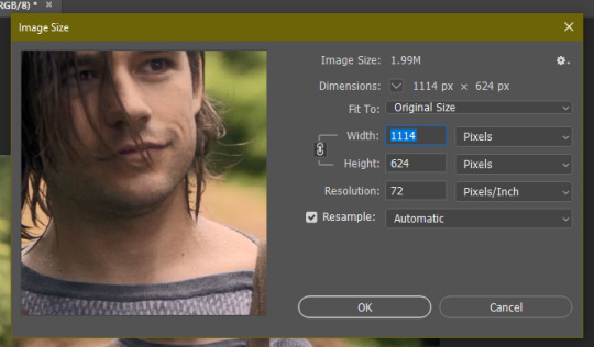
next, image size. i honestly didn’t know about cropping it and then using image size for a few months when i started giffing (i don’t even know what i did back then not knowing that.)
then as you can see, it’s 540 x 500. if you’ve cropped it to the size you want beforehand, it’ll be automatically those dimensions.
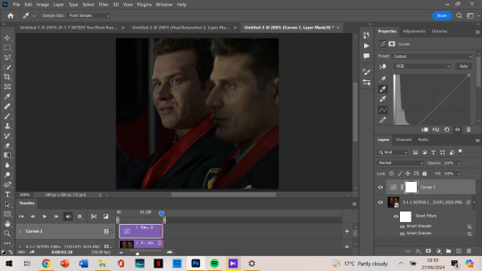
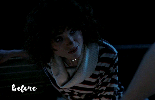
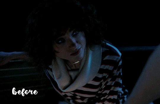
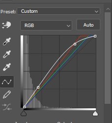
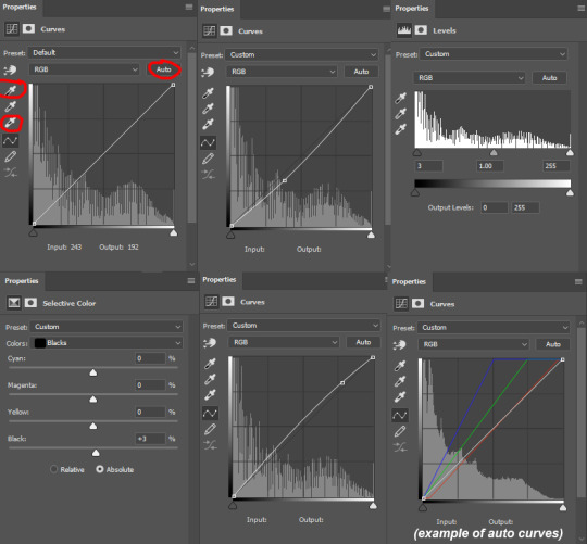
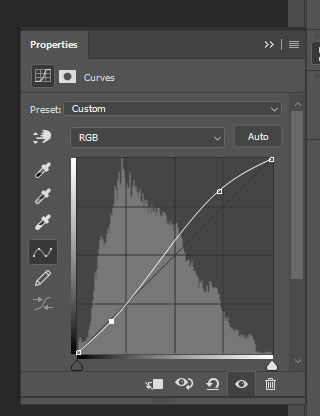
next, we’re finally starting on colouring. i always tend to start with curves and use the middle brush on the left. the top one you use to make it darker, and the bottom you find the whitest point on the gif to make it a lot brighter. but i find the middle one colour corrects too, so it’s not too bright or dark, and is less yellow or whatever colours you don’t want.
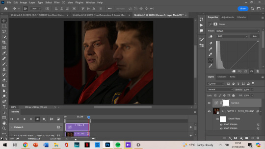
it depends on where you click to get this result, i’m not sure how to explain what i do but i just click all over and try to get the yellows off and the skin colour to look generally the same as what they have. most of the time, if i get this accurate enough, the rest of the colouring process is just to brighten up the gif.
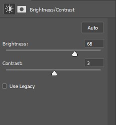
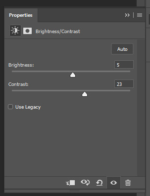
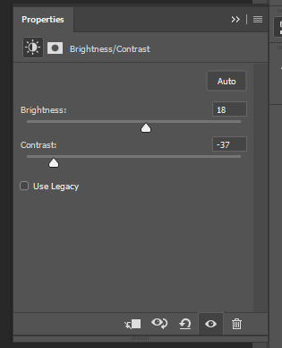
so, then after i got my desired result, we’re brightening it up because you can’t really see them all that well. i use brightness/contrast but i tend to use exposure the most.
as you can see, i am at +2.78 exposure which is crazy high (imo). but as that and the curves layer did a lot of the work for me, i mostly have the colouring i want.
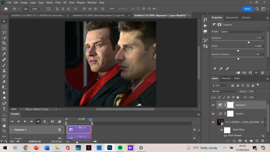
although i think it could be a little lighter, so i add a new layer of brightness and contrast this time. i don’t brighten it all that much after that. i want to make it so that either one of their faces aren’t shining, and with too much of the exposure, it can make that happen.

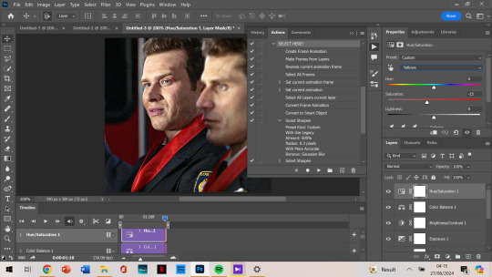
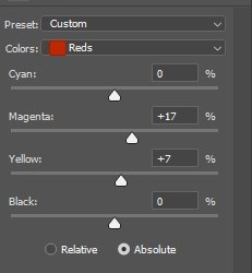
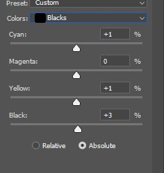
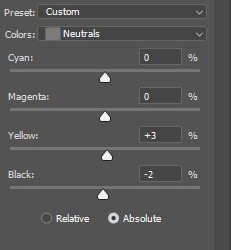
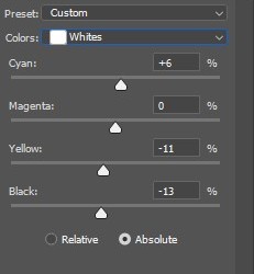
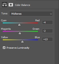
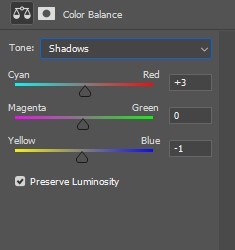
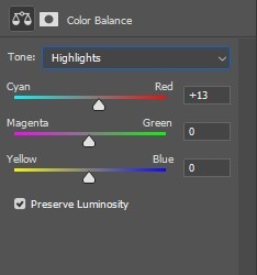
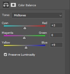
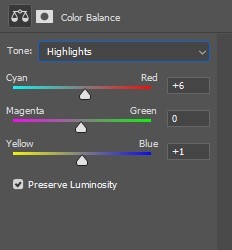
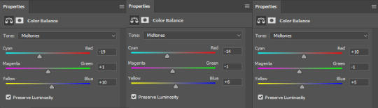
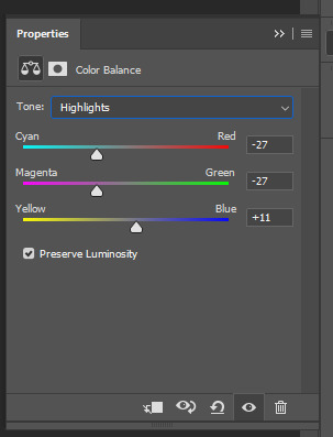
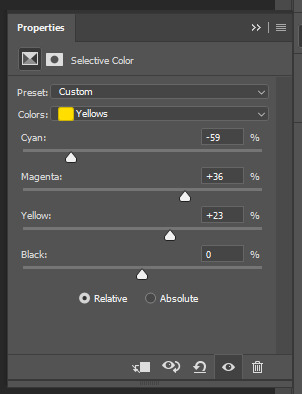
next, i notice that tommy is kinda green/yellow, so i want to fix that up and make him more natural. i go to colour balance for that this time. most of the time i go to selective colour -> yellow or red, depending on how much i want to change. with selective colour, it gives you a few options in shades: cyan, magenta, yellow and black to alter, all for your specific colour.
meanwhile, colour balance changes the whole thing. since i wouldn’t mind that in this instance, i just go with colour balance.

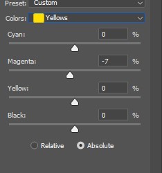
tommy is looking less yellow and green, but still, he’s not where i want him to be. (plus oliver’s scruff area is naturally ginger so it shows up as yellow, and i want to decrease that a little.) so i go to hue/saturation, choose yellow, and decrease it a little more.
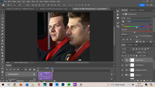
now, after this, i messed around with selective colour as i mentioned earlier and with the colour yellow and red specifically. but after comparing where i was at before, vs with those selective colour layers, i just liked that previous one more. so my last layer is the hue/saturation one. and i’m done colouring!
next, i go to my trusty camera raw filter to make them stand out more and be a little crispier.
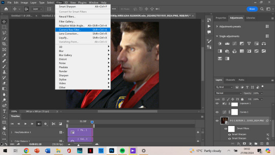
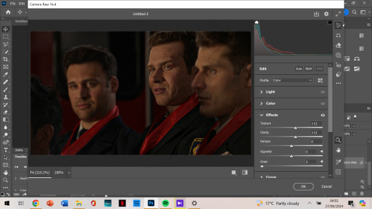
i tend to stick to + 10 up to 30, somewhere in that range. sometimes the texture and clarity match, sometimes they don’t. it’s all up to you, but for this one, i knew it would end up a little too crispy so i didn’t go too high.
i also like to add some grain so that it’s less pixelated (it admittedly annoys me a lot when it’s got those visible square pixels all over.) i never go higher than 5 in grain, it does the job well.
after that, i’m finished with my gif!

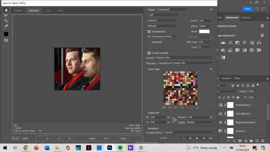
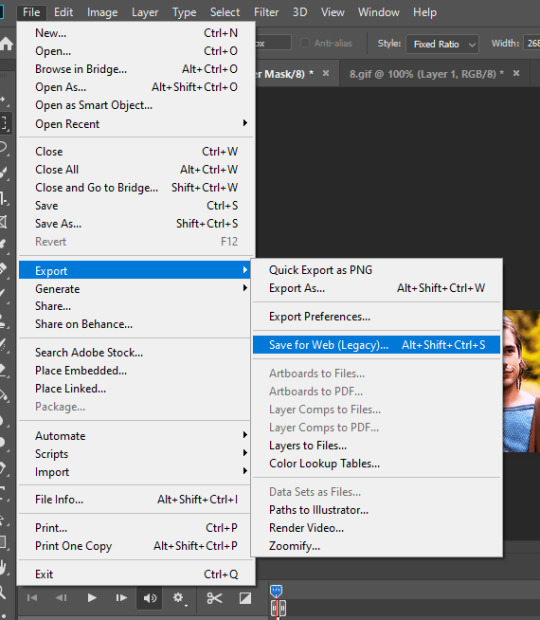
next, we want to export the gif.
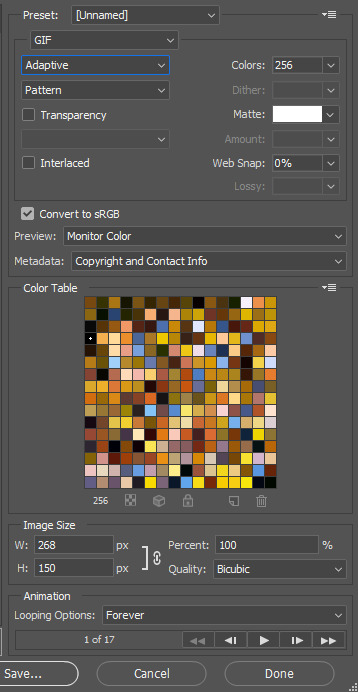
as you can see, the gif is less than 10mb, is set to loop for forever, and is made with selective diffusion. admittedly, i don’t think about that setting that much, but sometimes if it’s a lower quality gif, i’ll change it to selective/adaptive pattern instead. but that’s not relevant here.
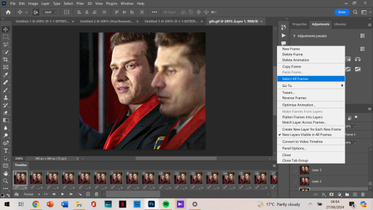
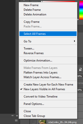
after that, we open our gif that we just made into photoshop again. this time we want to select all frames:
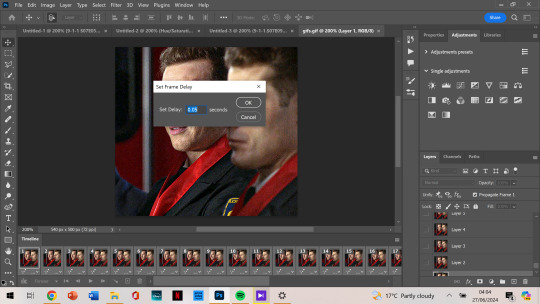
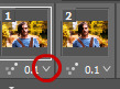
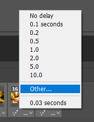
and change the frame delay so it’s not as jumpy. for some reason, it automatically changes so that they alternate in frames from 0.03 to 0.07, but i want them all to be 0.05.
now that’s the last step and you just export the gif again!
this is the final gif!!!
i hope this was easy to understand! thank you for the kind words, and for asking me about my process because i’ve honestly always wanted to make a tutorial. if you have any more questions, or want to see my process colouring something more difficult to work with, let me know! 🫶
90 notes
·
View notes
Note
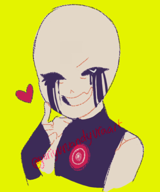
,,,,how do u get that fuzzy fuzz feel on ur art pieces,, is it just by usin’ noise? (As in static, I think)
oh! i experiment a lot with colors and effects (most of which i don't even remember the name SOB) but i can give you a summarized version of my steb by step on how i art
first of all, the colors!
here's the og, and you can probably see that in most of my art i tend to use grays and soft colors a lot and that's because it's easier for me to pick a 'theme' if you will? like 1 bright color that pops and the rest is a lot less harsh and that's what helps me define the contrary color and base my editing on that!
like here is where i usually choose my colors! but you can pick something darker and more saturated too idk i don't think it'll affect the end result- at least as long as you can change contrast and lighting in your program. i know color theory but not enough to explain it hhh :'D <333
so now use the wind tool on photoshop (there's some free editing versions online that will work just the same) and if you don't have or wanna use Ps, firealpaca and medibang have similar enough options- use motion blur, then the curves tool to make it look liiike
this! now blur the piece from a 5 to 10 range depending on how big your piece is, then you'll have that soft fuzzy outline! put some random static on top (very low opacity) then sharpen the whole thing if your art is very small like mine here so you can see details xD
use the lighten mode on your next layer and add a blue tint to the character (and leave the pop color untouched: here the yellow bg)
if you want a vhs look! and add more line-like static (just google static images and mess with colors/edit them yourself if you can't find any good options on your art program) and change up the hues and tints/contrast if you really wanna lean into the vhs asthetic like:
these! and add a 3D effect (or chromatic aberration? i think that's what the translation is cause my settings are in french xD do look it up if you can't find it on ibispaint, clip studio or whatever program you're using!)
i really suck at explaining so i don't consider this a tutorial, but mostly me rambling about effects and editing hhh but honestly? best advice i can give you is try every single effect you can and see how it looks with hues and color changers added on top of it!
stumble upon new effects and learn how to replicate them without needing to rely on special layers or tools if you're looking to improve your coloring!! >:Dc i only use these because my version of sai doesn't have a blur tool cause i pick the colors myself in most cases now :') but as i said i'm bad at explaining so hope it kinda sorta helped? a little? hhh<3333
#ask#tutorial#sorta?#my art#utmv#killer#killer sans#killer!sans#all these versions you see? that's how many i end up with when i finish editing my art- and i have to pick a favorite to post :'(((#i like them all but i can't really tell if this is actually useful HHH#sorry i'm skipping through some steps but also i deleted a whole paragraph cause gosh there's too many words and it's almost 2am where i am#so i can't proofread at all xD thank you so so much for passing by!!#glad you're interested in effects cause i love playing around with editing softwares and photoshop variants! try it out guys it's so fun<33
26 notes
·
View notes
Note
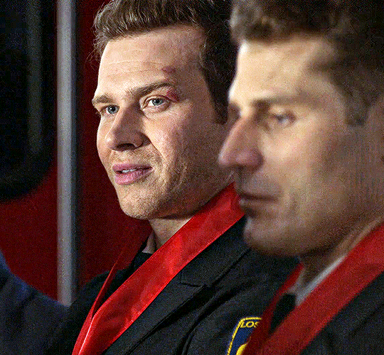
hi! i’m wondering if you can explain a bit how you made those gifs if ian looking at mickey in the s4 ep at the party. like how you made their skin tones show and stuff cause the original scene is really yellow? i hope that makes sense. no pressure im just curious!!
hiii sorry I took so long to answer this, im not really good at explaining these things but im going to try! ill put it all under the cut:)
(the gif set in question)
To preface, I make gifs in Photoshop!
okay, so basically my best friend when it comes to color correcting scenes is the Channel Mixer tool. I'm sure there are other ways to do it, but after a lot of experimenting I've found this method to work the best for me.
The way the CM tool works is kinda hard to explain, esp because I only figured out how to use it through trial and error, but essentially it breaks your canvas (gif) down into 3 primary colors: Red, Green, and Blue. Each color will have 3 channels: the primary channel (for blue it's blue, red is red, and green is green) and two secondary channels for the other two colors. The primary channel will always default to +100, and the secondary channels will default at 0.
Using the tool, you can adjust each color's channels to add more or less of a certain color to the existing colors in your scene. For example, you can add more blue to the greens and reds on your canvas, or more red to the blues and greens, etc. In my experience, you will not need to adjust the Green settings very often other than for very minor adjustments to complement the other channels. It requires somewhat of a preexisting understanding of color theory (what combinations of colors will create what end result, what too much of one color will look like and what color will balance it, etc), but it's not too hard to figure out, especially if you play around with it and experiment with what each channel does and how it affects each gif.
The main goal of using the Channel Mixer for correction is to adjust the coloring of a scene to be as neutral as possible, and then to edit from there.
So with this particular gif set, the lighting was very yellow tinted. When using CM, yellow is a color that's grouped into the red family. So when you have a scene that is yellow-washed, you want to push more blue into it to start balancing it out.
Here is the original:

Now, like I said, we need to add some blue. In the Blue settings, I adjusted the channels to the following: Green +14, Red +14, Blue +100 (default). When using CM, small adjustments go a long way. Here is what our gif looks like now:

As you can see, it's less yellow tinted, but now it's a little rose colored. To fix that, we will go into the Red settings and lower the primary channel to +75. Here is the result:
The scene is still very dark and unsaturated, but the coloring is much more neutral now and will make editing much easier. After getting the gif to this point, I added a few more adjustment layers: Levels, Curves, Brightness/Contrast, and made some slight adjustments with Hue/Saturation and Selective color. Here is the final result (this is before sharpening):
For comparison:

I hope this makes sense! Feel free to let me know if you have any questions!
#tutorials#<- I GUESS...#lmk if anyone knows of any better/easier to understand explanations of channel mixer cause I know I kinda beefed this#asks#anonymous
13 notes
·
View notes
Note
THE EFFECTS!! THE TEXTURES!!! HOW DO I MAKE IT LOOK LIKE PAPER!!
now... i've added a background color (yellow) and then an orange ish color to add something extra as a background piece and have it have the same effects + have erase-layer-chipped-away at the the whole image in a clipping group as i've said!

for my sticky lou drawing and this with the orange background i take inspo from vintage posters...
my main inspo from this is this video - no need to follow it clearly since it does use photoshop specific things (and advertises their own tools a lot... they do come up later) and we HATE ADOBE in this house. BUT it does mention some good points and shows some of the Effects I Use Later. i've been using that stuff for a long time but this does have Several Things At Once. i sorta took what is covered in the video and do it my own way in the programs/tools i have accessible!
i have downloaded many paper and grain and dirt textures to use. some required me to sign with my email for a mailing list to access a download - i used a side email for that. after your download you can just Unlist Yourself. other than that... all of this is free!
before i go really into this, i would like you to check out my past tutorial on a similar topic to Get This Paper Feel!!! IT HAS IT'S OWN RESOURCES LISTED THERE AND MY ASSUMPTION IS THAT YOU'VE READ IT!! i'll list the stuff there in here too but i won't be going back to it much!
GUZMA'S FUNKY PAPER EFFECT GUIDE! CLICK HERE FOR IT, FELLAS IT'S ON MY MAIN BLOG! HOORAY, LESS TYPING FOR ME! (MY NECK HURTS!!!) (THAT GUIDE IS CLEANER THAN THIS ONE BC IT COVERS WAY LESS)
the next step is basically just fucking around with all of these assets... and things i talk about in the above guide... but yea you're gonna need those assets!
so let's get into... THE BIG LIST!!!
natural materials pack v.1 - by tombofnull, itch.io
paper texture google drive - (original tumblr post lost)
9 grunge png textures - onlygfx.com
film dust grunge texture - pixelbuddha
halftone textures set - pixelbuddha
grunge textures collection - pixelbuddha
paper textures kit - pixelbuddha
free wrinkle paper textures - dribbble
9 free high resolution grain textures - spoongraphics (spoongraphics in general has a lot of assets for this kinda style. typically not free, sadly.)
10 dirty surface textures - spoongraphics
24 free dirt textures in high resolution - spoongraphics
folded paper textures - indieground
fold paper texture - by daintyish, deviantart
-------------------------------------
SOME BRUSHES I USE!!! NOT ALL OF THEM FIT THE STYLE BUT JSYK SOME OF WHAT I USE!!! if anything has a tool to note i'll Note It
splatter brushes (.abr) - hello streetlight! ( i made my own messy brush using this on krita - i use it to add chipped away spots using the erase effect layer thing !!! )
glitches and distortion - krita.artists.org
dry & dirty bundle - krita.artists.org
ink-cow/moo krita comic art bundle - github (GREAT pack with TONS of halftones and other comic art related things! VERY SLOW but i use these halftones to add effects to my art. i also use it's grain tool later!! so get this pack or another grain brush - but the one this back has is GREAT!)
awez brush bundle bonanza - krita.artists.org
awez flat brushes - krita.artists.org
-------------------------------------
so first, i start by adding the textures from tombofnull's pack as i show in my previous guide....

i then pick up the ink-moo grain brush i mentioned earlier (the star-shaped one!) and scribble over the whole drawing using it on a new layer... using whites, greys, and blacks, so it's mixed well! and then i just set the layer mode to overlay and lower the opacity.


i then take a splattery brush or whichever textured brushes and just... splat in black and white around at random (but maybe i keep in mind where i'd like certain splotches to be?) set to overlay and lower opacity, too...


maybe add another layer set on overlay and add darker splotches... maybe some splotches on a multiply layer as well...

but oh... what's that? want MORE paper texture? one thing you can do set the handy layer group that contains the lineart, colors... the whole shabang - to multiply! then select a paper texture you like and put it underneath. make sure your background yellow color is set to multiply also. play around, see what works! with this you need to do less of the layer effects i've been playing around. really - just play around and see what works for you best! :D

i then added a folded paper texture on top using a gradient map (to get just the Lighter Part) then set to opacity....
played with some dirt/grunge layers from downloaded assets...
and to top it all off i added a desaturated orange-yellow layer on top of everything, set to color, on a low opacity. and coz im extra i added an saturation layer there as well.

AAAAAND that's the finished product!
hope this was useful despite it being so long :] apologies for the lack of detail at the end, i feel like you'd get the point At That Point and i've been at this for hours i gotta rest
<3 thank you for asking!!! if anyone uses these feel free to lemme know because i WANNA SEE ART LIKE THIS!!!!!!!!
Hi! I'm kinda shy but I love your vintage finish on your work. Would you consider offering pointers for how to achieve that vibe?
oh, absolutely!! i love that sort of style and i think more people should be able to achieve it if they want!! shouldn't gatekeep art stuff ^^ i don't really do vintage style stuff a lot, and i take more comic book/print/retro inspo than anything. but, these go hand in hand!! please know i am still learning, too! this is just how i do it.
also, there's a lot of guides for this online and tools... that you have to purchase. i can assure you everything listed here is free! (including my pirated SAI2 copy!) some things have donations available towards the artists that made them, so you can do that if you want to support an artist :D
i'll go over basically everything i know, so this WILL get long! i also spent hours going over several days searching for resources, so i'll list everything so you don't have to ^^
(PART 1/2 BECAUSE OF IMAGE LIMITATIONS!!! PART 2 SHOULD BE WRITTEN SOON AFTER THIS ONE!! reblog THAT once it's done!)
-------------------------------------------------------------
THE ART ITSELF / INSPIRATIONS:
for the ARTSTYLE and WHAT you draw: you can just draw whatever!! really, do your own thing! twist this style in your own way, it doesn't have to be a 100% accurate!! i literally used these same vintage look effects in a drawing drawn in my usual style of high roller. you can draw anything you want and you don't need to copy comicbook styles or all that!!

or - you CAN take inspo from vintage comic books / artwork or other printed comics! (for me tom and jerry comes to mind as something with a toony style, since it's what i read as a kid. also donald duck comics! no need to follow this but if you wanna be extra you can! ^^ looking at inspo is good.)
however you will need to look at examples aside from just the Artstyle, to achieve the actual Look!!
here's some examples pics i took of some comics i own laying around in a shelf. these are mixed ages, the asterix and ducktales comics being older and the tom and jerry comic being newer. i have some oldies since i got them passed down! czech text + asterix jumpscare, sorry.
to move on from the artstyle talk fully and more to the general style/look part - notice how the tom and jerry has brighter colors, less dirt, and an overall better quality!!

one thing i want you to note, in older prints there's obvious color misprinting and imperfections! you may chose to do this, or don't! depends what kind of era or printing you wanna reference. of course, also keep in mind the veeery limited CYMK colors they had Back In The Day. also note the dirt!!! how some parts are lighter and more chipped and how it isn't a full block of color!!


a lot of this does parrot posessedpasm's own guide, which i HIGHLY recommend! it's where i got a jump-start on things. there's other things listed on their post, which you should give a read! goes over history of some things that will let you have a better understanding of stuff.
speaking of inspo and on the topic of posessedpasm, before we move on - they're one of my biggest inspirations for this! their art is incredible and i think it's important to look at other artists' take on these styles. go out there and look at other artists who draw in a similar style achieving the same retro look!!! (no but genuinely i could look at posessedpasm's art forever... i love just looking at it and studying it!! i want what they have... but i'm not gonna gush now!)
-----------------------------------------------------------------
ACTUAL TECHNICALITIES / HOW THE FUCK DO I DO IT ???:
FIRST, LINEART!!: i choose a brush that's somewhat fluttery and resembles ink at least a little bit, instead of a basic round brush. here's the brush i used, for any sai2 users. i'll show my krita faves after!!

(note brush size, gets fuzzier the bigger it is)
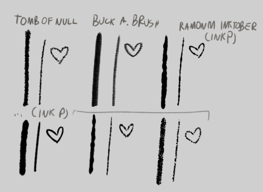
and the krita alternatives! i don't do inking / lineart in krita in 99.9% of my art unless i'm experimenting. but there's some great brushes you can find online to use! here's links to the ones on screen
tomb of null
buck a. brush
ramonm inktober (he just presents it but since it's his post i named it that) (download link is on the video!)
that alone already gets the lineart look just a bit. but it's not all! krita is especially useful for this, as sai doesn't have this function. (but i find my way around it


here's a WIP screenshot i took while drawing that piece VS the final piece!
you may notice the lineart is "chipped" away in some spots. printing always wasn't perfect and created some imperfections, that may smudge and chip away as time goes on.
HERE'S A GUIDE FOR IMITATING THAT!!!!
what i do, is simply create a clipping layer on the lineart. (typically i do the lineart, then color, THEN do lineart effects, but this is just for show) (i also usually have a set, typically orange/yellow background color picked already, but i haven't done that here for Whatever Reason)
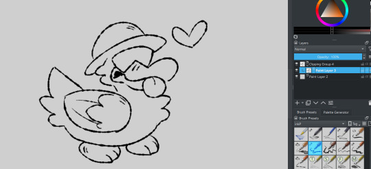
set it to "erase" layer mode... (and click the little "a" to actually clip it to the layer. you could also just make a quick clipping group that does it for you!)

and draw over the lineart! (preferably with a highly textured "dirty" brush!) the erase clipping layer will only erase the lineart, and nothing underneath it. you can change the opacity up and down to adjust the erasing... you can add more erase layers to play with the effect a little!

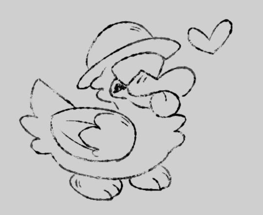
what i then do (sometimes), i ctrl+e the lineart group to one layer. i copy it. i ctrl+z to go back to keep the group if needed. i paste the copied lineart underneath it. i add a blur filter, shift it to be slightly off from the lineart by a few pixels, and set it to "burn". i may change the color to be a very dark orange-ish brownish color. gives an effect of the lineart bleeding a little!


COLORING!!:
color: okay so for this part i just kinda bullshit it and either pick whatever colors i want, or i color pick them from this image below then slightly alter if i need a different color. i do not have the patience to do my own cymk layer management digitally, just adding my effects can take OVER an hour and i have a way that looks nice Without It. i either fake my color misprints later or i just don't do it. still stuff to consider!
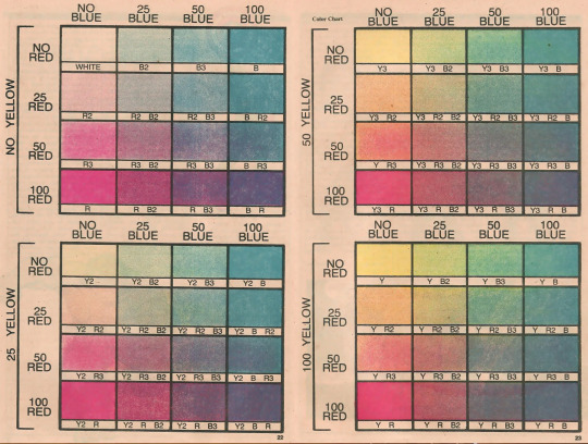
(taken from posessedpasm's guide! this is how i colored my sticky lou drawing. usually i will just pick my own colors and yellow them/dim them slightly.)
how do i do it: i color in sai using my usual brush or the one i showed previously. if i color on krita i use a different fuzzy kind of brush...
some colors i do on different layers and i move them slightly to make the misprinted effect. then i may erase small bits of it to make it look a bit better if i want.


if you really want the funky color mixing that may not be Extra Accurate anyway - draw using different colors on different layers. the layer overlapping with the bottom layer... set it to "multiply" and eyedrop the color where the two colors overlap. set the layer effect back to "normal". lock your opacity so you draw only on the Already Colored Parts and color the overlapping area using the eyedropped color! neato !

ONE THING TO NOTE!!! if something is white, you should leave it uncolored/transparent. unless you stylize it to be a different color entirely, if so... go ahead! but if it's WHITE white - just don't color it at all!!!
and now, to my Favorite part - the halftone overlay effect!!! here's where things can get fairly convincing already - plus, i use this effect / similar even in my normal art!
before ANYTHING!! at least, for krita - to achieve the best look i use the newspaper plugin!
newspaper plugin for krita
FIRST, i merge the color layer into one layer and then add it into a clipping group. i then copy the color layer and paste it OUTSIDE the clipping group.
then, select your PASTED color layer (named on the screenshot so u know what i mean) and go to tools>scripts>newspaper (once you install the plugin!)
i then play with the settings a bit. i typically don't touch everything - i just change the mode to Four color (CMY+K Pictures) or Four color (CMYK - Pictures) (this one usually looks better imo)
i also change the size to be smaller, usually around 4.00px.

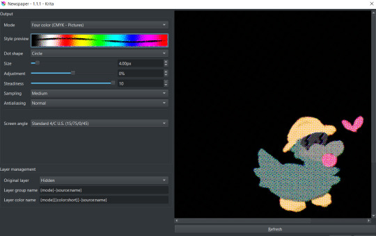
click OK! it'll generate cymk halftone layers IN a clipping group! don't worry about the black, you can rid of it easily ;]

just close the group and move it to be inside of your color group below! clip the whole cmyk group over the color layer... and BOOM!
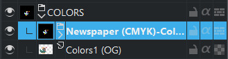

but that's not it! set the newspaper group's layer effect to luminosity (or whatever you find works best...!) adjust the opacity to around 50%-30% and BOOM!!

though, that's not all! do the same things we did to erase up the lineart earlier to the coloring, too. same steps! in the same clipping group! just make sure it's above the cmyk newspaper group.
you can then group both lineart groups and color groups into ANOTHER group that will contain them both. with that you can then make an erase layer over them both so they both get affected by it and make it look like both got chipped away, and not like they're separate entities. ^^
you can then use this for backgrounds... text... other things!
one important thing is also getting those papery, dirty effects... which i'll cover in a reblog! (image limit :,]) alongside that, i'll list all my resources for download there!!!
25 notes
·
View notes
Text
Ok, so I didn't save the psd for that, but I remade one very similar to it.
For this tutorial, you just need any photoshop and basic gifmaking skills!
(p.s. sorry if it's a bit wordy... )
To start, pls do not feel in any way compelled to color exactly as I do. If you have your own way of coloring that works for you and you just want to pick and choose what parts of this to add to your technique, that is 1000% fine. This tutorial is kind of personalized to me and the process I use to color and what makes sense to me. Ok, spiel over...
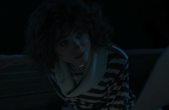
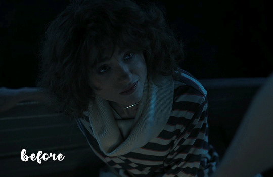
So here's the original gif, sharpened with no psd
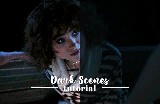
STEP 1: Exposure 1
First, I added an Exposure layer to brighten things up.
GIF:

STEP 2: Curves
With this Ccurves layer I like to do a bit of color correcting by adjusting the individual RGB curves. Because this scene is so blue/cyan, I made sure to bring out the reds in the highlights by pulling the small box in the top right corner of the red curves directly to the left, same with the green curves.
I moved the box on blue curves only a little since the scene is already so blue. I made sure to move the small box in the bottom left corner to the right to add some yellow in the shadows to counteract how blue the scene is.
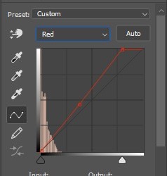
(I dragged the curve down a little bit because the gif was a little too red for my taste. Dragging it down puts some cyan in the shadows.)
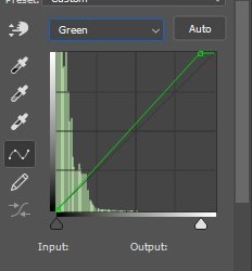
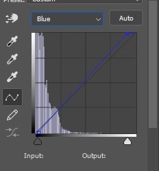
GIF:
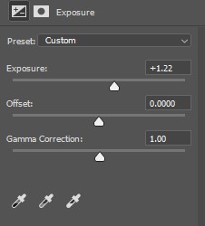
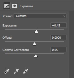
STEP 3: Exposure 2
I added another Exposure layer to brighten things up more. This time, I moved the Gamma Correction slider to the right to add more contrast. With this layer, the difference is slight, but it is effective.
*** I don’t normally start with an Exposure layer or even use 2 Exposure layers for that matter (usually just one after my curves layer), I only started doing this while making gifs for these darks scenes in Stranger Things. Idk how well this specific process works for dark scenes in other shows/movies***
GIF:
STEP 4: Selective Color
I used this layer to add some more yellows to the gif and add some contrast. I like to make my gif almost too yellow and then fix it later with Color Balance.
GIF:

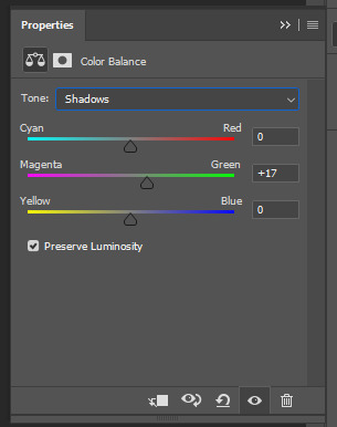
STEP 5: Color Balance 1
For the first Color Balance layer, I like to place it beneath all of my other layers. To me, it kinda makes the effect “richer” in a way, idk how exactly to explain it. But I’ve been doing it this way for years and it works for me.
GIF:

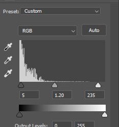
STEP 6: Levels
Now this Levels layer goes back to where we left off above the Selective Colors layer.
GIF:

STEP 7: Gradient Map
I used a black and white gradient map and set it to Soft Light with the opacity at 20%.
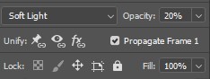
A gradient map may seem counterproductive since it deepens the shadows and darkens the gif, but I like the contrast that it gives.
GIF:

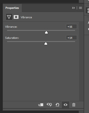
STEP 8: Vibrance
Ok, so this one is more or less optional. It makes very little difference, but I like a lil vibrance, as a treat.
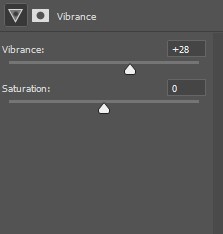
GIF:
STEP 9: Color Balance 2
This Color Balance layer is really just used for any additional color correcting that may be necessary.
GIF:
STEP 10: Adjust Curves layer
Now that we have the coloring/color correction mostly done, I can finally decide just how much more I want to brighten my gif. I go back to my Curves layer and add a curve somewhere in the upper right corner, just to where it looks bright enough to my liking. I’ll then pull down the curve in the lower left corner to deepen the darks and add some more contrast.
GIF:
STEP 11: Brightness/Contrast
For the final step, I add a Brightness/Contrast layer because I didn’t think adjusting the Curves layer brightened the gif enough. I added this layer directly above the Curves layer and below the 2nd Exposure layer.
GIF:
Here’s the finished product:
and here’s a quick before and after:
I know there are a lot of tiny adjustments, but as I was explaining to the anon who originally asked the question, I like to build upon the layers. I don’t try to solve every problem in one layer. I don’t try to make the gif bright enough with just one curves or brightness or levels layer. I make a lot of little adjustments that, in the end, make a large difference.
Also don’t feel as though you have to get the adjustments exactly right when you first add the layer, especially with a dark scene like this where it’s hard to see how much of something you need. I had to go back and add more in the color balance layers or lessen the levels or adjust the RGB in the curves multiple times before I felt that the coloring was to my liking.
I hoped this helped. If you’d like the psd, pls message me bc tumblr won’t let me add links.
Do not hesitate to ask me any questions!
#usergif#completeresources#ps help#tutorial#coloring tutorial#dark scenes#stranger things#mine and only mine#i saw some people in the tags asking#how i colored the scenes with steve in the upside down#and i pretty much used the exact same process#but i added a few extra selective colors to bring out the cyan/blues
403 notes
·
View notes
Text
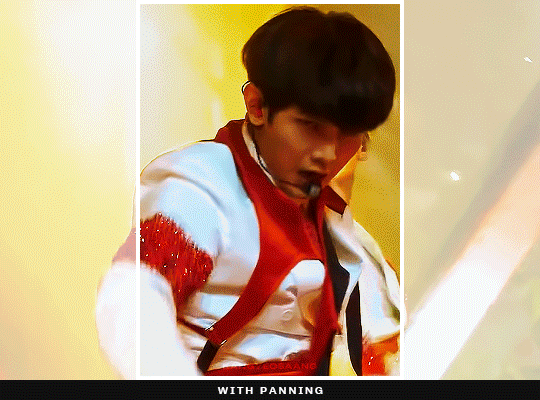
how to pan gifs
were u ever like gahd these camerapeople again making yet another stage ungiffable. yeah me too.
sooo here in this tutorial i'm gonna try to explain how to pan gifs so ur subject can remain centered or at least not be out of frame, sth like this:
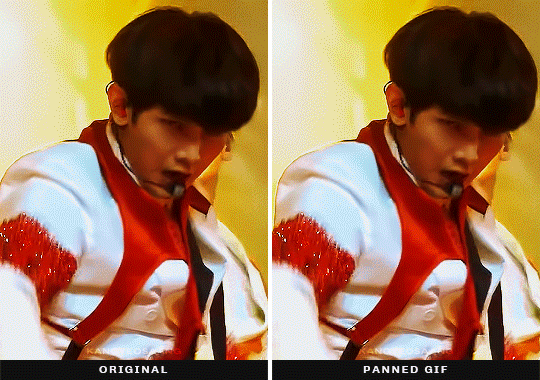
this is a more advanced tutorial, in a sense that i'll assume you know how to make gifs, not in a sense that this is complicated lmao, okay let's gooo:
essentially this is what's happening and what we gonna do:

before we dive into the how tho, it must be said that photoshop's timeline can only do linear movements so no easing. at times it can look unnatural or choppy or... frankly both. (if you want to know more about this look up ease-in-out animation curve, or easing curves)
part 01 · prepping gifs
as i wrote in my gif making process post i usually crop my gifs bigger than they usually will be. e.g. a 268px gif will be cropped to anything between 468-540px. sometimes because i want to have the opportunity to position the gif a bit differently but most of the time because i know 268px is a reeeaaalllyyy tight place and i need to make some movement adjustments especially for weekend music shows where the camerapeople seem to be on crack or just very into experimenting
part 02 · let the keyframe madness begin
whichever way you are making gifs just open up your gif and crop it to the final size, colour it and whatever else you fancy. once you have everything ready just open your video layer on your timeline (if you don't know where you will be able to see it in the video later)
you will see 3 tracks, transform, opacity and style. for this we will use the transform because it contains movements (but also resizing if that's what you fancy).
all we need to do is create keyframes which will define what is the position of the video layer at a certain time. so e.g. here we are moving this box to the right by 50px in 1 second.
to create keyframes click on the timer icon in front of the position label and photoshop will create you one. the active one will always be yellow. if you move on the timeline with your playhead (that thing that is moving) and you resize/move your layer photoshop will create yet another keyframe for you without you needing to click on it, because it will recognise the change. so all you need to figure out is when the movement starts and which position your layer should be, and the same for the end and ps will take care of the rest.
part 03 · some things to consider when panning gifs
now this is the part where it gets subjective and less tutorial like. so all i can provide is some explanation how i go about it and what i pay attention to.
tip #1: match the movement speed to the gif
whenever you are panning a gif it may result in the gif being choppy bc the framerate and your movements are not matching up, so it's either too fast and photoshop needs to move your image by too many pixels frame by frame or it's too slow resulting in basically the same thing but kinda reversed, either way it won't look smooth. this mostly happens when the original footage is moving (there is a quick camera pan/movement) and you are trying to keep it in place, less when the original is kinda still and the subject is moving. this is kind of a trial and error process: try moving your keyframes closer to each other or maybe further, add more/less movement between two keyframes and just see which results in a smoother gif.
tip #2: try moving your gif once in one direction
there are times when your subject might go out of frame multiple times and you have the urge to keyframe the whole gif and keep them in center the whole time. however, as we do not have easing curves in photoshop the switch between moving something from one direction to the other one will be very visible. so try placing your subject in a way that you'll only need to make one movement and it's kinda okay all the way thru or pick the most annoying 'placement' you want to correct. here in this example it mostly bugged me that the gif was not centered at the end, but onda kinda remained in frame.
tip #3: pan your gifs when there is a quick zoom/movement
sometimes whatever i do the gif will look choppy regardless one movement or not. in these moments, and these moments ONLY we can be thankful for the sometimes unnecessary zooming that's happening and reposition our gifs while the zooming is happening. since there is already a drastic movement you can get away with basically anything, as long as you time the beginning and the end where the zoom begins and ends. also i must add that you can pan stage gifs way more and more drastically bc there is a lot of things happening in the background, so adding a bit of movement on top of all the other movements is less noticeable than... moving footage where e.g. the background is static.
✨something extra✨ · panning/moving other things
so what we looked at is moving the whole gif to fit into the frame we have, but with this technique obviously you can move all sorts of stuff, text, texture whatever you fancy. you can apply this process to the layer you wanna move and this is when you get these:
a sidenote: the fade effect is literally the same keyframe business but instead of playing with position keyframes you change the opacity keyframes.
aaand that is all, if you have any questions my askbox is always open so hmu <3
tagging @sanhwalynight bc of requesting reasons hehe
2K notes
·
View notes
Note
Hi! This is probably a weird question but how do you shoot night time scenes for your story? I always have a hard time getting good lighting
gah night time is so hard anon I feel ur pain!!! I usally try to avoid it if I can but sometimes I have to shoot at night but the editing for night/ dark pictures always takes me longer! I'll explain under a cut!

(1) for this scene I basically started by deepening the contrast kinda with the 'curves' tool in photoshop. I always do this step first. I also inceased the brightness and upped the contrast on top of that to stop luna fading with the background. Once I was happy that she didn't blend so much (2) I then made an overlay layer and took like a light but really rich yellow kinda colour:

this gradient tool is my absolute favourite I use it for everything. I put it at 20% opacity and select radial gradiant (top menu) and I go and drag it across the areas where theres light. I also did this on Luna's face to imply there was a light source across from her (all of this is still on the overlay layer btw).

But it helps her to stand out even more in the foreground. (4) Lastly I make another overlay layer, and kind of outline around her with that same or an even brighter yellow colour:

Again to make her stand out but also to maybe kinda suggest that the light behind her is lighting her up from that side too (idk for me I feel it just completes the look)!

It's like in this scene I use four lights to brighten with overlay: 1. the window which I use a warm colour for to match the light. Then 2. the fading sky, I brightened this a little because in the summer time idk if you've noticed but sometimes u can still see the like glow of the sun really late in the evening :O then 3. the outlines and light reflecting on Luna's face (also draws attention to her expression... brow, chin etc.) and 4. those tiny streetlights I super brighten in the background to make it more obscure looking/define the shapes less!
But yeah basically you want to avoid shooting in complete darkness if you can help it! There's always gonna be moonlight if you're outdoors and if ur sim IS in pitch darkness somewhere even then you can raise the brightness and a little and play around with curves and contrast to make sure your sim doesnt get lost in the background!
Anyways sorry that ws a little long winded, I hope it at least made sense? 😭👉👈 if it didn't please don't be afraid to ask me to elaborate or explain something properly!! 💖
28 notes
·
View notes
Note
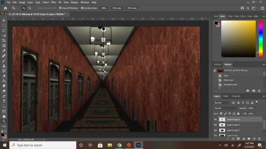
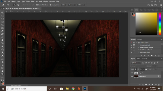
hey bestie quick question how the FUCK did you make that hallway look like it goes on forever please and thank you
Firstly this is the only way i will ever accept small tutorial/explanation requests from now on secondly it's actually easier than you'd think, bestie. This can be done in pretty much any editing program that you can layer in but i will be using photoshop 2021 (because adobe updated without me knowing) but that's besides the point
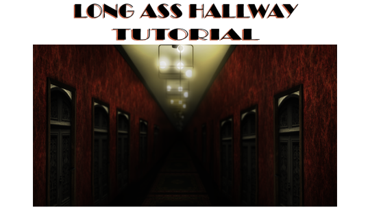
{Tutorial under the read more}
Alright step one: Make your hallway
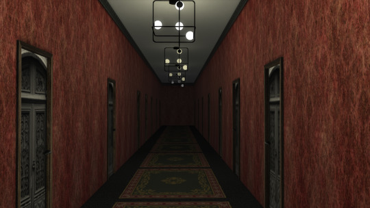
Still kinda long, but nothing dramatic as this was done on a small lot in a basement...but i digress. When adding lights make sure the farther the light is from the "camera" the darker you have the light set too. Like in mine the first light is about half of warm white, and after that it is a third, then a quarter, then a little bit higher than nothing, while the last one is off. Add doors to get some more depth, and space them out a little better than i did if you want the door vibe. But if not, then just make a long and narrow hallway and [IMPORTANT] Make sure you get a SOLID V SHAPE FOR THE CIELING AND FLOOR! This is what makes it feel like it goes on and on and on...
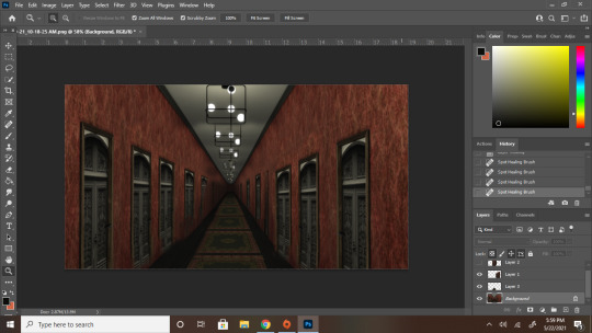
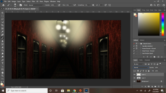
Step two: Take it into your editing app of choice and make it a layer.
Then duplicate that layer 2 or more times. With each layer, make the picture smaller and smaller. Make a very solid effort to line up the Vs of the ceiling and floor (but if the floor doesn't quite line up then just focus on the cieling as that will be what really sells it)
In this example, i had 5 layers. You can see where the next picture begins by the banding of the lights. You can kinda see what I meant about the floor thing hear
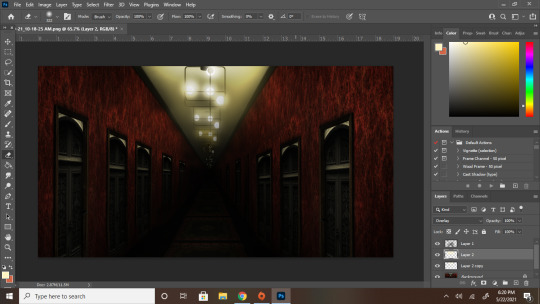
Step three: BLEND FOR YOUR LIFE
This part involves a LOT of erasing and little spots of correction as you go. Focus on blending the walls the most. Although the cieling and the center point are what really sells it, the whole wall give it away because that's what makes if very obvious that this is just a screenshot you made gradually smaller and smaller. What i've done in mine, because i like making things easier on myself, was i just copied one side and mirrored it with the other. And for the floor i just copied the bit with the smooth lines and made them bigger.
Now you're probably looking at this and thinking "Hey bestie...that looks a bit crap still" And you'd be right because i'm rushing and also have like 5 more steps HOWEVER if you're keeping the hallway fairly well lit then this would be your final step and you'd clean all the obvious flaws way more. But to me the fun part is always the mood lighting
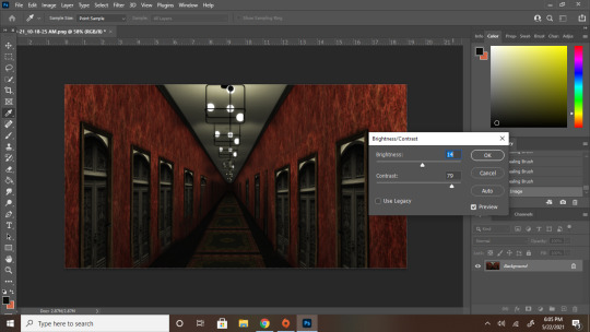
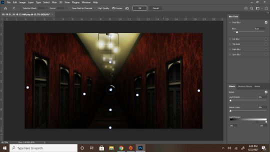
Step four: LIGHTING
Merge your layers together (If you trust yourself like that. If not then merge everything into a folder if possible and do everything else I'm about to say on adjustment layers.
4a: Brightness and contrast make it a bit more moody and darker so the flaws become a little less noticeable. After this i also used curves to make it a little darker and the red richer. But that was more of a me thing than a necessity so i didn't capture that part
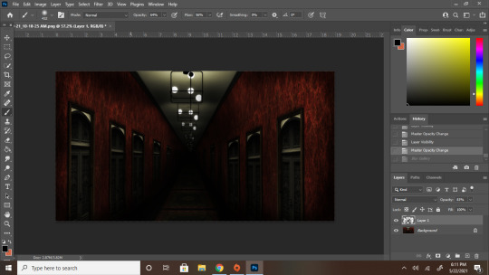
4b. Now make a new layer and go HAM on the shadows with a soft brush with zero hardness. Imagine an X where it is the darkest where the cieling and floor Vs connect while the ones along the wall are a little lighter. After make that X go into Filter > Blur Gallery > Field blur and mess with the settings of the shadow layer until you feel its as harsh/soft as you want your shadows to be, I personally went for 103 while my shadow layer was at 83% opacity
Before blurring
After blurring
She a little smoother now and is coming along nicely YOU'RE PRETTY MUCH DONE!
4c. High lights! Follow the lines of where the little lights are and blast them with some light yellows or full white depending on how heavy you want the lighting to look IN A NEW LAYER. Once you're done with that layer, change your normal setting to overlay and blur it to your hearts content as stated with the shadows. You usually won't need to blue highlights as much as you need to blur out shadows. For example I only blurred mine to a 25 px for the lights as opposed to the 103 for the shadows
Highlights in normal layer
Highlights in overlay and blurred
Step 5: The final touch, Depth of field
To get the deep look for this i'd reccomend going into blur gallery one more time and creating a t with your blur points and each 2 less than the last. For example, in my the center point was 6 px blurred. The four points around that were 4, then 2, and then 0
And YOU ARE ALL SET! After all of that your deep and spooky hallway is complete! Now go forth and cause chaos, bestie
#ts4#simblr#ts4 edit#ts4 tutorial#tutorial#ps tutorial#hall posts#hall tries to edit#i know i said i had another post to edit and yeah i still absolutely do but i wanted to make this first so i went back and reedited#the hallway so it looks...better#better for the tutorial at least#hall tries to help
56 notes
·
View notes
Note
in your post about things you would change about the Batfamily post you said you would give Tim a new costume and I was wondering how you feel about the rest of the Batfamily current costumes and if there's anything you would change? (I personally hate Jason current costume)
The one with the restraint mask and red eyes? God I hate that costume too, especially because Jason already had the coolest costume in the Batfam before that.
With Bruce, Dick and Jason I’m a strong believer of “if it isn’t broke, don’t fix it,” their classic costumes are just fine. I don’t want to see them in anything except the black and blue bodysuit with the Nightwing symbol, the brown leather jacket of Redhood (with NO helmet-lips plz) and a good old all-black Batsuit (without a speedo or round yellow Batsignal symbol) for Batman.
Recently with Barbara they have made the black part of her Batgirl be this shade of blue/purple? While her cape/gloves/boots got shorter? Altogether it just feels like they wanted a more “cutiefied” and casual look for her, which I’m not here for, I would much prefer it if she had a pitch-black suit with yellow gloves up her elbows and yellow boots up to her knees, something like this. (but then again I would rather Babs be Oracle instead of Batgirl, so I don’t really care)
I like both Stephanie’s Spoiler’s outfit and Batgirl’s outfit, but I may prefer the Spoiler one because I think we need some variety in costumes and there’s too much black clothes in the family. My only complaint is that I wish they gave her a Bat-symbol on her chest or something to make her outfit less plain, also just make her face-mask cover only half her face instead of all of it.
I also like Cassandra’s Orphan costume, but I would prefer it if she went back to her creepy-smiley-face Batgirl outfit, but without a cape (capes just don’t suit Cass) and I would really like it if they went crazy with the stitching part of her costume by extending it all over her costume for max creepiness. Basically a mix between her current costume and Catwoman’s costume from the 92′s Batman Returns movie.
Like I said in my “things I would do if I was in charge of DC” I would destroy nostalgic Tim’s fans who don’t want to let go of the 90′s by giving Tim a brand new Superhero identity and costume, so he can finally leave the Robin’s role completely behind him. I don’t know how I want it to look like though, I just want it to be capeless (I would like to believe that it’s a tradition for every Batboy to go capeless after they stop being Robin) also I wouldn’t mind if his costume had a new color not used by anyone in the Batfam, maybe orange?
With Damian, I may like his version of the Robin’s outfit the most, but I feel that recently they have been over-exaggerating how long his tunic and cape are, I much prefer his pre-Rebirth Robin’s costume, but I guess sometime change is good? If that’s the case then I would love it if they gave his costume a more Arabic feel and maybe make Damian have a Tim-dropping-the-green-part-of-his-Robin-costume moment, but instead he drops the red part and goes with green and yellow instead, I did photoshop his costume to look like that if you’re interested.
And Lastly Duke, at the beginning I didn’t like how they gave him a yellow costume because I associated that color too much with Babs, but over time I got over it, although I still think his costume is still too “Power Ranger-y” if that makes sense? I think it has something to do with helmet, so I think it would be for the best if they gave him a domino mask and a hoodie instead. (but honestly I’m kinda neutral about his current costume, so I wouldn’t be mind if they just gave him a new one instead)
#Jason Todd#Barbara Gordon#Tim Drake#Damian Wayne#Cassandra Cain#Dick Grayson#Bruce Wayne#Stephanie Brown#Batfamily#Anonymous
66 notes
·
View notes
Note
psst share your outer banks coloring secrets
ah, yes, one of the worst shows to color lmaoooo. i'll try to give some tips but im sure as anyone who has tried to color this show knows each scene is diff and has it's own flavor of awful yellow/green/red shading.
some tips on how to go from this to this......


............under the cut! (warning v long and idk if i'm the best at explaining things lmao)
so firstly, i use this psd i made ages ago for everything (alecbaenes was my url many moons ago i just am too lazy to change and reupload). usually i will go into each individual layer of that psd and see how they work with the scene, and will change the opacity or turn off the layer depending on what looks best. generally for obx, i will lower the opacity on the gradient map layer, as well as certain vibrancy/curves/levels layers, ones that make the gif brighter and more vibrant. i will usually bring back some vibrancy and brightness later but when im first getting the base coloring, some layers just heighten the yellow/red and we need to kinda bring that down before we make adjustments to get aspects like skin color more accurate.
so, just with my psd/adjustments made to the psd layers, the gif may looks something like this: (going to use this gif bc i made it more recently so i remember some of the stuff i did better, and is the most accurate to my current process--plus it sucks to color lmao)
ususally still way to red/yellow for my liking, both for the skin tones and to be able to manipulate the colors for a vibrant coloring! so the next step is to get colors as close to how they are normally. warning, you will have to make 345435354 adjustment layers and just keep tweaking and tweaking... and tweaking. sometimes i will have like 20+ adjustment layers at the end of the process. i usually put all my adjustments under my psd--i also always add a vibrance and brightness layer above. sometimes it helps to do final tweaks above the psd if you just cant get anything right bc of course the psd will change how colors normally look.
anyways, usually my base fixes will be some sort of combination of curves, levels, color balance, and selective color. so like, if the gif needs more depth/darkness, or is way too bright, i will bring the curve down or up respectively. levels, and also increasing the black selective color layer will also add depth. i will also use auto curve sometimes! the first image i have below i circled some of the extra tools i may use--auto for auto curves, the top black eyedropper you select the darker points in your gif and it will adjust based on that, the bottom one for the lightest--if i use those i will either use the black one only, or the black and then the white. the other three are examples of how my curve layers may look--i already have S curves in my psd, so when i do extra curve adjustments, it's just one single point, and i don't move it that much. same with levels, i dont make a super dramatic change, when it's under the psd it's enough to just move a bit to make a big difference. sometimes i'll also bring these layers to a lower opacity.
generally my first step is color balance though, especially if the gif seems mostly fine lighting wise. for obx, i usually shift it towards cyan and blue to cancel out the red tones. magenta and green depends, if its more green i may move towards magenta and vice versa, but usually i dont shift it that dramatically and often leave it alone. i will usually move the bottom bar towards blue, to soften the yellow tones. color balance helps shift the overall colors of the gif. notice that it's on mid tones in these pictures:
as you can see, i shift the cyan/red one more dramatically than the yellow/blue, and with magenta and green i usually just move it 1-3 points over. in the last one, i actually shifted towards red above my psd layer, because after all my adjustments i lost some of the red/warmth, so i brought back in red.
with color balance/curves, the gif may looks something like this
less of a completely red/yellow filter over everything! but still not great, their skin is too red, and overall still not the best base to try colorings. so next up is selective color, which can really help you fine tune things, but because of that.... SUUUUPER tedious. i will have 3495874 selective color layers and sometimes like 5 of them will be half canceling each other out just to get something okay. but this is a hobby i've chosen so we must suffer LKRGJRG. generally, my realm revolves around red, yellow, and at times magenta or neutral. if you think back to how we fixed some of the colors with color balance, kind of a similar principle, just with the individual colors. and lots of experimenting. so with color balance i would cancel out reds by making them more cyan--on the red selective color, im also gonna turn up the cyan. for yellow, i'm gonna make it more magenta, to make the yellow tones warmer. i will tweak the other tones too, just kinda experiment to see how changing it affects the gif, and then soon you will kind of intuitively know how to change the values based on whats going on in the gif lighting. magenta selective color helps for red values that are more pink, so make them more red or yellow based on what you need--i don't use this as much, hence i didnt have an example in the crop of psds i opened, but it's helpful sometimes. with neutral selective color, it usually affects the whole gif, so again, only minimal changes--usually i will bring the black levels down if it got to bright, or add just a tinge or yellow or cyan or whatever i need. here's some pics to show examples of what mine looked like for this gif:
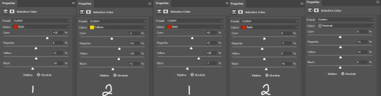
there were many more, but i just chose a few. the '1' and '2' i wrote to demonstrate that these layers were sequential, how they balance each other, and how selective color can be a tedious balancing act-- the second example it's like basically the opposite but it balances it out. also, if you have two characters with different skin tones, or the lighting is different for them, etc, you can use layer masks to erase certain adjustments so it only affects one of the subjects. some of these tweaks will be inbetween me transforming the gif to be colorful, and noticing how the colors interact, etc. so between this i was also making it colorful and it's not exactly the finished product at this stage: but this is kind of what the gif would look like after all the adjustments just to get it looking... normalish:

not totally perfect but MUCH better, and also will look a little different when surrounded by the colors i want to turn it into. i have some stuff about how i color in this tag, i can do a lil other tutorial or smth if needed but bc i have limited photo space on the ask and already wrote so much i wont get super into it here. but for shows like obx, it helps to work with a group of colors that will work with the show--yellows/oranges are easier bc of all the yellow already found in the show. pinks can be harder because there is so much yellow in the show, but doable. greens are good because of all the green in the show, and thus blues are good because its easy to go from green to blue with selective color and stuff. thus, purples are good too because its easy to go from blue to purple! stuff like that makes it easier. some work with selective color, hue and saturation, gradients, and voila!

you can see how maybe some of the issues like it being still a little too yellow/greeny toned balances out with the surrounding colors.
also, a big part of it is just practice! i've been giffing for yeaaaaaars and with media that has just the most god awful lighting so i've gotten good at understanding what to do and sometimes i'm just on auto pilot.
hopefully that helped, i know it was long winded and it can be hard to explain/understand photoshop. if y'all want some more in depth explanation about a part of the process i can try, or with other examples!
9 notes
·
View notes
Text
detailed giffing + basic coloring tutorial for beginners
so a lot of gif/coloring tutorials are pretty outdated or not that detailed & i wanted to put my own out there! in this:
how to get the screencaps for your gifs
how to make a general gif
basic coloring (no psds here, it just gives you a basic idea for making colors pop and look nice. you can look up how to use psds, but i prefer making my own for every gif as it’s much more personal, gratifying, and creative. there’s nothing wrong with using psds as long as you don’t claim them as your own, it’s just not my personal thing)
how to save a gif
we’ll be going from this:
to this
what you need:
photoshop (cc 2019 is what i’m using, but this works with any version of photoshop really as long as you download a version with the timeline feature) i won’t add download links here since i don’t want this deleted, but you can look some up on tumblr or use the pirate bay (current url is pirateproxy.blue as of 4/29/2020) & follow the instructions there.
for windows: potplayer/kmplayer (both use literally the exact same instructions) this tutorial uses potplayer but kmplayer uses like literally the same instructions, it just doesnt work right on my computer
for mac: mplayer. this tutorial does NOT cover this so find a tutorial on tumblr on how to take screencaps with mplayer & then skip to the “how to make a general gif” section. though, again, i’m on a pc so i have no idea if this is entirely accurate for mac.
if you’re downloading from youtube: clipconverter
if you’re Definitely Legaly torrenting: utorrent + the pirate bay (again, current url is pirateproxy.blue as of 4/29/2020) or another torrent site + you should really consider getting a VPN when torrenting (i use privateinternetaccess but you can find one that suits you)
note: download an adblock of some kind, disable automatic downloads on your computer, & download an antivirus program if you want because some sites are sketchier than others! this is ESPECIALLY crucial on sites like piratebay. keep your computer safe babes.
1. screencapping
there’s several ways to get screencaps on photoshop, but this is the easiest imo and i’ve never done the whole convert video frames to layers thing. like i said, you’ll need potplayer or kmplayer. i’m using potplayer. important note: don’t accidentally download viruses here! read each screen carefully & make sure you’re not hitting accept to download any secondary programs.
1. download your .mp4/.mkv. you can go to youtube & find a clip/scene/whatever and use clipconverter to download it. just make sure you download it at 720 (or higher) as anything lower than that will give you a poor quality gif. you can also download using somewhere like the pirate bay, but for this you need utorrent & i would HIGHLY recommend using a vpn if you live in a country where torrenting copyrighted content is illegal, as your internet provider may flag your ip address if you don’t & you torrent too often.
2. download potplayer/kmplayer & get it set up
3. create a screencaps folder. i always put mine on my desktop. in your screencaps folder, make a folder for however many gifs you want in your set. i just have one for mine so:
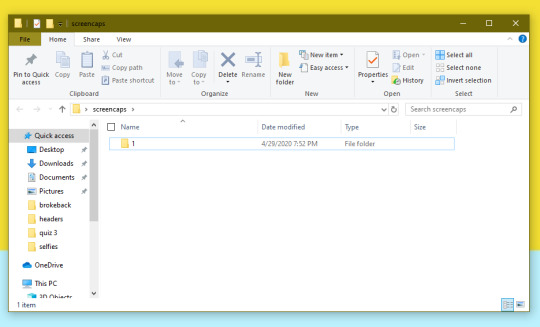
4. open up your .mp4/.mkv
5. hit ctrl + g to bring up the screen capture pop-up & set your settings to these. click the button w/the three dots next to the storage option & select the folder you created for your first gif
6. navigate to the scene you want to gif. when you’re there, pause it and hit the start button on the consecutive image capture screen, then play the video. how many screencaps you need depends on the size of your gif. for larger gifs (so like 540px wide gifs), you’re probably going to want to keep it below 30 frames. for smaller gifs (268px wide or less) you can maybe stretch it to 60, depending on how much coloring you add. you can always delete screencaps later though in photoshop, so don’t worry about it too much. for this gif, i only had 17 frames because the scene was really short lmao
7. go to your screencap folder you made & delete any unnecessary frames. it’ll look like this:
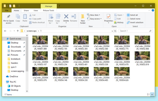
8. repeat the process for any other gifs, making new folders in your “screencaps” folder, numbered for however many gifs you’re making. make sure to change the folder you’re loading the images into on the image capture pop up though so they don’t all go into folder 1.
2. making a simple gif (+sharpening)
1. first, you need to load your screencaps. when you open up photoshop, go to file > scripts > load files into stack
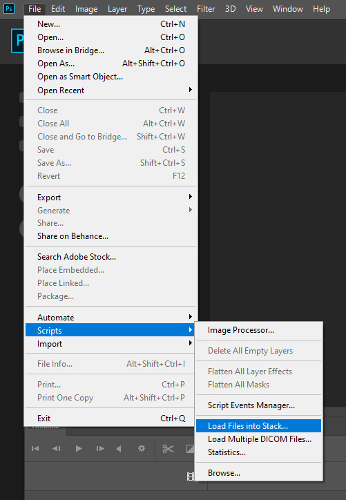
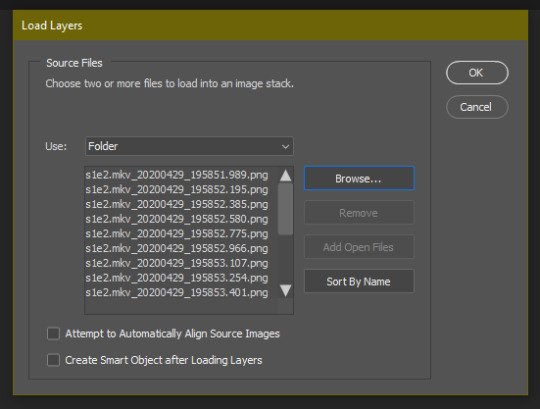
2. when the window pops up, switch the “file” option to “folder”
3. click browse and find your screencap folder for your first gif (in my case, desktop > screencaps > 1) once it’s all loaded, click “OK”
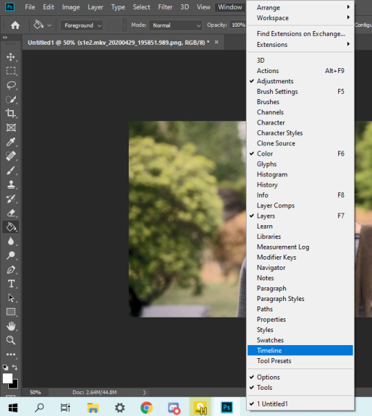
4. it’ll take a minute to load all your screencaps into photoshop. when they do, go to the upper bar on photoshop > windows > timeline
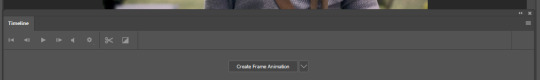
5. when the timeline bar shows up, click “create frame animation”
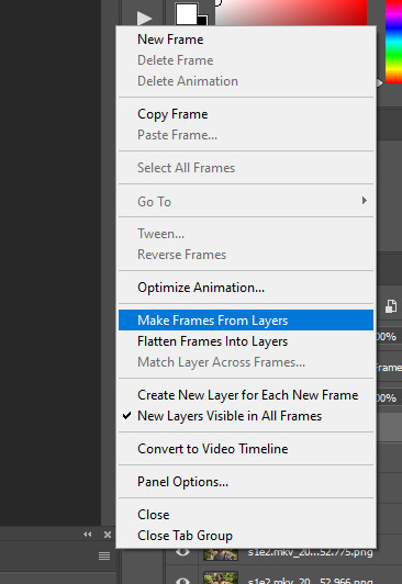
6. hit this button and click “make frames from layers”
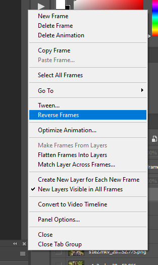
7. hit the button again and click “reverse frames”
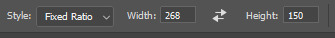
8. click back onto your first gif. then select the rectangular marquee tool and set it to whatever gif size you want. the width for 2 small gifs next to each other is 268px, the width for full size gifs is 540px. most people use 268x150 px for gifsets of 4+

9. use the marquee tool to select what area you want for your gif, like this. it’s up to you how to crop it! get creative!
10. go to image > crop
11. now that your image is cropped, go to image > image size. change the size to your desired gif size (in this case 268x150). hit “OK”. then make sure it’s zoomed in to 100%

12. now, you COULD just save this gif, but they look way better sharpened. so you need to convert this to a smart object. to do so, first select all your layers in the righthand layer window. to select all the layers, click on your top layer, hold shift, and scroll down to your bottom layer & click on it as well while still holding shift
13. next, you need to select all your frames. go back to the options button from part 6 > select all frames
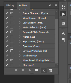
14. next, we’re going to create an action to make your life 100x easier when it comes to sharpening gifs in the future. to do so, go to the actions icon (may look different on different versions of photoshop, but basically just find the actions window)
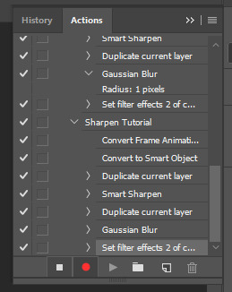
15. create a new action with this button. name it something. i named this one “sharpen tutorial” and hit “record”
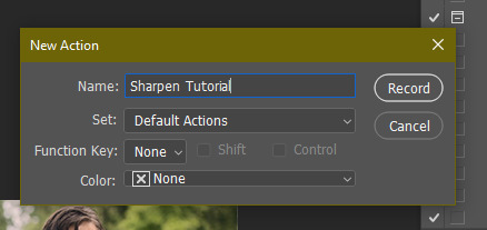
16. click this button to convert to video timeline
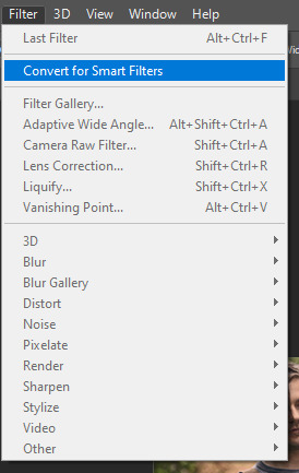
17. go to filter > convert for smart objects
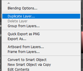
18. go to your single created layer and right click and click duplicate layer. this helps get rid of the transparent border around the gif.
19. go to filter > sharpen > smart sharpen & use these settings
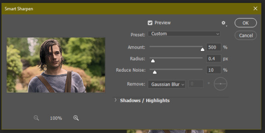
20. go to filter > blur > gaussian blur. set it to these settings.
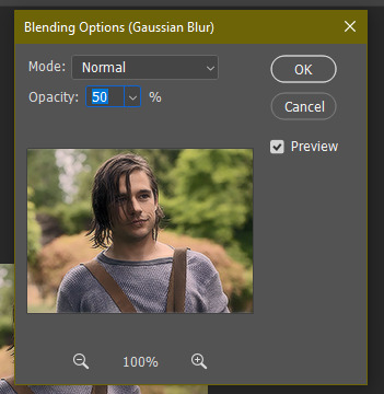
21. go to your second layer with the filters on it & right click on the gaussian blur filter to select “edit smart filter blending options” and set the opacity to 50%. you can mess around with this for different levels of sharpness. the closer to 0%, the sharper your gif will be.
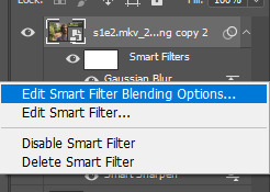
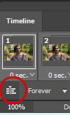
22. hit the stop recording button on your sharpen action. now you’ll have an action to use next time you make a gif! after you’ve followed all the steps 1-13 you simply go to actions, click on your saved sharpening action, and hit play instead & it’ll do steps 14-21 in a few seconds. here’s a pic of the stop button on the actions window
23. our gif is now sharpened! you can end with this & skip to the saving a gif section, or you can continue to coloring. here’s what we have so far.
3. coloring
now on to coloring. this is pretty basic coloring and it probably won’t work if you follow my numbers exactly, as every single scene is different color + lighting wise. but this is just an example of the kind of thing you could do. basically, if you’re making vibrant gifs, you want to up the brightness + contrast + vibrance and make the colors already present pop. if you want anything more complicated (pale gifs, changing the colors to make, say, quentin’s shirt in these gifs red instead of blue), you’ll have to find other tutorials or experiment on your own. learning how to color & finding your style takes time! you can download psds if you want, but imo those kinda take the fun out of making gifs? that’s just me though.
after each step, i’ll show you what the gif looks like.
1. i usually start with a curves layer. i usually don’t mess with the color curve options, just this one:
2. next, i do a brightness/contrast layer

3. next, i do a vibrance layer. make sure not to make it TOO saturated or it’ll look bad.
4. next i do a color balance layer. this is where it really starts differing depending on what color you want your gif to be.
5. next we move to the selective color layers, which are arguably the most powerful. here you can make colors pop, change colors, etc. it’ll take lots of practice & messing around with, but here’s what i did with this gif. this one is making yellow + blue pop
6. next, i did two more selective color layers editing the blue tab to make the blue pop even more


7. i still wasn’t quite happy with it, so i added another selective color layer to edit the blacks + neutrals + greens
8. for good measure, i added one more brightness/contrast layer

9. and the gif is done! however, you can play around with various adjustment layers until you’re happy. again, this is just an example of how to do basic coloring. it’s a skill like any other & takes practice. to keep consistent coloring in a gifset,
9b. you may want to make a psd of this coloring. to do so, you need to put all your adjustment layers in a folder, delete your frame layers, and click file > save as. save it as a .psd. then you can open it and drag it onto any other gifs you make, adjusting the coloring accordingly but still with the same vibes. you don’t have to do this, but it makes life easier. here’s how to use your saved psd, though obviously you’re using your own in this case and not a downloaded one.
4. saving your gif
1. on photoshop cc 2019, you go to file > export > save for web (legacy). for other versions, you can just go to file > save for web. use these settings. the gif size limit is 3mb per gif, so make sure your file size is under that. if it’s not, you’ll need to delete some frames or some adjustment layers.
2. now, photoshop is a bit of a pain & this gif timing will not be right. so you need to open your newly saved gif. then you hit this button + select all frames
3. click this button & select “other”. tumblr gifs are typically .05-.08. my photoshop is glitchy and i have to set mine to .1-.15 or they’re WAY too fast. but usually, go with .05-.08 unless yours ends up glitching too.
4. save it like you did the first time and ta-da! you’ve made a gif!
#gif tutorial#photoshop tutorial#edit tutorial#coloring tutorial#yes im using the magicians its my hyperfixation and i get to choose the gifs
164 notes
·
View notes
Note
hello!!!!! what sizing do u do for ur gifsets of 4?? also could u do a Tutorial on how to color gifs and add text to them on photoshop??? Thank u!
hi anon!! i usually use 268x268 or 268x360 or 268x380, it depends on how i want the gifs to look like, if i want them perfectly squared or kinda rectangular. you can play with height but remember to not change the width and always use 268 if you want to upload 2 gifs one next to each other and want them to look hq!
and since you asked here’s a quick tutorial on how i color gifs + add text! i’ll pick the coloring i used on my last gifset which is basically the coloring i do every time and i’ll start with this sharpened gif:

first of all, if you’re not familiar with gif making + gif sharpening here’s a great tutorial on how to do it! and before we begin keep in mind that every gif is different and that the same coloring might not fit different gifs (on other gifs it might be too bright, too dark, too blue, too purple, too pink, too this and too that) so you might have to make small changes to help the coloring fit the gif.
having said that, let’s proceed. all the adjustments are made by selecting a new adjustment layer from the top panel. so i start with adding curves and hit the “auto” button. sometimes i do it manually, but i often use the “auto” button! and then i add an exposition layer and increase “exposition” until it looks good to me. i usually like a high exposition on my gifs! for this gif i used exposition +0,63. and it now looks like this:

it looks too yellow now, doesn’t it? so i add a selective color layer, select yellow and set yellow to -100%. i usually don’t like yellow so in this way it looks kinda rosy and definitely less vibrant:

now i like to add photo filters! usually if the gif is too blueish you could use the sepia photo filter, while if the gif is too yellow/orange you could use one of the cooling filters or the deep blue filter. since i’m addicted to purple, i always choose the violet filter with the violet set to +25%. then i duplicate the photo filter layer twice. and the gif now looks like this:

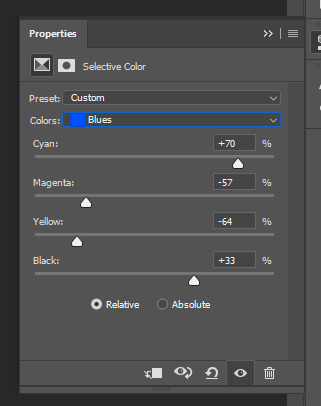
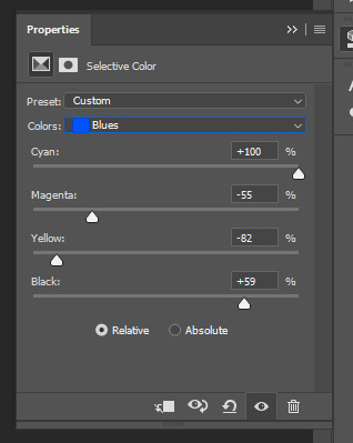
now my favorite part: highlighting the purple! or turning the blue into purple. in this case the gif looks already pretty purple, but taylor’s guitar is still blue. so i’m gonna change the blue into purple. this process isn’t always made in the same way for each gif i work on, sometimes i use selective color + hue/saturation and sometimes i use only selective color or only hue/saturation. i play with blue a lot until it reaches a satisfying level of purple for me. in this case i used both selective color and hue/saturation. i added a selective color layer, selected blue and set:
cyan: -37%
magenta: +100%
yellow: -100%
black: 0
then i added a hue/saturation layer and set the blue hue to +30.

et voilà! the coloring is done! as i said before, this coloring with these exact options looks good on this gif but it might look less good on another gif. so you always have to further play with adjustment layers and see what happens - as i do every time!
additionally, adding a text is very simple: you just need to select the text tool from the tools bar to the left, click on the gif and write whatever you want. make sure to put the text layer above every other layer! then you can play with colors and text options by clicking twice on the text layer or selecting the text layer and then clicking on “layer” from the top panel, then “layer style”, then “blending options”. here i set the color of the text to #ffffff and the blending option to difference (probably my favorite option):

that’s it, i hope you enjoyed this tutorial and if you have other questions feel free to ask me. 💜
73 notes
·
View notes
Photo

let me talk about my latest gifset here. the above gif was made when i was tinkering around with different settings to get my sharpening right and doesn’t have anything to do with the gifset i published lol.
typically i release an “aesthetic” gifset of different shots i found particularly interesting in the episode. however, when i was making the murder family gifset, i got incredibly drained from making it. the stress of downloading it, clipping the video, to making all five gifs with the text....to y’all it may not seem like much but i am still messing around with the sharpening atn which i thought i got it down but apparently...my method takes up a HUGE chunk of time and i’m actually like... :( because i thought it solved the problem. but whatever...i got it done xx
you’ll be surprised to know that the psd i used actually comes from a supernatural psd asjdklsajkldsa i tried other colorings but none of them really Respected the scene, you feel me? i didn’t want it to be too warm nor too cold so this one really did the job. do i wish it was a bit less warm and really make the skin color more “natural” (for a lack of better words)?? yeah, i kinda do BUT honestly, nothing in my arsenal can truly prepare one for prodigal son. that show is RUTHLESS with its coloring and make us content creators SUFFER -_-
before opening photoshop, i actually wrote down a few notes in my notebook for what colors i should use for the subtitles because i need three. i know the typical ones are usually black, white, and yellow but because the scene is so dark, i couldn’t use black so i went with another color i see some people use which is blue. the original hex code i had for it was...a bit much when i actually went into photoshop so i had used a lighter blue to really pop. i do like how the subtitles came out because i was worried i didn’t know what font y’all are using nowadays but luckily i had a psd to help with that <3 also i don’t like subtitles i feel like every time you put the text psd onto the gif, it’s never centered where you want it to and the way you gotta have it in the exact same place it was on the previous gif....girly....the pressure.
all and all, everything worked out really nicely. it just sucks that it took a huge chunk of time given the ordeal with the sharpening atn which i might go back to my usual “soft” sharpening because tbh.....it’s not worth the trouble. plus some people don’t really see any difference which sucks because i was really proud of that new sharpening....to me it made the gifs look crisper but i digress. it’s my eye for detail, really.
#there is this one atn that i had that would do the whole thing that i am doing with the gifs rather quickly but i didn't like how much it#blurred the gif so i stopped using it (you can see one gif i made with that atn on my writing blog @aelunis it's my pinned <3)#i think i deleted the atn but i might try to dig it up again if it's in my recycle bin or if not...i'm gonna have to like go find it online#EITHER WAY! i might make an aesthetic gifset later for that episode but i'm not really confident in delivering that promise we will see :)
5 notes
·
View notes
Photo
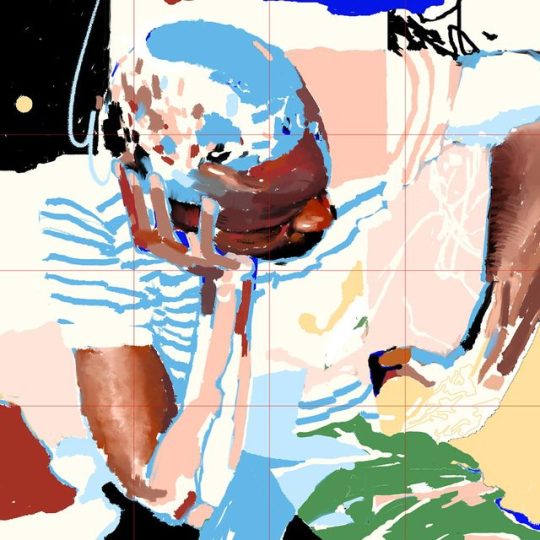
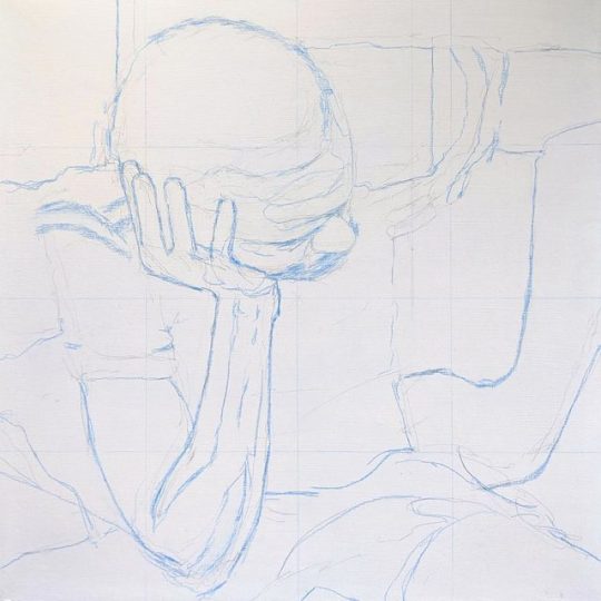
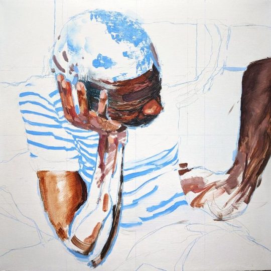
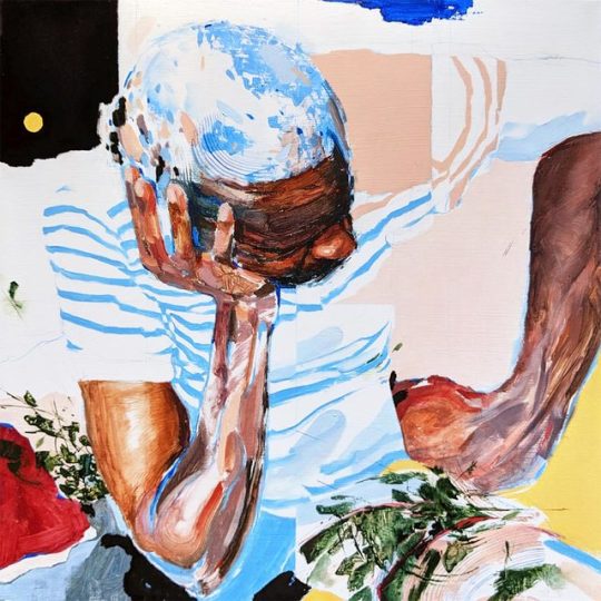
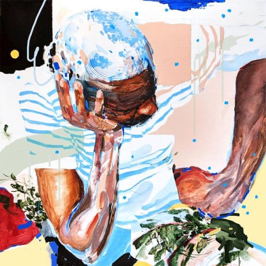
Thought I would share some of my thinking with you guys on this new painting.
Into endless river Oil and pencil crayon on panel, 16" x 16", 2019
Prints available
It was inspired by this amazing old National Geographic article about this massive boat that carries 1000+ passengers through the Congo River - essentially a travelling merchant town barely floating down the river with a journey that can span several months. The one I read was printed in 1991 and I can’t find it online but you can read a more recent article that isn’t as good here lol - it’s pretty incredible.
Anyways, there was this photo of a man in a cramped coach cabin, seated among 40 others with his head resting in hand, deep in thought and/or exhausted from the voyage. It was a story about survival and struggle and people putting their all into the hopes for a better future for themselves and their family. Uprooting themselves and trading away what they know and love for opportunity. I’m privileged to have been on the receiving end of that kind of story but it’s what my parents went through and their parents before them - and those kinds of stories have always been deeply affecting to me. I never had the intention of making this into a full painting, but I had the biggest urge to sketch it out and after I did, I kinda just kept spending time with it.
I started with a digital sketch, building out the composition and major forms in light blue (which I like to do with oil paintings as well). The pose had this super heavy, architectural quality to it and the folded stripes of the shirt made for a beautiful contrast. I cropped the composition tightly around the figure to frame him in a state of discomfort and intensity.
I really liked the sketch so I started experimenting with compositional elements and bringing in more colours. I knew that I wanted something really vibrant and crazy - I wanted to somehow convey good vibes and bad vibes in the same image and let whoever’s looking at it reflect off of that. Once I felt like I had a good starting point laid out in Photoshop, I threw a grid over it, drew it out in light blue pencil crayon on my panel and got started.
This is the first painting I’ve made where most of the critical decisions were discovered digitally. Unlike traditional media, it’s basically safe from any kind of commitment and it allowed for really fast, endless exploration. You can pick checkpoints throughout the process and branch out into different options. My intention for the digital stages was to only rough out possibilities - I wanted to save a fair amount of uncertainty for the actual oil painting process. In the future, I’d like to rely less on the digital stuff actually, as it kinda obviously makes things feel more predictable and I felt like it took some of the magic away.
The actual painting process has been pretty different from what I’m used to. It's very flat and pieced together, mostly single layer. Most of the elements have come together in a fragmented, designed way - not a whole lot of blending going on outside of the skin tones. Overall, I’m really happy with how intentional I was with this one, without having it look sterile or over-laboured (I hope). I’m excited to move on and work on more stuff, maybe similar to this one.
Palette:
Titanium white
Mars black
Burnt sienna
Yellow ochre
Cadmium yellow medium
Napthol vermillion
Phthalo blue
French ultramarine blue
Sap green
Viridian
I’m not used to doing this kinda thing - has this been helpful? Is there anything you guys would wanna know next time I do something like this? Send me questions!
#art#art process#process#art tutorial#painting#painting tutorial#artists on tumblr#art guide#oil painting
427 notes
·
View notes
Text
I've talked at length about Sullivan, and I know I still need to flesh out those bullet points, but for now please allow me introduce you to some of my other Cats OCs
I've got quite a few, so to keep this from getting super long, I'll break it down into parts.
Part 1: the "Alleycat Triplets"
(not actual triplets, just always together)
Persimmian
(per-SIM-mee-an) Not "persimmon." Persimmian. An intense, short-tempered alley cat that values looking tough, but mellows somewhat with adulthood.
Doesn't put up with your bullshit
Stubborn, proud, and irritable
Used to be more aggressive and violent than she is now
Has mellowed but is very much not mellow
Resting bitch face
Vigilant and alert
Mind always racing
Excellent tactician, but poor long-term strategist
Lives in the moment
Must do something with hands
Lots of arm-crossing as a result
Intense serious business mode
Enjoys joking and messing around in down time
Sense of humor is mostly dry sarcasm, mockery, and blunt insults
Will laugh at your misfortune, but not at your pain
Loves her two best friends dearly but is too proud to say it out loud
Became the leader of an alleygang in mid-adolescence that was once the Jellicle's closest neighbors
Demi
About Munk's age (used to consider him a rival)
Lean and athletic
Soft medium-length fur
Colorpoint with a little bit of diluted orange in the points, making her technically a calico colorpoint
Deep blue eyes
Floofy tail
Nickname: Persi
Scaramouche
(skahr-ah-MOOSH) Member of Persi's gang and one of her two BBFs.
Also acts tough, but more as a job or for fun
Actually a laid-back goofball
Calm and nonchalant
Believes he's not smart, but has more common sense than Persi or Crash
Sees the bigger picture
Almost impossible to get him down or get under his skin
Forgives easily
Bores easily too
Master of casual snark and playful teasing
Will fight you for fun then offer you a drink
Unshakeably loyal to Persi and fiercely protective of both her and Crash
Bi
Slightly older than Persi
Tall and slender
Short scruffy fur
Solid brown
Scar crossing over left eye from left forehead to upper left lip, causing a slight sneer
Bright yellow-green eyes
Blind in scarred eye, but very good at hiding it, even Persi and Crash sometimes forget.
Sometimes slurs when excited or upset because of his damaged lip
Nickname: Scar, and he's so proud to finally have the scar to go with his name
Crashendo
(kraa-SHEN-doh) Member of Persi's gang and the final member of the alleycat BFF trio.
More openly kind and friendly than his friends
Still very good at posturing and intimidation when the situation calls for it
Acts generally chill and care-free but secretly worries a lot
Fast learner, good memory
Technically the smart one, even if he's not always wise or sensible
Pays attention to the details
Brings the sass
Loves rough housing and acrobatics
Sensitive and empathic
Will gladly listen to your life story
Will also gladly tell you exactly why you suck
Intensely loyal and faithful to Persi and Scar, whom he considers his soulmates
Demi/Bi
A bit younger than Persi and Scar, closer to Tugger's age
Small and sturdy
Short smooth fur
Silver bengal-like markings
Warm golden eyes
Nickname: Crash or Crashie
All three:
Are almost never apart
Might as well be literally chained together because it wouldn't even bother them
Have no patience for idiots, bullies, or people that threaten or hurt the other two
Have called Munk "Tough Guy" since adolescence
No they don't remember which one of them called him that first
Are the first ones that called Alonzo "Patchwork" which eventually got picked up by Macavity's gang
Used to call Tugger "R.T." and still do occasionally
Think Asparagus (Jr) is "a pretty cool dude"
And that the twins are "stealth badasses"
No they don't know what that's supposed to mean
Are a force to be reckoned with in a street fight
Less useful, but still get by, in one on one combat
Will absolutely team up on your ass
Would literally die for each other
Some pics to show what I mean by "calico colorpoint" (not Persi's exact markings):

and "silver bengal-like" (he's not actually a Bengal, just unsure what else to call these markings):
UPDATE: I've added some pics of what Scar kinda looks like. The left pic is his shade of brown and face shape, the right is my best attempt at photoshopping his scar onto a brown cat, though I realized too late I was using the wrong color for the scar, it should be a more pinky greyish kinda tan color if that makes sense...
Part 2 Part 3 Part 4 Part 5 Part 6
17 notes
·
View notes