#it feels weird to draw charlie in a dress and vaggie in pants but
Explore tagged Tumblr posts
Note
Could you draw a Chaggie bodyguard au?
this is the best i could do anon, ive never come across bodyguard aus. it doubles as a human au if thats anything

#hazbin hotel#charlie morningstar#vaggie#chaggie#it feels weird to draw charlie in a dress and vaggie in pants but#i figured a skirt would be inconvenient and i wanted charlie to kinda be giving lilith so#reqs
221 notes
·
View notes
Text


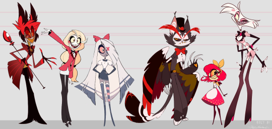
Here's a photoshop edit of my take on the Hazbin Hotel Redesigns! Some of the recent redesigns have felt unbalanced in color, so I decided to try it out myself and give some fixes! Though Alastor's I'm still unsatisfied with. You can see the struggle in the lineup. There are too many good ones.
Shoutout to @darlinkaz on twitter for their black-gloved Angel Dust design, they were gOING places with that. I just made them fingerless, and gave him some bracelets!
Alastor's red suit and shirt are iconic, but that's all there is to his color scheme. To break it up, I added more gold in both his shirt and eyes and messed around with some white. What design do you guys like better? I actually like Alastor better with a tie, but I felt like removing his bow tie felt... wrong... despite most of the cast having bow ties.
Definitely prefer Charlie's redesigned hair. A lot cuter and makes more sense. Her redesigned outfit is very nice, but everyone complained about too much red. Keeping her pants black and adding just a slight red tint to her eyes should do the trick! (Also her long white shirt? I'm in love... she looks so professional!)
Vaggie's new design made me think she was going to Sunday church, however, I will recognize again, that she looks more professional in that button-up shirt than the last outfit she wore. The problem is again, too red. So I took her new outfit and mixed it with her old color scheme, and kept her stocking because she's gotta keep some of her gothic pastel personality! I also gave her boots, and her redesigned hair, and took off her bow strings since I feel like... with all that hair it's unnecessary to have them be that long, especially for the animators to deal with.
Husker's new design isn't out yet, but he too has too much red. Don't even get me started on those symbols, my god, those poor animators. So I simplified his colors to mostly black and brown! And I gave him shirt sleeves, and gasp- PANTS! With a belt! My man may be a furry, but he's not a nudist. He looks like a legit fancy bartender now.
Niffty doesn't have her new design yet, but her current one needed a lot of help. I erased her odd bullet holes in her shirt and instead gave her yellow polka dots on her dress! She has a gold/orange shirt, and an apron. She also has a new hairstyle that better represents a 50s hairstyle with a classic headband bow! She's so much more cute and charismatic now. A proper housekeeper.
Angel Dust's redesign was pretty solid up until it got to the gloves. I love the long gloves, but the pink AND white gloves? Unbalanced and distracting... feels weird. So as mentioned, kept his redesigned look; used @darlinkaz's black glove design but made them fingerless gloves, and gave Angel Dust some cute pink bracelets to be more fashionable! I also added hot pink soles to his heels. Some people draw Angel Dust with his classic hat, but Angel Dust seems like a character that gets with the times. I think he seems more genuine without his hat, especially since the mob business is what messed him up in the first place. I think he'd want to separate himself from that.
Anyway, that's what I've got so far! spindlehorse pls hire me
#hazbin hotel#hazbin hotel redesign#charlie magne#charlie morningstar#vaggie#vaggatha#angel dust#husker#niffty#alastor#alastor hazbin hotel#vaggie hazbin hotel#husk hazbin hotel#husker hazbin hotel#niffty hazbin hotel#angel dust hazbin hotel#photoshop#edit
303 notes
·
View notes