#it draws on a lot of other films for inspiration
Explore tagged Tumblr posts
Text
Paul Atreides is sooooo T.E. Lawrence coded
#lol yes ik dune is partially inspired by him and the arab revolt#it was a very interesting movie(s) to watch when ive just been intensely learning abt +#the history of colonization in the middle east for the past month or so#i kept thinking. man this is just like [insert history]#and it def especially reminded me of lawrence of arabia#it felt like LoA if it was sci-fi and much more intense and yknow if Lawrence went a lot further#just a lot of scenes in part two really reminded me of stuff from that film#okay also other thoughts:#MANNNNNN I LOVE JAVIER BARDEM'S CHARA#hes soooooooo!!!!!!!#something about deep loyalty and belief really gets at me. and also he was very fun and silly sometimes :))#hes so ride or die!!#also there was a ring kissing scene. and yeah. man..that gives me drawing ideas for you know what#catie.rambling.txt#dune
9 notes
·
View notes
Text

This piece based on the Overlord Husk AU created by @celestialalpacaron
Husk and Angel's attires are based on those worn by Frank Sinatra and Vivian Blaine from Guys and Dolls, the 1955 musical film.
For other clothes and that pinup poster, I took inspiration from other old America musical films. Surely one could easily recognize that red dress and feather headpiece :)))
Drawing timelapse
Tools: pencil, M&G gel pen and Leningrad watercolor.
A lot of mistakes, but at least this is less mediocre than my firt HuskerDust fanart. Still nowhere as good as I pictured it in my head. I felt like I did @lilshroomboi's Hazbin Cafe AU dirty by my first work. But rest assure @lilshroomboi I will work on a better fanart that does justice to your beautiful AU.
#huskerdust#hazbin hotel#overlord husk#angel dust x husk#angel dust#hazbin angel dust#hazbin hotel husk#husker hazbin hotel#husker x angel dust
2K notes
·
View notes
Text
ok so since it's just occurred to me that the fandom is constantly growing and changing and learning, there's some bits of hermit backstory that I know that others might not. hermitfacts coming up:
the server was built as an equal mix of builders and redstoners (and then Joe Hills was added as a WILDCARD to shake things up)
season two only happened because Joe Hills ran a coup
tango is the father of the iron farm, before 1.14 made iron farms easy, your best bet was to ask tango. tango also modded villagers before the villager update
etho invented the etho hopper clock, revolutionised the minecraft let's play, and inspired a lot of the server to play/film
impulse is the guy behind the item sorter, and he is a master of villager manipulation, with his villager breeder being in massive use
bdubs' brother, pungence, joined hermitcraft before he did and played for season one
iskall is behind the vault hunters mod and it's really cool and you should check it out
the way cub built concorp inspired Mojang to update the way villagers work
doc is friends with the Mojang game Devs (even if they took his arm)
Hypno runs the hermitcraft website, even when he's not active on the server
Welsknight came in to defend the others in a rap battle when he was away from the server
Stress runs a fitness channel alongside her Minecraft channel and being a parent
Joe hills used to have a webcomic and do drawing streams - he saw twitch be born, and will likely see twitch die
Scar got his start in call of duty
Joe Hills thought hermitcraft was a scam when he was invited
add your own!
11K notes
·
View notes
Text
DISCUSSION ABOUT EL’S POTENTIAL ENDING
So Millie has been giving a lot of interviews lately promoting her latest film Damsel, and ofc interviewers have been trying to get some ST5 info out of her. (We all saw that clip where Mlvn got mentioned to her and the face she made lol)
Well there are two new interviews in which Millie talks about El and they are making me kind of nervous…for lack of a better word.
The first is this one…
She was asked what song helps her cry, and she said “when it’s cold I’d like to die” Now that song famously plays every time a character dies on ST, so it wouldn’t be weird for an actor in the show to associate it with sentimental emotions. However, what concerns me a bit is that she mentions that this is “El’s theme” uh??? Since when girl??
The other interview I’ve already seen it floating around so I won’t add a clip, but she was basically asked about whether she knows how it ends for her character. She goes on to say that she asked for a meeting with the Duffers and she saw a board with her character’s fate and went “ohhhh” and slowly walked out.
I’m not gonna lie that answer is not inspiring happiness in me.
I don’t think the Duffers will “traditionally” kill El. In the sense that I don’t think they would fully kill her off (that would be too fucked up). I do wonder if her character will be around after Vecna has lost and the supernatural has gone away, though. Will she somehow disappear after the conflict is gone? Was she part of a bigger allegory or metaphor related to the supernatural plot of the show?
In the original pitch, the Duffers described El and Mike’s relationship as an Elliot and ET bond. ET is an alien, therefore at the end of the movie he has to leave Earth. He can’t stay there with the other characters. Are we gonna see something similar regarding El? She won’t die but maybe she has to go/be somewhere else?
I don’t want to alarm anyone it’s just that I feel like I’m putting some pieces together here lol…
The Duffers also admitted after S2 came out that El was originally written to “die”, as in she was gonna disappear when she took out the demogorgon. However, they changed their minds when the show got renewed for more seasons. Nonetheless, the Duffers have said that their ending for S5 draws inspiration from the ending of S1.
What the hell are they referring to with this???
I’m also aware that Millie is an actress and she’s drumming up suspense for the show. I know she has admitted to lying in interviews just for fun too. Can’t really trust an actor ever, but I do wonder if we’re seeing some truth from her here.
What do you guys think? Any theories?
578 notes
·
View notes
Text
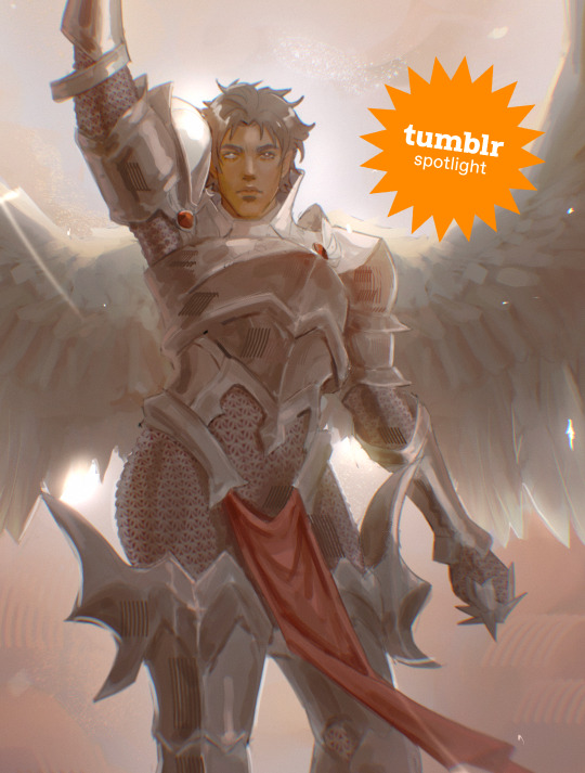
Creator Spotlight: @chaaistheanswer
Hi everyone! I am Clara, but you can also call me chaa! I am a digital artist based in Auckland, New Zealand, with a bachelor’s degree in Creative Media Production. After graduating from uni, I moved out to pursue my art career and I’ve been a freelance digital artist ever since. I love concept art, especially character design! Creating characters influenced by my love for fantasy is what I live for. Thank you for stopping by, and I hope you enjoyed my art! And thank you, Tumblr, for this opportunity!
Check out our interview with Clara below!
Did you originally have a background in art? If not, how did you start?
I specialized in art in high school and have a bachelor’s degree in Creative Media Production from Massey University with an animation pathway. For our thesis film, which I worked on with several of my classmates, I took on the role of producer, art director, and concept artist. Our short film was featured in the Wellington Film Festival Terror-Fi in 2020. After graduating, I went on to become a freelance artist, but my goal is to work for the gaming industry as a character concept artist. Ever since I first picked up a pencil, I knew I wanted to become an artist!
Have you ever had an art block? If so, how did you overcome it?
Art block is quite common among artists, and unfortunately, I too have fallen prey to the affliction. I have several ways of overcoming art block: watching movies, playing games, reading, or going out for a drive with my sister. These are just a few things I love to do to help keep my creative juices flowing!
What is one habit you find yourself doing a lot as an artist?
I tend to obsessively research about completely unrelated topics while I draw. I find learning new things helps improve my concept designs, especially in creating backgrounds for my characters.
Over the years as an artist, what were your biggest inspirations behind your creativity?
Video games and anime were my biggest inspirations! Anything with a captivating story that’ll send me to the edge of my seat, and loveable characters. I’m particularly drawn to high and dark fantasy.
How has technology changed the way you approach your work?
Technology has made a huge impact on us artists over the last few years. I used to draw a lot on paper, but since getting a tablet, I find myself searching for the undo and redo buttons and even trying to zoom constantly while I draw on paper. I used to only draw for myself as well, but after posting my art online, I now have an audience to whom I can share my art. Because of this, I am able to earn a living doing what I love by creating illustrations for clients.
What is a recent creative project that you are proud of?
I am very proud of this recent commission I’ve done for a client! Fortunately, the piece turned out exactly how I wanted it to look, and my client was very happy with the result. I am also in the process of working on a Webtoon, which is going as smoothly as I hoped it would be before its re-release!
What advice would you give to younger you about making art that's personal or truthful to your own experiences?
The best advice I would give my younger self is to never hold back! Try not to think about the negatives of creating and sharing art that you believe in. Embrace vulnerability, and don’t be afraid to dig deep into your own emotions and experiences. Always explore, and don’t limit yourself to your own bubble. And most important of all, stay true to yourself! Stay true to your values and beliefs, and never compromise your own authenticity for the sake of pleasing others. Your art is a reflection of you as a person.
Who on Tumblr inspires you and why?
@yuumei-art has been an inspiration to me since my early Deviantart days. I admire how she uses her skills to focus on environmentalism and cyber activism. @nipuni is another inspiration of mine. I found her when I was in the process of recovering from Dragon Age Solavellan hell. I admire how she manages to capture faces well while also sticking to her style. Her paintings are so beautiful and very pleasing to my eyes!
Thanks for stopping by, Clara! If you haven't seen her Meet the Artist piece, be sure to check it out here. For more of Clara's work, follow her Tumblr, @chaaistheanswer!
603 notes
·
View notes
Text
"The Acolyte" wasn't 'woke' propaganda.
I had my issues with the show (you can check out my other posts to see what they were) but there's this notion that The Acolyte was created to spread The Message™ of "woke propaganda"... and I think there's a bit of a mix-up going on, there.
Because that's simplifying things a lot.
When you're a minority, you're not "being woke" when you're just being yourself! Conversely, you're not "writing to be woke" when you're a minority drawing inspiration from your personal experiences to tell a story.
I talked before about how George Lucas implemented elements of his personal life in his own films. In his own words:
"There's no way to write without writing from yourself. Y'know, the stuff gets made out of things that you care about… whether you've actually lived them or not. There are emotional issues that you deal with, and I think that's always a major factor with any writer. I don’t think— it's hard to write without having some kind of emotional connection to the material. I've never seen any reason not to. It’s easy to write that way. It's hard to write in the abstract. So when I write a scene, I write a scene that moves me or I care about, or is something that is personal to me." - George Lucas, Q&A with Lynne Hale, 1994 (StarWars.com)
Any piece of writing worth some salt needs to come from a personal place to some degree because that's where the heart of the story, the truth, lies. That's what an audience will relate to.
Example: The six original Star Wars films are purely George Lucas. As in, everything in those films, from the characters, to the cinematography, to the editing style, etc are all a reflection of who George is as a person and what he stands for:
anti-Vietnam / "fight the corporate & imperial machine"
60s-70s white kid from Modesto, California
single father of three
who defines himself as Methodist-Buddhist,
has an anthropology major and
a passion for Kurosawa,
cinema vérité,
cinema history in general
art and visuals and
car racing.
You see all that in those films.
Same thing with The Acolyte.
Leslye Headland drew from her personal experiences.
Among other things, Leslye is gay. So that's what she uses as inspiration to, for instance, craft Qimir's character motivation.
"I was on the treadmill being like, “What is [Qimir] gonna say?!” And my wife, who is a huge part of my creative process, finally she said, “What do you wanna say? Stop thinking of it like you have to somehow tap into a different guy.” [...] I was like, “I wanna say that people don't want me to exist as a gay woman, as a woman in this particular space, working in this wild sandbox.” There was a whole crew of people who believed in me, but deep down, I felt like, “I am unaccepted for who I am because of what I believe in and wanting to wield my power the way I'd like without having to answer to the legion of people that just exist out there.”" - Leslye Headland, Collider, 2024
She took this specific life experience of hers, and then made it more universal, so that a bigger audience could relate to it.
"By the way, I think everybody feels this way. I think that's why it resonates when you're honest about yourself, and you get personal about it. When [Qimir] says, “I want freedom,” that's what I want. I just want freedom. I want to be able to just be out there and be myself and be the type of artist I want to be without having to answer to anybody." - Leslye Headland, Collider, 2024
Same goes with Osha and Sol's relationship, or how she defines the Jedi Order. It derives from her own relationship with her father and how she felt being raised straight, in a Christian household.
If you have the time, listen to this audio clip where she describes that.
In the context of the whole interview, her voice goes down a few octaves and starts to crack a bit. This is a vulnerable moment, when she's talking about it... and it's this experience that she turned into fuel for her writing of Sol and Osha's father/daughter bond.
"There's this thing that's called benign sexism, and part of it is this paternal protectionism — it seems like this good thing, but like you said, there's this, “I have to protect you from everything. I have to make sure you're okay. I have to tell you what track to get on, and then once you're on that track, I need to support you.” Ultimately, what happens is — again, this is a father-daughter relationship — as women evolve in their lives and develop their own personalities separate from their fathers, at some point, they have to reject that protectionism. [...] She cannot stay a little girl or an adolescent or young adult. She has to, at some point, say, “I reject what you have told me I need to do to make you proud, to follow in your footsteps.” She has to do that." - Leslye Headland, Collider, 2024
Now... if we're talking consistency with the themes in Lucas' Star Wars, then yeah, The Acolyte misses the mark.
The Jedi Order isn't the patriarchy or the Catholic Church. They're more like Buddhist monks, George has stated so multiple times.
The Jedi teachings aren't narratively meant to be the same traits found in toxic masculinity or benign sexism.
When a Jedi tells you to be mindful of your emotions, it's not meant in the "boys don't cry" sense.
When they talk about letting go of attachments, it's not meant in a stoic "don't get emotionally involved" sense.
Anakin too, the whole point is that he's wrong, the narrative frames his fall to the Dark Side as his own fault, it's not meant to be perceived as a failure in upbringing.
But she's not the only one who does it. Filoni does it too, a majority of fans have this take on the Jedi.
And because of her experiences, I can see why her takeaway would be that. Same goes for Filoni, they're products of their generation, upbringing and experiences.
My point is:
Leslye Headland is writing from a personal place, when she's writing The Acolyte. It's partially informed by her politics because - like she quotes, "personal is political" - but when it comes to the writing of the show, it's personal first and foremost.
What this was, was a Star Wars fan (arguably the nerdiest one we've had so far, in terms of creators) putting all of herself in the creation of a show that perfectly reflects who she is and what she stands for, resulting in:
a story about growing past your father's paternal control and accepting that our guides aren't infallible,
where her wife holds a role and gets to wield a lightsaber,
a show about taking corrupt religious institutions to task
about the Sith and the Dark Side
and questioning the unquestionable
and exploring whether the good are really so good and if the bad are really so bad.
This was a project written from the heart, and regardless of whether the resulting art found its mark, I think it's important to note that it wasn't written to spread a propaganda message in some "pro-woke holy war" or whatever the hell the YouTubers are peddling.
223 notes
·
View notes
Text

🖤🐍Mr and Mrs Malfoy 🐍🖤
Talk about a POWER COUPLE! What is it about twisted characters in books that make me enjoy drawing them? I despise all they've done in the HP books/films, but man, are they an attractive pair :) Sometimes you just can't help but love a villain (or antagonist in this case) :)
The two of them complement each other very well. And Draco is the well-rounded combination of the pair of them. He's like his father in a lot of respects, but a bit of a mama's boy too <3 A Mommy and a Daddy issue both! What a catch!
I liked drawing the adult versions of Narcissa and Lucius because the teen versions were already so great to do. With a little help from her husband's fortune, Narcissa grew into her love for fashion and perfected her look. She's also a bit of a femme fatale with the sharp edges in her style, making her appealing and unapproachable at the same time. Lucius just fully embraced the aristocratic vibe. He has everything tailored to fit him just right, accessories subtly, but perfectly (with a little help from Narcissa) and he's one of the only people I've seen who can pull off the long hair. It reminds me a bit of Daemon Targaryen from House of the Dragon... I did get inspired by his hair in the first season :)
Now, I decided to play a bit more with their colours. You may be shocked to see RED AND GOLD on them in the middle illustration. I wanted to, not for any significant reason other than that I thought it would look good on them :) Sue me. Anyway, I love this. And I love you. I hope you enjoy! Love xxx Fleur


#luciusandnarcissamalfoy#luciusmalfoy#narcissamalfoy#narcissablack#lucius#dracomalfoy#malfoyfamily#malfoy#illustration#harry potter#draco#draco malfoy#characterdesignsheets#gryffindor#harrypotterdesign#harrypotterart#characterart#characterdesign#hogwarts#harrypotteruniverse#illustrator#draco lucius malfoy#slytherin#slytherinhouse#hogwarts school of witchcraft and wizardry#hogwarts houses#wizardingworld#wizardingworldillustration#wizardingworldofharrypotter#marauderseraslytherin
273 notes
·
View notes
Text
Animation Night 189: Nonphotorealistic
There is a funny trend in animation-related terminology to define things by what they aren't. Animation is any technique for creating film that isn't live action. Limited animation is any style of 2D animation that doesn't follow the conventions of Disney's 'full animation' on 1s and 2s - a category that includes a wildly diverse range of approaches and techniques, as this wonderful history by Animation Obsessive describes.
In 3DCG circles, there is a similar term: nonphotorealistic. Which describes, naturally, anything that isn't trying to look like a photograph of a real scene. There has been a real boom in this of late, and just like the other terms, it really doesn't narrow it down very much. Other terms like 'hybrid animation' add a bit more hints.
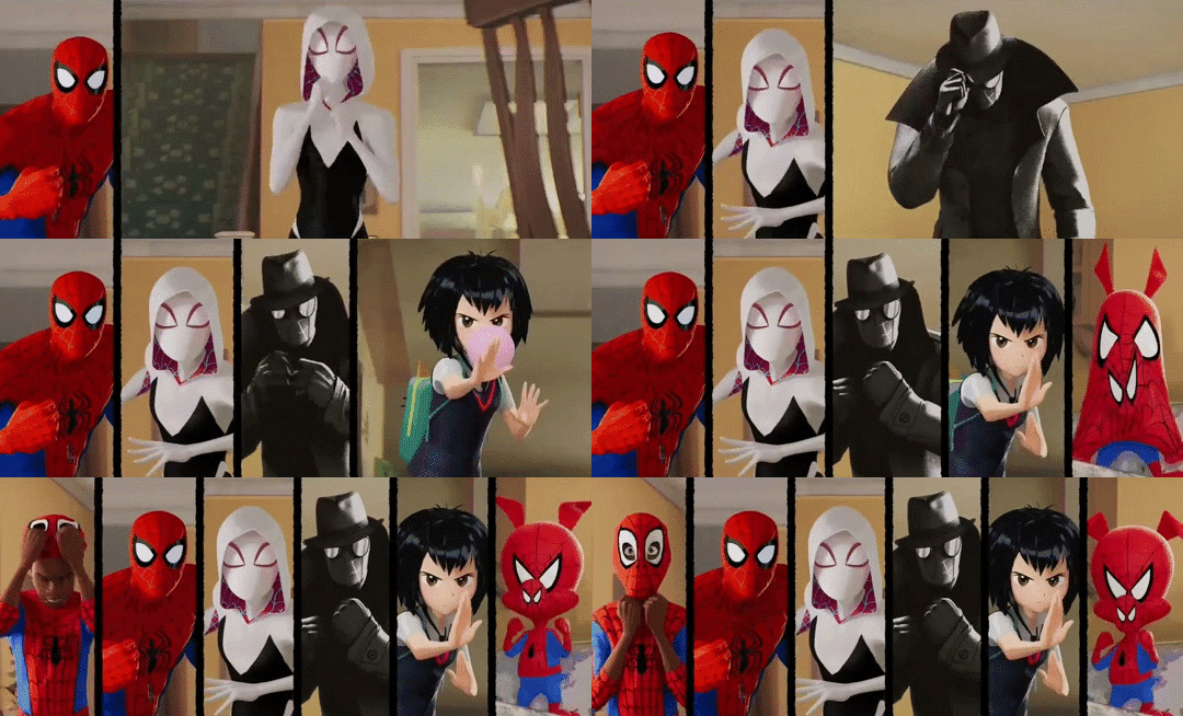
Of course, if you've been anywhere near animation in the last few years, you'll probably know another term: 'Spiderverse style'.
There is no denying that Spider-Man: Into the Spiderverse (2018) by Sony Pictures Animation was an absolute landmark for animation. (I wrote about it way back on AN21, focusing more on the cultural angle.) The ludicrously stylish film pretty much set the direction for animation in the 2020s - making a bunch of money and awards and thus finally throwing open the door to 3DCG animation that doesn't look like the style set by Pixar/Dreamworks in the 2000s. Its sequel, Across the Spiderverse (2023), was even more ambitious and successful (despite a troubled production involving a lot of needless crunch). We'll be showing that soon in a Spiderverse double bill so look forward to it!
So perhaps not surprising that when people see the use of graphical styles, 2D elements, limited framerates and the like in 3DCG these days, Spiderverse comes to mind. In its wake have come various films and series that apply these and related techniques: 3DCG animation is more varied than ever, and it's cool.
It isn't really a style, tho.
youtube
Here I'm indebted to youtuber Camwing who has made a nice video overview breaking down the animation of recent movies in this vaguely defined paradigm. Among them we have The Mitchells vs the Machines (2021, also Sony), Puss in Boots: The Last Wish (2022, Dreamworks), and Teenage Mutant Ninja Turtles: Mutant Mayhem (2023, animated at the French/Canadian studio Mikros animation), and of course over on Netflix you got the wildly popular League of Legends spinoff series Arcane (2021, Fortiche Productions), and the romance film Entergalactic (2022, DNEG), tying in with an album of the same name.
None of these films has exactly the same style, but they all pull from a related bag of tricks. The core techniques are animating on reduced framerates for a 'snappy', high-clarity feeling, the combination of 2D and 3D elements in some fashion, and taking inspiration from traditional media such as paintings or comic books.
For example, Arcane and Entergalactic both use the trick of 2D backgrounds/projecting paintings onto 3D geometry, inhabited by 3D characters with a stylised shader. Arcane is dripping with 2D visual effects. Puss in Boots drops the framerate during its action scenes - the opposite of the old paradigm of full animation, where fast actions would get more frames. Spiderverse draws 2D expressions onto its 3D models to push them further, and is full of all kinds of colourful stylised rendering - screentone effects, kirby dots, outlines, the works.

It's tempting to link this to 2D-in-3D animation, and certainly many of these films apply this technique - this is the major niche where Blender has found its way into industry pipelines. But using 2D isn't mandatory to count here. For example, TMNT Mutant Mayhem has an incredibly striking storybook-painting style, accomplished largely by clever shader work and a strong sense of graphic design. Genndy Tartakovsky's canned 2014 Popeye project was planning to use a ton of 2D-style posing and squash-and-stretch, accomplished largely with rigged 3D models. There are many paths to take!
And mind you, I haven't even covered one of the biggest angles here. Search for nonphotorealistic 3DCG on Youtube and what you'll probably find most is information about cel-shading - aka 'anime style'. This has also advanced considerably in the last few years, with the techniques pioneered by Arc System Works in Guilty Gear such as editing the normals of characters for more precise control over shading, and minute adjustments to break up the mechanical feeling of 3D, becoming widely copied in both games and films. (And particularly, animated porn.)
youtube
Vtubers in particular have really run with this technique, generally speaking using cel-shaded models with edited normals, inverted eyes, etc. etc. to try and get the feeling of an anime character come to life. [You can see a lot of these state of the art techniques if you download Pixiv's free VRoid Studio software and import the model into Blender using the VRM plugin.]
Naturally this kind of cel-shaded approach has found a particular home in Japan. In anime, the biggest champions of it are certainly Studio Orange, whose hybrid approach involves planning out shots with 2D animation before matching them with the rigs. We've covered their adaptation of Houseki no Kuni in great detail on Animation Night 97; their Trigun reboot was perhaps even more popular. But cel-shaded techniques, 3D previs and the like have also made their way into big films like Eva 3.0+1.0 (AN66).
Although this type of rendering aims to recreate the look and feel of 2D animation as much as possible, it always ends up being something new: character models that would be too complex to draw, an ease to 3D movements and camerawork that would be challenging in 2D, and generally a new hybrid style. This is good! 2D animation is already very good at being 2D animation - it's fascinating to see what 3DCG becomes with that inspiration.
So with that brief overview, where does that take us tonight?
I'm not quite ready to do a Spiderverse double bill tonight, so instead the plan is to check out a couple of recent American franchise films that are taking on the new suite of techniques. I've mentioned them up above, but let me introduce them more fully here.

Puss in Boots: The Last Wish is a sequel to a fairly unpopular spinoff about a side character of the Shrek franchise (AN75). Not, on its face, very promising - which is why it is all the more striking that I was told on all sorts of sides that I must watch this movie. I'm finally going to make good on that.
The title character is a kind of feline musketeer type, now facing the end of his swashbuckling career as he's lost 8 of his 9 lives. Not wanting to hang up his hat, he goes on a quest to restore them. What makes it stand out its the action scenes, which go all in on the anime-influenced, extreme perspective and lighting, limited framerate style that we're discussing above. Apparently it looks sick as shit.

Teenage Mutant Ninja Turtles: Mutant Mayhem is a fresh reboot of the venerable TMNT franchise, which pretty much describes itself in the title: four turtles (named after Renaissance painters, of course!) live in a sewer as ninjas, led by their aging master who is a rat. Starting as a comic book, it became one of the iconic toyline-driven TV shows of the 80s - but it's still going! Indeed, Turtles has been on a roll of late (at least going by animator scuttlebutt), with Australian studio Flying Bark Productions turning a lot of heads with their neo-Kanada School style (and for really stretching the definition of 'storyboard').
This new film takes a different approach to the bombastic action of Rise. It focuses on a new origin story for the turtles, telling a kind of coming of age story - but what makes it unique is the animation style and cinematography. Cinéma vérité is not a phrase you really expect to be associated with ninja turtles, but the film seems to really go all out in a way you wouldn't really expect from a franchise movie, shooting the young turtles in a handheld style and focus heavily on character. Marcel Reinhard's shader work, allowing the animators to isolate lights to specific objects and characters and introducing graphical elements of cross-hatching, stippling, etc. etc. to the lighting, gives it a uniquely painting-like feeling, augmented by a lot of 2D creativity in lighting and effects.
Turtles has never really been my thing, but this film looks unique enough that I really want to see it - and I hear it's a good film too.
So that's our bill for tonight! Puss and Turtles. Let's see what the big studios have been cooking of late...
Animation Night 189 will be starting around 10pm UK time (roughly three hours hence) and carrying on til about 2-3am same! We'll be on twitch.tv/canmom as usual. Hope to see you there!
149 notes
·
View notes
Text
Like the Movies
about: a series of my favorite movies reimagined with (some of) the boys of seventeen.
notes: the movies inspired the fics, please don’t expect it to be an exact word for word reenactment of the films; i had a couple of ideas and decided to roll with it. unfortunately i will not be doing all of the boys as some of them are key side characters unless specifically requested! the stories are interrelated in some way; it won’t be explicitly stated but try and look for crumbs!
also! most if not all the y/ns in the fics are directly stated to be female due to some of the stories heavily relying on y/n’s biological sex to be female.
currently working on: pretty girl !
Pretty Girl
based on: Legally Blonde
pairing: law student! joshua x heiress! reader // ex boyfriend! wen junhui x reader
synopsis: the youngest of 3 successful sisters, no one expects you to accomplish anything save for sitting still and looking pretty, but after your boyfriend dumps you for a much more educated girl, you get your eldest sister to pay your way into harvard law where you meets joshua hong, who does not seem to appreciate how lightly you takes things.
tropes: opposites attract, popular girl x nerd boy but with a twist, they start off at the wrong foot, it gets resolved, joshua will say hurtful things along the way though
A Sweet Haven
based on: Notting Hill // Maid in Manhattan
pairing: golden retriever!mingyu x single mother!y/n
synopsis: never in your wildest dreams did you expect acclaimed actor, kim mingyu, to stumble into your quaint bakery and ask you to hide him from the onslaught of paparazzi. what began as one chance encounter turns into constant visits to you and your daughter. but just as you begin to see a future between the two of you, the reminder of his fame and reputation hovers over the both you.
tropes: forbidden romance, single mom! reader, mingyu’s an actor, secret relationship
Hot and Cold
based on: Pride and Prejudice // Emma
pairing: wonwoo x reader, seokmin x oc
synopsis: as the eldest child of your family, you have only ever wanted the best for your siblings. so when your sister confesses to being in love with someone— you do everything you can to make sure they both end up together… but the infuriatingly handsome brother of your sister’s beau seems to be against the union altogether.
tropes: enemies to lovers, they really don’t like each other at first, just two people being protective of their younger siblings, elder sibling trauma written by an only child LOL
Mr and Mrs. Choi
based on: Mr. and Mrs. Smith
pairing: agent!scoups x agent!reader
synopsis: you and seungcheol (code name: scoups) have a bit of a work place rivalry going on, and the agency wants to put you both to the test by pairing you up with each other in a mission that would determine who gets the promotion… the catch being that you both would have to play a married couple.
tropes: rivals to lovers, technically also coworkers to lovers, fake marriage au, a lot of back and forths, cheol is a teasing lil shit with y/n, will very much include the old “the target is gonna notice we’re tailing him hurry let’s make out”
Love Me Tomorrow
based on: 2 week’s notice // flipped
pairing: jeonghan x reader
synopsis: your friends and coworkers say you’re foolish for harboring a crush on the worst man ever; aka your boss. yoon jeonghan is a successful ceo, and he is well aware of the hold he has over you; often using you to perform minute and tiresome errands. but what happens when you finally draw the line?
tropes: unrequited love (initially), she fell first but he fell harder, hannie’s an asshole here ngl, he gets better i promise, y/n is on a path to self love, when hannie realized he loves her he’s so pathetic i swear

Something Borrowed, Something New
based on: My best friend’s wedding
pairing: minghao x extraverted!reader, slight vernon x reader, and slight minghao x oc
synopsis: you love your fiancee you truly do, and you were very sure he felt the same long enough to propose to you; but he’s quiet, and well- you’re not. you know this, and so you always make sure you are not too spirited in days where he doesn’t feel it. but when he runs into his old college friends, you could not help but notice how he becomes a lot livelier with his childhood best friend.
tropes: established relationship, opposites attract, golden retriever y/n and black cat minghao, angst, like a lot of it, hao has a girl best friend :(( , two people who don’t communicate because of their own personal reasons
#seventeen#seventeen x reader#svt x reader#angst#fluff#suggestive#svt angst#svt fluff#svt imagines#scoups x reader#joshua x reader#jeonghan x reader#wonwoo x reader#mingyu x reader#the8 x reader#like the movies — satin#minghao x reader
231 notes
·
View notes
Note
Your Fredbear/Nightmare Fredbear design reminds me a lot of a children's movie called "The Great Bear". Were you inspired by this film to draw Fredbear?

I had never heard of the film, I just saw it, I loved it and there is a great resemblance to my au and the fredbear that I make! But to answer where
I got inspiration from was a story he told about an old and blind wolf who was ferocious and wild but at one point this wolf found a lamb when he took it to his cave as his food, the lamb deceived him, the wolf deceived him. He spared the life and raised the lamb. The little boy and the wolf grew up together, always taking care of each other. The wolf, despite being blind, was smart and knew how to find and protect him.
The lamb said he hated him but loved him like a father. The story ends when the wolf He says that he will "take a nap" but the story ends with the lamb finally being free but being too sad for the wolf. Even so, I am very surprised that the film is similar
503 notes
·
View notes
Note
I wanted to vent, but also ask an honest question. Since I was a teenager, I always wanted to work on character design. And one thing that always caught my attention was how I always preferred male character designs over female ones. My first thought was that I was always more into androgynous fashion and more masculine styles. But time passed and I came to the conclusion that it wasn't just that, and it seems that male characters can always be different things: fat, thin, handsome, ugly, short, tall, young, old, etc. and female characters, for the most part, fall into two categories: cute or sexy. I wanted some tips on how I can make female characters with more interesting designs, without having to fall into those two categories. I love your work and you managed to make someone else like the three musketeers <3<3
Hello ! That's definitely a good question and something I think about a lot. The bias towards beauty is very strong in character design and it takes a conscious effort to diversify output in that regard.
That sort of advice might be a bit obvious, but one habit I picked up from the director on my first feature film gig was to actually "cast" characters. Without reference, we tend to go for the kind of symmetrical face and "average" features mostly out of stylistic habit. I like to look at character actors with distinct faces (I like this pinterest page that has a lot of faces in one place) but also just acquaintances or pictures of random crowds.
When designing a character, at first I'm always building a big reference board trying to decide what Type of Guy (gender neutral) I'm going for, trying use photos rather than other people's art, because I want to rely on automatics and graphic symbols as little as possible. Whether I'm designing a man or a woman or other, I use references of fashion styles and people across the board in terms of gender so I keep the scope open. Sometimes a character ref board for me will be a picture of one of my aunts next to a bunch of screenshots of Columbo. In my experience, a lot of the times, it's mostly about going with styles and archetypes the same way you would for a male character, and switching it up somewhere along the way by looking at real women in your life and beyond as a grounding mechanism. Sometimes that will mean changing almost nothing, because the borders between genders and how you characterize them is blurry and fluid, and sometimes it will mean using features that are uniquely tied to some sort of female experience.
I enjoy realism and I think getting more proficient at it did help me diversify my designs (I find that more difficult to do with more minimalistic styles). Still, I am mostly a fantasy artist and in my case that comes with some amount of stylization and idealization of shapes and looks. I'm far from perfect in my biases and I'm not going out of my way to draw "ugly" characters because that doesn't mean much to me ; I try to draw inspiration from the faces of every day people and I associate it with my love for fashion. It's also worth noting the work I post here for fun is a lot more hash tag aesthetic than the stuff I do professionally where diversity is much more important.
I don't know if any of that is relevant but that's definitely an interesting topic ! I'd love to know others' perspective and tips on the matter.
263 notes
·
View notes
Text
Wanderhome
"You should play an obligate sexual cannibal in Wanderhome I think it'd be funny" - Jay Dragon, developer of Wanderhome
Touchstones: Ghibli films
Genre: Cozy game, Adventure
What is this game?: Wanderhome is a game about playing small critters travelling, to where? who knows, its the journey that counts, not the destination
How's the gameplay?: Wanderhome functions on the Belong outside Belonging framework, which functions in a push/pull of Tokens, Tokens allow you to take negative plot beats in return for later having positive plot beats! there's also playbooks that specify what you can spend tokens on and how you gain them. Wanderhome is a very simple game, this is because it lacks a GM! storytelling is done entirely collaboratively, it works shockingly well, especially with such a simple setting and premise!
What's the setting (If any) like?: Wanderhome's setting places the players in a pastoral landscape ravaged by a prior war. The world is healing, the people are hurt, and things are getting weird. The setting has some extra lore, like the Little Gods, in effect "God" is a very strange concept in the world of Wanderhome, being a collection of tiny deities that make up the world, rather than one or 10 centralizing figures. The setting of wanderhome is a large draw of the game, and I'll leave the rest for you to find out. Oh also, the players are all small furry critters, and the usual roles of cattle and other things are replaced by very large bugs, this is the big aesthetic draw of the game.
What's the tone?: Wanderhome's is a world where things got very dire a while back, but things are getting better, people are healing, gradually, and the horrors of the past are being reconciled with. It's a setting largely about healing and improving
Session length: Wanderhome lends itself to shorter, 1-2 hour long games
Number of Players: 2-6 are all fully possible, however, in my opinion, 3-5 is preferable
Malleability: Wanderhome's mechanics are faaaairly generic and can be modded into many other things, even if the setting is a large draw and part of the game. This is a game I'd honestly recommend mostly sticking to the default setting, though, just because it's so interesting
Resources: Wanderhome has a ton of extra fan playbooks, some extra official playbooks, though its lacking on group sheets (That I could find) and other useful things, its a very simple game, though, its not like you require a lot
Wanderhome asks the question, "What if Ghibli-inspired games took more than surface level aesthetic inspirations?" and runs with it to create one of the tightest and most interesting experiences currently in the space, it's a wonderful game made all the better by one of the most beautiful books i've ever seen
128 notes
·
View notes
Note
Hey Mera! Today's Friday the 13th and I couldn't help but wonder, do you have some thoughts for any serial killer (insert twst chara) for the day? 👀
personally thinking of sk Floyd with the lake theme surrounding Jason Voorhees, being the final girl when your group of friend decided to have a little camp out nearby the cursed lake.
but you know, sk Azul (persumed dead) coming back for revenge after being bullied and "drowned" in the camp lake is also a delicious thought....
AAAA sk twst thoughts!!!! Sk Floyd and Azul....... both of those ideas are so delicious,, being the final girl who is no match for these obsessed killers. >_< they're going to have you one way or another. Whether that's speared on a knife or his cock. :)
Omg but sk Rook is also a yummy thought!!! Maybe you're a horror writer trying to get out of a writer's block, and there's Rook who is so obsessed with you and your books. Your biggest fan, one might say. He decides to help give you inspiration by throwing you into the plot of a typical slasher film, only this one isn't just confined to the page. >:D Rook terrorizing your town and you've no idea what's going on, but people around you are dying in brutal ways and the killer seems to be getting closer and closer to you as the days pass. orz
And sk Cater!!!! Cater who wants to go viral so badly, but nothing seems to be working. So he decides to become a masked killer who livestreams all of his kills. :) he starts with insignificant people. It draws in some views, but nothing will get the view count up quite like a bigger target. Someone that people actually care about. Maybe you're a public official or a celebrity. In any case, lots of people adore you and now here you are, stripped naked and bound like a pig, and Cater's having his audience vote on which ways he should play with you first.
Sk Idia....... something something very messed up plot where he's running an experiment to see how much mental exhaustion and stress a person can endure before they inevitably break. Cold, detached STYX Idia......... putting you through the worst hell of your life and to him you're merely Human Test Subject #57. >_< there's no chance of escaping, and even if you do manage to miraculously break out of your cell and slip past the robots Ortho will stop you. He can quite literally control all of the surveillance and other high-tech security on his own, so bringing you back to Idia is no issue at all! :D omg what if,,, Idia but it's that one sleep experiment creepypasta....... I think Idia should be used for more unethical science concepts. He can be so frightening when he's clinical.
84 notes
·
View notes
Text
I've been thinking a lot about Jossam lately, totally obsessed, and I've come up with some headcanons!
• Josh is a film enthusiast, and this is clear as a crystal. Just like that fact, he loves Sam. They say every artist has their muse, their inspiration—and for some, it's distant people, historical figures, or even actors or musicians. Josh is no different; he has his muse, and luckily for him, it's his sister’s best friend.
• Josh is an artist. He loves working on small film projects to tell little stories he's written. Of course, he always finds a way to get his friends involved, whether it’s Jess playing a Carrie remake or Emily as a masked killer... But none of them came close to being in as many projects as Sam. Josh always put Samantha Giddings in his films. She was always the lead, the final girl, the one who gets the guy at the end, the princess, the superhero—because that’s who she was and always had been to him, the protagonist of his life.
• Sam loved being part of those amateur films. She always thought Josh's artistic vision was beautiful, even if that wasn’t the reason she kept doing it. She loved listening to him talk about his ideas, loved how focused he became, loved hearing him go into detail about every little thing he had in mind. His mind fascinated her. She was in love with everything he did, in love with him, which, on its own, made everything he had to offer—even the "little things"—feel magical.
• One time, a town fair caught Sam’s attention. It was an animation competition, and when she read about it in the paper, the first person who came to mind was Josh Washington. Well, she was the girl who did the drawings, but he was the guy who handled everything else. Maybe it was her way of trying to spend more time with him. Maybe that feeling made her call him and tell him about it, and maybe it was his own desire to spend more time with her that made him agree instantly.
• They didn’t win first place in the competition, instead placing third and getting a silly plastic trophy for both of them. Regardless of the result, they were happy. Spending that time together was probably what they needed to understand their feelings for each other—even if they hadn’t admitted them yet. Everything seemed to be falling into place... until the anniversary of the twins’ disappearance came around, and with that... well, you know the story.
#jossam#jossam headcanon#josh washington#samantha giddings#josh x sam#josh washington x samantha giddings#until dawn#game#headcanon#jossam hc#fanfic#movie#rami malek#hayden panettiere#cute headcanon#hc#fanfiction
59 notes
·
View notes
Text
Sebastian Stan, the interview: "If I met Trump I would ask him how he looks in the mirror"
The American dream, the unpredictability of Jeremy Strong, the instincts of an actor: twenty-five minutes of interview with the amazing protagonist of The Apprentice. At the cinema.
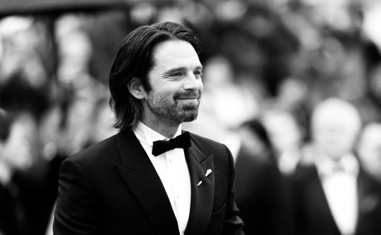
INTERVIEW by DAMIANO PANATTONI
While answering questions, Sebastian Stan approaches the webcam lens of the computer he is connected to. As if he were, in a certain sense, eliminating distances. Connected from a London hotel for our exclusive interview , he is in the midst of the promotional campaign for Ali Abbasi's The Apprentice , in which he plays none other than Donald Trump . A role, as they say, that is worth a career. An excellent performance by someone who could be considered one of the greatest contemporary actors.
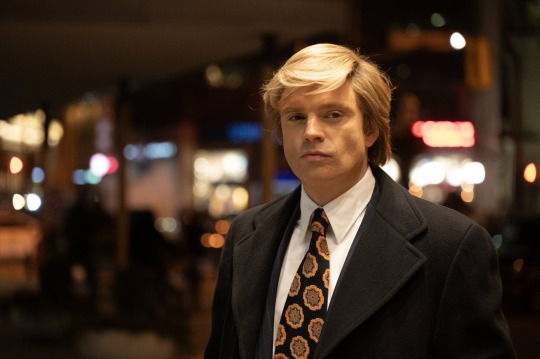
The set, among other things, he shares with two other champions: Jeremy Strong in the role of fixer Roy Cohn, and Maria Bakalova who plays Ivana Trump. Sebastian Stan, for the entire twenty-four minutes of the interview (he was very generous, and that is not at all a common thing), thinks about the answers, takes a breath, weighs his voice. Like when he reflects on what the killer instinct of an actor is, given that in the film, the character of Trump himself, claims to have a deadly instinct "For me it is the truth, and how you make real what, instead, is not" .
The Apprentice: Interview with Sebastian Stan
Sebastian, how did you manage to immerse yourself so deeply in Trump’s body?
Well, I think when you play real people, fortunately there is a lot of information to draw from, and to look for inspiration. I think it almost becomes a real detective story to solve. You put things together and try to understand what drives a person, where these decisions come from. There is a technical aspect that has to be applied consistently over time. It really becomes second nature.
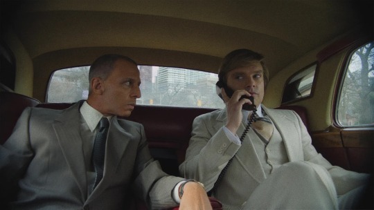
Ali Abbasi spoke to both her and Jeremy Strong separately before filming. What struck her most about the performance her co-star brought to the table?
The unpredictability I felt I had in what Jeremy brought to every day, and every take. As a result, I felt very alert, very alive on set. And I think I was immediately in awe. For me, it was a great parallel to the relationship we were exploring, as if I was Donald in that moment. At work, being surprised is key, that’s the best.
There is a heated political discussion in the United States around The Apprentice. Do you think that helps or hurts your film?
In the film we are talking about a man who has always believed that there is no such thing as bad publicity, and his participation in the debate only confirms that, obviously. But I think the goal was to talk about the film. And I say: even just trying to start a conversation in such a polarized environment is a victory. Everything about this film has been a victory for us, even in terms of it being almost banned from being released. Now we are talking about it and people can choose to go and see it. It is a victory, in a very scary time.
A challenge against censorship
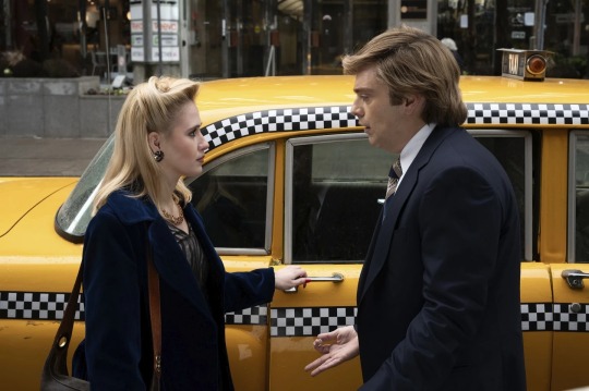
Did you have any pressure while making it?
My experience so far has been just compliments on how good and brave I was. People felt a certain curiosity about what this film was trying to do. But I think I made a very clear choice once I decided that this is what I was going to do, that I wasn't going to let anyone or anything scare me or censor me or have an impact on how I approached the work.
How much weight did your judgment have on the character? Did you embrace reality or did you take refuge in representation?
I think there was a certain degree of actuality that you had to distance yourself from, just to get an objective point of view on the period and what was happening to these characters.
There is a very strong sequence, where Trump rapes Ivana. What was it like to shoot that?
We had an intimacy coordinator, and we followed the obvious approach, which is to make sure we were all on the same page, and how we were going to shoot the scene. Obviously, there is a certain trust, which is important between the actors. We felt that the scene, as brutal as it is, was still necessary not only for Trump's character, but also for what happened in Ivana's testimony under oath, where she talked about it.
Practical question: The sound design is amazing, capturing the chaos of New York, even though it was shot in Toronto. Was it difficult to shoot outside?
Locations are always important. We had an incredible team that did the production design and locations. We had Kasper Tuxen, the cinematographer who shot Apocalypse Now , with us . He saw the film twice and said it was the best New York film he had ever encountered!
The United States, Beyond Black and White: The Shades of a Complex Country
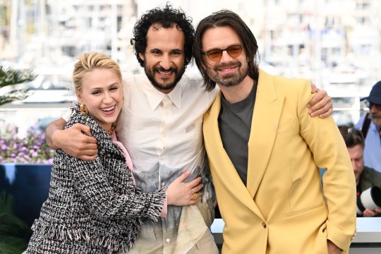
Trump wrote on Truth Social that the movie is false and classless. How did he react?
Unfortunately, it's not very surprising, but I'm glad he acknowledged the movie in some way, I think it shows that he really cares. If he does, it's good for us. I'm glad he did. I also want to thank him for thinking of me at 1:00 AM when he could be thinking of other more important things.
After The Apprentice, what more have you learned about the United States?
We need to continue to explore the idea of the American dream, which on the one hand can be so rewarding and on the other hand can be very expensive. I think you have to look at the system in which this man, Trump, was born. You also have to look at Europe as a point of comparison. But it's not all black and white. The truth is much more gray and we have to analyze it from all angles.
I don't know if you've ever met Trump, but if you did, what would you say to him?
What would I ask him? Simple: How do you wake up and look in the mirror every day and lie to yourself so much? Tell me because I'm really curious. Do you feel anything other than self-hatred?
#Sebastian Stan#The Apprentice#Interview#mrs-stans#StansClan#SStan#SebStan#sebastianstansource#sebastian stan source#sebastiansource#sebastianstannews#sebastianstanedit#sebstanedit#sebastianstan
62 notes
·
View notes
Text
He's finally done I think. WOAW! Radio demon time!!!

Okay time for comparison + breakdown rant ^ - ^ another SUPER long one I had a lot to say about this silly guy

ALRIGHT. So. Atp all that can be said has been said about Alastor but I'll gloss over it anyhow. Grossly historically inaccurate hair and clothing. Invisible deer theming. One of the main reasons he's got one of the most clowned on designs in the show is bc he's a pretty good representation of the worst it has to offer. He's absurdly red and has the waspiest waist in town. Also gotta zero in on the coat for a second bc I find it incredibly stupid that he went to that tailor bc of his coat being ripped and then left the shop with the exact same torn coat on oh goddd that felt like a complete joke who wrote this
Also his "redesign" was pointless. He stayed pretty much entirely the same except his colors got pinker and grosser and now he has this?? White trim on his lapels??? Even less 1930's accurate and it only serves to hurt the pallate in my eyes. It's the only spot of white on his entire design, it doesn't appear anywhere else so it throws it all off. And it's so bright. Is it supposed to be a focal point?? His tits????
Anyways onto my guy who I love so very deeply. I'm pretty sure sepia film was outdated by the 1930s but I gave him a palette inspired by it to emphasize how dated and stuck in old ways he is. Added blood red accents bc. Well. Cannibal murderer. Also bc I redid the sin colors so red is wrath and it seems like a fitting sin to pair him with.
After looking into 1930's men's fashion a tiny bit (thanks anon, this video was helpful!) and gave him a double breasted coat but wider and pointier so he looks a little less like just some normal guy and really emphasize how prideful and egotistical he is. "Ooo look at me I'm super big and imposing and powerfulll". I think it's a fun character trait of his. Definitely keeping it.
I liked him wearing gloves bc I feel like he wouldn't like getting his hands directly dirty and would always be covered when committing his murders. Maybe he's a germaphobe even. "I can excuse murder but I draw the line at dried blood on my skin". Also the gloves being white would contrast really well with blood so. Love that
I gave him a long tie to free him from the Vivziepop bow tie uniform and a fedora to add to the 1930's vibe and serve as something that can occasionally obscure his face in shadow. His glasses are also opaque and I imagine his eyes would rarely be shown if ever to make him seem more inhuman and off-putting, disconnecting him from personhood a bit. Wanted to add to that with his smiling mouth never opening and just being a static grin that can only occasionally widen or lessen, his voice cracking out of his "speaker" with fuzzy radio static. Seen multiple ppl use that idea and it always eats
I love Alastor's silly theatric nature (primarily in the pilot) and I'd probably keep it, but I'd add a layer of uncanny-ness to him where when he's not putting on his silly jovial facade, he gives off an unnerving vibe. Trying to appear approachable and charming and pleasant to lure people in before he's revealed to be less than human. Loveee thattt
I love Alastor being a deer. Predator becoming prey (animal) + "prey animal" lulling people into a false sense of security before striking. Love it. We should be CAPITALIZING ON IT❗So I gave him deer like legs, visible deer hooves, and more readable deer ears + the ham radio tower antenna antlers (sorry 4 calling them horns 💀)
Tried to make it a little more obvious that he's a mixed man of color by giving him dark wavy hair and the faintest hint of lip definition Viv uses in her style. I think it works. He's still not dark skinned tho
LASTLY the mic. Also not an original idea as I've seen tons of others turn it into a carbon mic but turned into a pentagram shape and I love the idea a lotttt so I joined the crew.
AND THAT DOES IT!!!! hope u like him as much as I do hehe. Just 1 supplemental doodle this time sorry :/ showing off how his face is probably obscured most of the time. He's. So hard to draw. I'm just bad at men but I'm tryinggggg guys

Alsoooo I've already finished the drawings for Niffty, Angel, and Husk! Once I've finished their breakdowns I'll add em right to the queue, and then I'll make a post with all of the main 6 together :3
#my art#digital art#hazbin hotel#alastor#alastor redesign#hazbin hotel redesign#hazbin hotel rewrite
100 notes
·
View notes